Representing the creative future

Nicole Coson: How to appear without a trace

As I make my way to Nicole Coson’s show at Display Gallery, located on the Holborn Viaduct, I try to reconstitute a mental timeline of her evolving practice. I have been lucky enough to see her work numerous times, from her display at the Central Saint Martins Fine Art degree show last year, to an exhibition of her ‘Spirit Captures’ series at the Stamperia del Tevere, a small artists’ space in Rome, in between studio visits and smaller group exhibitions.

I have sustained a steady attraction to the ghostly figures and vibrant textures of her work, the mystery surrounding them has a very personal feel to it and this anticipated presence of the viewer, an open invitation to contemplation, is something I relish.

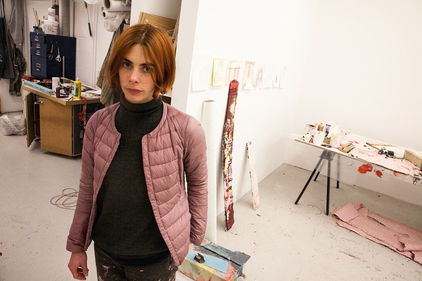
As I arrive and greet Caroline Minar and Josefina Pierucci, the duo managing the gallery who welcomed the Manila-born artist a year ago as their second permanently represented artist, Coson heartily starts to show me around.

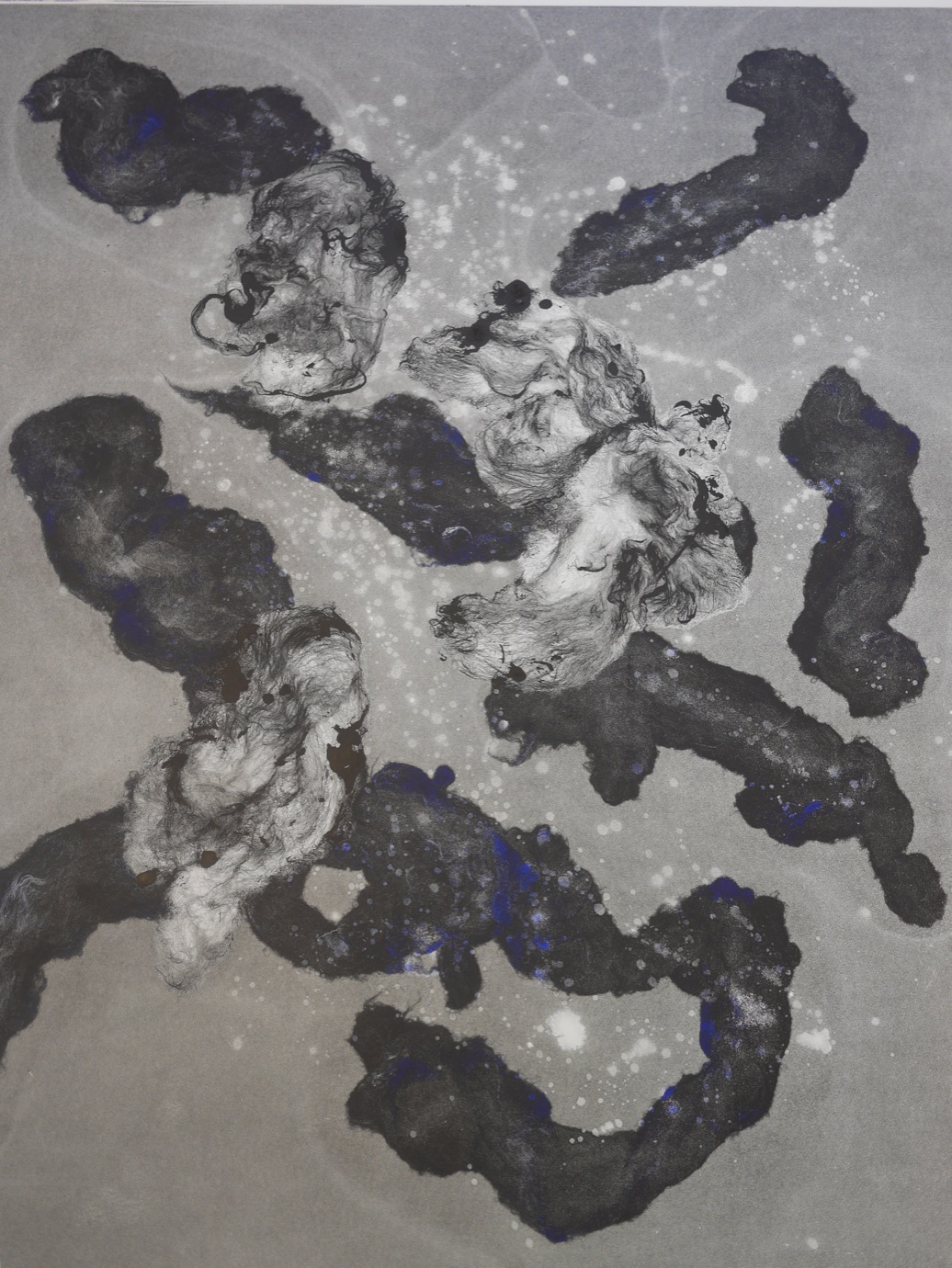
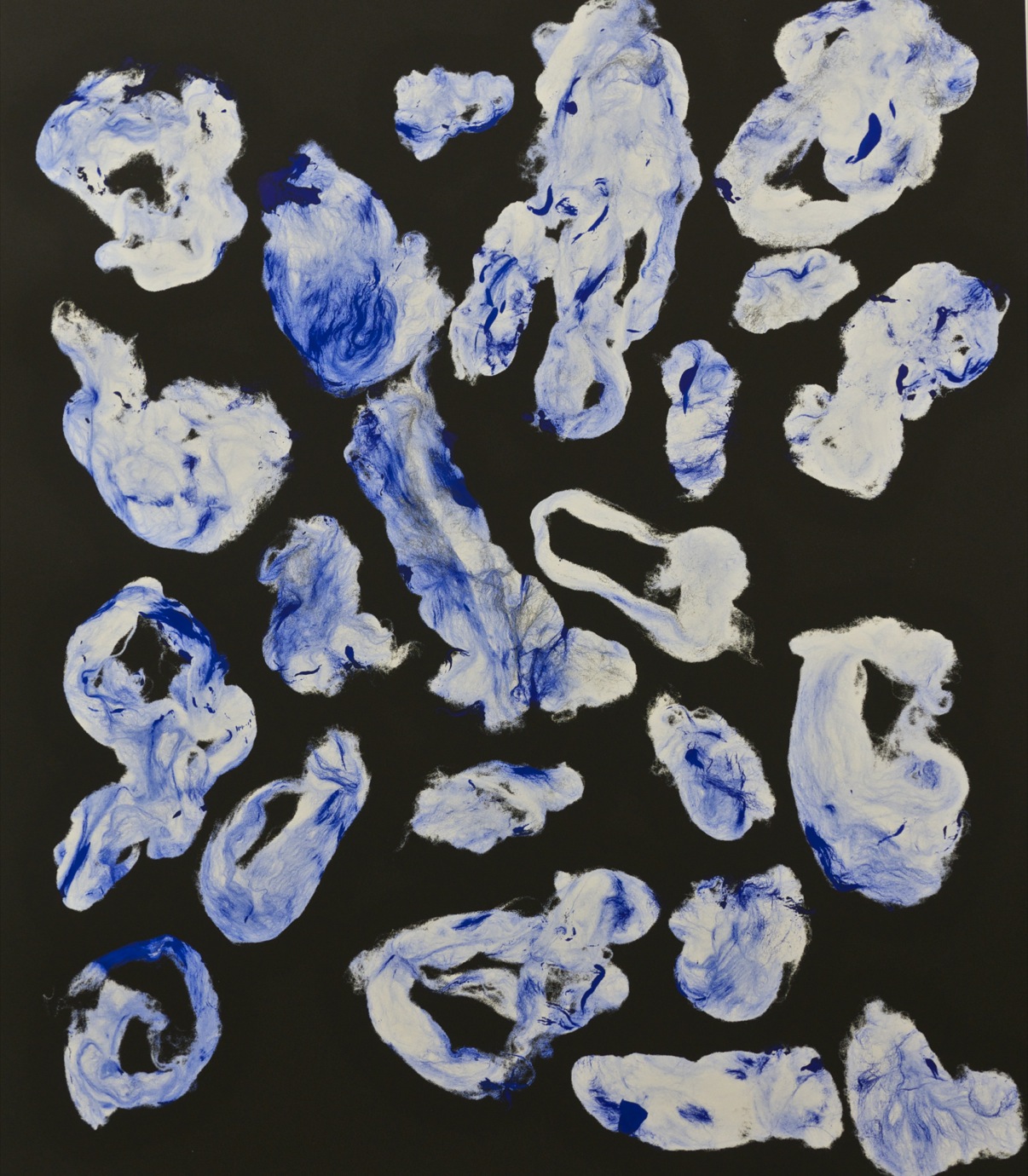
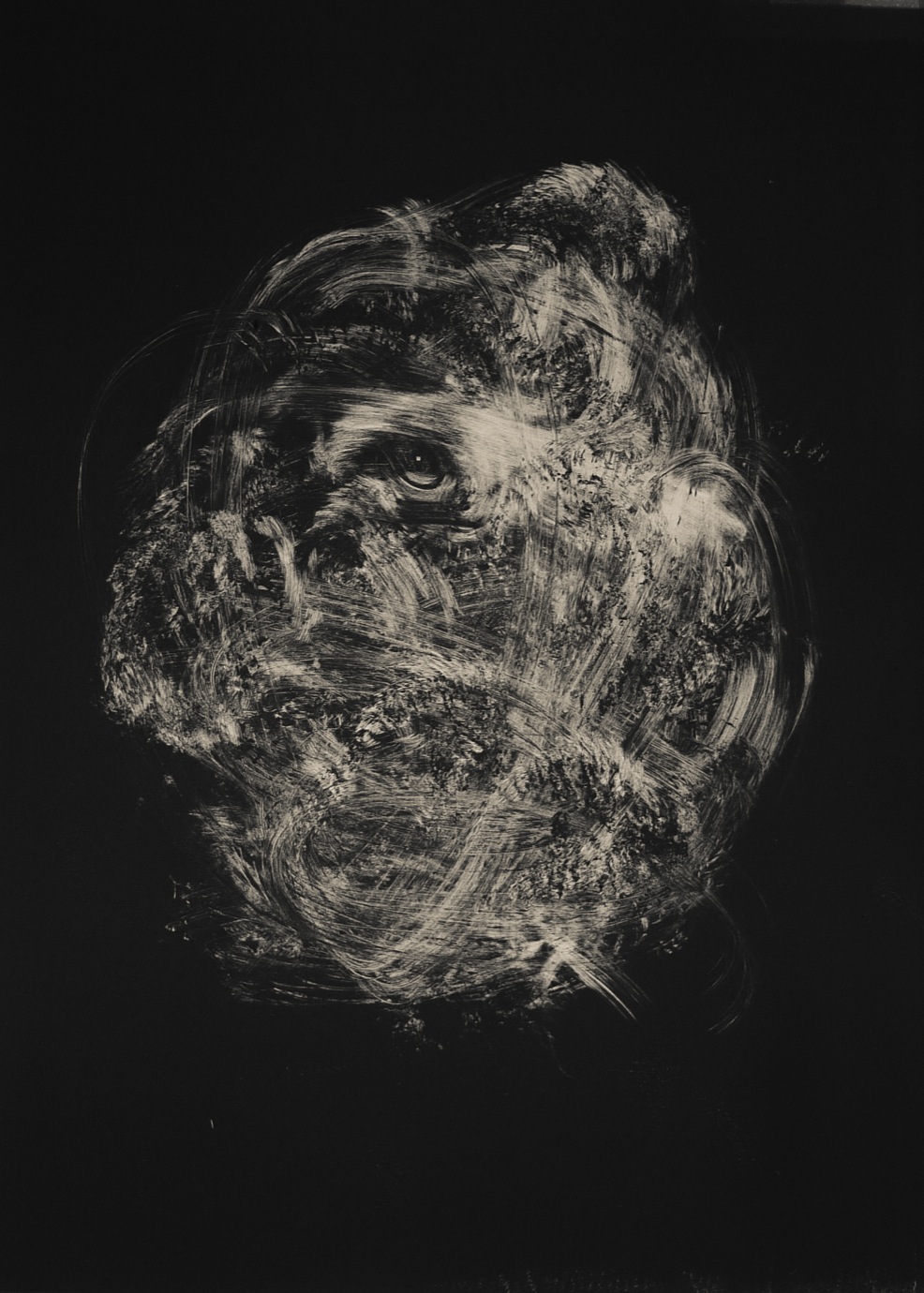
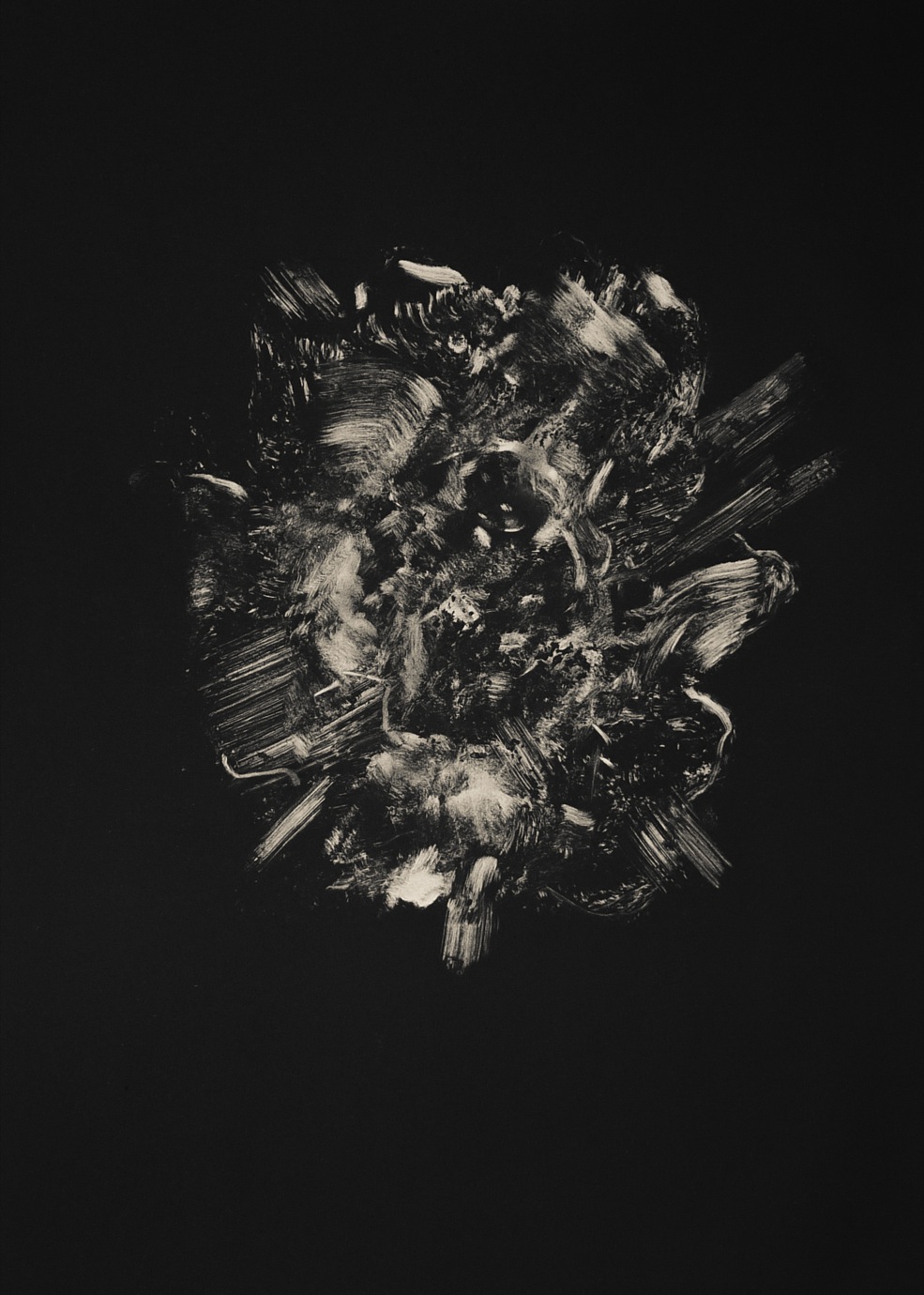
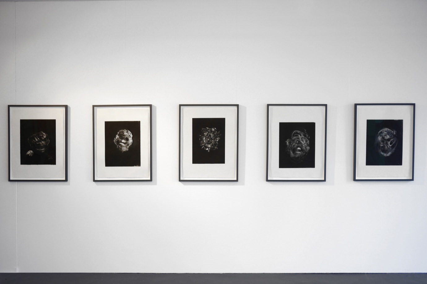
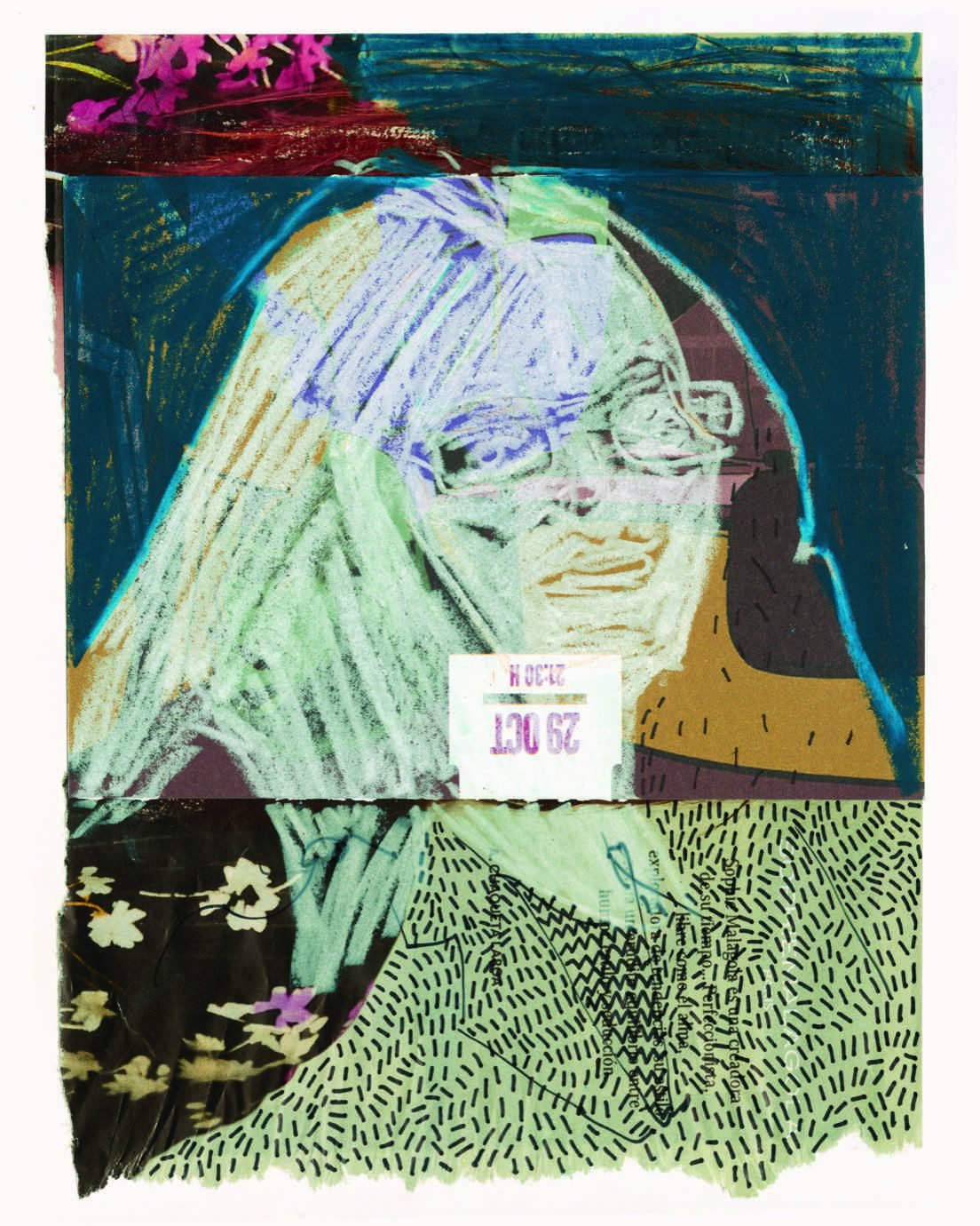
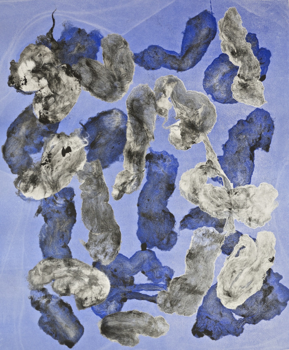
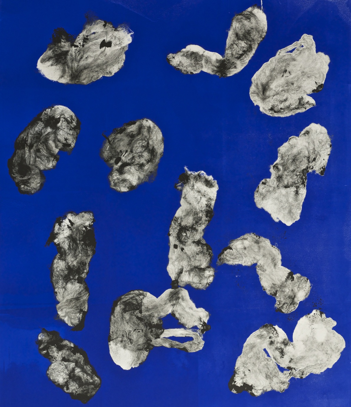
How to Appear Without a Trace, her first solo show in London, displays her most recent works on the two gallery floors, entirely self-curated. It is an extensive collection bearing witness to the amount of work and the cyclic evolving thought process of her practice. Detail is of course never left aside; the intricate and beautifully textured prints render an extraordinary amount of shapes, traces, blurbs and dots, in which one can read a certain fascination for the ghostly figure, the uncanny, the transformative aspect the viewer’s gaze is subjected to. No image is fixed. The process itself is one of discovery, for both the viewer and herself, as she either traces blanks through sheets of ink with her fingers and pieces of cloth to make an image appear, or awaits the unexpected shapes produced by inked up wool roving on paper.

“WHENEVER I MAKE A PRINT, IT CAN BE TRANSLATED AS SOMETHING INTESTINAL, LIKE BOWELS…”

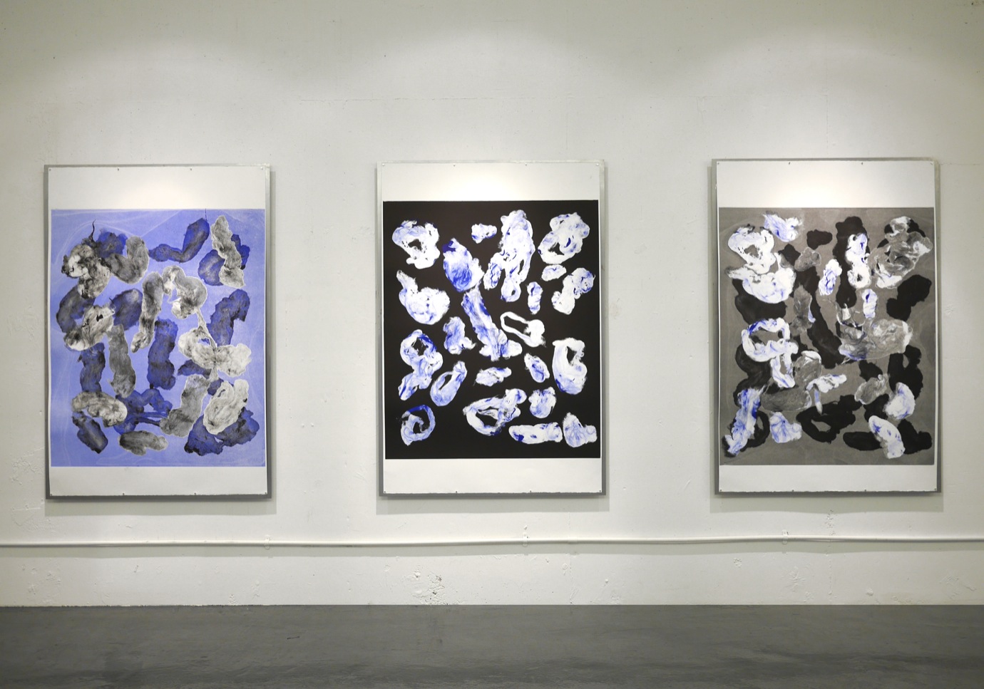
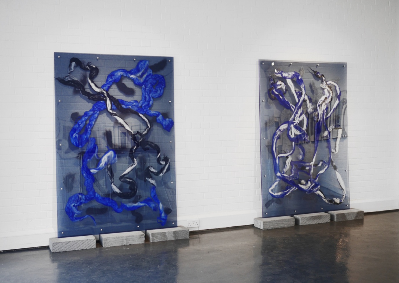
For the first time, Coson has used colour extensively in her new large-format works, overlapping her usual choice of black and white with ultramarine blue. This adds light and warmness, rather than cooling it, and there is a definite change in the overall energy of the work: more ethereal and complex, thanks to the layered shades of black, grey and blue.

She softly comments on that recent development as she shows me around downstairs. “To me, it’s super colourful. I really like that the blue is a colour that is manmade”.

Besides the pristine rendering of the wool traces in black and different shades of ultramarine blue, the framing has also required a high amount of work and an equal amount of thought. The wool bundles are pressed inside three sheets of Perspex in two shades of grey (one darker than the other) and ultramarine, held together by screws and bolts, which evokes the process in which particles are squeezed in between microscope slides.

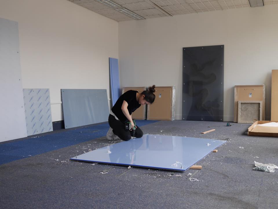
Some paper prints sit in traditional frames, while others are mounted on metal plates with magnets. “The reason I have used the tiny magnets holding the print up is because I really wanted to introduce this filed sheet as a reminder of the process. I find that to be such an important part of the entire show. It is capturing an instance in time, never to be repeated again because it’s a monotype. I cannot make another one.”

The metal sheet is where the ink get transferred from onto the paper, but in the case of the Perspex framed works, the wool is inked up and directly introduced in the press without a plate. “It all ends up on a piece of paper, so it’s kind of like a residue of the process.”

I wonder out loud if there is a correlation between the polarity of the softness of the wool and the harshness of cold, thick metal. “I definitely tried other fabrics, but I am really interested in the material of the wool because, again, it is the residue of something. It used to be part of an animal and now it is granted a second life.”

Moving on, she goes on explaining that the work has “an organic look to it. Whenever I make a print, it can be translated as something intestinal, like bowels…”

“IT IS FOR THE VIEWER TO DECIDE WHAT HE WANTS TO SEE.”

I found myself going back and forth between having my nose almost touching the frames enveloping the paper prints and having my back against the other side of the room, trying to decide whether the black and blue shapes remind me more of intestines or close-ups of cells. The latter makes her smile. “This actually makes me really happy. One of the reasons I like this material is because it makes such fine details and confuses the viewer about what the scale of everything is,” She comes closer and stands next to me, pointing towards one of the pieces. “The detail is so fine, but compared to the size of the print, one wonders if it is the representation of something enormous or something small? And when the pieces are presented within the Perspex, you realize that it’s not as big as you thought and it’s not as small as you thought. It’s actually a non-representation of something. It’s just the residue, so we are being brought back to the real, and I think that’s what makes it so interesting. You can’t tell the scale.”

“I like that ambiguity, I use it again and again throughout the show – ambiguity of the shape, ambiguity of the scale; none of the works are titled,” she continues. I remark that she intentionally widens the scope of possible interpretations of the works without leaving the viewer clueless, which is somewhat refreshing in the midst of a trend of “forced information” or the polar opposite trend of not even trying to pretend there is actually something to get out of a work of art.

“That’s where the title of the show makes sense: things can appear as they are; appear to you as a viewer. It is for the viewer to decide what he wants to see.”

“THE SHOW IS REALLY ABOUT THINGS THAT APPEAR WITHOUT PRESCRIBED SCREENS OF IDENTITY, THINGS THAT MIGHT BLUR WHAT YOU ARE ABOUT TO PERCEIVE IF YOU HAD NOT COME WITH ANY EXPECTATIONS. “

Two works in the show catch my attention, especially after finding out that monotypes are the only version of themselves. Reminiscent of Rorschach tests — a test in which subjects’ perceptions of inkblots are recorded and then analyzed using psychological interpretation — two prints mirror each other, and are a reminder of Coson’s interest for psychoanalysis and Freud’s notion of the Uncanny. It also defers the freedom granted to the viewer from her other prints, taking the form of a more forced invitation to interpretation. “It is still monotype printing, but there are two. The shapes are the same, but the markings are different”.

Perhaps this psychoanalytical reference echoes the interpretative possibilities of the viewer, and asserts the fact that no scholarly and academic background is necessary to voice an opinion, even if only internally, on a piece of art.

As we continue walking through the show, I tell her that the title of the show, How to Appear Without a Trace, evokes to me a stand against everything digital, the Internet in particular; the fact that her process is all about catching a moment in flight, being intractable, irreproducible, is the antithesis of everything that art exhibited, duplicated or produced through the Internet stands for.

Is that something she is conscious about when making her art? “I guess it does tie in. I haven’t thought that much about the Internet culture when producing my work but the title of the show is really about things that appear without prescribed screens of identity, things that might blur what you are about to perceive if you had not come with any expectations. To appear on its own terms.”