Representing the creative future

Behind the pop prints of Antwerp student Quinten Mestdagh

"I wanted to work around the concept that showed the power and strength of fashion photography and fashion imagery."

You could hear Quinten Mestdagh’s designs before you could see them. At the graduation show of the Antwerp Academy, his collection was met with cheers and applause before they even left the runway. The third year BA student was inspired by ripped up publicity panels in the Parisian subway and his “love and passion for fashion photography and imagery translated through a strong graphic identity.” The result was a playful and colourful collection that felt both nostalgic and modern.

What was the main inspiration behind your collection?

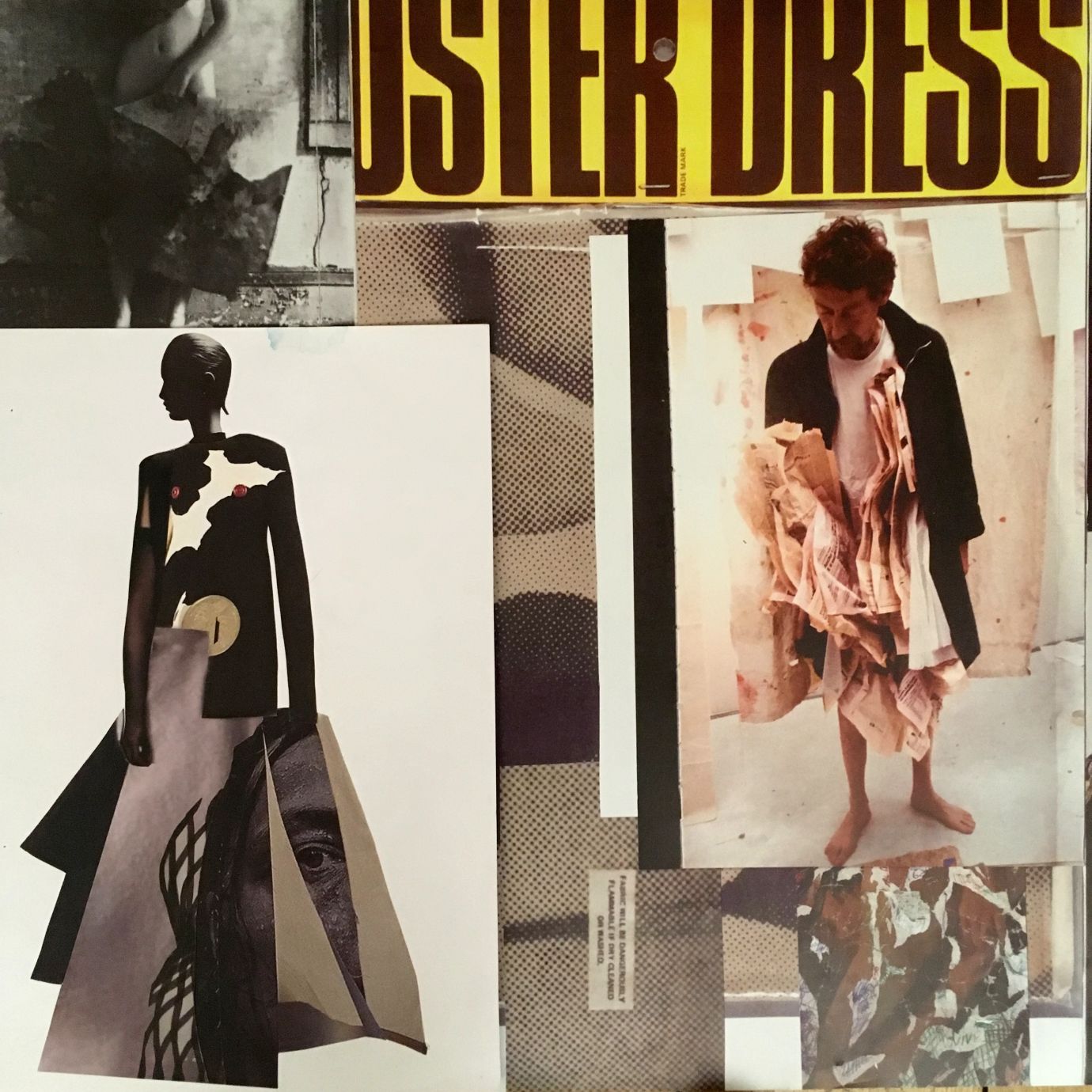
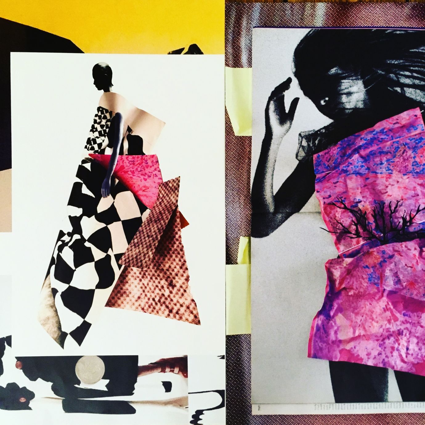
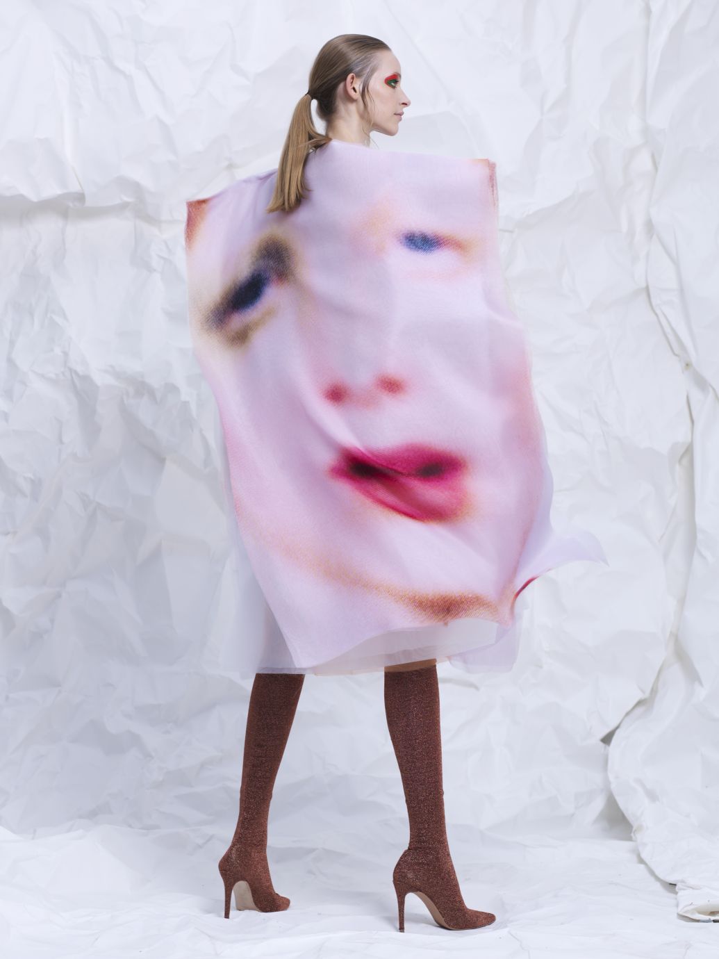
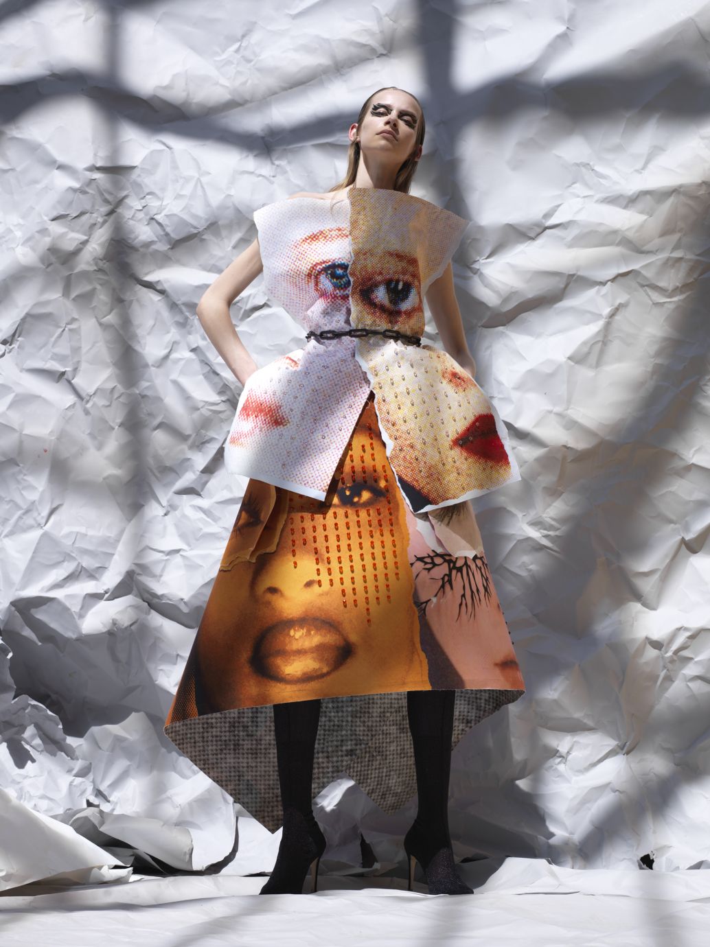
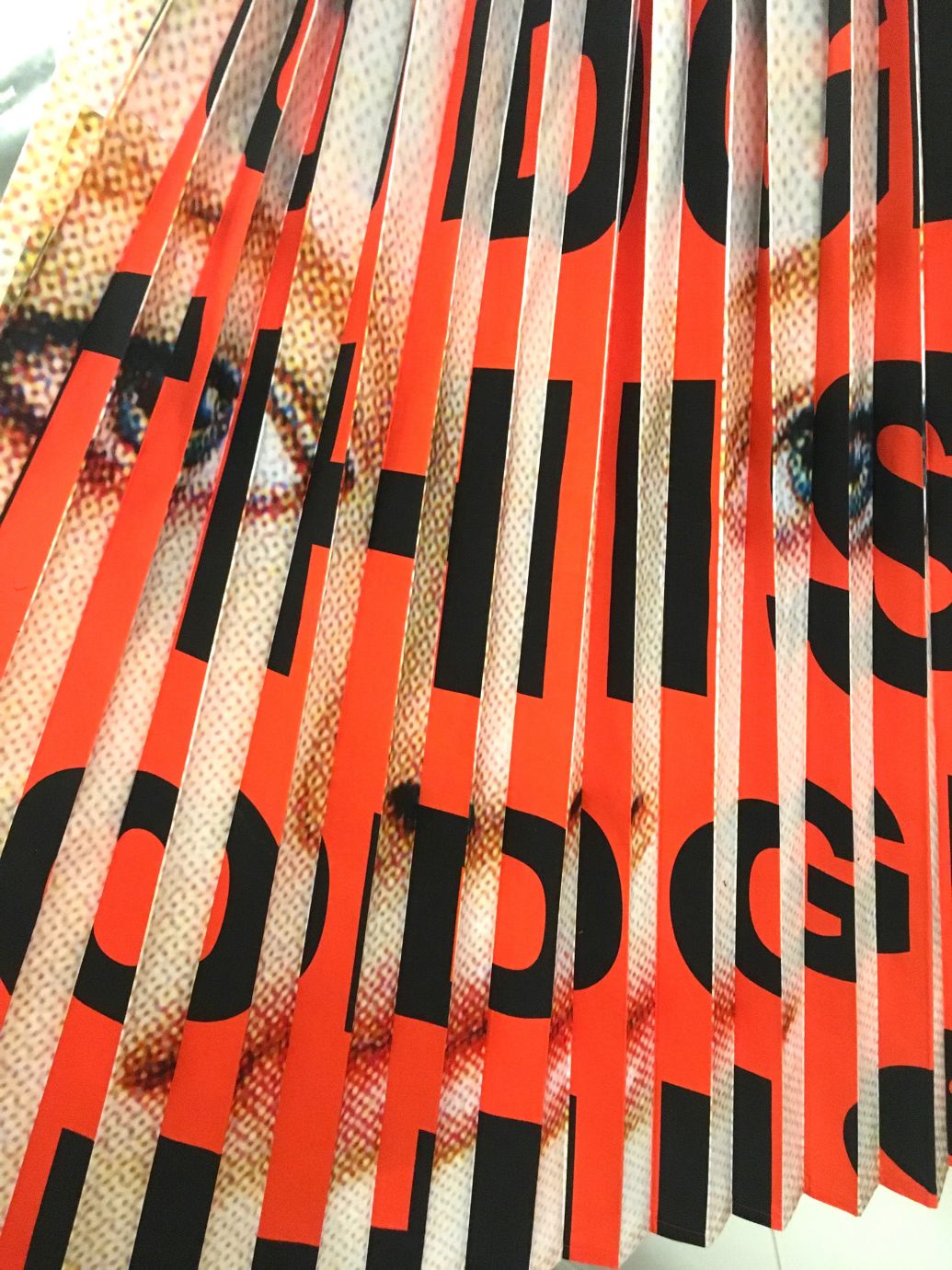
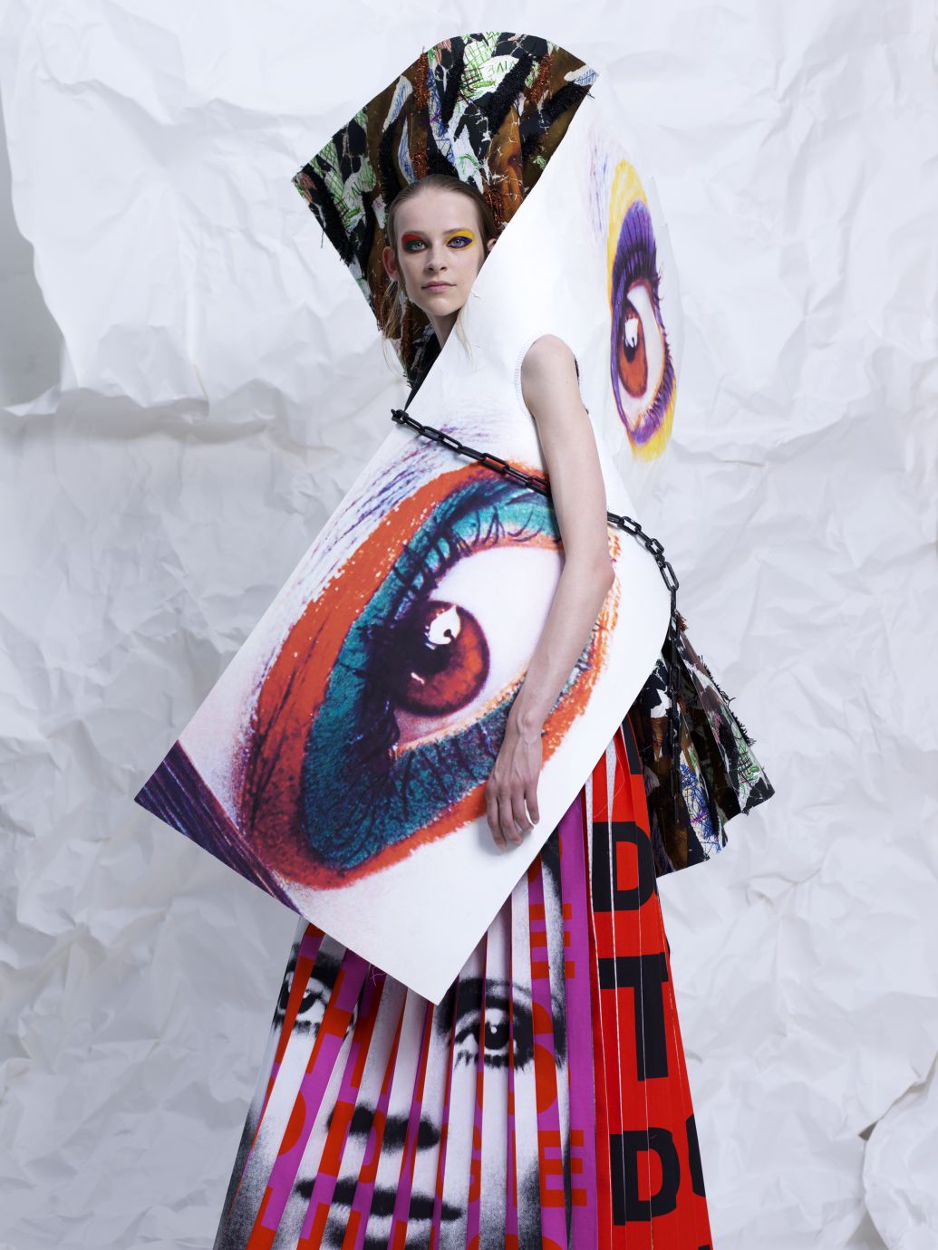
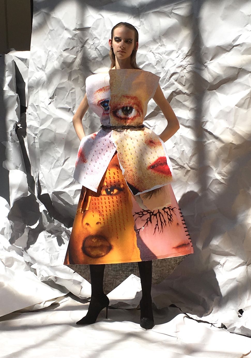
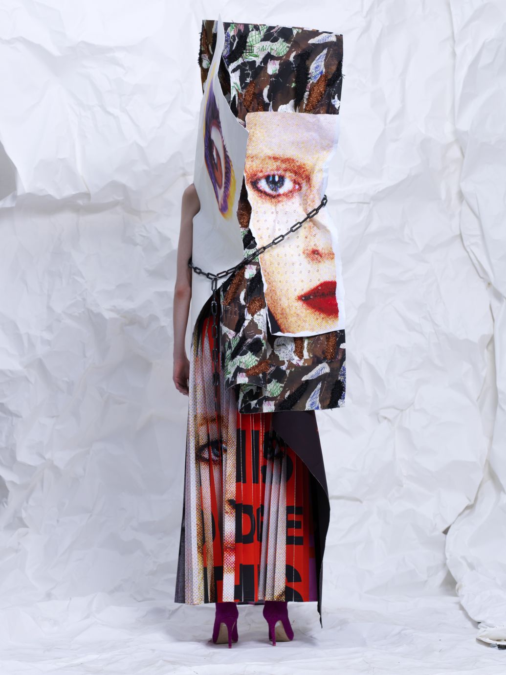
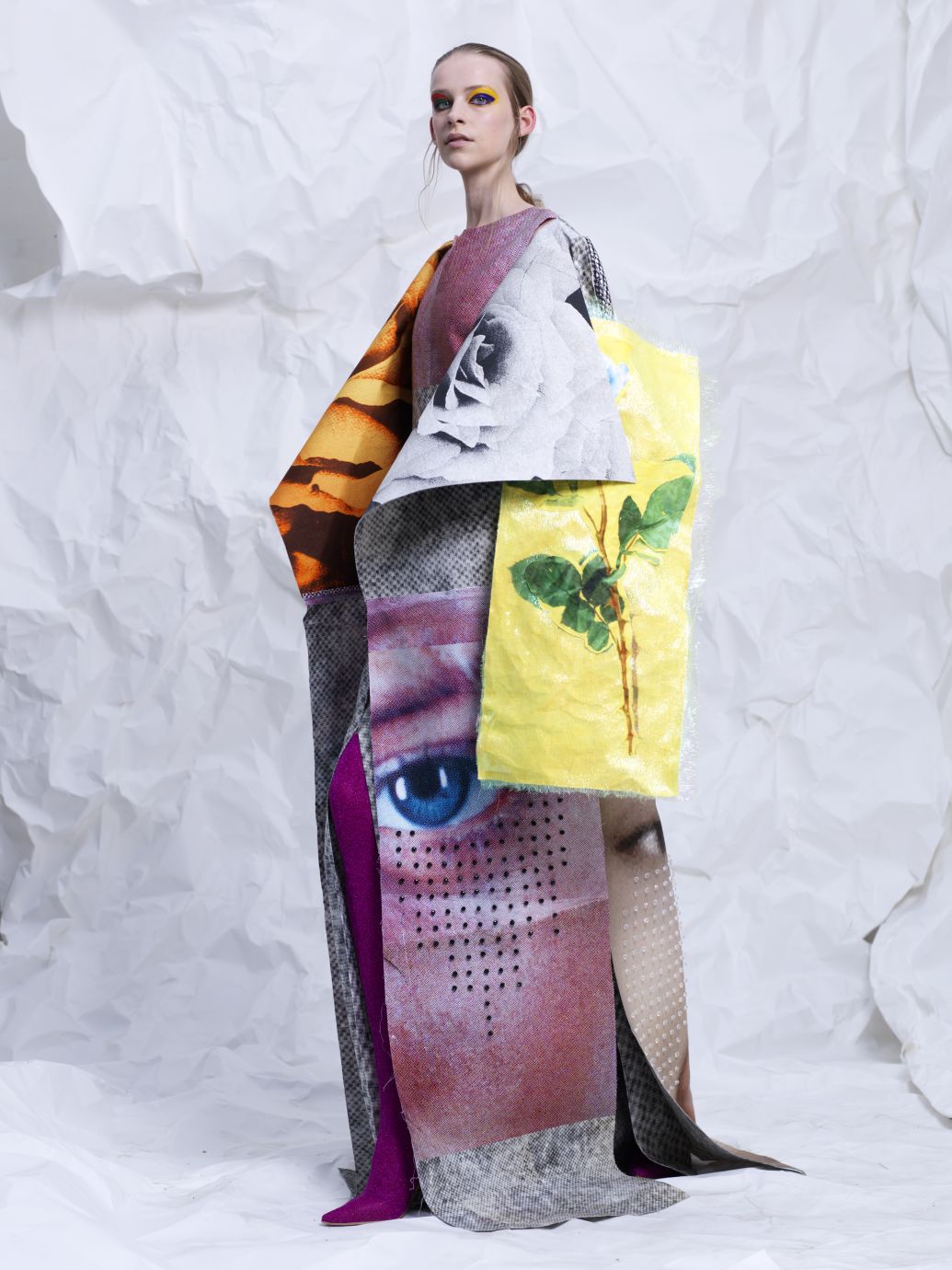
The starting point for my collection this year was that I wanted to work around the concept that showed the power and strength of fashion photography and fashion imagery. I’ve always been attracted to highly stylised and iconic fashion images in magazines and advertisements and they were the main inspiration for starting the collection. During a walk through the Paris metro stations I came across an advertisement from the department store Les Galleries Lafayette. On the advertisement there were two models wearing very skinny trousers. From the waist up, the poster was ripped off and the silhouette of the long legs continued into the rips of the paper. It created a new and abstract silhouette. Seeing these ripped advertisements, I started to get interested in the idea of creating, by an act of aggression on a beautiful picture, a kind of tension or disruption of an image.
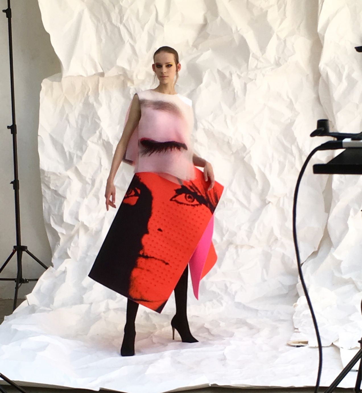
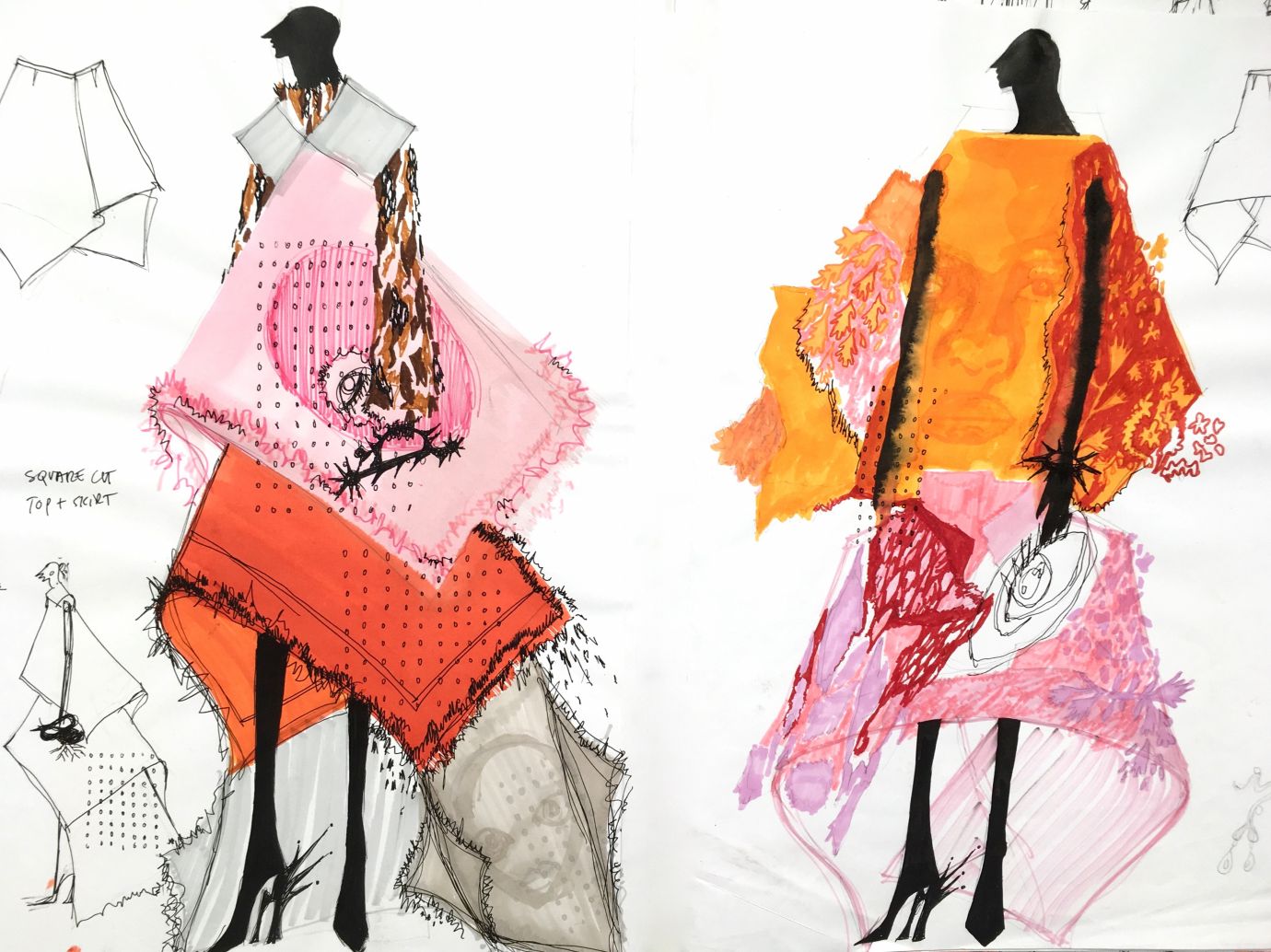
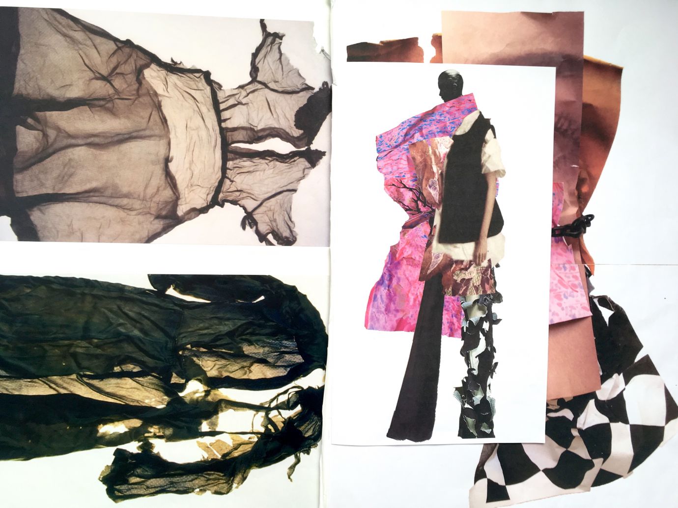
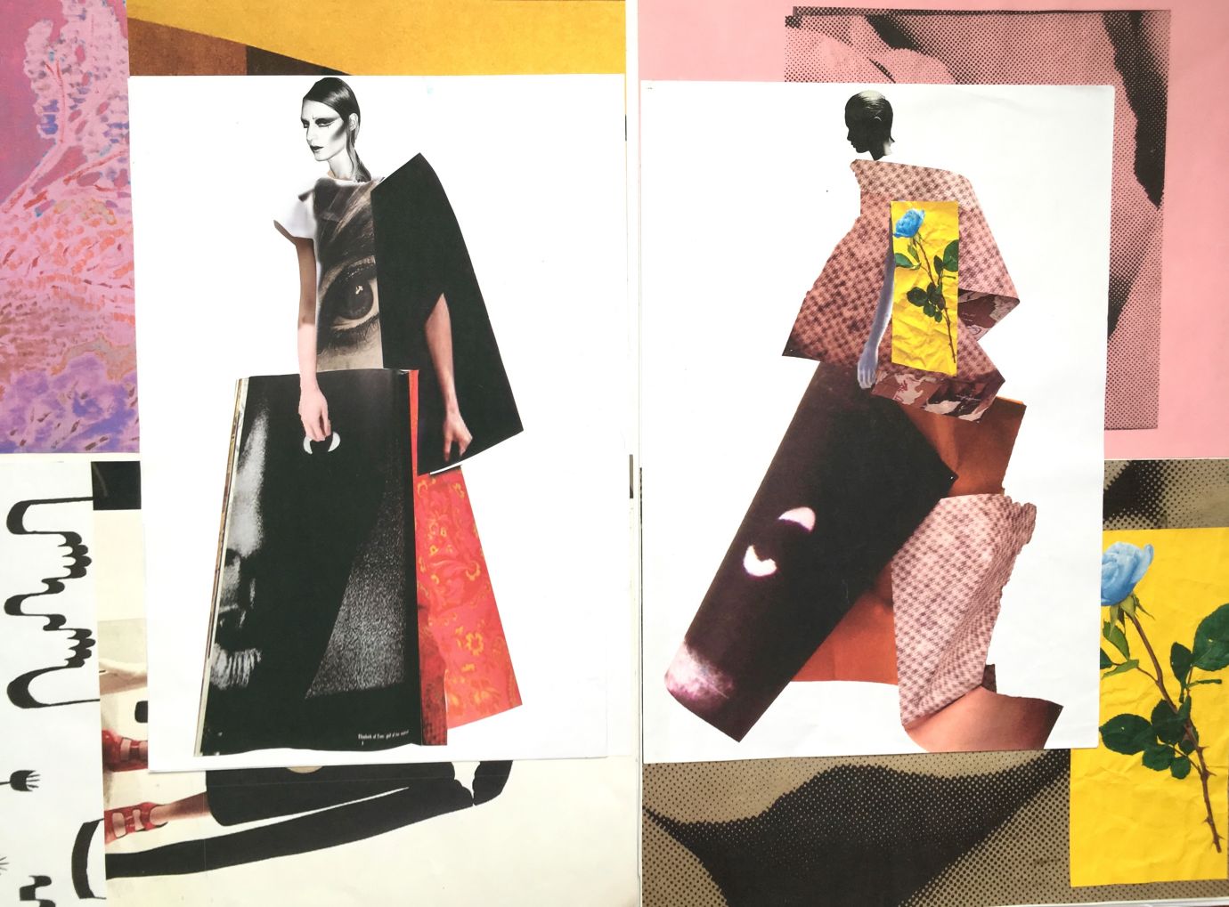
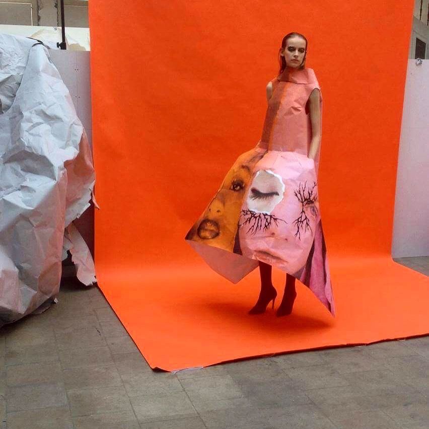
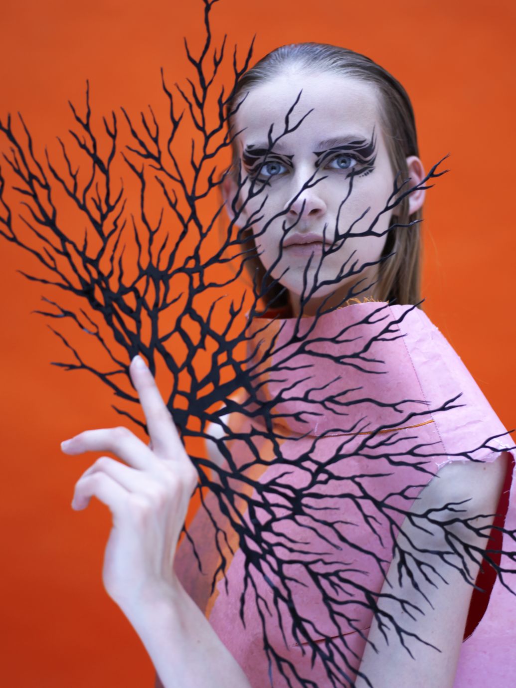
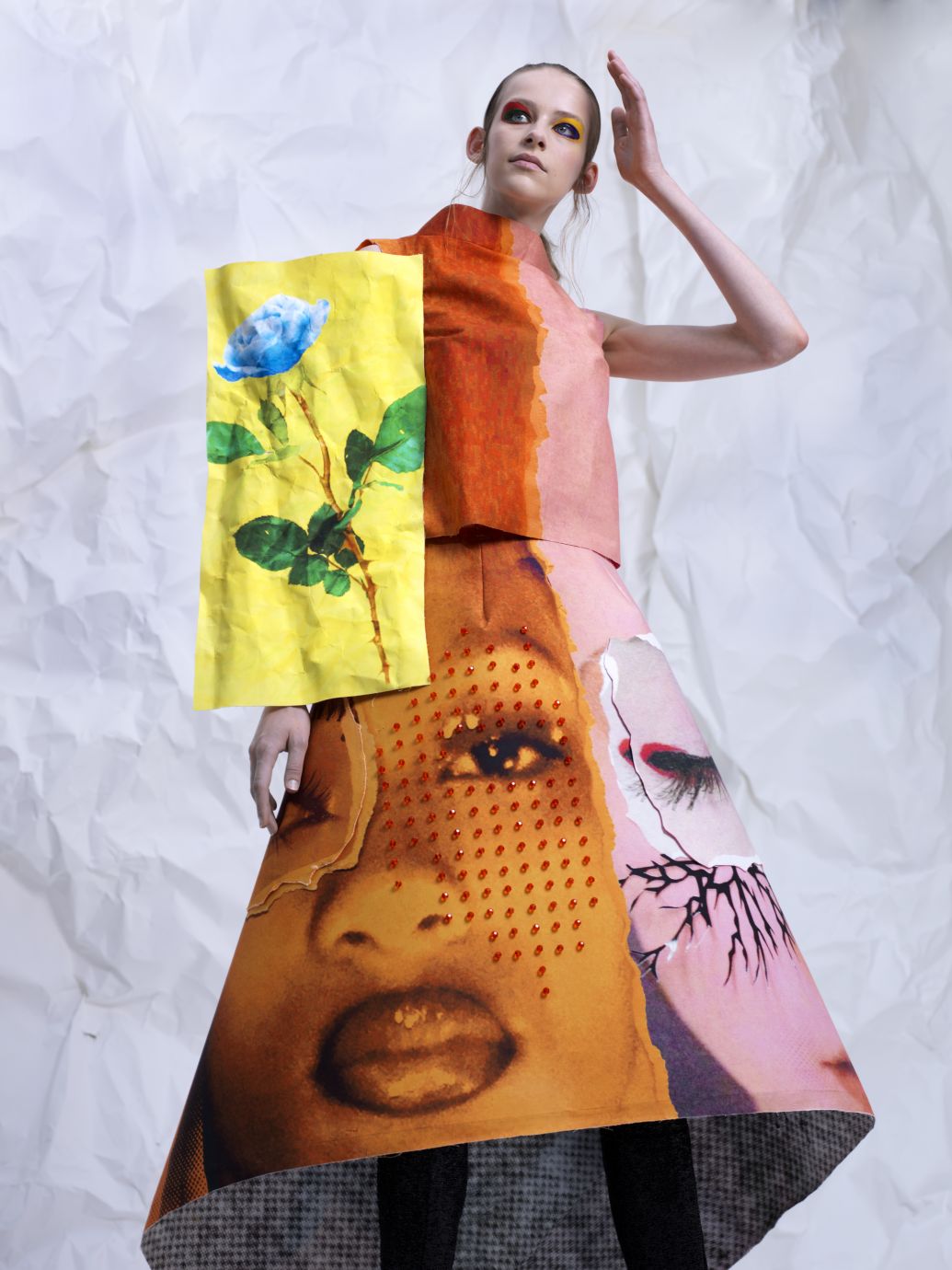
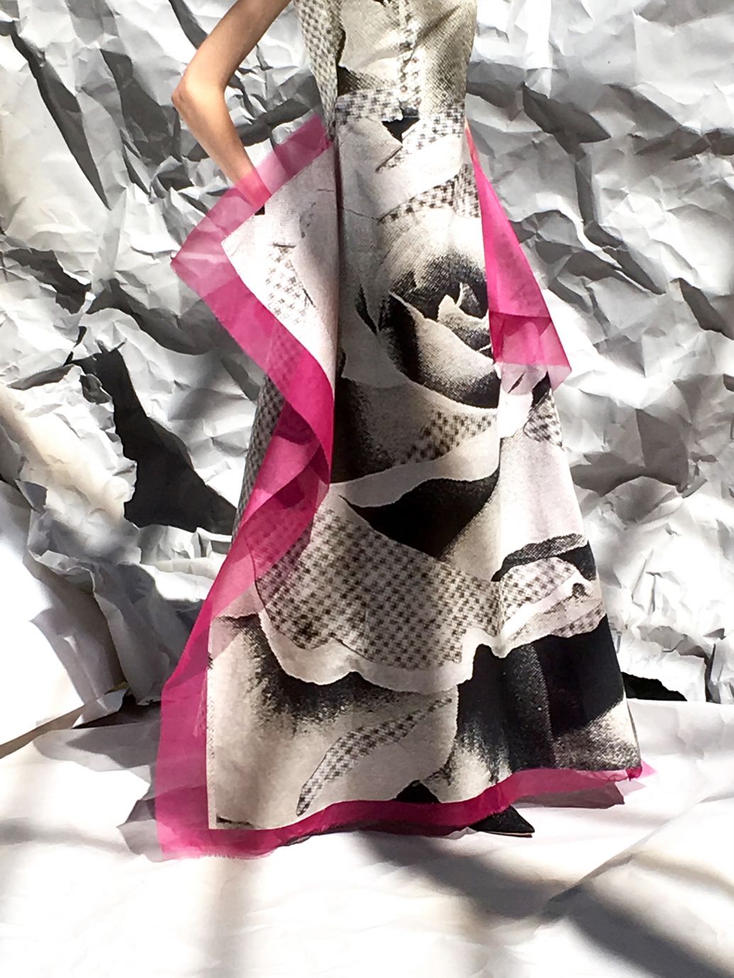
I started by making collages and 3D paper compositions myself, with images I found in the archive of the MoMu library in Antwerp. Glossy pictures of women’s faces are disrupted by paper rips and shreds resembling the damaged advertisements, creating a tension and roughness in contrast to the beauty showcased in fashion photography. Afterwards I made blow-ups of these prints and started to think how I would translate them to into three-dimensional garments.
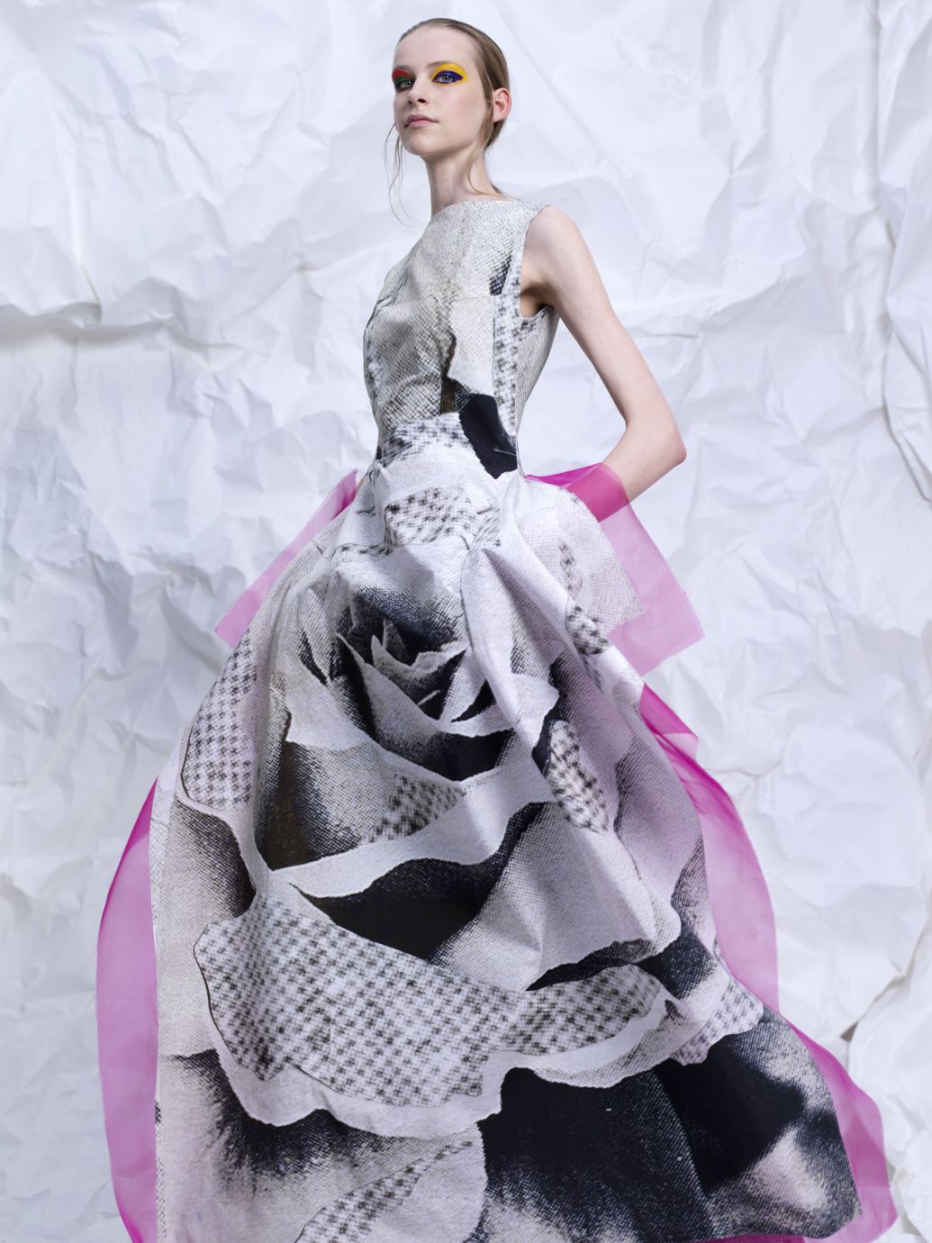
For the shapes of the clothing I looked to the clean and architectural volumes of mid-century couture gowns. They had an elegance but also a kind of static and strong feeling that worked really well with the impact of the prints. I used trompe l’oeil effects by printing the paper collages on different fabrics and reinforcing them with stiff Vlieseline and paper. This way, it has the effect and lightness of paper but the fabrics have enough stiffness and structure to hold the shapes. I also worked with pleating systems in full skirts where the two pictures are fused together to recreate the feeling of rotating billboards.

Could you tell us more about the prints?

Most of the women in the prints are fashion icons of the 50’s and 60’s like Nico from The Velvet Underground, Princess Elizabeth of Toro and Penelope Tree. I placed them next to more contemporary models like Selena Forrest or Karen Elson to get this contrast between beauty ideals and tendencies from then and now. I like to work with these portraits because they are all very beautiful but they also have something mysterious and sterile about them.

How did this collection relate to the work you did in previous years? Will you continue to develop it next year?

I think it related in a way that I was already working a lot with prints on garments but I think that this year, it came together in a more clear and cohesive concept. I will definitely keep on working with prints but I am starting to get interested in how you can translate prints or graphics into something that has more texture or depth or that it can become something very elaborate and decorative. I am also interested in how I can create graphic shapes directly into the construction of the garments instead of printing them on it.

What was your biggest challenge last year?

The biggest challenge was definitely the technical execution of the pieces. All the pieces had to be very stiff but light at the same time and it took quite some trial and error before I got the right balance. With my first jury pas in January we had to make and present the first silhouette and starting point of the collection. It was the first time I made a silhouette by reinforcing the fabric, and because I printed on a fabric that was way too heavy the whole dress collapsed and it looked horrible. I had three days to come up with a solution and the only option I had was to re-print the dress and make it out of paper. Back then it was not the most fun thing to happen but I definitely learned a lot out of it!

Was there anything a tutor shared with you that was particularly helpful?

The ongoing dialogue and process of going to school, showing your work and talking to your teachers is the most helpful thing you can get at the academy. The teachers are there to guide and push you but at the end you learn the most by figuring out things yourself and making mistakes. I think that as a designer, you are constantly busy solving problems. But if the teachers see that you are a hundred percent convinced about what you are doing they definitely let you go all the way!

I know social media has helped you get press attention, how do you feel about that?

I think social media platforms like Instagram are great because you can share and communicate your work in a very visual and instant way. Visual impact is something that really interests me and it’s something that I really would like to work further on for next year. I really see Instagram more like a kind of online portfolio and I think it’s a great platform to showcase your work.

Do you think you’ll easily find your place in the fashion industry?

I have no idea to be honest. I hope so of course, but I think I will be the most happy if I can end up in a place where I can work as freely and creatively with fashion as we can do it here at the Antwerp Academy.