
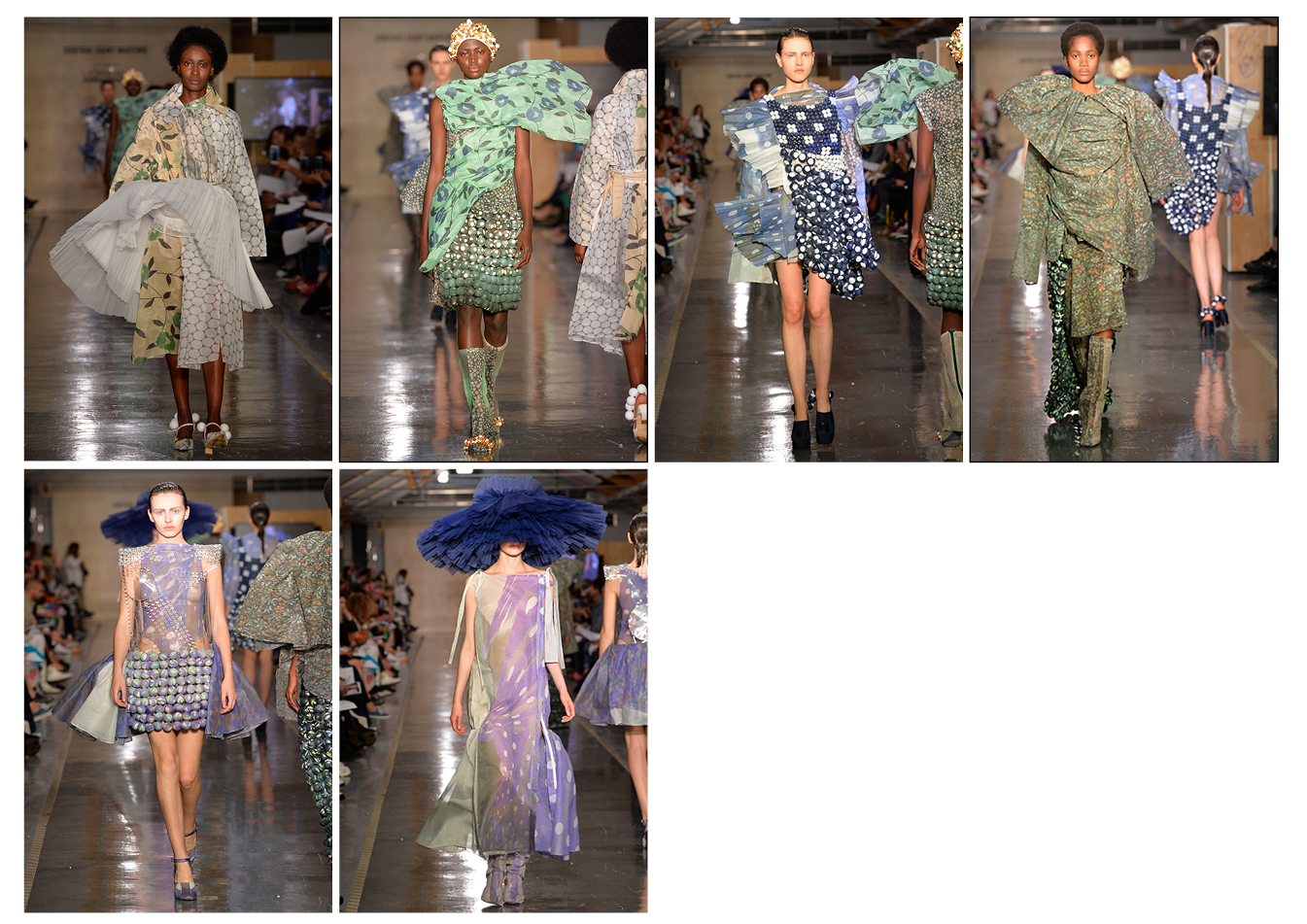
SIMON VALER DACSEF
BA Fashion Womenswear
CSM BA graduate show 2018: full line-ups
When young talent becomes commodified entertainment, what happens to those less comfortable in the spotlight?
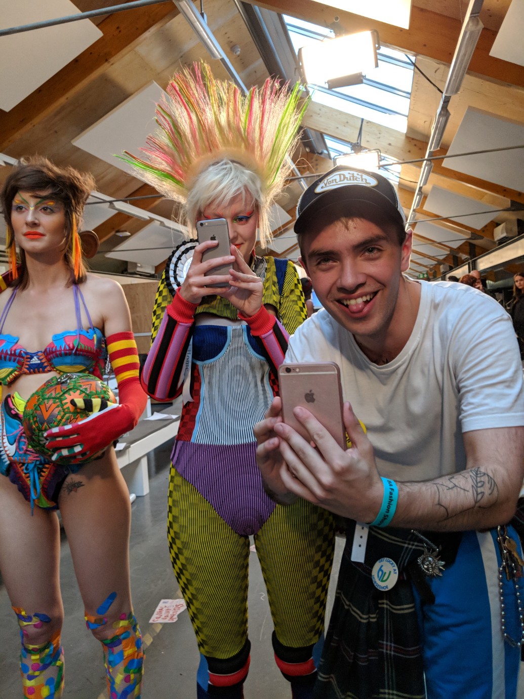
Last year, we were questioning the purpose of designing clothes. With Brexit looming and an orange at the White House, fashion suddenly didn’t feel as important. “Why create?” On Wednesday, a new generation of students seemed to have grown tired of questions without a response. They wanted to be the answer. An explosive celebration of unrestricted creativity. L’art pour l’art.
Students are increasingly aware of the role they will play in what is exposing itself to be a toxic and unsustainable industry. These graduates chose to go out with a bang. Fed up with the system, they decided to throw a Surrealistic feast or shower their audience with bananas. Delicious and genuine fun! This generation revels in the seductive power of on-screen likeability and the focus (of students, tutors and media) continues to shift from the design to the designer. The cult of personality, heavily criticised by Lidewij Edelkoort a few years back, appears to reign ever so strongly.
That is, until research and inspiration are revealed. Go through the backstories behind all these collections (gracefully obtained by our new team member Vivien) and you’ll discover a much more exciting side to all of these talents. Below the surface brews a melting pot of heartwarming, intelligent and wacky stories, both with the Instastars and those that didn’t make your feed.
But who still has time to listen to them?
A quick scan of fashion news coverage the following day suggests that those who live to entertain might be the only ones to survive this industry. It would be easy to listen only to those who scream loudest, but there were many voices that night. “If you woke up and you didn’t want to buy anything, then what would happen?” asked one of them. These students are questioning and reshaping our world in a variety of ways, but are we paying attention to them equally? Are we open to the proposals that aren’t as hashtaggable?
Eyes turn to young talent when the habitual sight gets boring. We expect graduate shows to inspire, but in doing so, are we asking creatives to become entertainers? Some are born for the spotlight (and fashion would be so boring without them), but what about the others? We should demand and push educational institutions to thoroughly examine our industry and invite students to rethink the system (not just create the masks they would need to survive within it).
Until we do so:
“Lights, models, guest list, just do your best, darling.”
The starting point of my collection was the idea that during a fitting at a renowned fashion house everything looks much better, much more spontaneous and energetic. I wanted to capture that moment by looking at different stages of a fitting. The techniques came from draping with items of a fitting: toile, fitting shoes, expensive lace mixed with ordinary cotton, dressing gowns, slip dresses, paper and, of course, coat hangers. The materials and colours I used were inspired by these items but I had to find sustainable materials. My looks were either made of recycled polyester, organic cotton, or reclaimed and donated fabrics.
A major trial was that I knew that I wanted to be inspired by fittings and the spontaneity around it but did not know how to translate it without losing the energy of reacting in the moment. I did not want it to be too planned. Out of that came the idea of unconstrained draping, working with materials such as coat hangers. It was a struggle to create a collection that would be relevant, nice, sustainable and look good on the catwalk.
MASHA POPOVA
BA Fashion Print

My collection started with memories of growing up in post-soviet Ukraine. Back then, I had to wear clothes until they were completely worn out. The garments were all carrying traces of the wearer. They were reshaped and starched on the elbows and knees. I translated this initial research into my collection by utilizing traditional smocking but in a way that allowed me to play with silhouettes without using traditional pattern cutting. This allowed me to shape the fabric, to mould, shrink or deform it. That way I was able to create a ‘fabric memory’. My aim was to create a collection that triggers an uncanny sensation, challenging conventional notions of beauty and taste by recreating old, worn out, badly fitted and familiar garments in unusual ways.
It was challenging to figure out how to make toiles because none of the existing fabric behaved similarly to the fabric that I was making. I ended up not making toiles in the end, I just worked with final material straight away.
For my music I chose Pure by IVVVO and Maxwell Sterling. IVVVO is my husband and a big influence and inspiration for me. He was writing his album at the same time I was working on my collection. It was a natural choice!
HARRY TURNER
BA Fashion Menswear
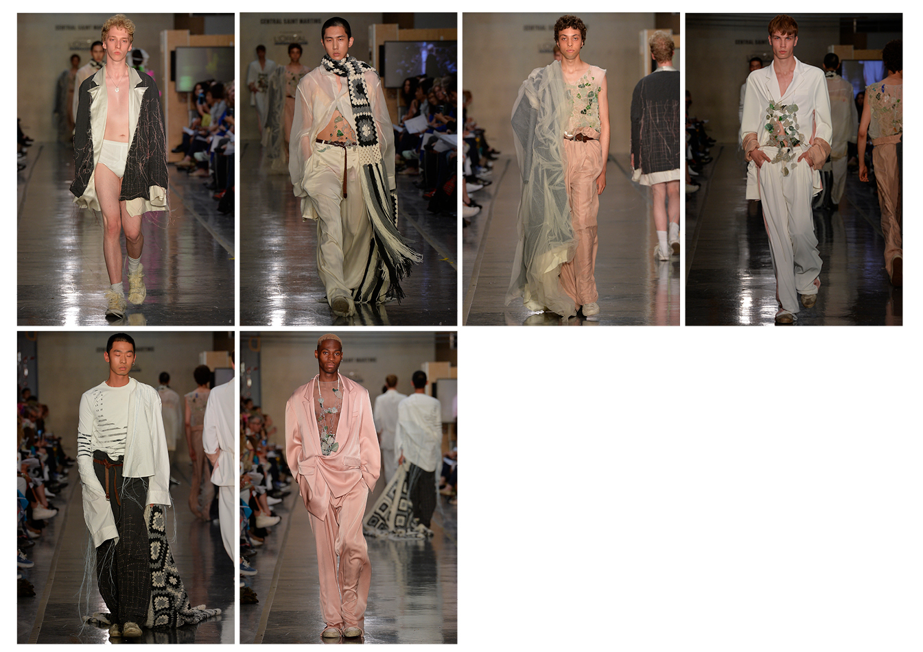
I have always loved how clothes can hold so many memories and become such strong signifiers. I have, for example, the memory of my mother’s nightgown and the delightful and devilish times I had playing in it as a child. My father’s suit also holds strong memories, full of looming expectations and the need to conform. What is so beautiful about retelling a memory is that they always have this blurred distance from reality. I wanted to retell through my collection. My aim is to create a dreamlike mood that transports people back to my bedroom, to the times when I would play dress up in my parents’ clothing.
I started my research by filming a movie of myself playing with my parents’ clothing. Stills from this film then informed the colour, textiles, shape and mood of my collection. Most of the shapes derived from my father’s suits. I removed all structure from the tailoring (shoulder pads, canvas, etc.), as a way of stripping away the armor that protects the wearer. I did this to make them look and feel more vulnerable and exposed. The fabrics that I chose reminded me of the touch of my mother’s nightgown that I used to sleep in as a child. This made the tailoring drop and gave a relaxed feel to the pieces. It also created movement which was very important for my collection.
The jewellery and embroidery were inspired by the glass that my father and I would collect when I was younger. It is one of the few memories I have of the two of us doing something together. All the knitwear was made by my mother and is a replica of a blanket she gave me before I left for uni.
FABIO FRASCA
BA Fashion Womenswear
The starting point of my collection was a group of family pictures from the late 70s. The domestic atmosphere of warmth and togetherness that was oozing from those images was one of the few things that really put me at ease during this year. I tried to draw silhouettes, colours and patterns from them. The material play of the different textures was inspired by my personal interest for Arte Povera and its subtle irony.
The biggest challenge for this collection was probably to find my identity in it and still try to be experimental and innovative. I really challenged myself to put together six looks that would tell a story and also be well finished at the same time.
The piece I am most proud of is probably the piece I am most happy with, which is the faux cable wool jumper. It is one Kg of merino wool, all embroidered together. It is really warm and cosy!
For the music I chose a piece by Dorothy Ashby. She is this great harpist from the 70s, so talented and underrated.
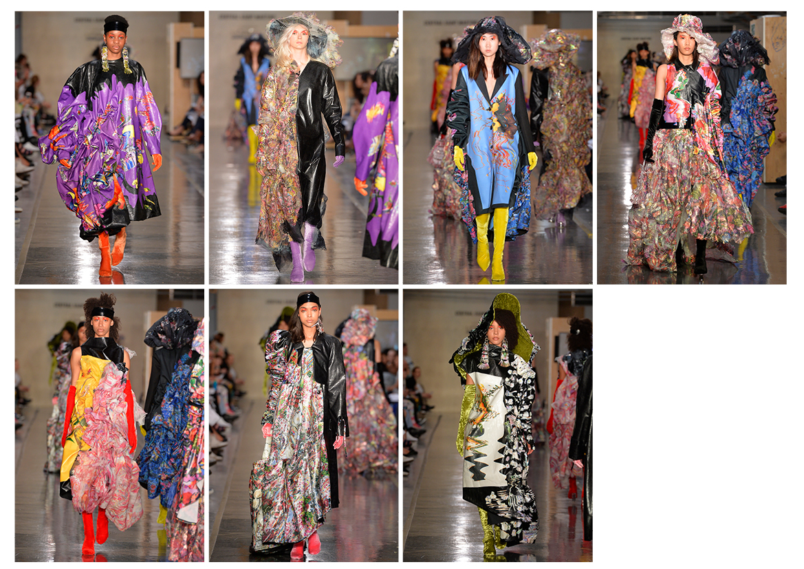
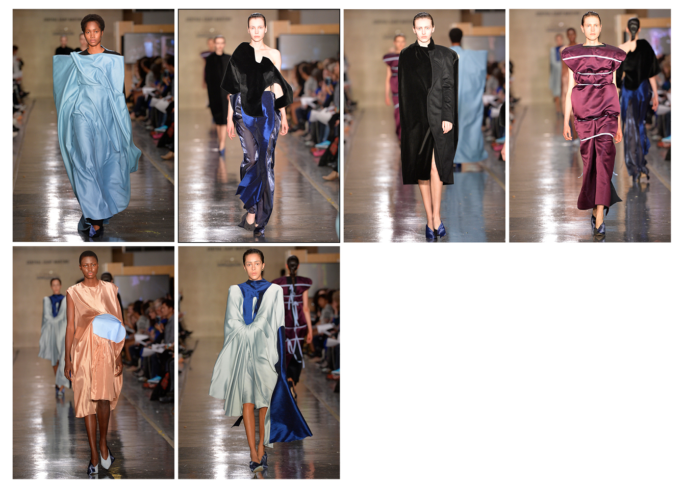
VINCENT LAPP
BA Fashion Womenswear
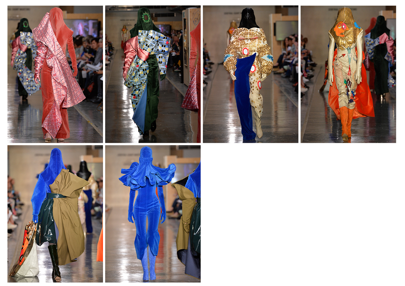
My collection questions religious fanaticism and obscurantism. The starting point was a personal story: my sister became very interested in Jewish religion (nothing fanatic about it), to the point where she moved to Israel and converted. It reminded me of the French movie Le ciel attendra. It describes, right or wrong, how young girls are attracted to a form of fanatic religion through social media and cut every boundary they have with their families. From there, I started researching similarities I could find between fanatic practices in the most spread religions in Europe: Christianism, Islam and Judaism.
They often cover the face and hair of women, which is why I decided very quickly that my collection would be made of outfits that completely cover the bodies of the models. This idea was supported by my textile developments. I did paintings of what a fanatic would look like and you can find this caricatural face either quilted, painted or made out of silicone on my garments.
The body of every girl is different which means that things like the head shape will be worn differently by every model. I had to adapt to that and fit it differently for every girl. It was very tricky because just changing it a little could make the shape completely collapse. The last hat was the most problematic because the fabric was quite fragile and was ripping between all the seams.
PIERRE-LOUIS AUVRAY
BA Fashion Womenswear
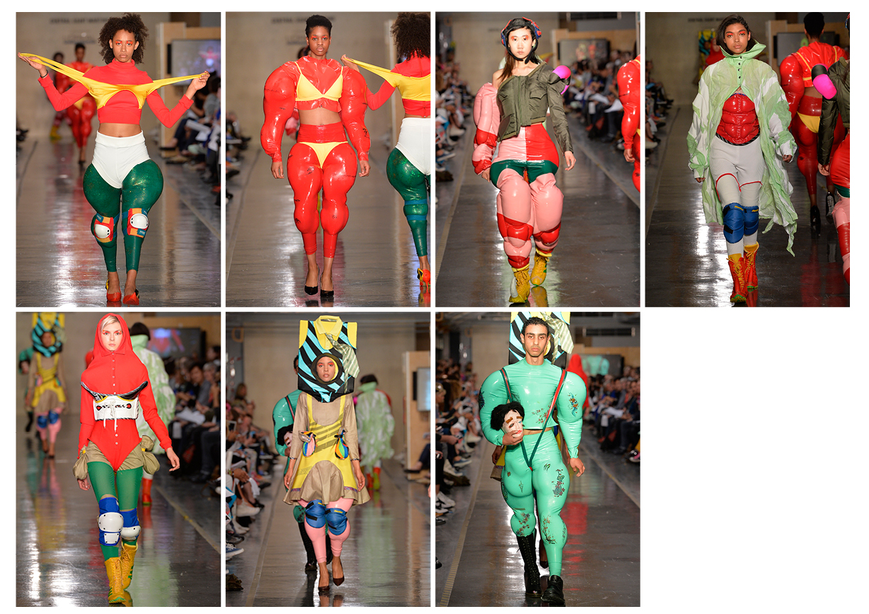
It all started with these medieval depictions of people fighting in red tight clothes. The proportions were so ridiculous, yet playful. I then gathered research on contemporary wrestlers to create a mashup of both, and it resulted in all these big sculptural shapes. The goal was to make it fun, yet still precise and relevant. I decided to build these muscly garments on which I would put more clothes. I basically worked on patterns for a new body silhouette.
The biggest challenge I faced was to create realistic muscles that would not look like superhero cosplay. I tried lots of different techniques and it took me months to come up with a realistic looking silhouette but it was such an exciting process! It also felt very rewarding.
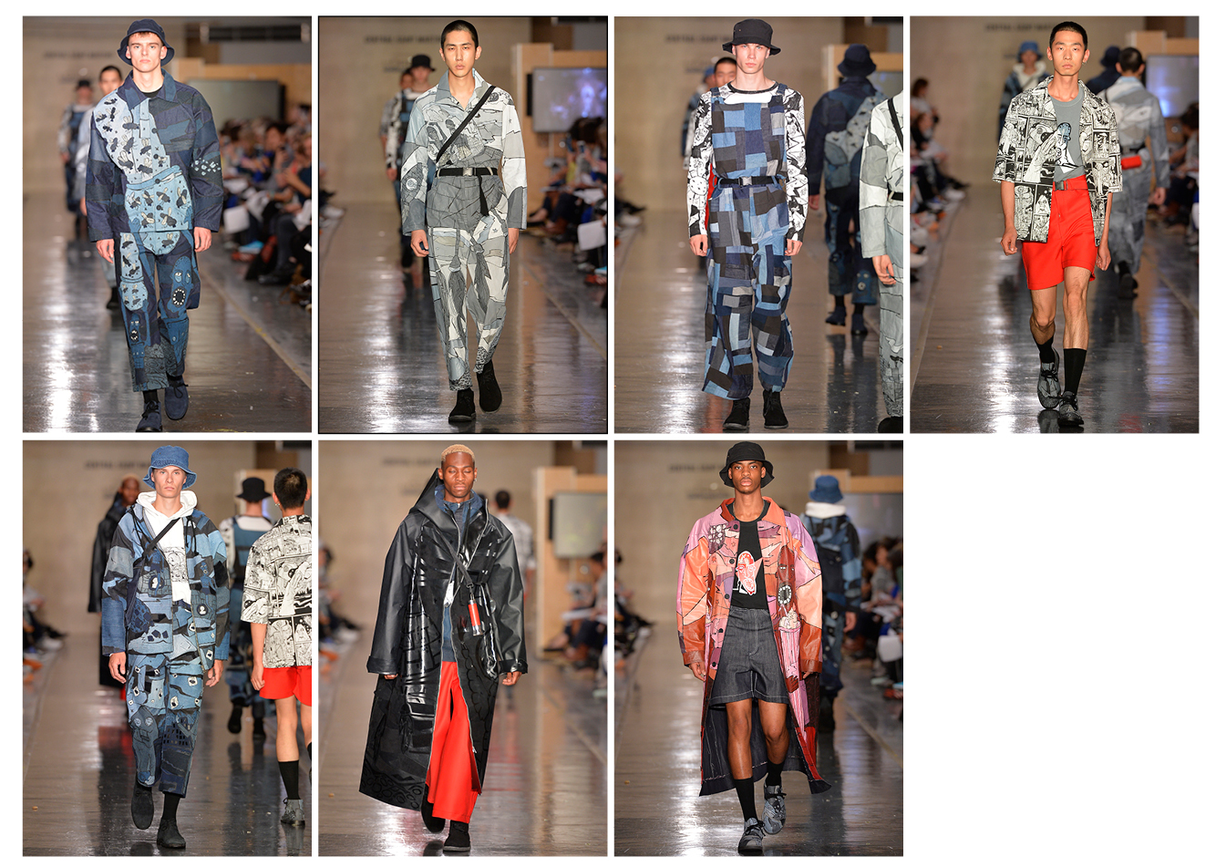
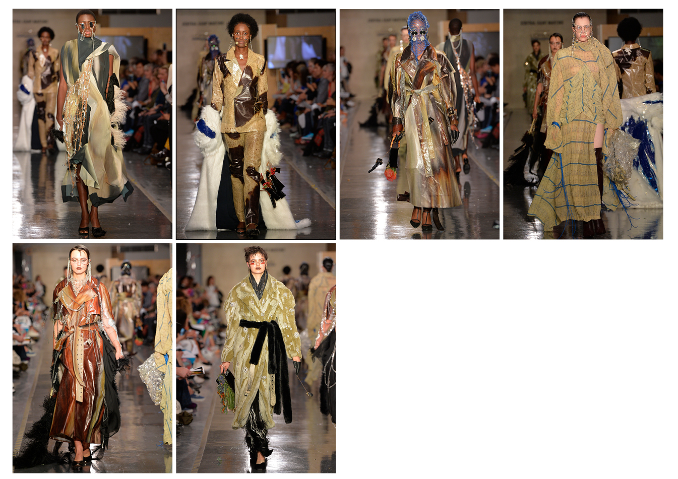
DING YUN ZHANG
BA Fashion Menswear
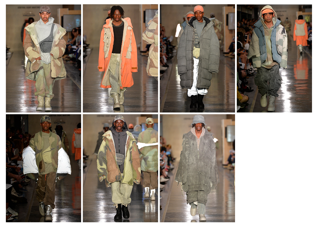
I explored the contrast between luxury culture and necessity. I was inspired by the book Farm by Jackie Nickerson, which captures portraits of workers in their workplace in small towns and on the corporate plantations in Malawi, Mozambique, South Africa and Zimbabwe. It provoked my interest in exploring the difference between clothing selected for pure aesthetic reasons and clothing that is worn out of necessity. I found that especially in countries with a high poverty rate, dress choices are mostly based on utility. Their way of dressing is informed by their work, which involves their whole body, and by their environment.
In regard to the techniques I used, I dyed all the fabric bases myself. On top of that, I hand painted the camouflage print. I achieved the faded and distressed look of my fabrics by washing it multiple times at different stages of the process. I then went over it with hand embroidery. The inspiration for hand stitching came from Japanese boro. It also informed my decision to work with camouflage as my print design. In contrast to the usual flat print, I wanted my camouflage to be three-dimensional and rich in texture. That is where the idea of felting with wool on top of it came in. I really wanted to push the concept of layering on top of another with this collection.
I was not intimidated by the shaping and tailoring because this is something I am quite used to. But creating textiles, working with dyes, embroidery and different kinds of print techniques was something that was new to me. The problem with hand painting and then washing the fabric was that with every washing circle, colour would come off. This was something I could not control and more than once I had to repaint the garments because the washing had taken away too much of the print design. The whole process involved a lot of layering.
ANDREA SISO
BA Fashion Design and Marketing
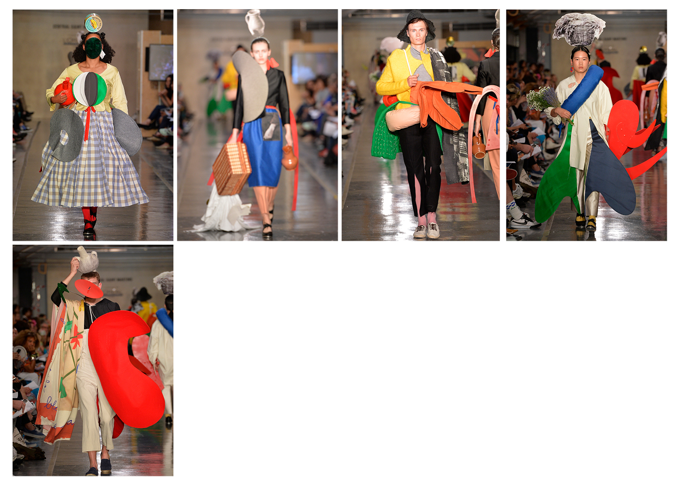
I wanted to do something about immigration. As an immigrant, and the daughter of immigrants who grew up in Miami, it felt natural to use my heritage and my personal experience. This collection is an homage to my Spanish heritage and Alexander Calder, who I used as a metaphor for my personal journey from America to Europe.
I was looking at images of traditional Aragonese folk wear (the region of Spain my father is from), photographs by Robert Capa, which were taken during the Spanish civil war of people fleeing into France, and Calder’s Monumental sculptures, which were massive works of steel meant for the outdoors. Throughout my design process, I collaged my inspirations together to design my final five looks.
In my research, it was important to create metaphors in the garments as well as literal translations. Layering skirts called ‘faldetas’ is part of the traditional folk wear but at the same time, in the images by Capa, people wore multiple layers to carry more of their clothing as well as protect themselves from the weather in the Pyrenees. None of my looks have less than four layers. I also wanted to create an Alexander Calder piece titled ‘Bent Propeller’ in felt. To create that garment and several others, I used millinery canvas to help achieve the volume, while still being relatively light.
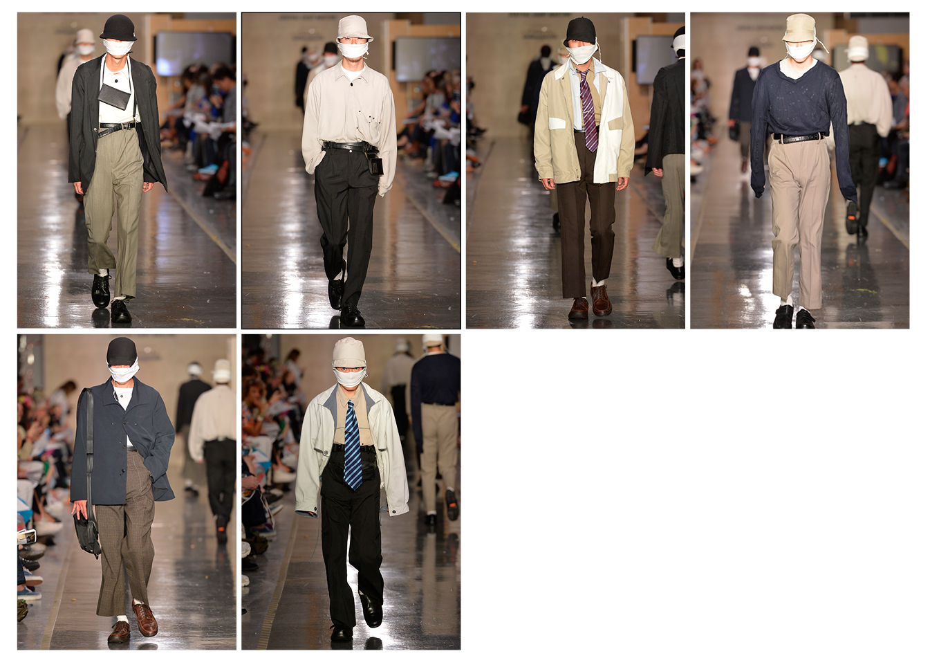
RANDA KHERBA
BA Fashion Menswear
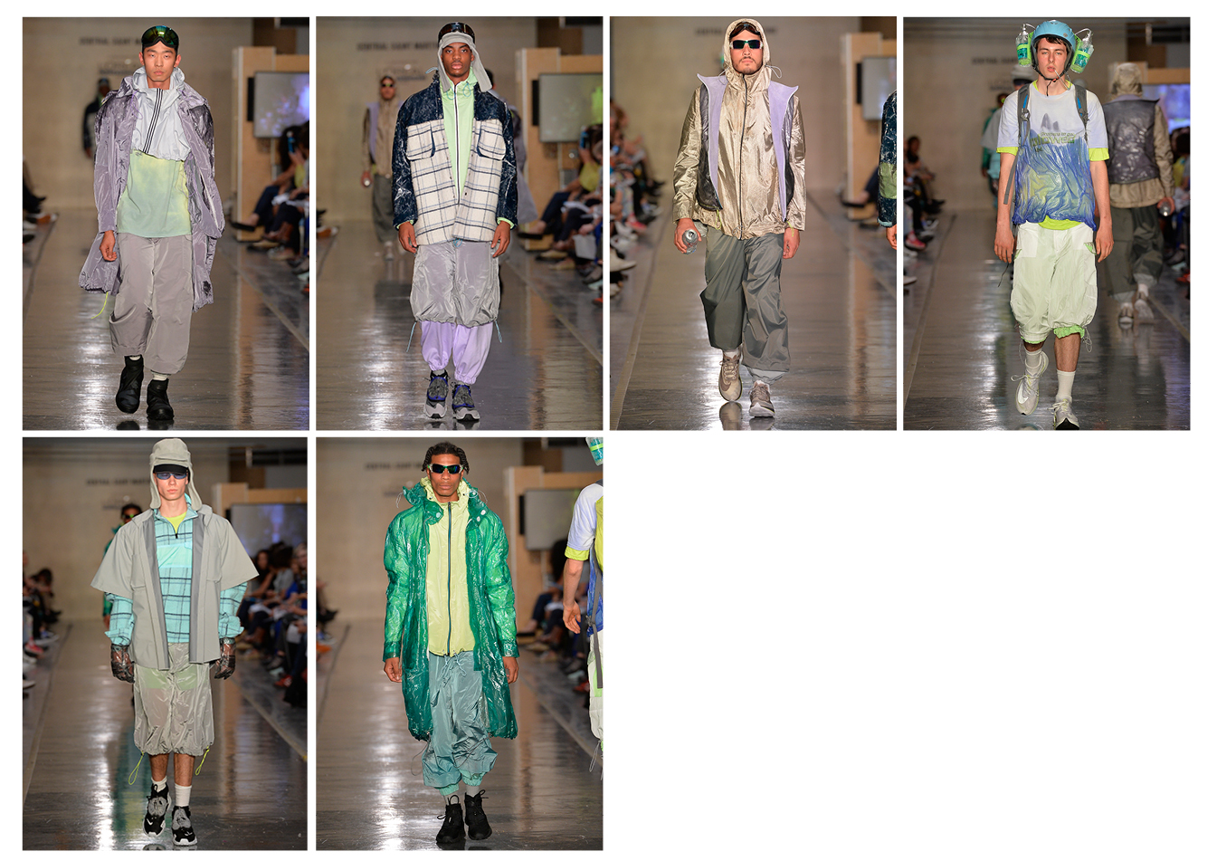
I became intrigued by a festival called the Arctic Man whilst binge watching Alaska State Troopers one weekend. It is a weeklong, boozefest alongside the world’s toughest ski-race in Alaska, basically an Icy Burning Man with less hippies.
I used this collection as an opportunity to imagine what a rave in the Arctic would look like. I was playing with washed lime greens, lilacs and ice blues whilst fusing classic thermals with frozen tech nylons to make this my reality.
The main focus was on the fabrication. I was lucky to have been sponsored some amazing fabrics by Stone Island which became my starting point in terms of design. This allowed me the freedom to explore different treatments on a range of fabrics, all creating a variety of Icy narratives.
The biggest challenge was to work with unconventional materials such as epoxy and nylons. I also had to dye my garment, which meant that there was no room for mistakes. Anyone that has attempted to mix lime green by hand knows that it is pretty tricky, but I’m very happy with the colours I achieved. Understanding that there was no going back was my way of overcoming this. I started to welcome happy mistakes, learn from and through them and use this knowledge to progress.
PATRICK MCDOWELL
BA Fashion Womenswear
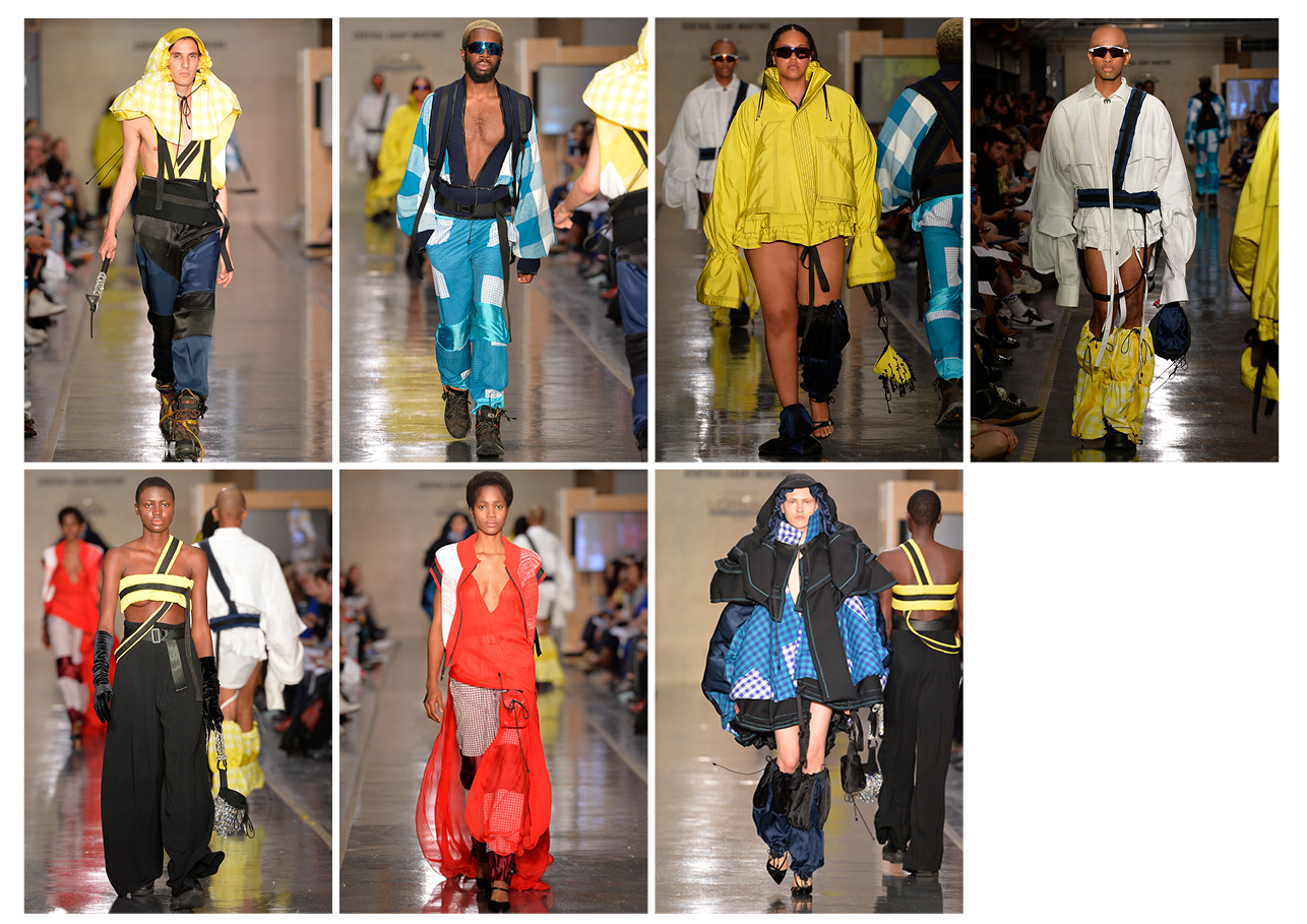
My collection is based on the climbing trip my dad completed to the summit of Mont Blanc when I was six years old. It is a commentary on the relationship a gay son has with his father and claiming the hypermasculine and queering it. I was playing with the idea of me and my mum climbing with him in full Liverpool glamour mixed with my dad’s obsession for gingham shirts. I imagined myself, at six years old, wearing his huge climbing jackets and my mum in her floor-length red dress hiking in the snow chalking her hands from a Swarovski crystal chalk bag. It was a deeply personal exploration into the relationship between a family from Liverpool. This collection aims to approach fashion in a calm and more intimate way. The clothes are all made from reclaimed fabrics and crystals, ensuring a commitment to sustainable design with moral practice.
I had to work with reclaimed fabrics, so I was limited to the amounts I had and could not get more. However, as a sustainable designer, this restriction ended up informing my design decisions. It pushed me to rework and develop designs and my collection is stronger because of that.
The long red chiffon dress with the two-meter train is the piece that makes me the proudest and happiest. It is based on a dress my mum wore in the year 2000 for a millennium party back in Liverpool. It is one of my earliest memories I have. Seeing her getting dressed up like that was always so beautiful to me. It is one of my favourite parts of fashion, to see how transformative it can be and how it can make people feel.
COURTNEY MITCHELL
BA Fashion Womenswear
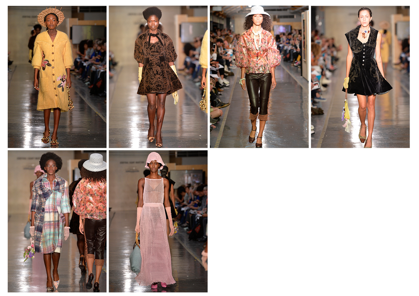
It all started with various conversations with my grandmother, who lives in North London, that I recorded during my placement year. These conversations usually started with me asking her about her memories of moving to England in the 1950s from Jamaica. Somehow these conversations always lead onto her talking about the friendship she had with Princess Margaret (the Queen’s sister), during the time that my grandfather worked at Kensington Palace, polishing door knobs and working in the kitchens.
I went through old family photographs and also went through my grandma’s wardrobe ‒ documenting clothes that she had made for herself or had bought herself. I also watched lots of British Pathé video footage of Princess Margaret on her travels around the Commonwealth. The designs mostly came from me trying to merge my grandmother’s clothing with elements of Princess Margaret’s. My grandma always wears this big mohair cardigan with appliques on it, and so that is where the mohair comes from. The pink gown is made from cut-up Jamaican string vests, with a horsehair underskirt to give it the shape and fullness of Princess Margaret’s gowns. I also laser etched into velvets with imagery that had to do with the stories my grandma told me as well as royal memorabilia. All my life, my grandma’s house has been covered in flocked wallpaper, which I also found when I visited Kensington Palace. So, the velvet engraving is meant to resemble that. The images in themselves are inspired by old-school sailor tattoos, which my grandfather had a few of.
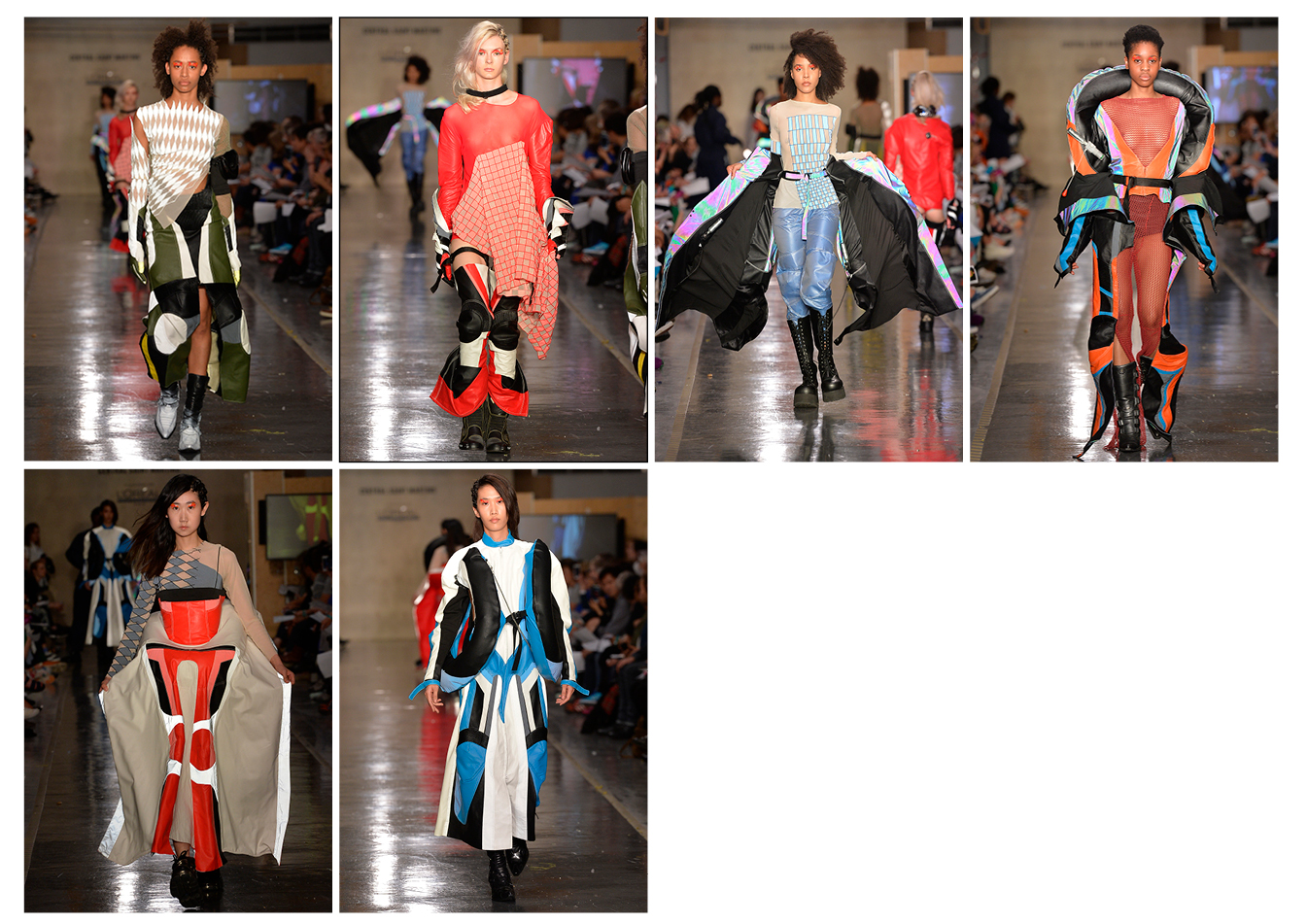
RANURA EDIRISINGHE
BA Fashion Knitwear
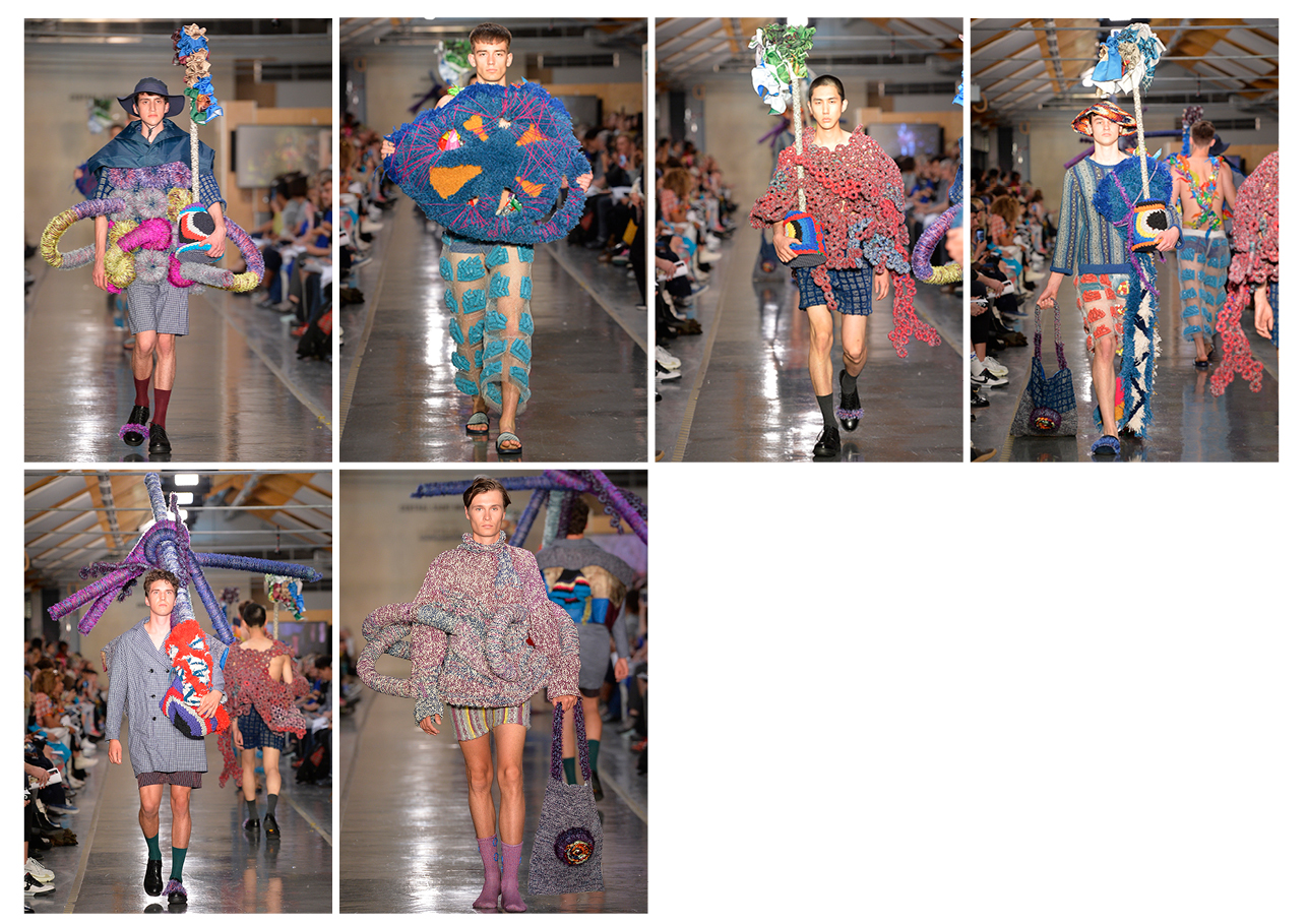
My collection is an investigation into the nature of sculpture, objects and clothing. It is an incongruous mix of the abstract and the sartorial rooted in my love of sculpture and craft.
My choice of colour, material and composition does not rest on any overarching theory; it is based on observation, on sensitivity and on a willingness to feel the environment around me. By flourishing in unexpected media with my collection I hope to blur the boundaries between art and fashion. At times it is a parody of the tired trope of a ‘fashion and art’ collaboration that is frequently used by fashion houses for commercial gain.
The value of time and labour are explored through the knitting and textile techniques, which are at times rapid and at times meticulous. The objects and clothes I created are repeatedly reimagined through reconstruction and re-composition. I asked myself how this fashion/sculpture and fashion/art collaboration might assert the status of its objects whilst also dismantling their hierarchy in relation to luxury fashion and utility.
If artists are still generally accepted to be the makers of objects, the definition of an object becomes critical. In a time of saturation and over-production, it is more important than ever to create with meaning and to make things that matter.
It was hard to find the courage to completely let go. Being guided by the materials, shape and texture that were around me was difficult. I found myself being limited by the fear that whatever I make will not be good enough. Sometimes I wanted to make nothing. I was thinking too much about the final outcome which was really stifling. I overcame this by not thinking about clothes until the very end. I just wanted to make sculptures.
KATYA ZELENTSOVA
BA Fashion Knitwear
I started off with a line from a book on post-soviet photographers. I compared this to the way Russia has been portrayed by Western photographers in the 90s and early 2000s and my childhood photo albums. I used really traditional Russian crochet and lace making techniques to present this narrative of someone who realizes that their surroundings are not particularly grand. In order to cheer themselves up, they decide to dress up, weaving a net of references. Shawls were also a starting point, as an item that has completely lost its appeal or function to my generation but has such a history. I thought a lot about readapting it. It was also amazing to be able to use the Stoll machine for all of my jacquards and to use all of my weird off-colour combinations. To me, these clothes are the representation of my own cultural identity crisis. But if someone just sees them as sexy mini skirts I am cool with that too.
I had to learn to deal with misbehaving yarns and retaining my sanity. A lot of the yarns I initially chose were either too slinky or too stiff to knit with, so I had to reswatch and reshuffle a lot. The sanity is still more or less with me because I developed all these patterns and rituals. Listening to the same music everyday, having a Friday night in watching the same tv show every week and imposing some pretty strict self-care routine that went beyond popping a face mask on every once in a while.
FLORENCE LAMY
BA Fashion Knitwear
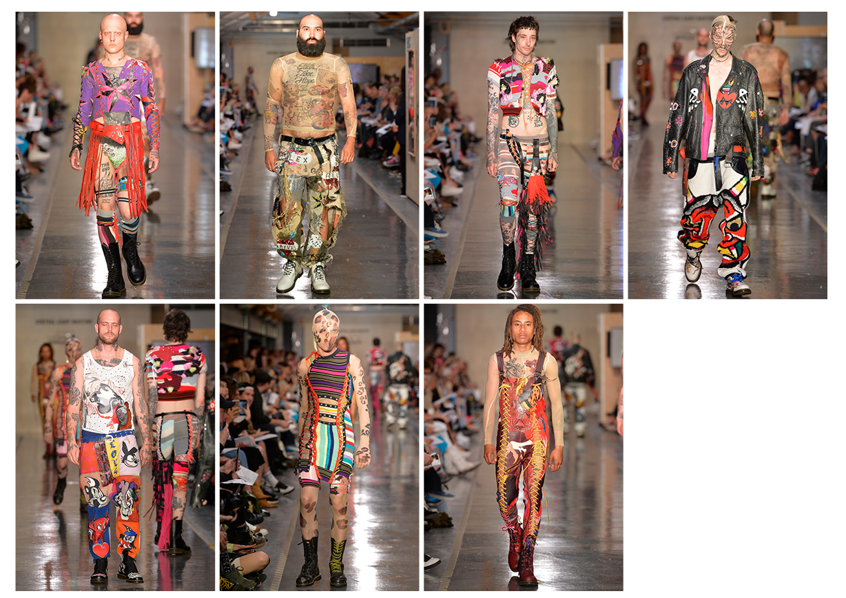
The starting point of the collection are tattoos and how they illustrate someone’s identity, eventually becoming a visual diary of their lives on their bodies. I wanted to celebrate that expression of individuality through body modification but also someone’s clothing and how they wear or customize their clothes to express themselves.
An important inspiration for me was the nonchalance, fearlessness and freedom of the punk and rock’n’roll movements. The rugged and ‘punk’ esthetics that are referenced throughout the collection are juxtaposed with luxurious and precious elements, creating a contrast that for me represents the beauty found in individuality.
My biggest challenge was definitely the whole laser cutting saga of my collection. It required so much organisation, so much computer work. Problems kept popping up and it was incredibly time-consuming without me being able to see any results for the longest time. I was terrified that I would have done all this work and spend all this time and it would just not have been worth it. I guess to overcome this challenge, I just had to take it one step at a time and try to stay on top of it. The burgundy leather overalls took a lot for me. I had a breaking point where I thought the textile looked horrible and I wanted to just scrap the whole thing and make plain overalls instead but luckily I had good people around me that called me crazy and shook me up.
I cried a few times as well ‒ I have been known to be quite an emotional student. I guess it gave me a chance to let the stress out and reboot.
STEPH LINN
BA Fashion Knitwear
I looked at the connection between queerness and demons. I had to dare to be vulnerable enough to ask people to collaborate with me. I am so proud of my collection. I am proud that I finally learned how to properly knit and print. I can not choose a favourite because each piece embodies a person and therefore picking a favourite would be weird.
KIRA MASSARA
BA Fashion Print
After spending a great year in New York, working for Marc Jacobs and The Row, I returned to Denmark where I grew up. In contrast to the hectic life in New York, Denmark could offer me a break from the fashion industry, and I decided to try and work with a new art form. The choice fell on ceramics and I spent many months doing all kinds of projects, without knowing that it was going to be part of my final collection.
I spent a year developing the ceramics. Creating body shaped ceramic pieces and still making them thin enough to wear was quite a challenge. I used almost 500 Kg of clay in the process.
The pieces that I am the proudest of are the two dresses made entirely out of porcelain. Both designs are about taking a fragile material not fit for clothing at all and pushing it to the limit.
The ceramics themselves make an incredible sound so I chose a piece by Brian Eno that is very subtle to accompany the sound of the ceramics.
JOO YEON KIM
BA Fashion Design with Marketing

The starting point was my own illustrations/hand drawings. Back in the days when I was feeling depressed, I drew lots of weird and uncomfortable postures of human figures. Most of the drawings I created back then were all about my feeling, which was just very black. Every little mundane thing got to me quite seriously. One day I met a character in my dream. It was a boy who stuttered, he was must have been about eight years old. I transferred my emotions to him. One of my close friends, who stutters, described her unstable feelings when she stutters in front of people, which is her daily life, to me. These feelings sounded similar to mine. With the rough black lines I painted, crocked and uncomfortable body postures of characters in my illustrations. In them my friend and I can share very deep emotions with one another. I believe that not only people that stutter, but everybody that has ever felt a dark moment in their life can relate to my collection. Because I wanted my collection to look like one of my drawings, I used mainly canvas and cotton fabric, only in cream and black. I did screen printing of my illustrations and also tried to make live brush strokes mixing different black yarns for my textiles. In terms of where my design shapes are coming from, I looked at boy’s school uniform and focused on ugly silhouettes that get created when kids wear their uniform untidy. In order to make my lines look lively I and for my garment structure I got inspiration from Edgar Negret.
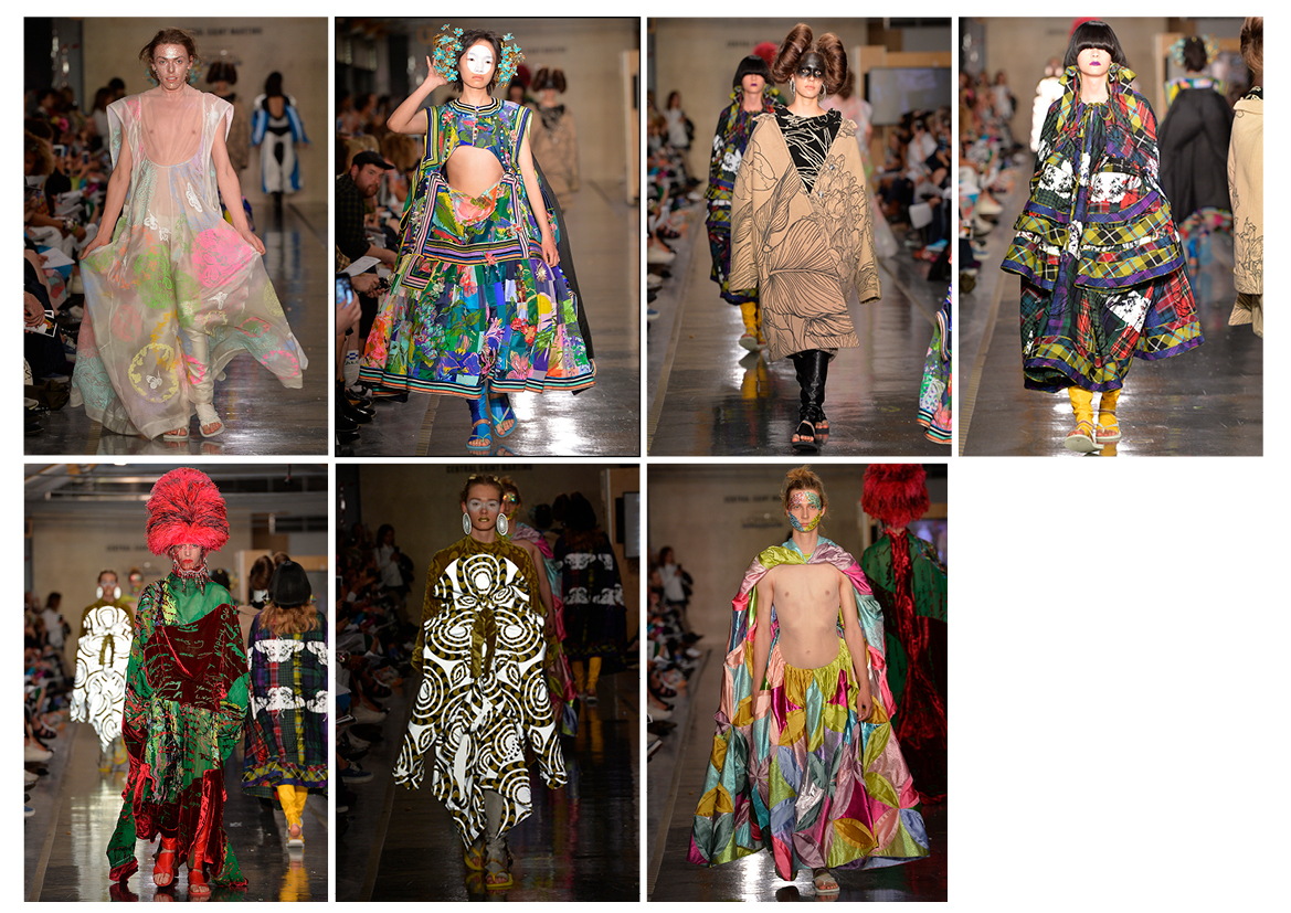
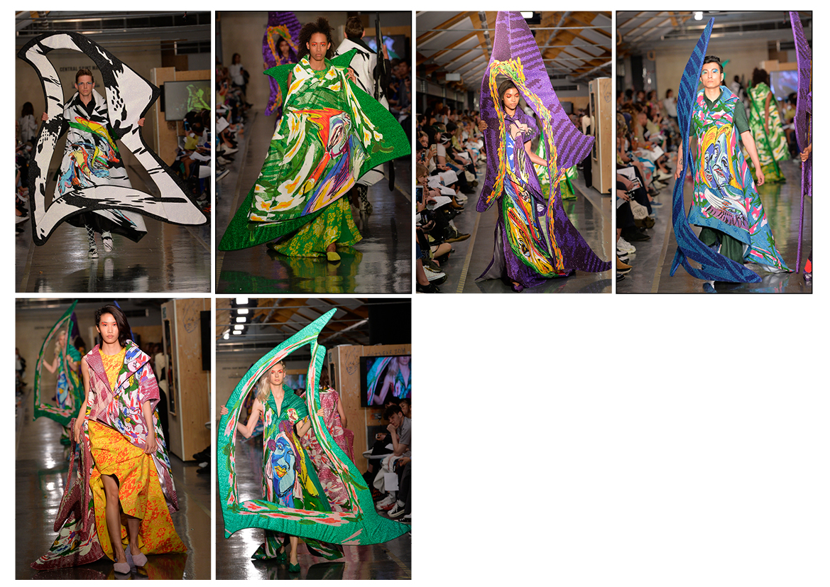
LEEANN HUANG
BA Fashion Printwear

When I came back from my placement year, I was pretty exhausted and felt disillusioned by fashion. All I wanted to do was either eat or do nothing. I started to become super fixated on cooking, and the pageantry of dining.
Doing the research was easy for me. I just looked at everything I loved eating and wanted to create a feast out of with clothes and textiles. Some of my favorite films like Eat Drink Man Woman, Tampopo and La Grande Bouffe are heavily referenced.
There’s also a lot of surrealism, surprise and joy in all the playing with food. I wanted all the clothes and details to subvert and change expectations. Each garment is like a different table setting. To give you an example: I decided to contrast average formal wear like tailored suits, shirts, trousers, and coats with intensely embroidered or printed dishes or tablecloths or even actual food. There is a tailored coat with walnut buttons that flashes open to reveal a whole dinner party. There are also chocolate- and jellycasted cable knits, and trousers beaded with oranges, walnuts and chandelier jewels, tablecloths pleated and bonded into a suit as well as an embroidered organza tablecloth molded into a shirt and trousers.
It was a challenge to make the collection cohesive because there are a million techniques that I could do with food. It felt like my work was constantly a mess and trying to organize it all into a few looks was tough. I was told by my tutor to stop coming in with something new every week. I kept having to edit down and try to keep things specific, and stop getting distracted or excited about random techniques like making chocolate jewellery or fruit leather. Otherwise trying to stay happy was super difficult. I listened to a lot of Oprah podcasts about practicing happiness and self-care to push through.
WENJUN ZHU
BA Fashion Print
The theme of this collection is ‘No More Reality’. It explores the reality distorting effects from mediation, and questions concerning technology-processing reality. In short, the collection explores the boundary between the ‘real’ and the ‘unreal’. All of the prints came from the illusion of distorted real objects from the viewing angle of an aquarium. The transparency of flowing water creates a distance to the images of daily objects and illusions of distorting reality. For example, the collage of printed flowers starts from a regular shape and then gradually distorts. I also created a watery surface on the fabric with digital print to make it more plastic and ‘unreal’. The final shapes are echoed within the print, which is also distorted. To achieve the overall shape, many gathering techniques and pleats were deployed. Alongside the garments, several transparent accessories are inlaid with flowers.
GUI ROSA
BA Fashion Printwear
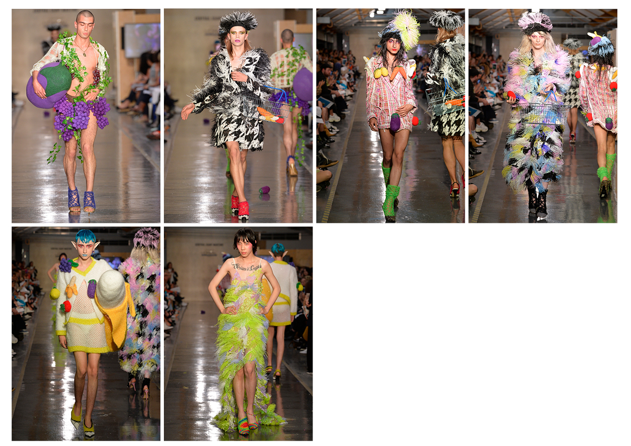
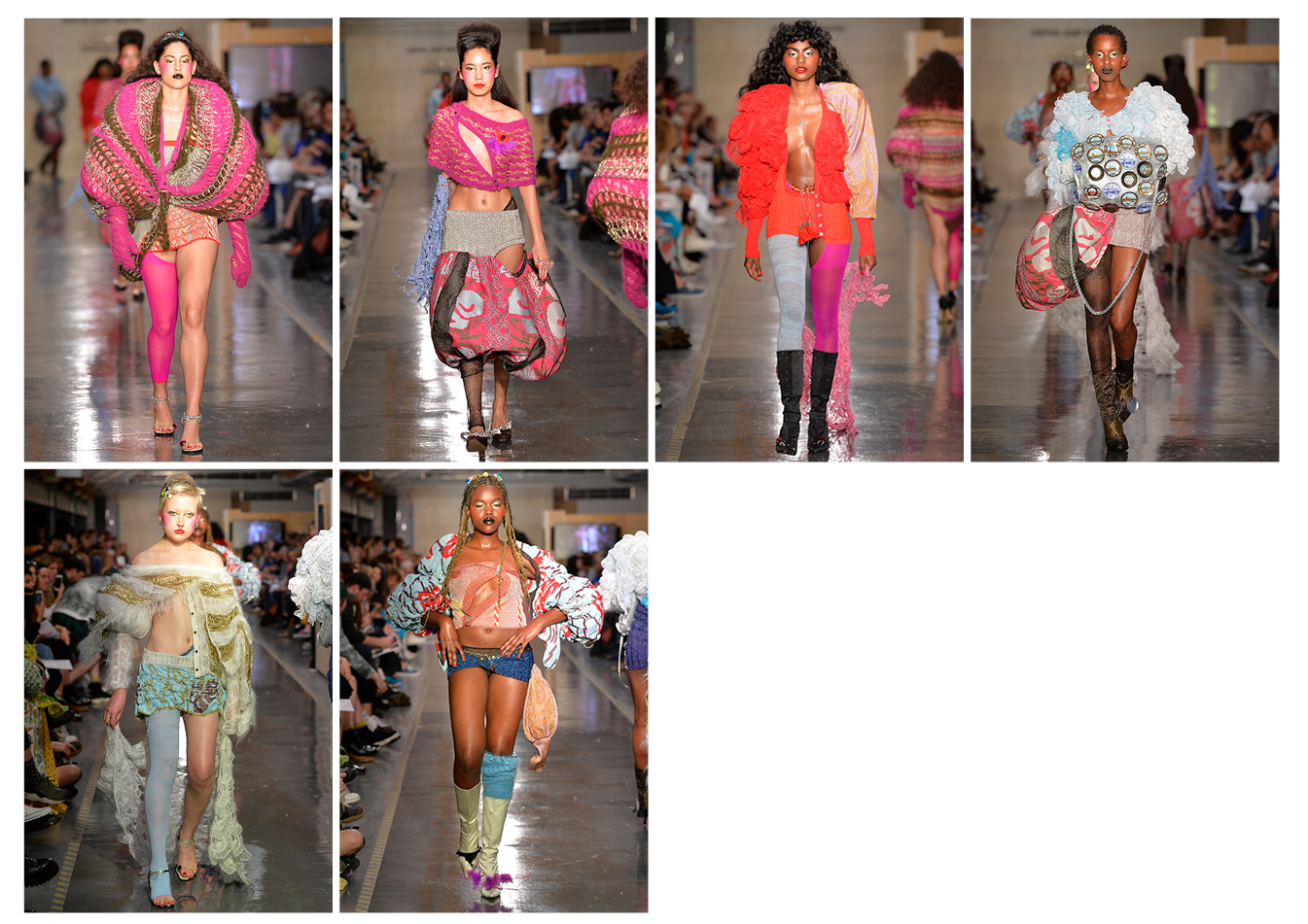
The starting point of my collection certainly was playing around with my grandmother’s old Chanel skirt suits ‒ to make them even more gorgeous. It was so important for me to bring a crafty demi-couture element but to make it fashion. It really is a celebration of the heydays of fashion shows, including the supermodel cliché (twirling, spinning around) modeled instead by real-life biological women. I was lucky enough to work with Sophie Hallette lace. I patchworked it into different bias cut houndstooth patterns with hand-dyed ostrich feather inserts that were used for tailored garments such as evening coats. I was particularly interested in using what is considered an evening textile for a daytime silhouette! I am particularly fond of the 3D crocheted fruits, the bananas and aubergines, that I used for the show. They were featured as massive crocheted fruit handbags as well as props that were thrown out to the audience! They are inspired by Portuguese ceramics and fruit bowls, made to resemble cabbages, strawberries etc.
RENE SCHEIBENBAUER
BA Fashion Womenswear
I searched for a link between a therapeutic quality and clothes. I ran art therapy workshops where participants were invited to explore emotions and physical sensations by creating drawings, sculptures or exploring everyday performance related to dressing. In the beginning, I was intrigued by the emotional and visceral quality in clothes. I wanted to explore how our choices of clothing relates to our mind-set or emotional state. For instance, which material is preferred over others? Soft, crisp, scratchy, etc. I was also considering the places people would want the garment to put pressure on their body and where it would hide or reveal the figure. Since all the participants were blindfolded during the workshops, their relation to clothes became much more internally related than visual.
I was interested in creating clothes that could carry the quality of therapeutic tools. This required a certain passiveness and an aspect of letting go of controlling the process and outcome of my designs. During a period of experimentation, I started to develop abstract garment pieces which would allow an open and playful way of engagement.
The people for my experiments were cast in the beginning of the project so I could work with them quite closely. When they would visit me, I simply passed them my designs and invite them to play with them freely. As soon as they stepped into them the people experienced a strong sense of absorption into the play. Once they took them off again they encountered a therapeutic quality and reported to be left with a balanced and grounded feeling. Working in this collaborative manner, the designs became personalized and somewhat activated due to the participants’ explorative gestures and their performance with the piece in that moment. In my show, I am showing “frozen” states of these moments, which are strongly related to the people wearing it.
SUNGKUN KIM
BA Fashion Womenswear

I think that people inevitably develop positive or negative prejudices about situations that they have never been directly exposed to. This happens through the influence of their direct environment and cultures. Not to put too fine of a point on it, but I had a negative perception of Muslim religion and cultures prior to starting this project. When I tried to understand where this negative perception of Muslims came from, I pictured myself as a child watching the news during the 9/11 terror attack.
This project really allowed me to reflect on my own prejudices and change the narrative that I had in myself. As for the garments, at first, I tried to catch the shape by blowing a burka with photography for my design development. The burka is a conservative garment as well as a symbolic item, which suppresses female sexuality and their communication in society in Muslim countries. That is why, as a way of exposing the inside of the burka on a model, I tried to think outside of the box about the negative perception of the clothes and visual images. After that, I tried to connect my design with the movements of the burka’s silhouette. As for the materials and accessories, they were all formed from inspirations and re-designs that I had developed during my research trip.
My hat pieces were designed to visually look like a burka, which covers the whole body, exposing only the eyes. That is why I had to make the hats deeper to cover the whole head compared to a standard hat as well as make the brim parts settle on the nose. I tried to make them with standard hat blocks at first but found that I could not create the design that I wished to make for this collection. So I visited a hat shop to get help and see the whole process to make a bespoke hat and then made a specific hat block by wood for my design myself.
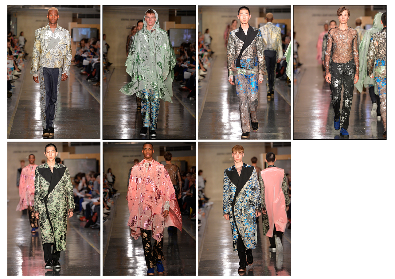
HYUNKYU JO
BA Fashion Menswear

My main inspiration was the characteristics of luxury clothing. I did lots of in-depth research about couture making and basic draping using generic kinds of fabric such as wool and cotton. For my prints I used very simple and direct graphic shapes like a cylinder and gradation. This choice was made because it seemed like the opposite of the decorative character which is the vital character of luxury fashion to me. In my opinion, cylinder shapes and gradation symbolize the very beginning of something. This is expressed in the feeling of Art Déco and Neo-noir. But in everything I did, I was still keeping it classic.
The biggest challenge for me came with trying to break the typicality of luxury fashion in the most direct and naive way. The piece that I am the proudest of is the wool swing coat with kimono sleeves that I draped. It has feminine features, is elegant and sits very nicely on the body. I find it incredible intriguing with its almost naive cylinder print, placed onto a tanktop and a pair of chino trousers.
SAMSON LEUNG
BA Fashion Womenswear
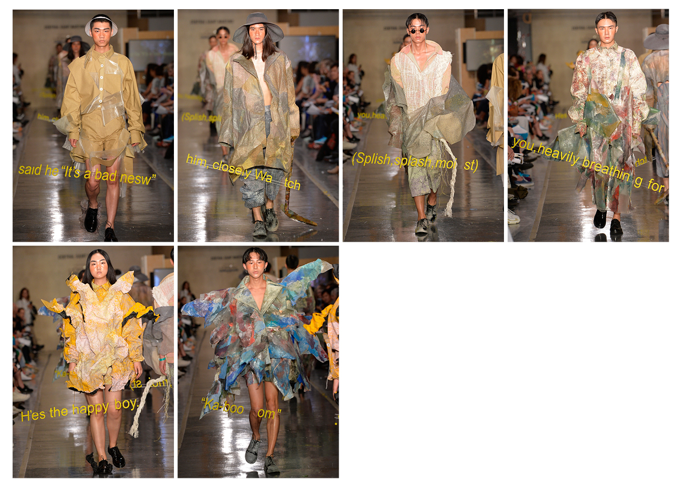
The starting point was me making three films. My idea was to fade them into my collection and then, eventually, into the catwalk show. The first film is called Dear You and I shot it in Japan in collaboration with Taka Hata. It is about really exploring the idea of feeling overwhelmed and about creating a mood. The second film, Paper Boys, was shot in Hong Kong and follows the narrative of the “paper” boy who wants to leave his life behind. It is more like a first hand research film, which I used to develop the content of my collection. The third, and last one, is the actual catwalk show itself. They all work as a sequel to one another. These films became the foundation of my research.
I never really look at secondary research. I mainly created my own research, my own narrative and then translated that into a narrative for my catwalk. In regard to the techniques and materials I used, I really explored grains and creating a grainy surface. I was inspired by the cinematic grainy texture and wanted to create own. Another huge source of inspiration, and reason for working with grainy texture, came from my choice to look at geology. My project is basically a self-portrait of what I am feeling and the experiences I made. I wanted to translate it in a way that would make it visible for my audience. As I was researching for my collection I found this Chinese artist, I can not remember his name right now, but he paints rocks. It is important to know that I am Chinese. In ancient Chinese self-portraiture, unlike the western culture, they do not paint self portraits of their own face, they chose to paint waterfalls, mountains, trees and rocks ‒ basically geology as a representation of themselves. So that is why there is a lot of this granite texture and rock feeling to my garments.
As a designer I really like working with material and handcrafting my own. It is one of the most important parts in the design process for me. For that reason I developed two textiles for this collection, the first one being a slime. I spent three months during my placement year exploring and experimenting with slime and figuring out recipes. The idea was to create a slime that, once dried, could become a textile that I could use in my collection. Once I had figured out a recipe I created sheets and sheets of it.
The second fabric/the second technique that I developed involved old oil paint. I did a lot of oil painting for my research to illustrate my concept and to present my ideas on paper. I developed this transfer print technique. Here, I used oil paint to directly paint onto film. Once it is dry, which takes up to a week, I translate the film onto the fabric/the pattern. So it is quite a long process. I do not paint straight onto the fabric, I create a coating on the fabric. I applied this technique also for my slime textiles.
ROBERT BELL
BA Fashion Menswear

My collection is based on a screenplay I am writing. It is about a boy from a small rural town in America who comes into contact with alien life. So within that, I have taken inspiration from 60s American design, the Sears Catalog (which I really love), and other films that I am inspired by. I am really into costume design, so I took inspiration from some of my favorite costume design in film too. People like Nancy Steiner, and films like Gregg Araki’s Mysterious Skin really pushed me to create characters in my collection instead of looks I guess. Which then opens up more of a narrative: What do these people do? How would they be wearing these clothes? It is always about people for me.
I did initial character development and costume design for some of the characters in the screenplay. I then shot some scenes for this hypothetical film, which really helped me to develop a mood for the collection. Whether it is a guy working a night shift at a gas station or a girl in her boyfriend’s clothes: it was always about translating their relationship with the clothes, and I guess with each other in the collection.
I actually produced the soundtrack myself, as I have always made music, and I am really into old movie soundtracks, mostly the written scores for 70s-80s coming of age films. Stuff like the soundtrack for Dario Argento’s film Phenomena I listen to almost everyday. I had these ideas about what the soundtrack for my film would sound like, it has got all these little alien whistle sounds and I recorded some character voices with some friends, saying lines from my writing. The music really is as much a part of the collection as the rest of it.
DIANE GAIGNOUX
BA Fashion Knitwear

This collection is about the sculpture of identity and the passing of influence. How do we construct ourselves and how do people and the environment around us shape and affect us? It began with collecting documents from six different identities/characters who I feel shaped by. The process in itself was not even a metaphor, but literally, me receiving all this information, digesting it and incorporating it. Selecting bits and composing with them, these subjective figures were, therefore, a self-reflection through absorption.
As the felt is molding itself into sculptural shapes to become them, one is molding itself onto another. They are soft and always in motion, never fixed. The shapes are fluid, folded. Just like skins in mutation, they have wrinkles. The biggest challenge was that knitwear can be very floppy and soft. I wanted to make dresses that could be shelters or vessels. Therefore it was about making a garment that holds its shape while staying soft. I wanted the shape to come directly from the material in an organic way, not a constructive way. Moreover, the aim was to have no seam, as if the material was one living substance.
This project was a complete adventure as I did not know how to do any of these things before. I felt like a constant searcher experimenting with the material. My way of overcoming the unsure was to focus on the process and not the result, never expecting anything; to work and keep finding solutions in the moment. The process was driving the technique and the result, which I liked.
Also, going into felting meant a huge amount of knitting, dyeing and a lot of physical energy. I had to knit pieces three times bigger than the final result. Since each step took a while and felting could never be controlled, I still could not tell if it would work until the last moment, half an hour before the show.
MARGAUX LALANNE
BA Fashion Womenswear
The starting point of my collection was theatre as a place possessed by past spirits and past characters. Their physical body is not there anymore, but their memory is present. I am using this context to question the duality between being present and not being present, being a physical body and not being a physical body. Through my design development, I attempted to express this duality, to evoke, not the absence, but the presence of someone else. In my whole collection, I was playing with contrast: mat and shine, soft draping and tailoring, transparency of organza and solid colours.
I aimed to explore the reciprocity between being visible and being present using layers in order to create abstract shapes as if they were the shadow or the ’empty space’ of another body.
I was mainly inspired by my own experience of feeling the absence/presence of someone gone.
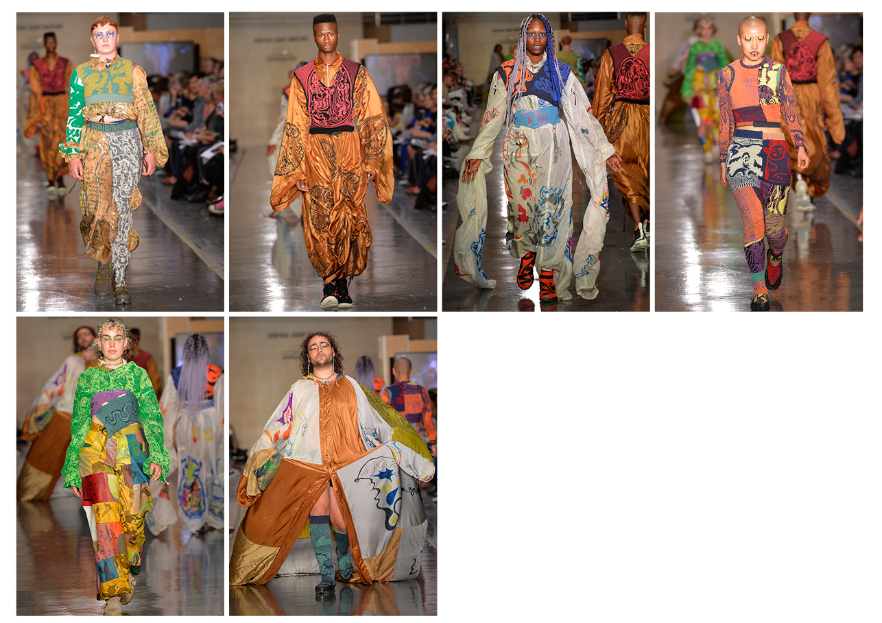
KAI NINAGAWA
BA Fashion Menswear
LILY WARREN
BA Fashion Menswear
I have always been interested in graphics and I love the layout and imagery of children’s science textbooks from the 1960s. This led me to look at scout manuals, documenting the space age, and cartoons from the period between the 1960s and 70s. I have always loved drawing and have been introduced to graphic novels early in my life, which gave me the inspiration to write and illustrate my own graphic novel.
Forever interested in politics and current news regarding the world climate, my novel is set in 2086 after global warming has left the earth derelict. A reform of rebellion of the people ensures them that they must move to the moon to inhabit it. But in order to be able to do so, they are obliged to use the materials left on the earth to build the new city. On their way, they get attacked by aliens, armed with giant fruit flies. In the end these two enemies decide to join forces, creating a new community in which aliens and humans can live amongst each other. The collection combines uniformed workwear silhouettes collaged with sustainable fabrics to create a mix of the old and the new. The garments are hand-painted, embroidered and embellished with the graphics from the novel. So the collection tells a chronological tale of the human race after year 86.
YE ZEE CHEN
BA Fashion Design with Marketing
A desire for gender equality sparked my entire creative process. The motorcyclist’s racing suit is one of the most genderneutral garments in the history of clothes: from its choice of fabrics, colours and prints, to the silhouette, the racing suit blurs the boundary between different sexes. Because of its tight-fitted shapes and usage of bright colours, the wearer’s gender is no longer apparent. The collection is mainly made of stretched fabrics and faux leathers. The blurred boundary of genders is empowering and provides the wearer with protection. This is the reason why I also added the element of inflatability and the use of reflective fabrics onto the garment, in order to communicate an emphasis of my own views on gender equality and feminism.
The inflatable parts were definitely the biggest challenge. The special finishings of the inflatable airbags didn’t allow for complicated shapes and this meant that I had to compromise and simplify my original designs.
Initially, when I was reflecting on my inspirations, I decided to look at my personal journey in life and looked back at the hardships and best moments. I explored various emotions and feelings that I felt and went through and then portrayed them through the silhouettes in my garments and the details in my designs. Additionally, I also explored and experimented with different ways of expressing my emotions and feelings on different stages in my life. My collection is a reflection on me, myself and I. I added oriental heritage and details, since I am from China. Another big influence on my life was moving abroad. I combined those two experiences and portrayed them in my collection through the elaborate silhouettes, the changes in my details and the transitional changes in my looks.
For my collection, I chose Quatere by Mario Batkovic. It reflects my memories from the past. This song has a sentimental melody to it and I believe it supports the flashback of my emotions from my own personal journey. Consequently, as this song is entitled Mario Batkovic Quatere and my collection is a flashback on the quarters and on my personal life journey, I believe that it complements and supports my emotions and the fluidity and movement in my collection.
HINAKO NAKAZAWA
BA Fashion Print
My starting point for this collection were rotten buildings/interiors and vintage items. I am very attracted to sculptured time, the aura that surrounds it. I found this in these constructions and objects. Wallpaper that was falling off, faded curtains/sofa, hanging clothes and broken windows were all translated into my print design, embroidery, the draping of the dresses and the glasses.
The vision of the women that I wanted to wear my garments came from portrait painting. My muses were painted women like Lady with Mink and Veil by Otto Dix. Each of my looks combines the beauty and intellect in madness and fear of those women and therefore my garments are designed for them.
I tried to express an atmosphere in my collection and that involved quite ambiguous print, not defined patterns. I experimented with techniques such as screen-printing, hand painting and wood print. It was really hard to get the effect I wanted. In the end, digital print using my photos taken through a water bottle turned out to work very well.
RIVER RENJIE WANG
BA Fashion Design and Marketing

My starting point was one of the most popular slogans during the Chinese revolution: “Being healthy is prioritized for the revolution.” It clearly defines the link between physical health and the revolution. The development mode of China mainly focuses on the economic aspect. It has created a lot of material wealth and temptation. On the basis of such an exquisite life, to a certain extent, the delicate material life controls the heart and body. The body that has the ability to act has become an important carrier of humanity. This collection uses the body as an independent carrier. The carrier of the things that have been abandoned during the Chinese social development. It can be seen as a kind of self-questioning or it can be reflecting the reality.
MATILDA SODERBERG
BA Fashion Womenswear

Due to a burn out I spent one year on my parents’ farm. I refurbished an old barn, grew vegetables, moved things around and cleaned. During this process, I started to think about human emotions in relationship to a capitalist economy. I wondered how this relationship is affecting human experiences and the outcome of human creativity. I made some samples inspired by my brother’s wood sculptures that he made when he was a kid. Having done carpentry the entire summer before final year, it just felt so natural to continue working with wood. Eventually, my narrative developed into depicting how contemporary human experiences are based more on representations rather than lived experiences.
GREGORY FRANCE
BA Fashion Menswear
My collection is based on the relationship between hyper-masculinity and hypo-masculinity. I looked at the dualism in masculinity in its rawest forms. This was then transferred into fabrication and cut to reveal a sense of hyper-expression. I researched and worked with historical techniques and natural, raw fabrics. In order to understand the latter better, I looked at upholstery. By developing my concept through the fabrication and cut, I tried to expose the vulnerability of the man and to consider the balance between the ‘hyper’ and the ‘hypo’. Another source of inspiration for the creation of collages and the development of the silhouettes were abstract expressionism sculptures as well as photography. This all led to me now playing around with the acceptability to subvert and question the purpose of menswear within this space.
Choosing a soundtrack was one of the many challenges actually. I always thought I would be able to match my emotion to my collection and vice versa, but it threw me. I always had a sense of rawness in mind, a moodiness. But that did not narrow it down. I wanted something acoustic or with electricity to match the balance and opposition in the research. Eventually, I chose Cherry Glazerr, for both their lightness in their lyrics and their boldness in sound.
CECILE TULKENS
BA Fashion Knitwear

The starting point was neolithic cave paintings and the ‘primitive’ collaboration with material, as well as the question of what a feminine attitude brings to the modern man. I translated this into my garments by letting the material lead the conversation, “What does this yarn want to make?”, like a prehistoric artist using the shape of the cave wall to inform the animals in the paintings. The classic mens’ suit, in six different characters, gave a context for me to explore this approach.
It was hard to apply tailoring techniques to knitwear in a convincing way, in order to make a fully knitted six-look collection also identifiable as menswear.
I am most proud of my opening look, the City Boy Suit. It is knitted very chunky, in yarn that I had created myself. The suit is fully fashioned in fifteen separate pieces, to show off the complex process of shaping knitted garments. Attention to detail was imperative to make sure the suit did not become shapeless ‒ the trouser crease at the front, covered shoulder pads, bronze cast ‘flint buttons’, half lined trousers, etc.
ALEKSANDAR MITROVIC
BA Fashion Womenswear
It all started with a trip to Turkey, where I witnessed this market of counterfeit items interspersed with beautiful craftwork. An interesting item was the counterfeit Frozen dresses being sold to little girls. It reminded me of my own experiences as an immigrant learning English from TV. This led me to a process of abstracting these traditional fairytale codes used to entice young girls into these fairytales.
The biggest challenge was to print cotton organdy. It was close to impossible to find somewhere that would do it and I had to wait a long time for the prints to come in. Also, painting the ping pong balls was a nightmare.
YUTING ZHU
BA Fashion Print
My inspiration were the years I was living alone abroad. I always kept an undeniable spiritual motivation that inspired me to maintain my enthusiasm for life and dreams. I called it the spirit of explorers. The movies that inspired me the most in my childhood were adventure films like The Wizard of Oz, Willy Wonka and Chocolate Factory and Mary Poppins. With this collection, I wanted to create my own fantasy adventure story about people like me with a ‘spirit of explorers’ that suddenly found themselves wrapped into a journey heading to the mysterious surreal utopian tribe.
In terms of my textiles, I got ideas from my adventure story and my utopian tribe culture. I deconstructed and drew the dolls in styles of different cultures combined with cubism sculptures to create new figures for my utopian world. I utilized vinyl cutting print and screen printing, which involved laser cutting the vinyls and preparing screens for at least ten colours.
In the terms of fashion, I was and am trying to get rid of traditional gender roles and focus on distorting the fitted garment shape that you can find in 1950s looks through moving the tailoring and my wrapped portrait print patterns.
HARRY FREEGARD
BA Fashion Printwear
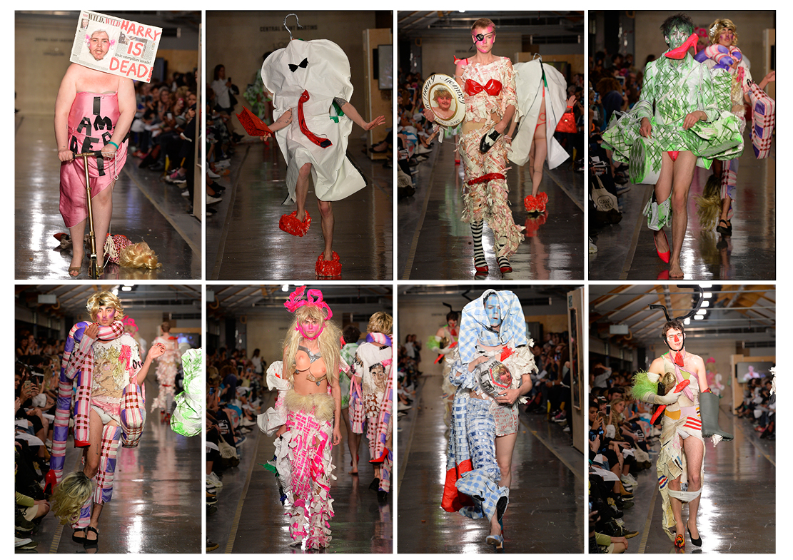
The starting point for my collection was a trip to a Highgate cemetery. I found myself wildly jealous of the deceased and for that reason started to plan my own funeral but making it far from morbid. My goal was an absolutely fabulous funeral.
My biggest challenge was to squeeze so many ideas into six looks! I did not really overcome it. I made about three collections which means that I will just have a juicy lookbook!
I am most proud of my commemorative plate which features myself, dressed as Princess Diana, under a halo of script, reading ‘in living memory’.
PAOLINA RUSSO
BA Fashion Knitwear
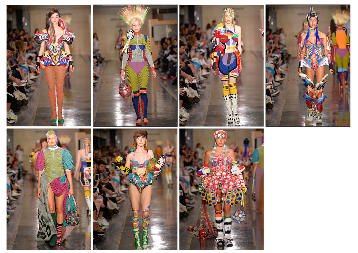
My collection started when I was in my hometown of Markham, Canada. The title is “I Forgot Home” and it is an homage to growing up in the suburbs. I played around with draping my old shoes and soccer equipment and then crochet it all back together to resemble corsets and armor. I also created pieces which had knitted illusion in it. The inspiration came from the strong sports culture as well as homemade craft culture that I grew up around. I wanted to marry the two together.
My biggest challenge was to try to keep up with my laundry. Seriously. It is actually super hard to live and eat normally when you spend all your hours in school. Things like clean laundry become such a luxury. When my mom came for the last few weeks before the show, she really helped me get my life back in order. Thanks to her I could focus on finishing the collection. Everything I was doing was mostly done by hand so it took up a lot of time. My mom is my superhero!
MANON MALAN
BA Fashion Print
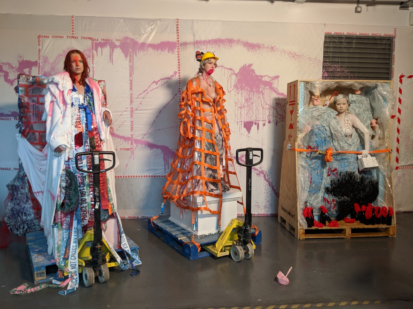
The starting point was the image of a statue being transported. It was a really old victorian sculpture, quite massive, super vulnerable looking. I really liked that idea of transporting a sculpture and the idea of mixing something that is so perfect with the imperfections of our society. I then went on to look at a lot of old sculptures and at the materials they were made with. Considering the age of these materials, I got inspired to work with objects and items that I found in the garbage. I either reprinted them or took them apart. The idea was to create something new and fresh with those old items. There is for example a mattress that I took a print from, which I then mixed it with other objects. A lot of the prints that I used in my collection were very dirty. They remind me of vandalism, something which is wrong in a way. I wanted to lift up this wrongness and celebrate it because I think that we, as a society, are trying too much and too hard to be perfect. I do not agree with that. I do not think we should be like that. To me, perfect is boring. I chose this project, this subject, to make a statement about fashion. I wanted to make a collection that would be more than just a catwalk show. I love fashion but I do not understand why we always decide on similar techniques to present clothing. There is so much room for more exciting ways, which I find very interesting. I like to break the boundaries between what is fashion and what is installation or textile design. That is why I really enjoyed this year. I was really happy to finally being able to do a free project that mattered to me.

Time to sync with our feelings, through our clothes
René Scheibenbauer on using emotions as the first step of his design process

Katya Zelentsova on excessive knitwear and two-week trainrides
Embarking on a proverbial train journey to self-discovery, the London-based designer revisits her native Russia
New Waves: Sam Chester
Translating handmade crafts to modern virtual spaces.

Parsons MFA 2024: maybe the kids are alright?
Discover the stories behind the collections of this year’s Parsons MFA Fashion Design + Society graduates

Masha Popova on her London Fashion Week debut
The Central Saint Martins graduate shares the realities of doing her first show from home

François-Xavier Lefebvre and the fashionable fetish
Where latex Vacuum Cubes meet playful design to escape everyday life.

Fashion Schools in lockdown: Swedish School of Textiles
Public education in a country with no lockdown: It is more complicated than it sounds
