
What was the main inspiration behind your collection?
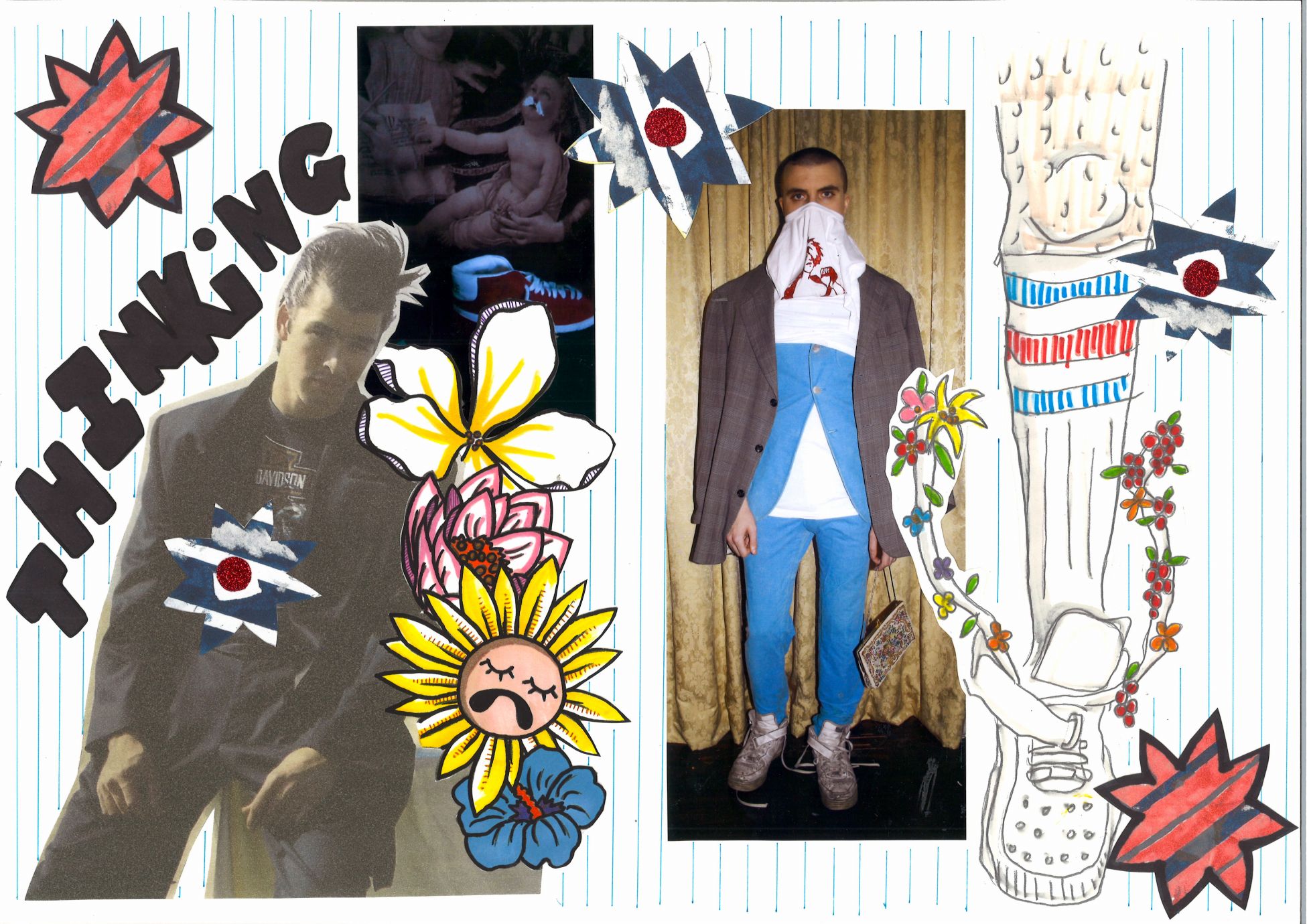
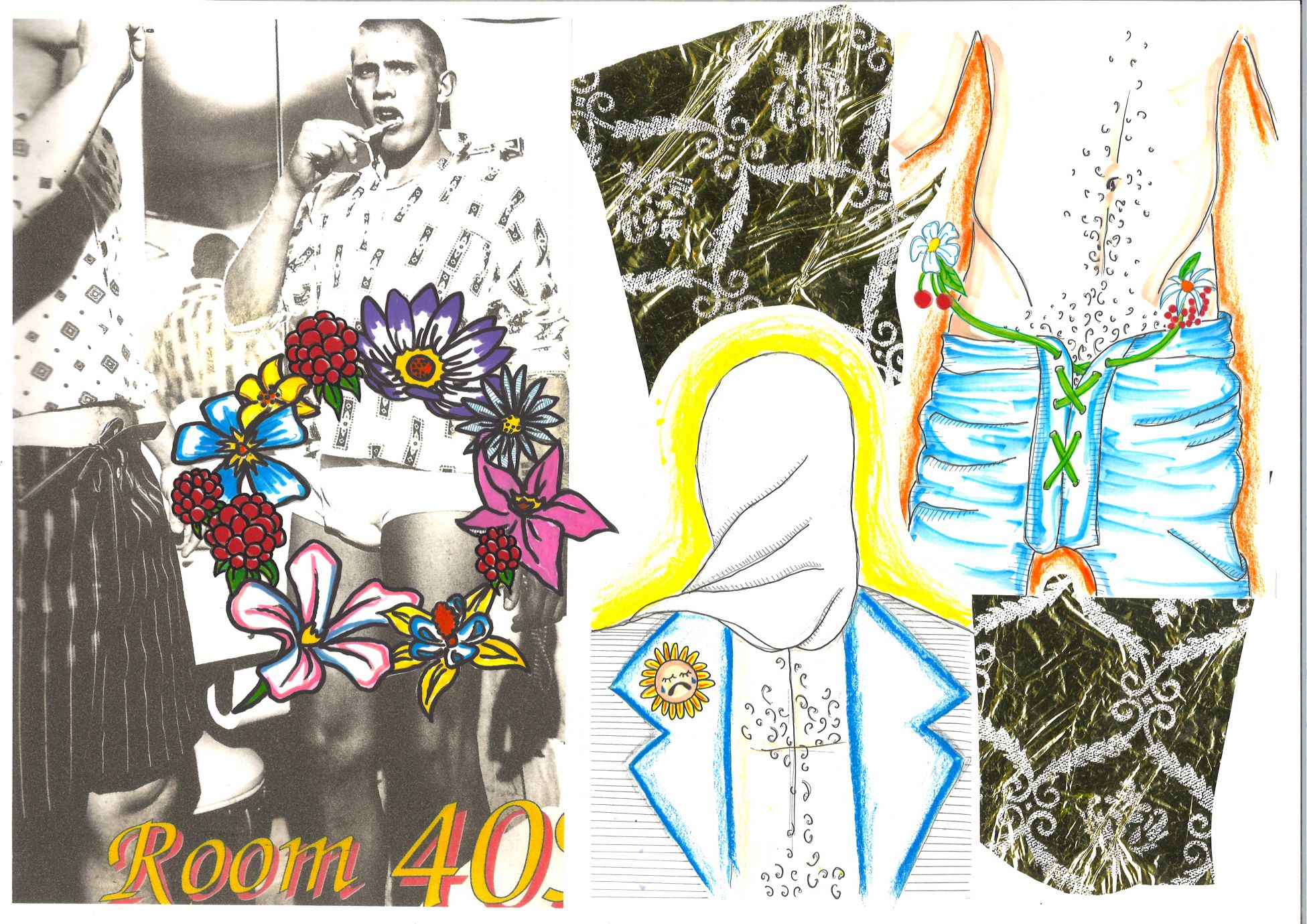
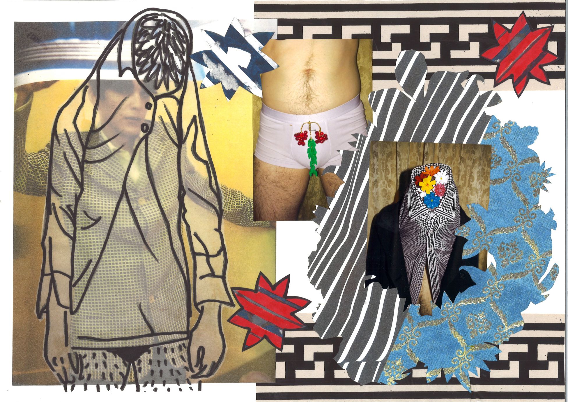
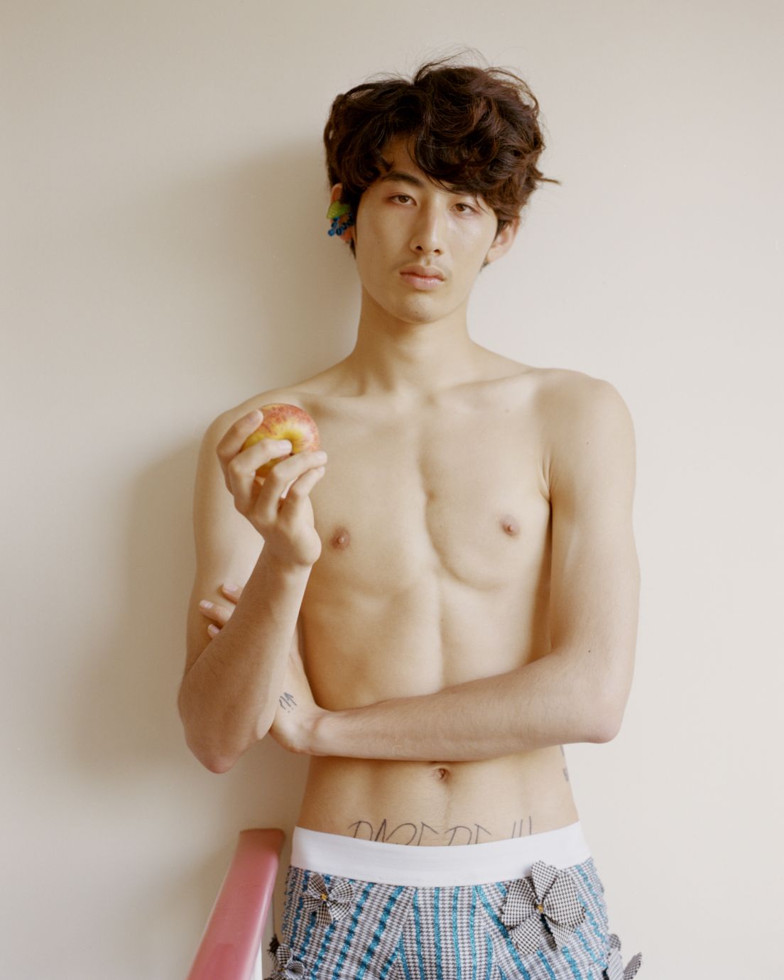
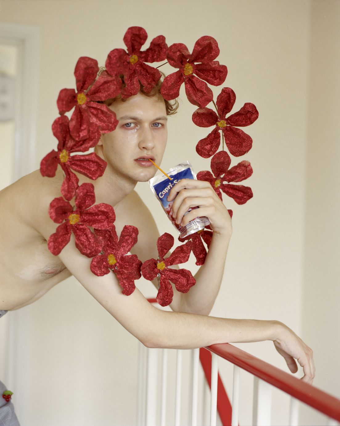
It started off as heartbreak, about a guy who had to get on with his day, get dressed and go to work. But all he really wanted to do was stay in his room and be sad. But that’s not a luxury anyone has, so he gets up, puts on his clothes, and imagines things around him becoming more beautiful than they are. Flowers blooming, berries growing, and things getting brighter and shinier and more colourful.
How did the concept develop?
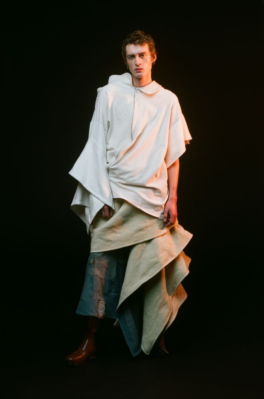
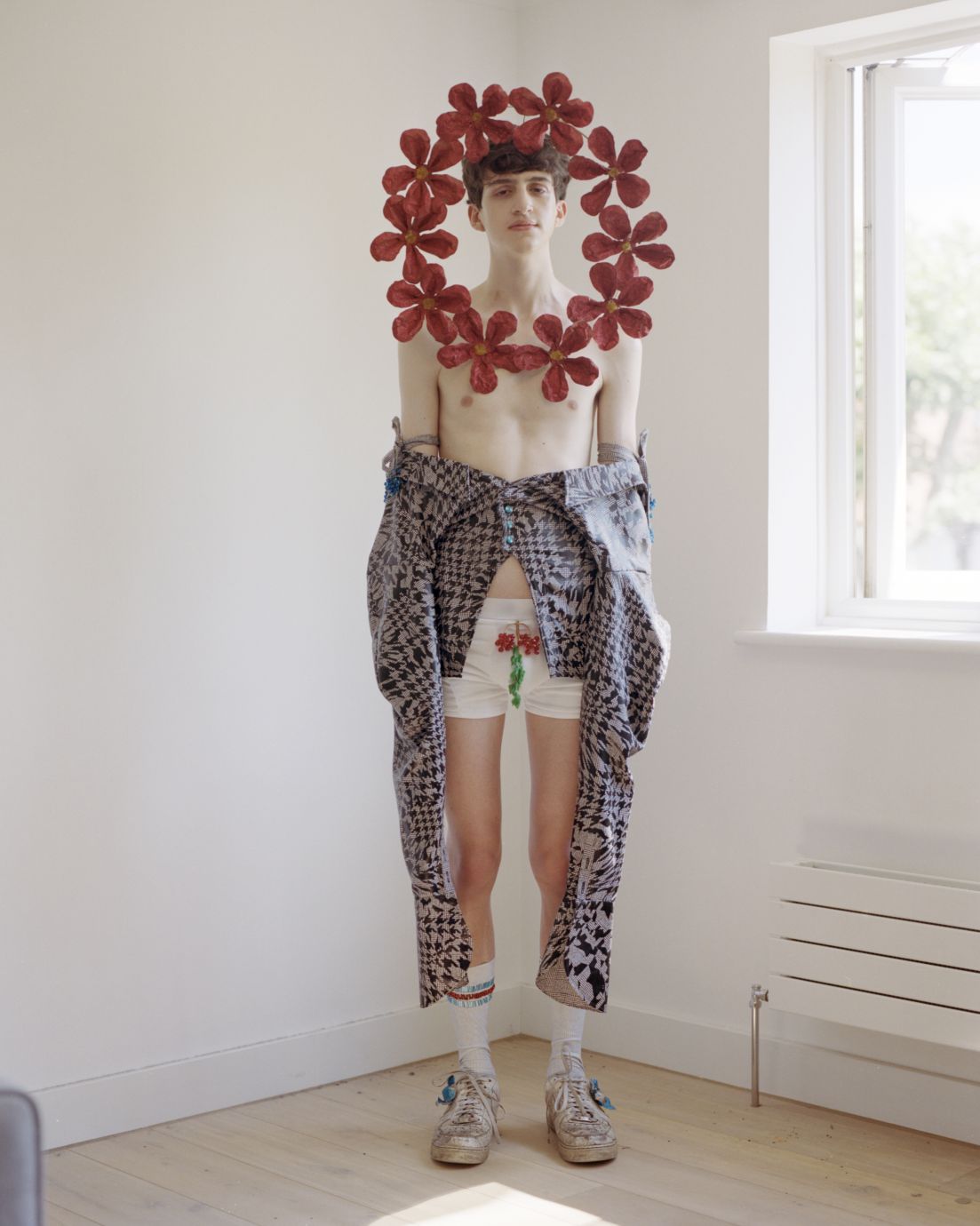
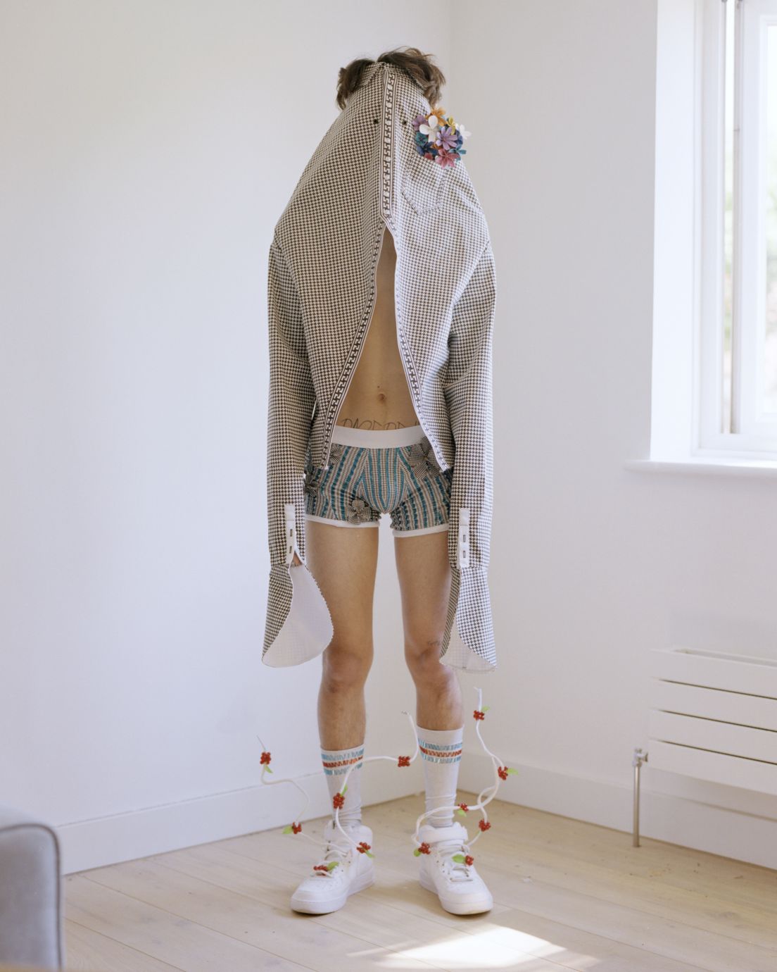
It started off as this intangible idea about an island, which was so convoluted I hated explaining what it was about to anyone, I didn’t really buy it myself. One of my tutors helped me realise that I work best when I have one foot in reality and the other in fantasy. I made everything up and I needed to have something to hold on to, a more realistic point of reference. So, I thought more about myself, how I deal with sadness, and made a short film in my bedroom – not that kind of film. I played around with decorating the space and trying to fit into shirts that were still buttoned up, putting shoes on before trousers, wearing an ill-fitting work suit, then sticking a flower on it to make everything ok. I wanted it to be something boyish and cute, but also sexy in an attainable sort of way. Grumpy but not angry, and definitely not dark. I think you can say a lot about sadness with bright colours.
What techniques did you focus on?
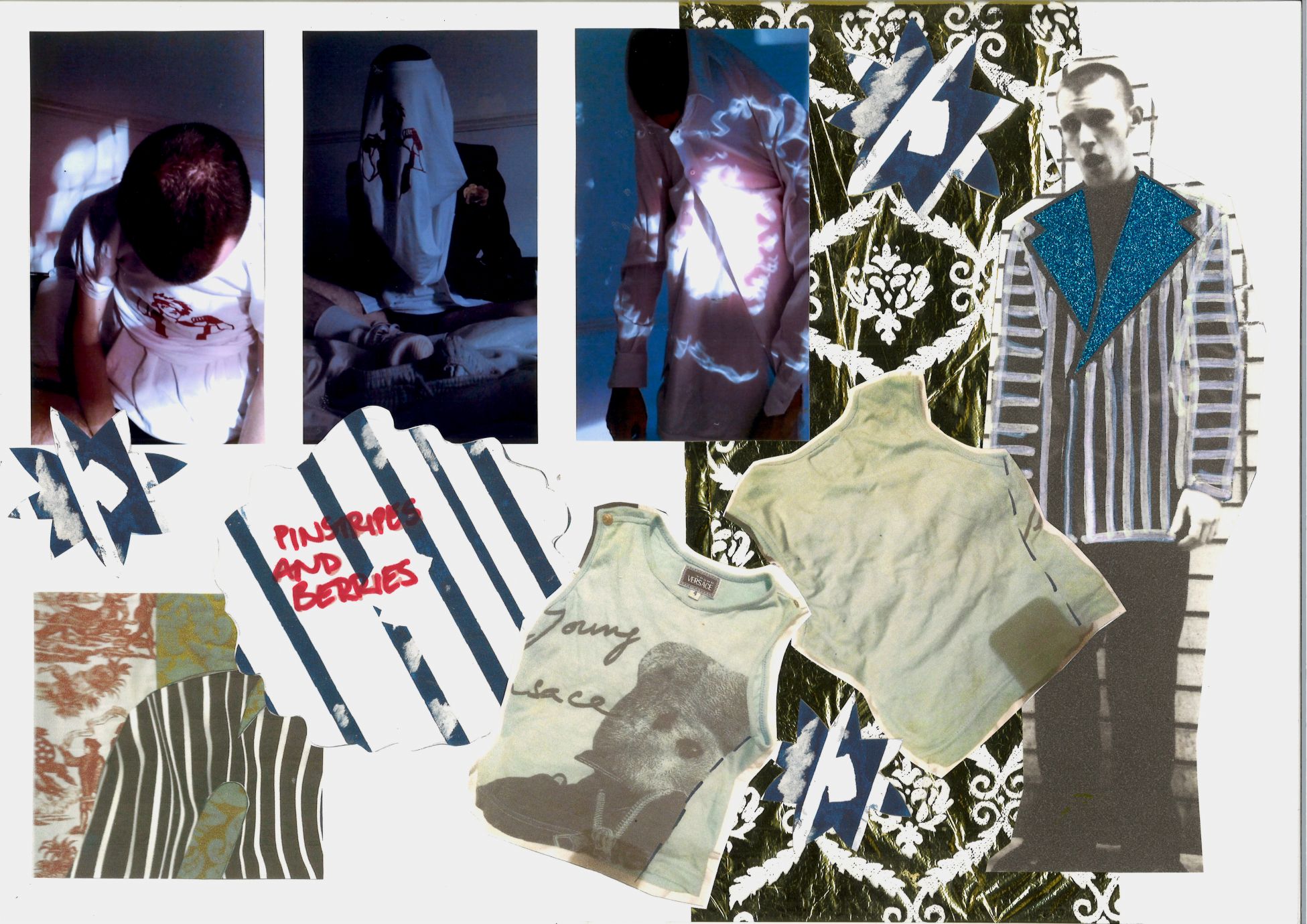
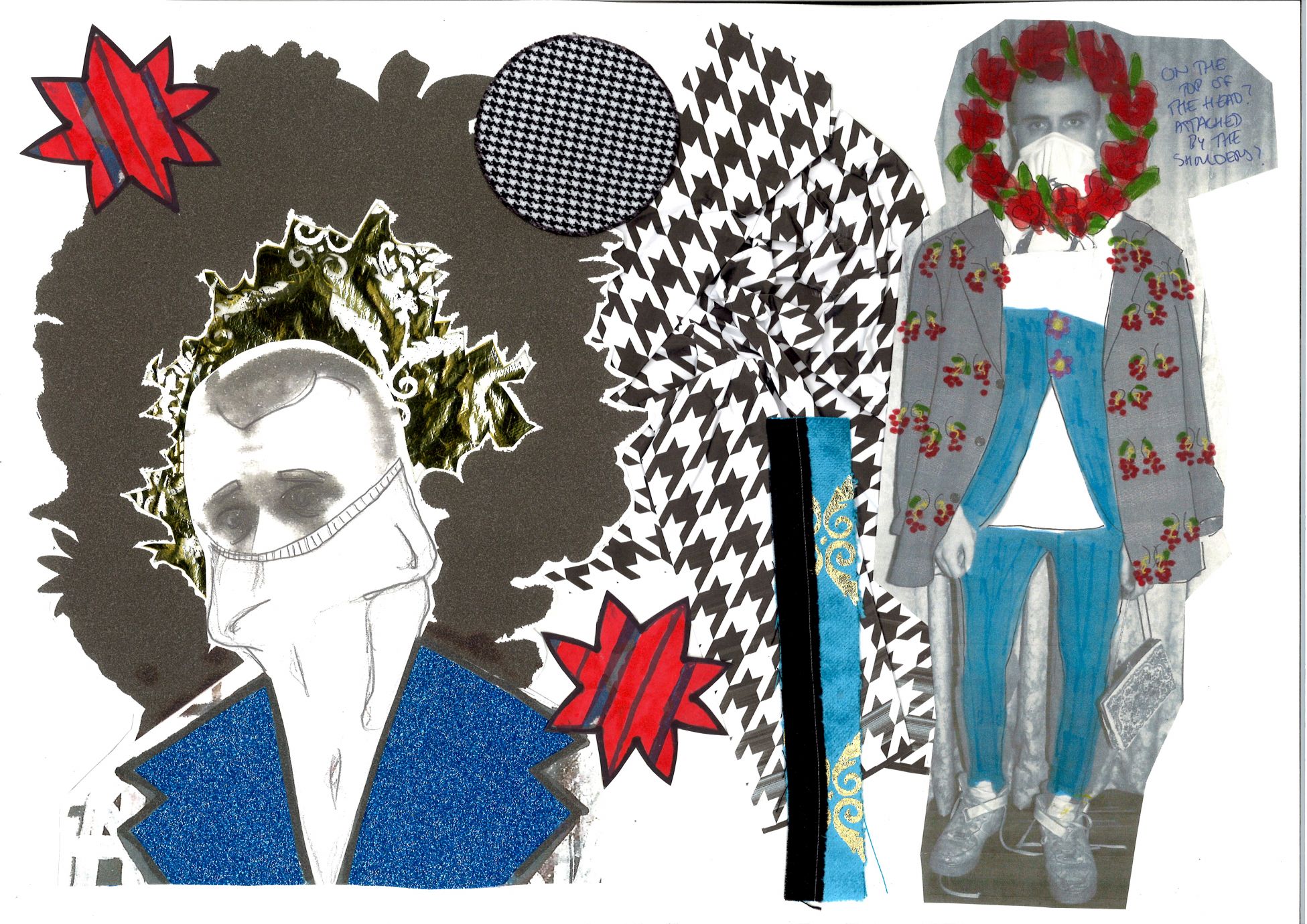
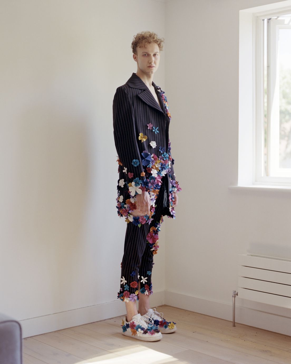
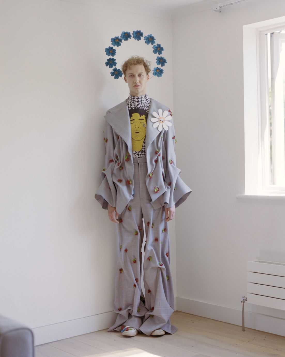
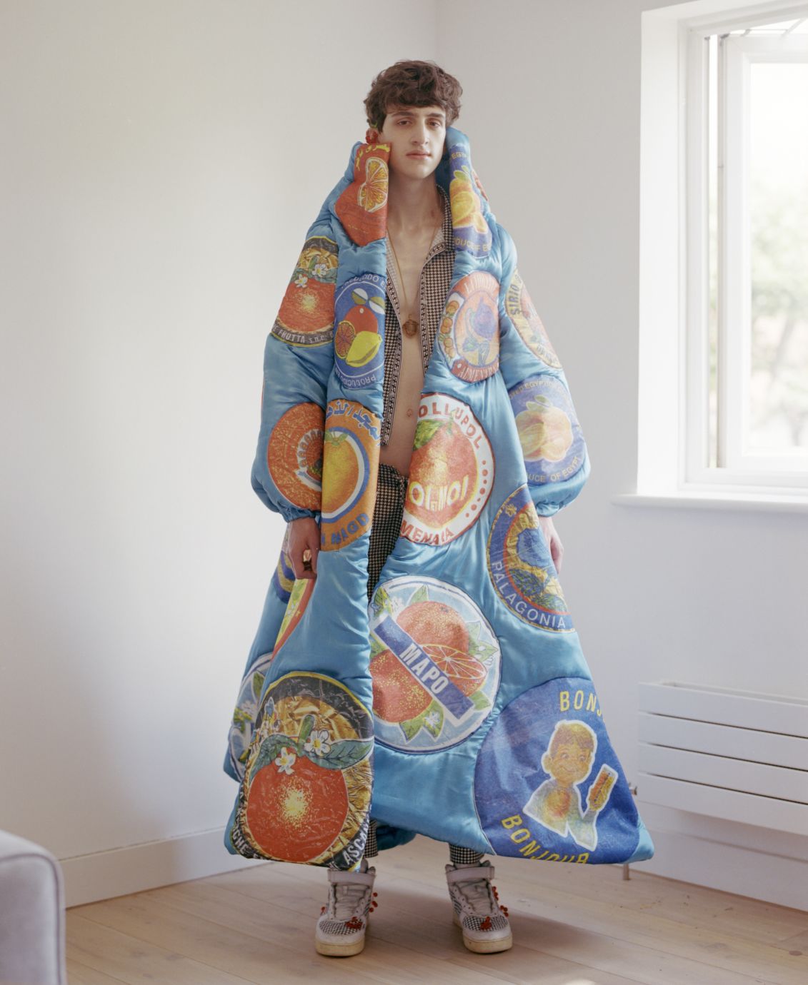
I got really into beading techniques, which is something I haven’t done since I was young. I used to make jewellery a lot; like real glass beads with clasps and crimps. My mum would get me to make stuff for her friends’ birthdays sometimes. It was nice to get back into that, and I ended up making a lot of jewellery for my collection as well as having beads on the clothes. For the socks, which were digitally printed with a trompe l’oeil texture, I beaded red and blue stripes along the top like those 70s sports socks. I also used this technique where fabric is gathered between two points by a beaded clump of berries, which I made a suit out of, and I think is my favourite look. I used a lot of glitter vinyl as well (thanks http://garmentfims.co.uk for the 30% off code) for the faces I put onto the t-shirts and for the flowers – THAT was a big job. We had to make 600 flowers for one look, with some left over for accessories and styling. We cut each petal separately and they’re all stitched together, no glue allowed. We had loads of styles and sizes as well so it got pretty confusing at times, especially since I was so particular about how many petals needed to be on each flower. Aside from the acrylic flower badges, which were laser-cut, everything else was done by hand.
What was most important to you working towards the final result?
Technique was important, it became such a personal collection that I wanted everything to be as close to me as possible. I wanted the fewest degrees of separation possible between me and the outcome. I was lucky to get on so well with my helpers, and I knew they were invested in it and understood why everything had to be so delicate and considered. They got even better than me at making the flowers. I don’t think you need to stay away from vivid colours if you’re doing a collection with a sad theme. I think the colours were important. I’m not somebody who likes to let negative things affect me too much, I try to keep my environment colourful and happy even if horrible stuff is on my mind. I guess it’s a coping mechanism. From all my research and sketchbook work I was imagining there would be a lot more blue in the collection but there is blue in every look, even if it’s just a small bit. It’s a very specific tone which I think is very evocative of all that I was trying to say. It’s the whole ‘blue-for-a-boy’ trope, blue for sadness, blue for a clear sky.