Representing the creative future

Swedish School of Textiles 2025: Rework and Rewire

Fashion as form, system, surface and suggestion – SST’s 2025 cohort doesn’t just design garments, they rethink what clothing is for.

The 2025 graduates of the Swedish School of Textiles approach fashion less as a fixed outcome and more as a live question. Whether working in knit, jersey, print or construction, their collections are driven by process: how things are made, how they change with time and touch, how they might be reimagined through use.

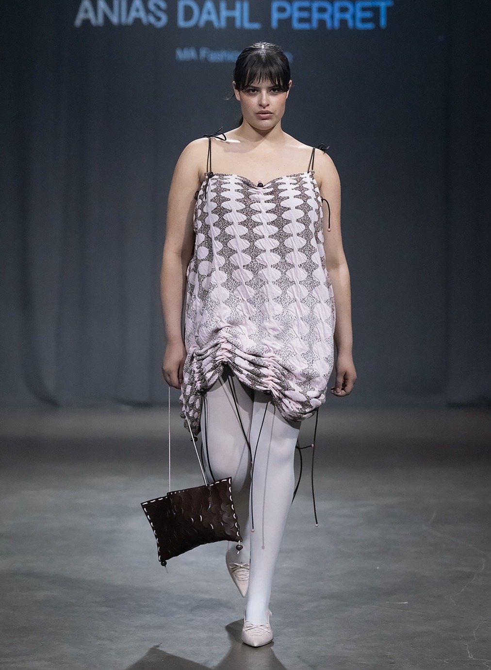
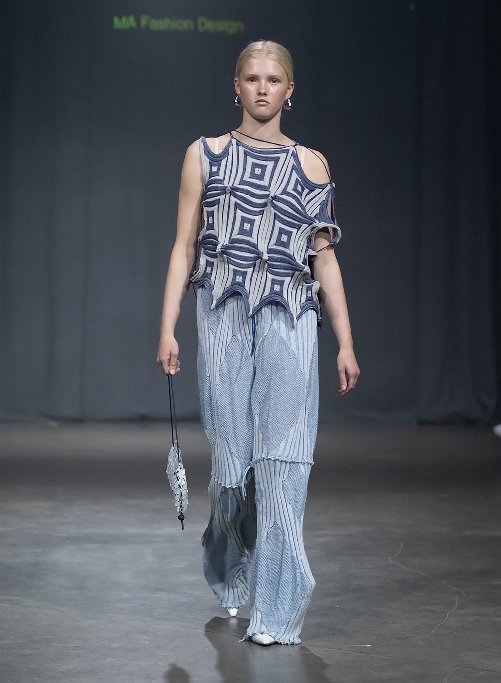
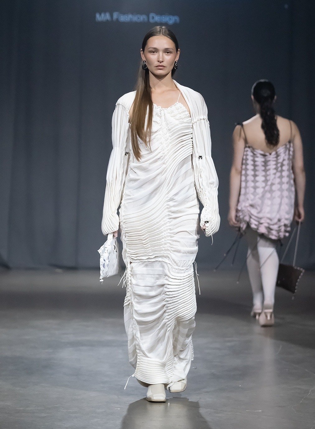
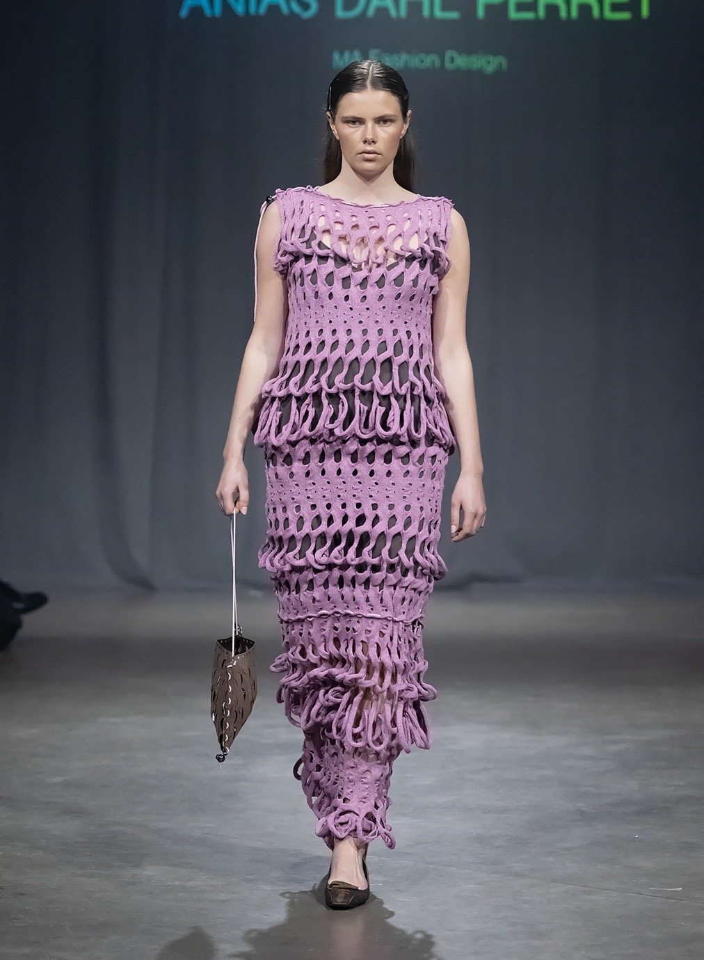
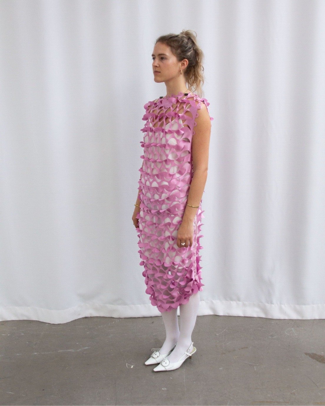
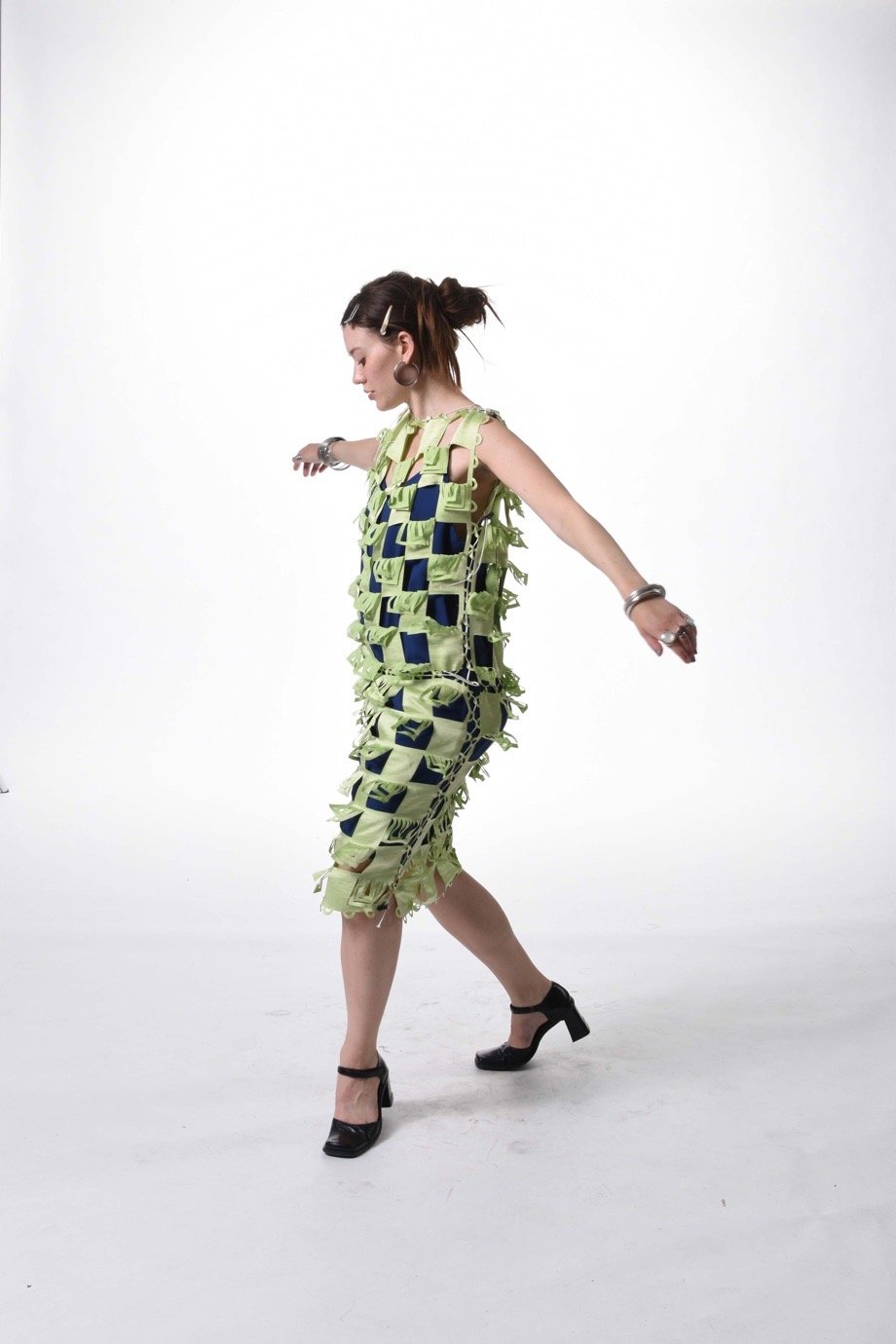
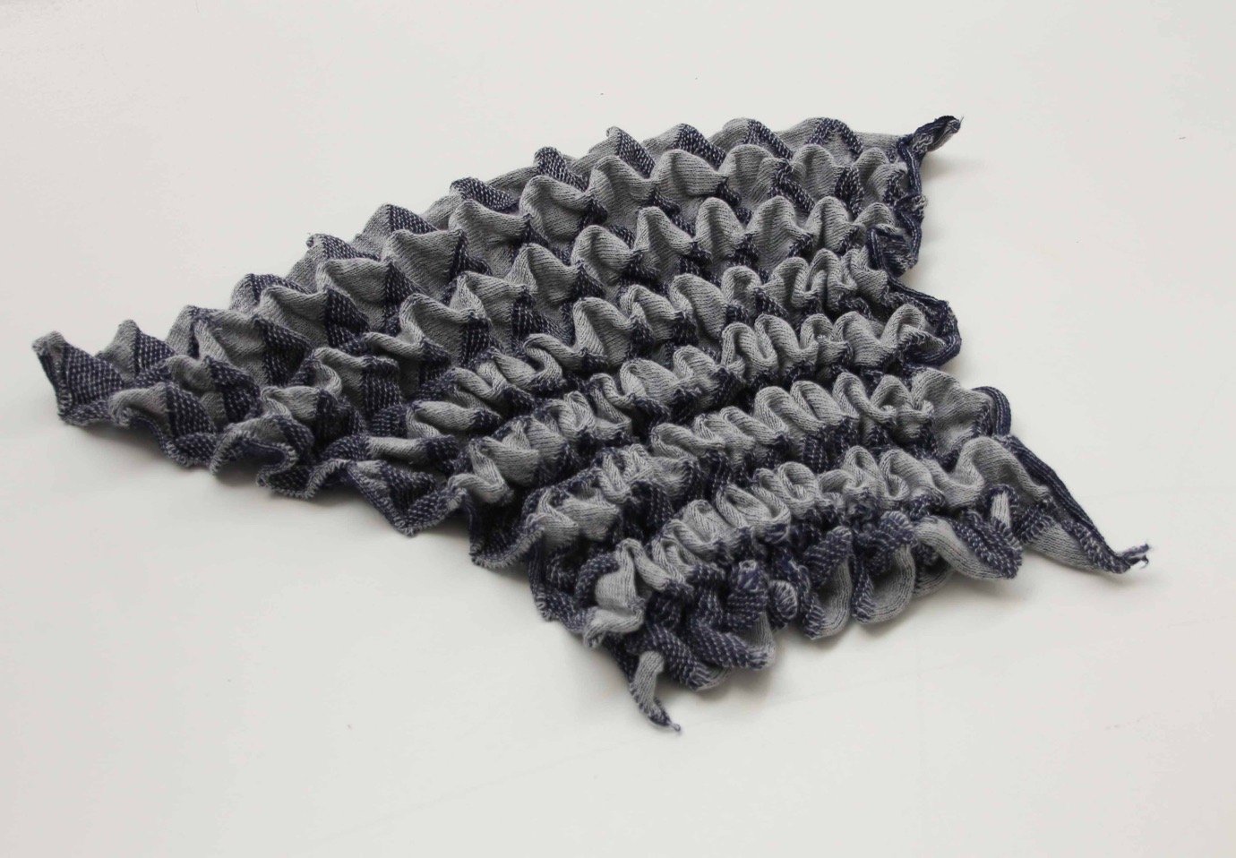
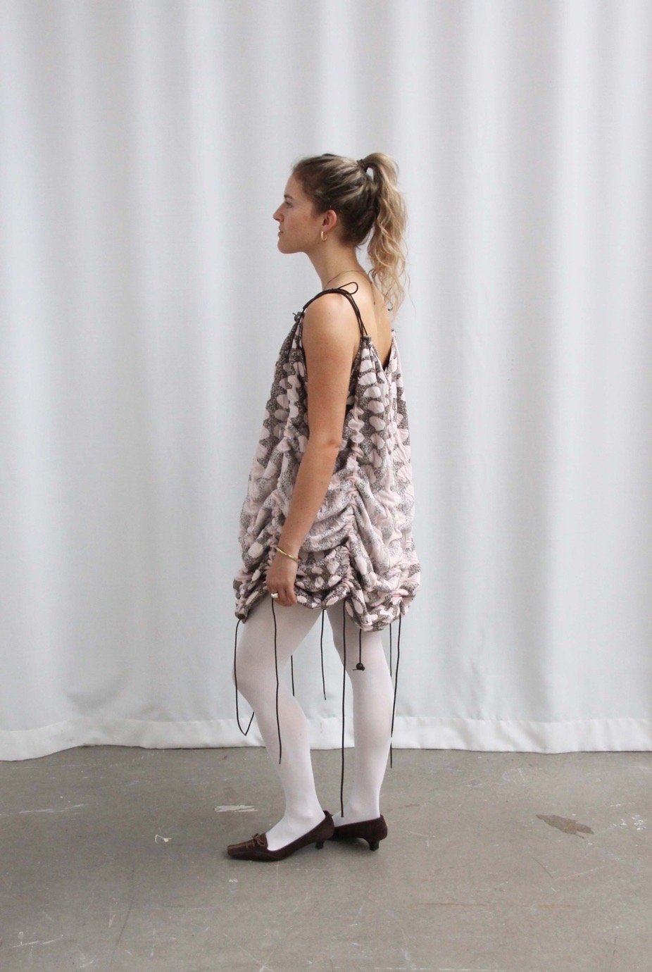
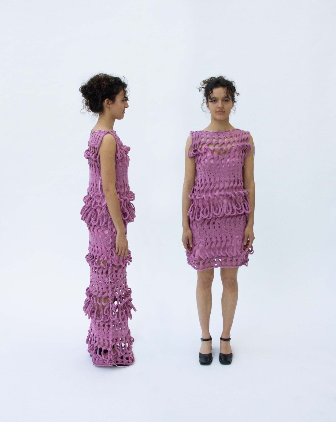
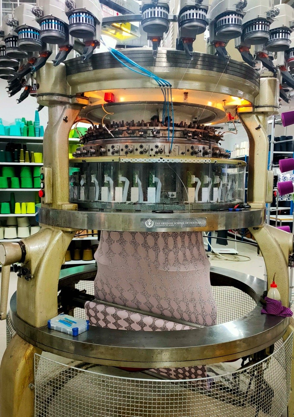
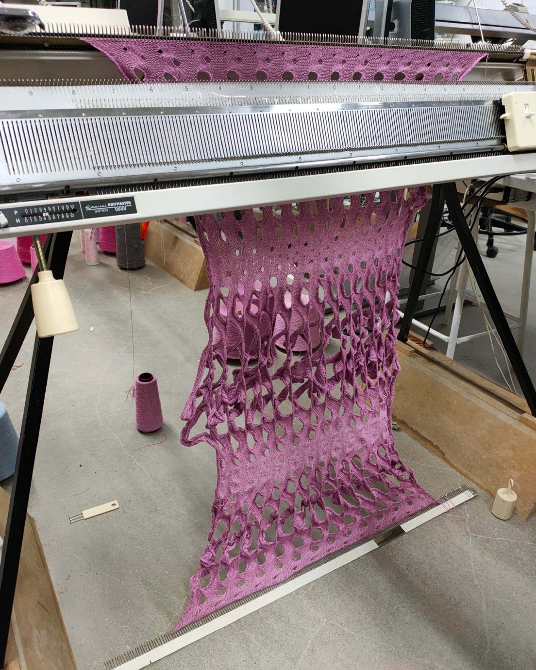
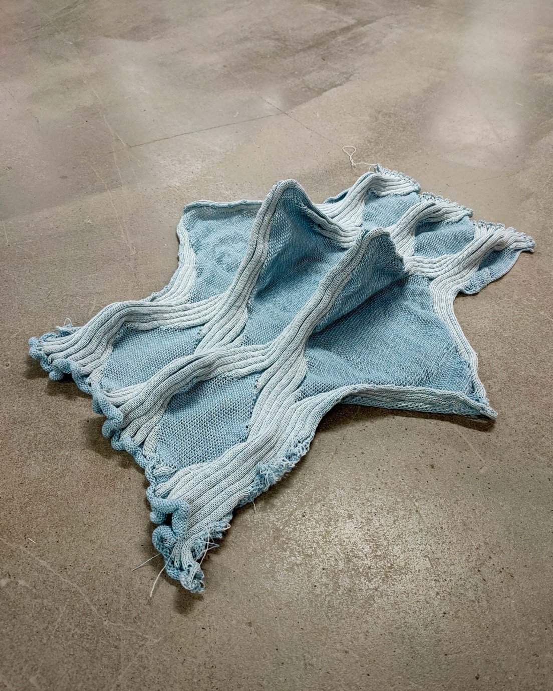
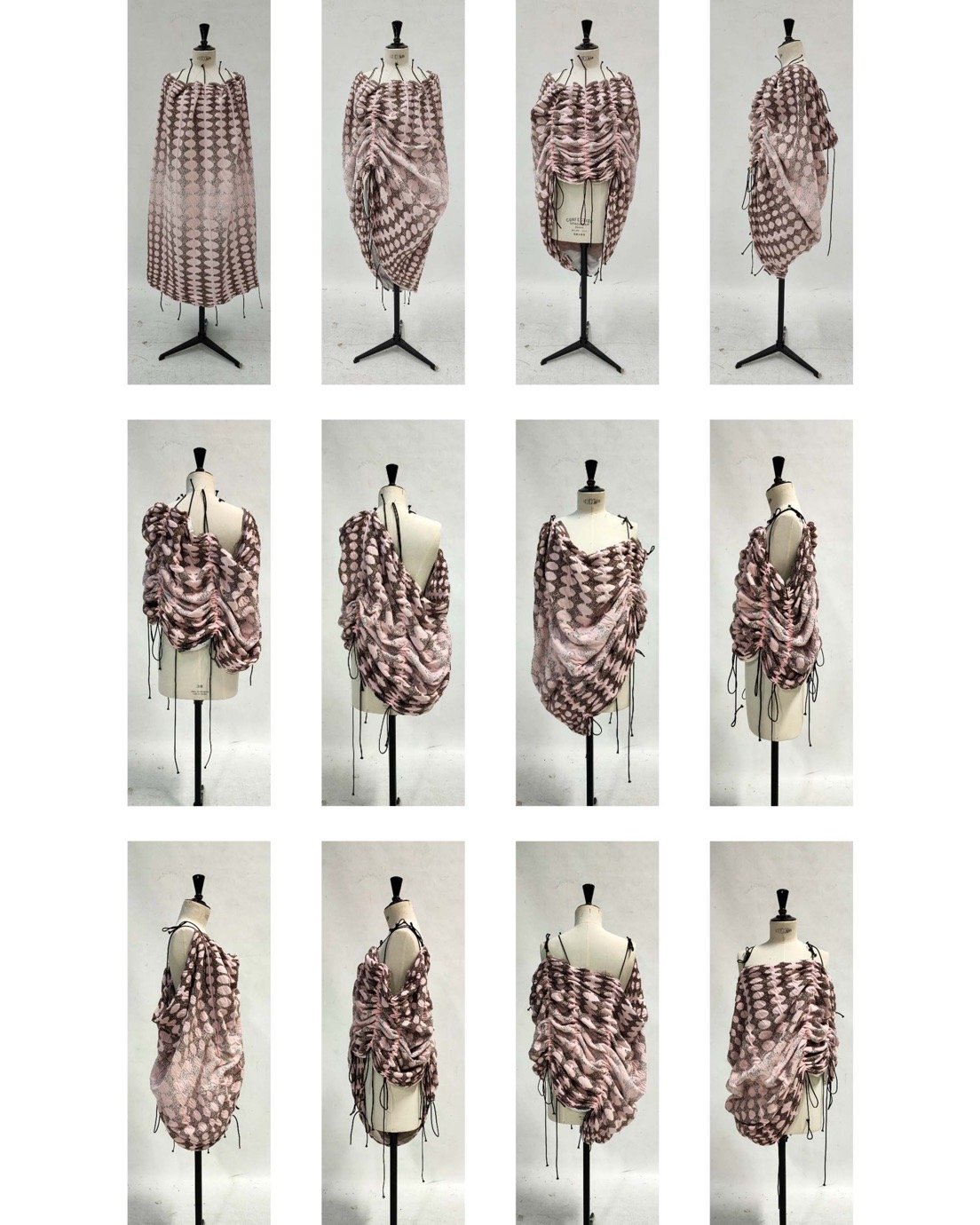
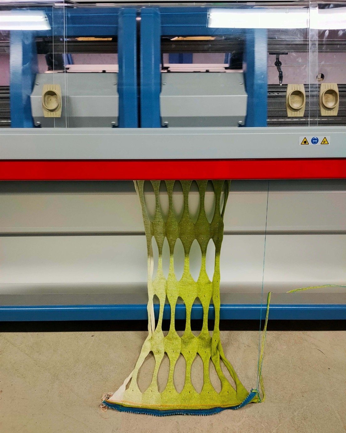
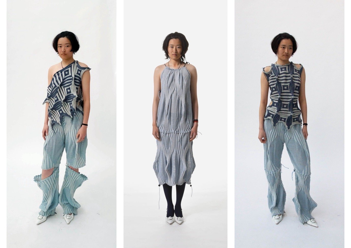
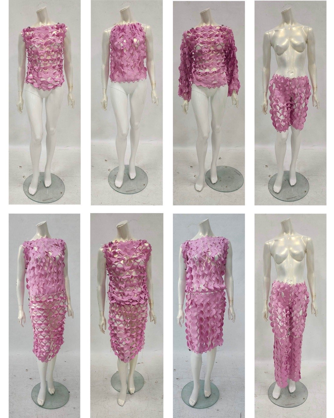
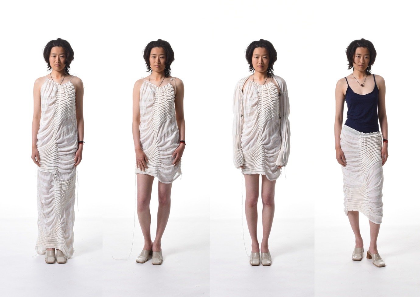
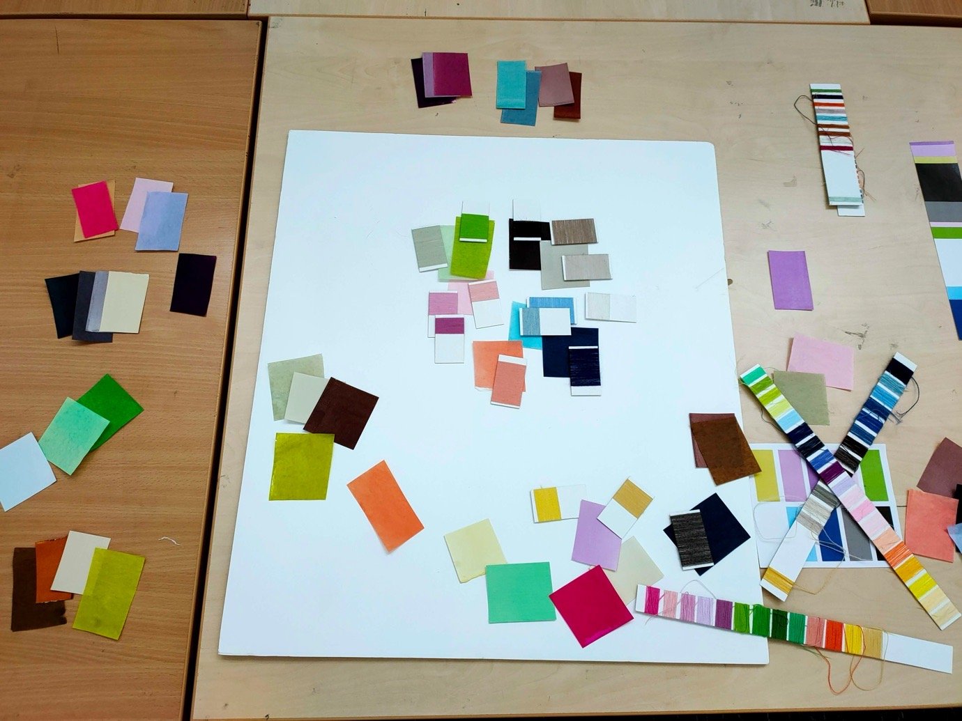
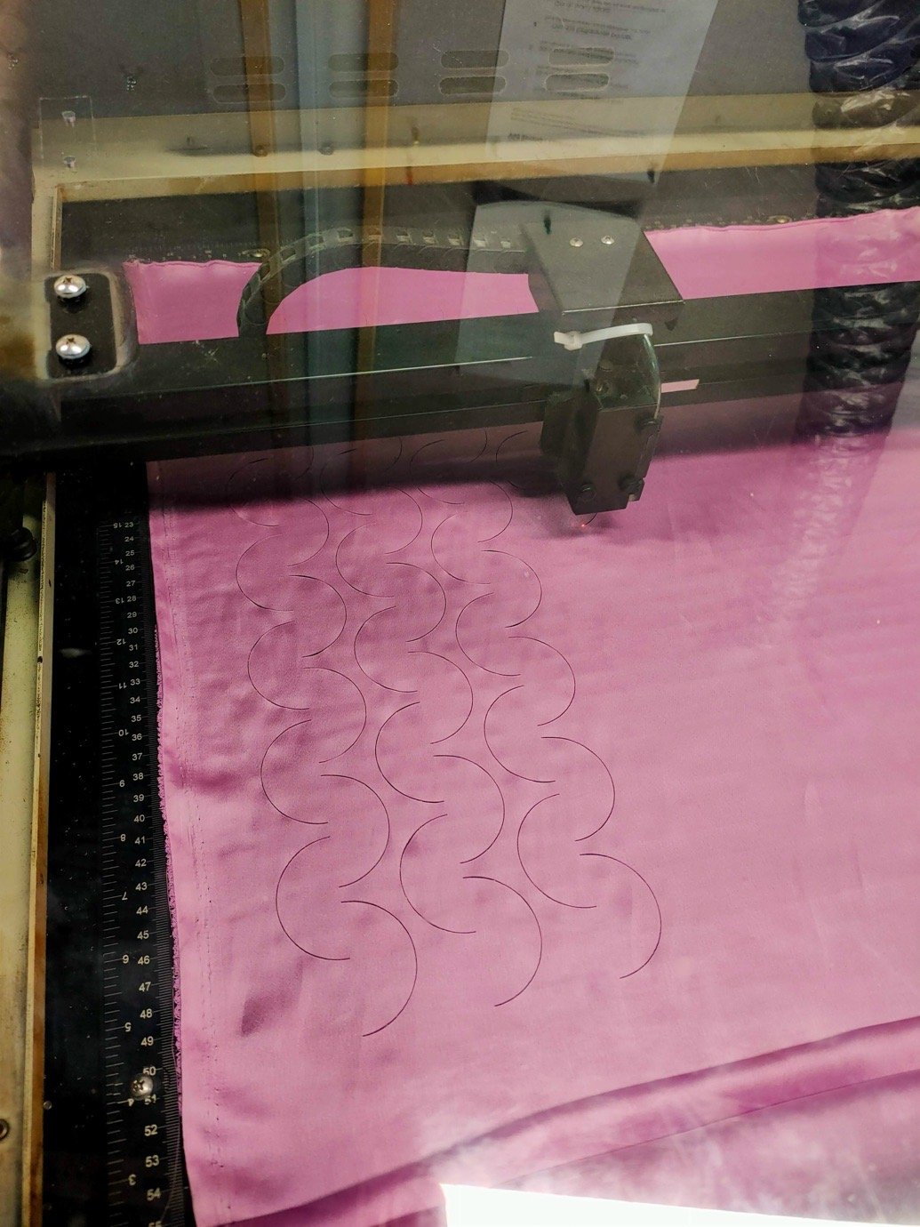
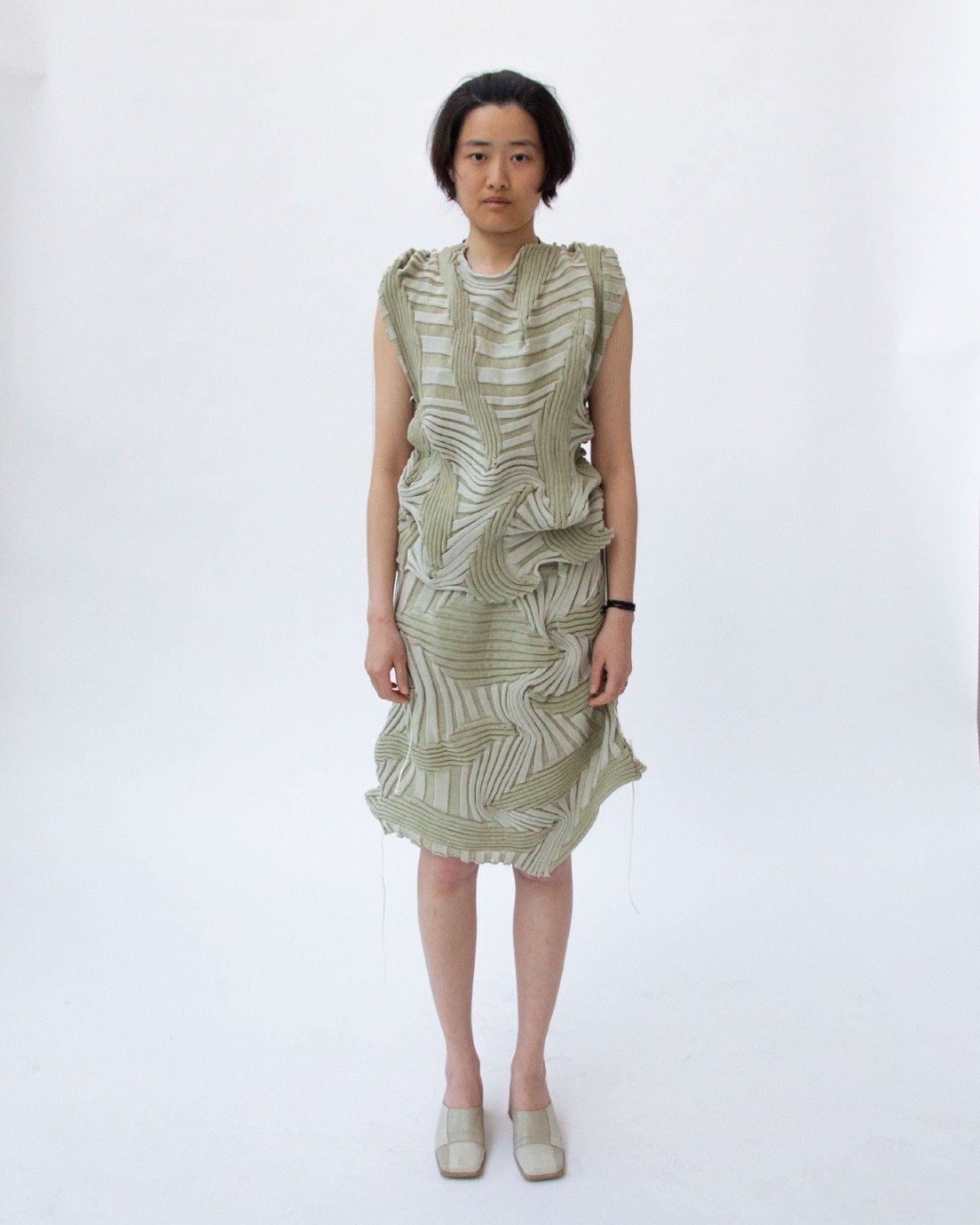
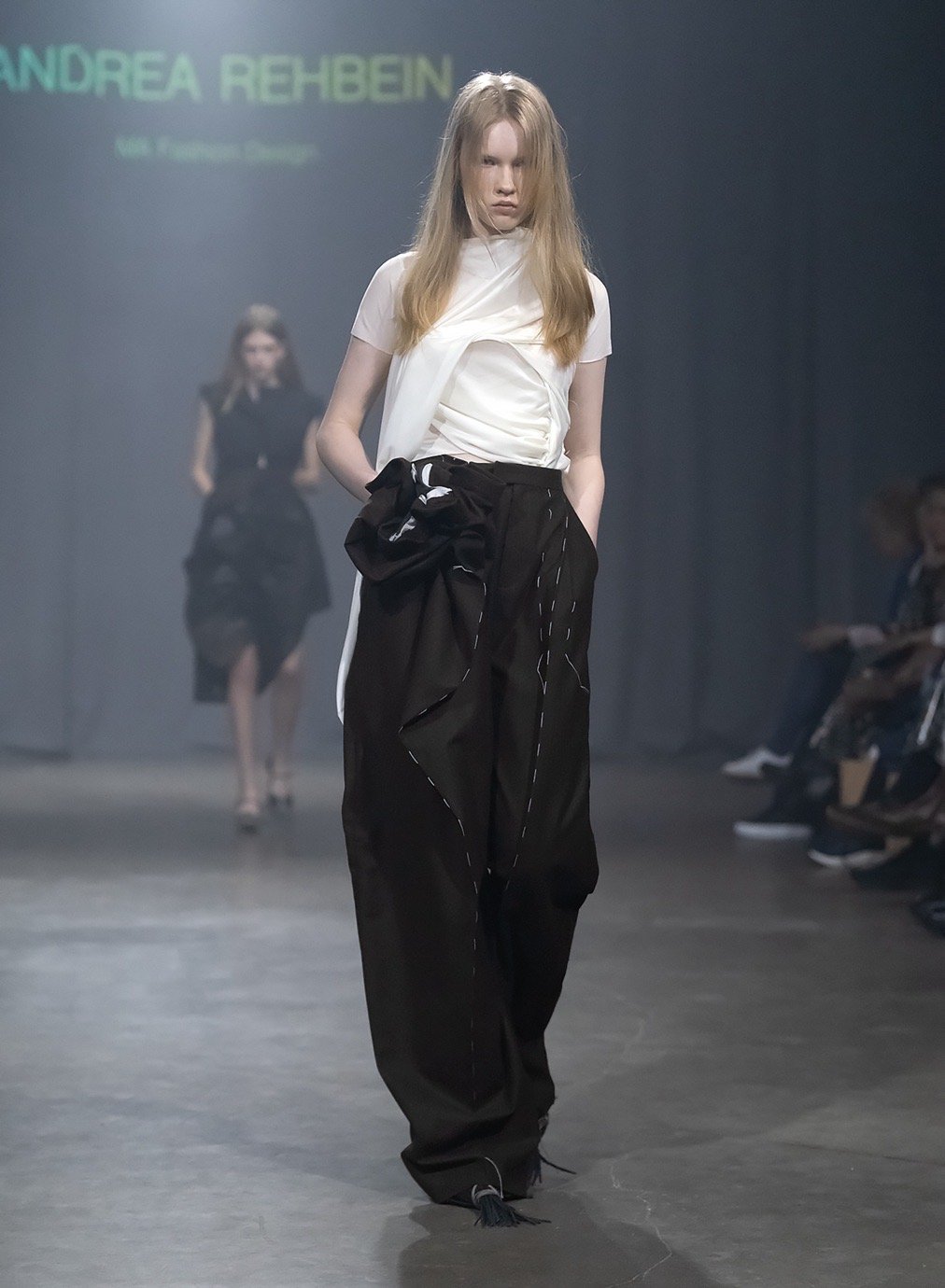
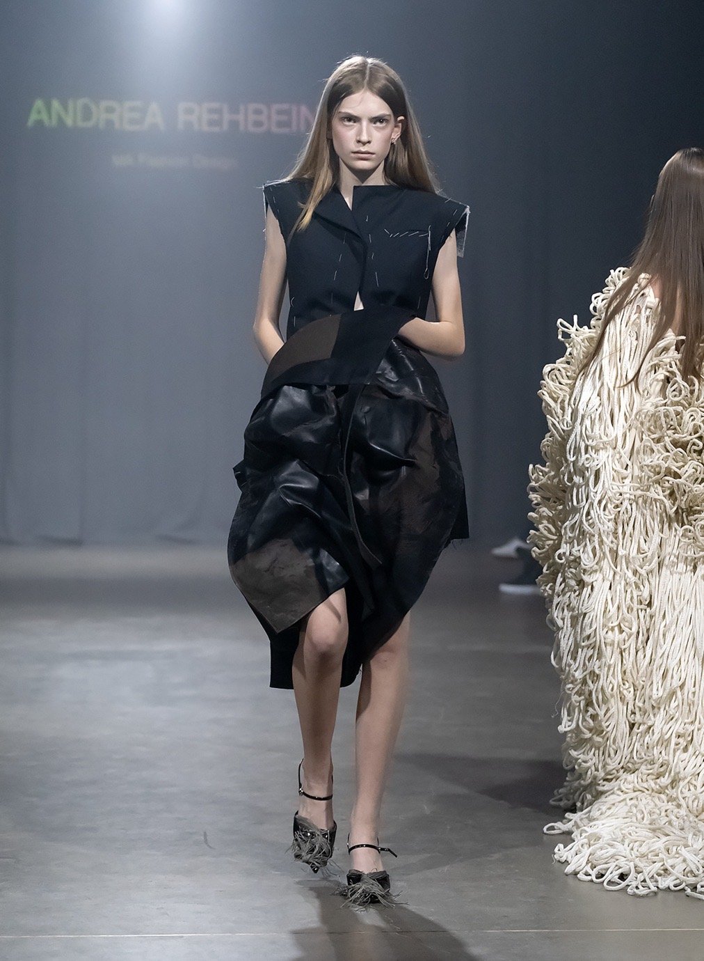
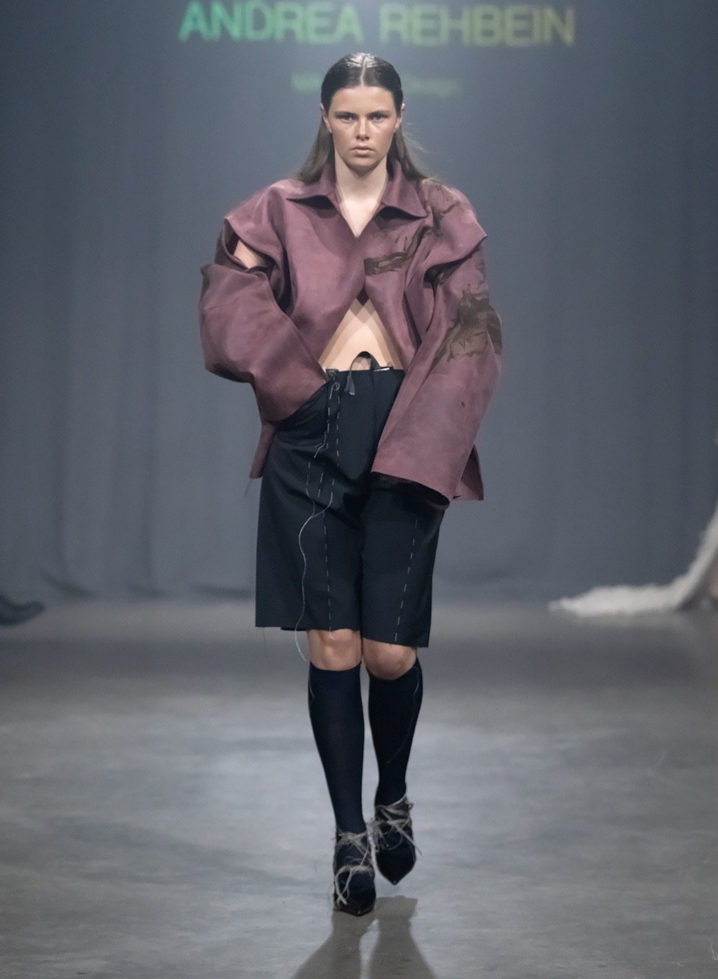
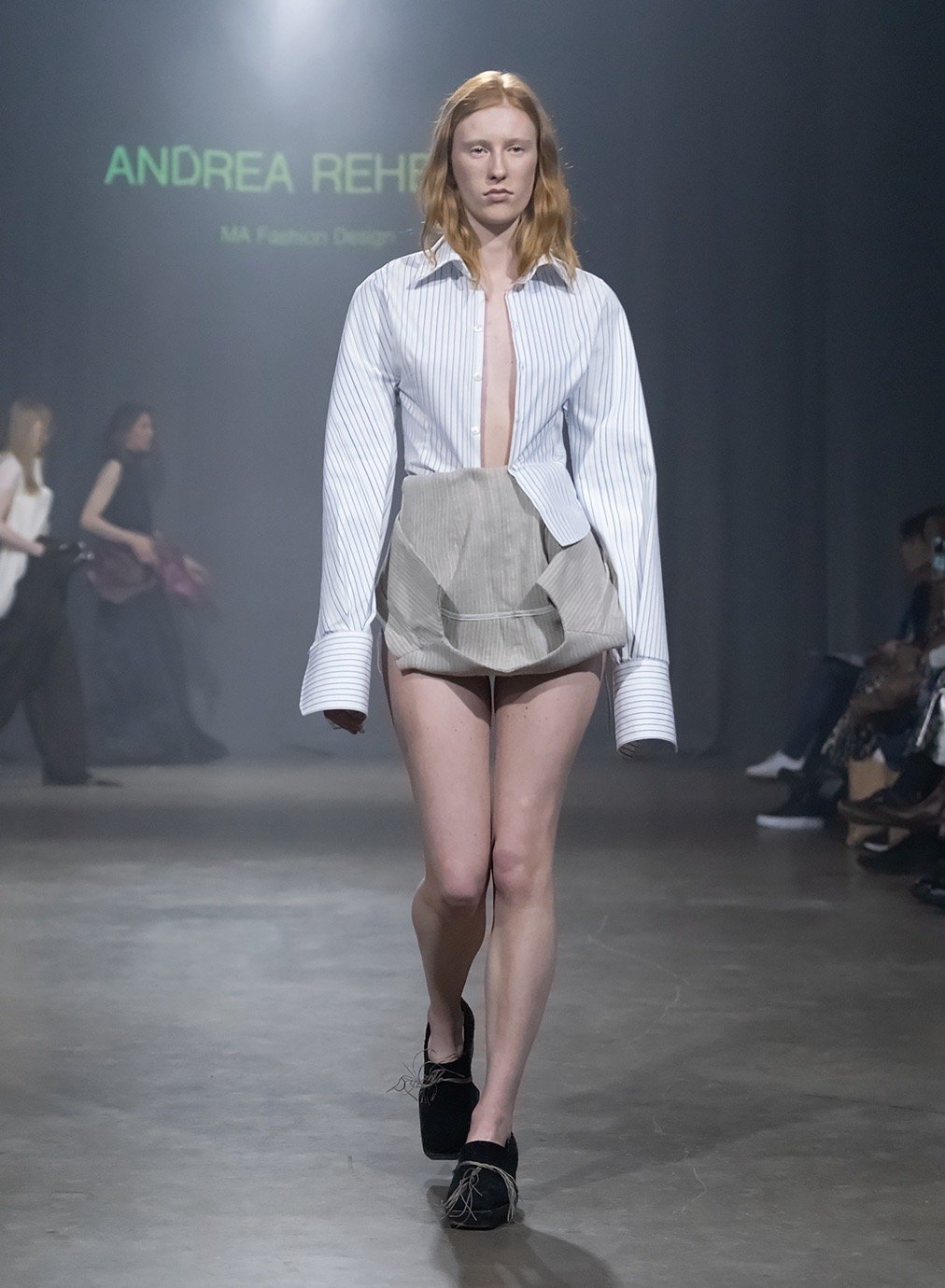
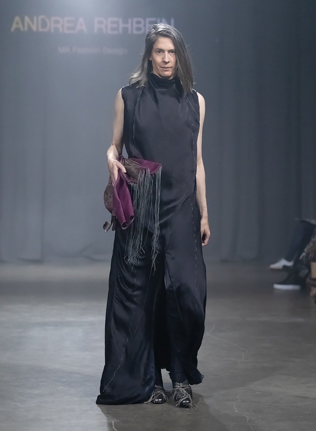
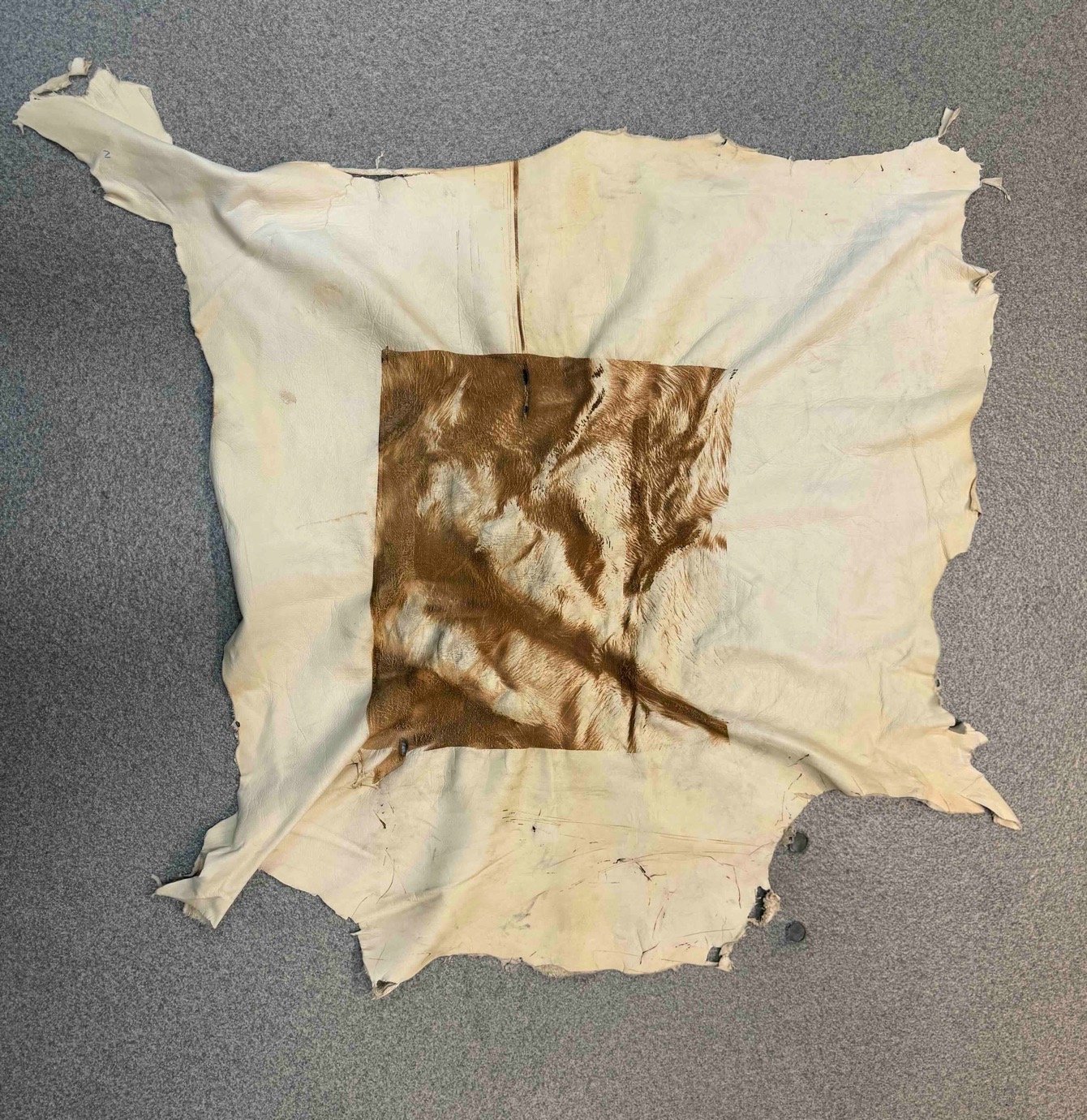
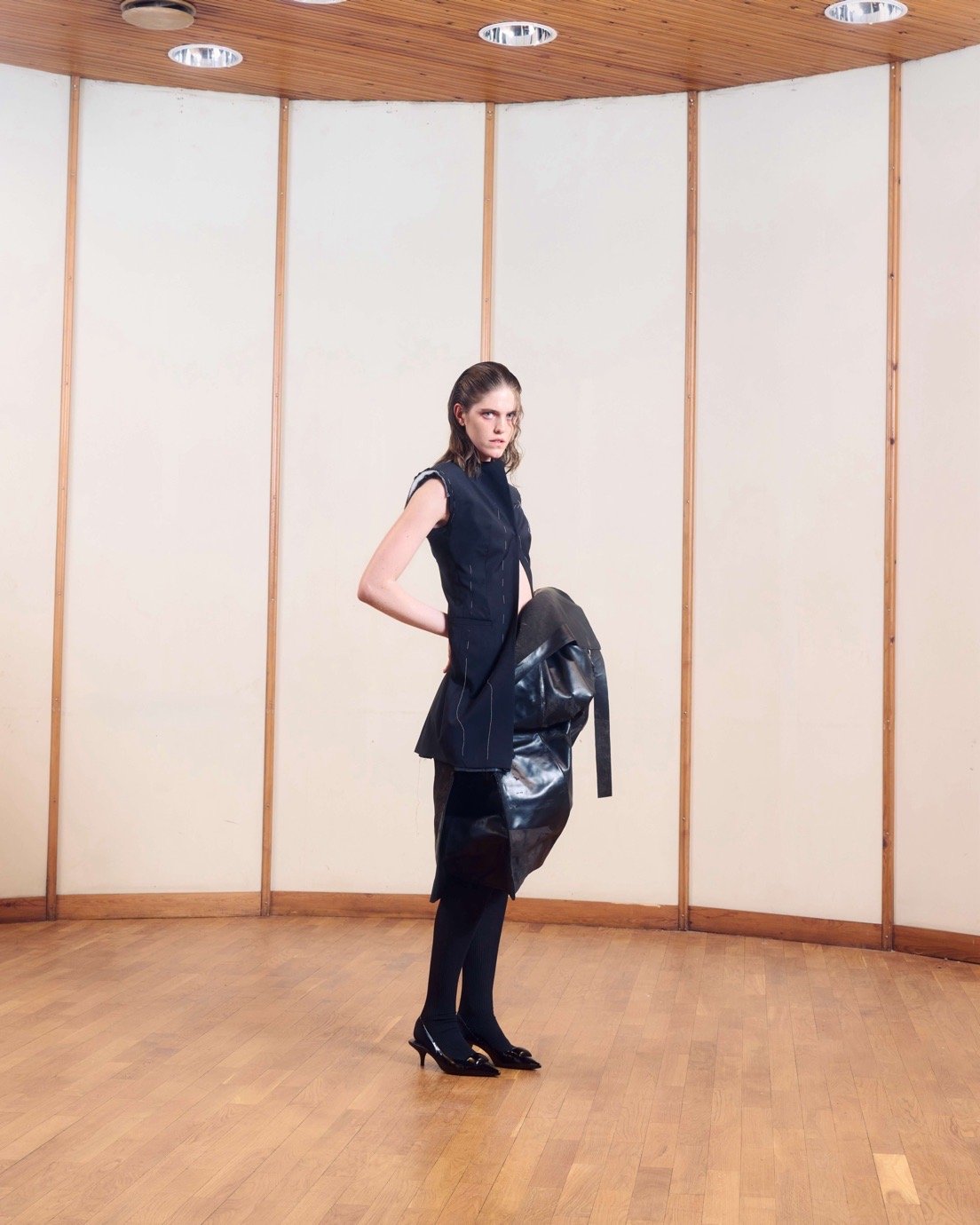
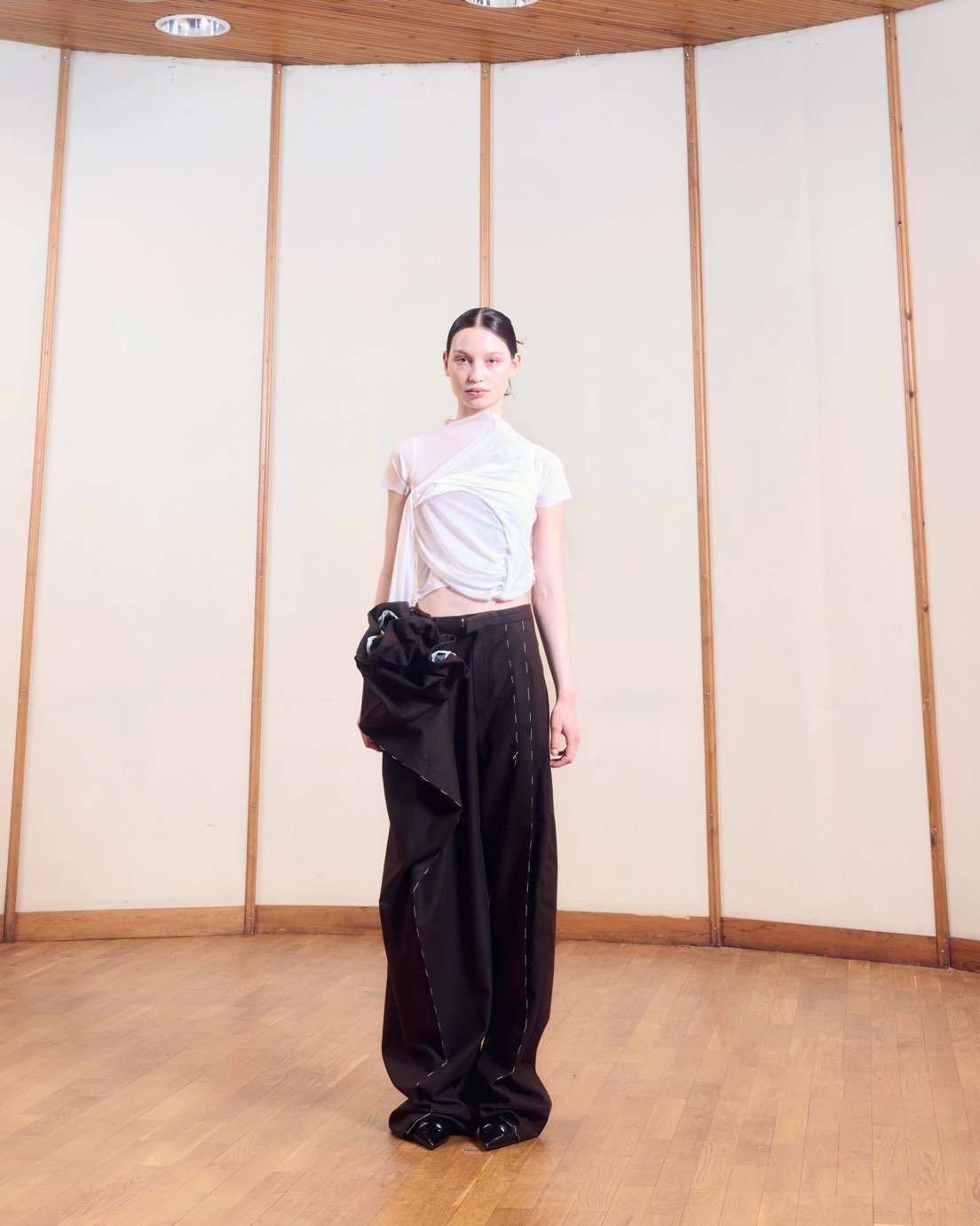
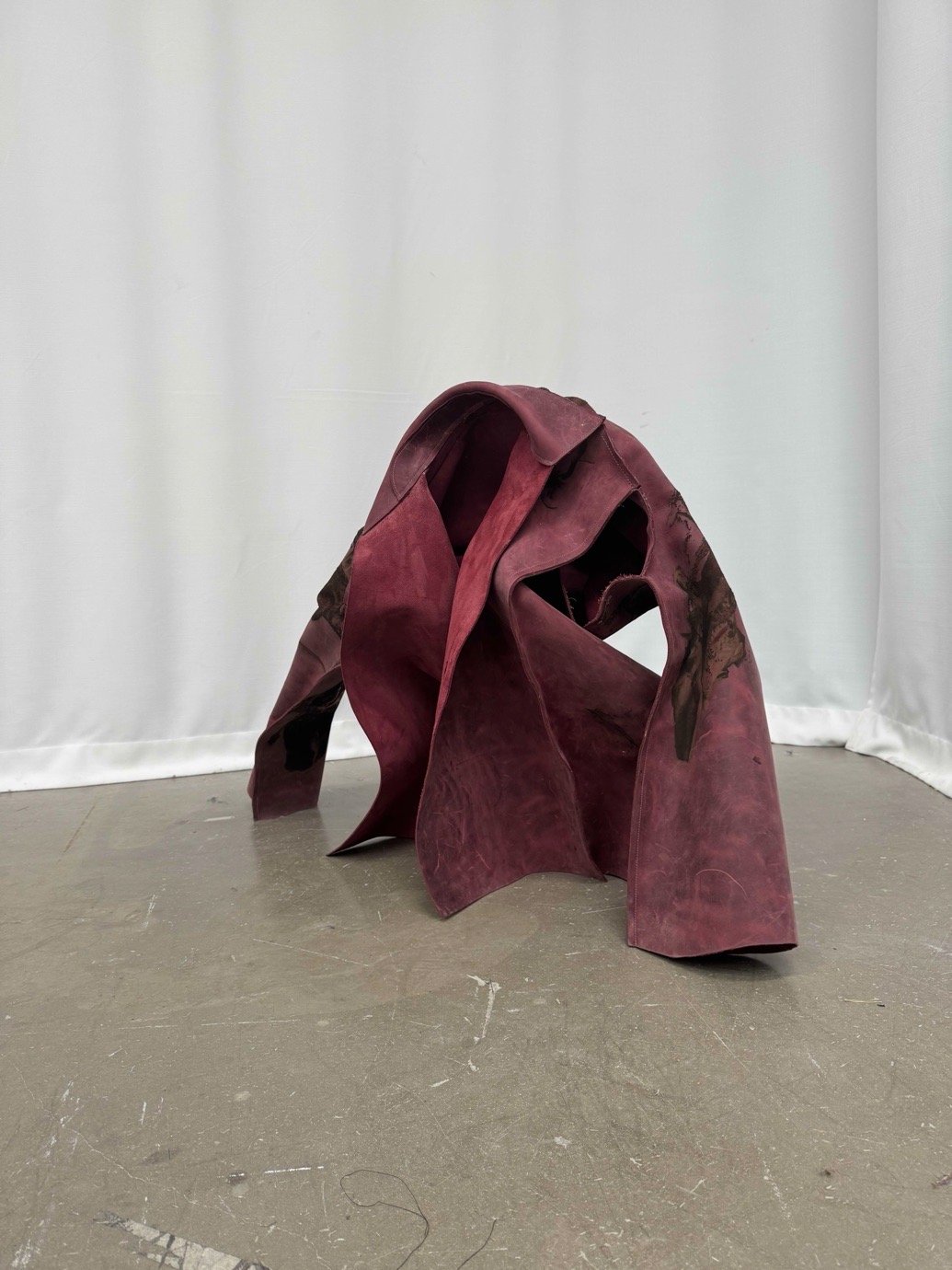
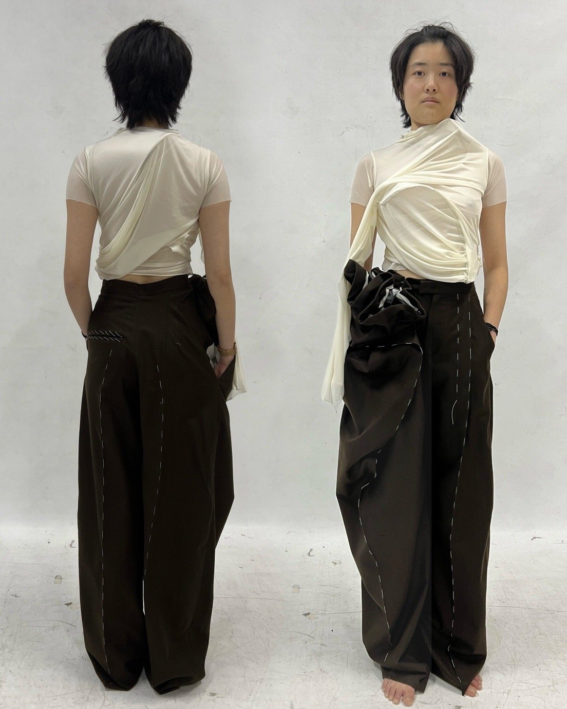
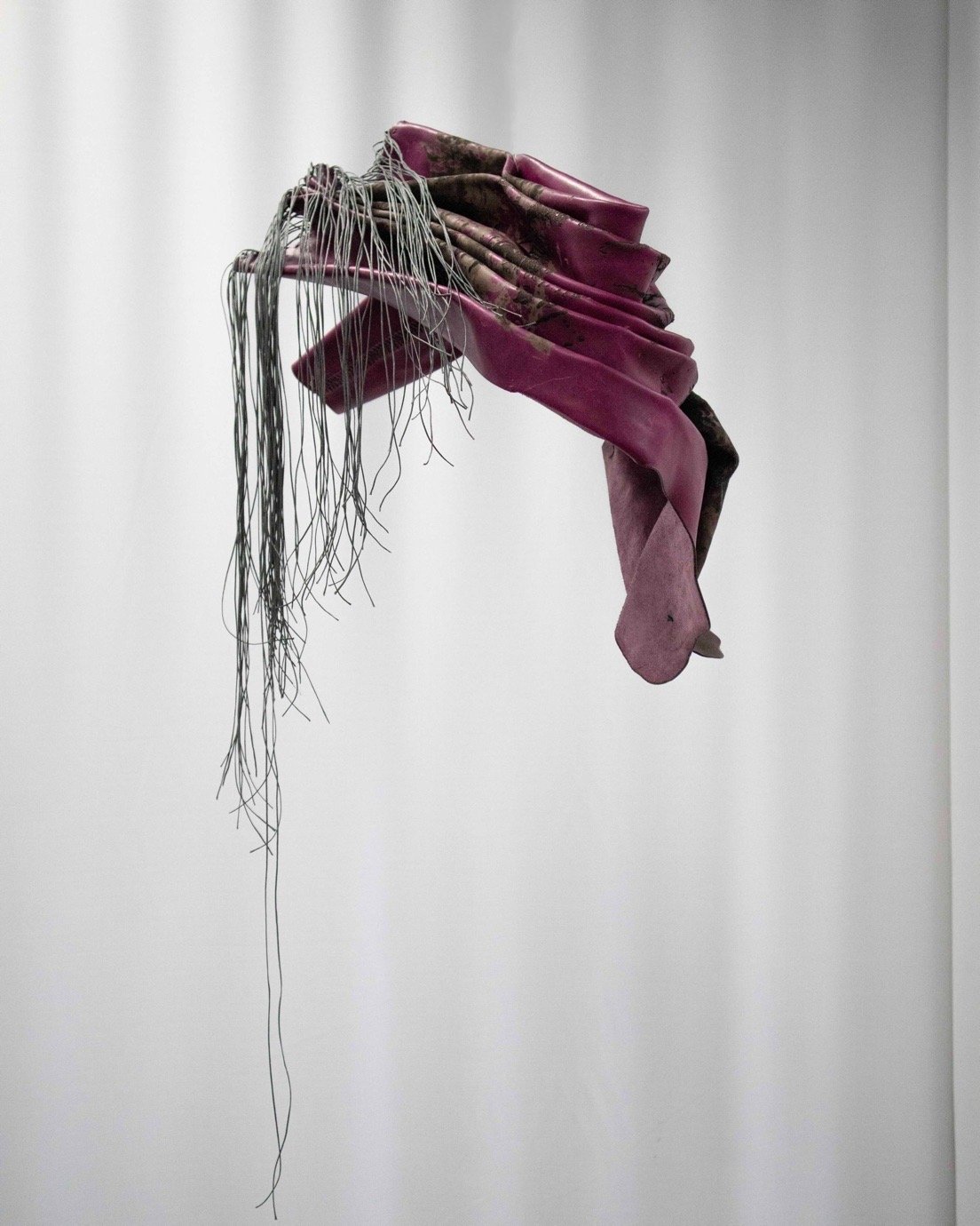
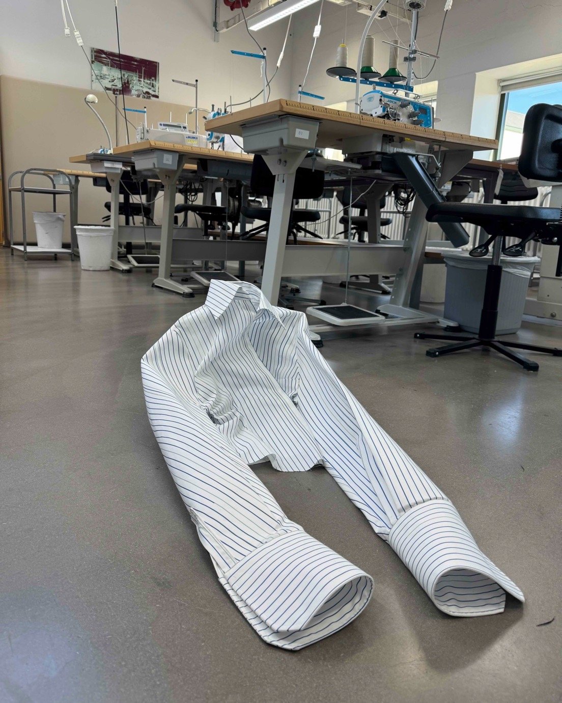
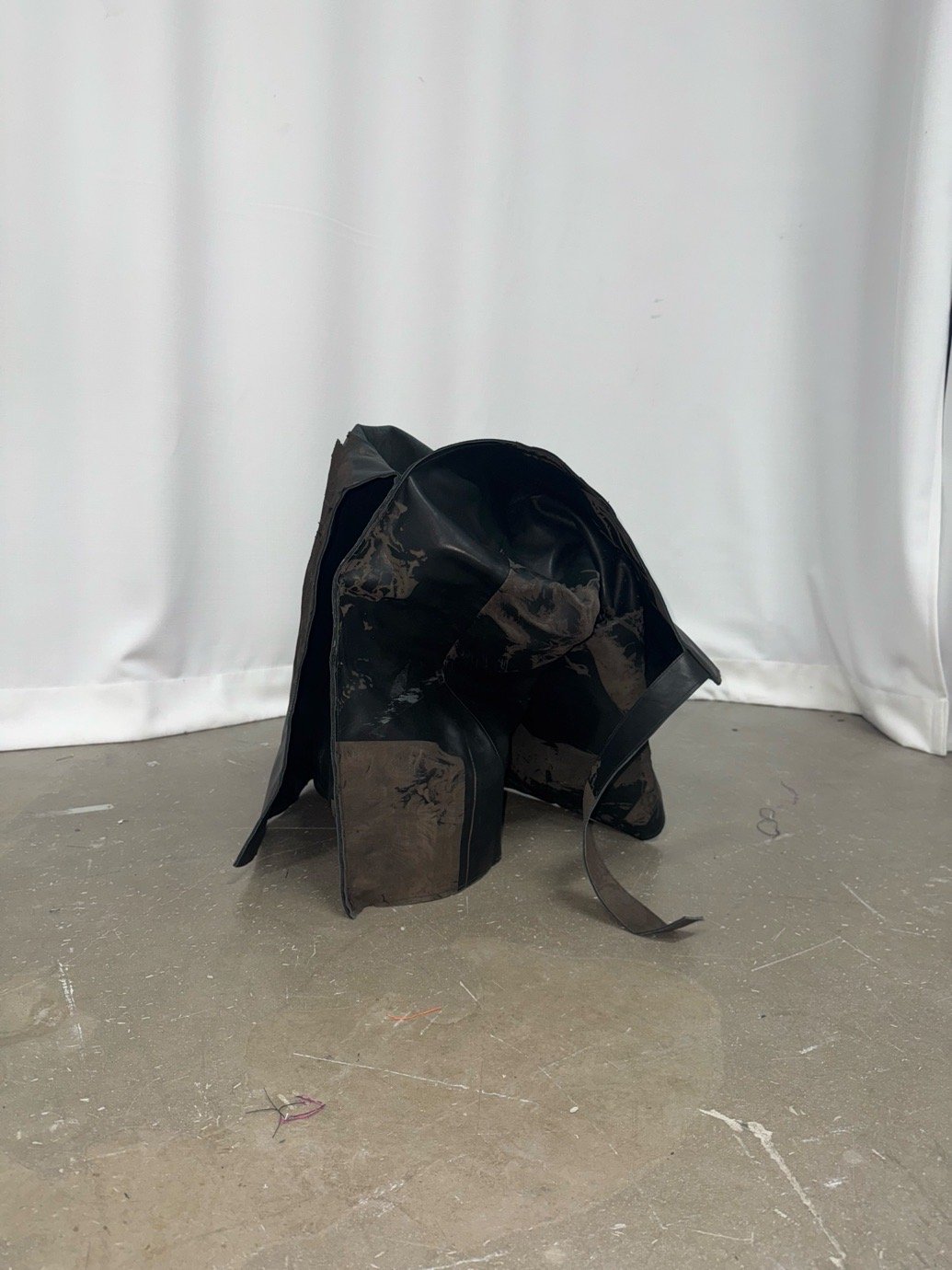
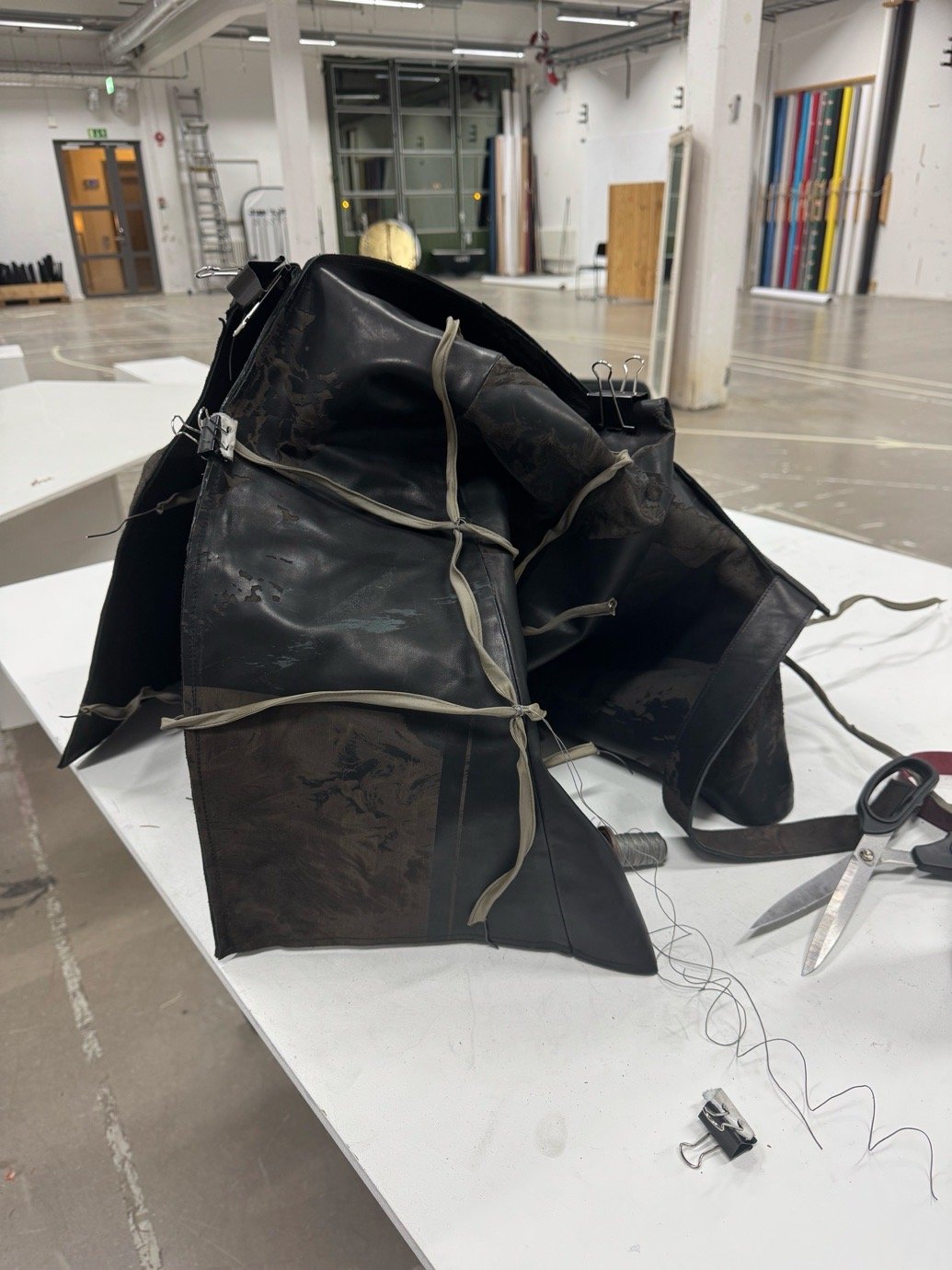
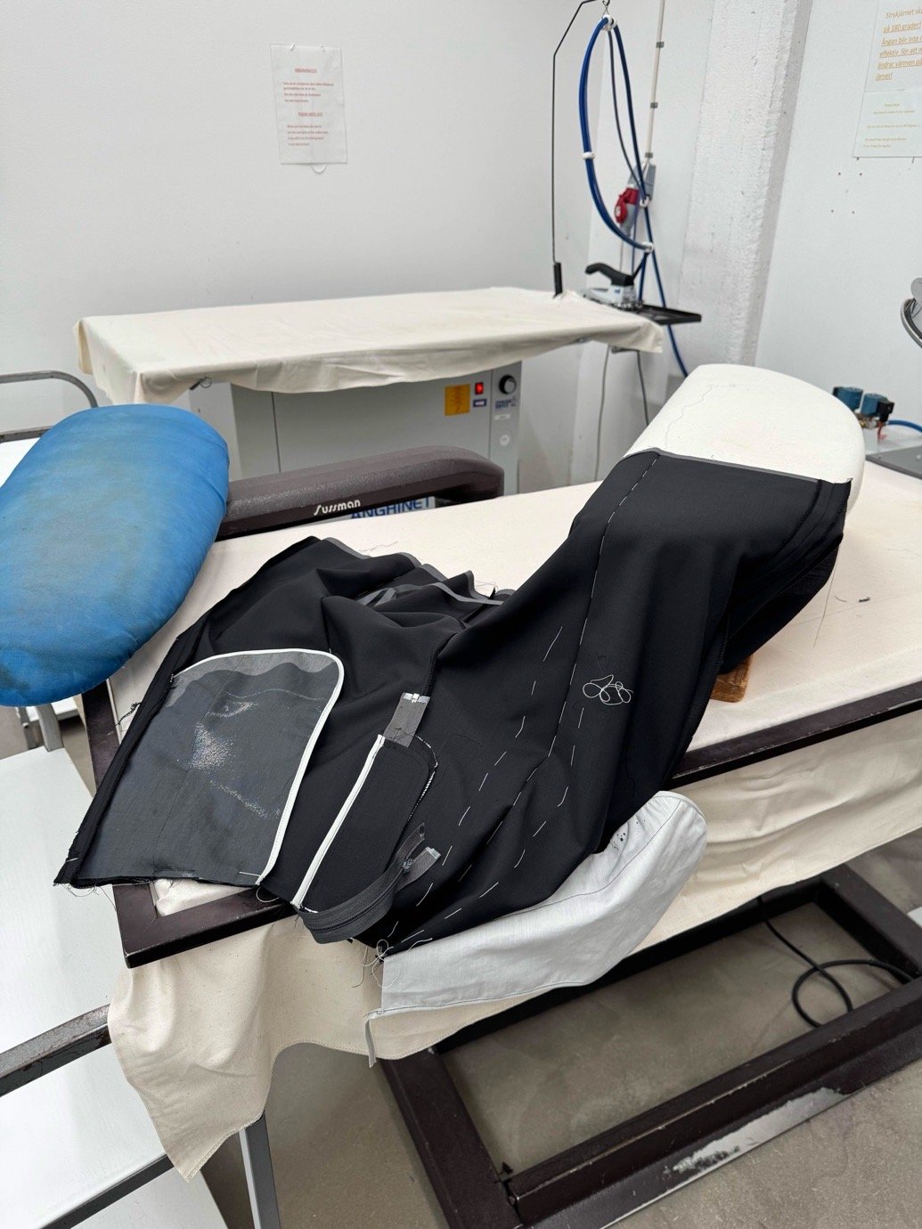
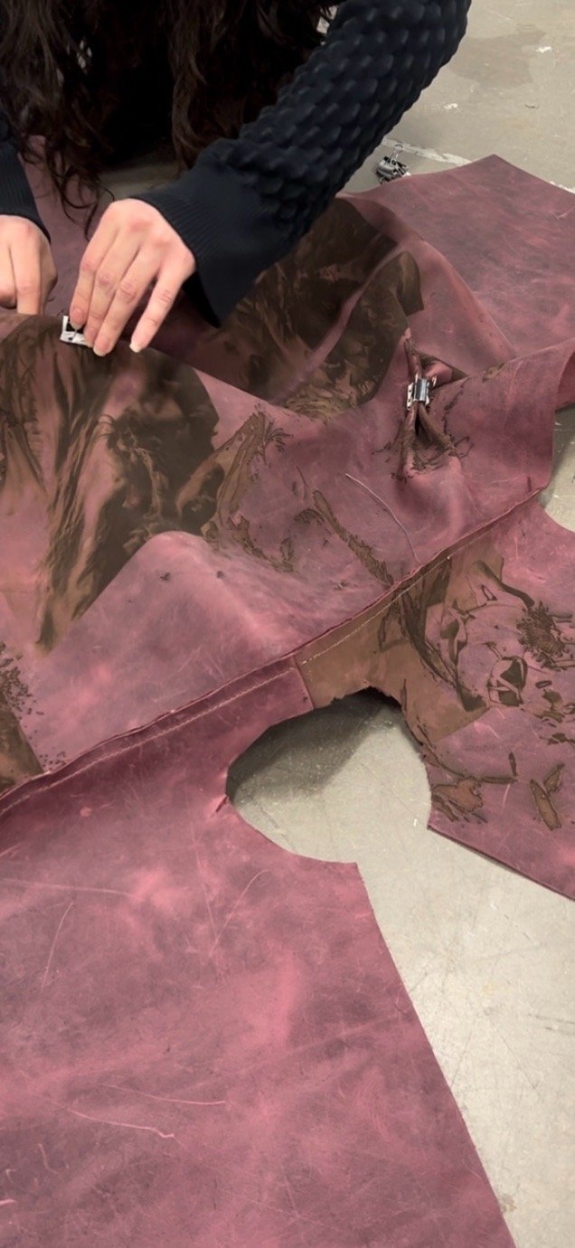
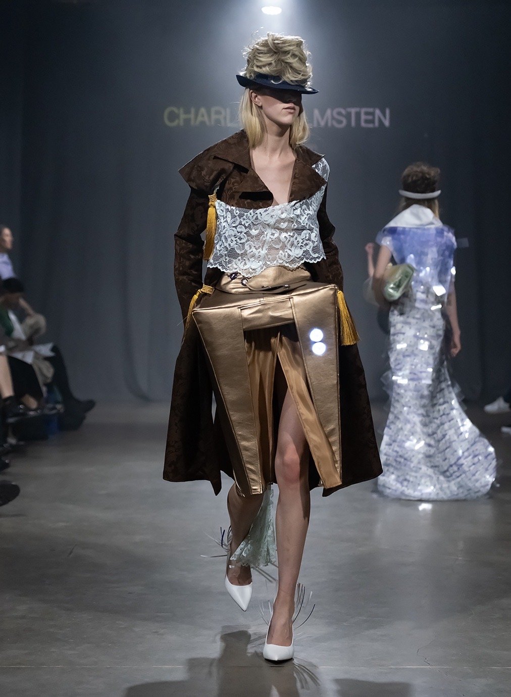
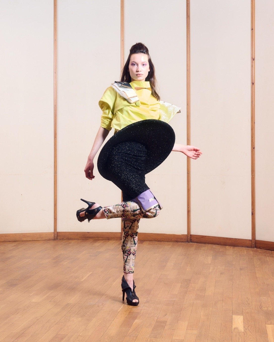
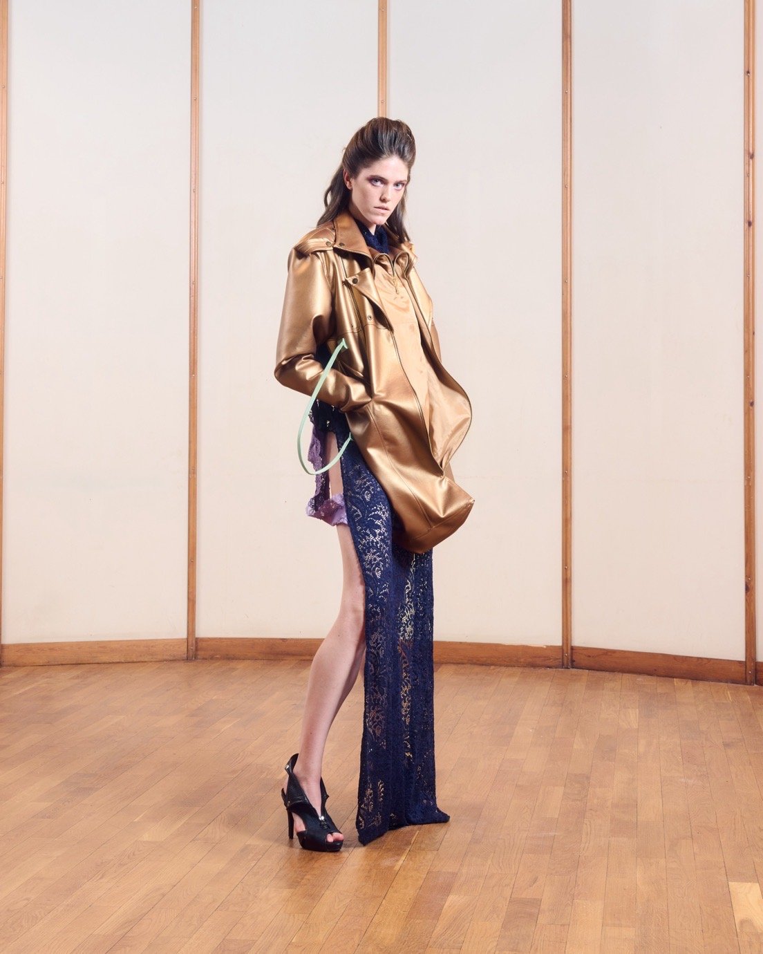
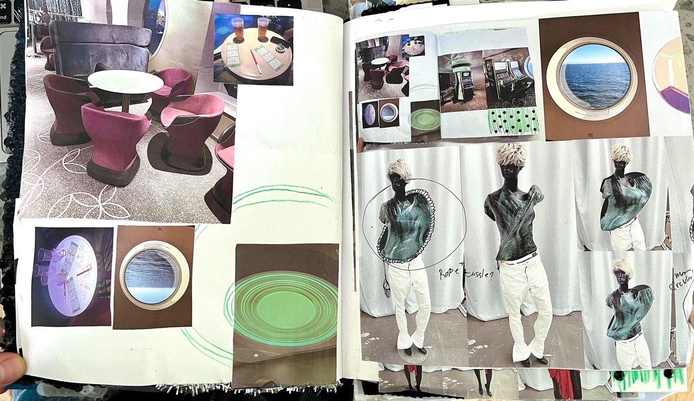
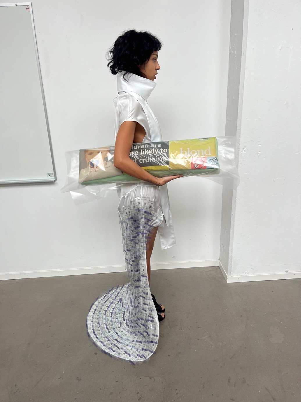
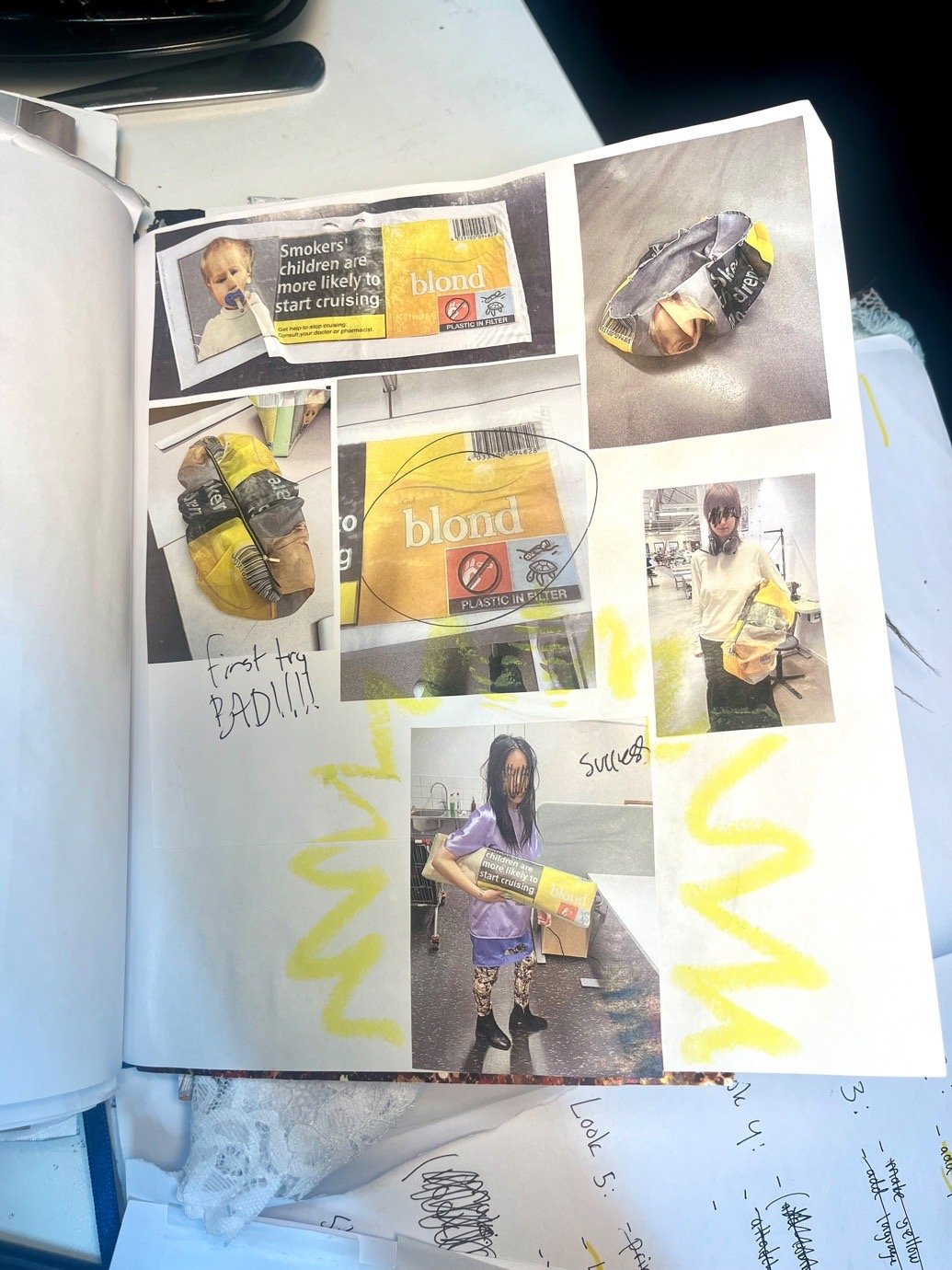
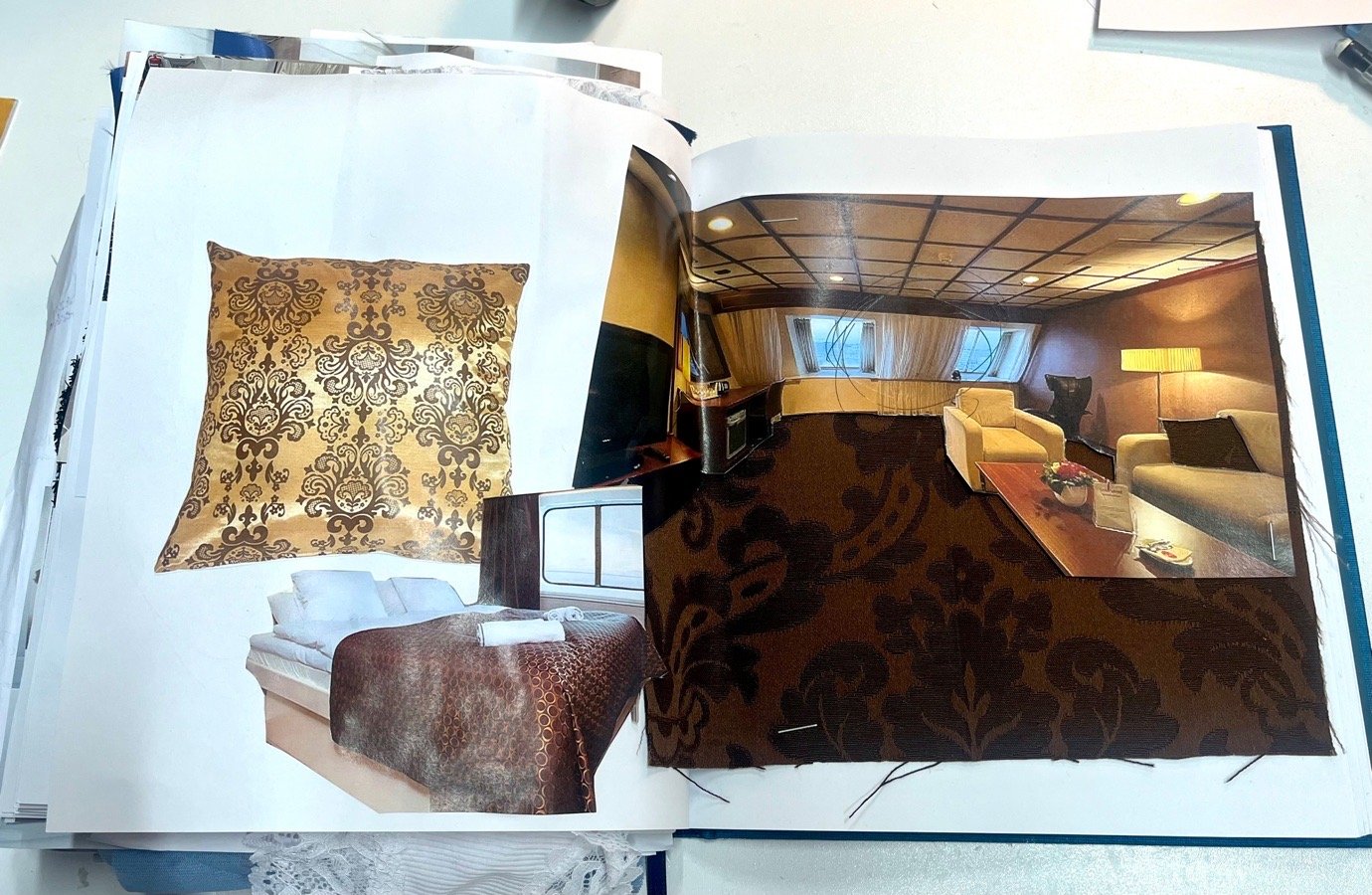
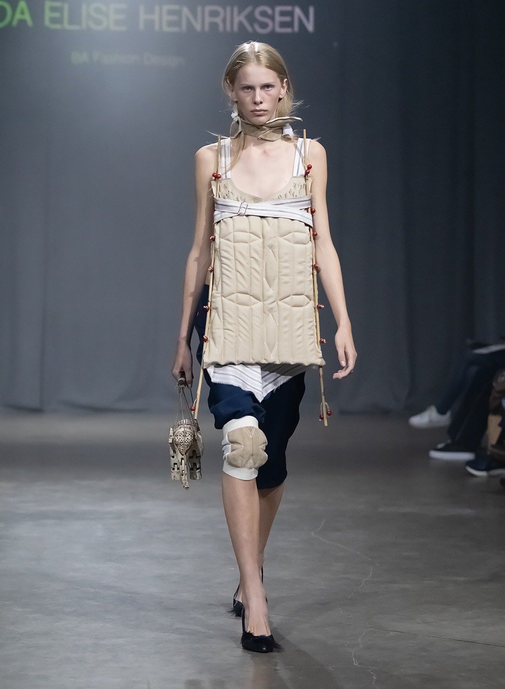
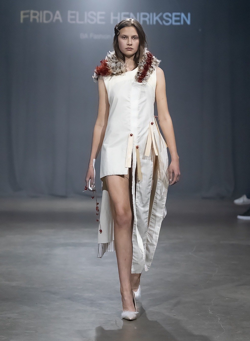
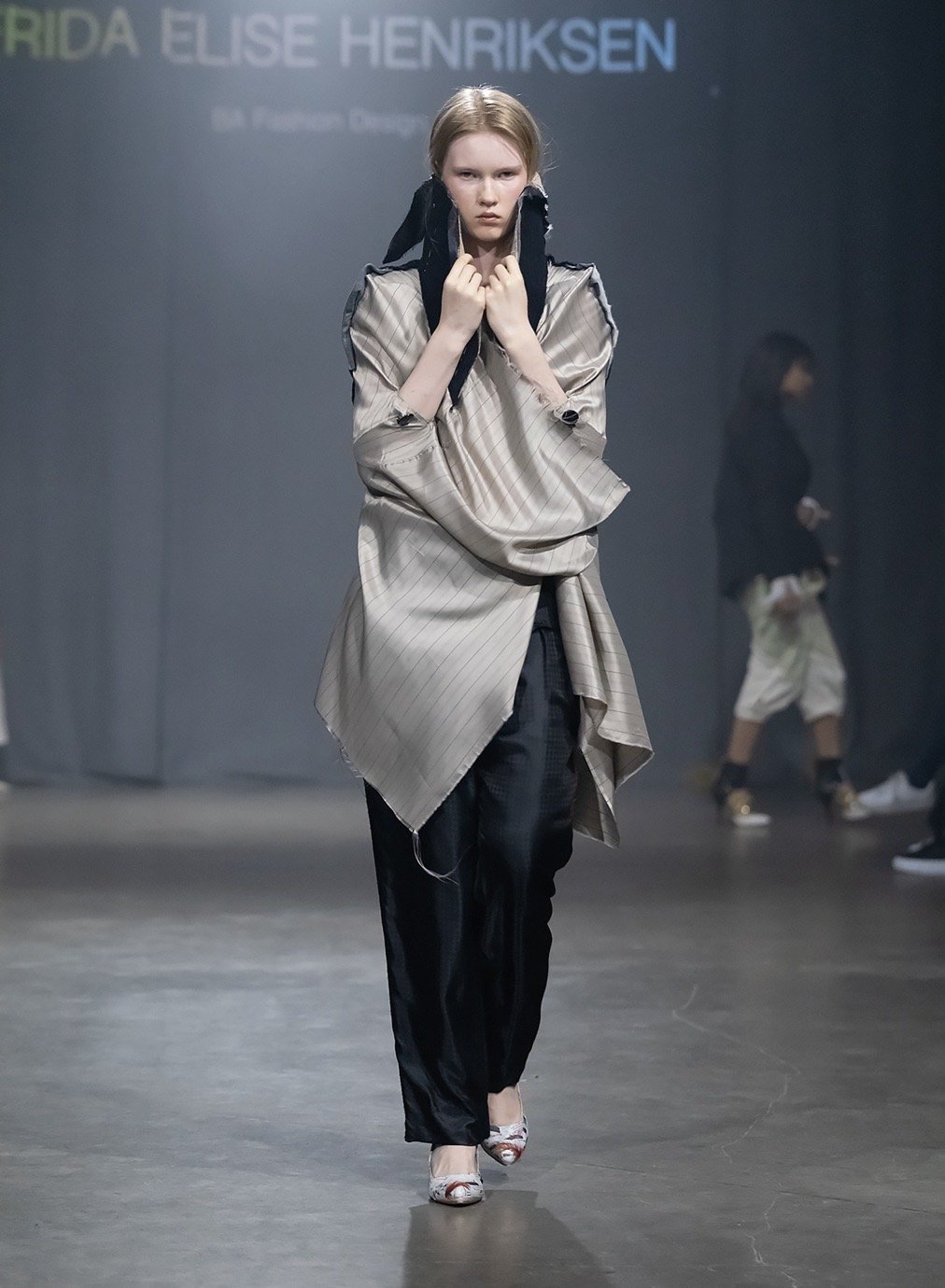
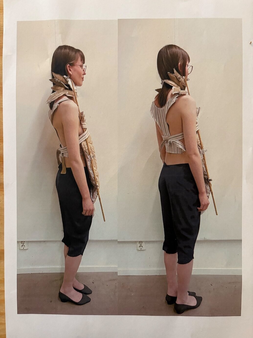
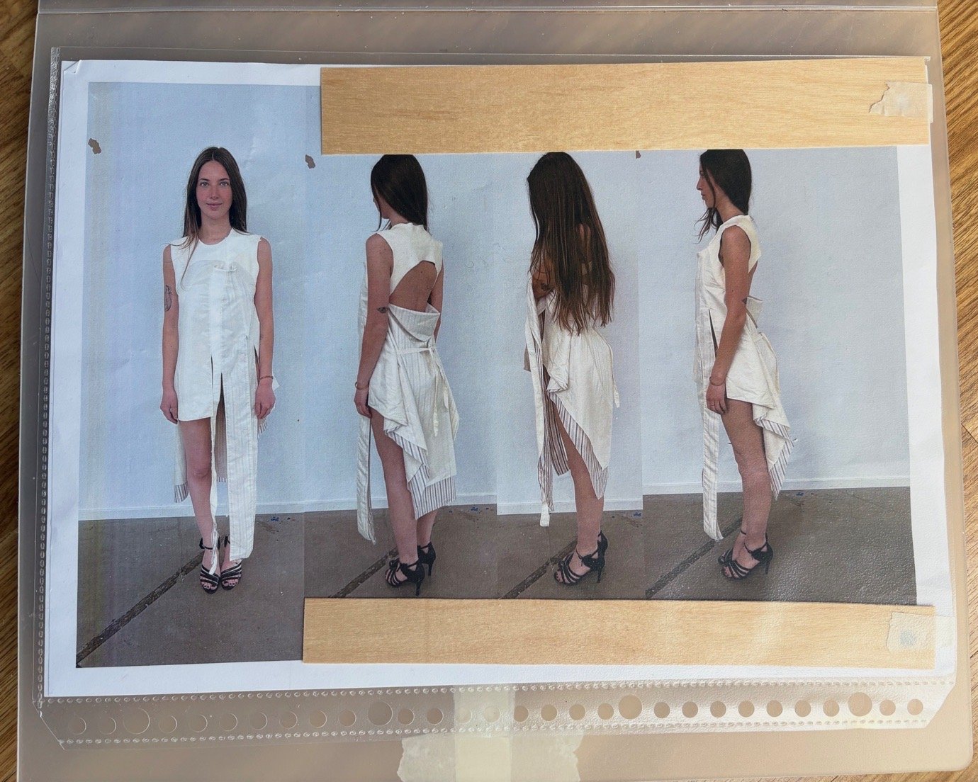
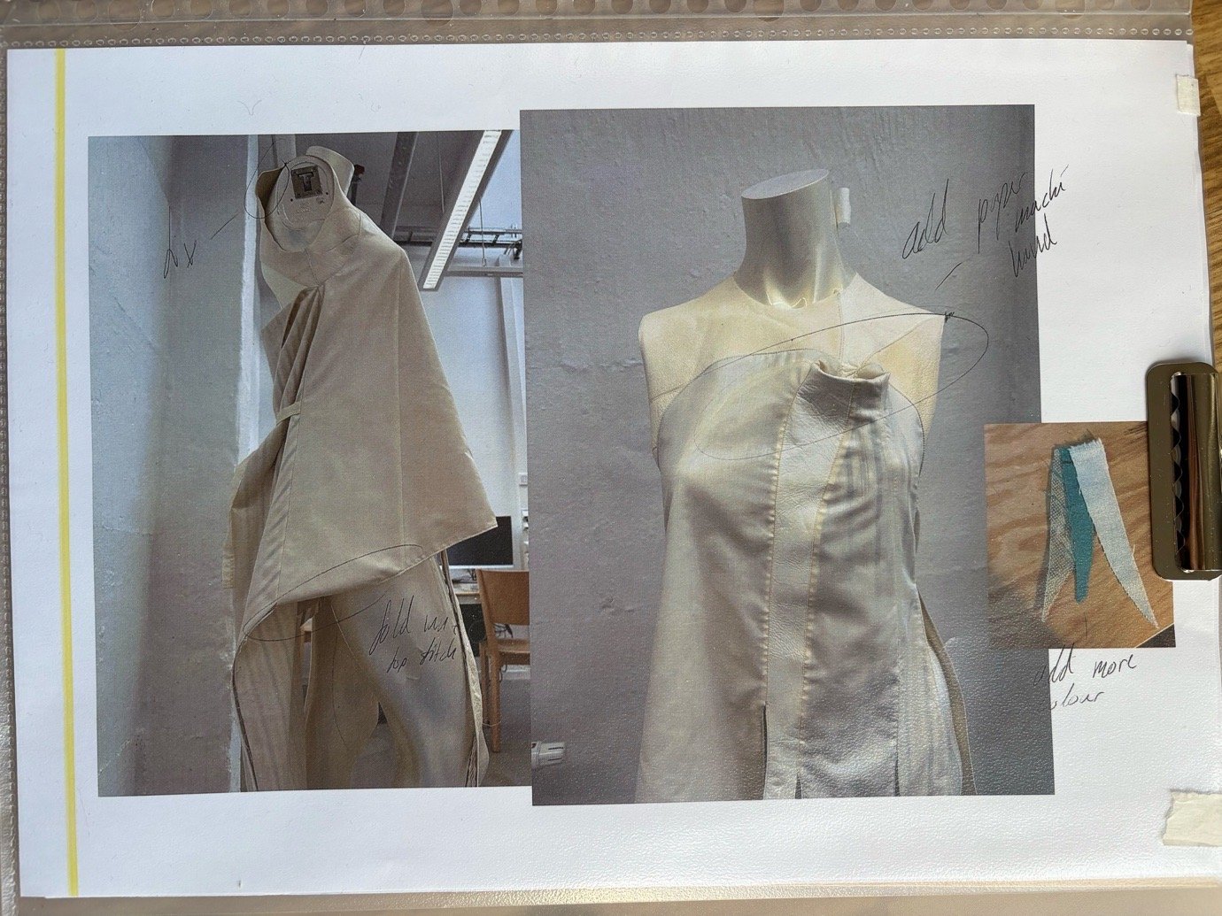
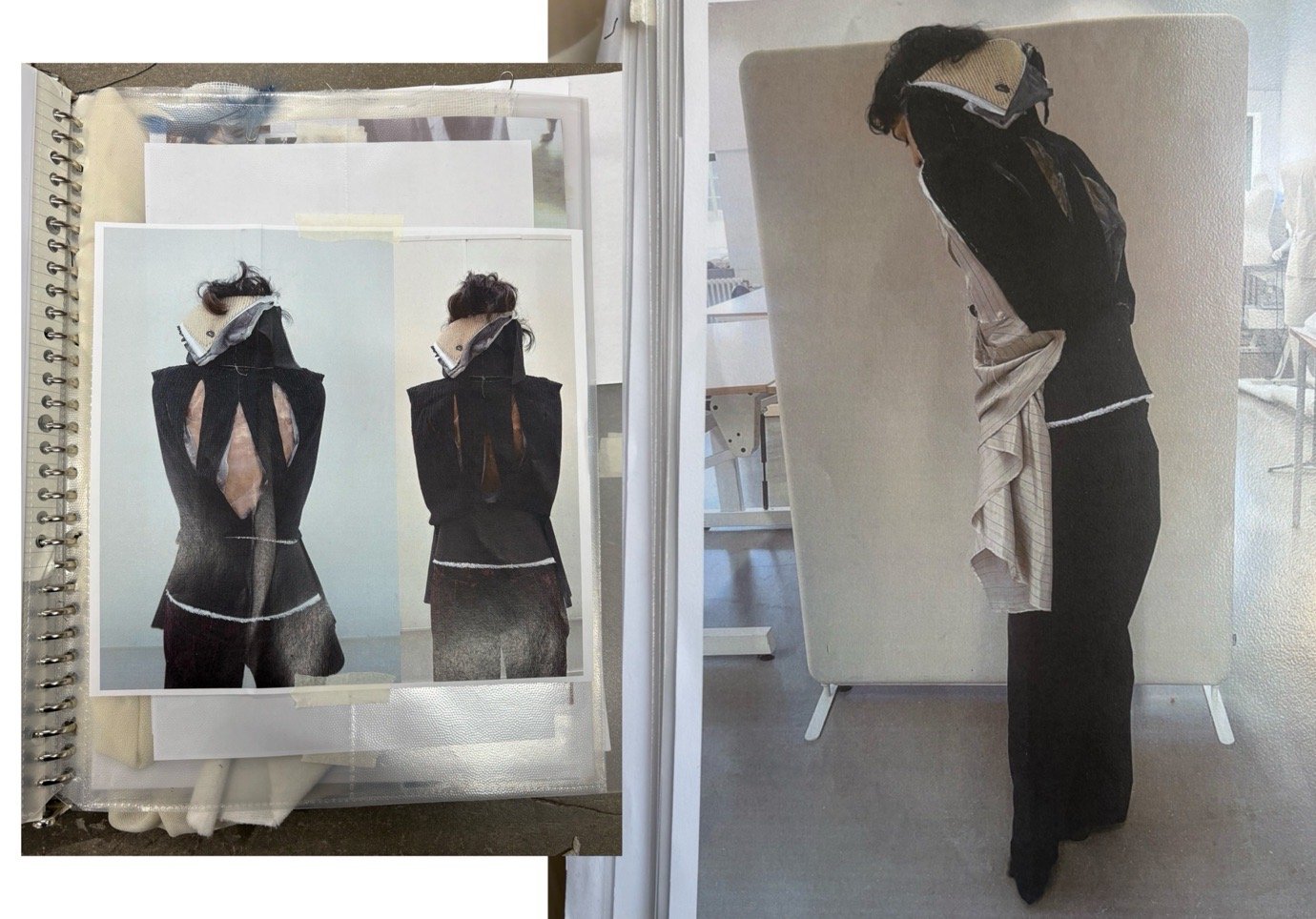
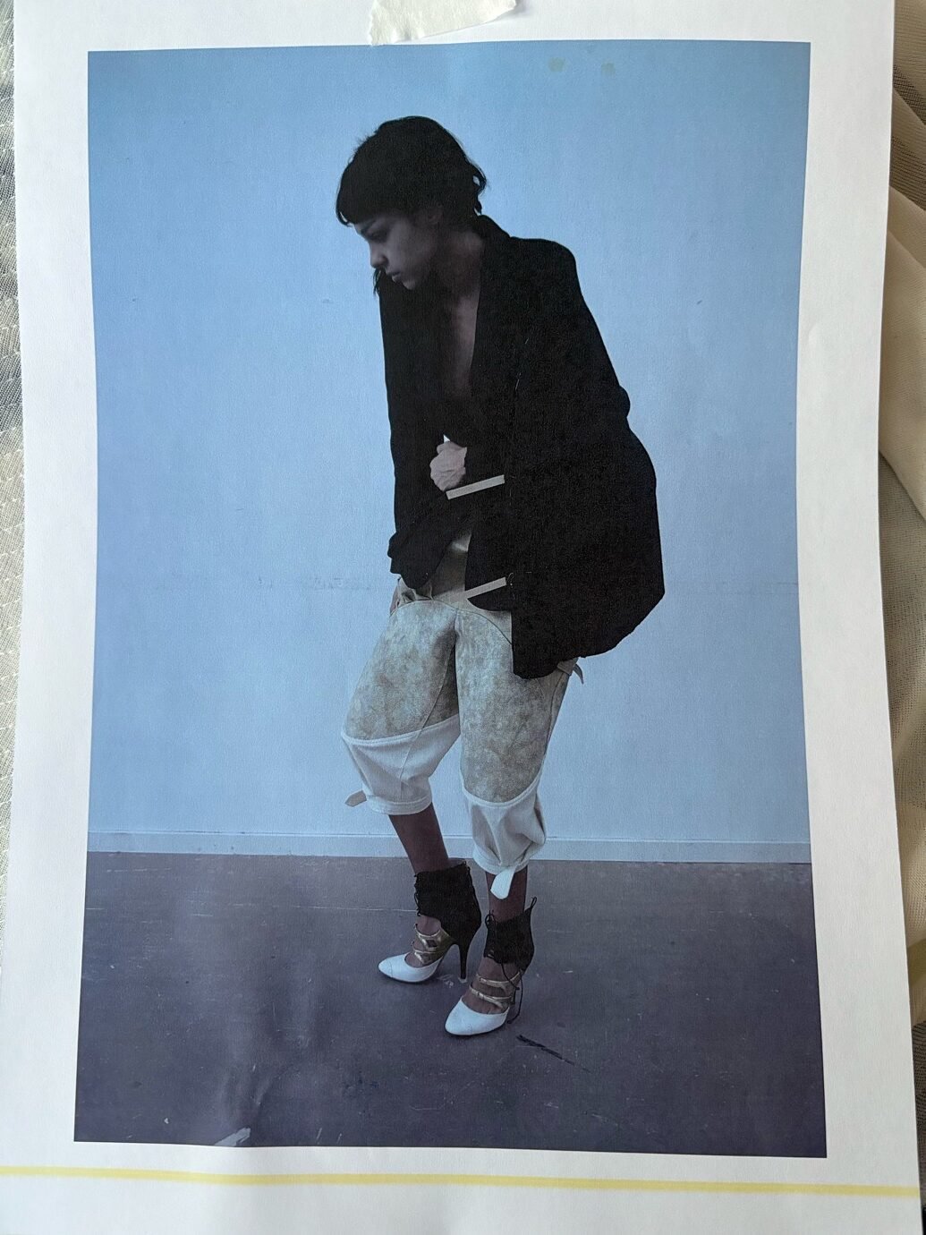
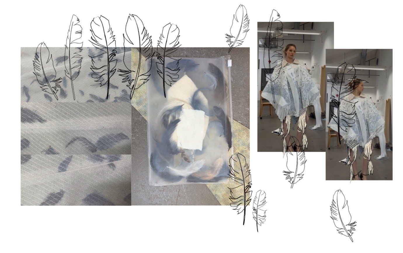
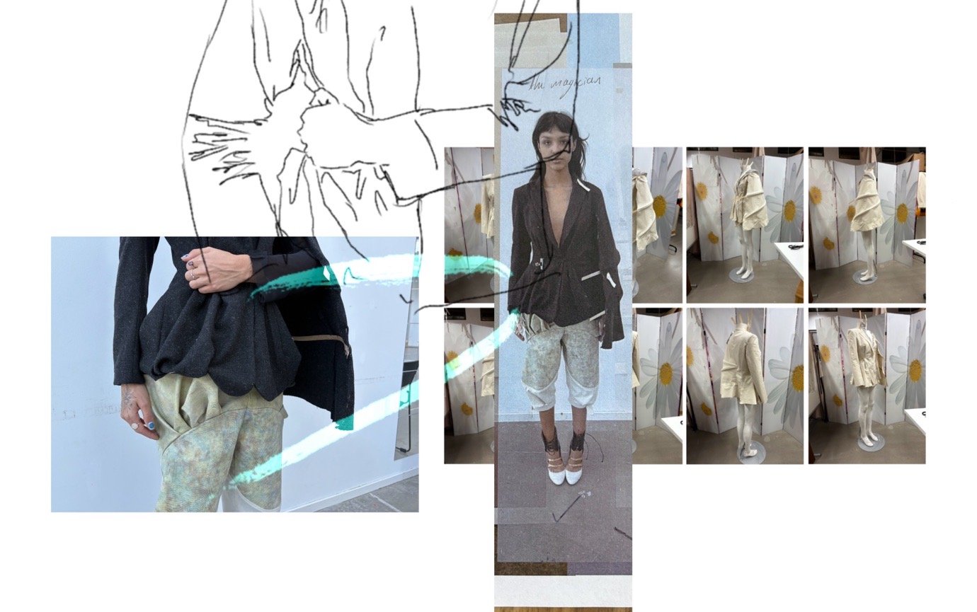
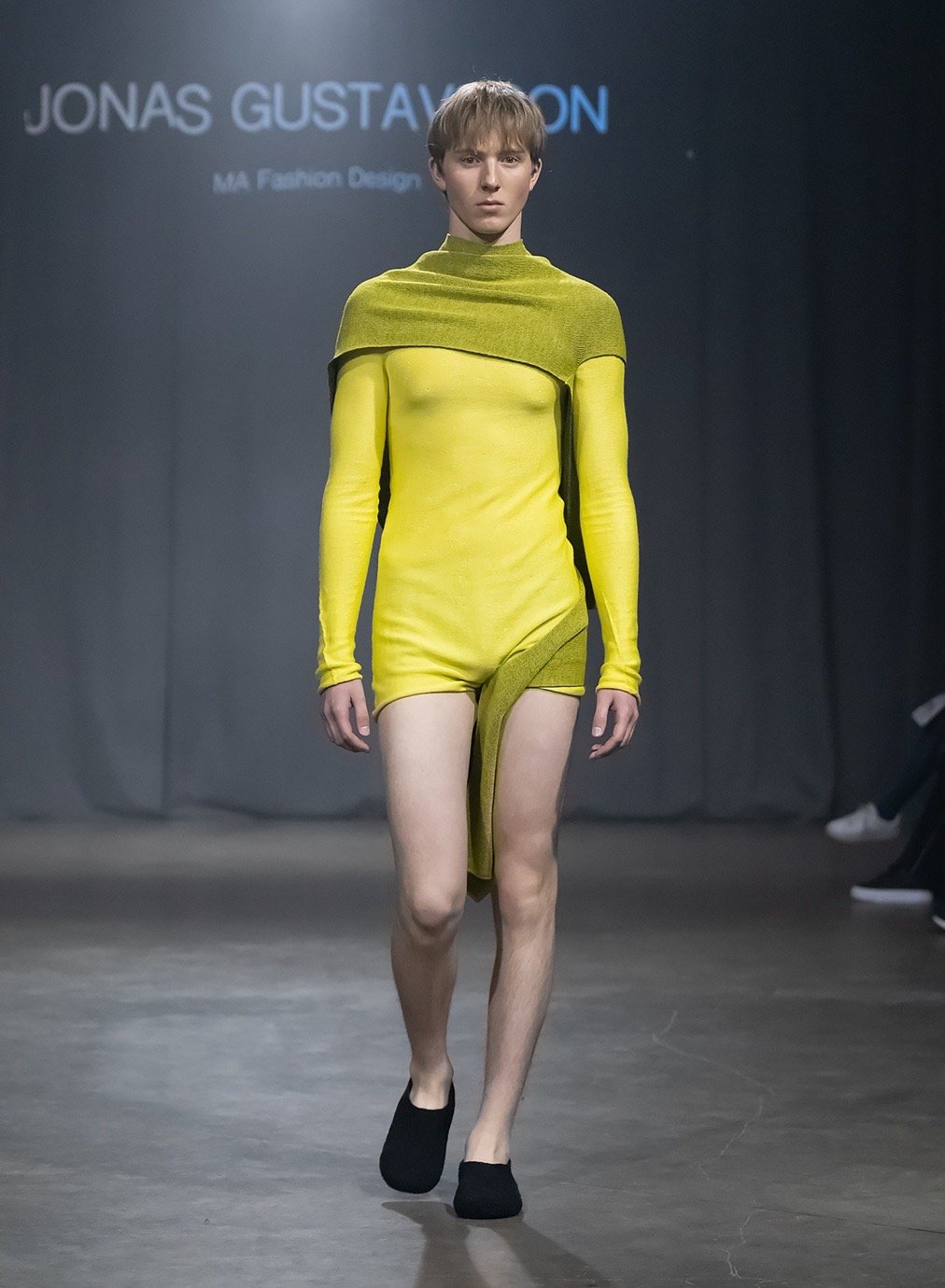
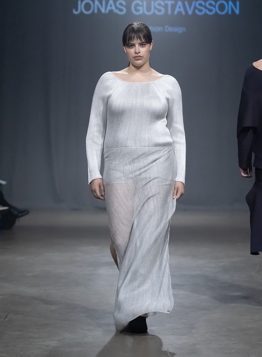
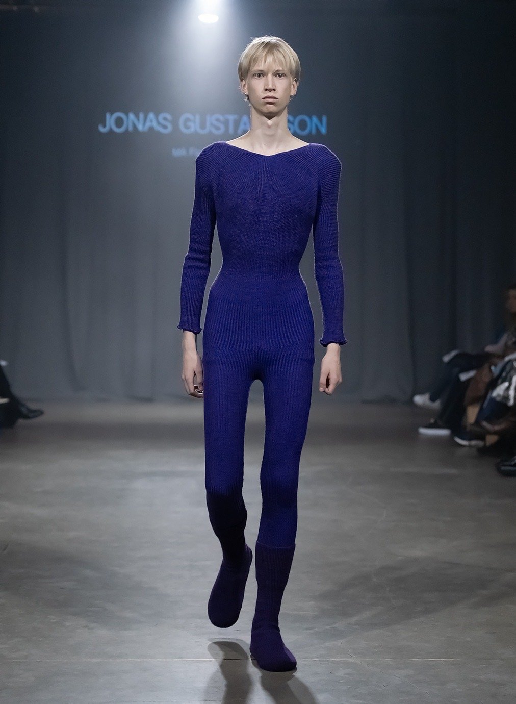
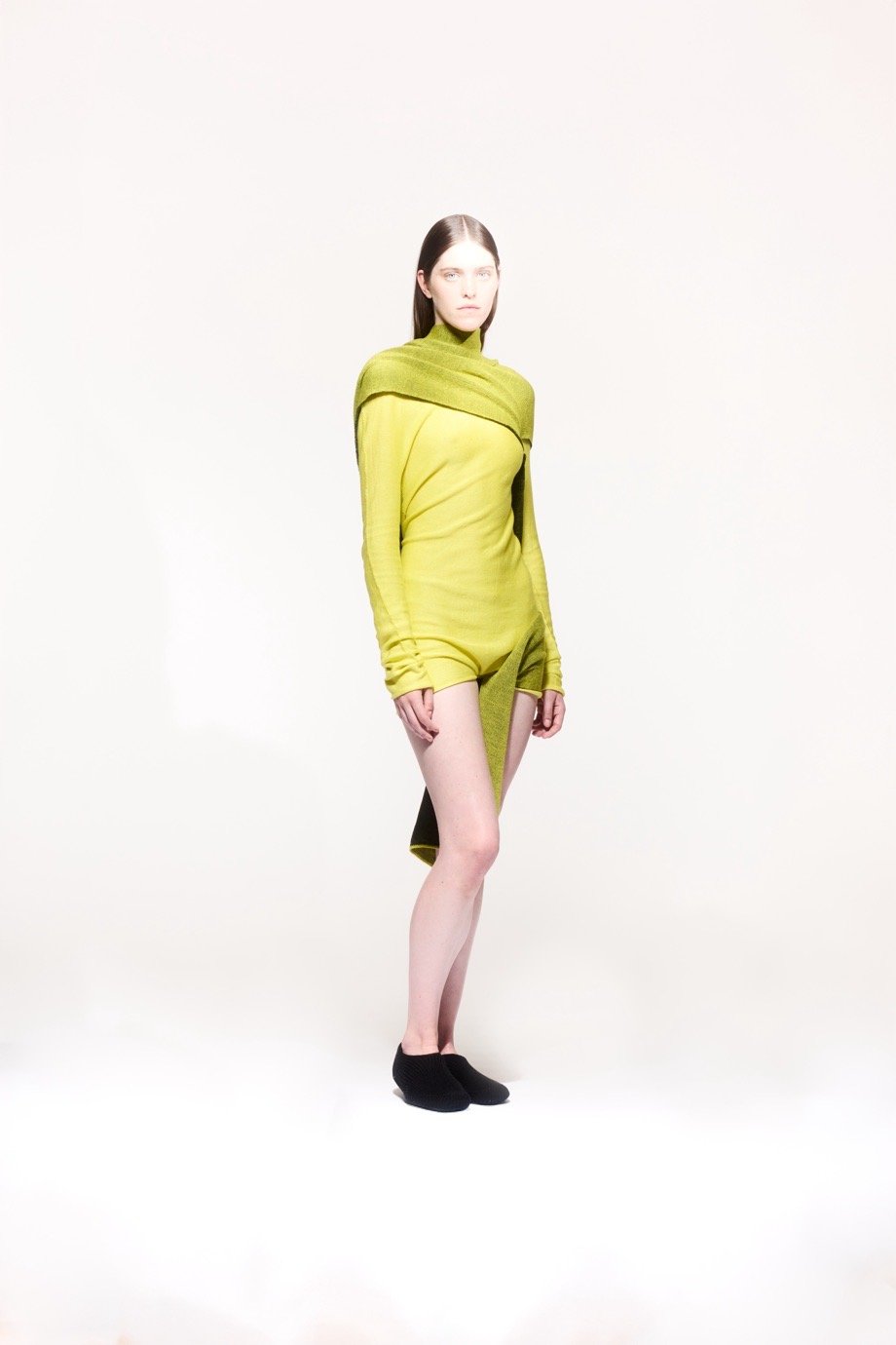
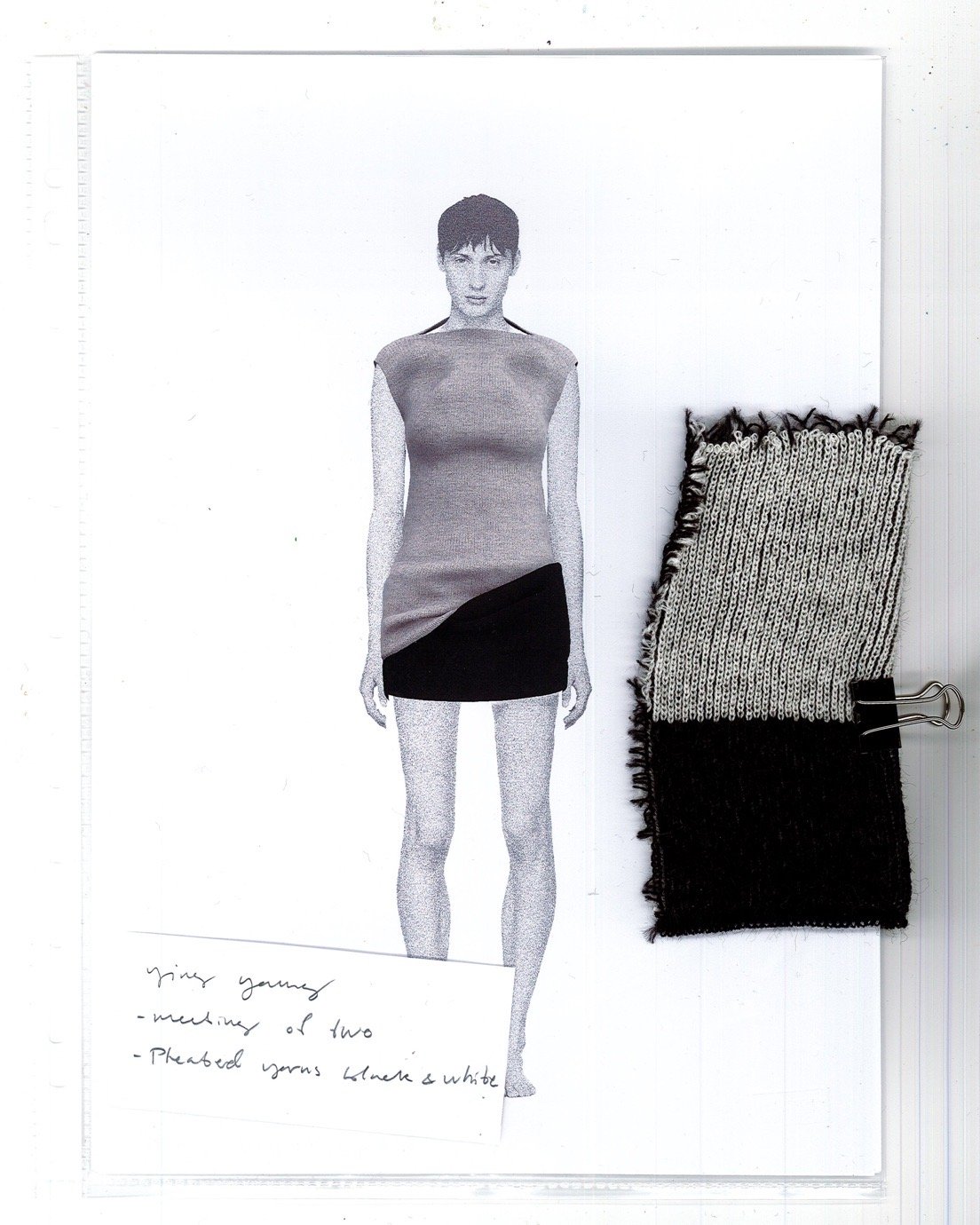
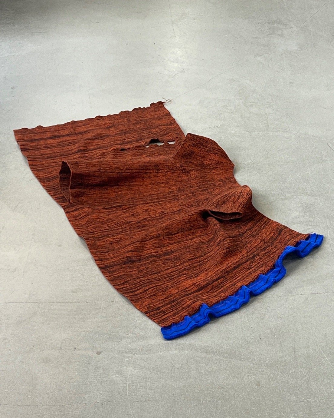
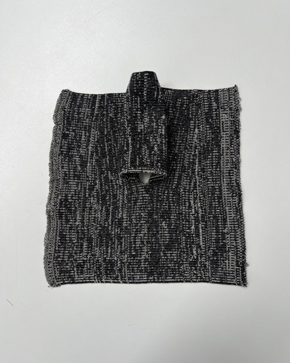
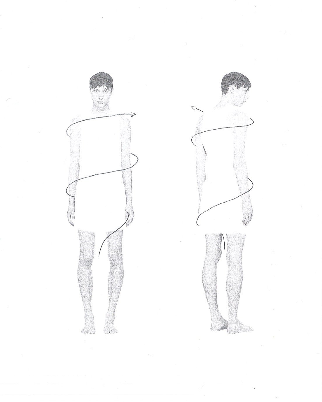
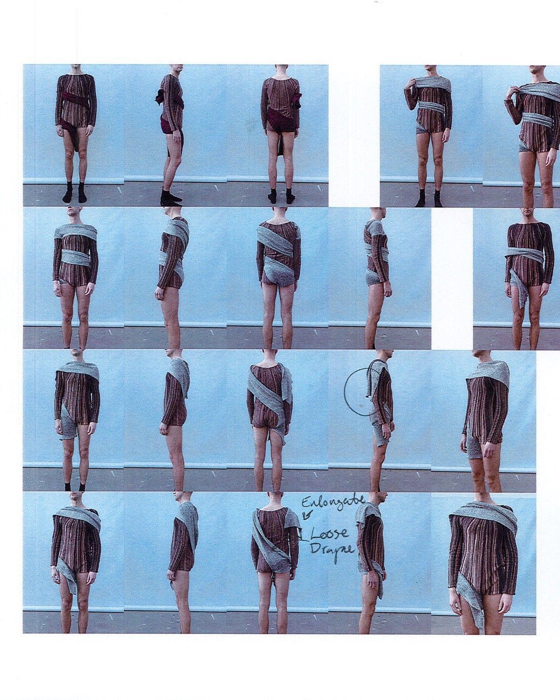
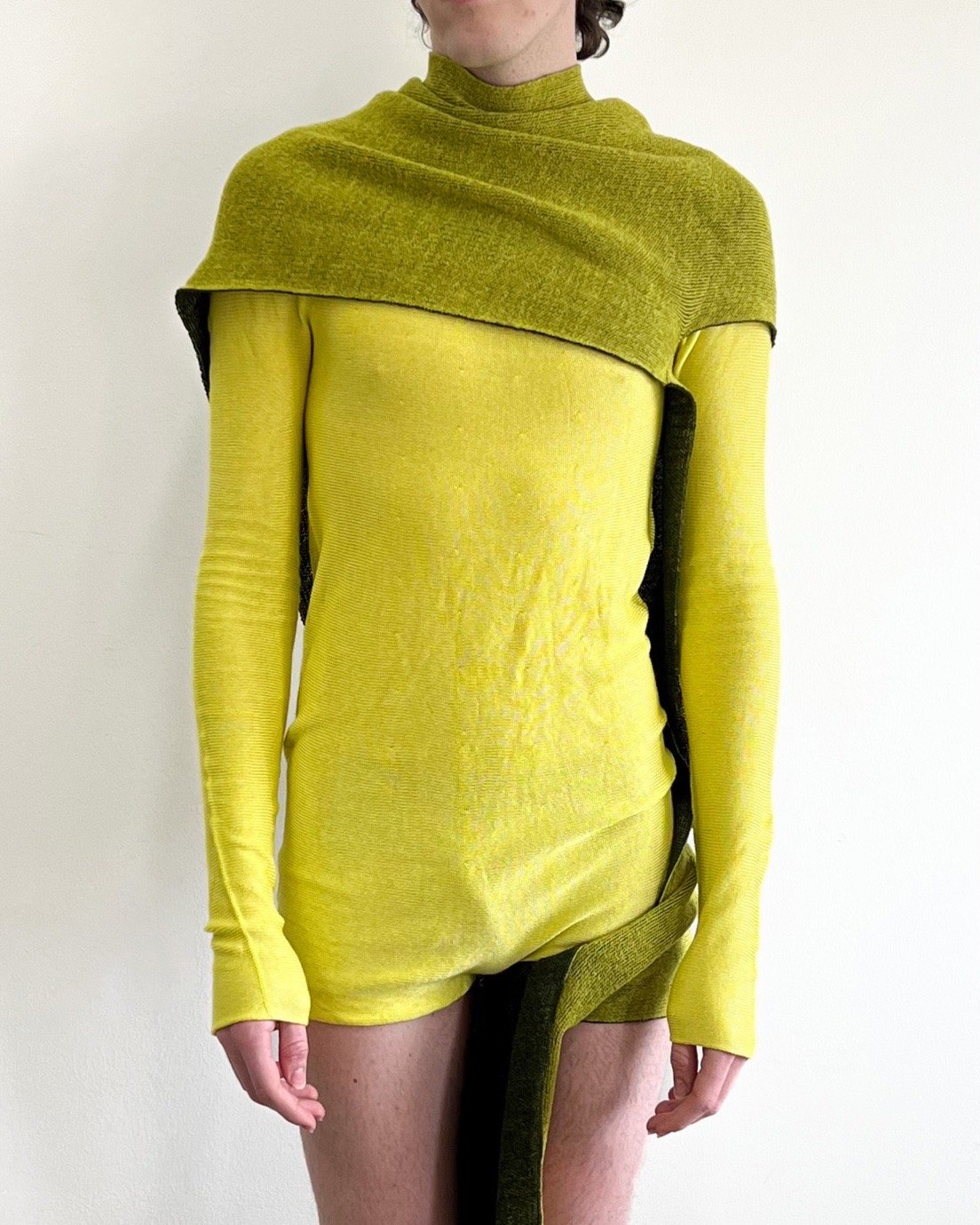
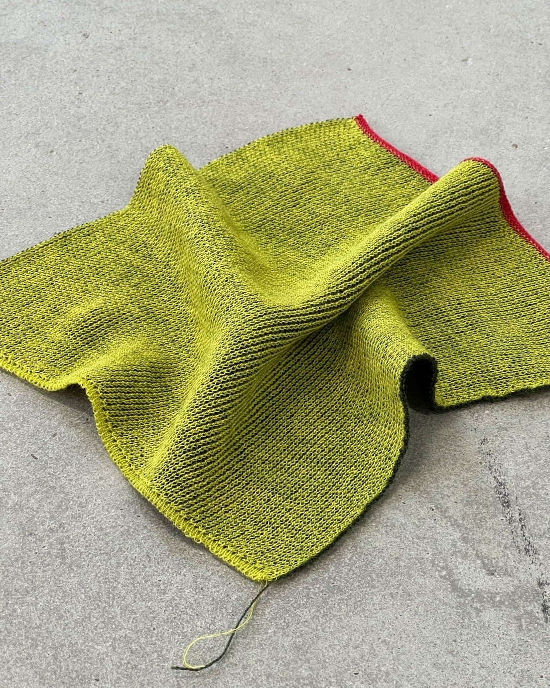
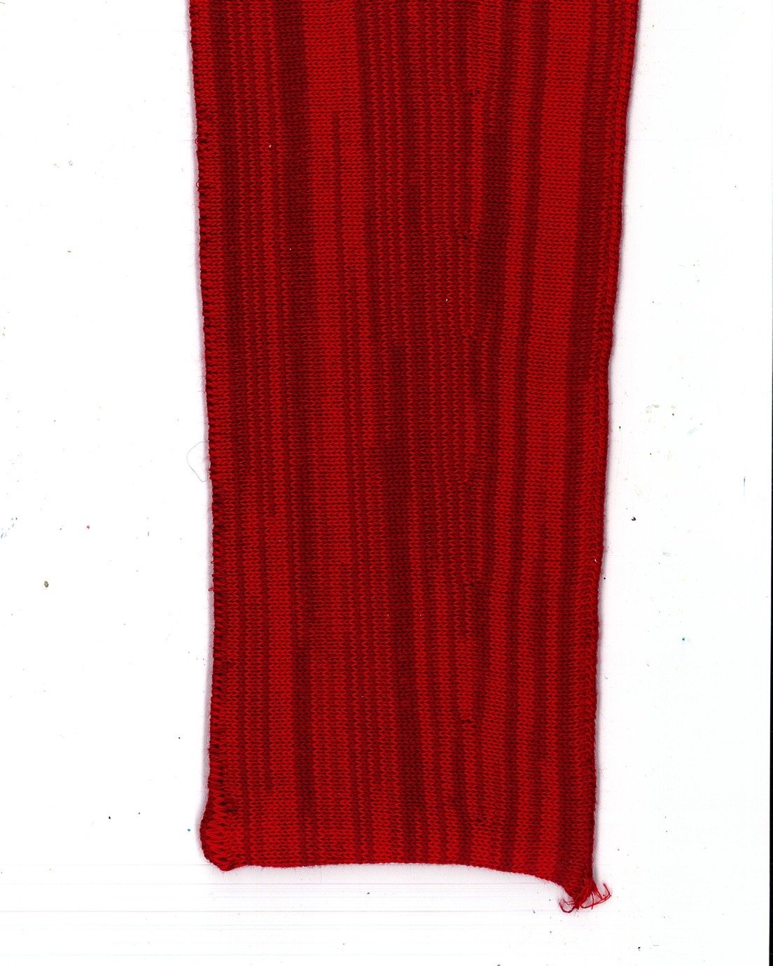
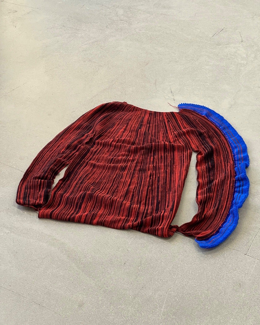
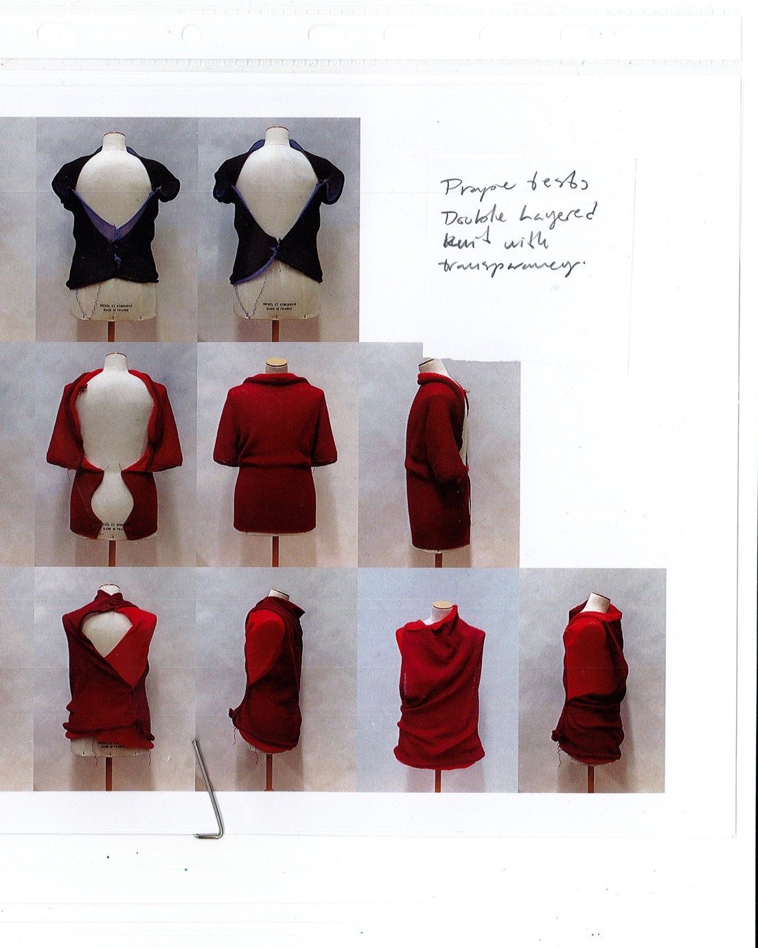
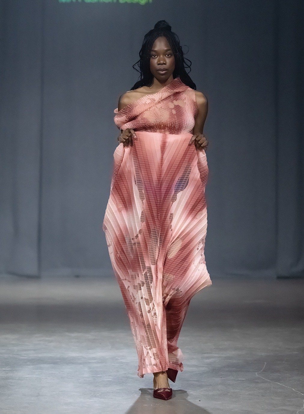
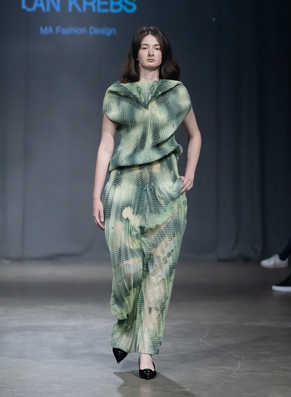
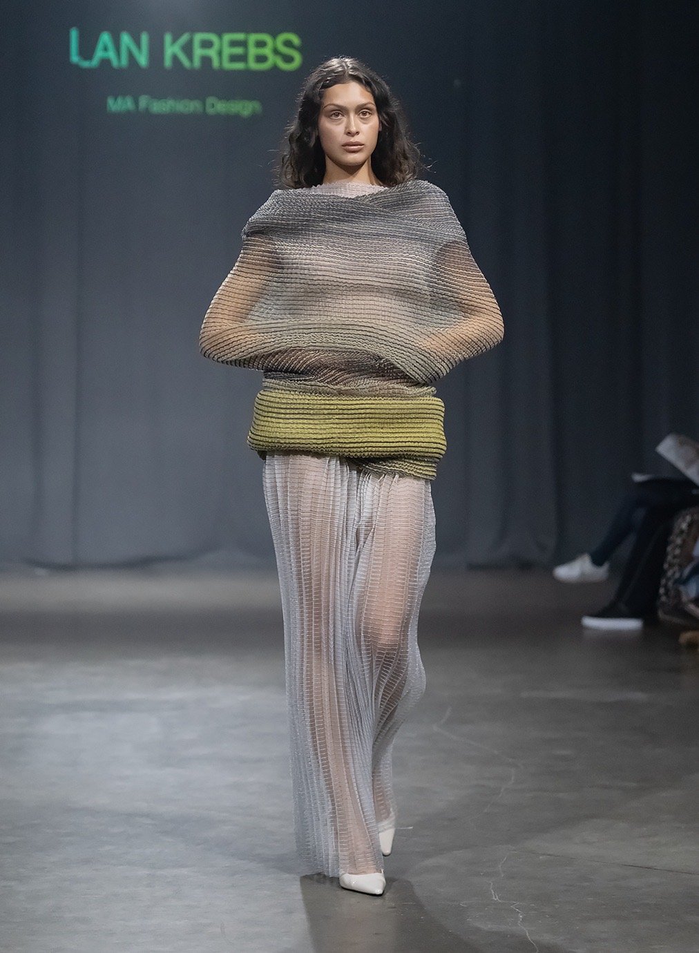
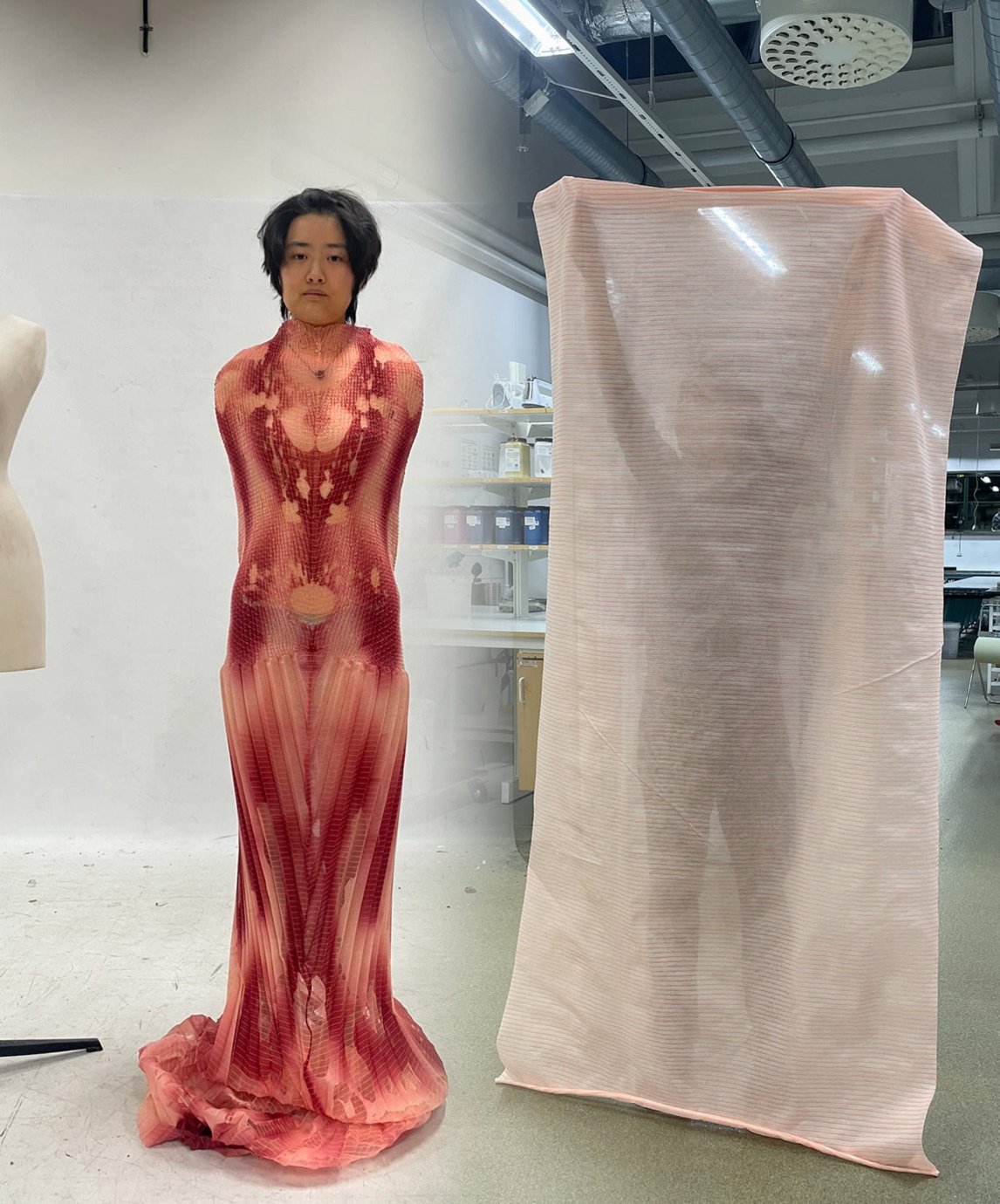
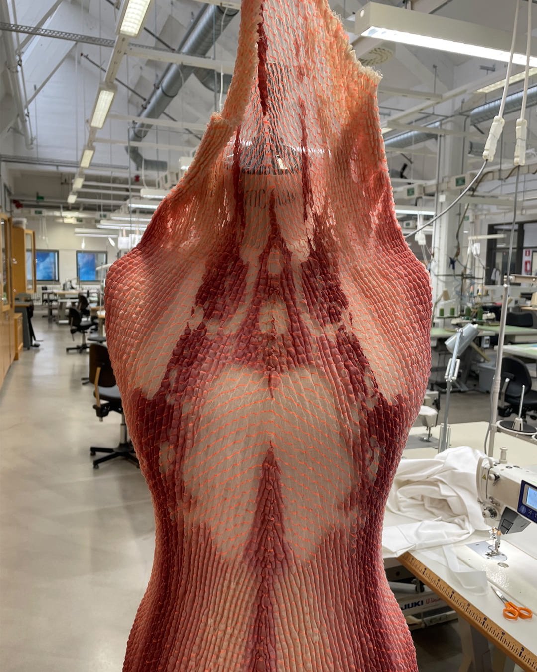
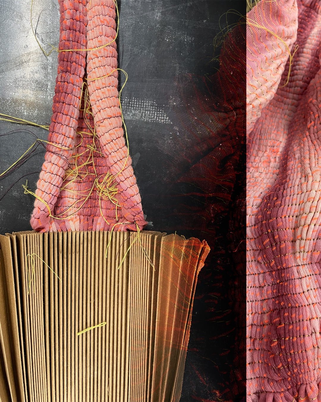
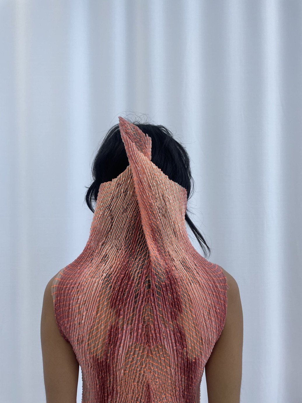
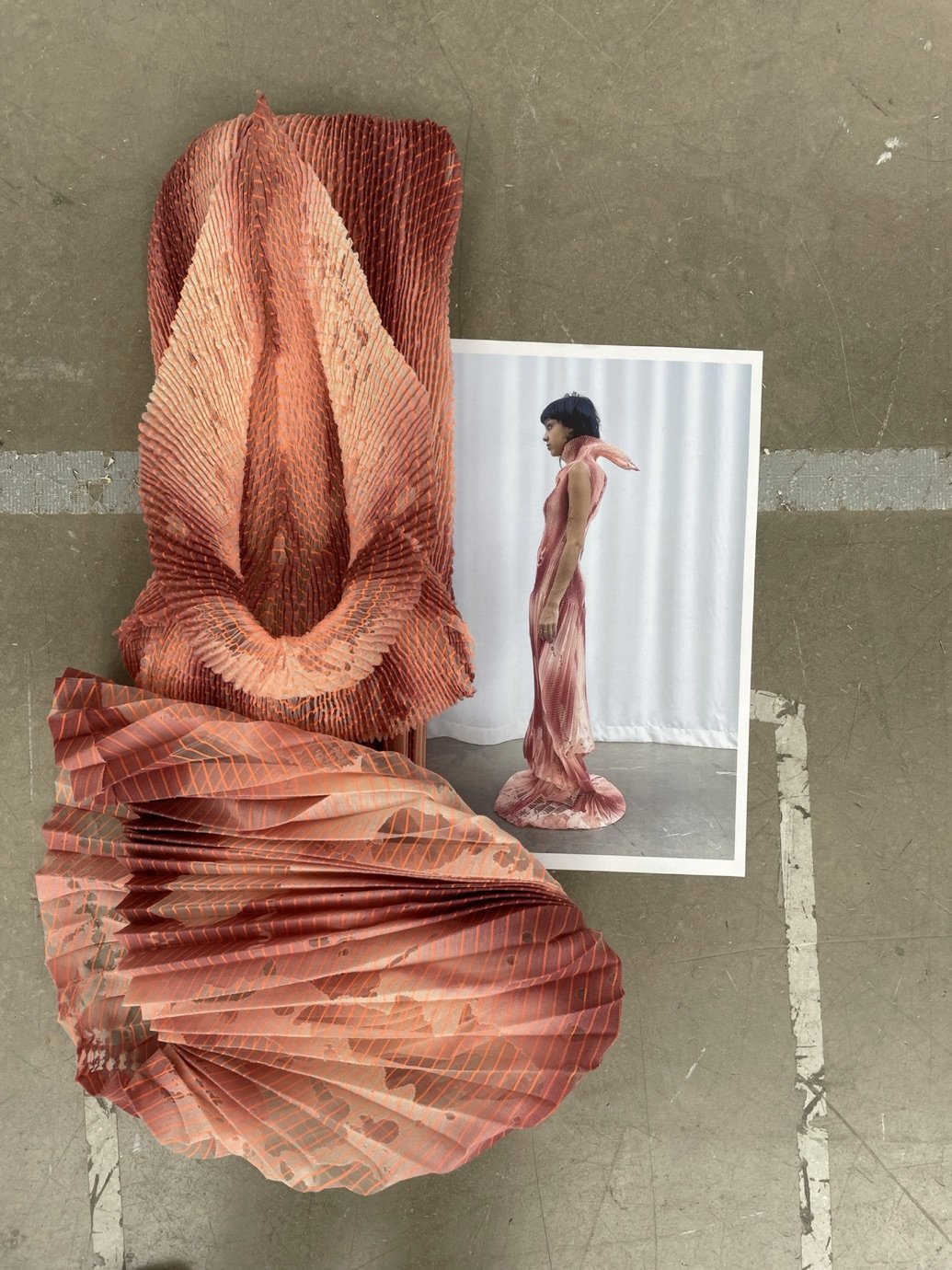
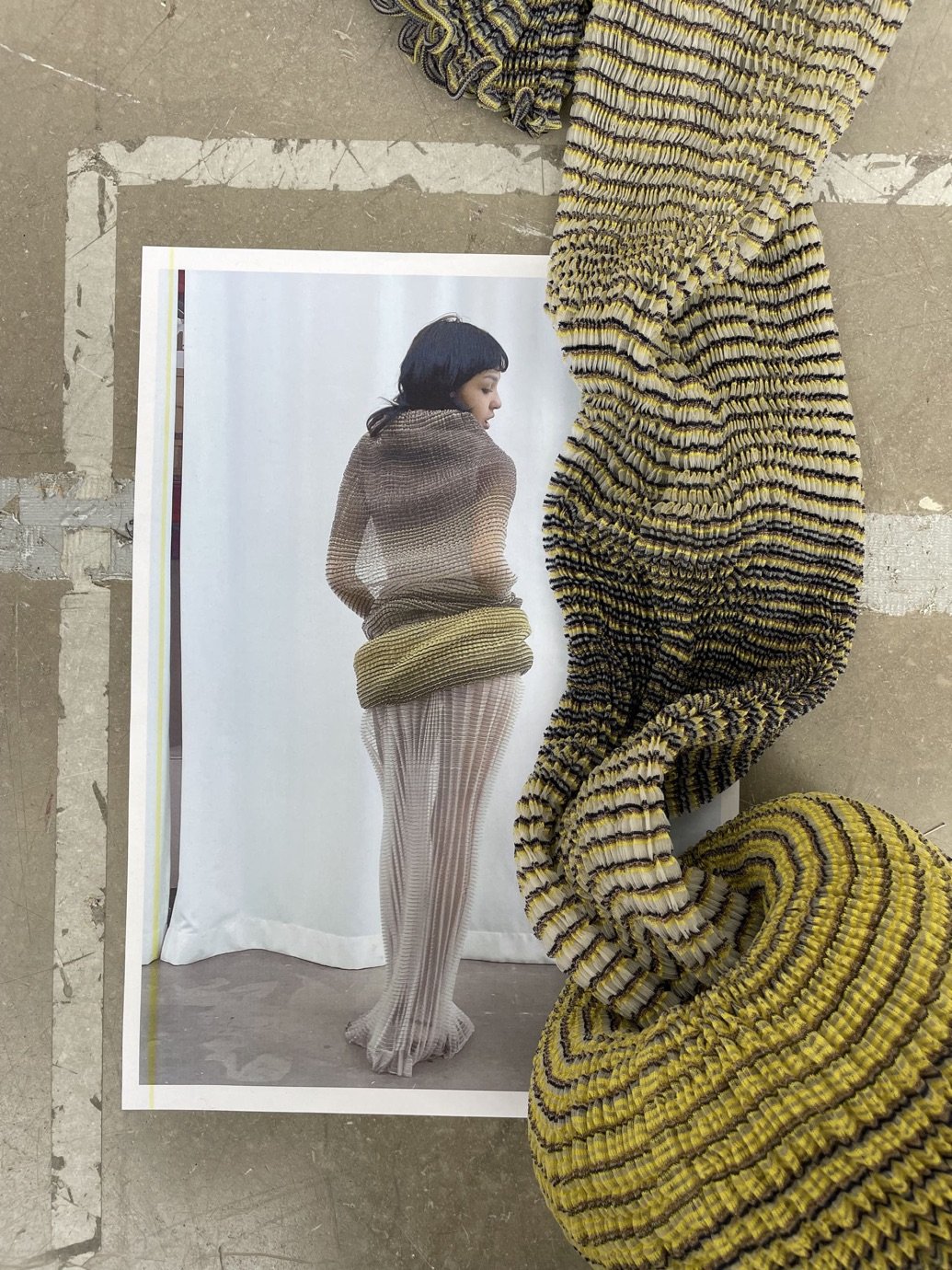
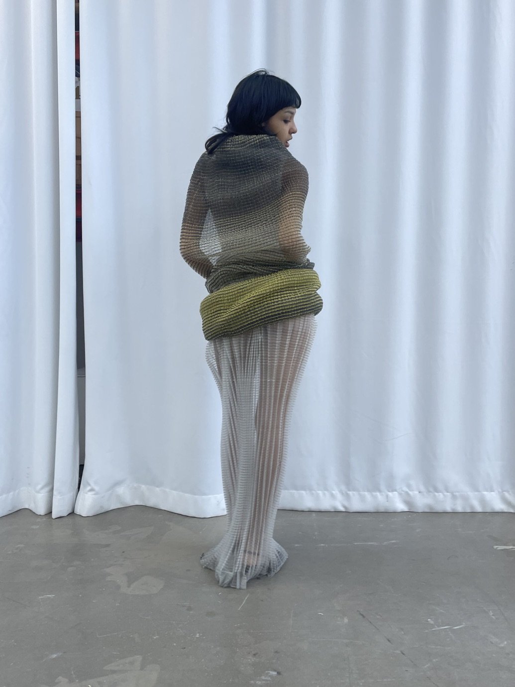
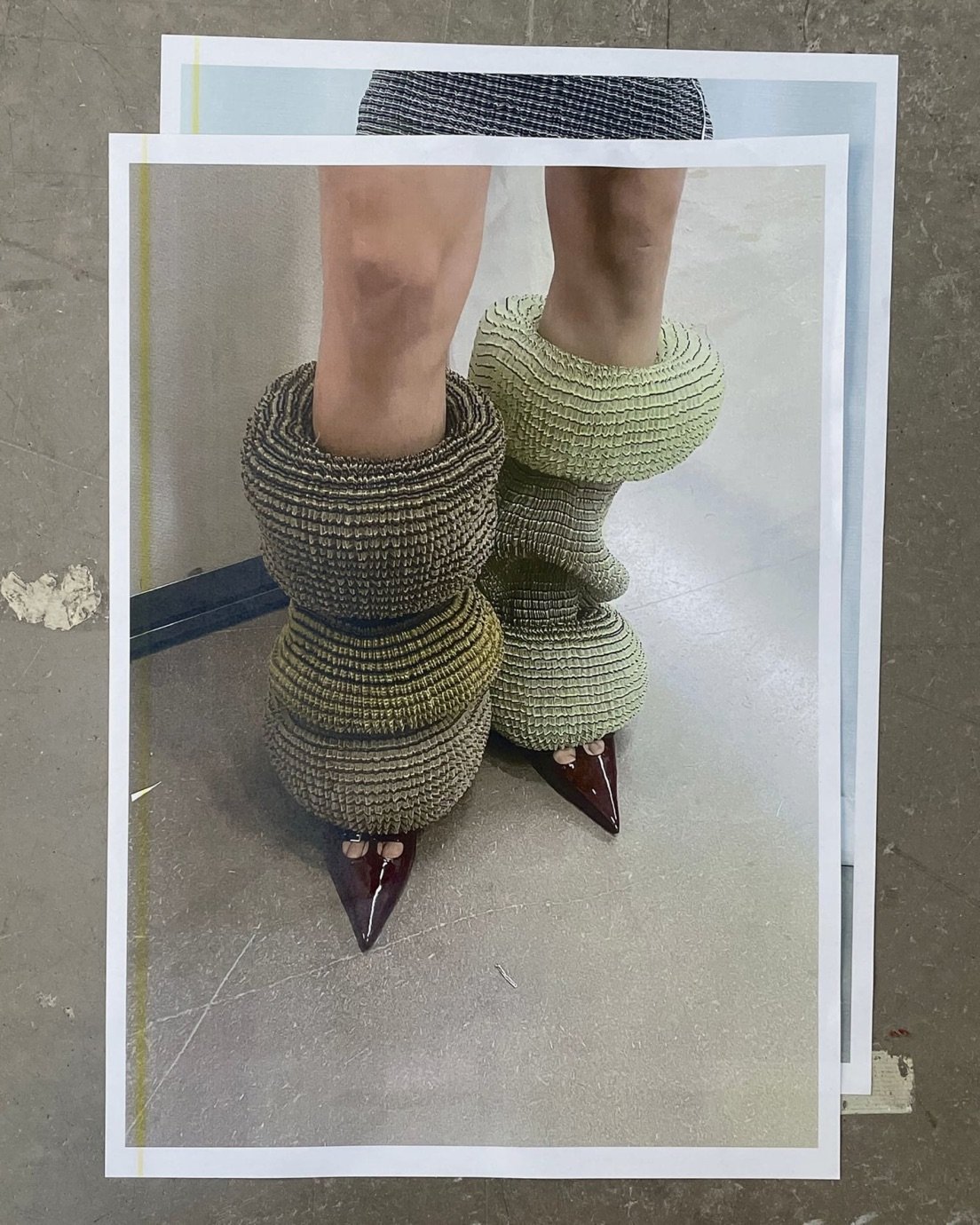
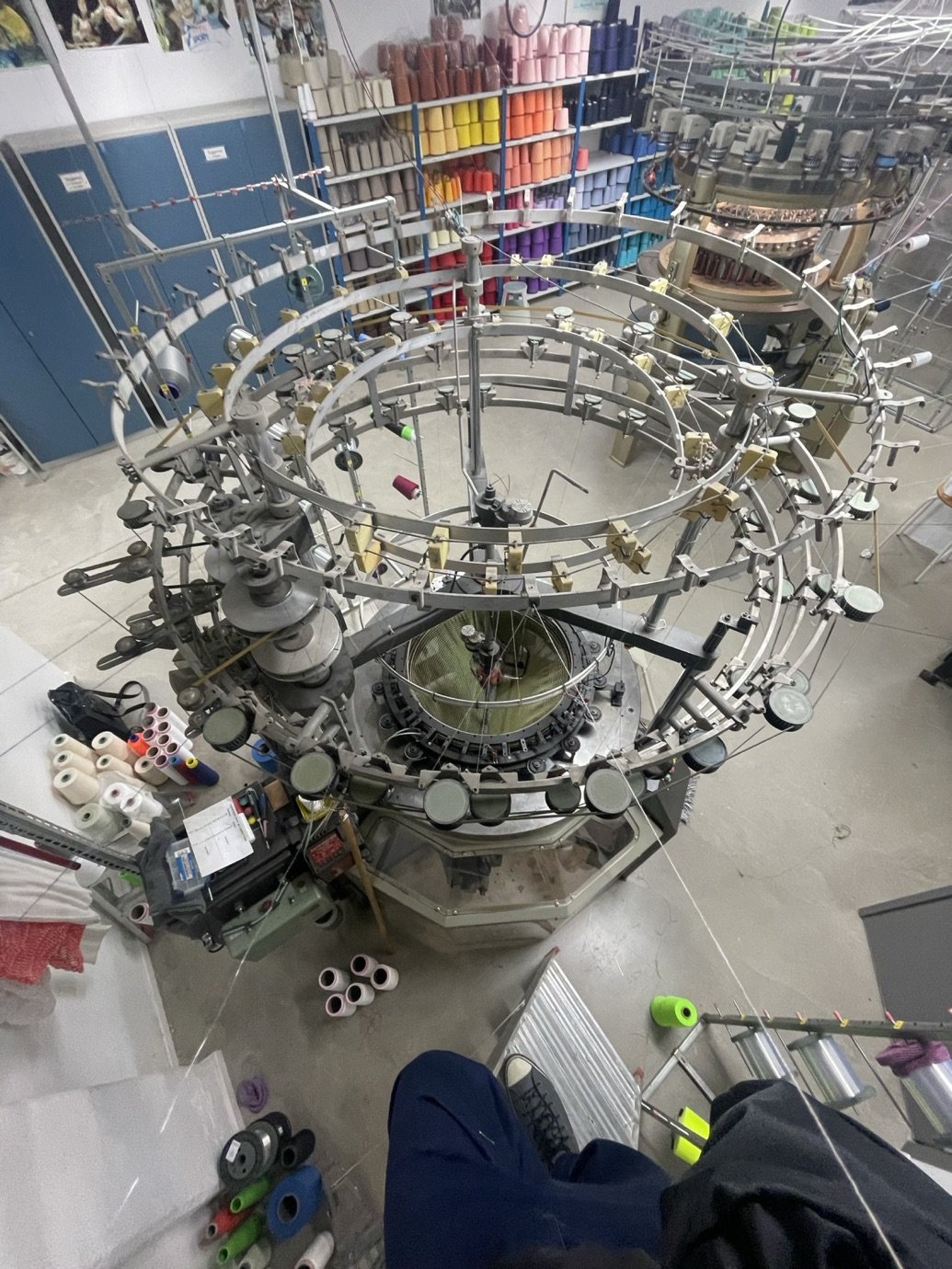
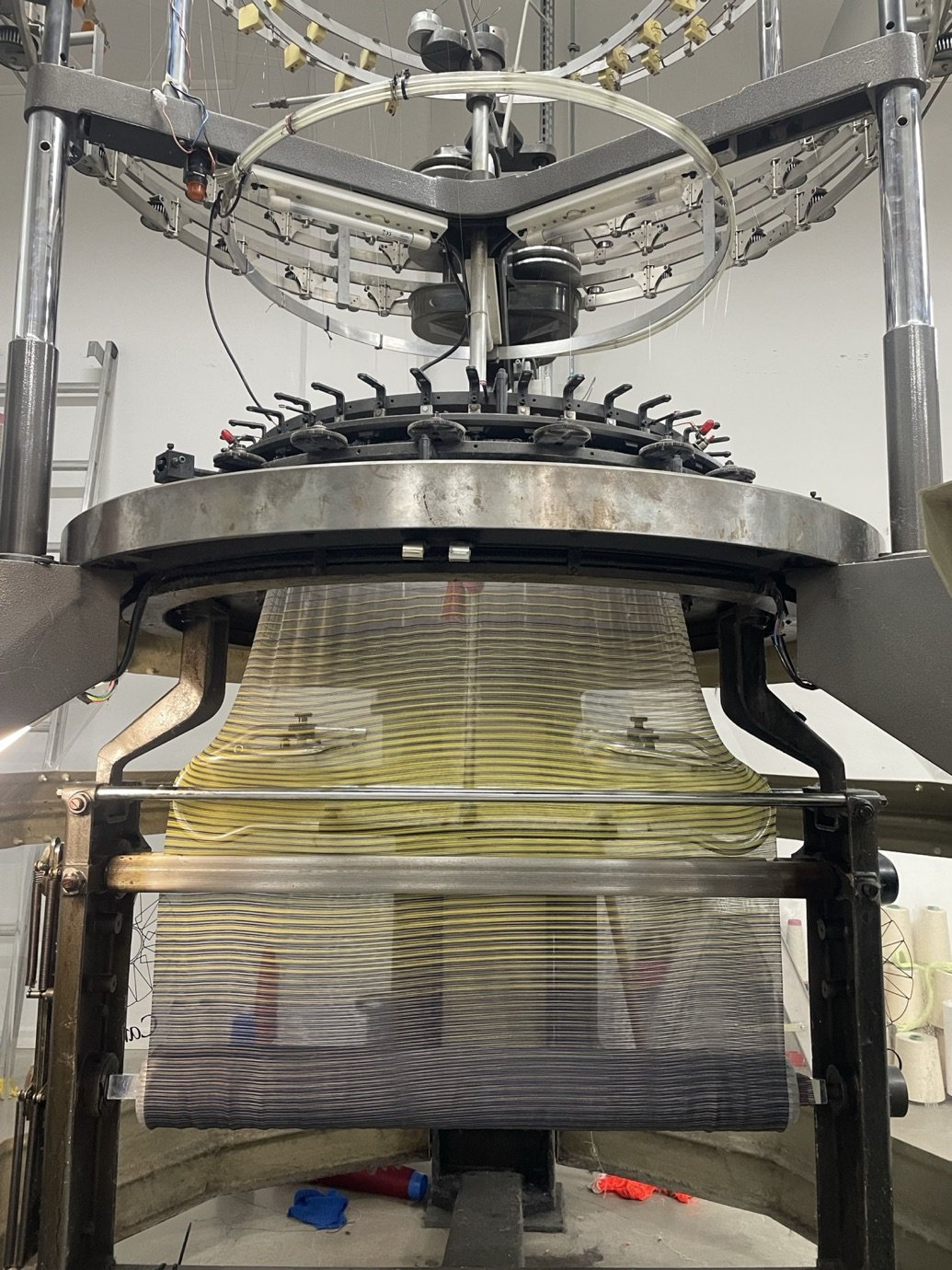
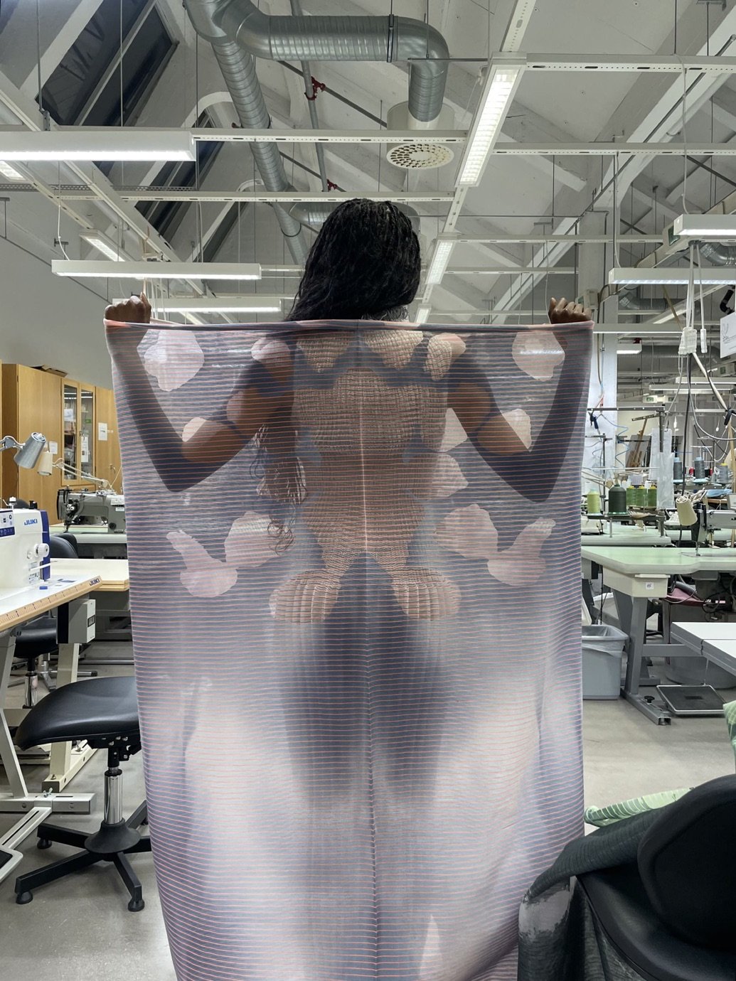
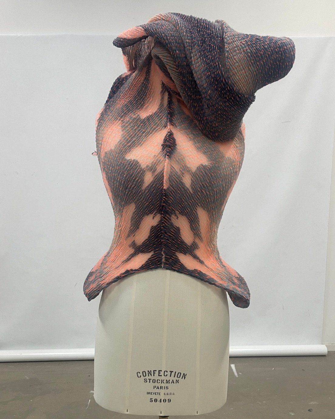
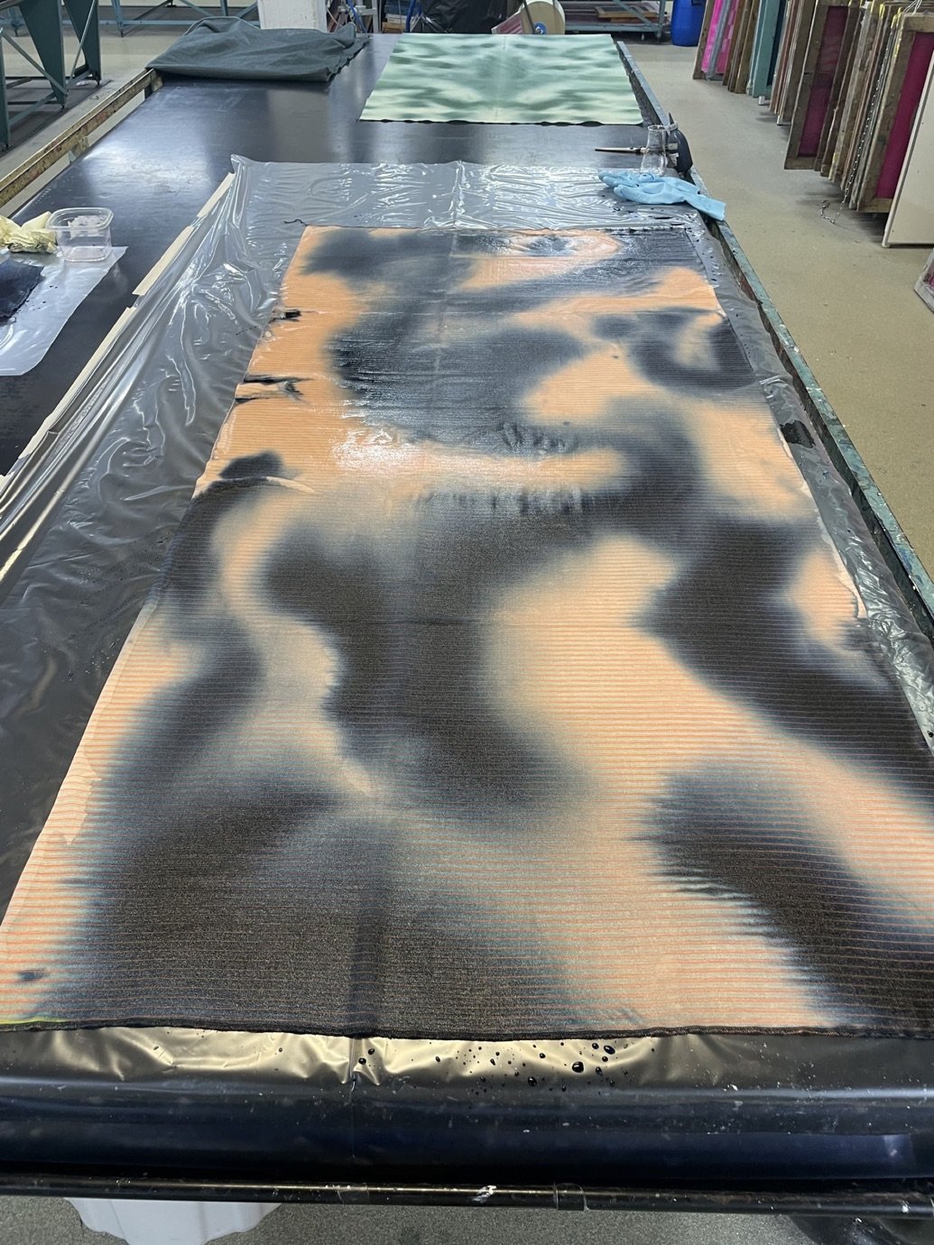
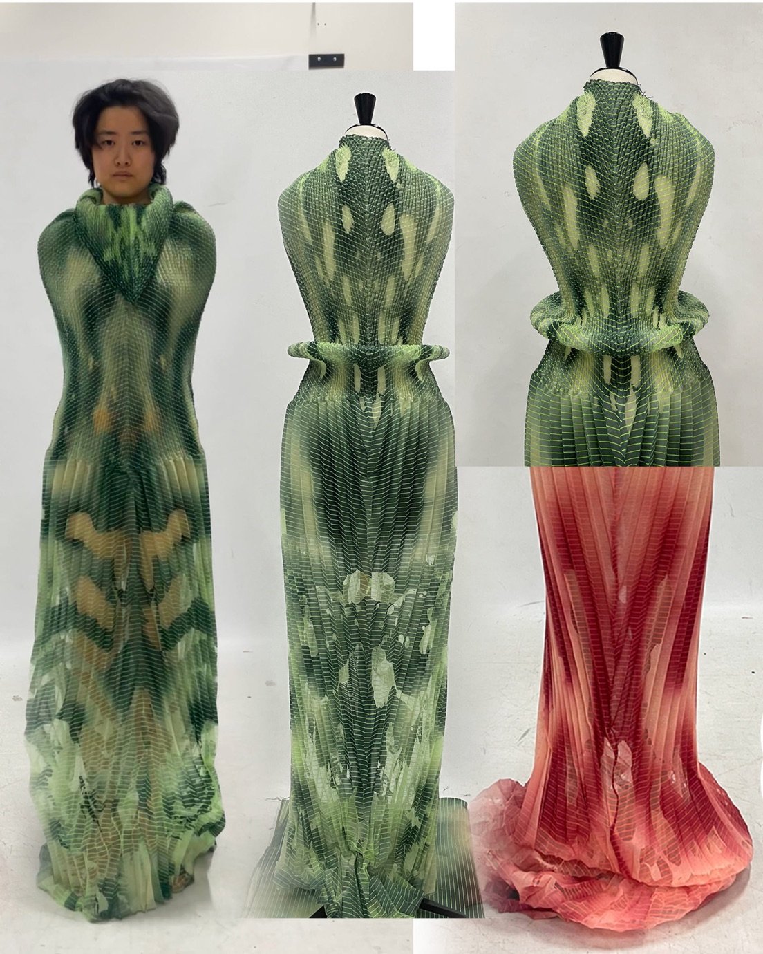
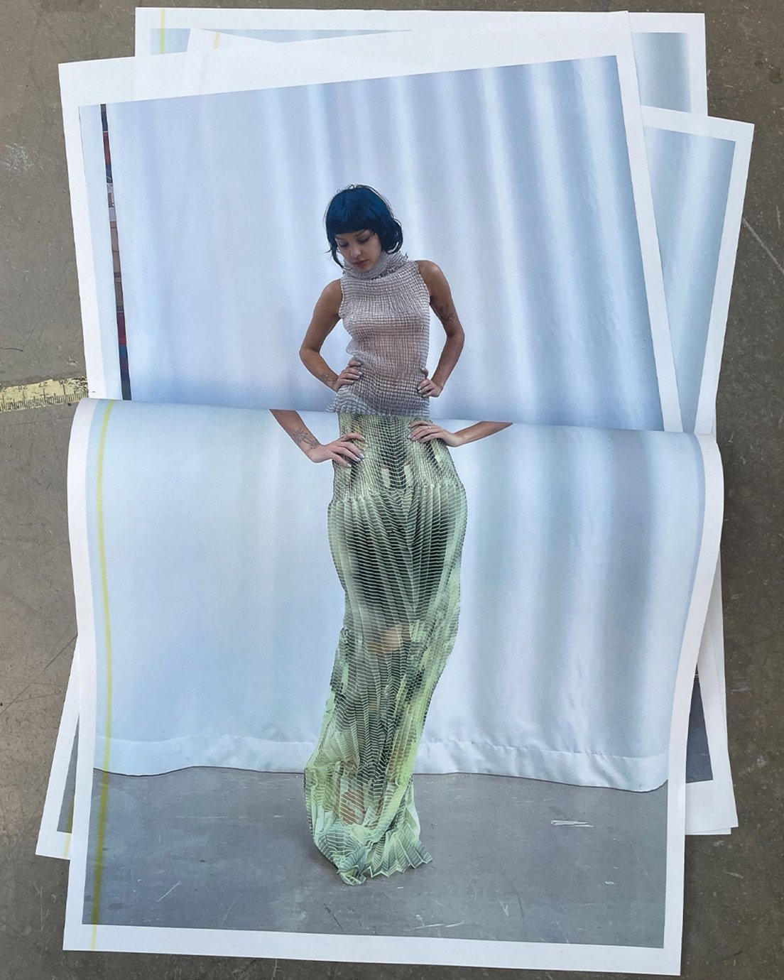
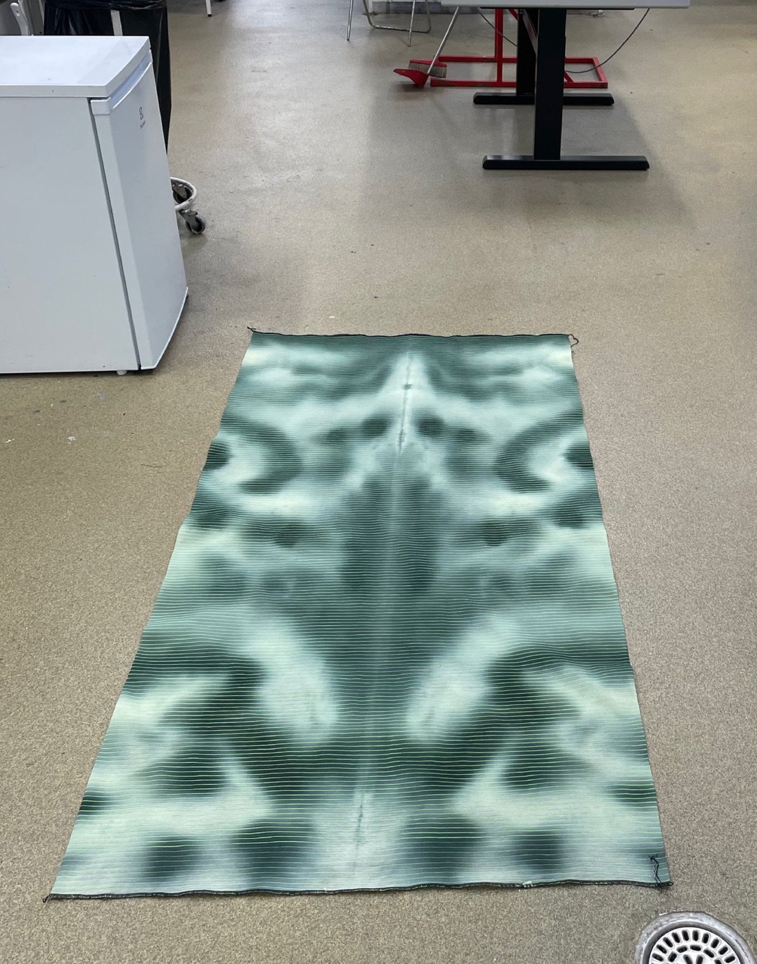
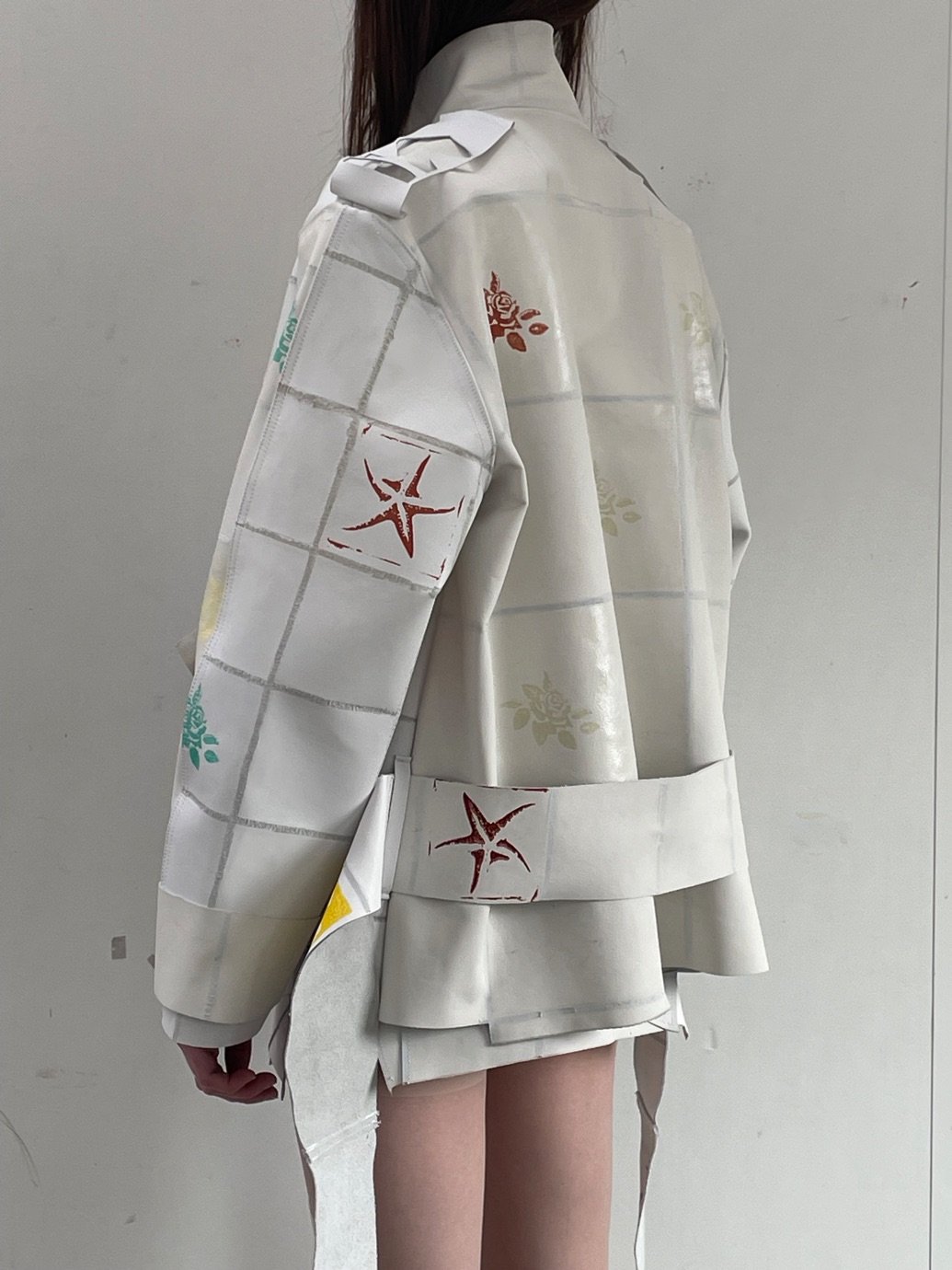
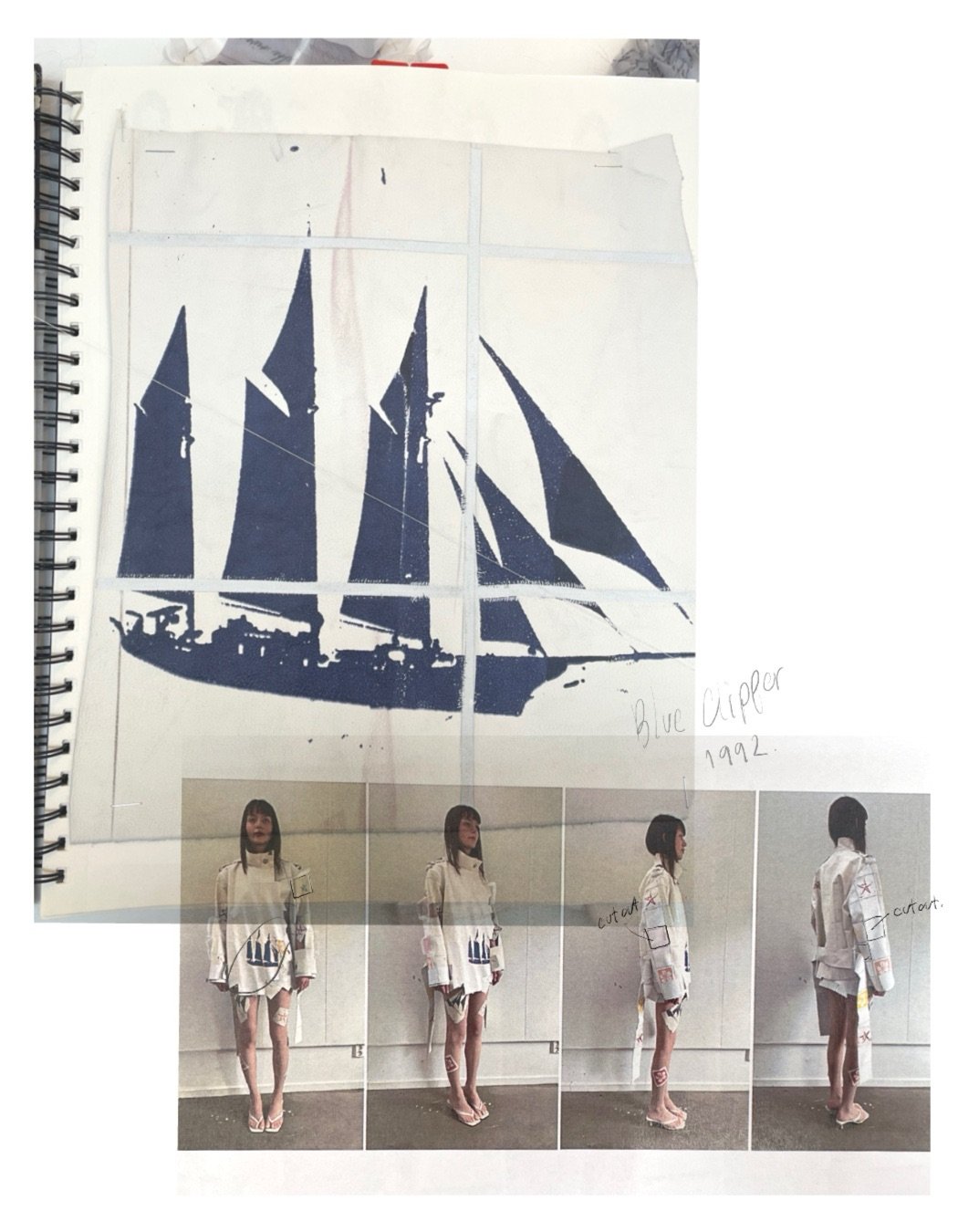
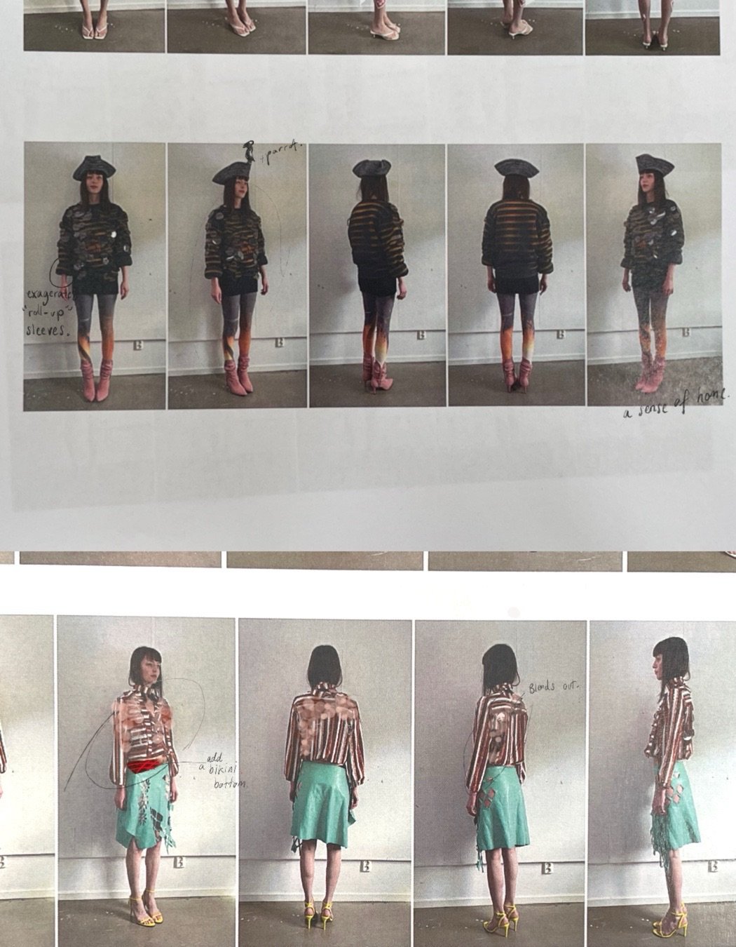
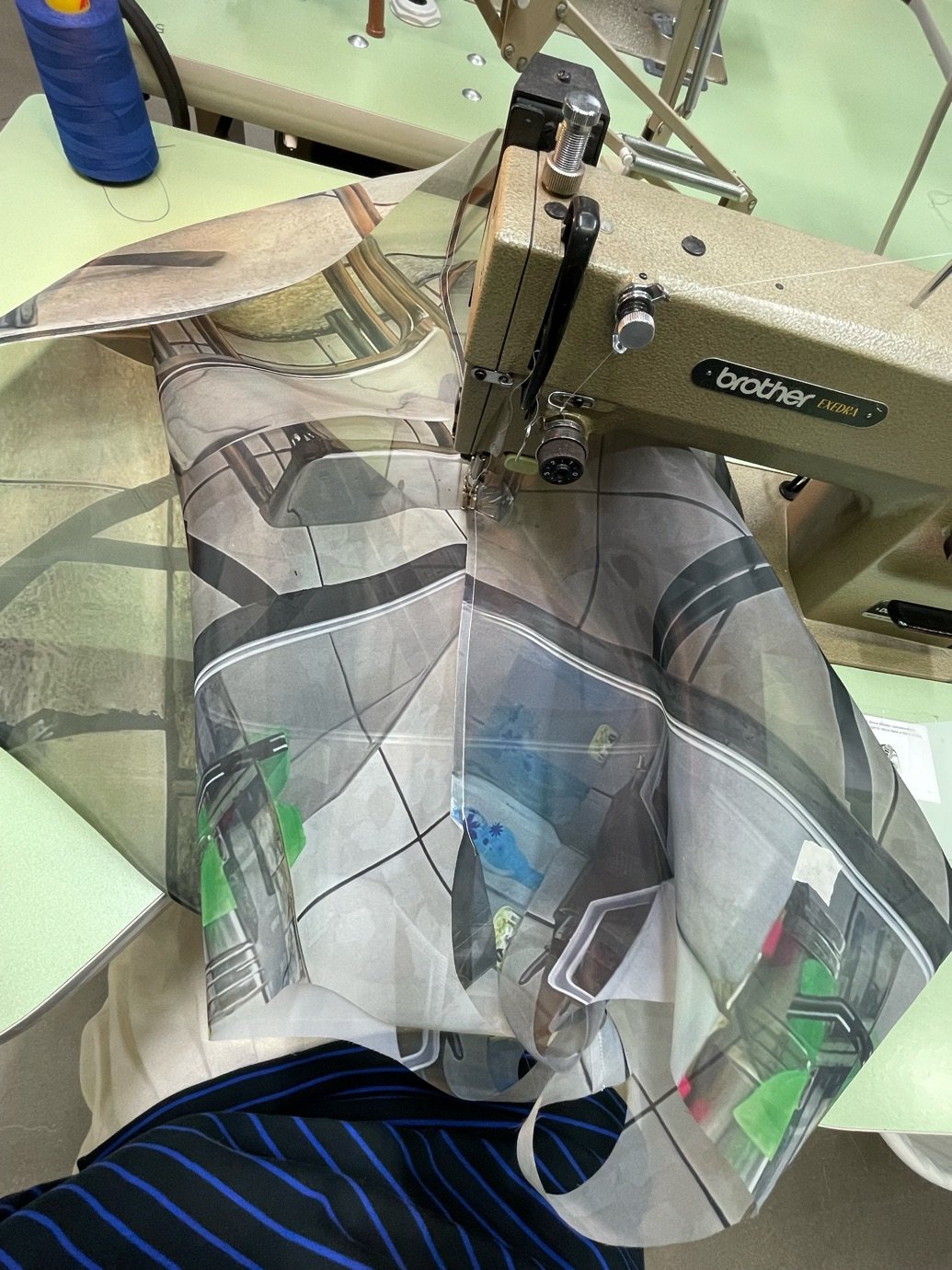
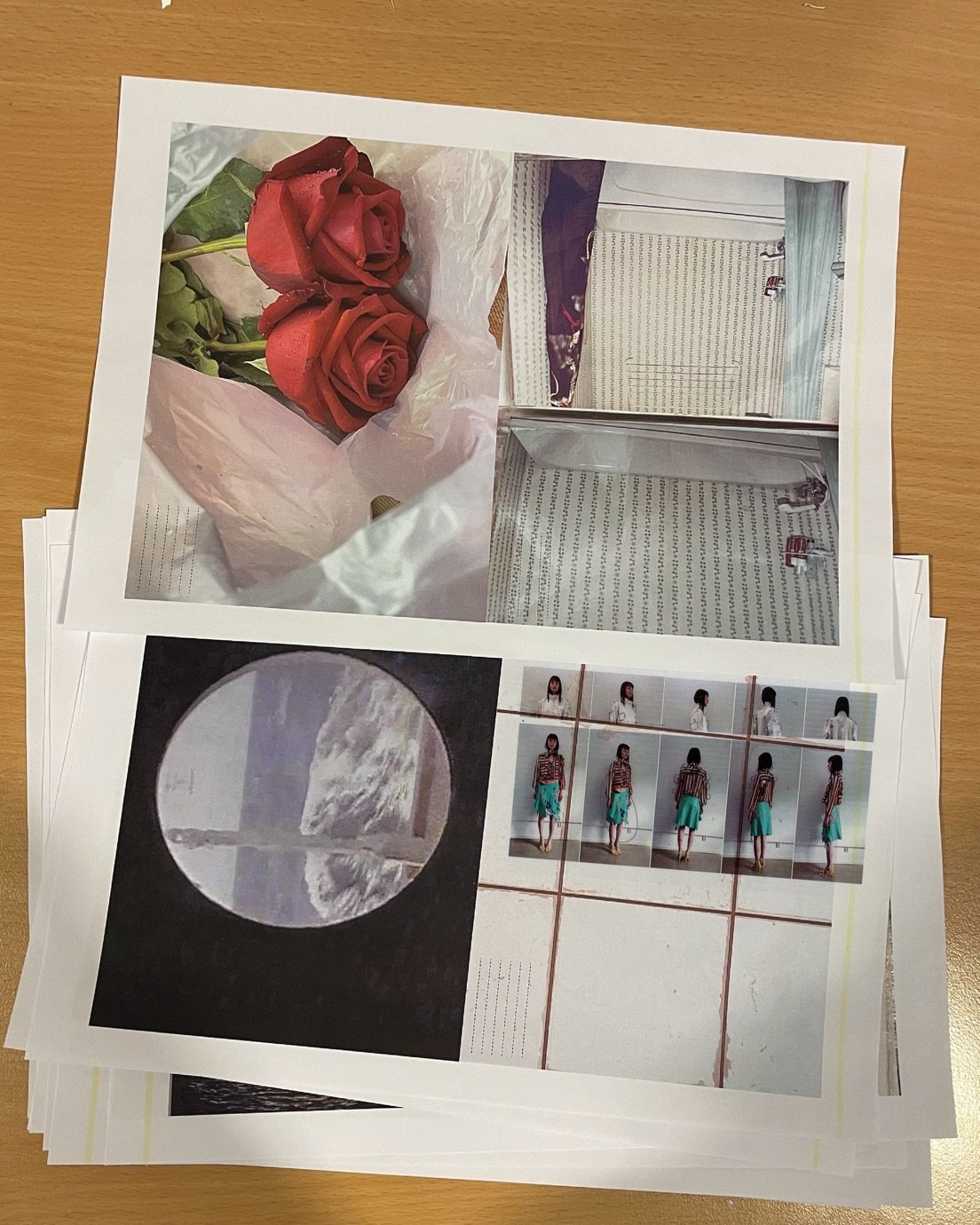
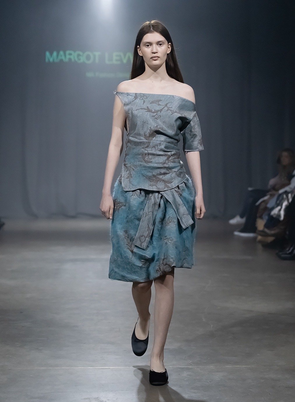
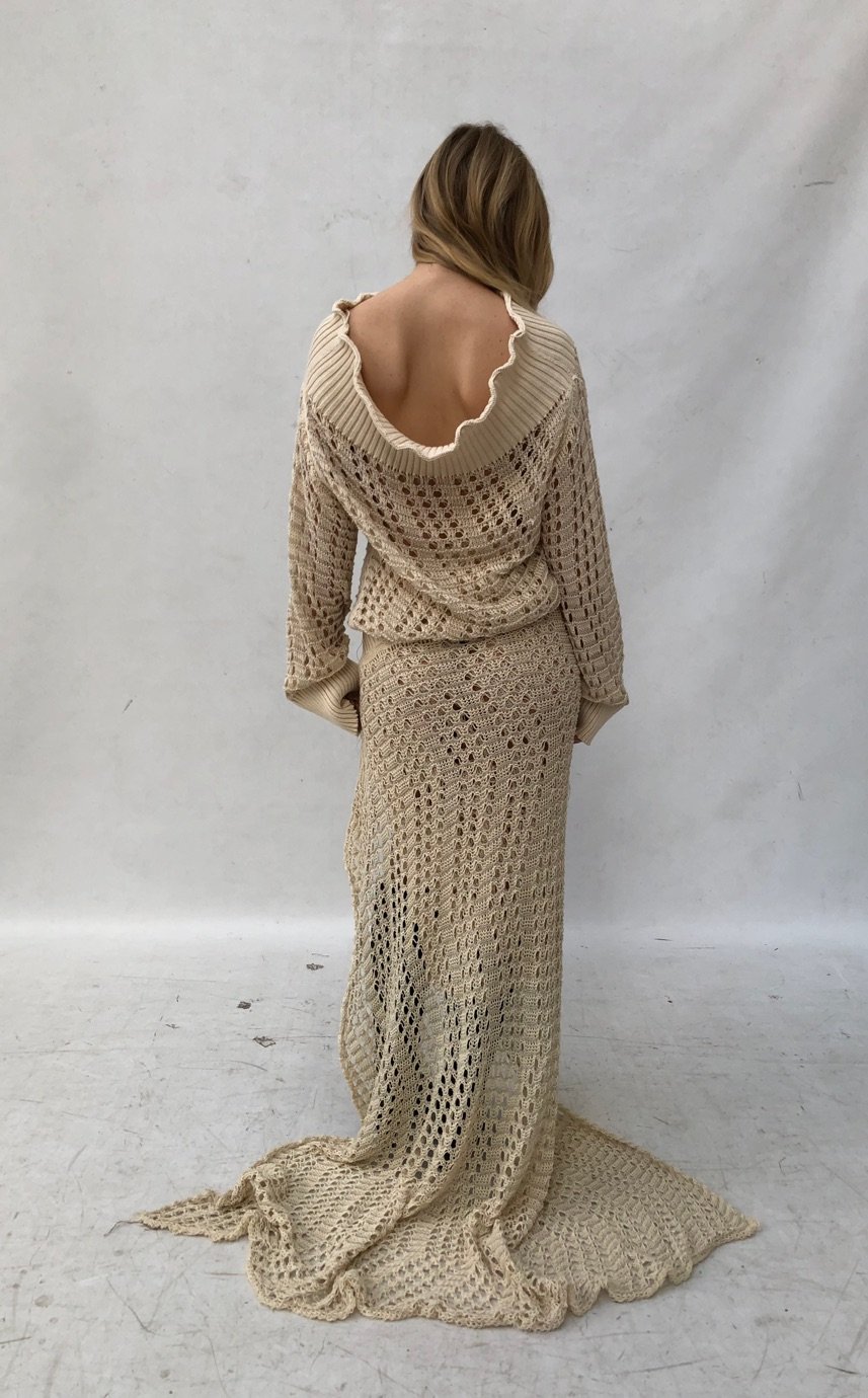
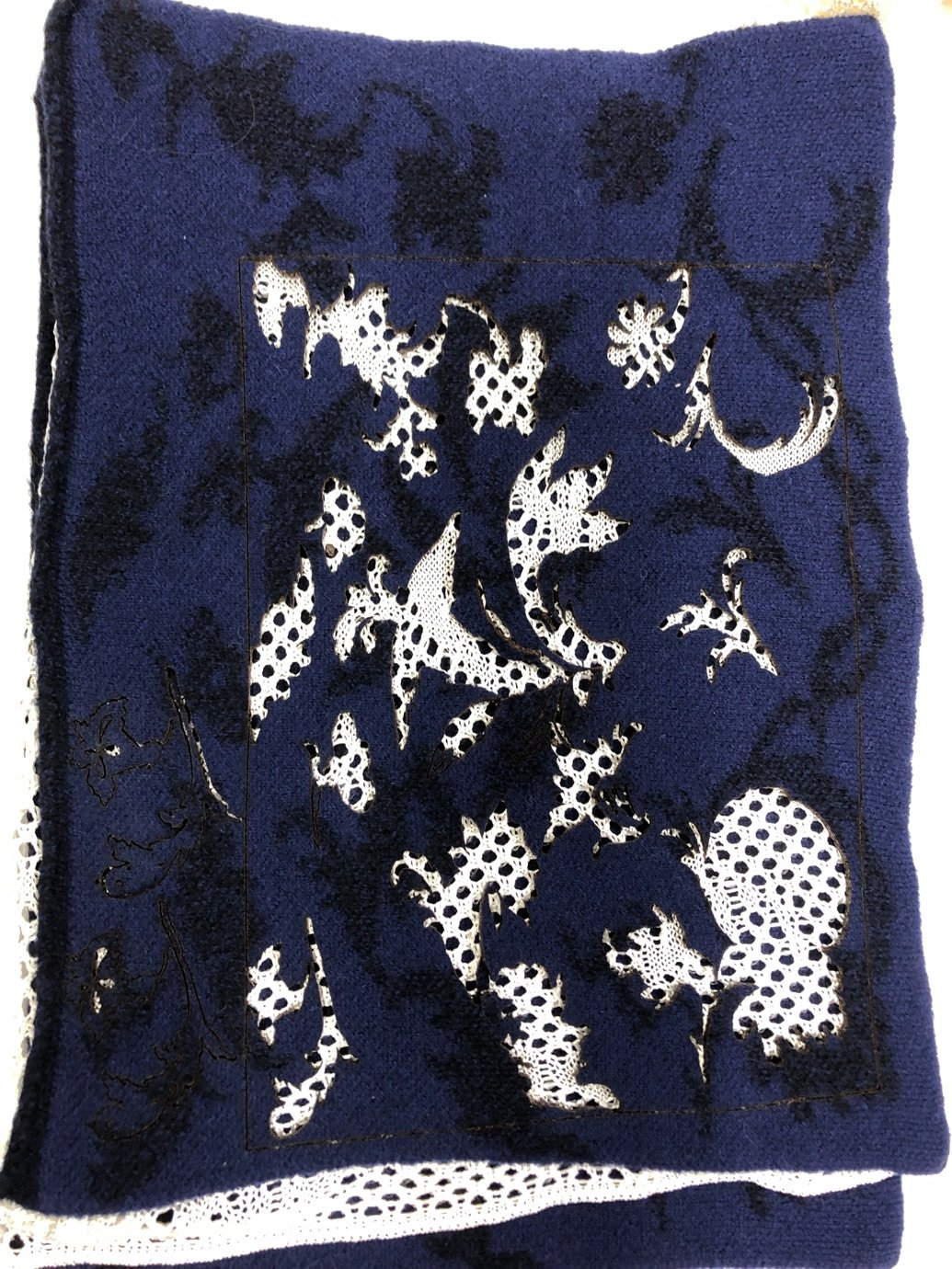
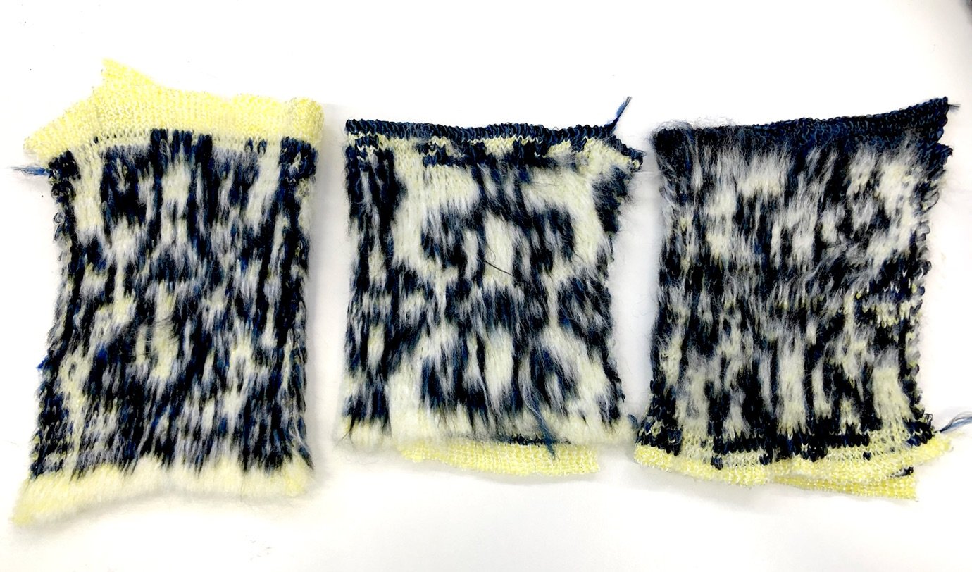
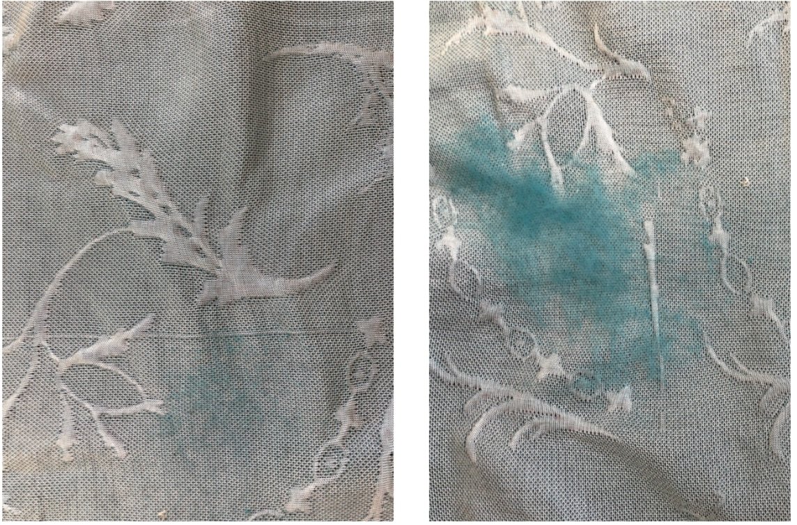
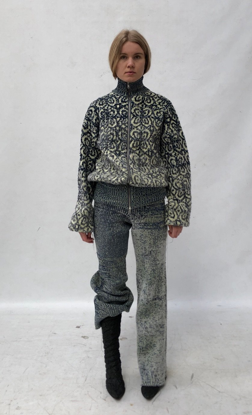
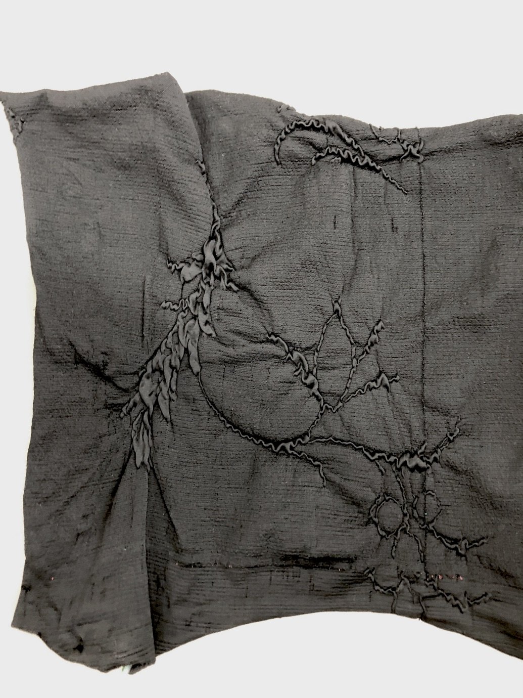
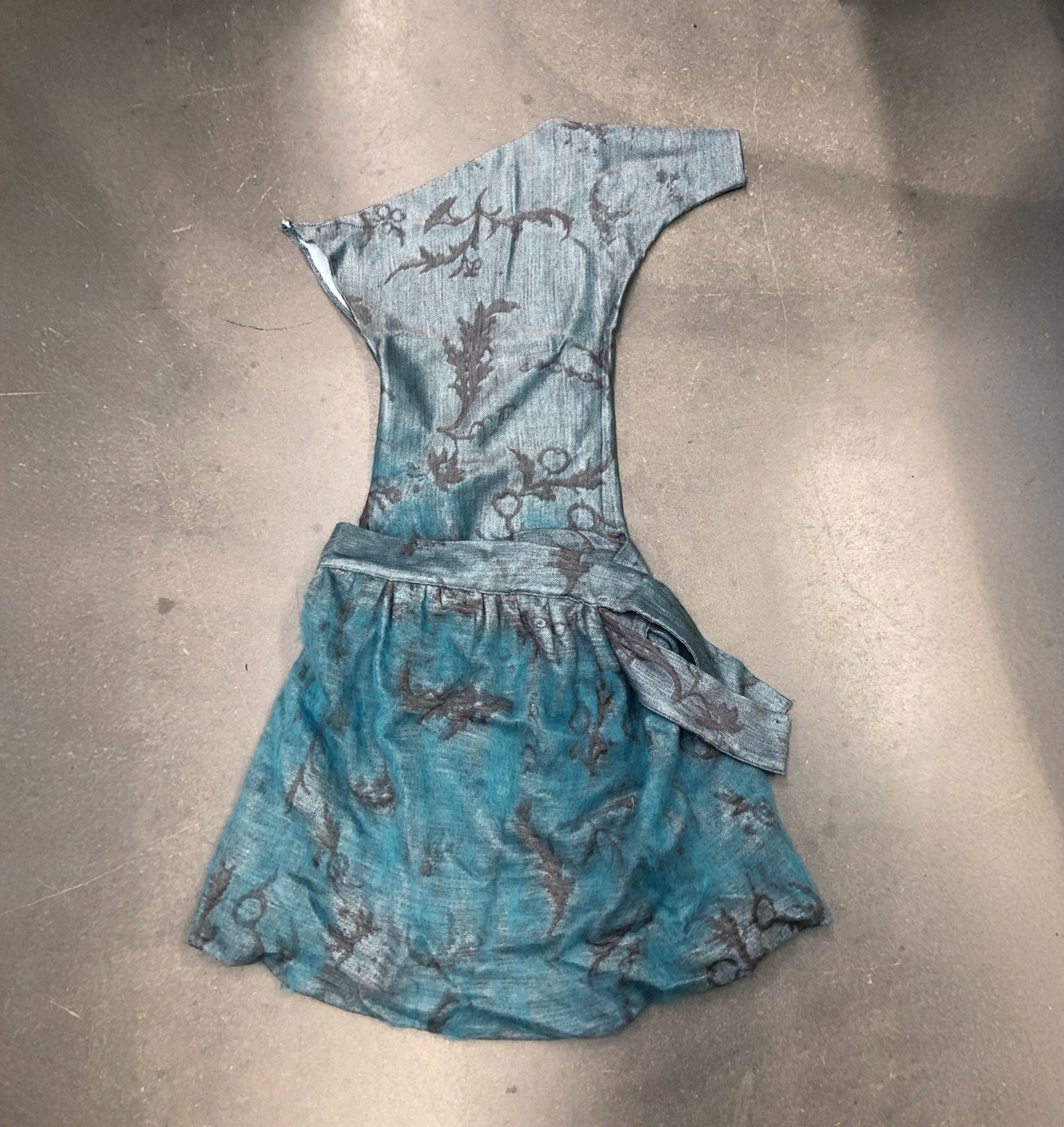
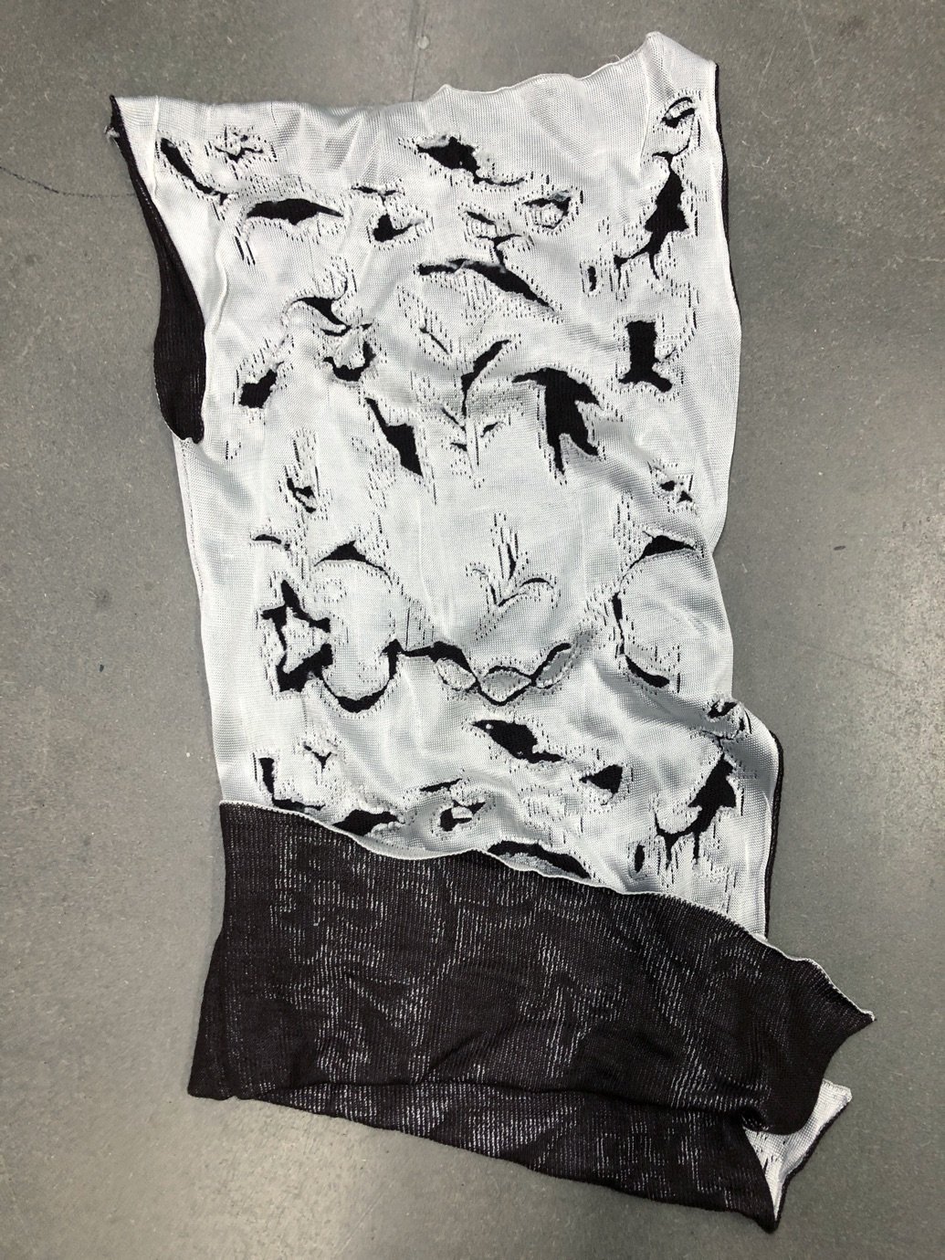
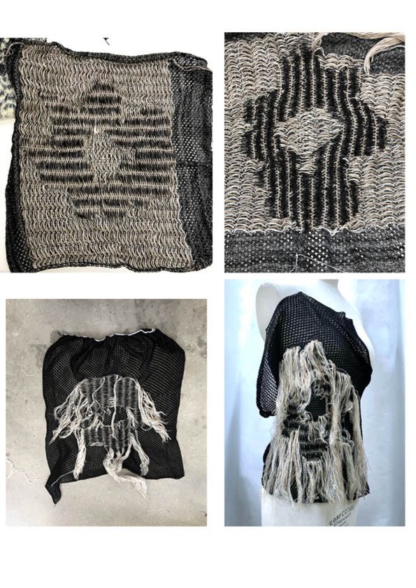
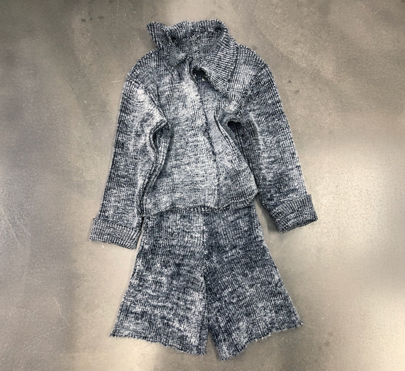
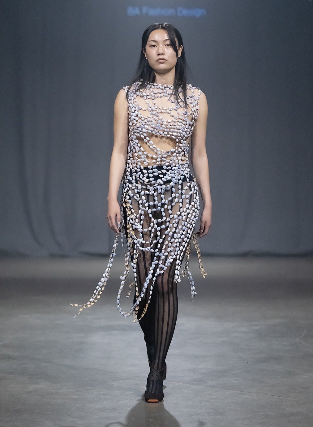
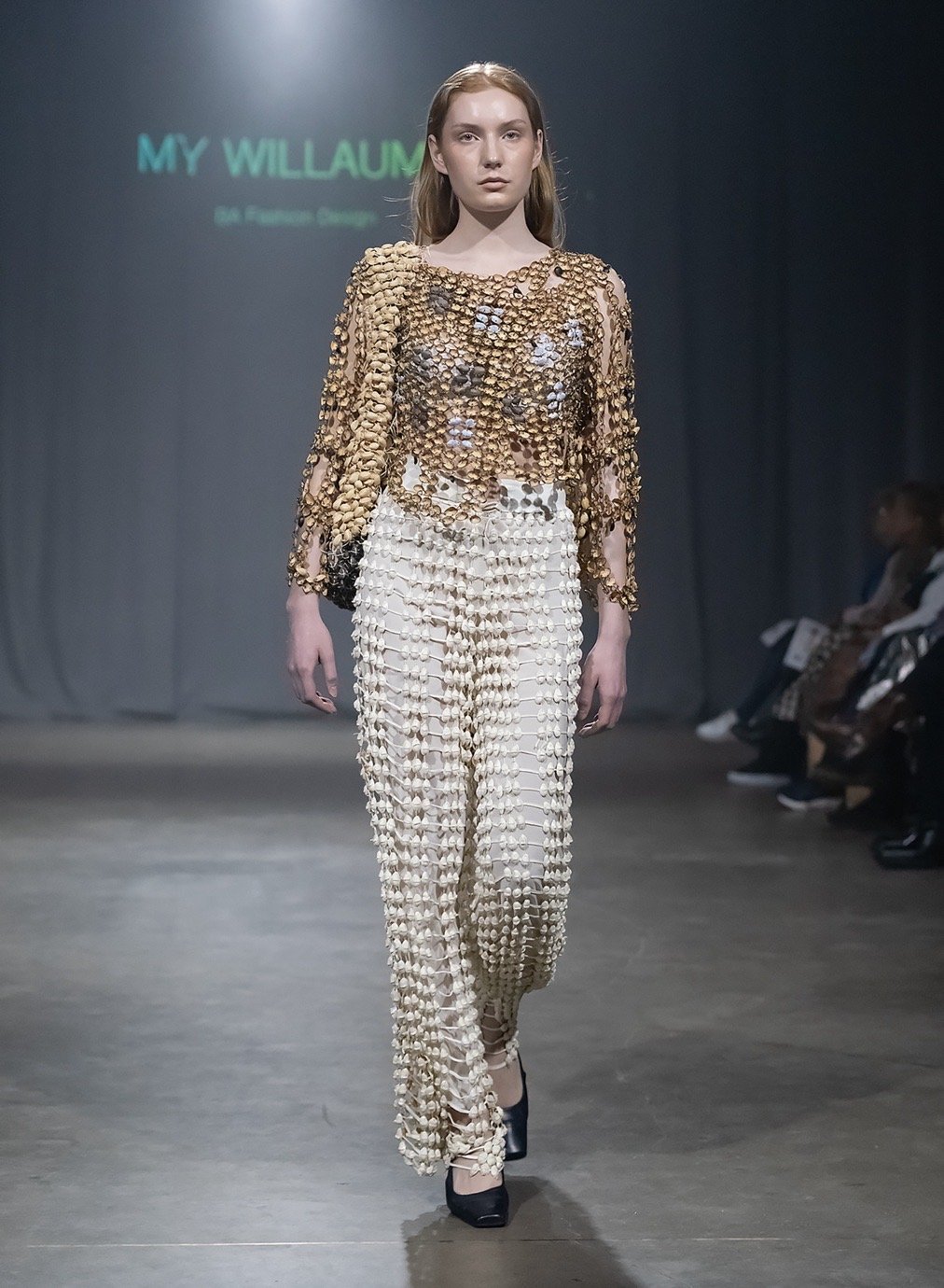
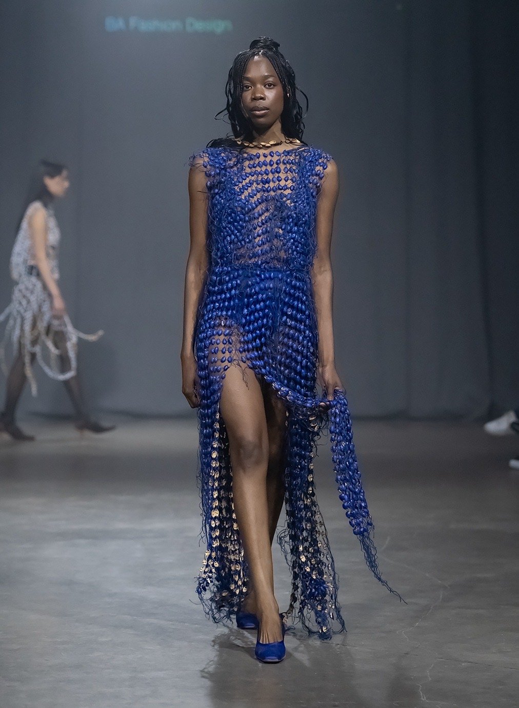
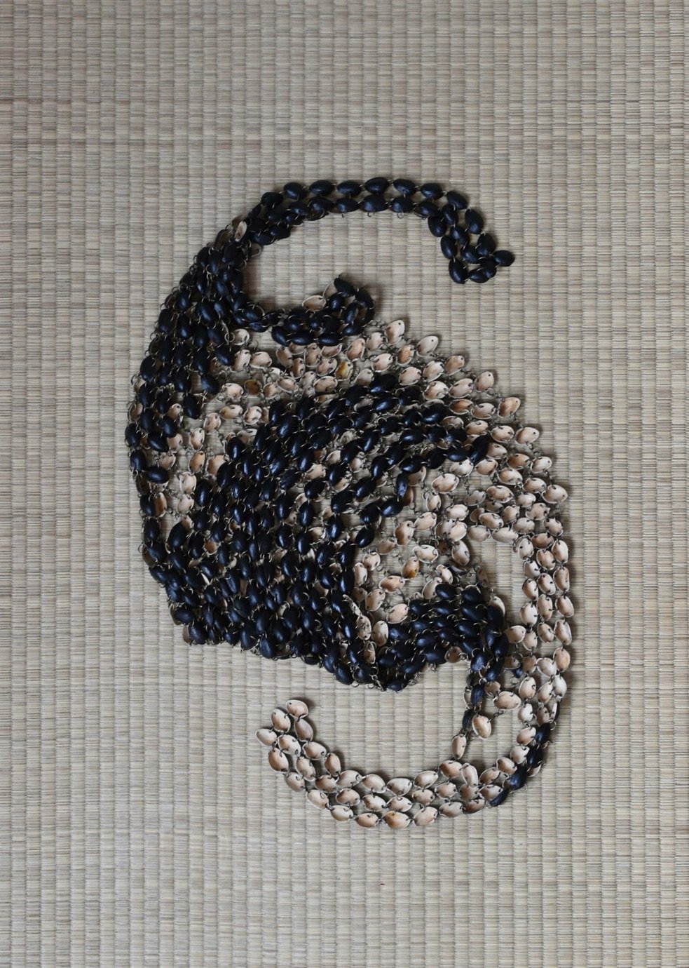
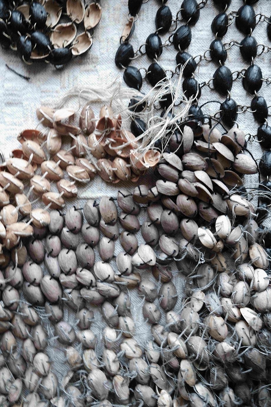
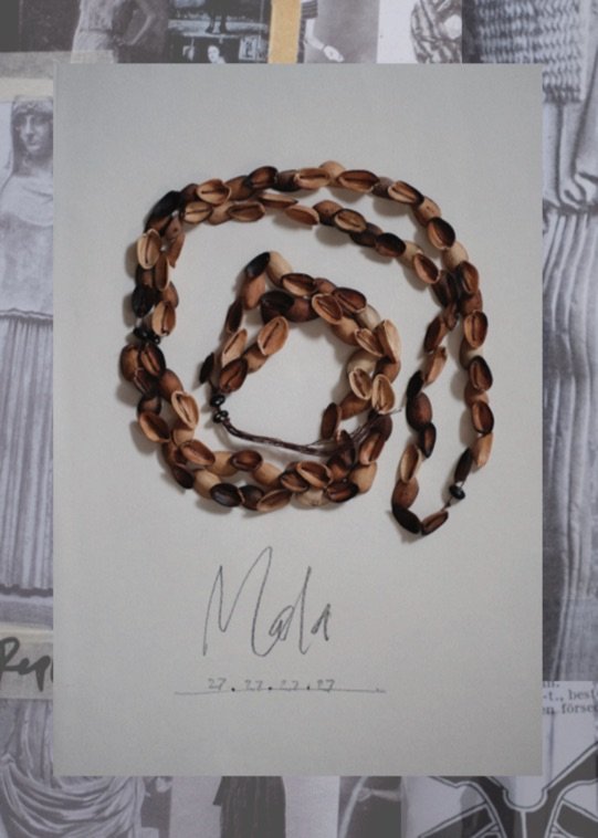
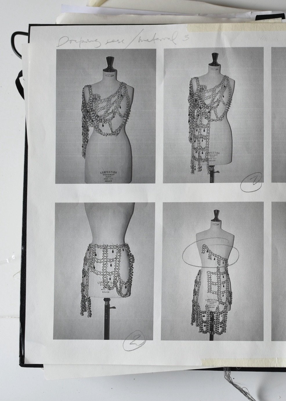
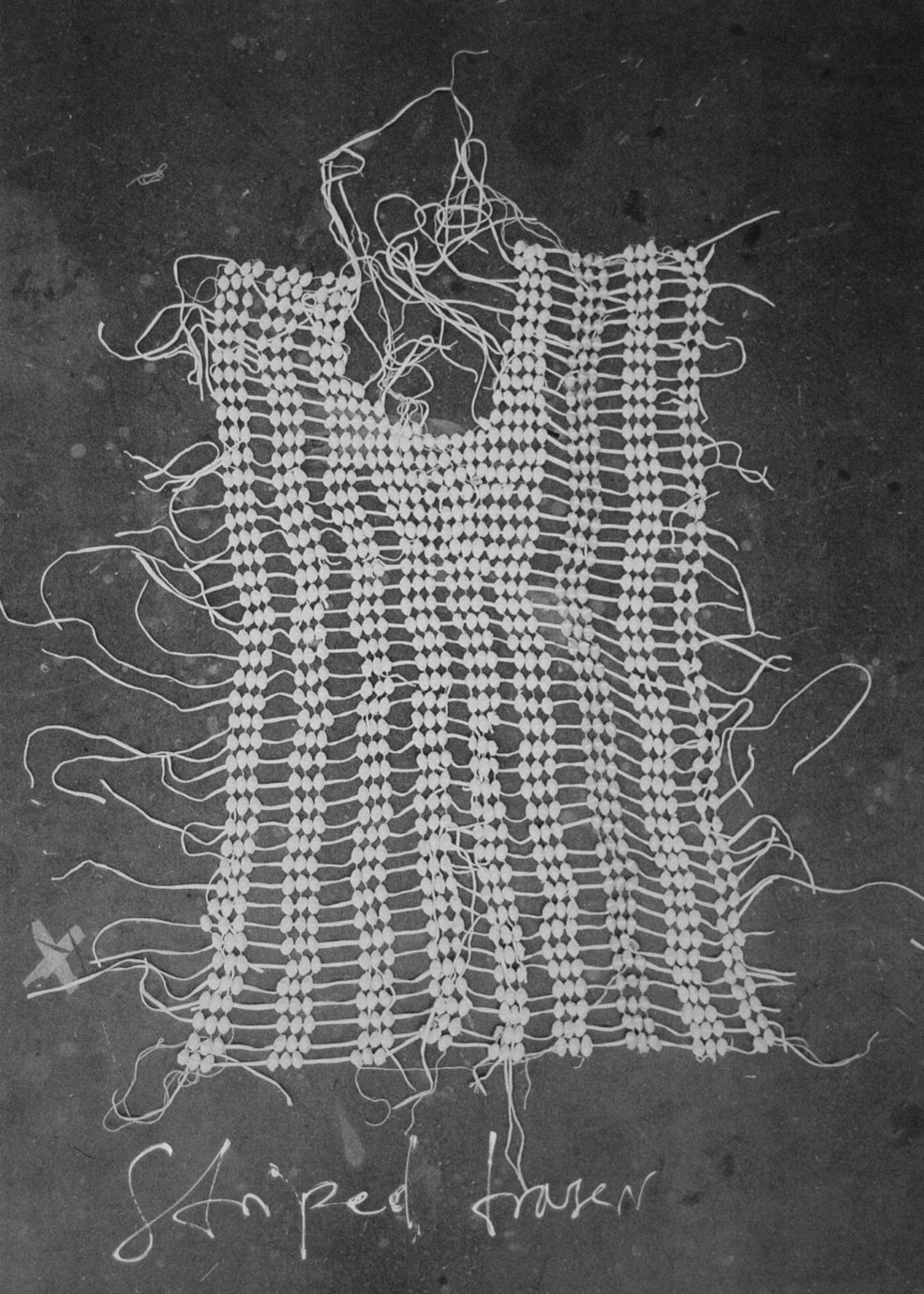
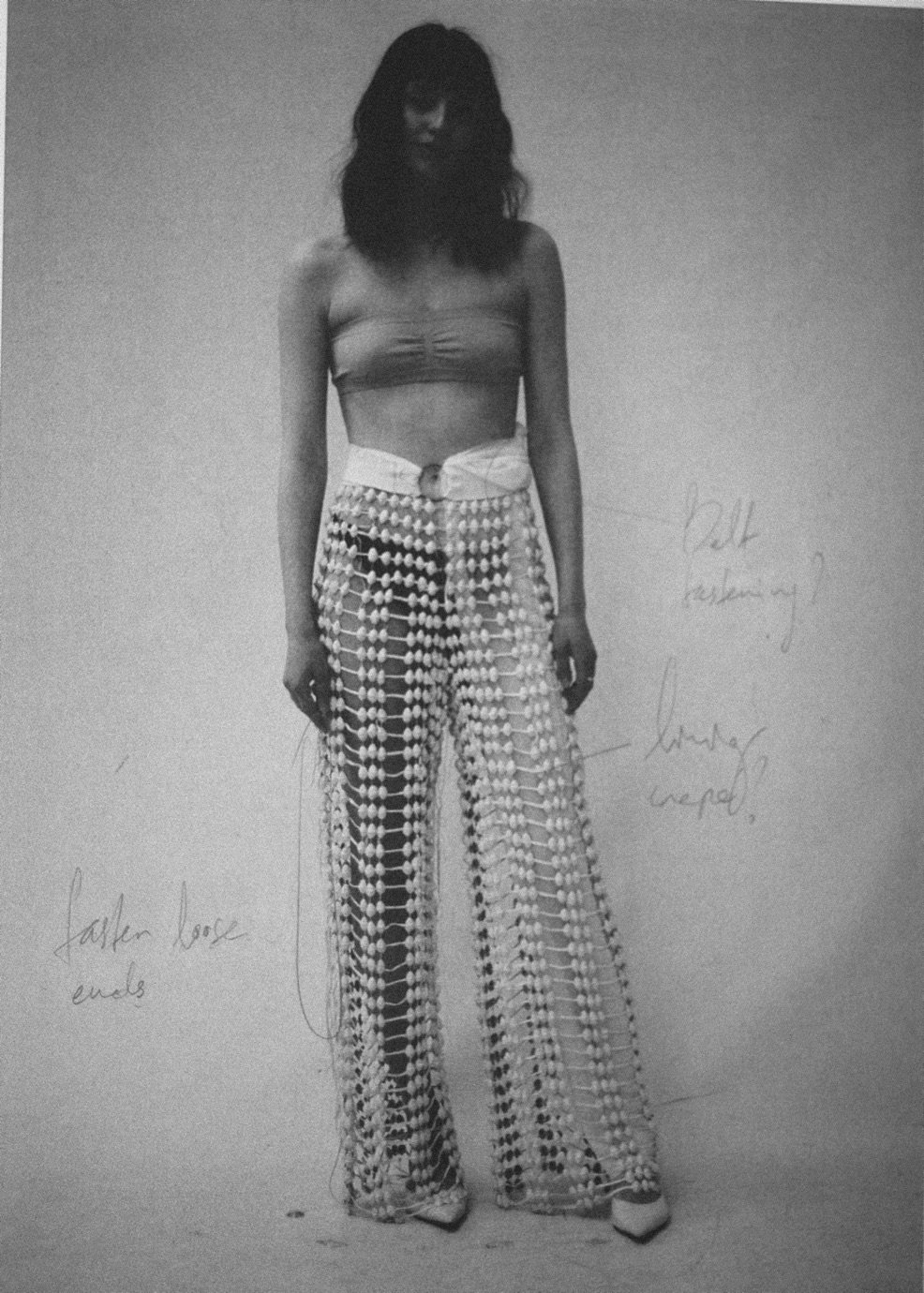
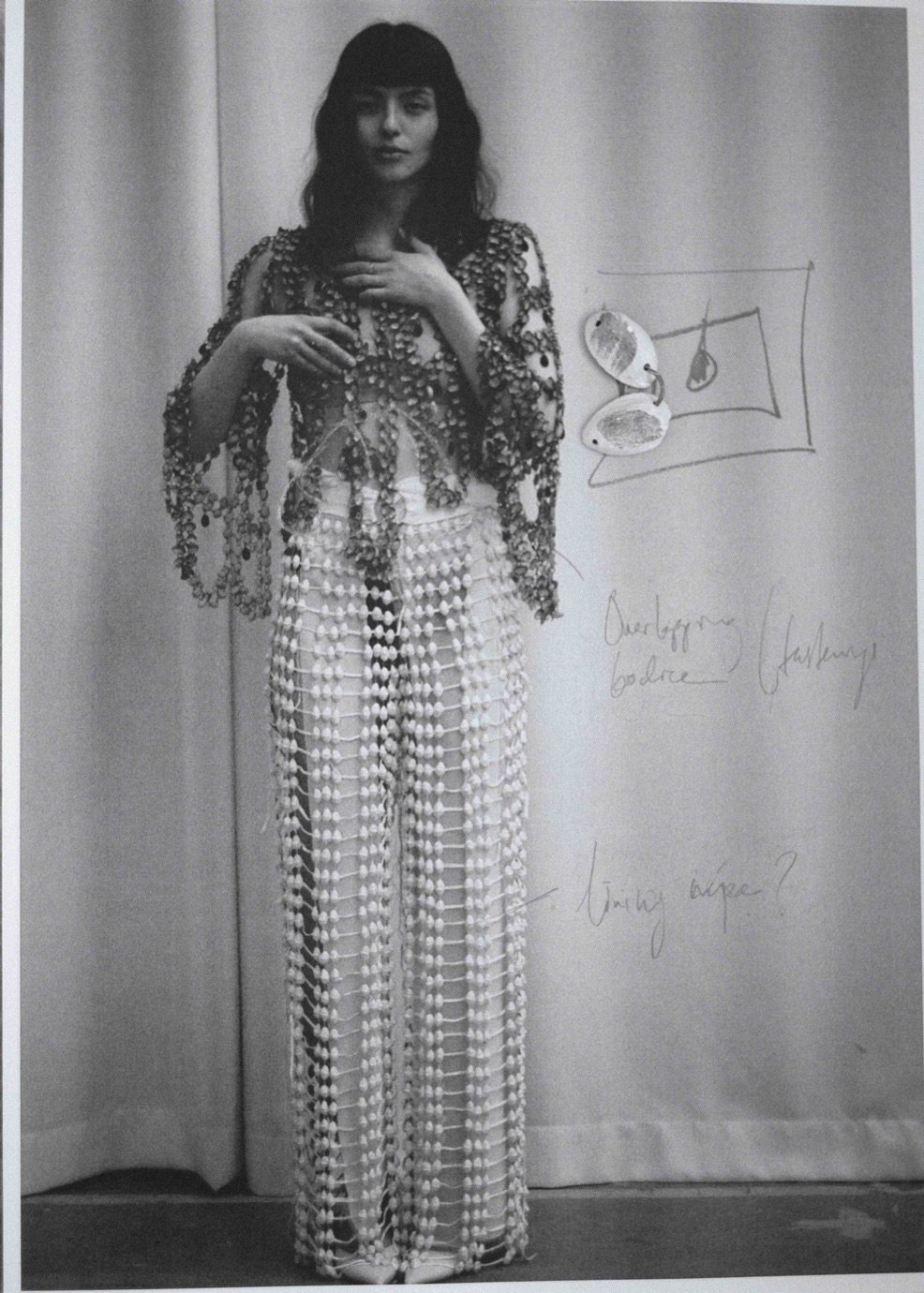
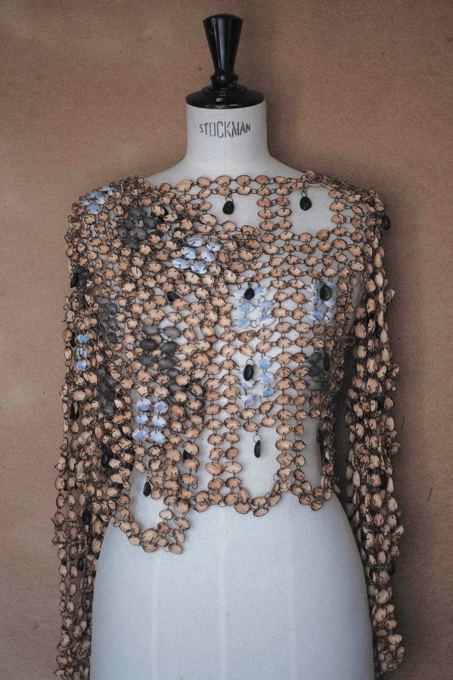
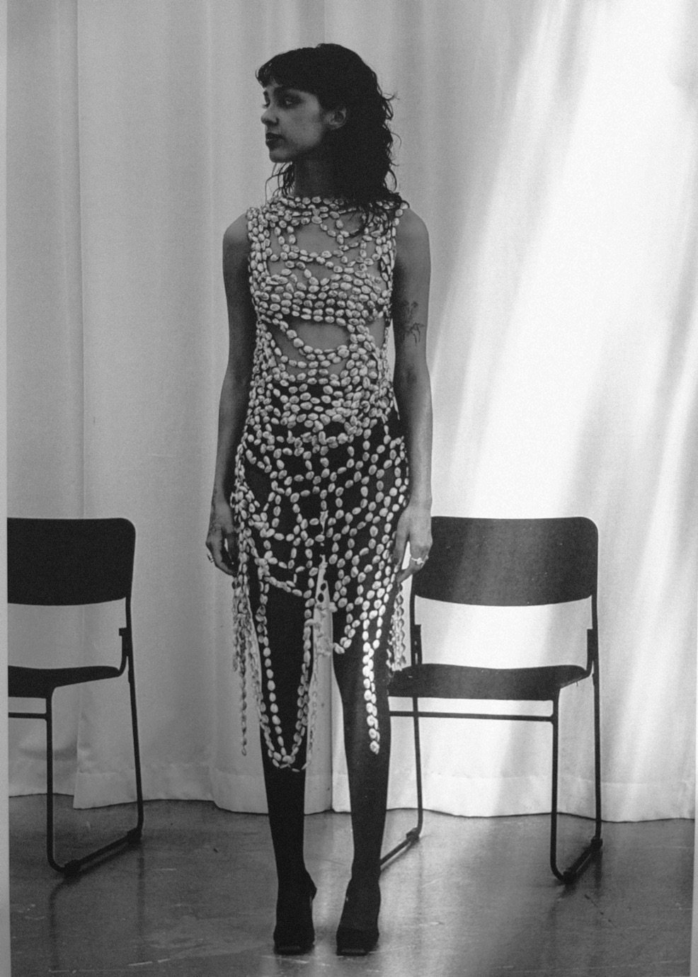
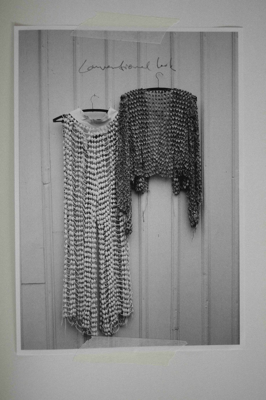
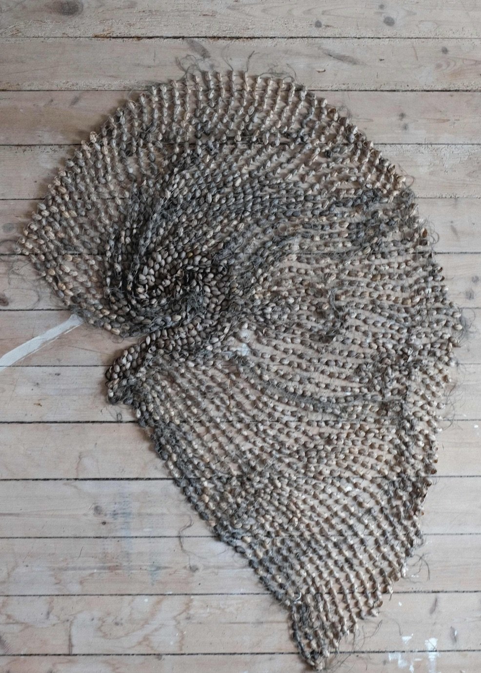
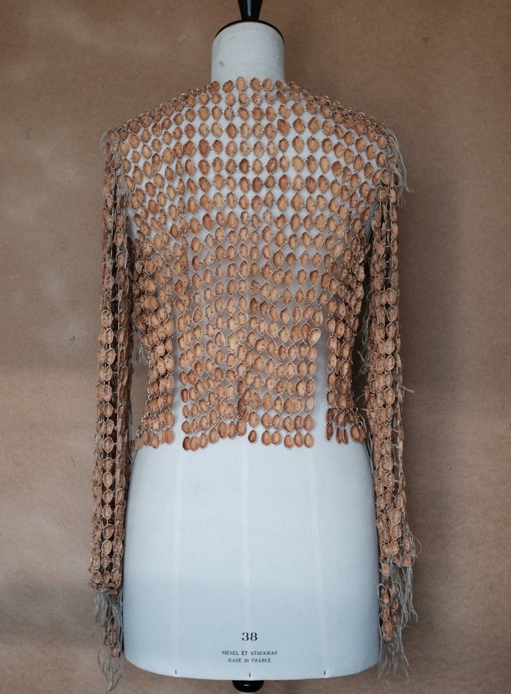
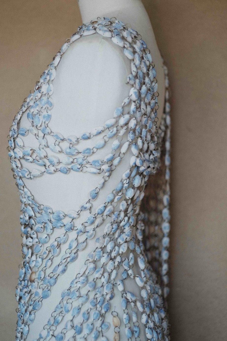
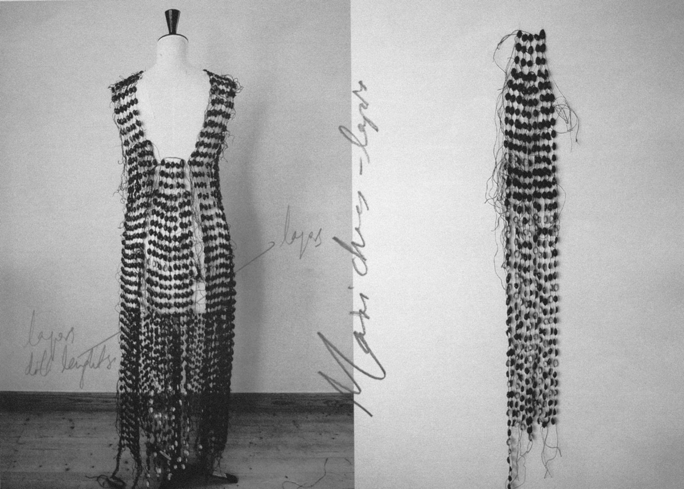
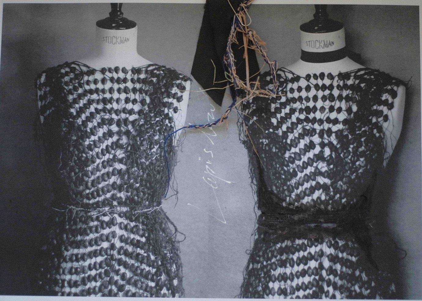
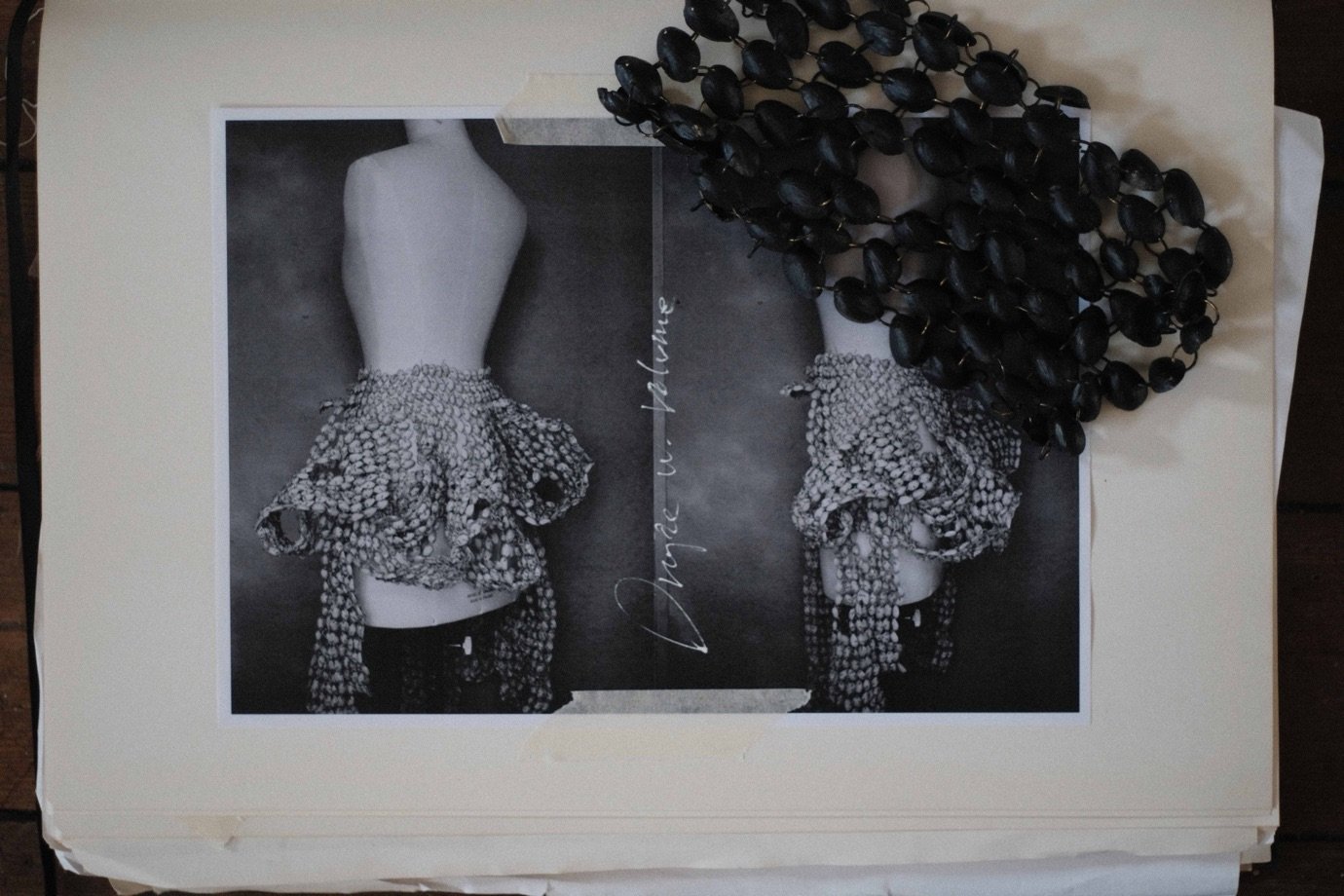
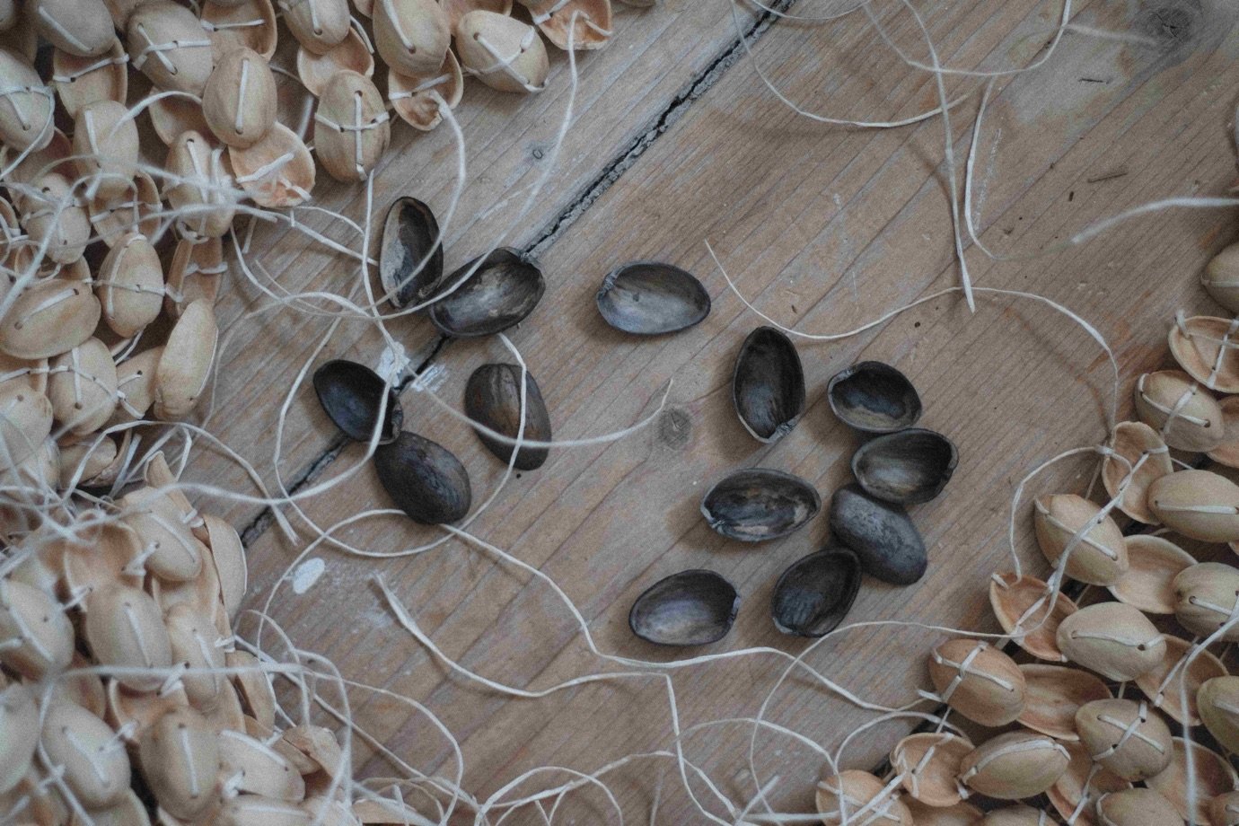
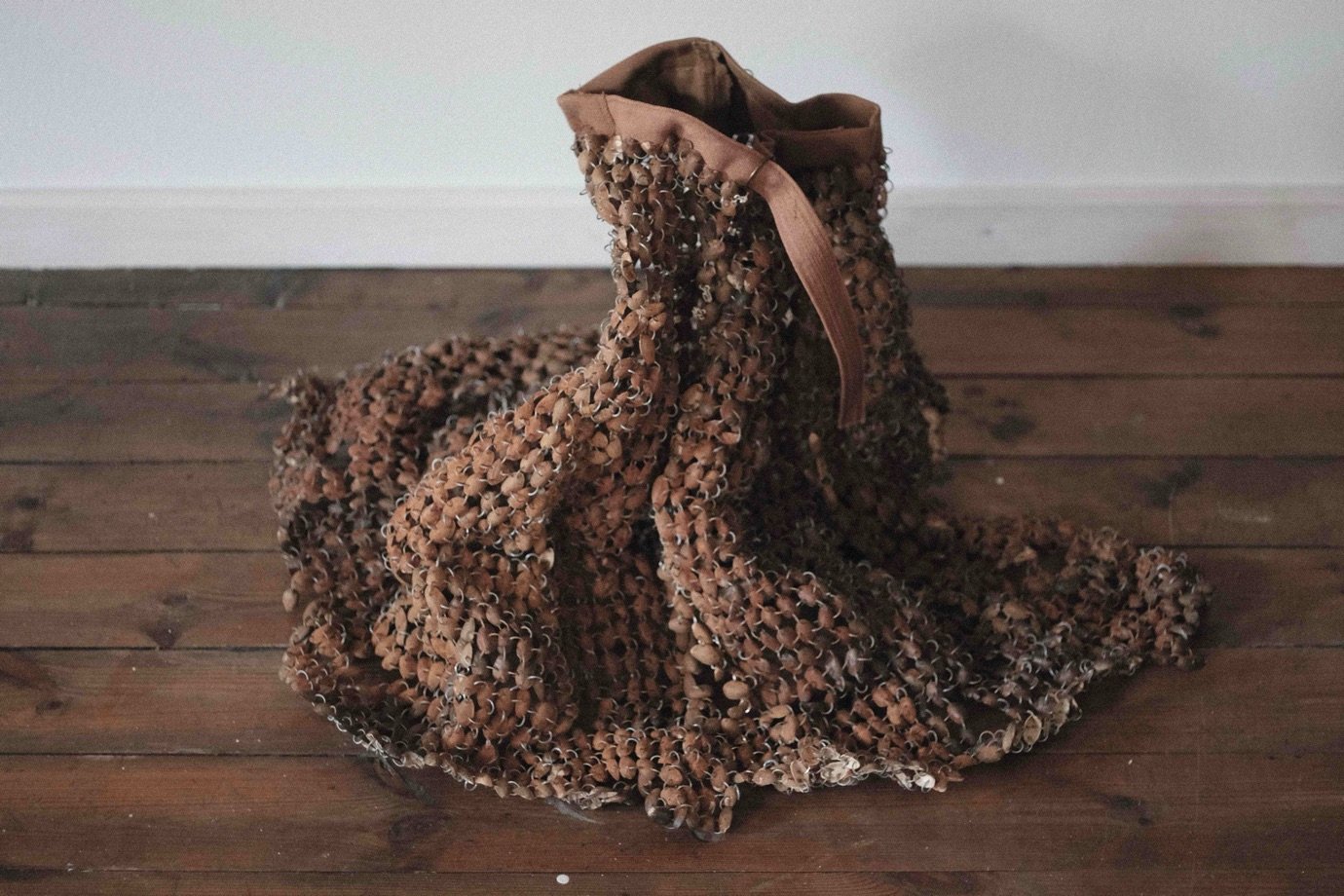
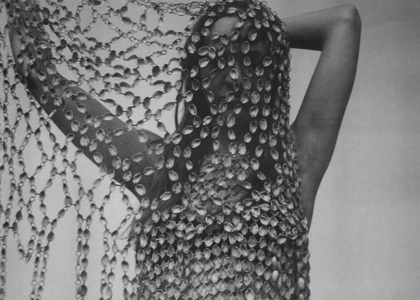
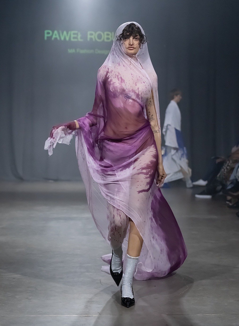
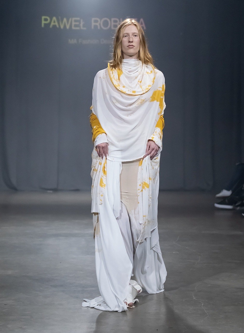
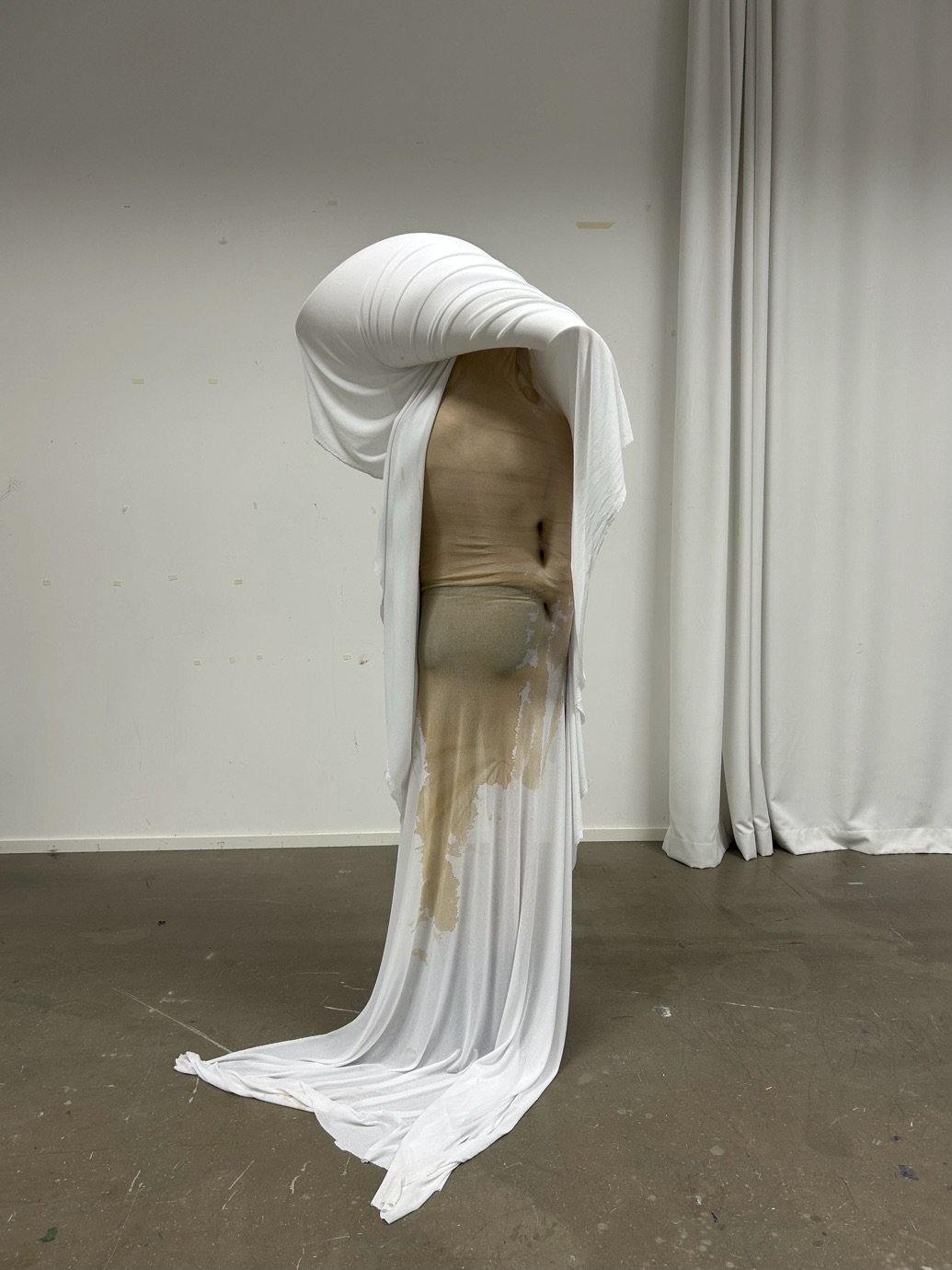
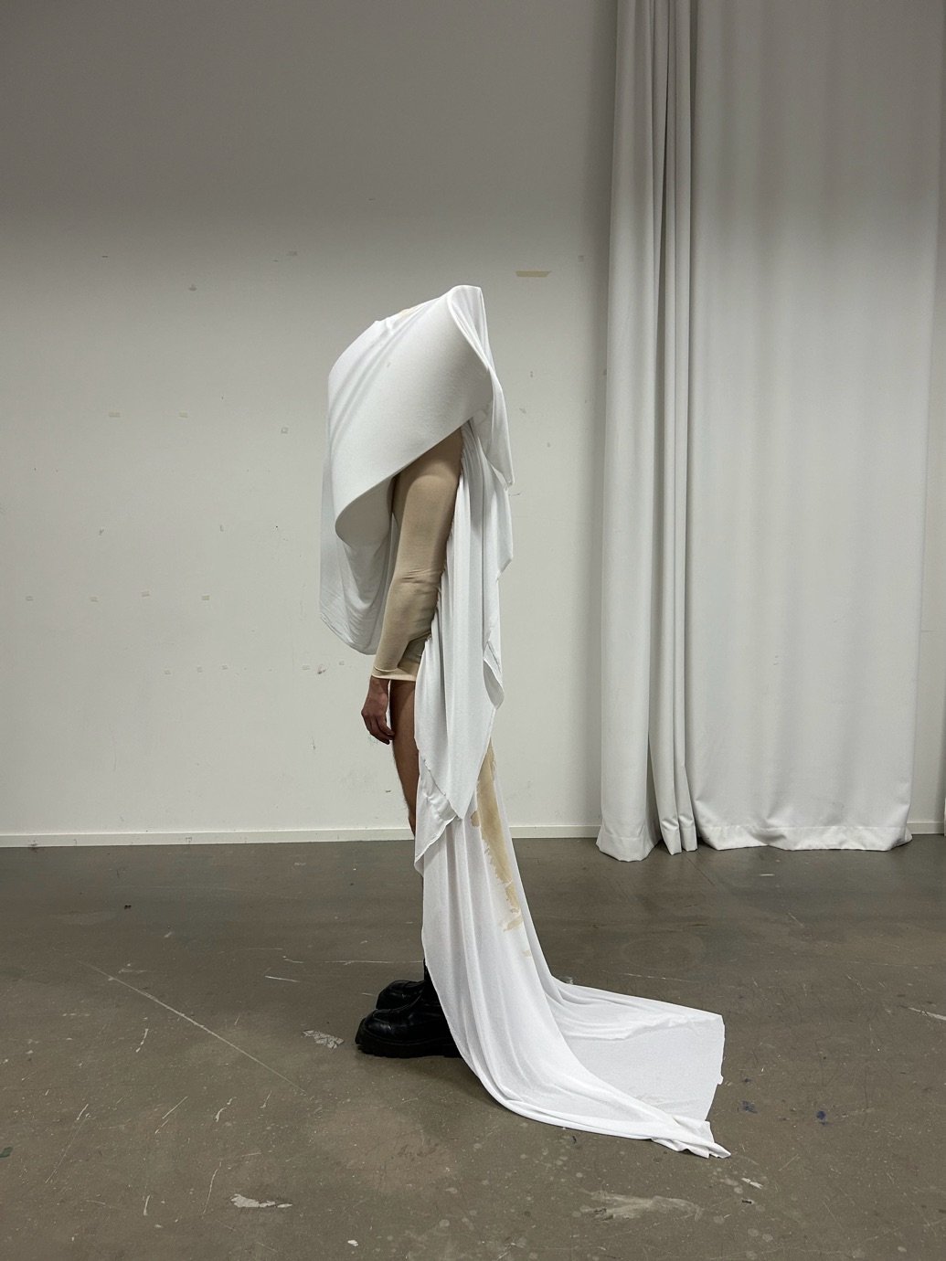
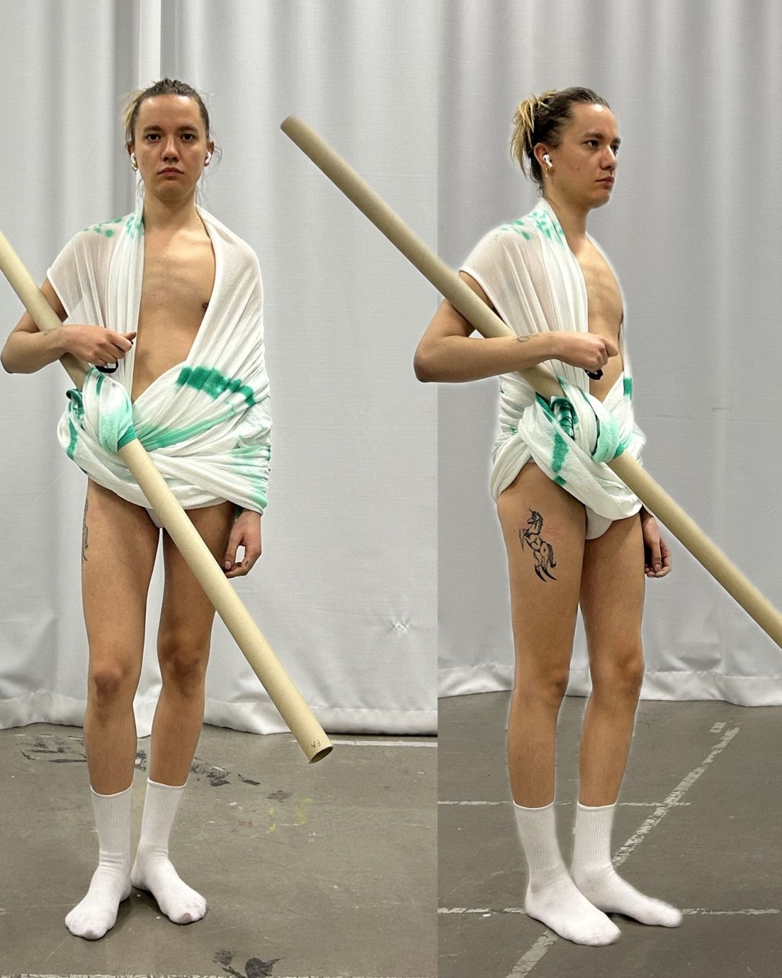
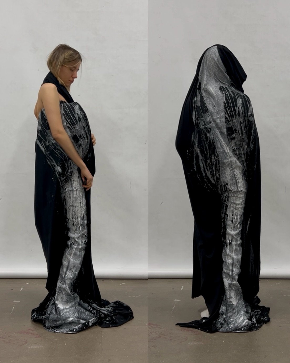
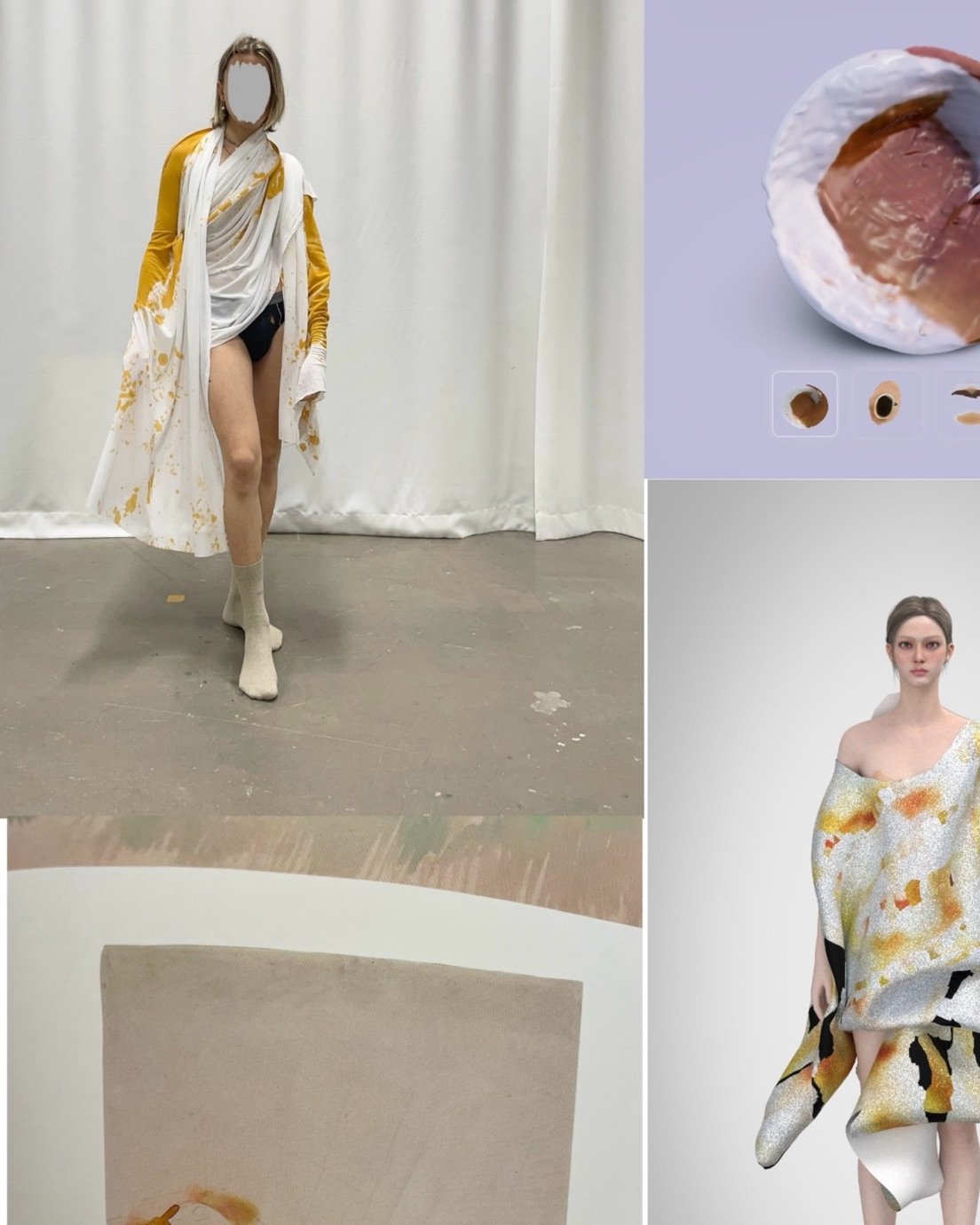
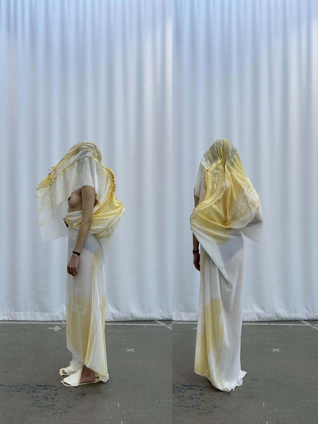
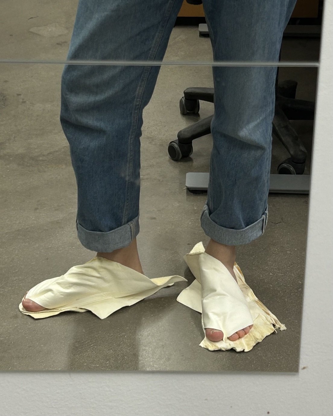
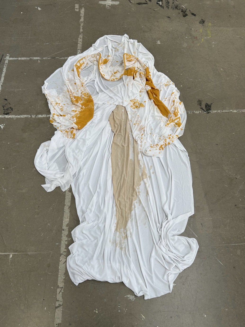
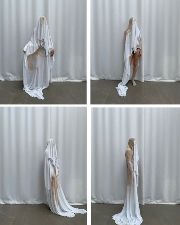
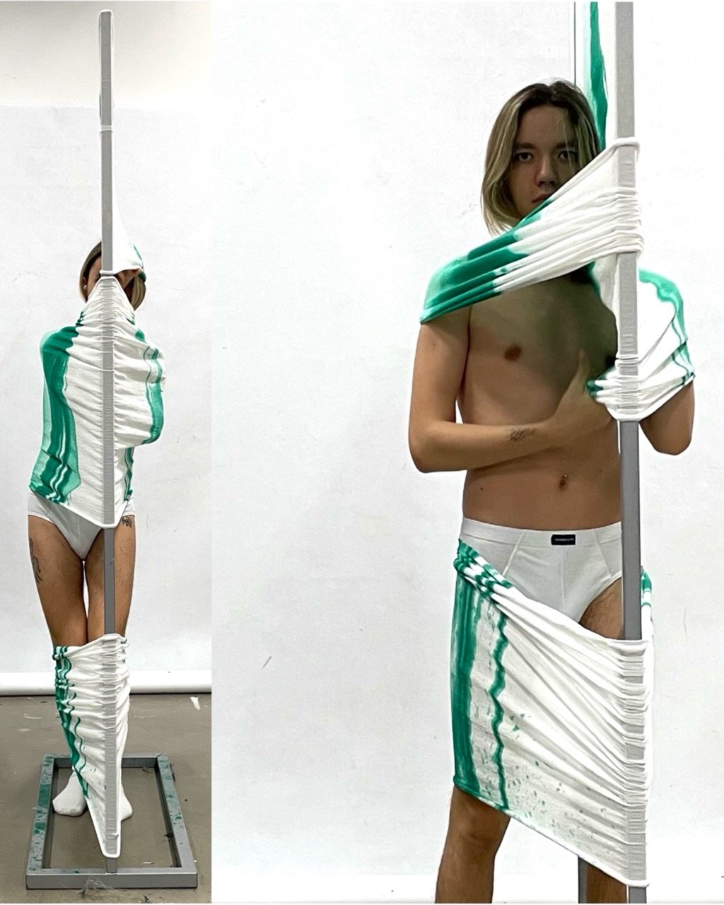
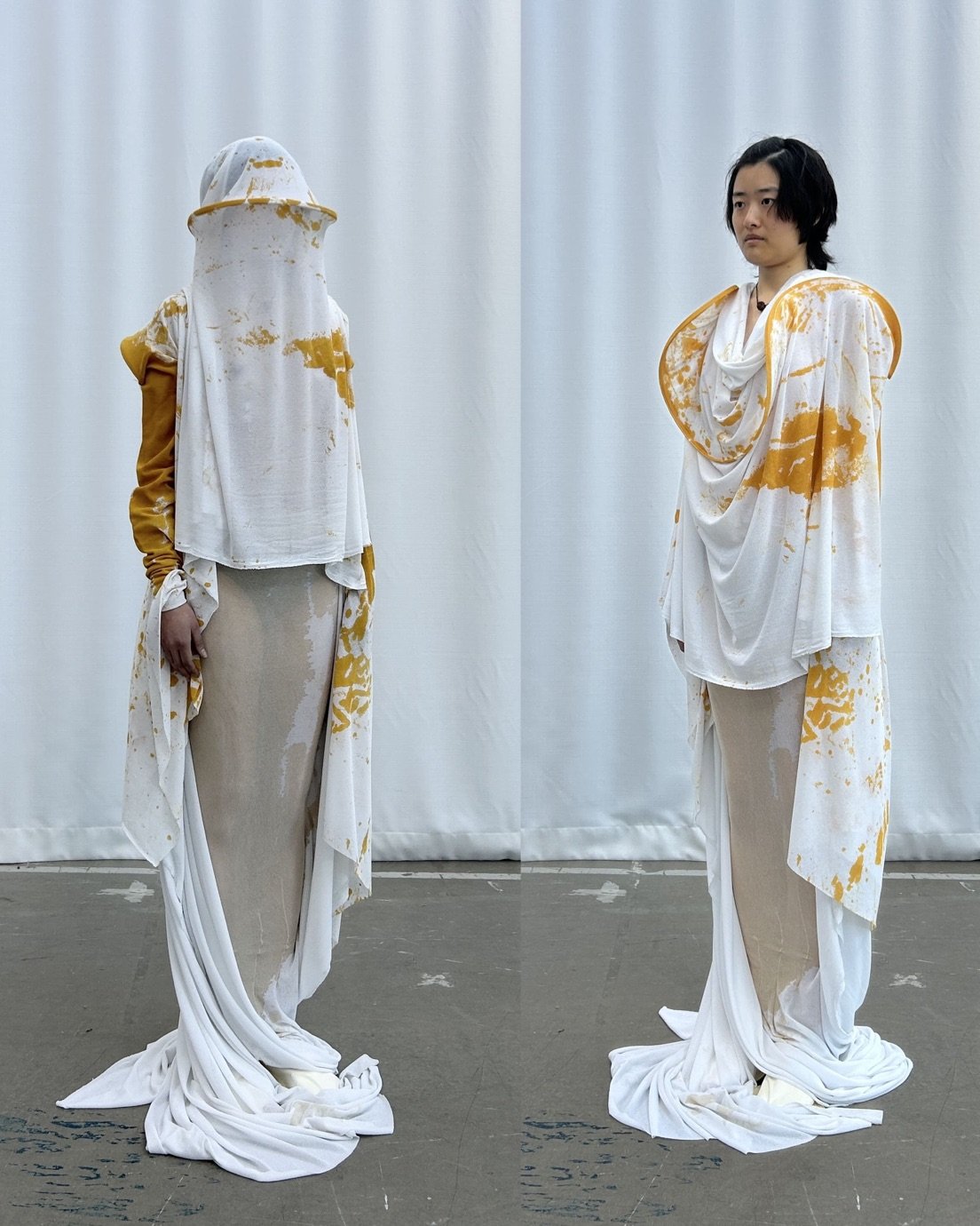
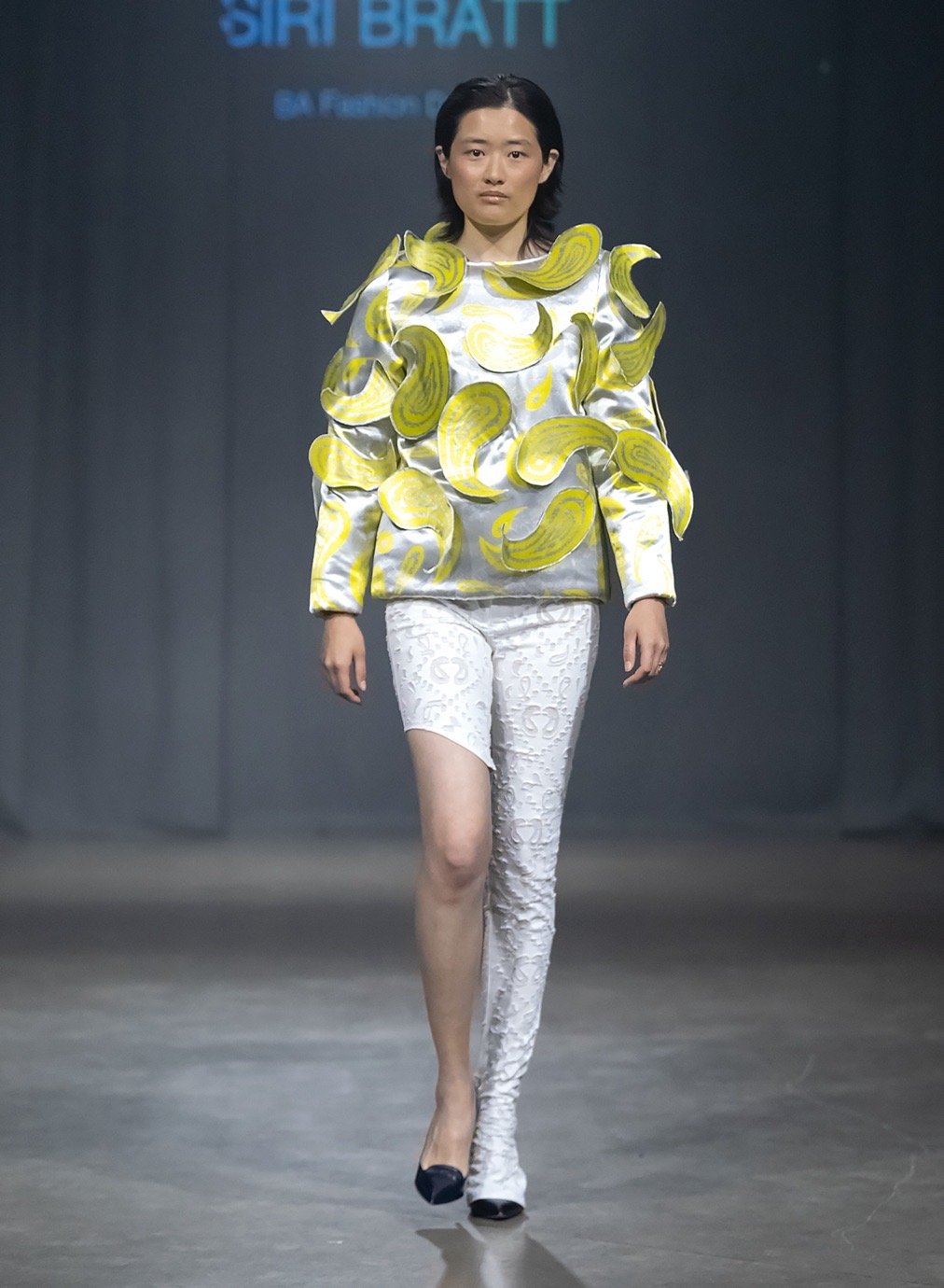
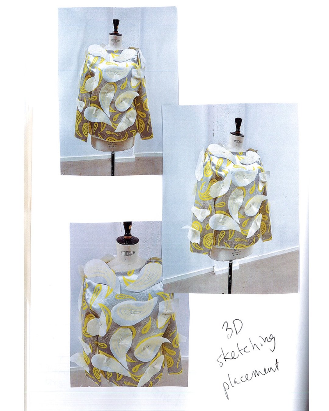
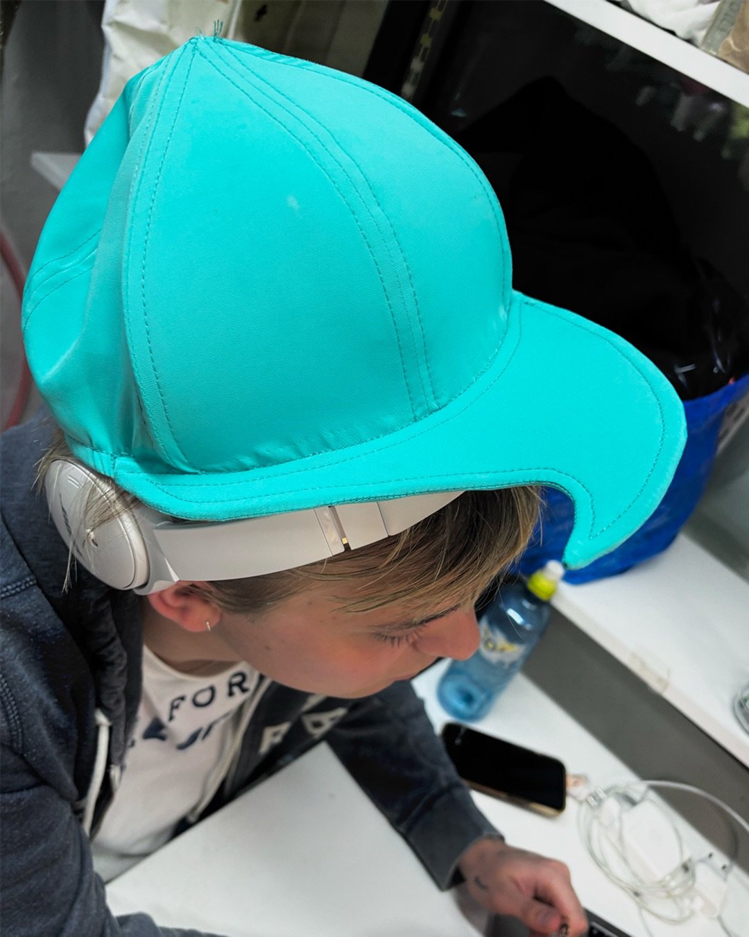
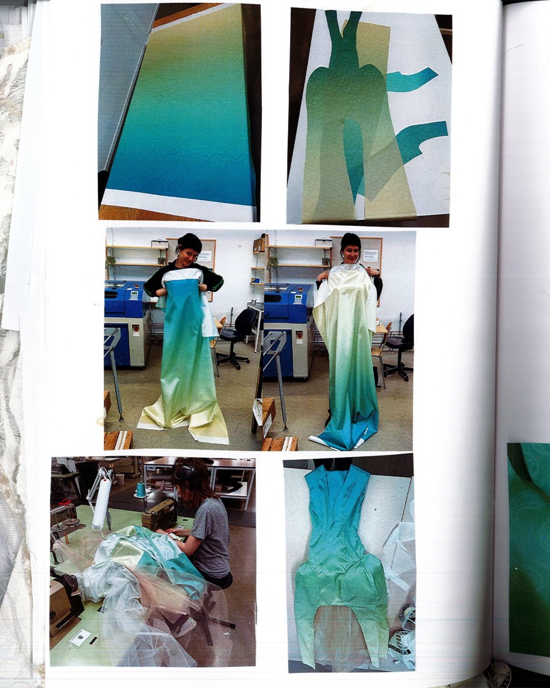
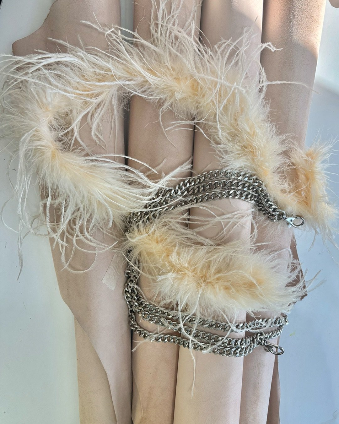
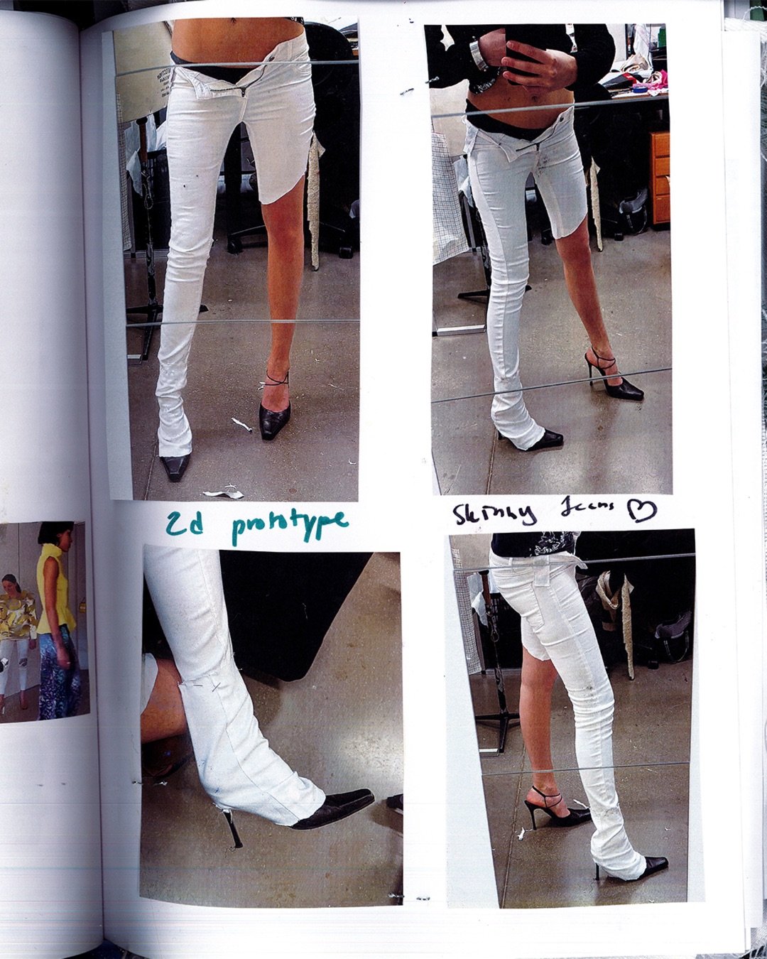
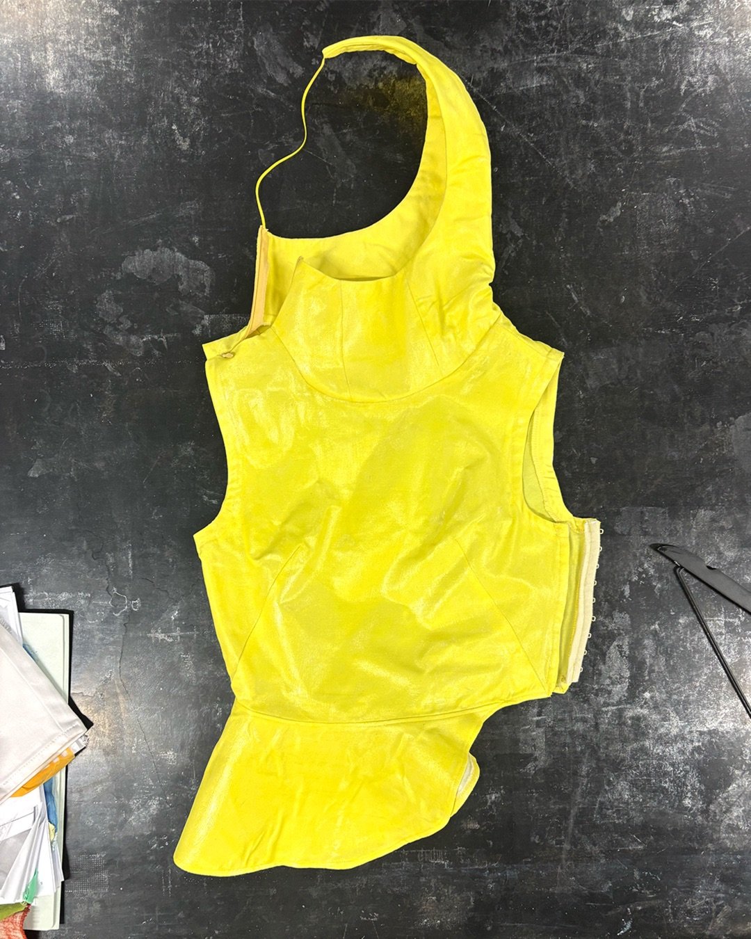
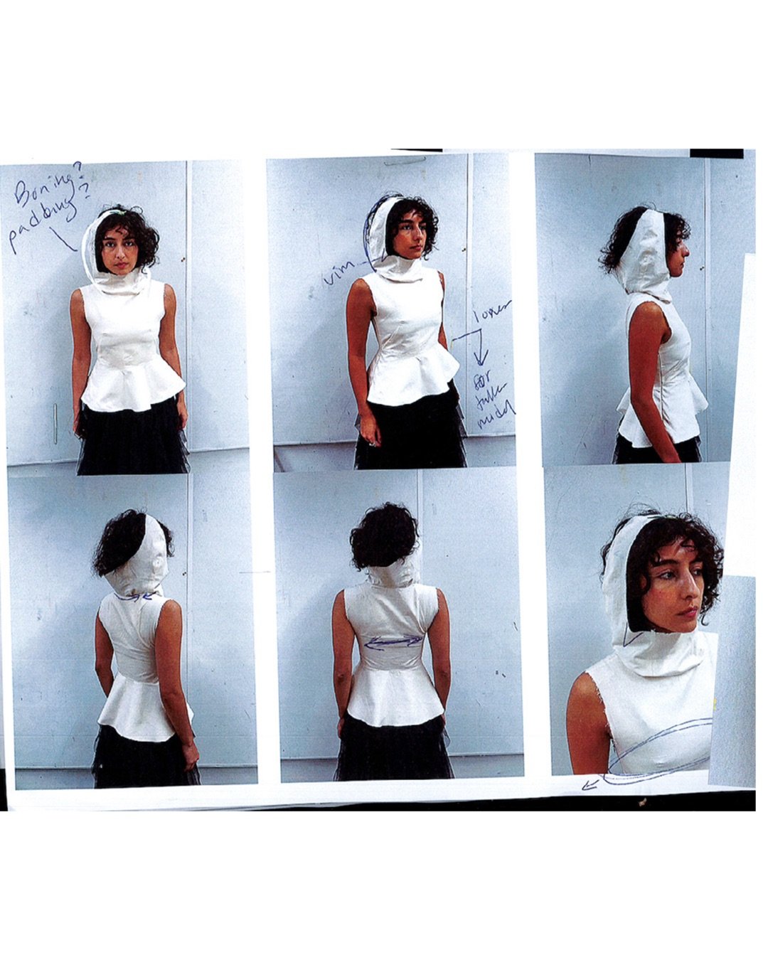
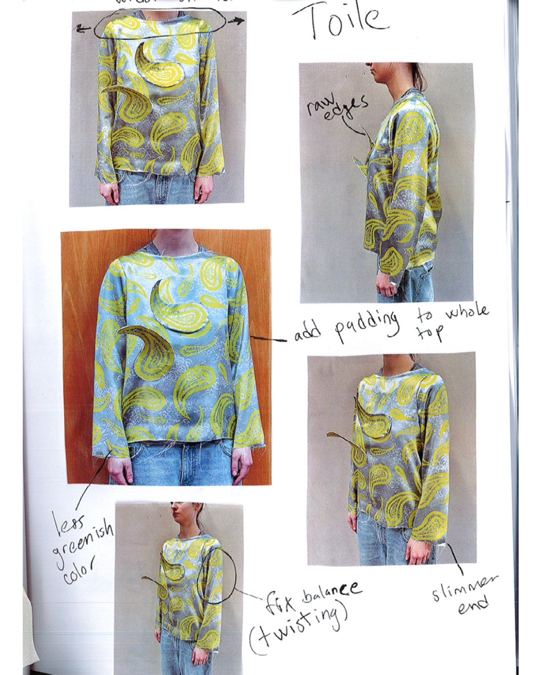
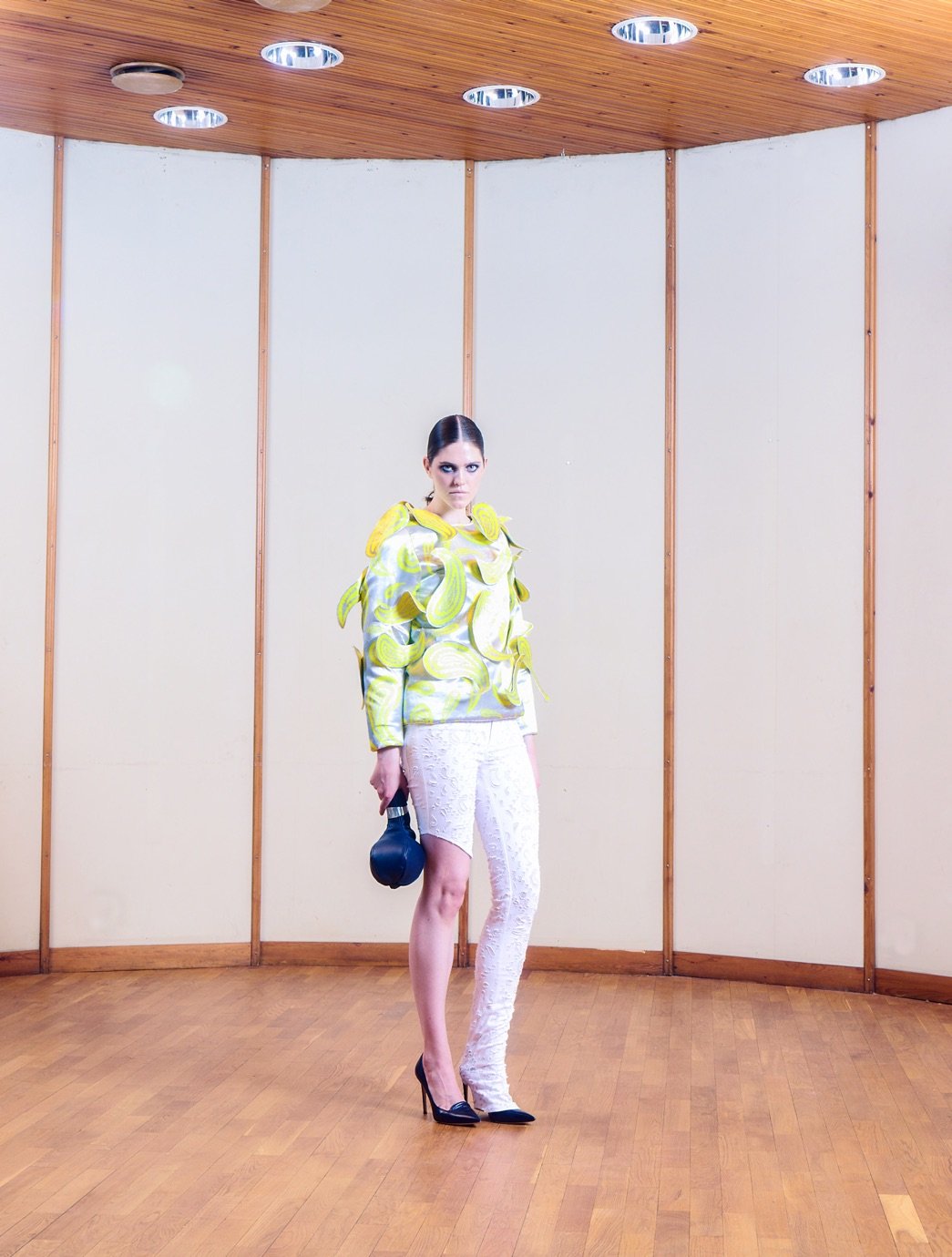
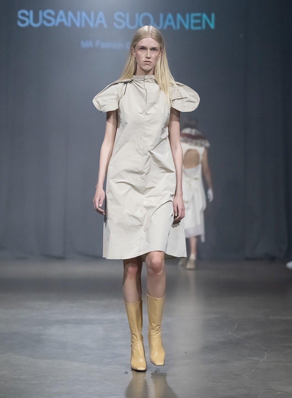
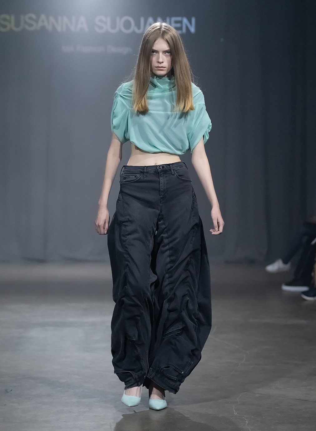
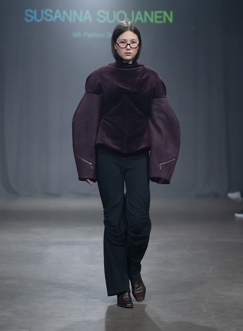
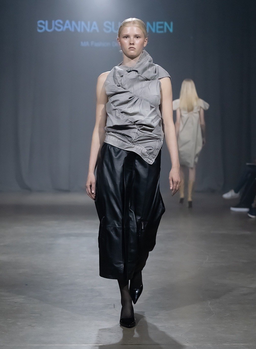
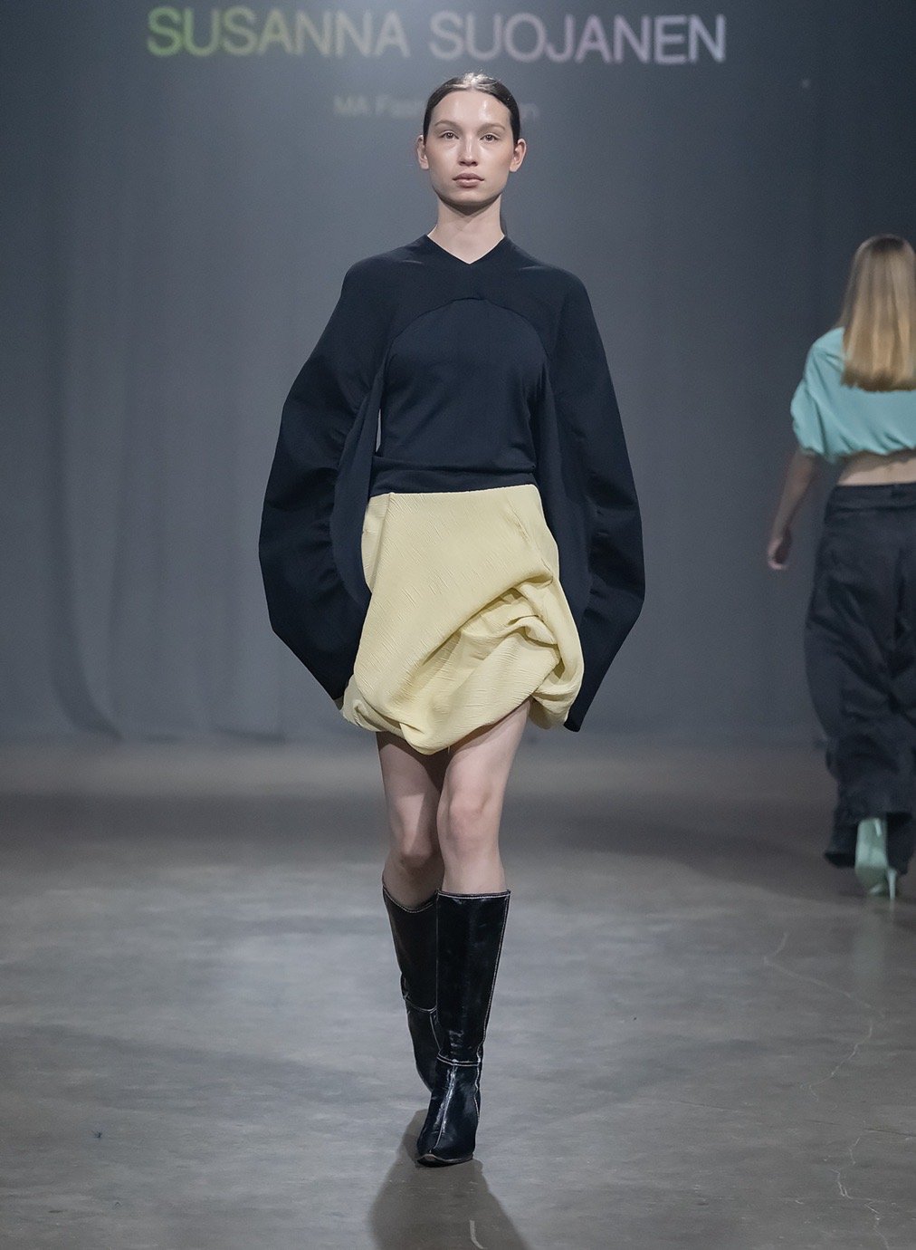
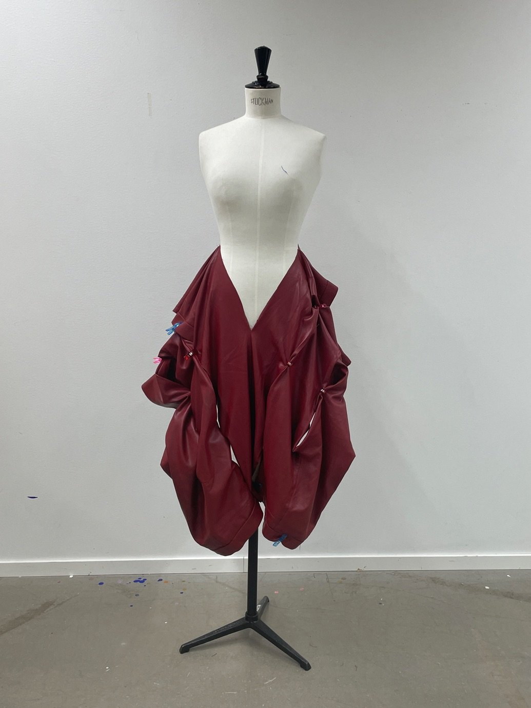
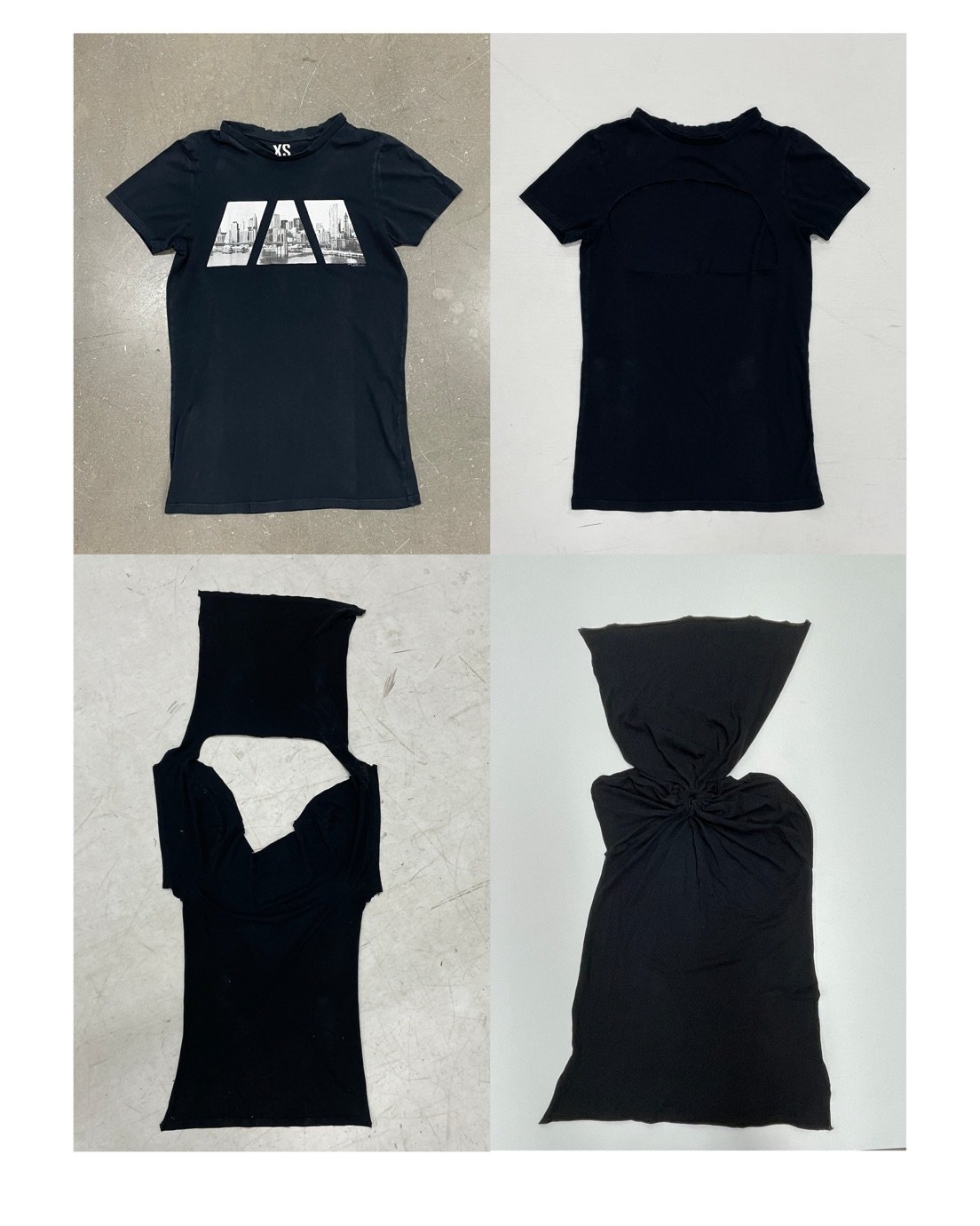
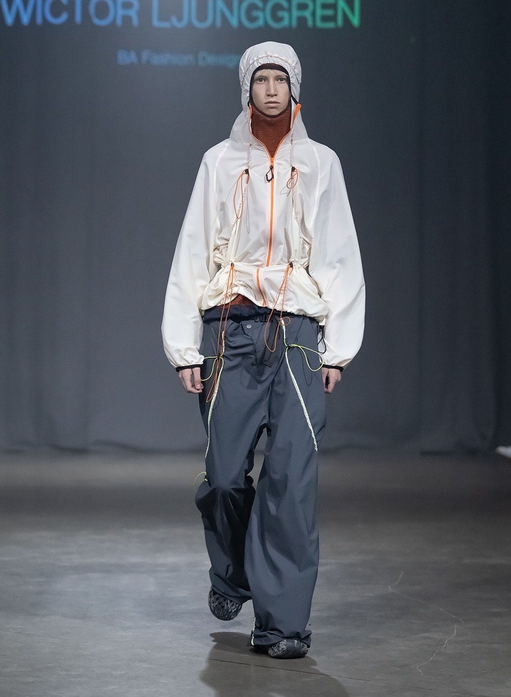
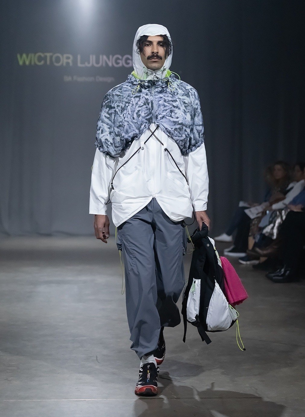
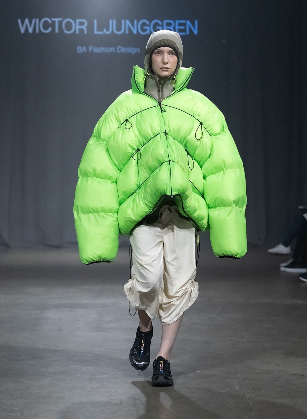
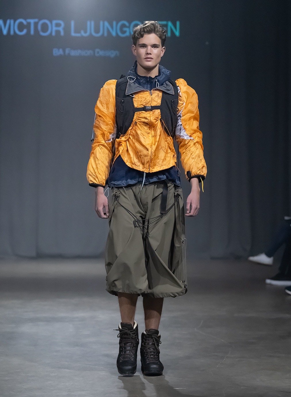
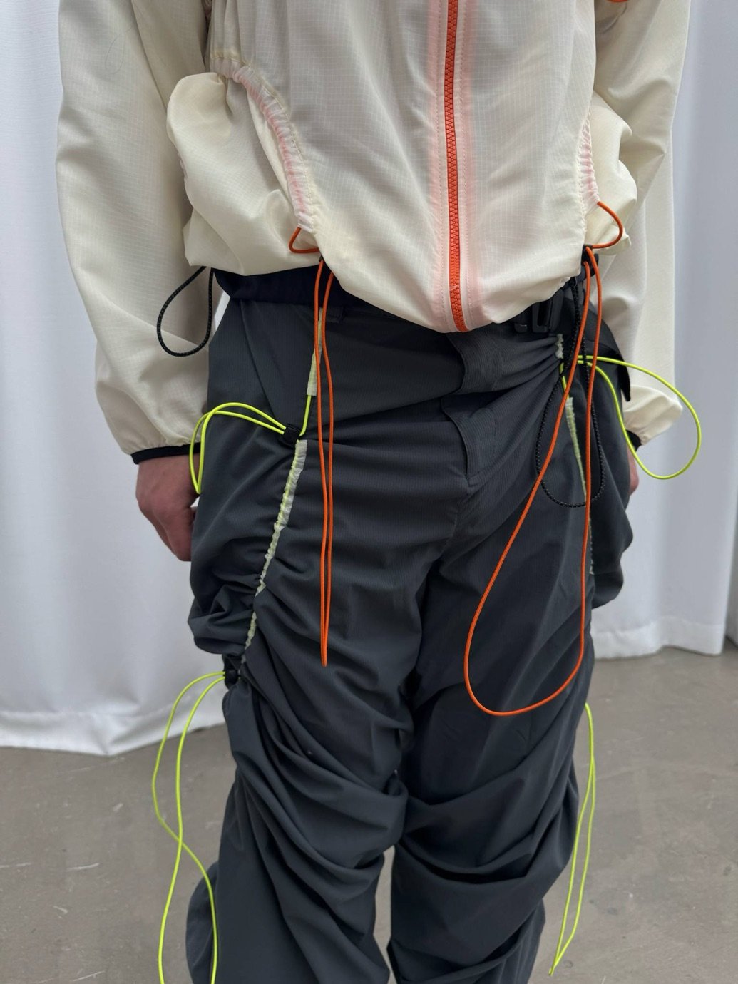
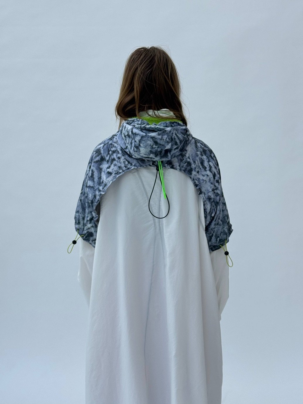
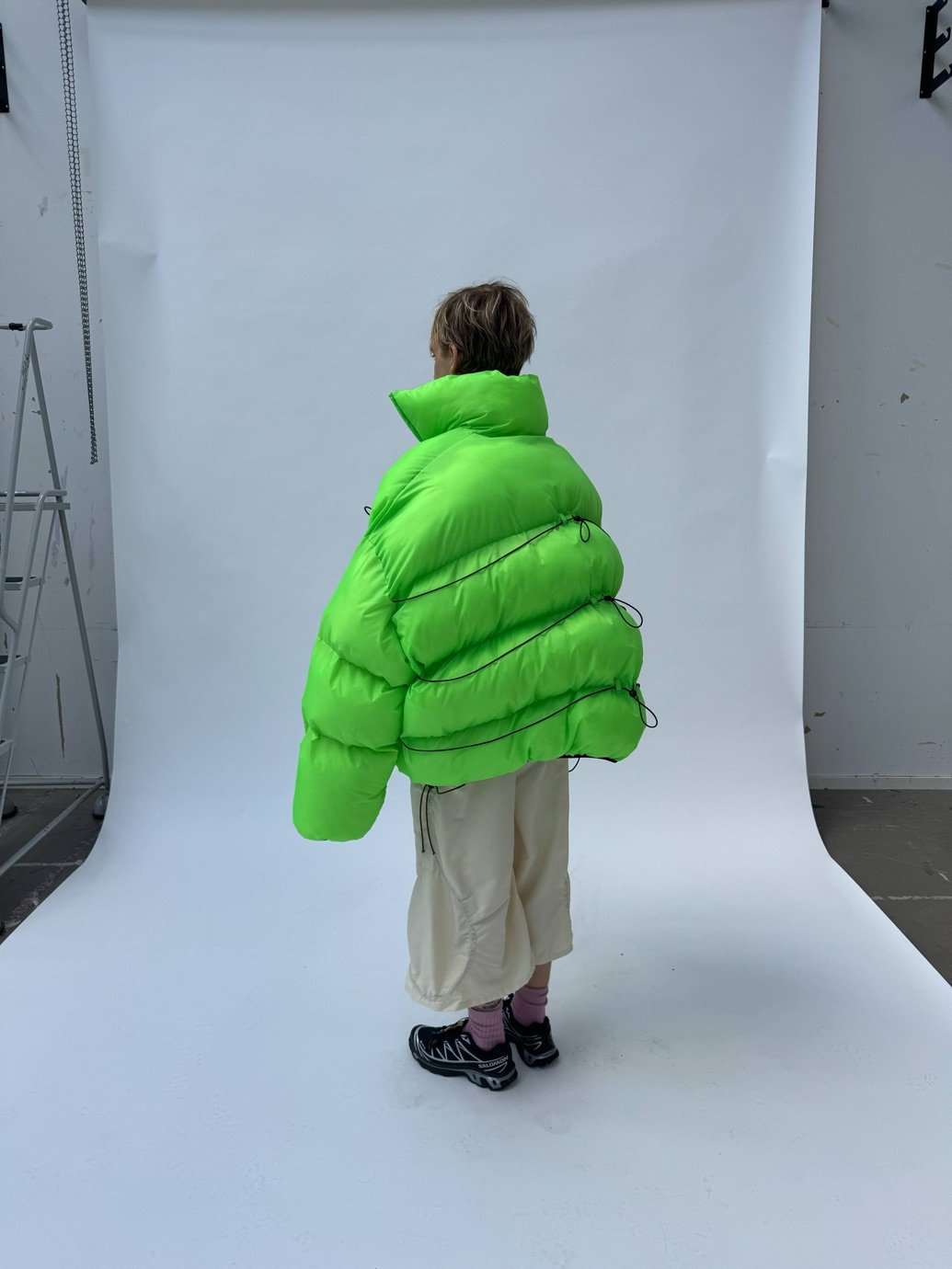
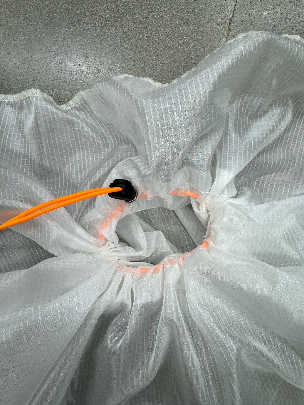
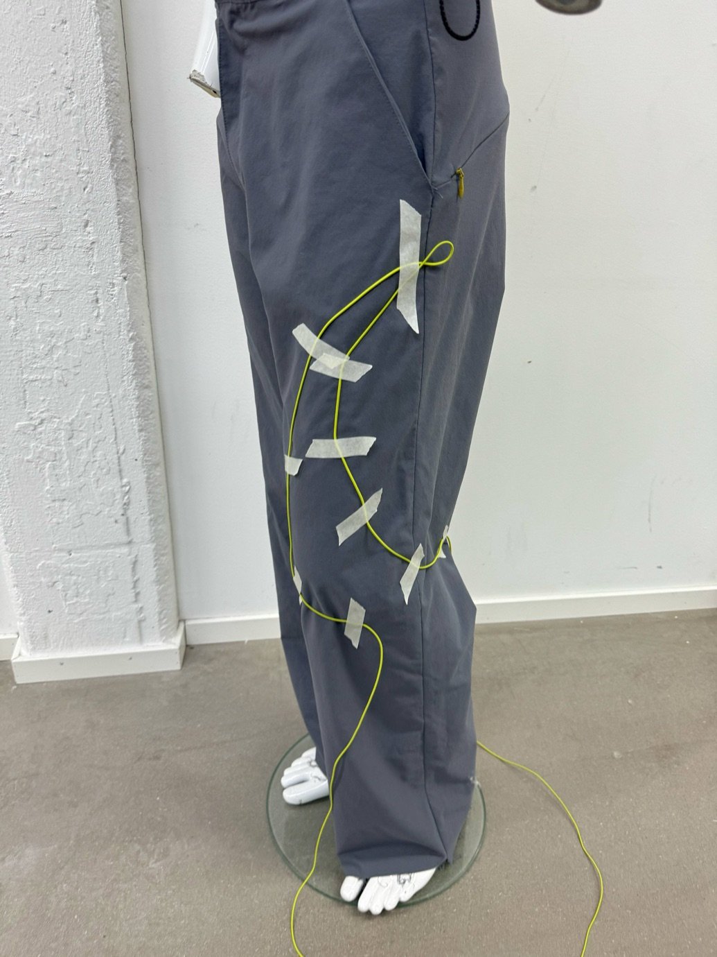
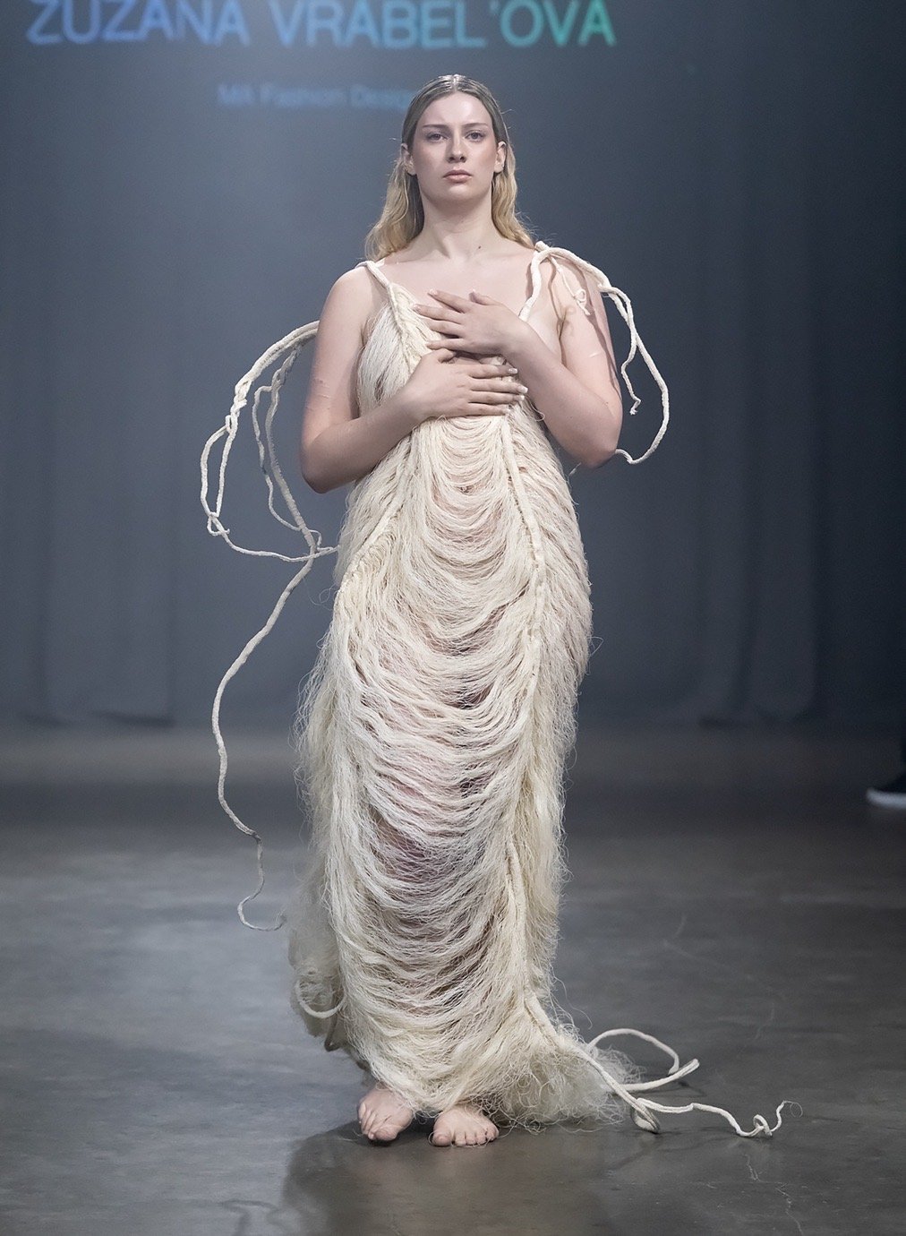
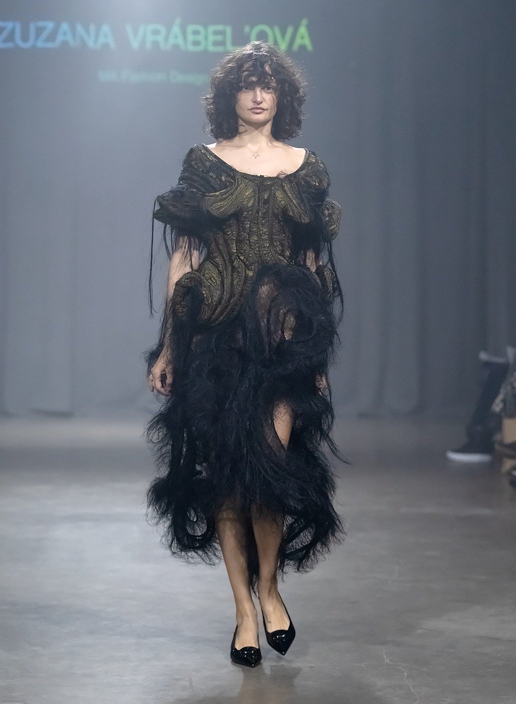
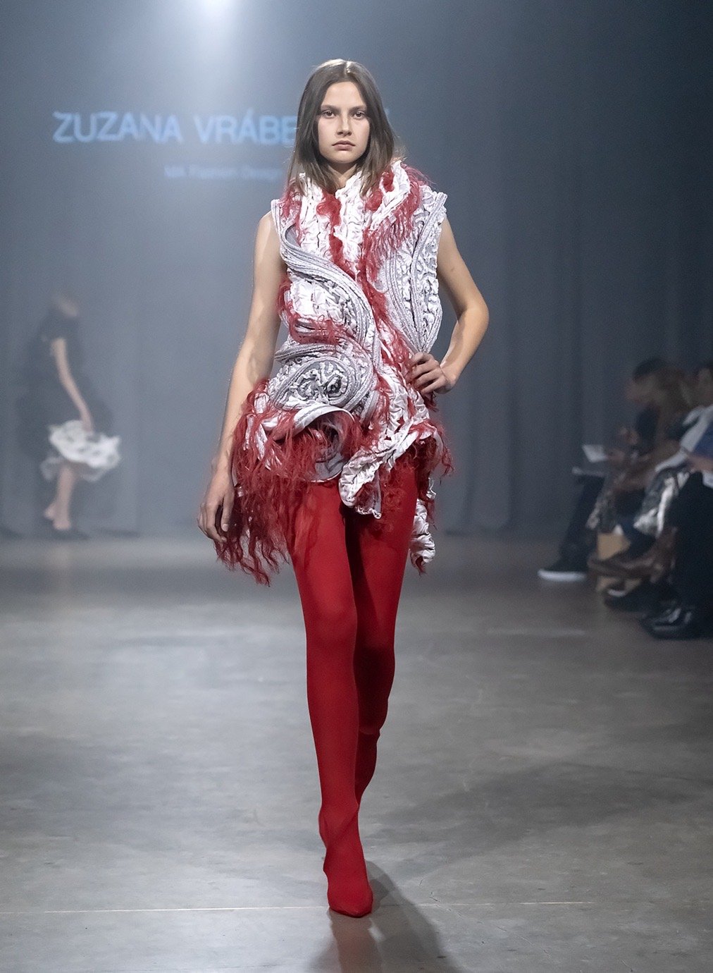
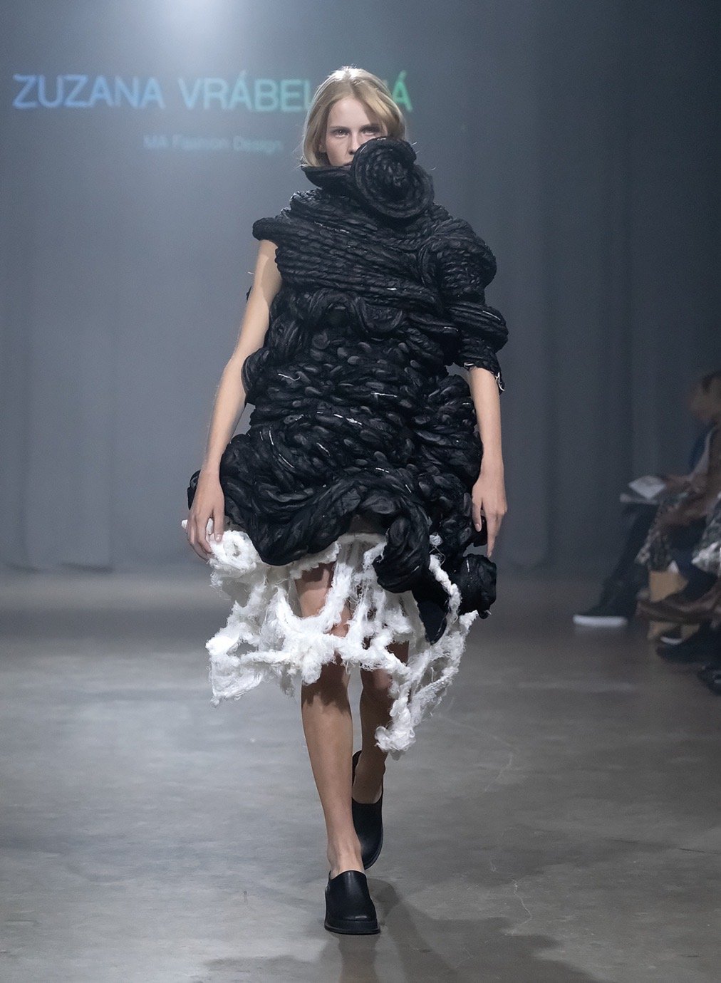
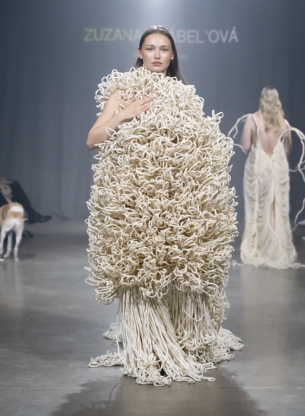
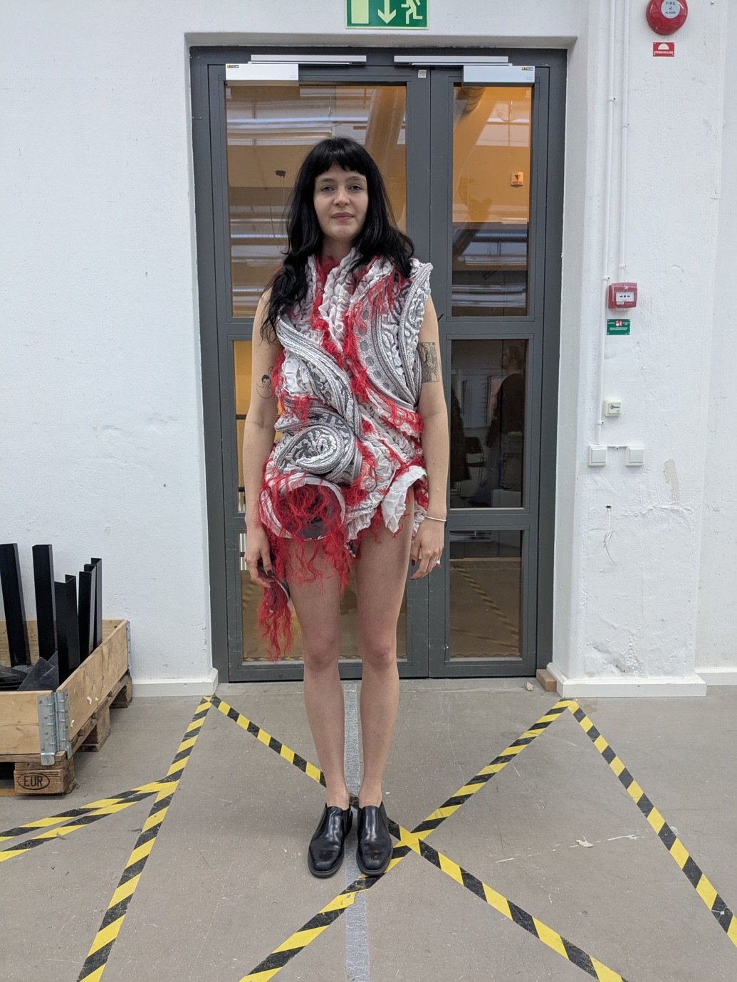
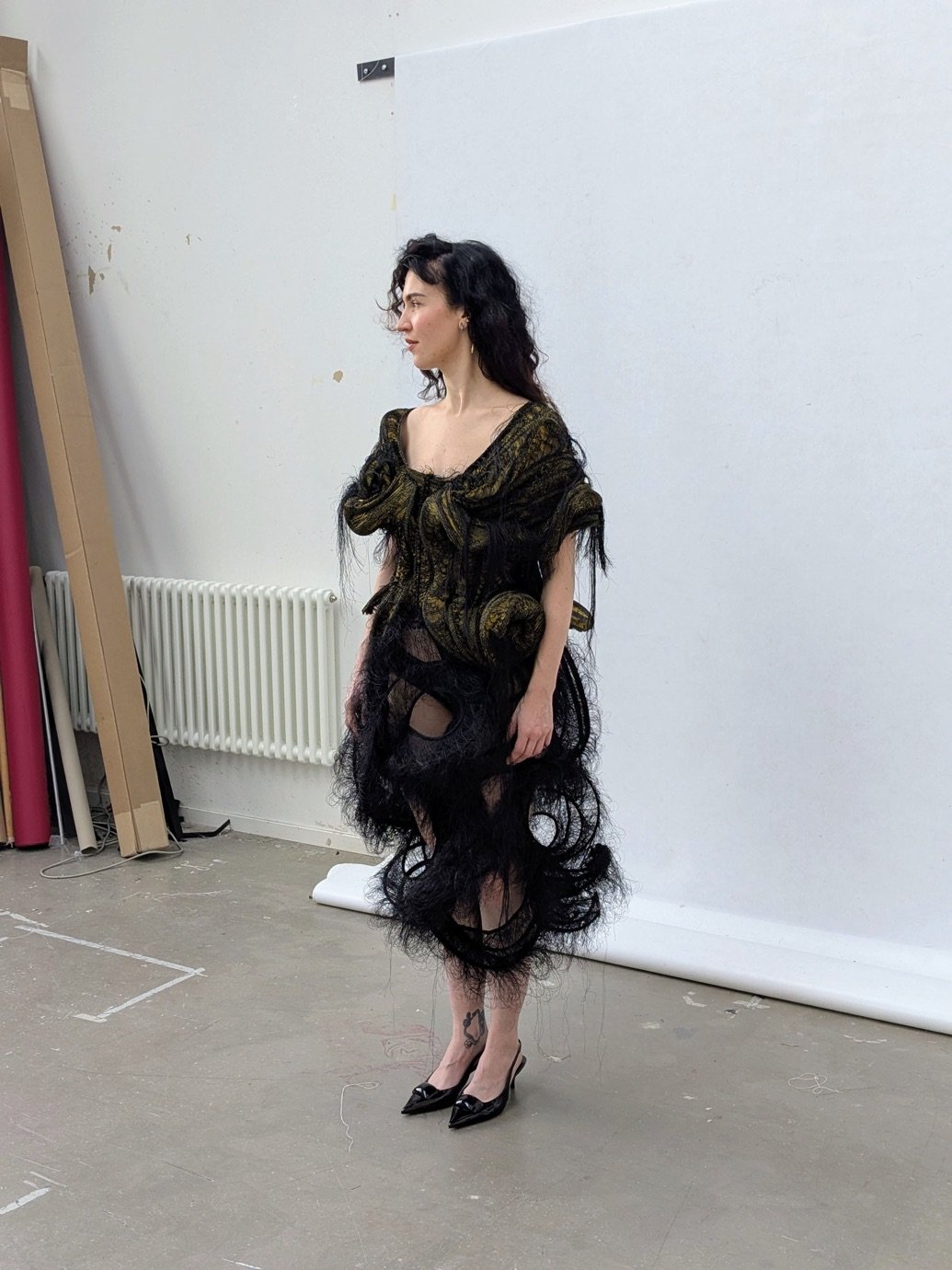
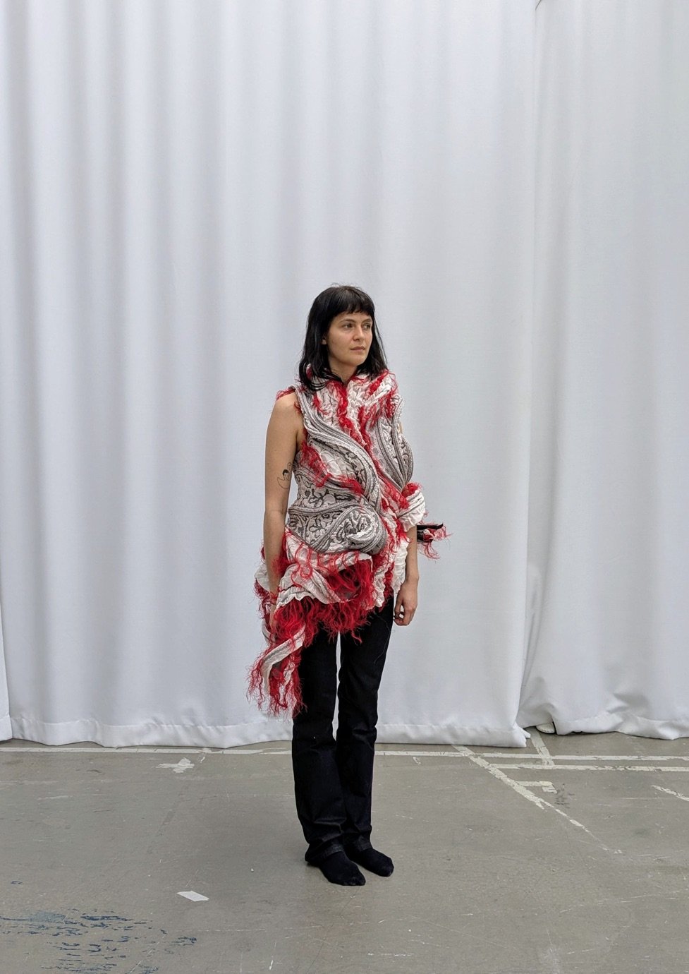
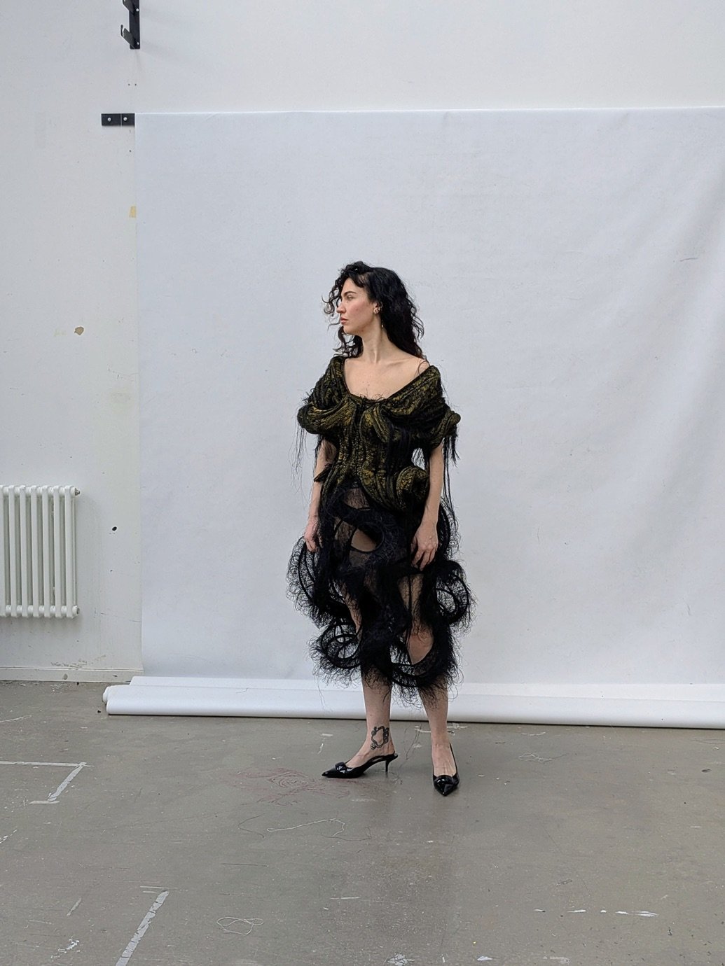
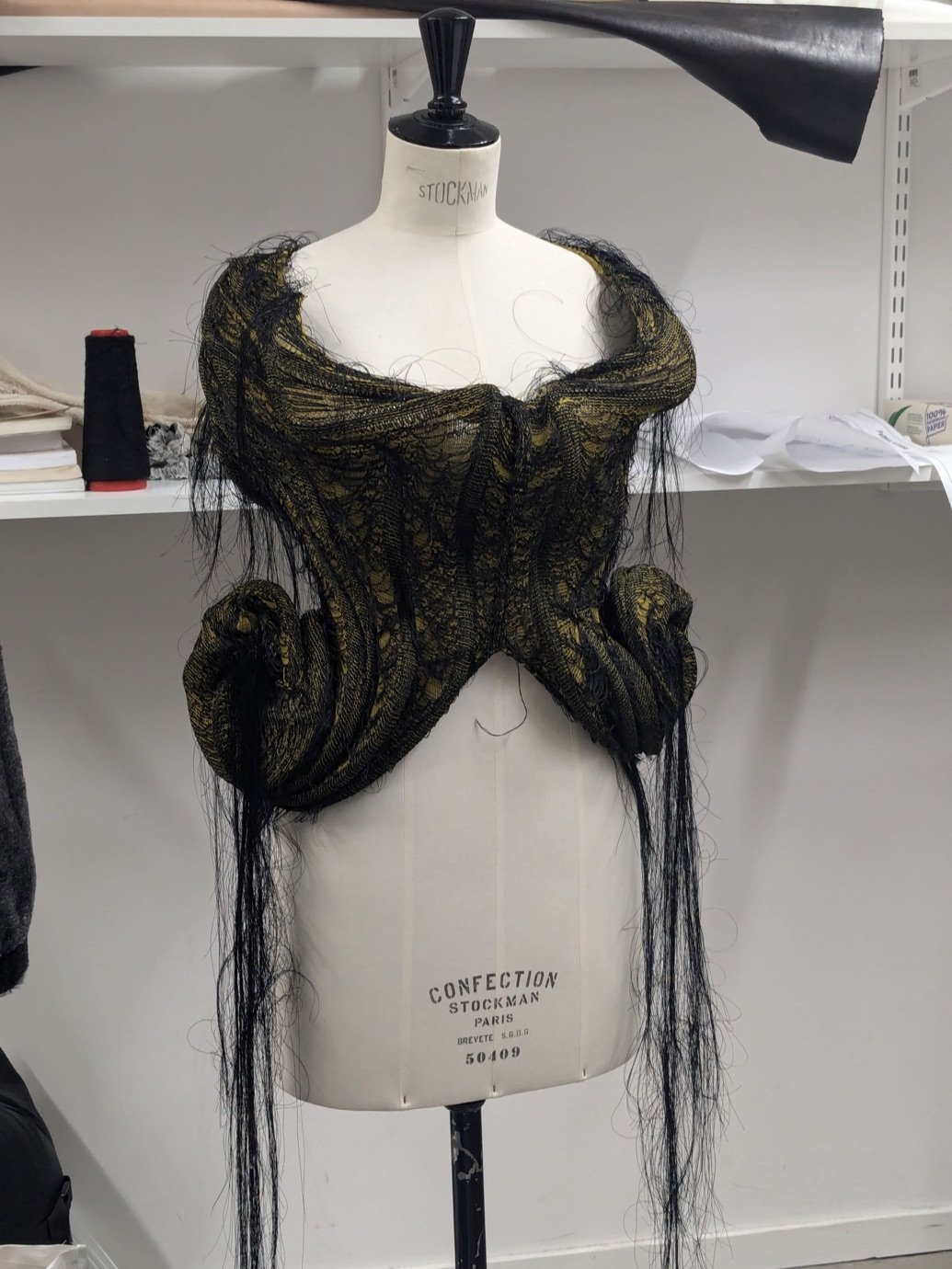
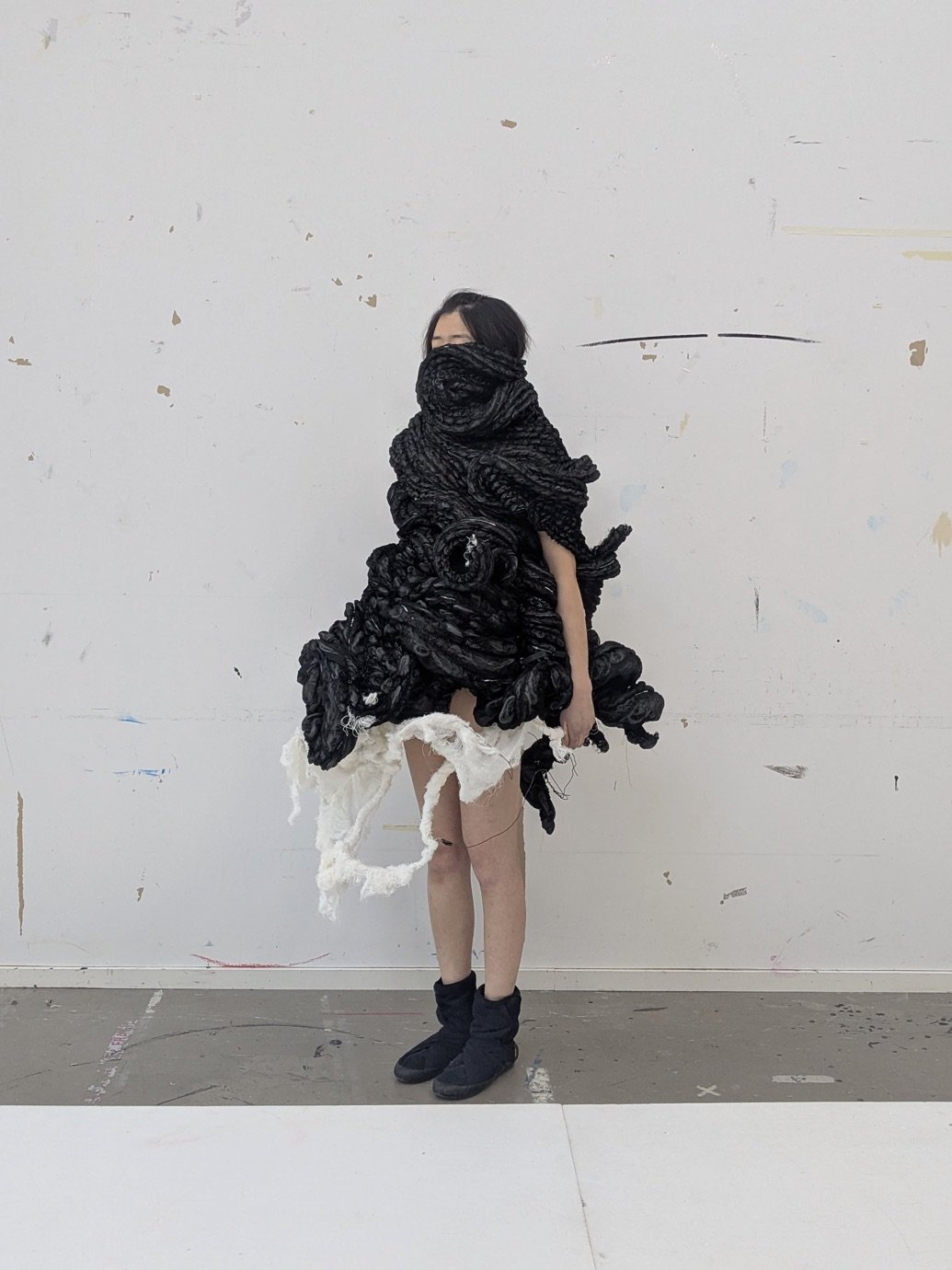
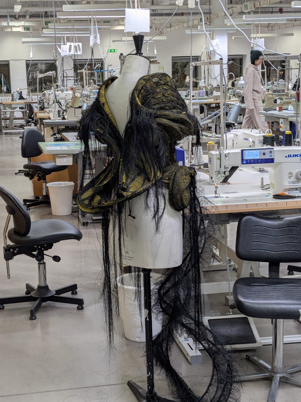
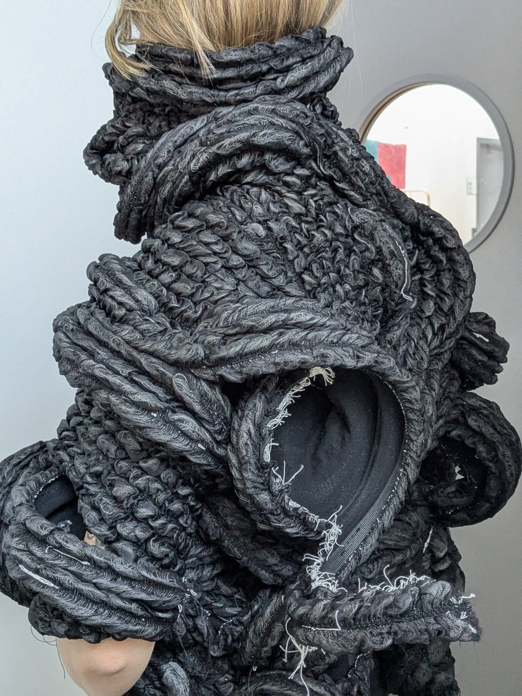
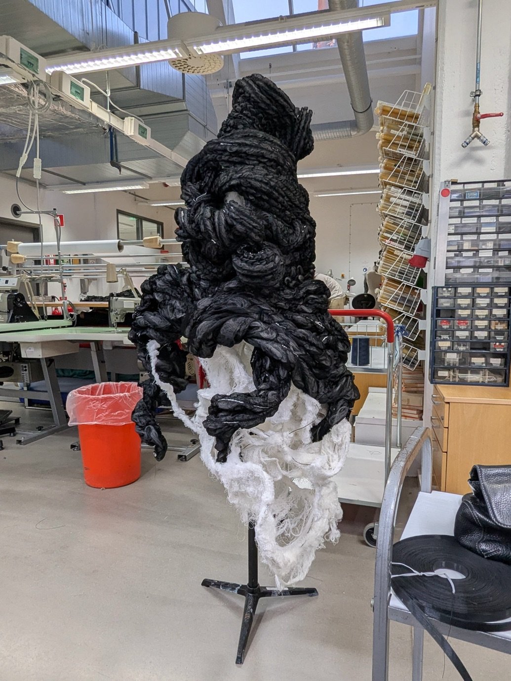
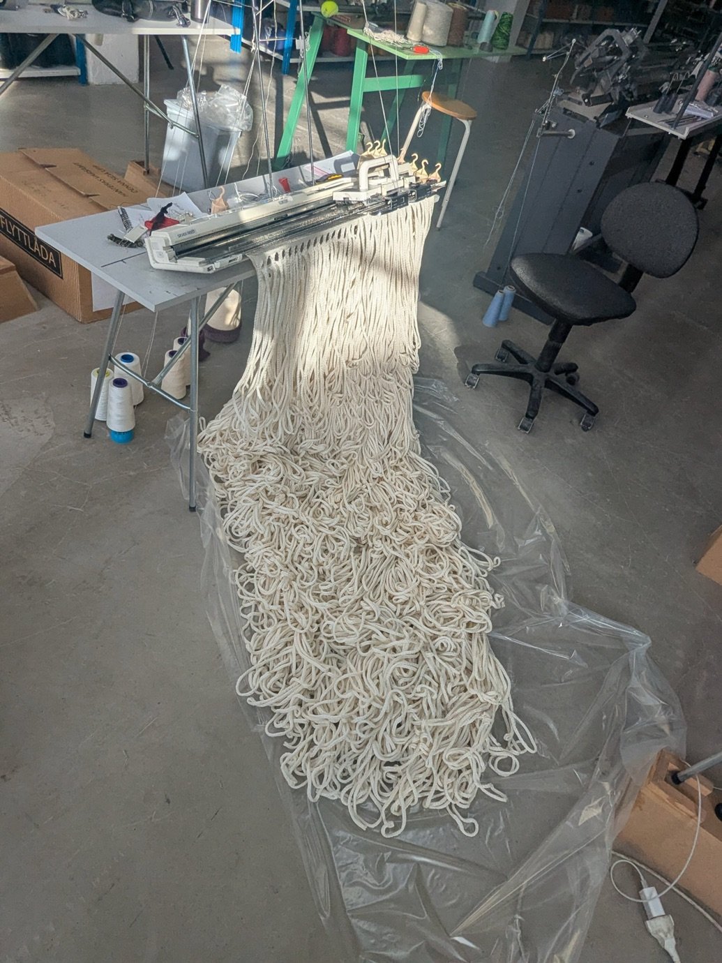
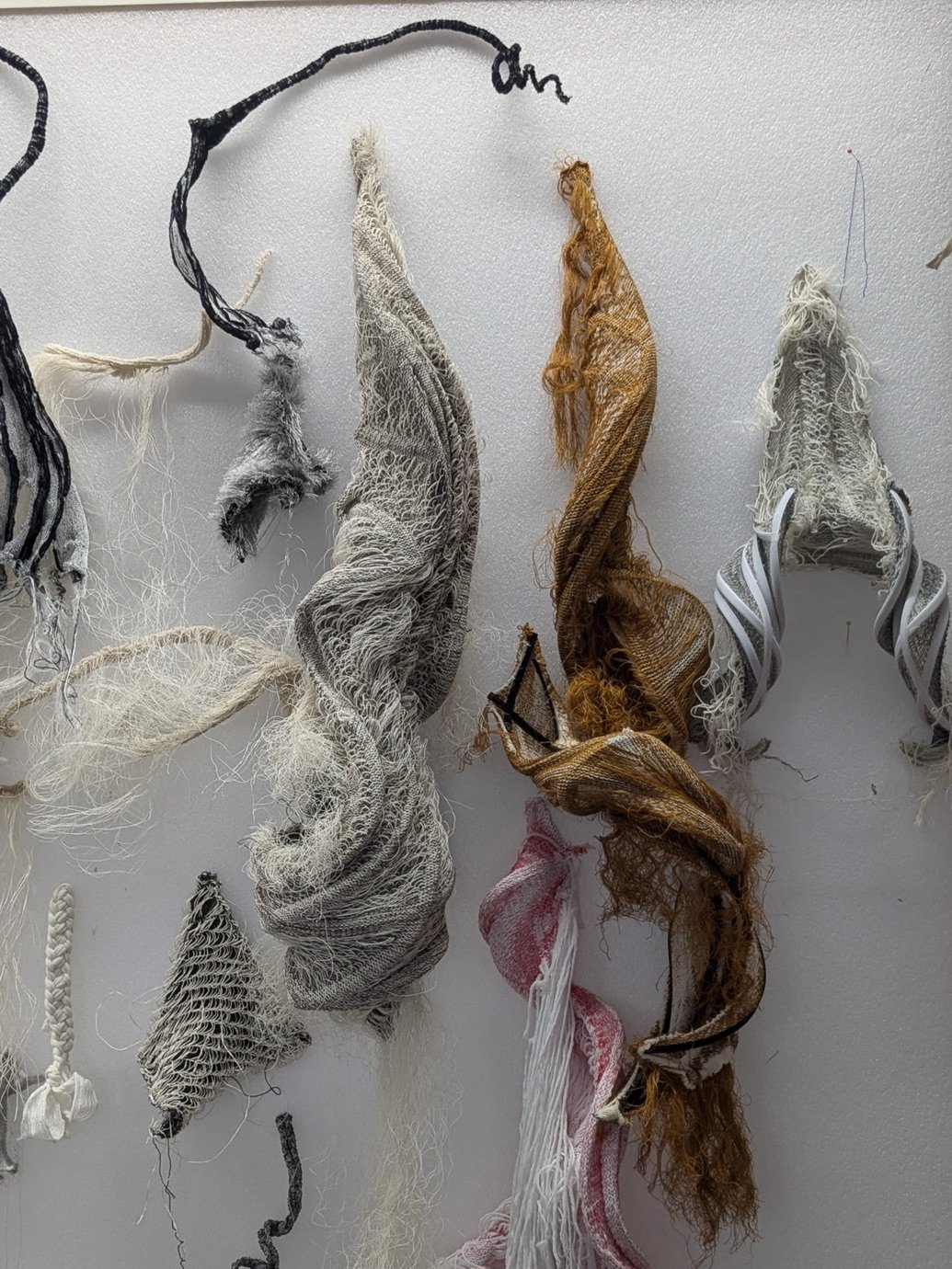
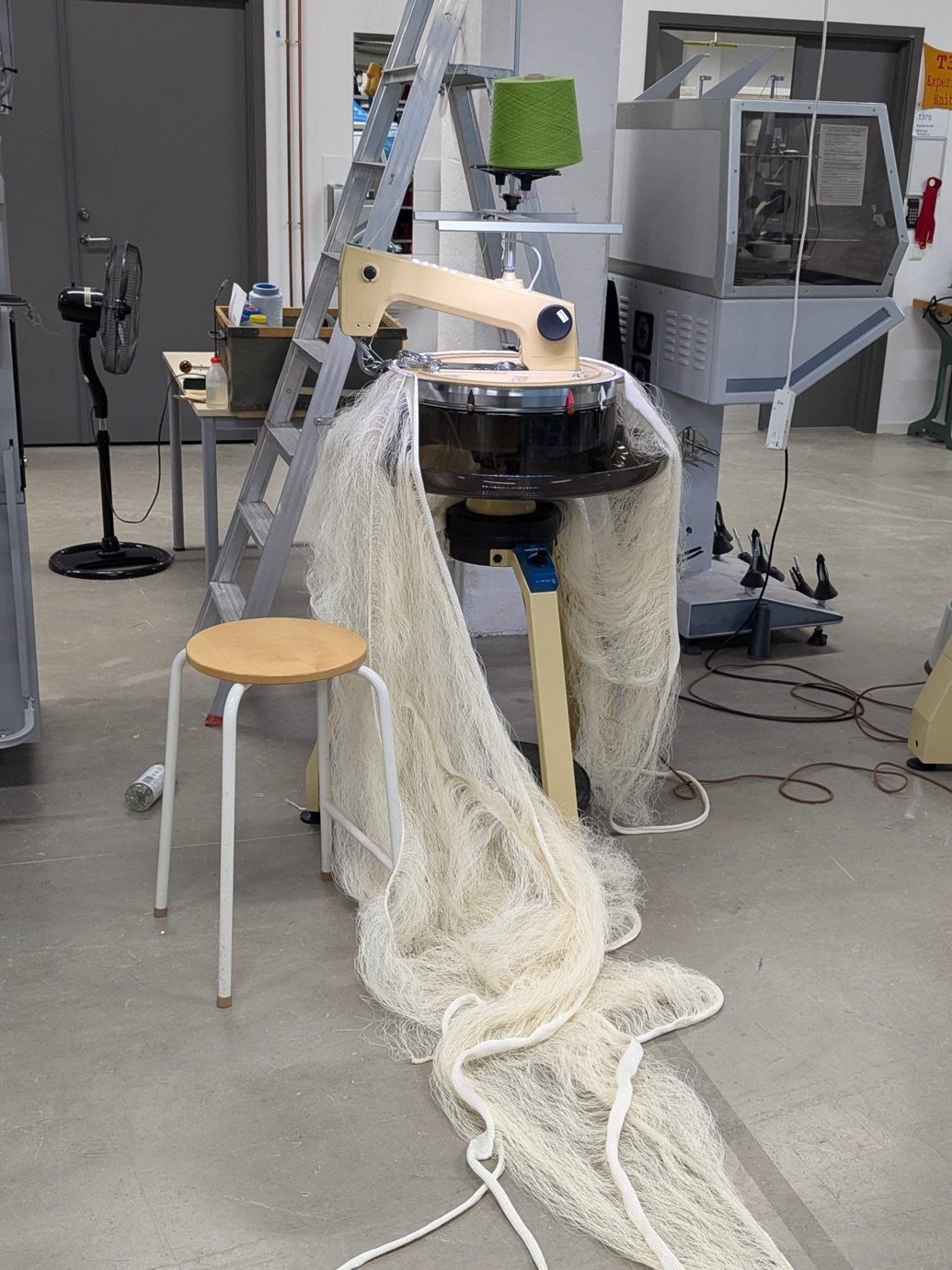
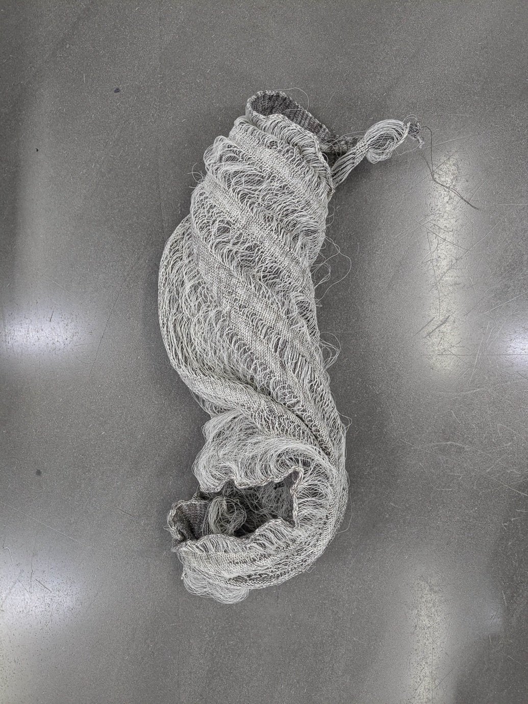
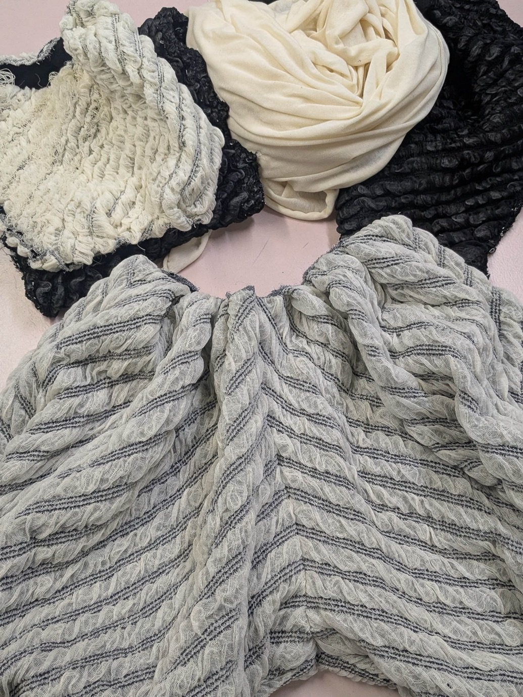
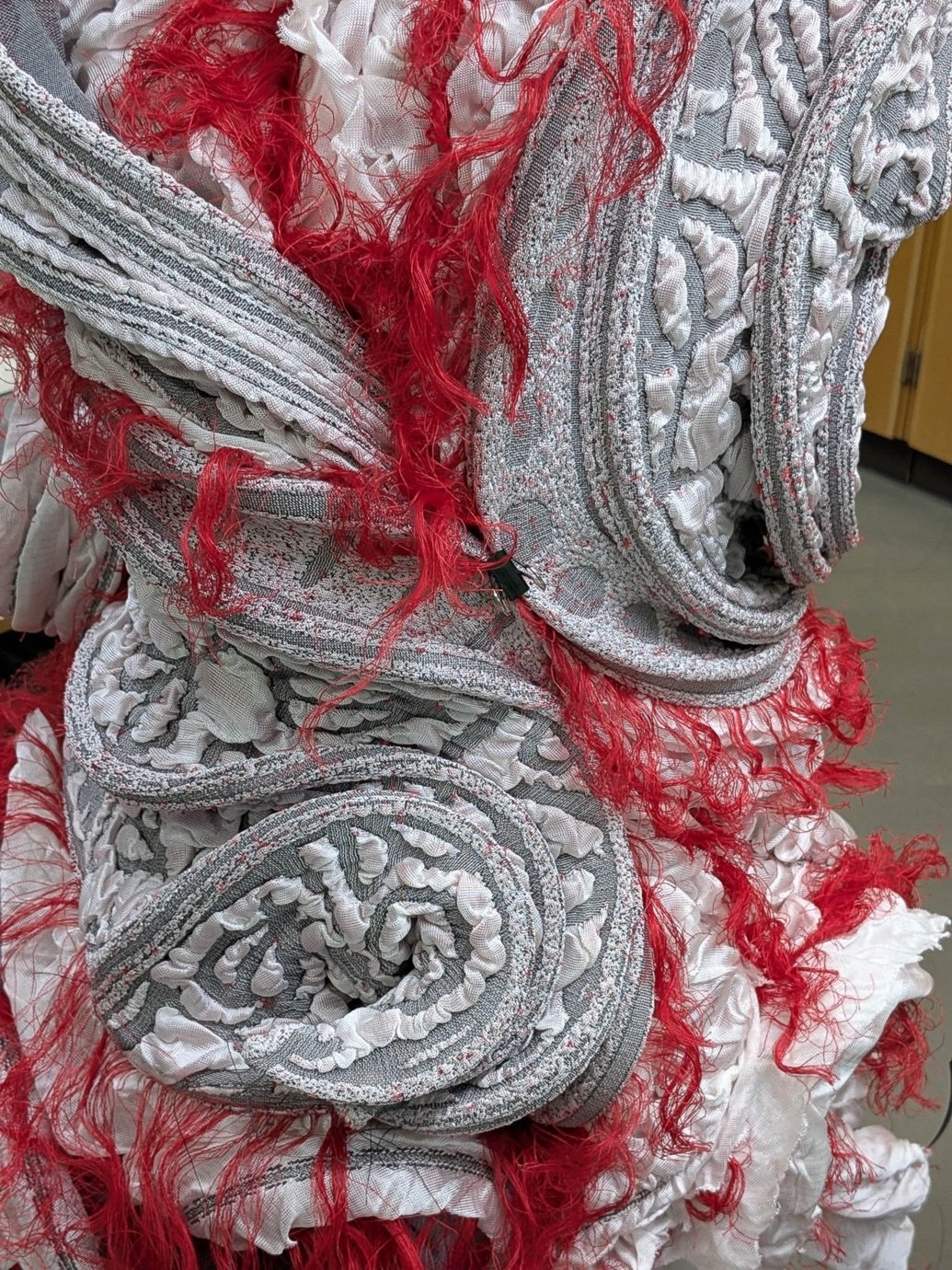
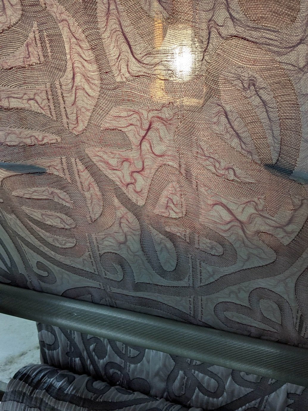
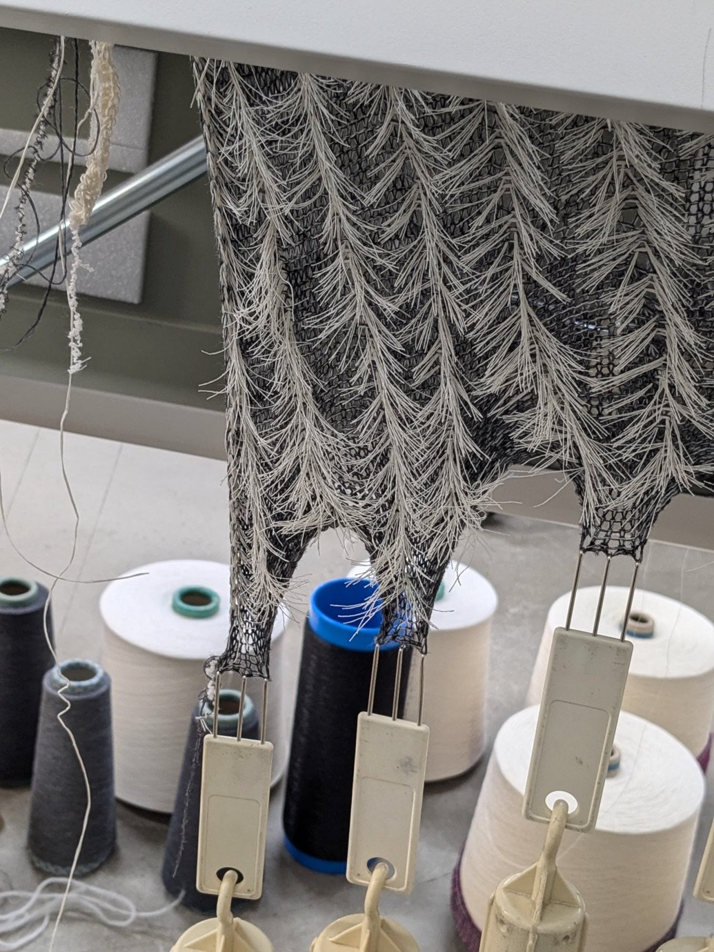
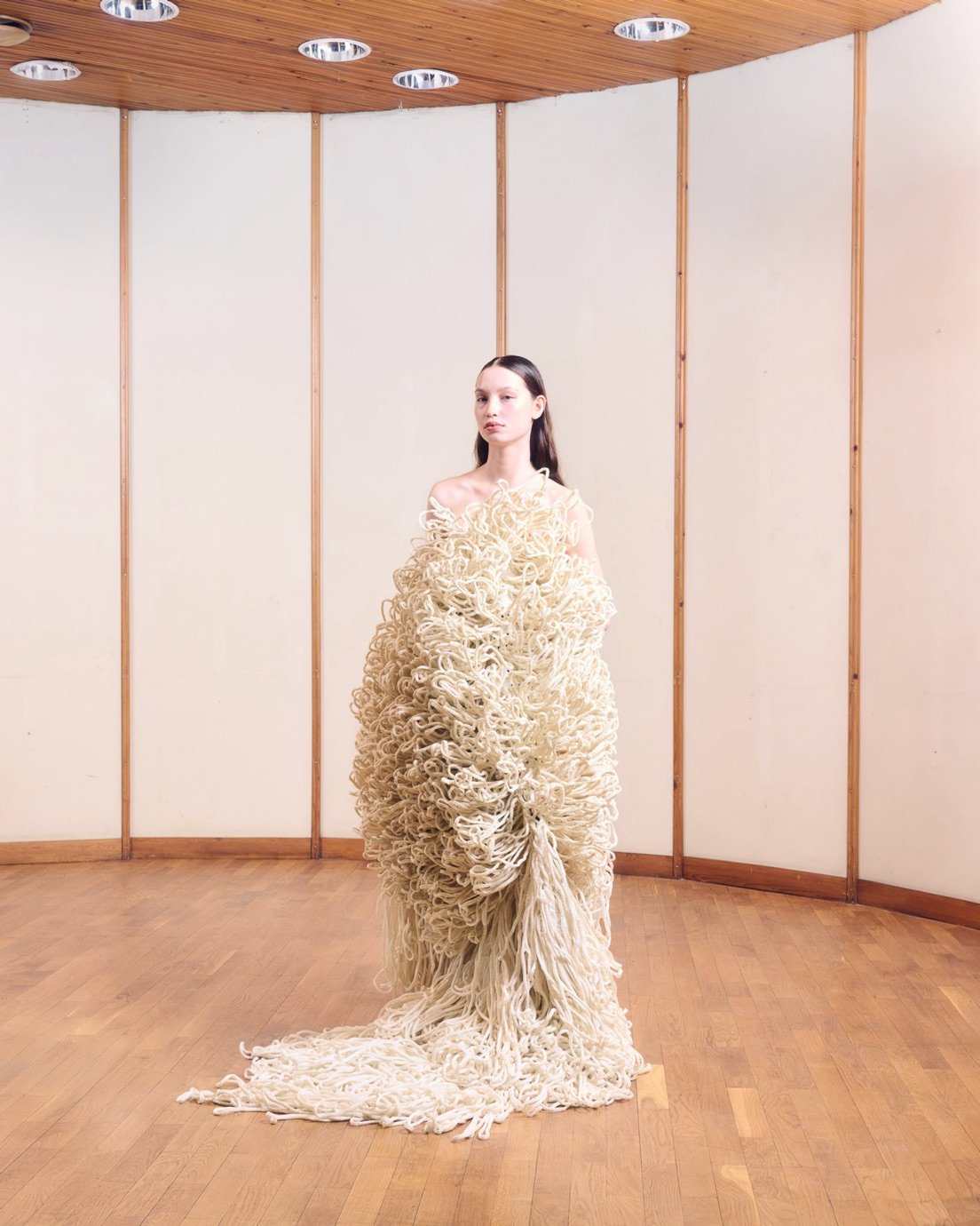
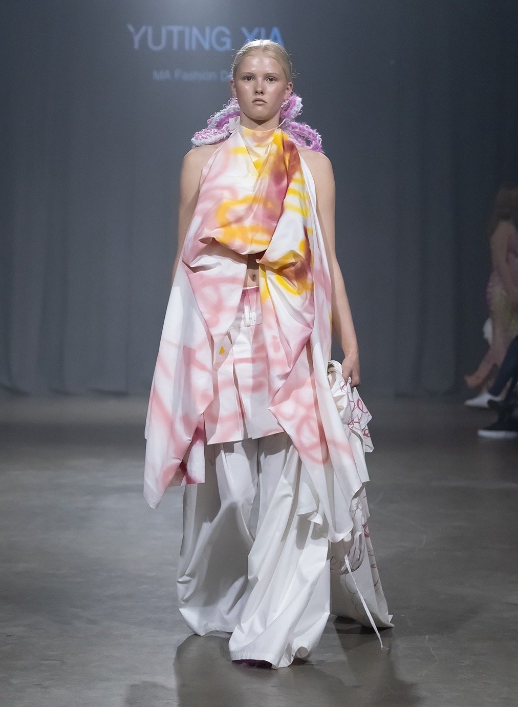
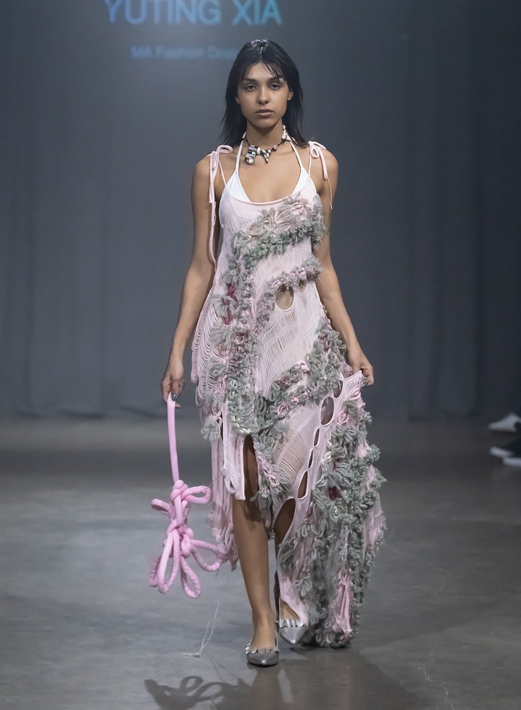
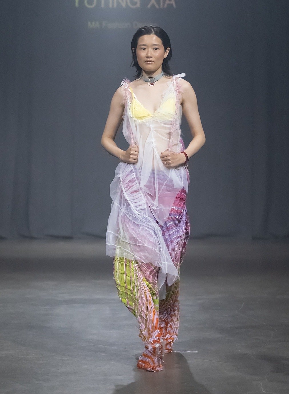
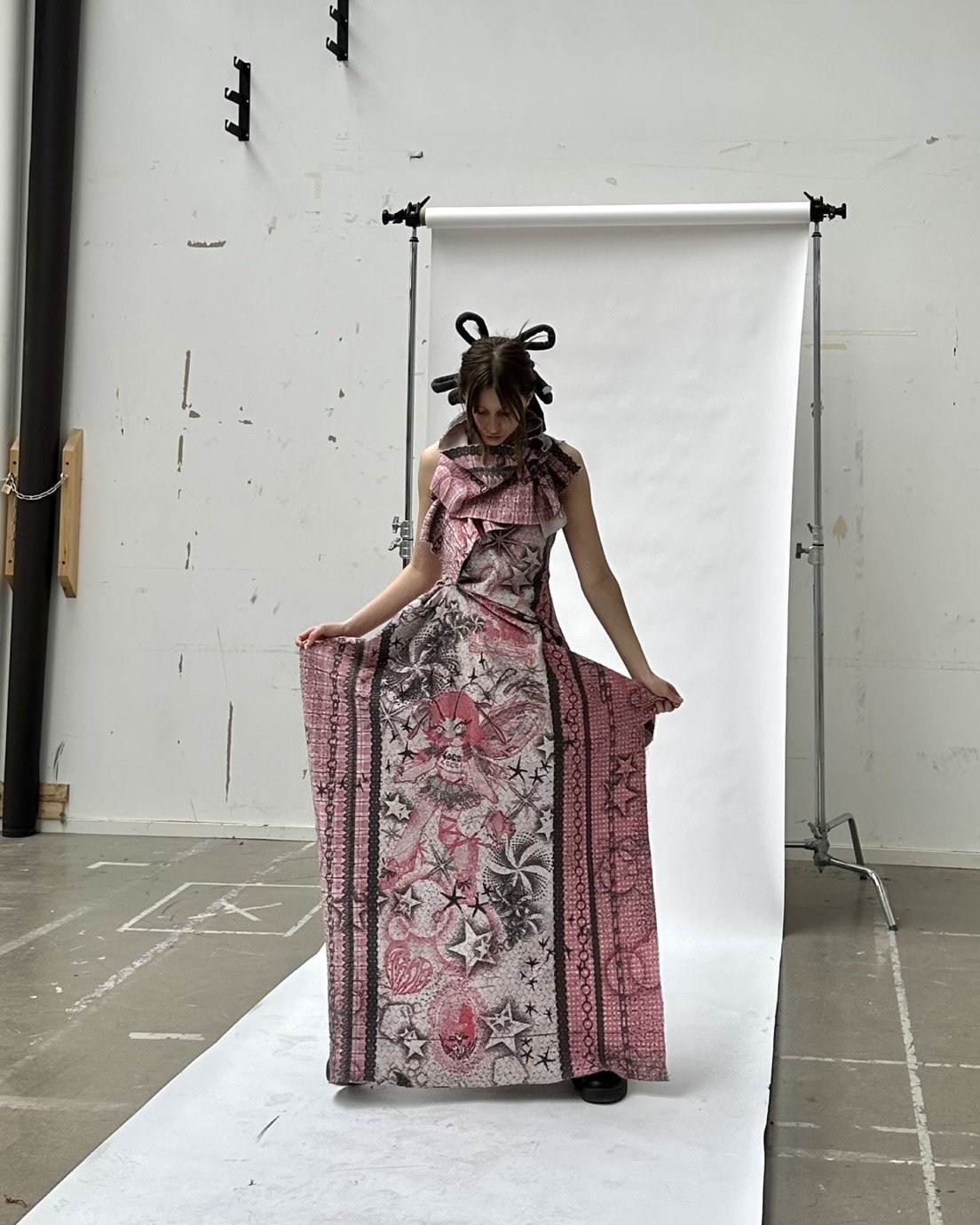
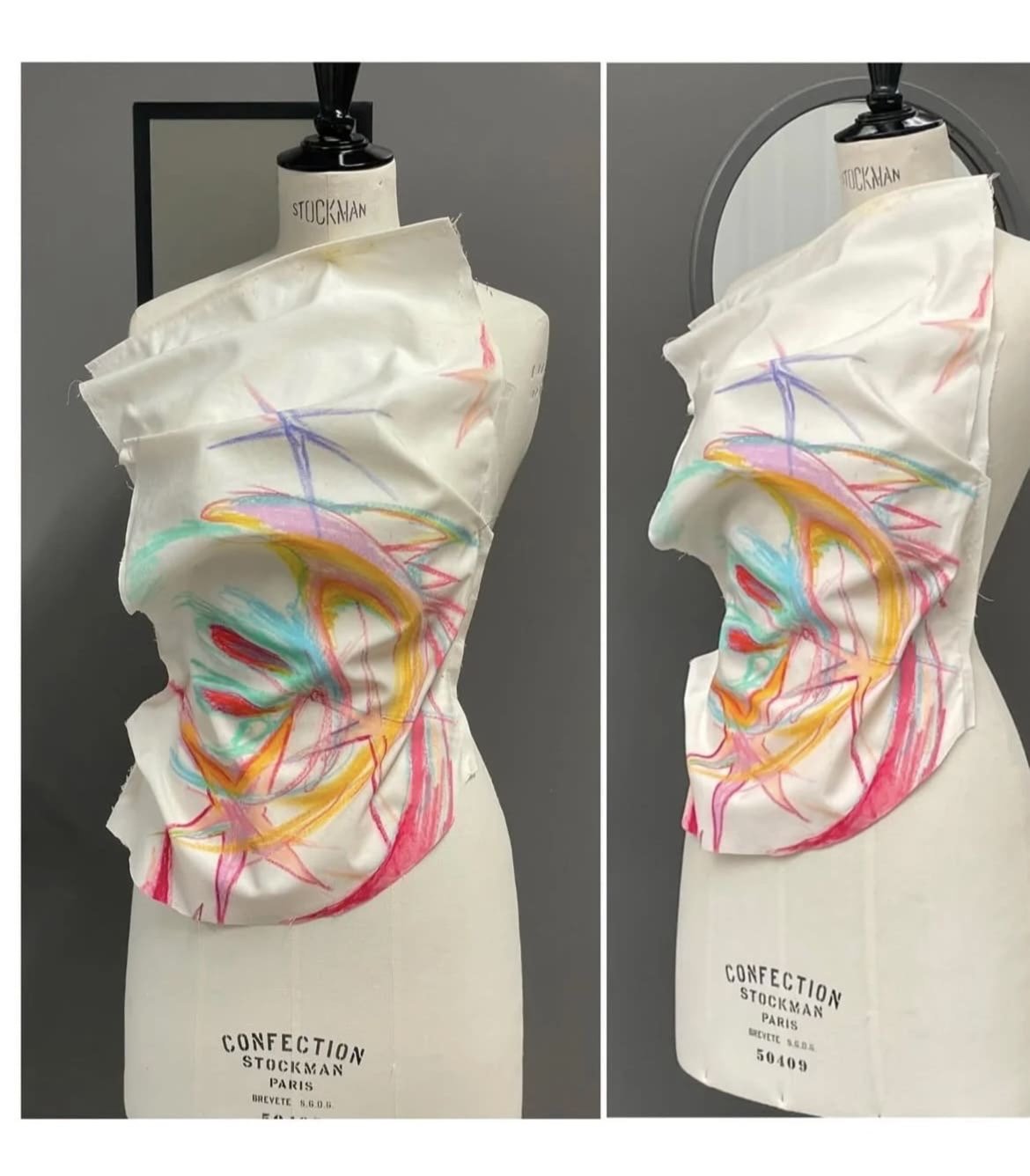
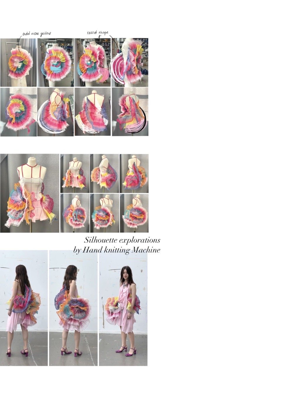
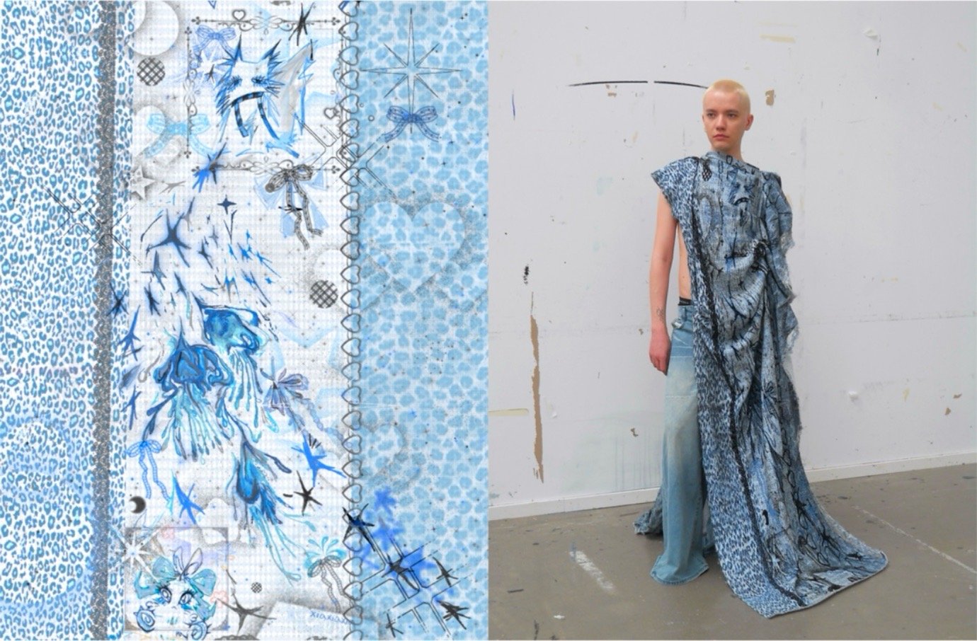
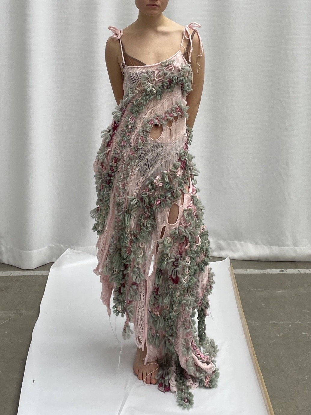
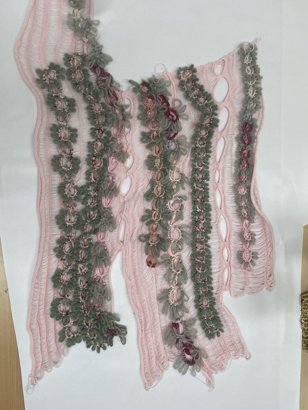
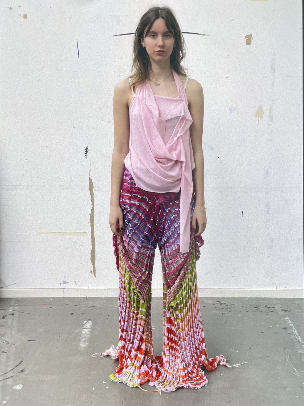
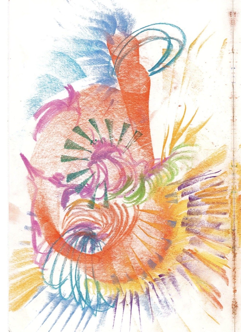
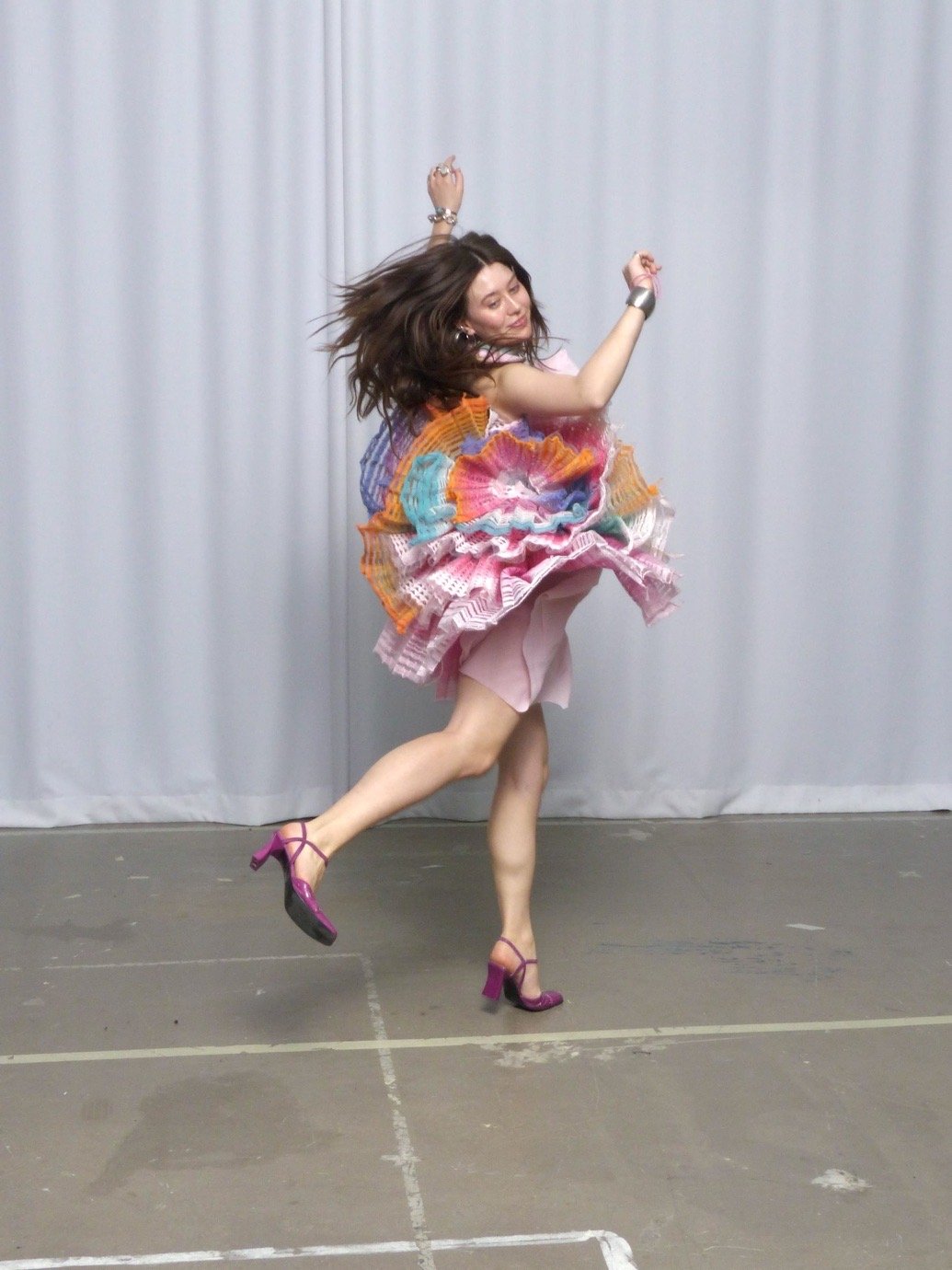
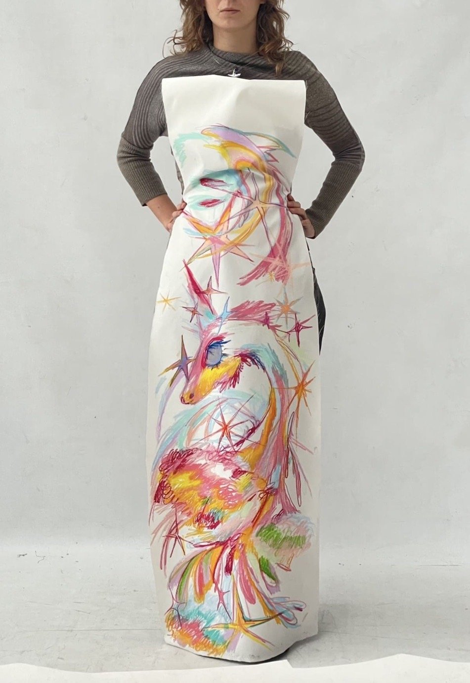
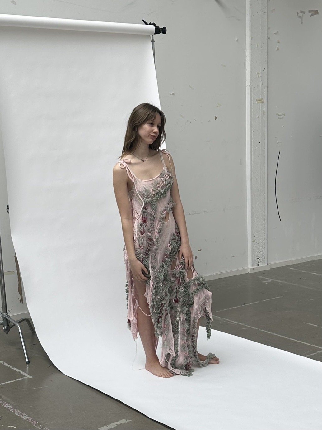
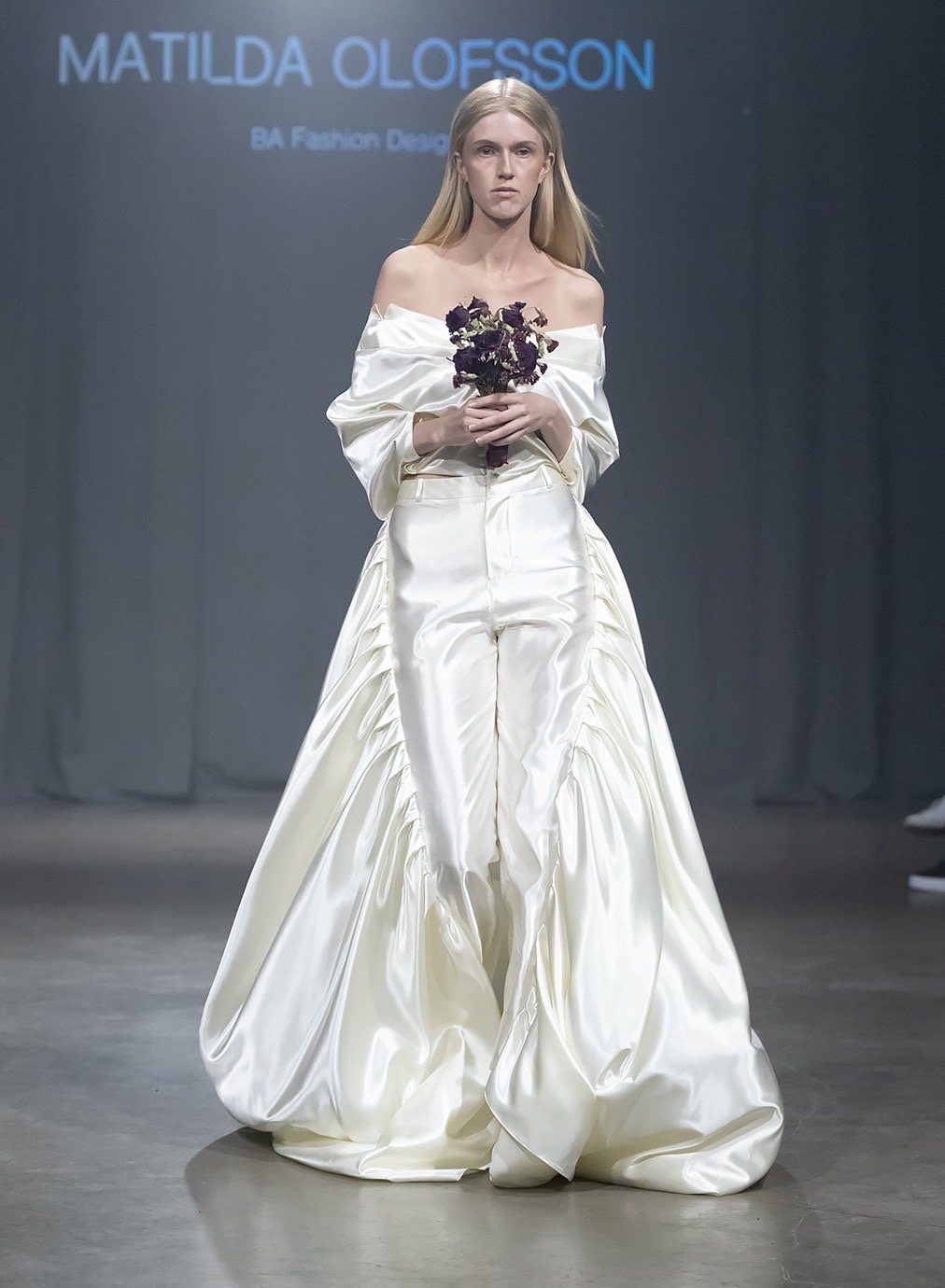
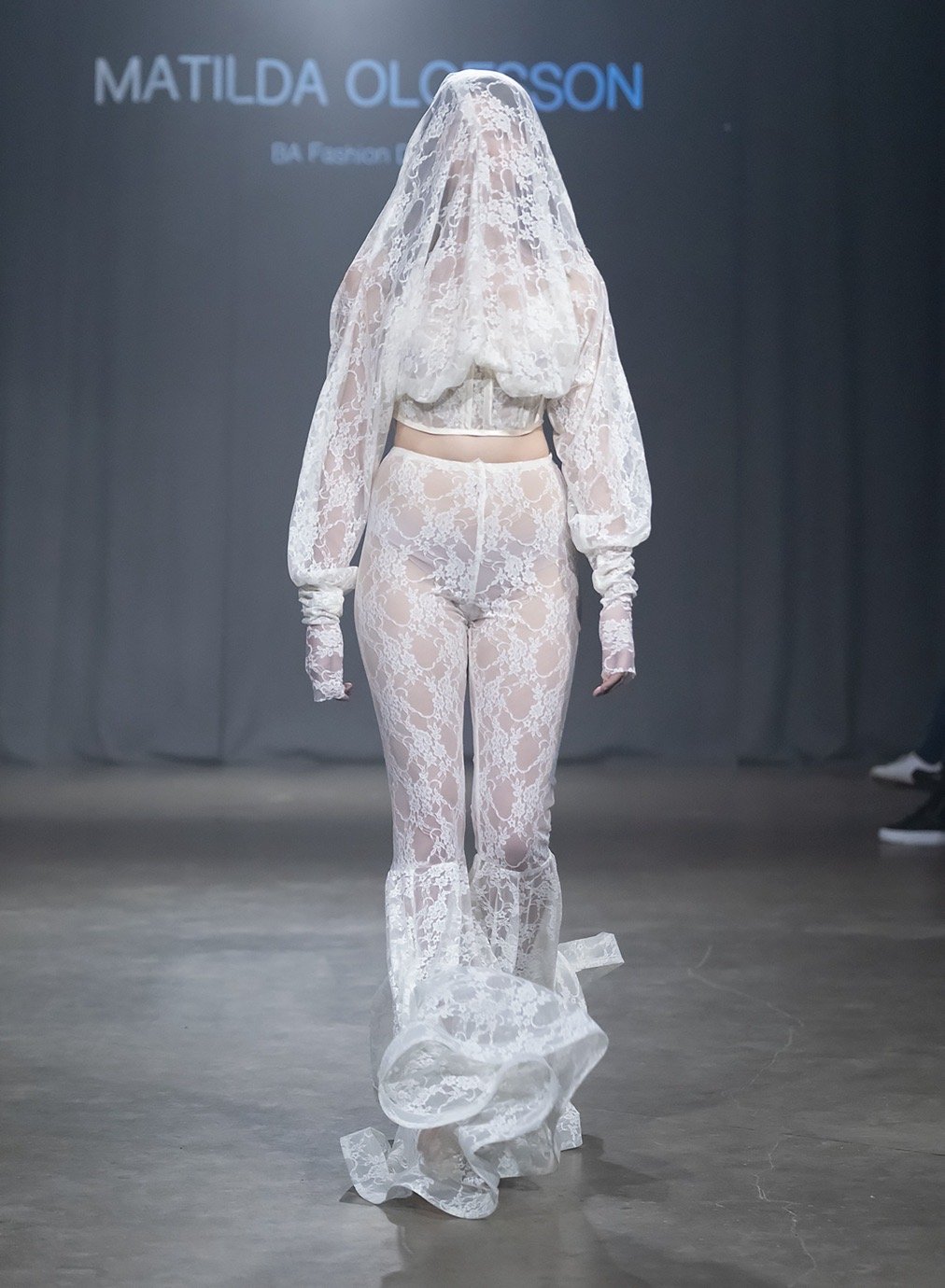
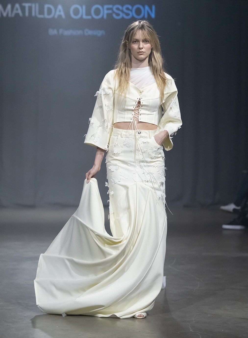
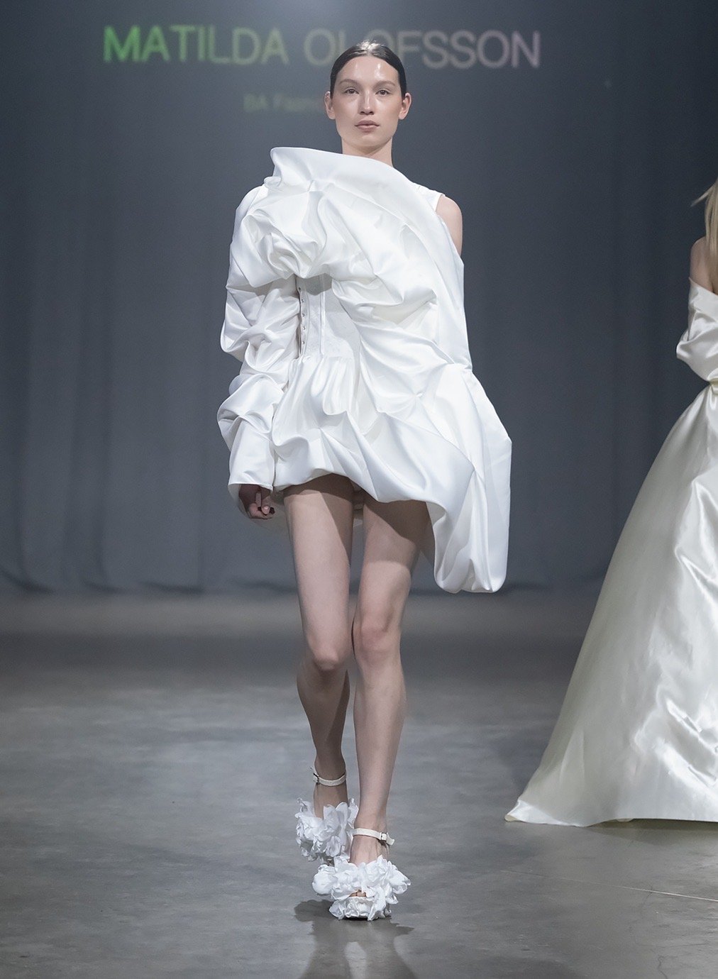
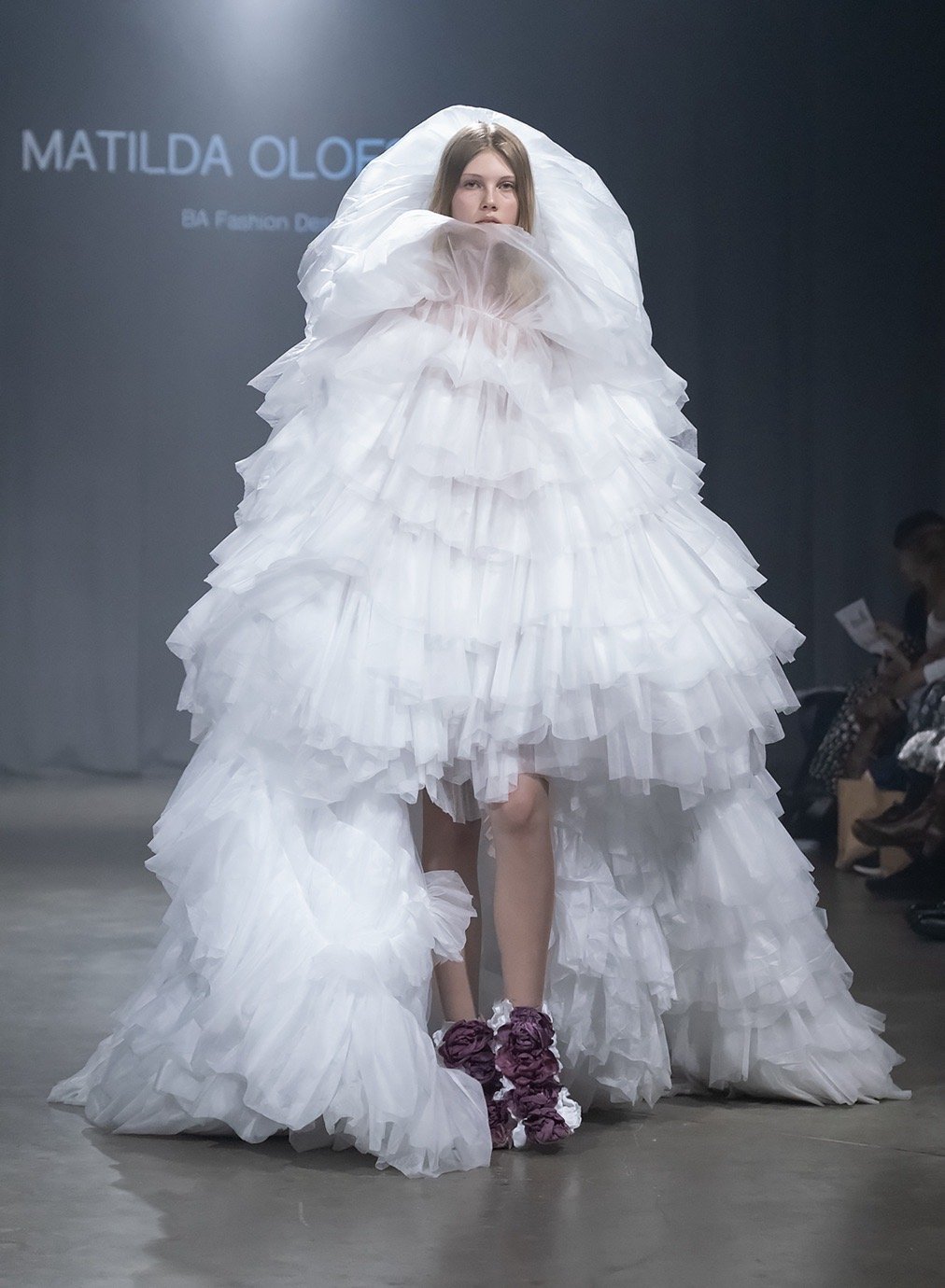
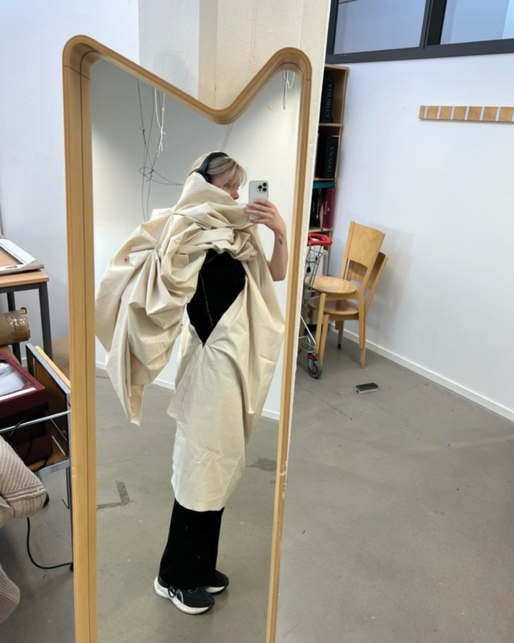
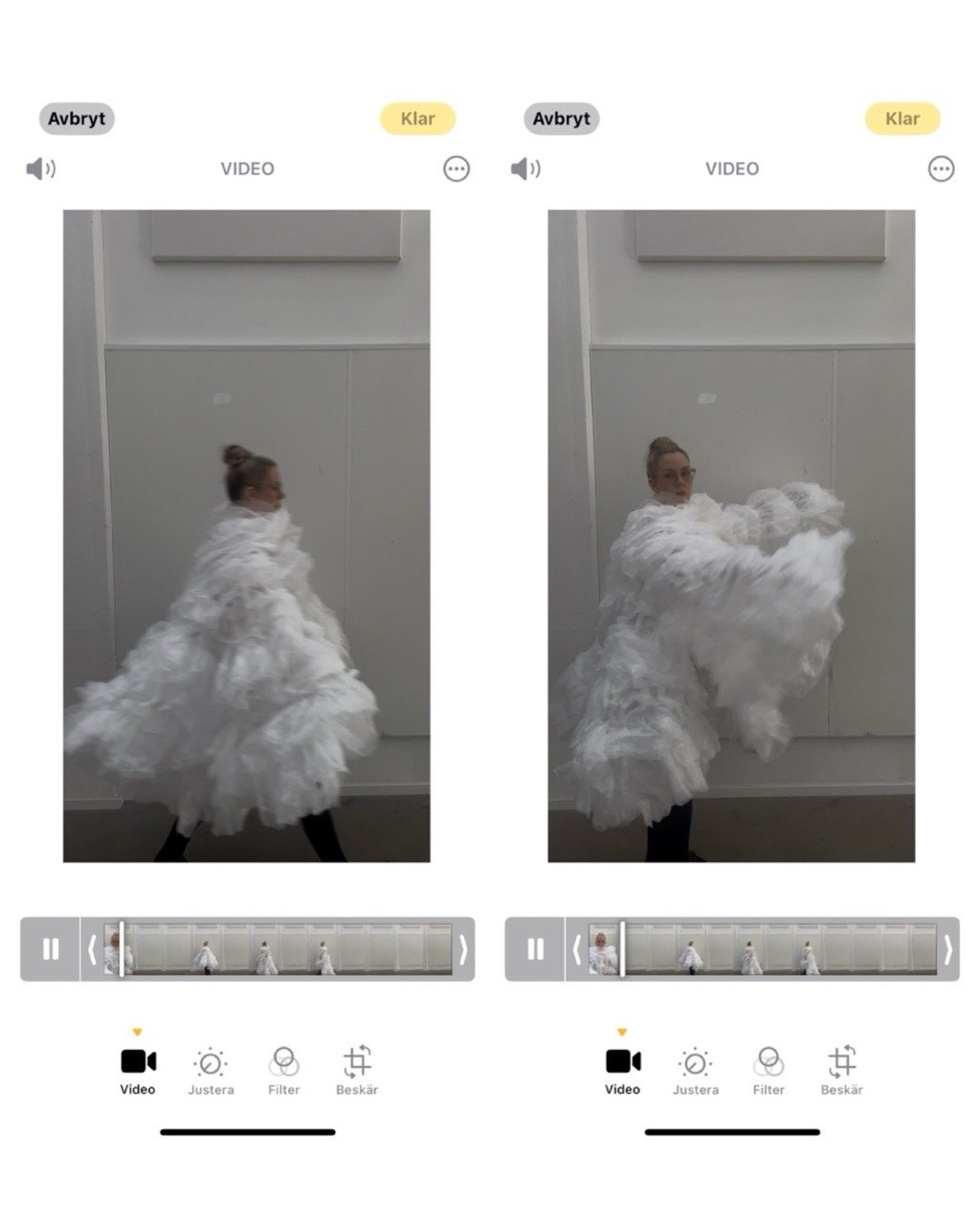
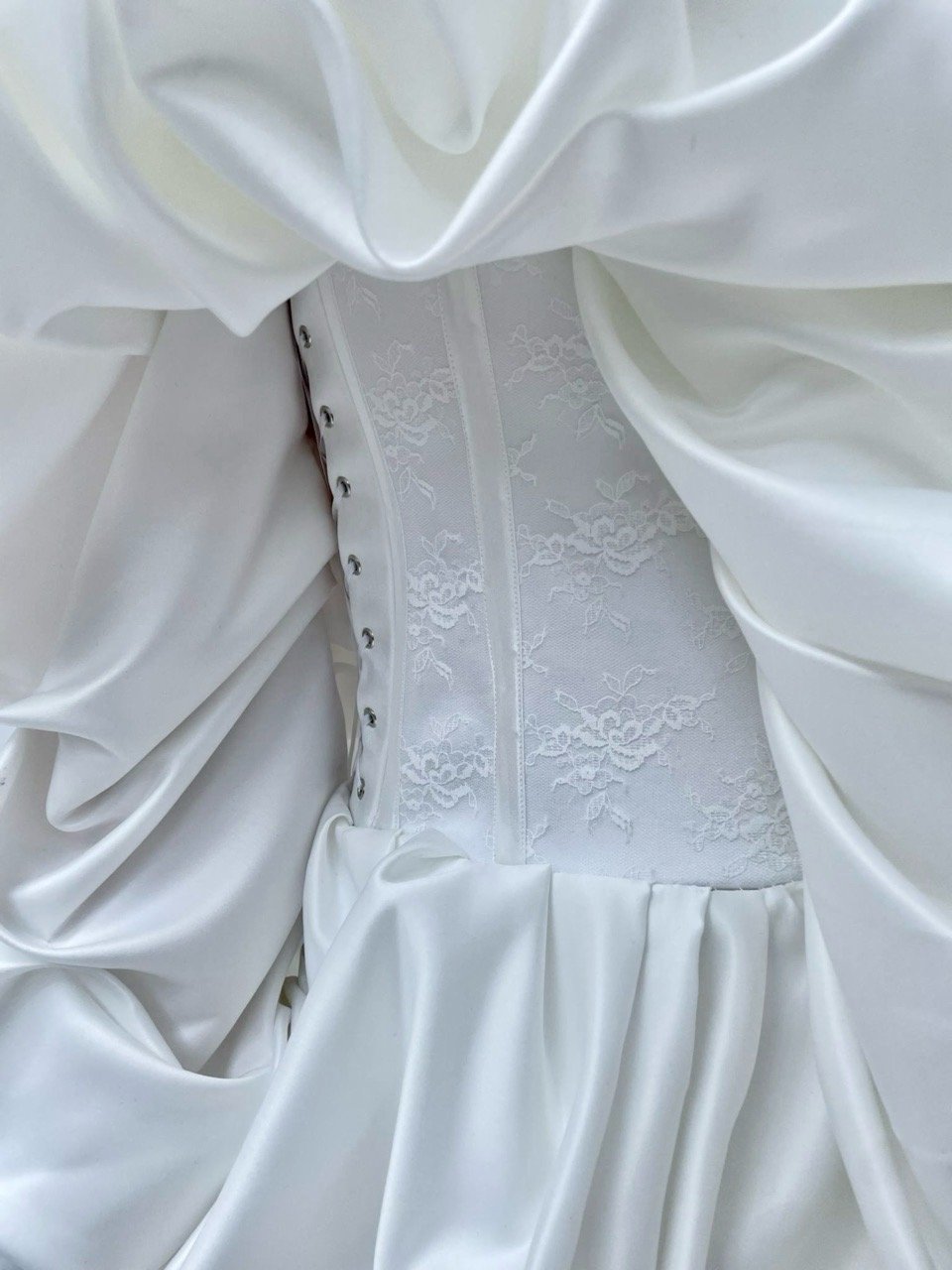
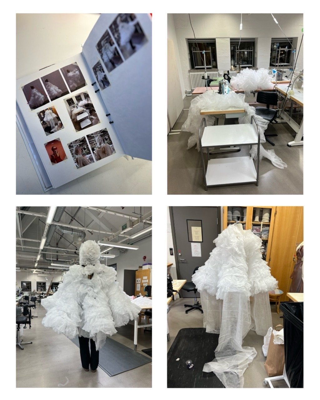
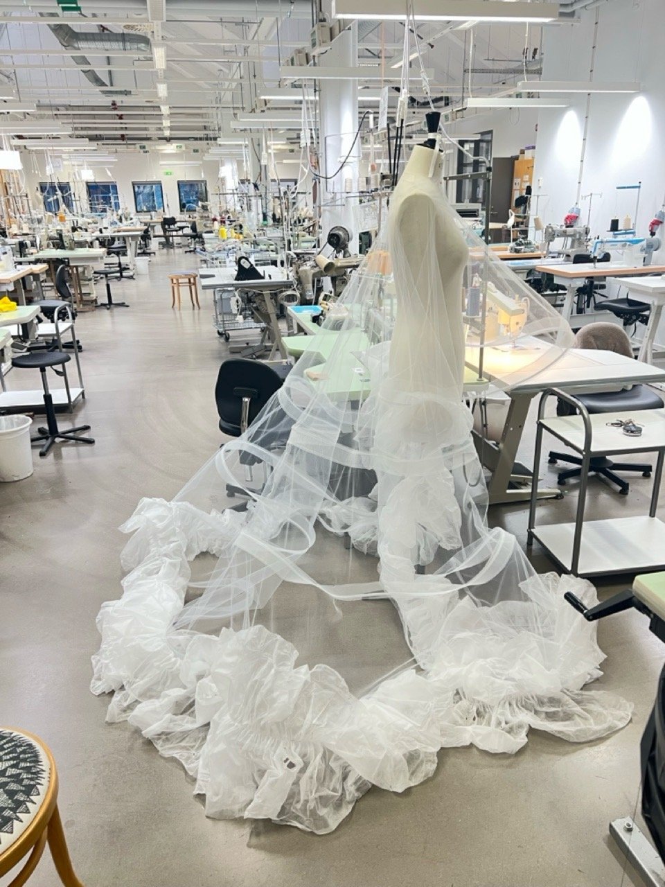
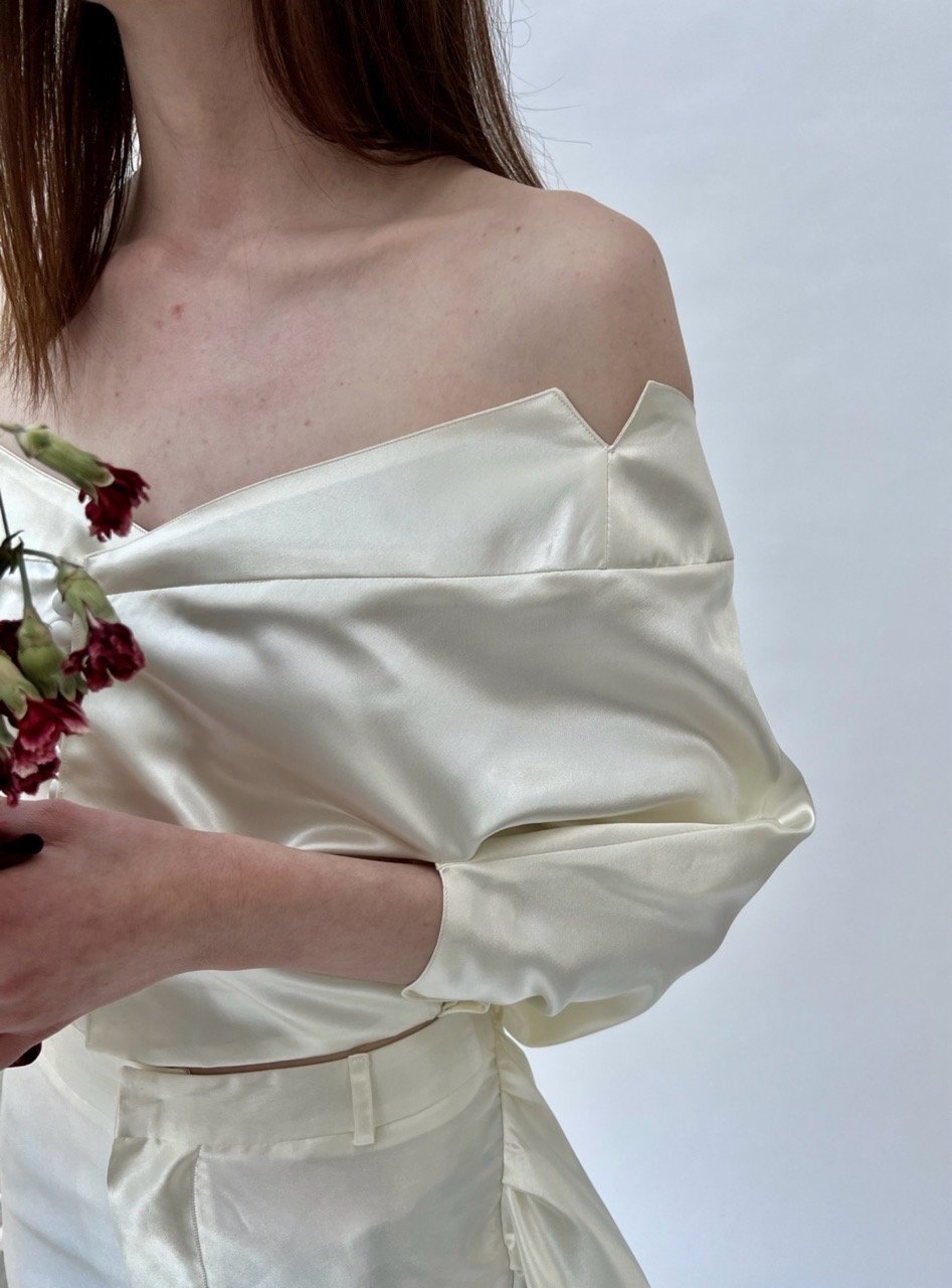
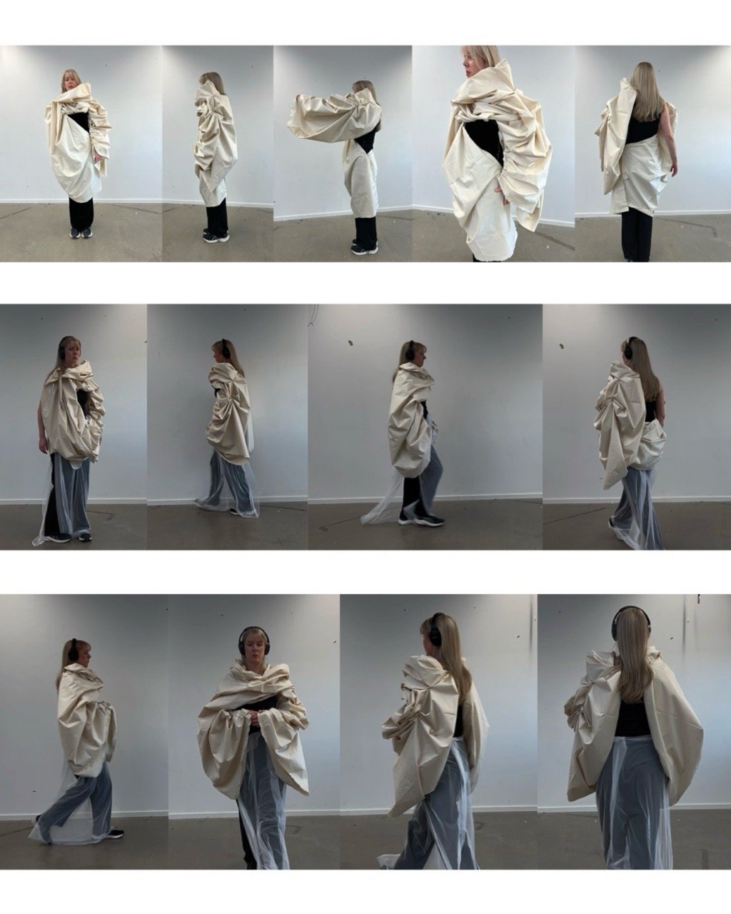
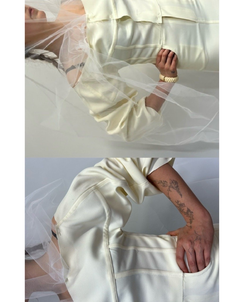
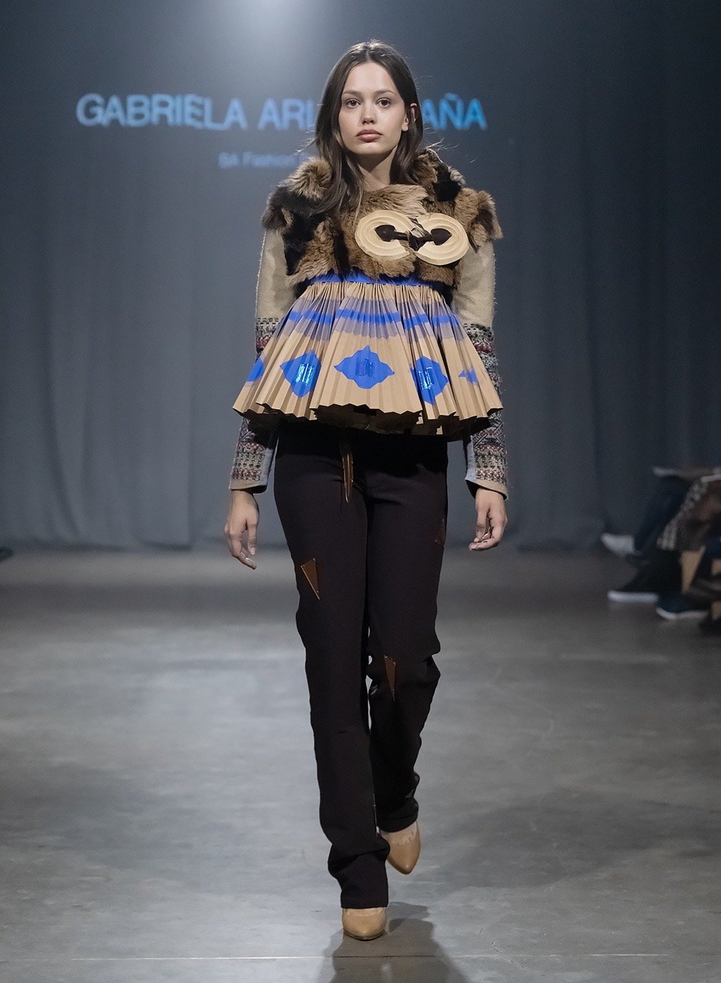
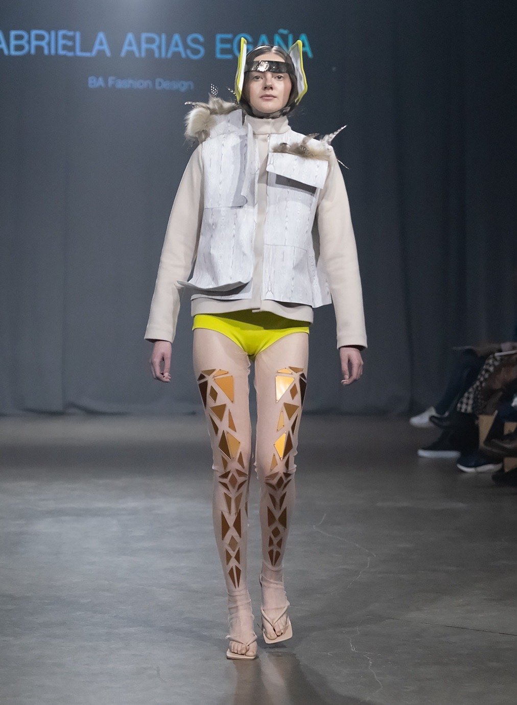
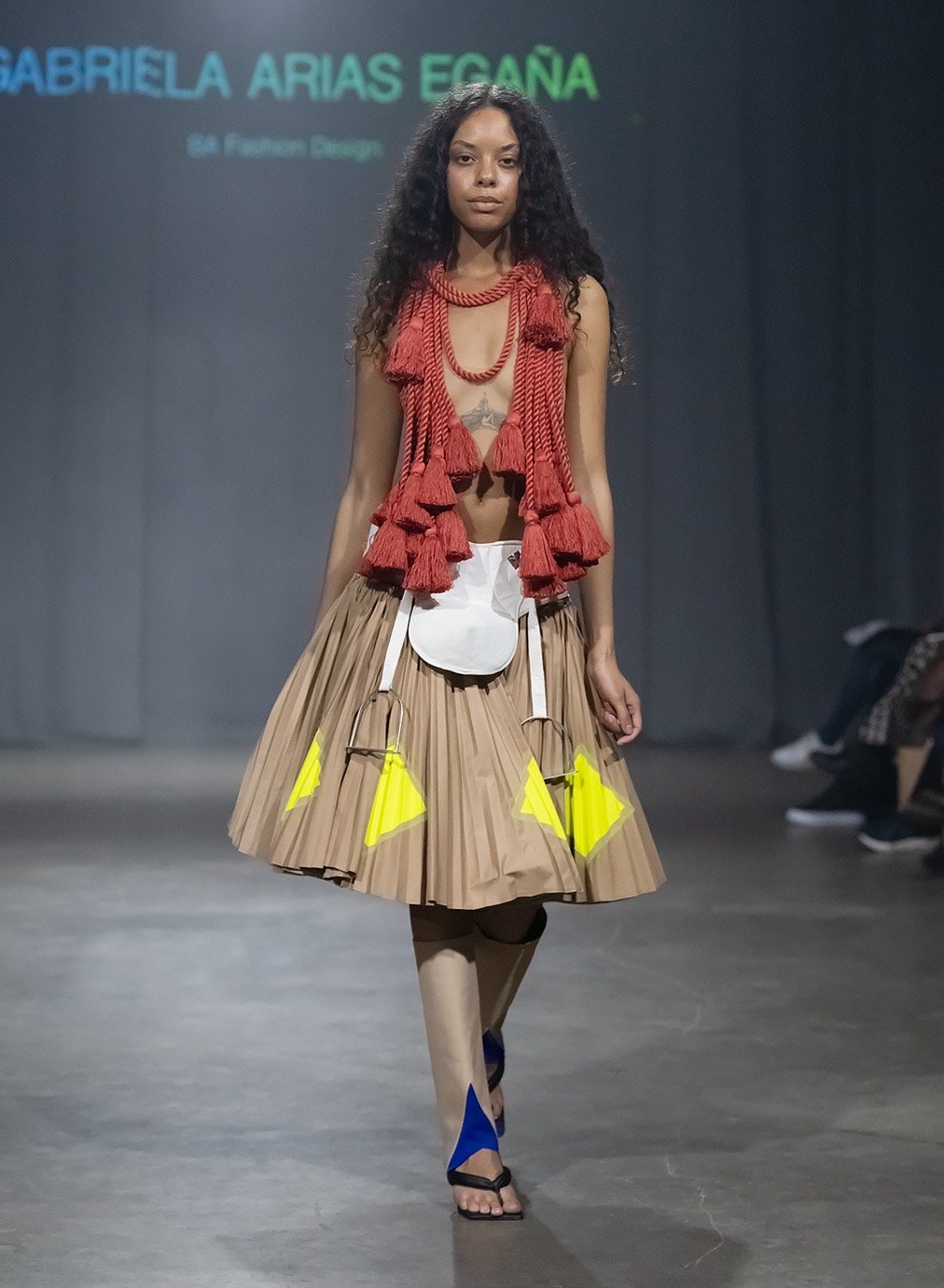
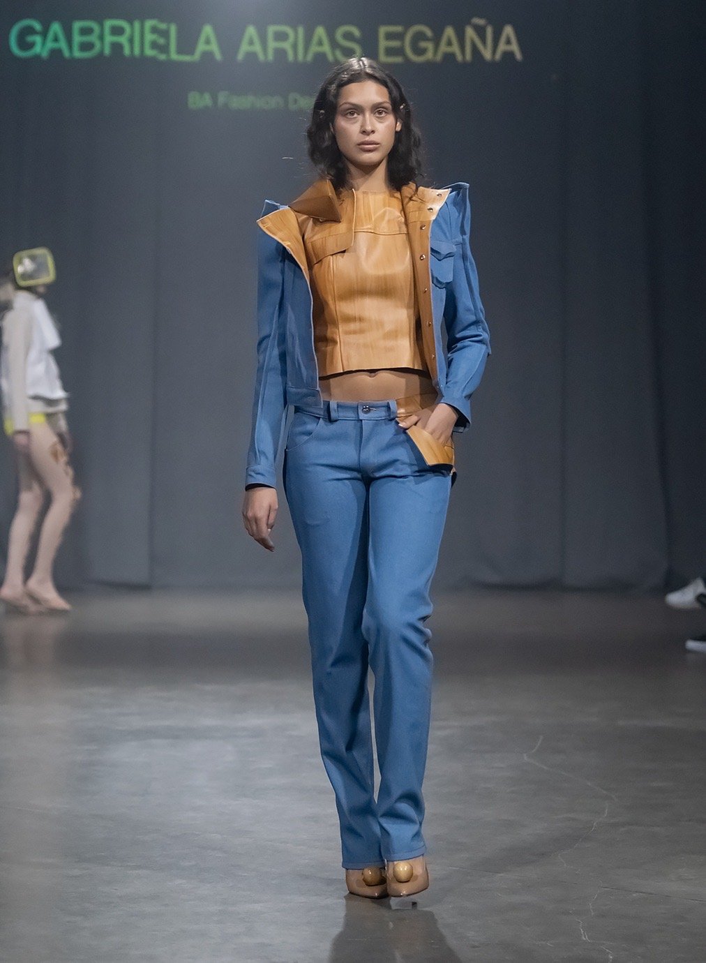
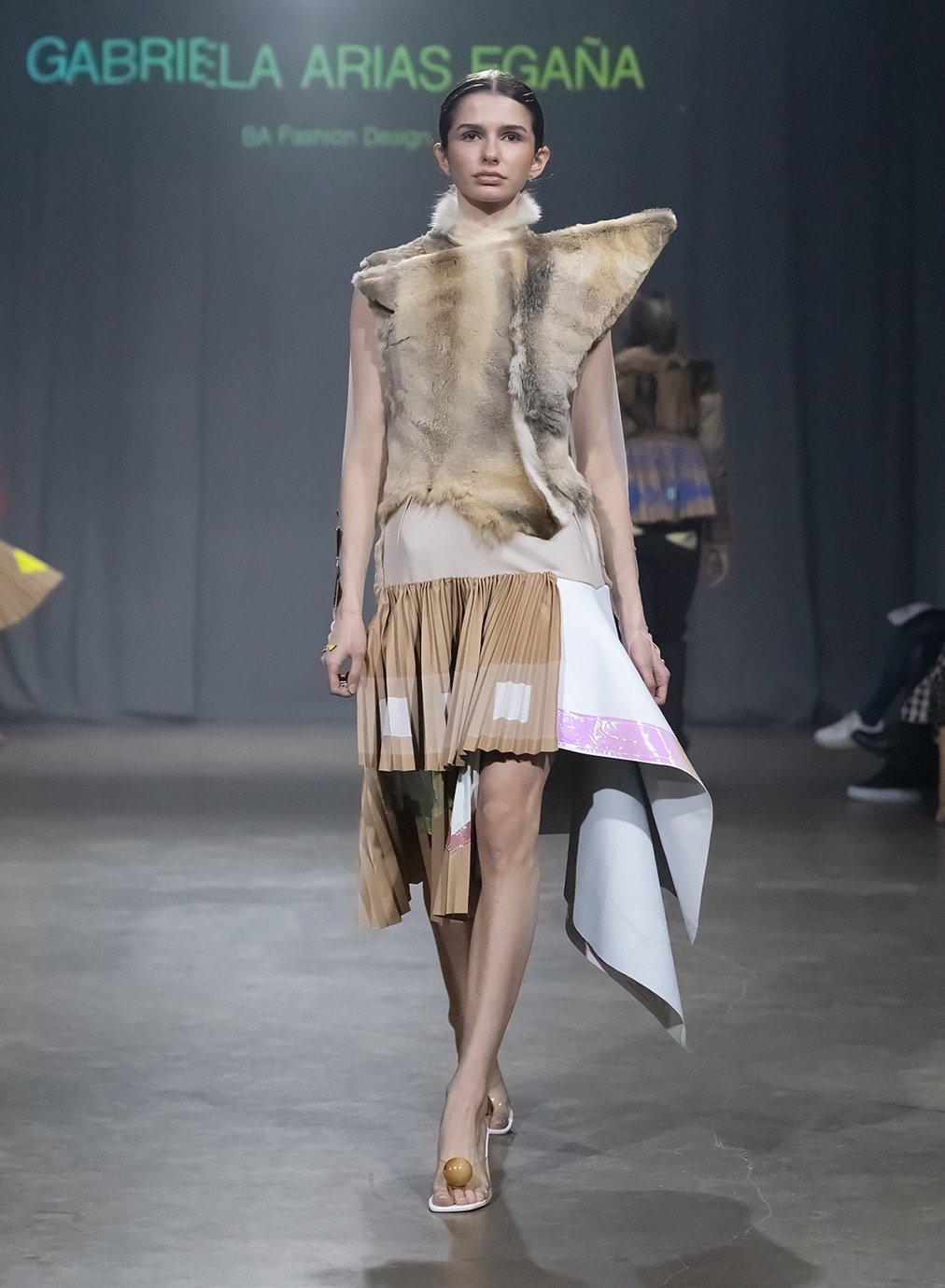
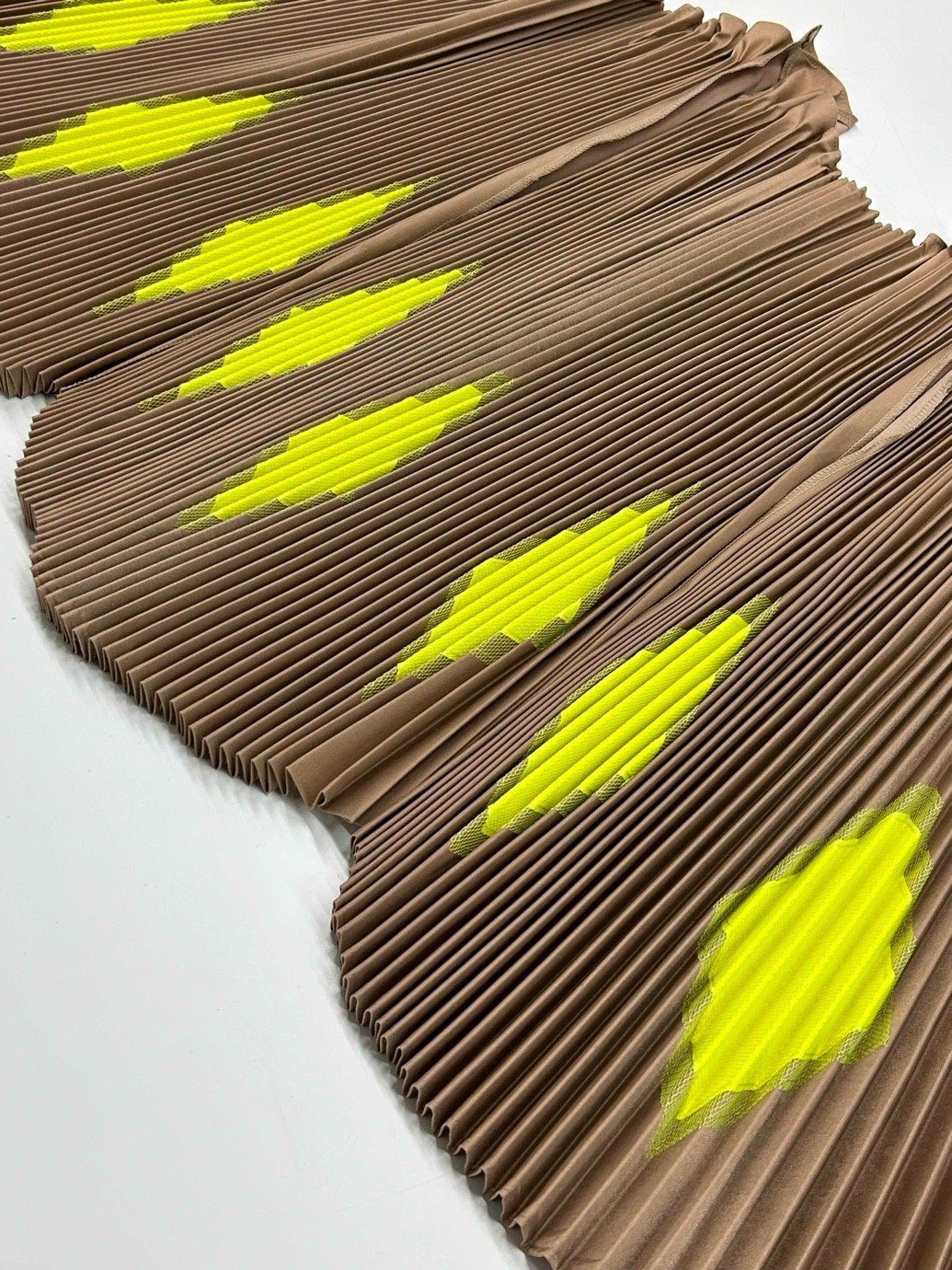
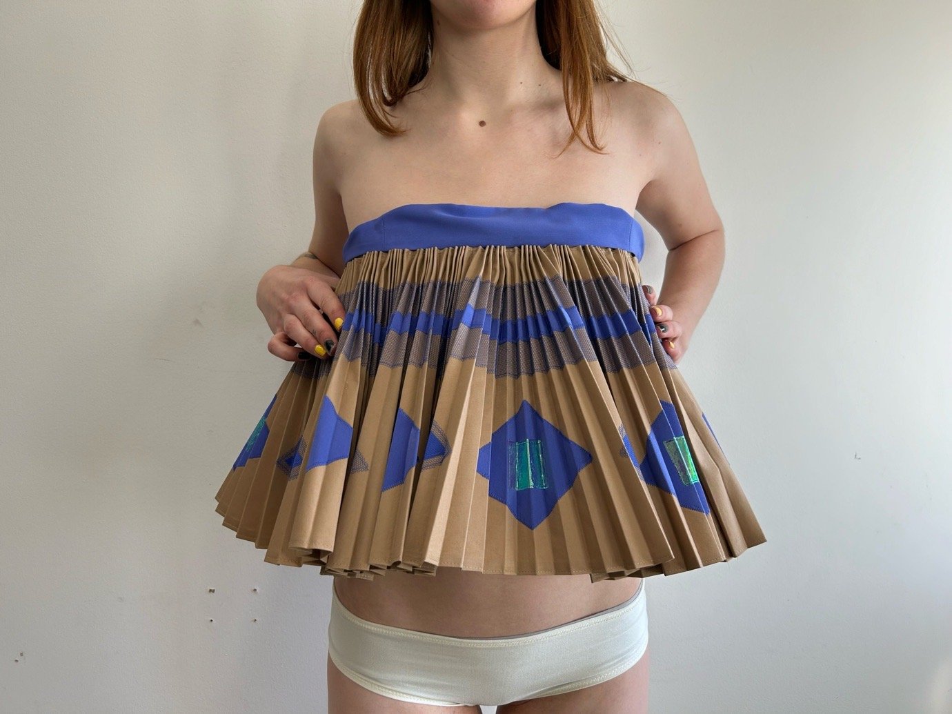
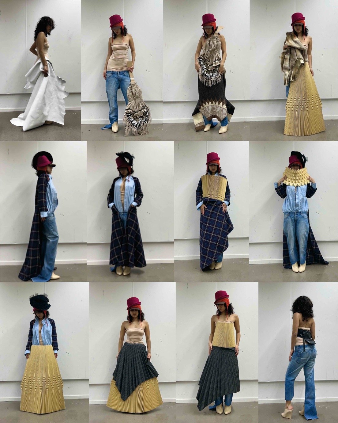
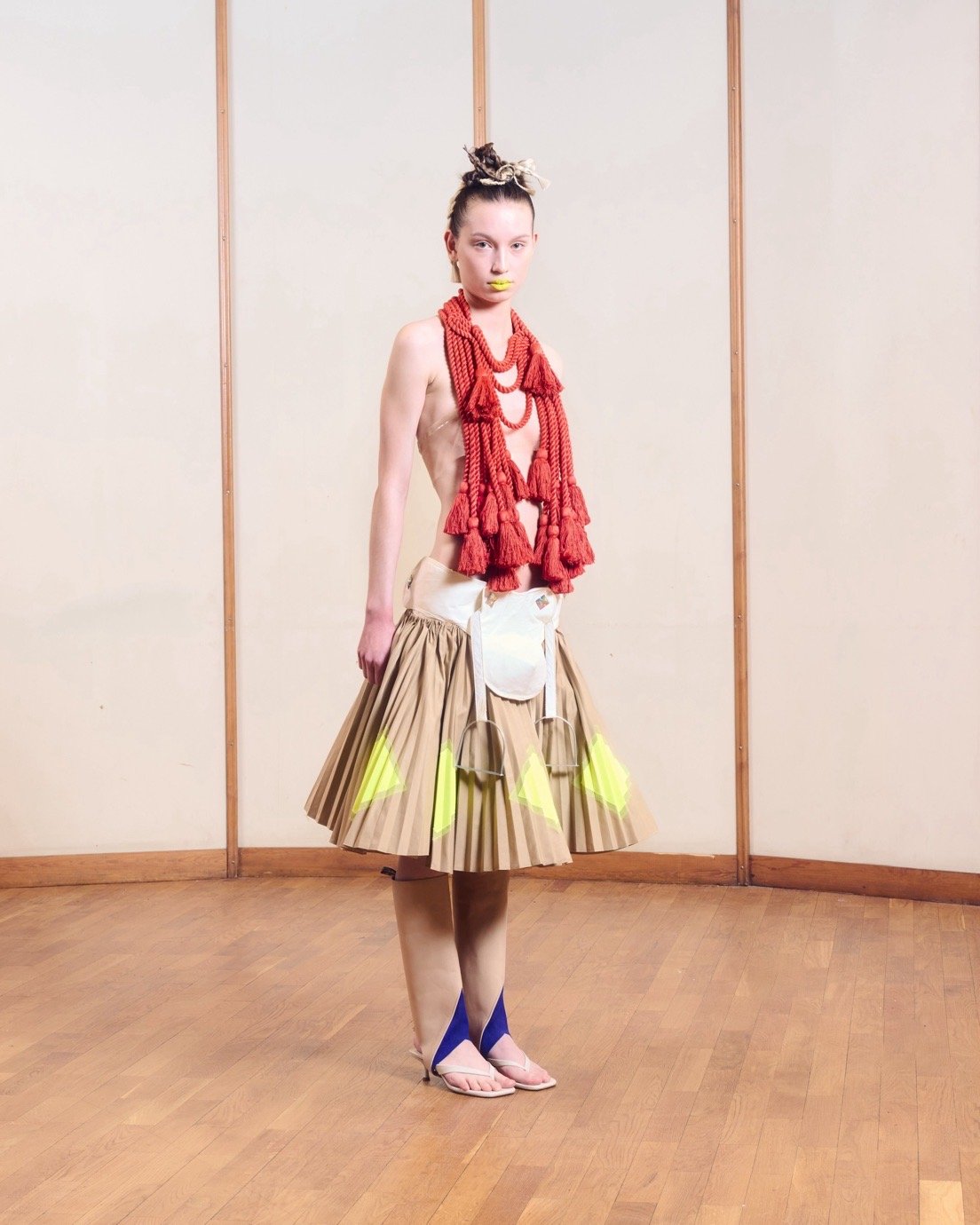
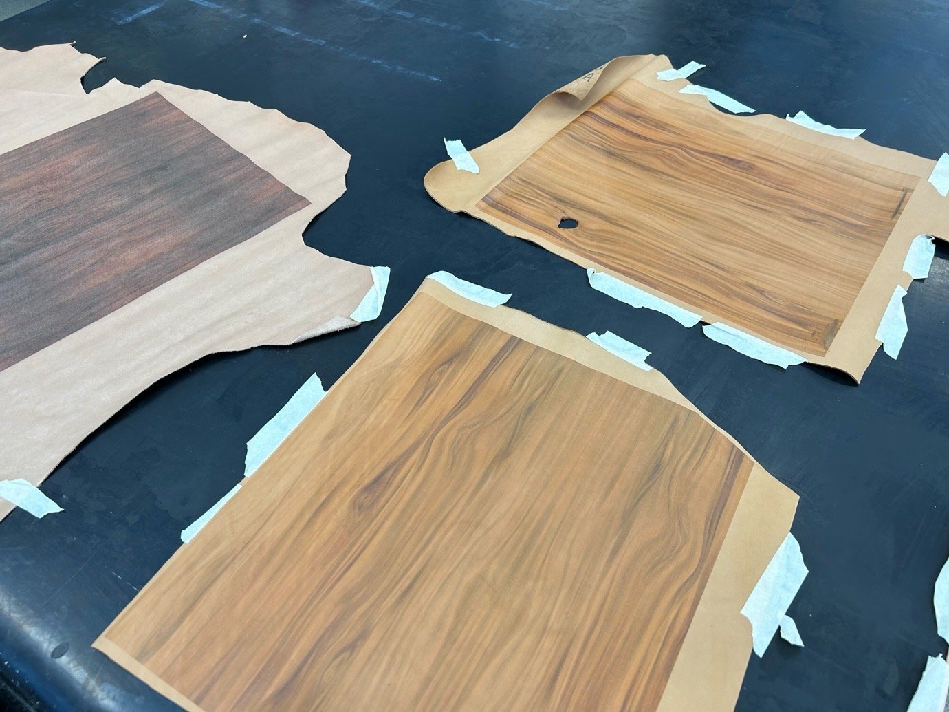
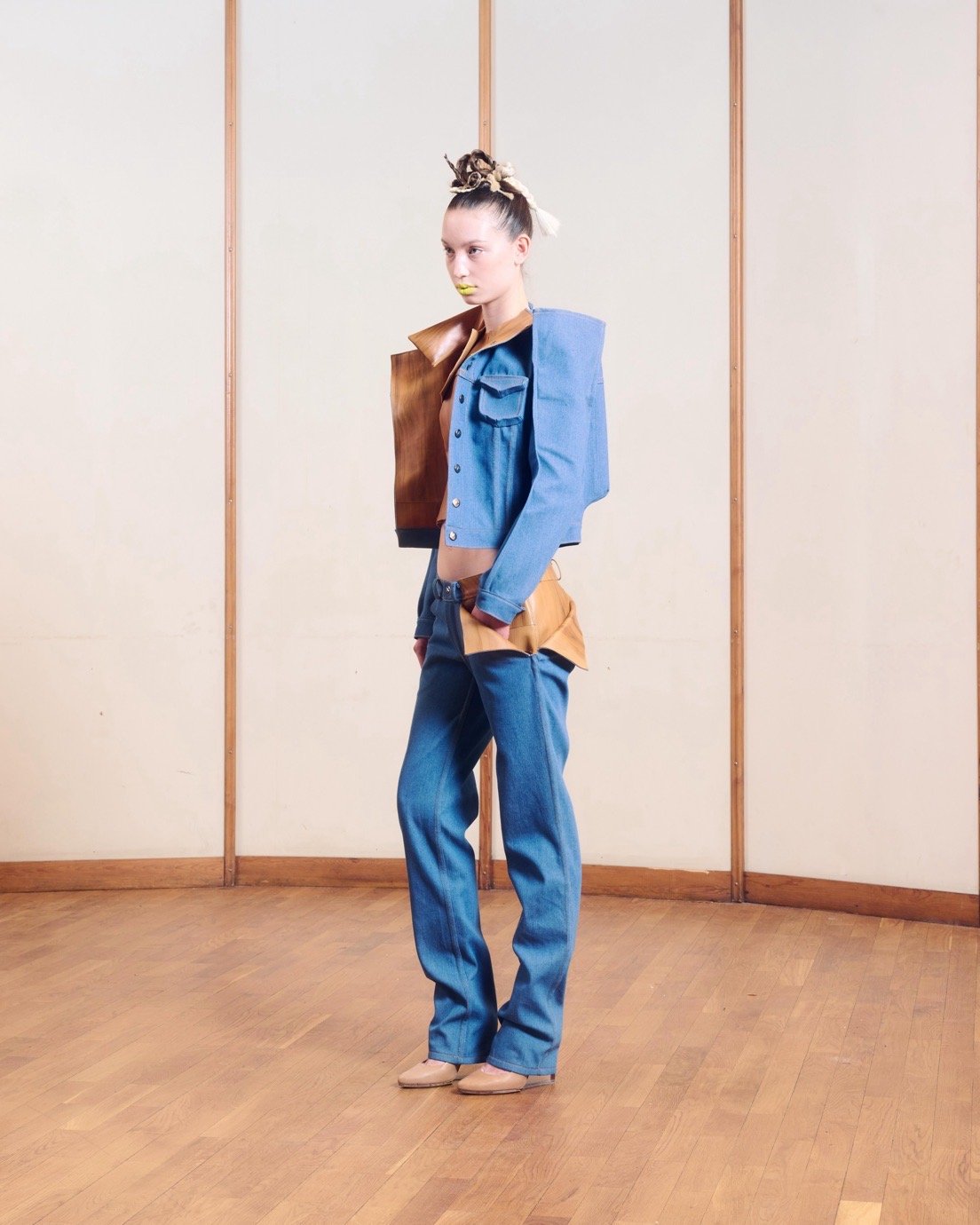
Across both BA and MA courses, there’s a deliberate departure from polished image-making. Instead, what comes through is a kind of functional introspection – material-led, often tactile, and rooted in the logic of making. Some students build modular systems that can be reshaped or reconfigured. Others embrace the irregularities of handcraft, or work with low-status or discarded materials in ways that are precise rather than performative.

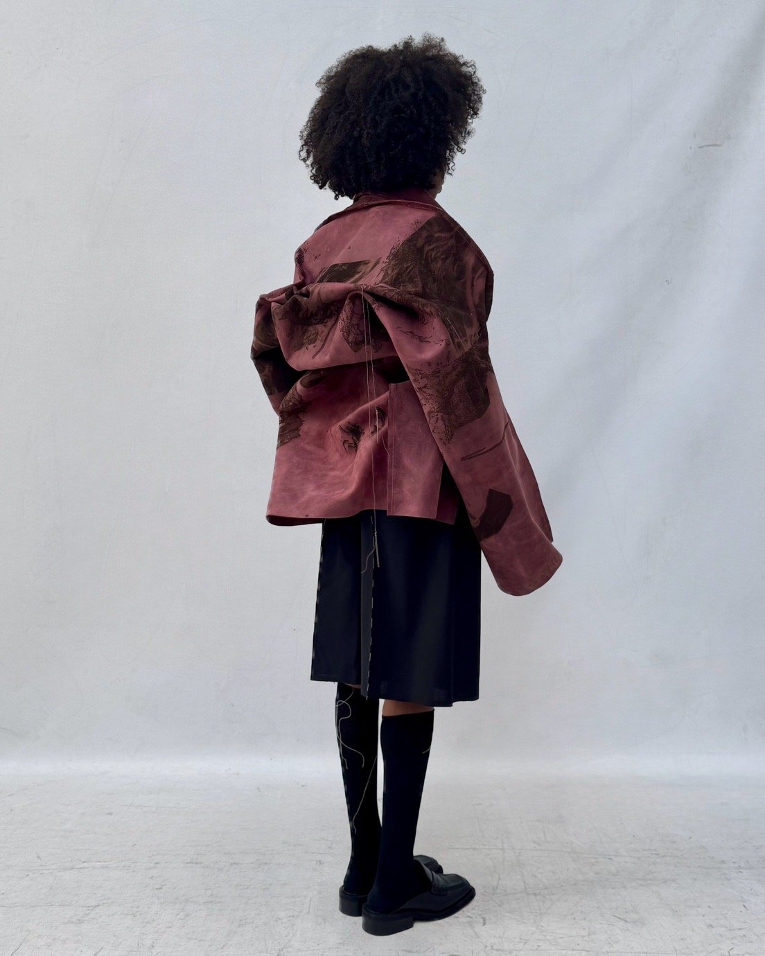
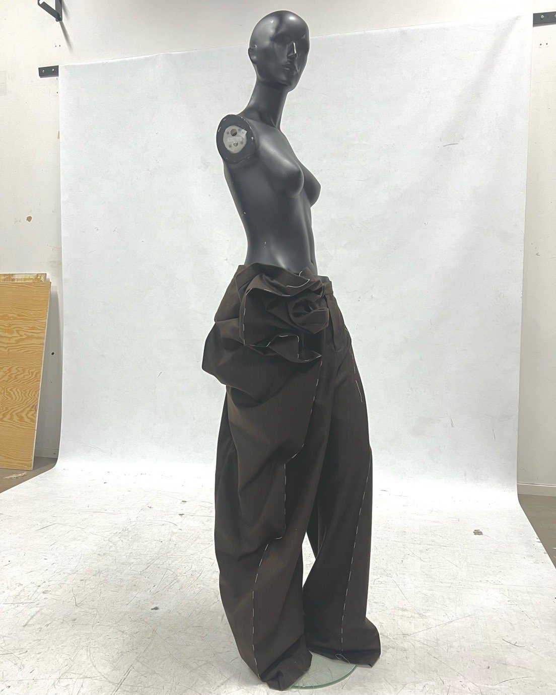
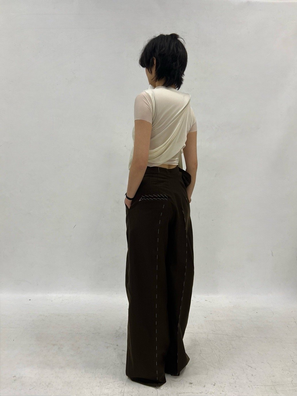
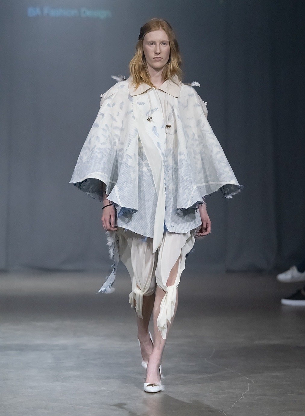
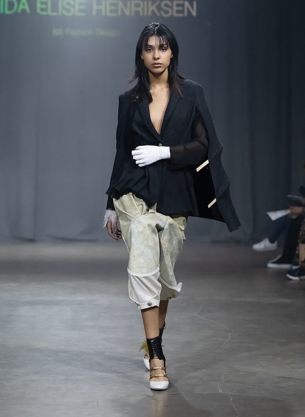
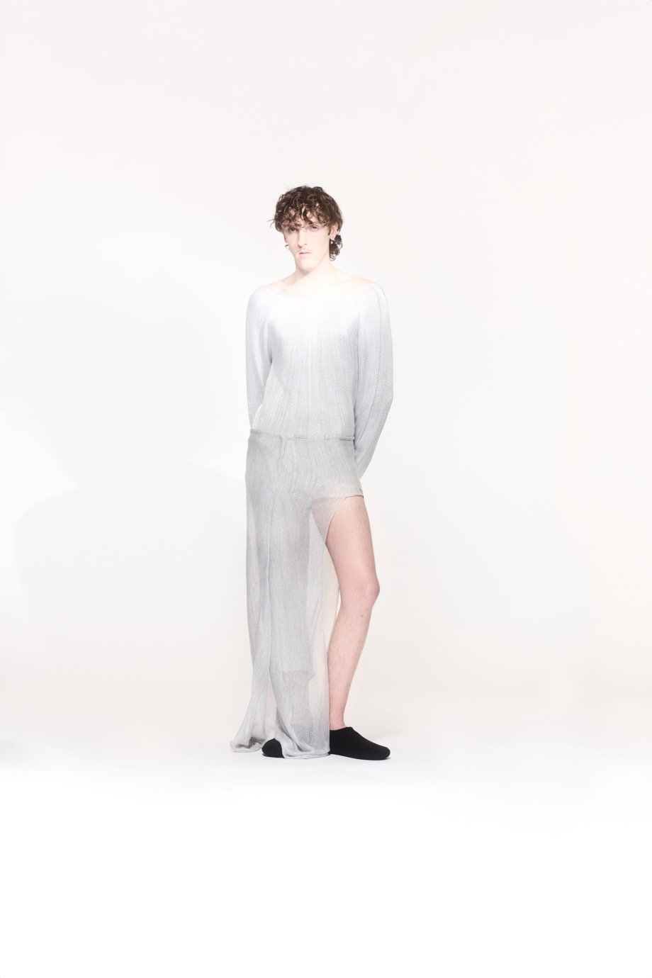
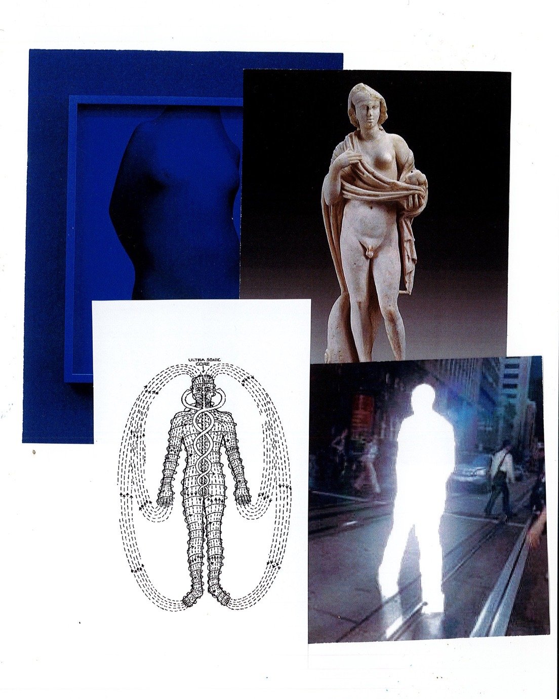
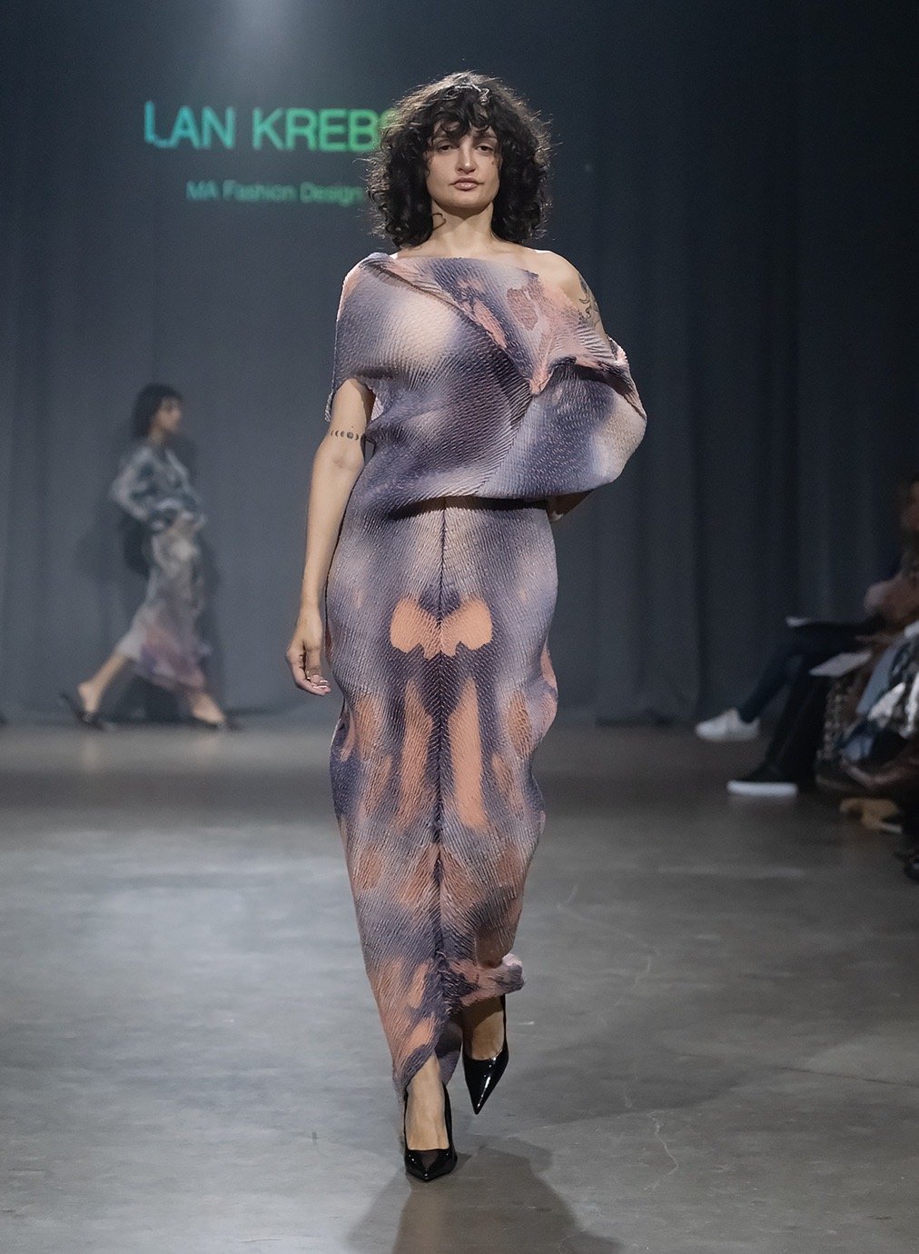
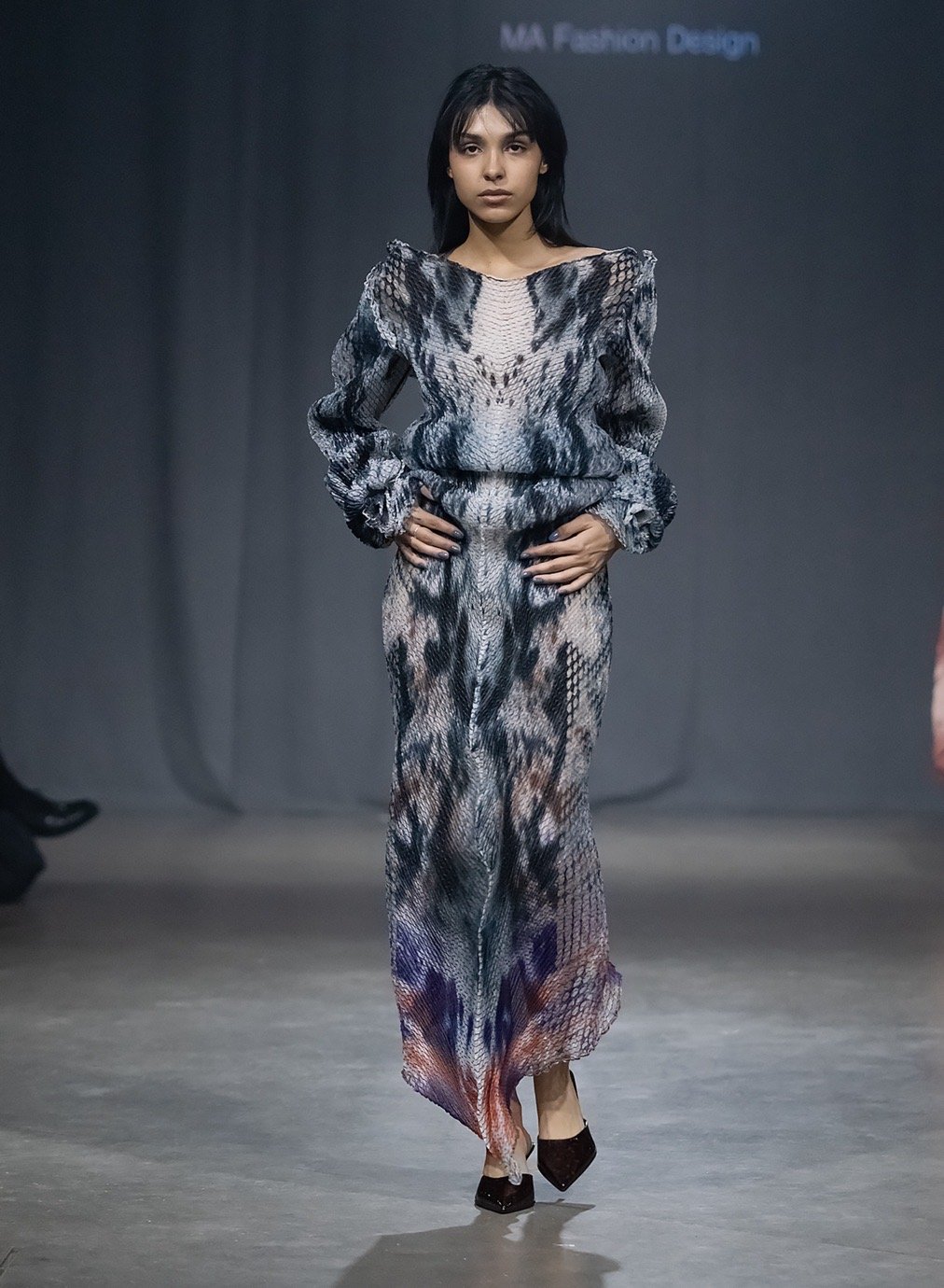
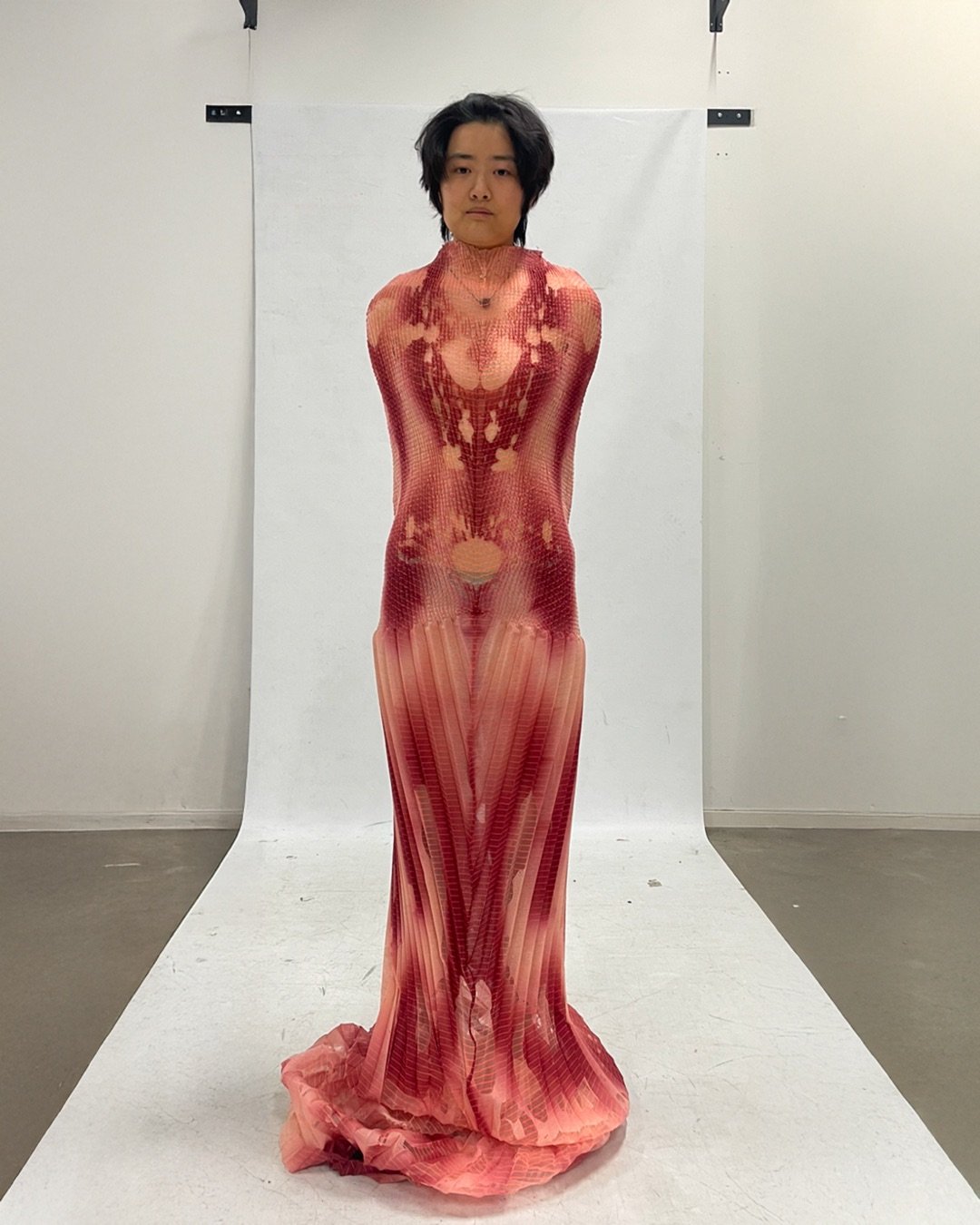
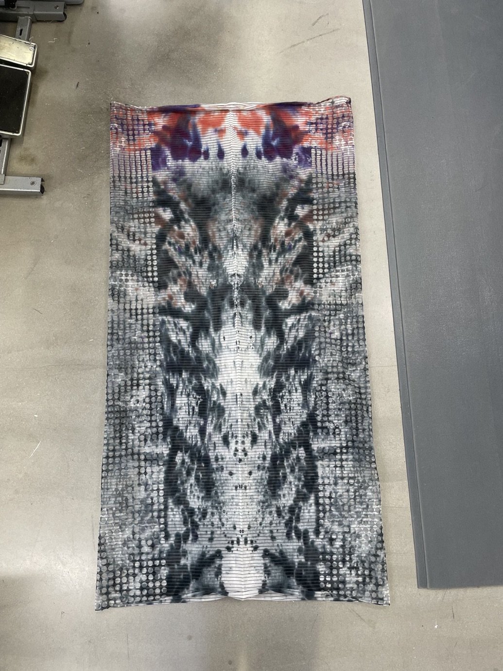
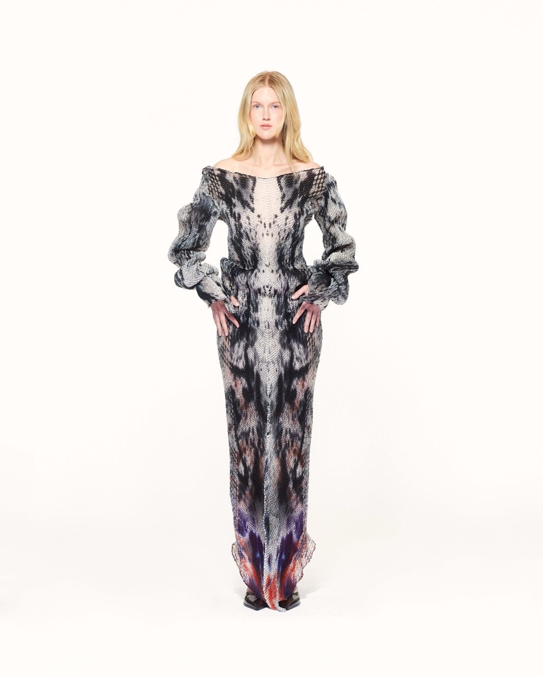
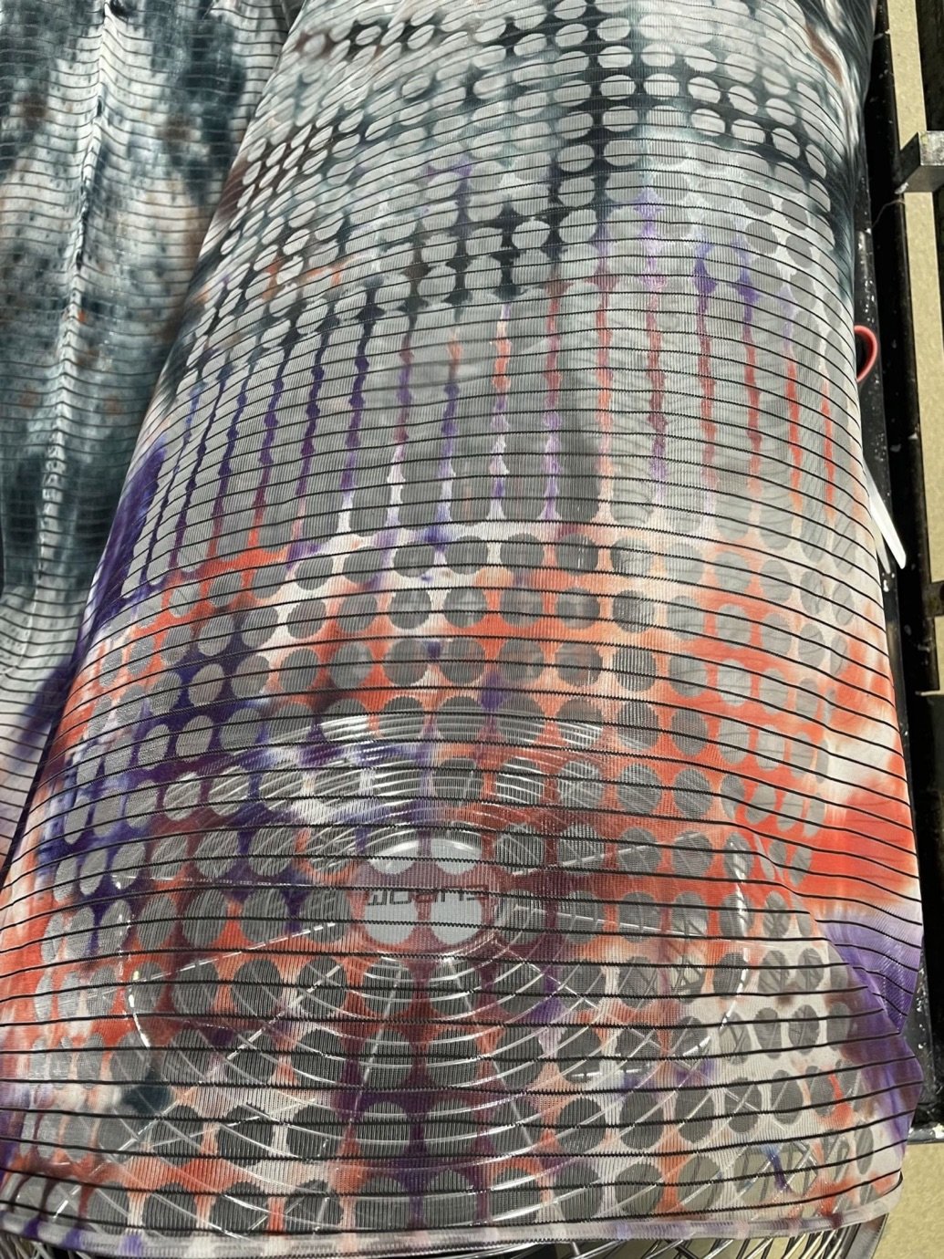
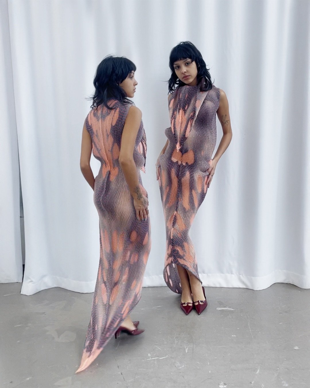
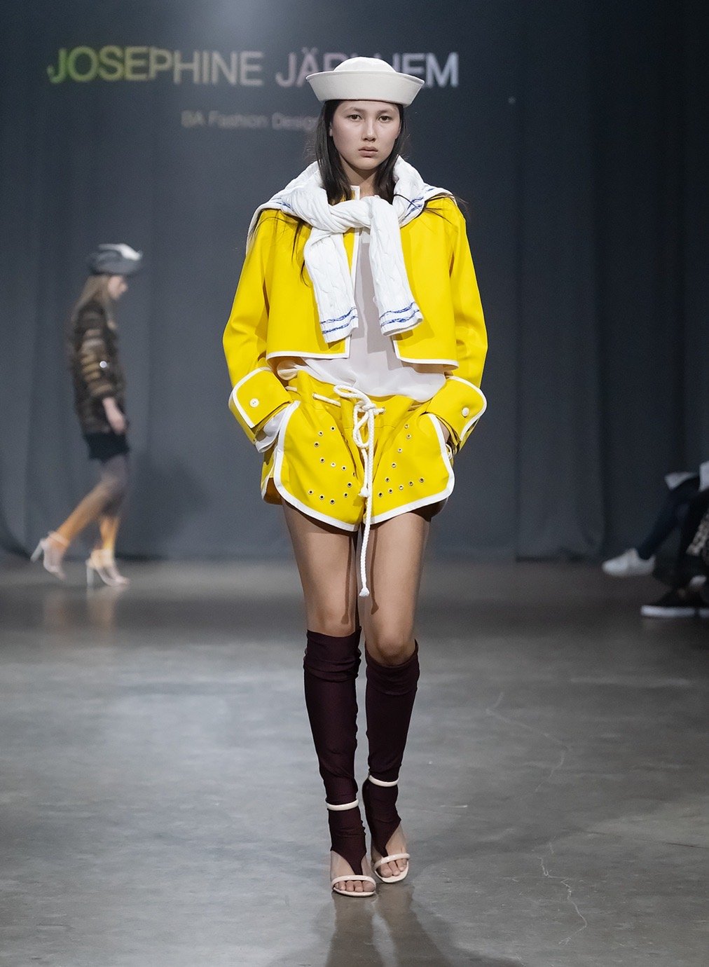
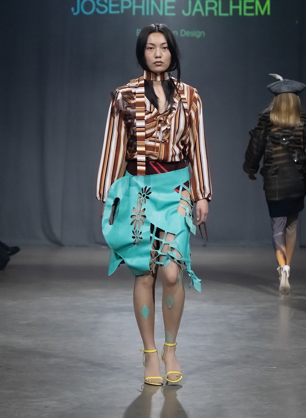
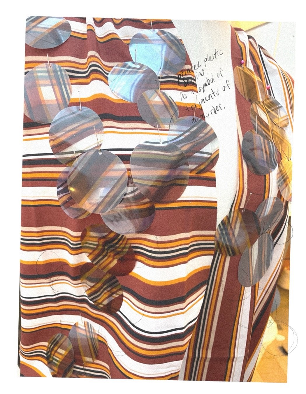
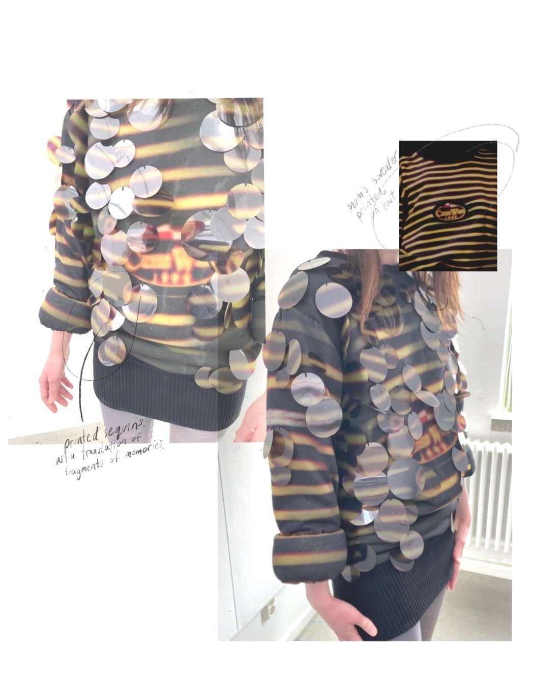
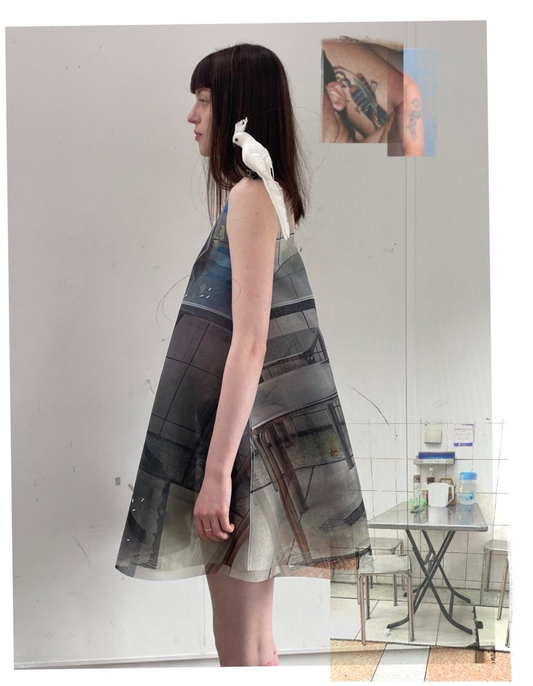
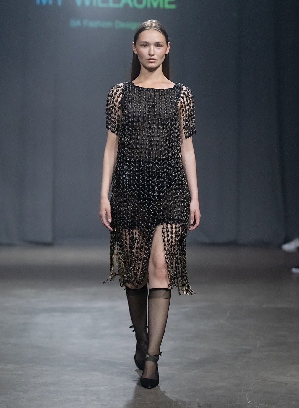
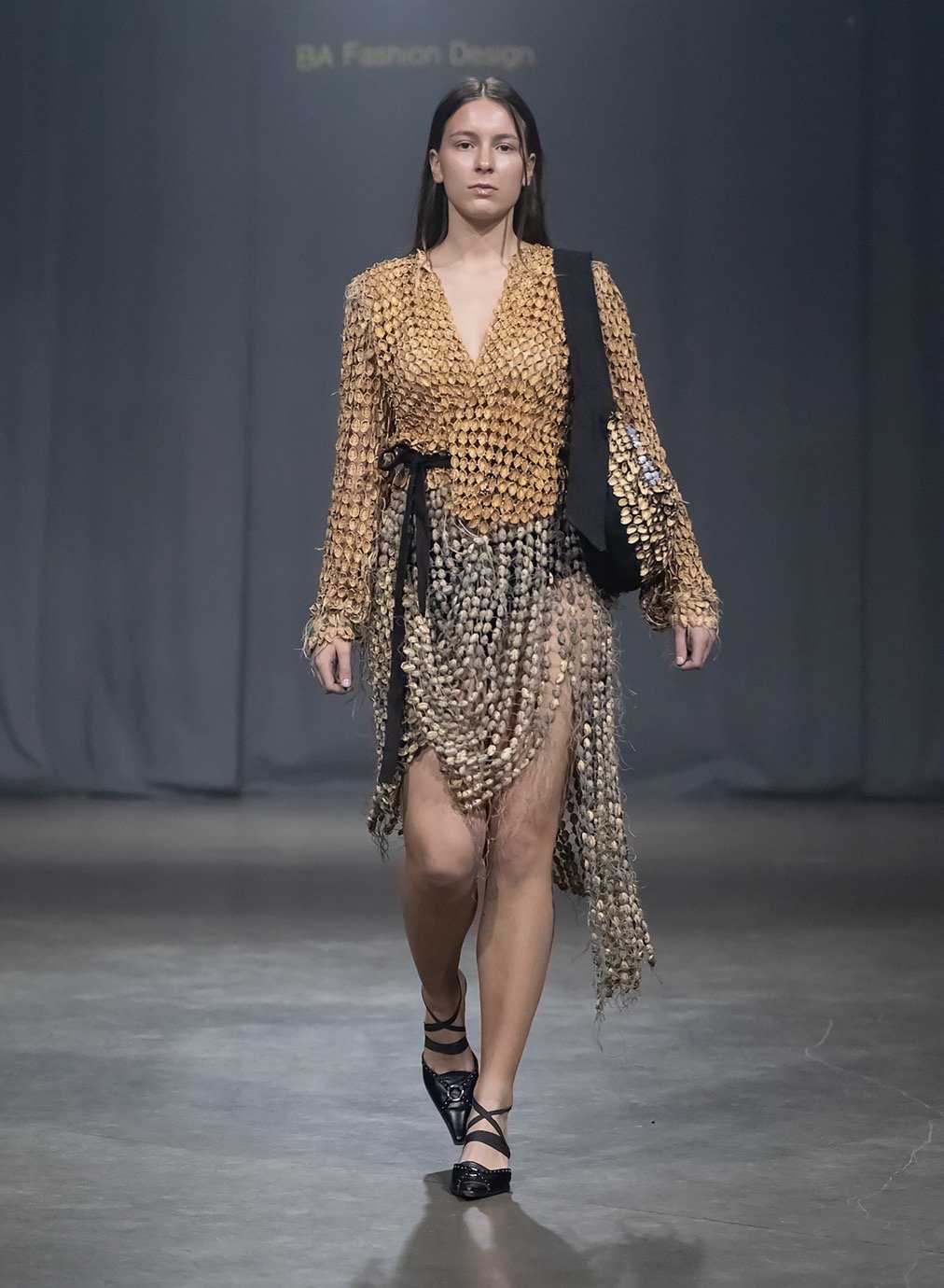
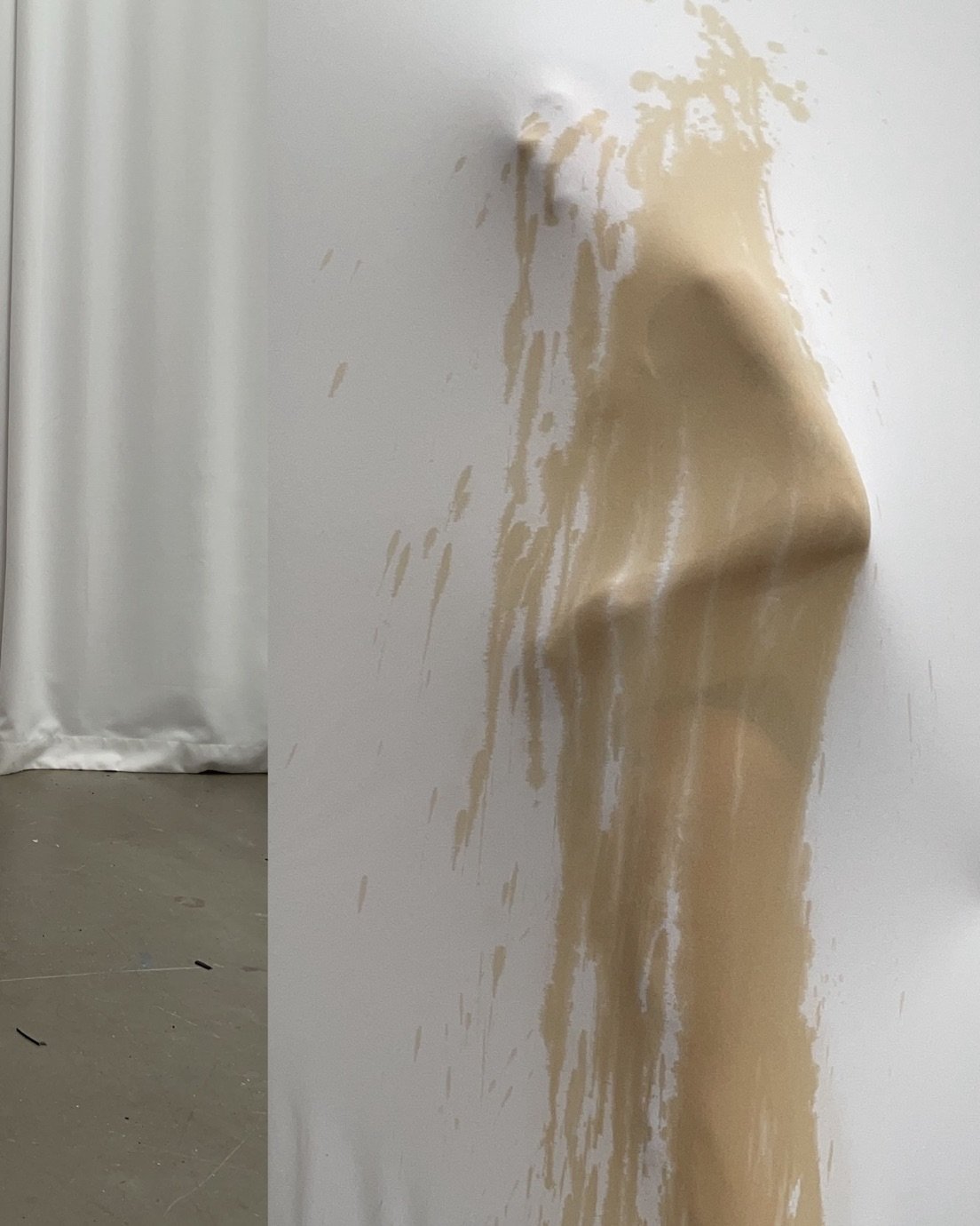
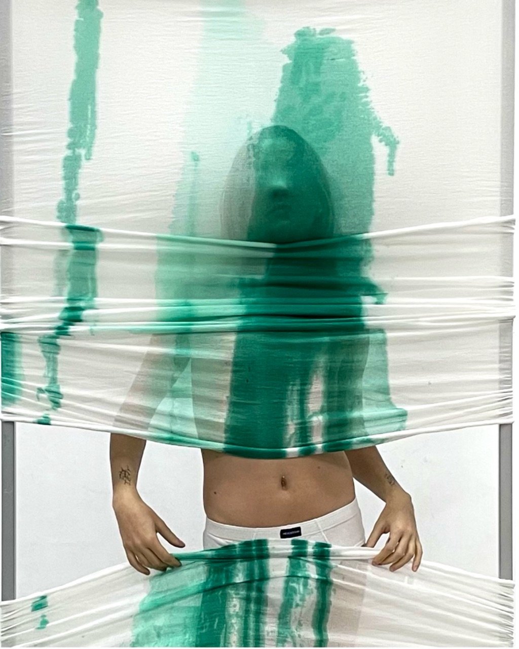
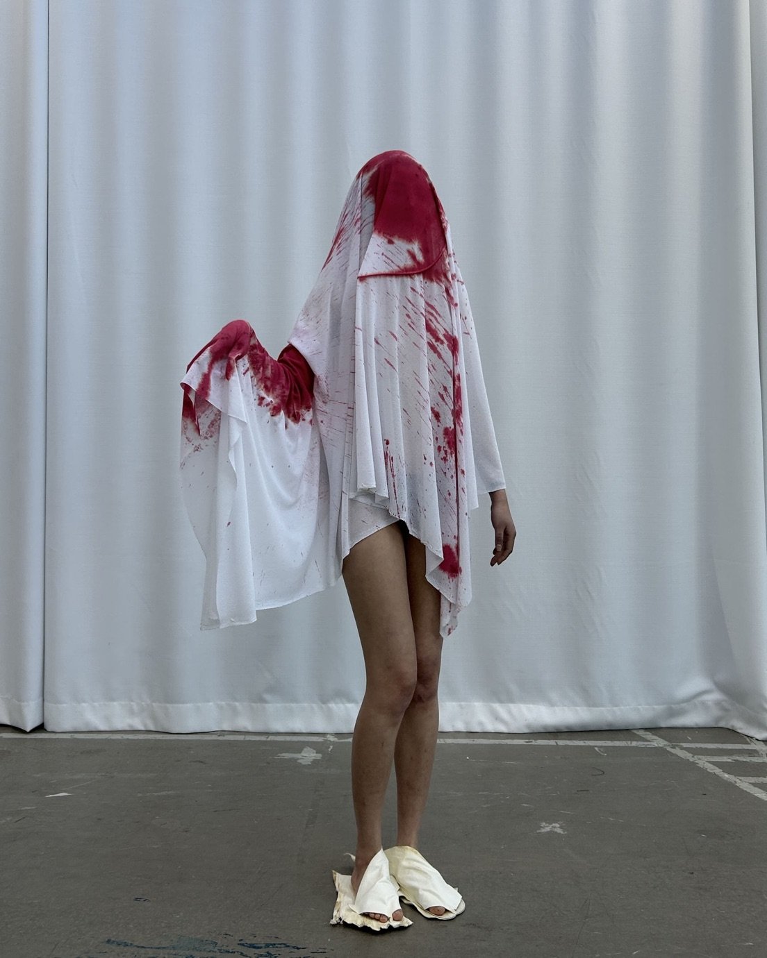
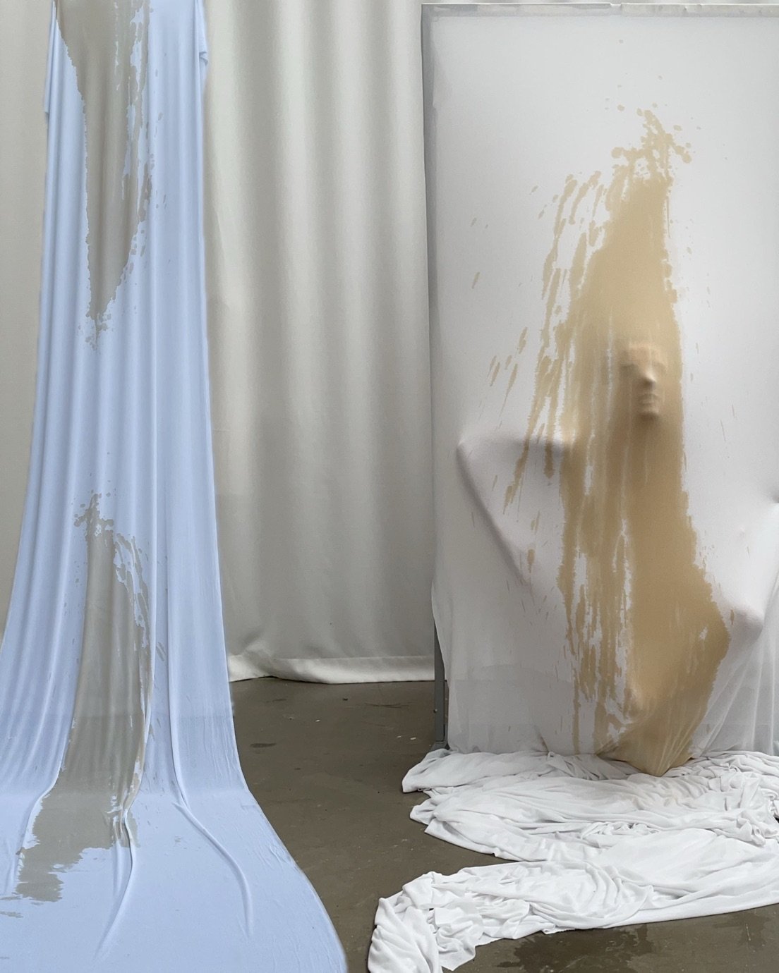
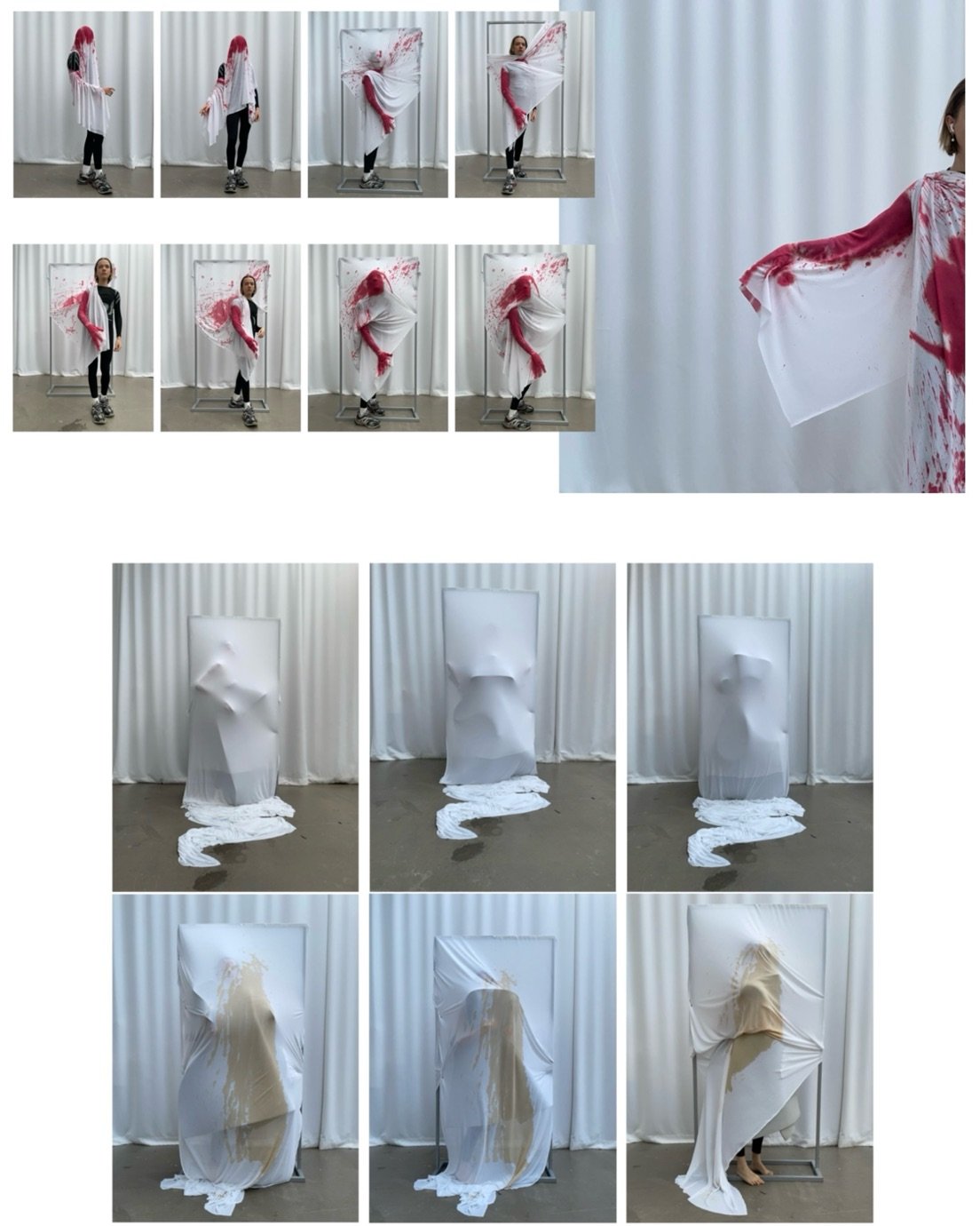
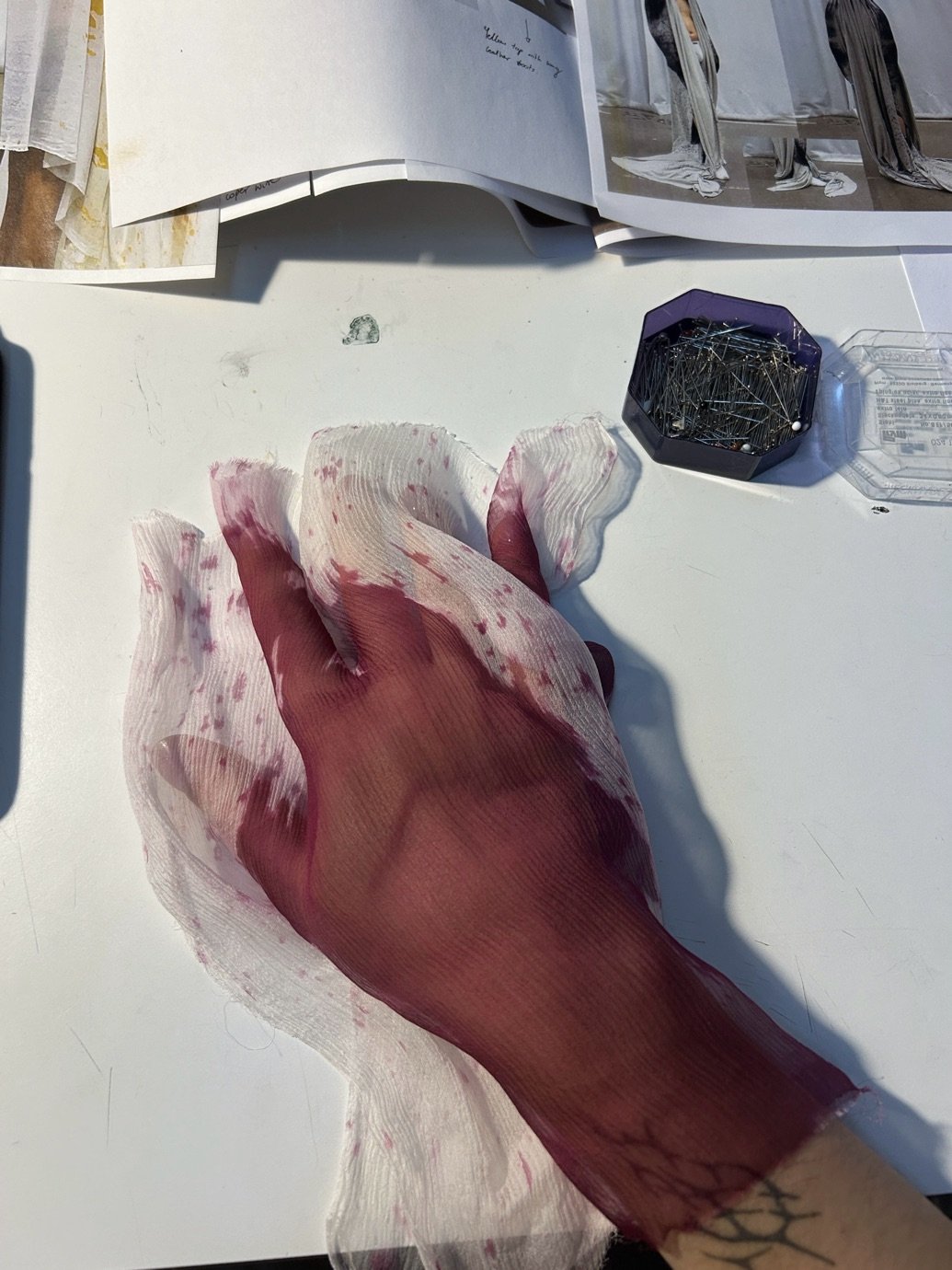
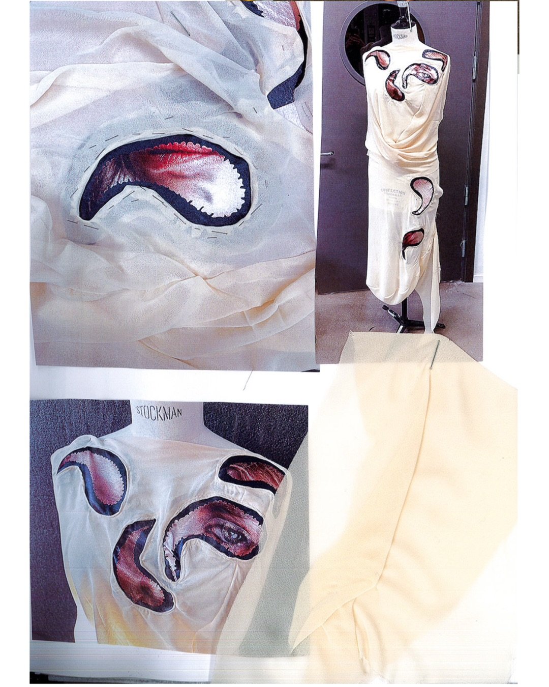
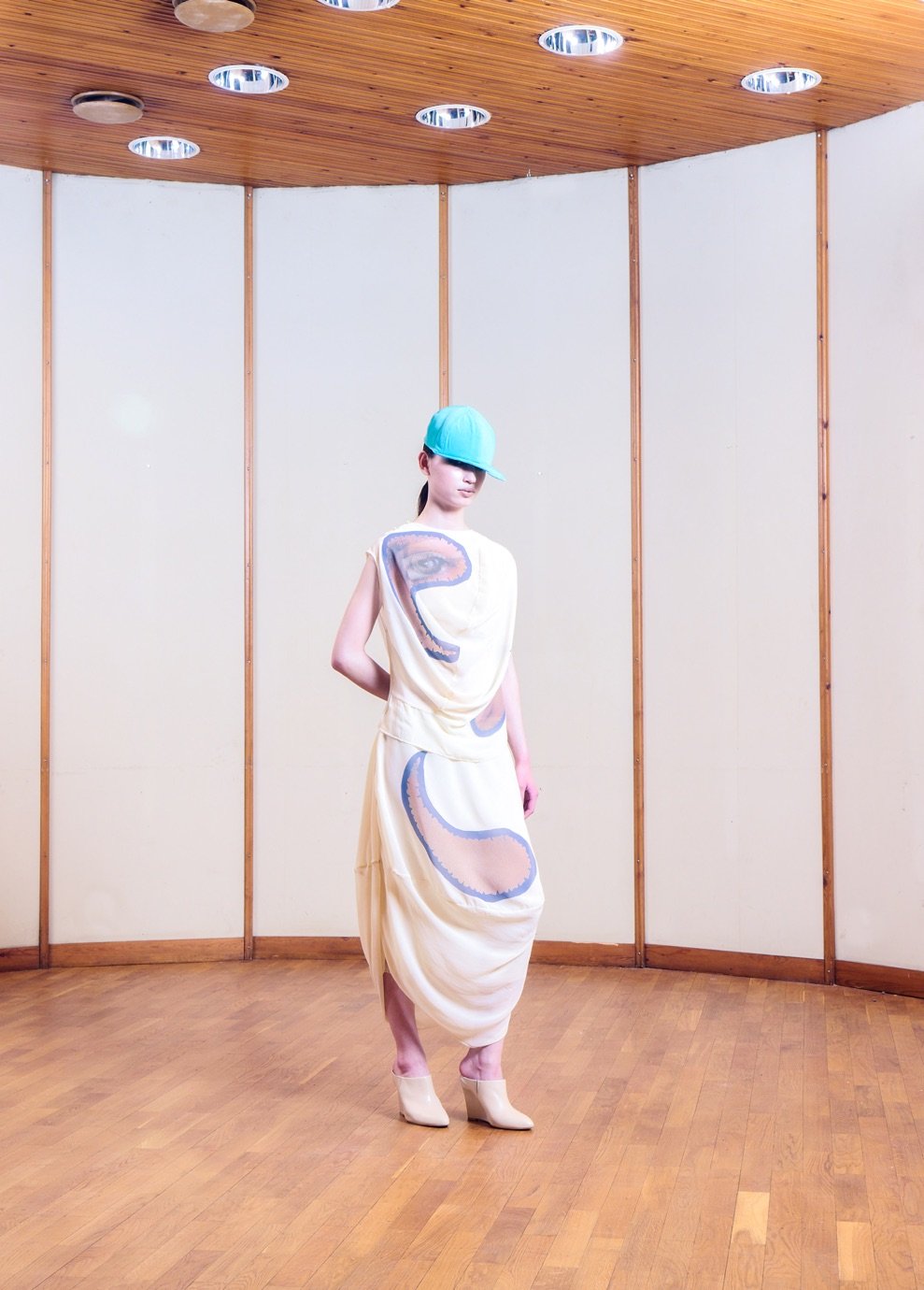
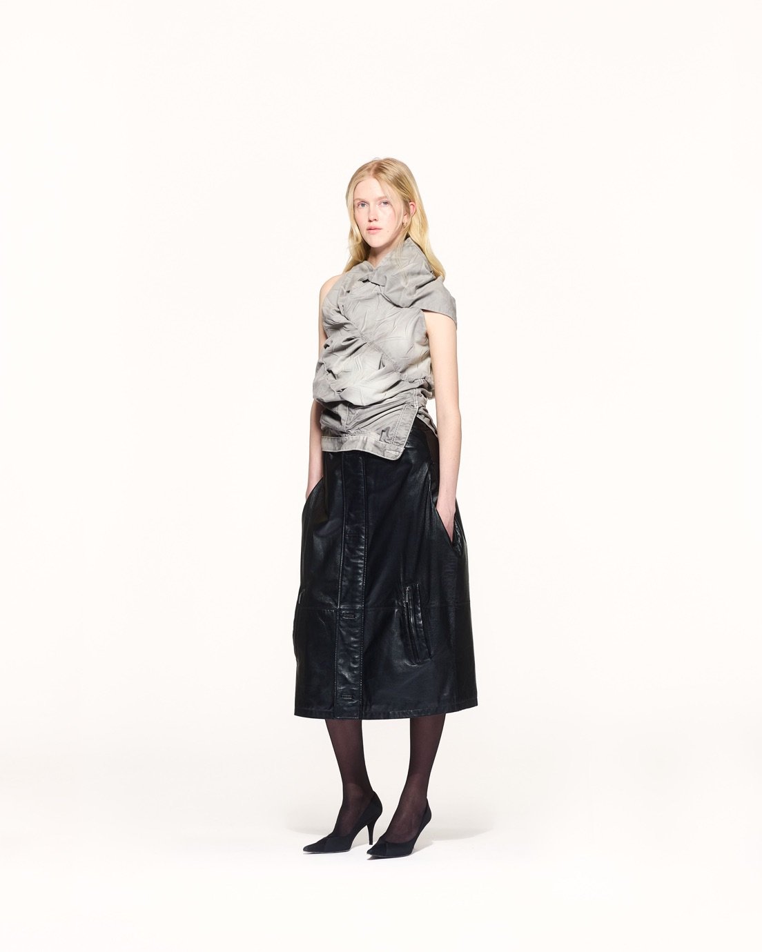
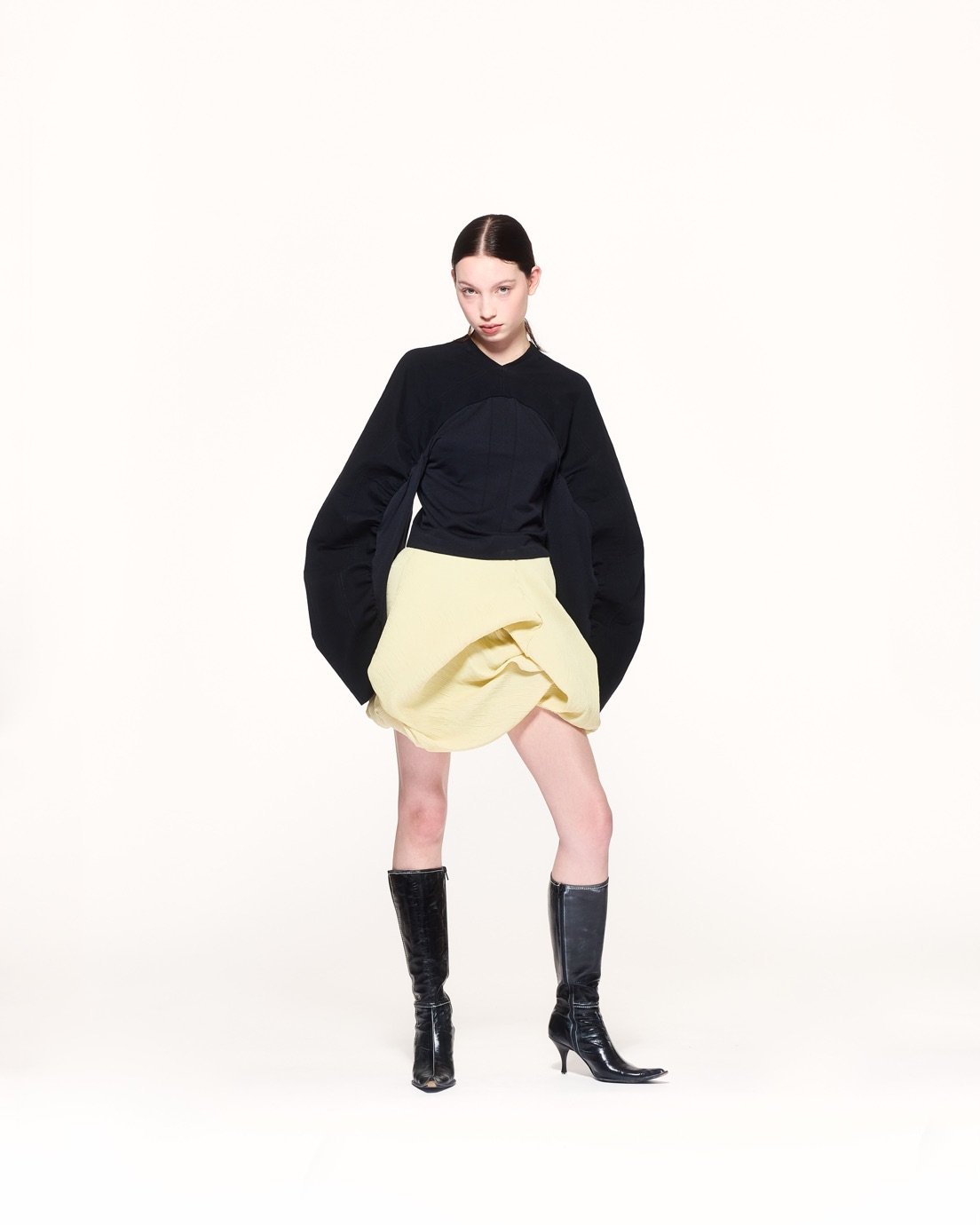
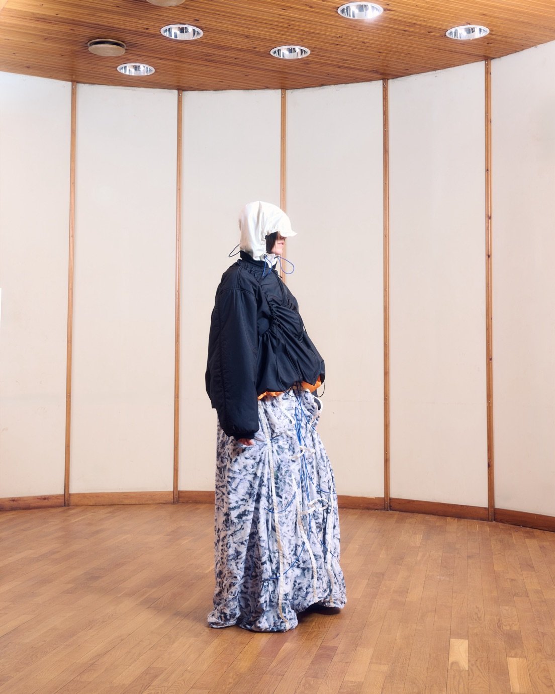
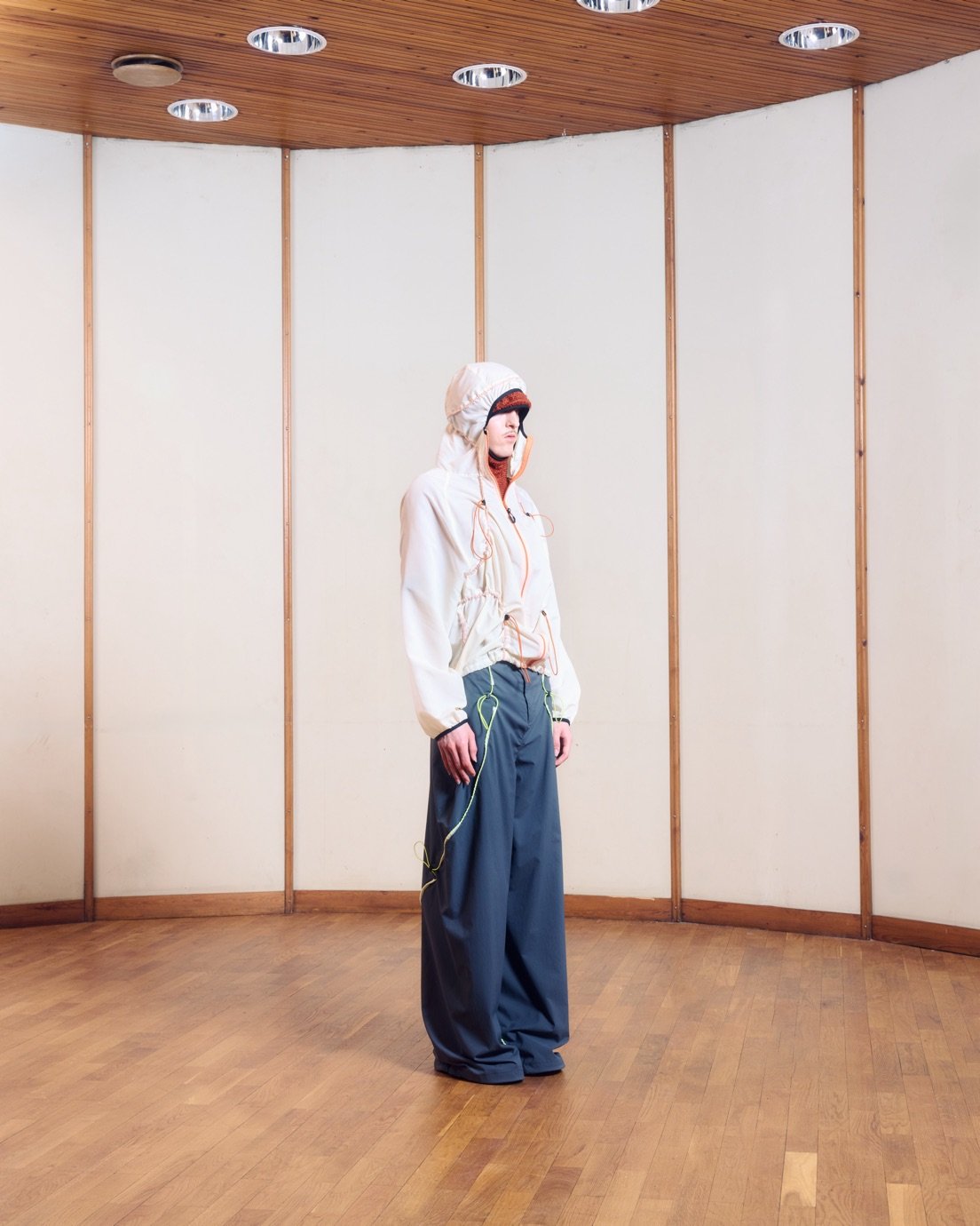
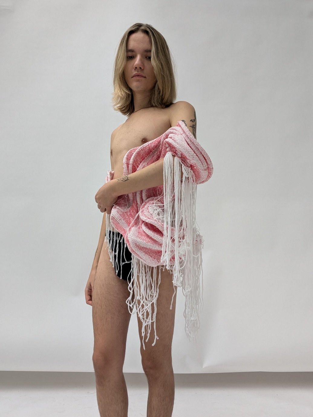
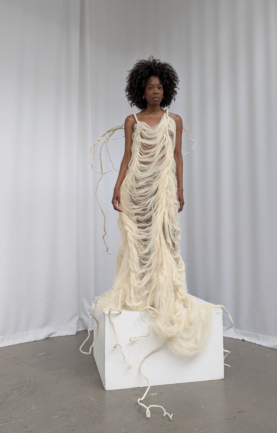
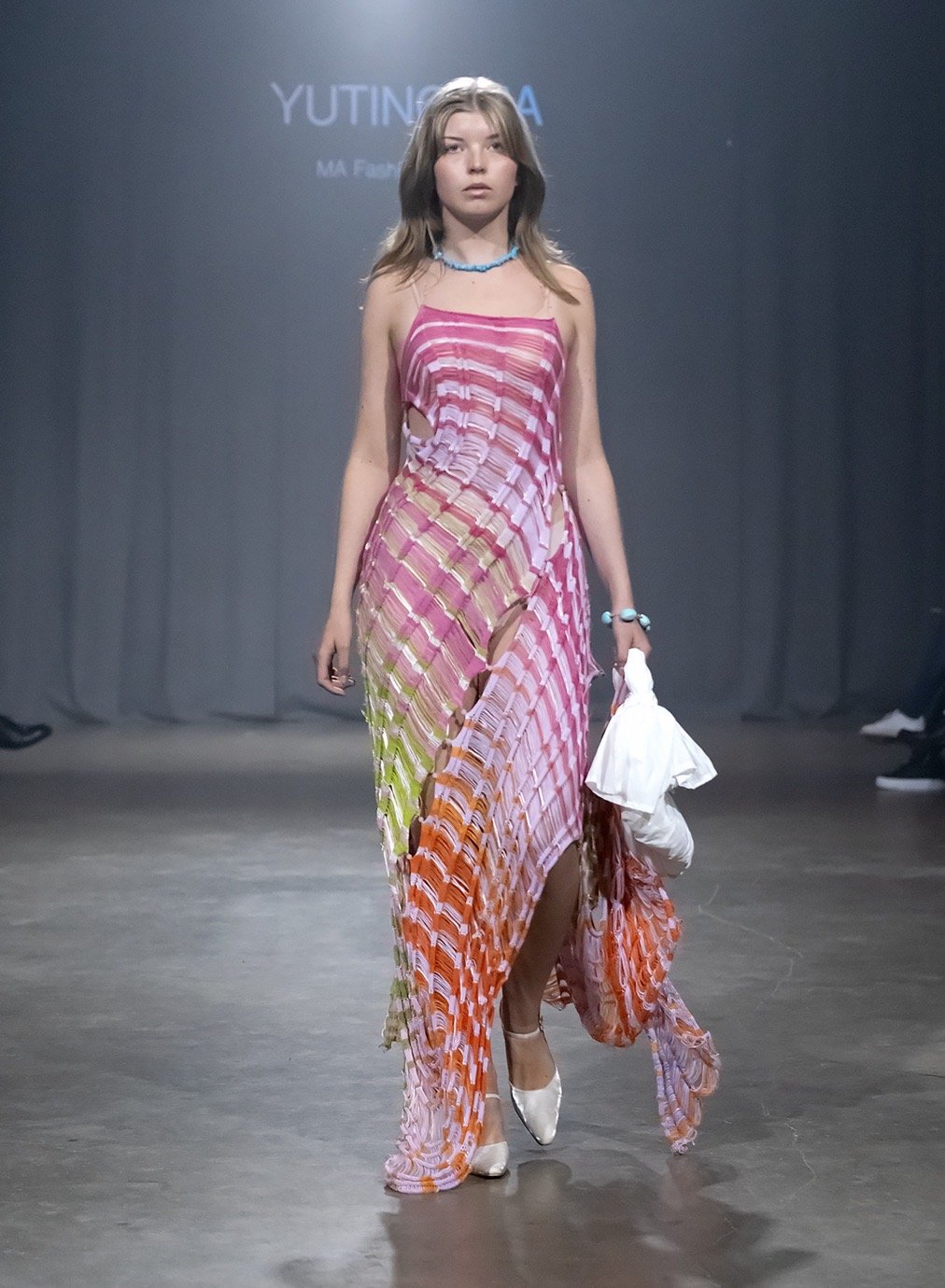
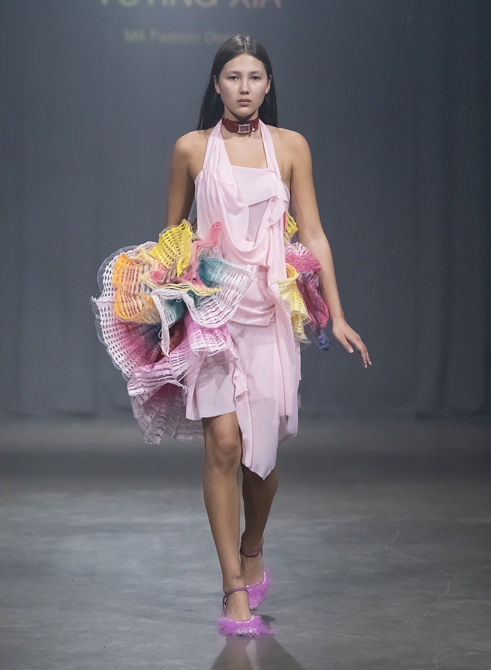
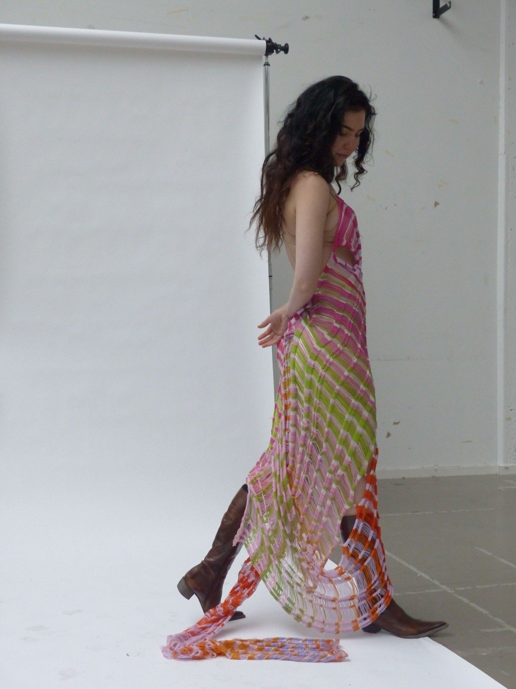
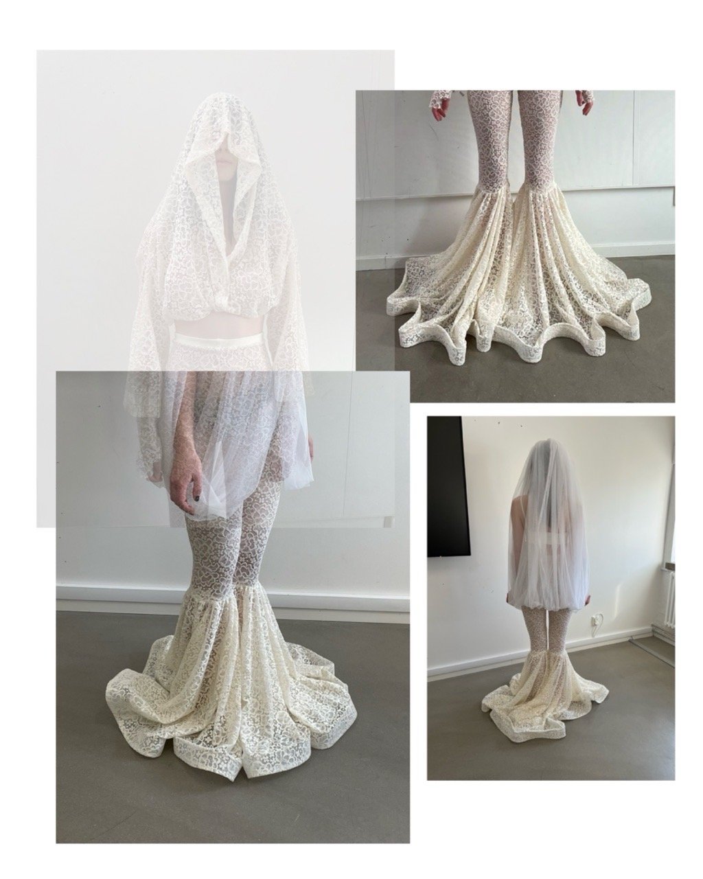
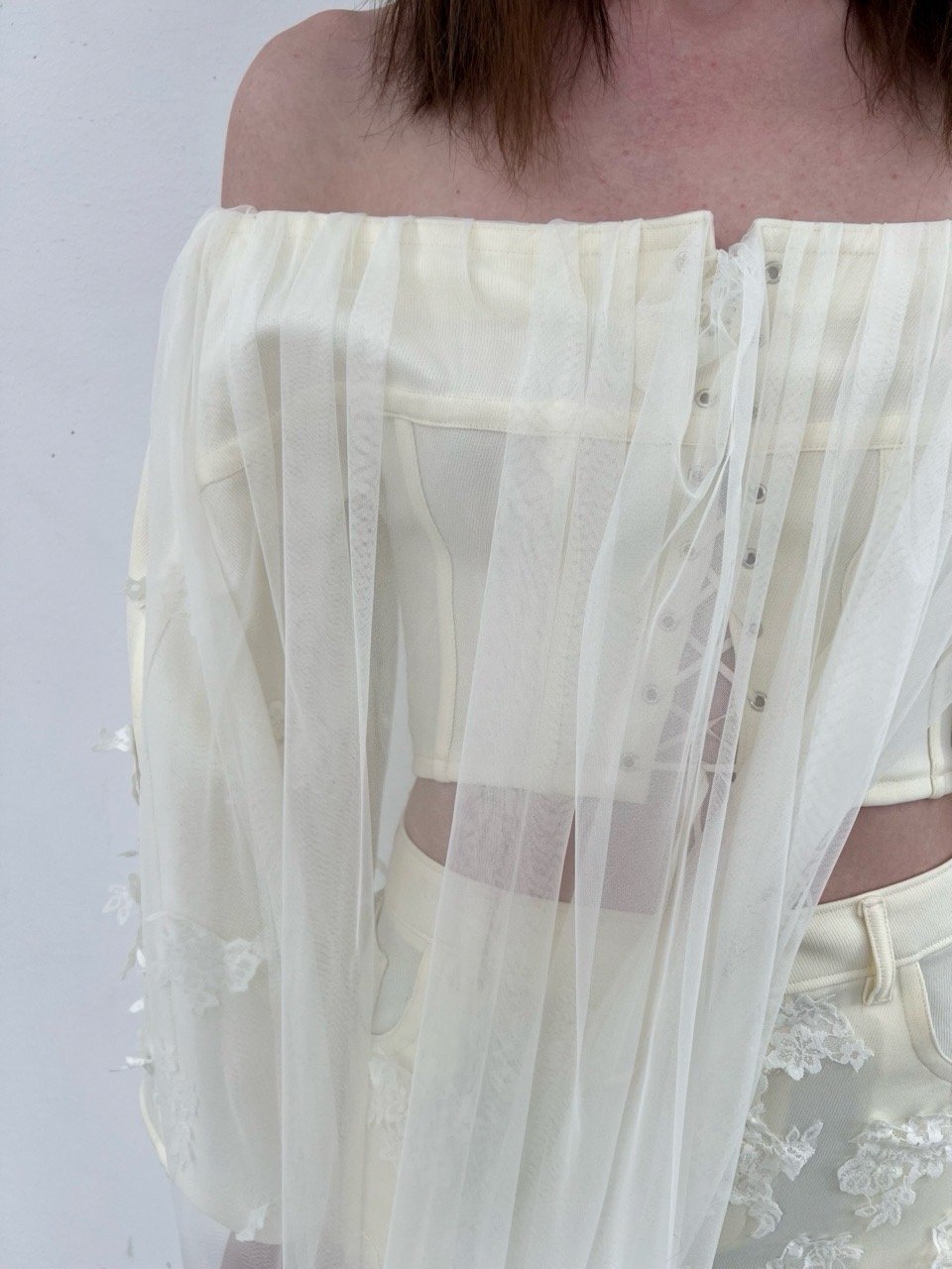
There’s a shared curiosity about transformation – less in the sense of dramatic “makeover” and more in how form, texture, and identity shift incrementally. A jacket becomes a register of time. A print holds the residue of movement. Fabric collapses, adapts, resists. Even when referencing historical silhouettes or archetypes, the results tend to feel provisional – offering propositions rather than fixed statements.

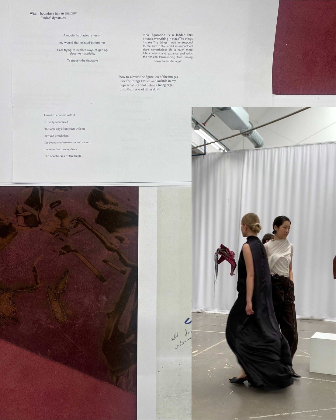
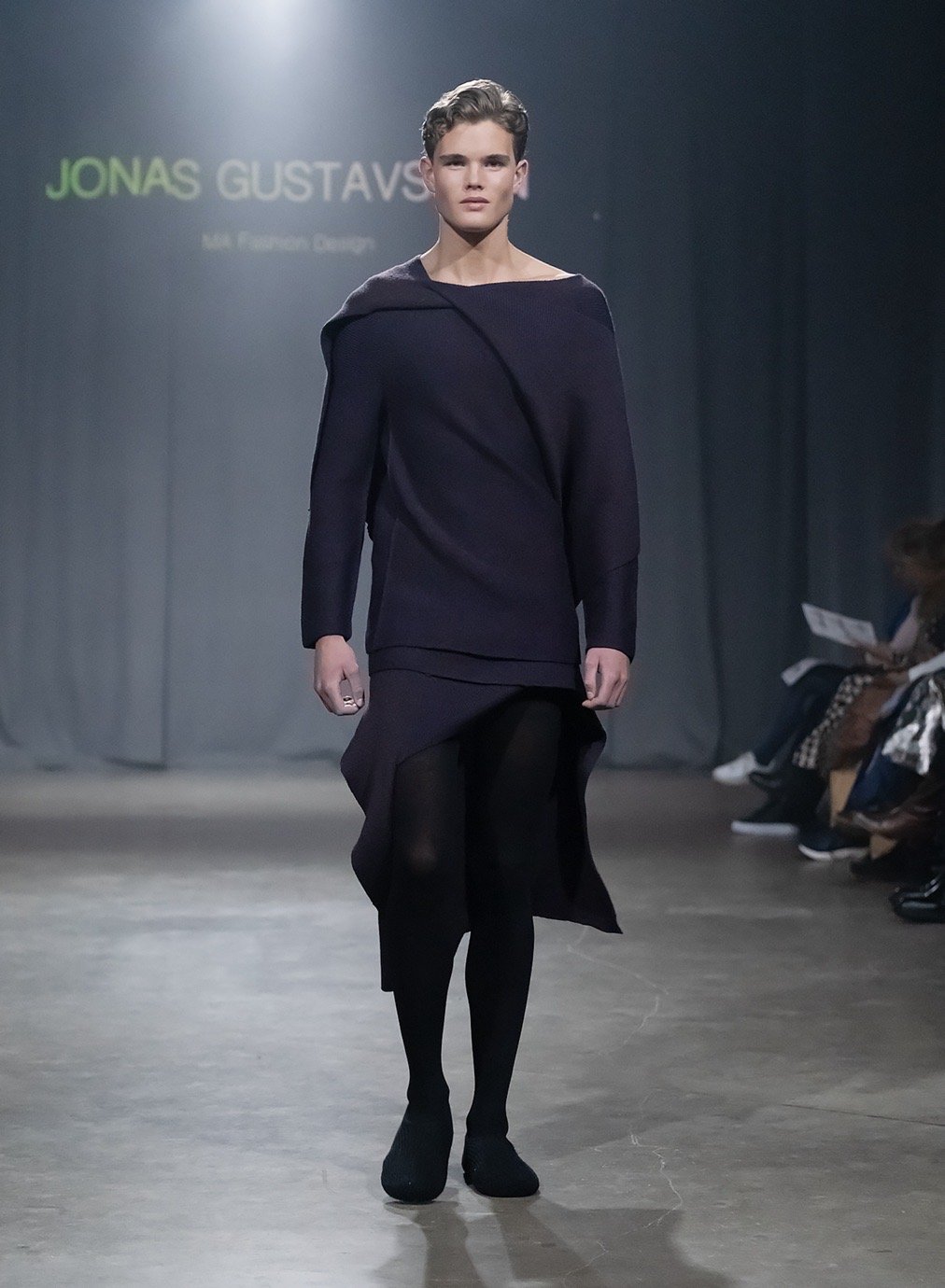
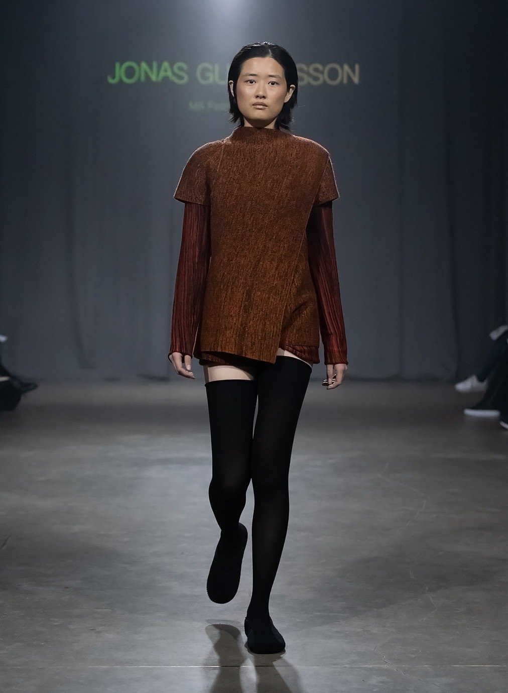
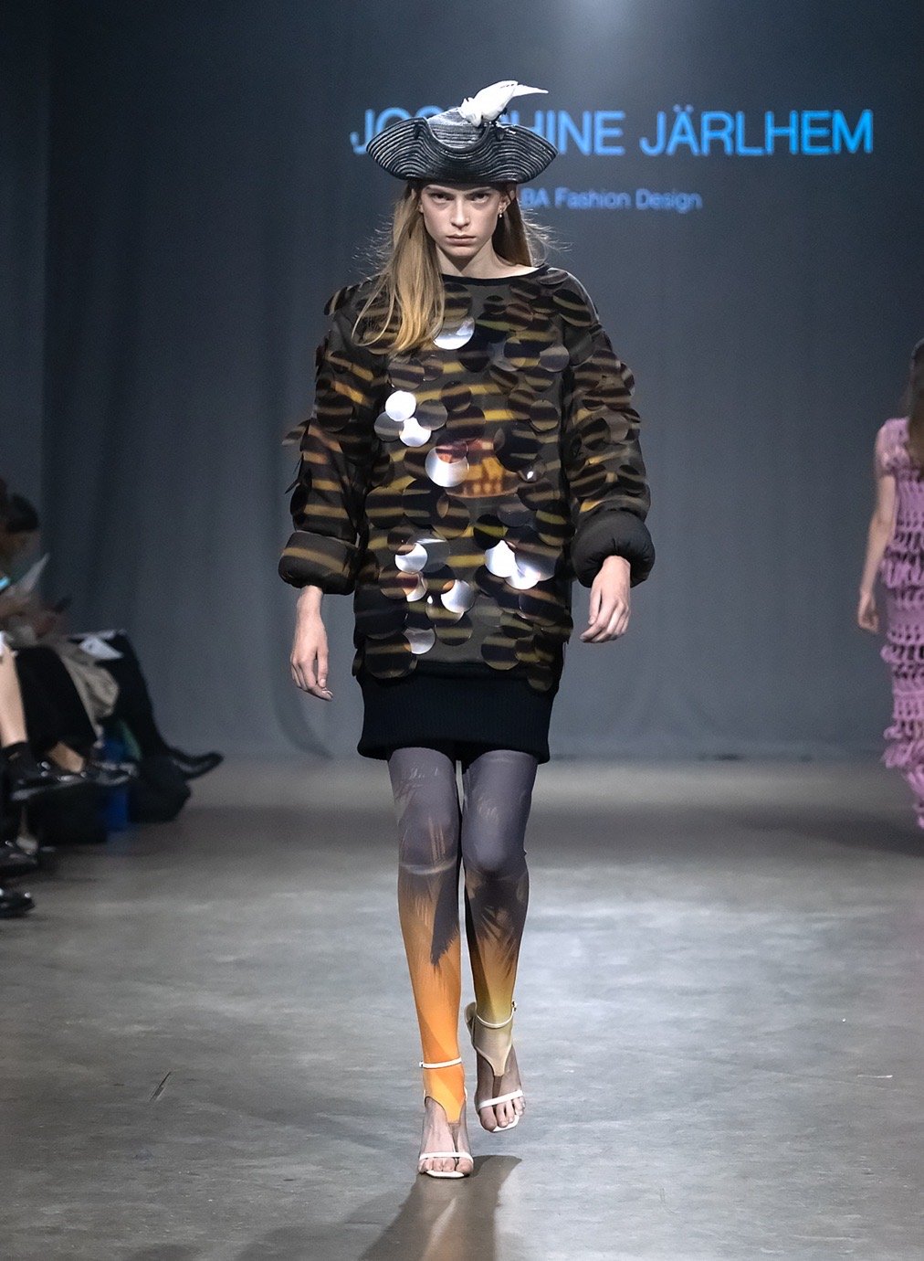
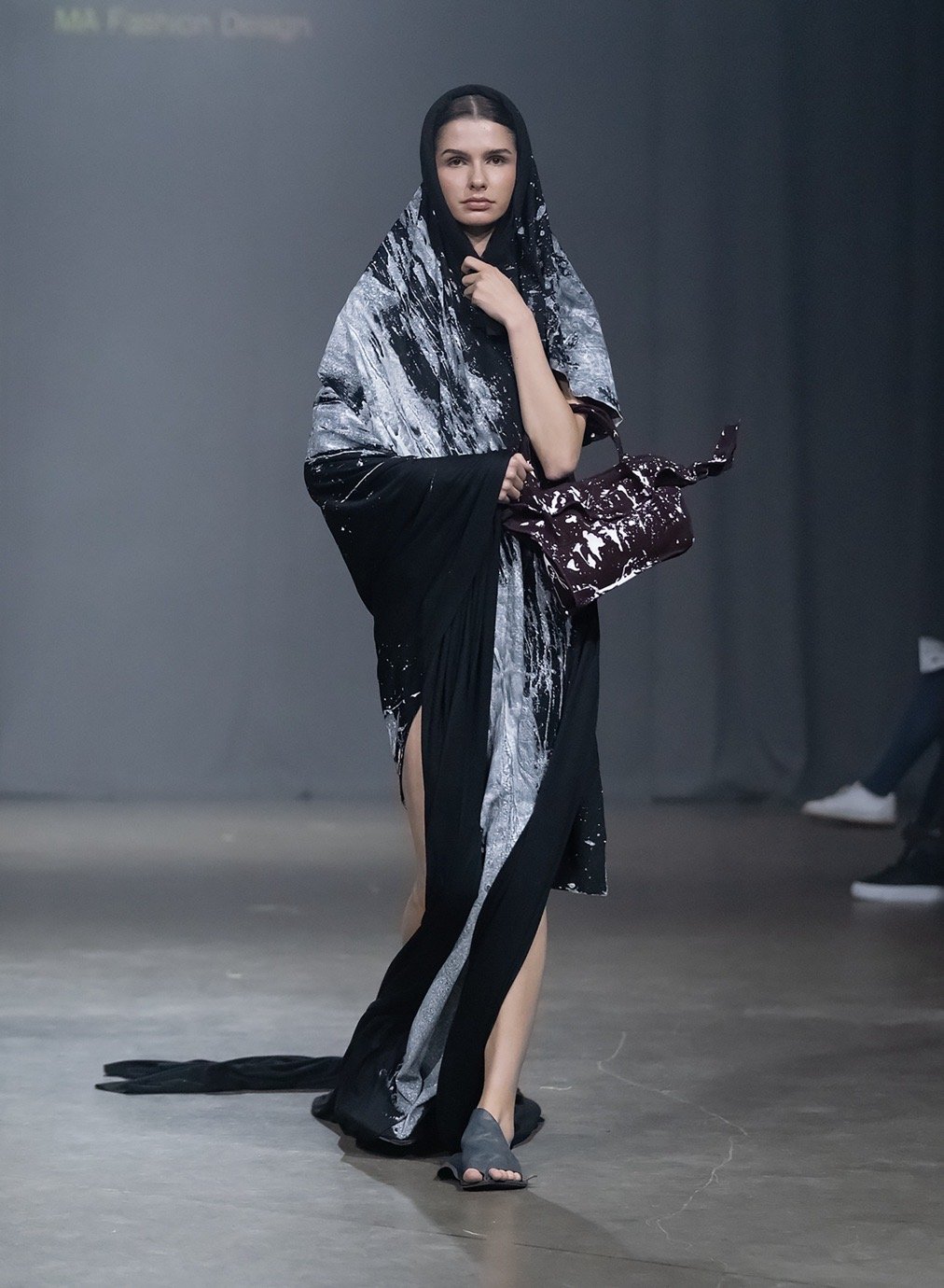
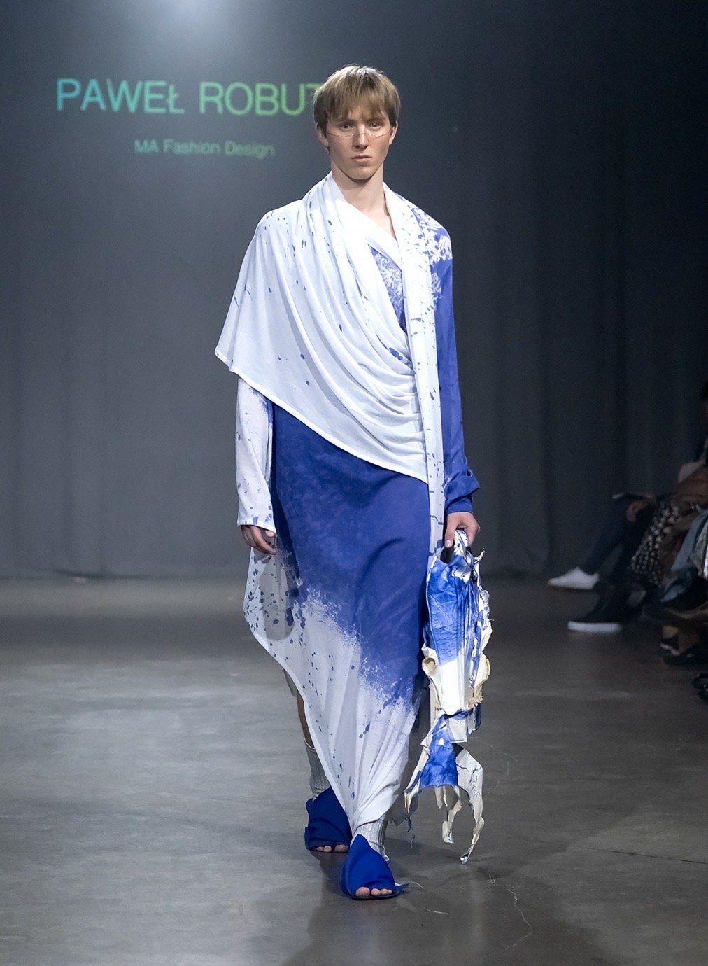
In a moment where fashion education often drifts toward commercial polish or concept overload, SST’s output this year feels unusually clear-headed. The work is experimental without being overblown; sensitive to context without being didactic. These are designers paying attention – not just to how things look, but how they behave.

Anaïs Dahl Perret, Denmark
MA in Textile Design, Knitwear
“Morphogenesis in Motion”

What are the key inspirations behind this collection? 

This collection is inspired by cellular behaviour and the idea of garments as living systems. It explores how modular textile structures can enable transformation, adaptability, and emotional connection. Square modules are interlaced with drawstrings, referencing how cells divide, repair, and form larger systems. This analogy guided the development of garments that can be reshaped and reconfigured by the wearer – inviting interaction and continuous aesthetic exploration. The collection challenges static notions of clothing, encouraging a slower, more conscious relationship with fashion – one shaped by care, interaction, and evolving form.

What materials, colours and techniques did you use in the creation of this collection? 

The collection combines knitting techniques with laser-cut textiles, balancing craftsmanship and digital precision. All materials follow a mono-material strategy to support recycling: knits are made from natural fibres like wool, cotton, and viscose, while laser-cut pieces use polyester for durability. The work incorporates manual and industrial flat knitting machines, as well as circular knitting. The focus lies in creating structures with changeable features that enhance transformability on the body. The colour palette is inspired by the seasonal shift between winter and spring – a symbolic time of renewal and growth – chosen to evoke freshness, transition, and positive emotion.

What’s next? 

I’m moving to Copenhagen and excited to enter the industry! I hope to contribute to sustainable transformation through design and help push the fashion system in a more conscious direction. I look forward to applying my skills to create products rooted in meaning, storytelling, craftsmanship, and care – offering aesthetic pleasure and long-term value for people and the planet. I aim to continue evolving my creative practice through knitwear and material exploration across fashion and textiles. I’m open to collaborations, job opportunities, and personal research – always guided by curiosity.

@anaisperret_design

Screenshot

Andrea Rehbein, Spain
MA in Fashion Design
“Approximations to the Acrobatics of Flesh”

What are the key inspirations behind this collection?

The collection proposes abstraction as a tool and craft as a language of individuality to explore new ways of interacting with clothes, identity, and space. It’s inspired by the parallels between Julia Kristeva’s writings on the abject and its processes in the subject, and Deleuze’s analysis of Francis Bacon’s paintings. Within this context, the unstable subject becomes a transformative space, and the fragility of its boundaries a point of connection. I use abstract forms to alter archetypical garments, merging body and space in a continuous becoming. The collection becomes a mark of this intimate process – a register of the ordinary through day-to-day garments.

What materials, colours and techniques did you use in the creation of this collection? 

The collection is crafted entirely from deadstock, using natural materials traditionally associated with archetypal garments. This links abstraction with historical and social traditions: cotton poplin shirts, light virgin wool suits, viscose T-shirts, silk dresses. Some fabrics were dyed or digitally printed to create a more expressive visual effect, though the colour palette maintains a familiar relatability. The process begins with layered laser engraving into vegetable-tanned leather, forming raw topologies that act as freeform draping guides. These abstract shapes are traced, transplanted, and tailored into drafted archetypical garments using experimental pattern cutting – a dialogue between abstraction and tailoring that gives rise to fluid, open-ended forms.

What’s next? 

I’m eager to keep learning, developing, and building something both defined and undefined. I’d love to grow professionally through an internship with a brand or company, and explore more opportunities to showcase my work in different contexts. There are always new ideas and experiments to pursue – so to keep working is always the “what’s next.” While I enjoy working experimentally, I also value craftsmanship and traditional methods. Ultimately, after an internship, I hope to find a position as a designer within a brand that allows me to grow in both respects.

@an.annbein

Charlie Malmsten, Sweden
MA in Fashion Design
“Why wonder if the glass is half full or half empty, refill it instead”

What are the key inspirations behind this collection? 

This collection is a personal story powered by cheap champagne, duty-free sparkle, and the raw glamour of the Finnish cruise ferry, where short-haired ageing women glide through kitsch-drenched corridors of camp. It’s a tribute to excess, a rebellion against invisibility, and a celebration of spaces dismissed as tasteless or tacky. As a gay man, I identify with these women – we share an outsider status in a world that prizes youth and heteronormativity. The ship isn’t just a vessel; it’s a floating stage, a working-class luxury mecca, and my muse’s smoky, sequinned confession booth. High drama, no irony. Step aboard.

What materials, colours and techniques did you use in the creation of this collection? 

I worked with synthetic fabrics, rhinestones, lace, metallics, and velvets – materials that reflect the ferry’s flamboyant interiors and low-cost luxury. Cheap and nostalgic. It feels like stepping back into 1991. These walls have witnessed countless stories: husbands left to drink while the women hit the dance floor. The palette draws from casino carpets, cloudy sunset decks, and karaoke lights – deep purples, garish champagne golds, and neon yellows. The aging lady is brought to life through accessible, literal approaches. I experimented with silhouettes that echo the ferry’s spatial design, reworking traditional party symbols using materials found onboard.

What’s next? 

I am going cruising.

@nilschar.lie

Frida Elise Henriksen, Tønsberg, Norway

BA in Fashion Design

“Kleist wrote something like “After self-consciousness grace will reappear”…”

What are the key inspirations behind this collection?

This collection is rooted in Heinrich von Kleist’s essay On the Marionette Theatre, which compares the grace of marionettes to the self-consciousness of humans. Marionettes move with pure, unconscious elegance – something we often lose through self-awareness. That idea became the foundation for a collection built as a narrative, where each look represents an archetypal character. Through making, each character unfolded into a more complex, emotionally rich figure. The process was as much about storytelling as it was about design – an exploration of grace, awkwardness, and the deeply human performance of identity.

What materials, colours and techniques did you use in the creation of this collection?

Because each look had its own narrative, I worked across a wide range of materials and techniques to bring out the individuality of each character. I used quilting, feather-dyeing, papier-mâché, and layered patchworking to reflect symbolic references and emotional textures. The roughness of performing puppets remained a constant theme. Draping and experimental construction became tools to explore how consciousness shapes posture, movement, and the clothing we choose to wear – expressing how our bodies and minds are in constant conversation.

What’s next?

First: getting out of my head! Then, continuing to learn, create, and explore. I’m eager to work with likeminded people who can share their skills and open up new creative worlds. After three years in a small town like Borås, I’m ready to expand and see what’s out there.

@Princesmononoke

Jonas Gustavsson, Sweden
MA Fashion Design, Knitwear
“Astral Project”

What are the key inspirations behind this collection? 

Astral Project explores gender beyond the binary, using knitwear as both material and metaphor to reimagine identity. Inspired by Charles Fourier’s concept of a third gender – alongside spiritual traditions from diverse cultures – the collection challenges conventional gender constructs by centring the abstract body and the spirit within. Cultural references from Greek myths to Eastern philosophies interweave throughout the garments, creating a narrative where fashion becomes a living philosophy. Rather than concealing the body, these pieces reveal and celebrate it, honouring fluidity and the often unspoken identities in-between.

What materials, colours and techniques did you use in the creation of this collection? 

The collection uses experimental knit techniques such as horizontal and partial knitting to develop a new whole-garment construction method that fluidly wraps and reshapes the body. Fine-gauge knits were chosen for their elasticity and adaptability, supporting a non-binary, body-inclusive approach. Colour plays a symbolic role, inspired by Rudolf Steiner’s colour theory and the chakra system, with each hue representing a state of consciousness. The interplay of colours creates a sense of duality – inner and outer, physical and spiritual. Together, the materials, colours, and techniques form a tactile narrative exploring identity, transformation, and the space beyond gender binaries.

What’s next? 

I’ve always dreamt of owning my own knitwear factory where I can explore all my knit ideas freely – a bit Willy Wonka-style, haha. So hopefully I’ll start pursuing that dream now.

@g.stvsn

Lan Krebs, Slovenia
MA in Fashion Design, Knitwear
“JERSEY DIVERSITY”

What are the key inspirations behind this collection? 

Jersey is often perceived as a simple, plain fabric – functional and modest in appearance. This work challenges that assumption by transforming jersey into a dynamic material language. Using machine-made tubular knits, I explored the potential of layering, wrapping, and sculpting fabric directly on the body without imposing a fixed garment definition. This approach not only reinvents jersey’s role in fashion, but also celebrates the potential of minimal material intervention to create bold, sculptural, and sustainable outcomes. Through these explorations, the ordinary becomes extraordinary. A simple tube of fabric becomes a medium of personal expression and form.

What materials, colours and techniques did you use in the creation of this collection? 

Each piece begins as a seamless knitted tube – an elementary form that becomes uniquely expressive through manipulation. I used pleating, hand-gathering, and experimentation with pleat angles and transparency. These garments don’t dictate a front or back, inside or outside; they invite interpretation, interaction, and play. I worked with cotton and viscose for their ability to absorb colour during space dyeing, combined with synthetic fibres to retain pleats and preserve devoré areas. Colours were chosen intuitively, often right before knitting or dyeing, to keep the process emotionally honest and spontaneous.

What’s next? 

I want to continue developing my research by exploring pleat structures, colour placement within garments, and how material choices affect visual impact. After graduating, it may be challenging to access the kind of facilities available at The Swedish School of Textiles, so I aim to work with an established brand that supports creative research – or seek funding to pursue a more independent path. I plan to showcase my work at STHLMFW, CPHFW, BCEFW, and LJFW, where new opportunities can emerge. I’m looking forward to continuing innovative practices and constantly learning new and exciting things.

@lankrebs

Josephine Järlhem, Gothenburg / Bangkok

BA in Fashion Design

The Passage from Lover to Lover 1992–2025

What are the key inspirations behind this collection?

This collection is a love letter—to my parents, to memory, and to stories passed down in fragments. It began with their love story, which started on a sailing boat from Sweden to Thailand—something I grew up hearing over and over, flipping through old photo albums. Each look is a patchwork of that story, filtered through my lens: part nostalgia, part distance, part reinterpretation of cross-cultural love. I was especially drawn to quiet love languages—like chei, an old-fashioned Thai styling tradition—which I echoed through silhouettes, prints, colours, and details.

What materials, colours and techniques did you use in the creation of this collection?

I worked mostly with polyester, leather, and touches of knit. Most of the experimentation was done by hand—I love how manual work invites unexpected discoveries and allows room for accidents. I explored leather carving, cut-outs, transfer printing, oversized printed sequins, and bits of embroidery. Every technique became a way to preserve a fragment of the story: the texture of an old photo, the colour of a remembered landscape, or the small tactile cues that feel like home.

What’s next?

First, a little break—to slow down, go home, and recharge. But after that, I’m excited to get to work, probably starting at a smaller brand where I can learn and contribute closely. And of course, I’ll keep crafting and selling pieces from my studio along the way.

@josephinewithph

Margot Leverrier, France
MA in Textile Design, Knitwear
“CONTRASTS IN DIALOGUE”

What are the key inspirations behind this collection? 

The key inspirations behind this collection are the contrasts between two textile techniques – brushed felt and lace – and the tension between handcraft and industrial processes. Growing up in Normandy, I was influenced by the region’s rich lace-making tradition. This heritage became a starting point for experimentation: reinterpreting the softness of felt using different materials and translating lace-like qualities through knitting. I was also inspired by the idea of transformation – how gestures like brushing or felting can alter not just texture but meaning. Ultimately, the collection is about memory, reinterpretation, and how craft can evolve while honouring its origins.

What materials, colours and techniques did you use in the creation of this collection? 

For this collection, I mainly worked with viscose. After extensive material research, I found it could replicate the tactile and visual qualities of brushed wool while adding a sense of fragility. Colour choices varied: some looks used a neutral palette like black or white to highlight texture and technique, while others explored colour more subtly. When brushed, the blue fibres emerge, revealing colour through texture. Technically, the collection balances hand work and industrial processes. I used both the Silver Reed for manual knitting and machines like the Stoll, circular, and interlay to program lace and knit structures.

What’s next? 

Ideally, I’d love to join a brand as a knitwear developer – somewhere I can keep experimenting, learning, and getting nerdy about knitting. But honestly, the dream is to open my own knitwear studio one day. A space where I can create freely, collaborate with others, and just have fun with the process. In the meantime, I want to keep travelling, meeting new people, discovering and making things along the way. I’m just trying to stay curious and see where knit can take me.

@margot.lvrr

My Willaume, Sweden
BFA in Fashion Design
“Assemblage: Pistacia”

What are the key inspirations behind this collection?

This project positions itself as a quiet form of activism – creating “something out of nothing” and challenging the accelerating pace of the fashion industry by advocating for slowness, material intimacy, and the value of making by hand. It questions conventional notions of luxury by using craft as a critical tool, focusing on time-consuming techniques to elevate low value materials – like pistachio shells – into a form of “low-key luxury”. Central to the project is the influence of Elsa von Freytag, whose legacy of reimagining and recontextualising overlooked materials informs the collection’s commitment to meaningful transformation.

What materials, colours and techniques did you use in the creation of this collection? 

The primary material in this collection is pistachio shells, intricately assembled using various natural fibre yarns, refined brass wire, and silver-plated steel wire. The process involved extensive experimentation with dyeing techniques – both soaking and surface application – with soaking proving the most compelling, allowing the material’s natural response to guide the outcome. A gradient of colour effects emerged through different soaking durations and treatments. Iron solution stood out for its depth and subtlety, along with pieces that were heat-treated – including shells baked in the oven to enhance tonal variation.

What’s next? 

At heart, I’m a curator of materials, and my instinct to collect whatever captures my attention will continue. That said, I’m looking forward to reconnecting with textiles and returning to their soft, flexible properties.

@mywillaume

Paweł Robuta, Poland
MA in Fashion Design, Construction and Print
“Liquid Relics”

What are the key inspirations behind this collection? 

This project explores how stains can shape new relationships between body and fabric through draping. Inspired by Barbara Baert’s concept of stains as “liquid relics,” the process embraced abstract splashes, allowing them to guide form rather than following fixed silhouettes. This approach repositions stains as sacred traces, not imperfections. Key references include Yves Klein’s Anthropometries, Warhol’s oxidation paintings, Helen Frankenthaler’s soak-stain technique, McQueen’s spray-painted dress, and Westwood’s Spring/Summer 2000 collection. Hegel’s view of Greek drapery as a space for bodily freedom also influenced the work – treating fabric not just as clothing, but as an environment for movement and expression.

What materials, colours and techniques did you use in the creation of this collection? 

The palette began with everyday staining liquids – coffee-with-milk-brown, wine red, lipstick red, grass green, and shades of ink – and expanded to include primary colours and tones mentioned in Ancient Greek texts. Materials included deadstock crepe jersey, silk organza, woven polyester, and heavy black and grey cotton jersey. I used techniques like space dyeing on silk organza, creating soft, bleeding effects, and pigment painting on jersey, where diluted paints soaked deeply like ink stamps. Polyester fabrics allowed gravity-led flows, forming tear-like patterns. White base fabrics served as canvases for these stains. Each silhouette is anchored at specific points – through four seams, one shoe construction, pins, a sleeve, or boning – to shape its form.

What’s next? 

I want to keep learning, but in a different environment than university or academia. I hope to test my abilities through an internship with a brand or company, gaining hands-on experience and insight. At the same time, I’ll continue trying, in Annie Ernaux’s words, to “save something from the time where we will never be again.”

@seraffa

Siri Bratt, Sweden
Womenswear, Print
“Ctrl+Paisley: Print. Post. Repeat”

What are the key inspirations behind this collection? 

This collection investigates new visual expressions of the paisley motif. Inspired by Miuccia Prada’s methodology – using something considered ugly to create interesting ready-to-wear – paisley became the starting point. The pattern is instantly recognisable but has stopped evolving, which opened up an opportunity to challenge norms in print design for women’s fashion. I personally find traditional paisley ugly, so it was fun and challenging to work with. I contrasted it with something I love – early 2010s fashion trends like skinny jeans and peplum tops – creating a clash that felt both nostalgic and subversive.

What materials, colours and techniques did you use in the creation of this collection? 

I used polyester and viscose satin – both beautifully suited for digital printing. The colour palette includes cold bright yellow, navy, turquoise, and beige. Techniques included digital print, transfer print, burn-out print (devoré), draping, and flat pattern construction. The project primarily utilised digital print and classic construction to develop paisley motifs and shapes in both 2D and 3D. The resulting womenswear collection, composed of five looks, reinterprets classic print traditions and explores how challenging our perceptions of ugliness can lead to something visually compelling.

What’s next? 

Moving to London or Paris, baby! I’m planning to intern at a cool smaller brand like Abra or Aletta – until I’ve got enough contacts to land a job…

@siri_bratt

Susanna Suojanen, Finland
MA in Fashion Design, Construction
“Translating Wardrobes”

What are the key inspirations behind this collection? 

Translating Wardrobes explores how worn garments can be reshaped into something entirely different from what they once were. The idea behind each piece was to let go of the garment’s original identity – to change it physically and, in doing so, break its ties to previous trends, times, and meanings, allowing something more abstract to emerge. In many ways, the garments themselves became my main source of inspiration. I felt most excited during the draping process, especially when discovering a detail, cut, or structure in the original piece that sparked a new direction.

What materials, colours and techniques did you use in the creation of this collection? 

To fully explore the potential of discarded garments, I worked with materials ranging from damaged, low-quality clothing to high-quality, pre-owned pieces. I focused in particular on varying jersey qualities, denim, and leather, combined with lighter fabrics such as crepe and chiffon. The collection moves between carefully hand-sewn, one-of-a-kind garments and more ready-to-wear pieces. The colours almost chose me – I focused on working with garments that seemed to call for transformation. I often carried fabric swatches from earlier pieces in my bag, comparing them with new discoveries as I sourced materials. Throughout the process, I also experimented with fabric manipulation techniques to create new textures and forms that would add depth and dimension to the collection.

What’s next?

I hope to continue developing my skill set and gain experience in the industry by working with a company that values sustainability. At the same time, I’d love to keep expanding on some of the ideas I began exploring during my studies – there still seems to be more to uncover.

@susannasuojanen

Wictor Ljunggren, Sweden
BA in Fashion Design
“Cinched In – Functional Silhouettes”

What are the key inspirations behind this collection? 

The key inspiration for this collection comes from the aesthetics of outdoor clothing – particularly hiking garments. The research delves into the foundations of functional outdoor wear and the evolution of multifunctionality, tracing its roots to military apparel. The collection explores how performance, protection, and adaptability can be integrated into fashion through contemporary silhouettes.

What materials, colours and techniques did you use in the creation of this collection? 

I sourced discarded functional fabrics, primarily various types of ripstop, for their durability and technical character. To add texture and contrast, I incorporated Alpha Direct fleece fabrics. Functional detailing was emphasised using elastic cords, stoppers, metal buckles, and eyelets. The colour palette mixes bright neon tones with grounded neutrals and clean black-and-white. I used transfer printing to apply custom graphics onto ripstop and developed the silhouettes directly on the body using draping techniques. Integrated cord systems contribute both aesthetic value and adjustable functionality.

What’s next? 

I’m now focused on applying for jobs, aiming to join an outdoor brand. My passion for functional design and outdoor culture runs deep, and I’m excited to contribute to a company whose values align with mine.

@wi_lju

Zuzana Vrabelova, Slovakia
MA in Fashion Design, Knitwear
“Bestiary”

What are the key inspirations behind this collection? 

In my work, I speculate on garments as beings or organisms. The focus lies on the materiality of the garments and the intuitive, process-led act of making. Some pieces begin with references to historical dress, but those anchors dissolve over time – destabilised by the logic of the material itself. I like to think they become “animated” through the making process. Knitting becomes a generative method, a way of sketching – transforming simple structures into sculptural forms that challenge conventional ideas of garment construction. Surface textures evoke bone, skin, or fur, suggesting a shared language between bodies and garments.

What materials, colours and techniques did you use in the creation of this collection? 

I gravitate toward materials with interesting properties – paper yarn, mohair, linen, unspun wool, elastics, and thermoplastics. As a designer, I’m very material-driven and purposeful with how I use each fibre and for what technique. Colours are part of this too, though I often begin with the tones materials come in and work around them. Most of my pieces are hand-knitted on a computer-assisted Silver Reed machine. Others were created using a modified circular jacquard machine with inlay.

What’s next? 

At the moment, I find myself in a kind of limbo – waiting to see what unfolds after shows, presentations, and fashion week events, as well as from internship applications and open calls. I’ve also been approached with some exciting feature opportunities, which I’m really looking forward to. While the future feels uncertain, I want to keep learning, experimenting, and developing new ideas. Most of all, I hope to find a placement within a knitwear design role where I can continue evolving my practice.

@zuza_na___

Yuting Xia, Suining, China
BA in Fashion Design
“Body Drafts”

What are the key inspirations behind this collection?

My sketchbook was the core inspiration for this collection. Drawing has always been a space of unfiltered imagination for me—spontaneous, raw, and full of life. When I sketch, I stop thinking about outcomes. That freedom is what I wanted to bring into my design process. I approached garment-making with the same energy—instinctive, emotional, and unconcerned with polish. Each piece channels the vitality of a quick sketch: unrefined but honest, animated by a sense of immediacy. I wanted my garments to feel as alive as the lines in my notebook.

What materials, colours and techniques did you use in the creation of this collection?

I experimented with knitting, crochet, and oil pastel drawings directly on fabric. Crochet, in particular, became a meditative process – each yarn acted like a different kind of brush. The act of drawing on textiles felt like painting without rules: I treated the fabric like a sketchbook page, letting marks emerge intuitively. Later, I kept construction minimal during draping, allowing the visual energy of the drawing to lead the silhouette. The result is a series of wearable paintings—works that carry the same spontaneity and soul I pour into my sketches.

What’s next?

I love this school – it’s given me a rare kind of creative freedom. I know I’m in a special moment, with space to experiment and incredible resources. But I’m ready for what’s next. I want to enter the industry, face its challenges, and see how far I can push myself. My biggest dream is to start my own brand. There’s too much inside me I want to express, and it would be a shame to let all that creativity go to waste!

@xiiaxiiaxiia

Matilda Olofsson, Sweden
BA in Fashion Design
“Forever and Always”

What are the key inspirations behind this collection?

I wanted to shift the classic bridal silhouette by rethinking how volume and cuts interact with the body. Bridalwear has always fascinated me – it’s one of the few areas in fashion where extravagance is not only accepted but expected. This collection plays with that space, pushing familiar forms just far enough to feel unexpected while still remaining recognisably bridal. The aim was to explore the boundary between tradition and innovation, celebrating the theatricality of bridalwear without losing its emotional weight.

What materials, colours and techniques did you use in the creation of this collection?

Working mainly in white and off-white tones, I combined traditional bridal fabrics like satin and lace with unconventional materials – most notably, horticultural fleece, which I used to recreate the lightness and structure of tulle. Much of the work was developed through live draping directly on the body, allowing me to sculpt each silhouette instinctively. This hands-on approach helped me prioritise form and emotion before translating the designs into patterns.

What’s next?

First, some rest! Then I’d love to find a position in an atelier – ideally in bridalwear or couture, where craftsmanship is at the heart of the work. I want to keep learning through making, and to contribute to a team where detail and care really matter.

@mtdaolofsson

Gabriela Arias Egaña, Stockholm
BA in Fashion Design
“Lost in Los Andes”

What are the key inspirations behind this collection?

At the start of my degree project, I realised I was masking a desire to explore heritage by focusing solely on textile folding techniques – avoiding the deeper, more personal act of cultural storytelling. Once I confronted that, I allowed myself to engage more transparently with Chilean heritage on my own terms, without compromising on tradition, narrative, or my visual language in fashion. This collection is an attempt at both comprehension and idealisation: How can diasporic identities, shaped by conflicting cultural origins, find expression in contemporary contexts and stay relevant?

What materials, colours and techniques did you use in the creation of this collection?

The work honours native uses of natural fibres – repurposed animal skins, furs, and feathers – while pushing their boundaries to mimic the properties of paper folding. Accordion pleats and polygon folds were achieved through engravings and various fusings that enabled precise material manipulation. At the same time, the collection references contemporary fashion aesthetics, treating fabric to resemble the beige cardboard used in traditional plissé, printing wood textures onto leather, and translating folk patterns into graphic appliqués through laser-cut bronze, neon acrylics, and holographic cellophane. These elements aim to merge heritage references with the visual codes of modern fashion – both materially and conceptually.

What’s next?

They say you have to get under someone to get over someone… maybe three more unpaid internships will do the job. The world is your oyster once you figure out how to pay for it. But, more than anything, I just want to leave this dinner feeling like it was okay not to order dessert right away.

@gabrielaariasegana