Representing the creative future

Westminster 2025: A philosophy of craft

An exuberance of texture, character and ideas.

It’s Friday the 13th on Marylebone Road, London, and a throng of people wait to file underground. It’s hot. The air is heavy with a gathering summer storm. Everyone’s excited or flustered, fanning themselves with programs listing the 30 graduates of Westminster’s BA Fashion we’re here to see. The show opens with The Clash’s 1979 punk anthem, ‘London Calling’. More than just a nod to London’s allure for fashion students, the lyrics speak of a city on the shores of near-apocalyptic change – a London that seems closer to drowning than swinging again. Despite working in an era of political turmoil and multiplying global crises where even the immediate future is far from certain, the Westminster BA class of 2025 showed a rousing level of self-assuredness in their collections. 

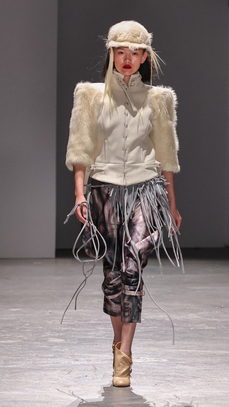
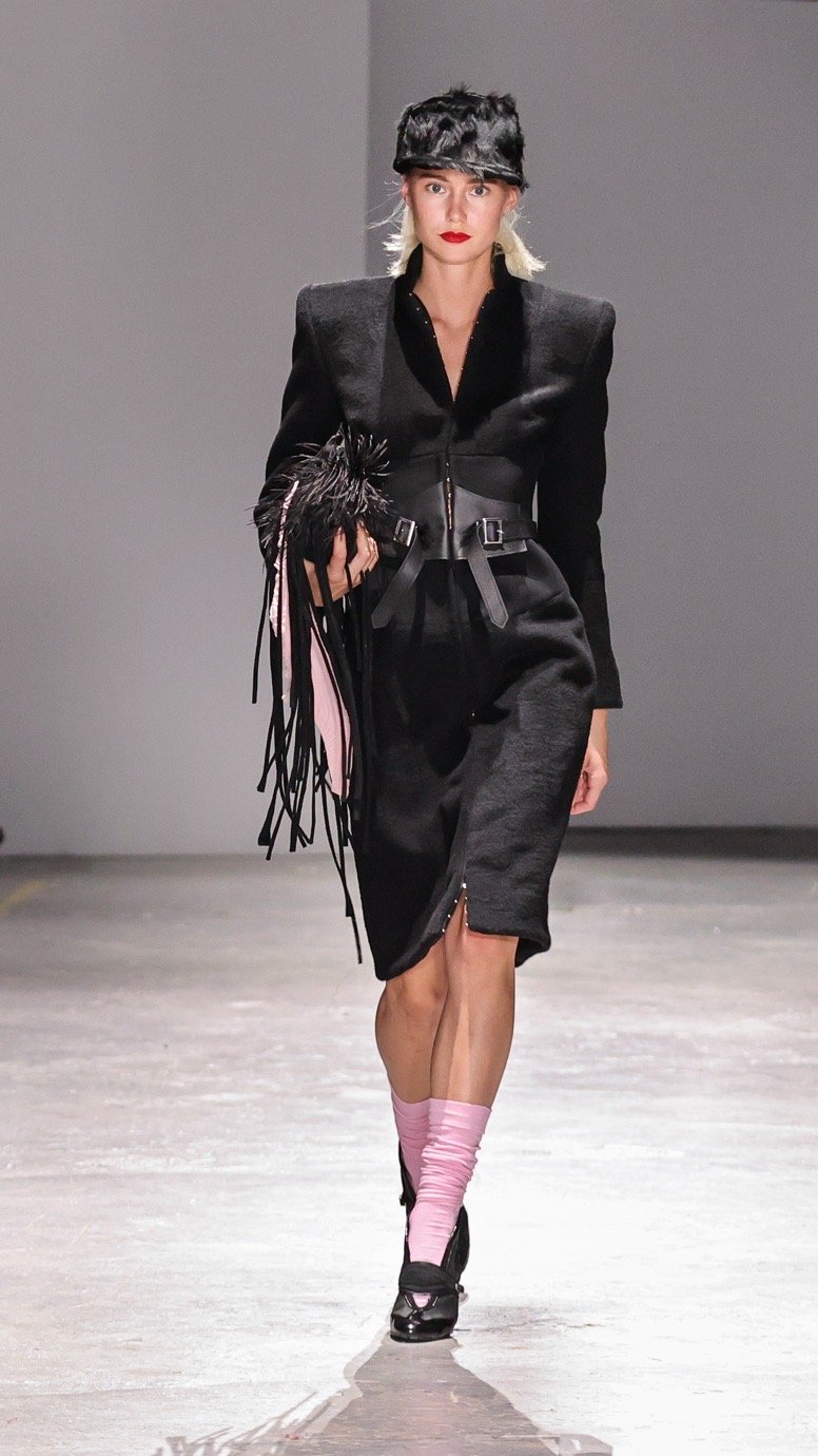
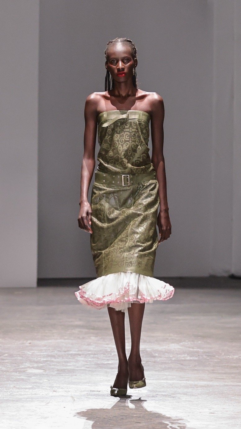
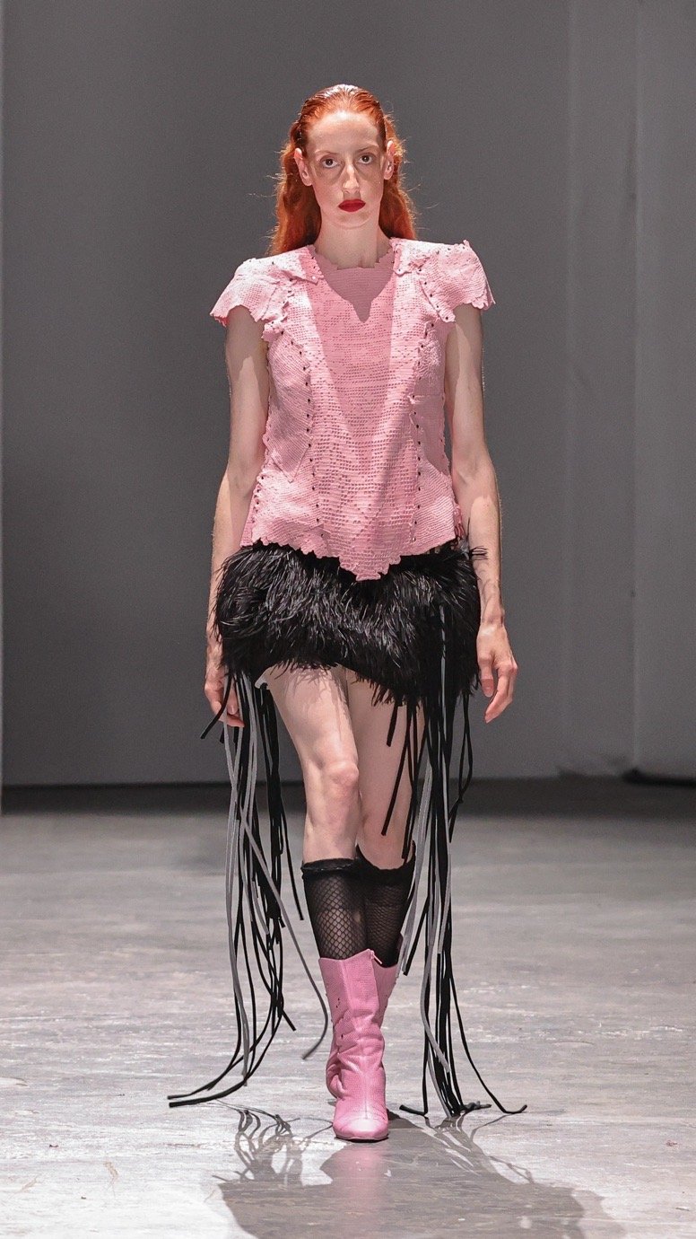
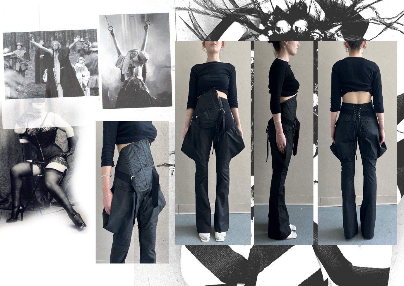
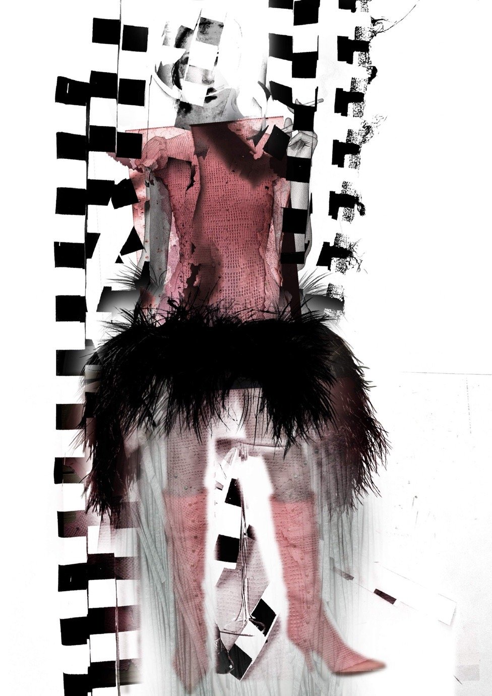
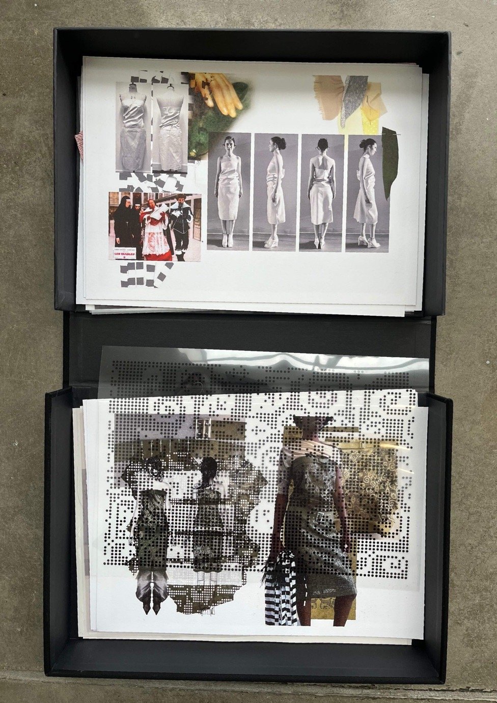
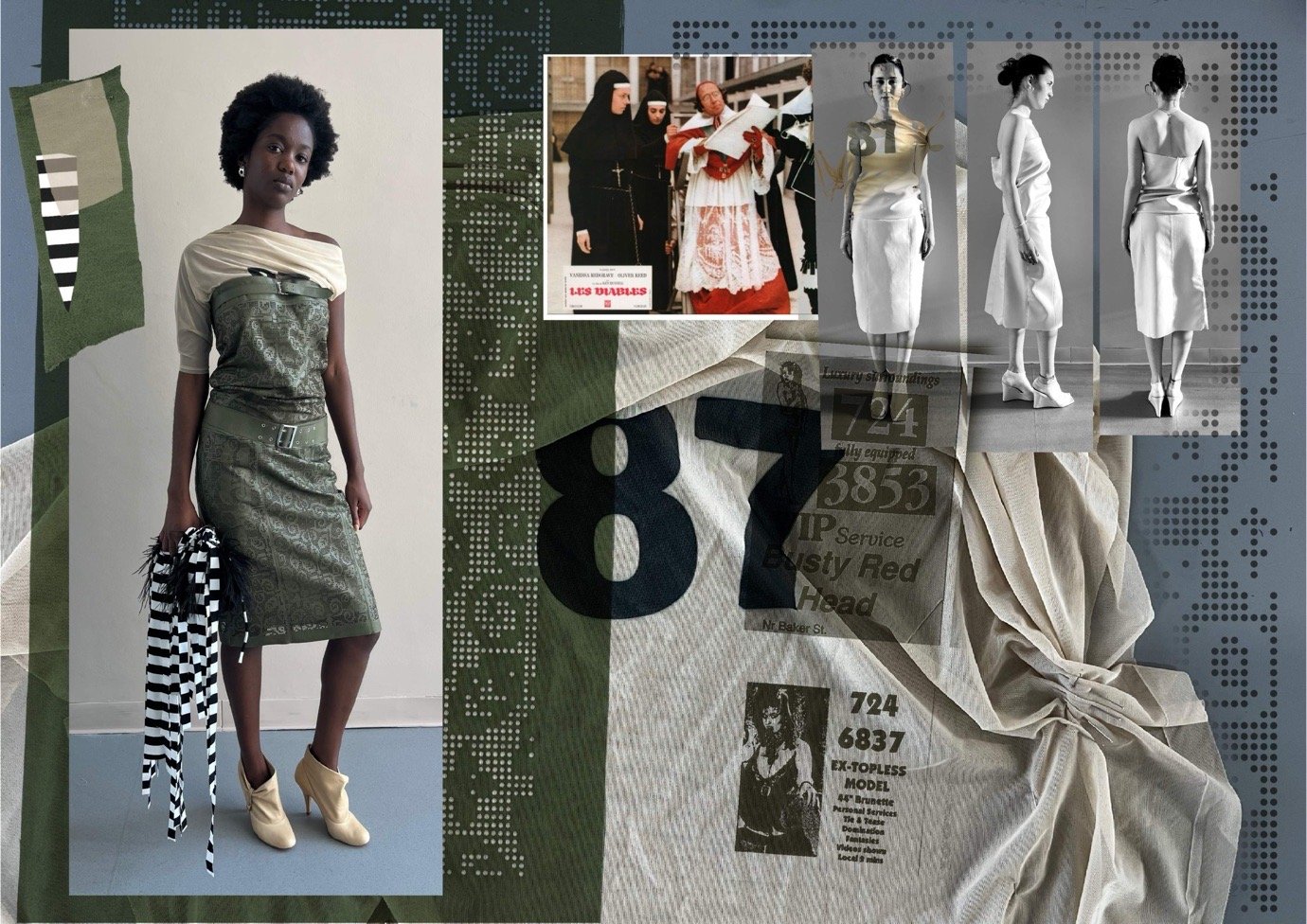
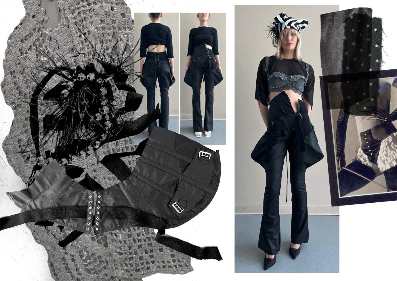
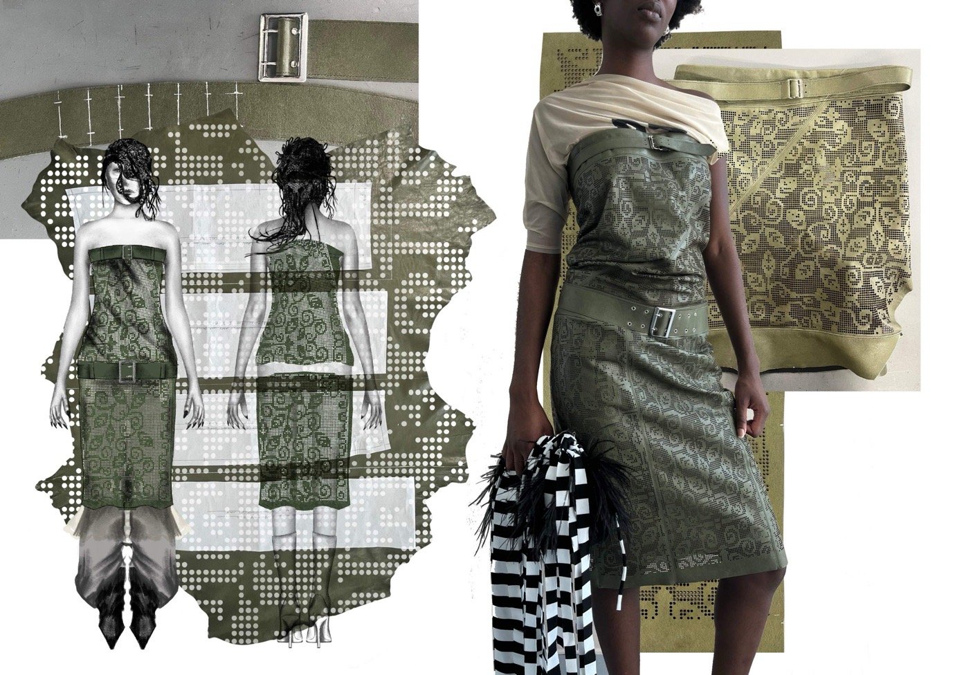
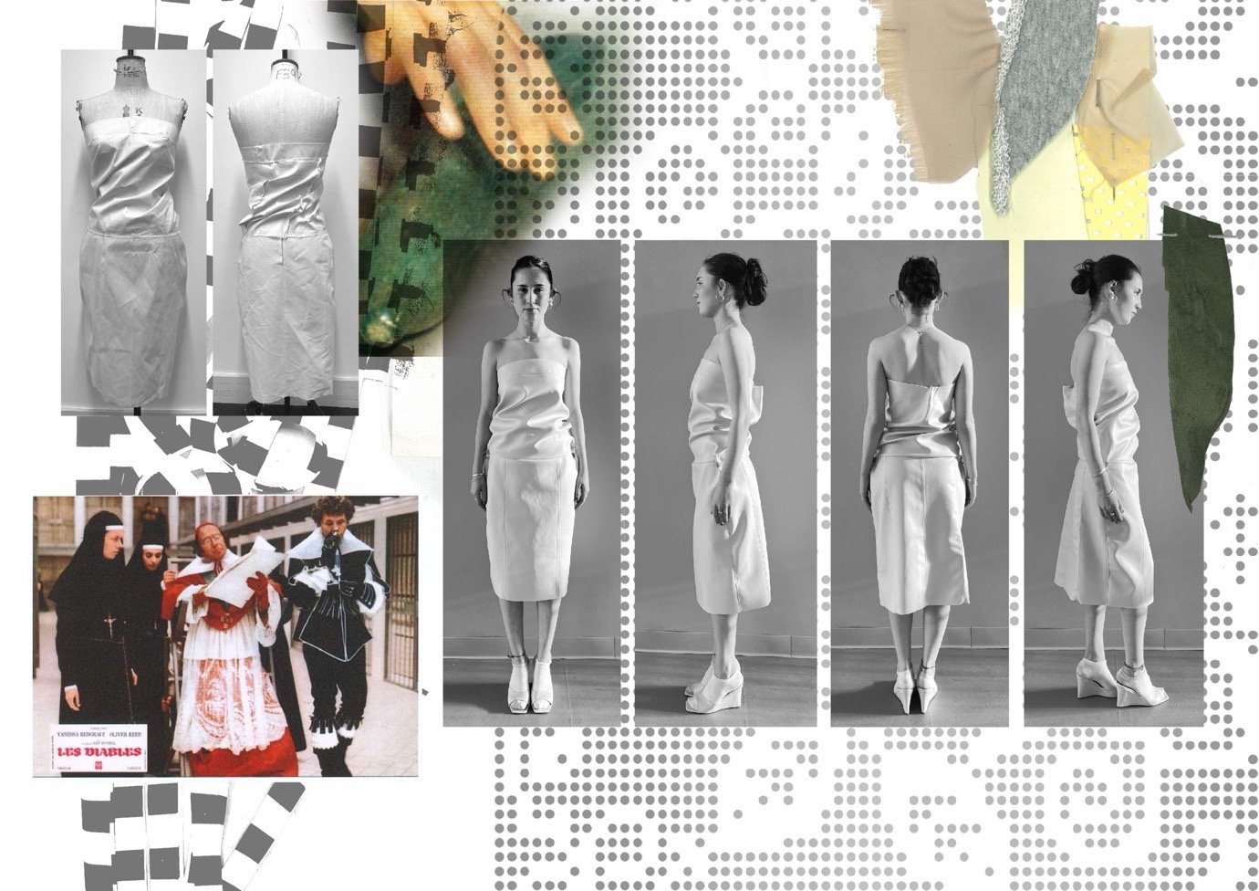
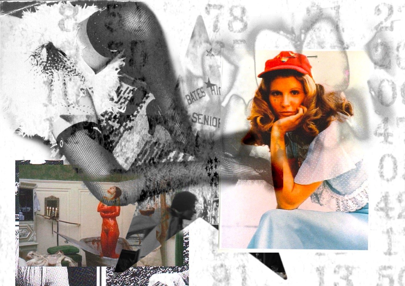
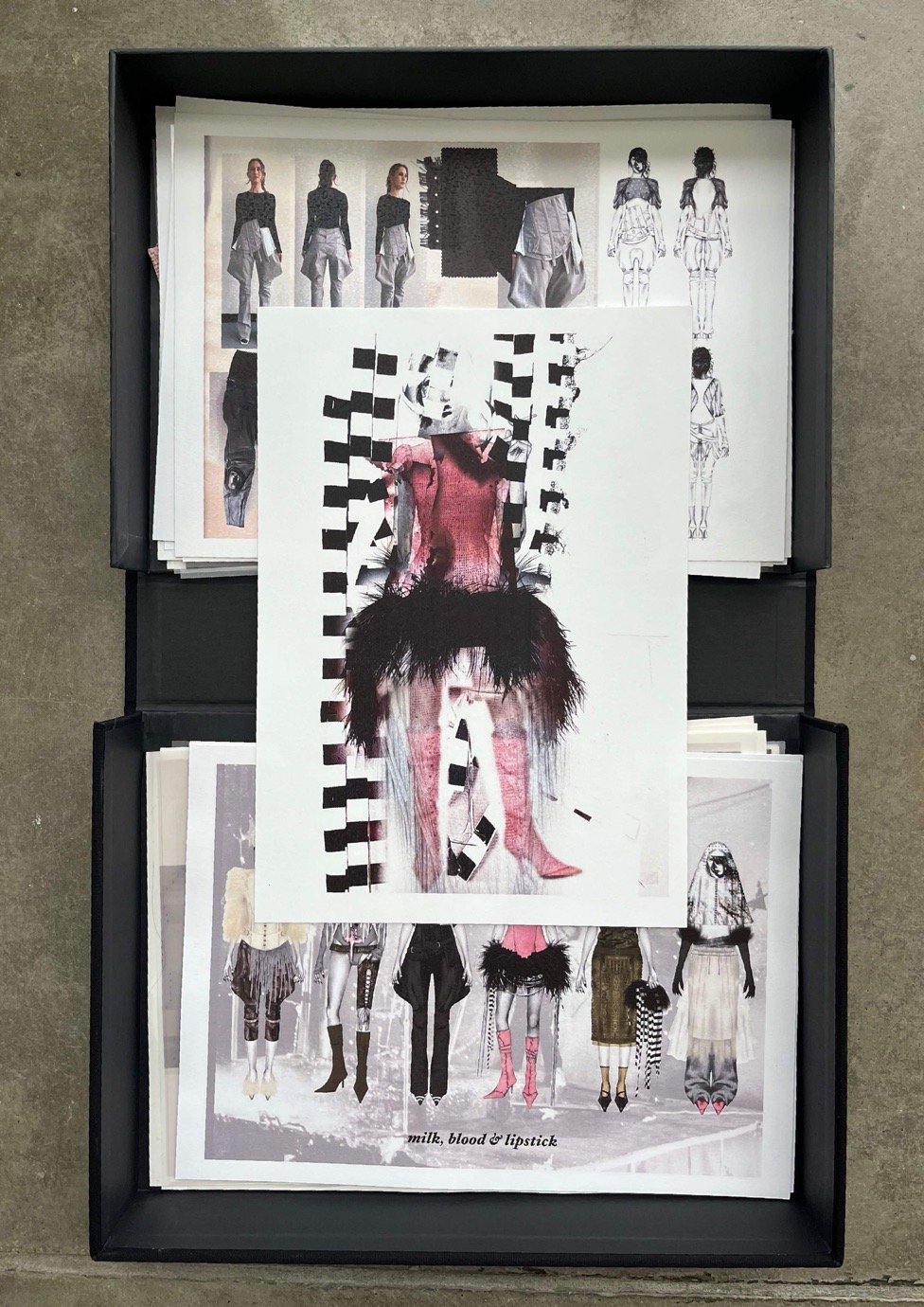
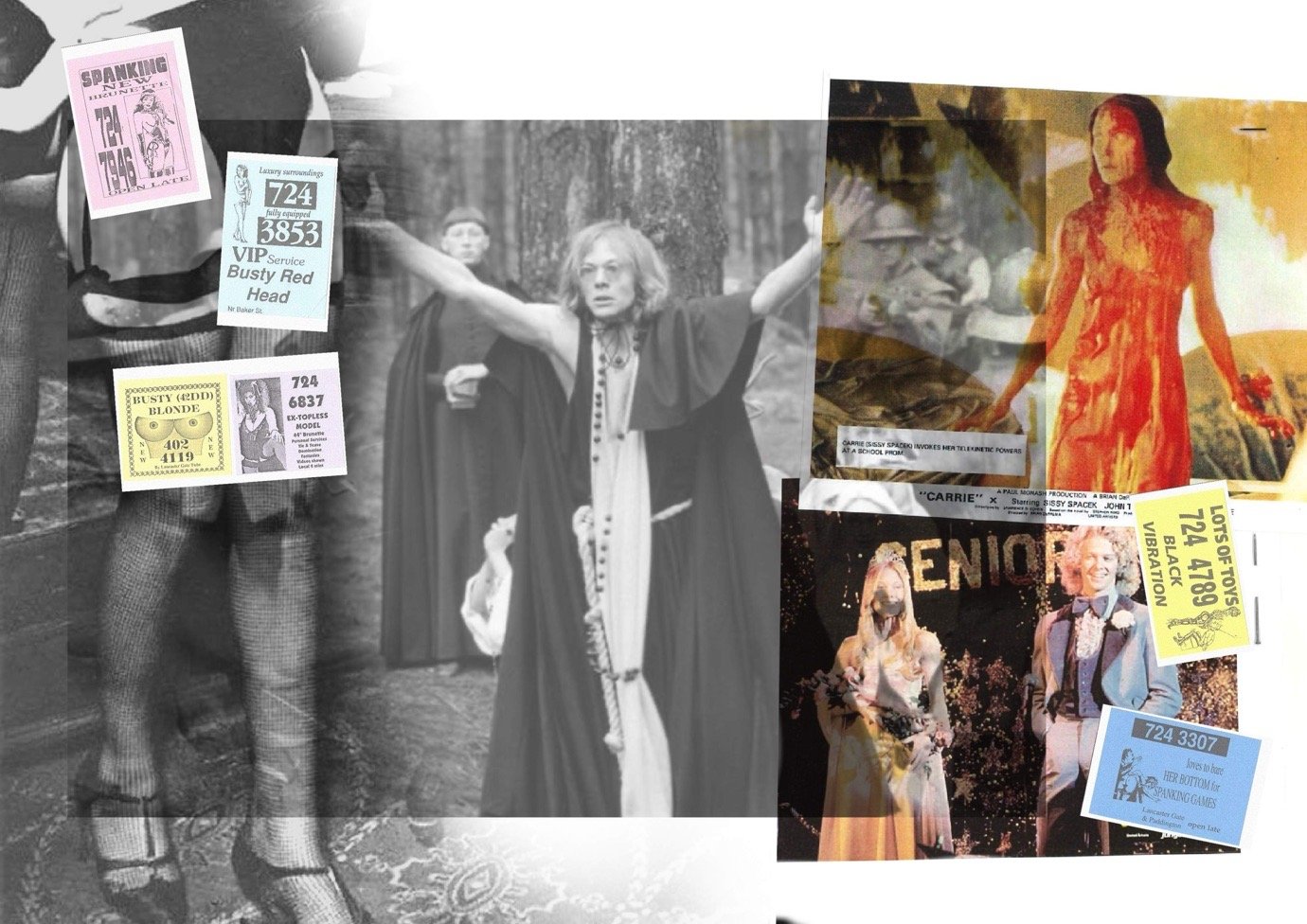
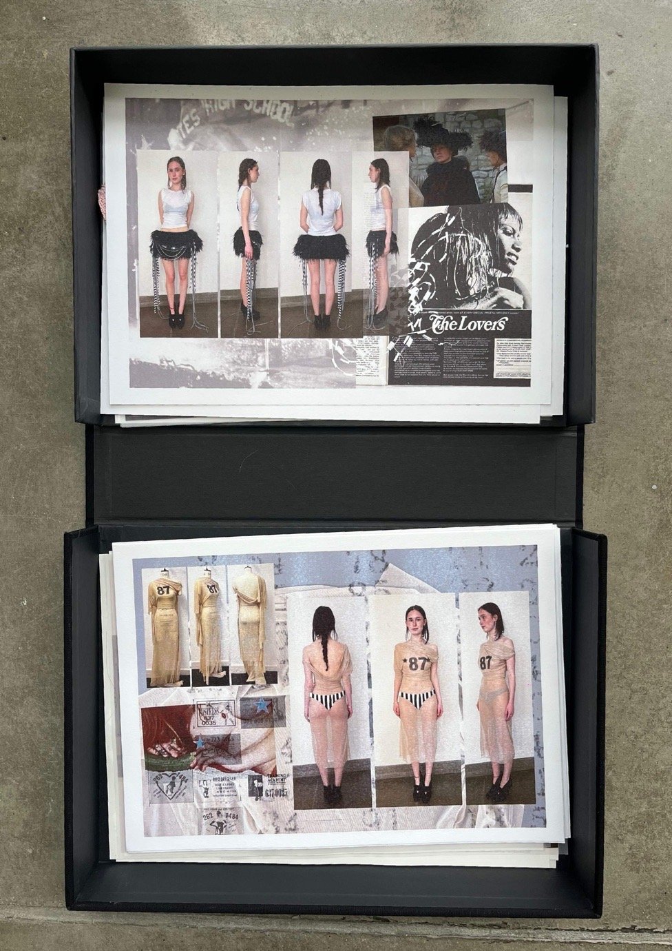
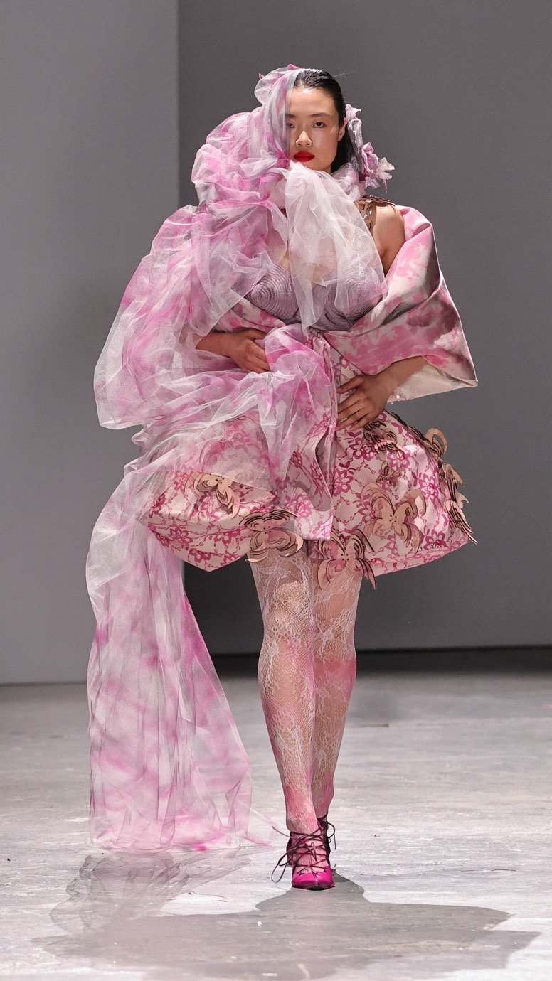
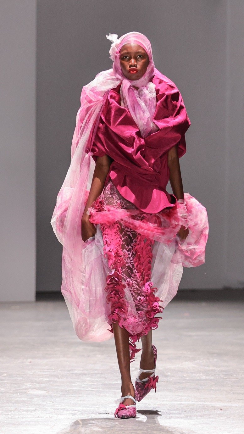
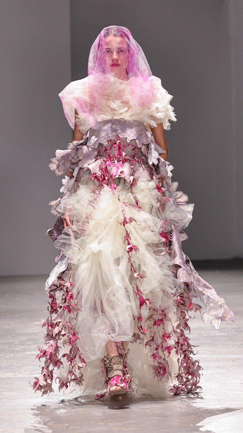
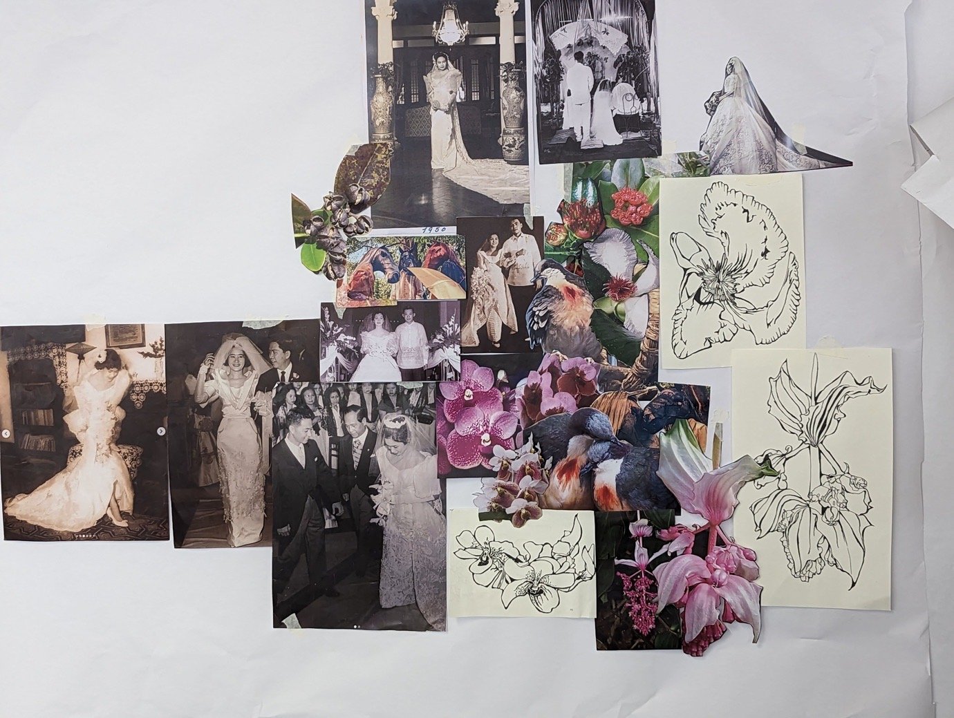
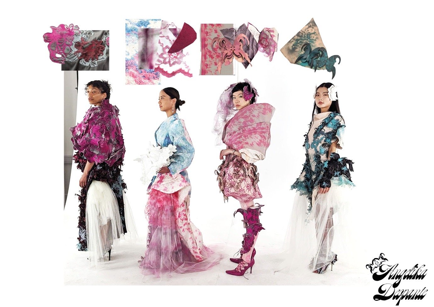
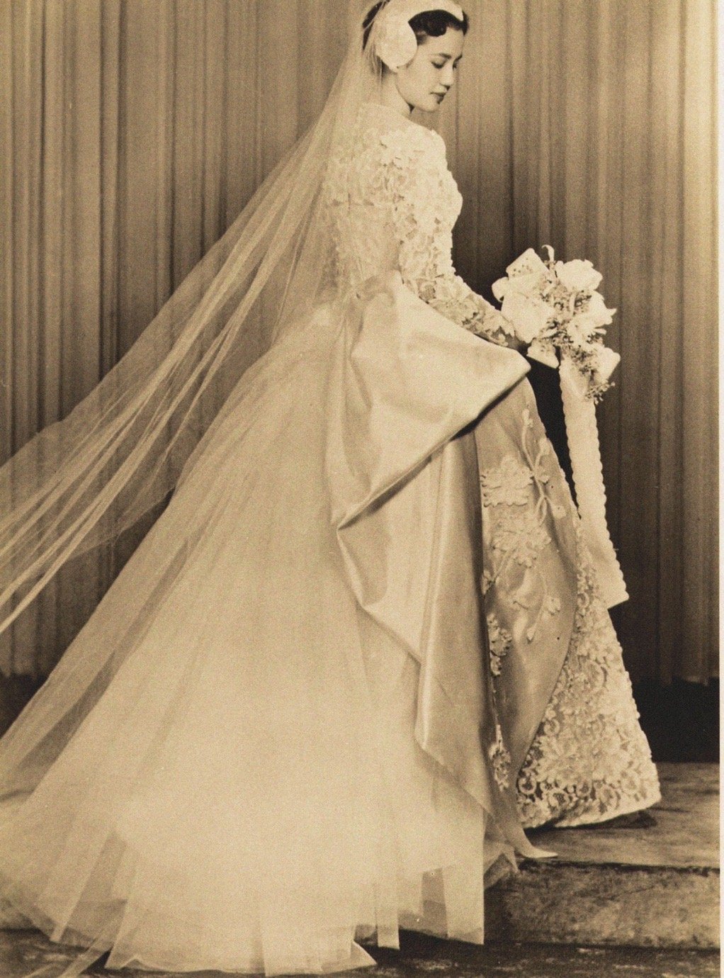
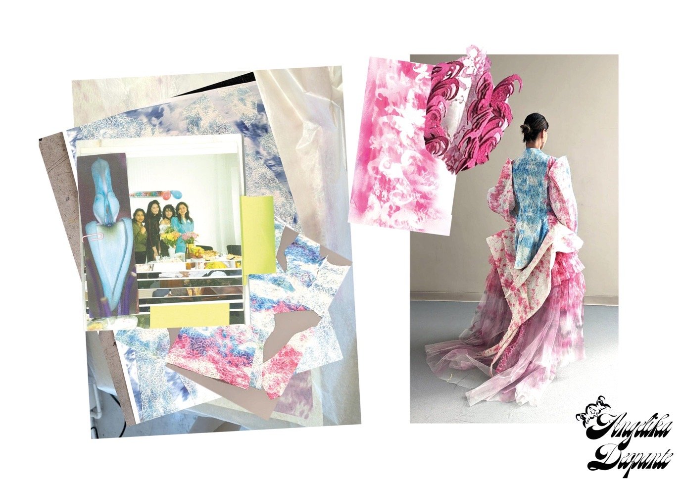
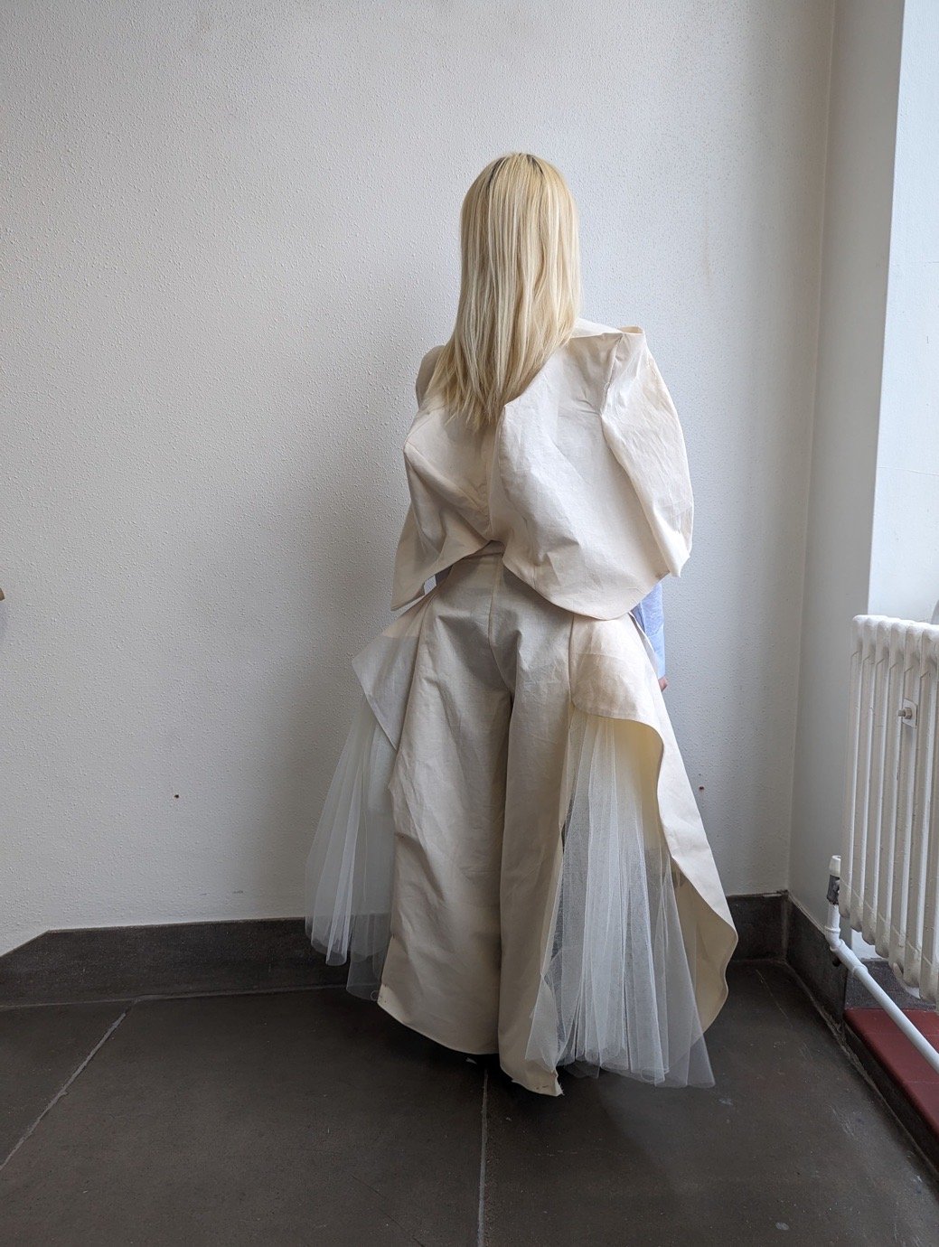
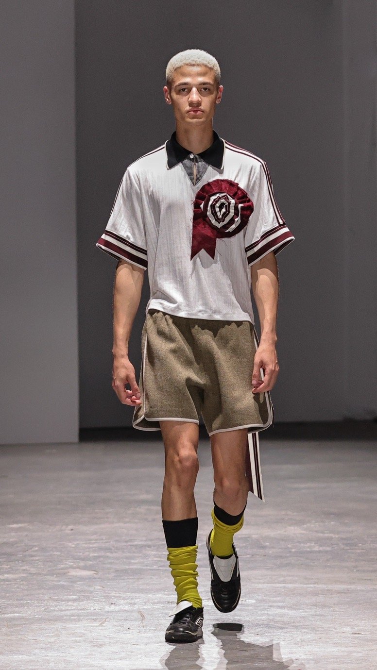
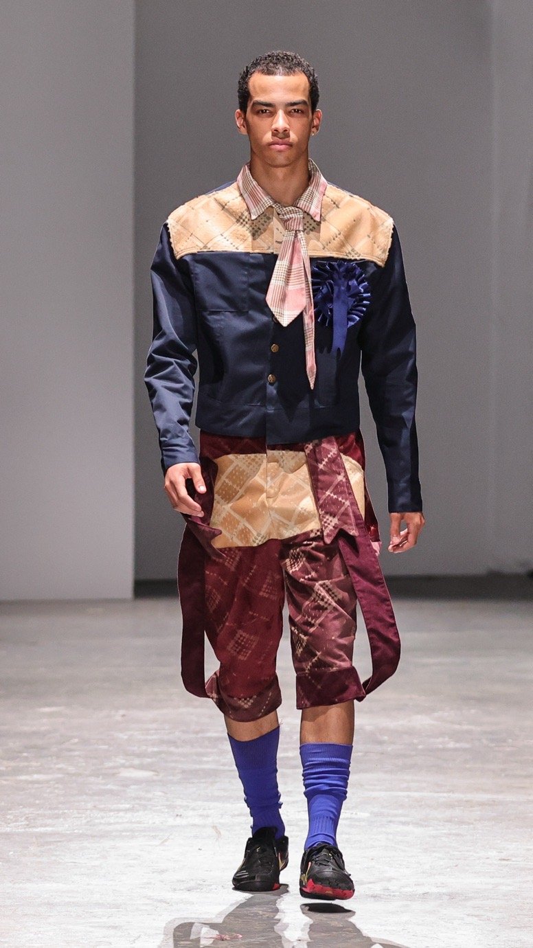
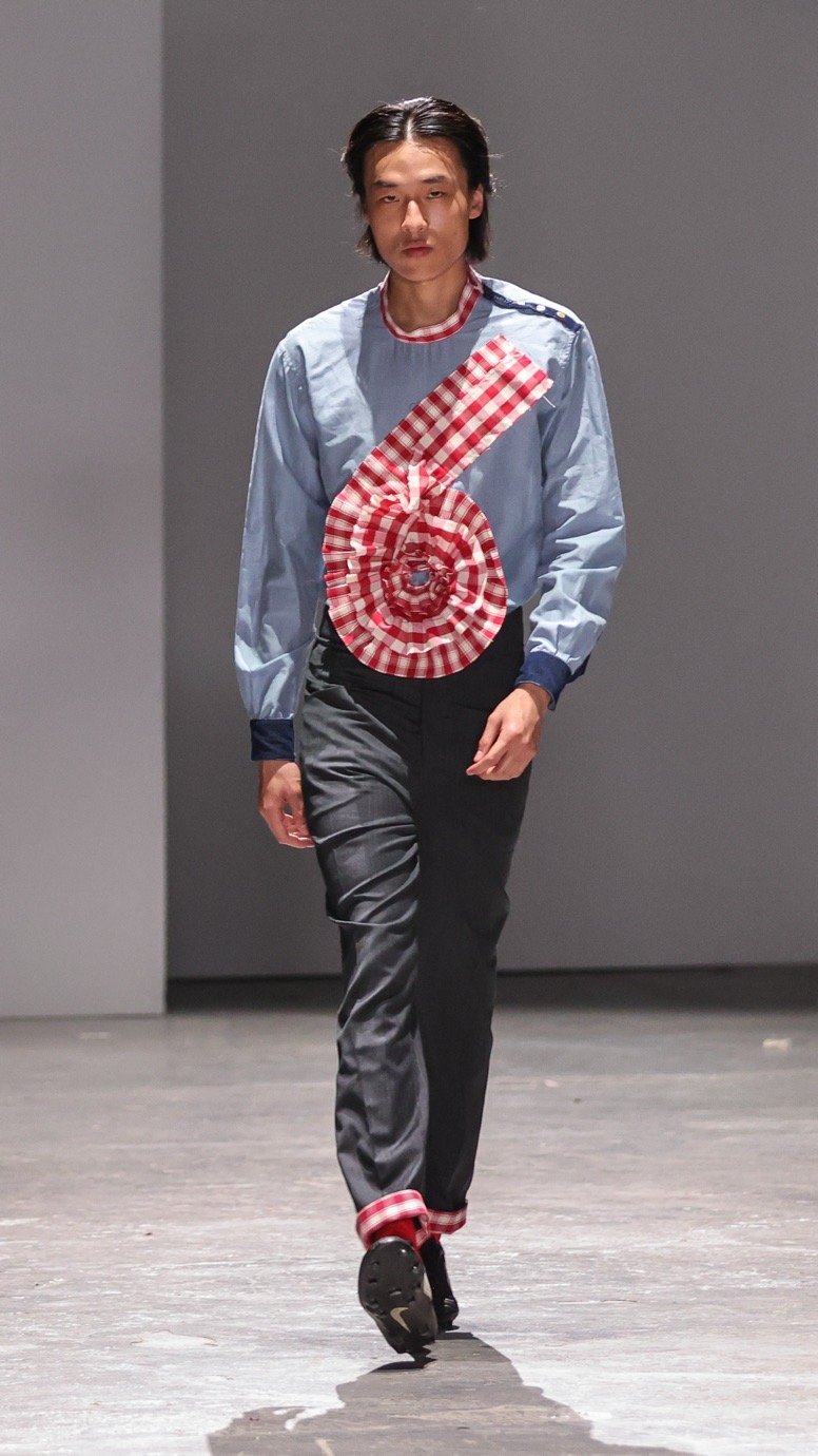
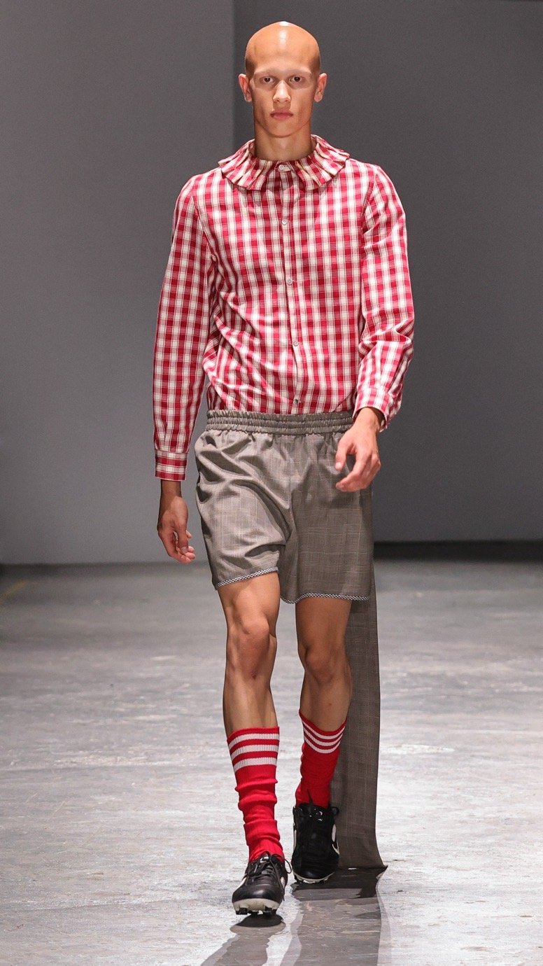
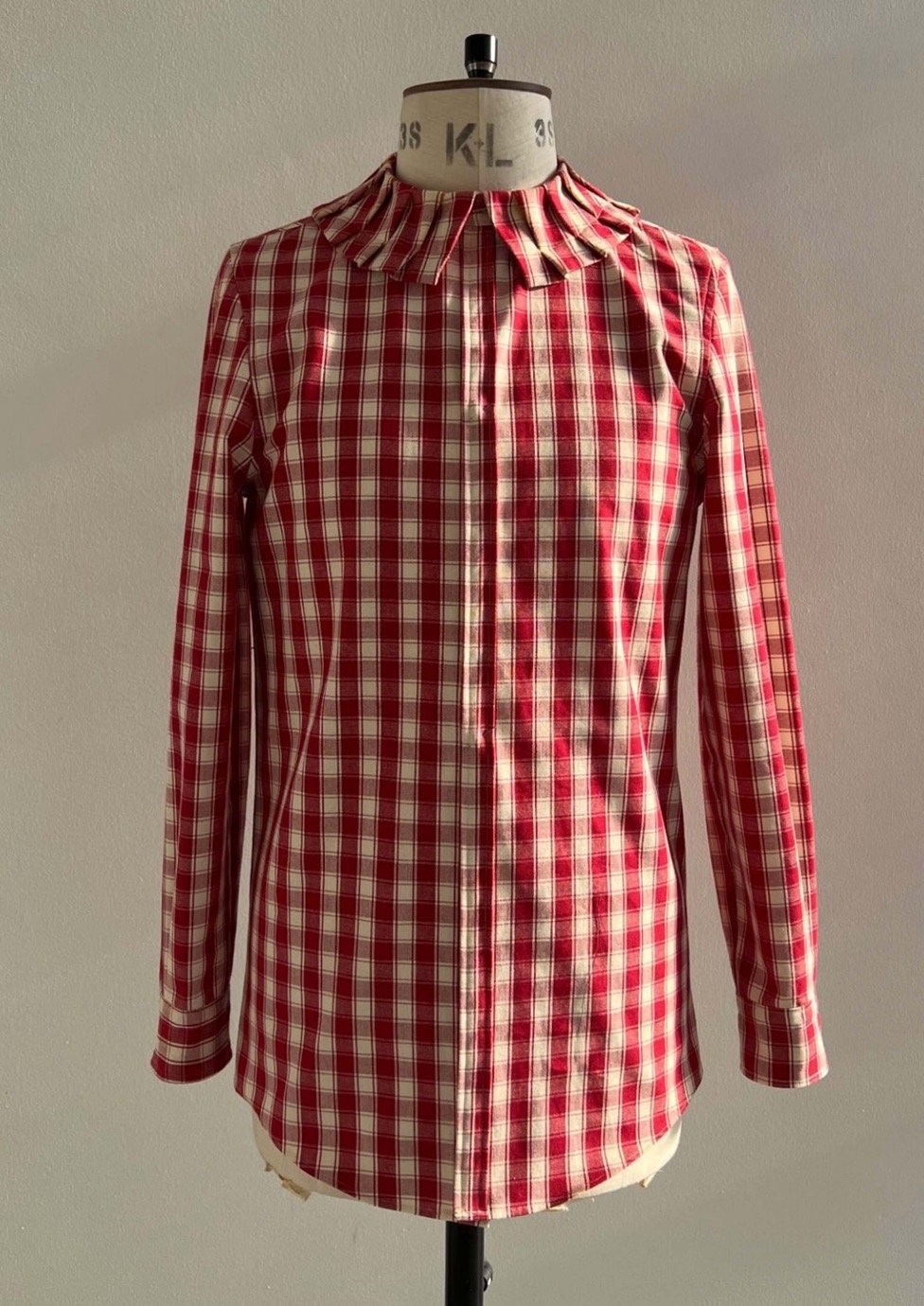
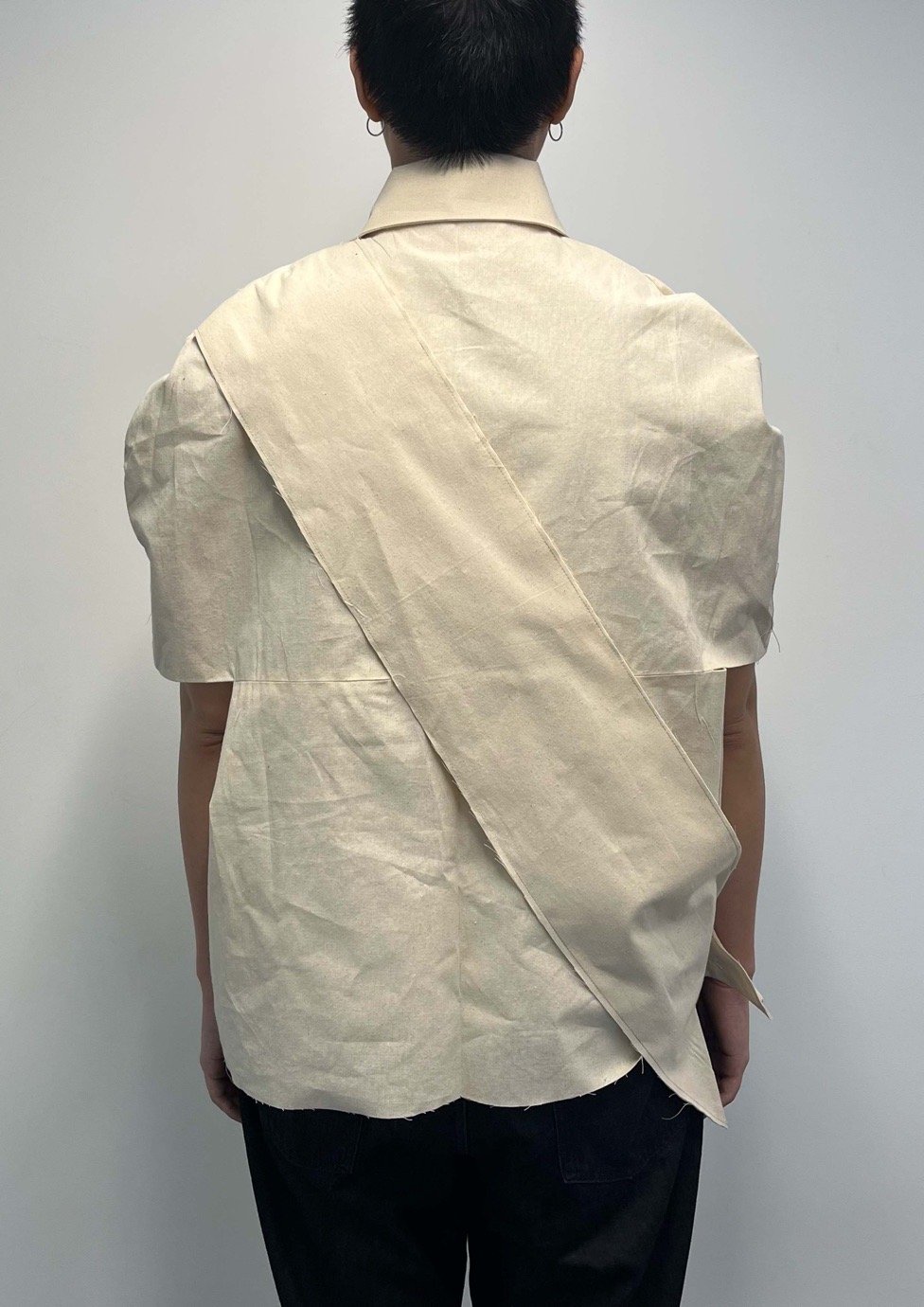
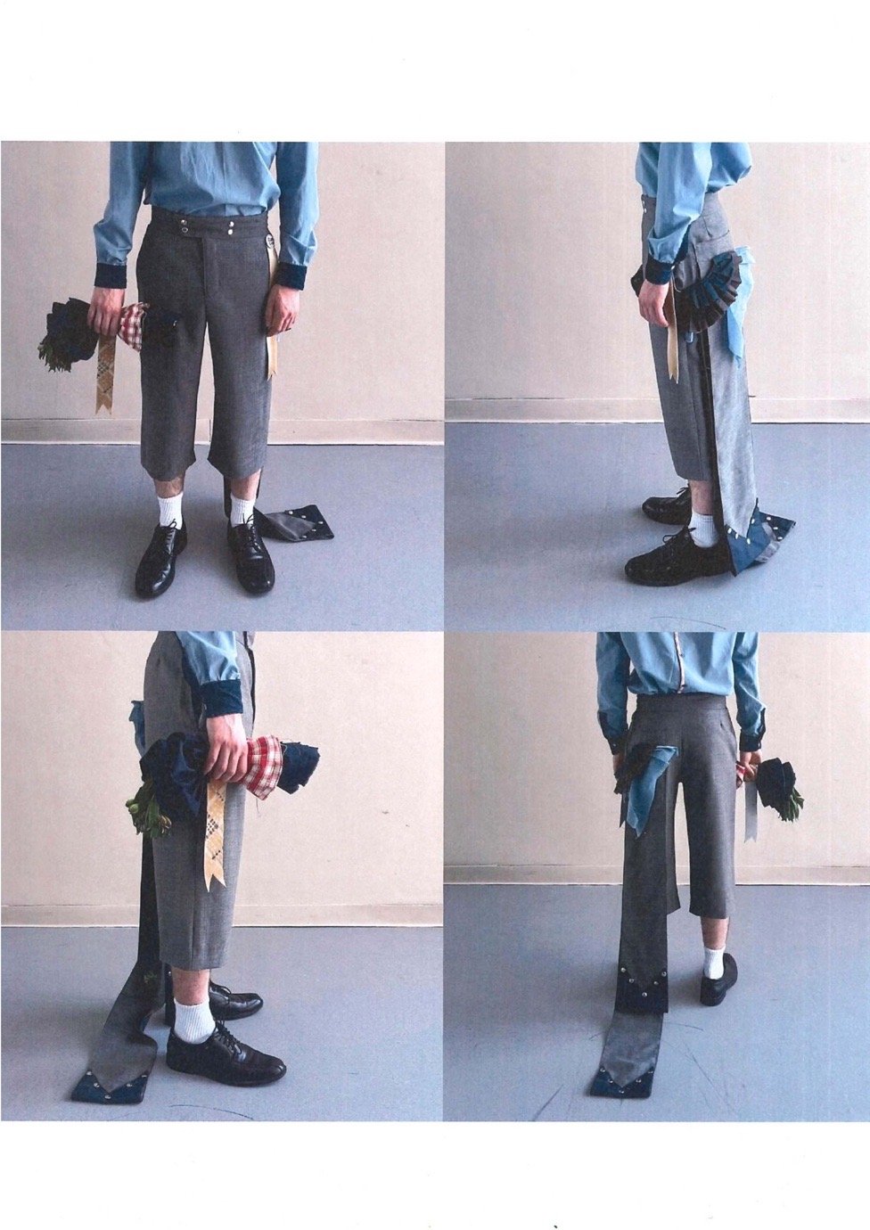
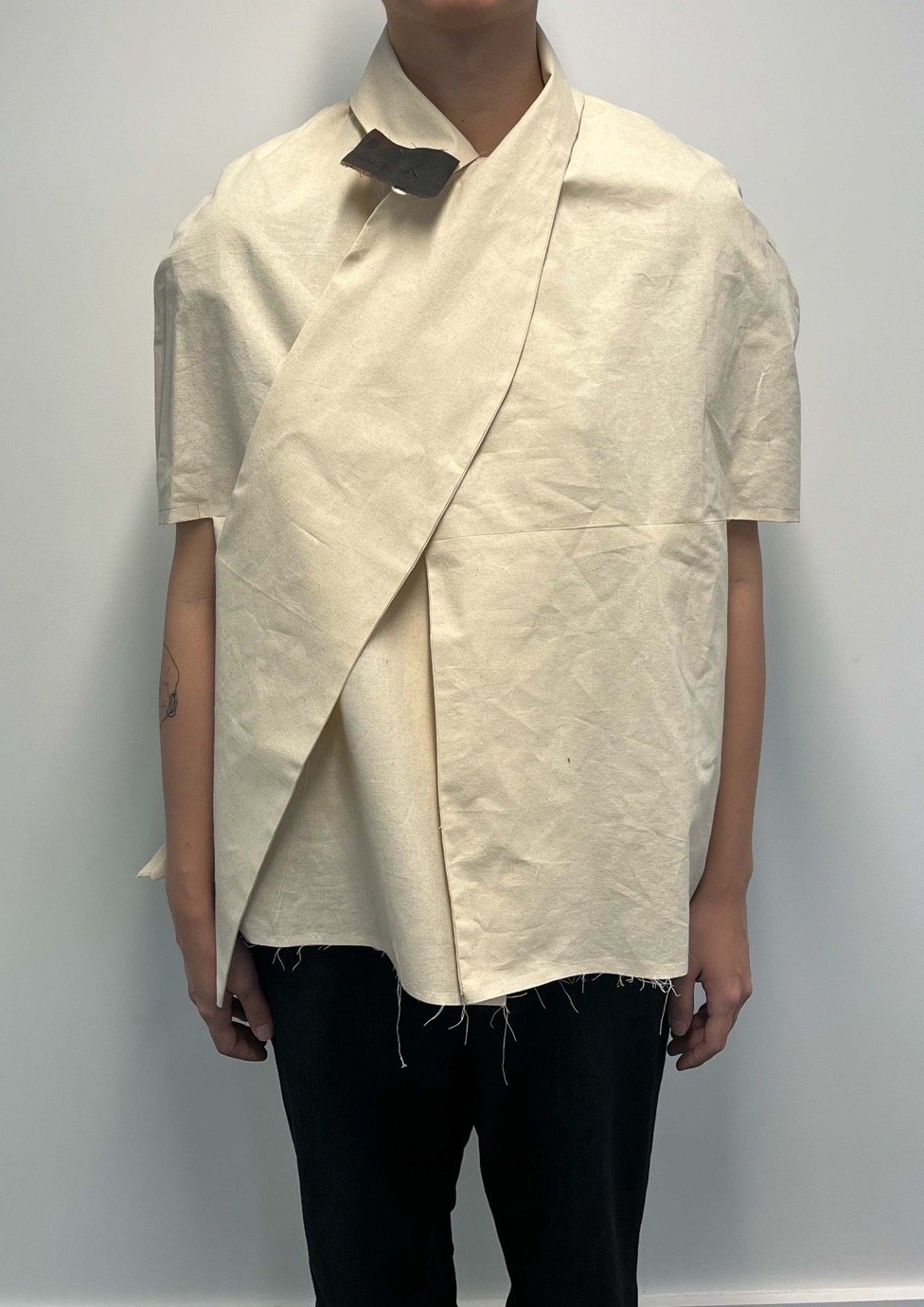
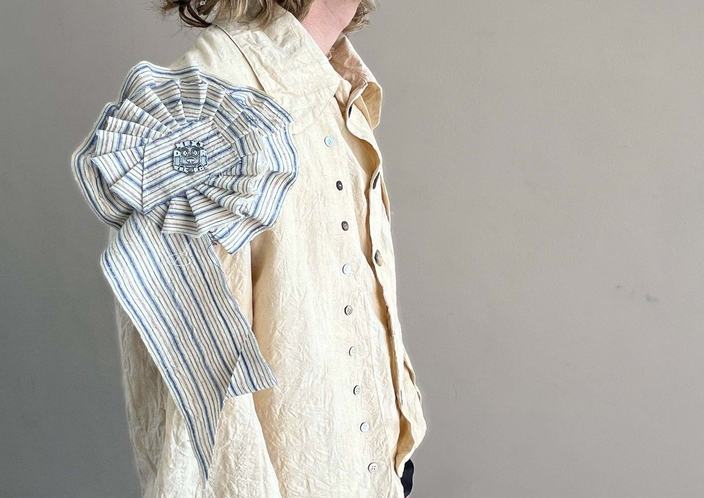
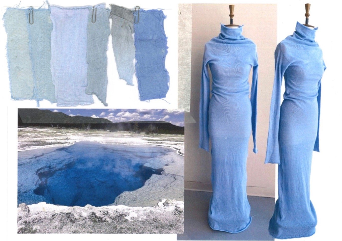
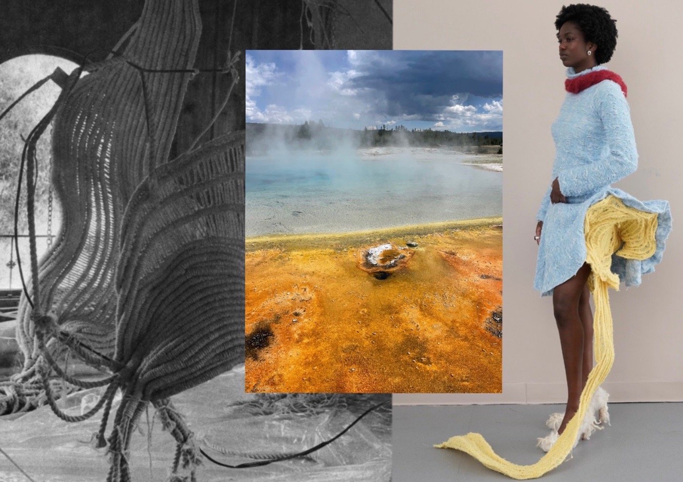
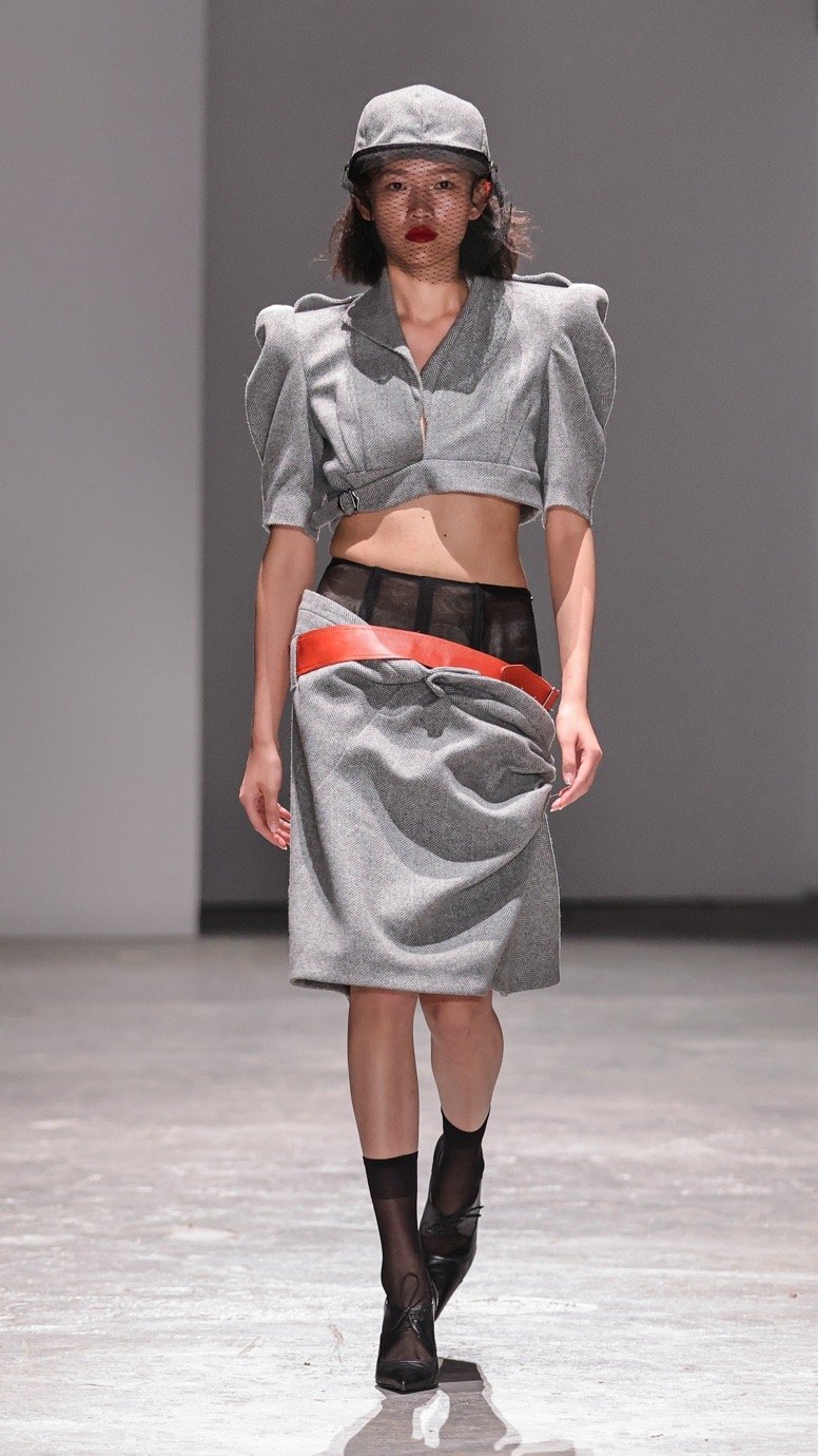
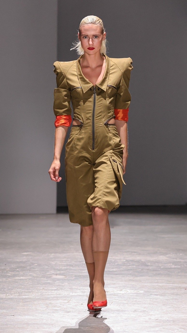
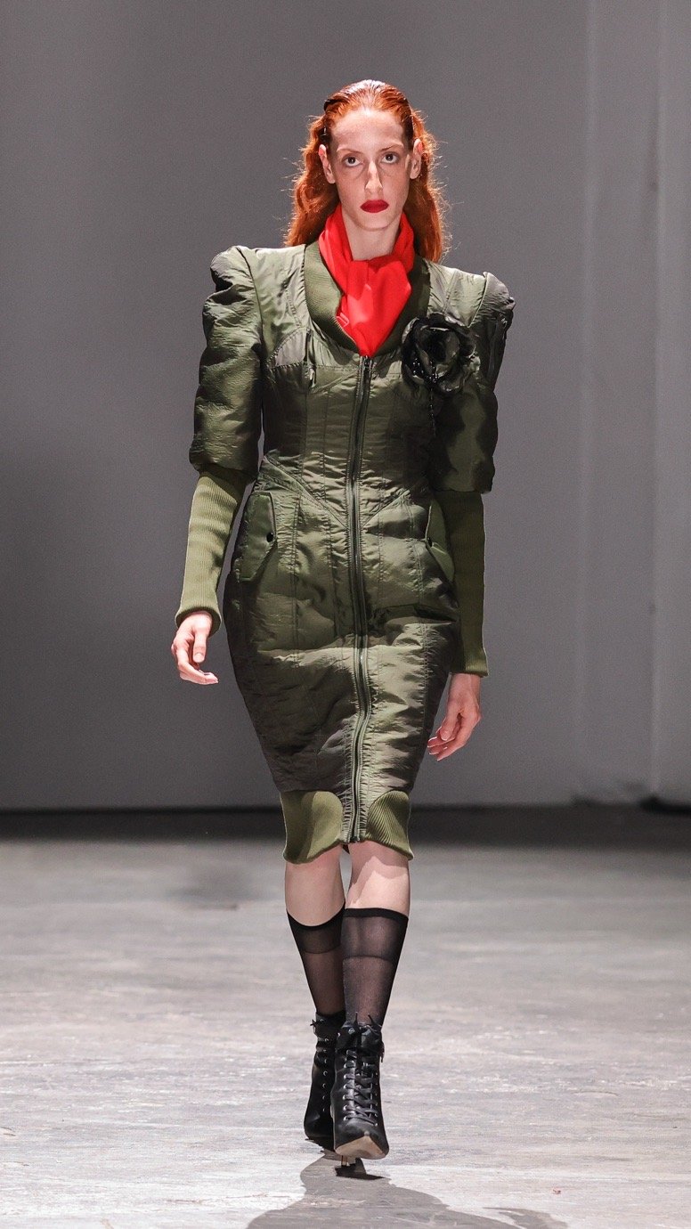
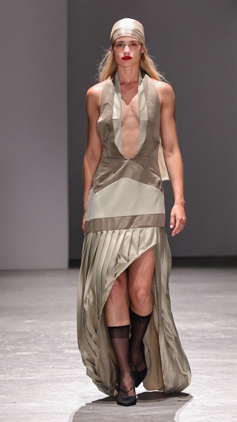
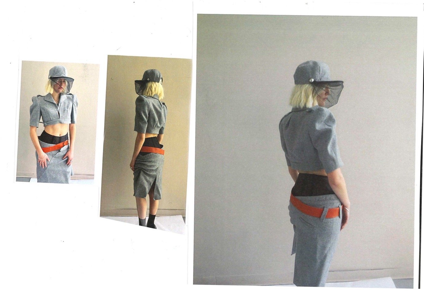
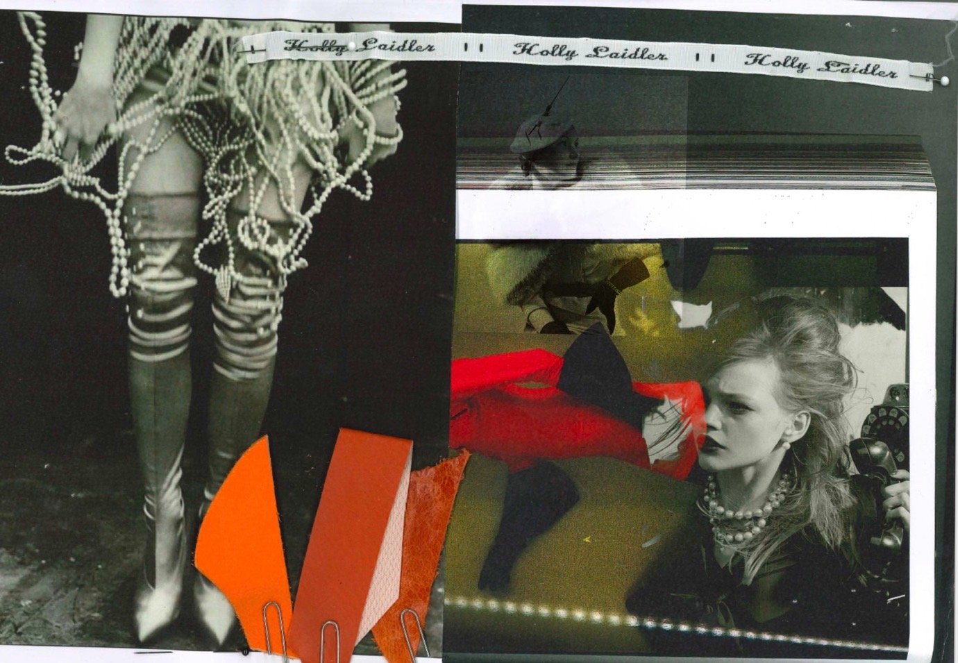
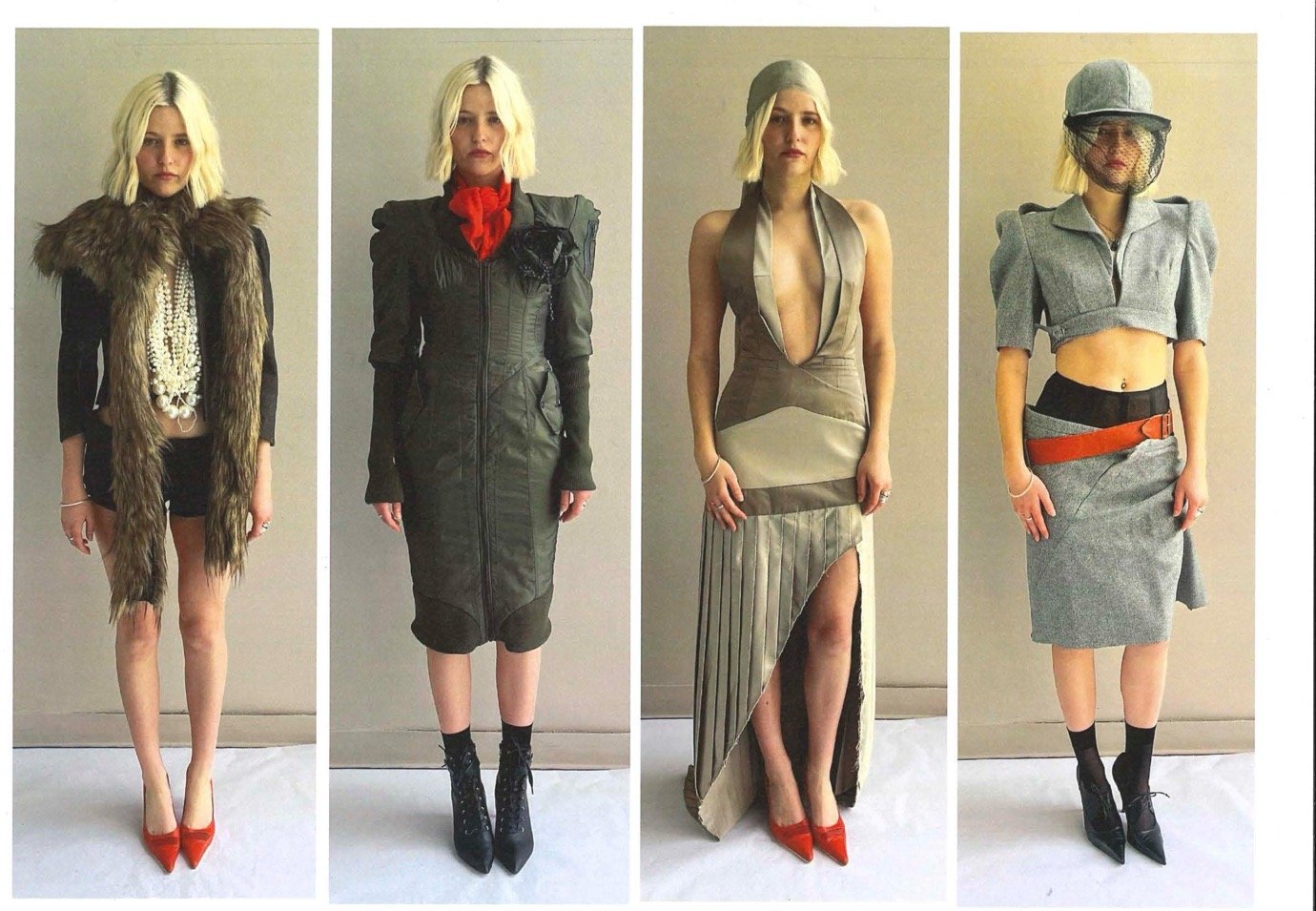
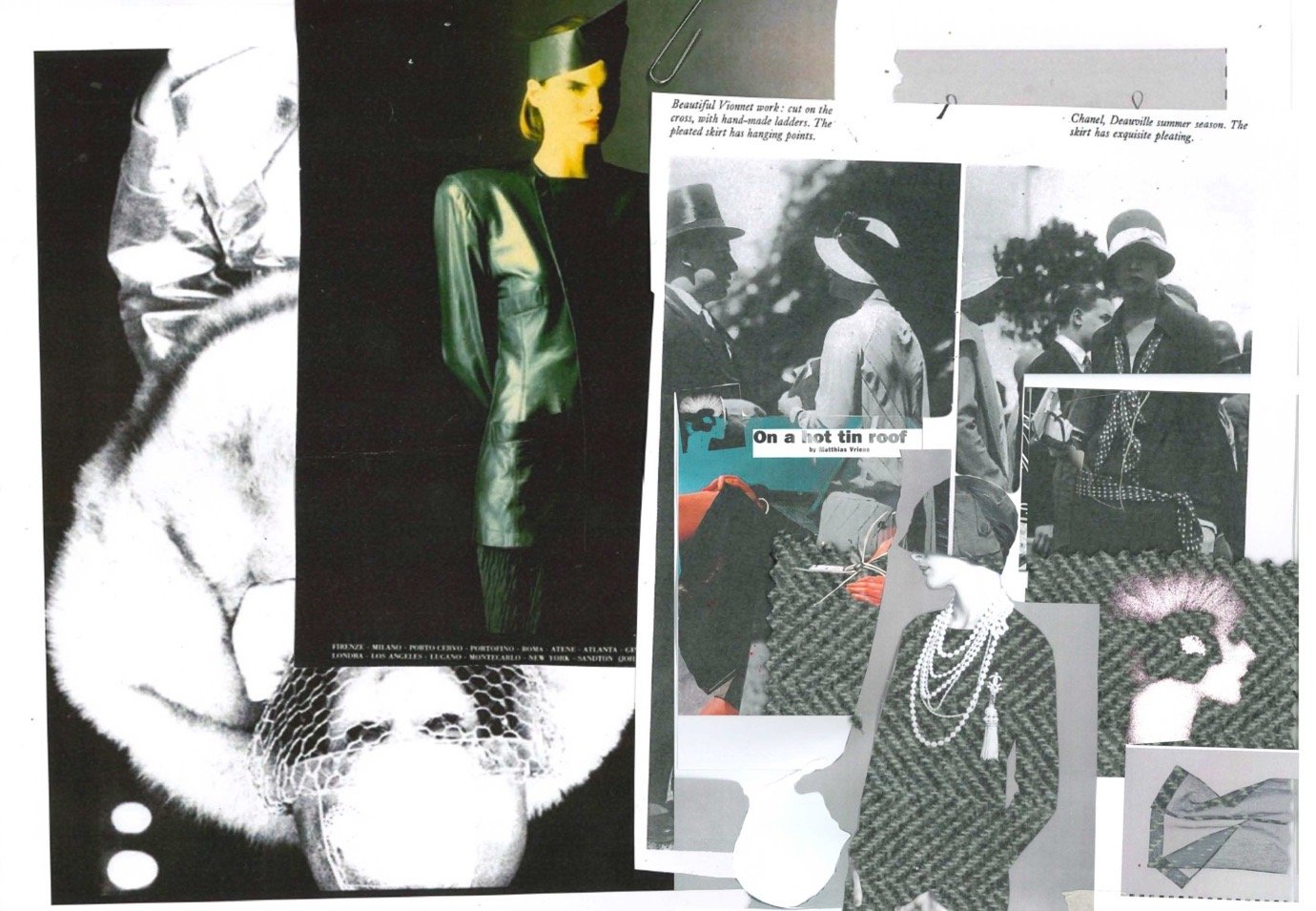
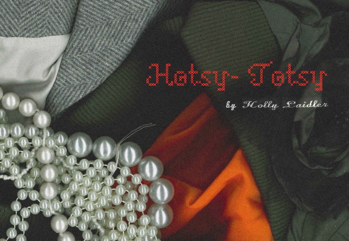
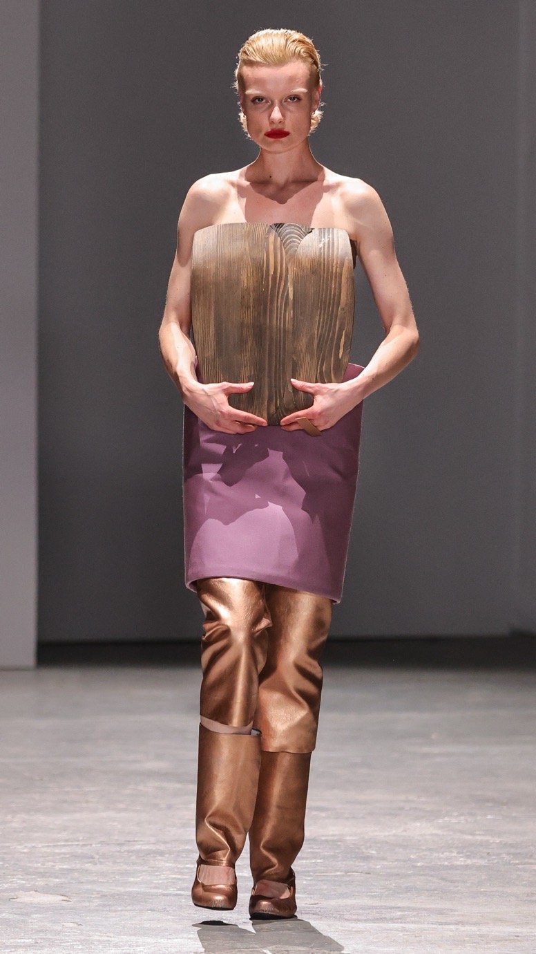
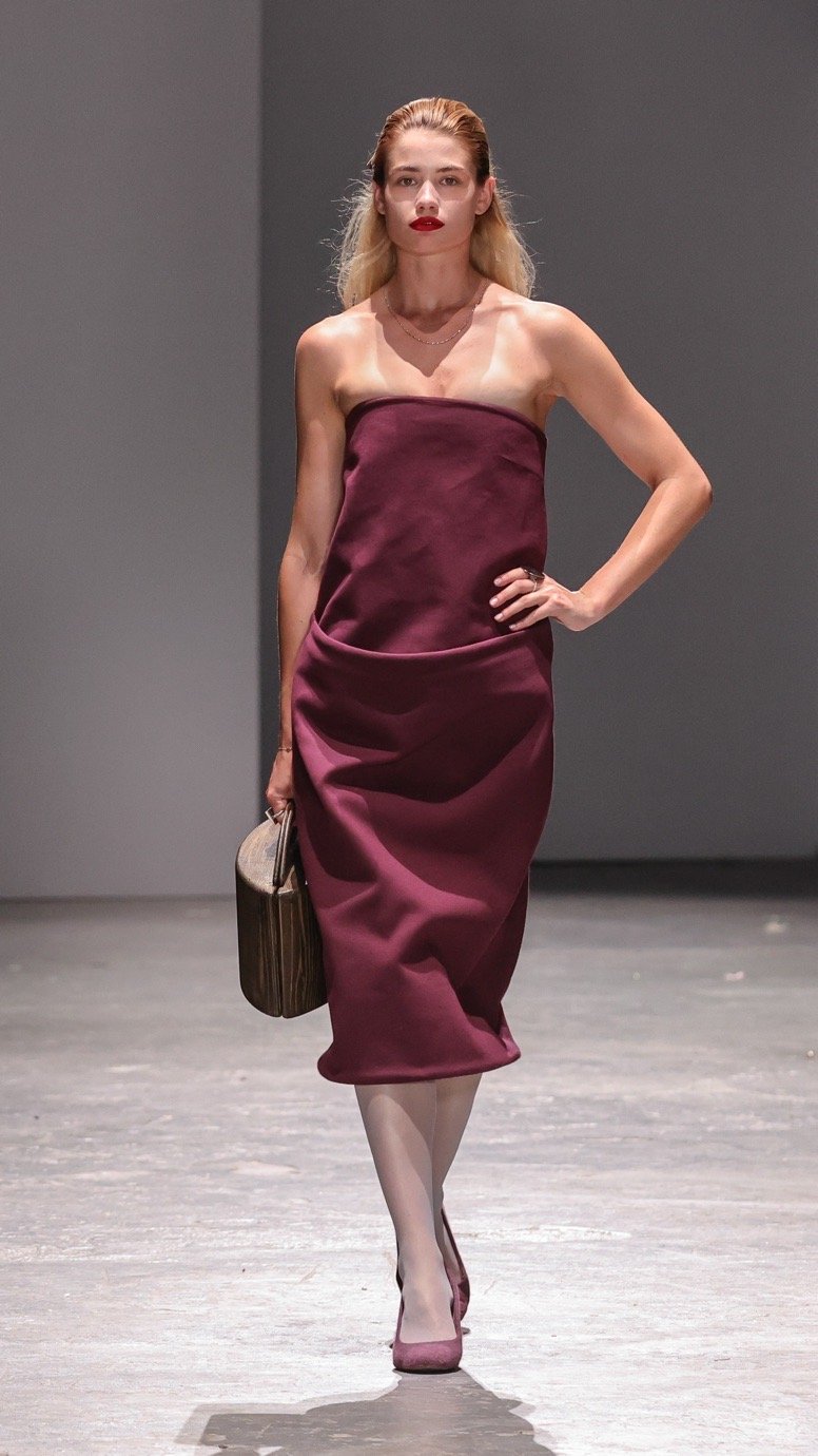
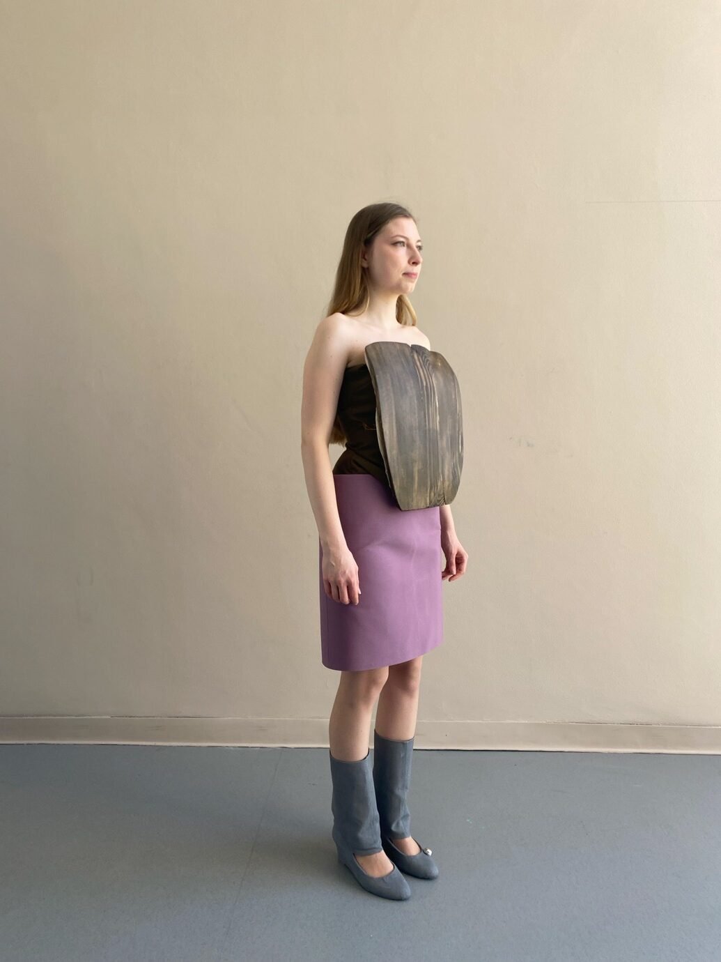
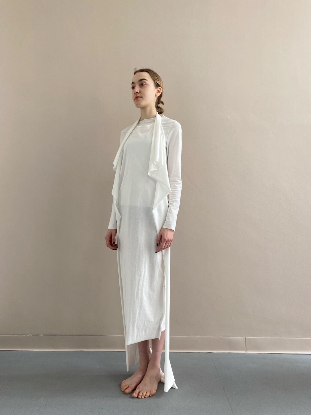
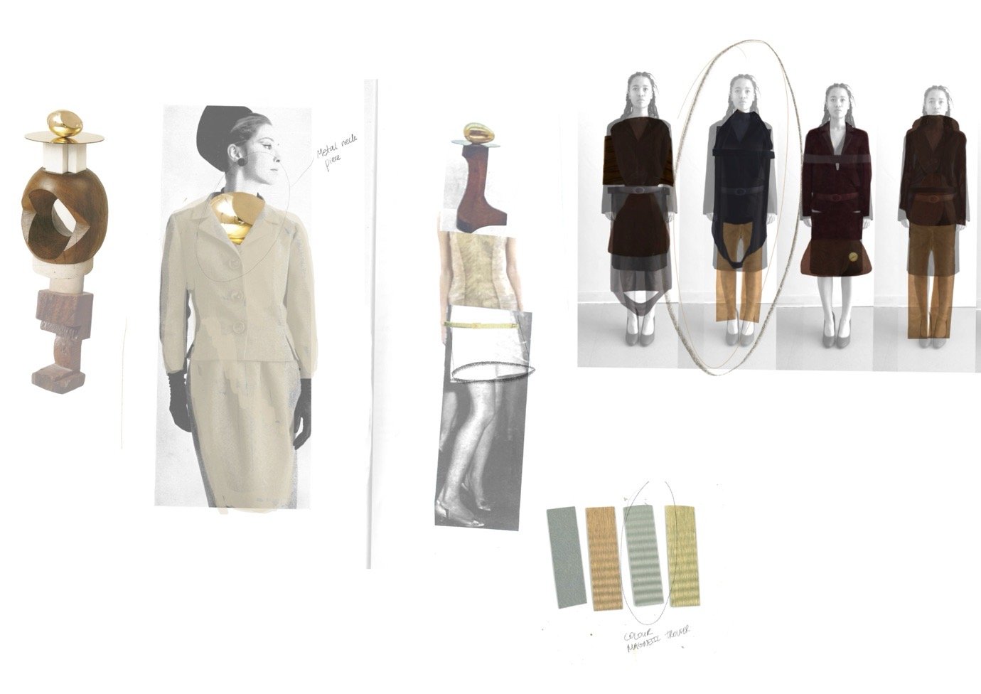
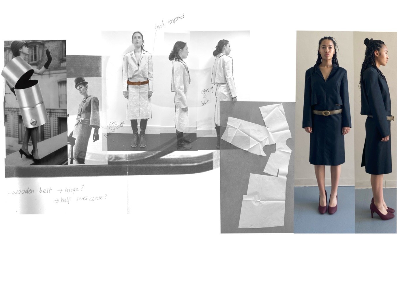
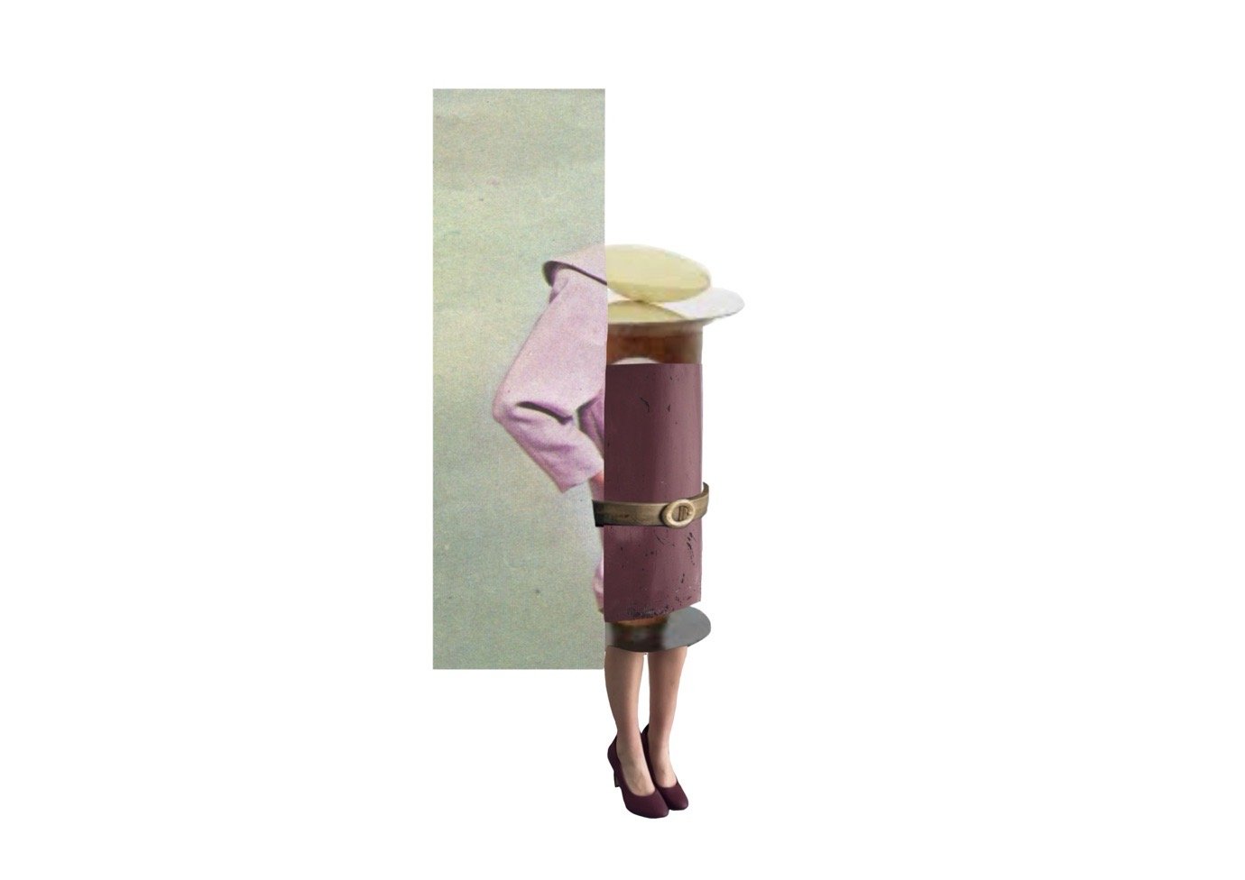
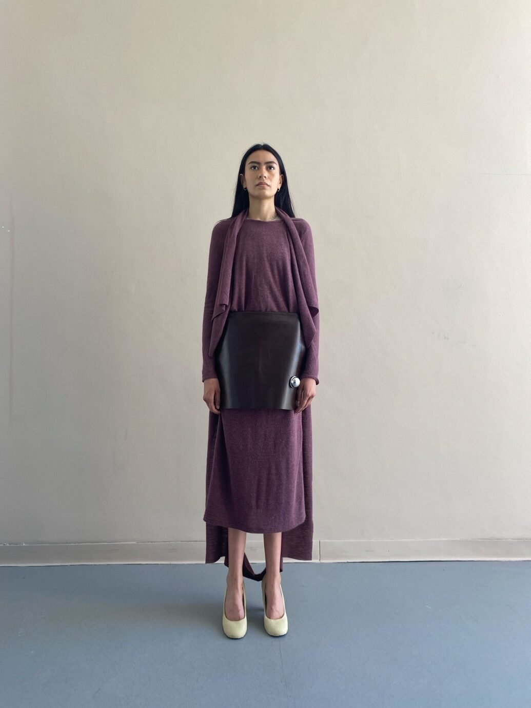
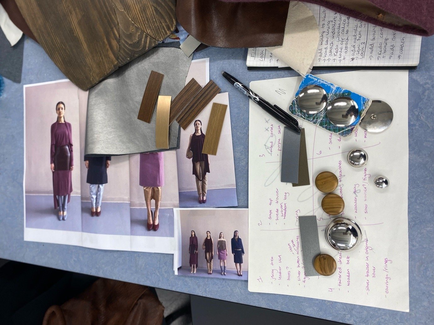
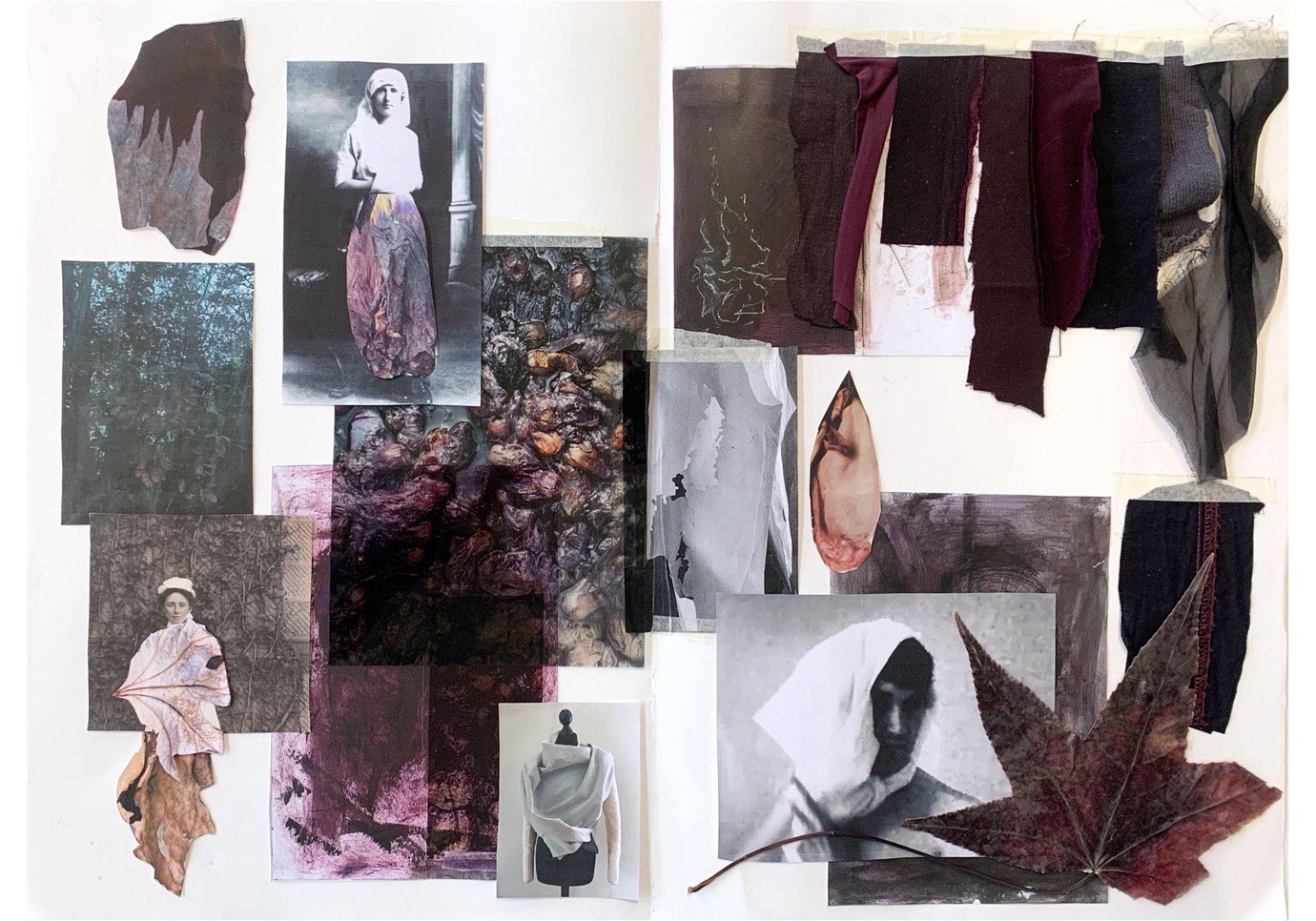
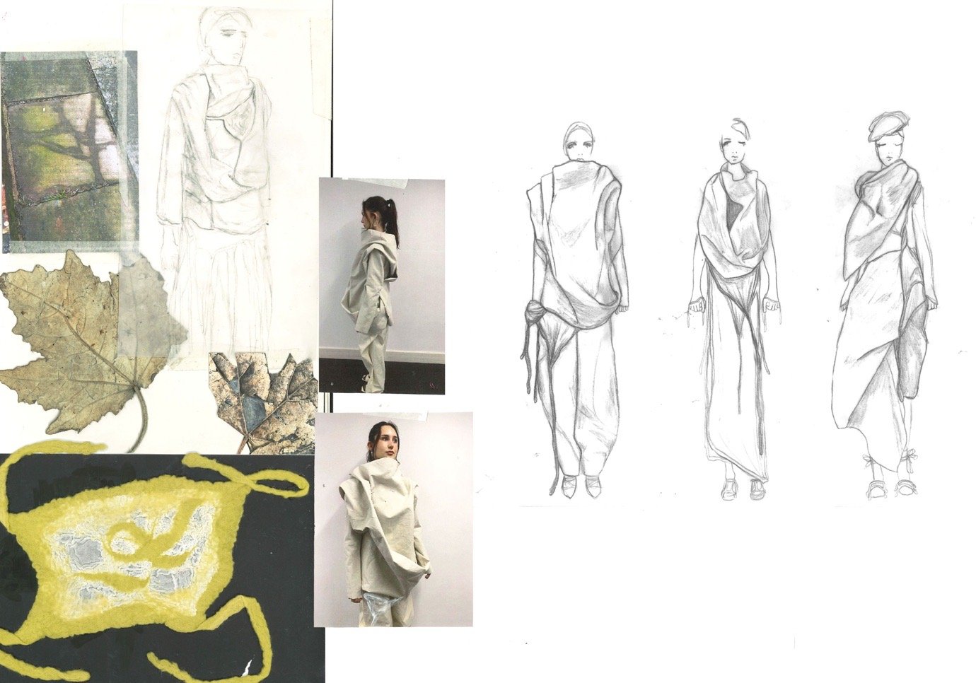
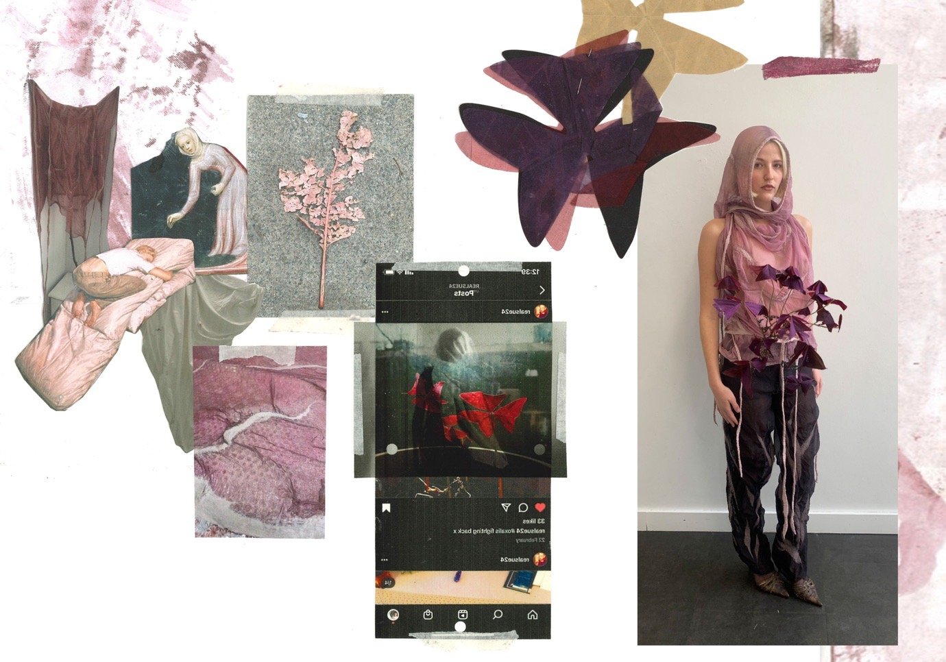
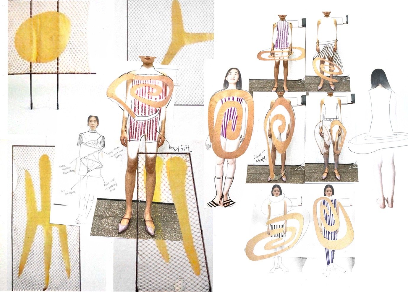
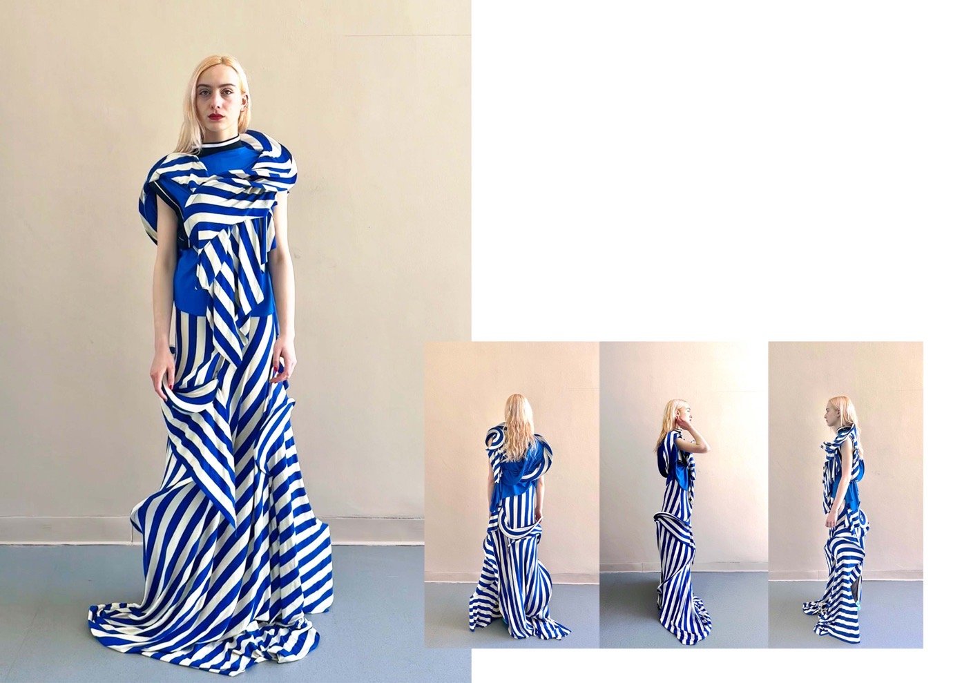
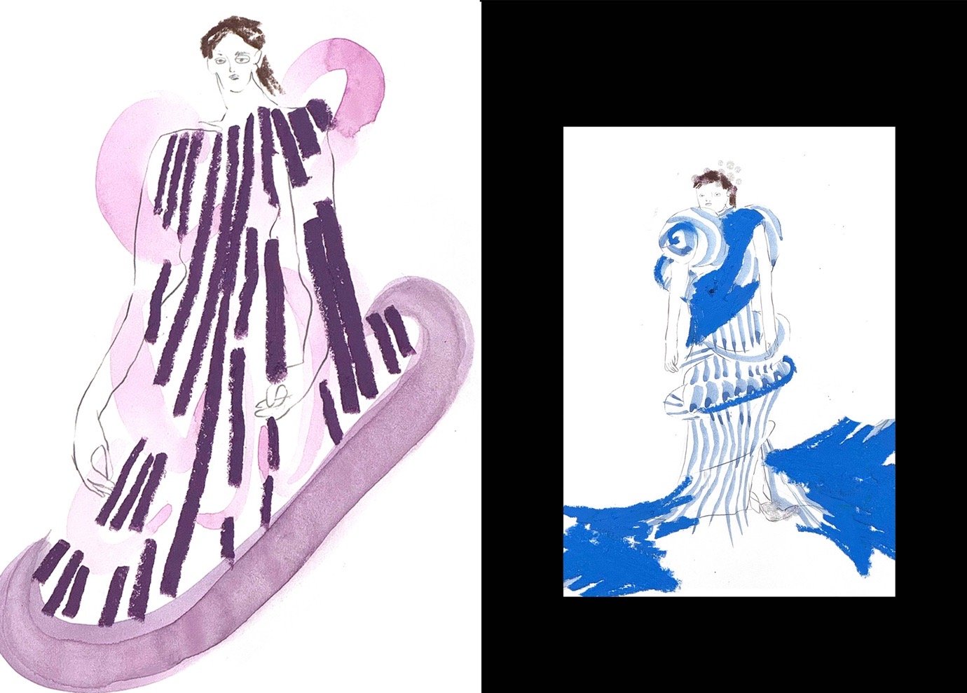
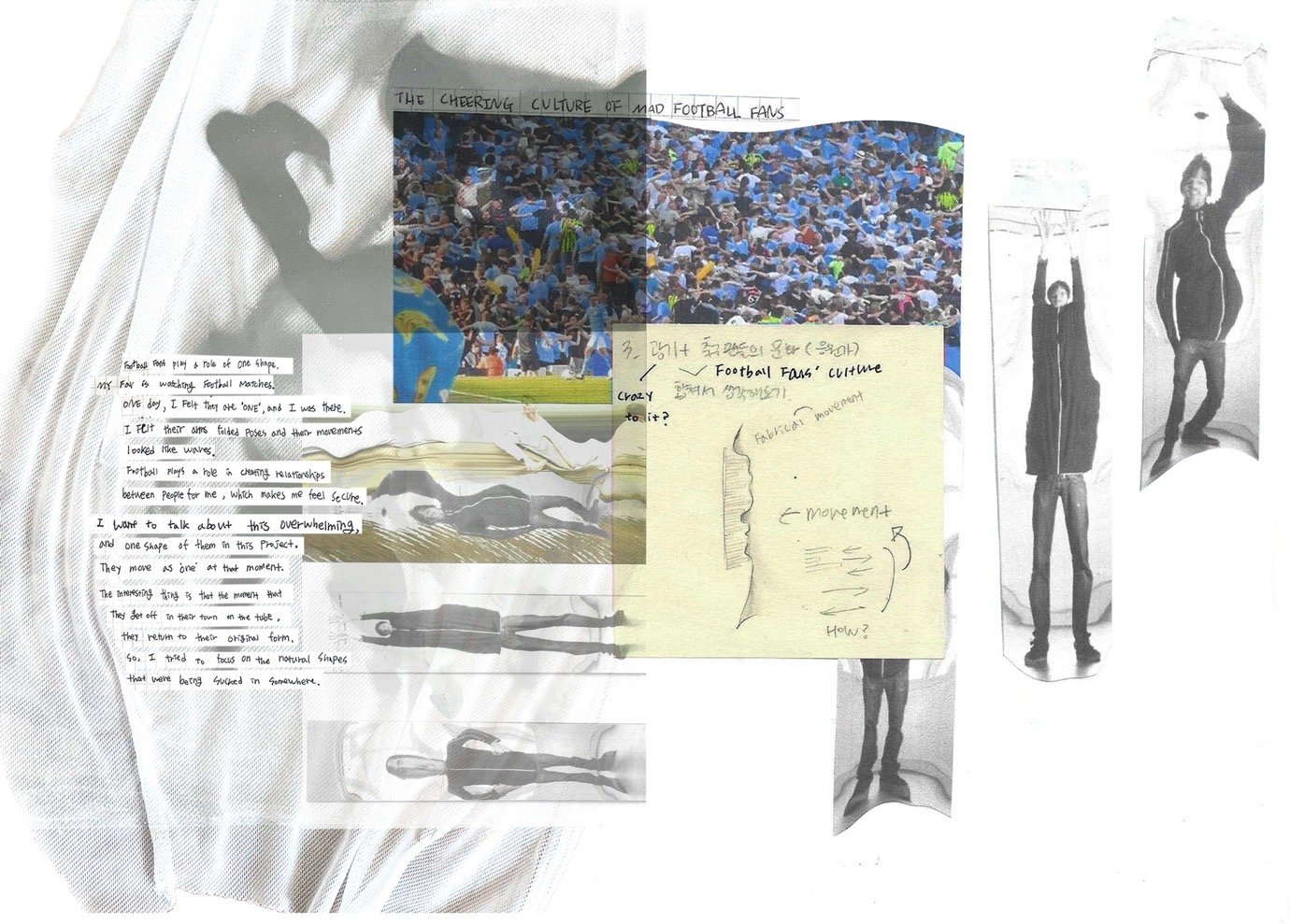
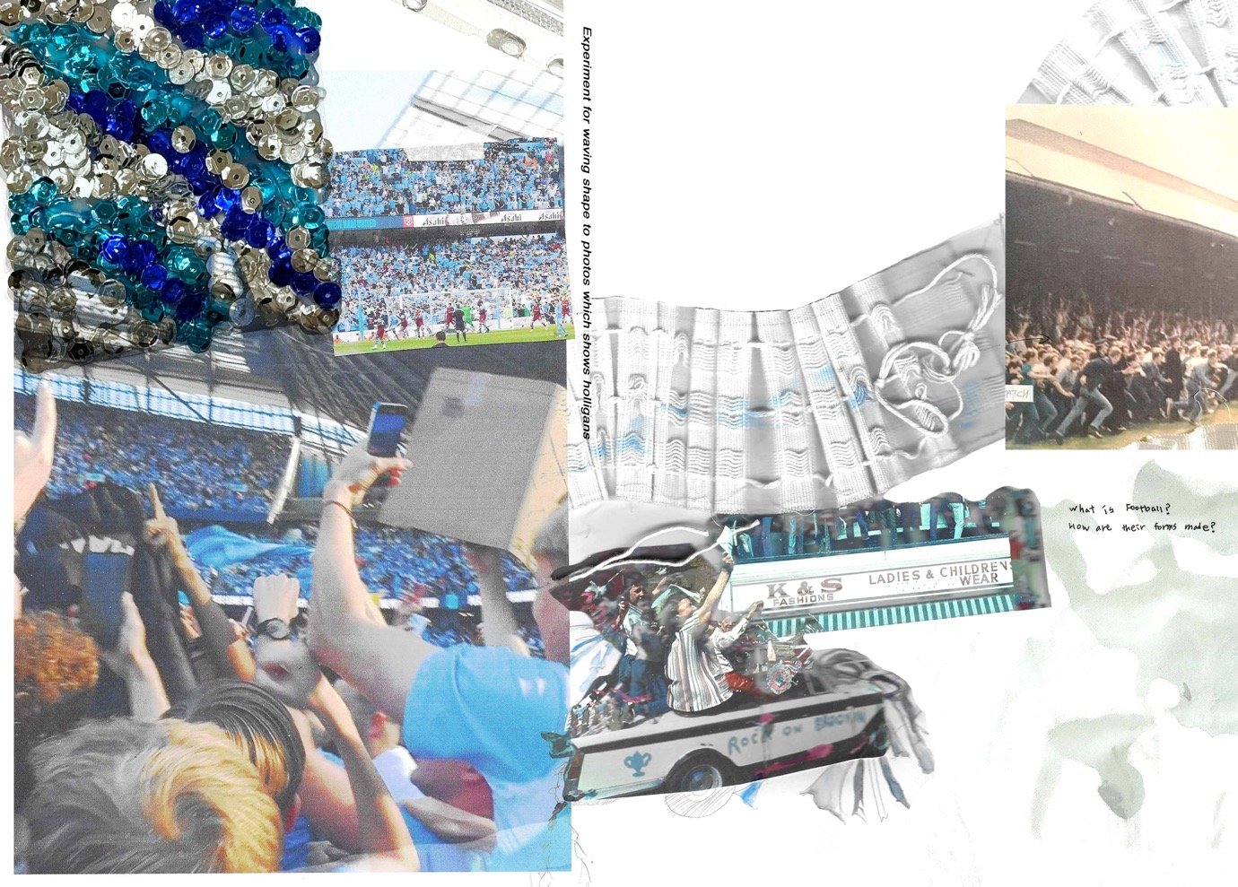
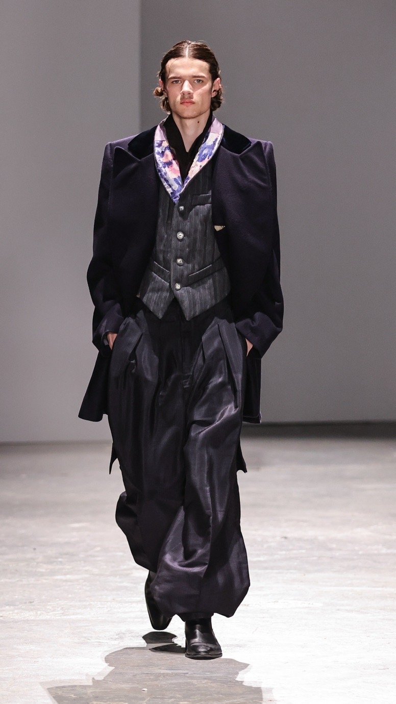
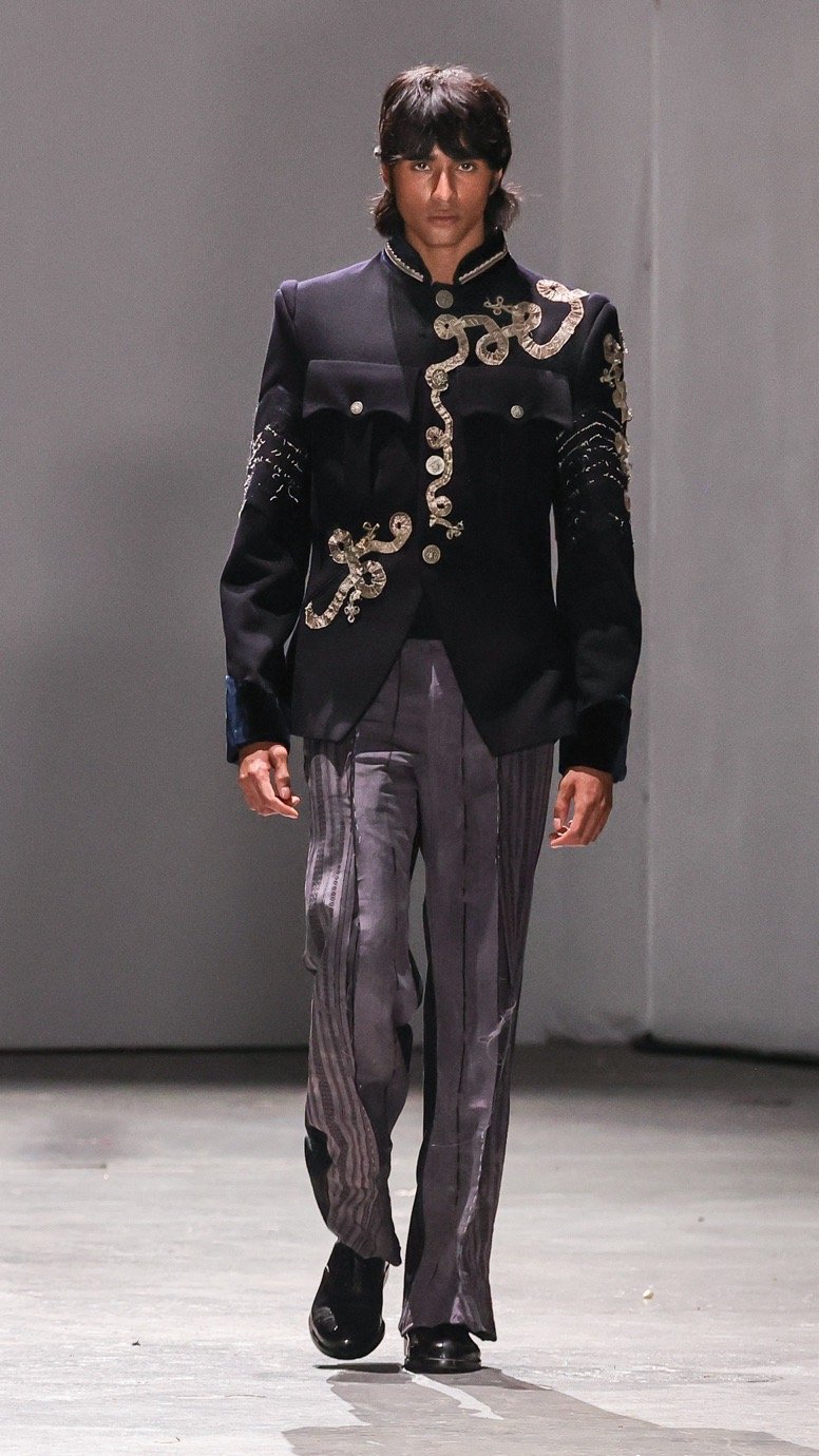
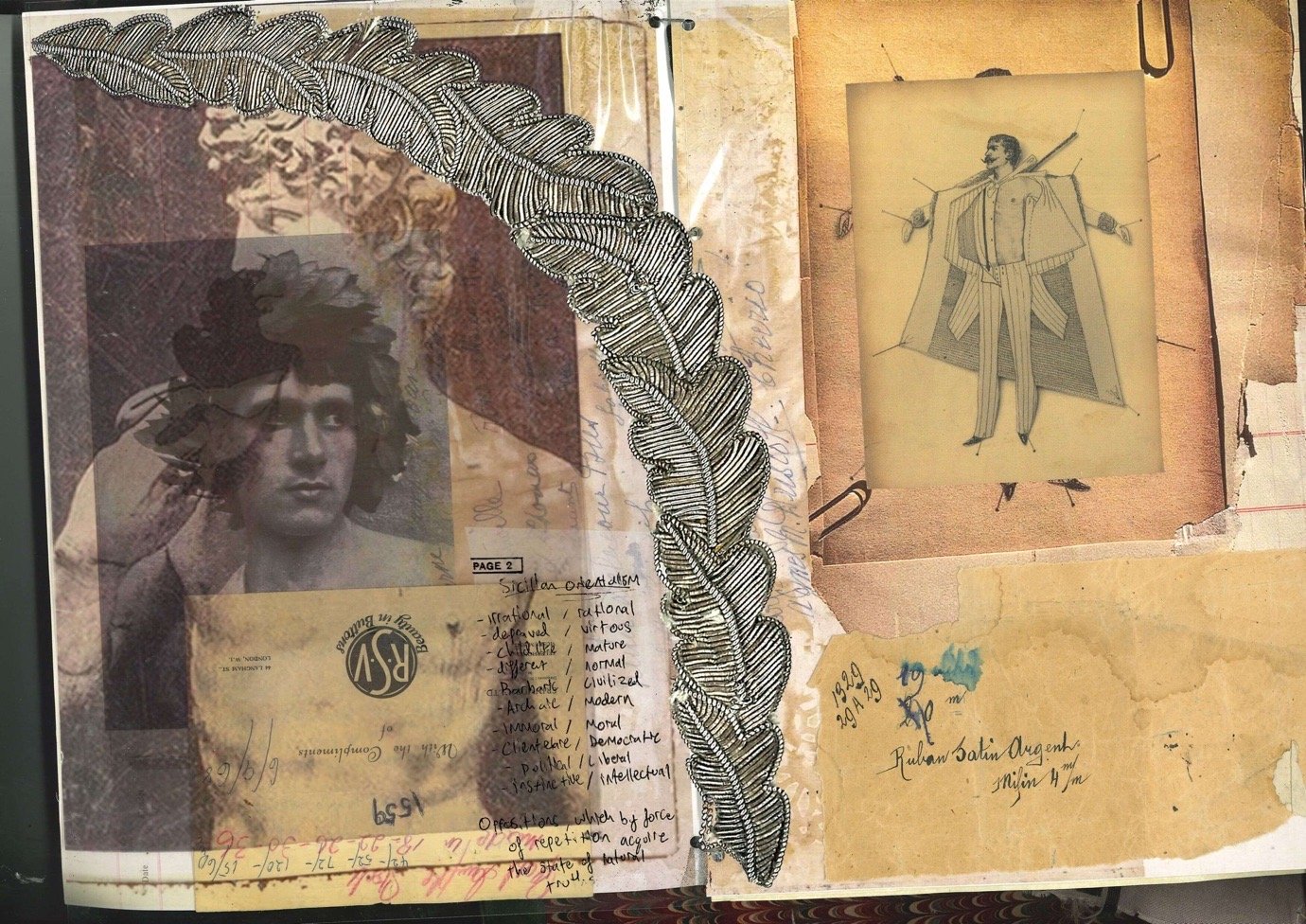
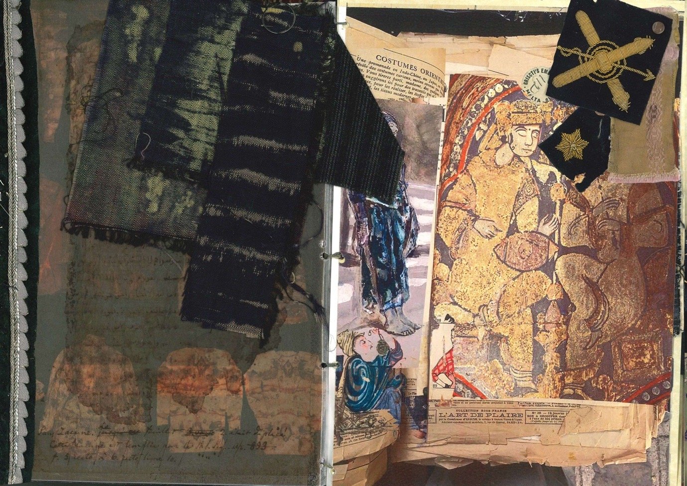
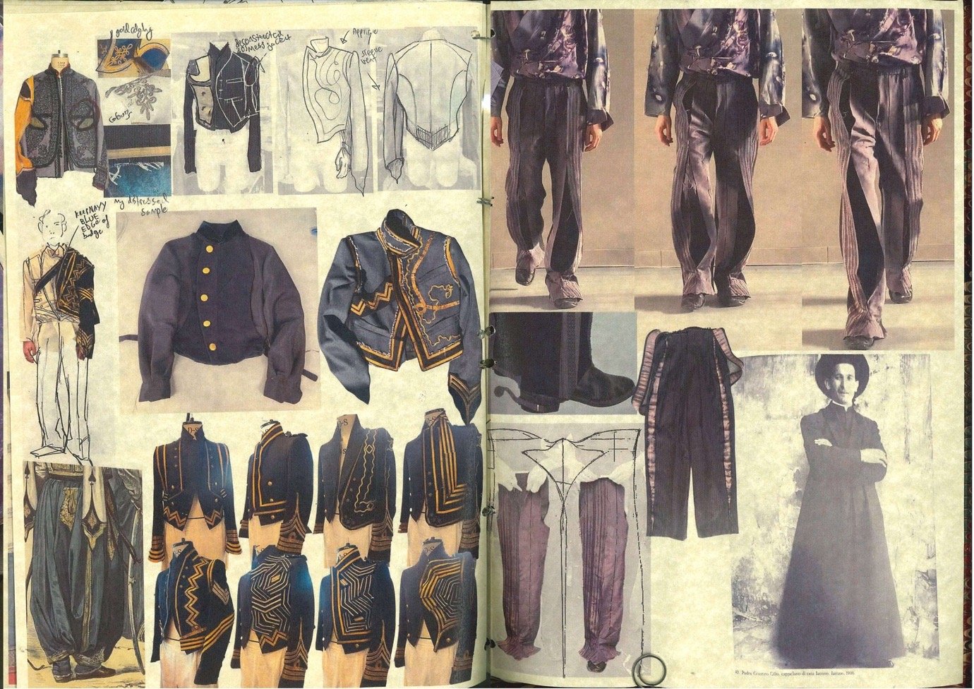
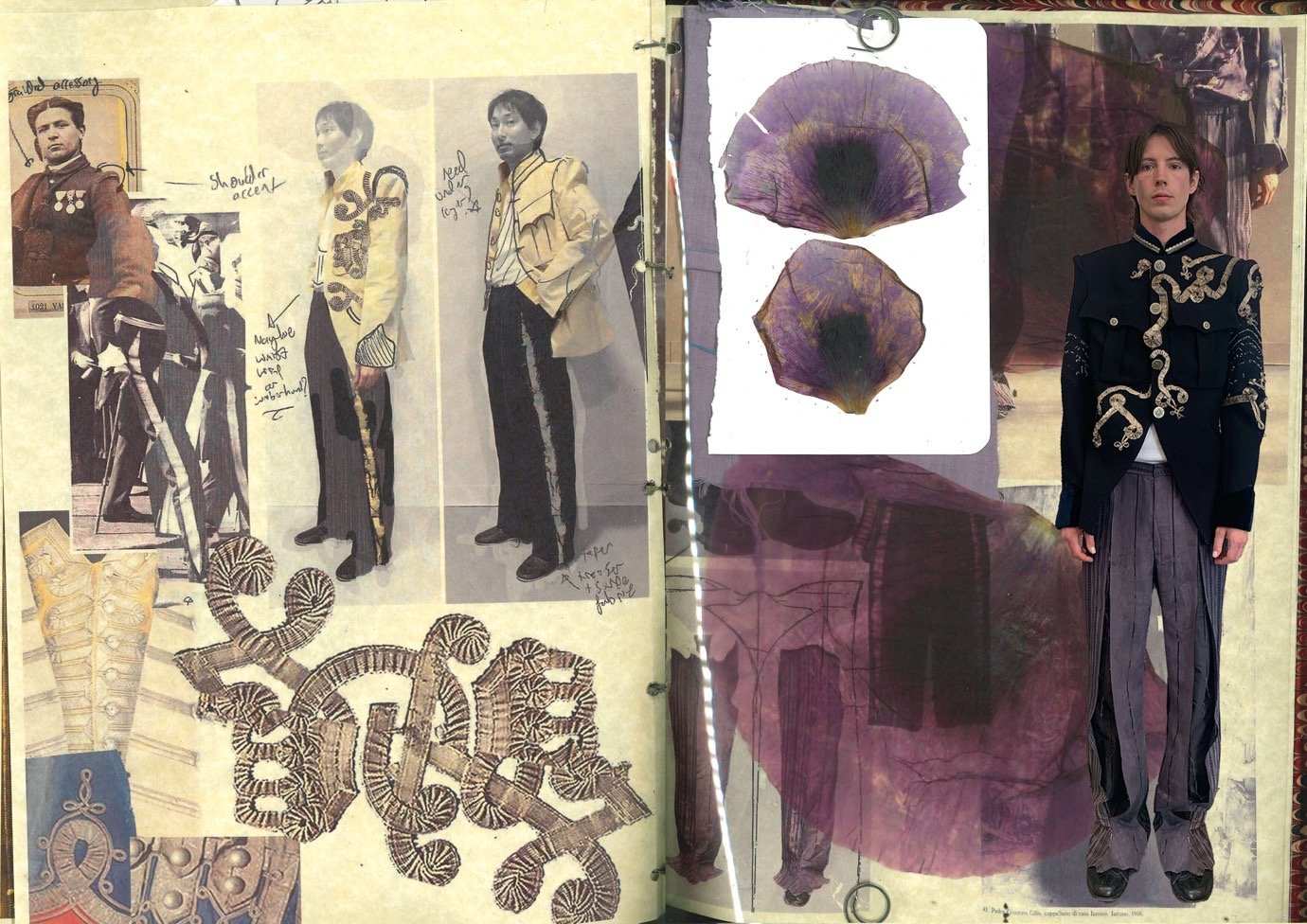
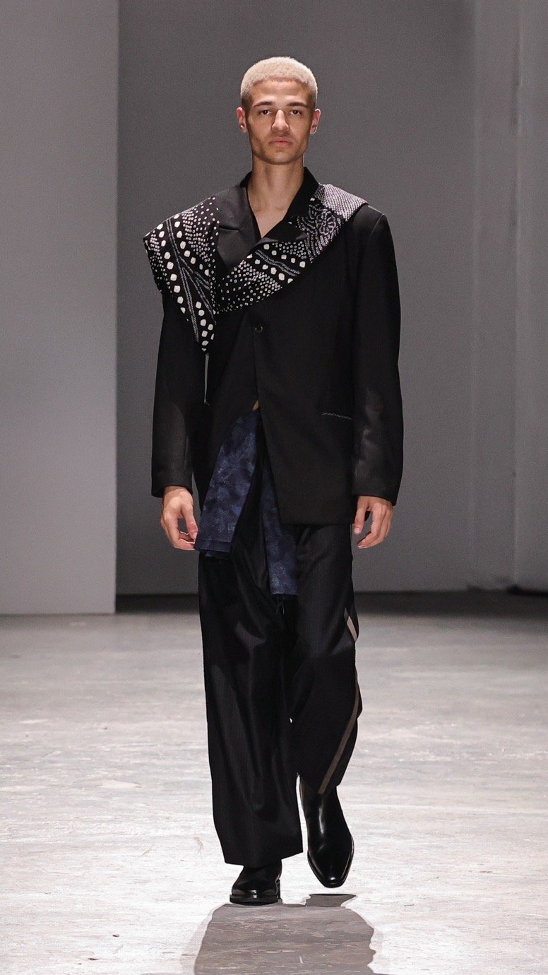
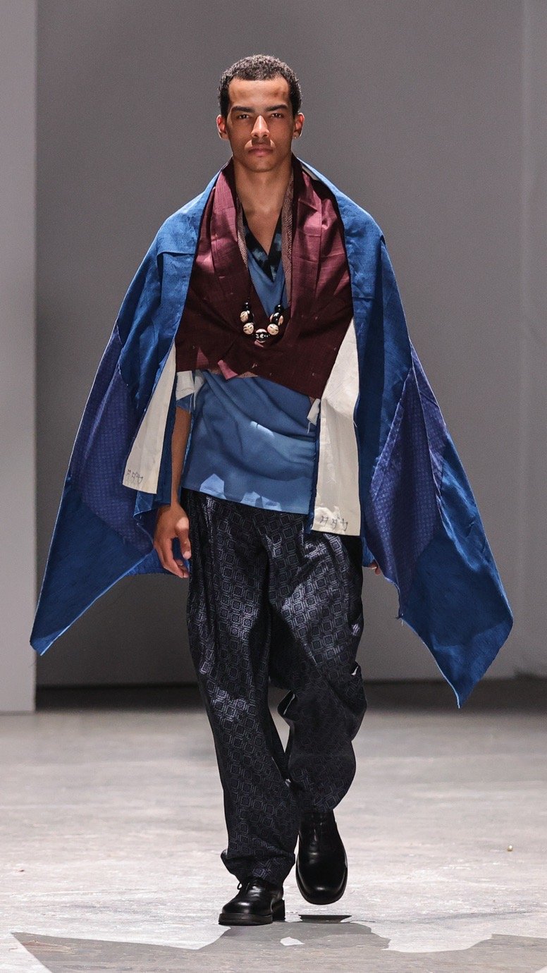
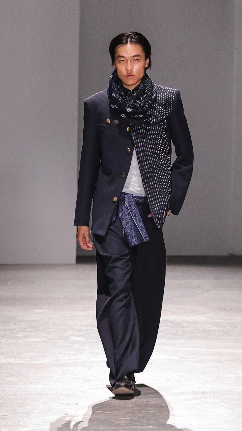
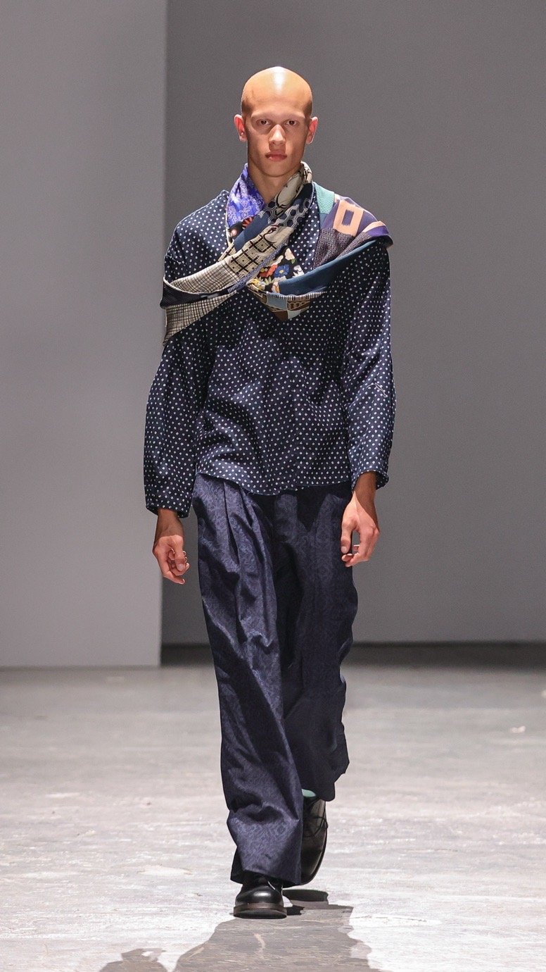
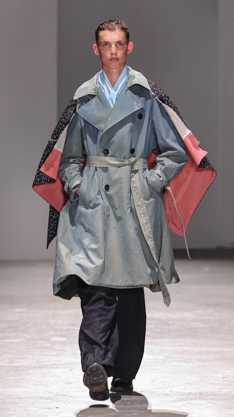
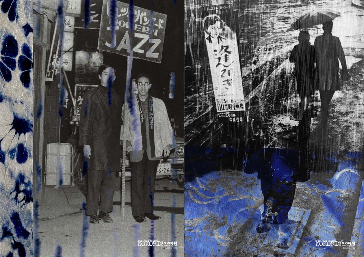
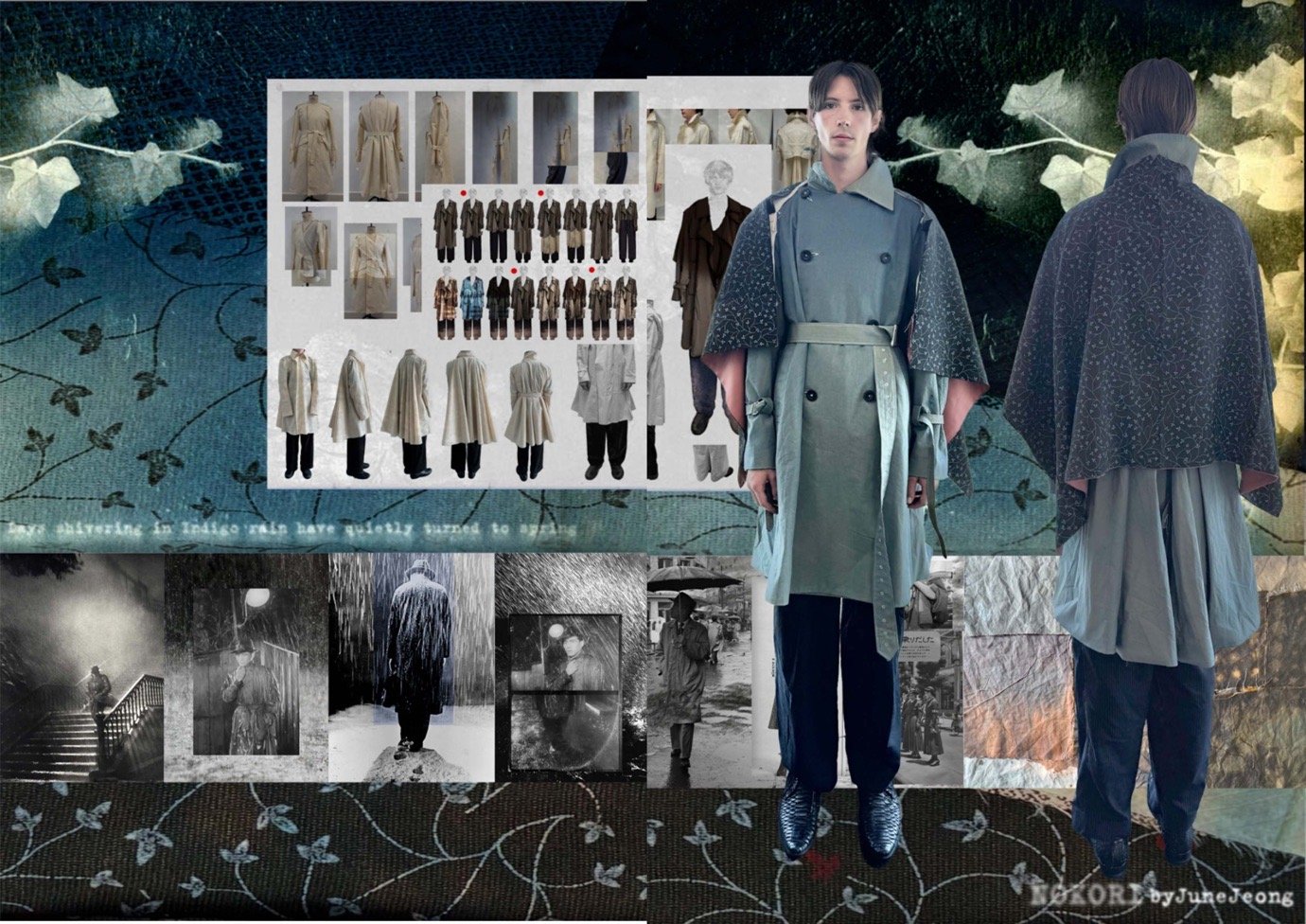
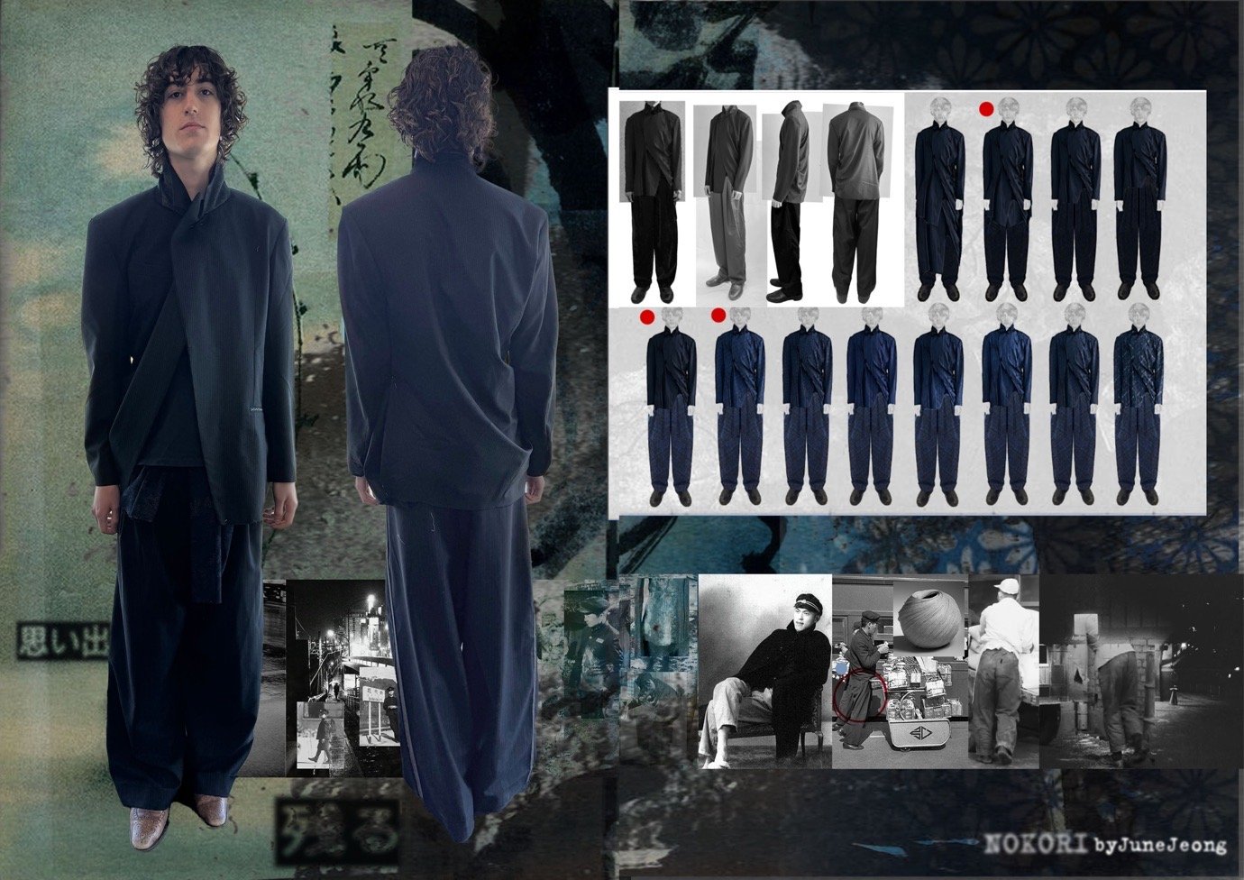
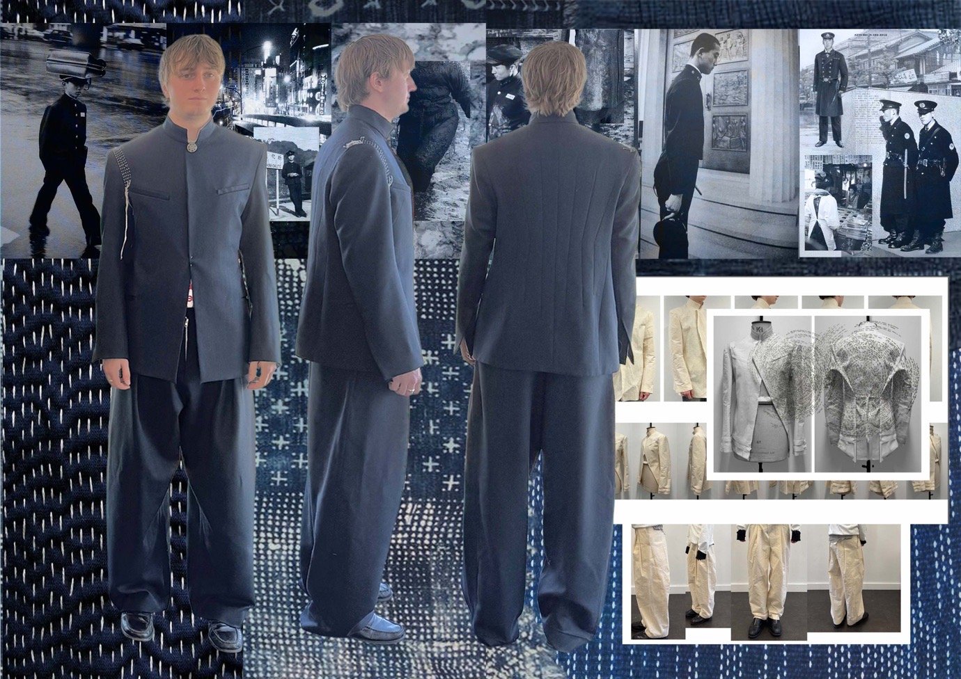
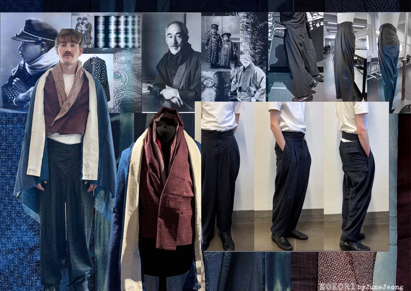
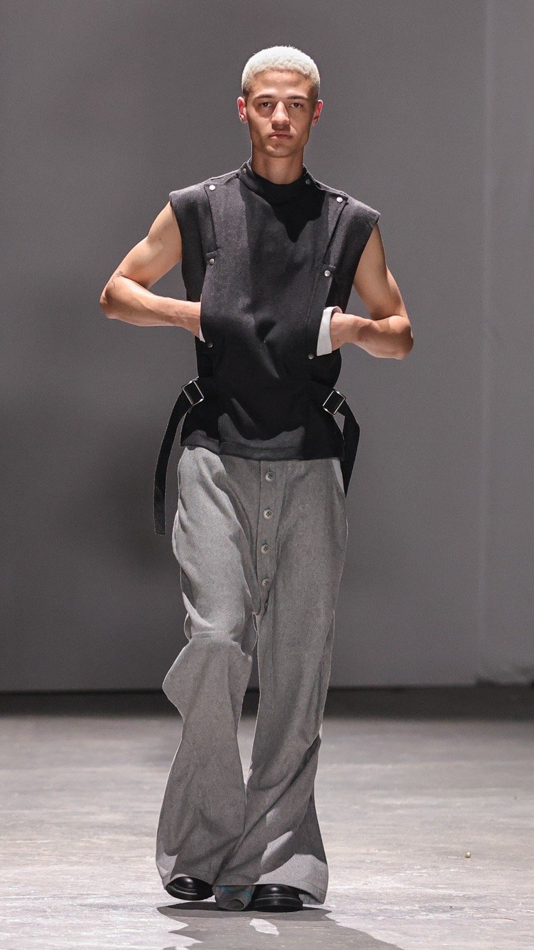
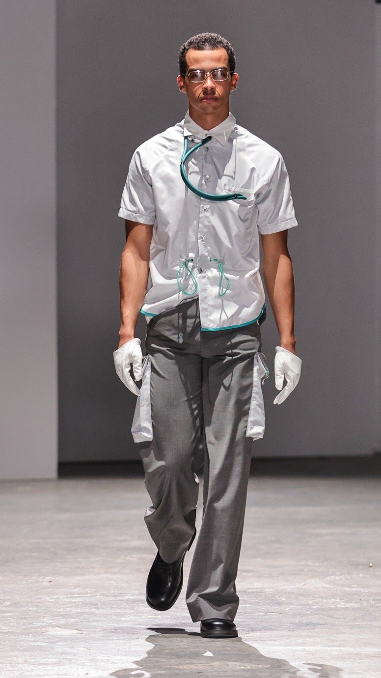
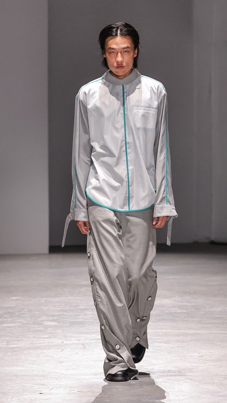
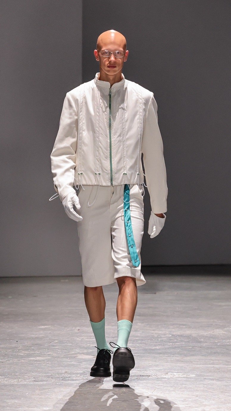
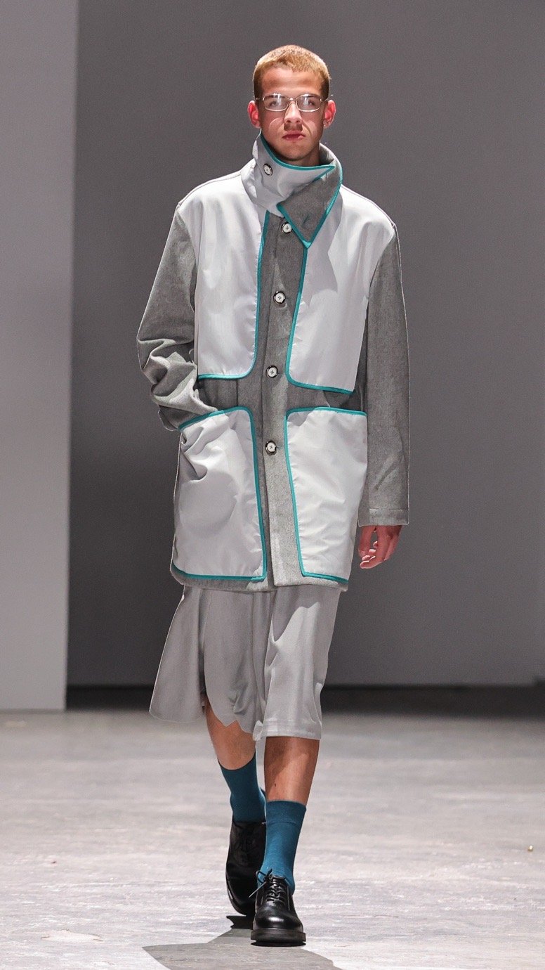
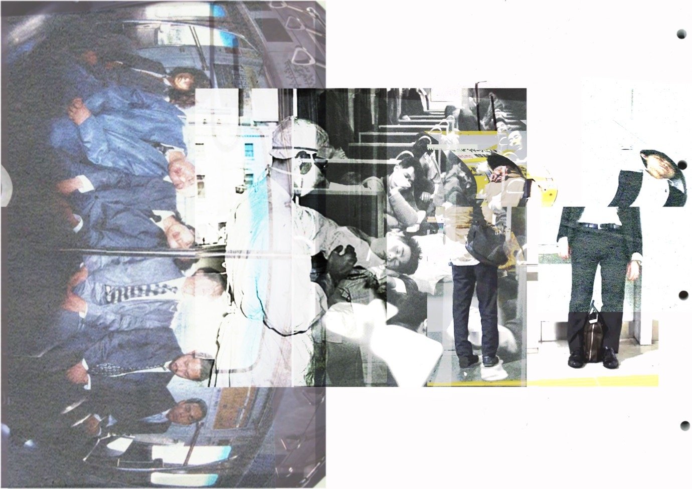
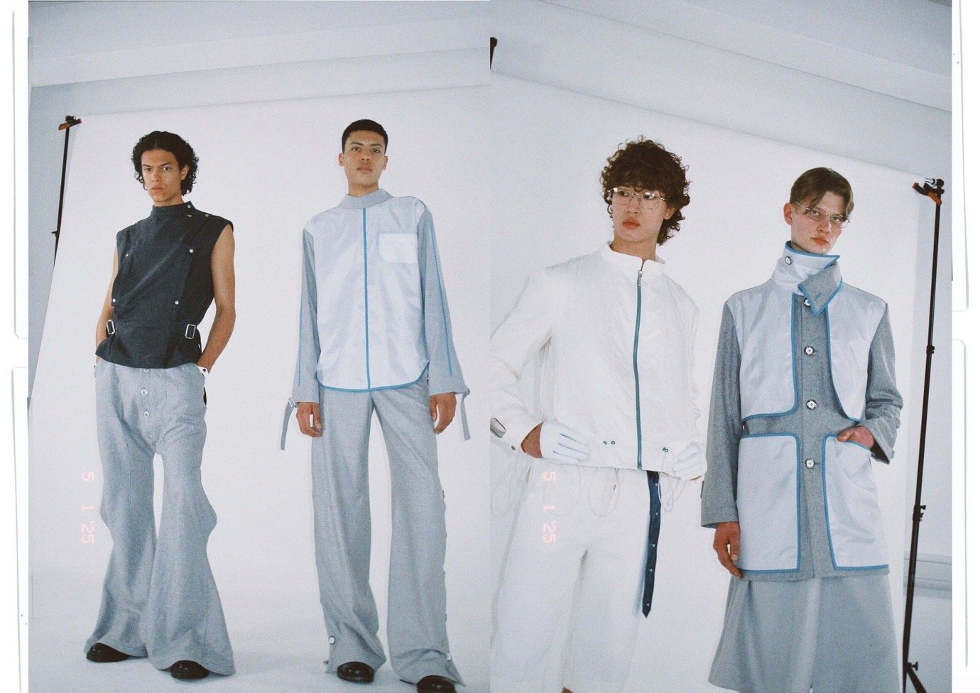
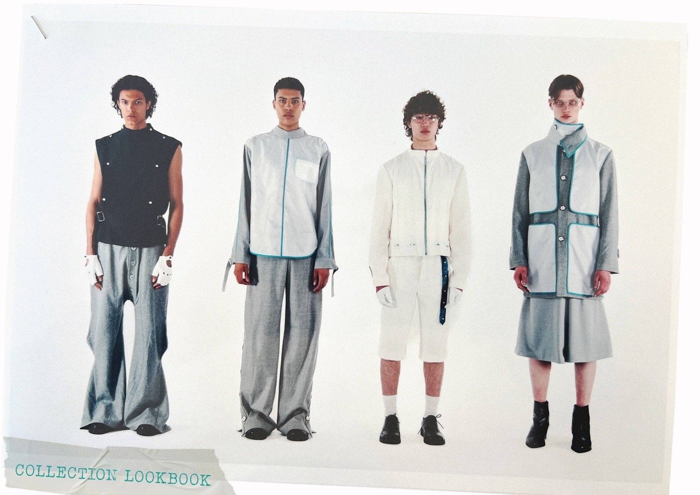
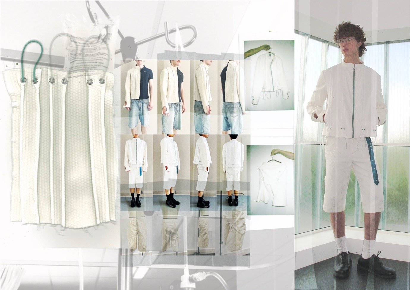
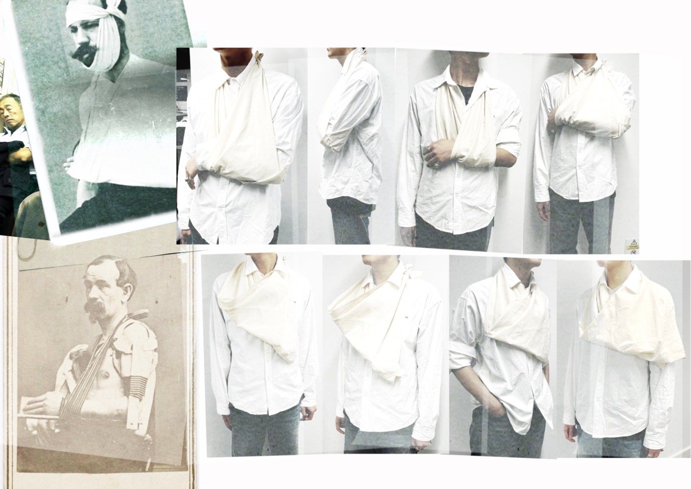
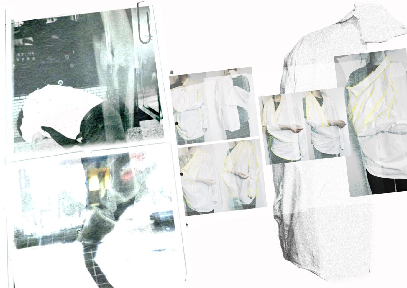
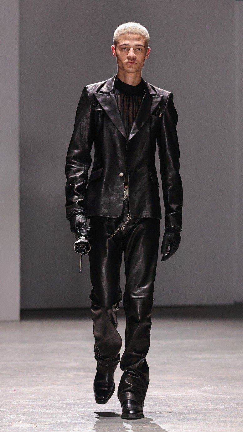
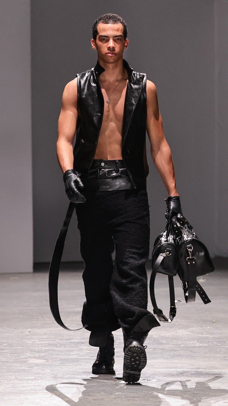
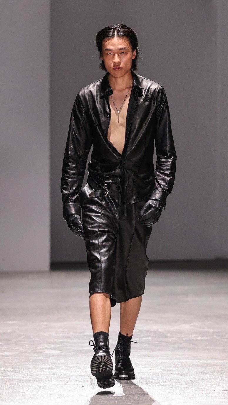
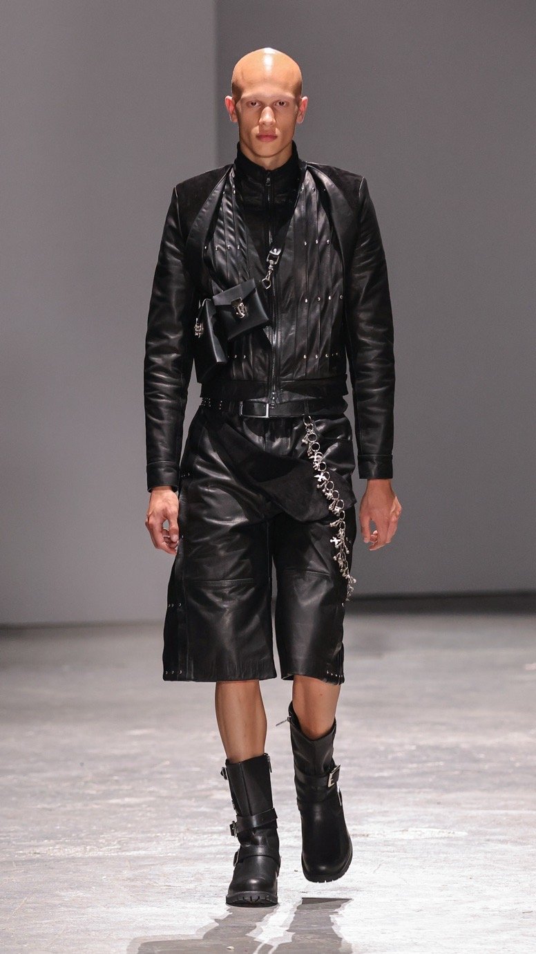
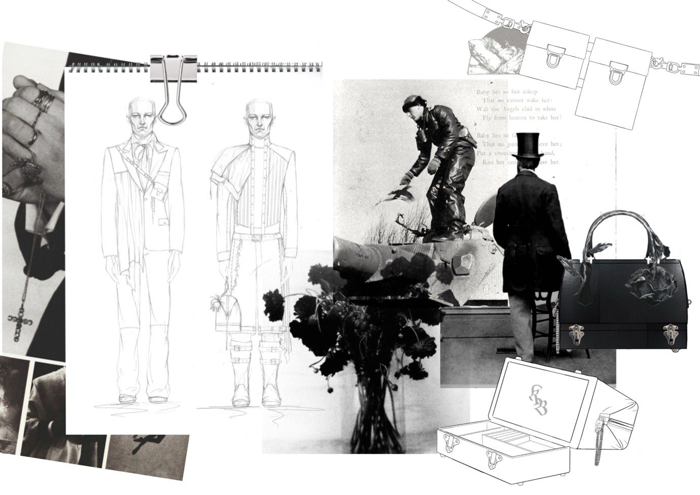
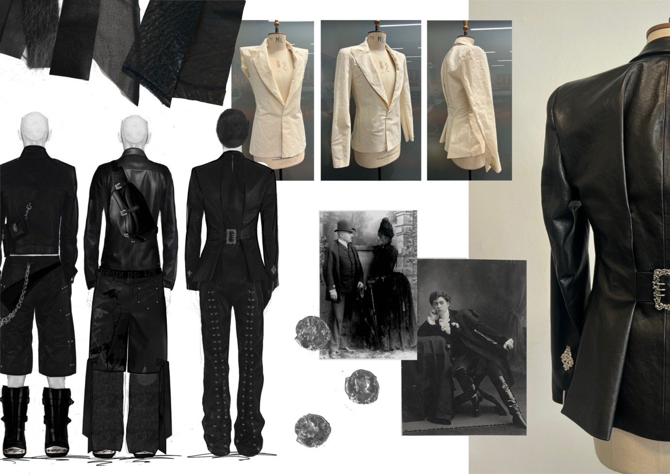
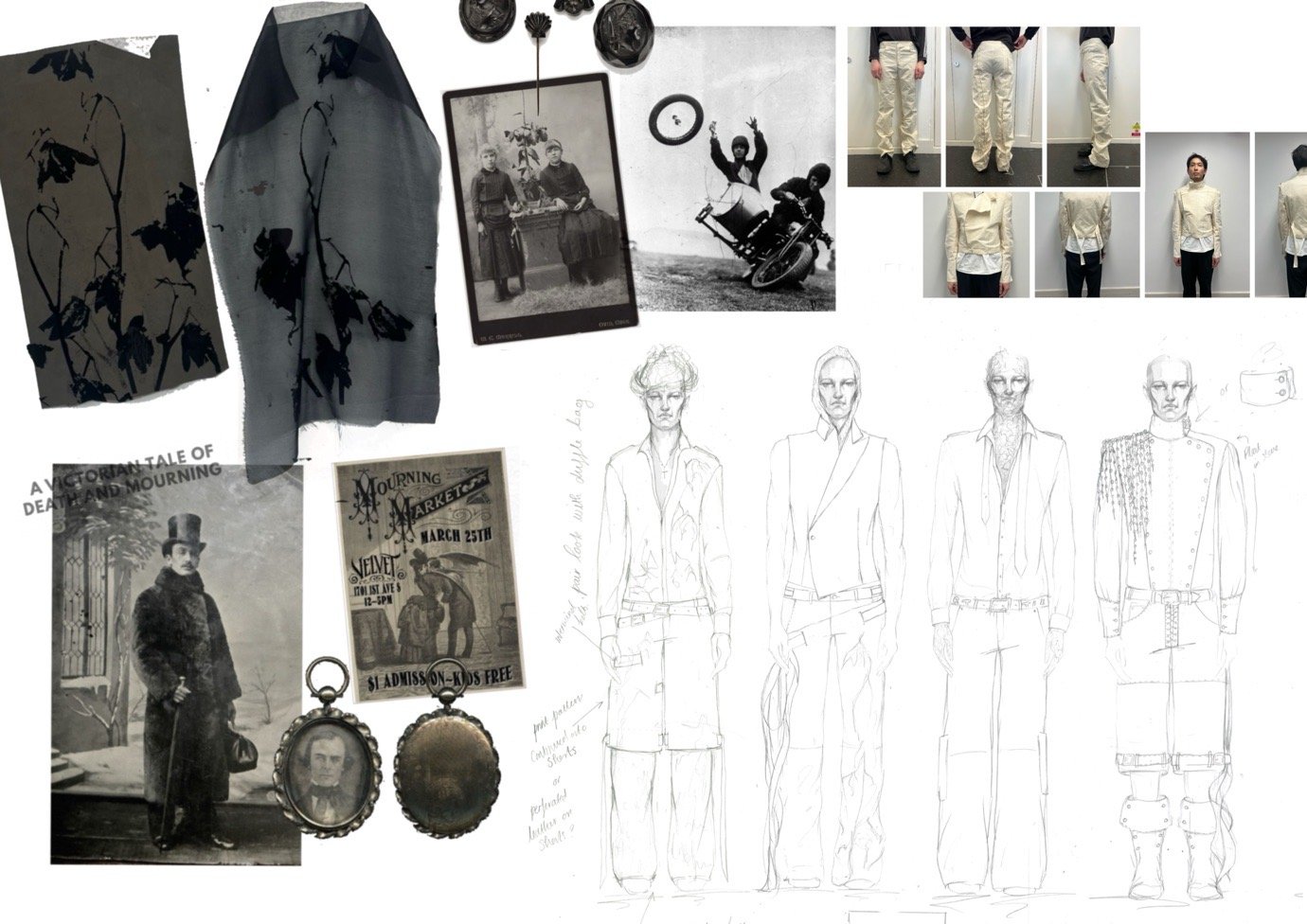
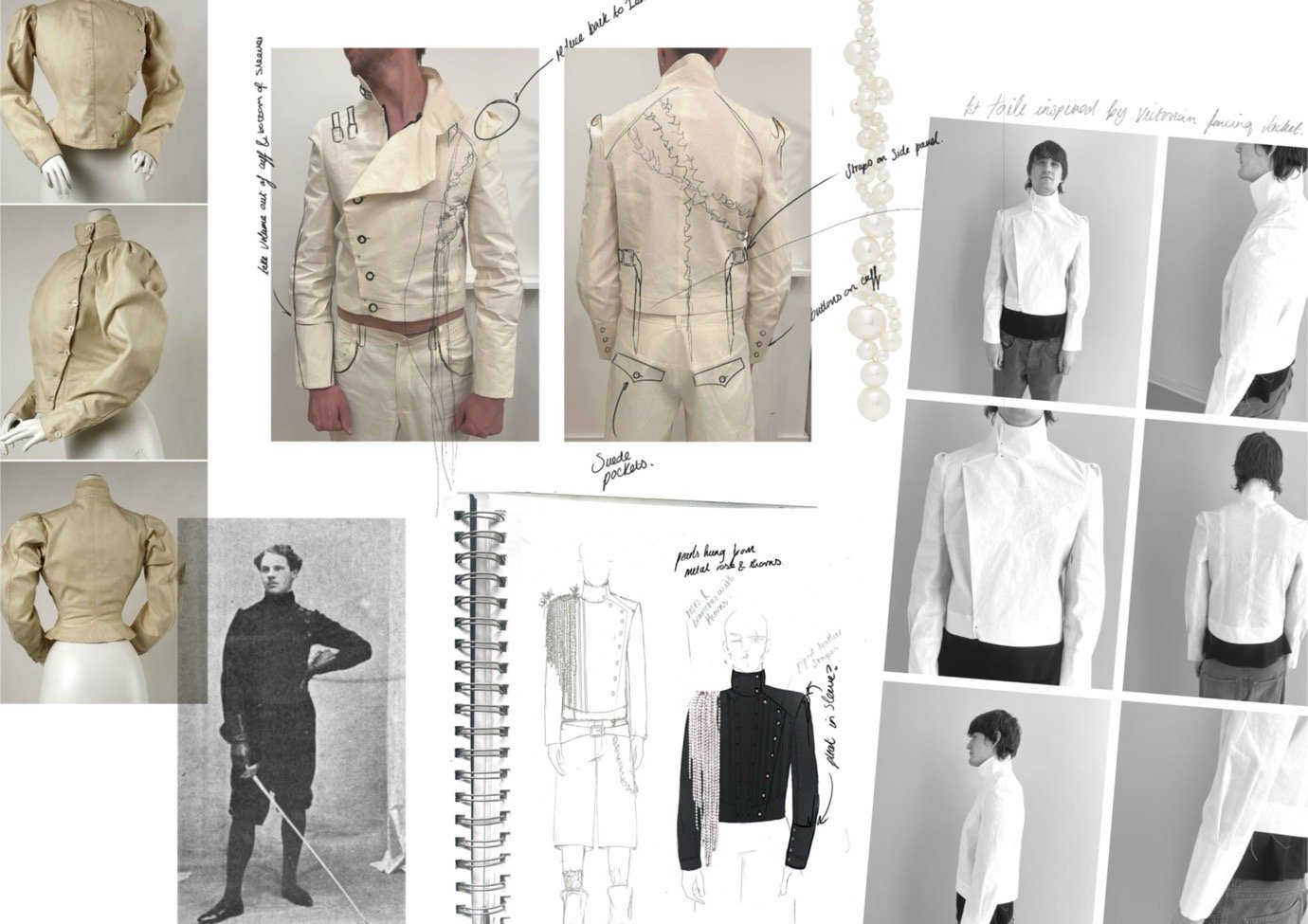
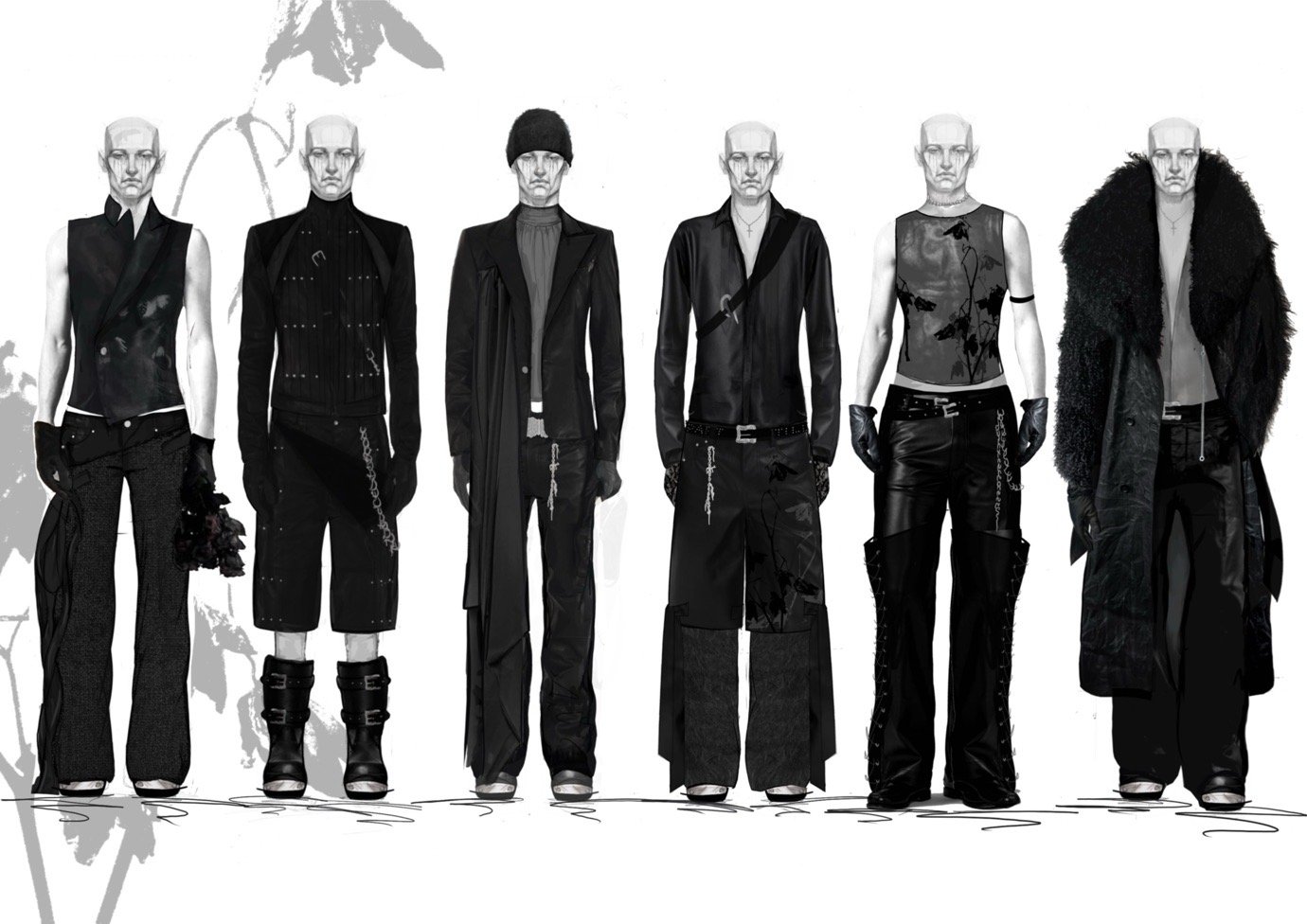
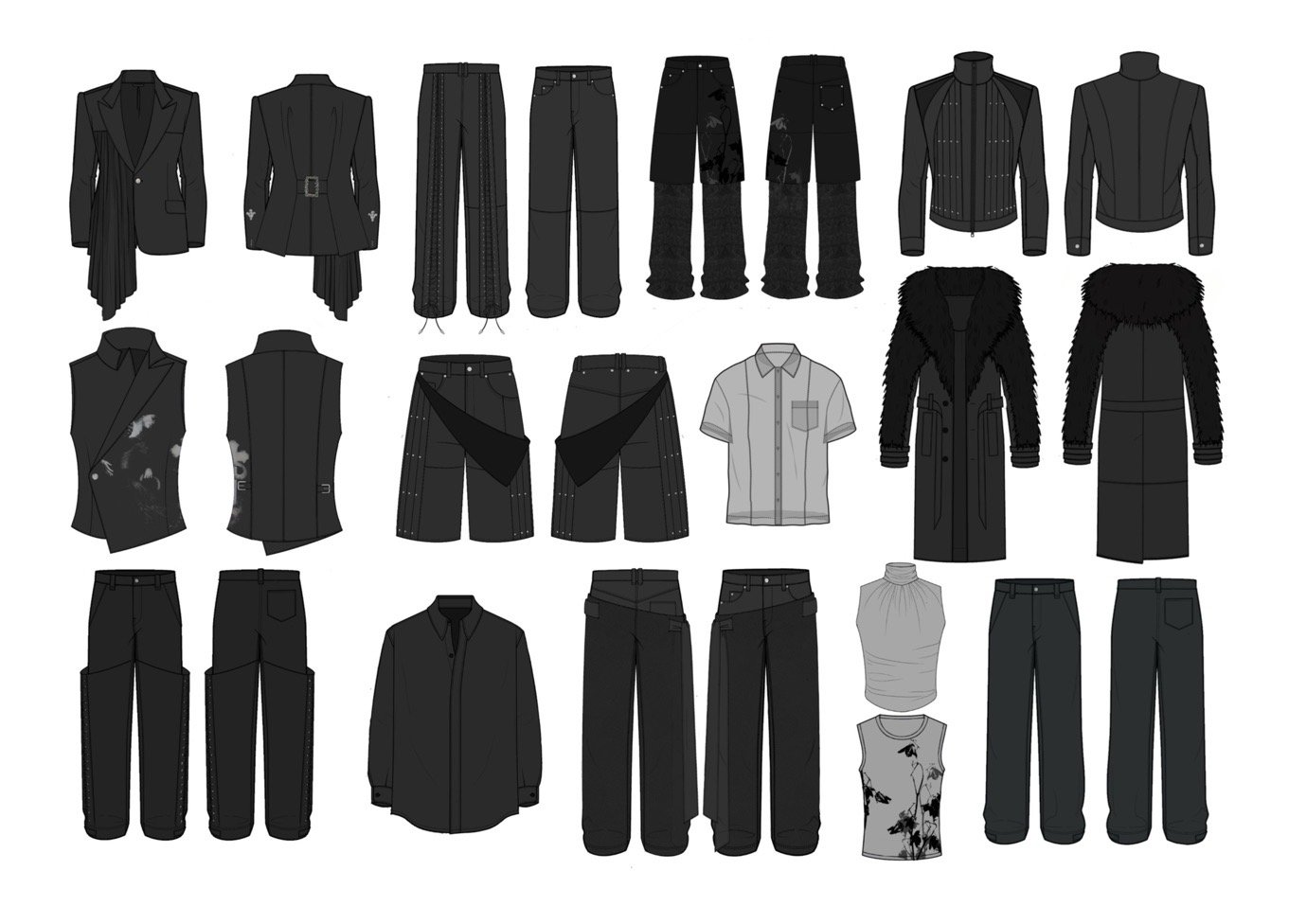
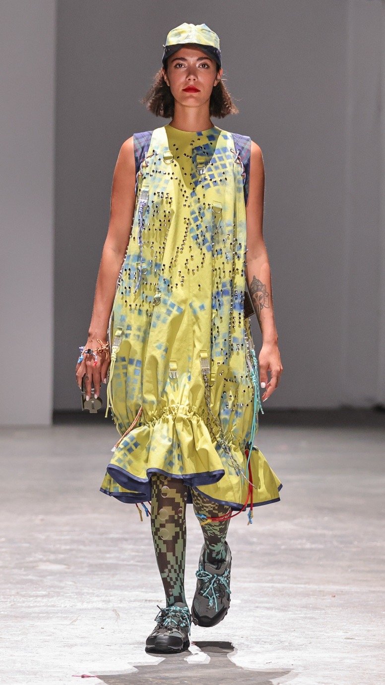
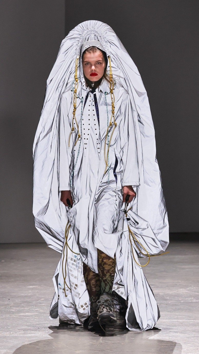
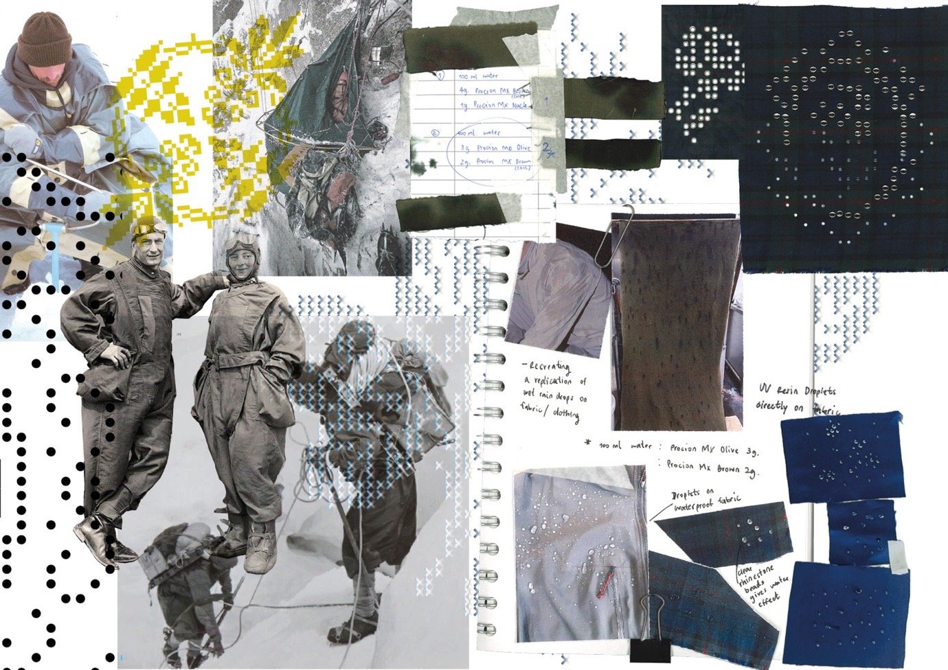
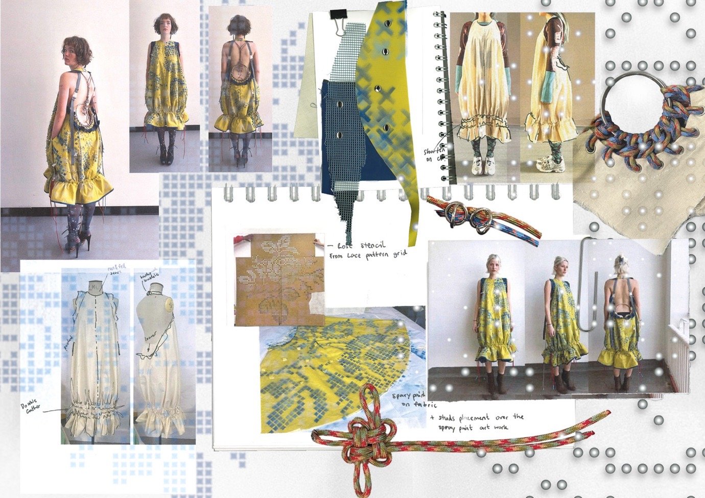
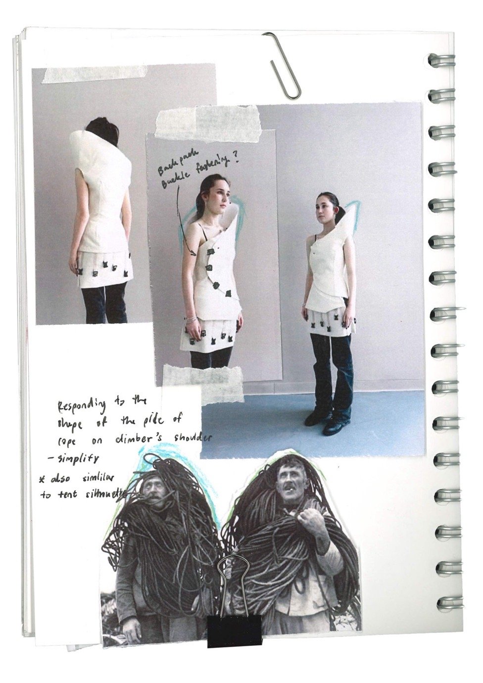
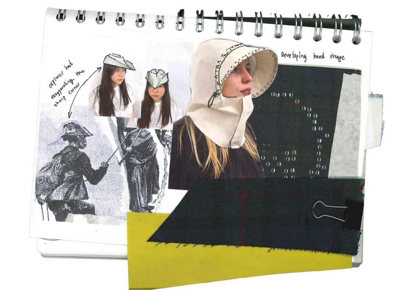
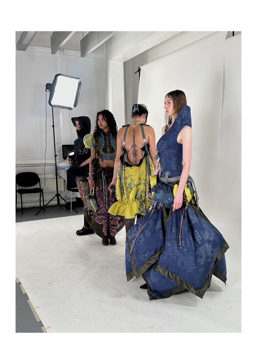
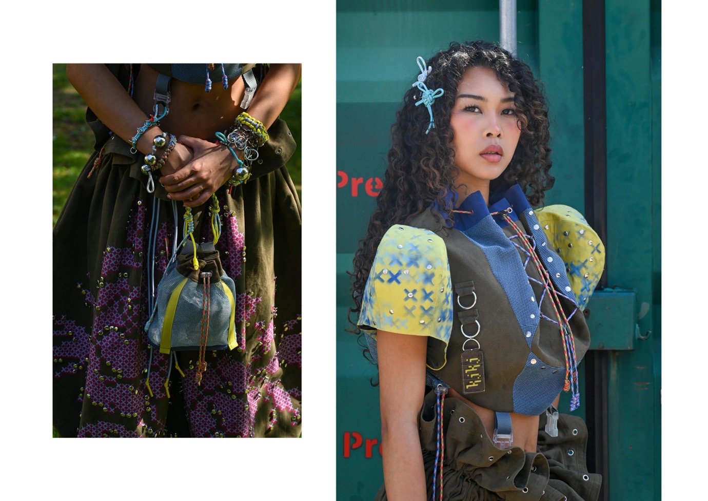
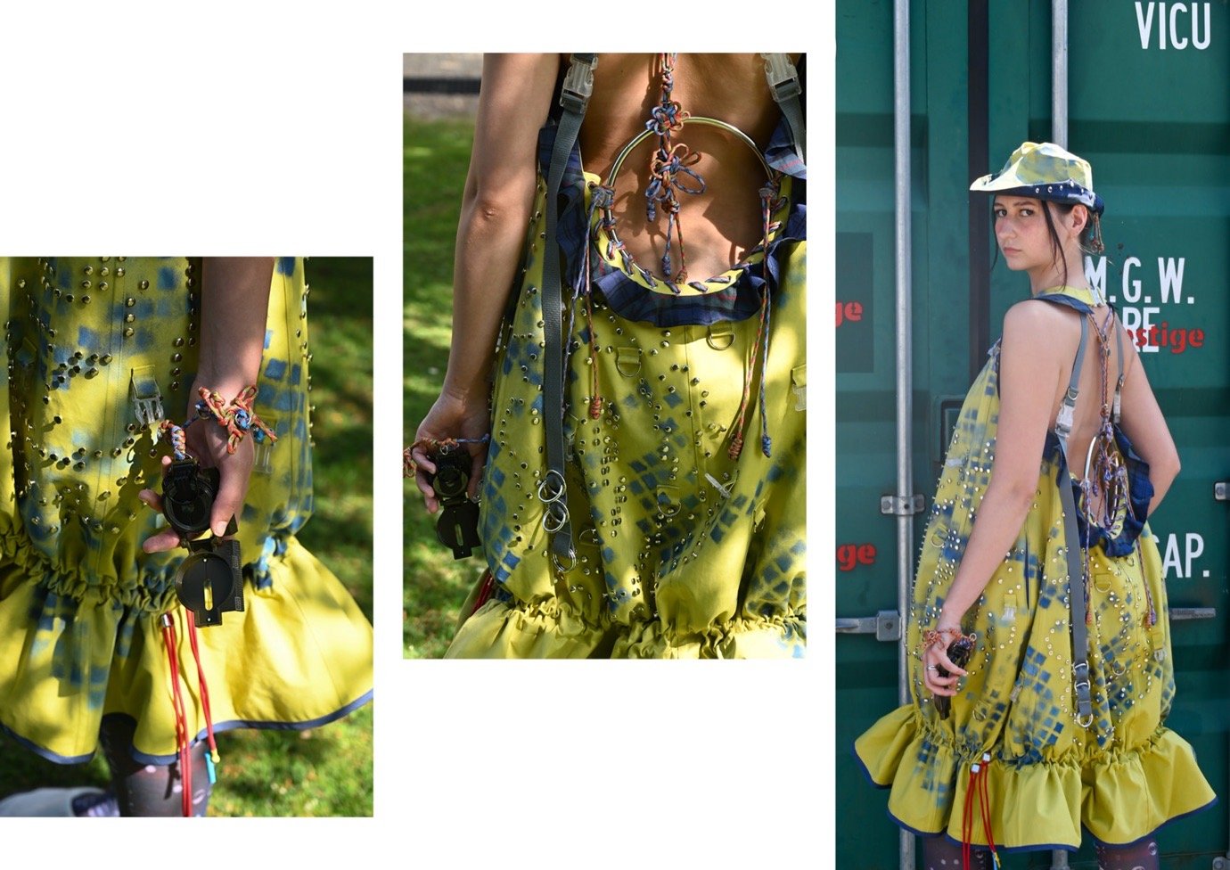
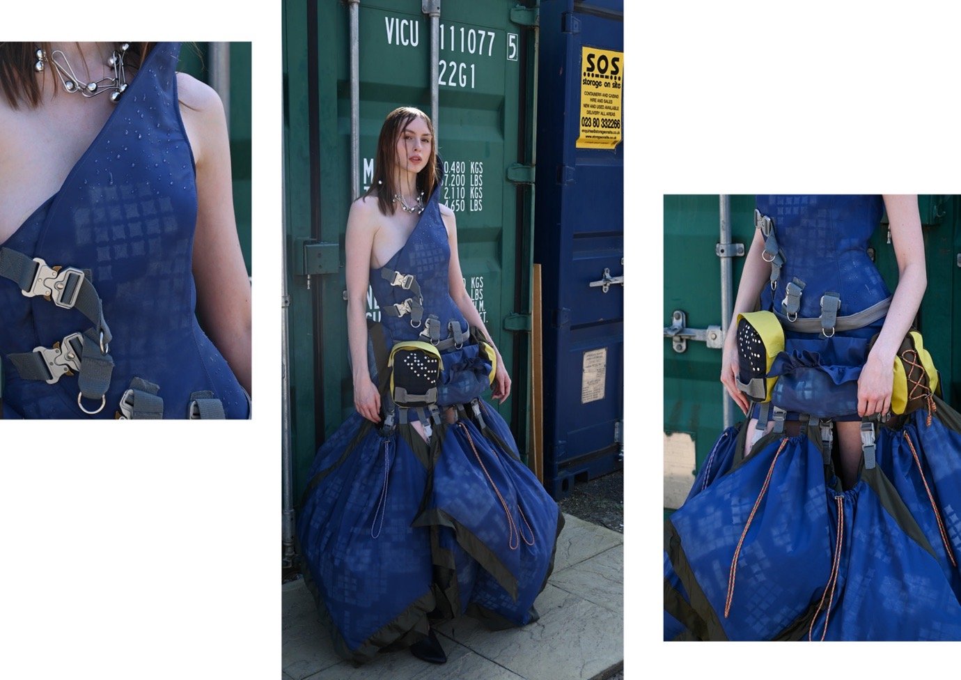
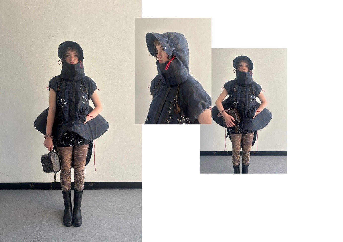
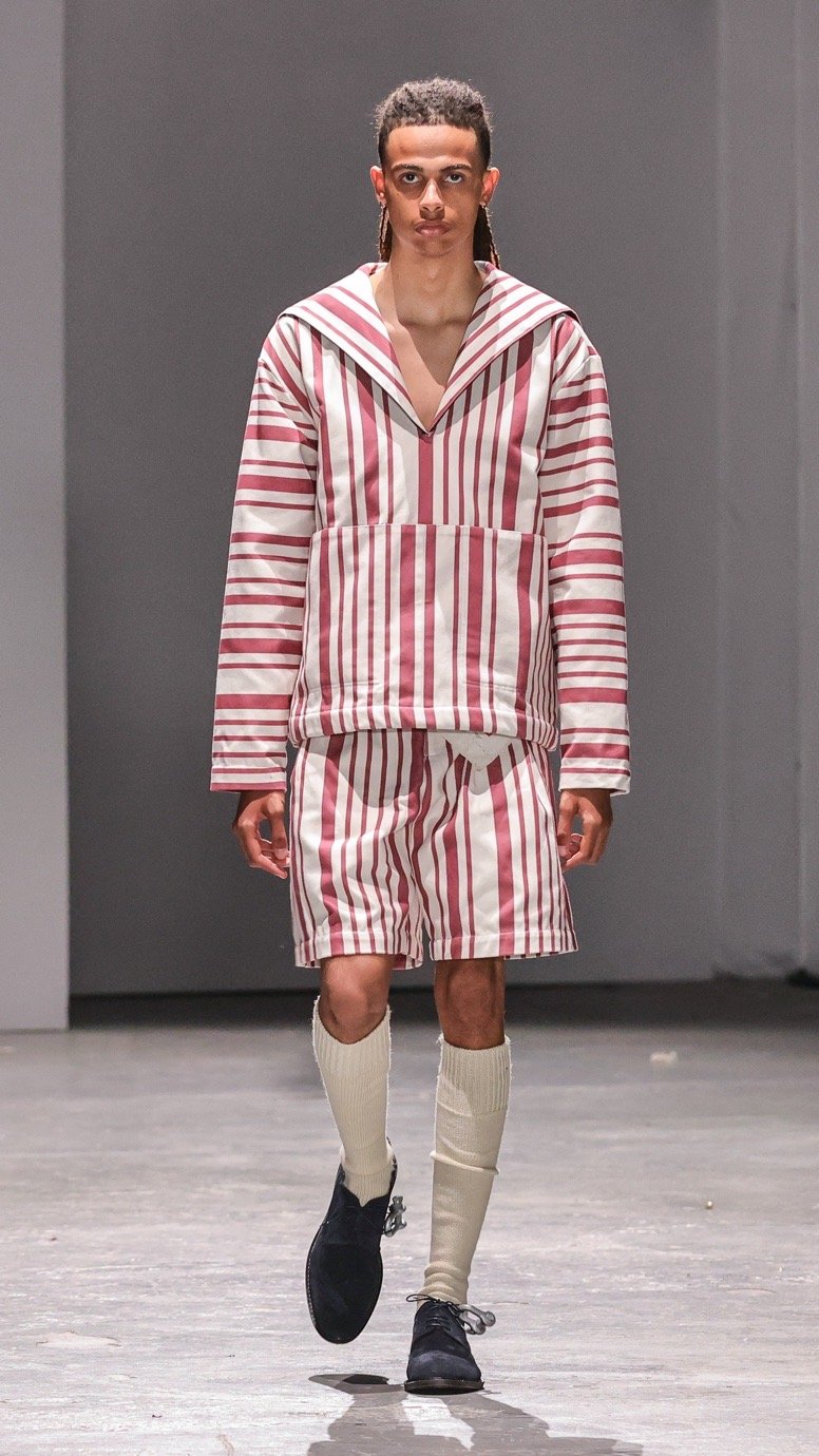
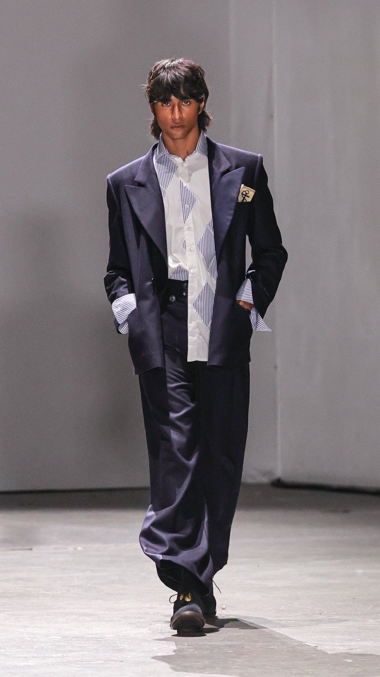
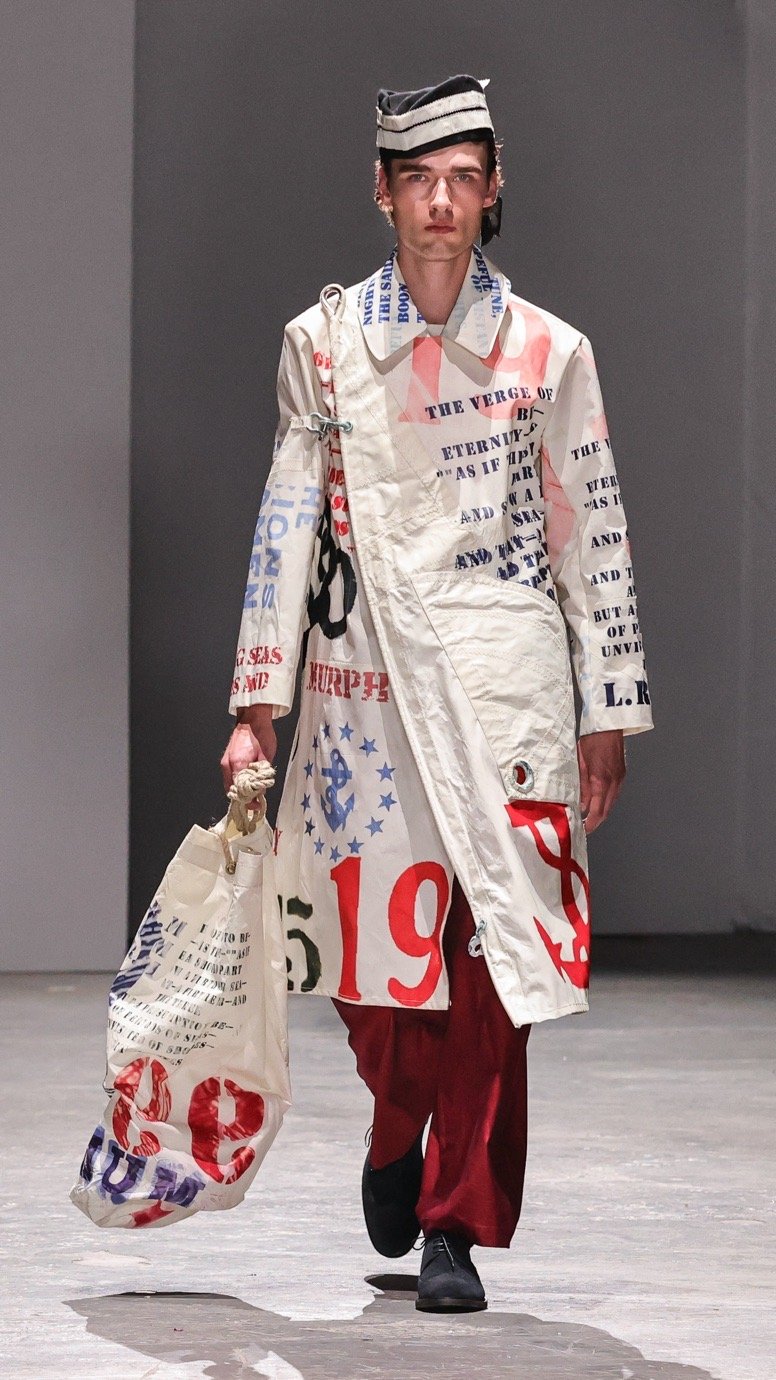
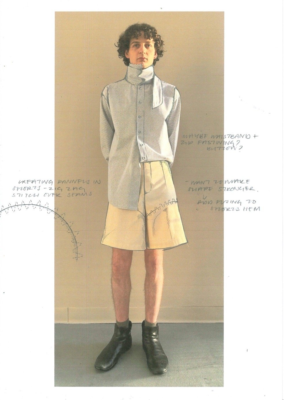
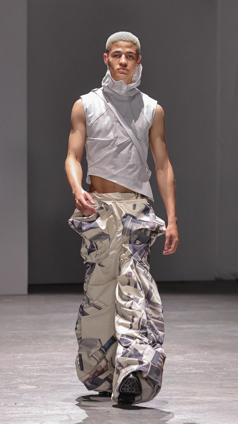
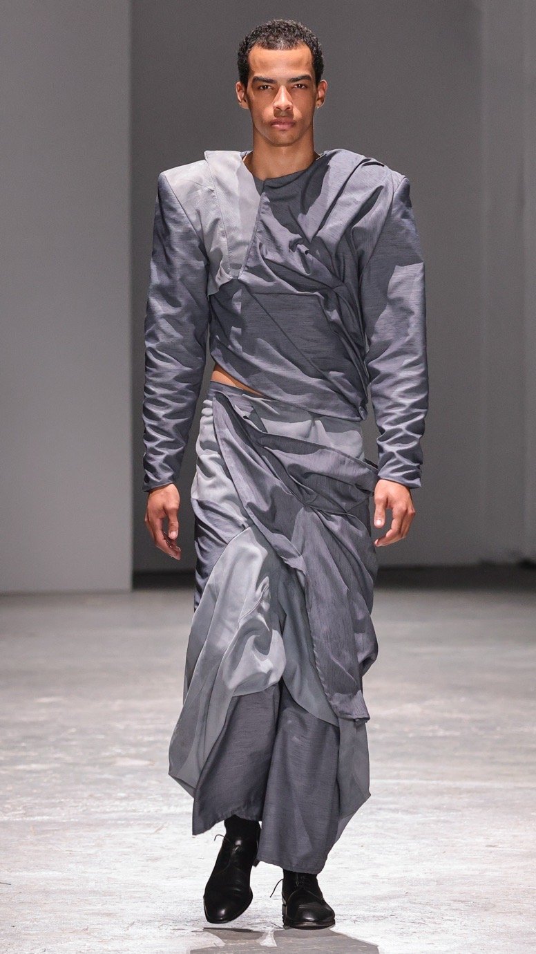
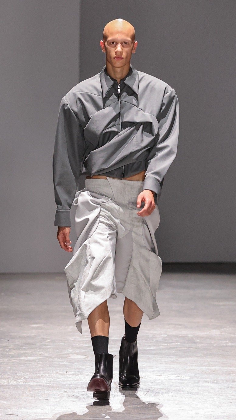
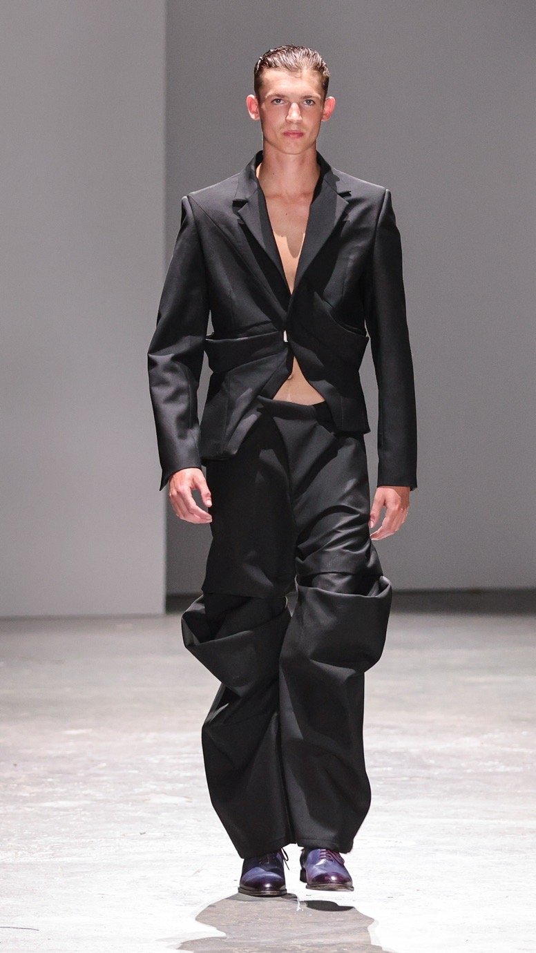
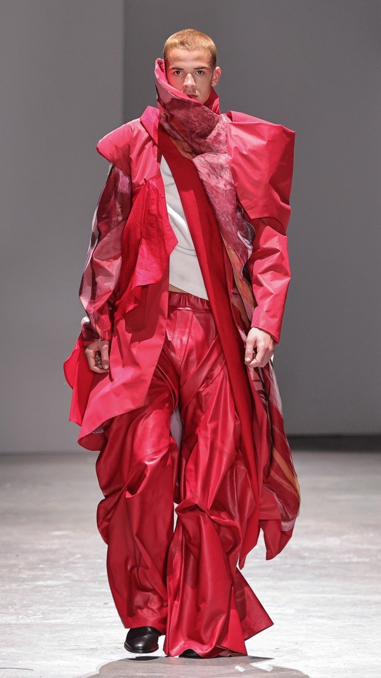
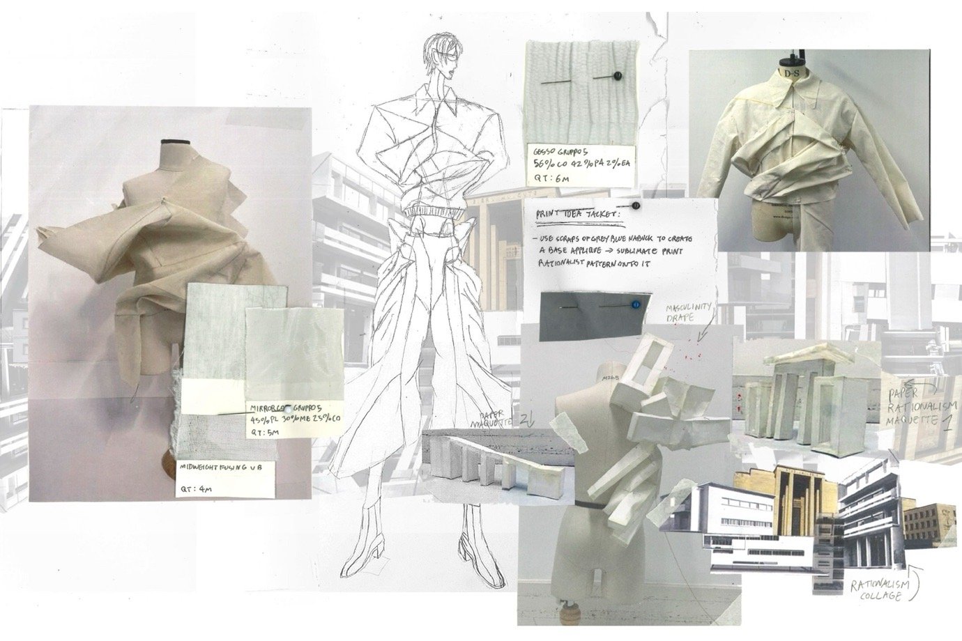
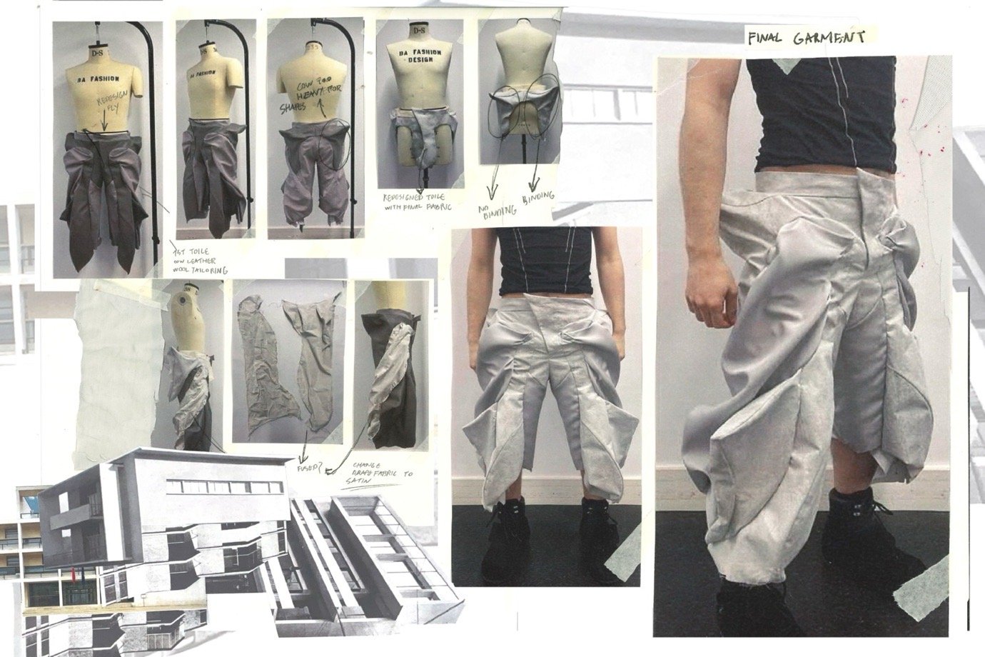
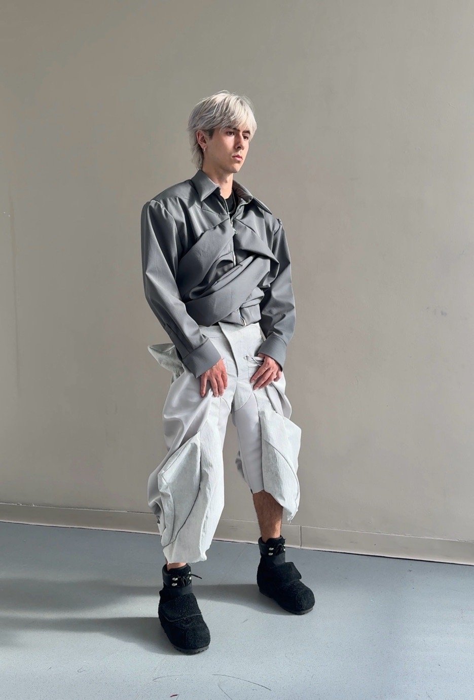
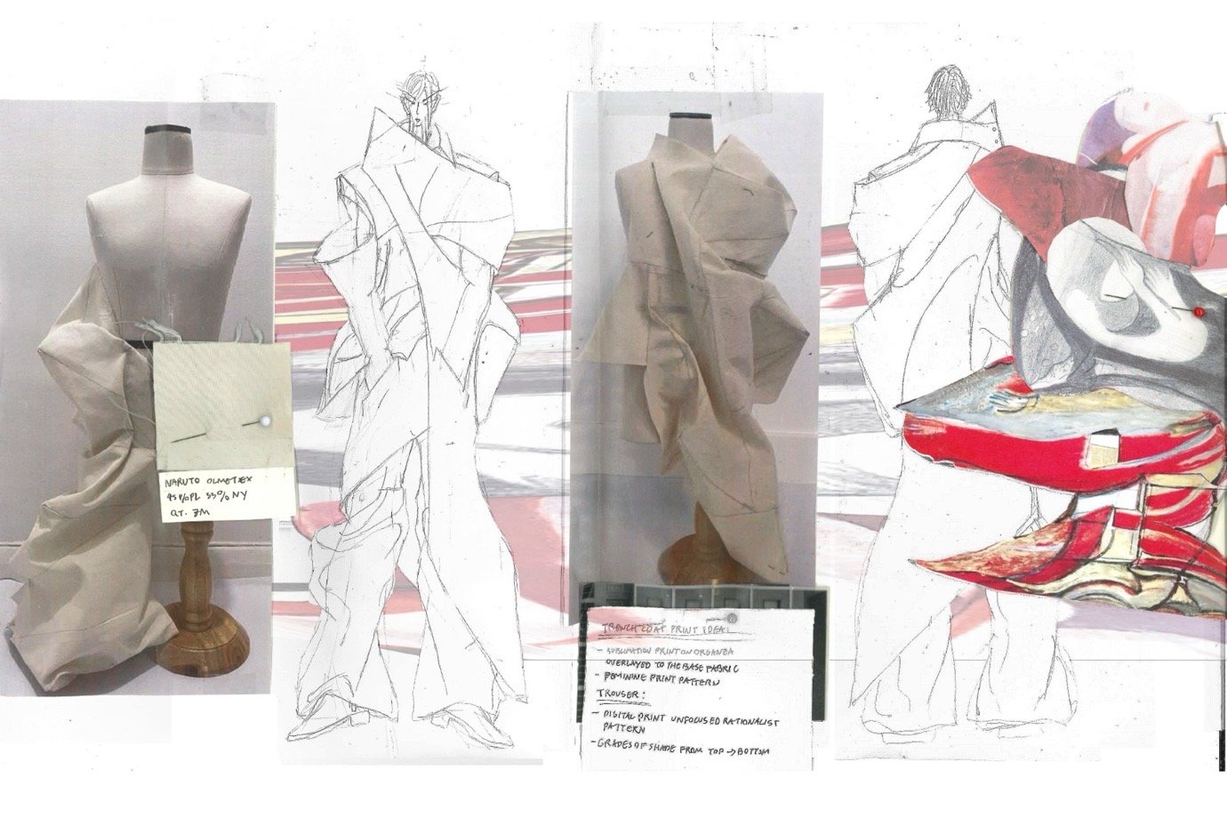
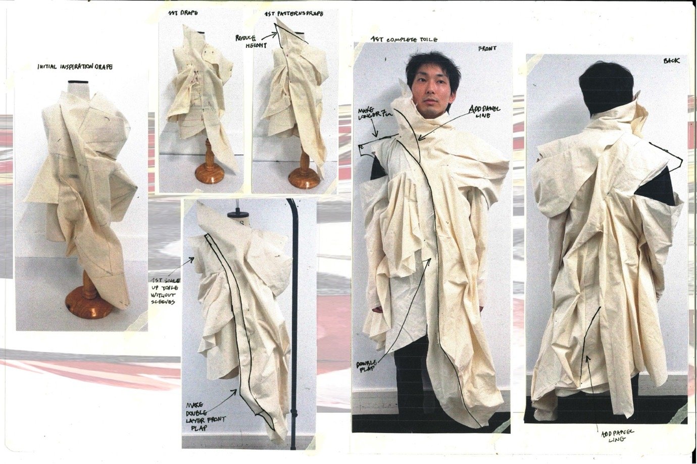
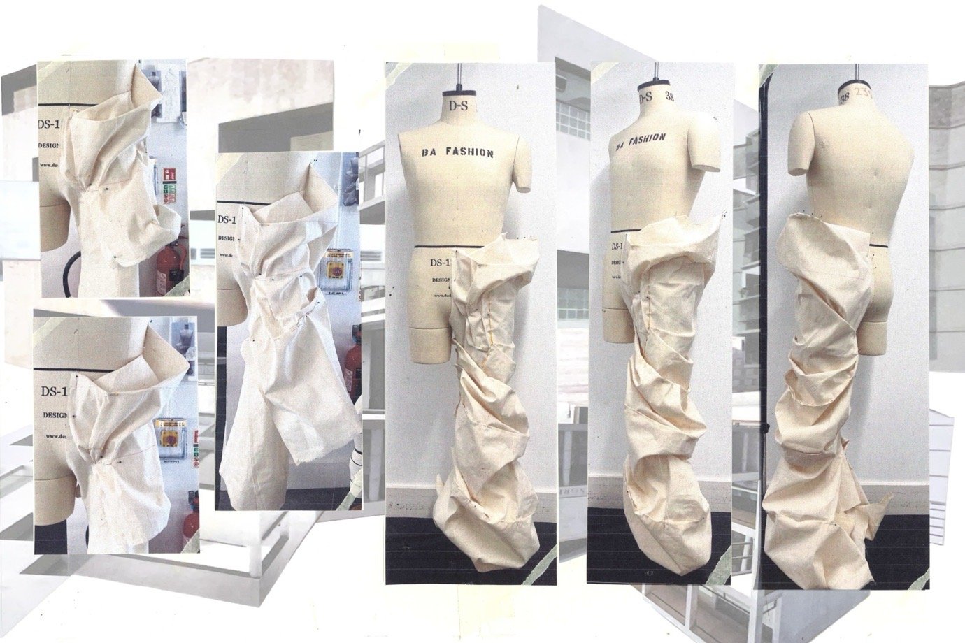
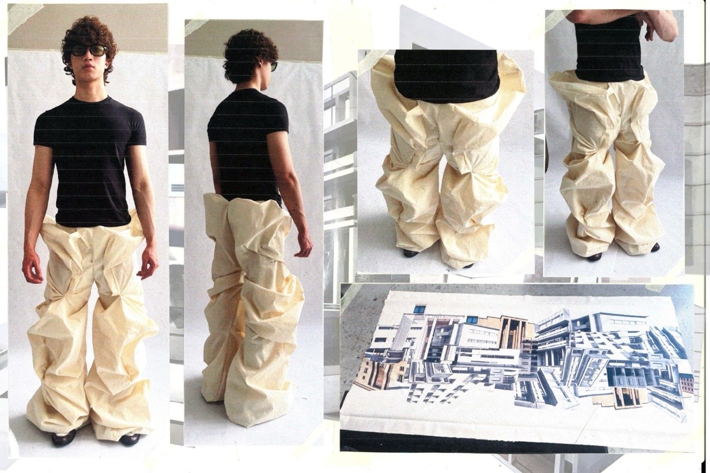
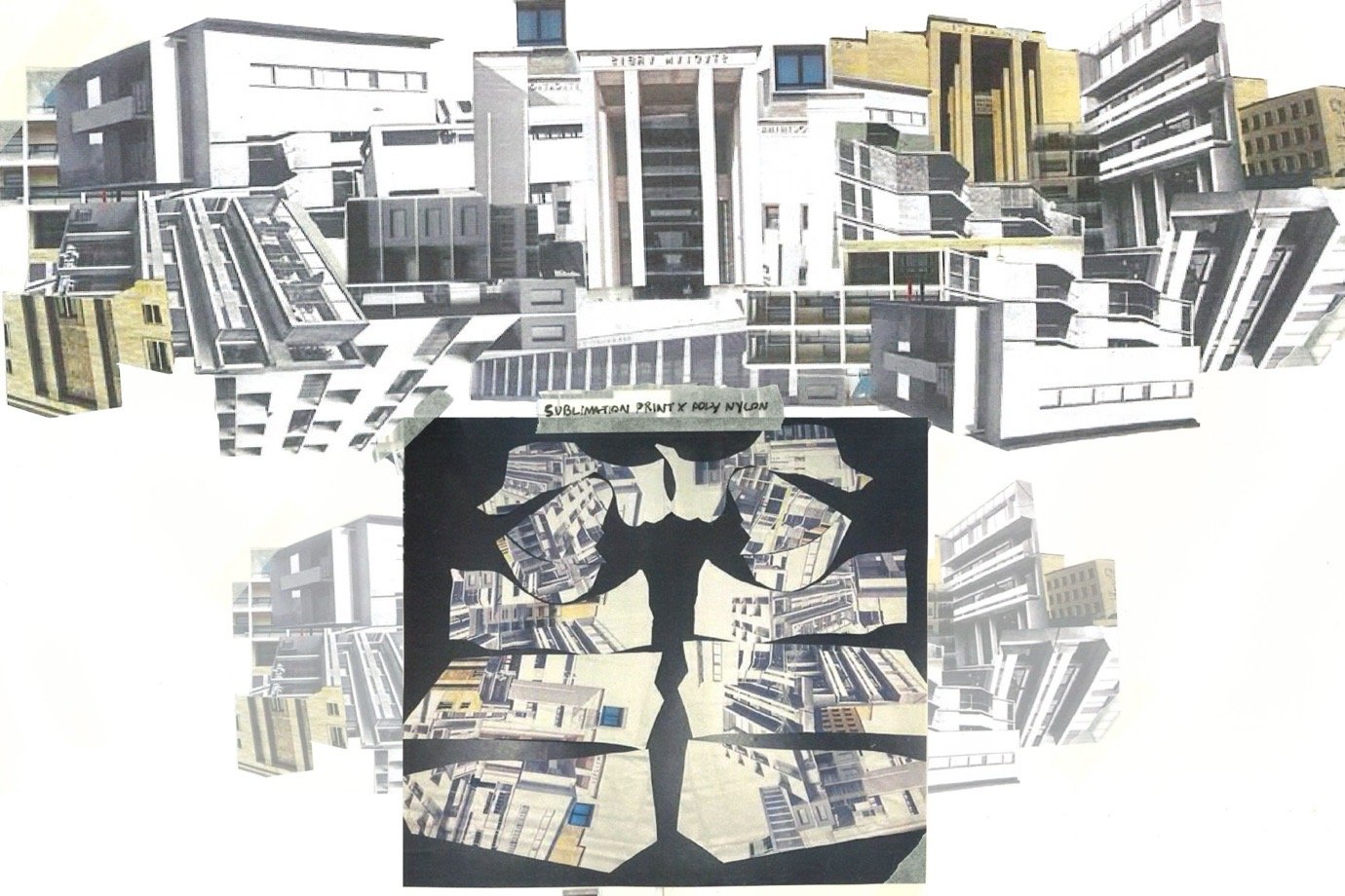
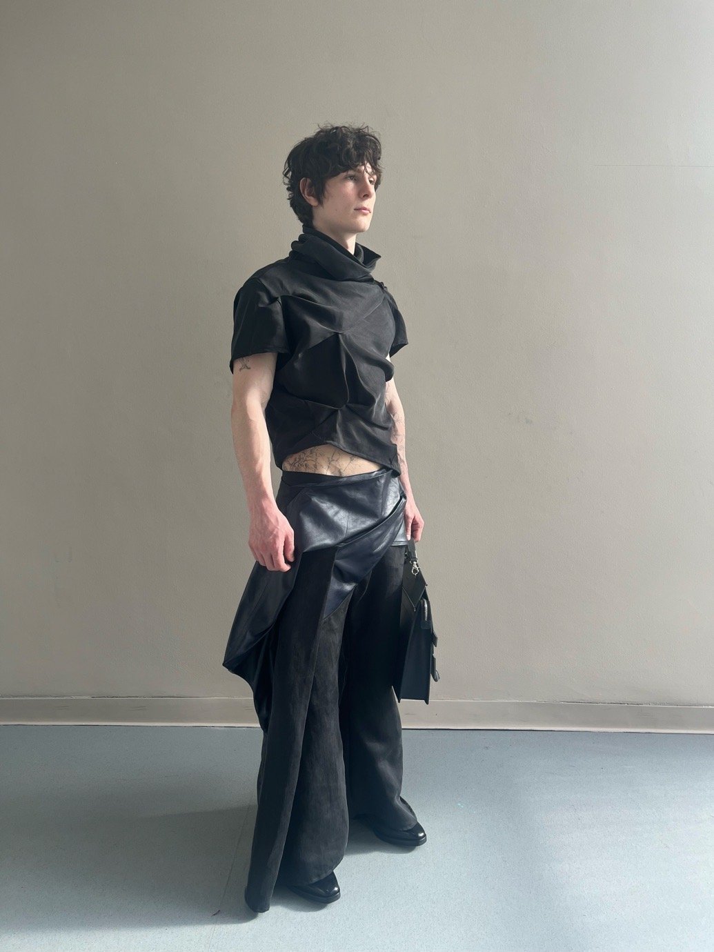
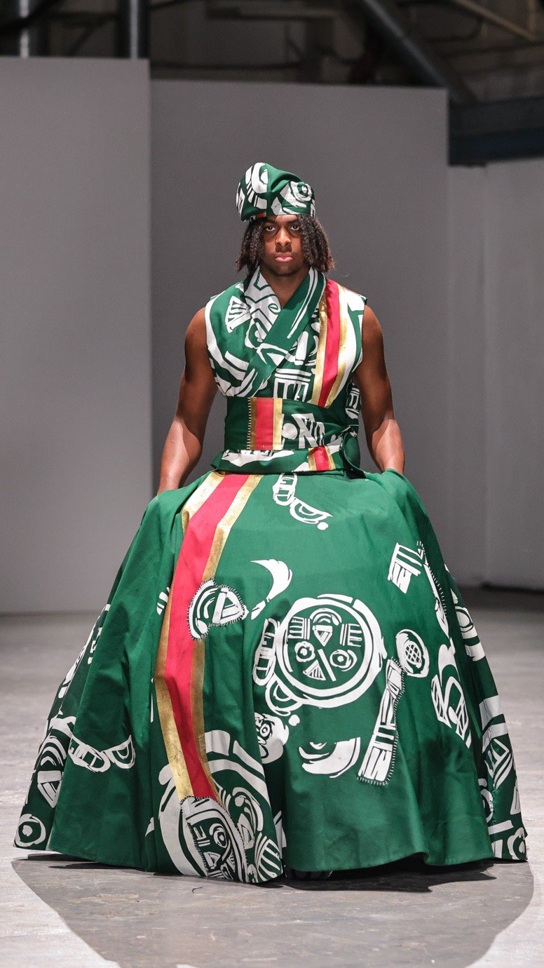
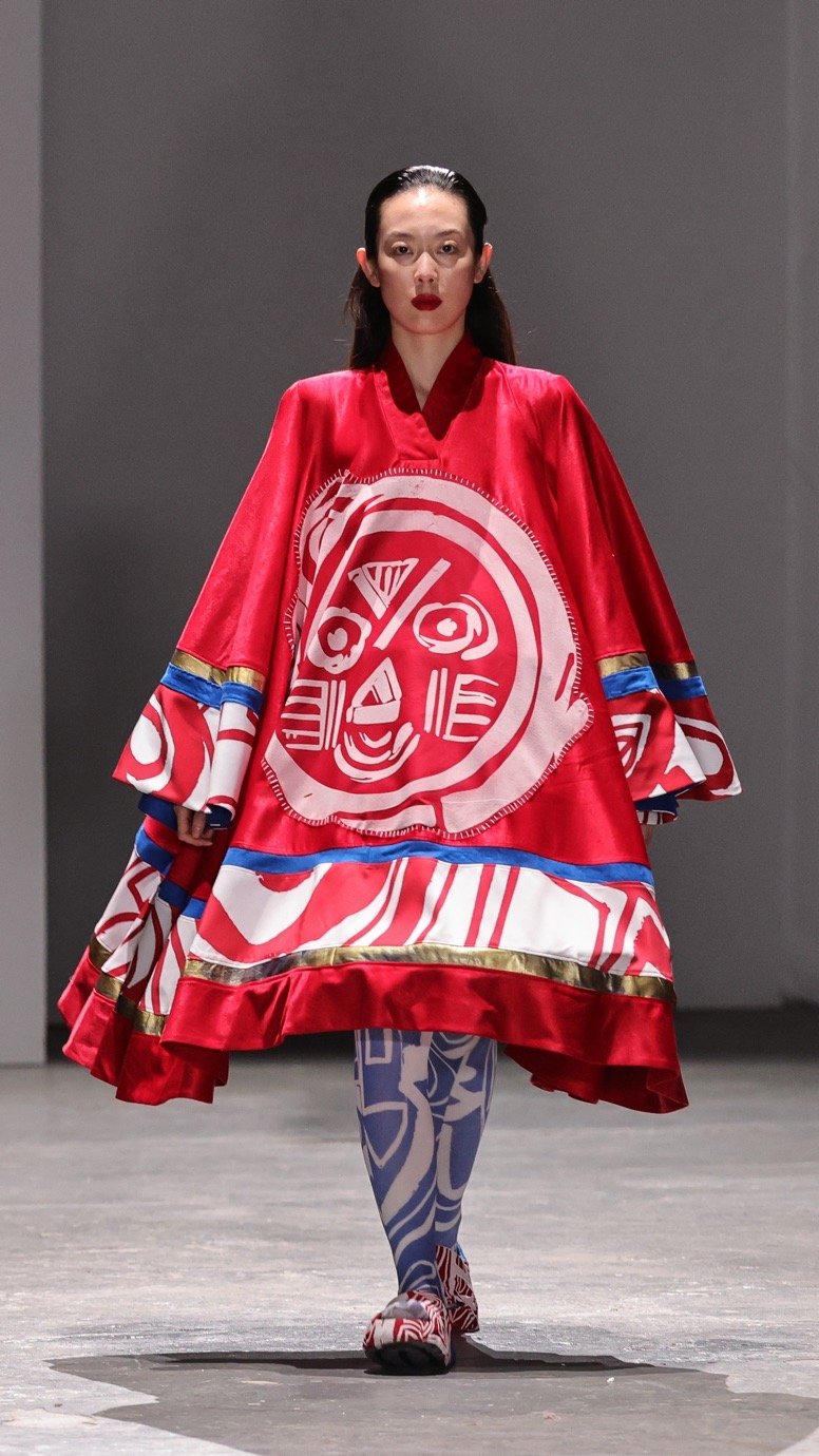
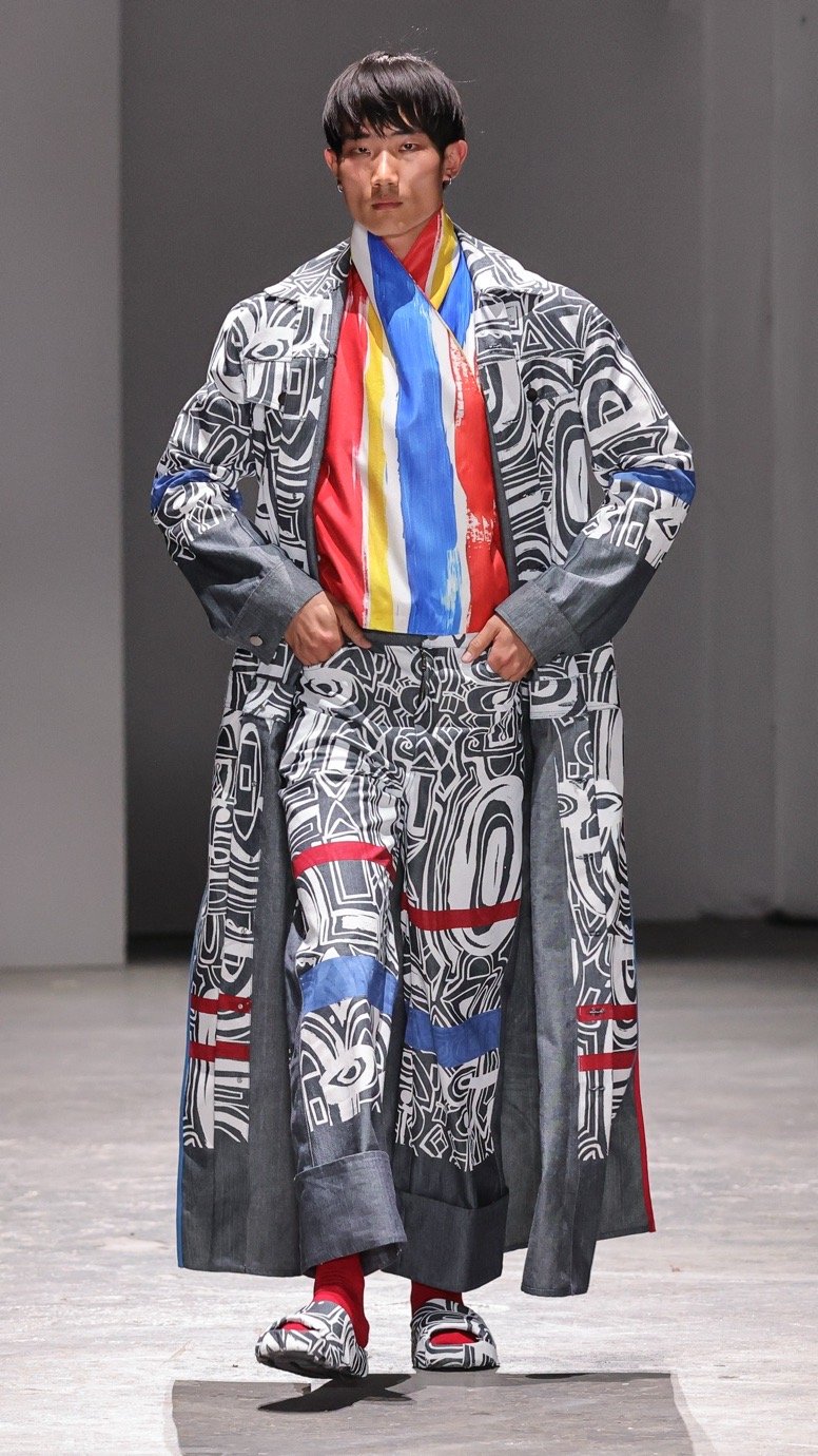
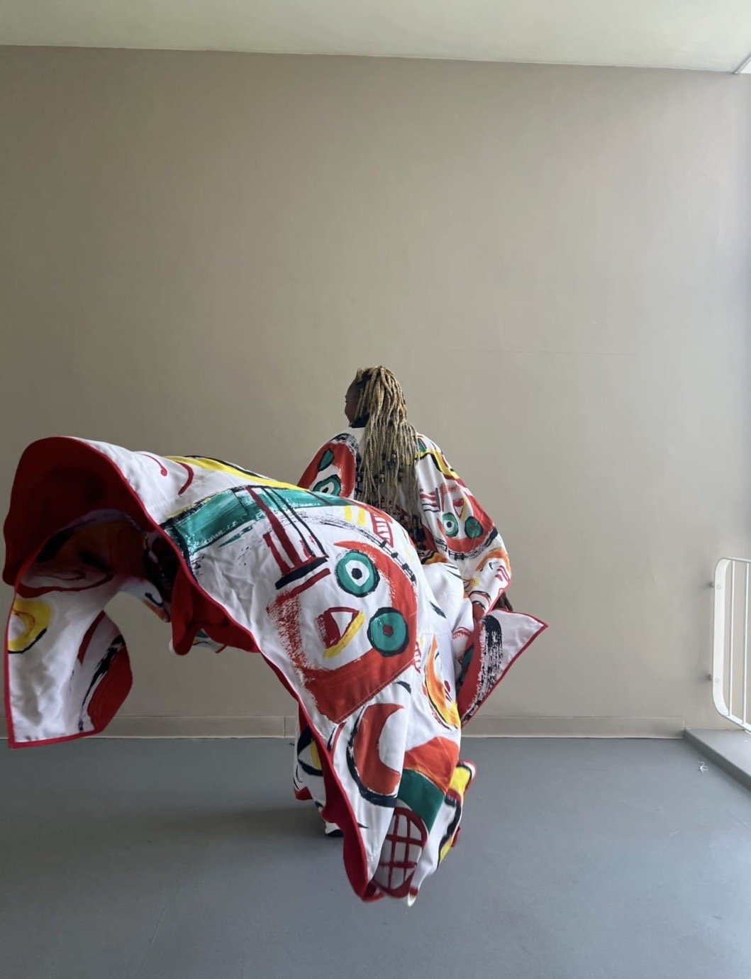
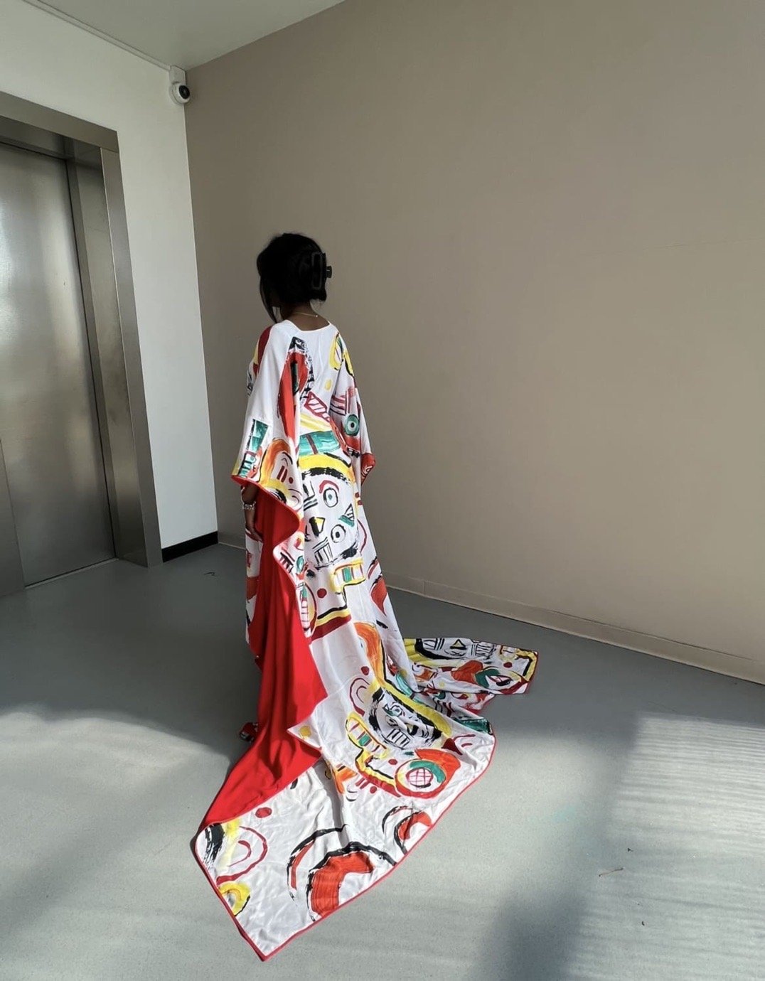
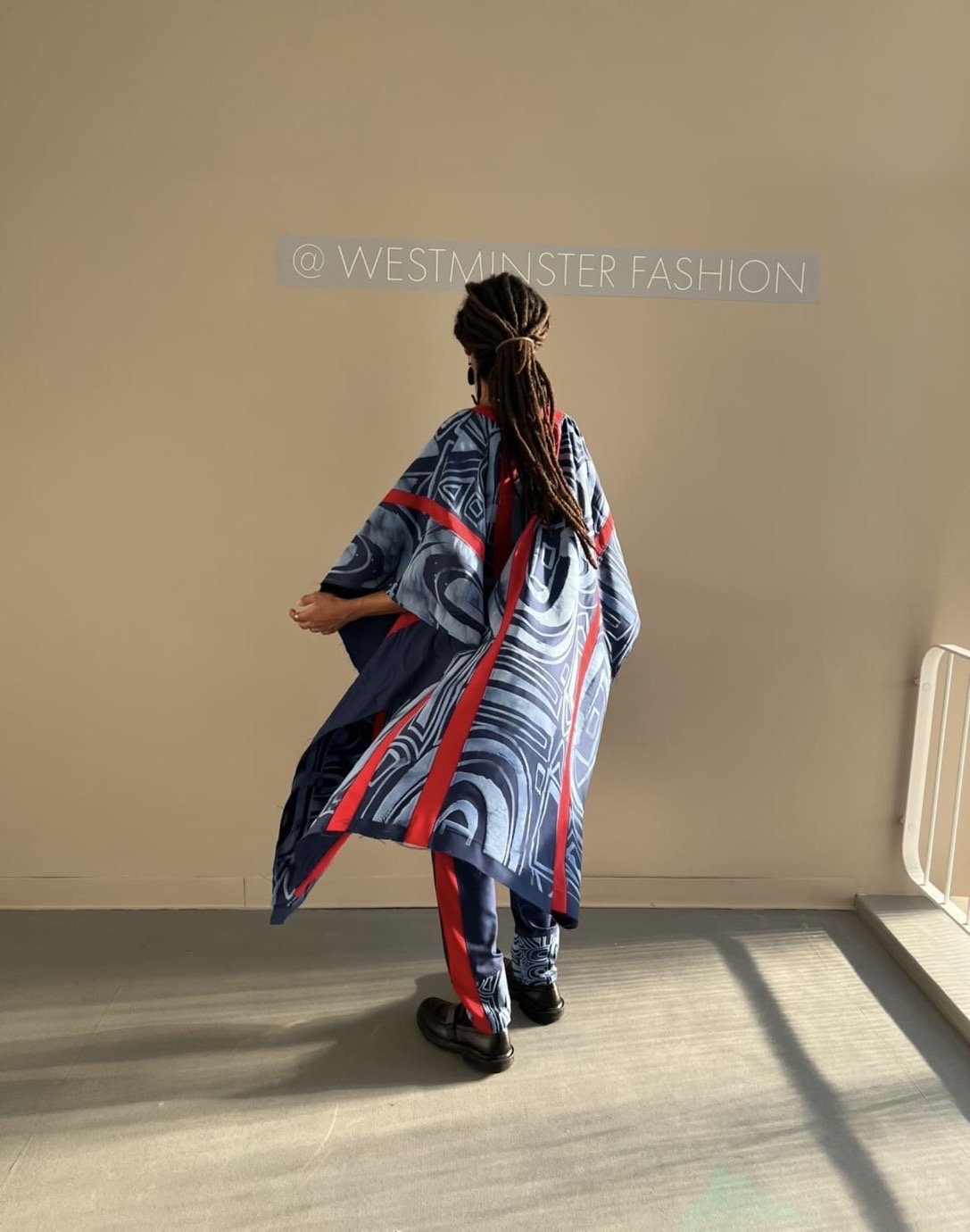
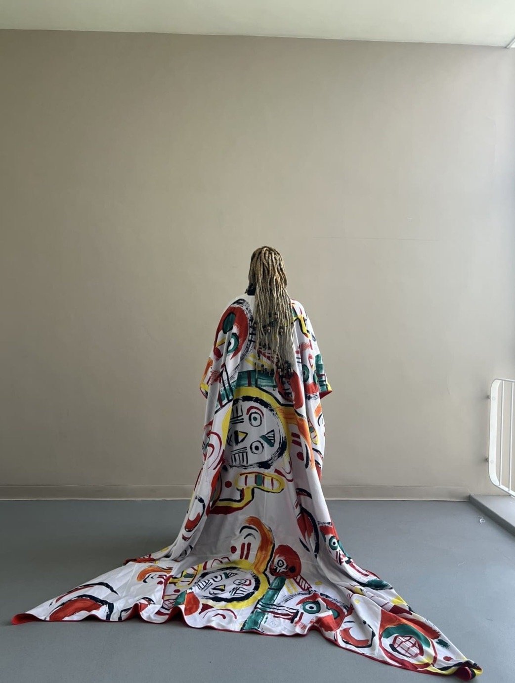
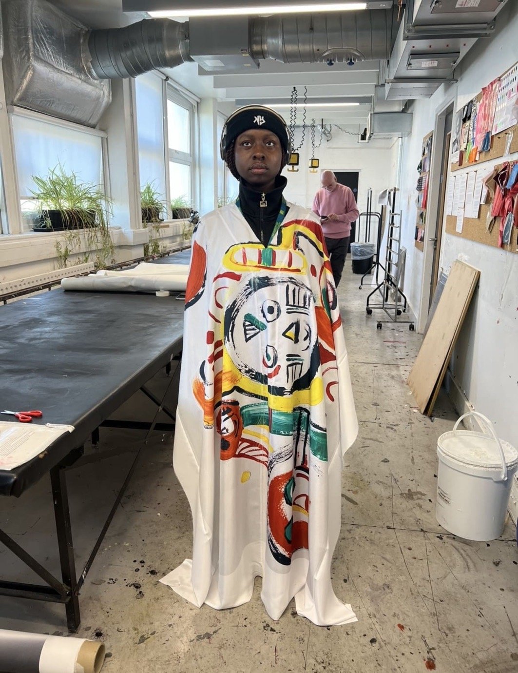
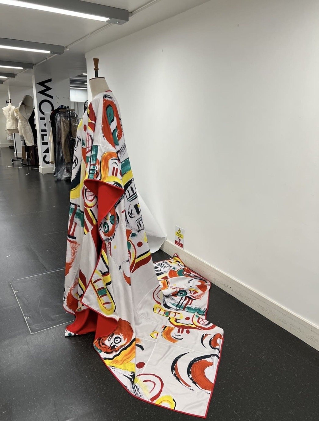
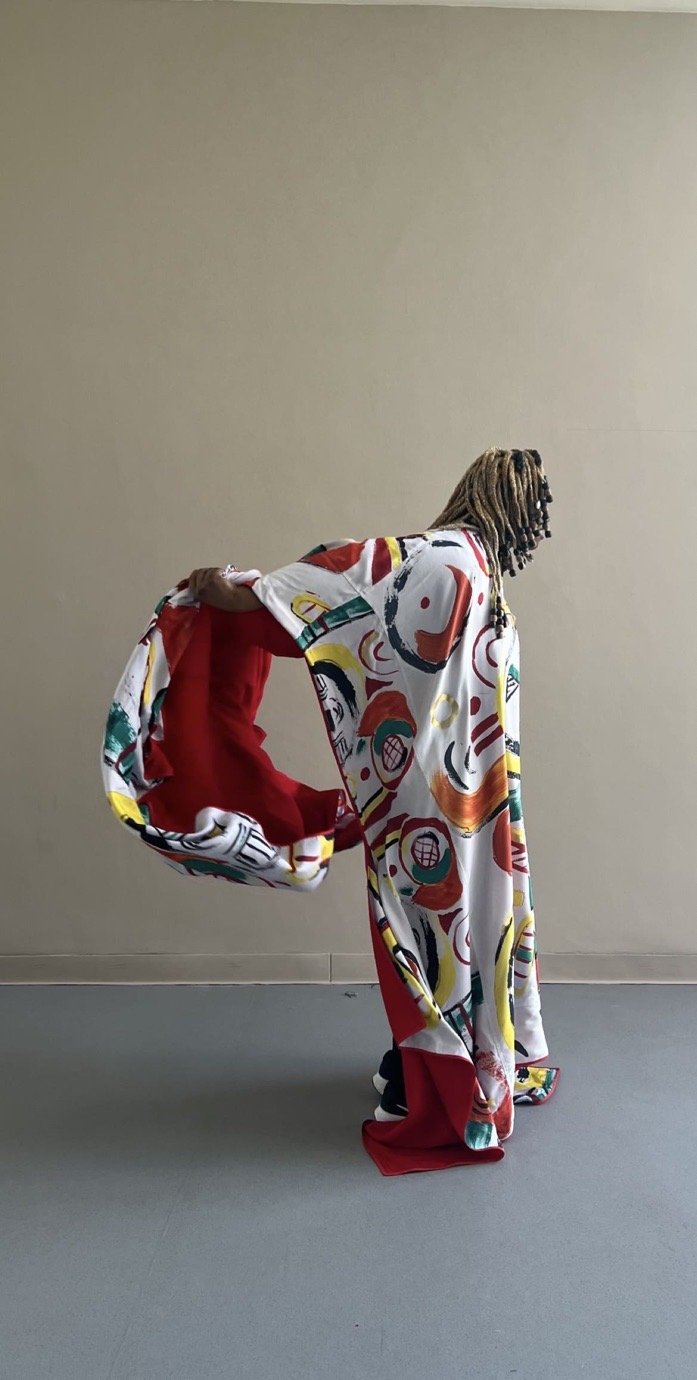
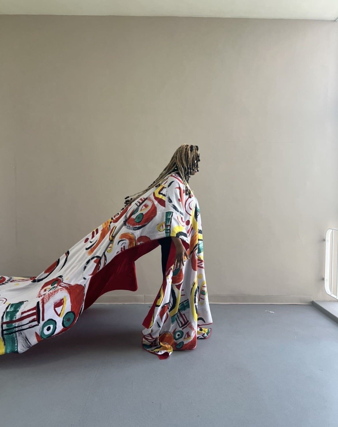
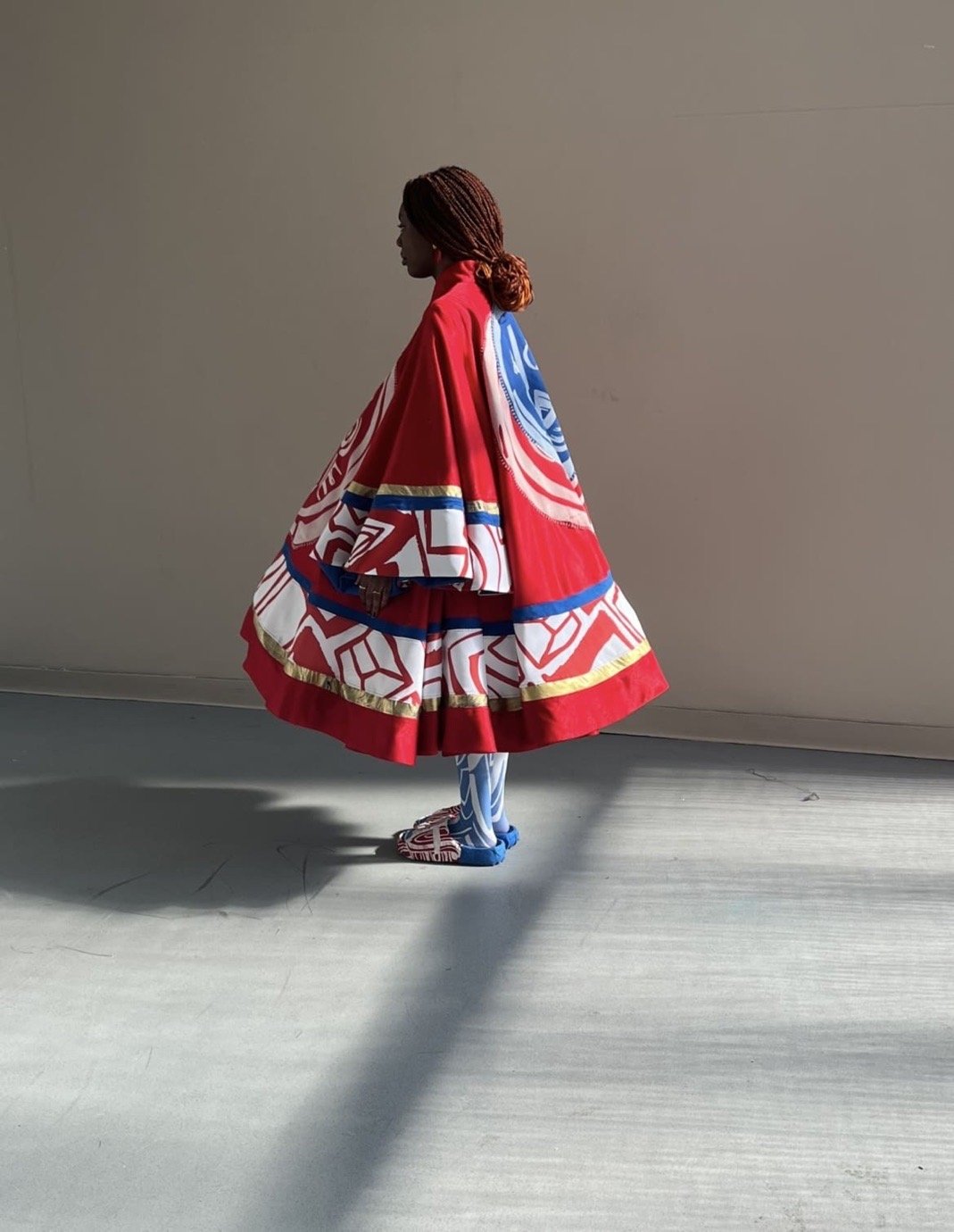
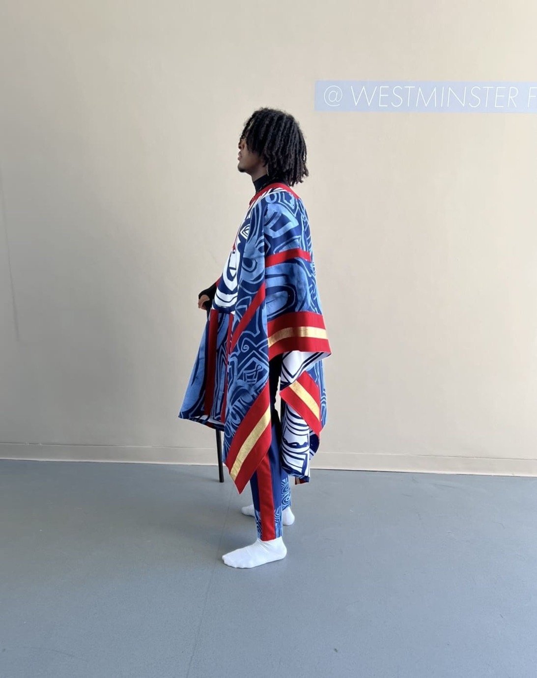
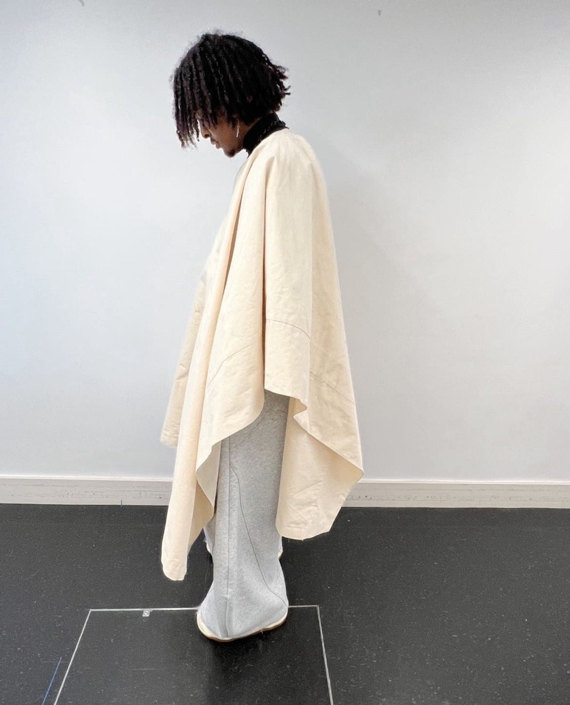
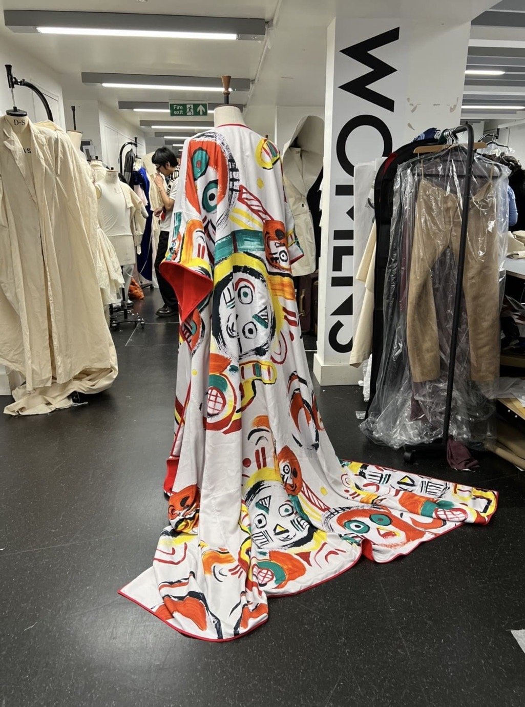
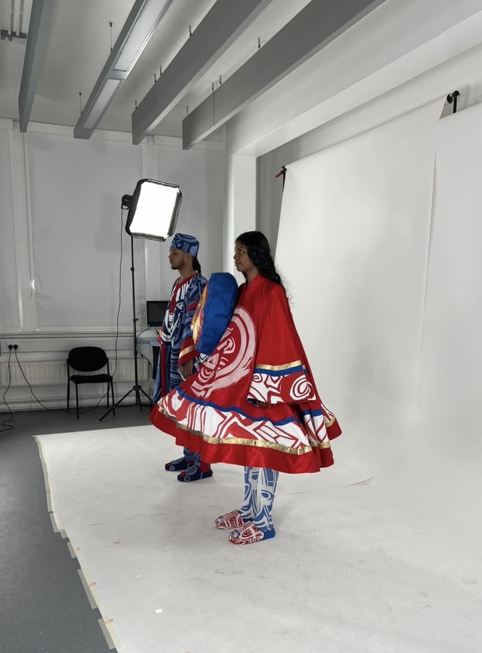
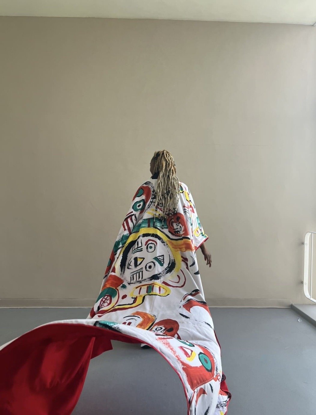
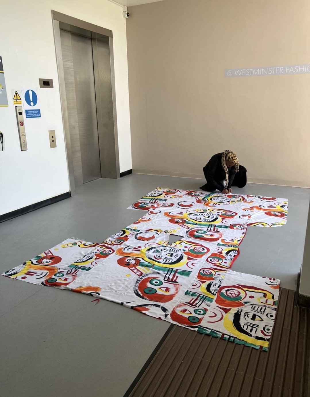
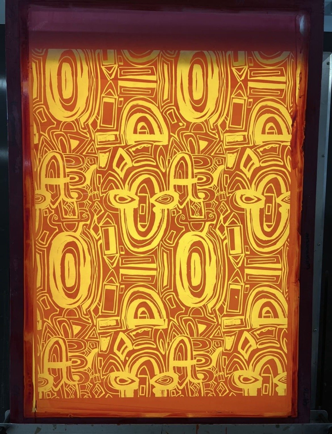
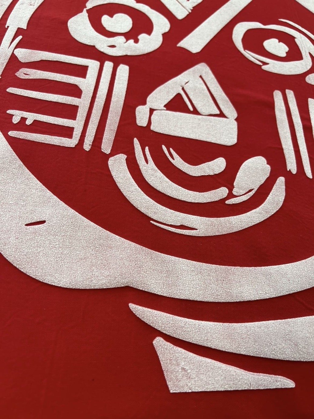
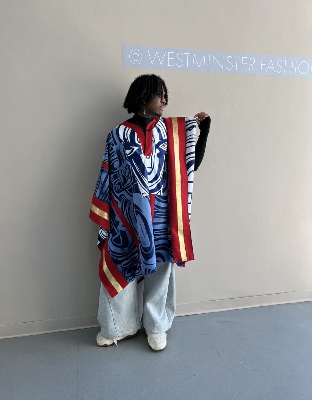
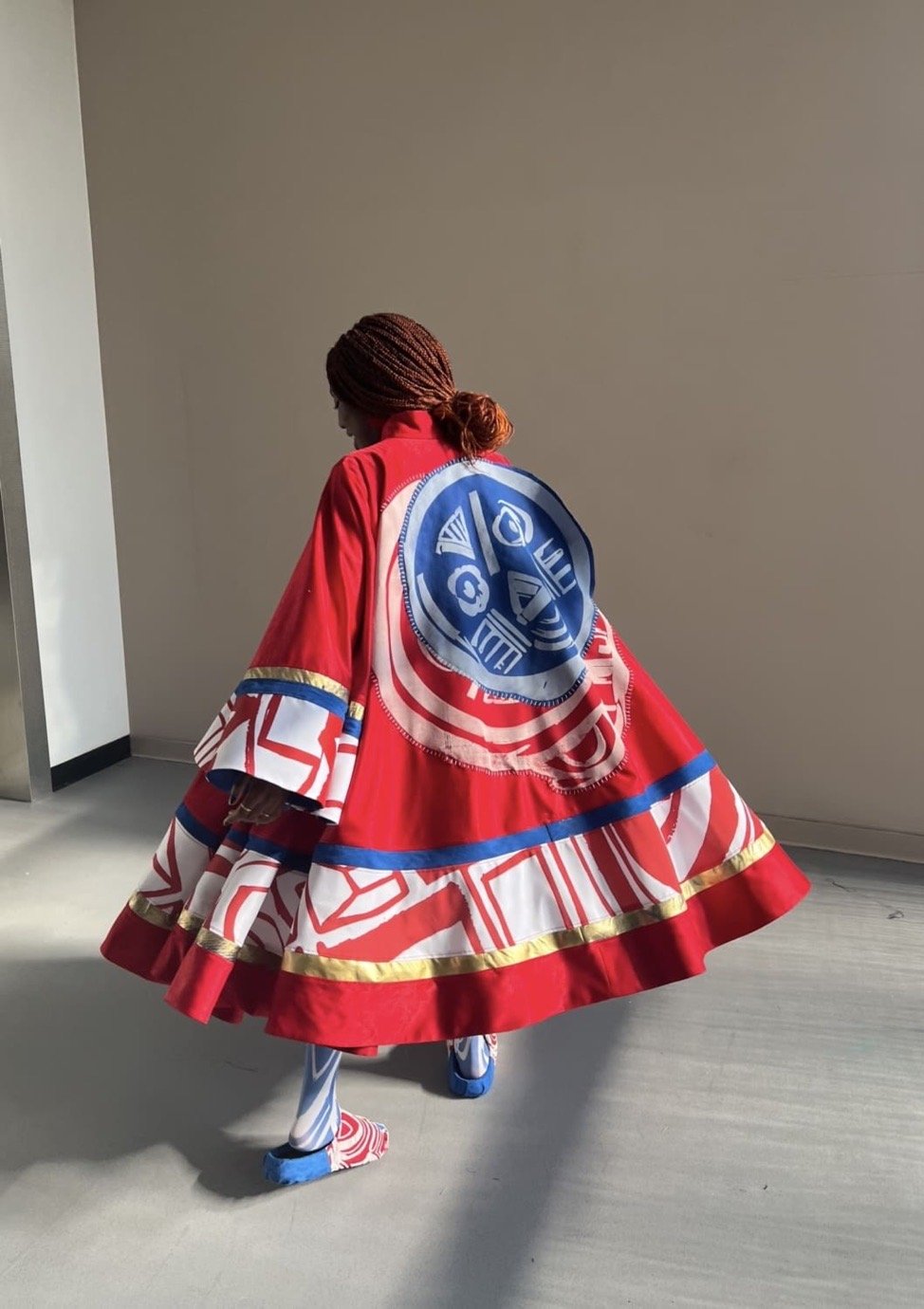
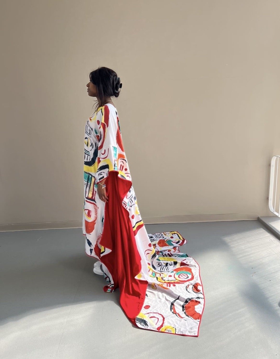
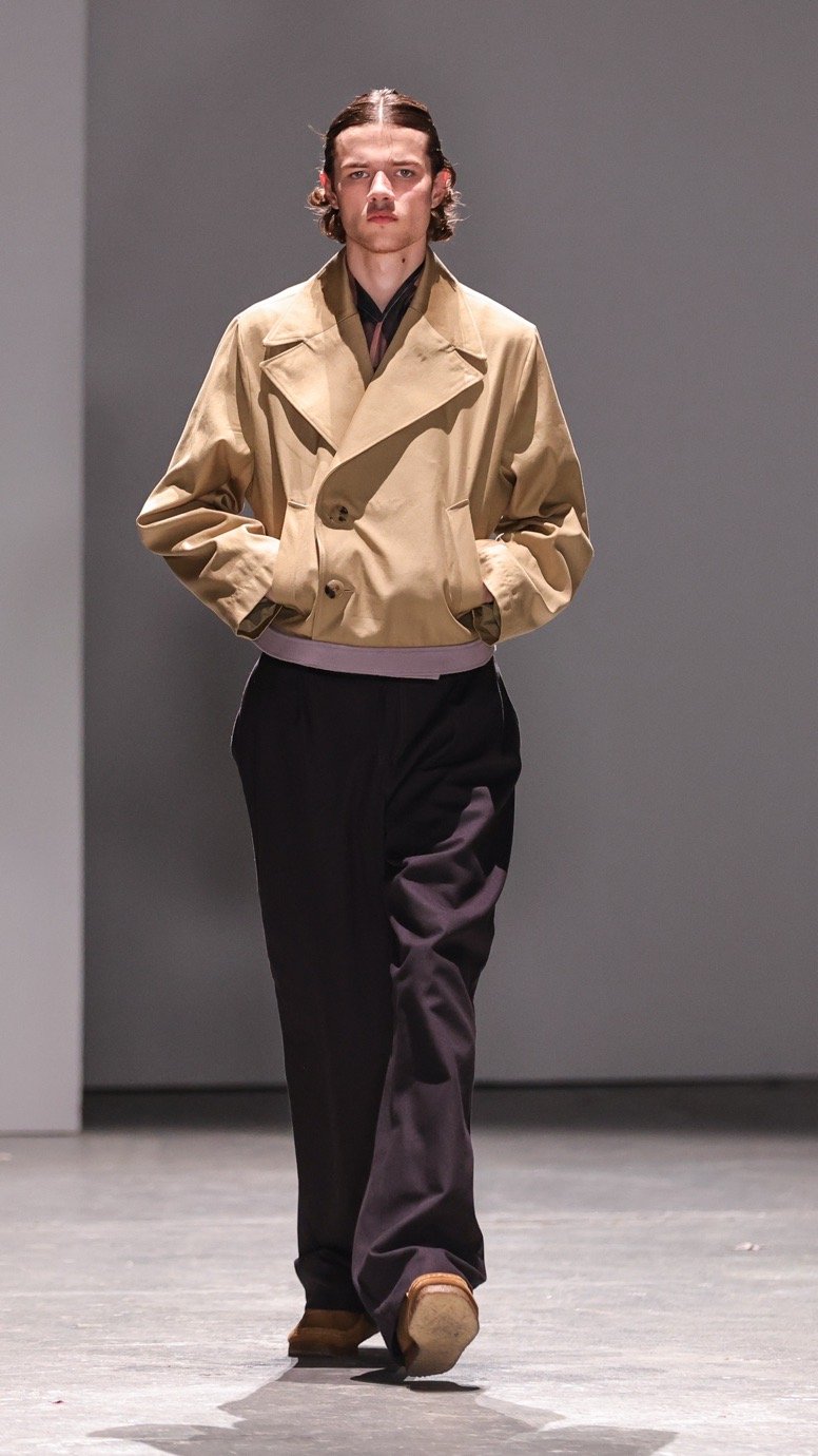
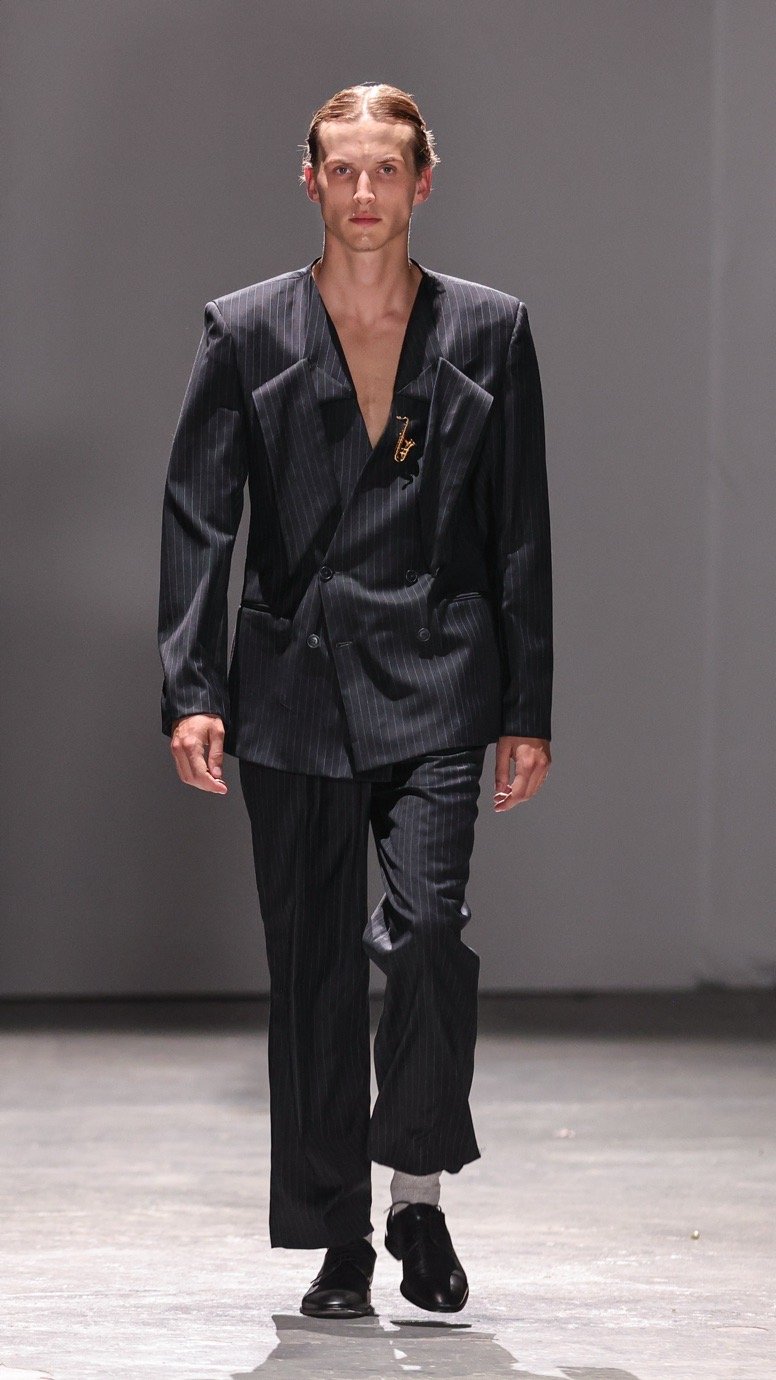
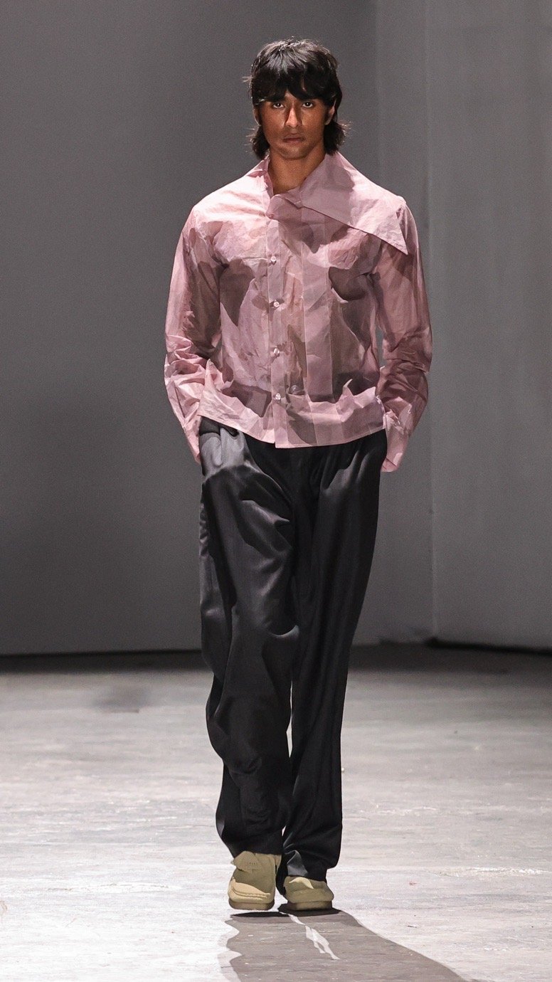
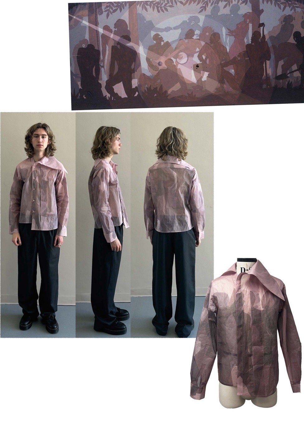
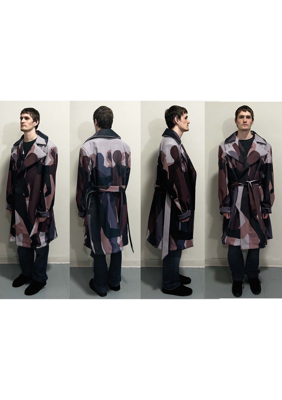
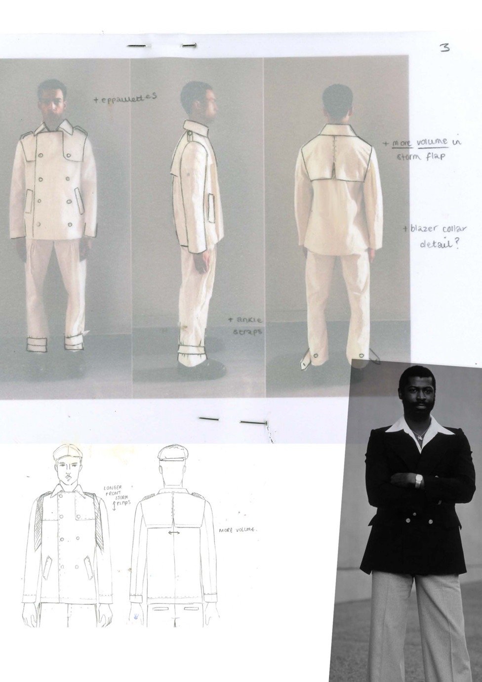
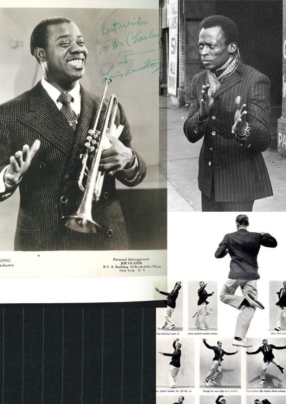
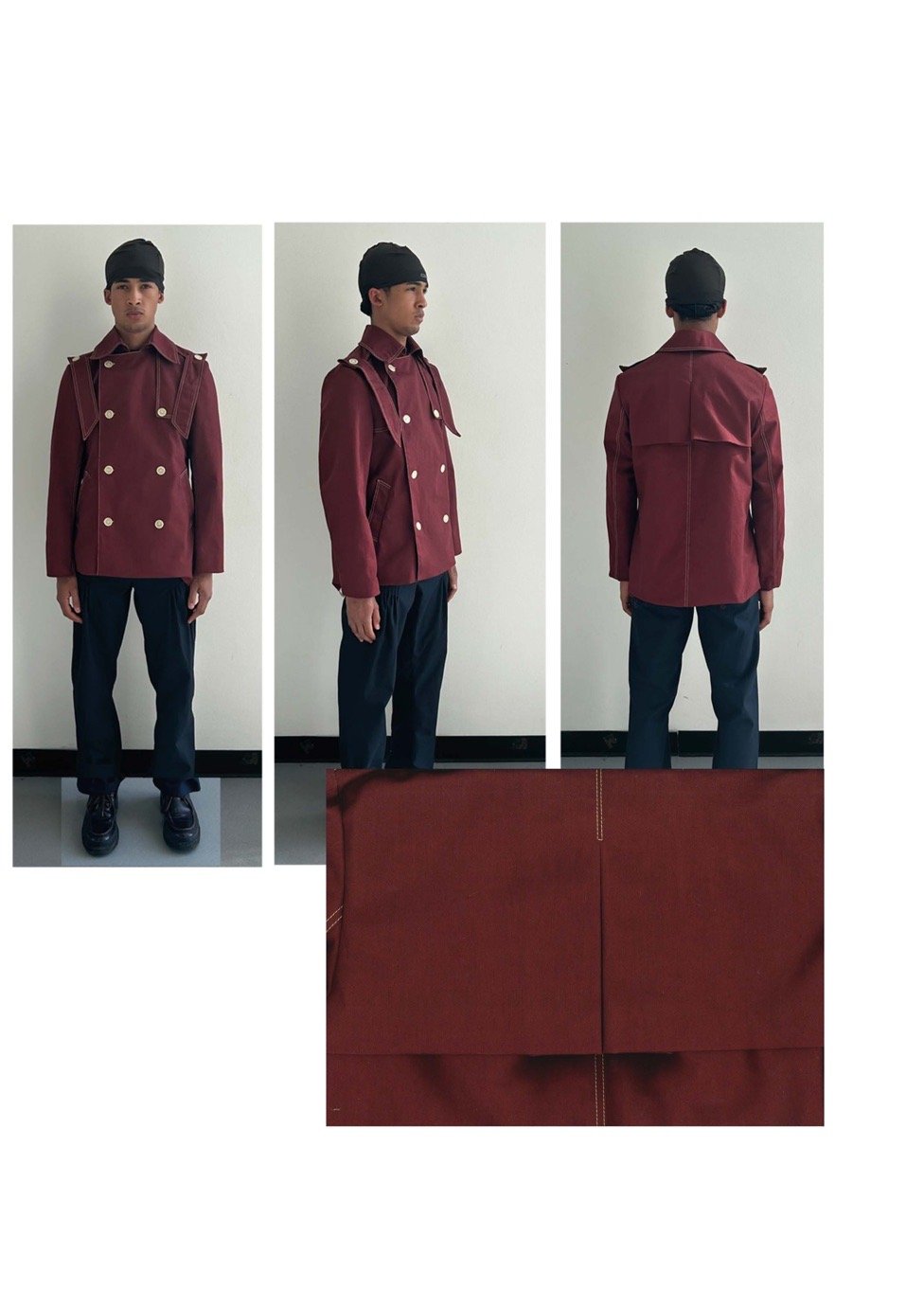
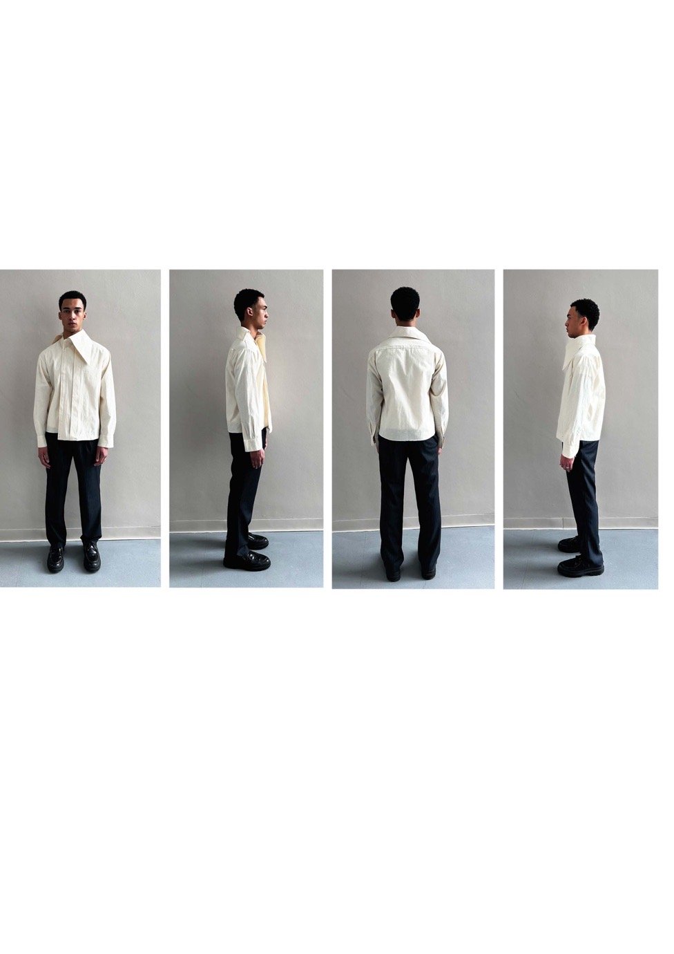
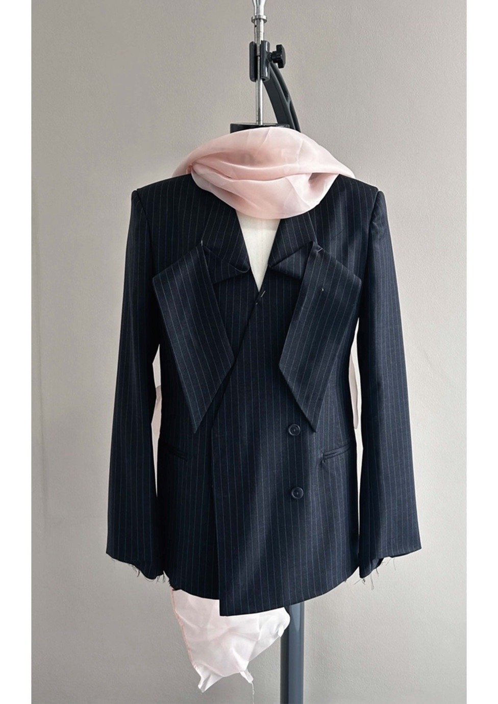
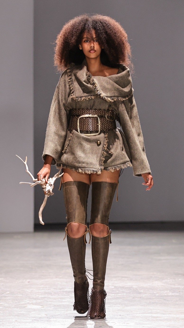
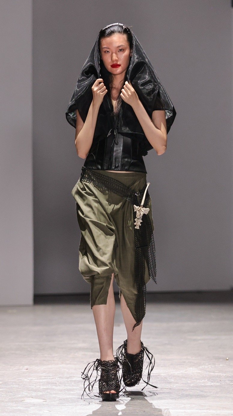
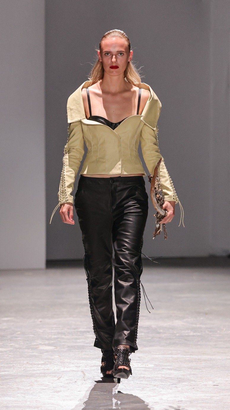
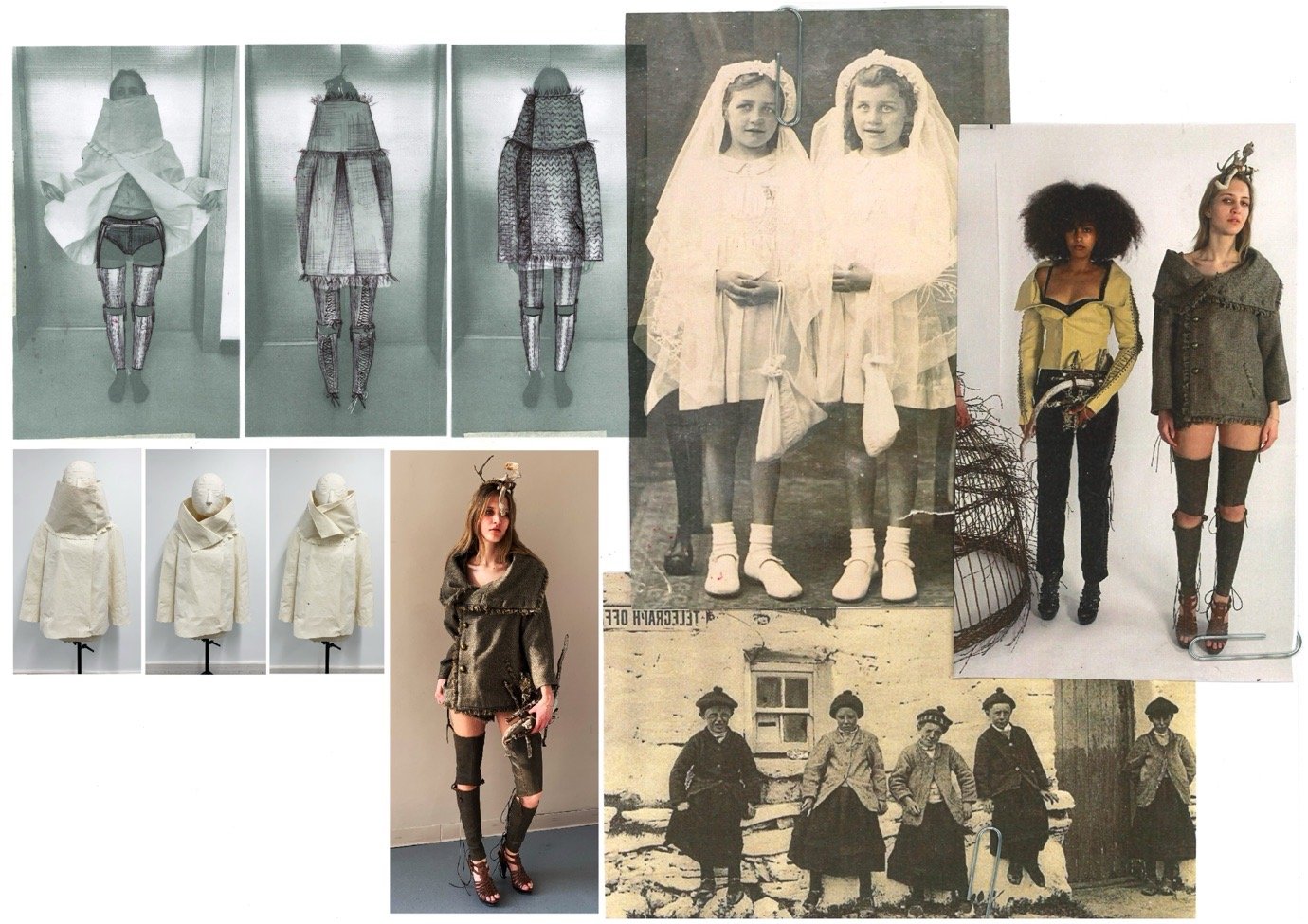
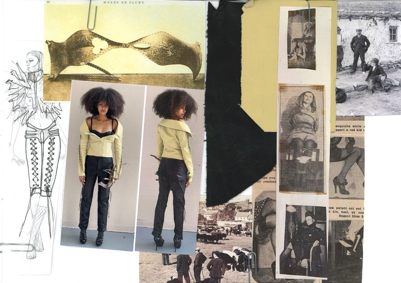
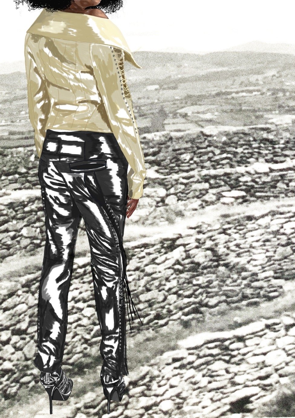
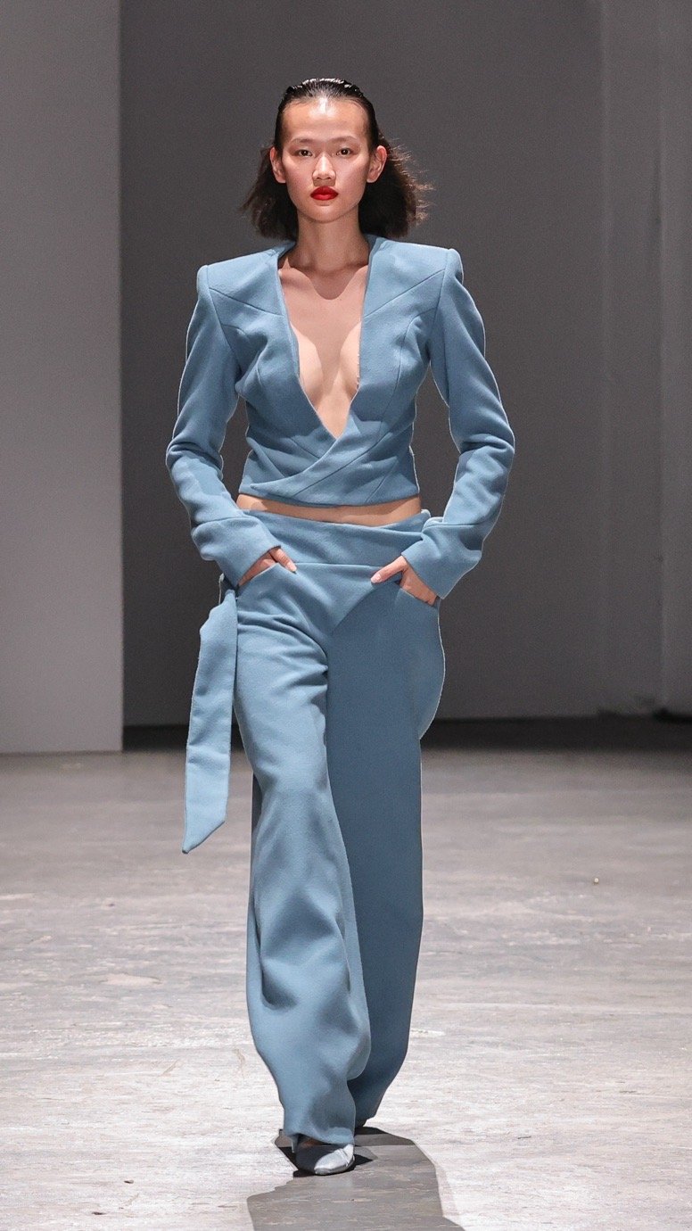
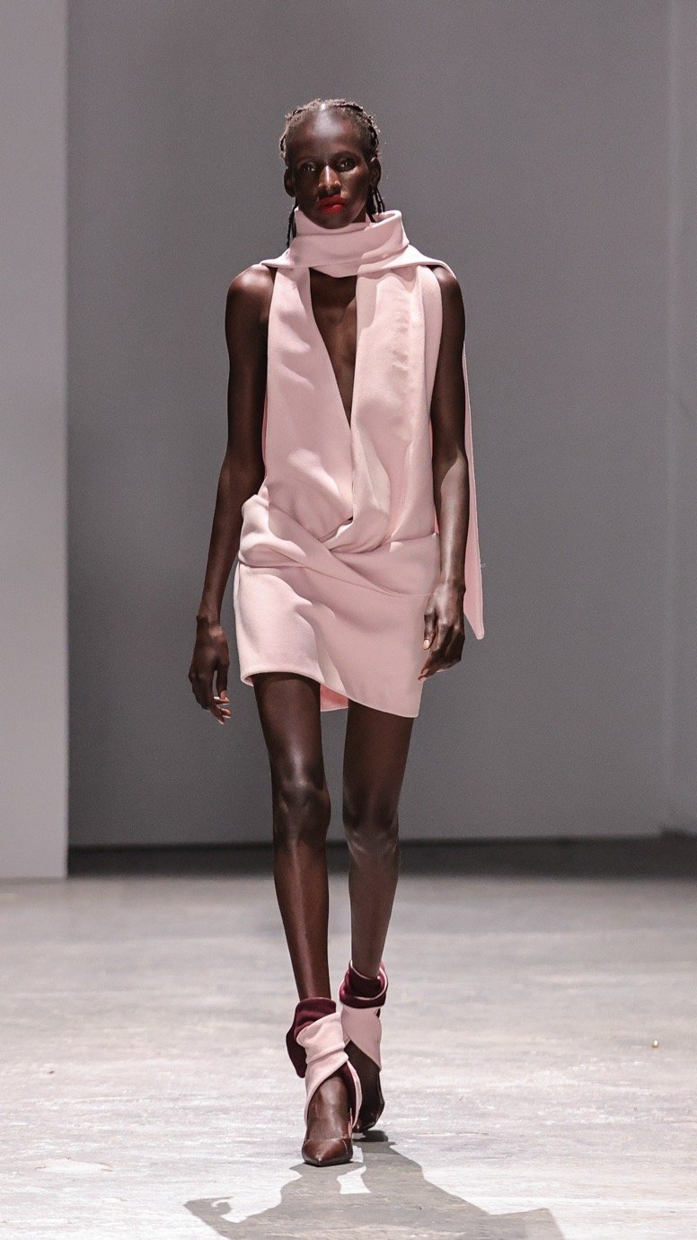
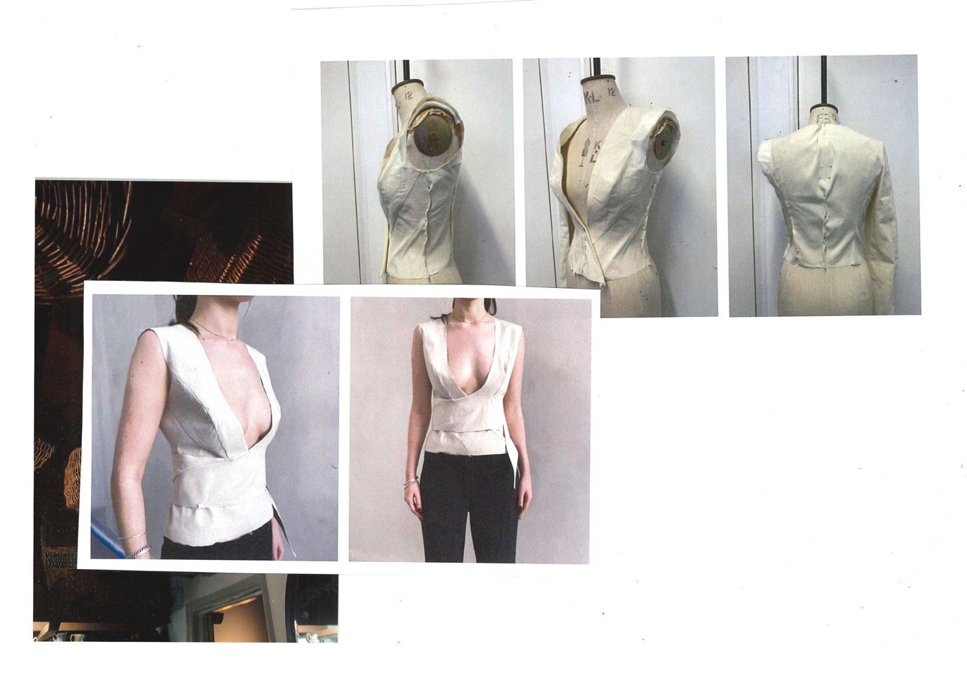
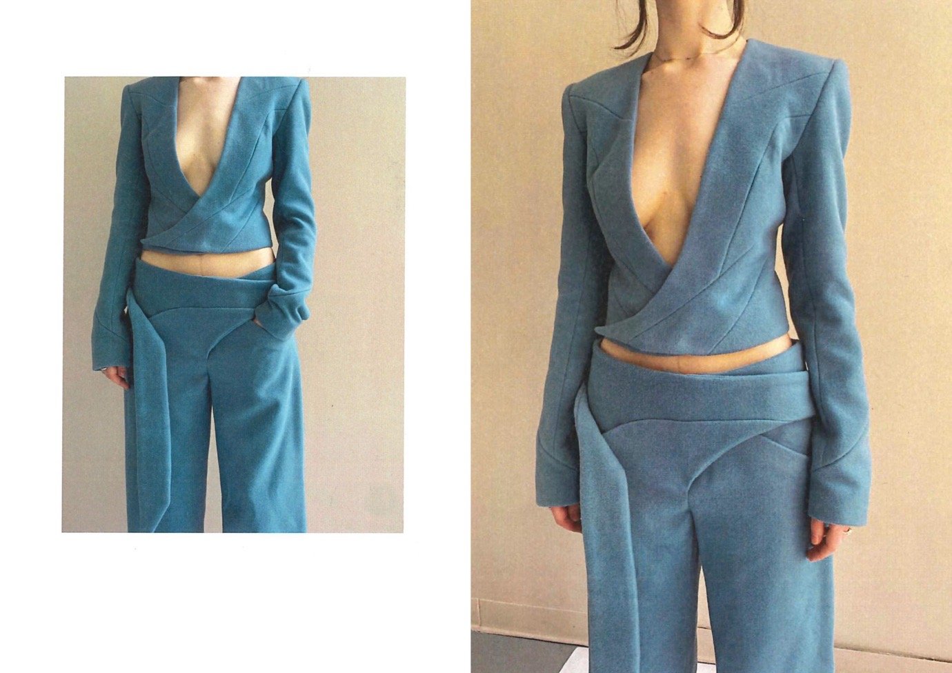
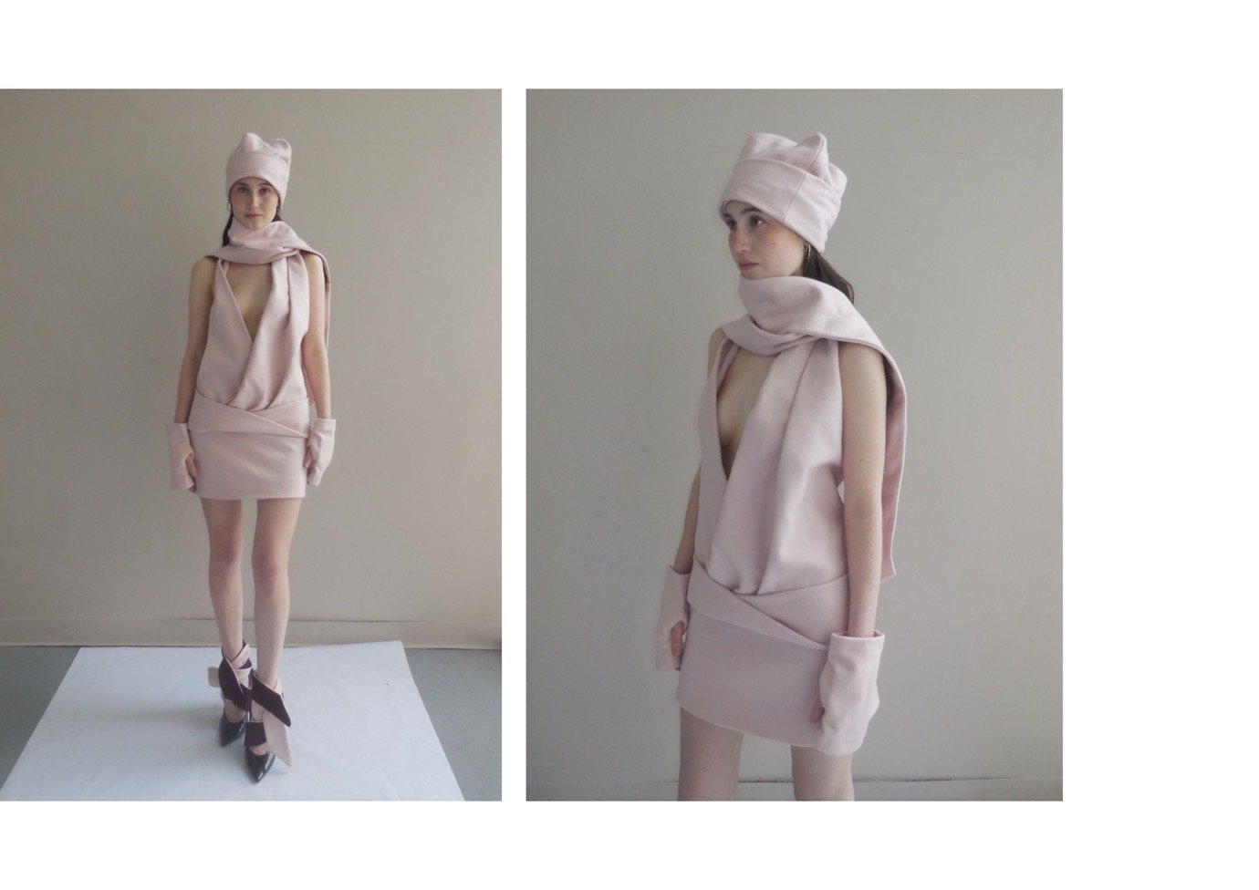
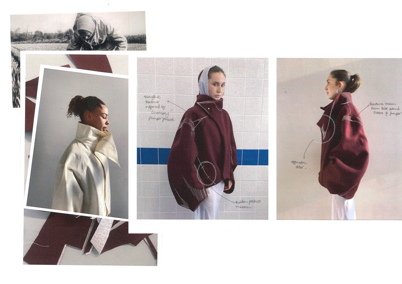
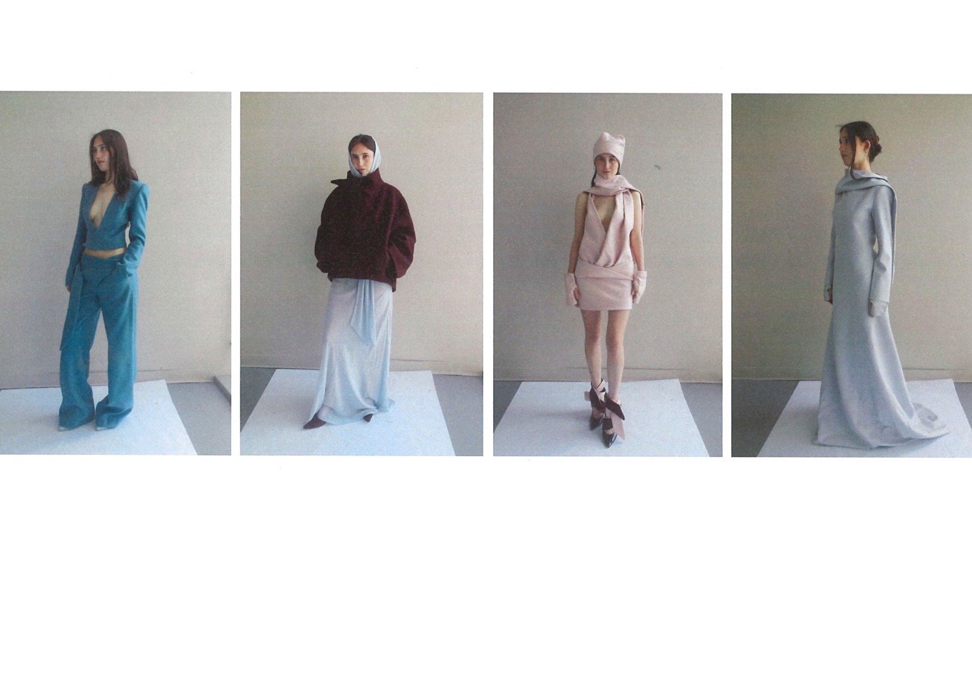
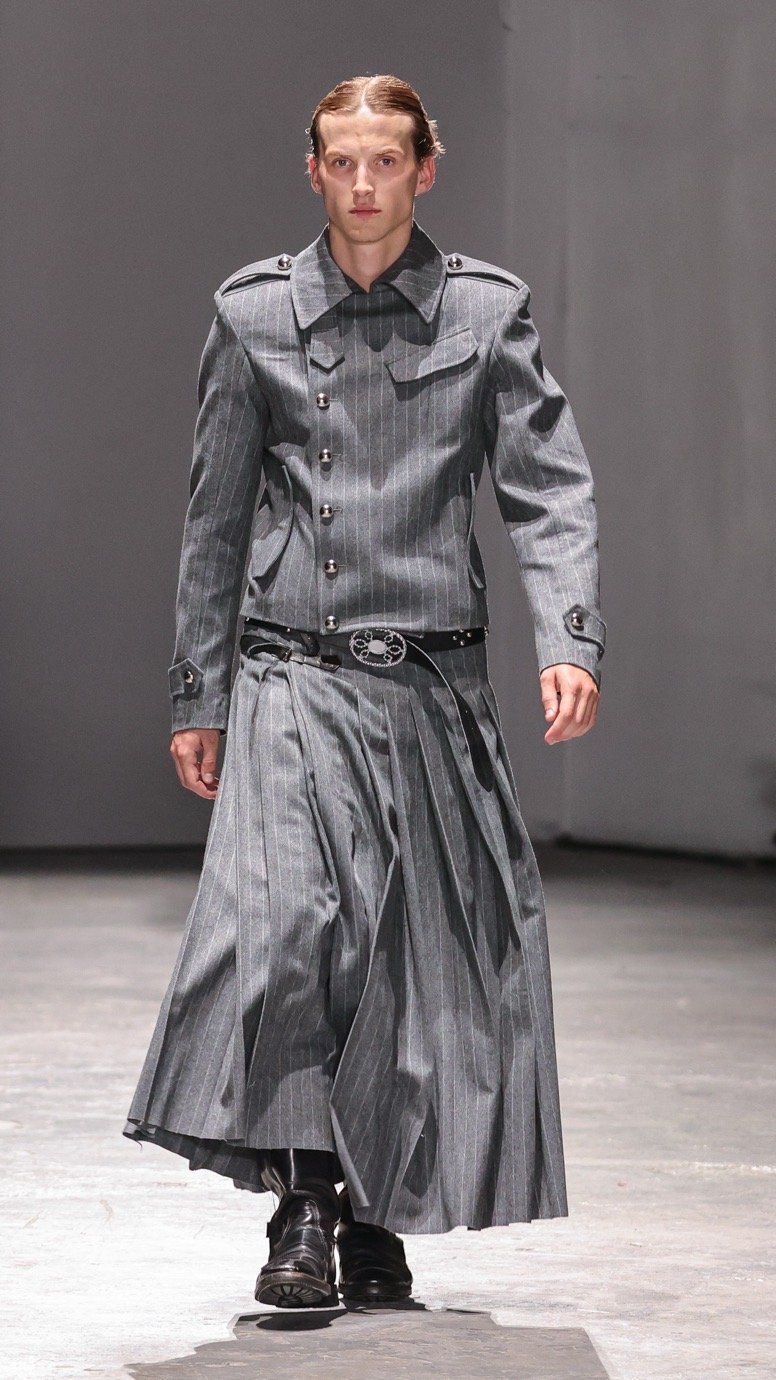
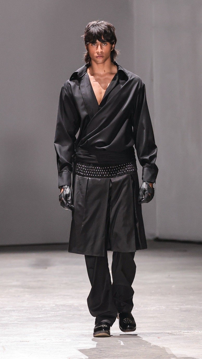
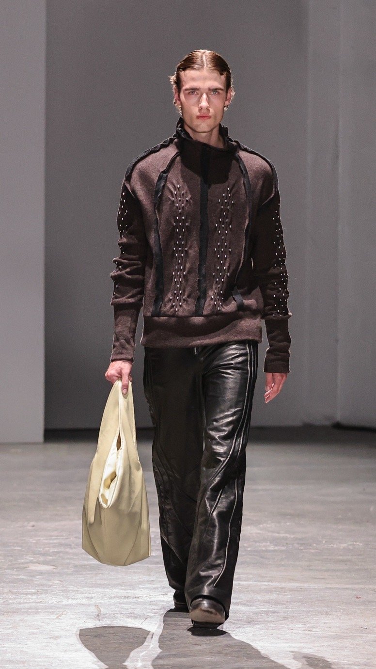
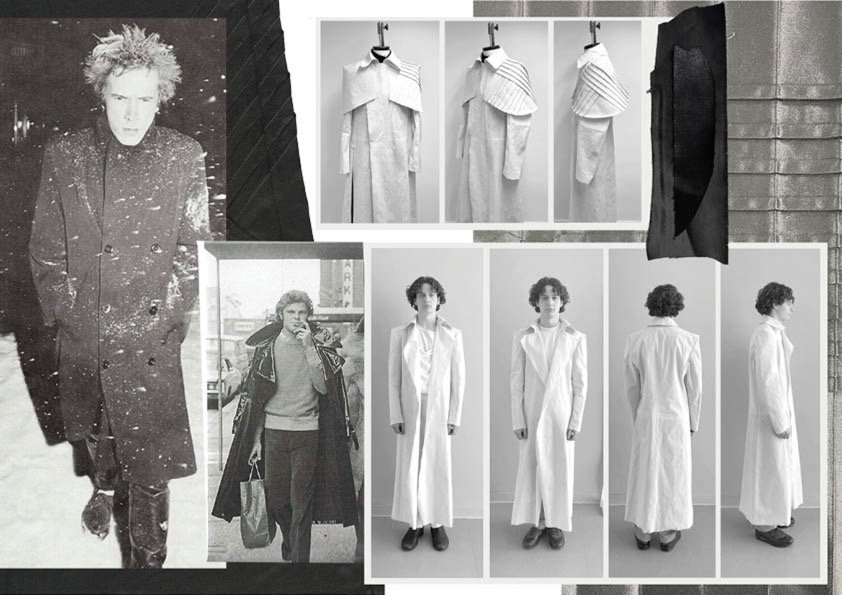
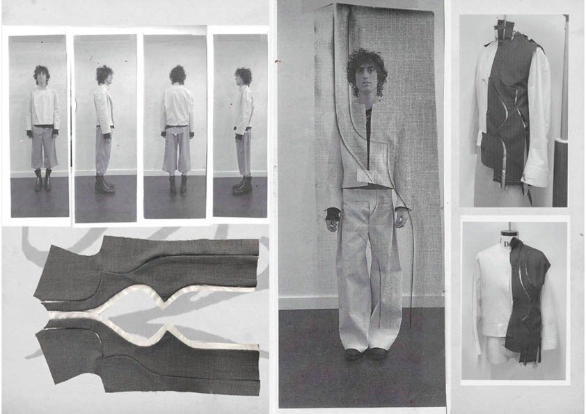
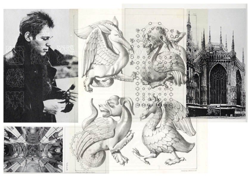
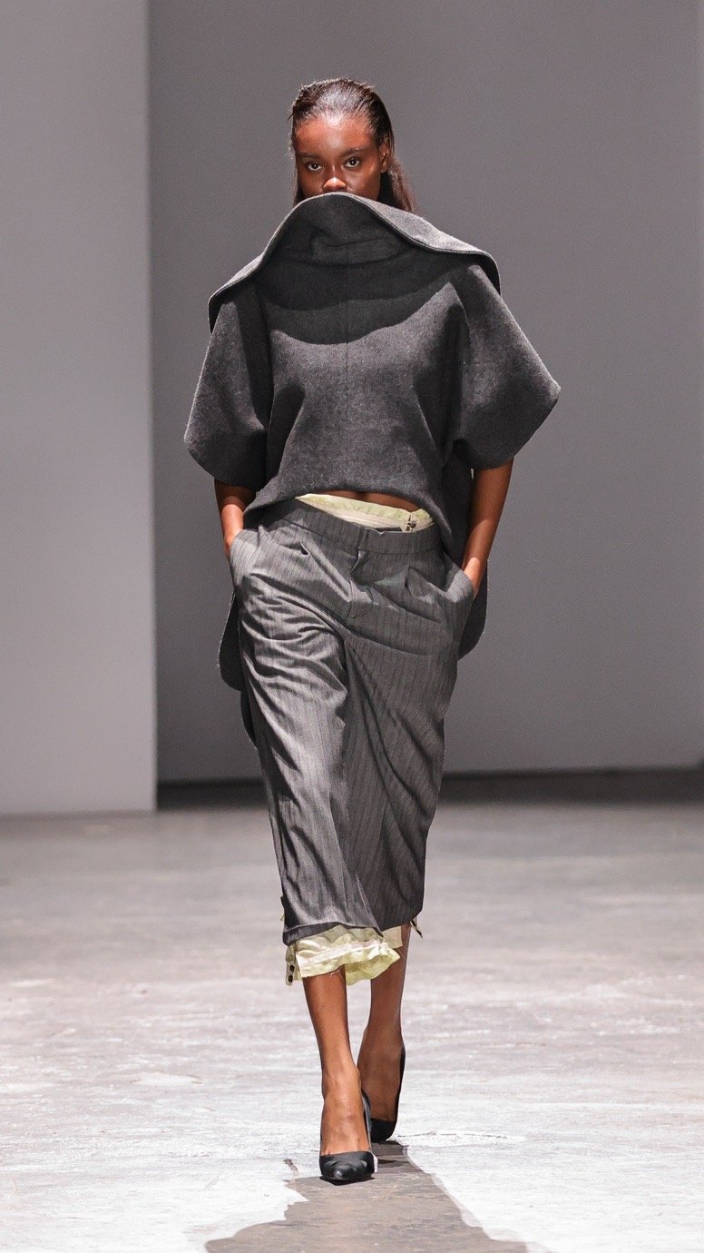
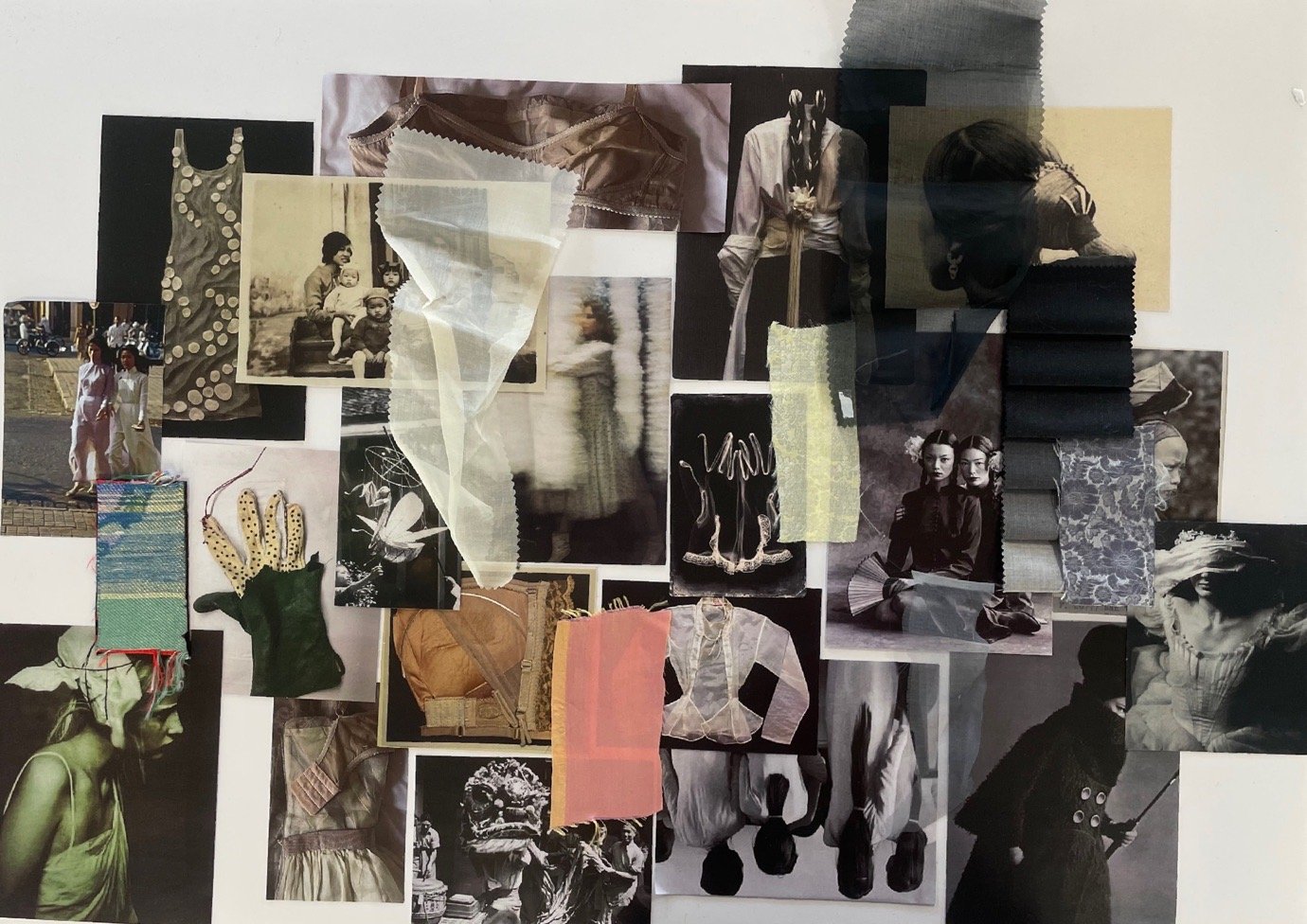
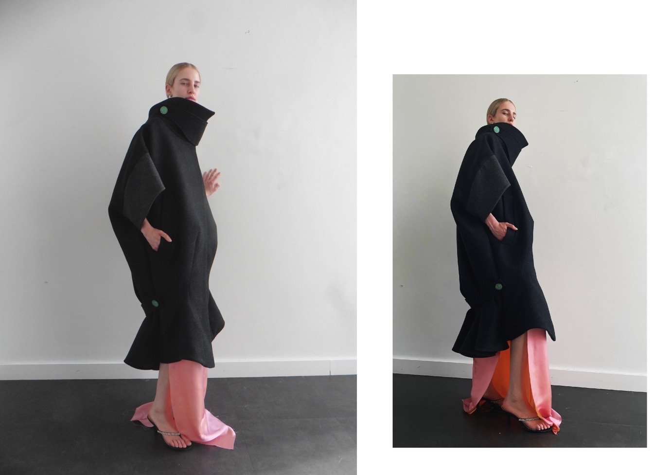
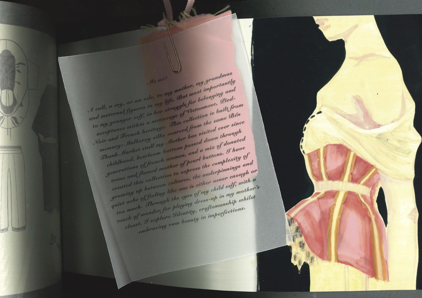
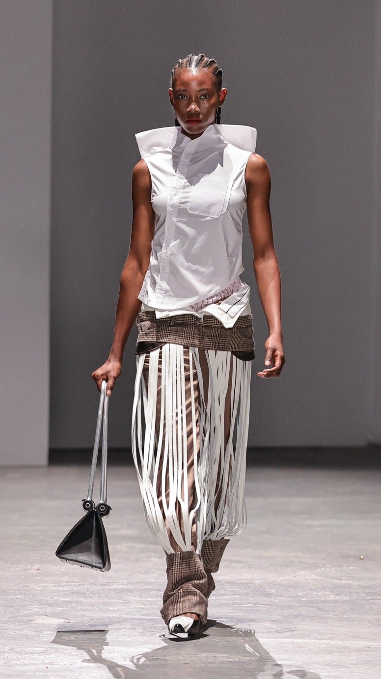
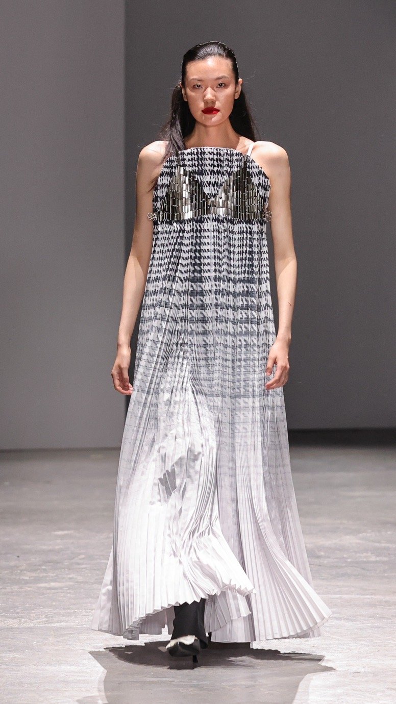
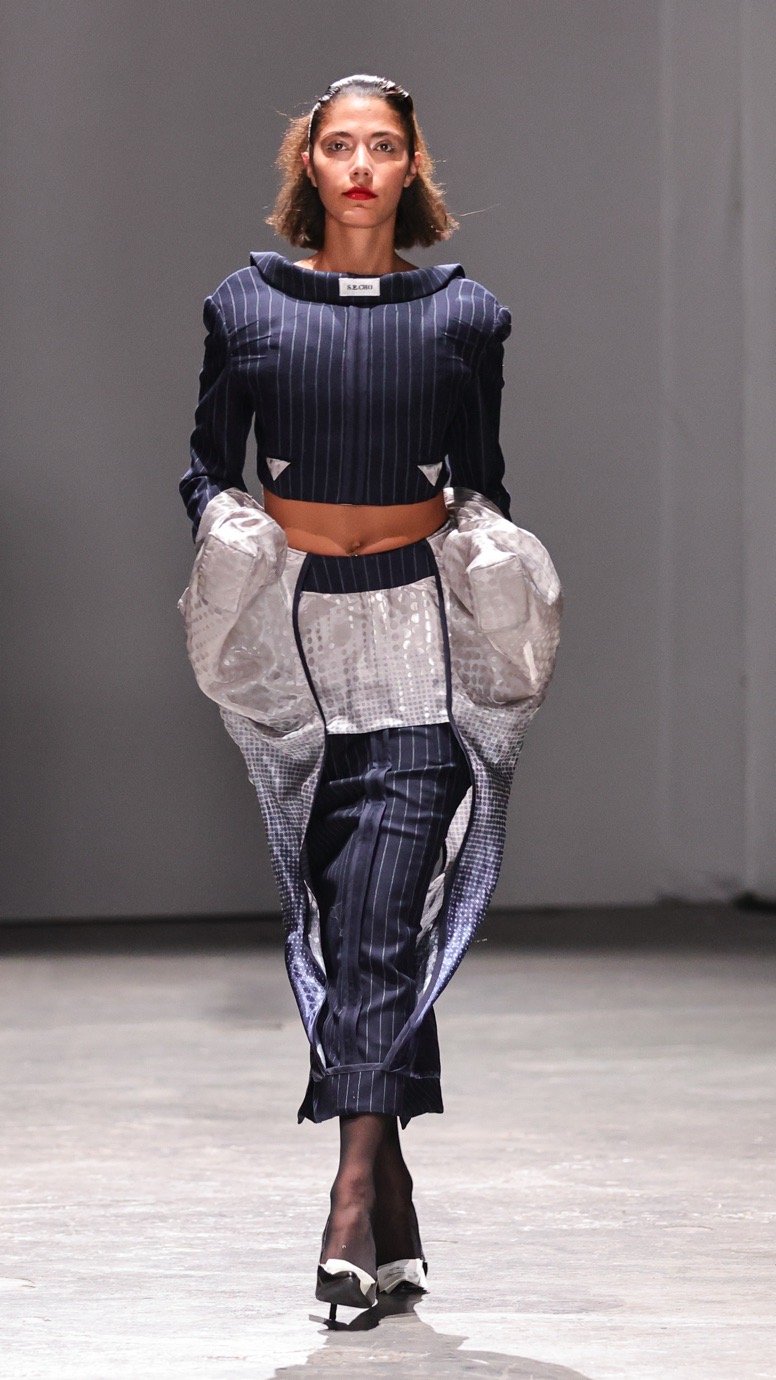
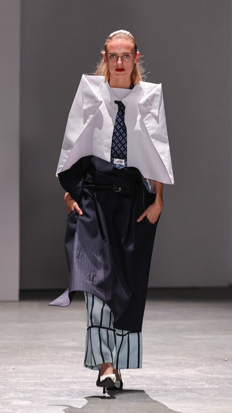
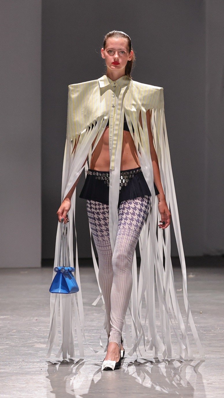
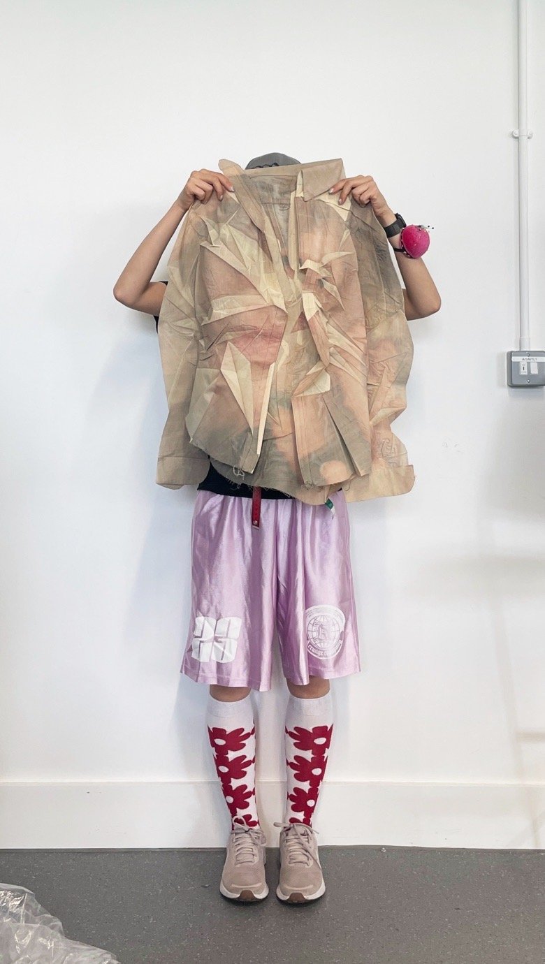
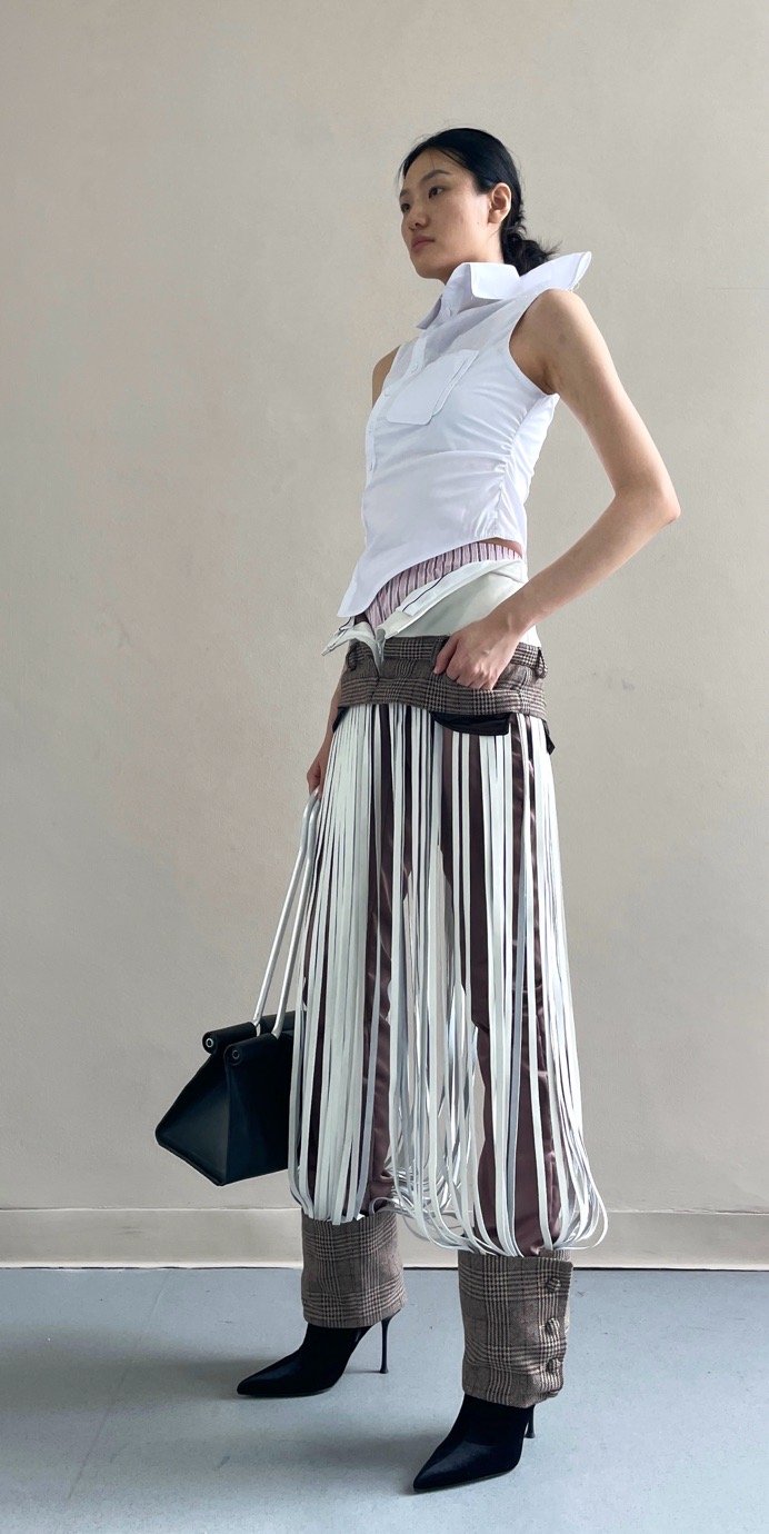
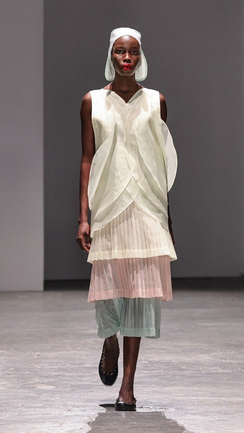
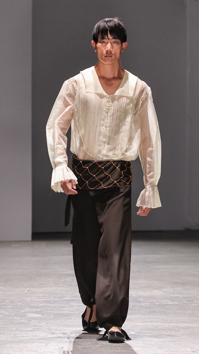
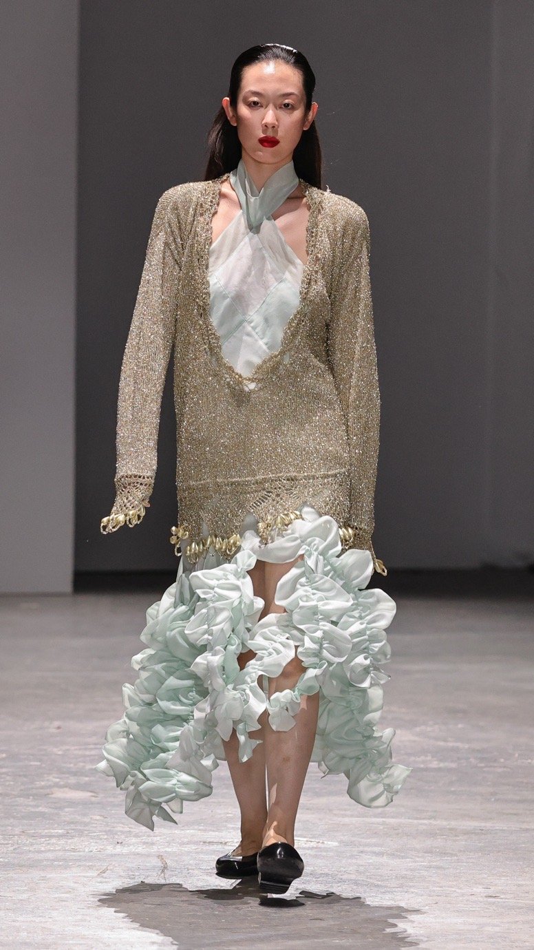
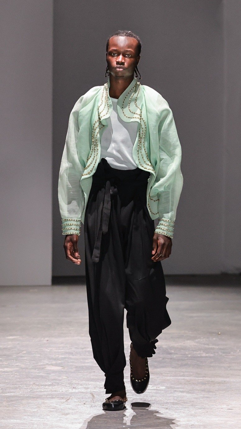
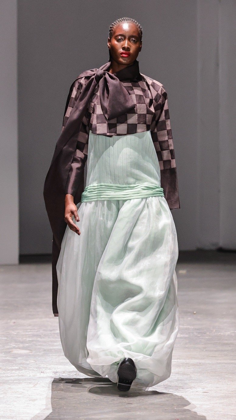
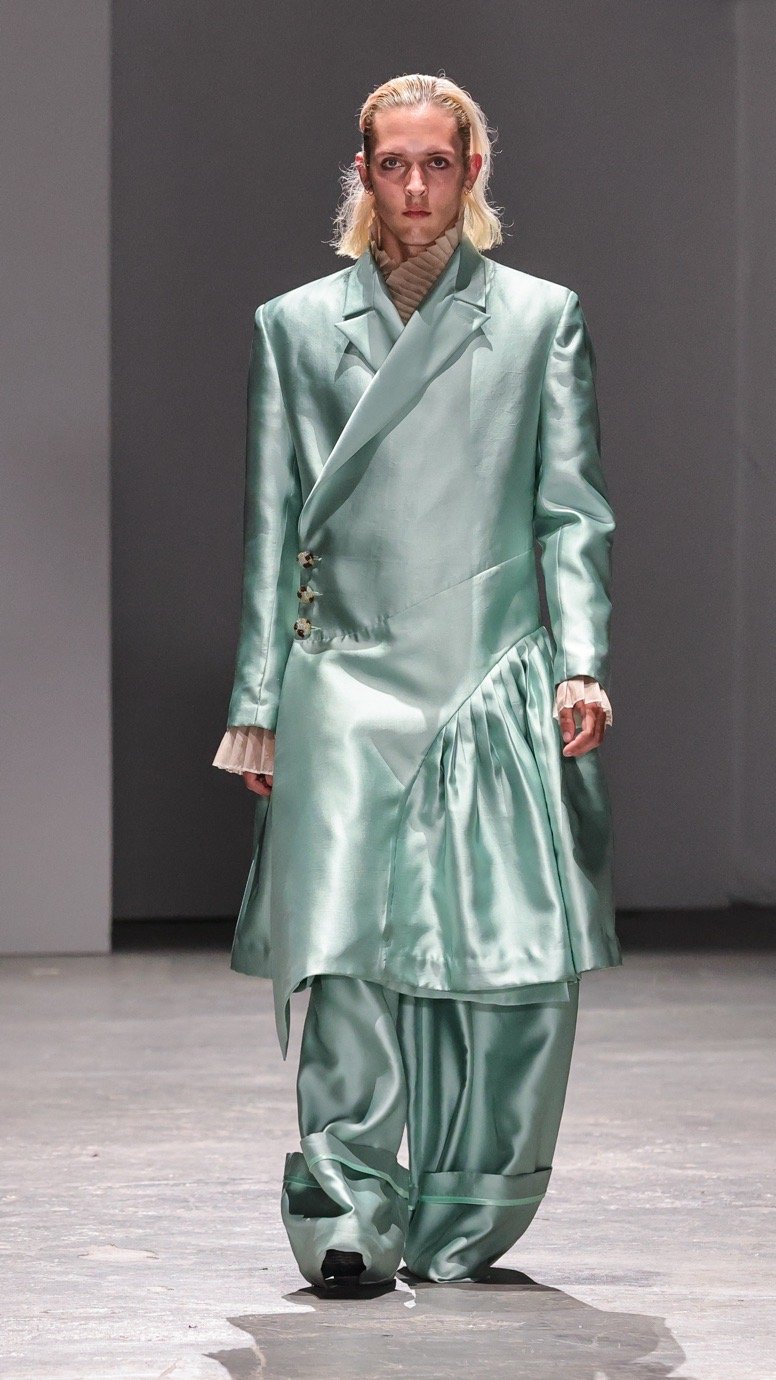
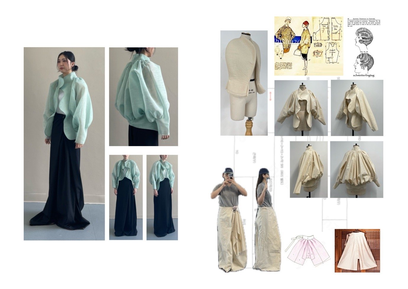
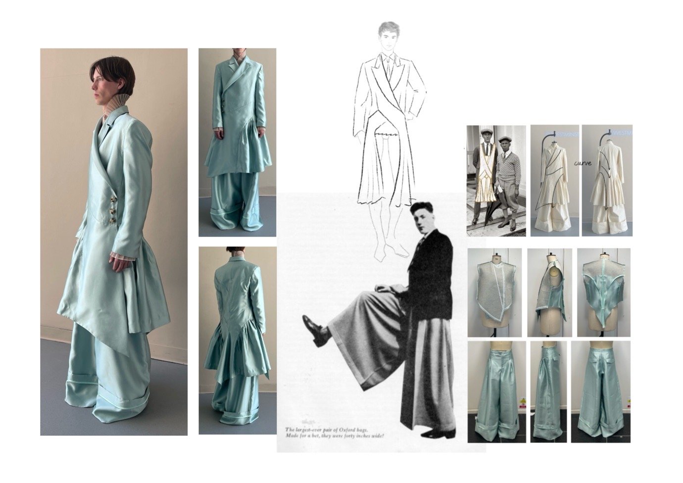
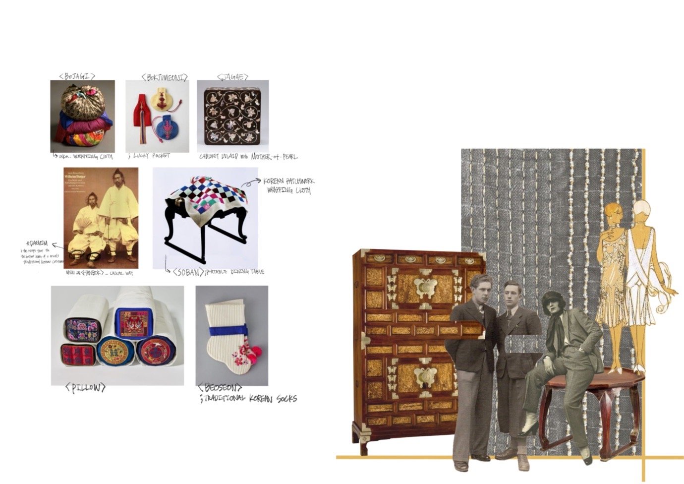
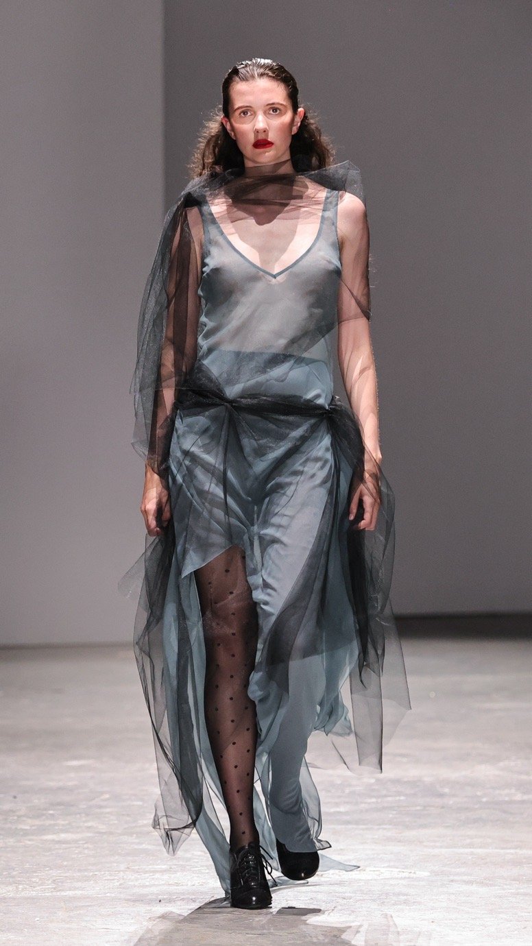
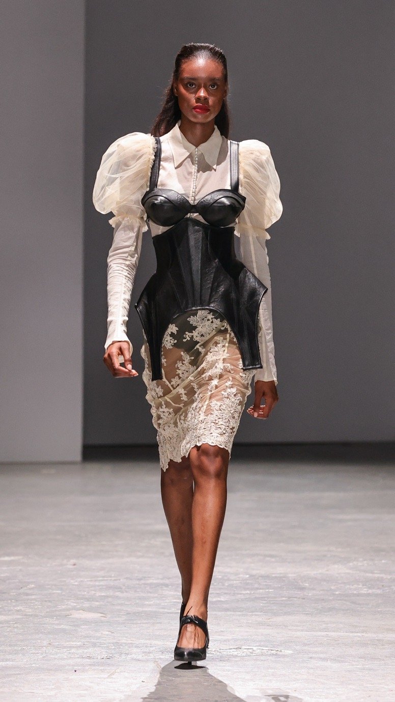
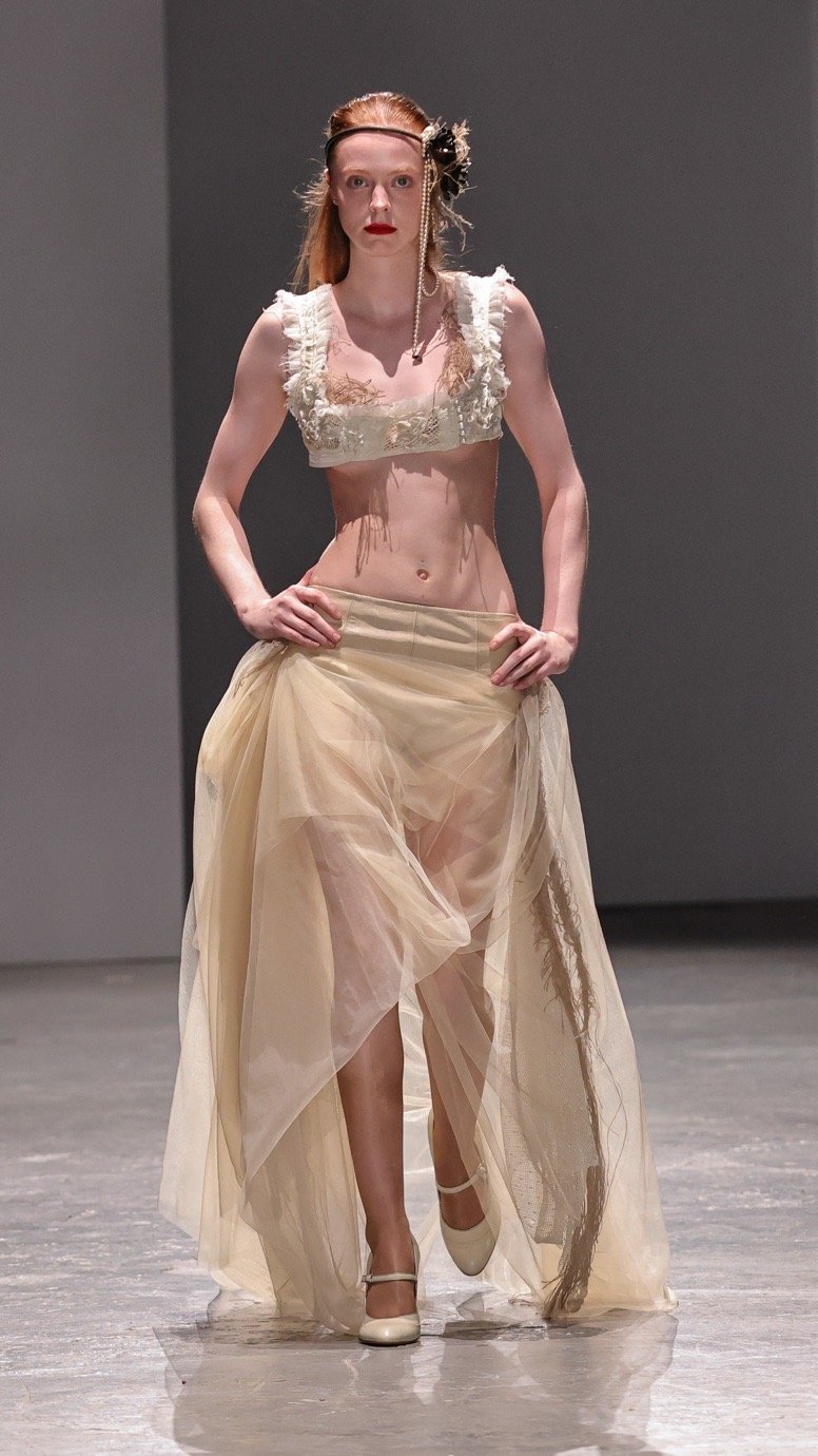
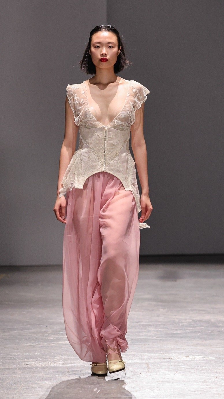
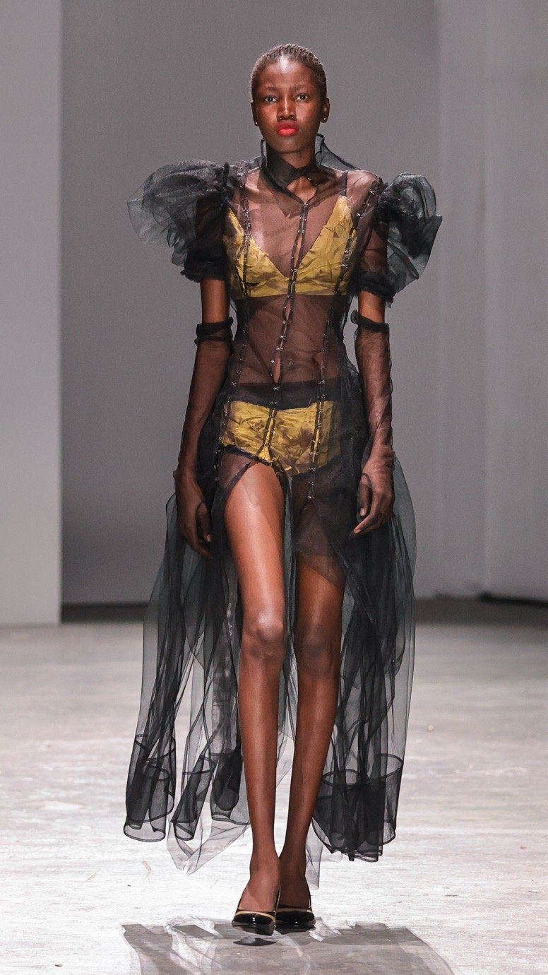
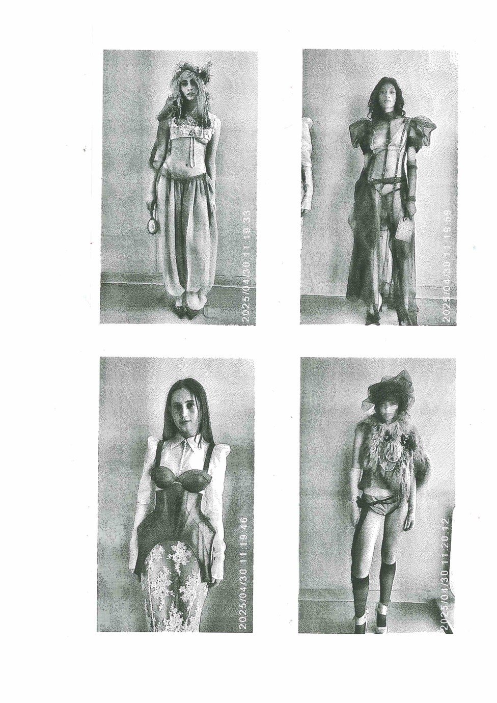
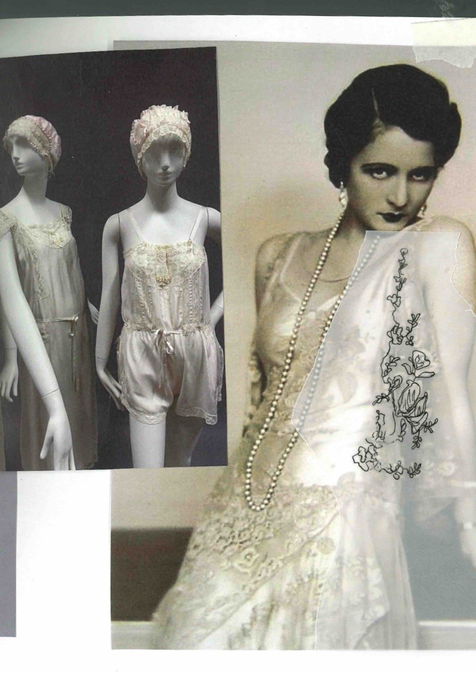
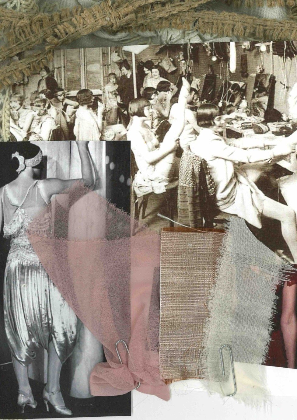
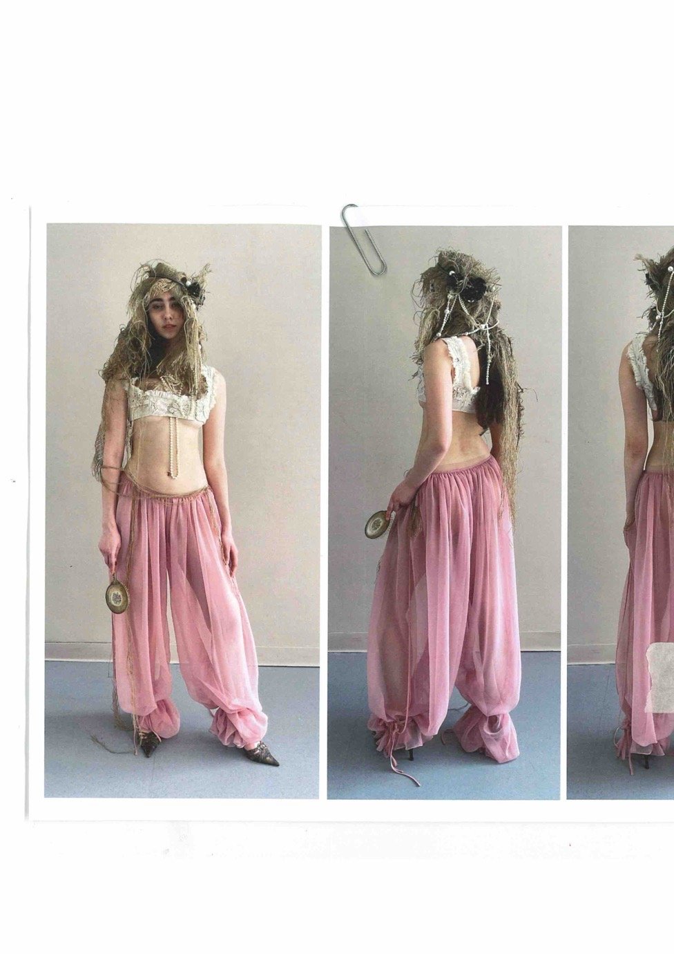
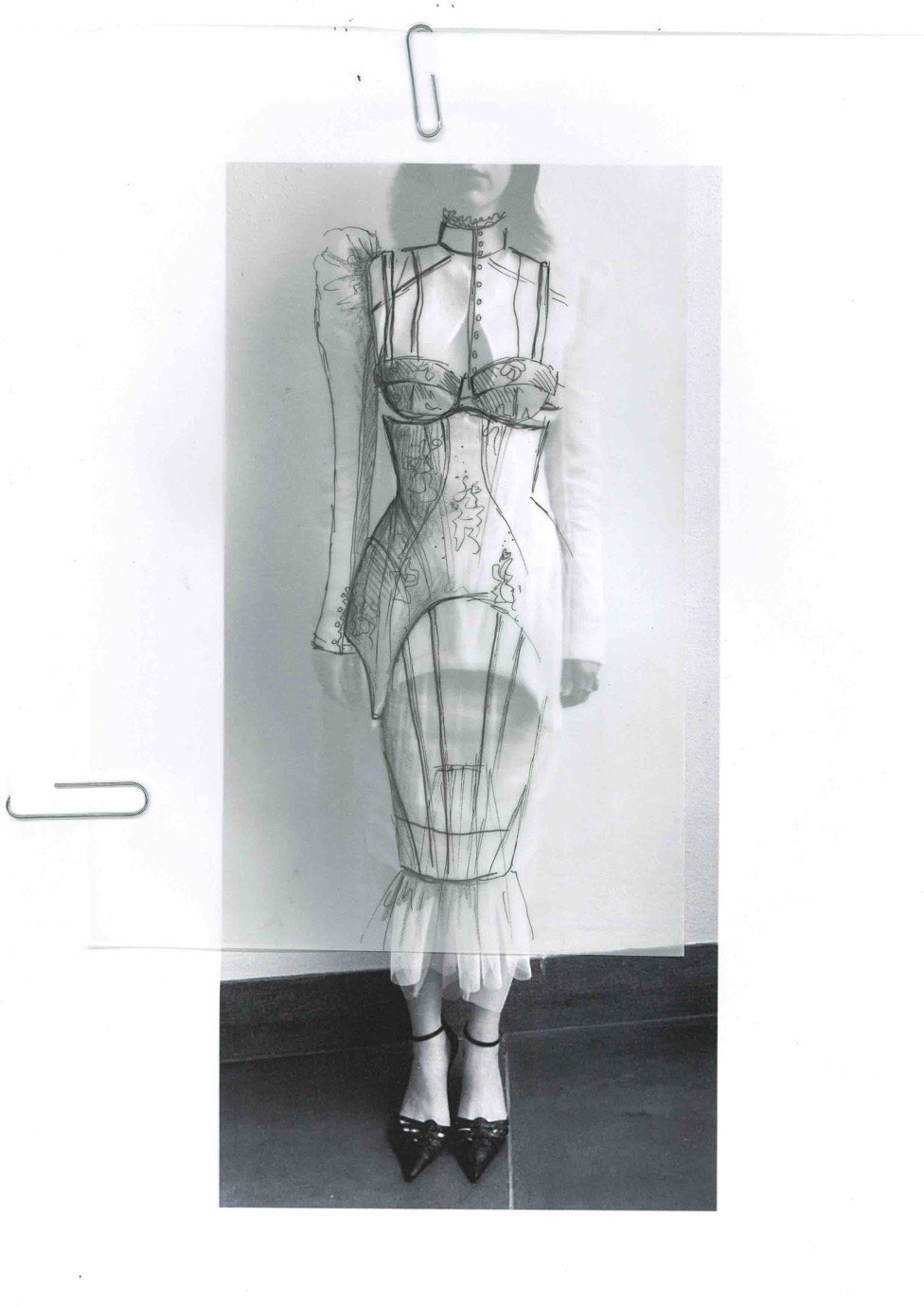
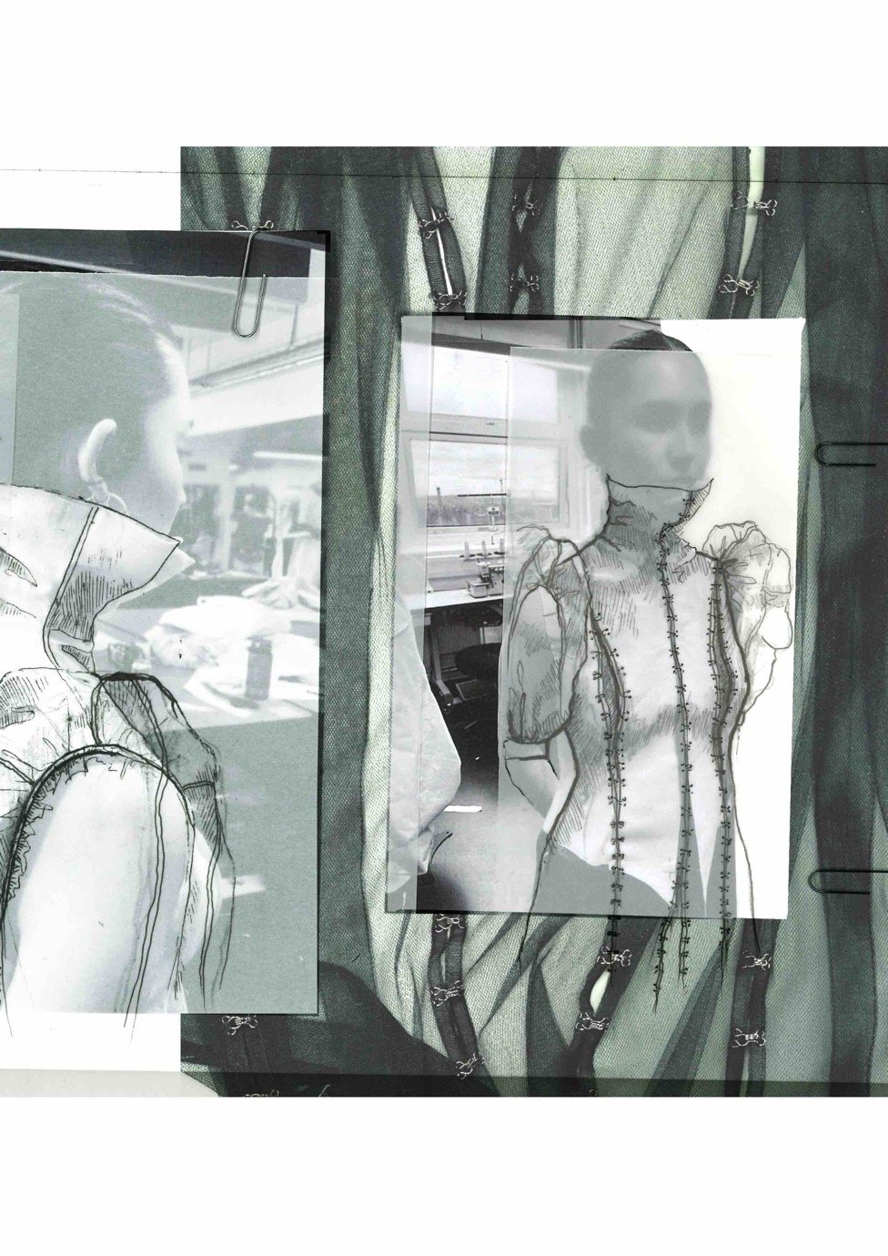
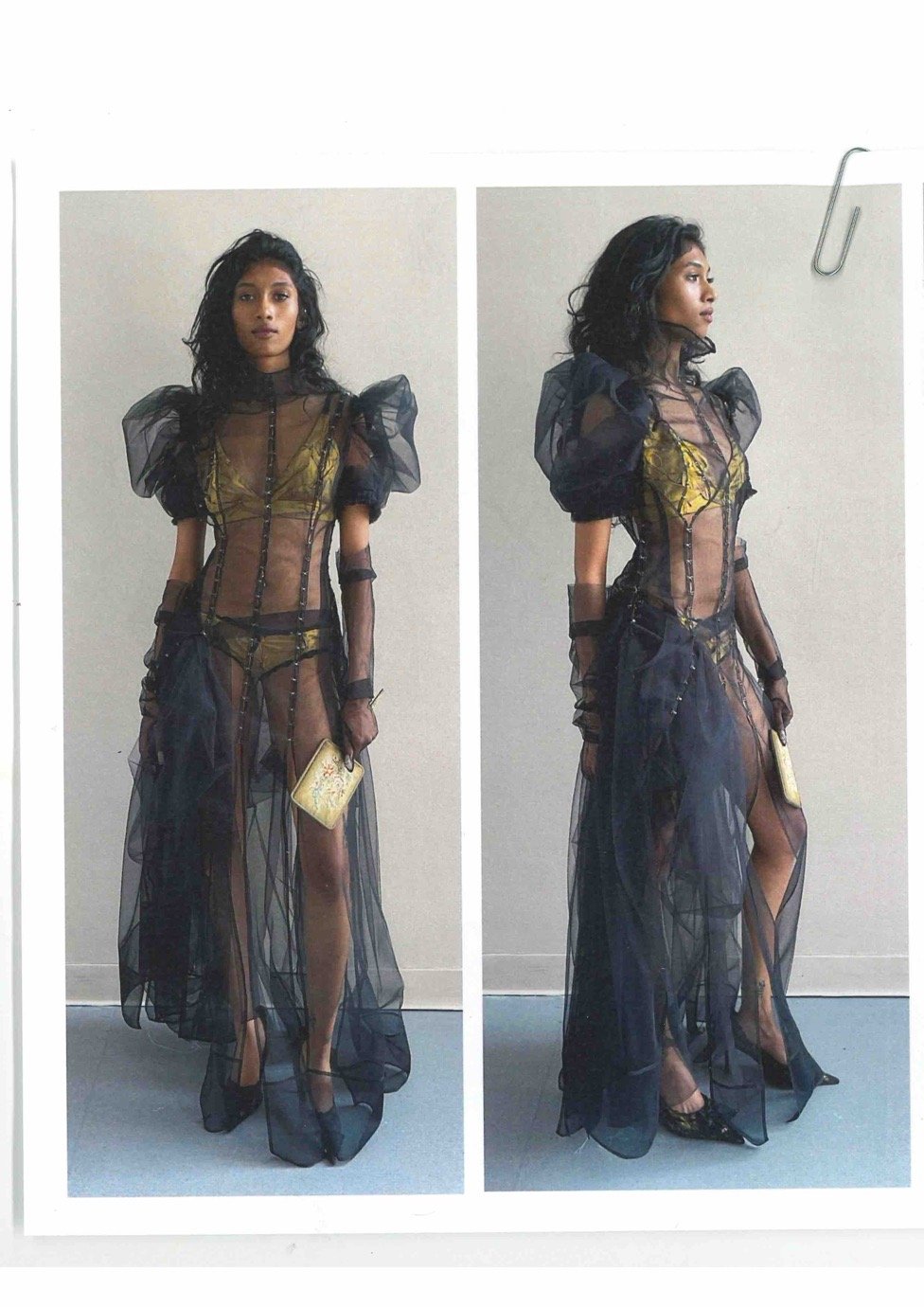
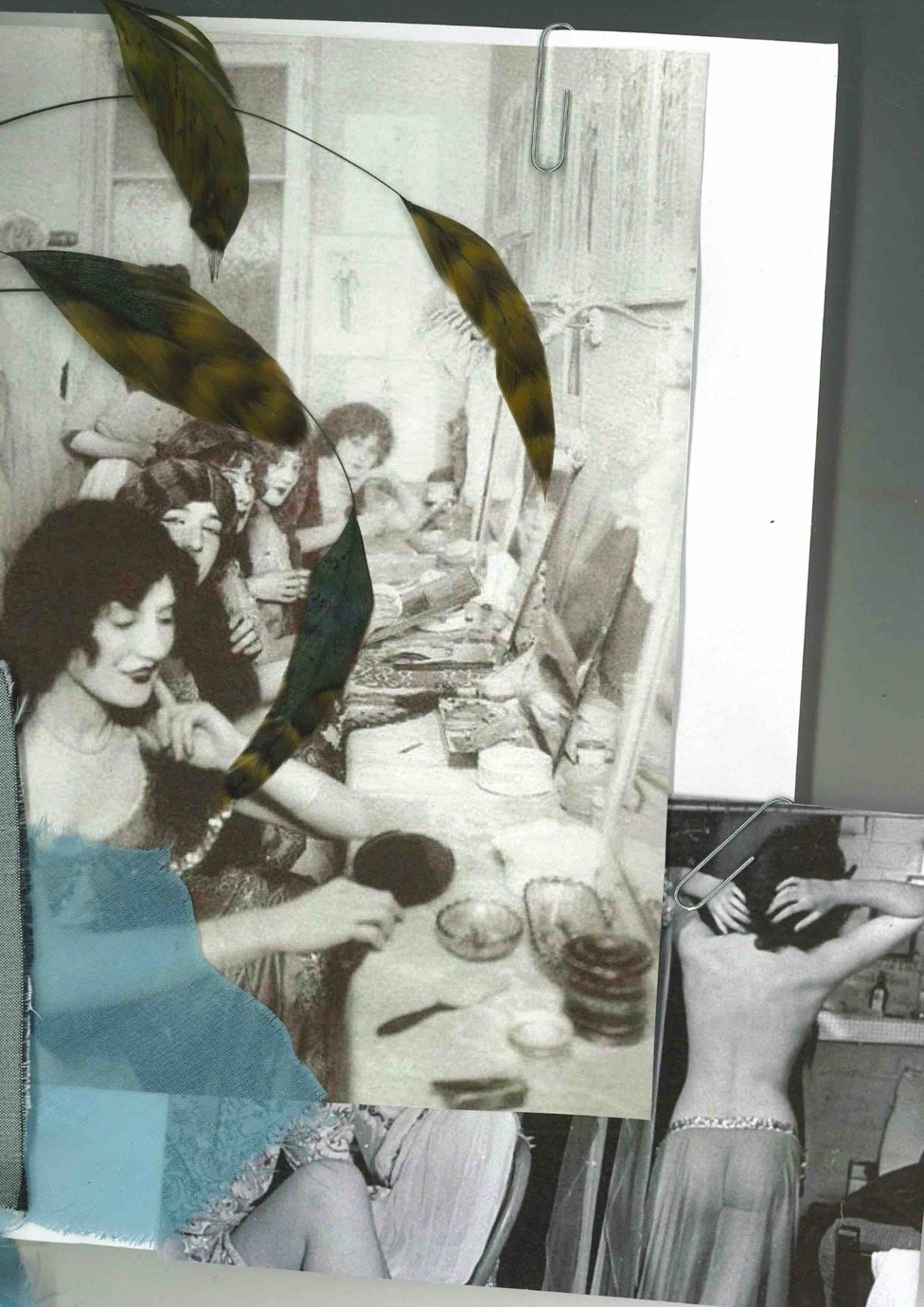
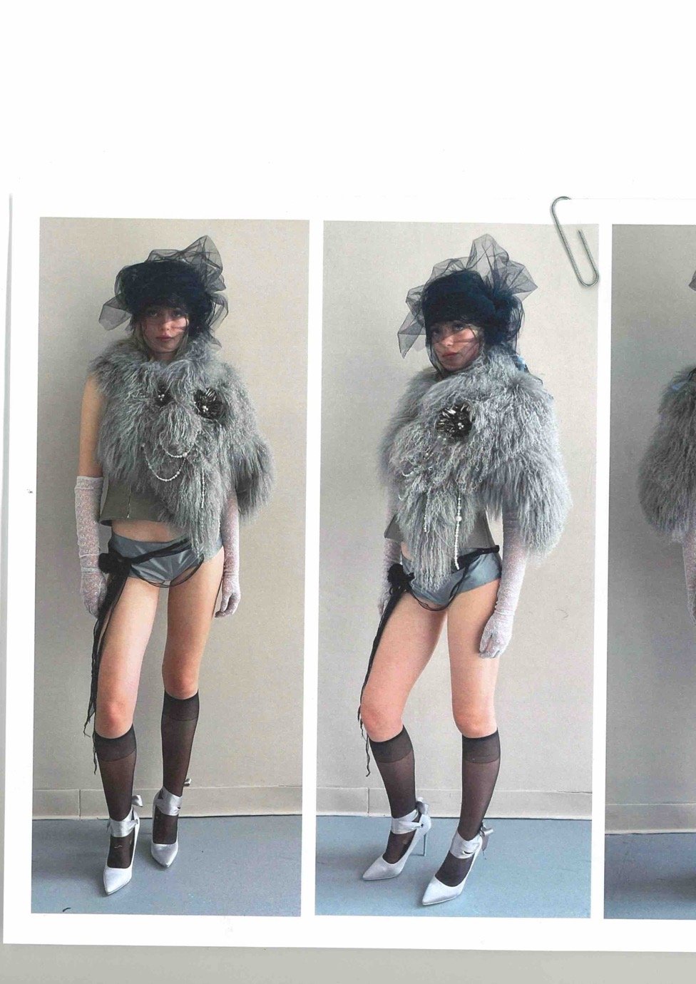
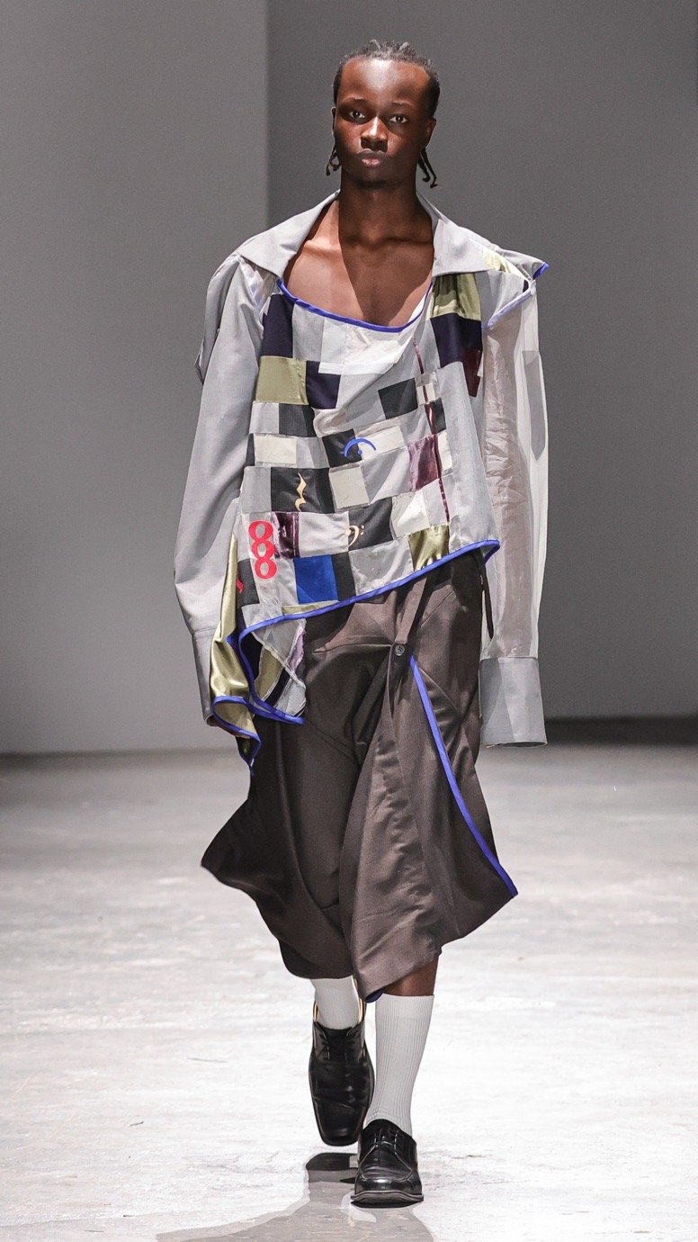
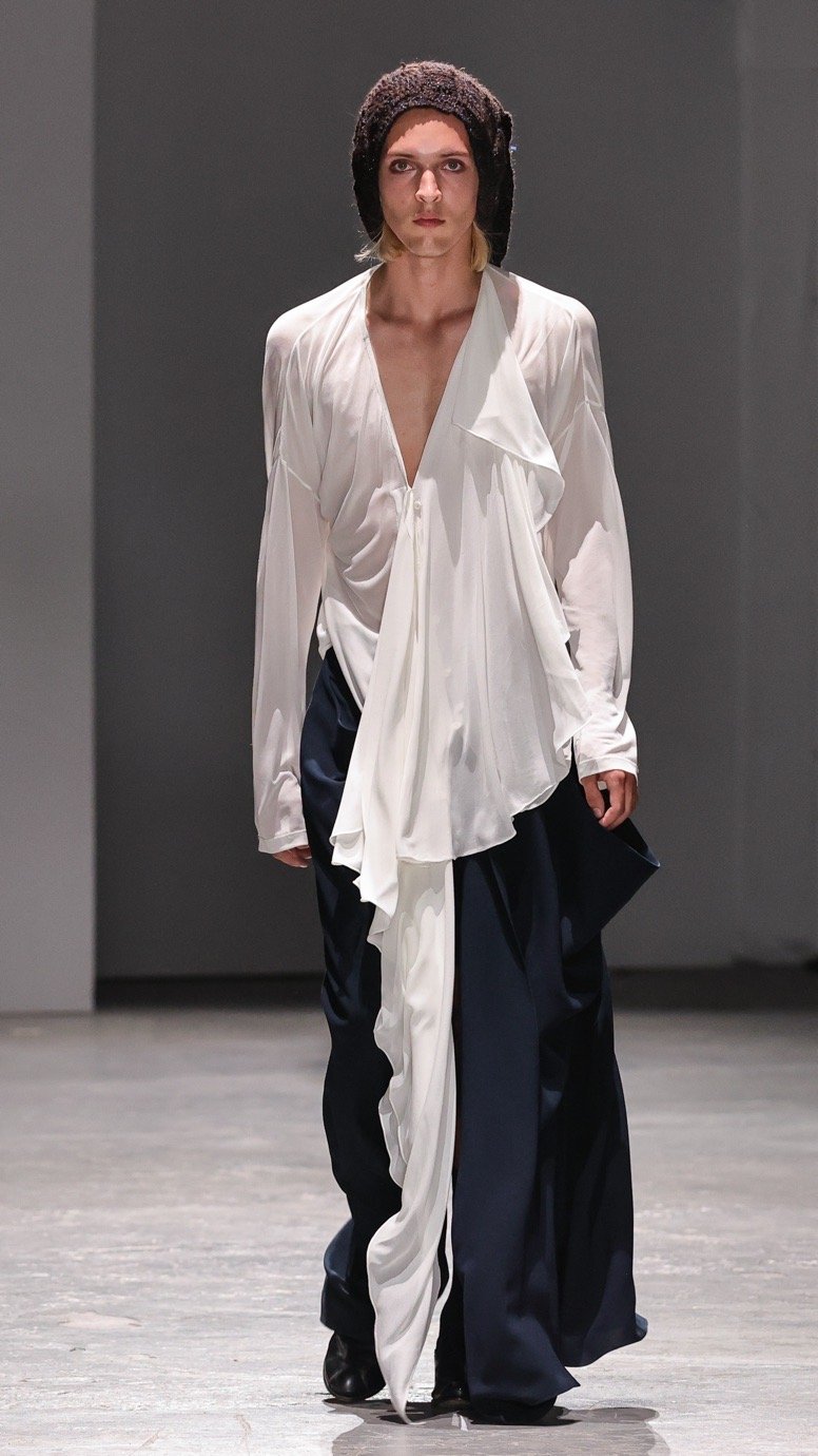
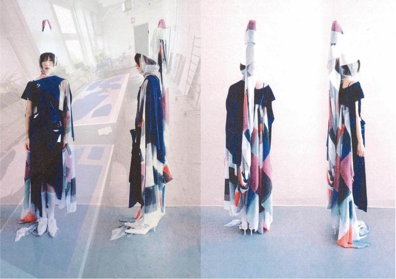
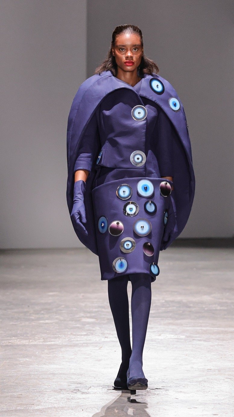
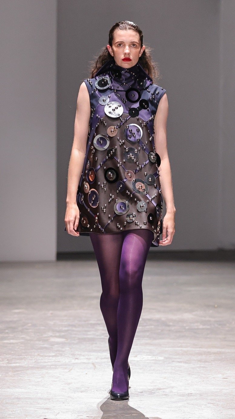
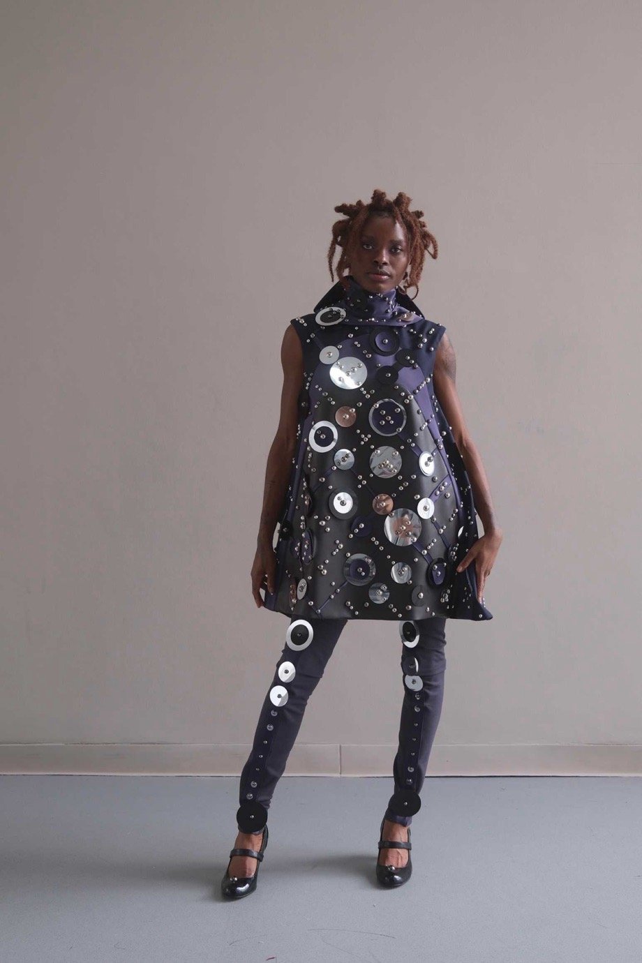
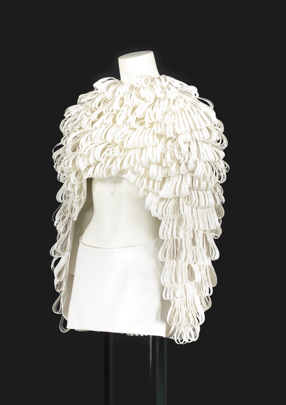
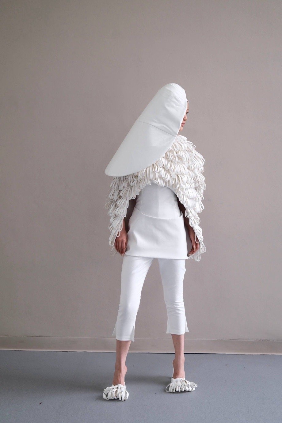
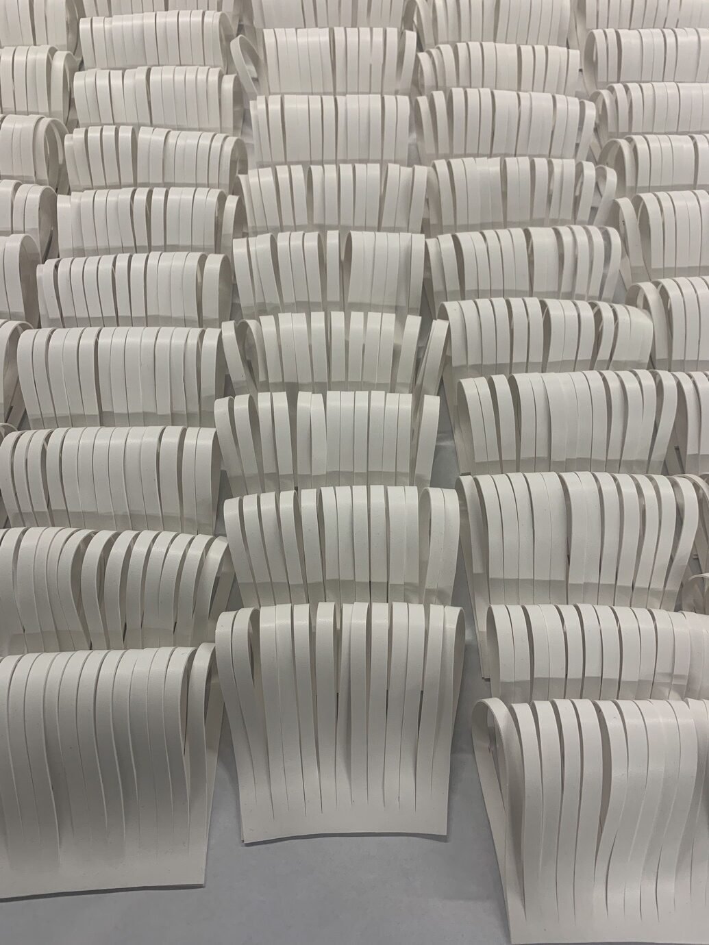
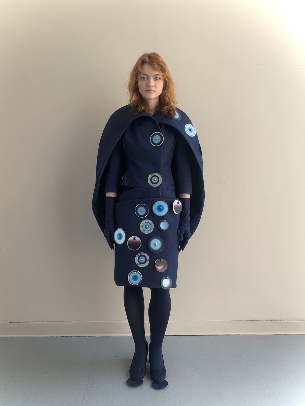
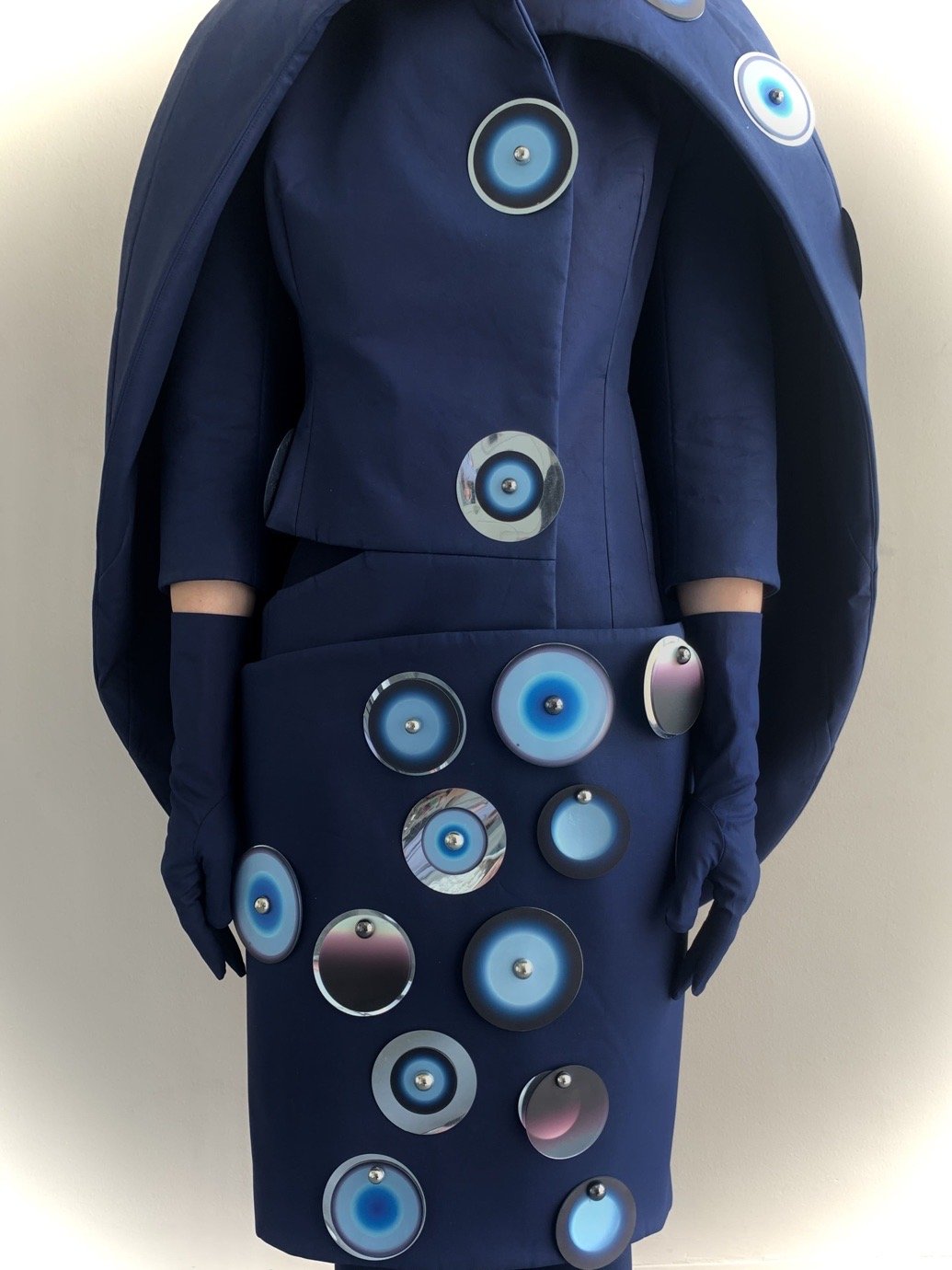
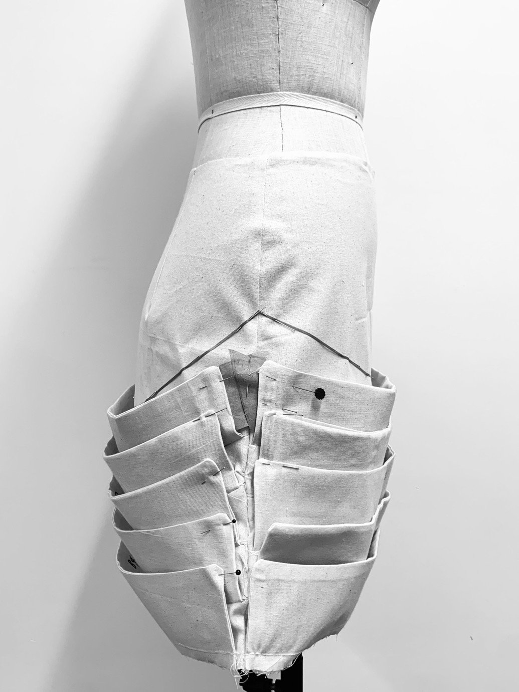
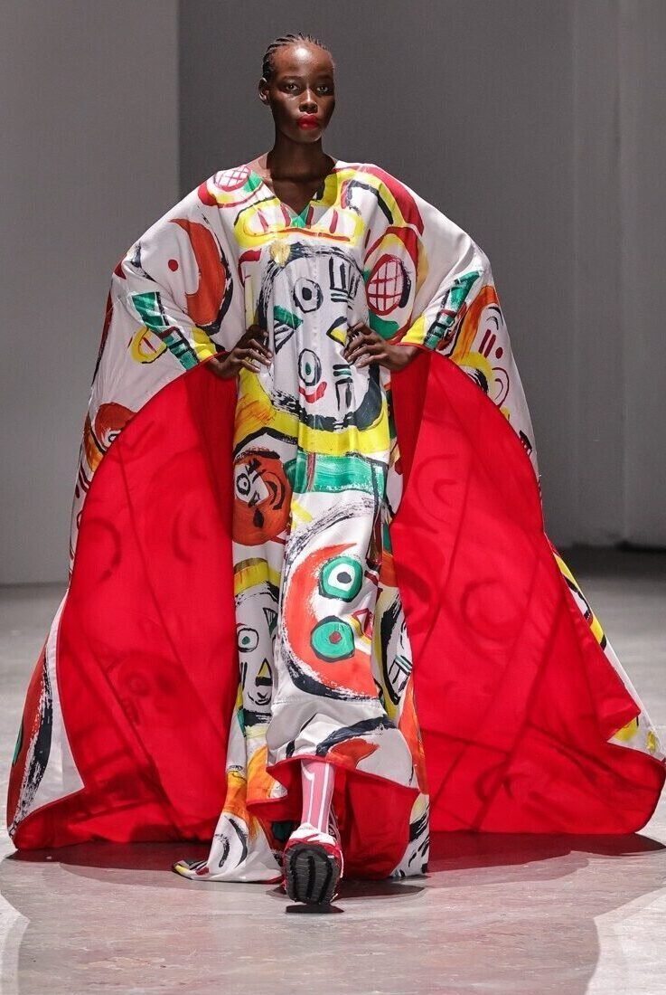
The international class of designers pulled from family memories, folkloric sources, history books and their internet browsing history to carefully construct a personal philosophy of craft – an emphatic part of the course’s pedagogy. Many of them were rooted in a specific time, place or memory: from an oasis in the Gobi desert, to Milan’s machismo; a Belle Époque cabaret to a Filipino wedding in Camden Town. Playful reimaginings of archetypal characters also peppered the show, from Holly Laidler’s dieselpunk “hotsy totsy” girls to Azeika Nelson’s vintage English football fans, or Siena Seung-Eun Cho’s avant-garde office workers with half-shredded shirting, and KJ Tantivachyanon’s heavily-ornamented hikers. 

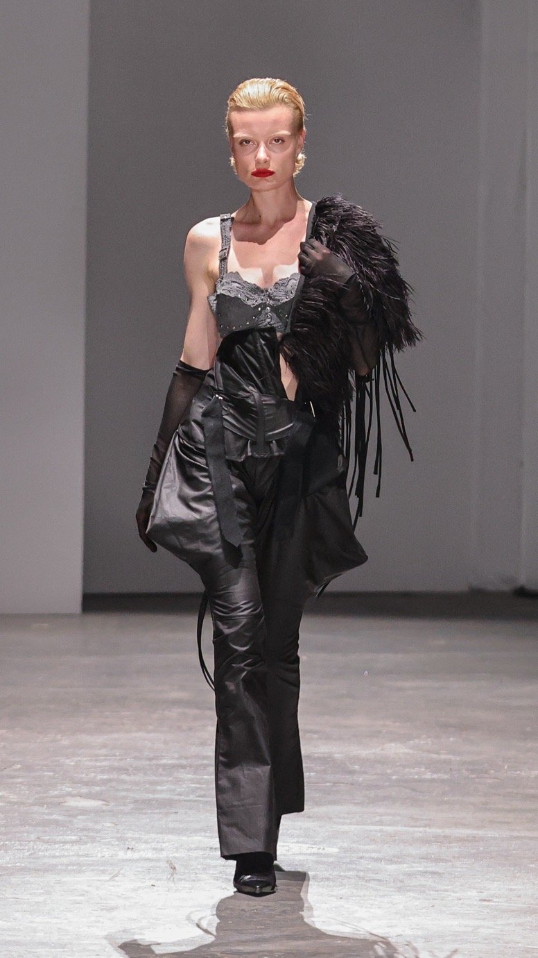
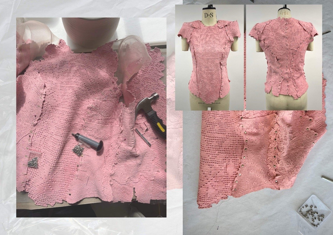
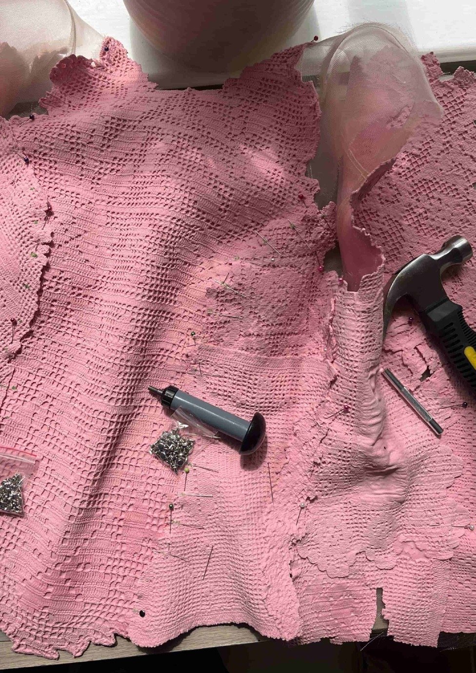
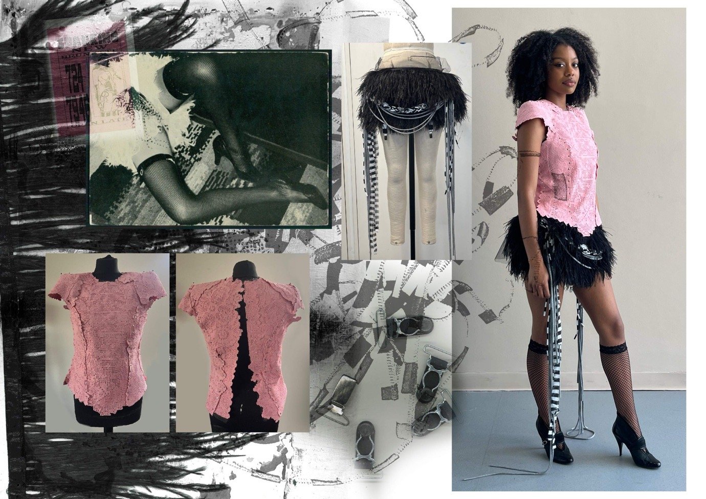
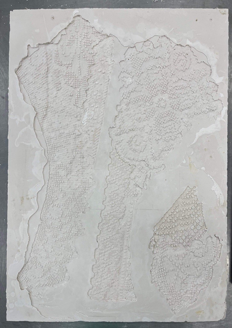
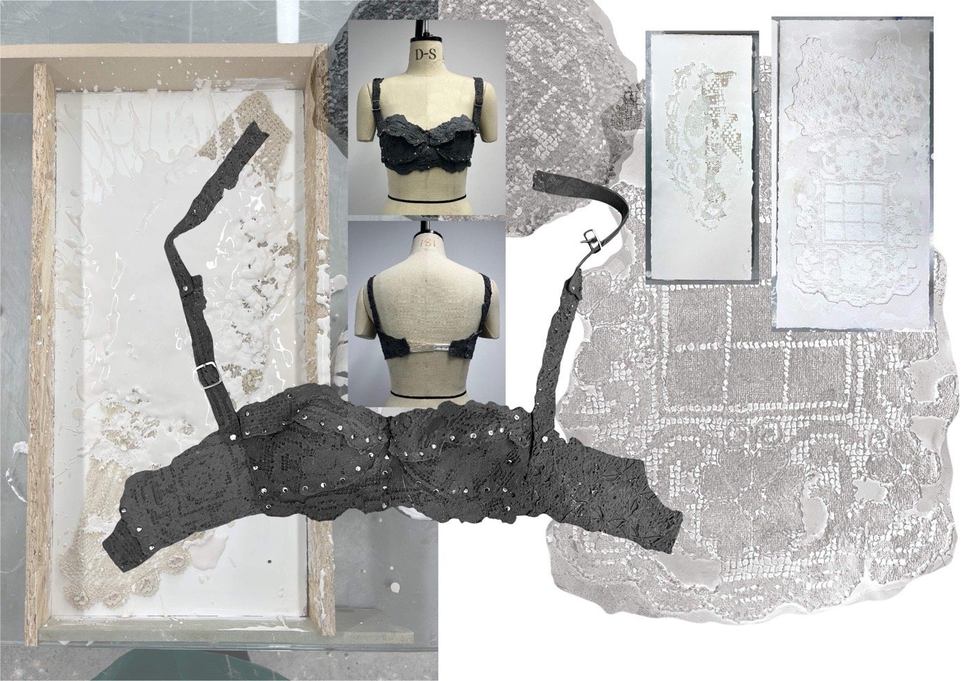
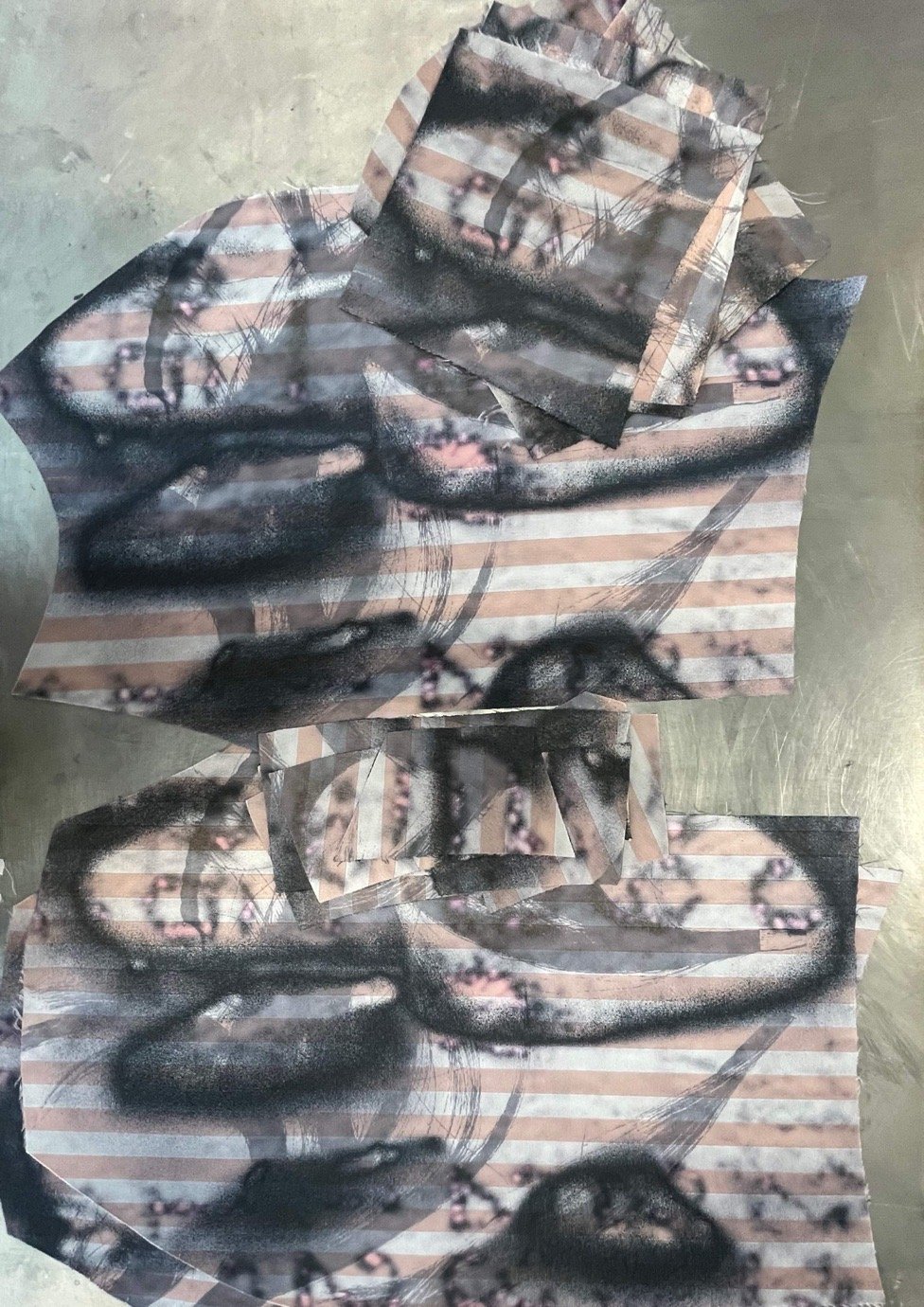
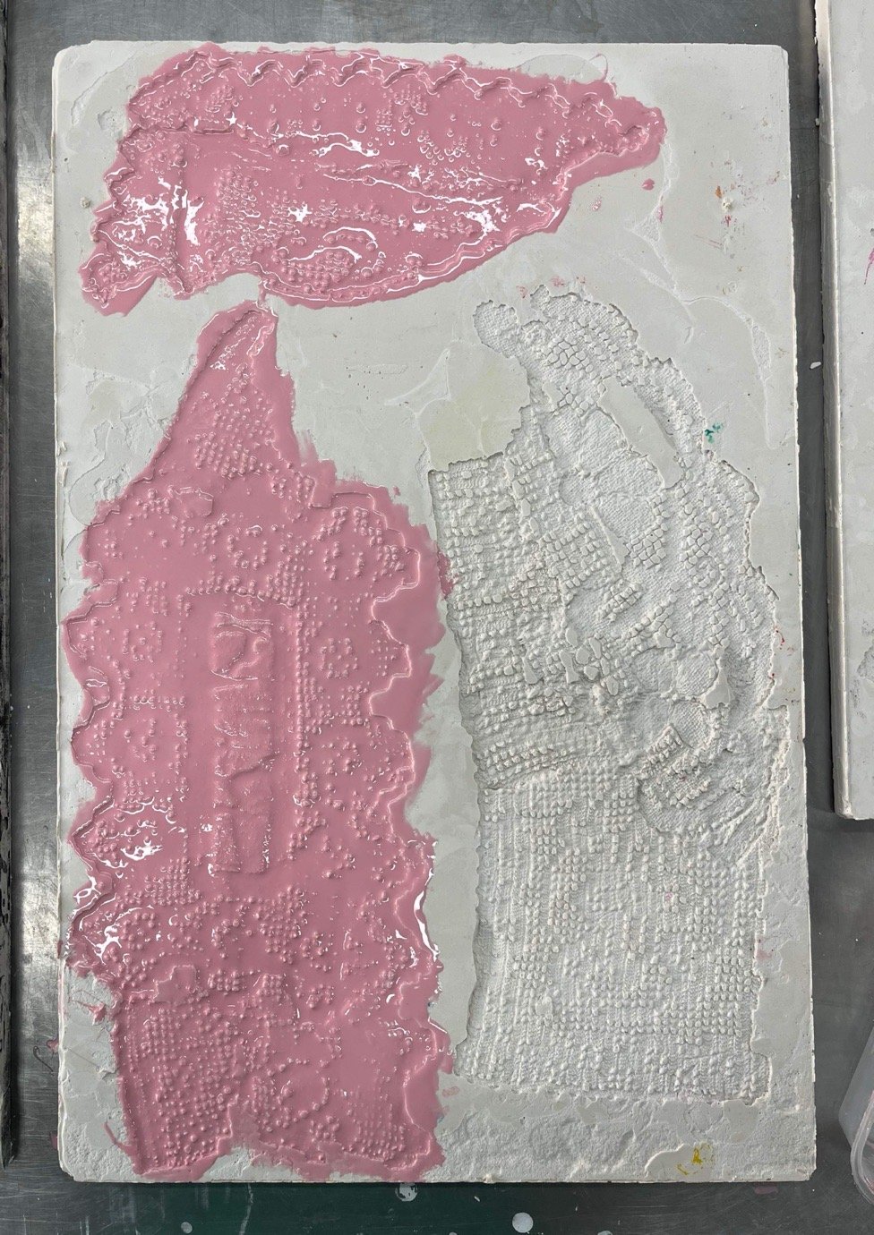
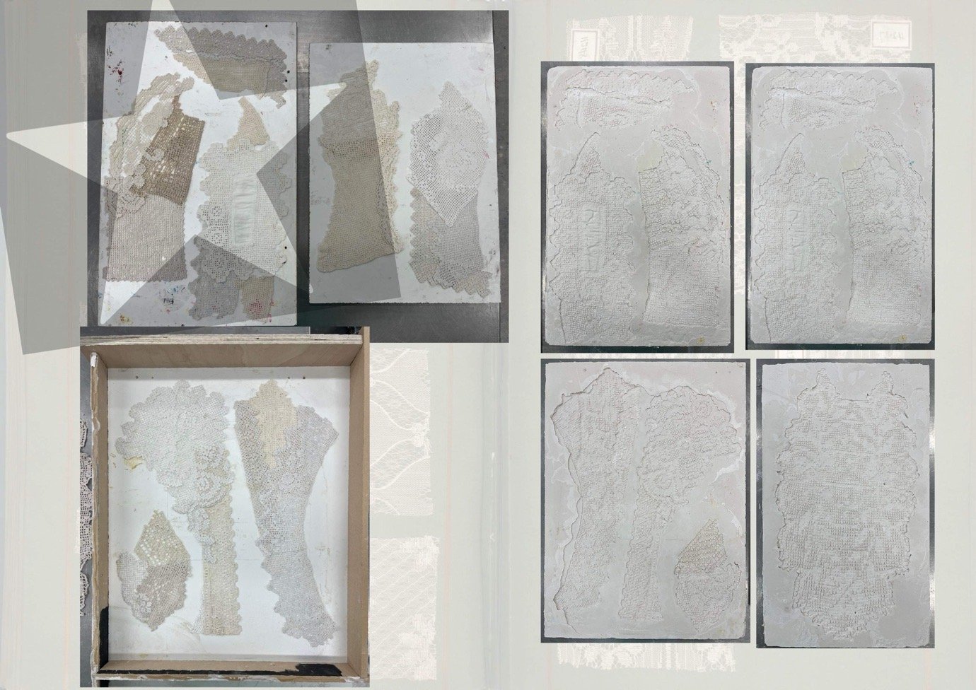
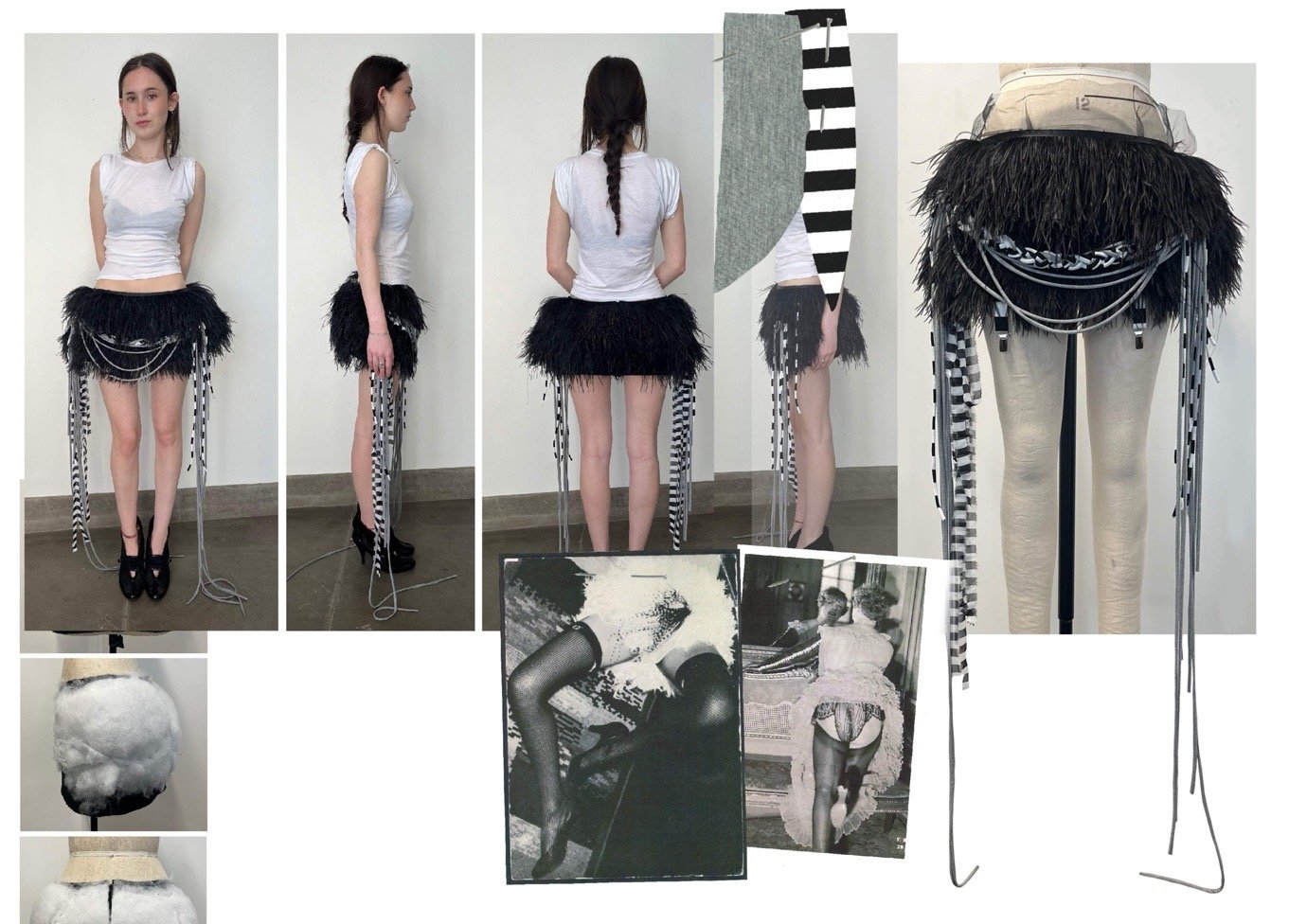
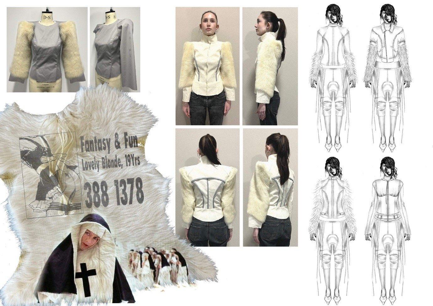
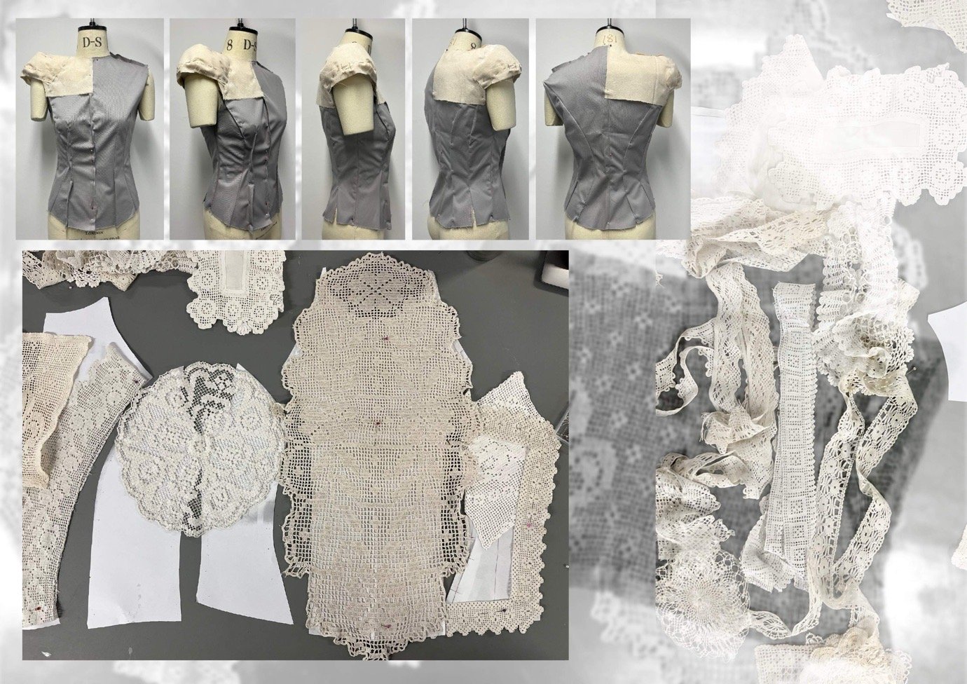
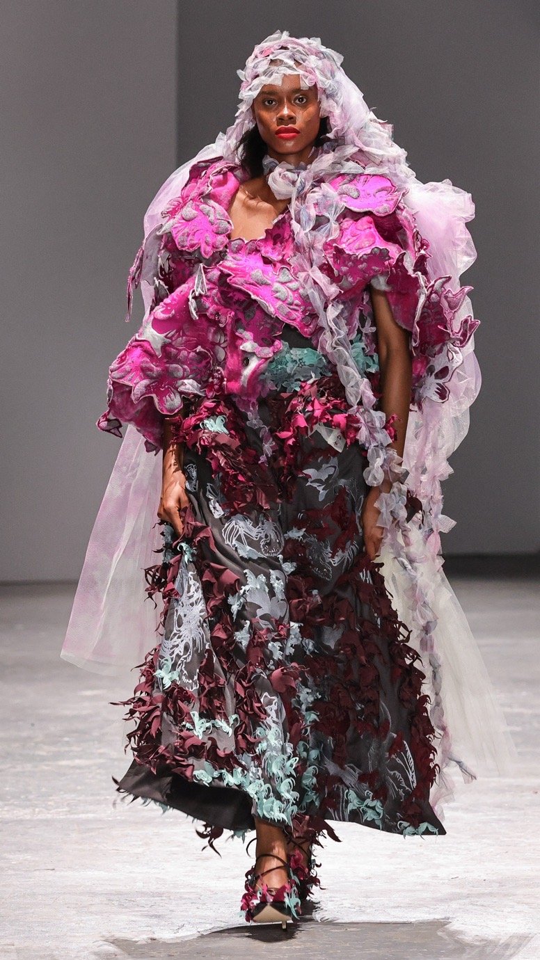
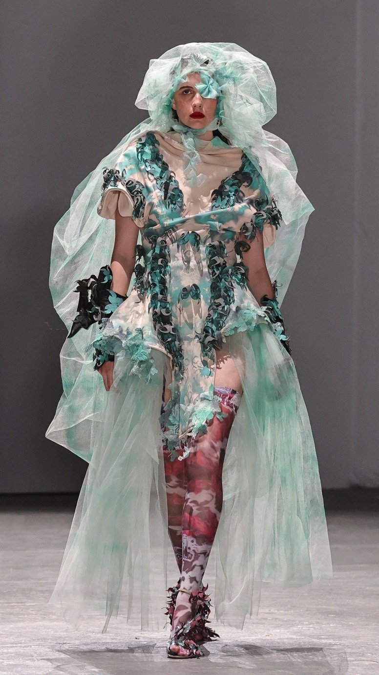
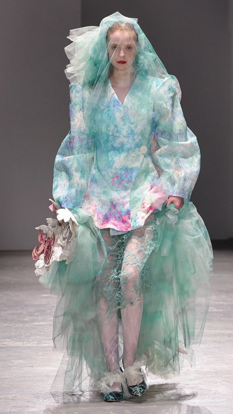
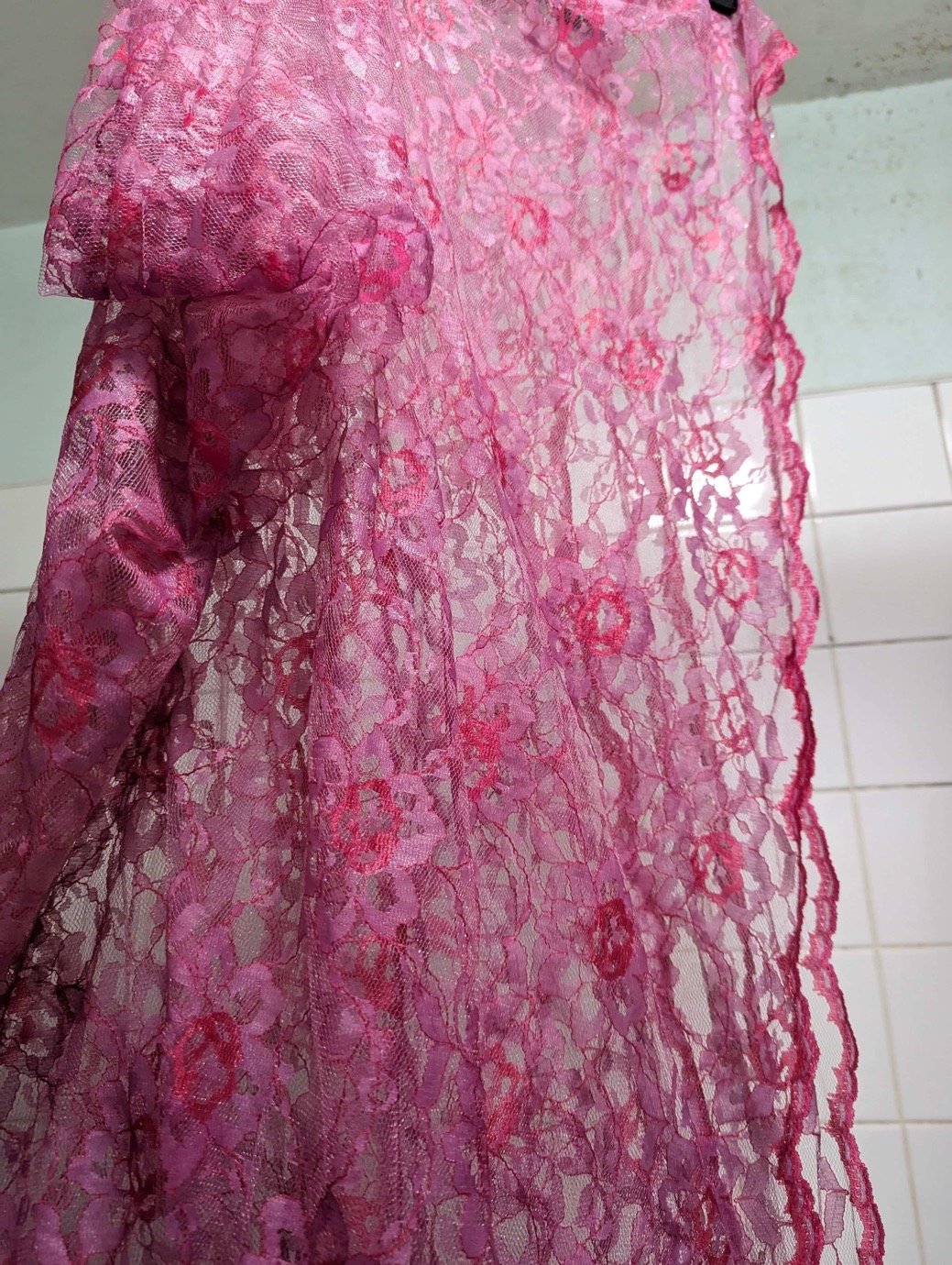
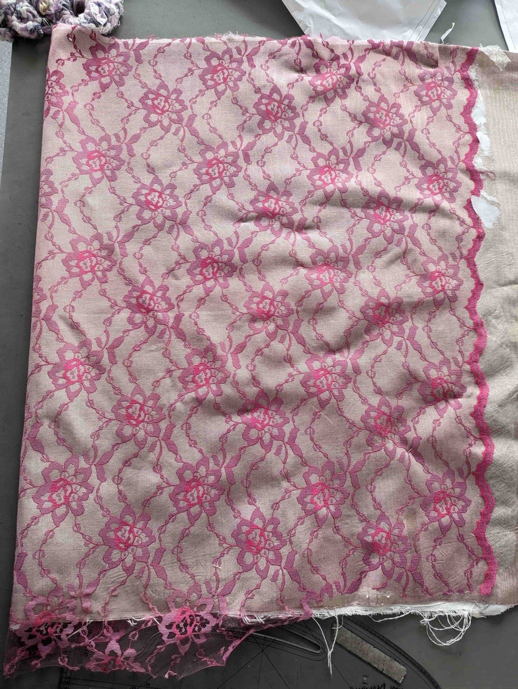
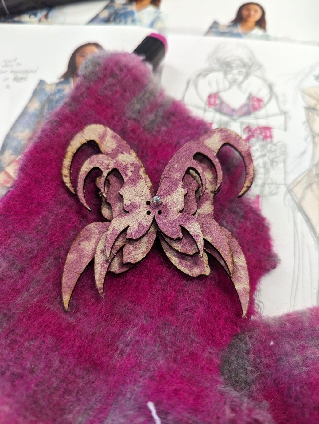
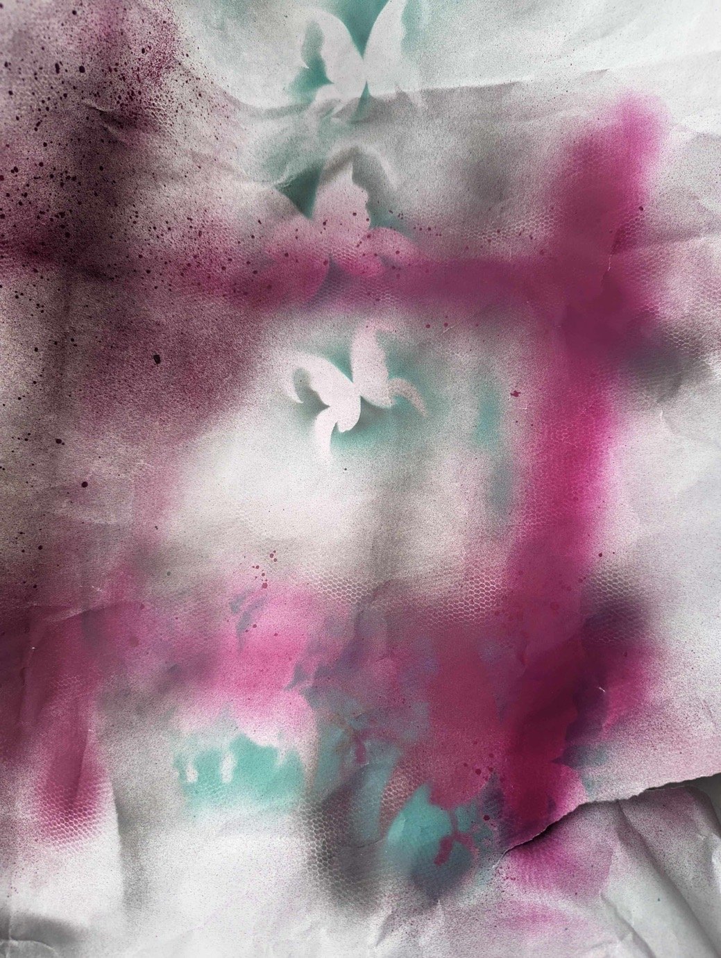
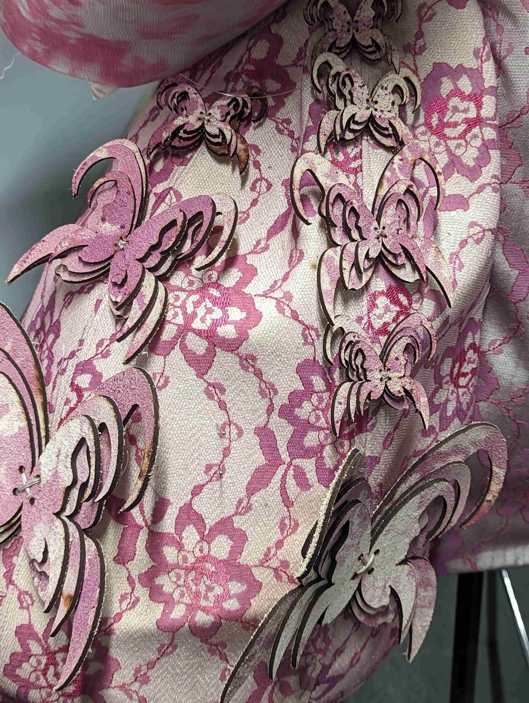
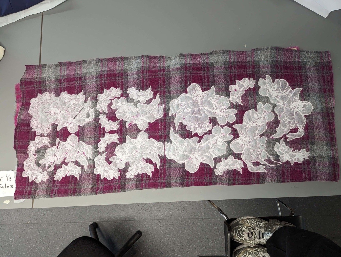
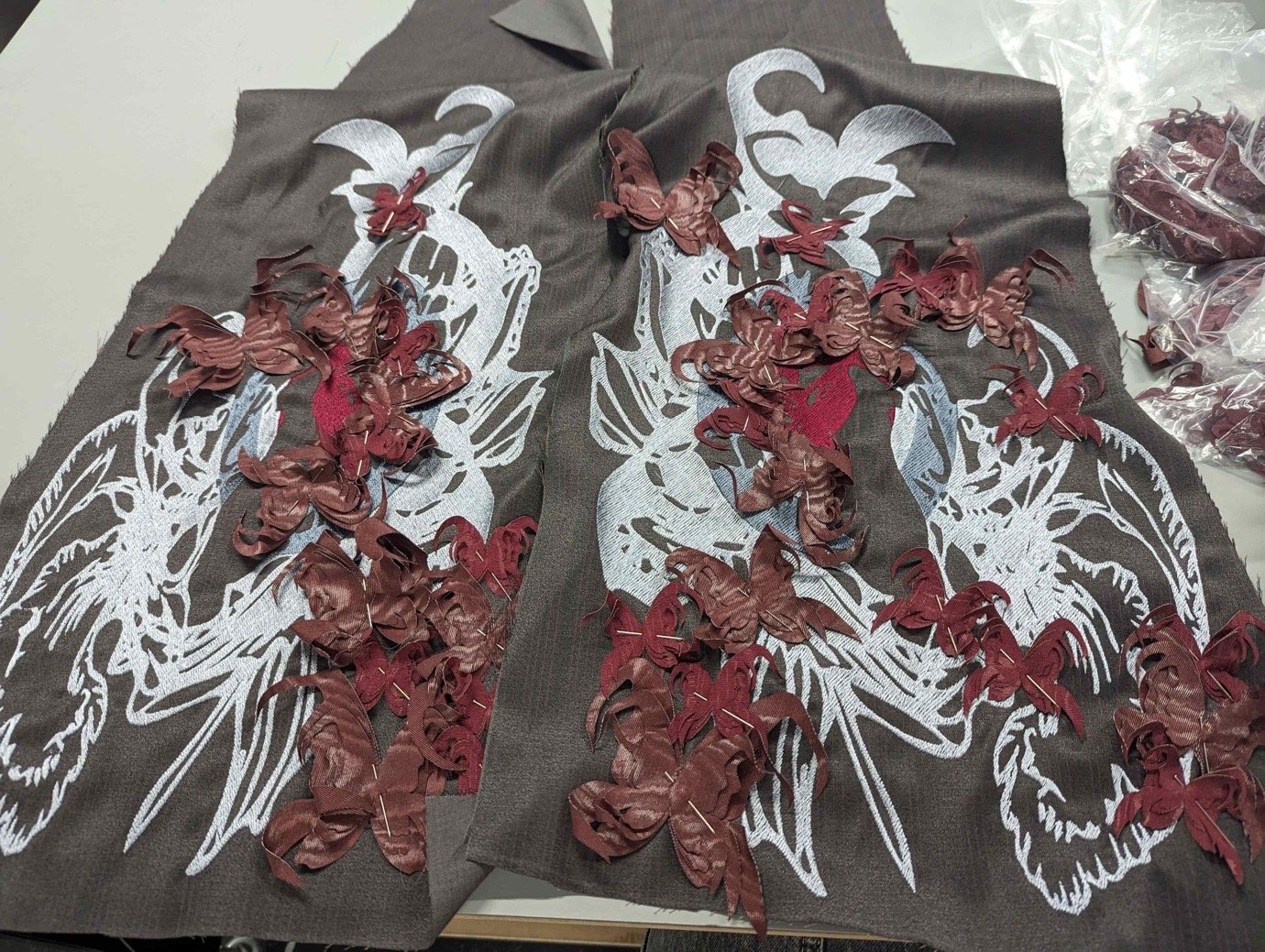
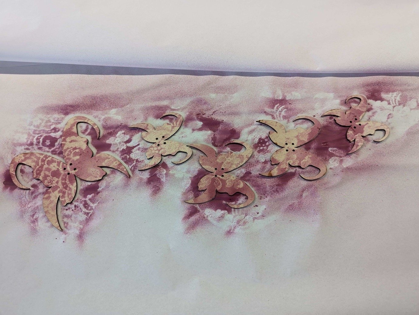
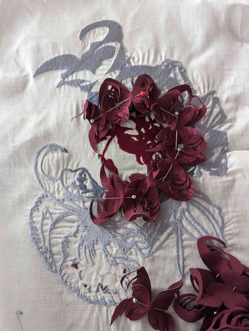
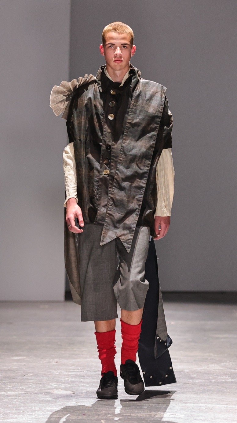
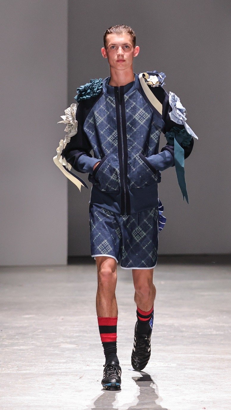
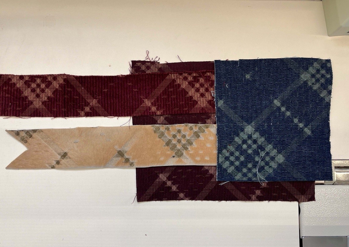
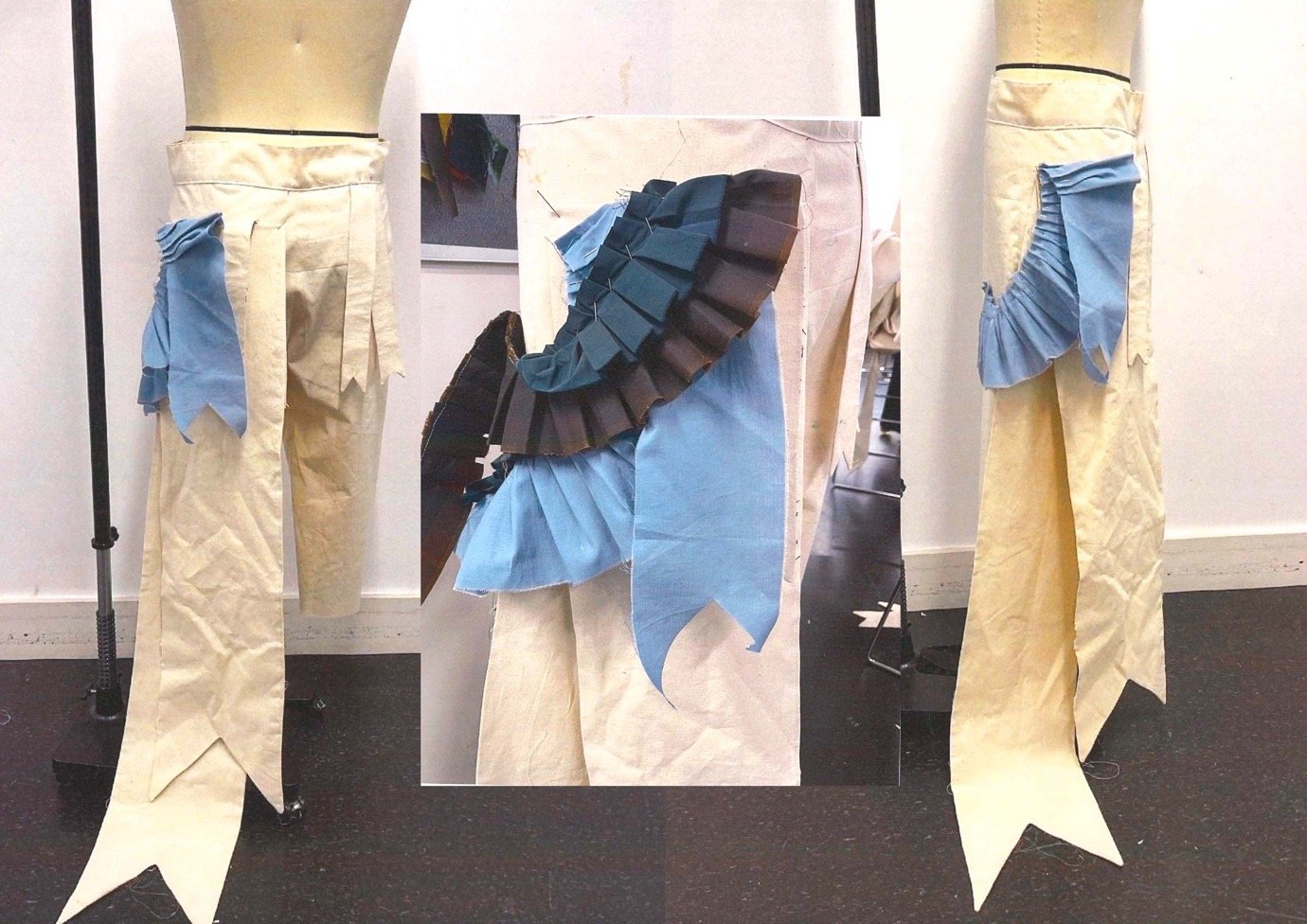
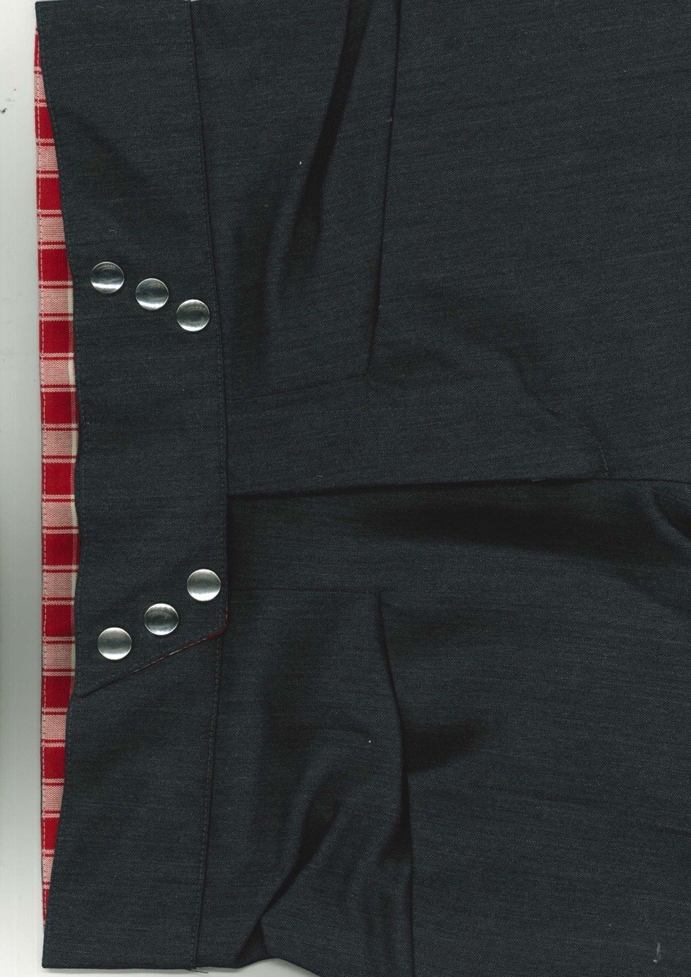
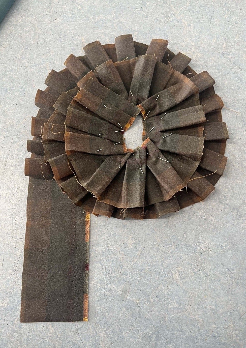
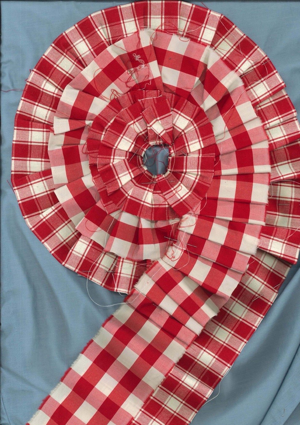
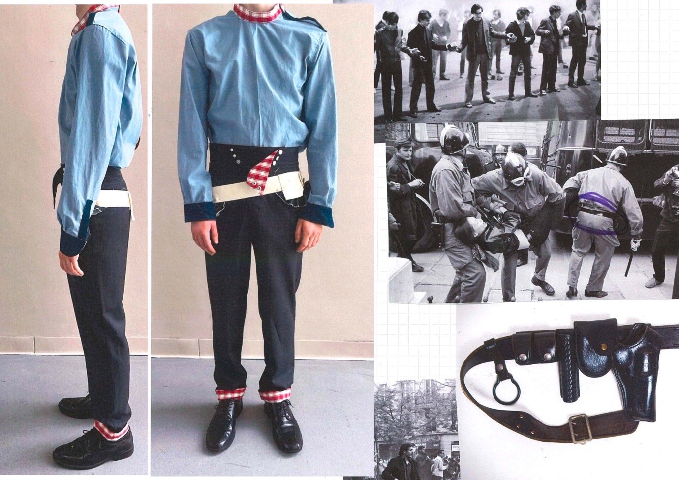
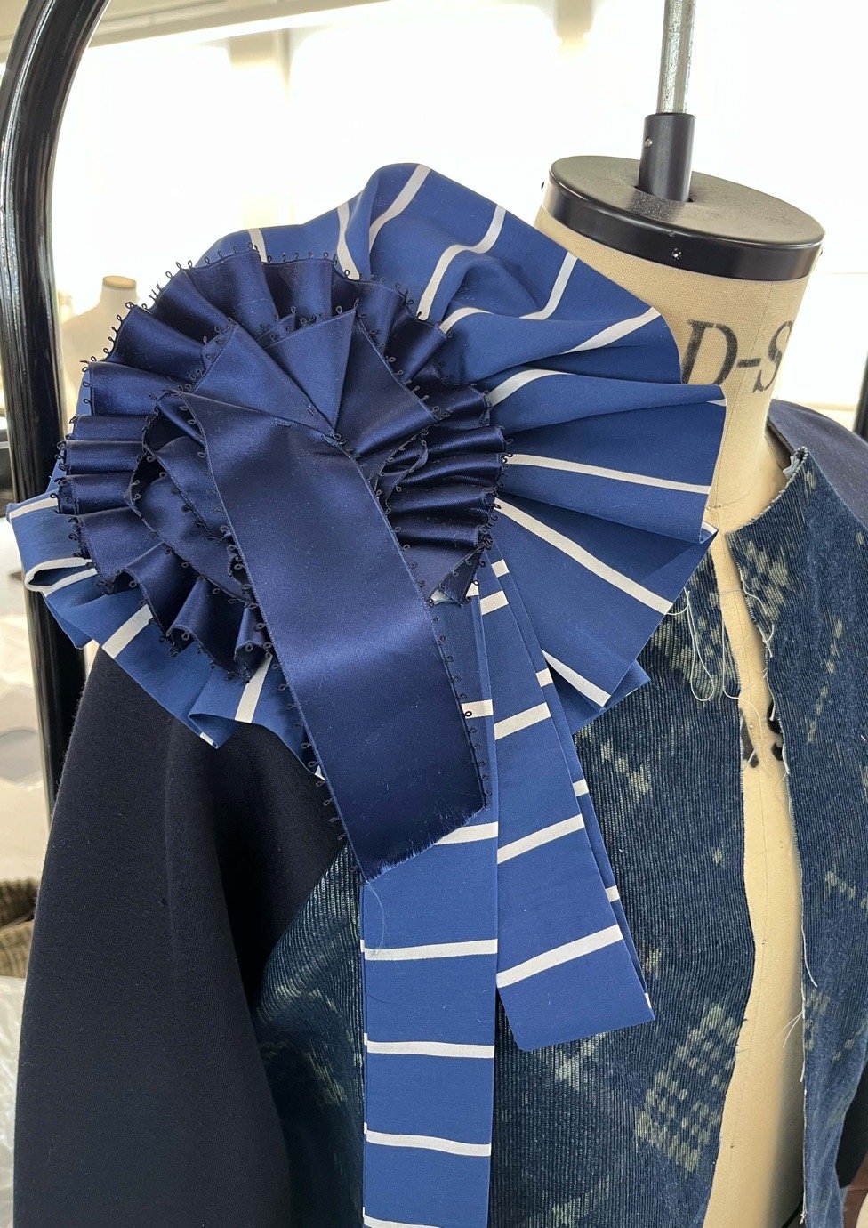
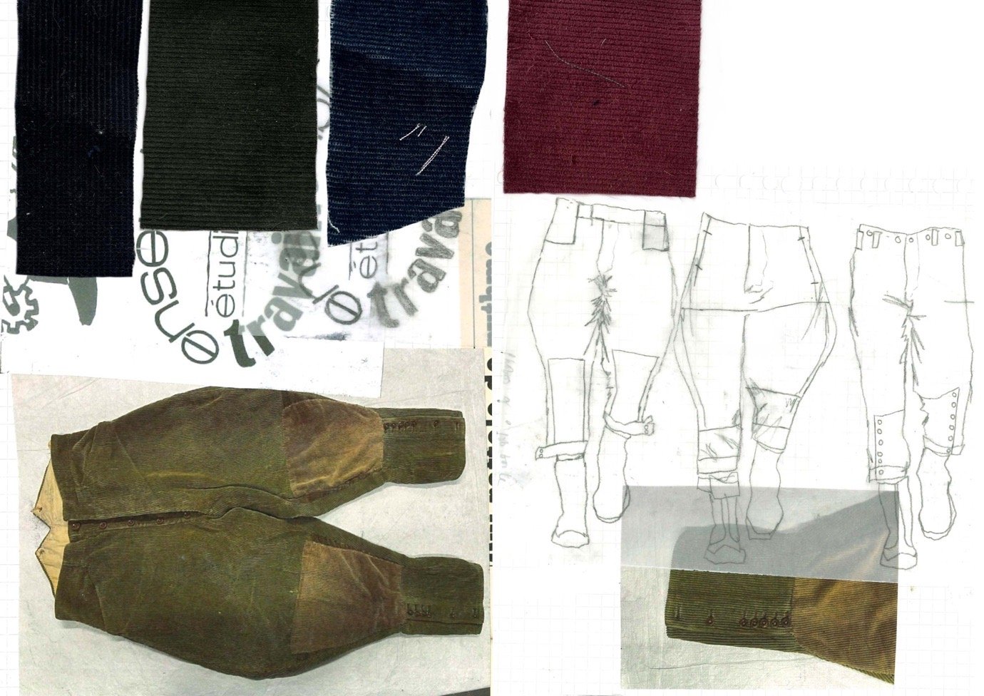
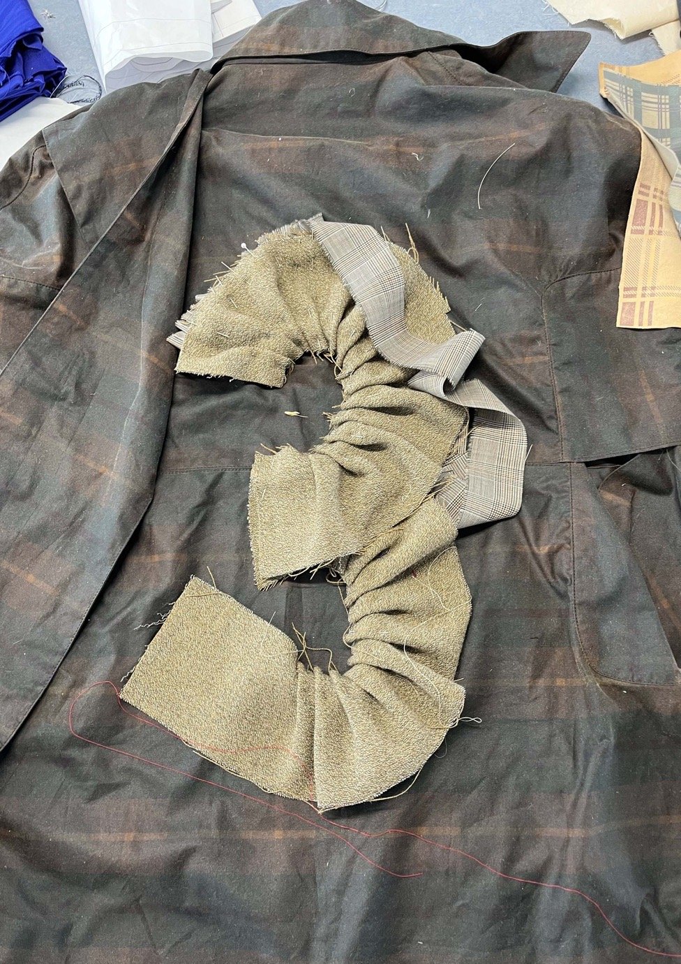
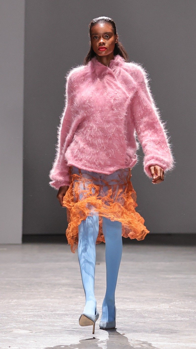
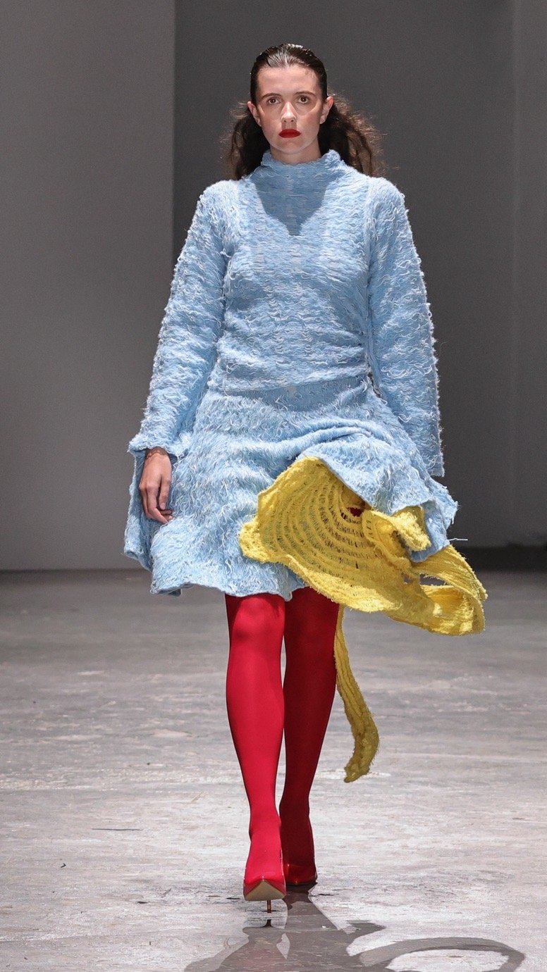
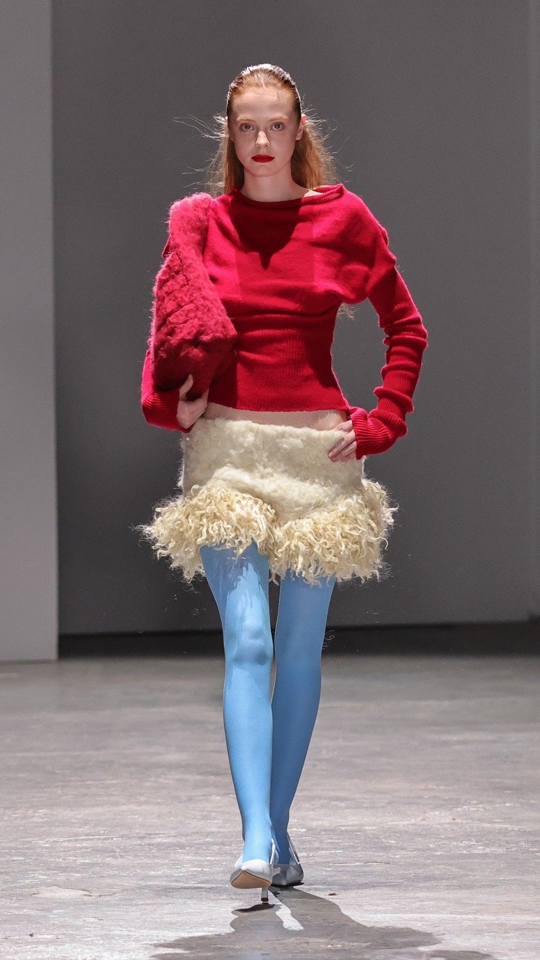
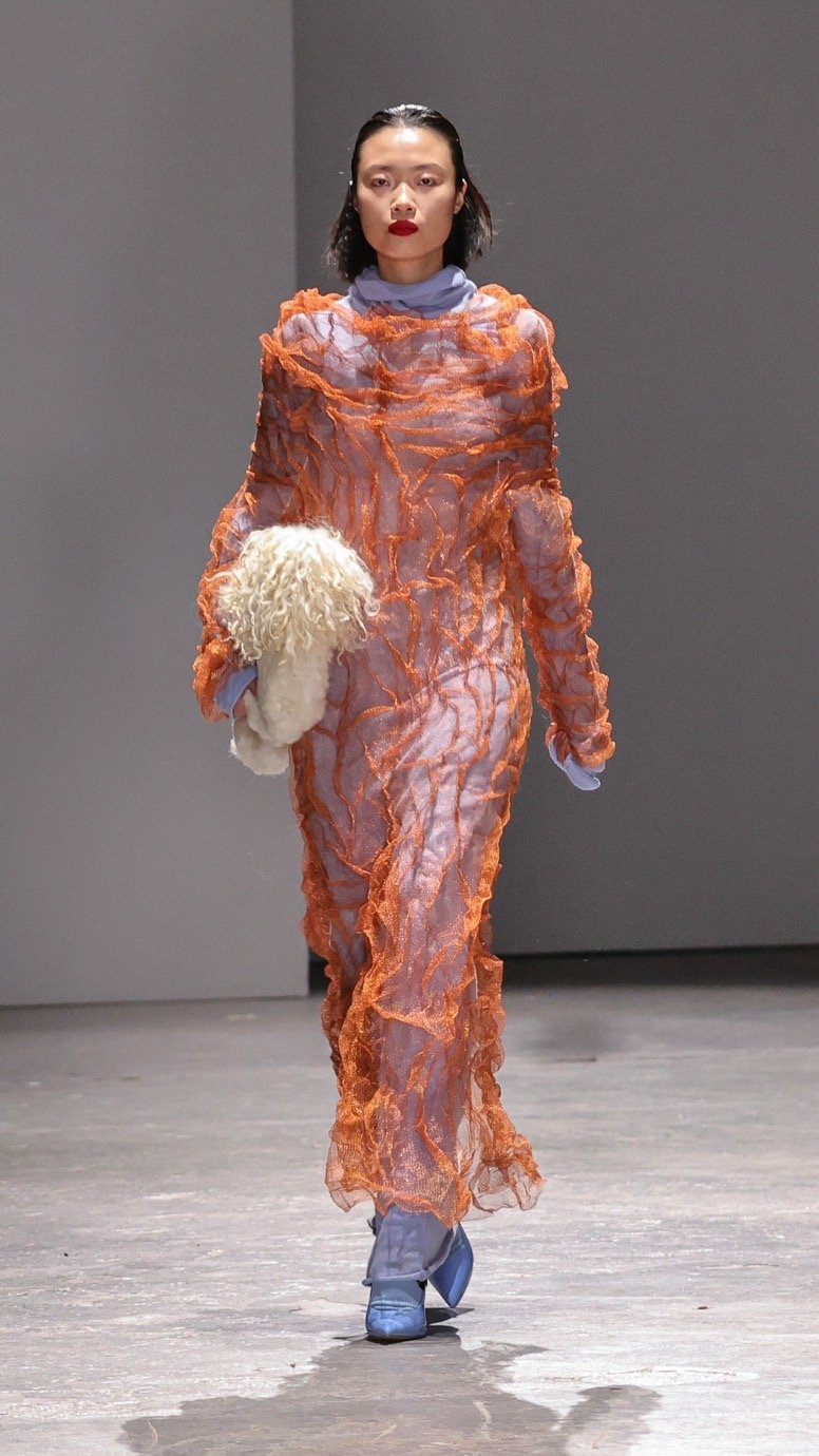
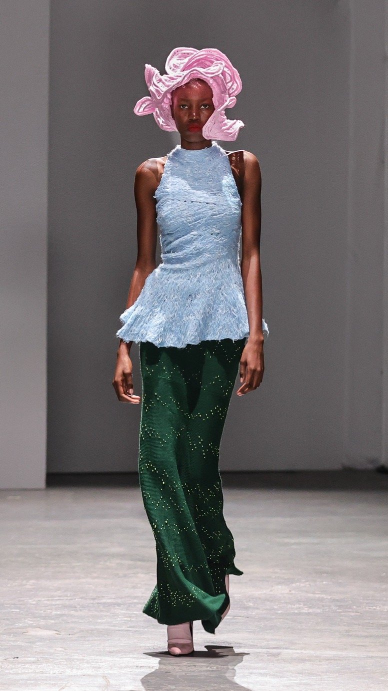
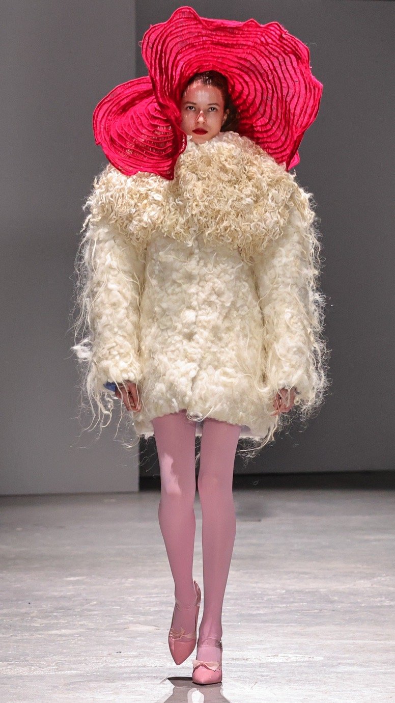
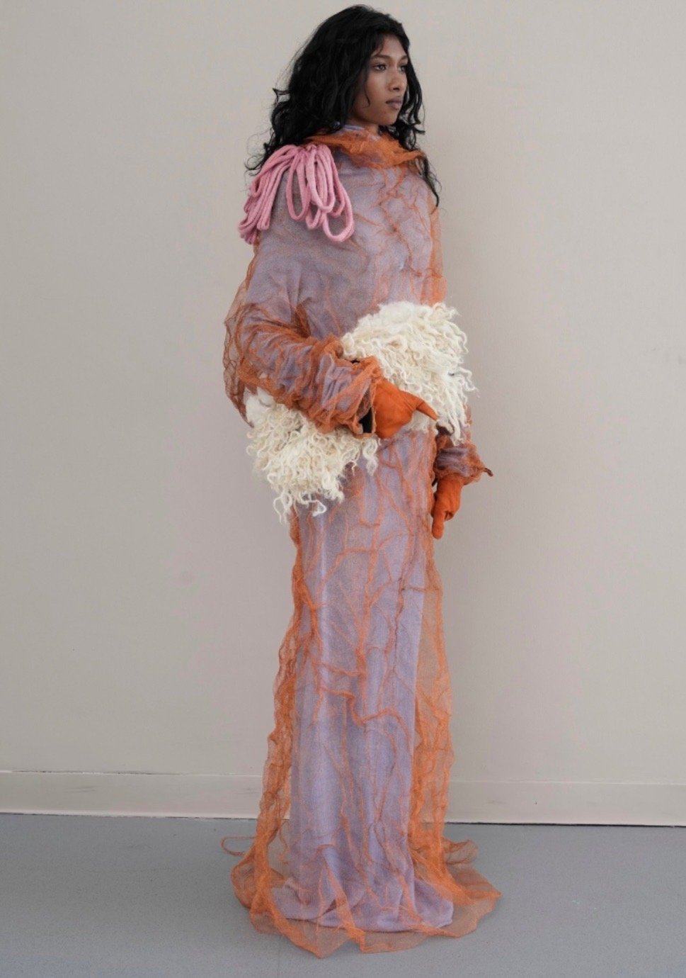
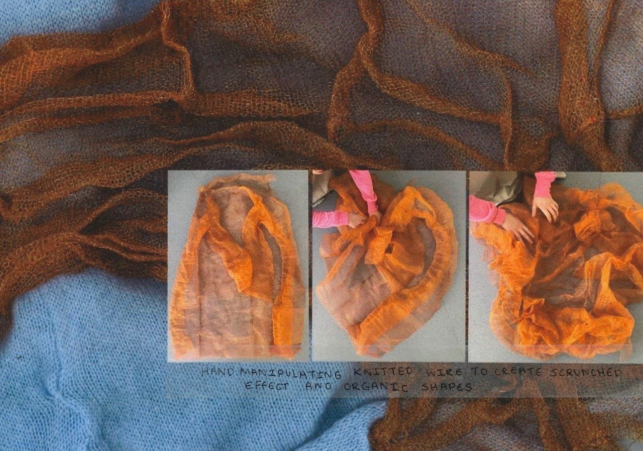
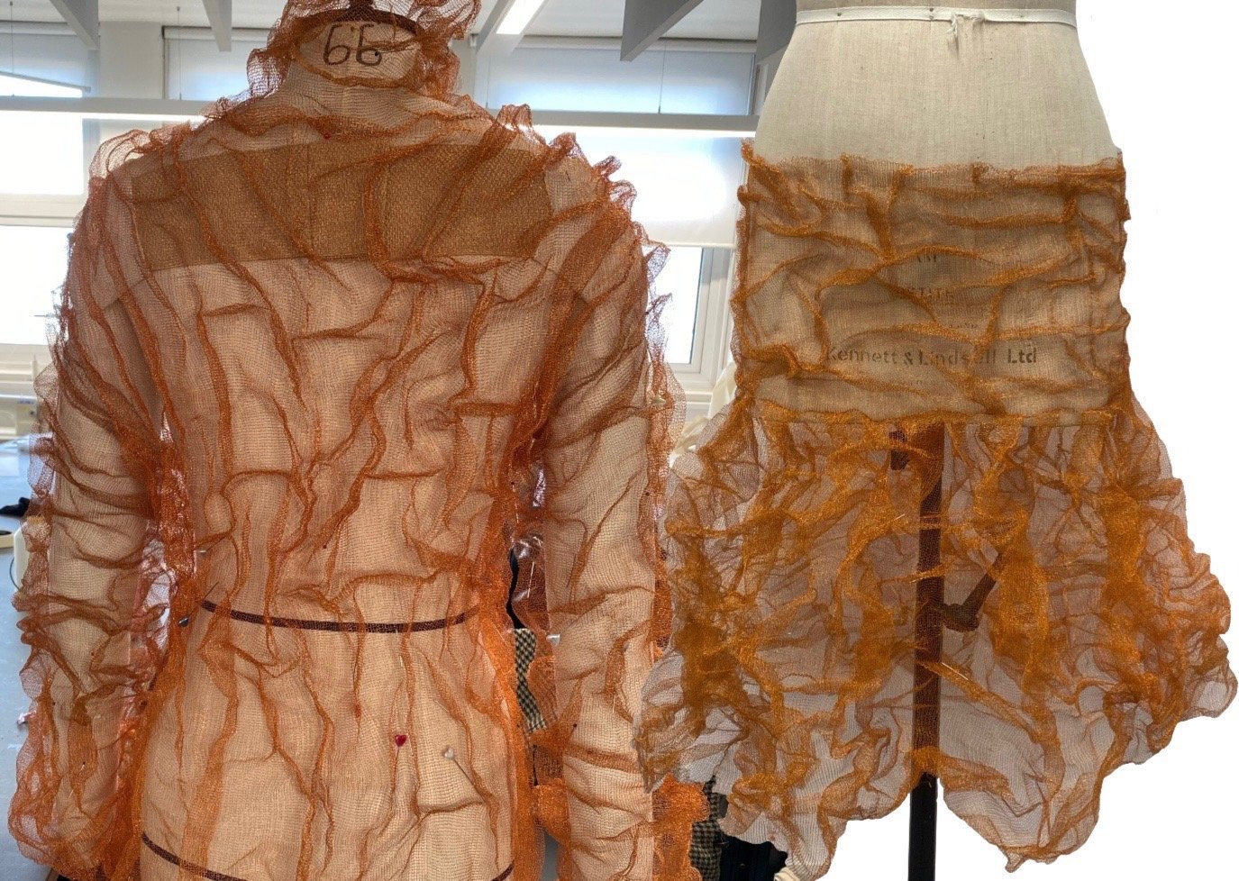
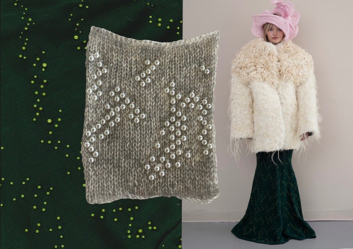
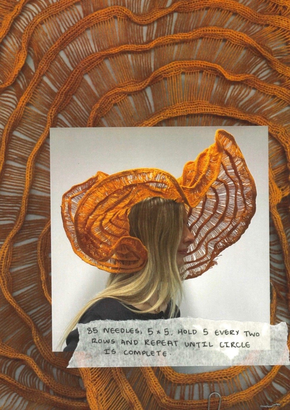
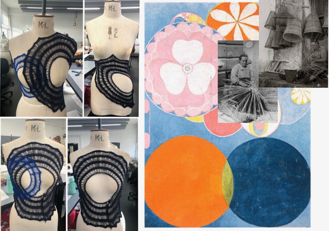
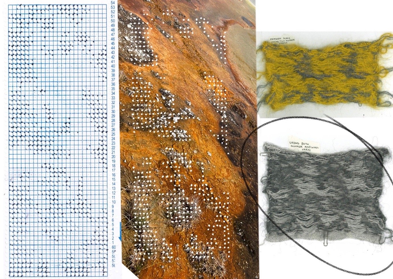
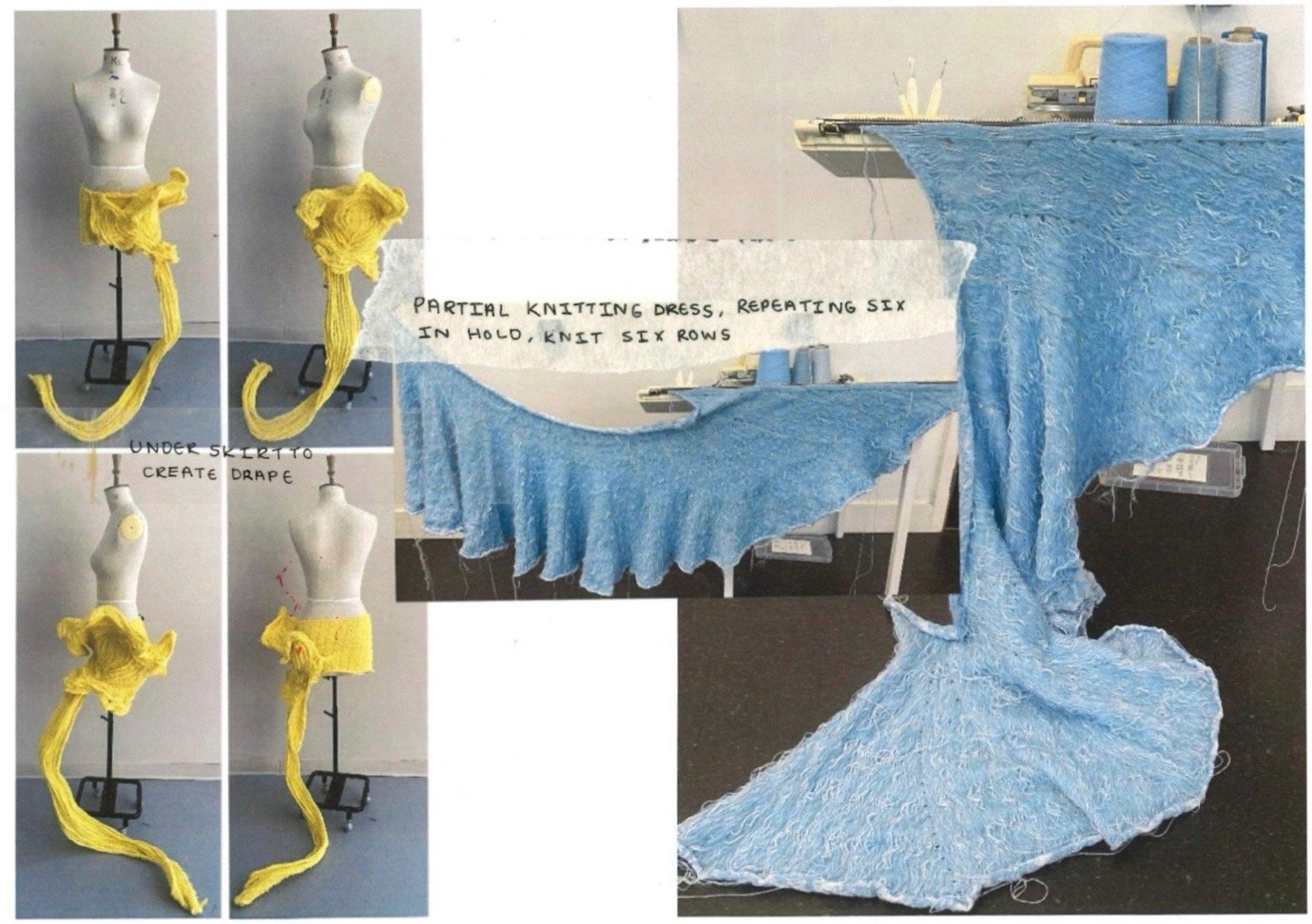
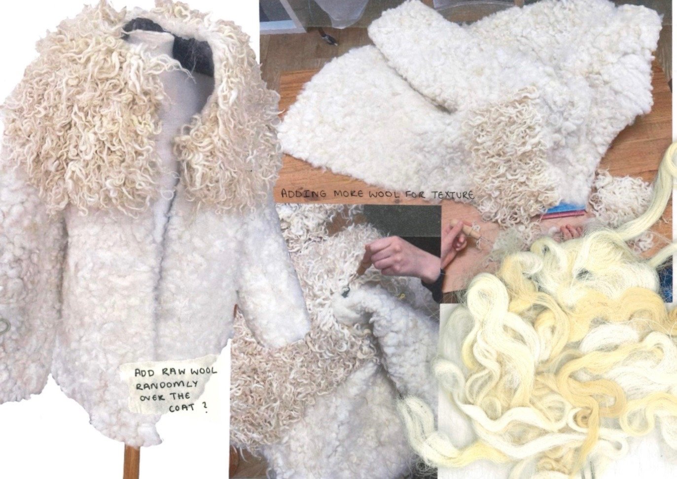
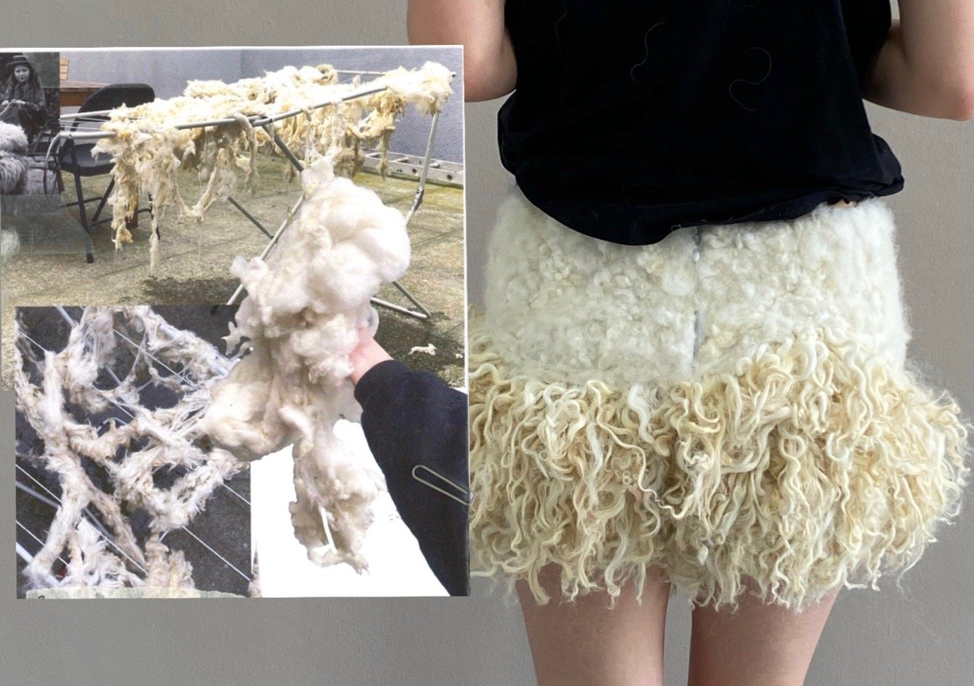
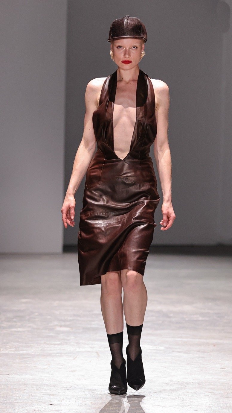
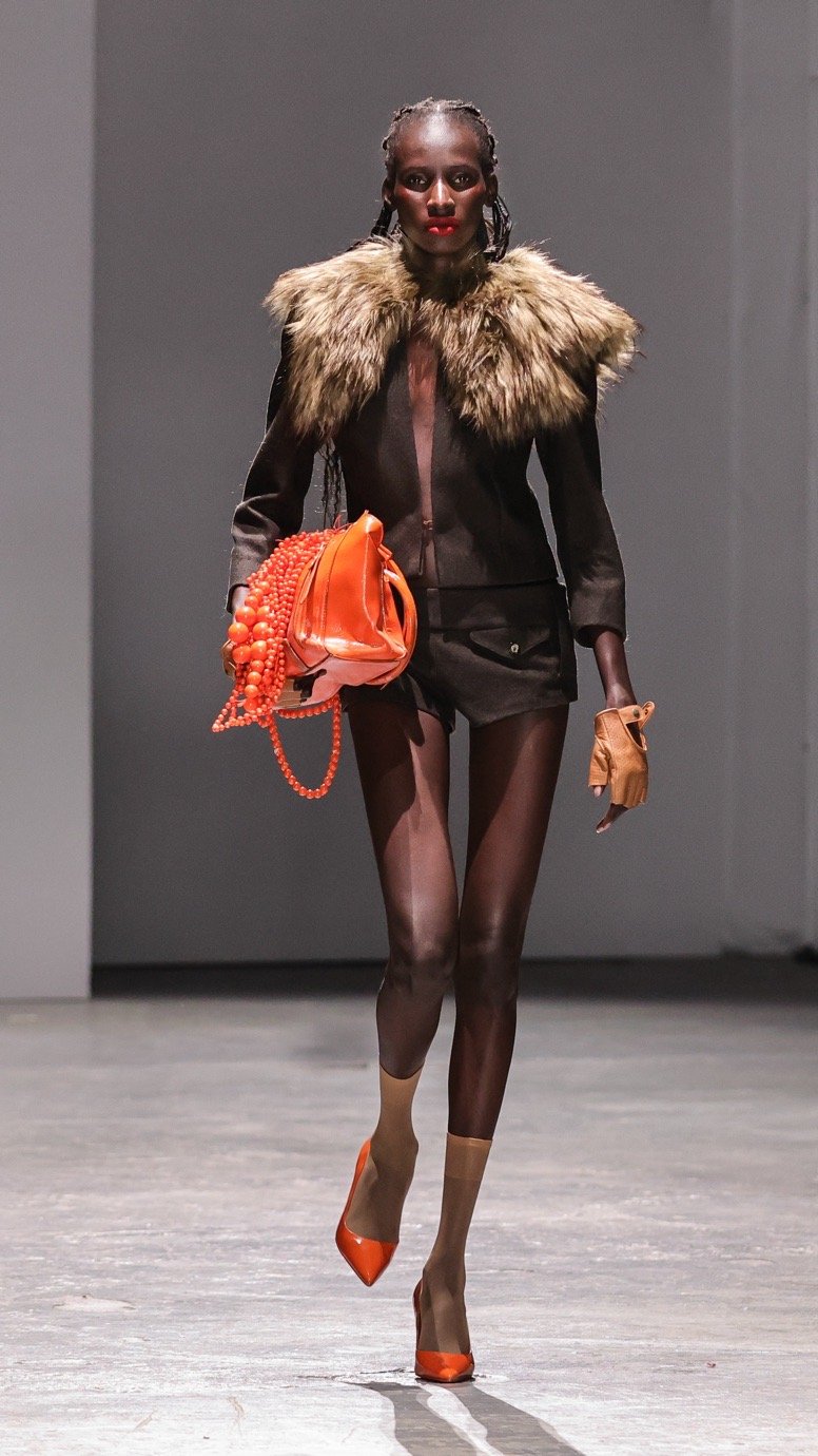
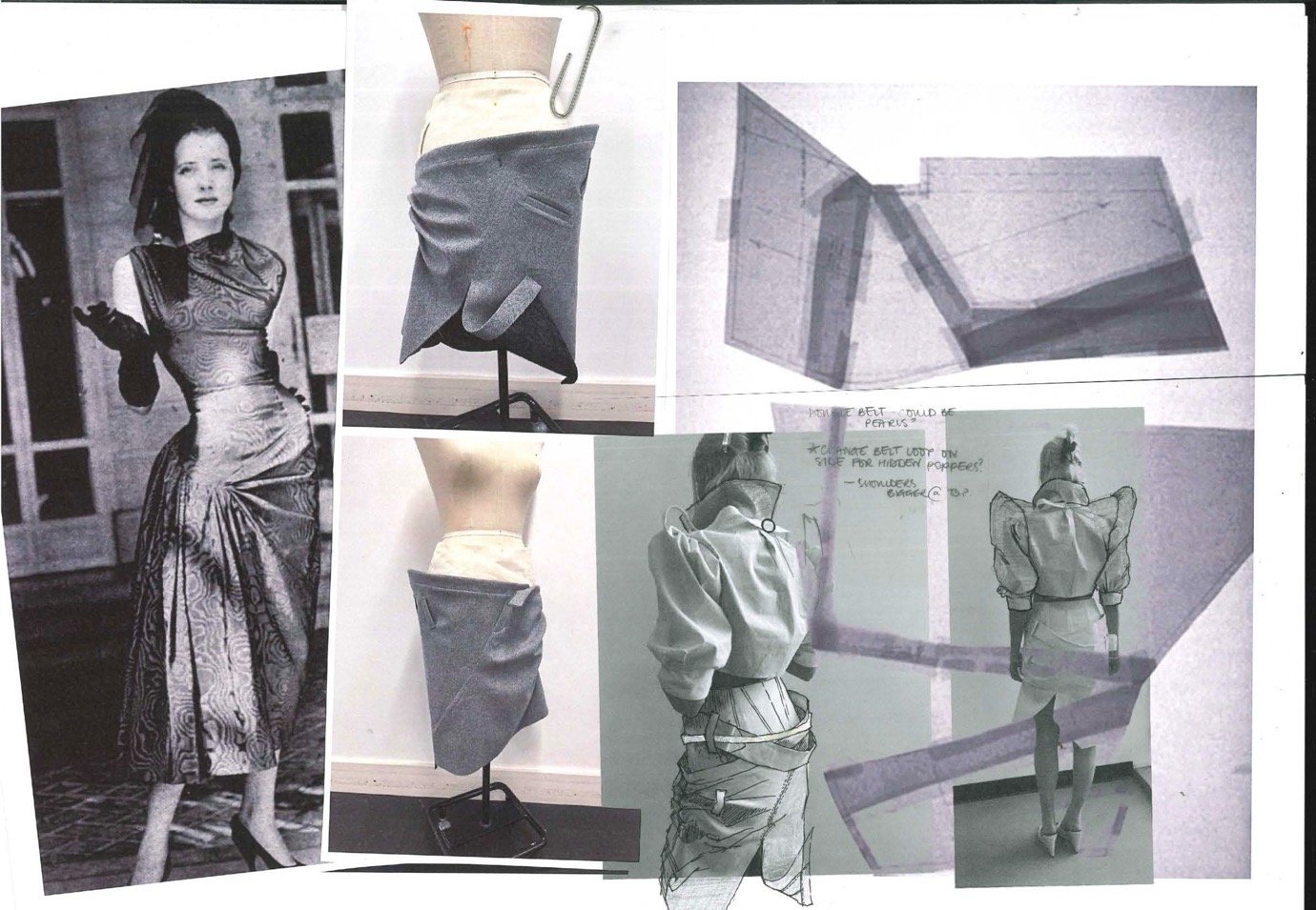
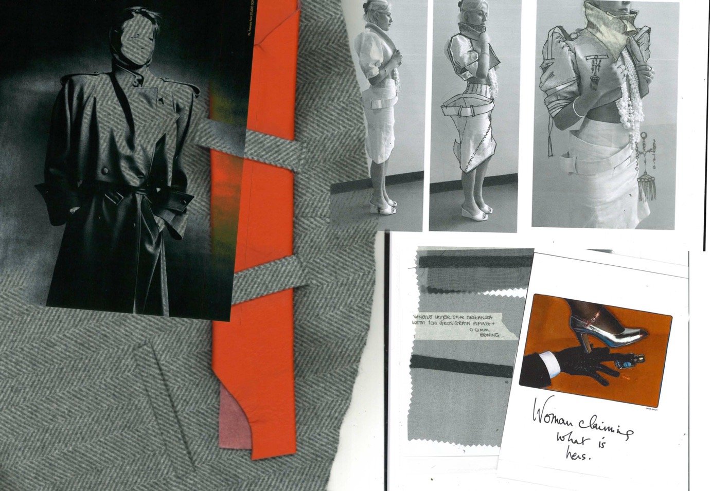
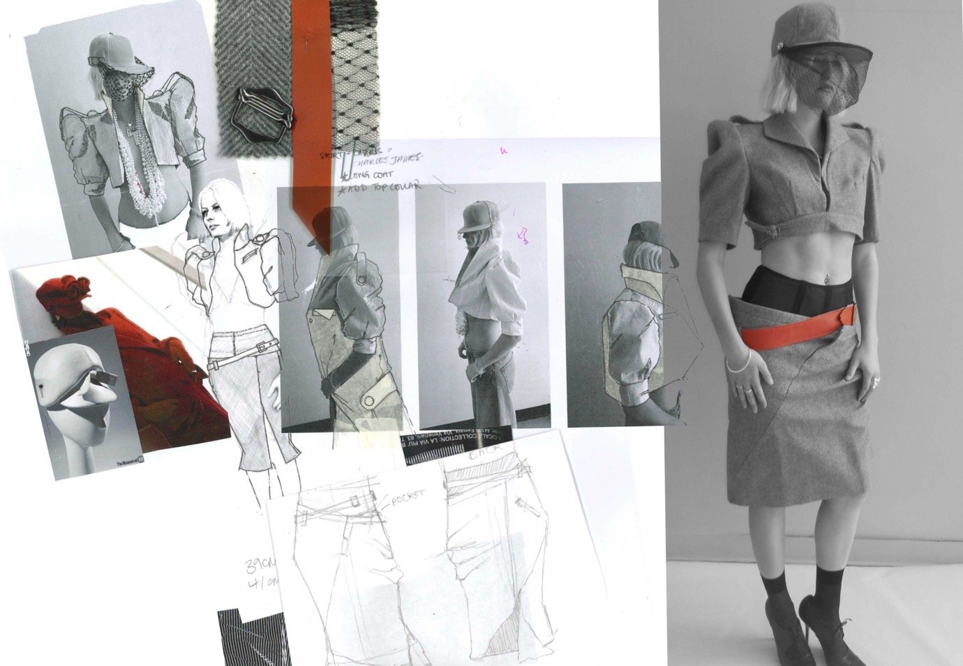
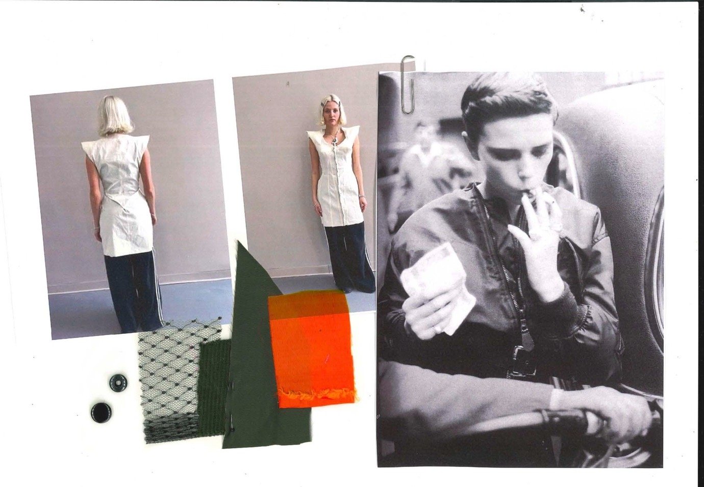
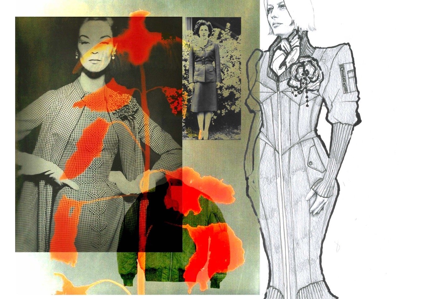
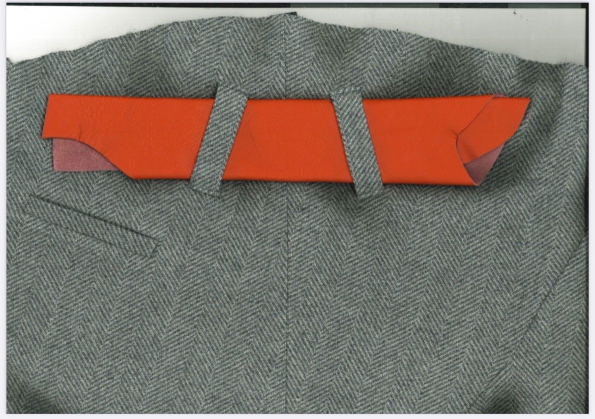
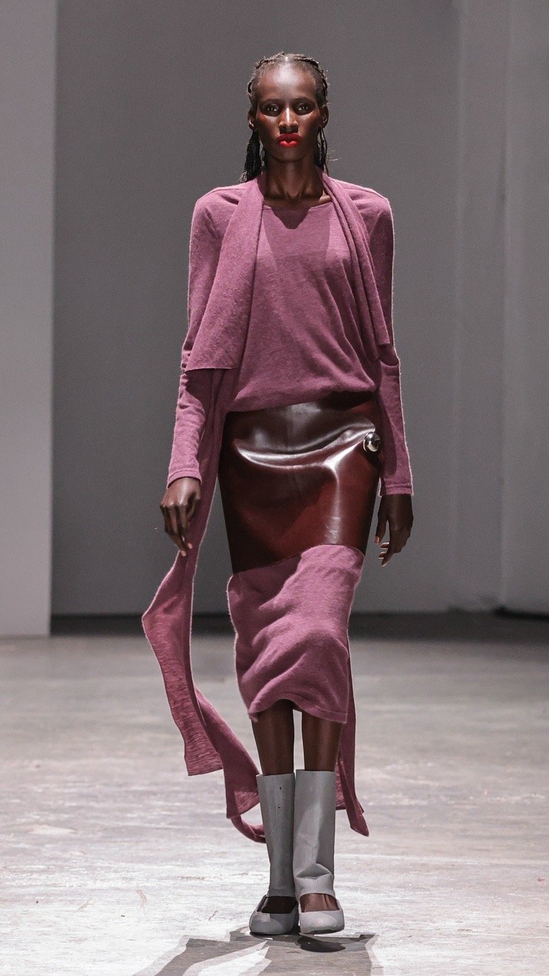
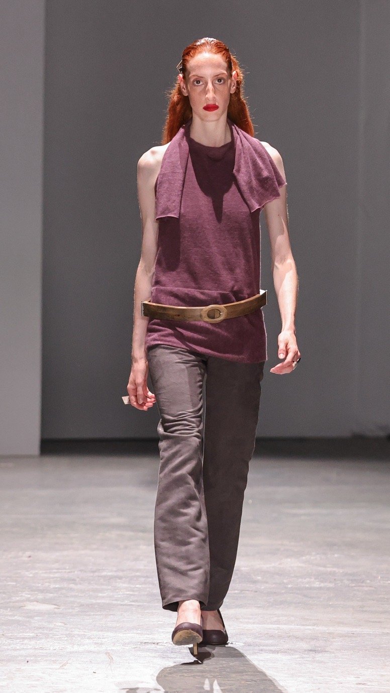
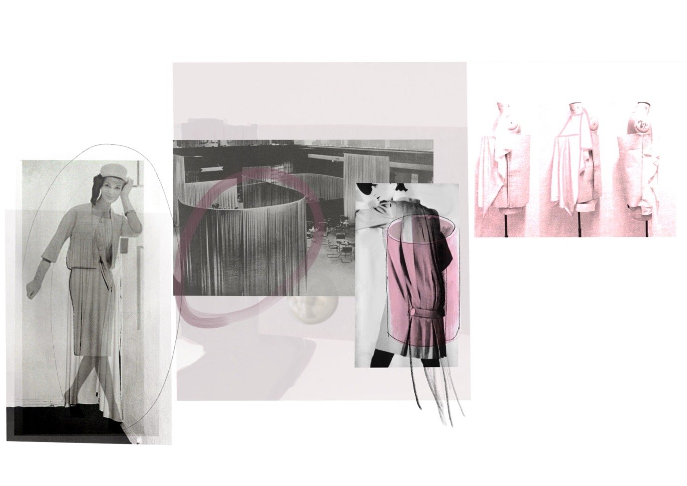
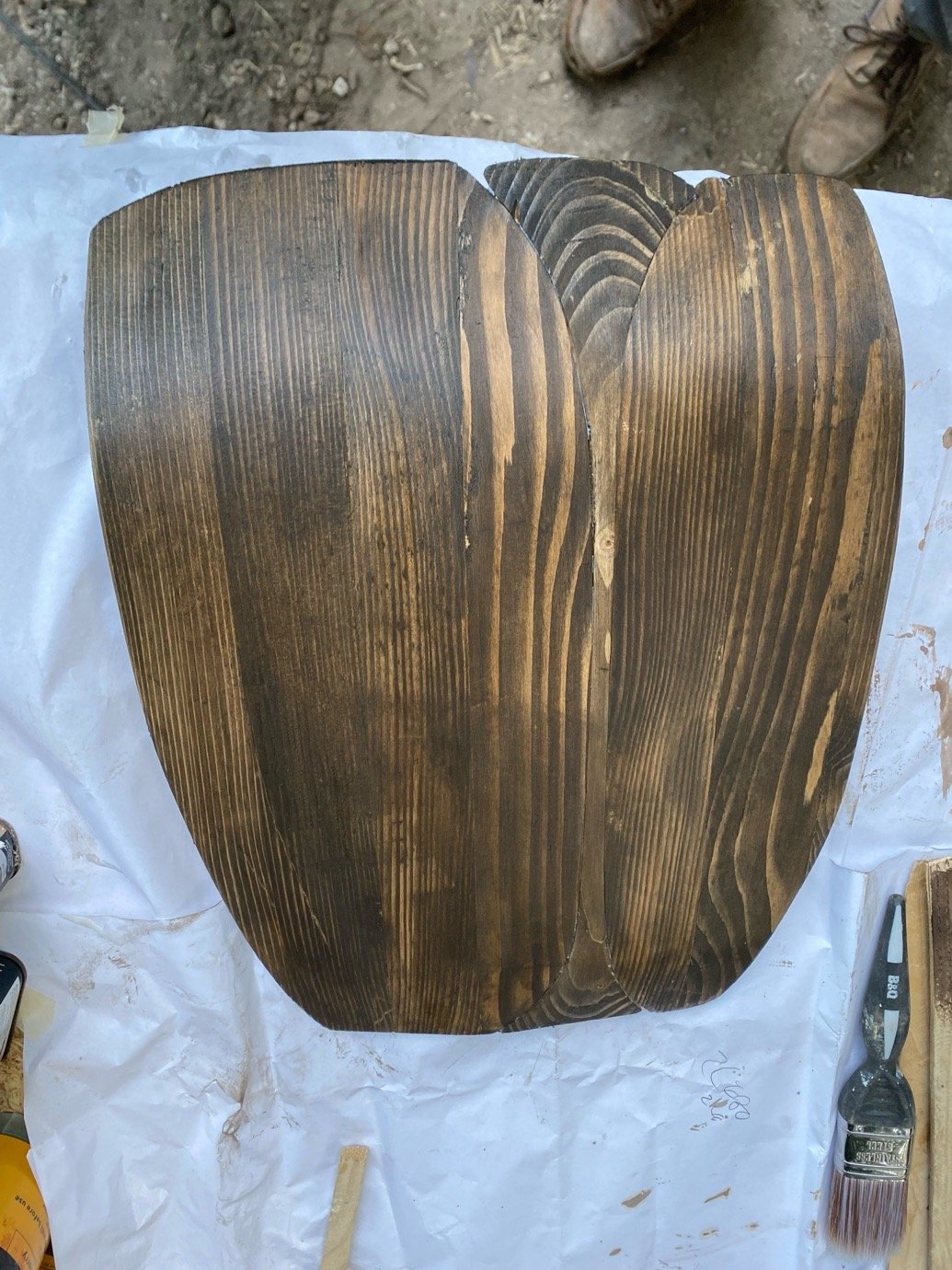
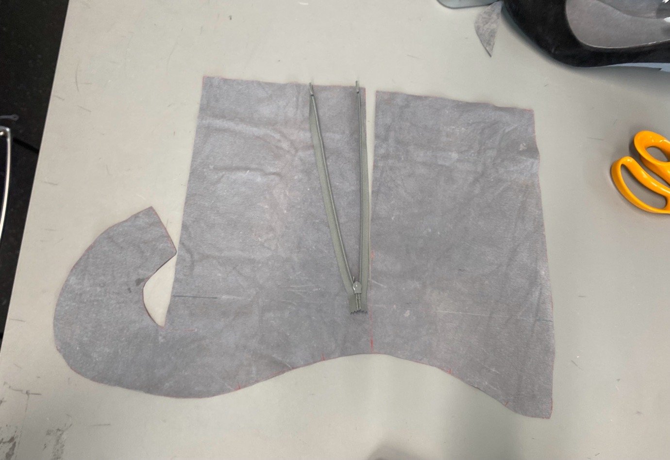
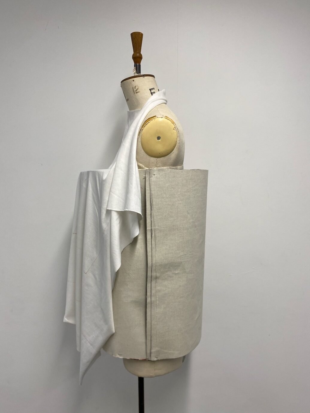
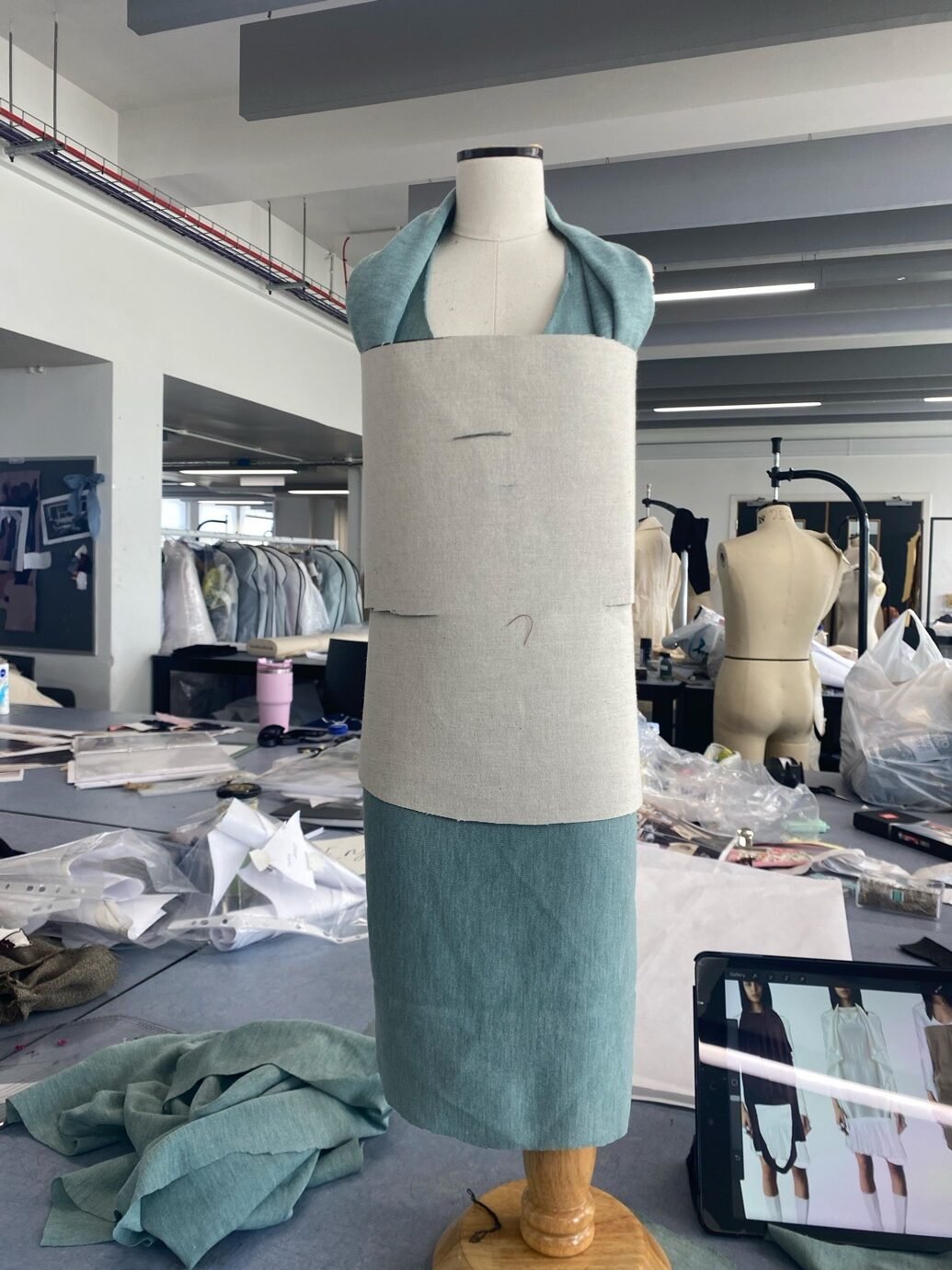
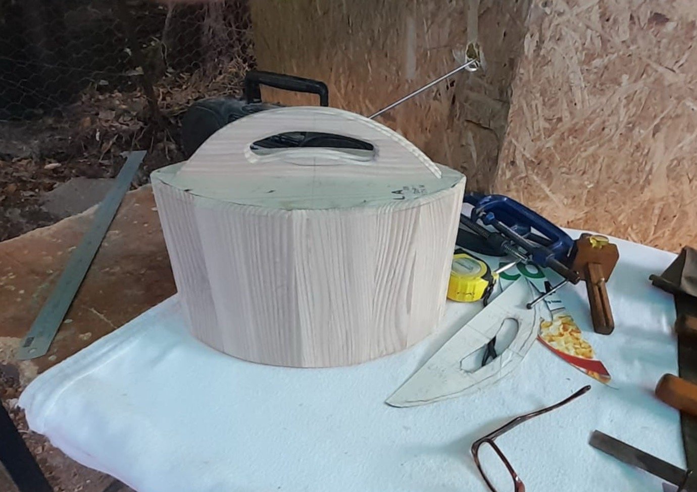
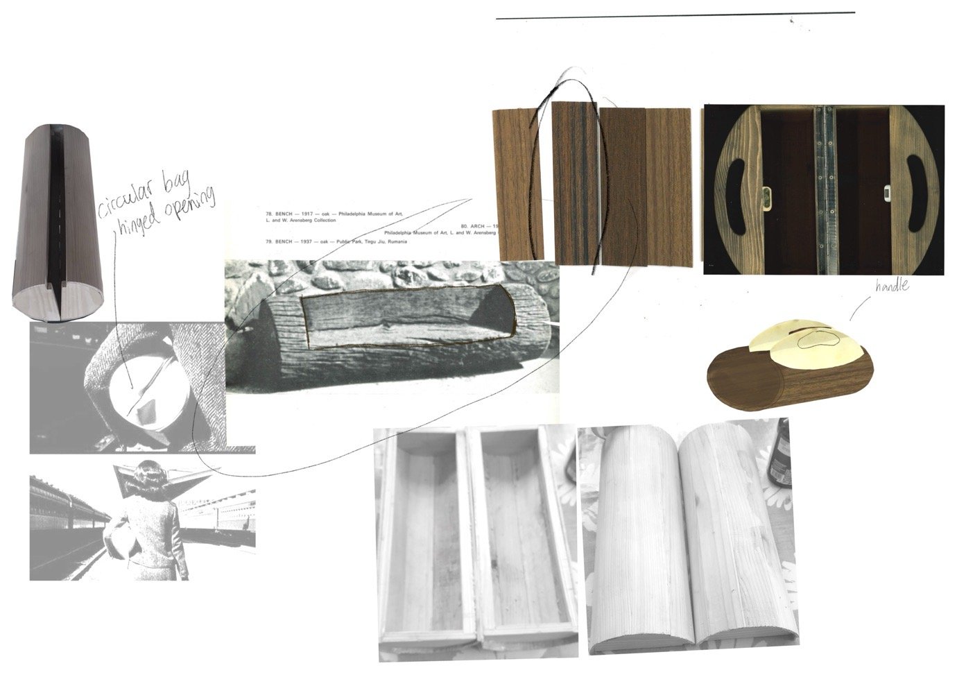
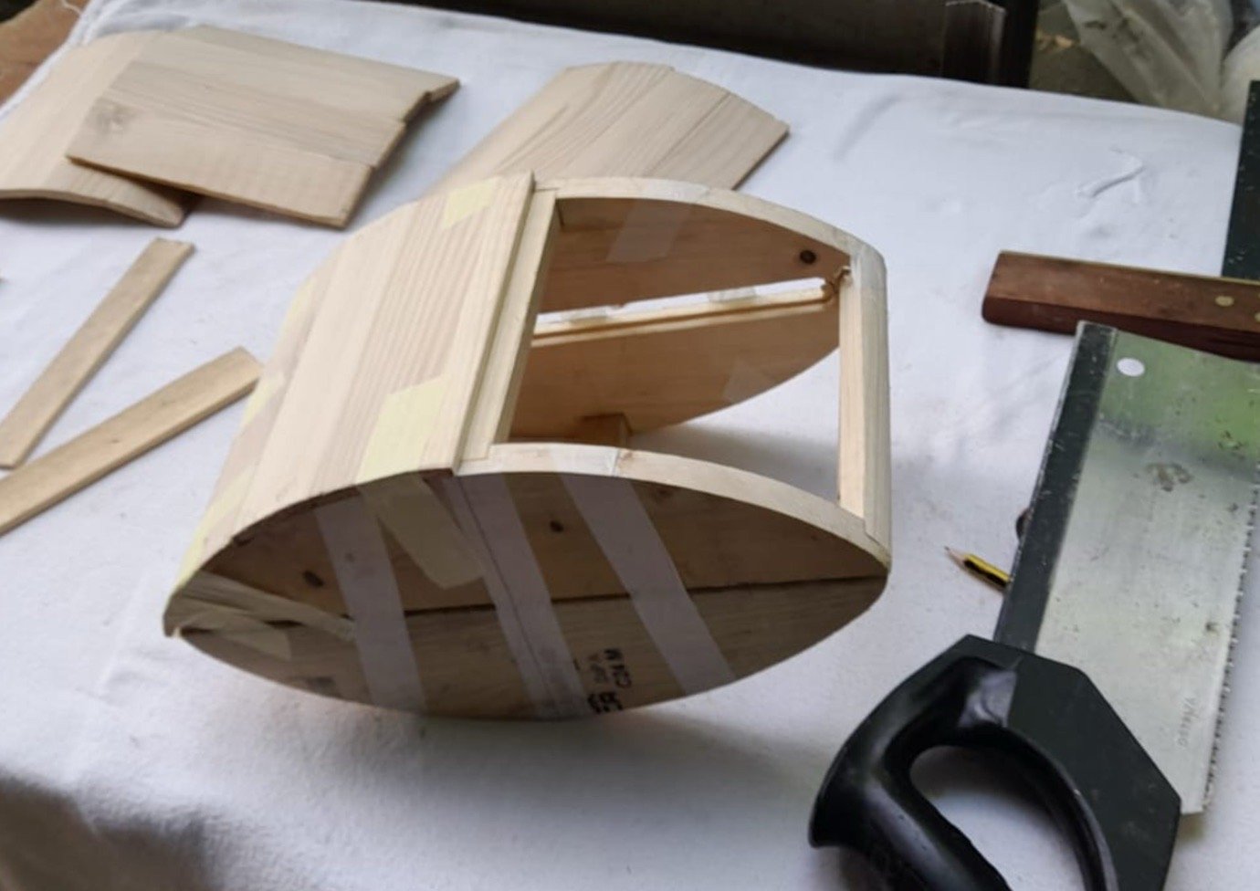
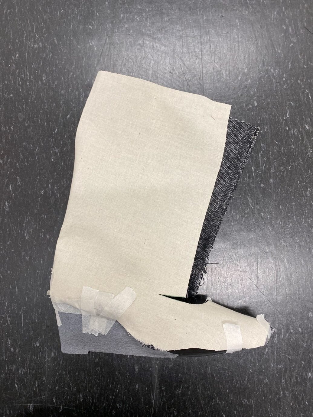
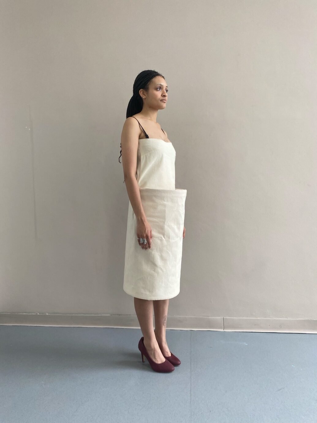
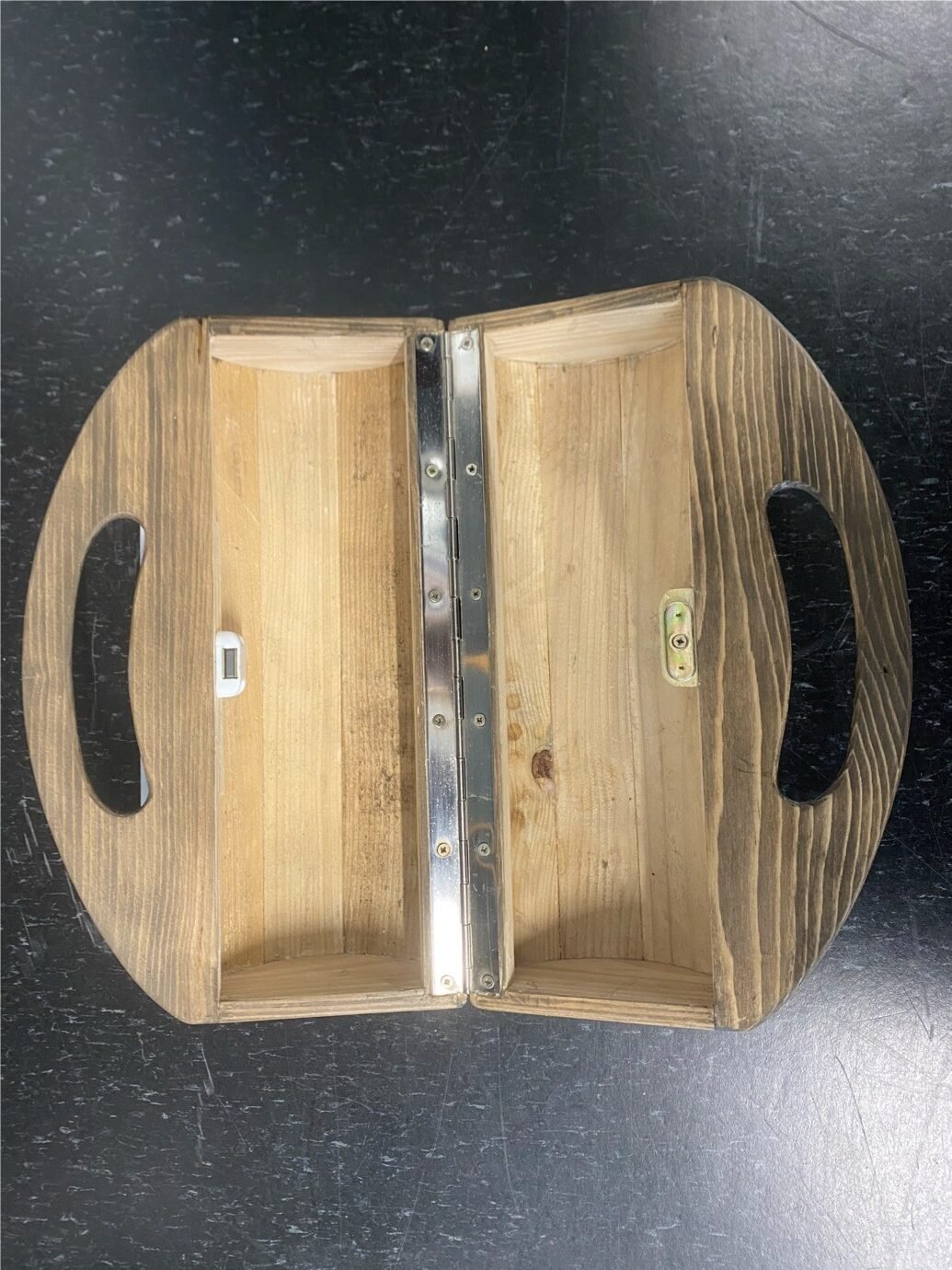
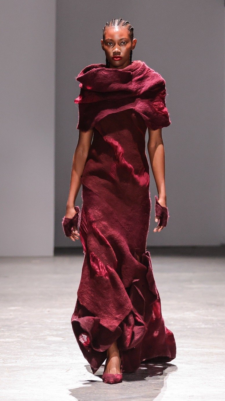
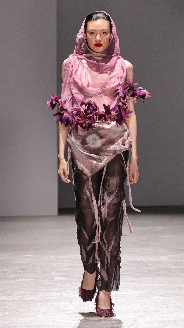
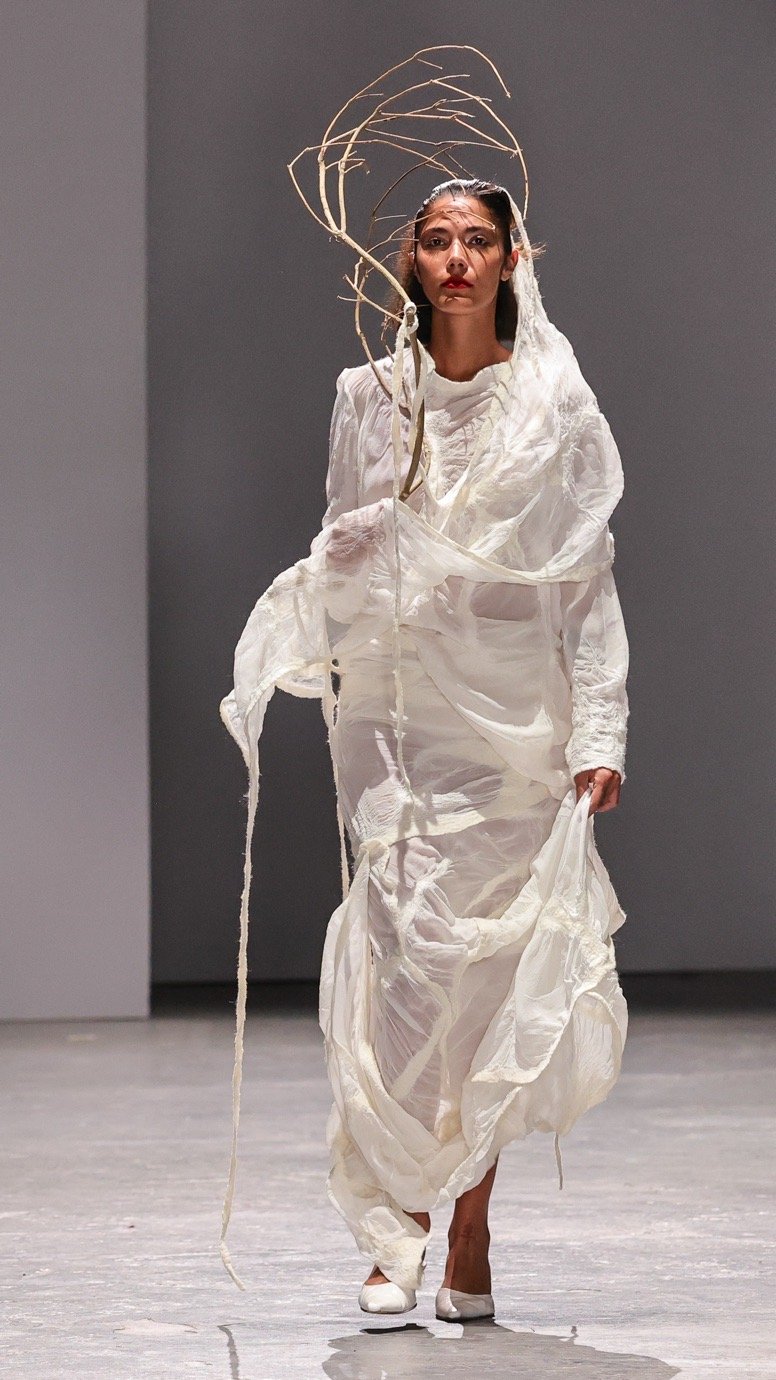
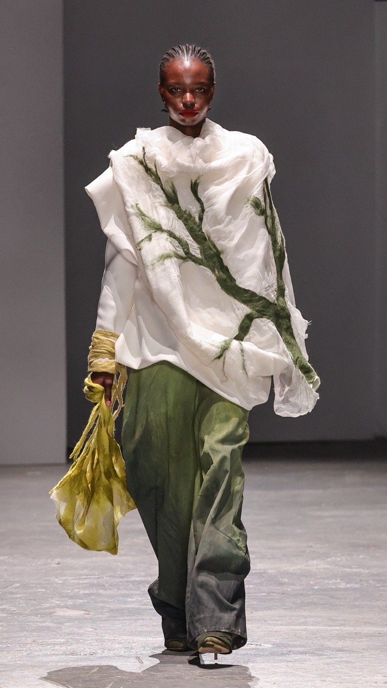
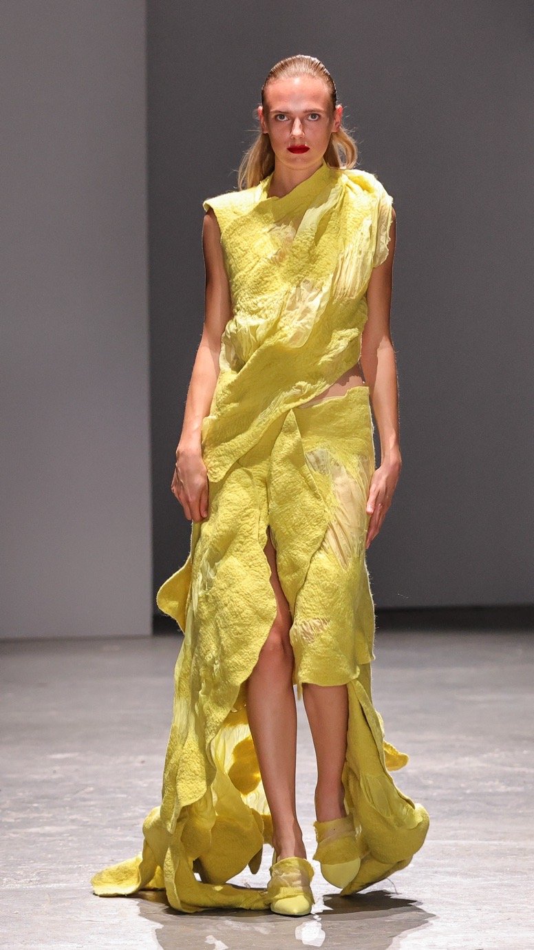
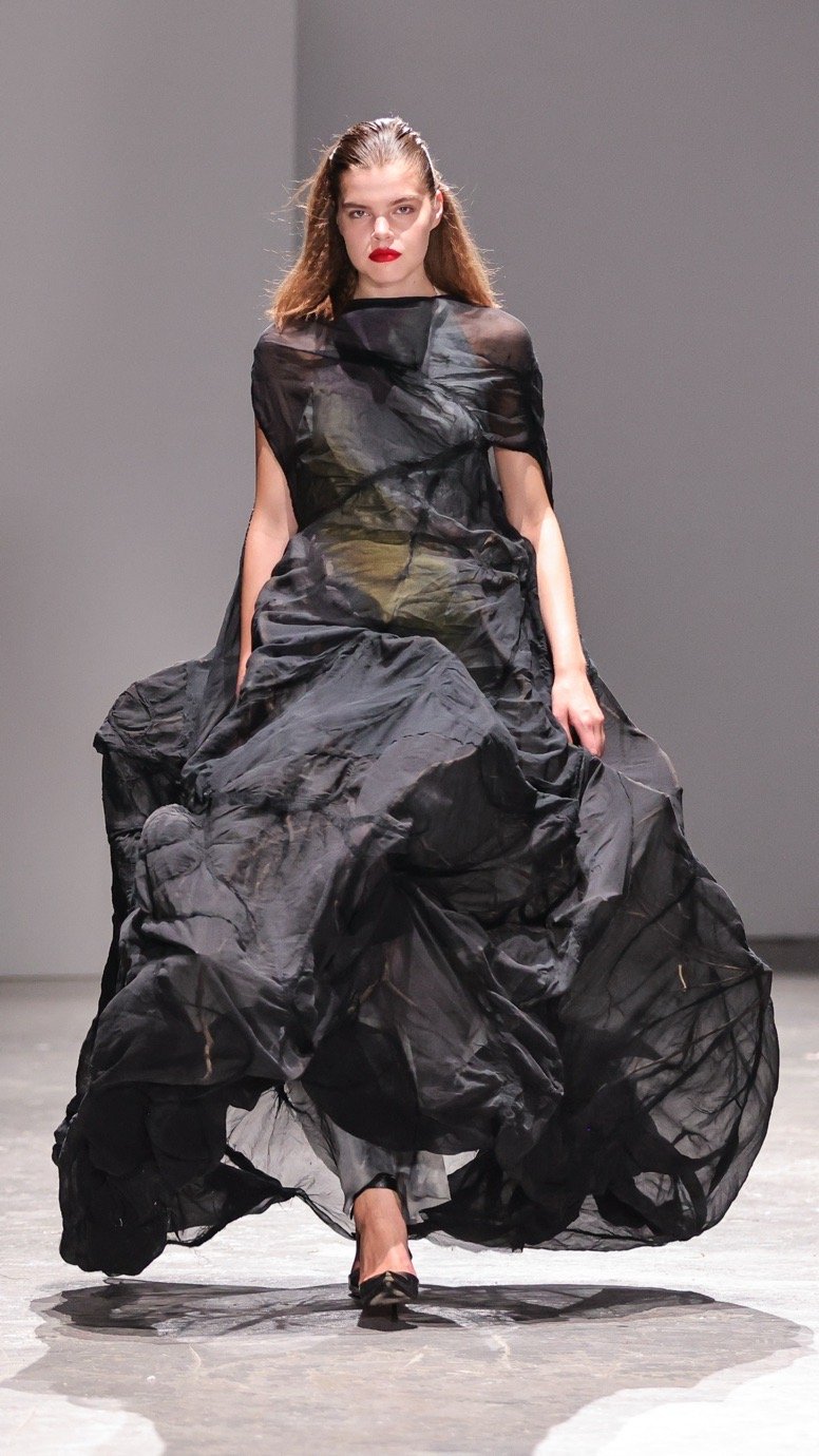
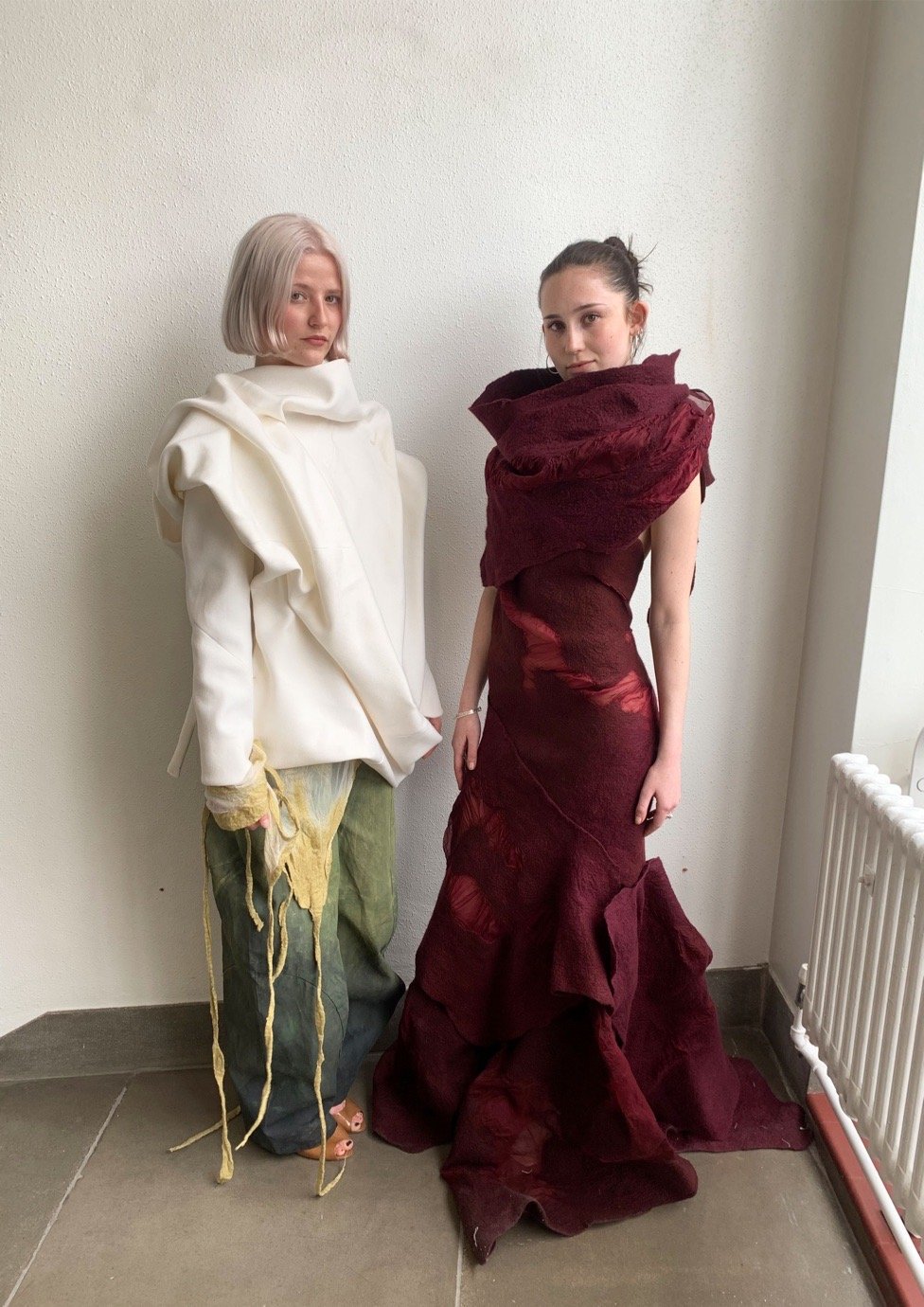
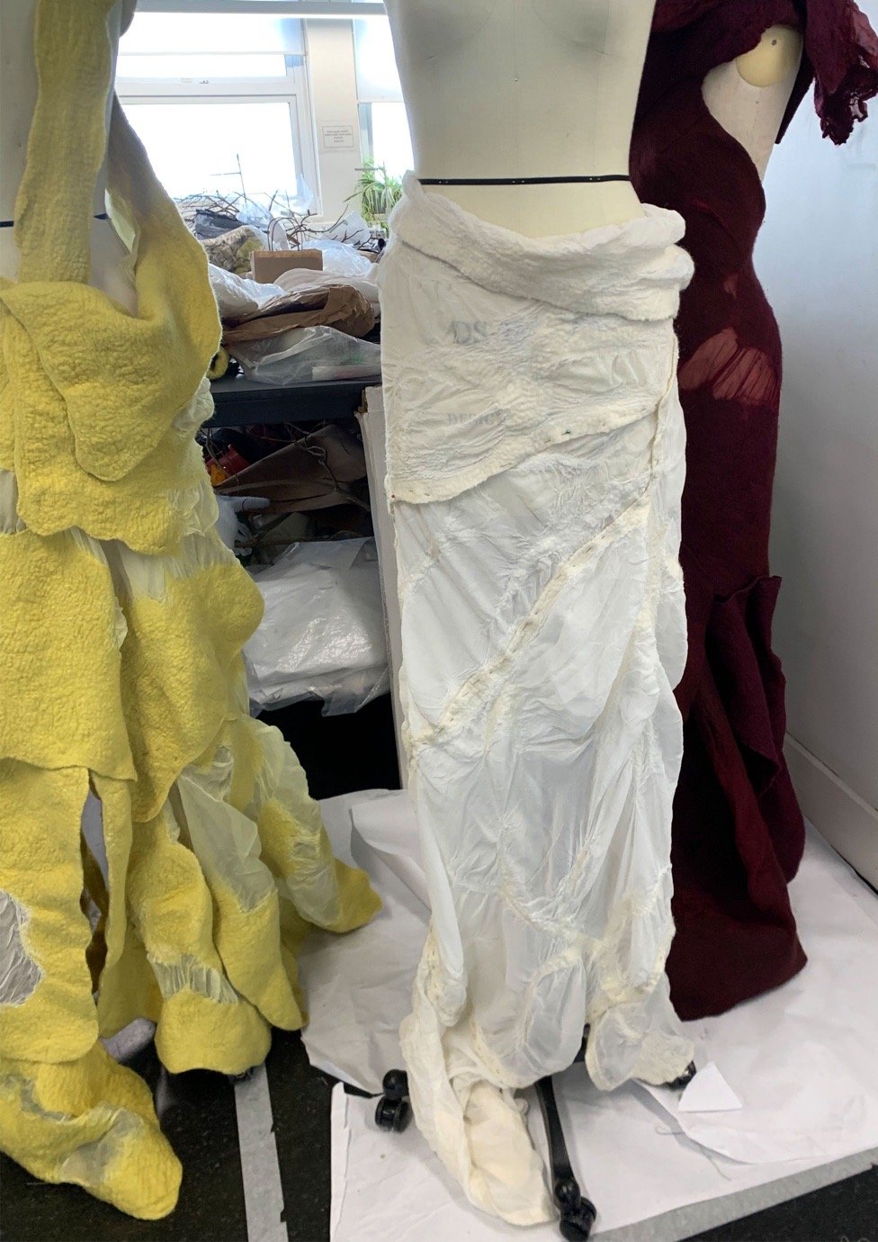
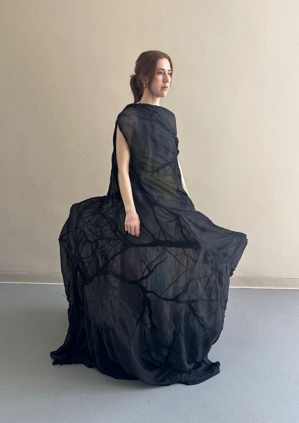
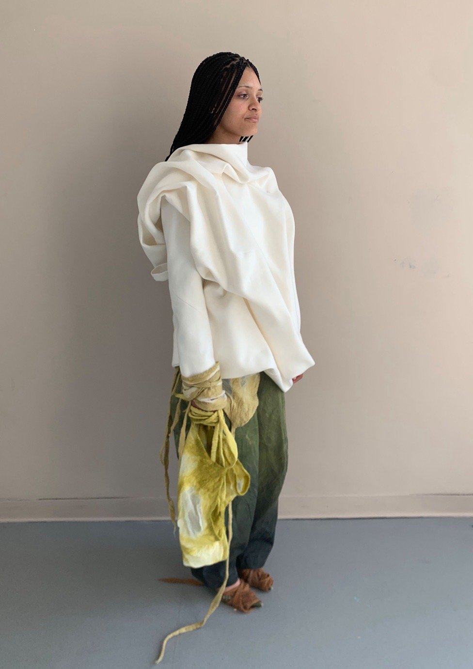
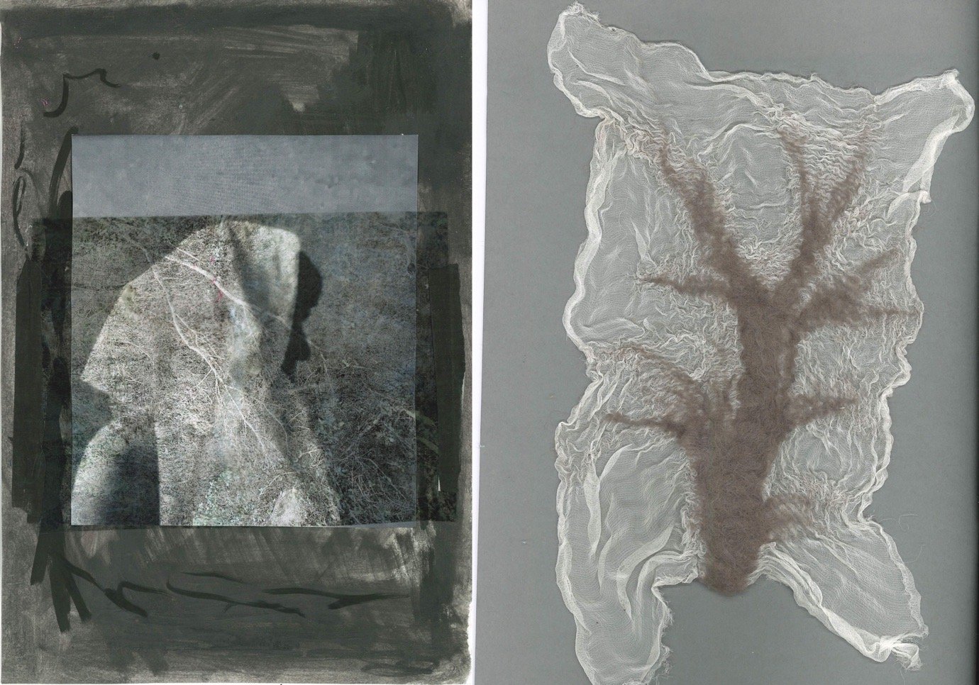
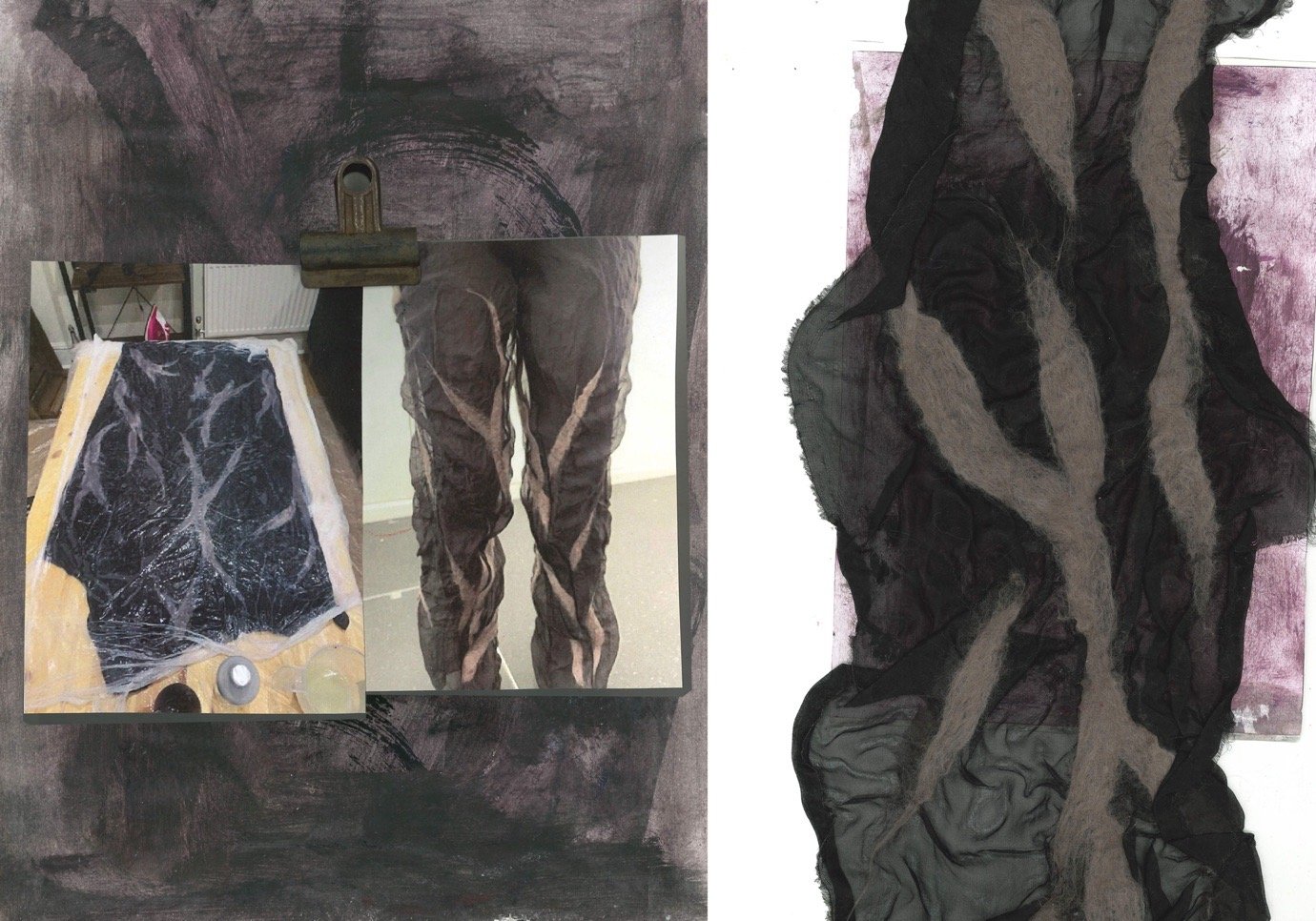
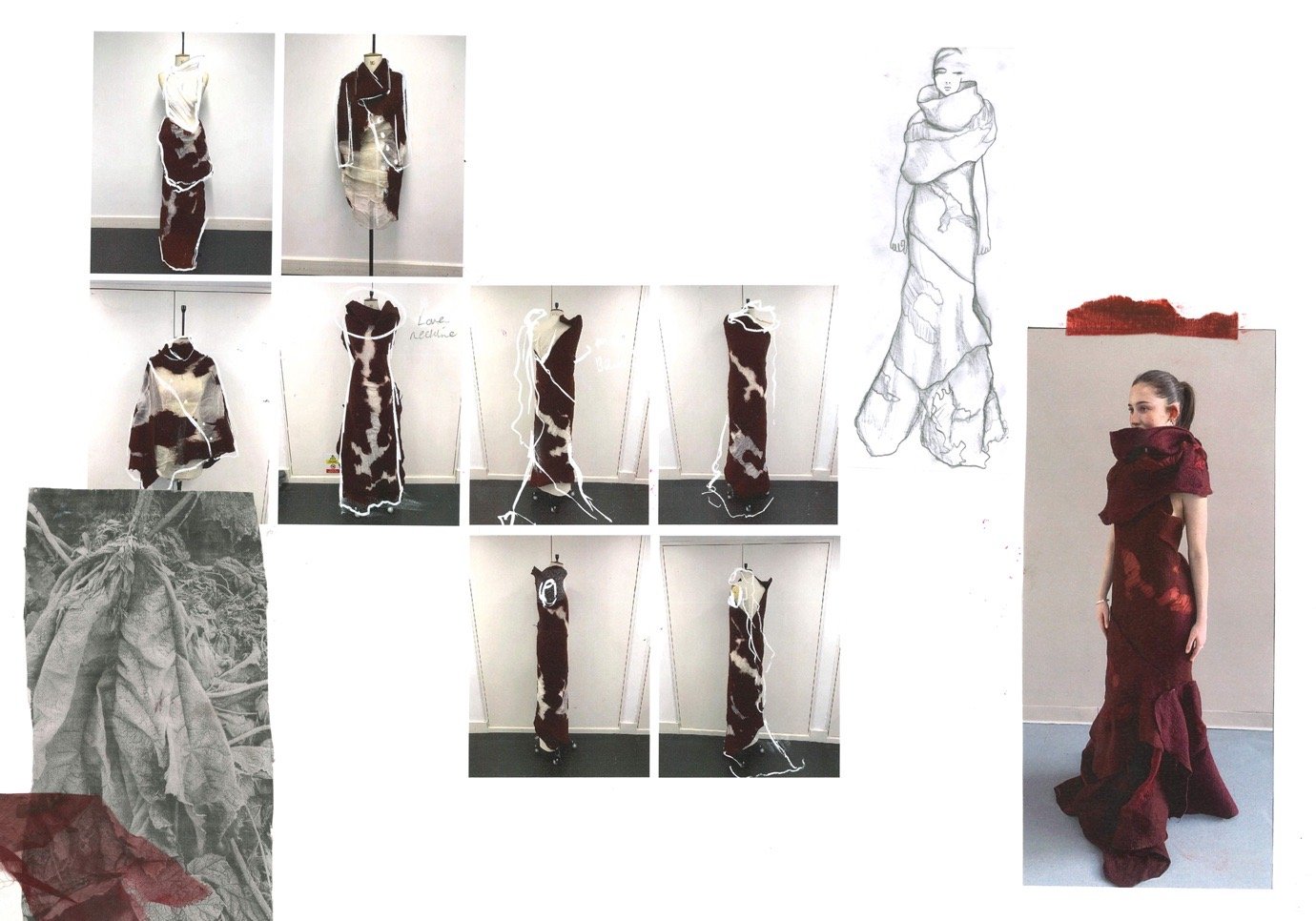
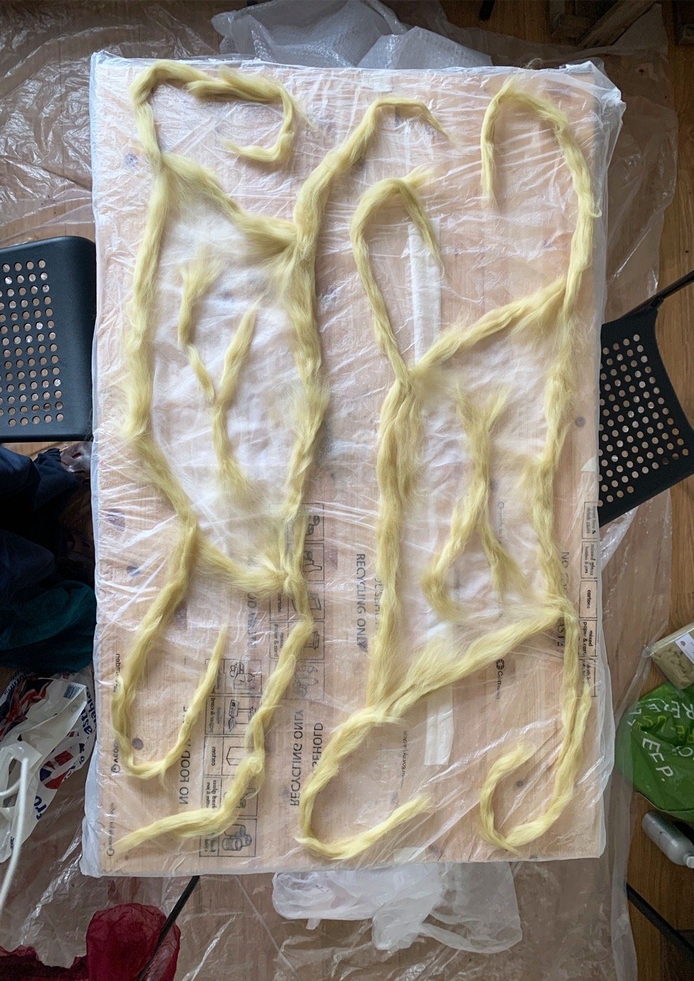
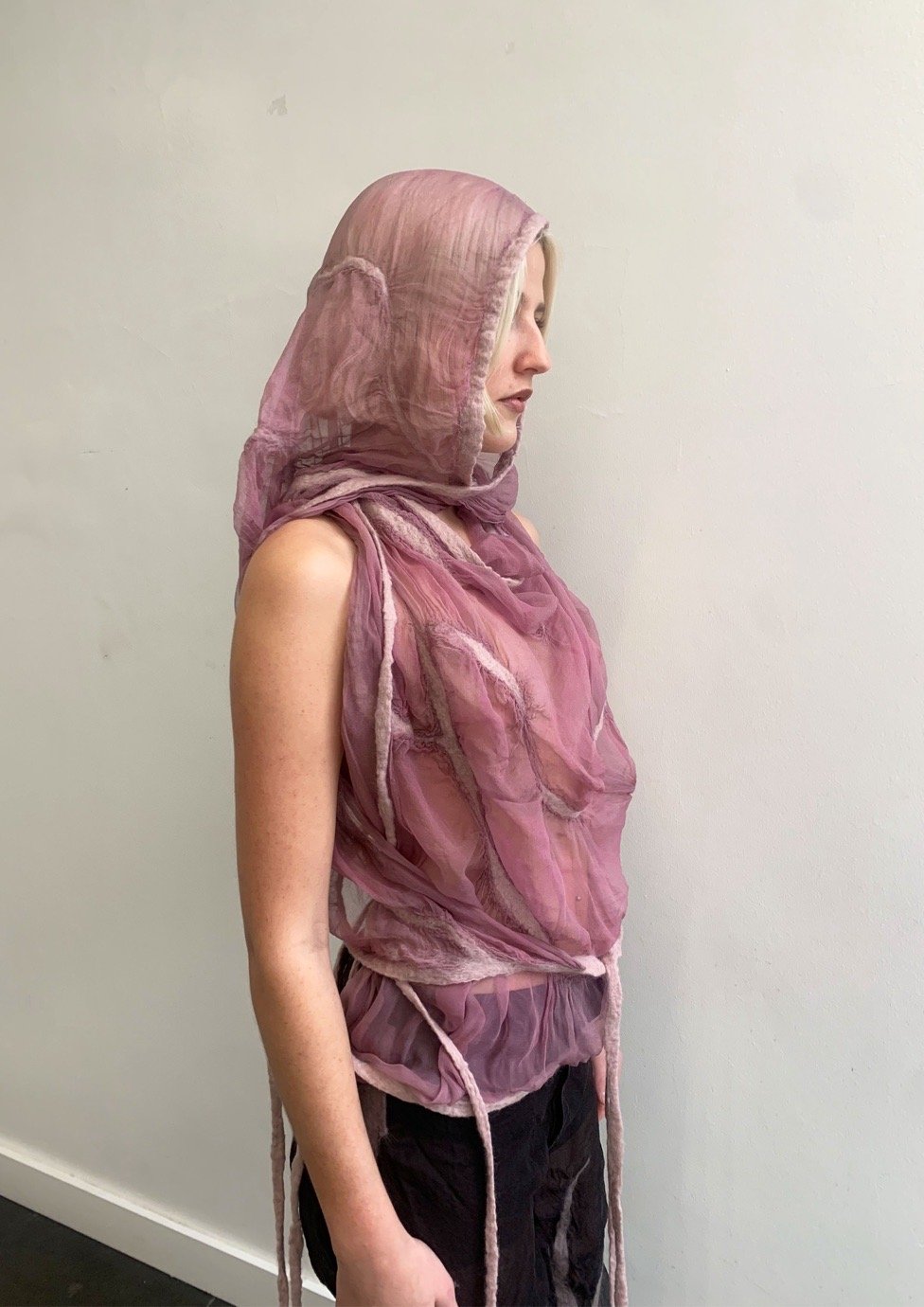
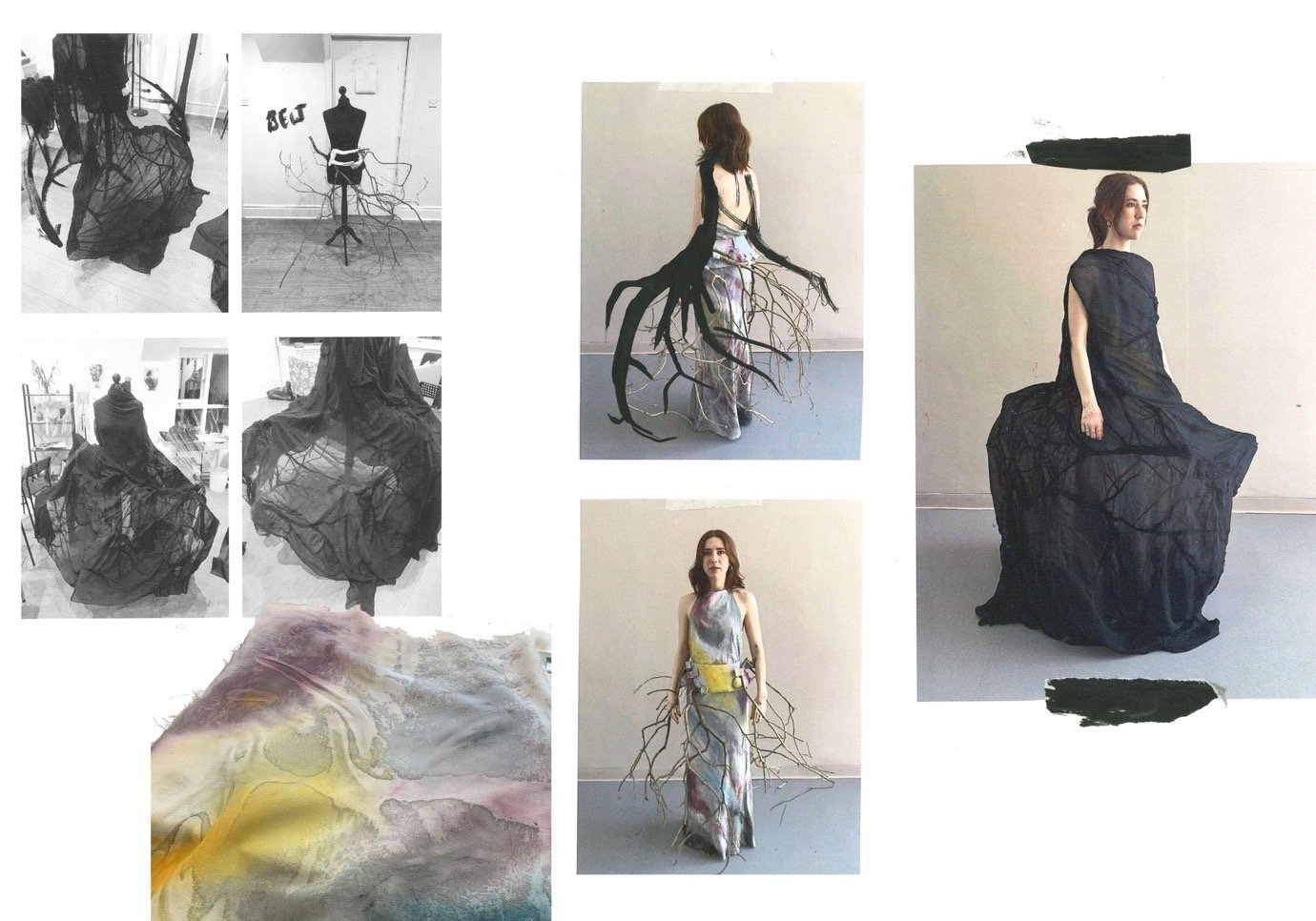
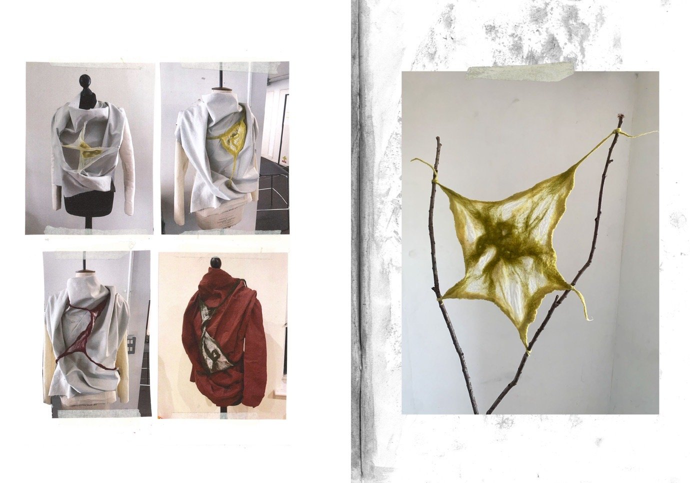
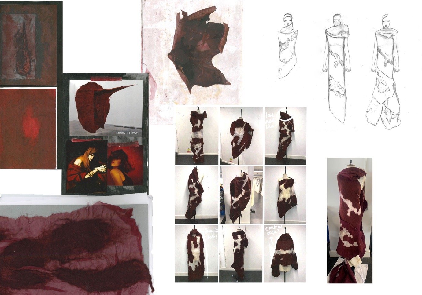
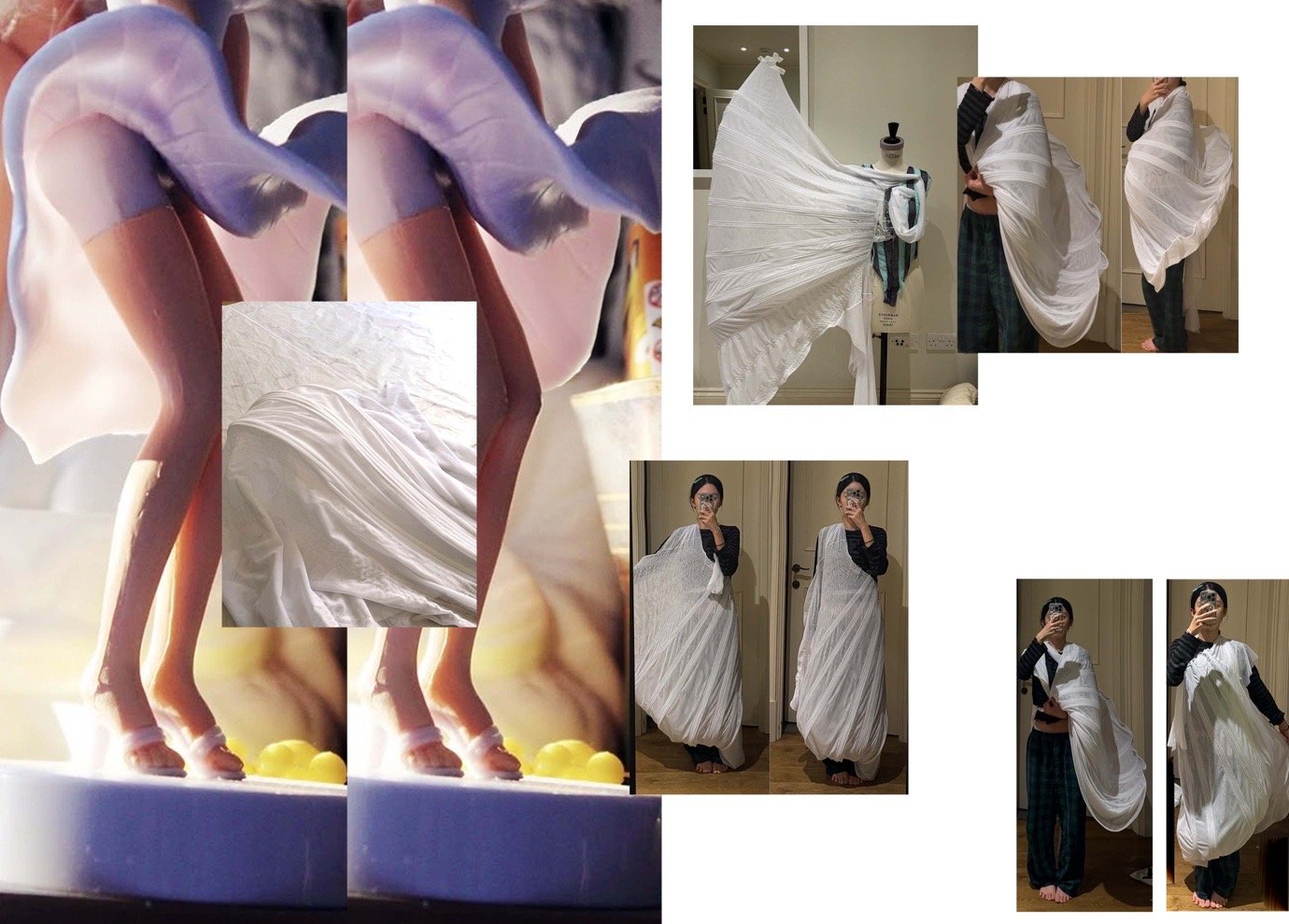
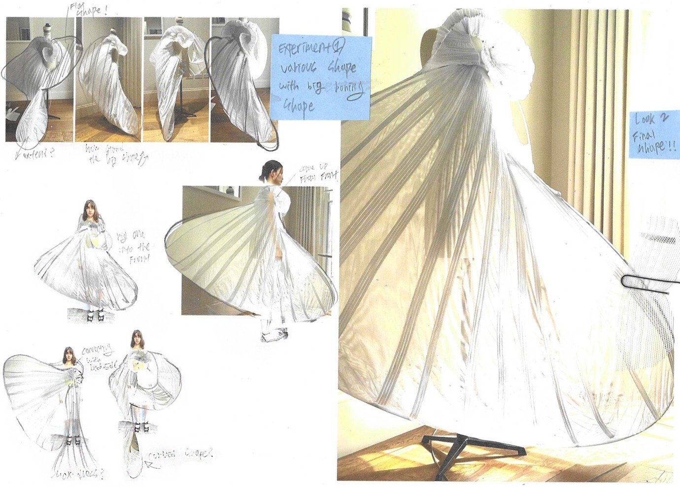
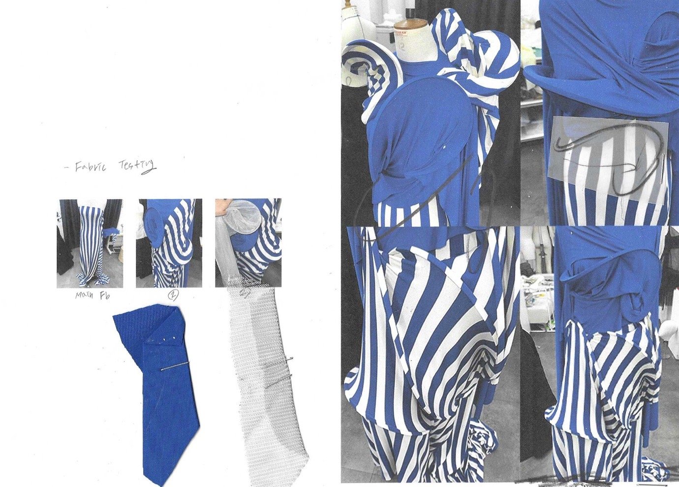
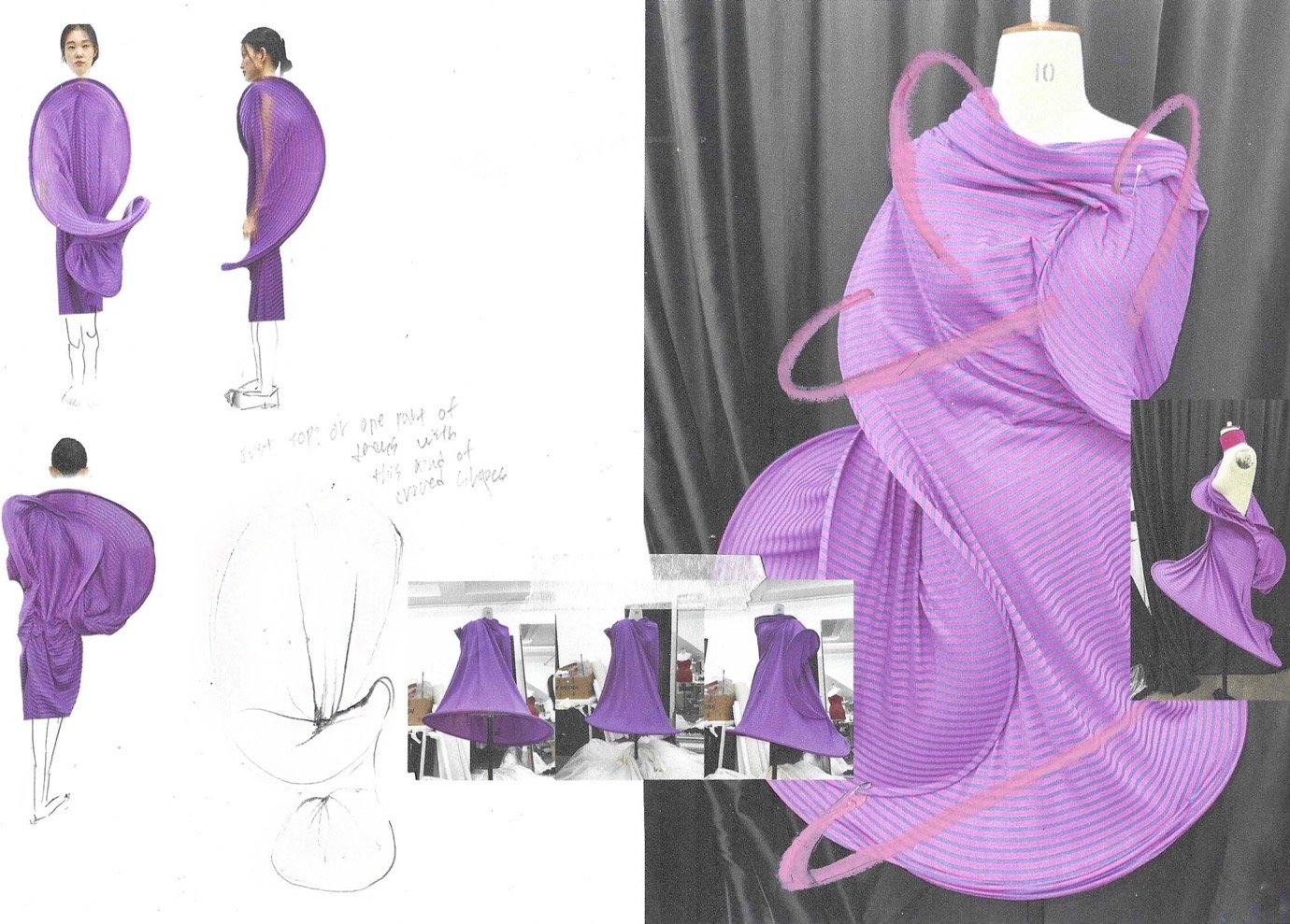
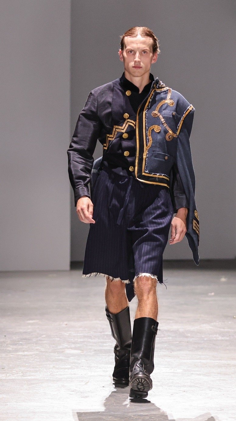
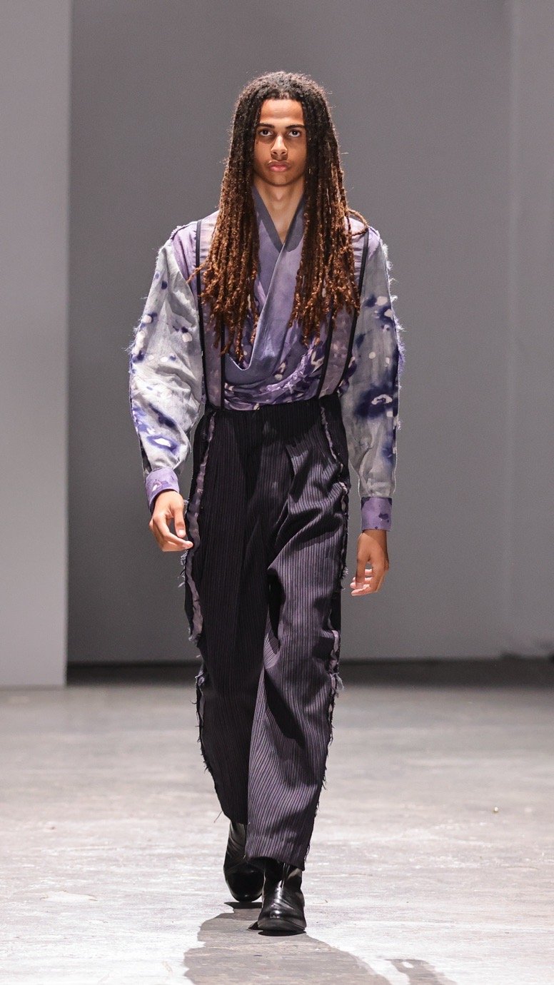
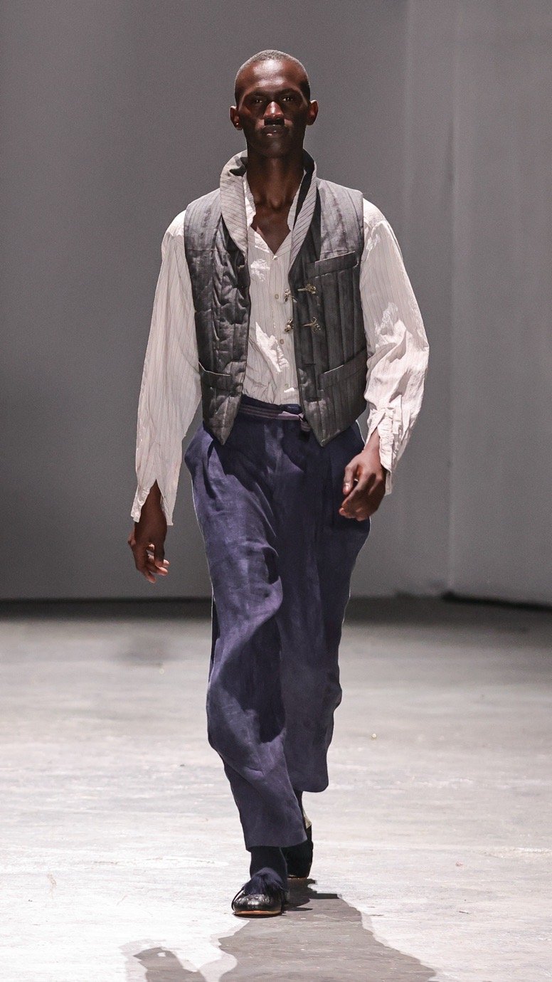
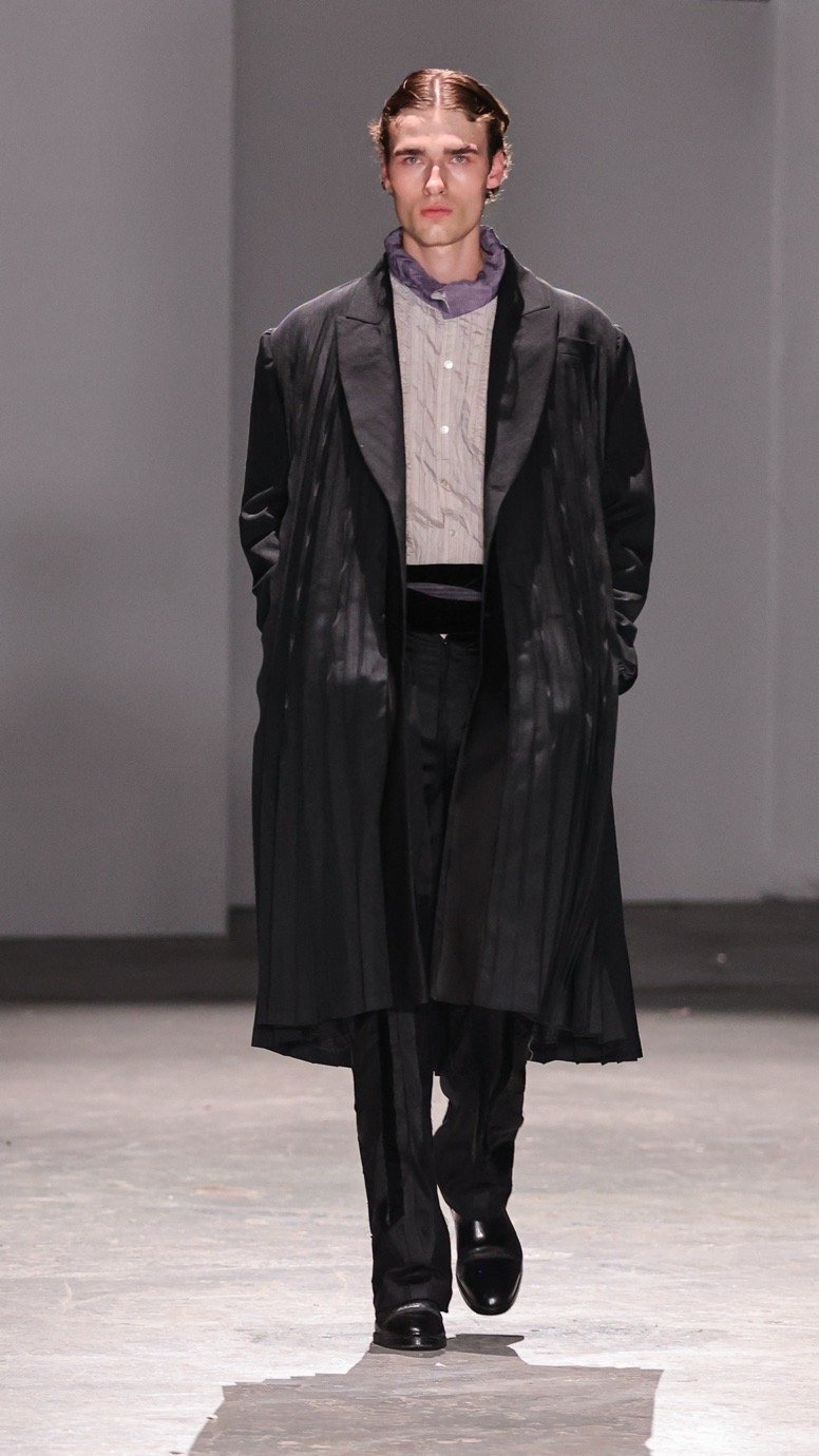
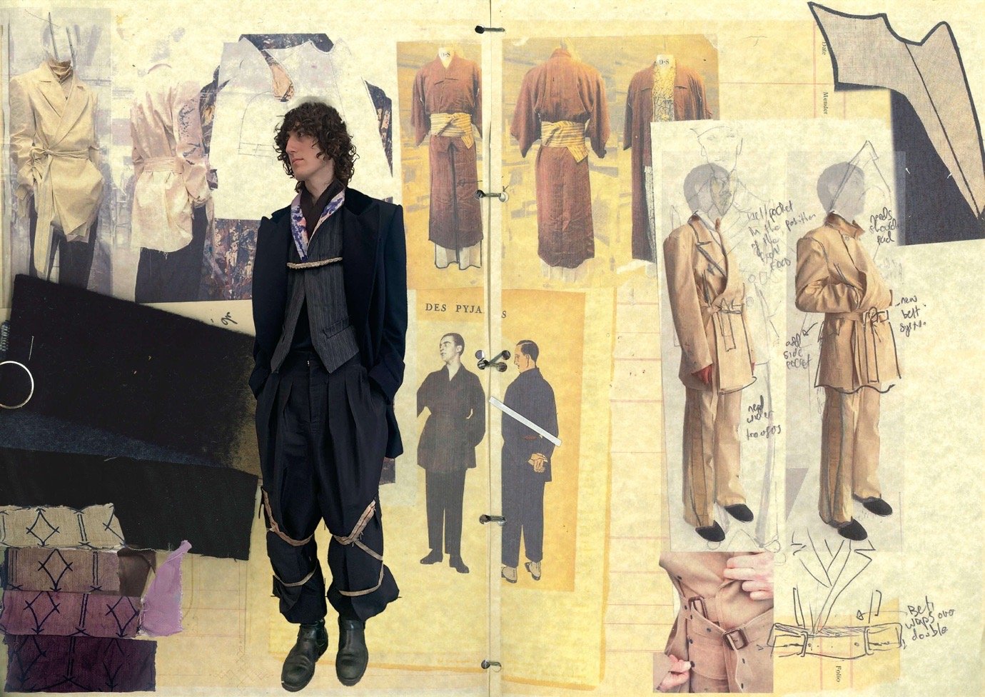
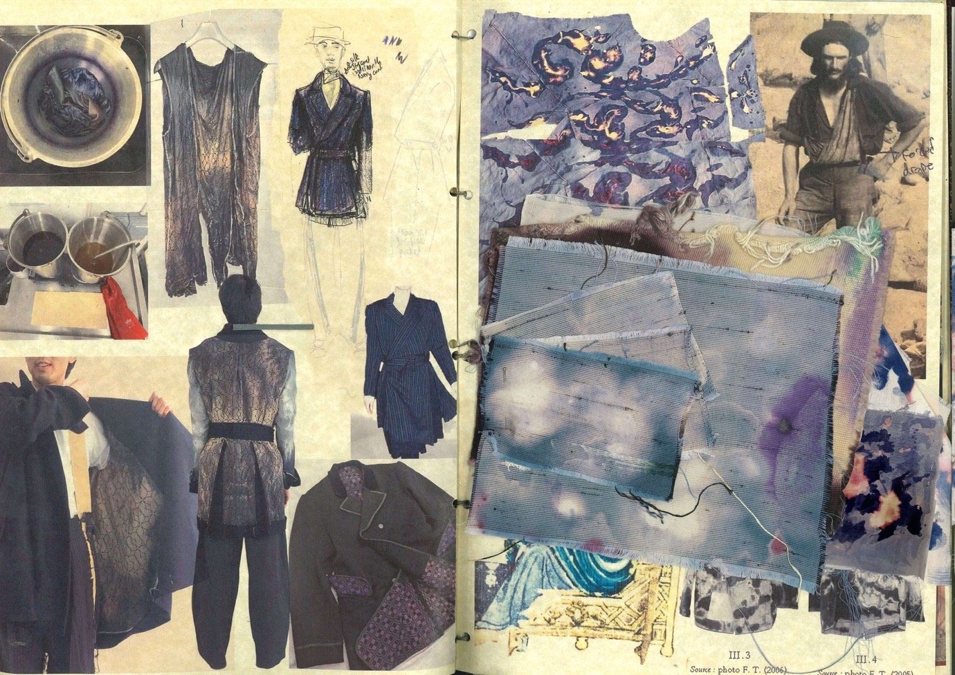
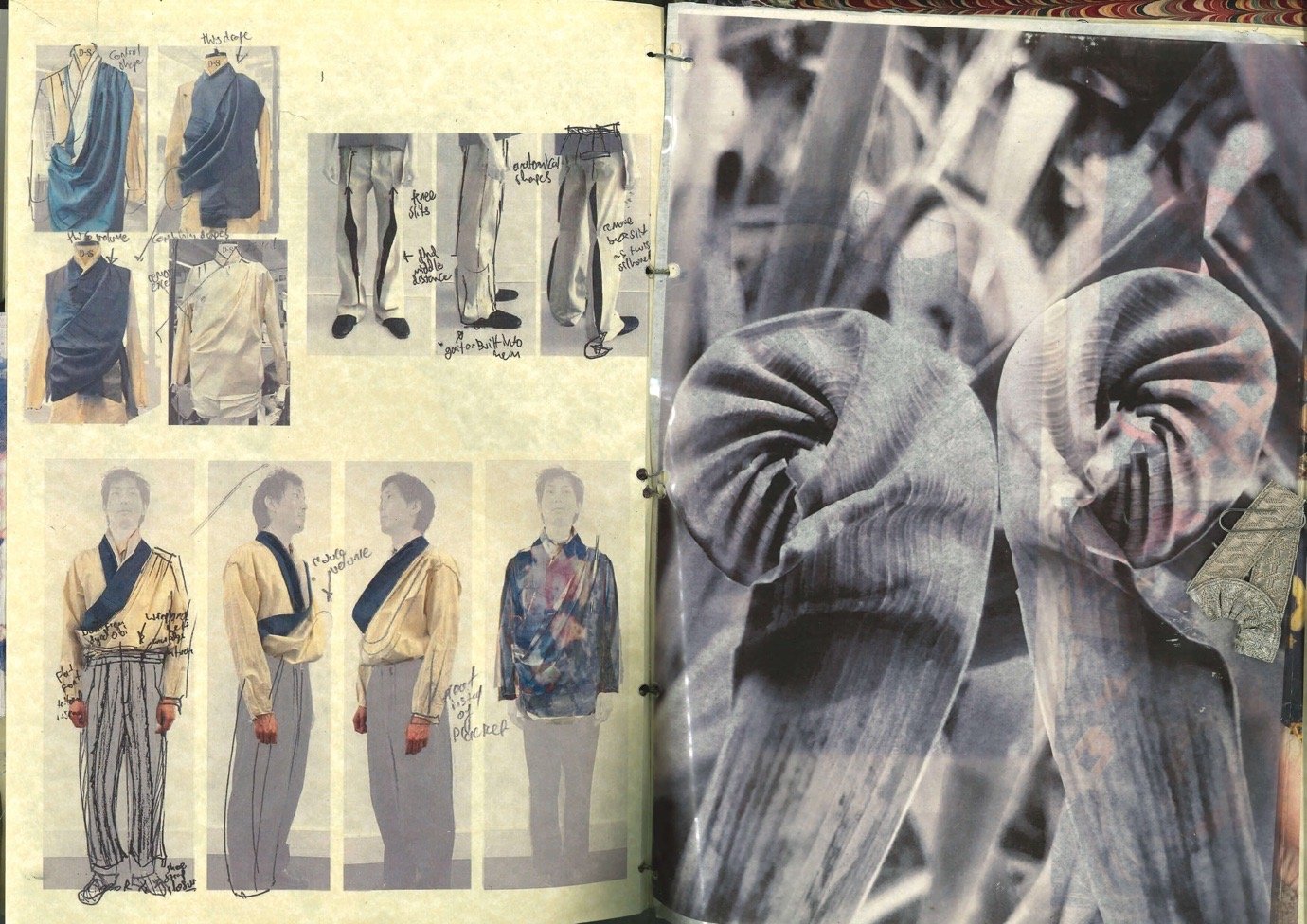
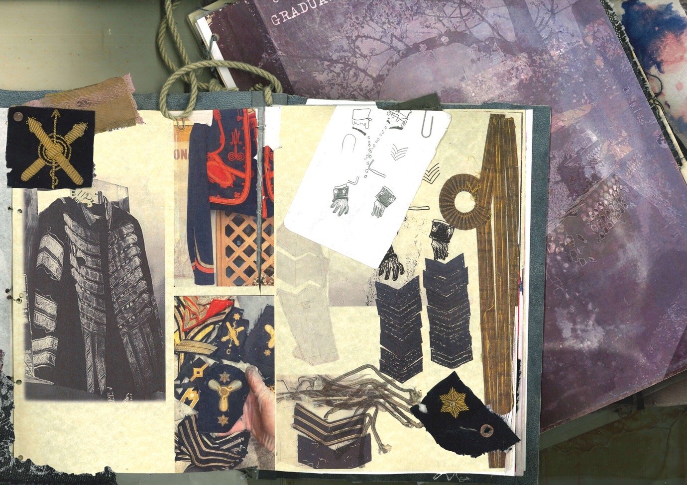
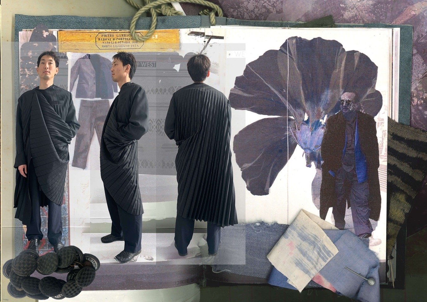
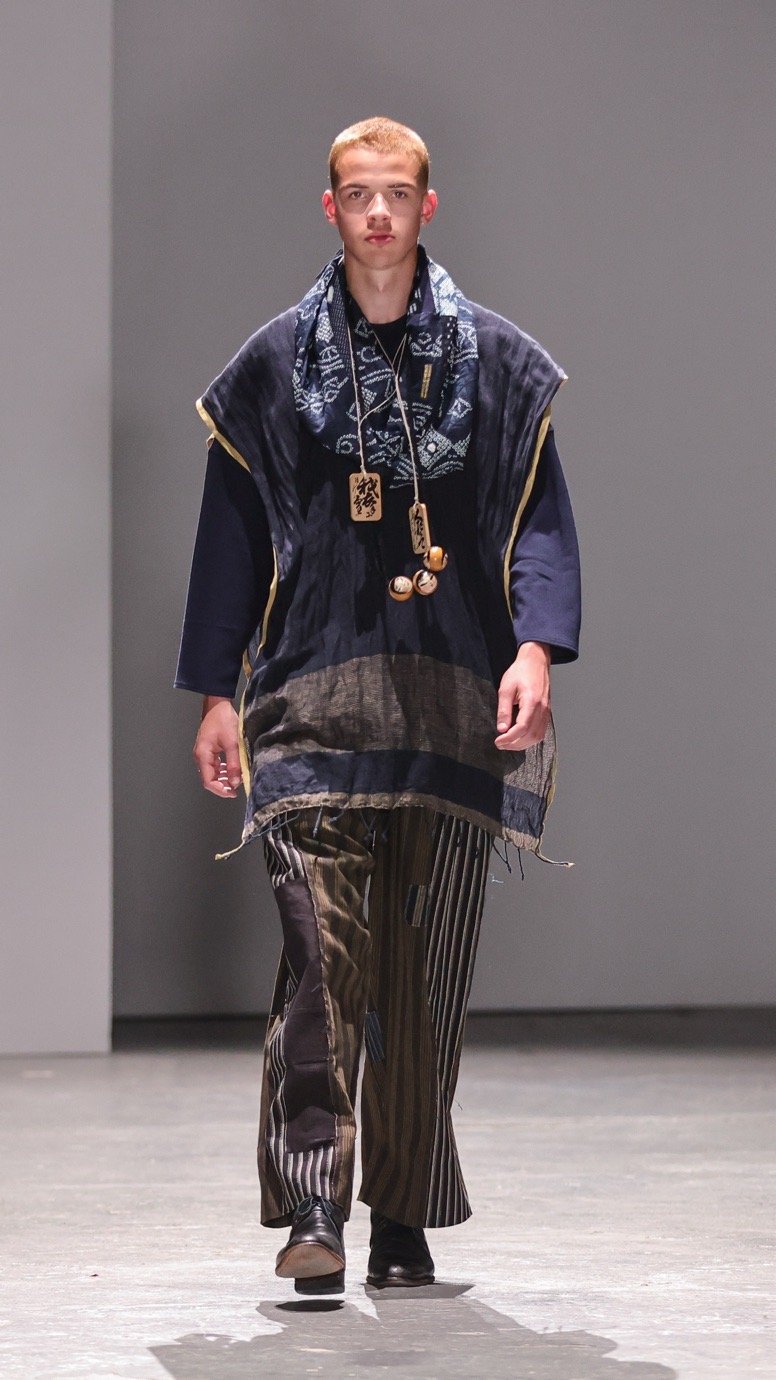
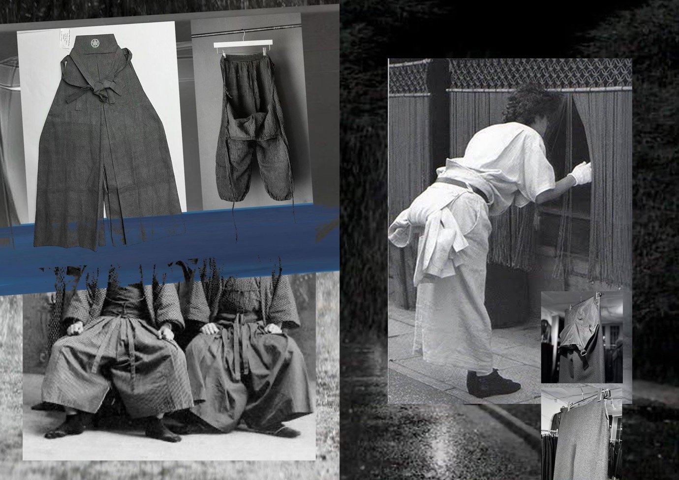
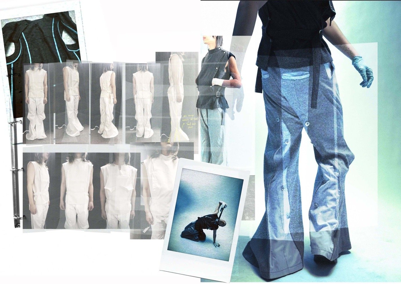
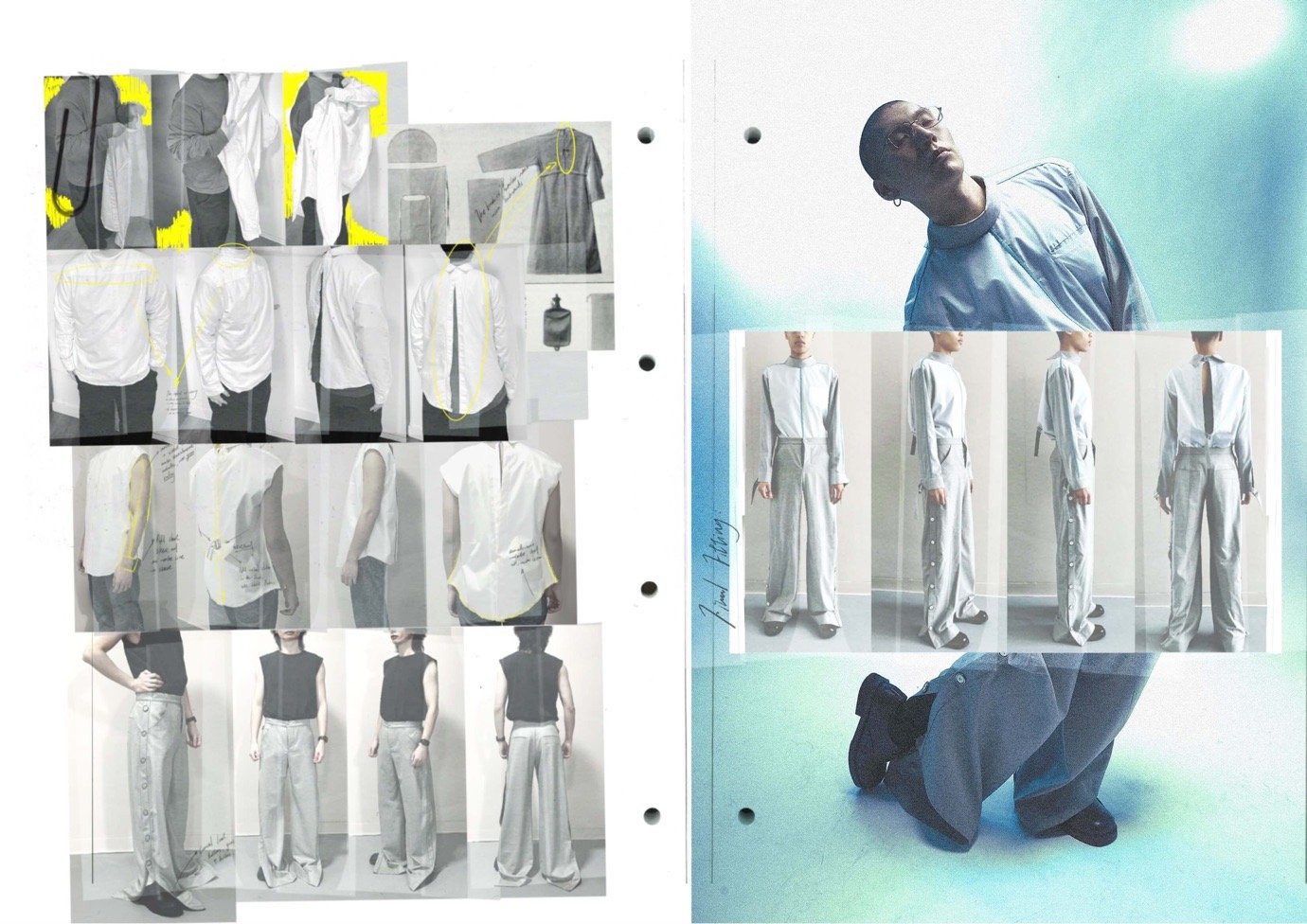
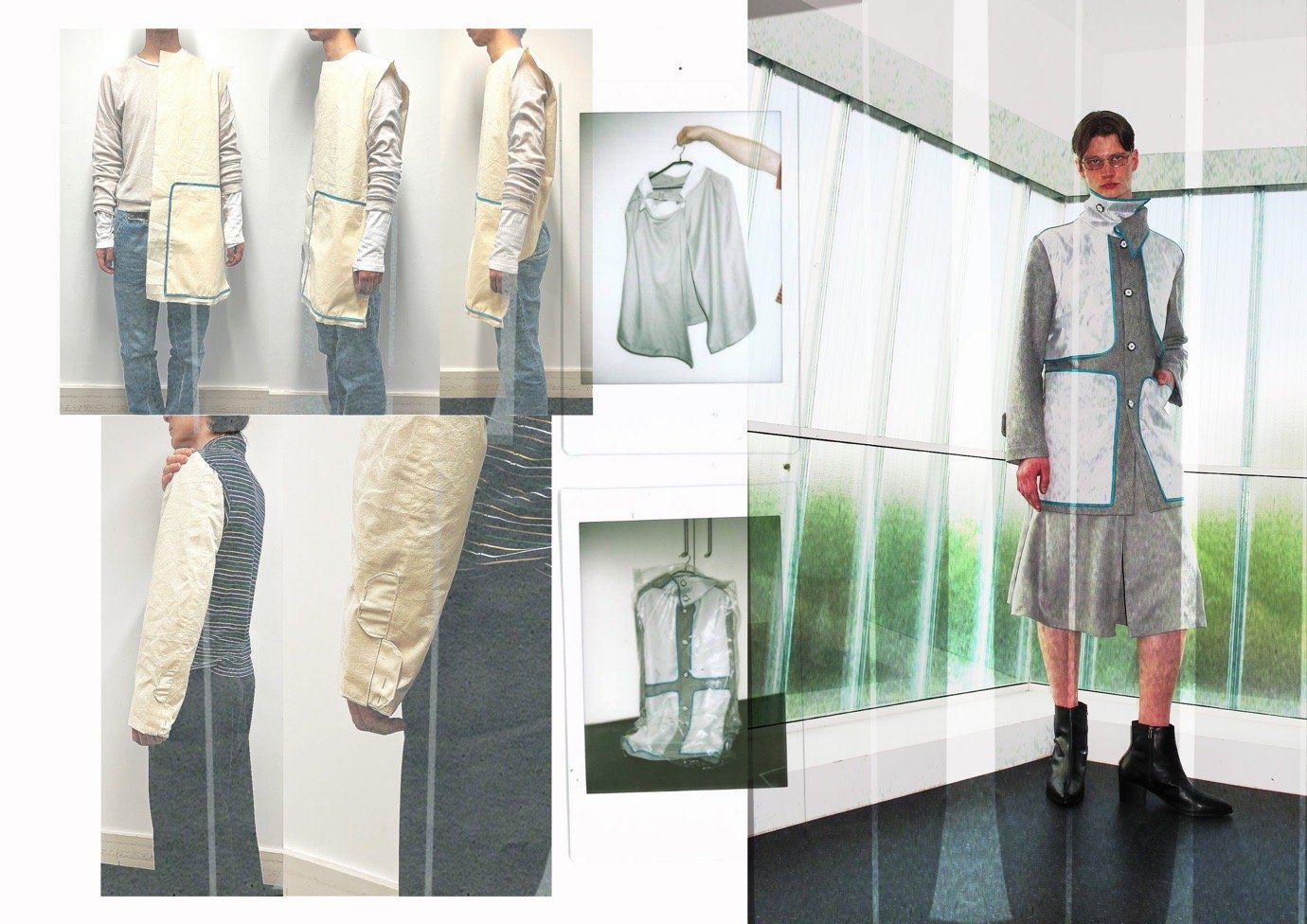
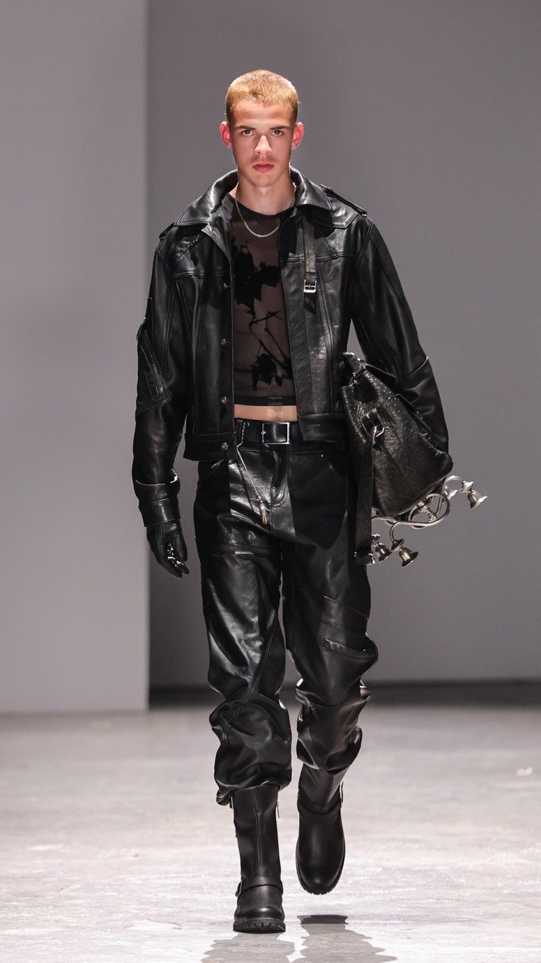
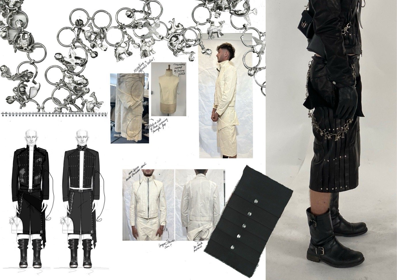
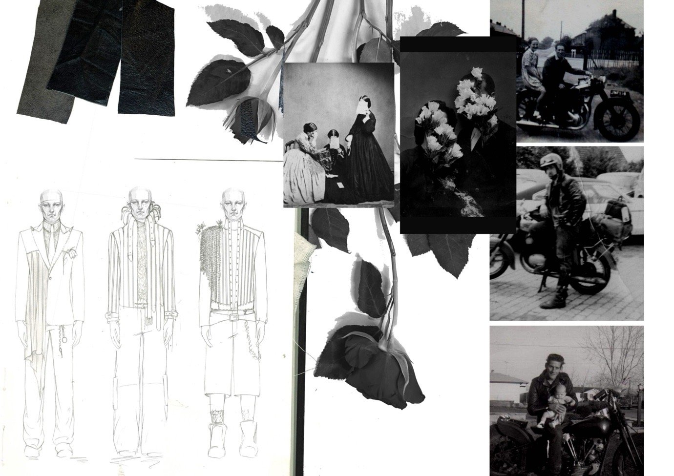
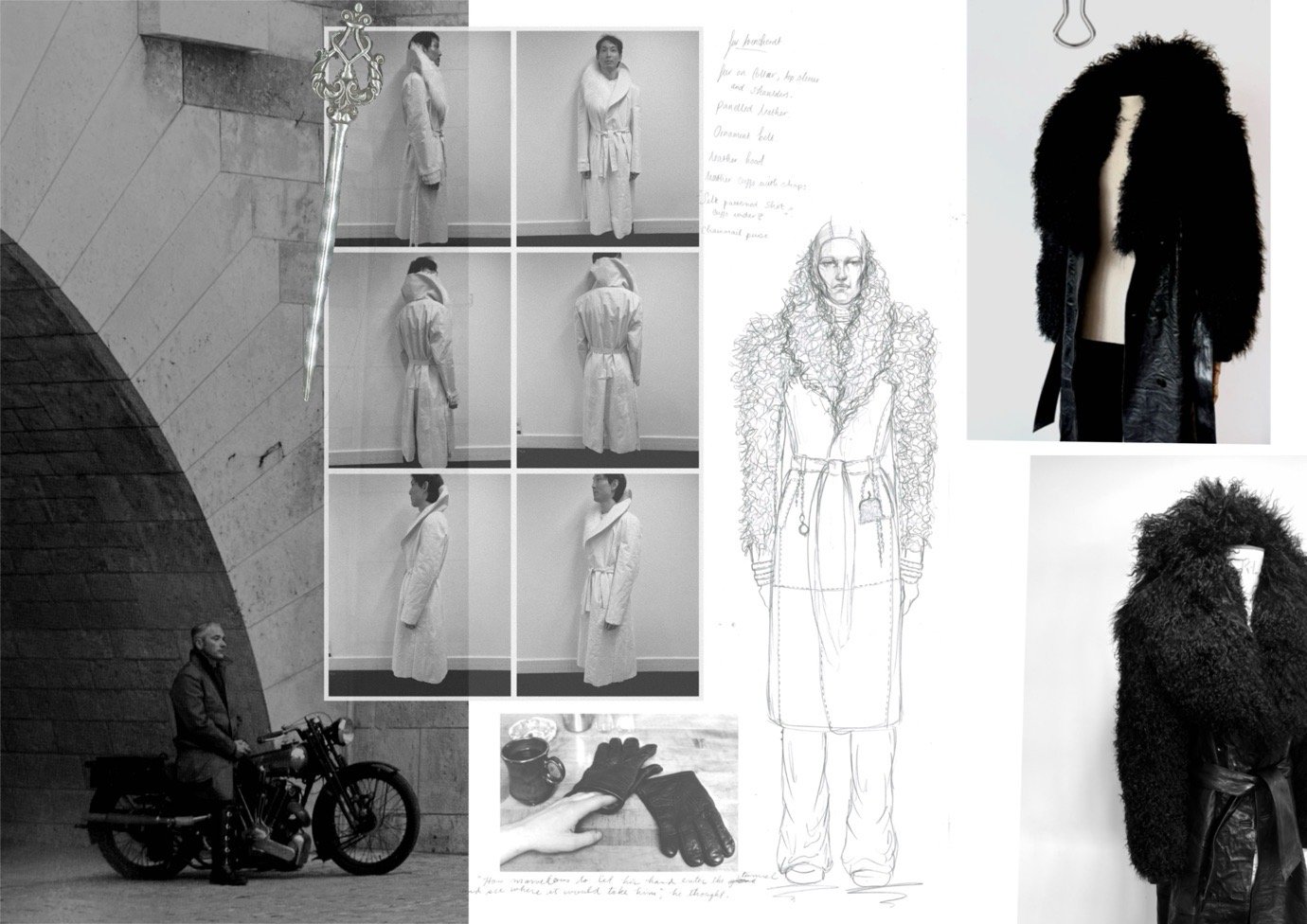
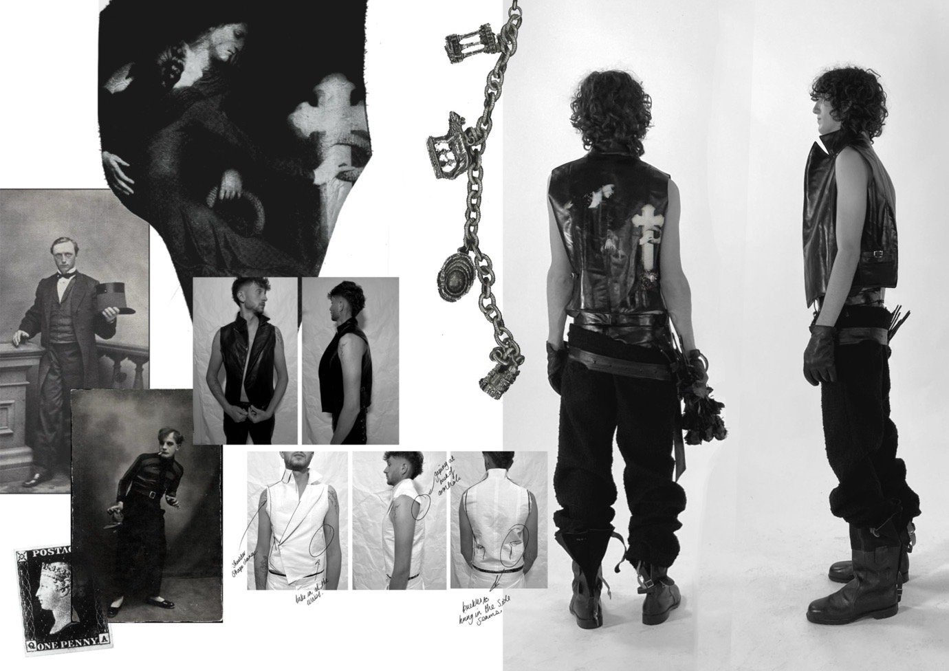
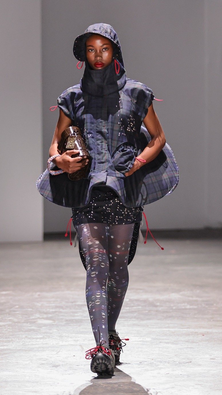
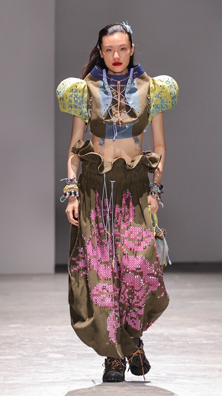
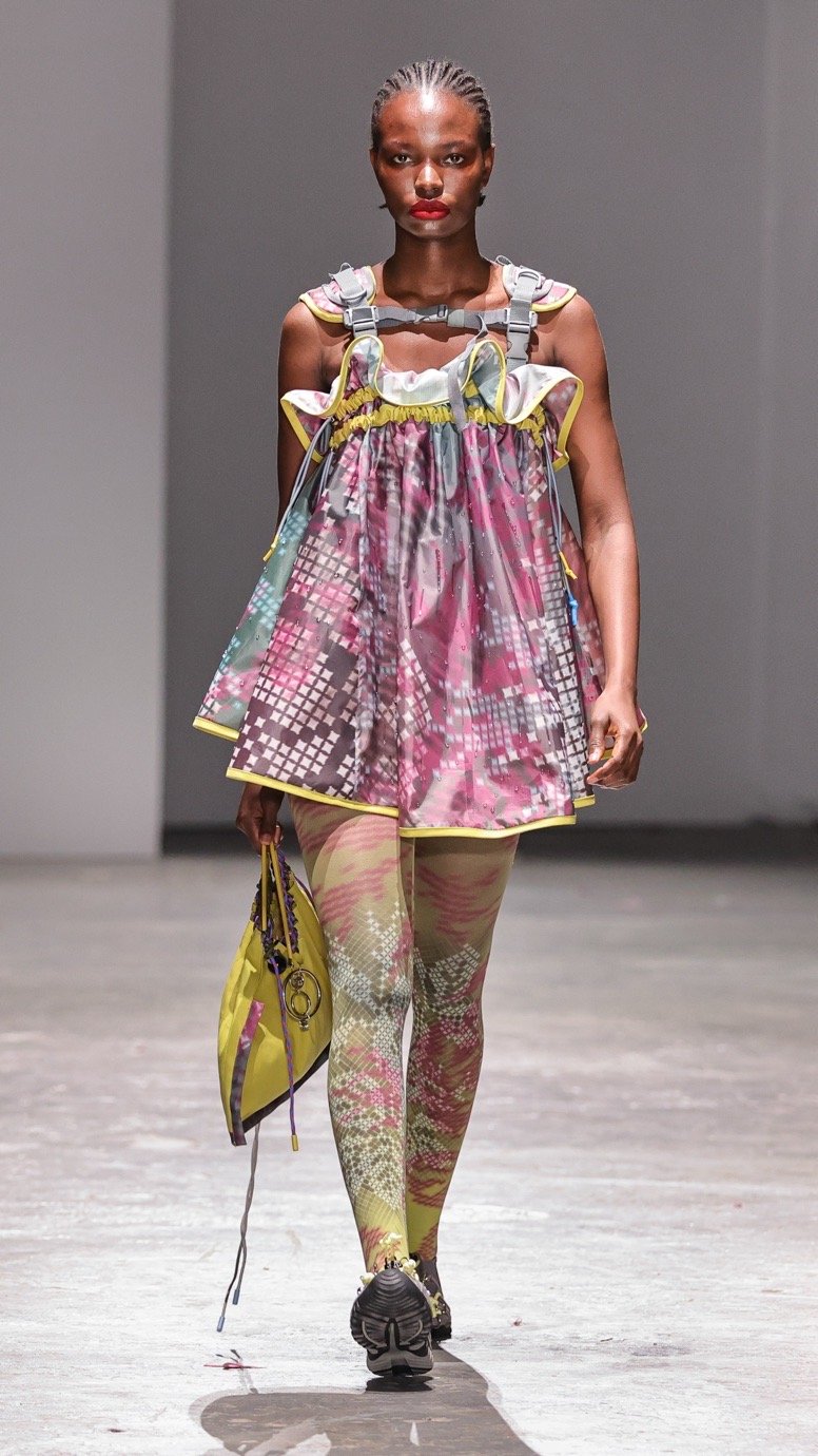
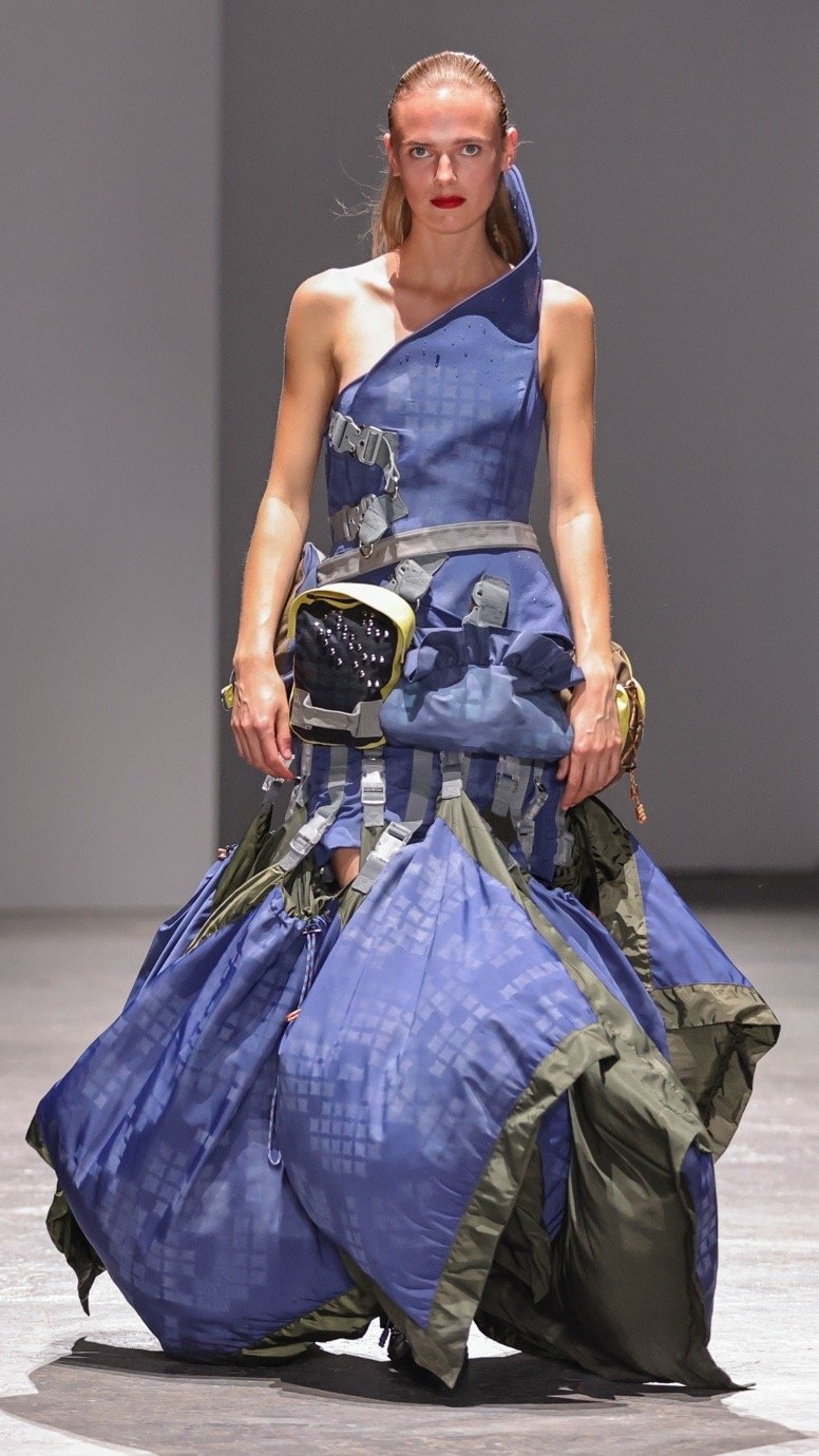
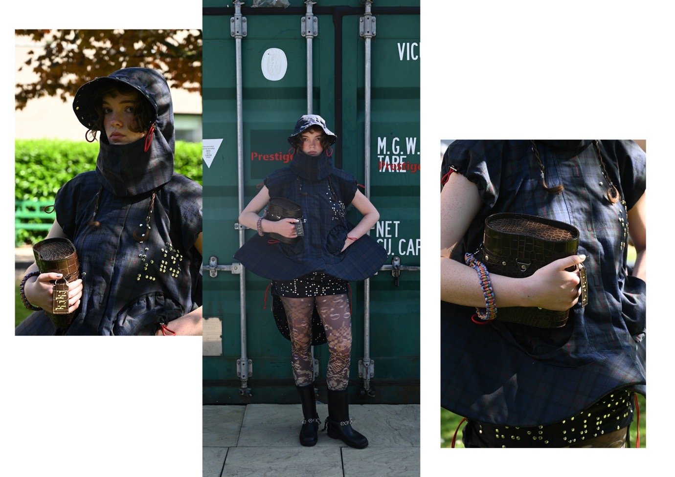
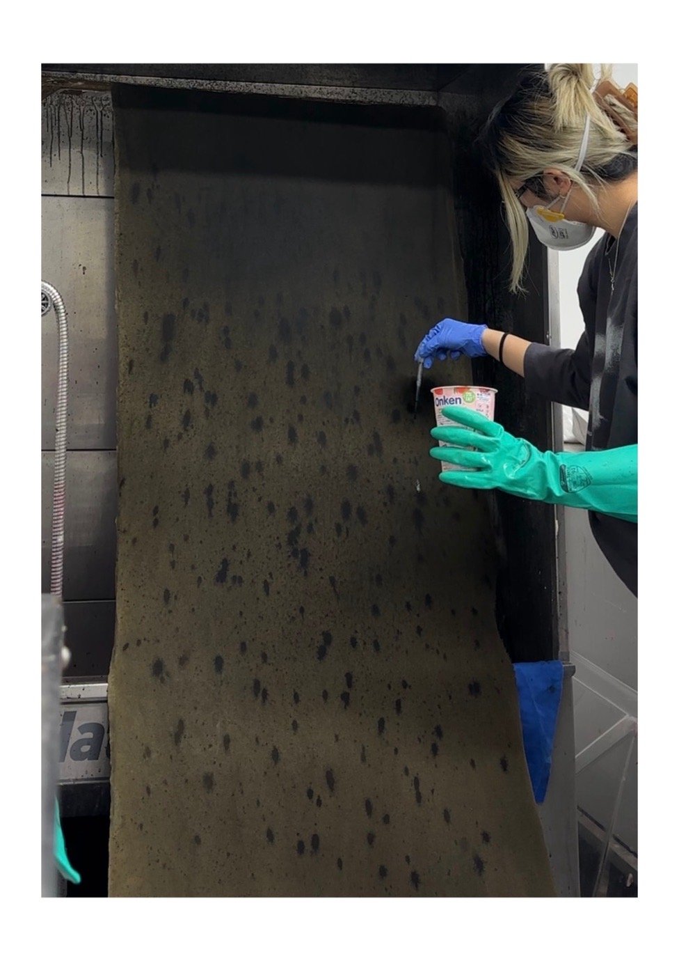
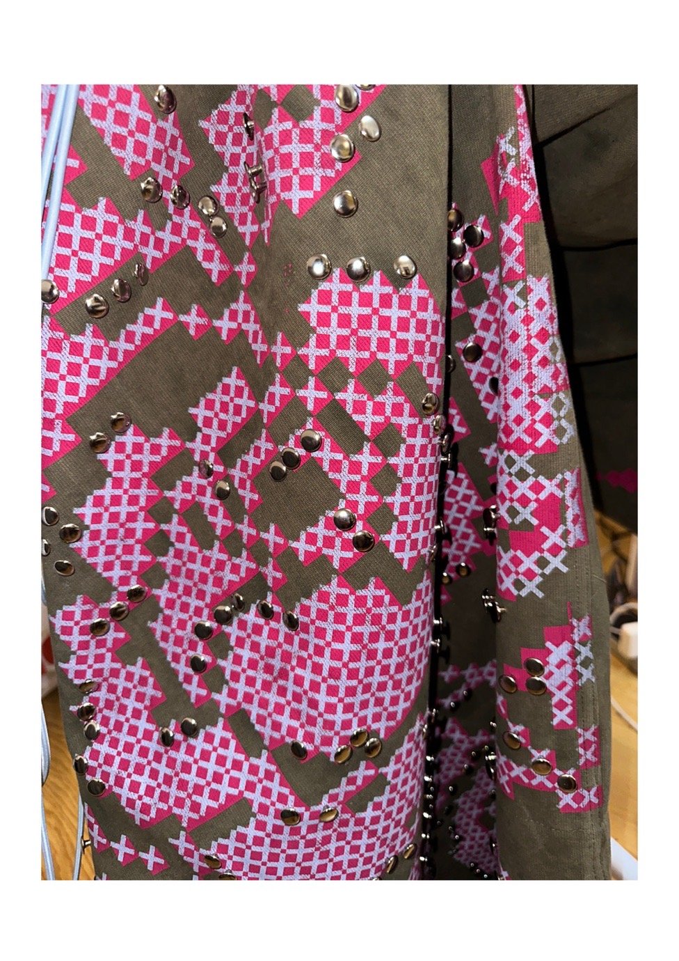
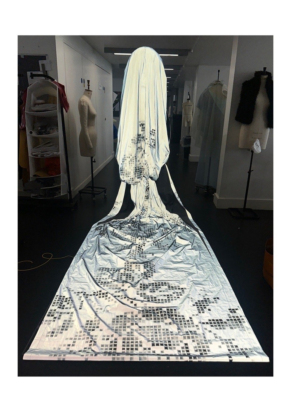
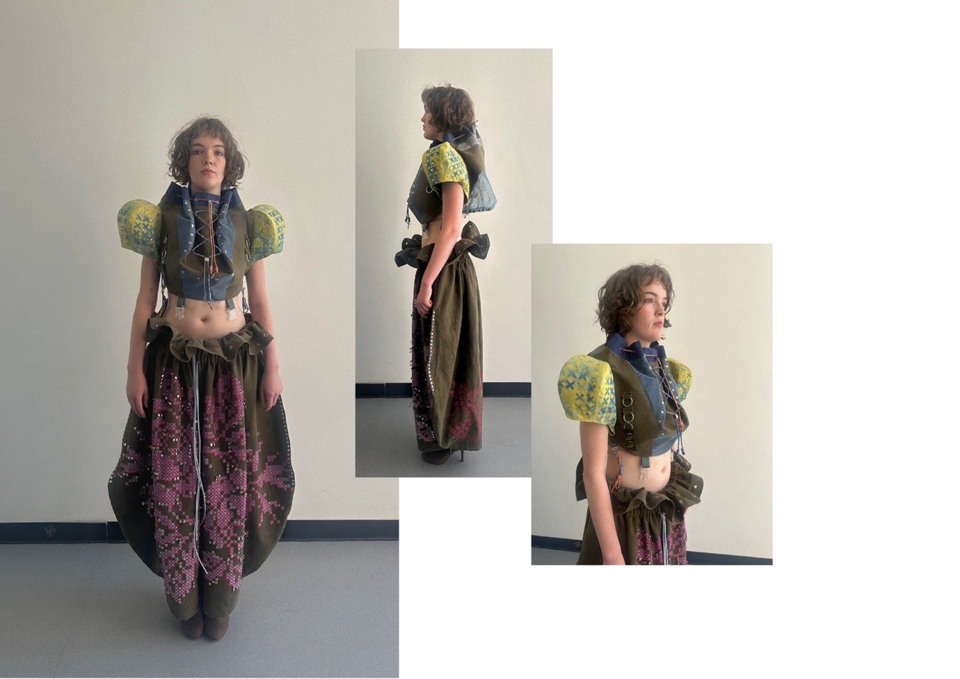
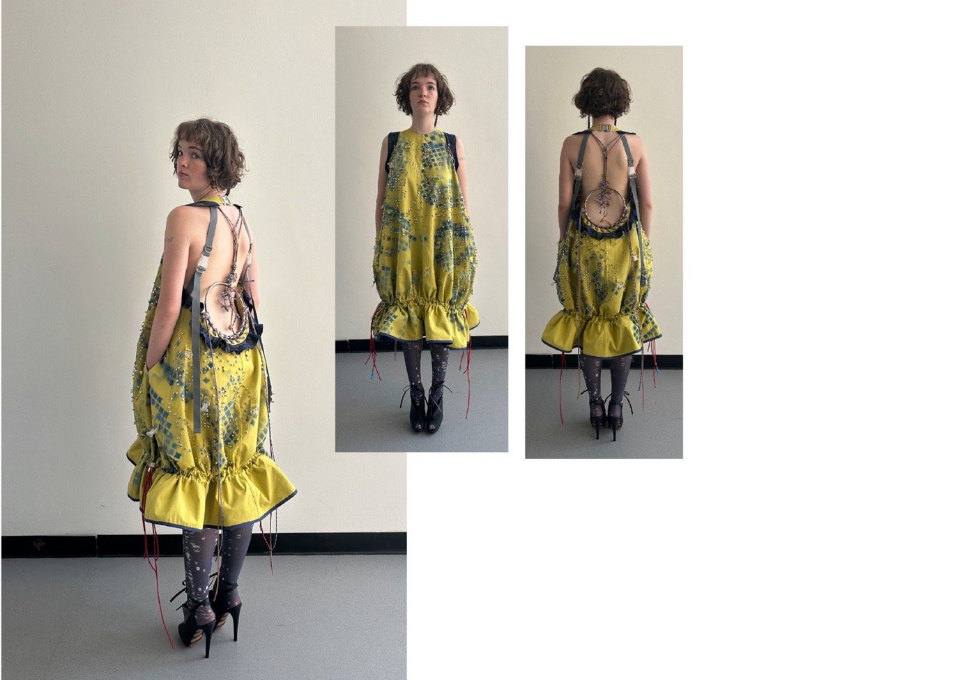
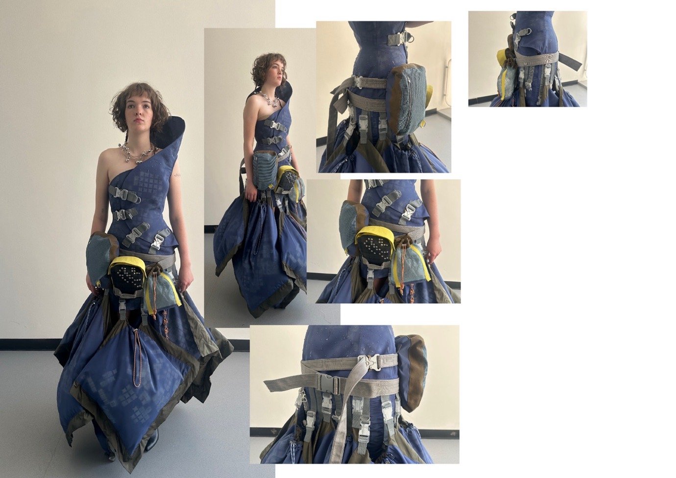
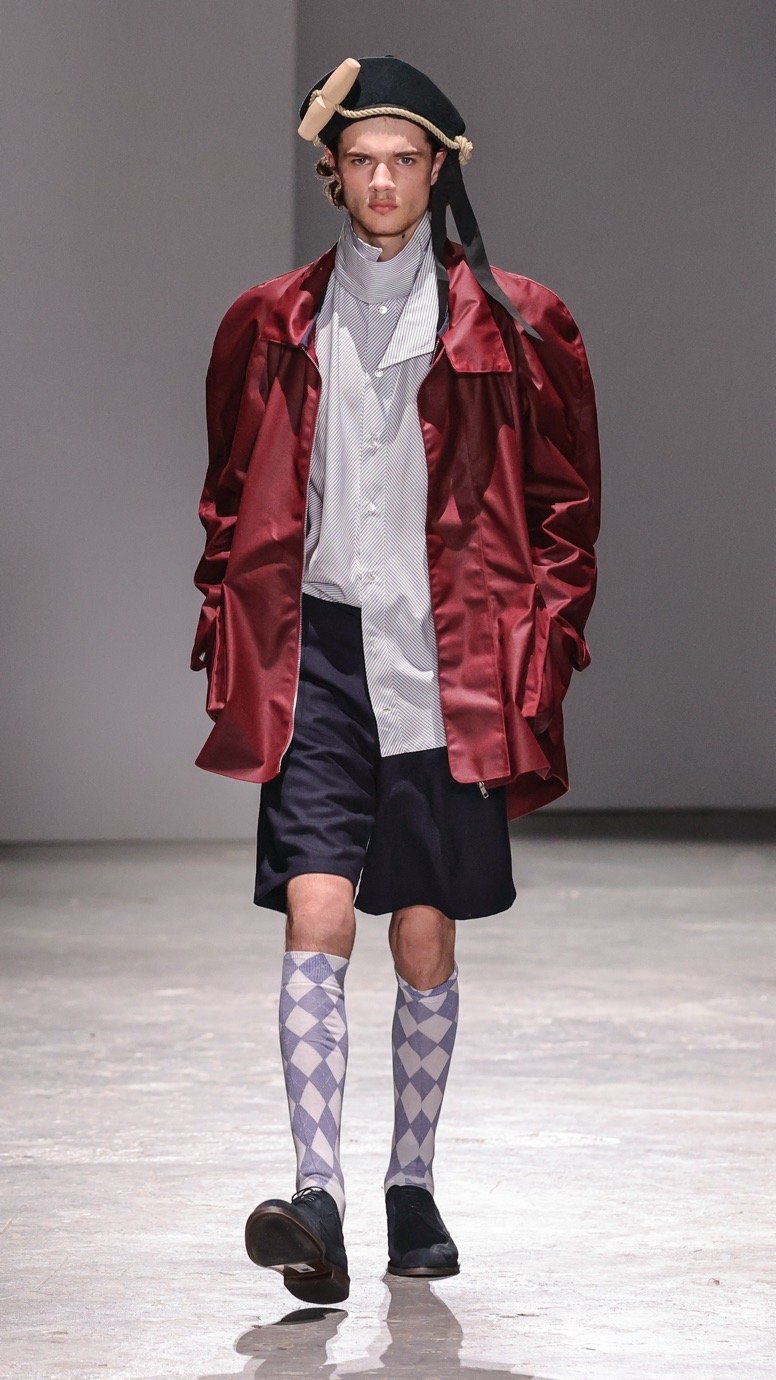
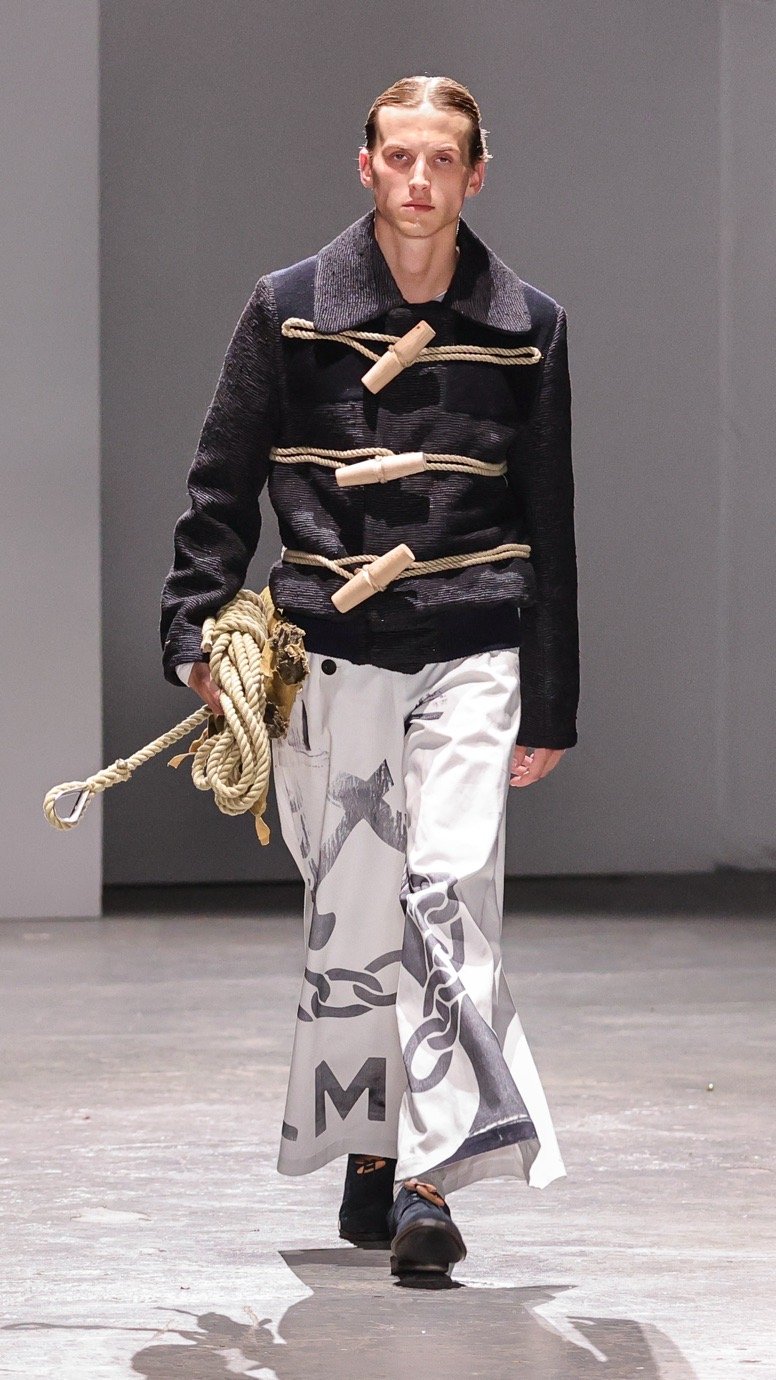
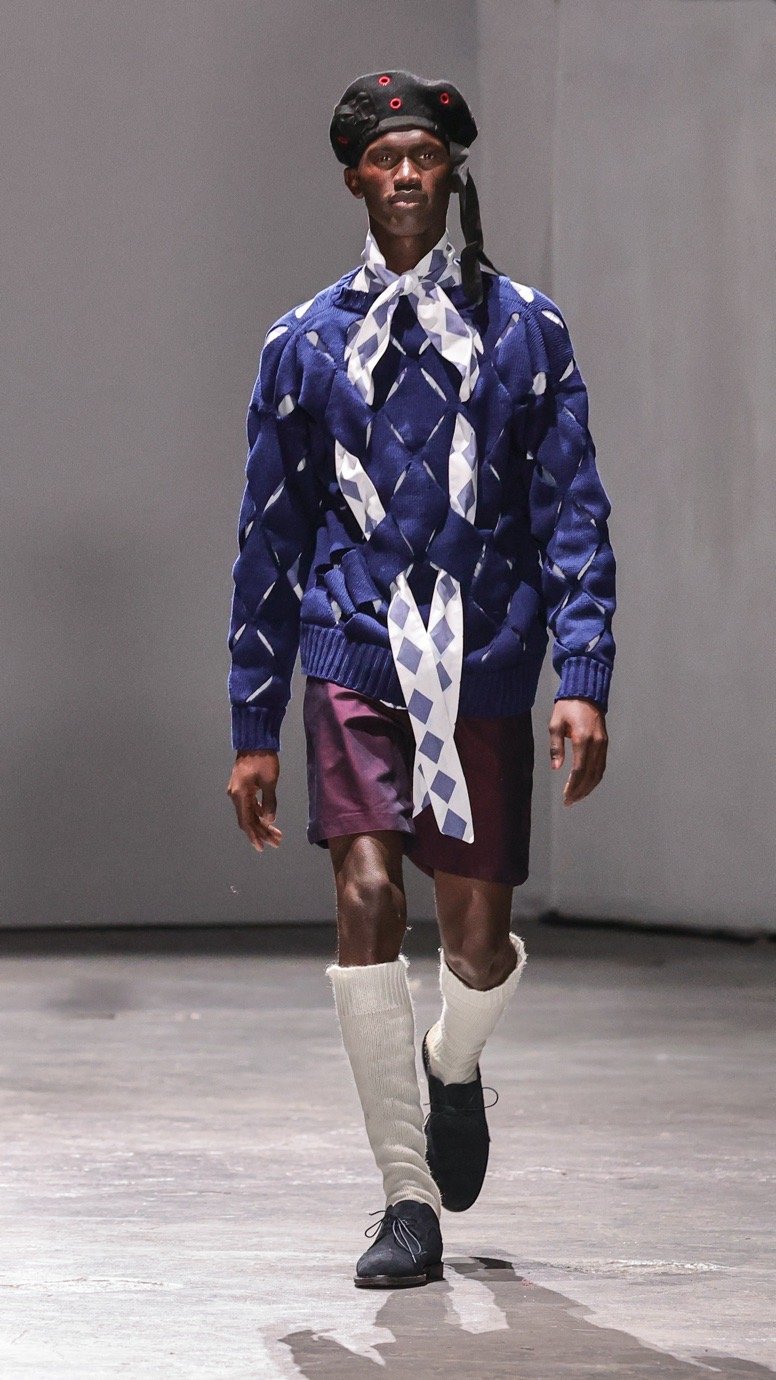
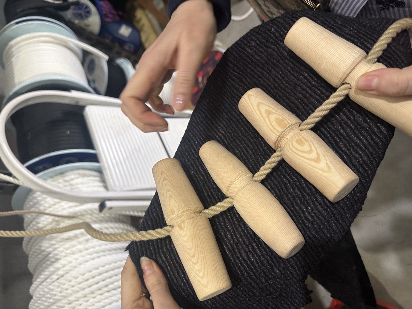
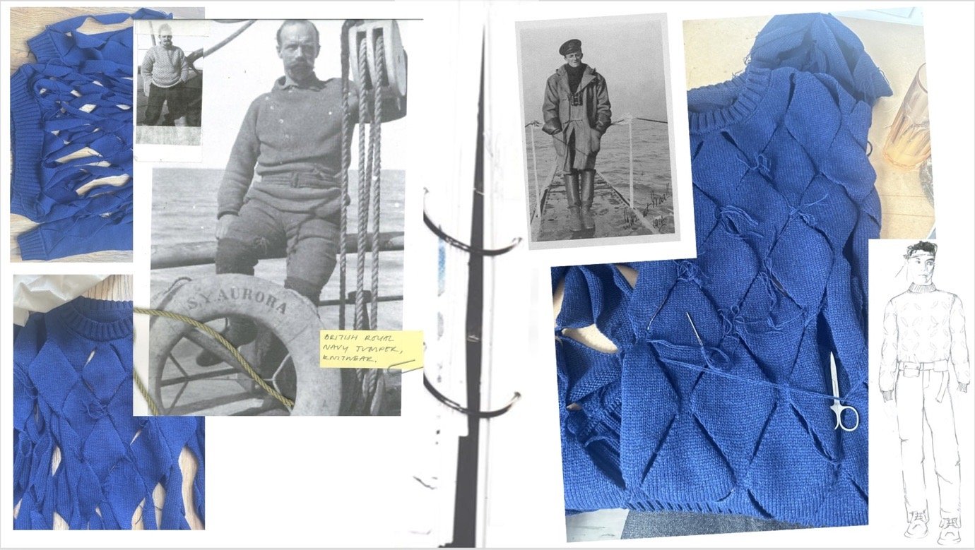
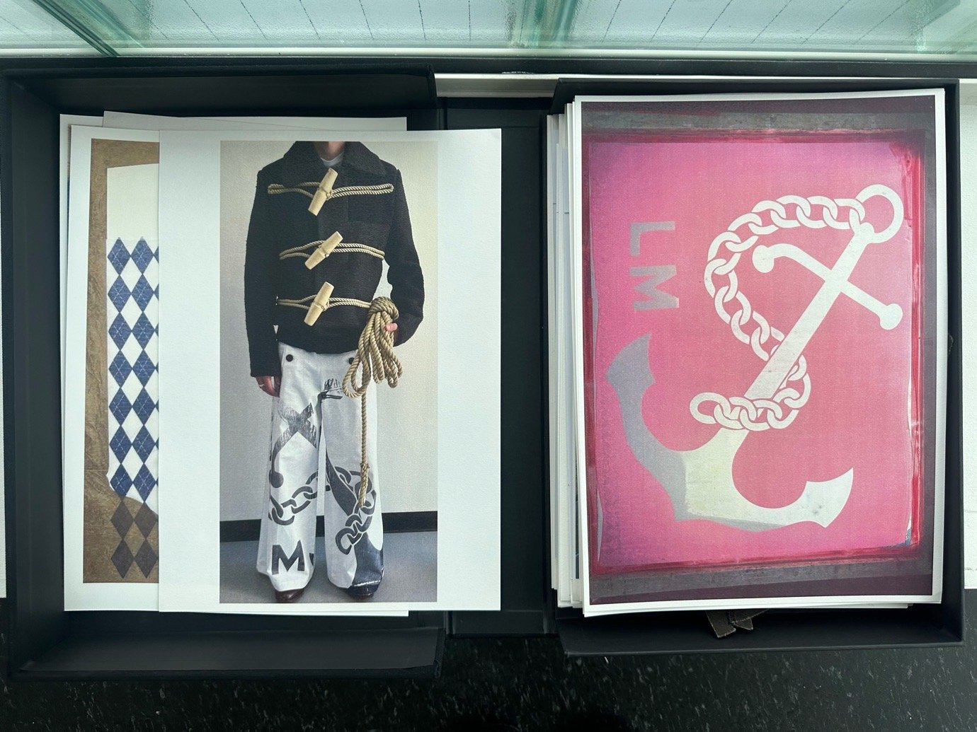
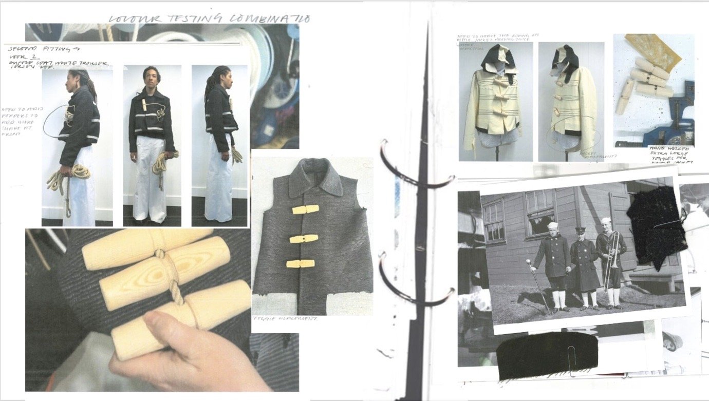
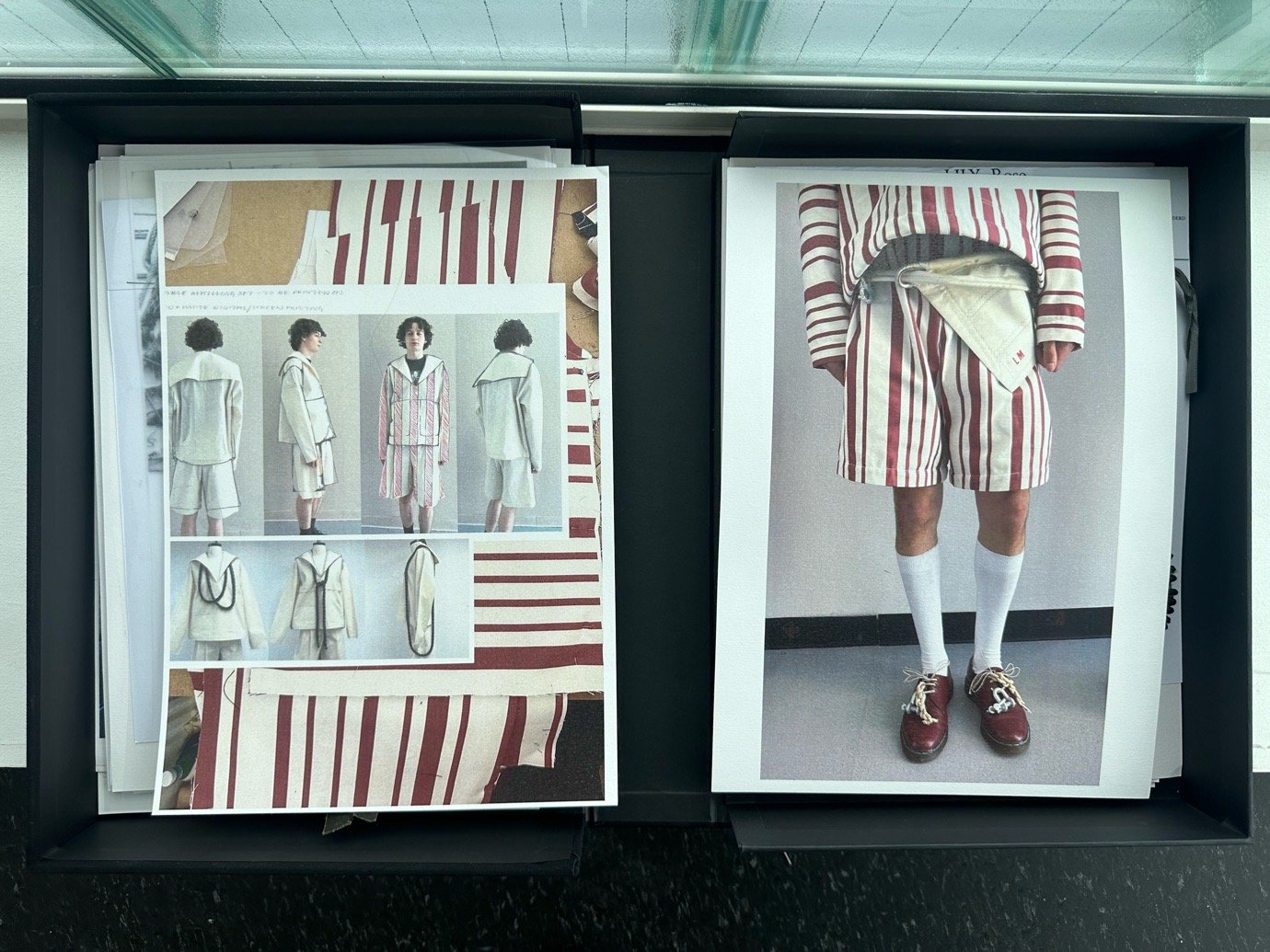
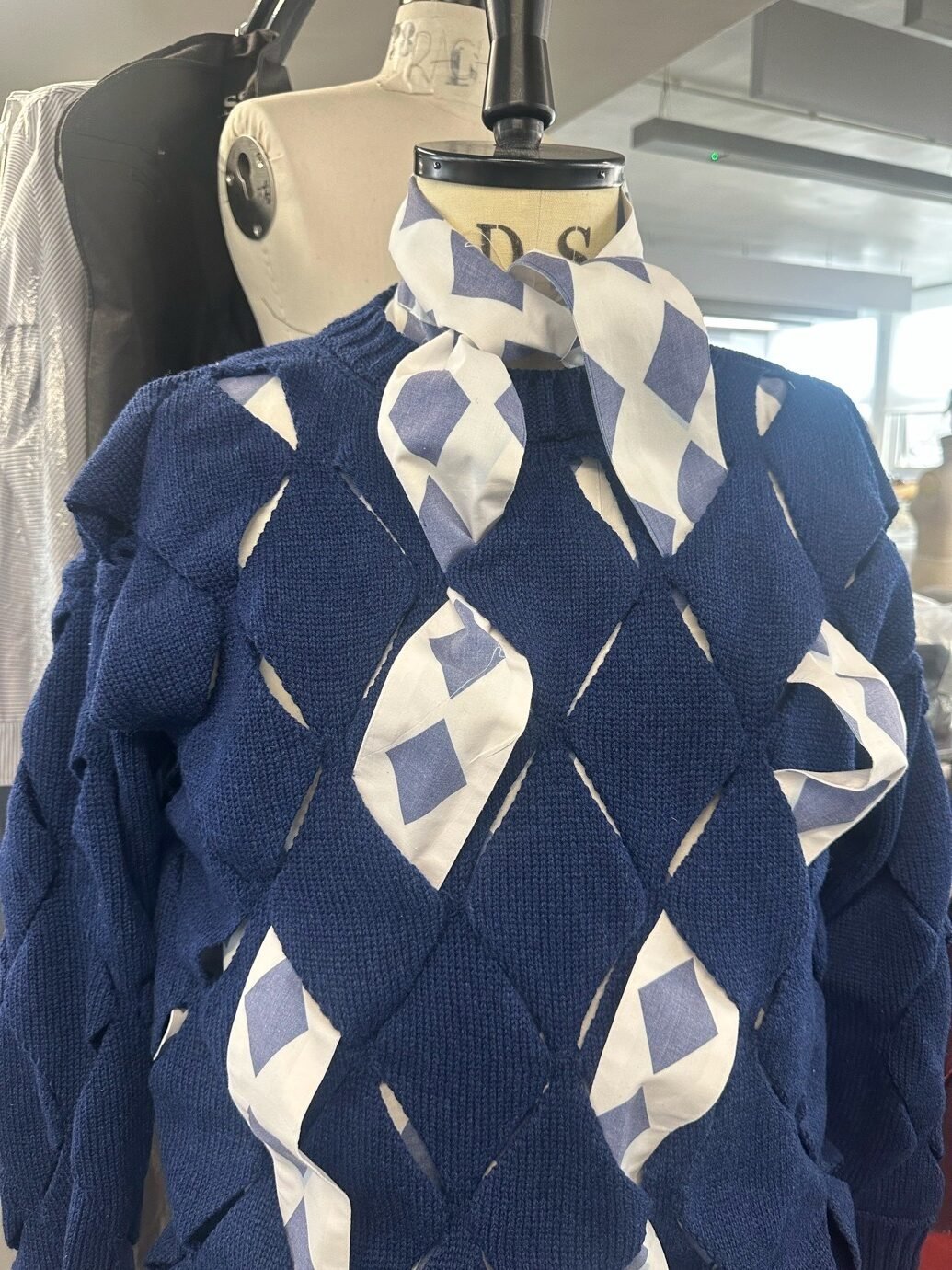
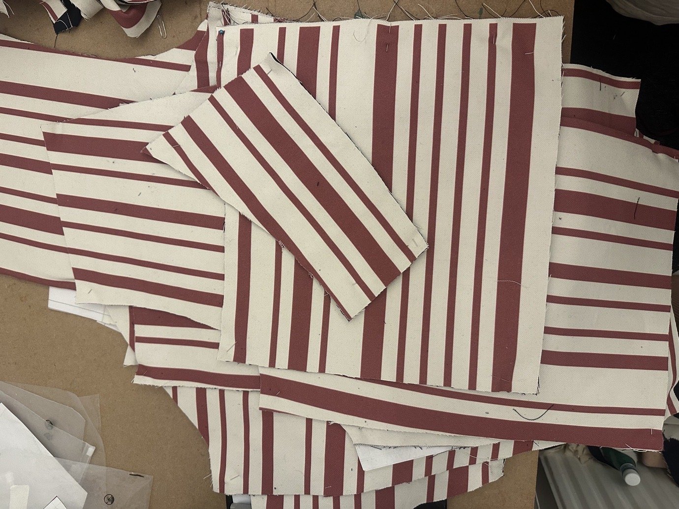
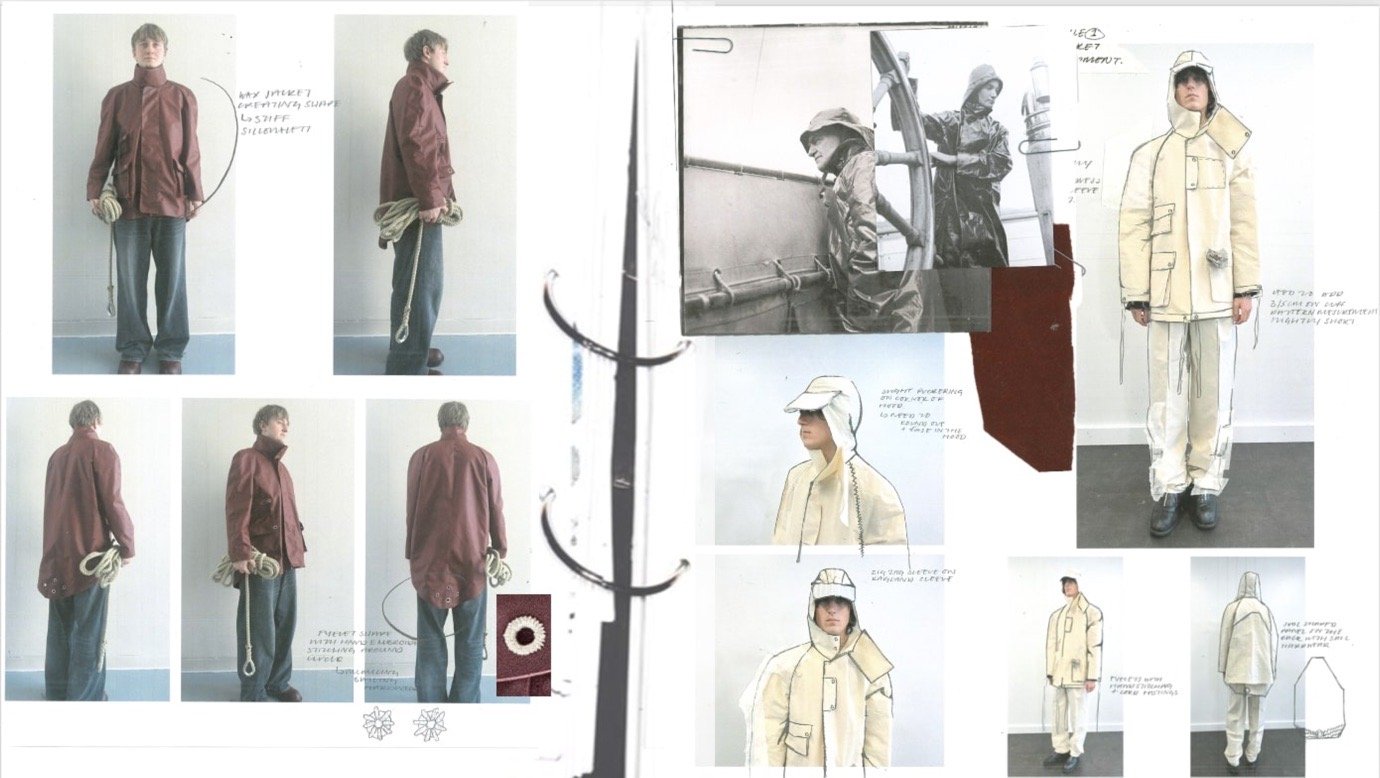
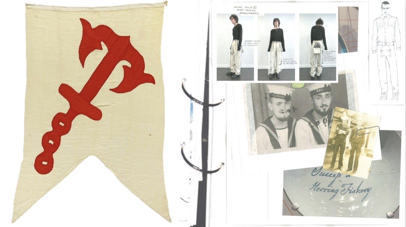
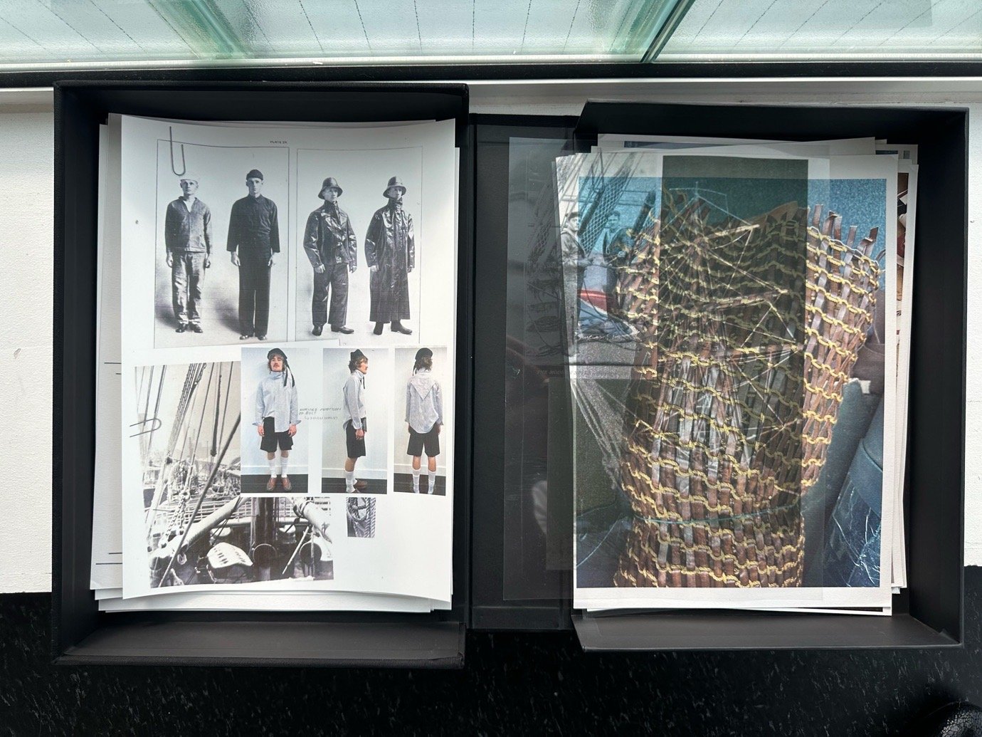
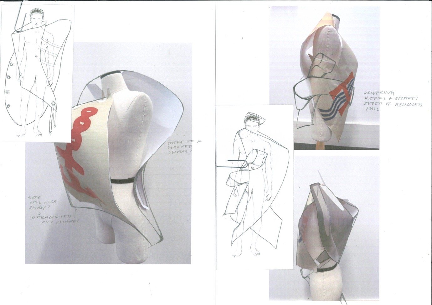
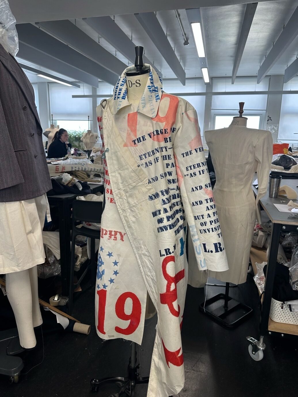
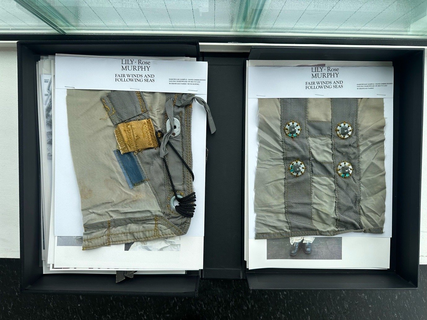
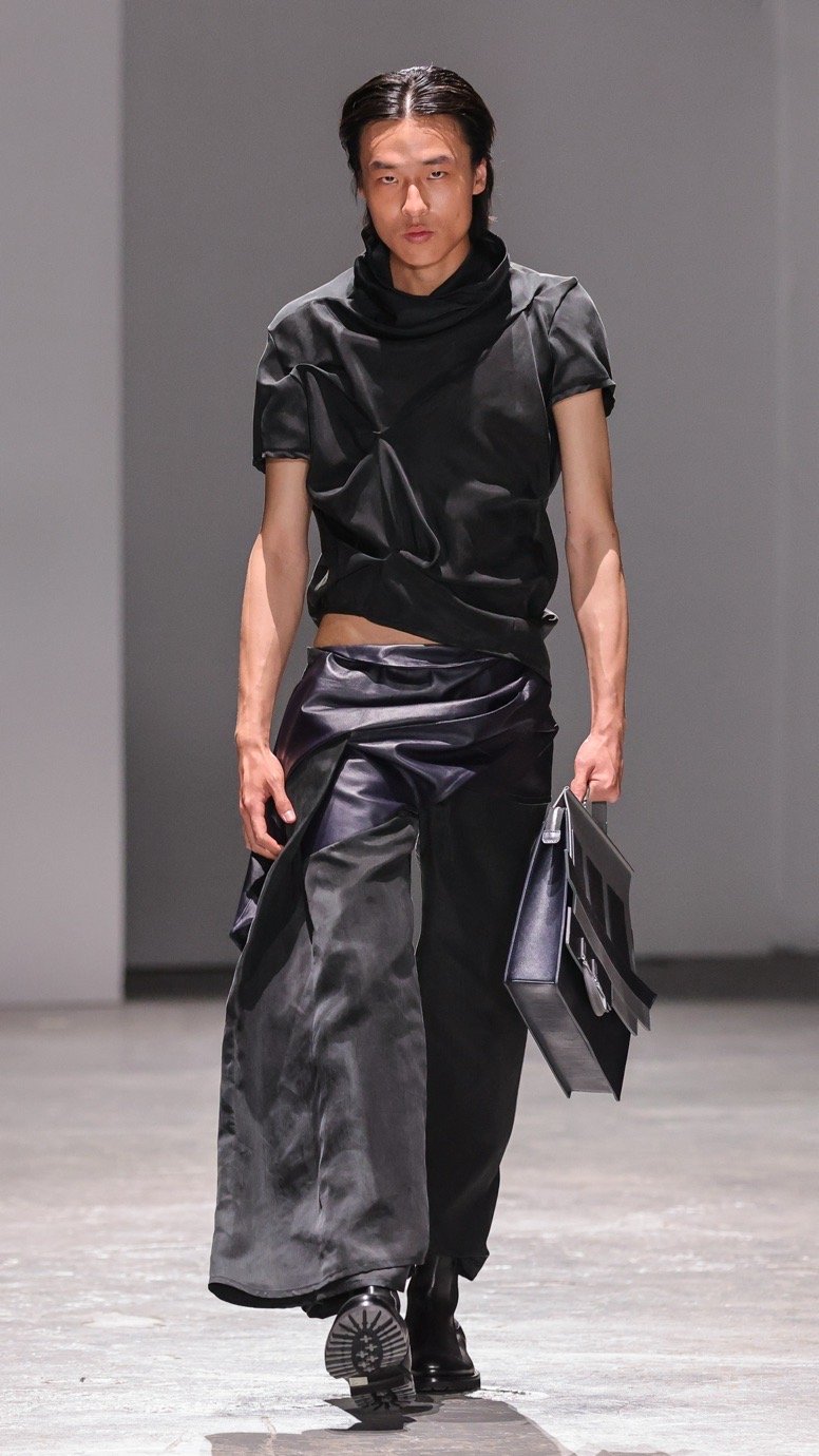
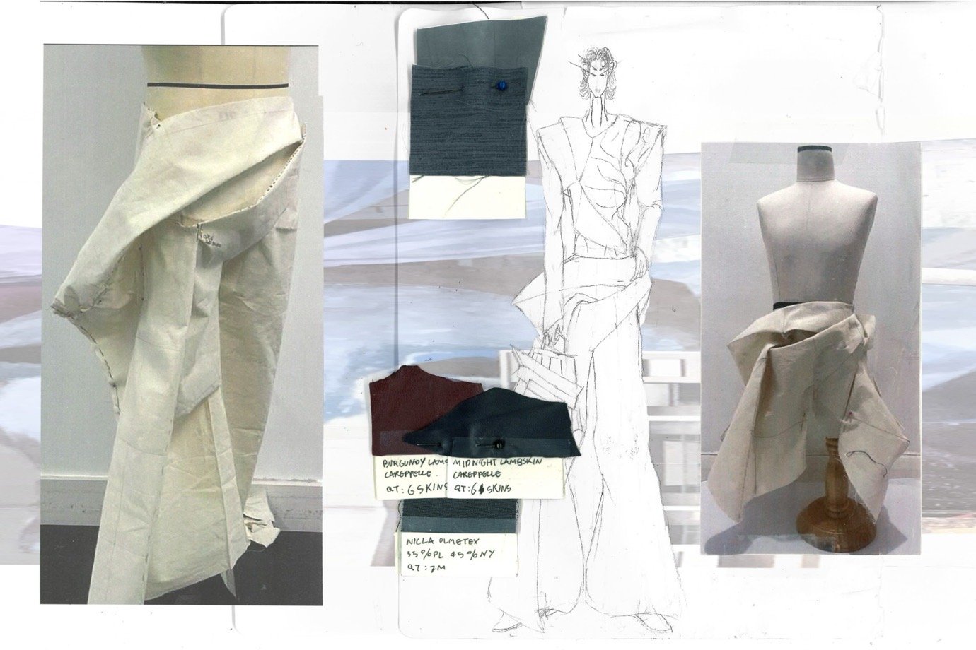
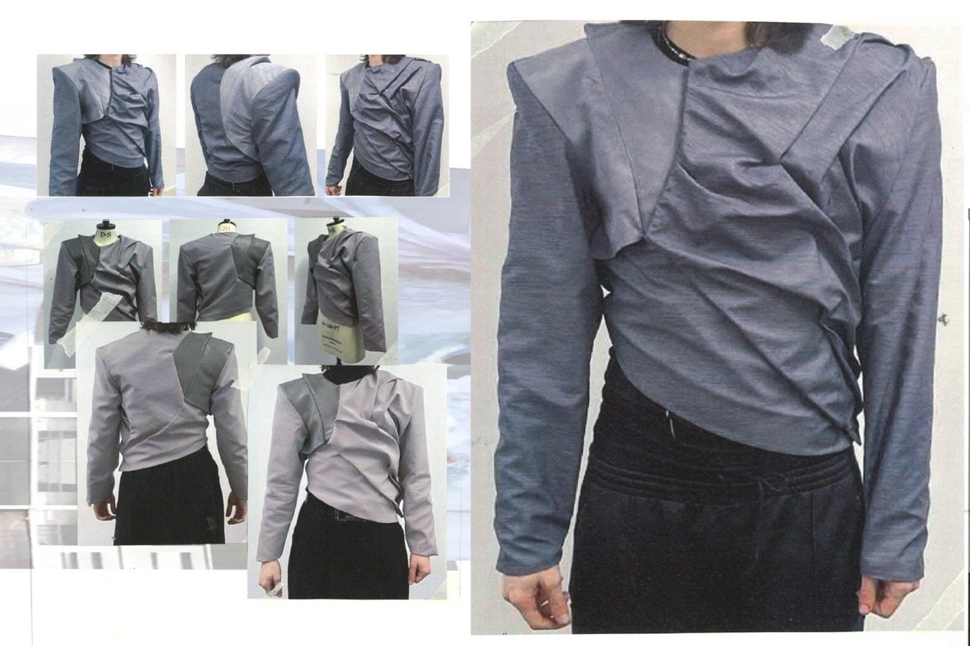
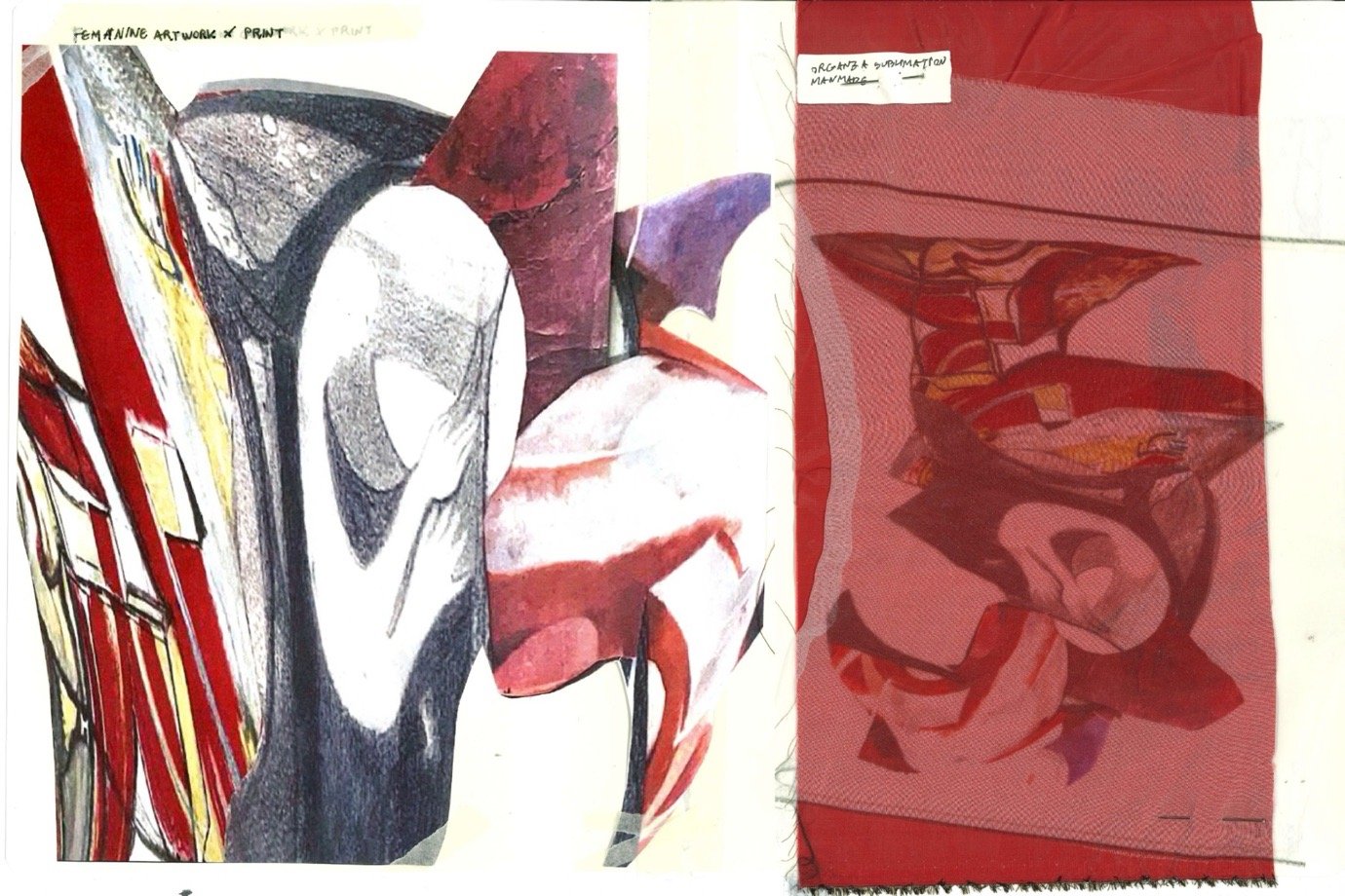
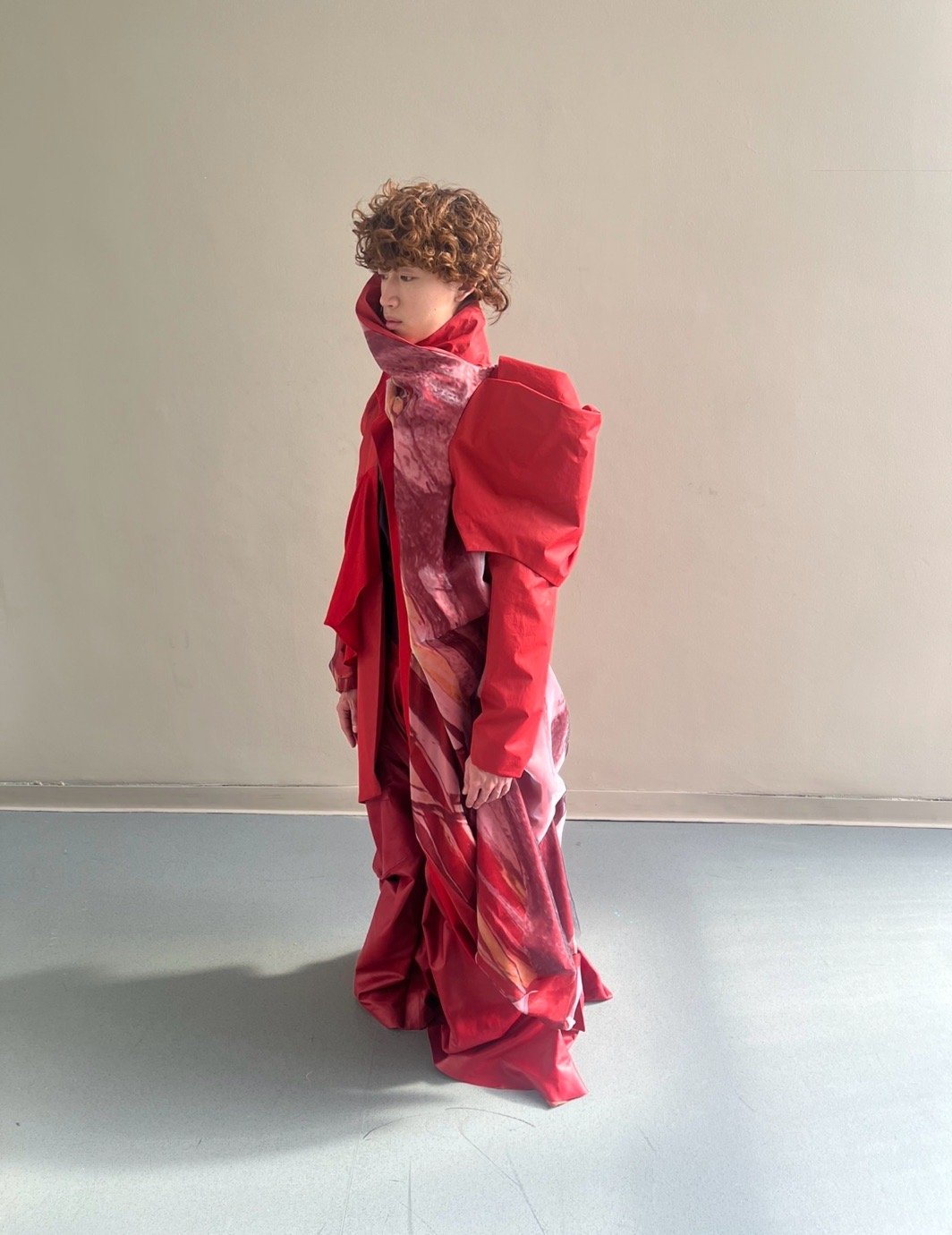
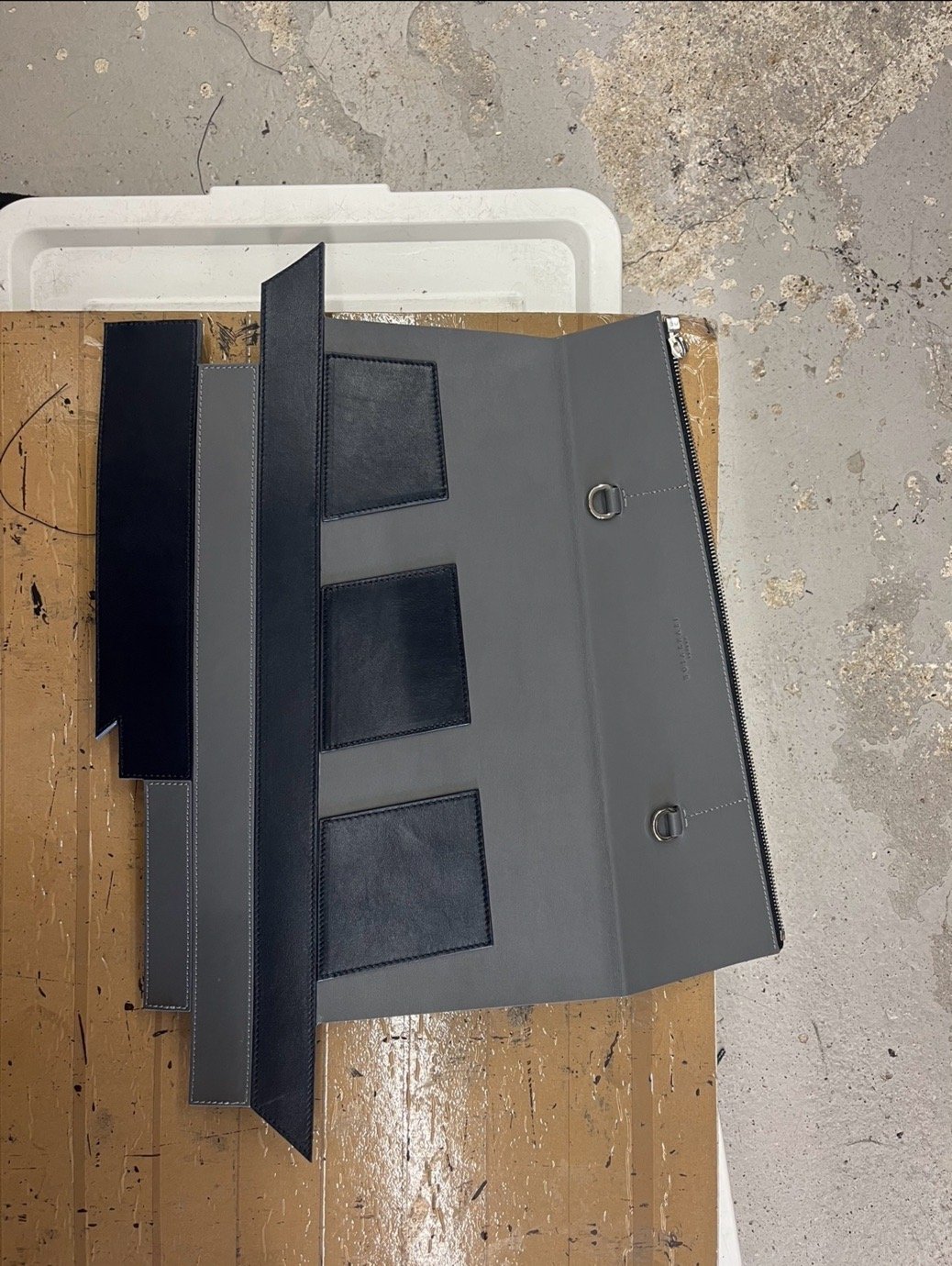
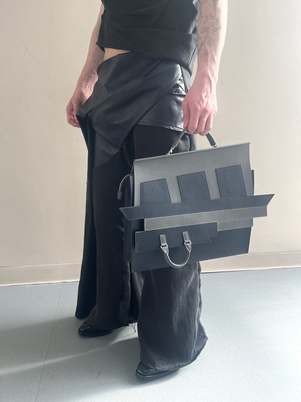
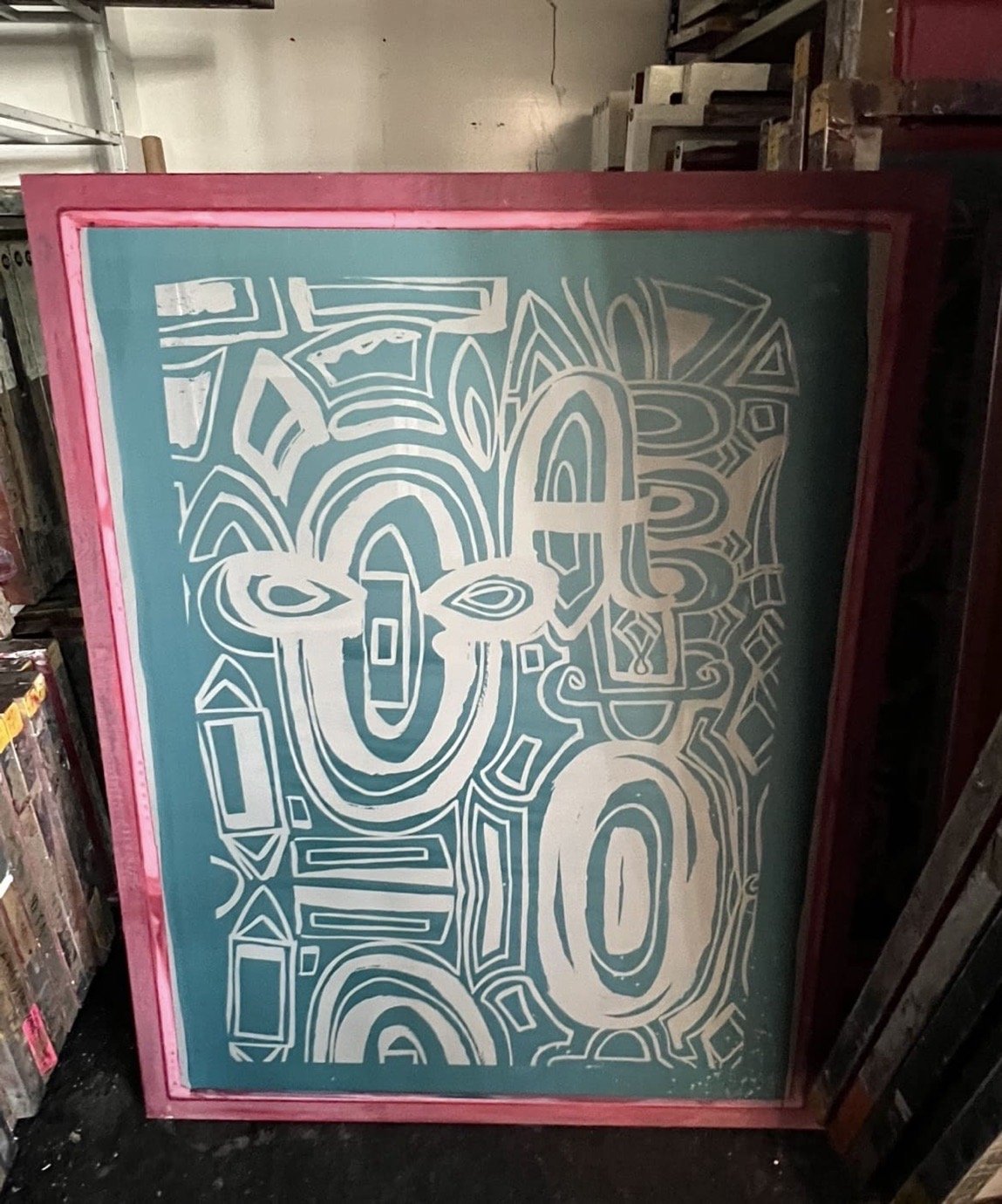
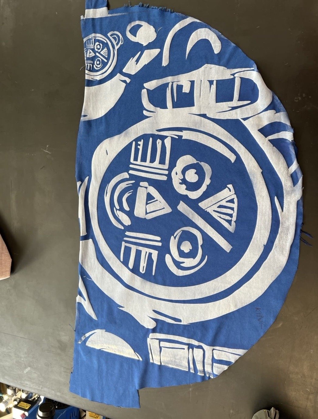
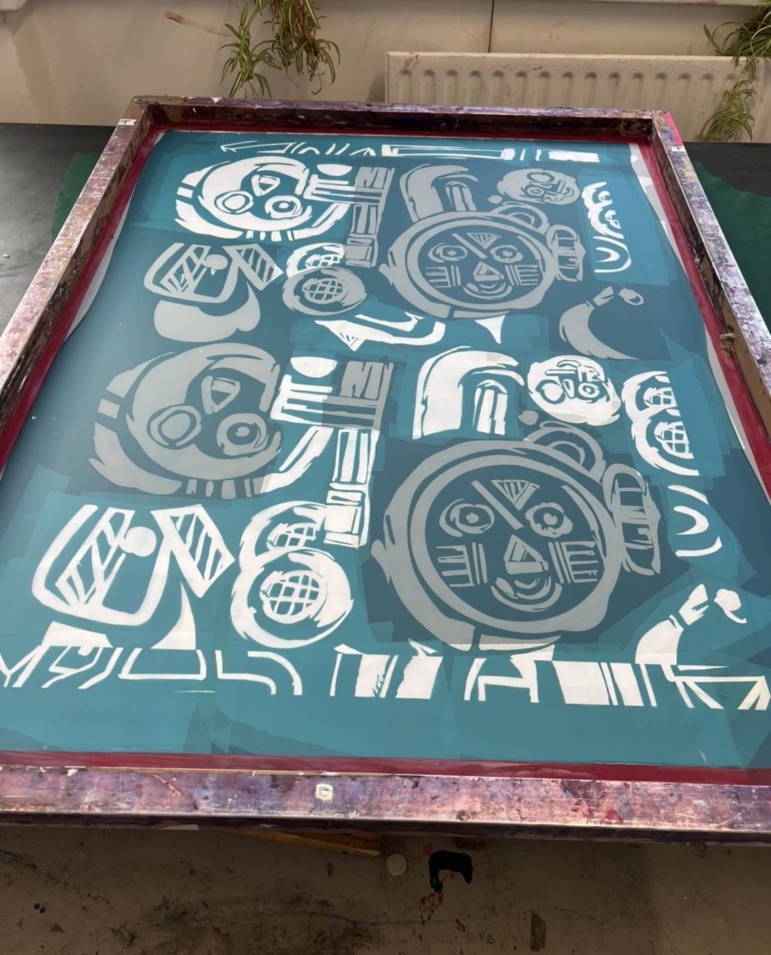
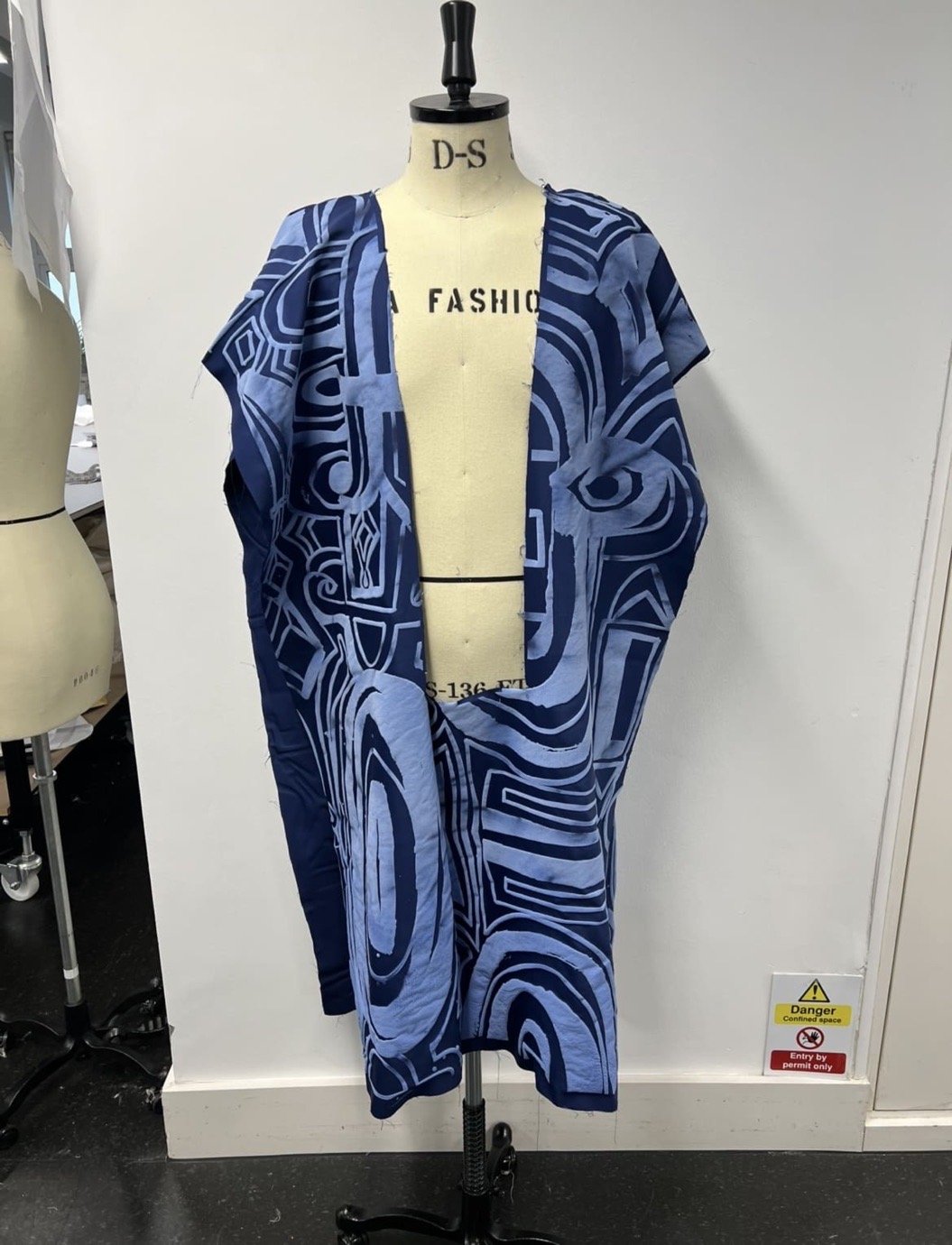
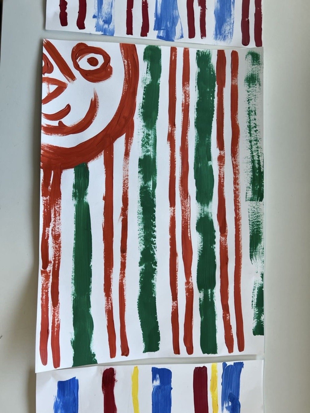
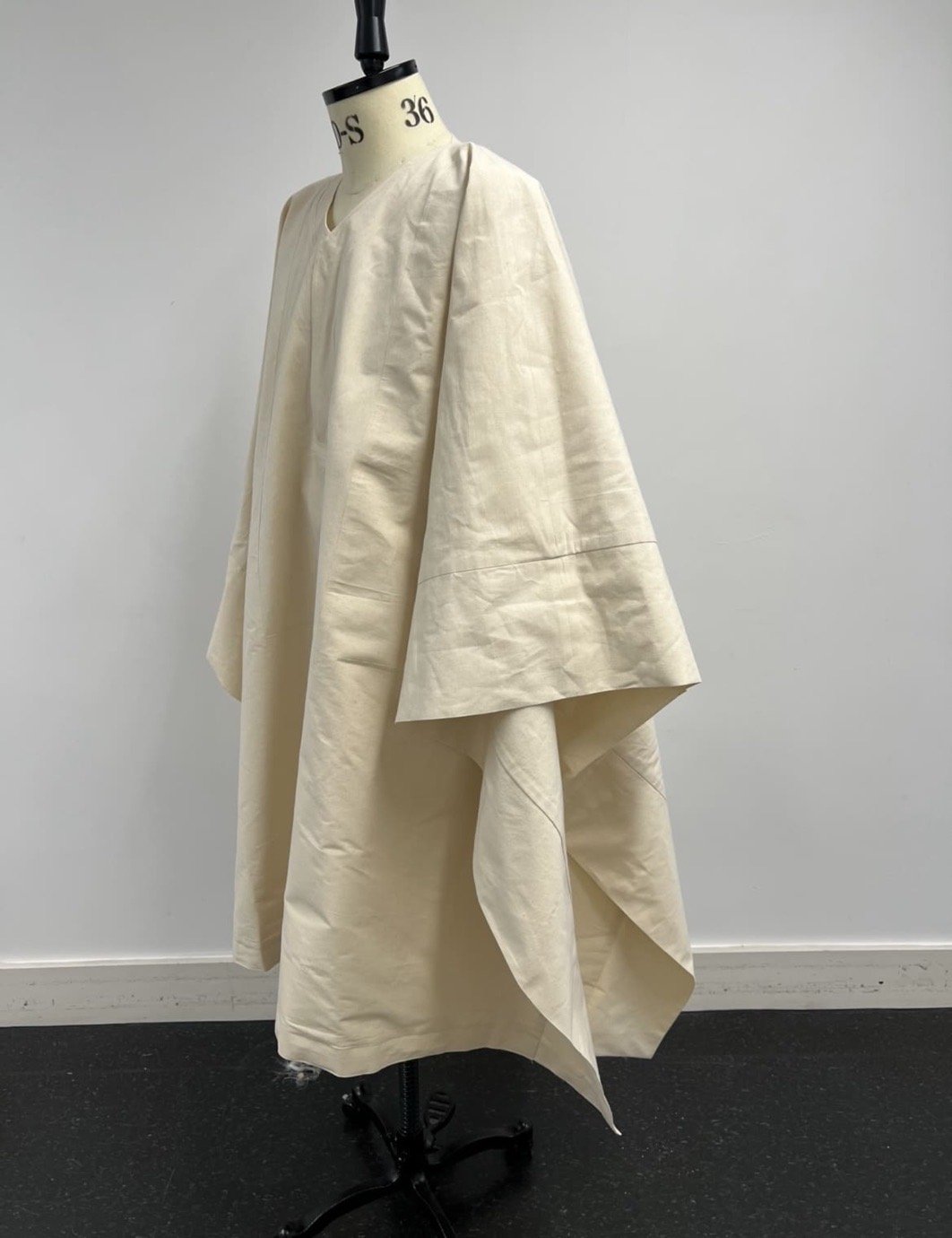
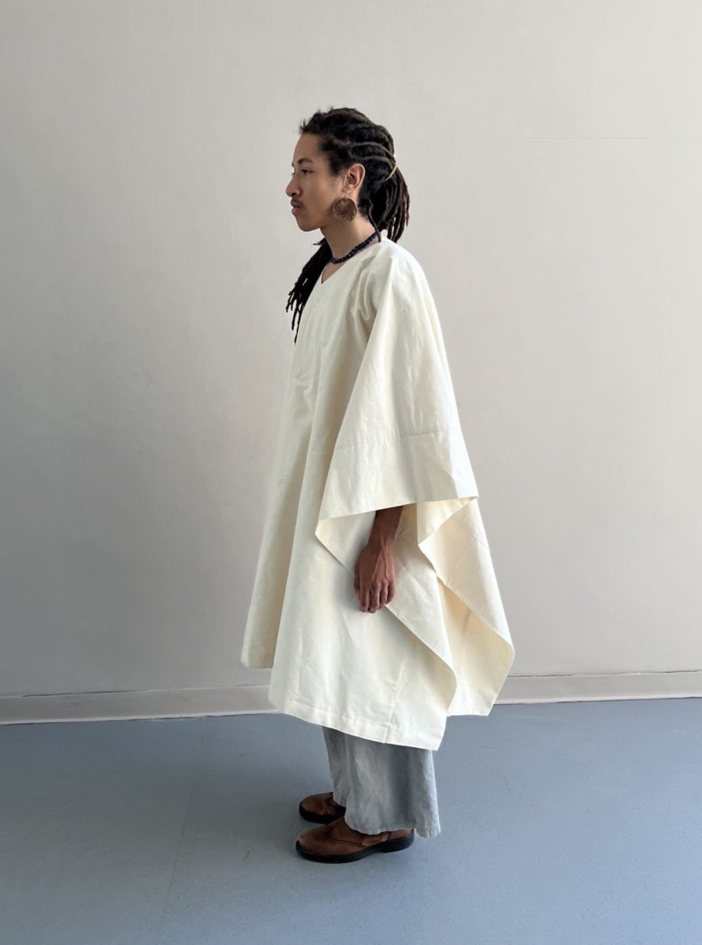
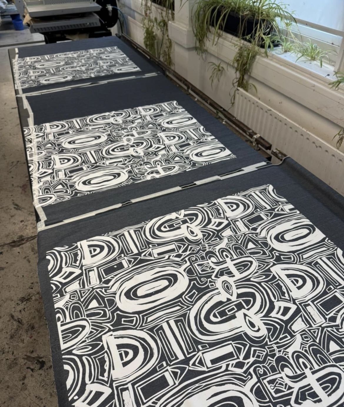
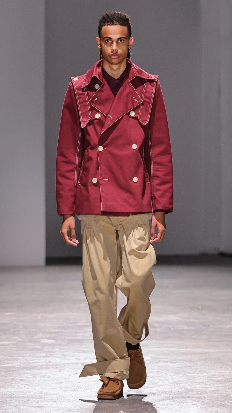
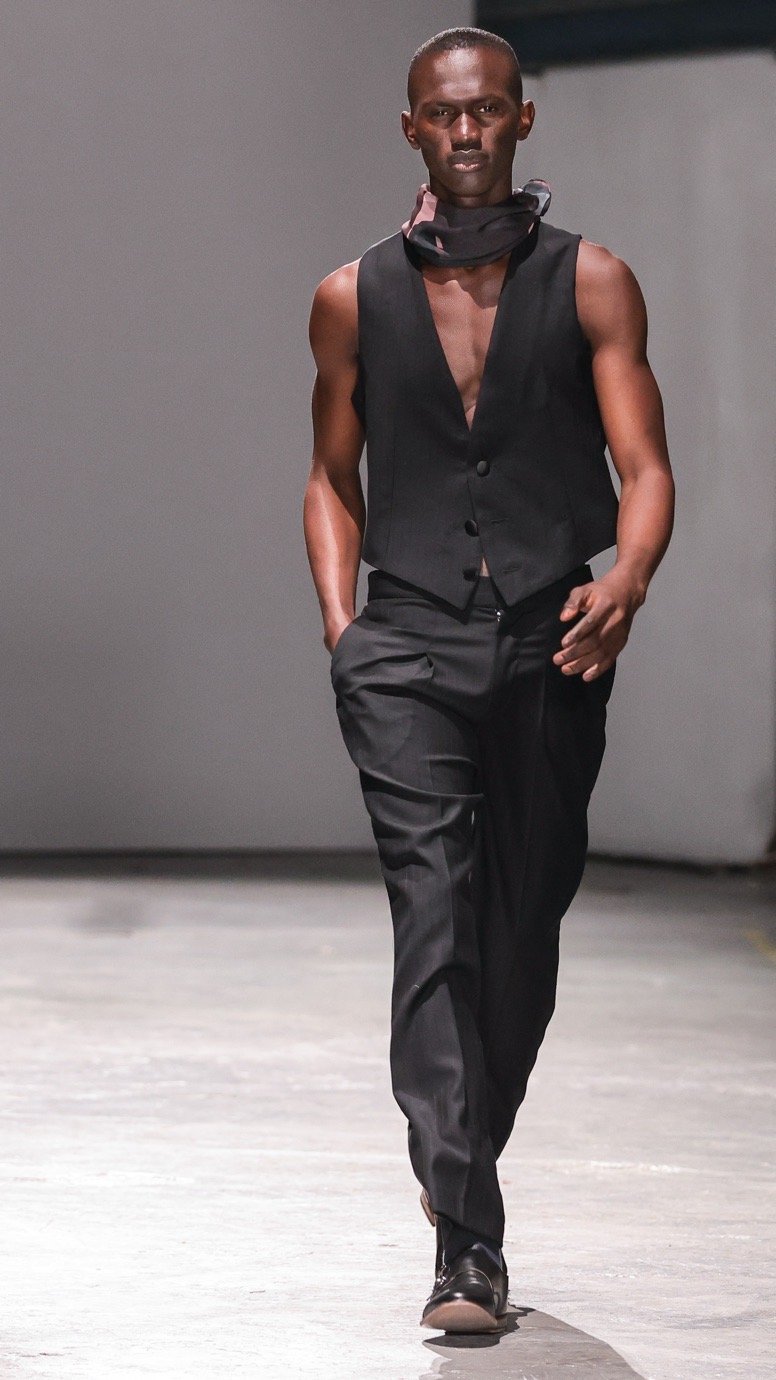
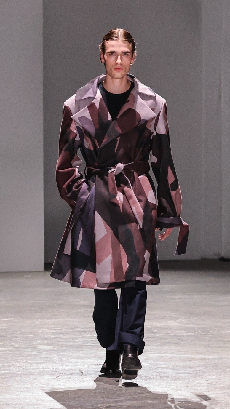
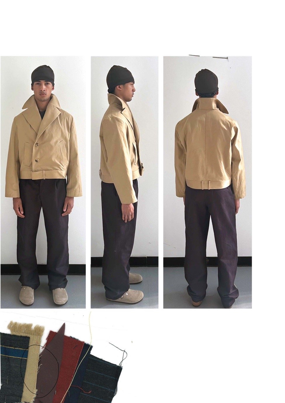
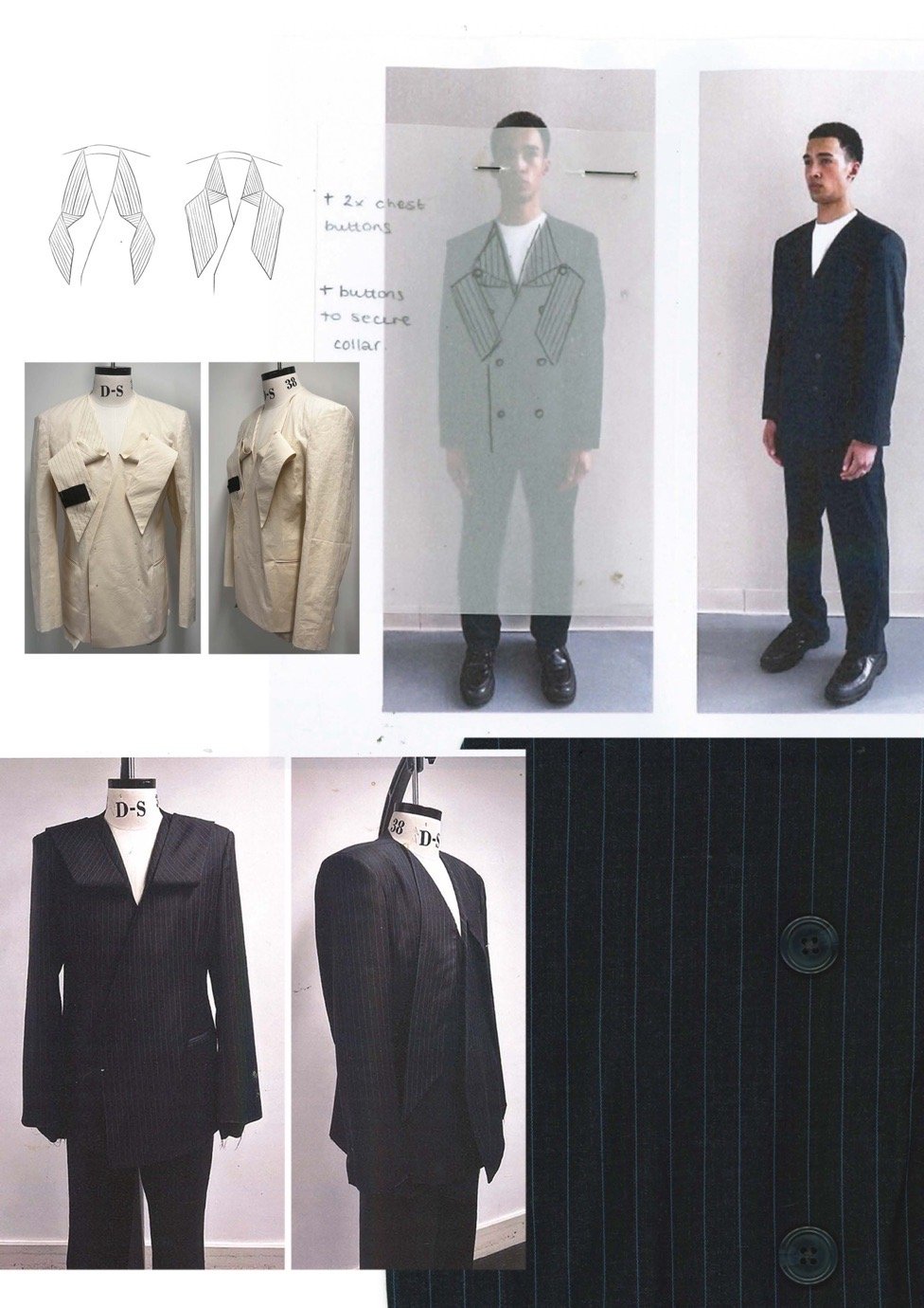
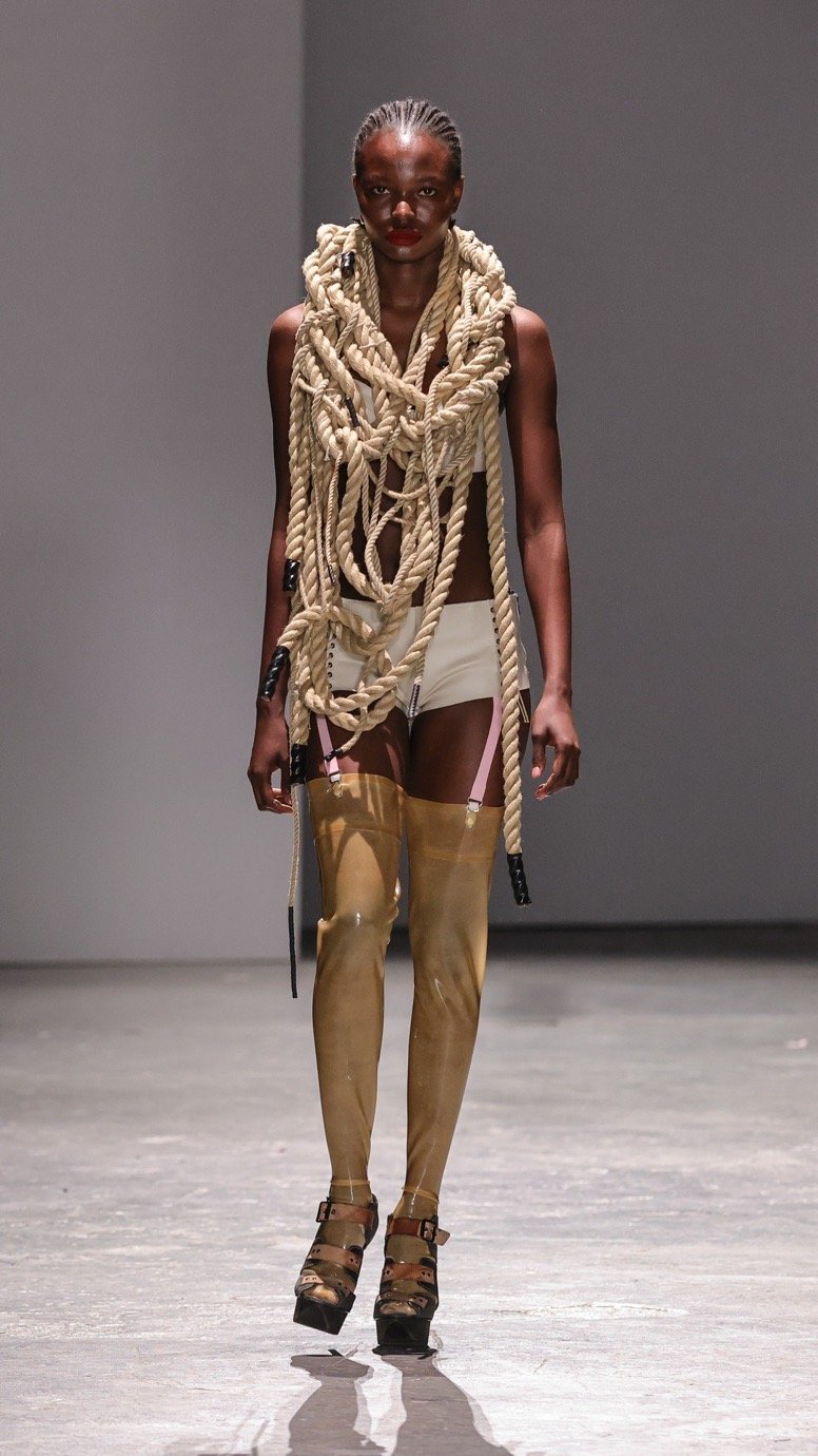
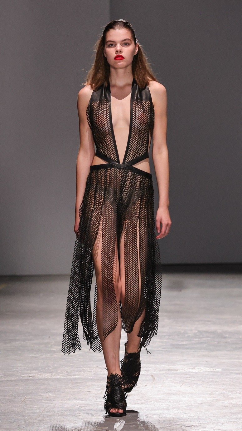
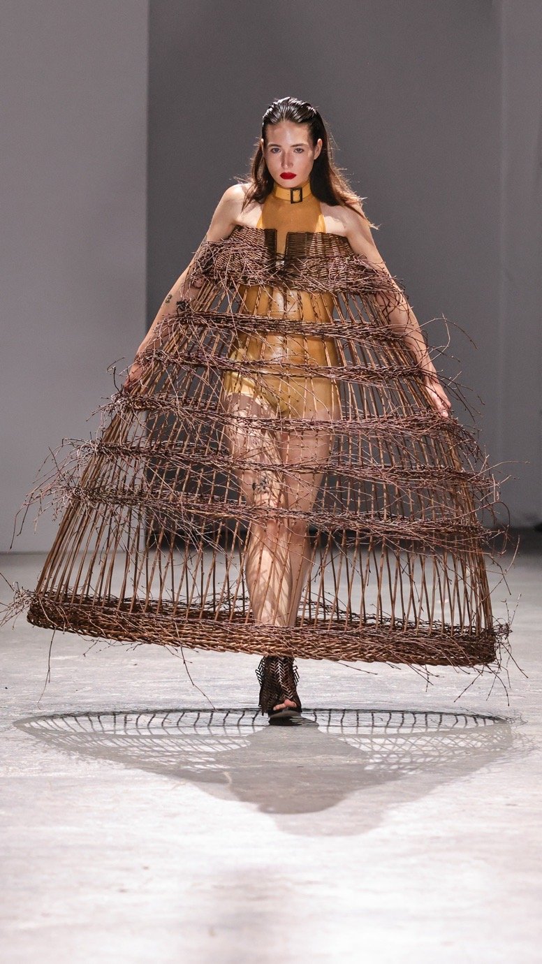
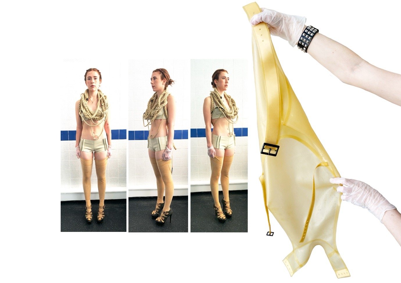
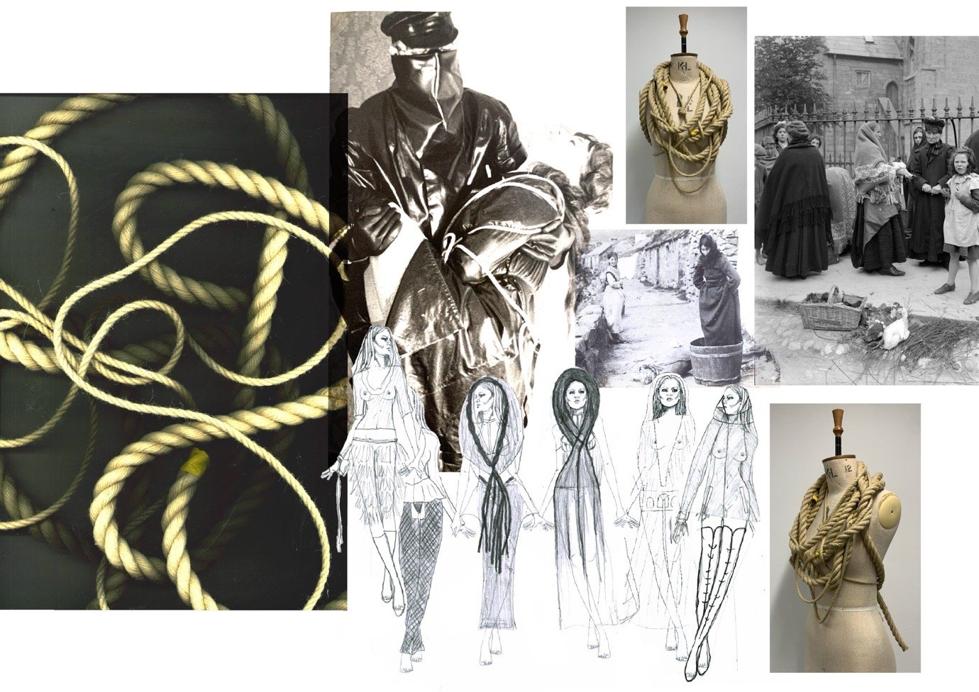
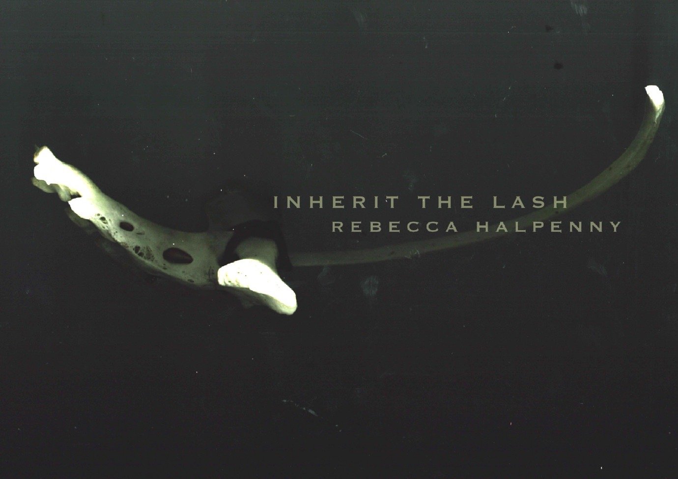
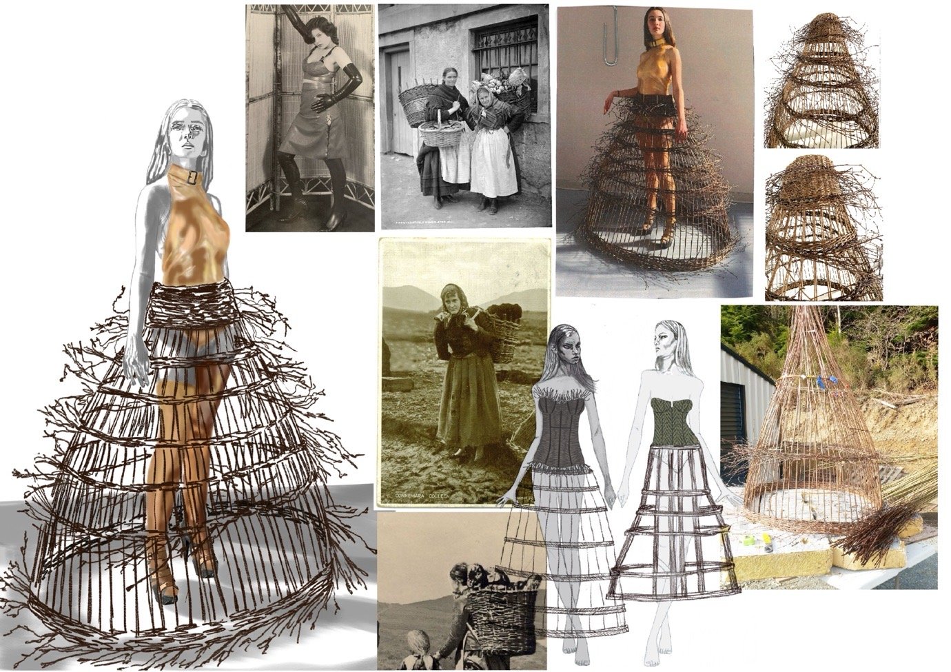
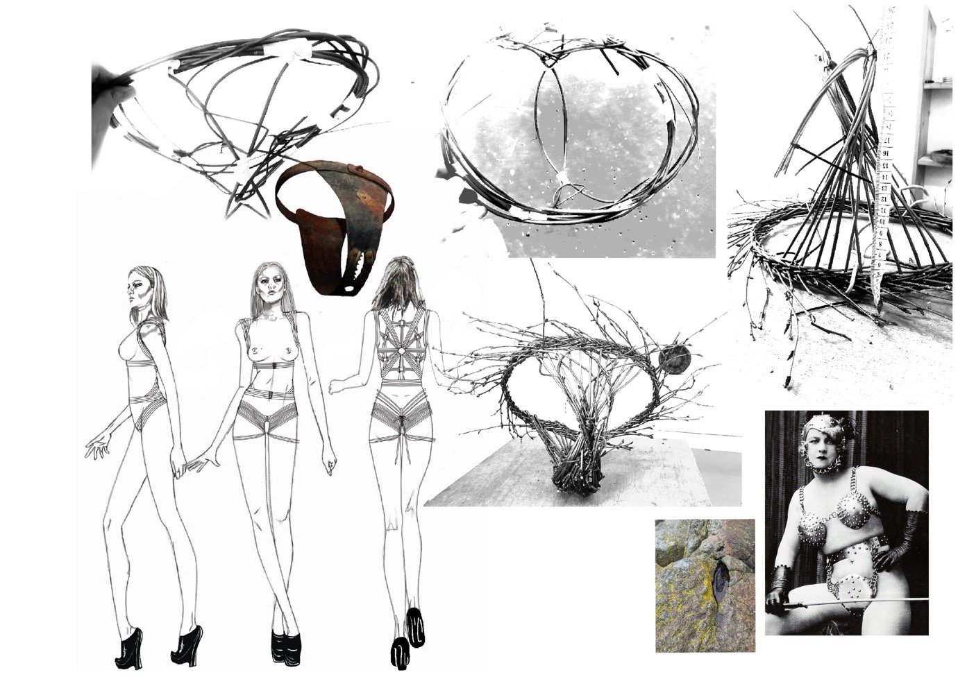
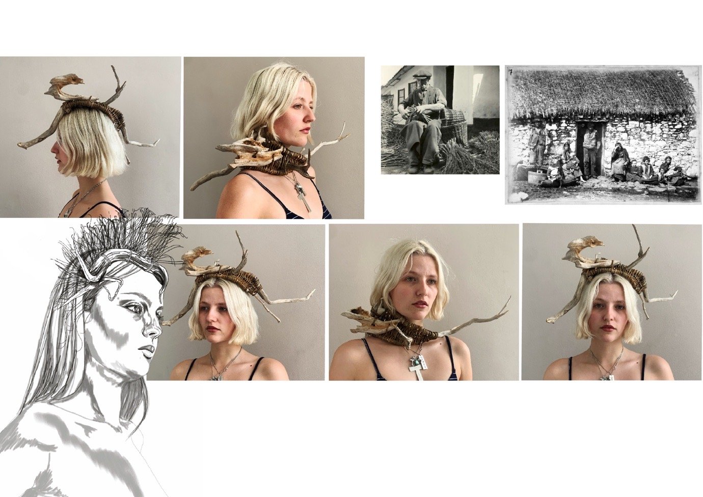
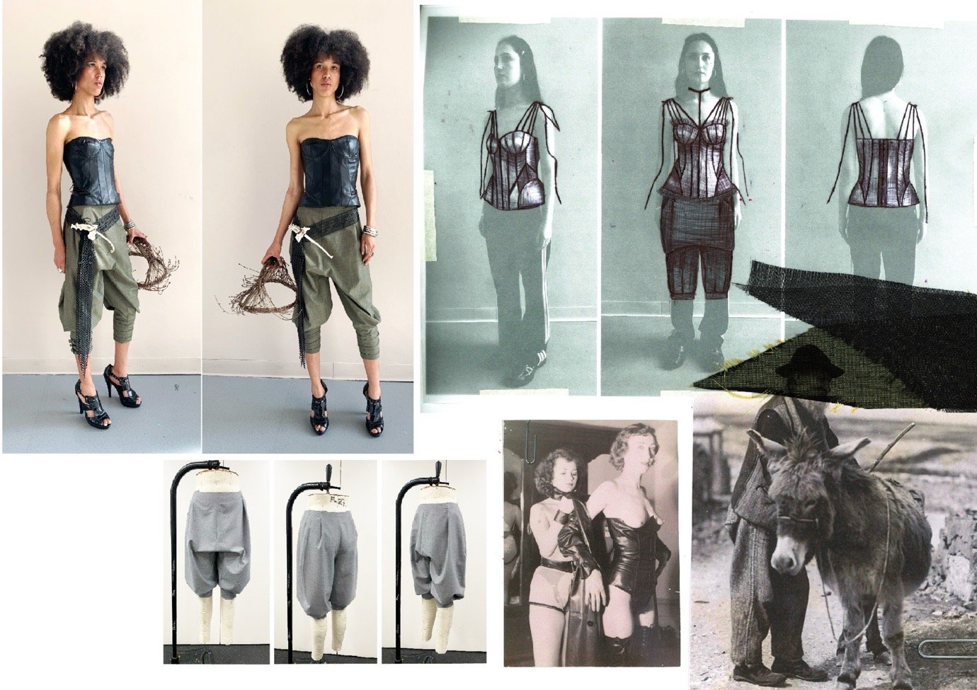
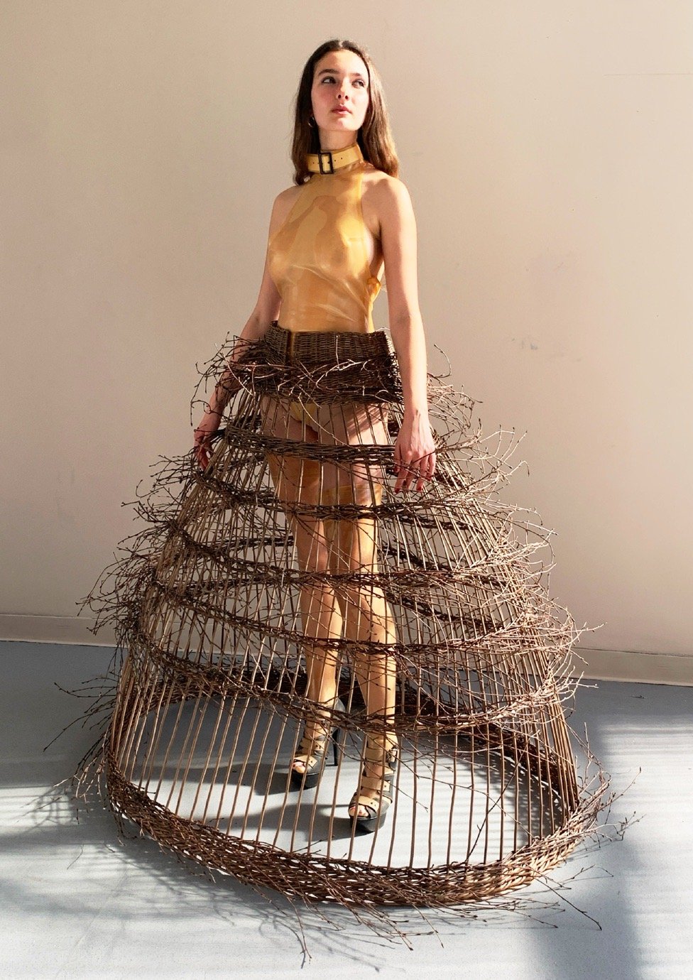
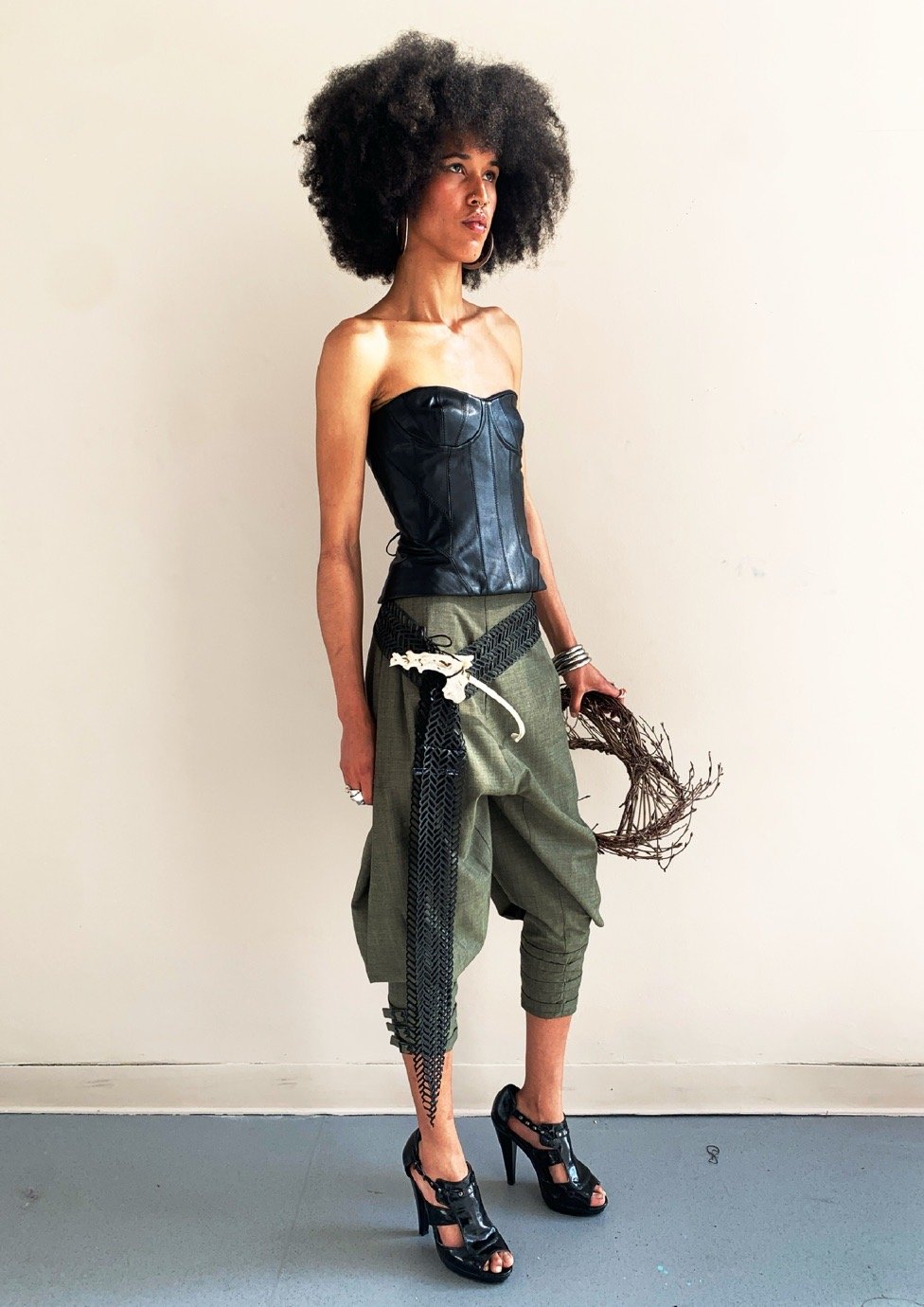
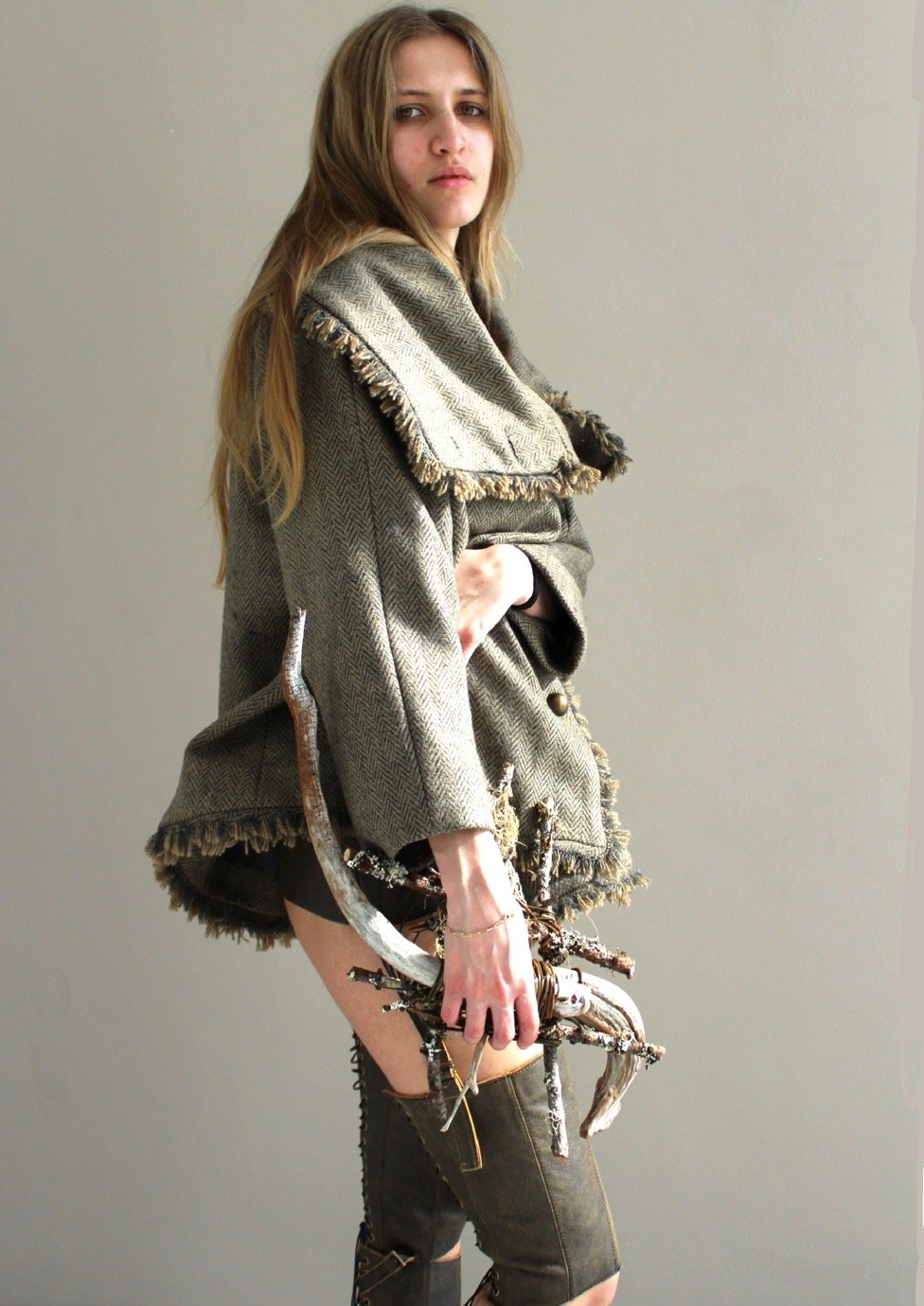
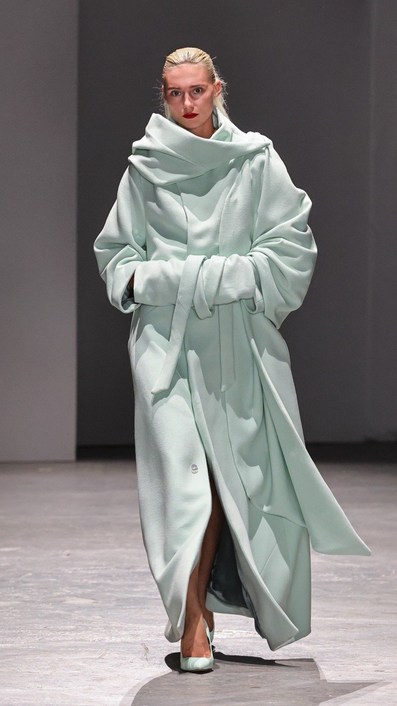
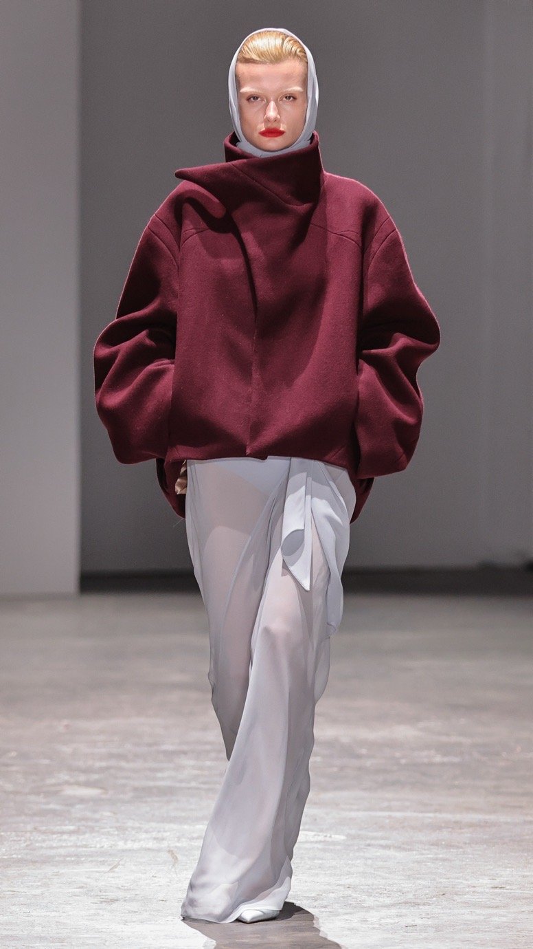
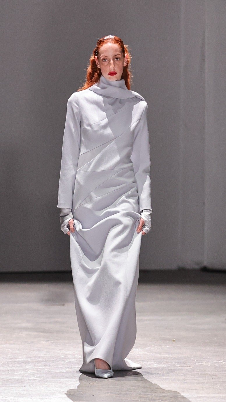
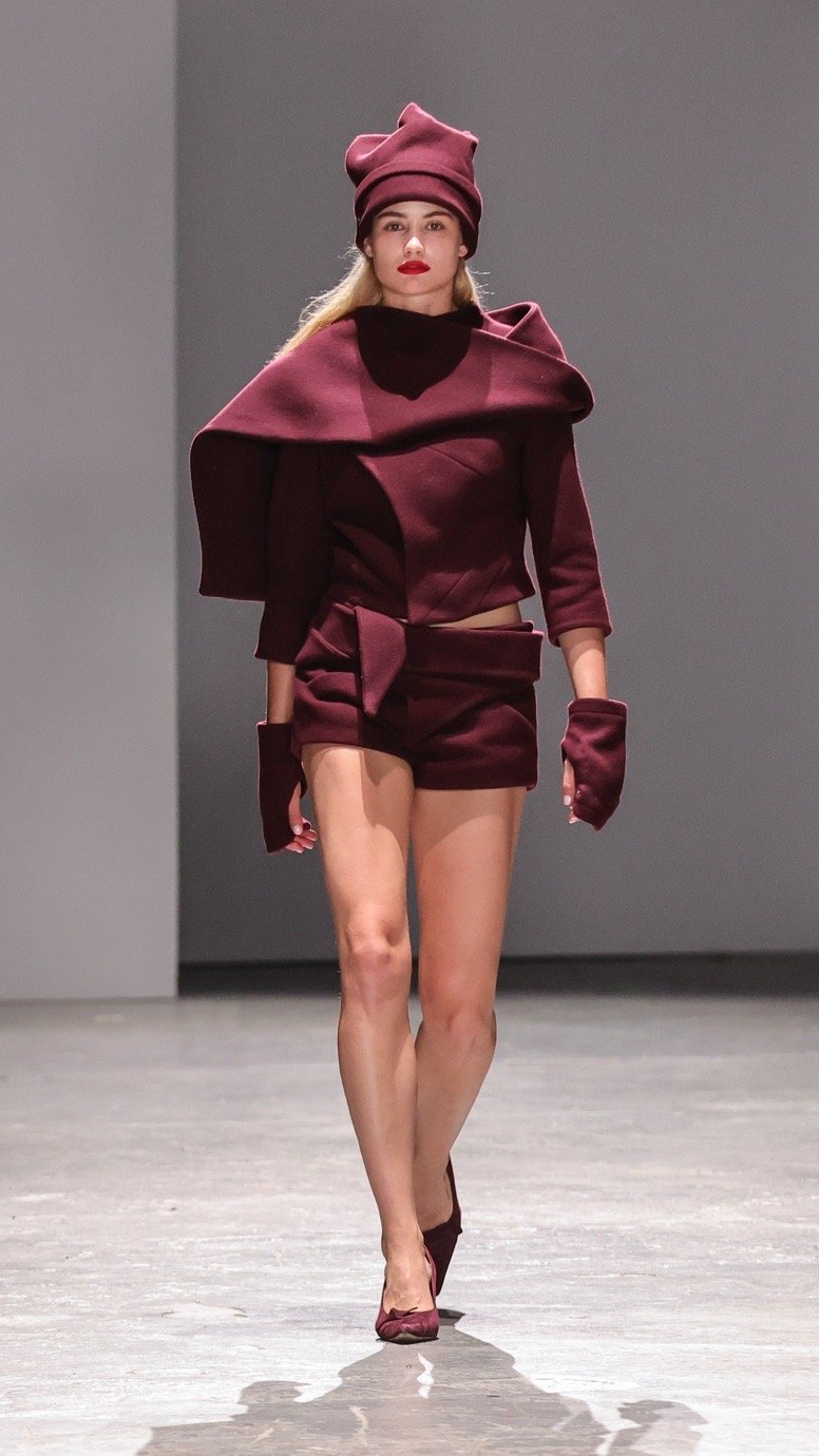
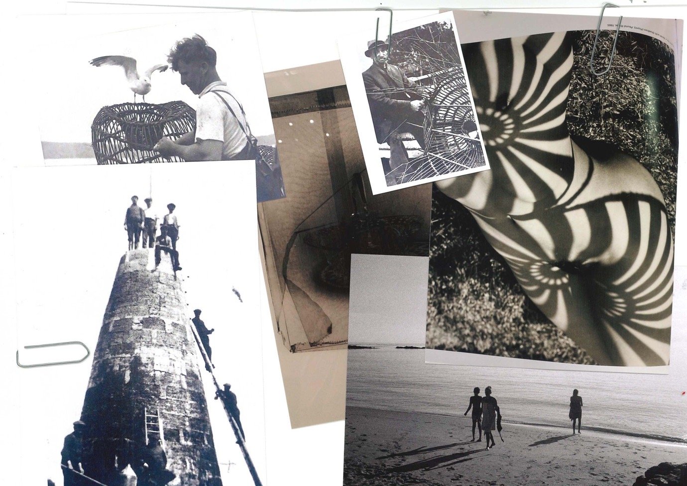
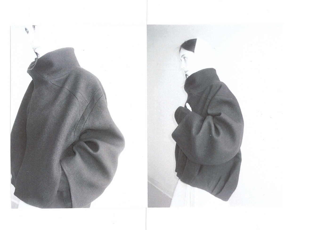
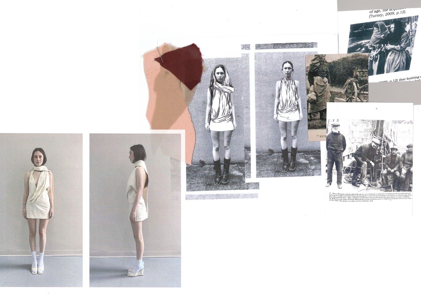
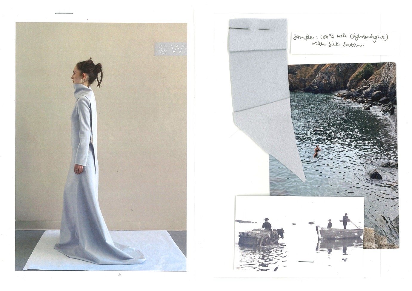
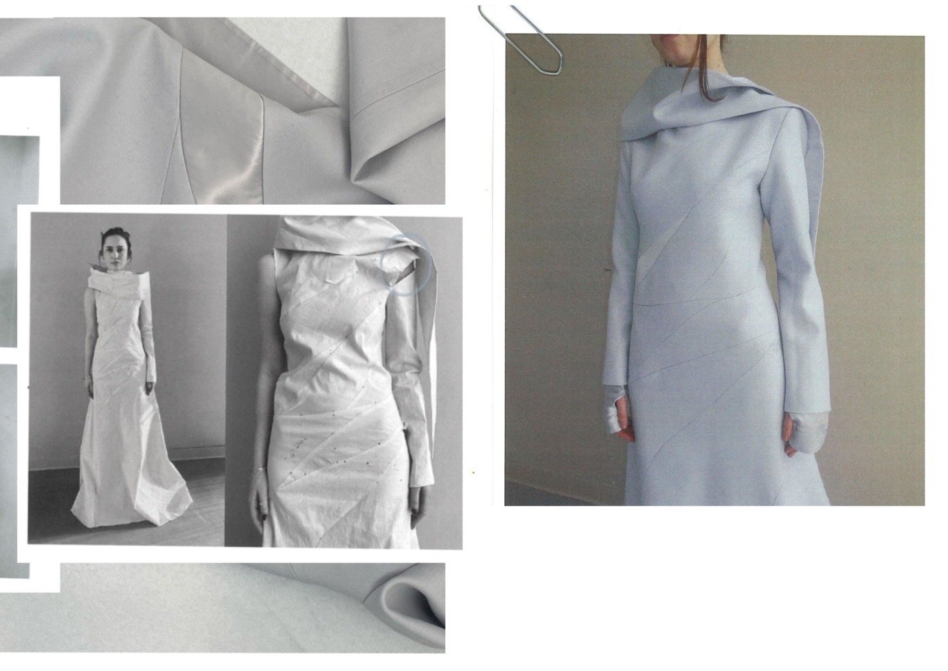
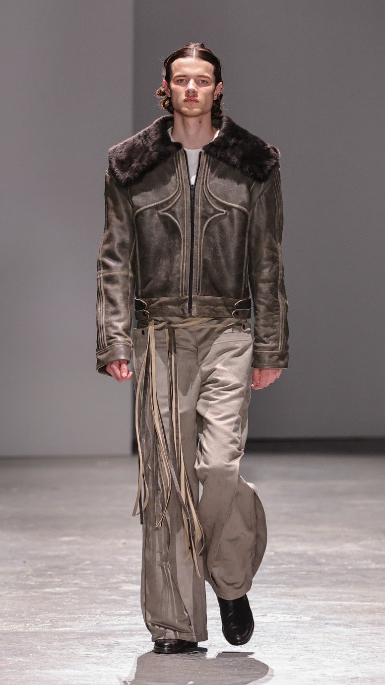
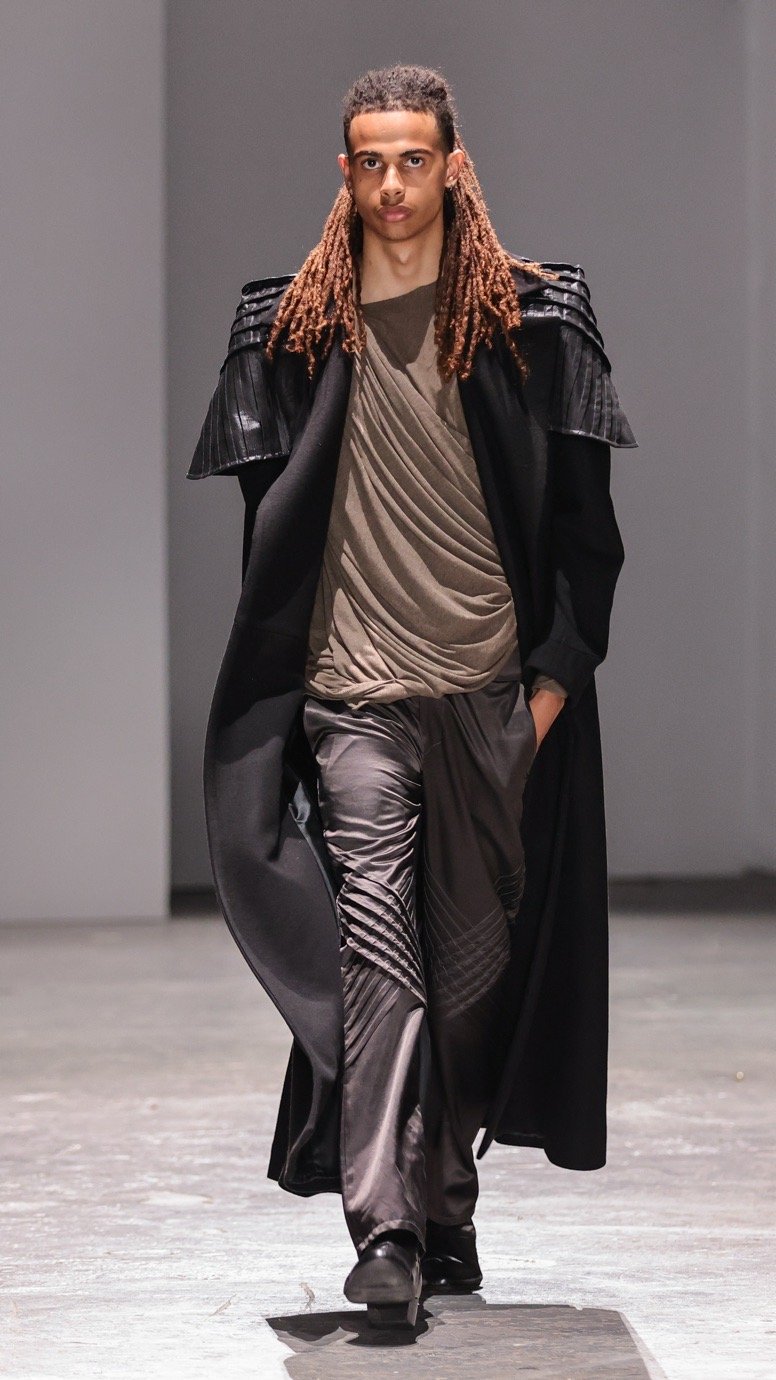
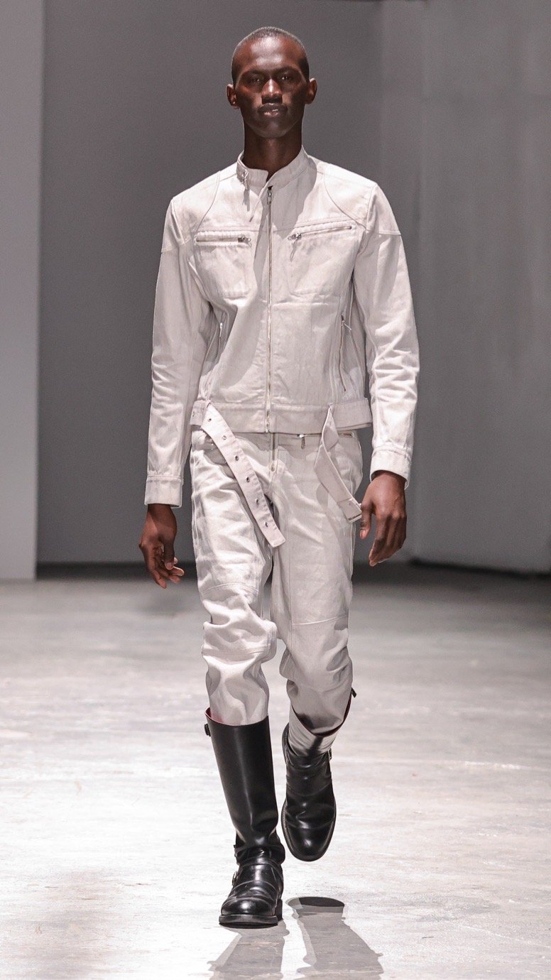
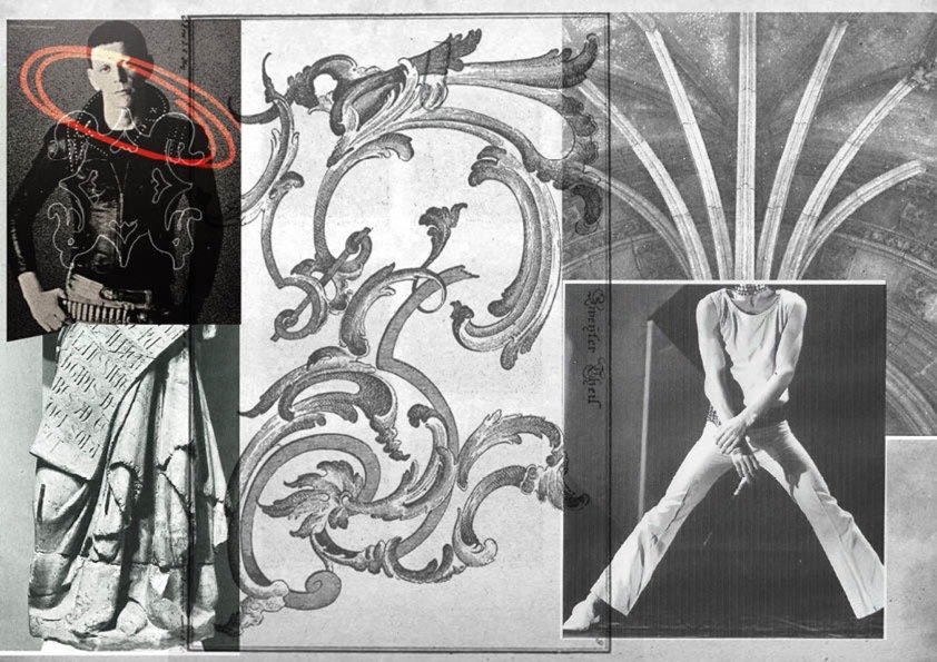
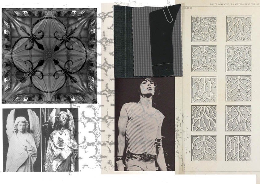
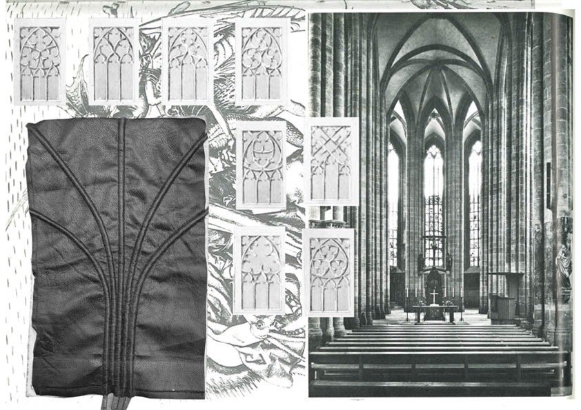
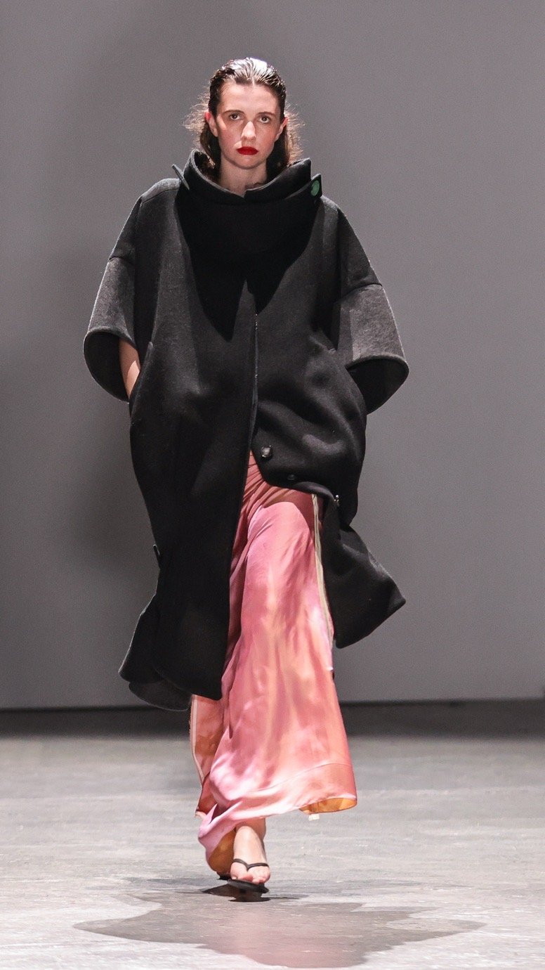
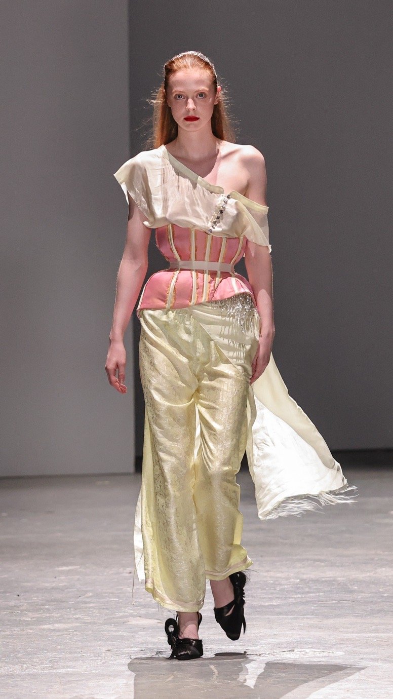
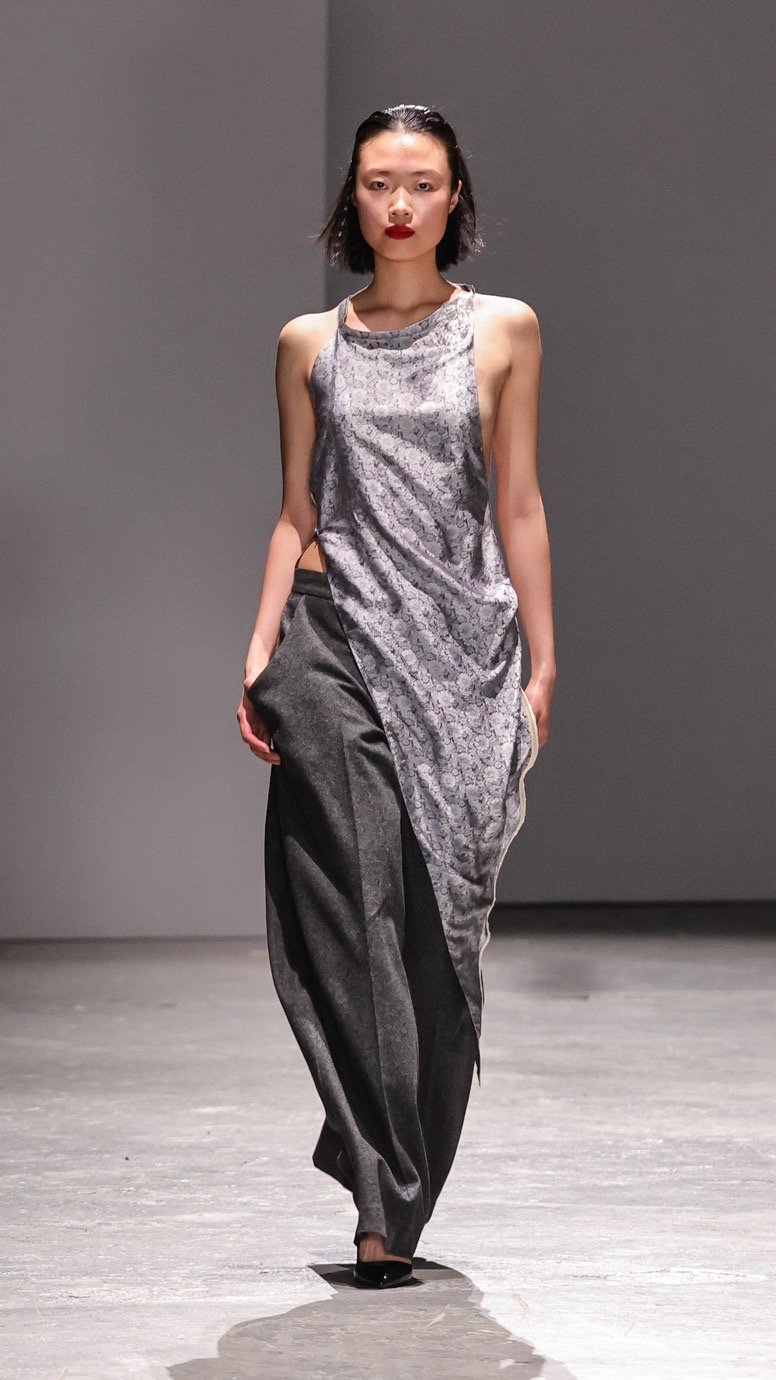
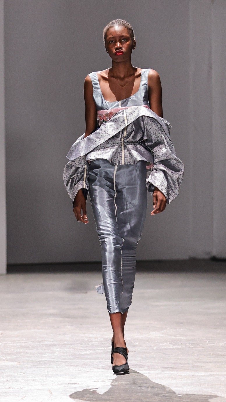
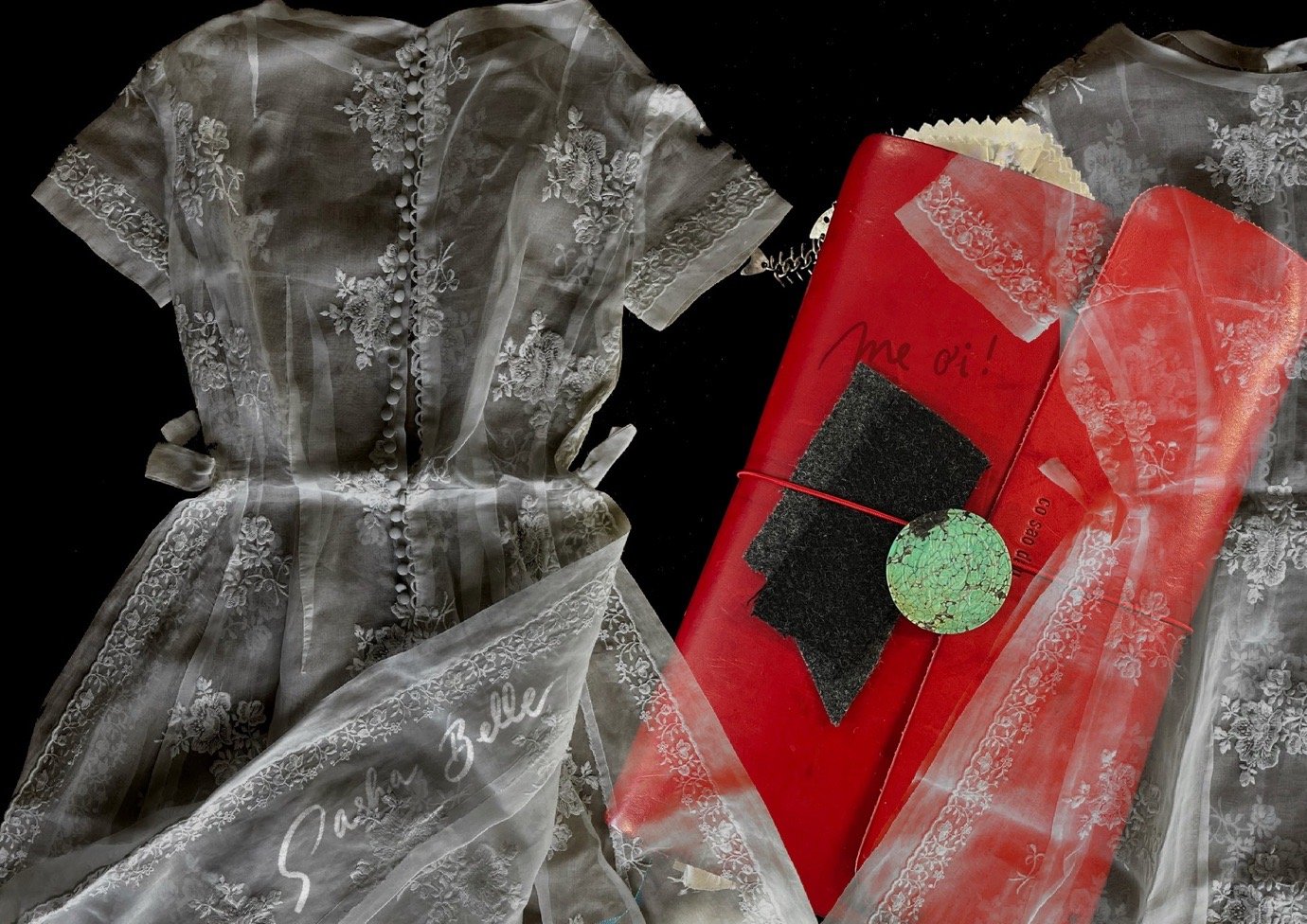
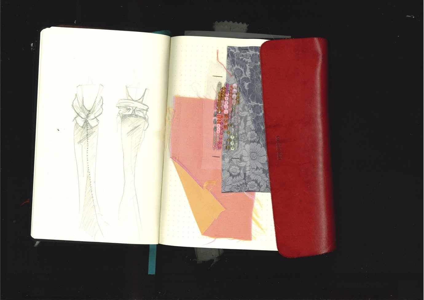
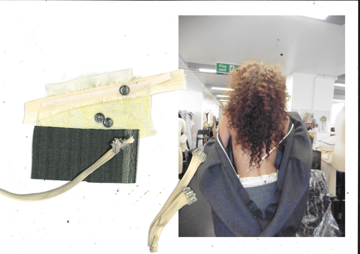
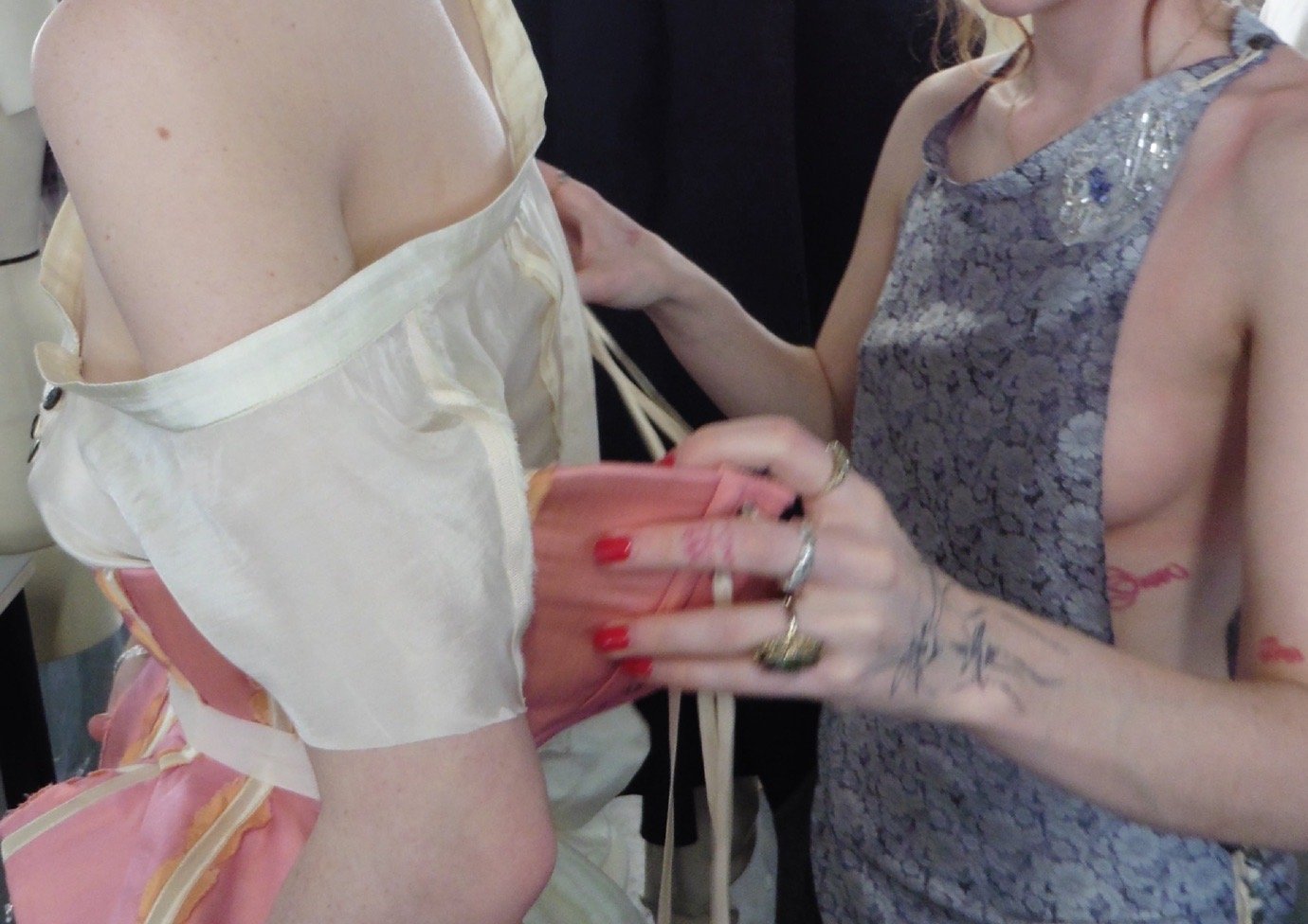
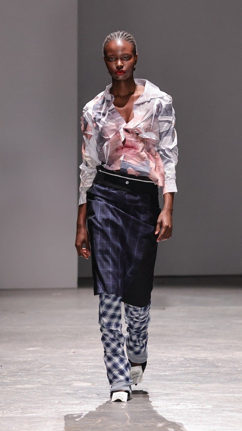
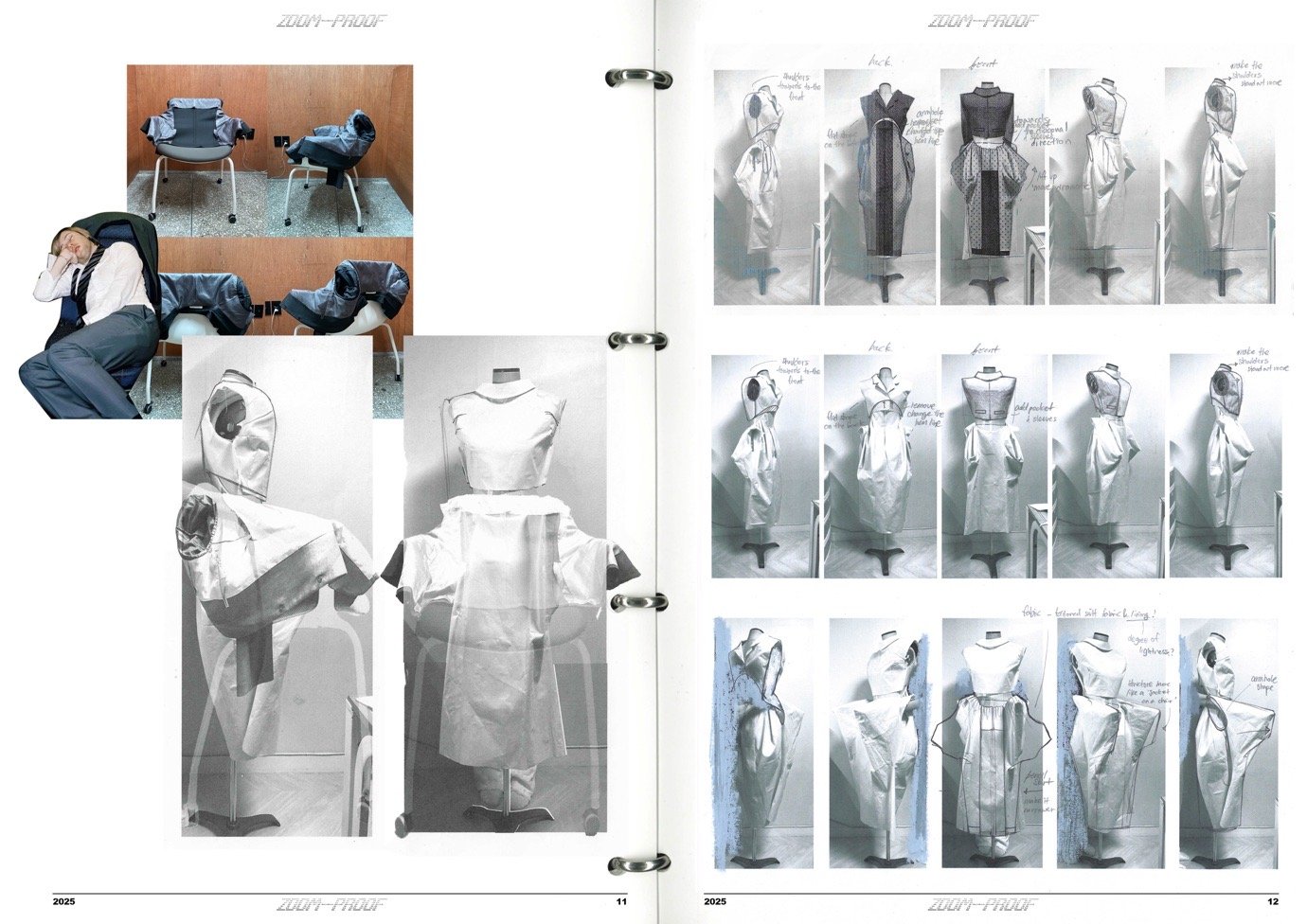
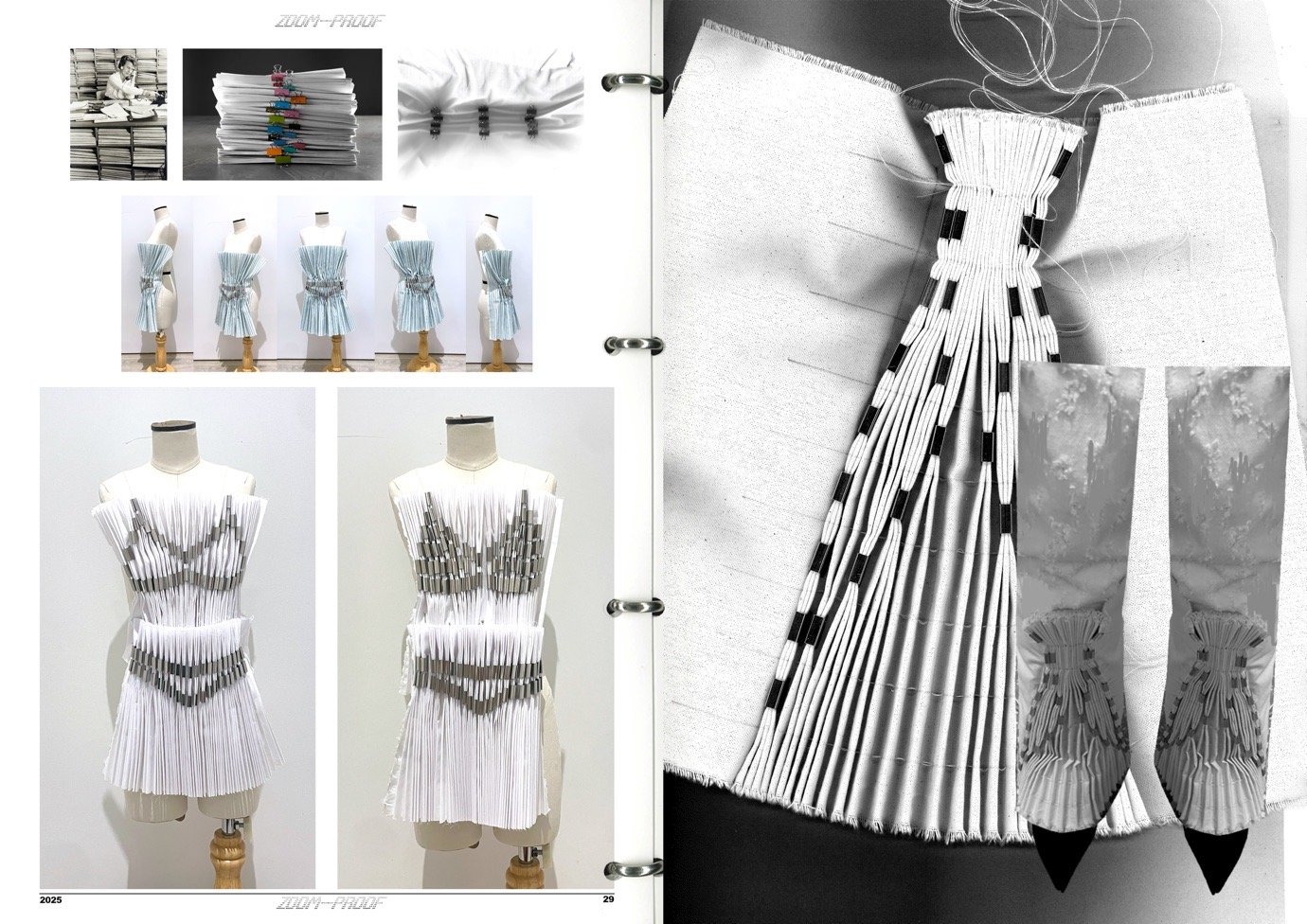
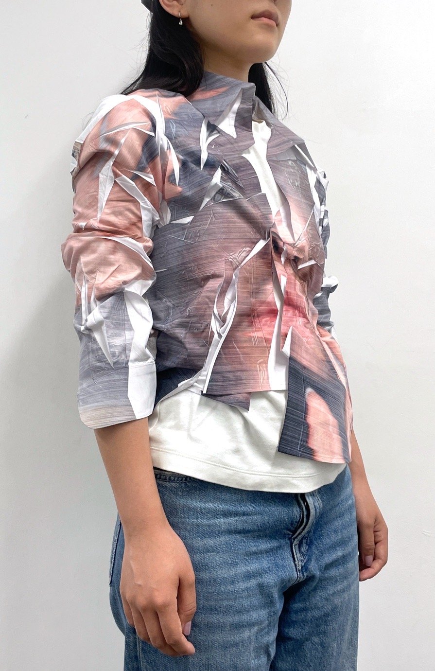
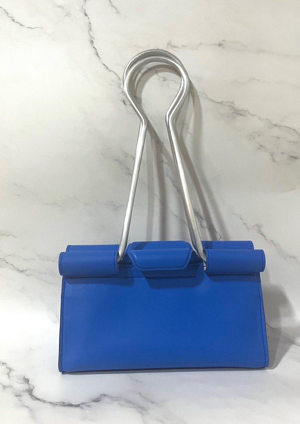
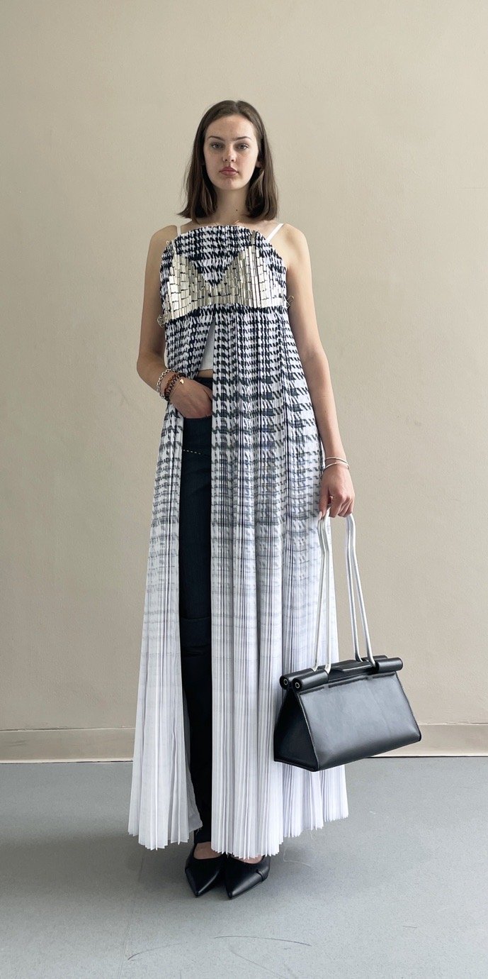
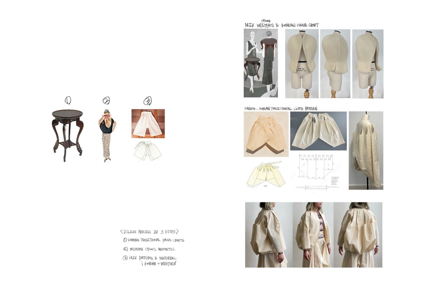
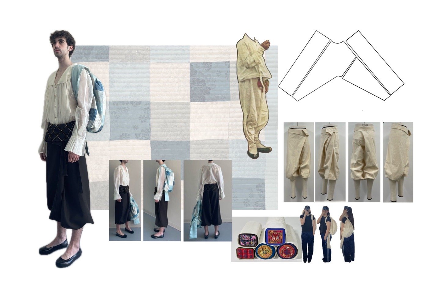
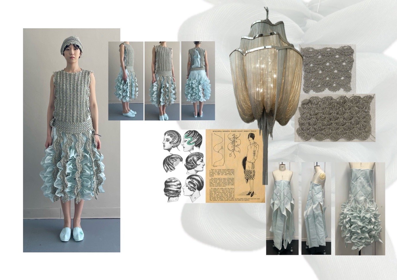
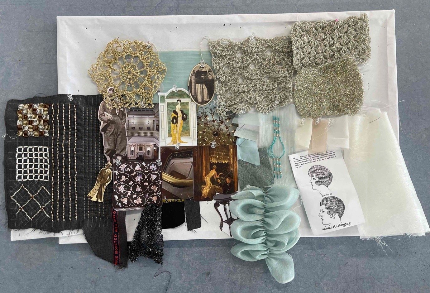
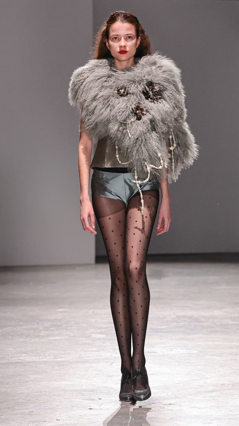
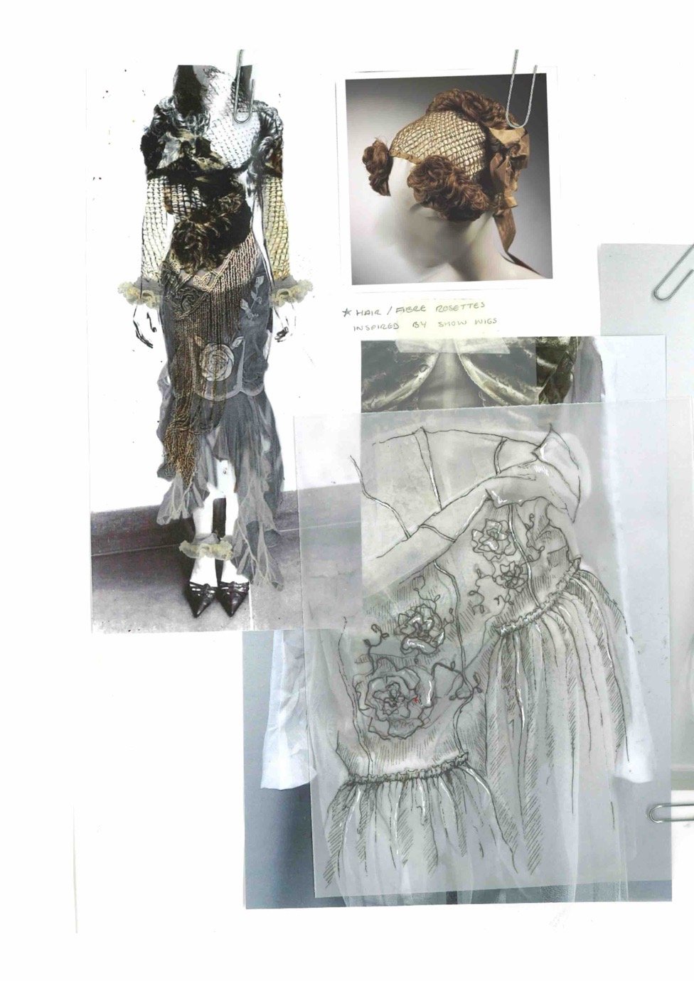
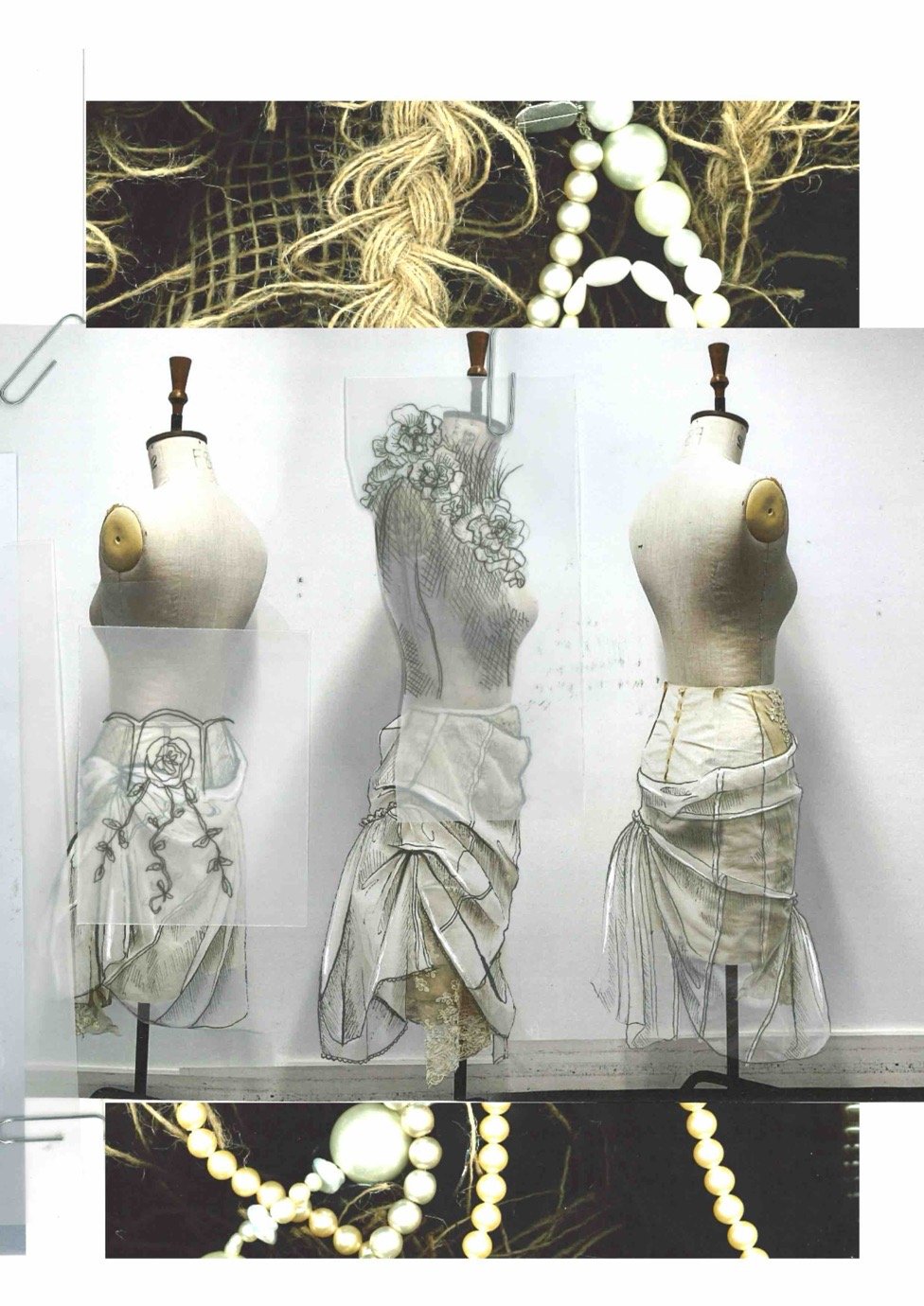
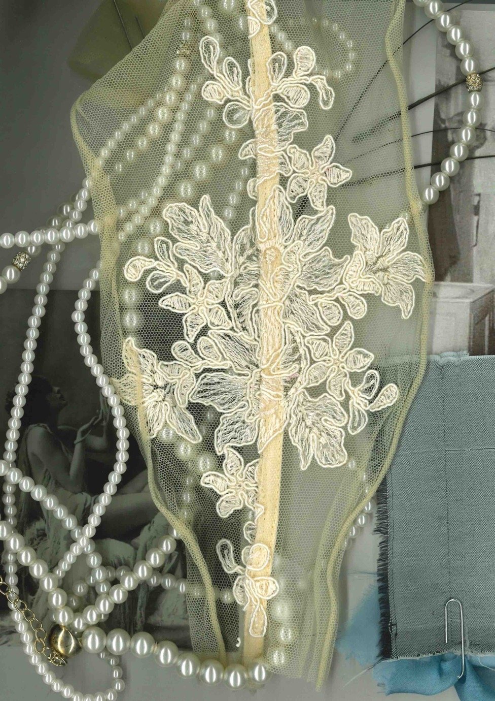
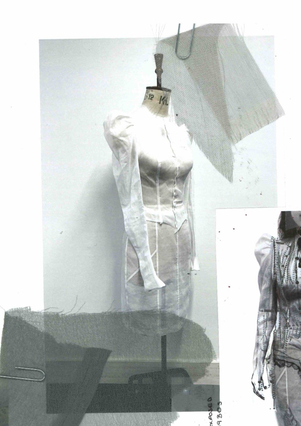
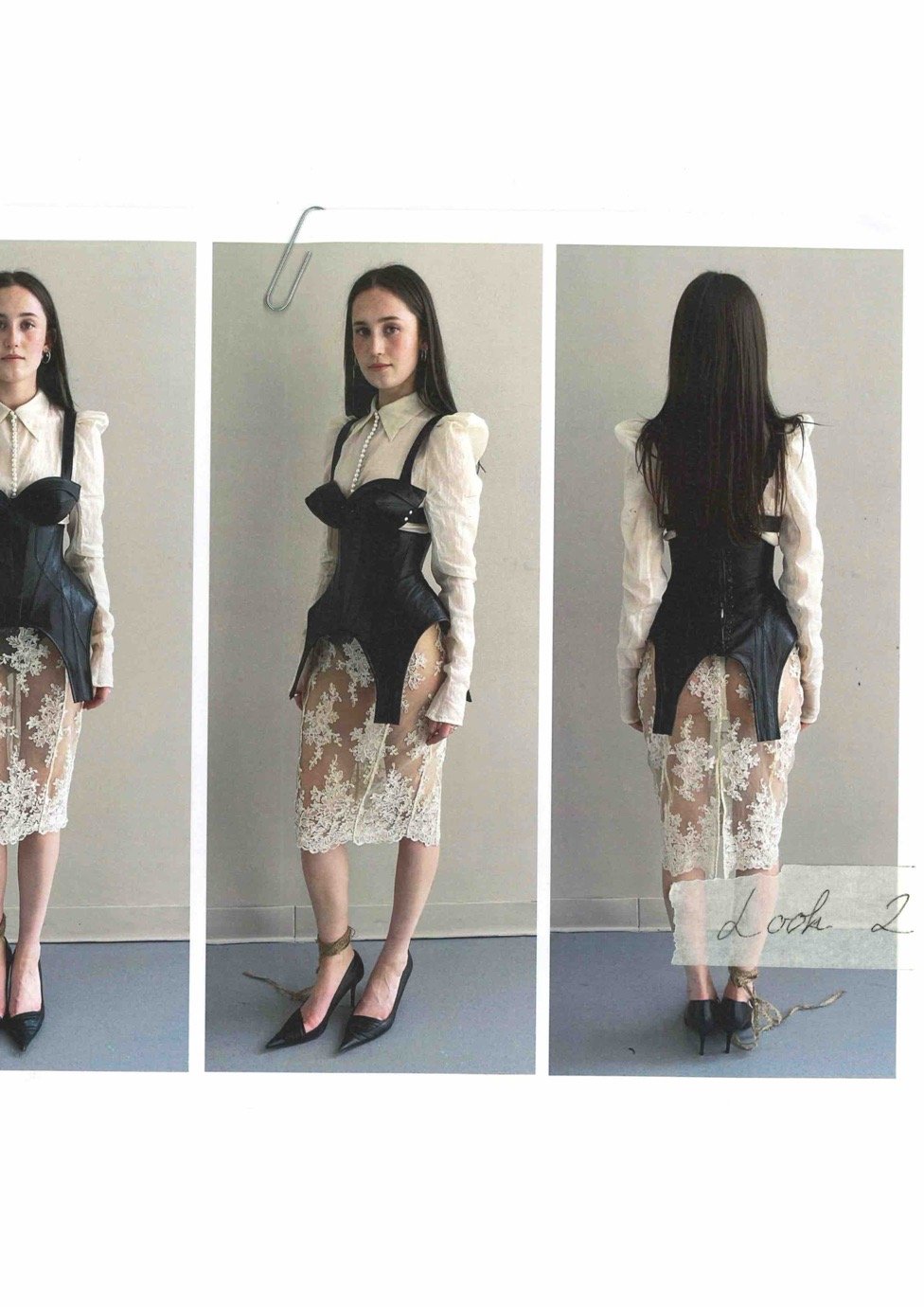
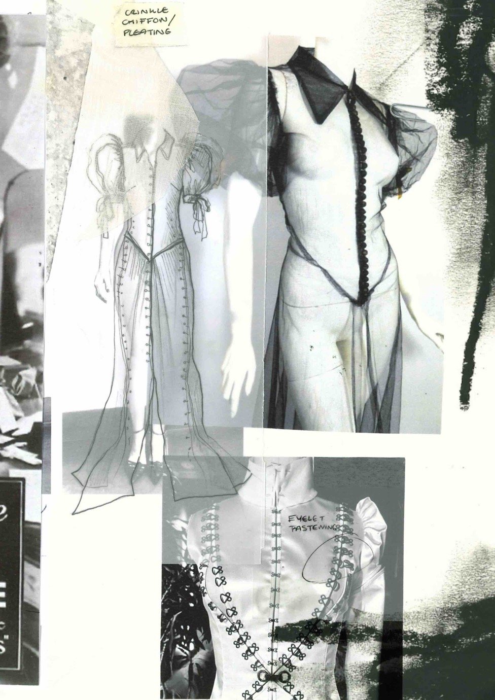
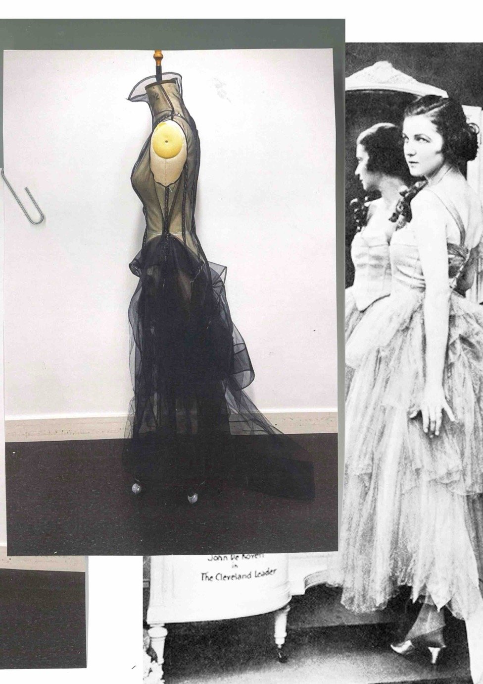
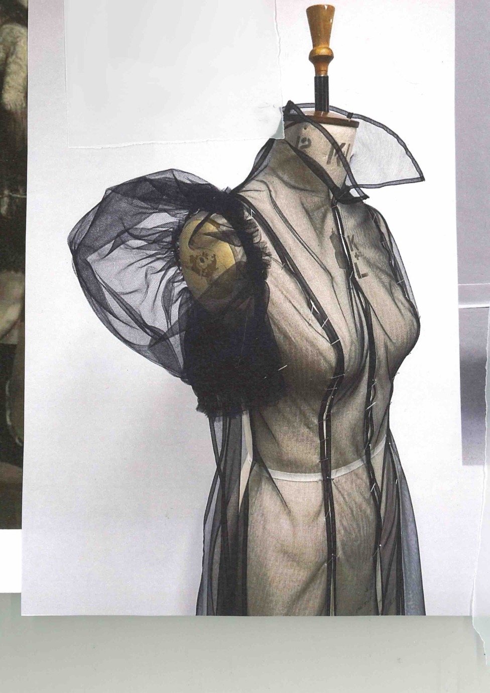
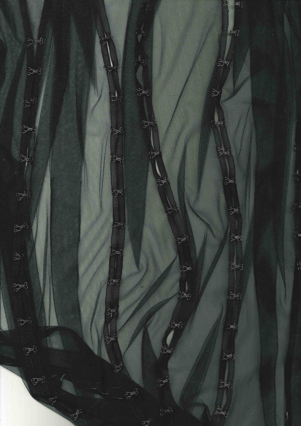
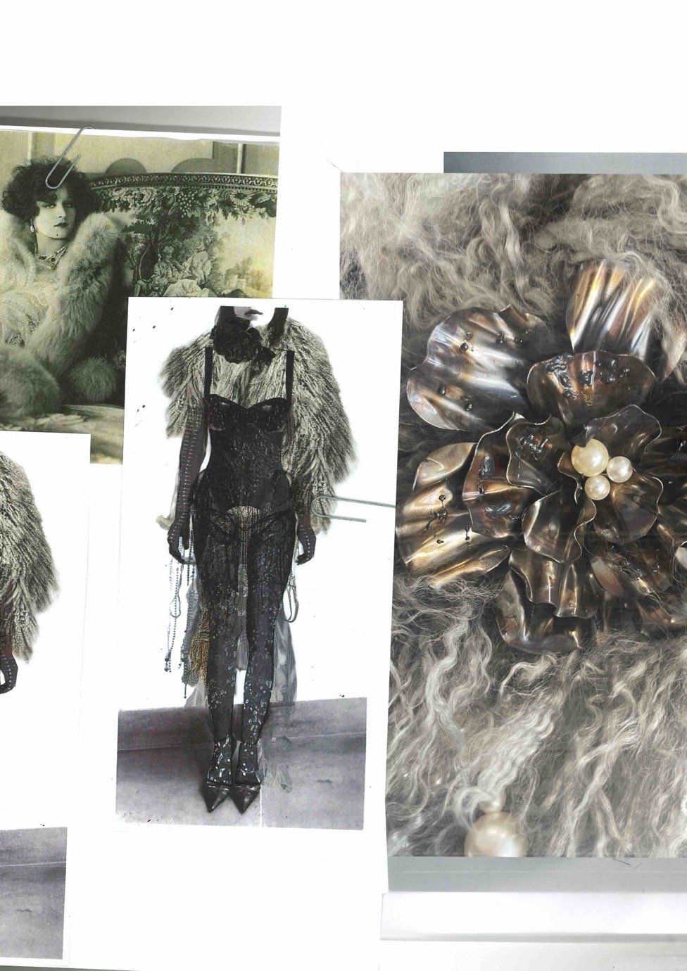
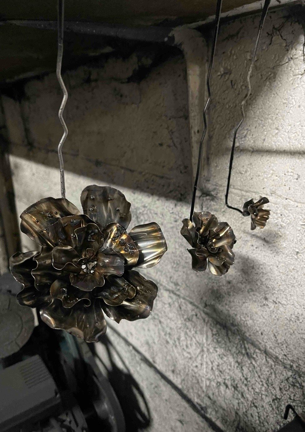
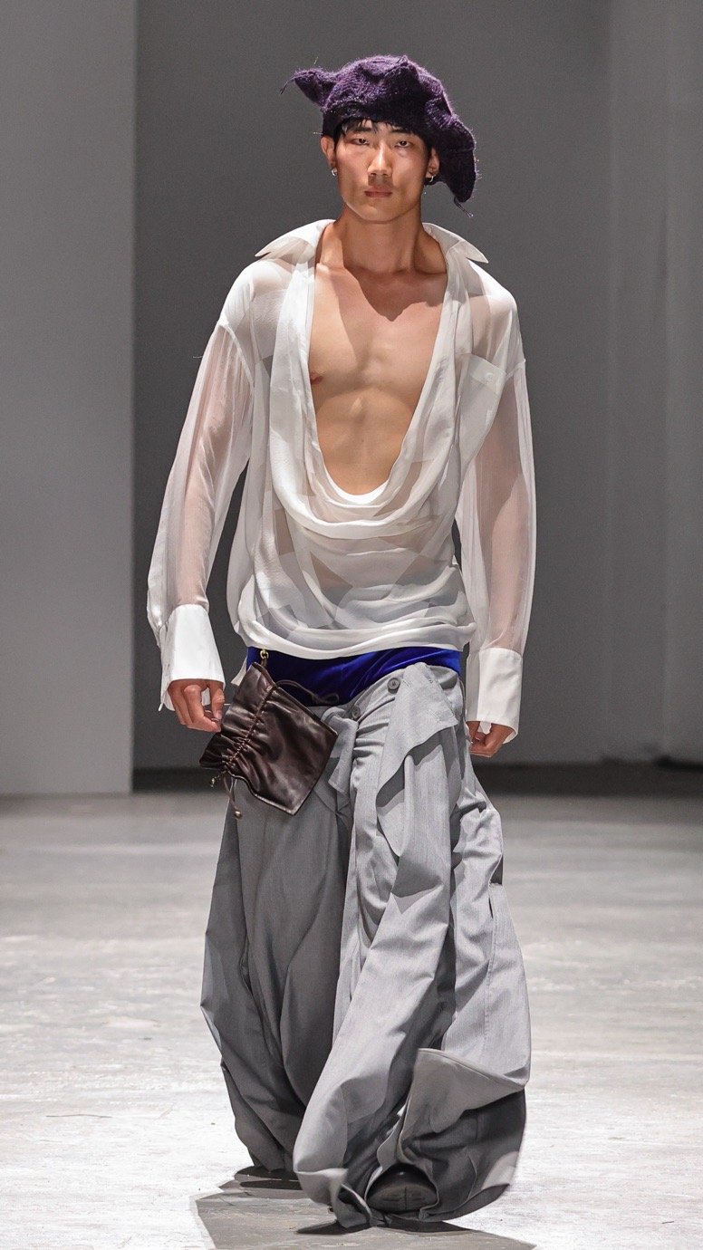
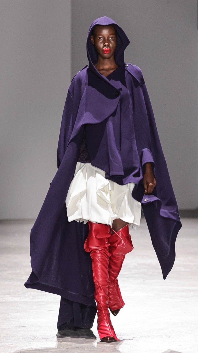
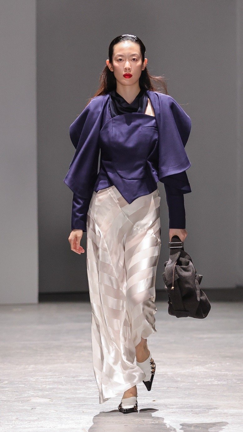
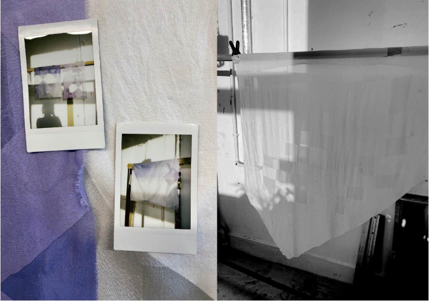
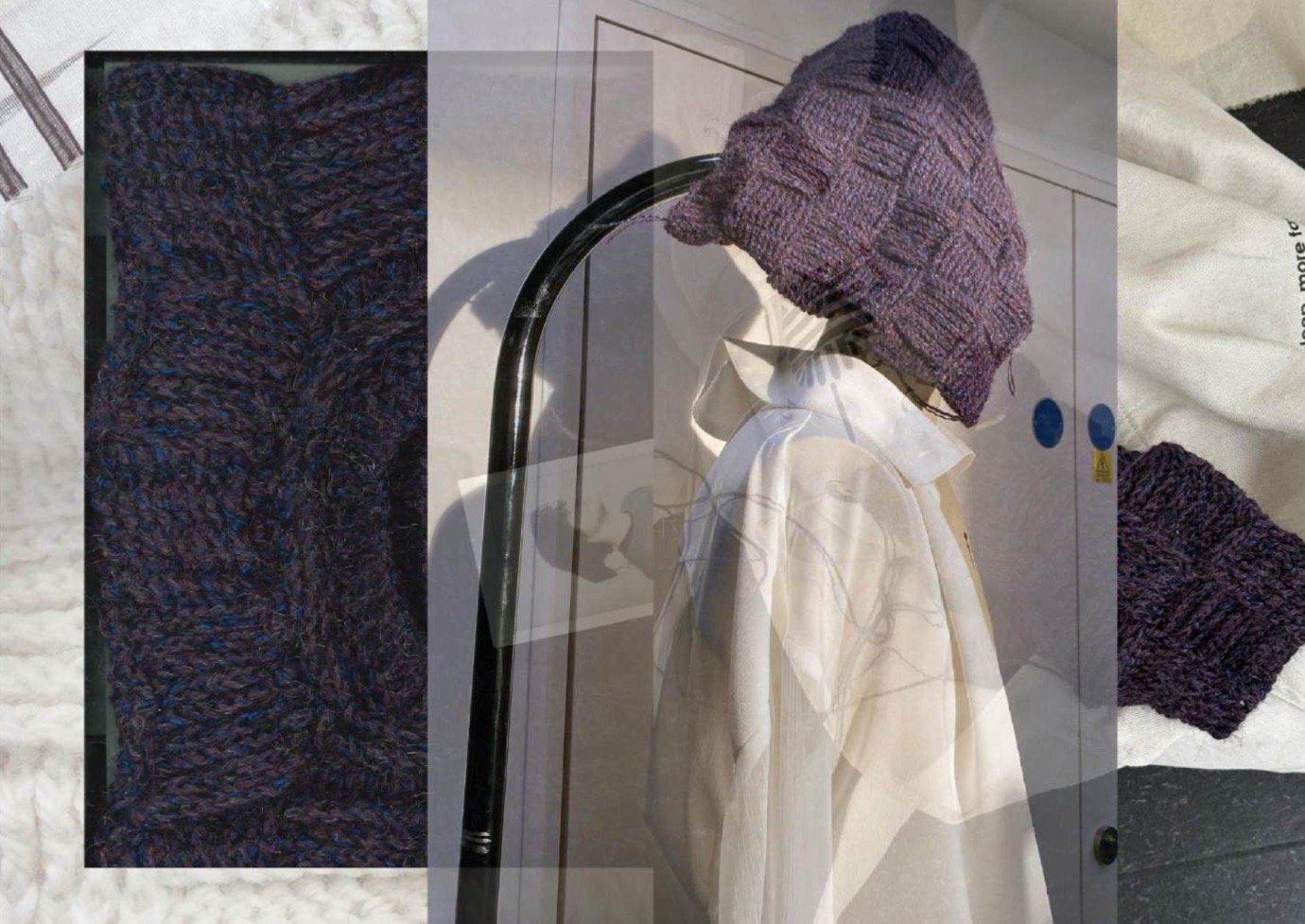
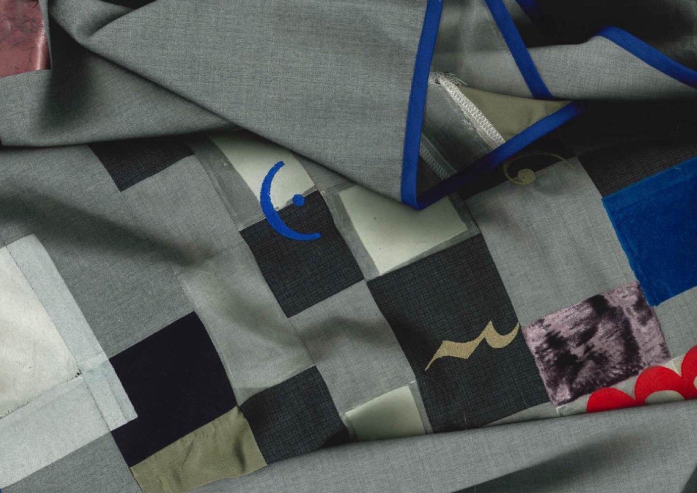
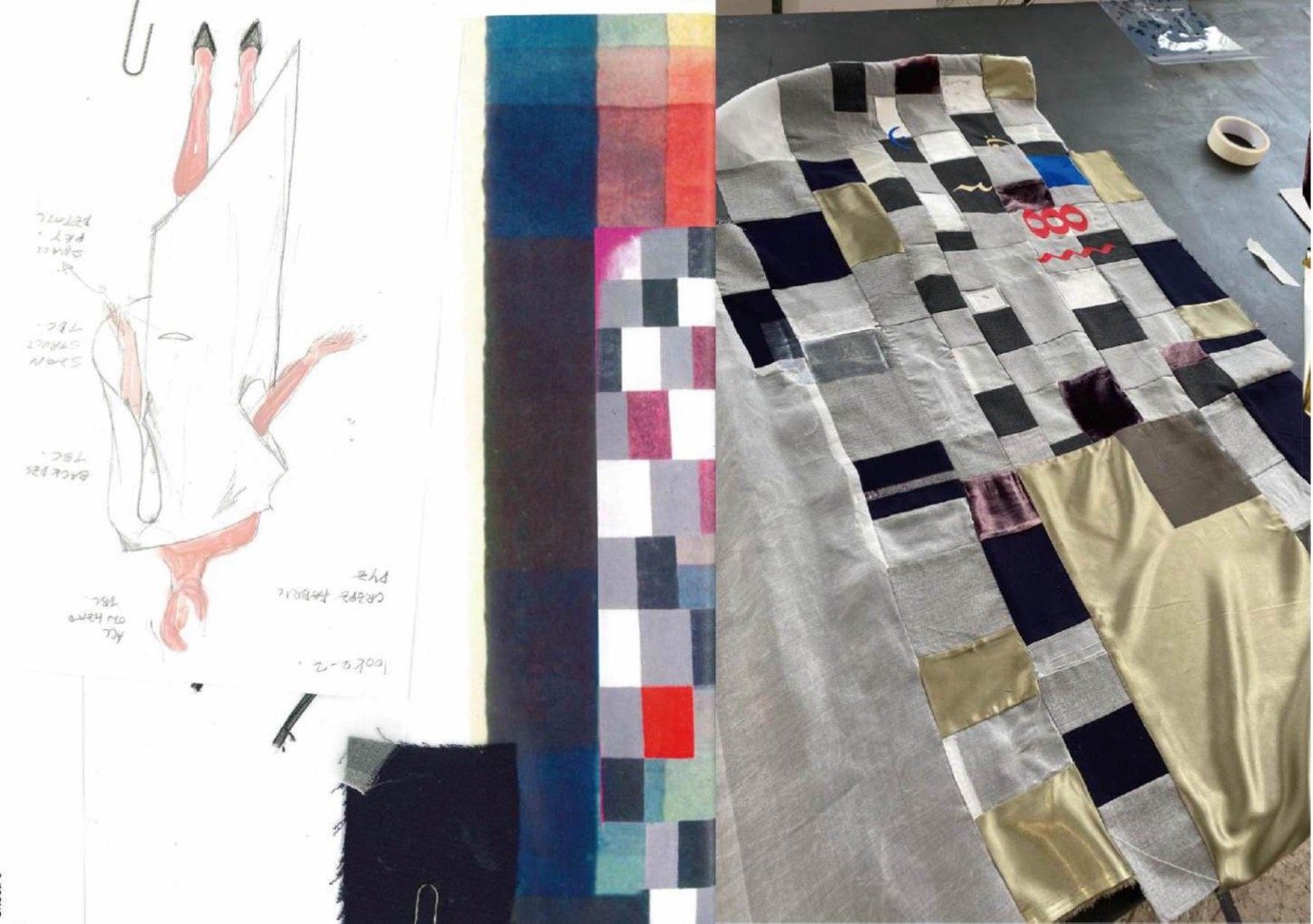
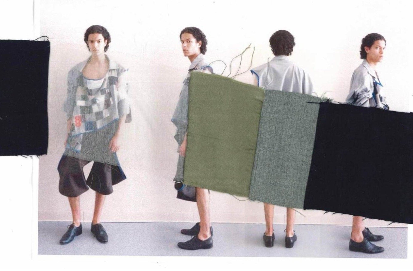
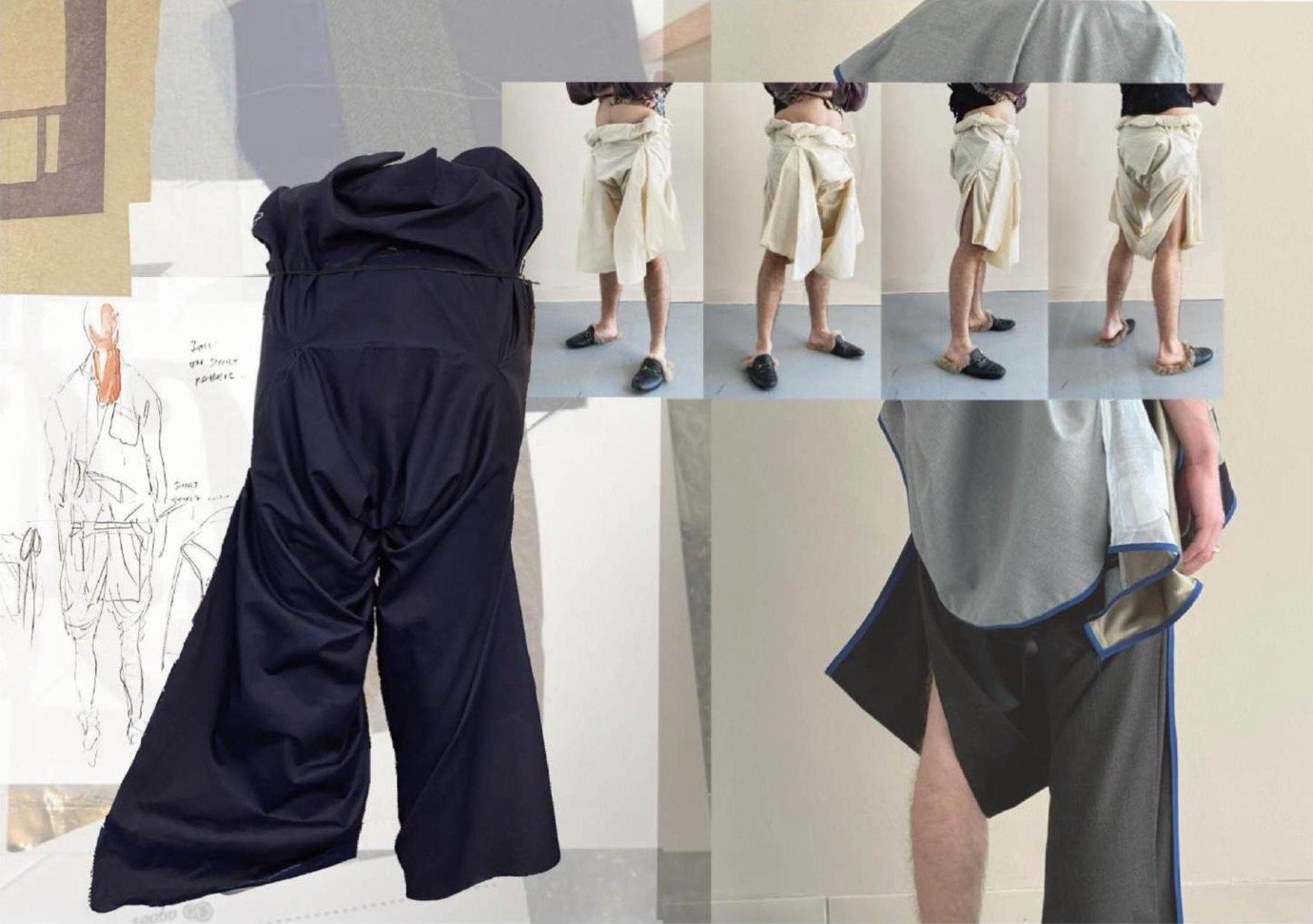
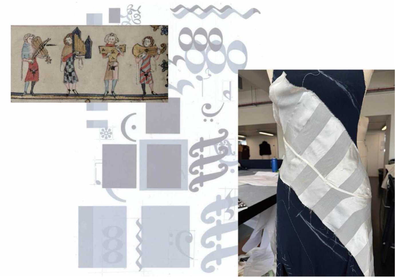
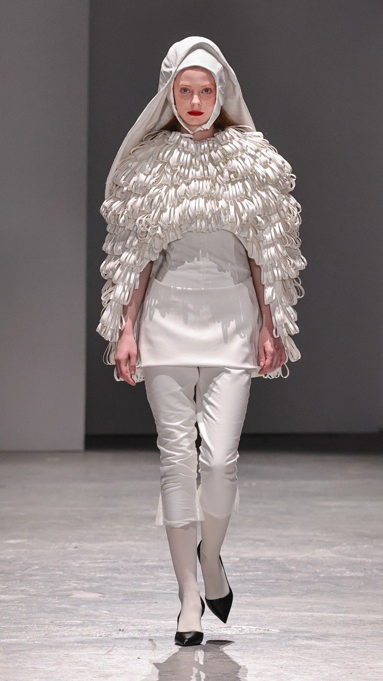
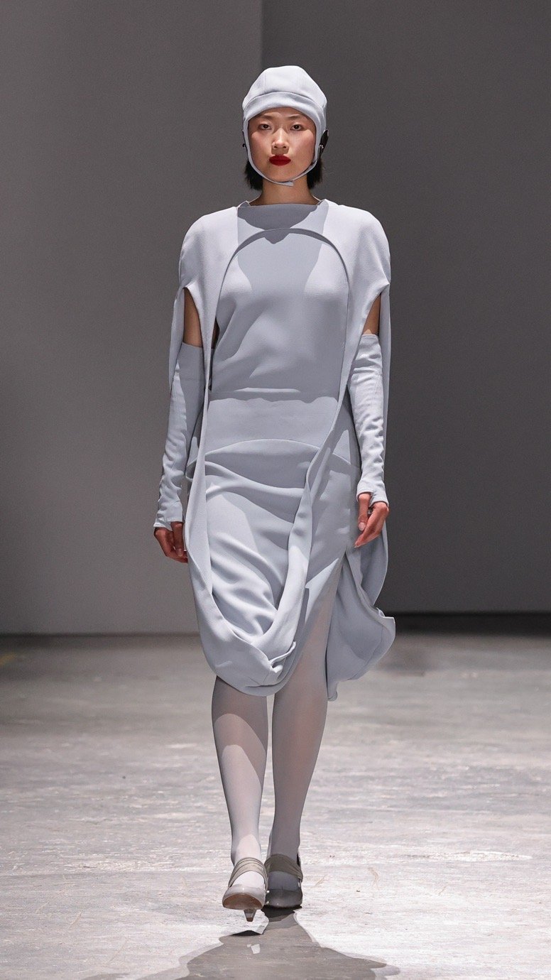
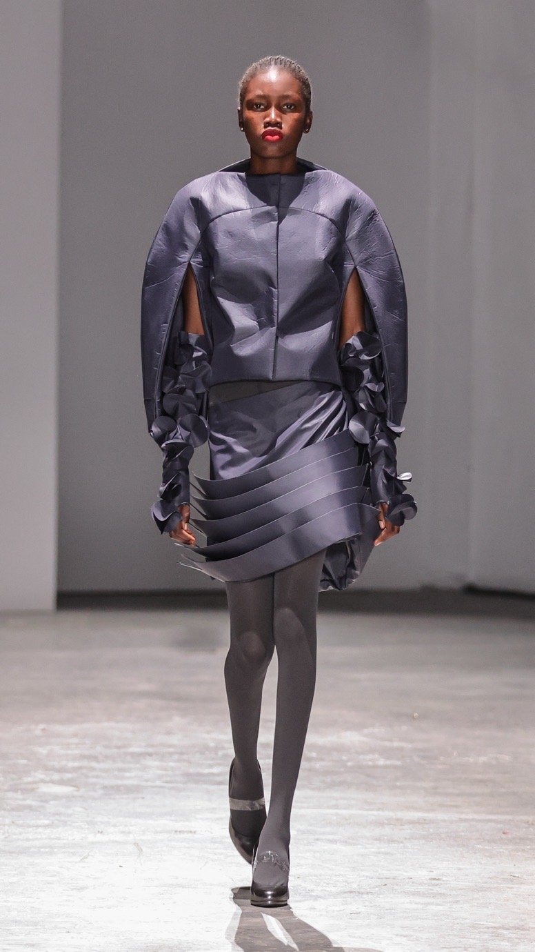
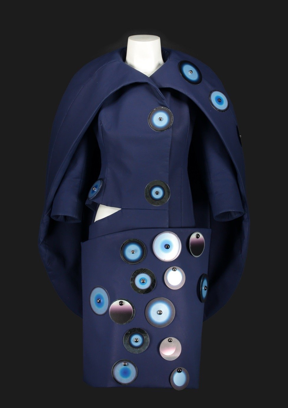
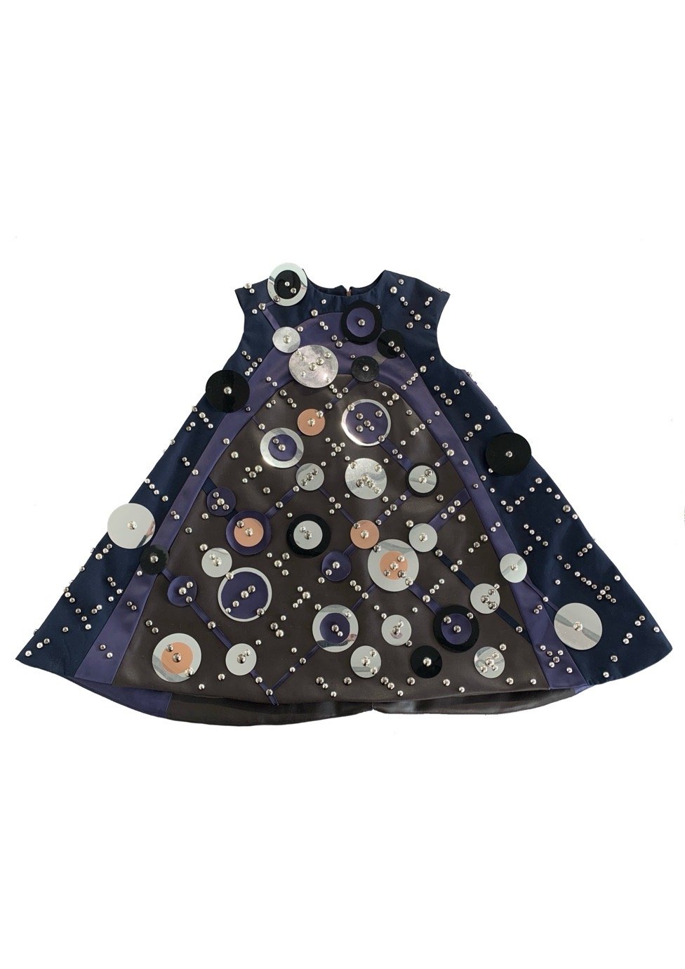
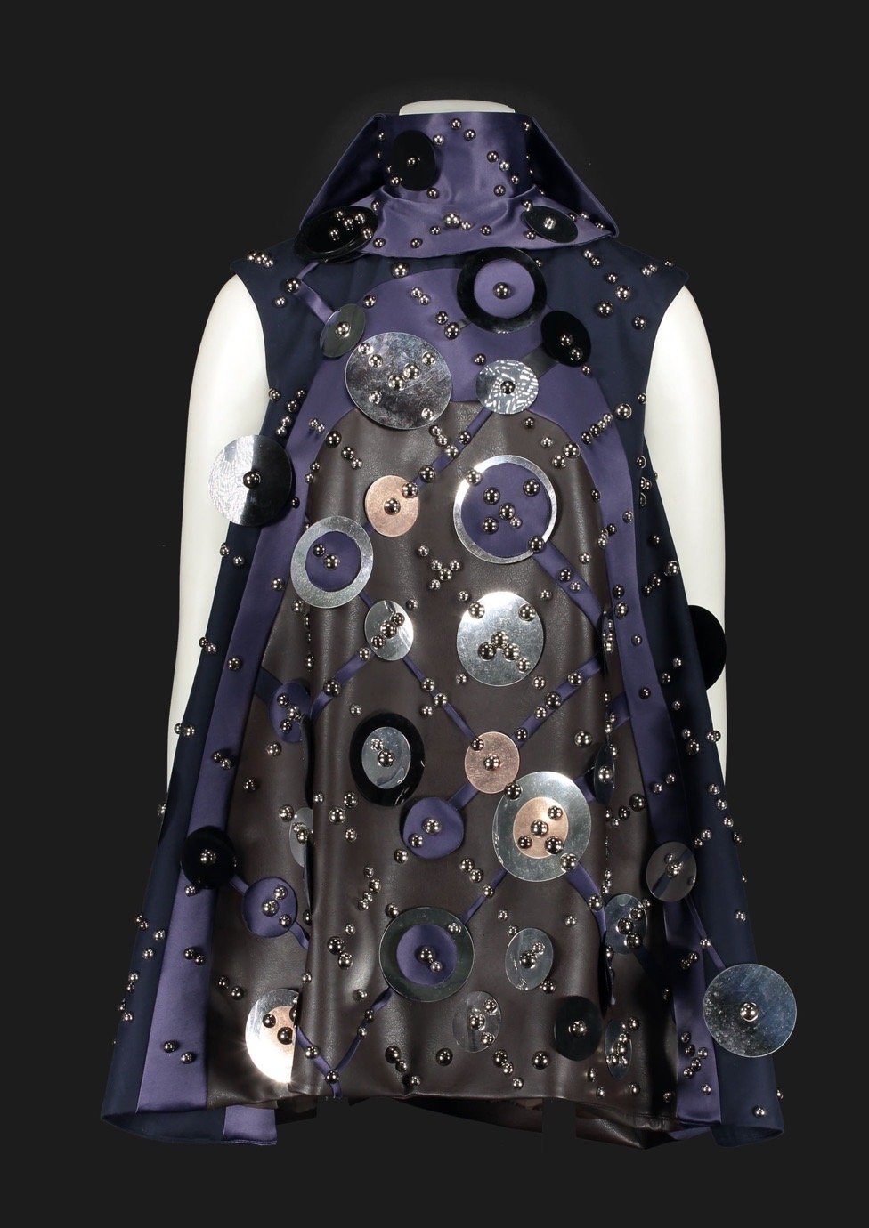
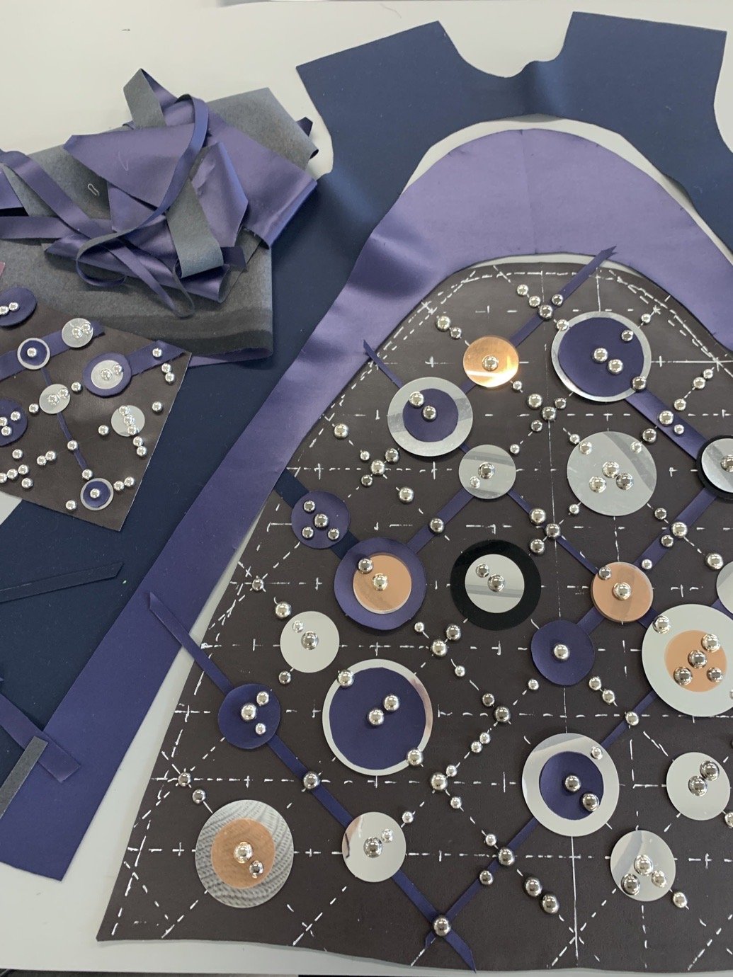
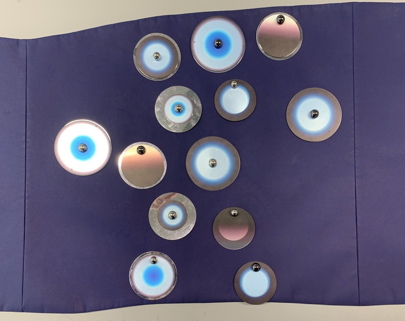
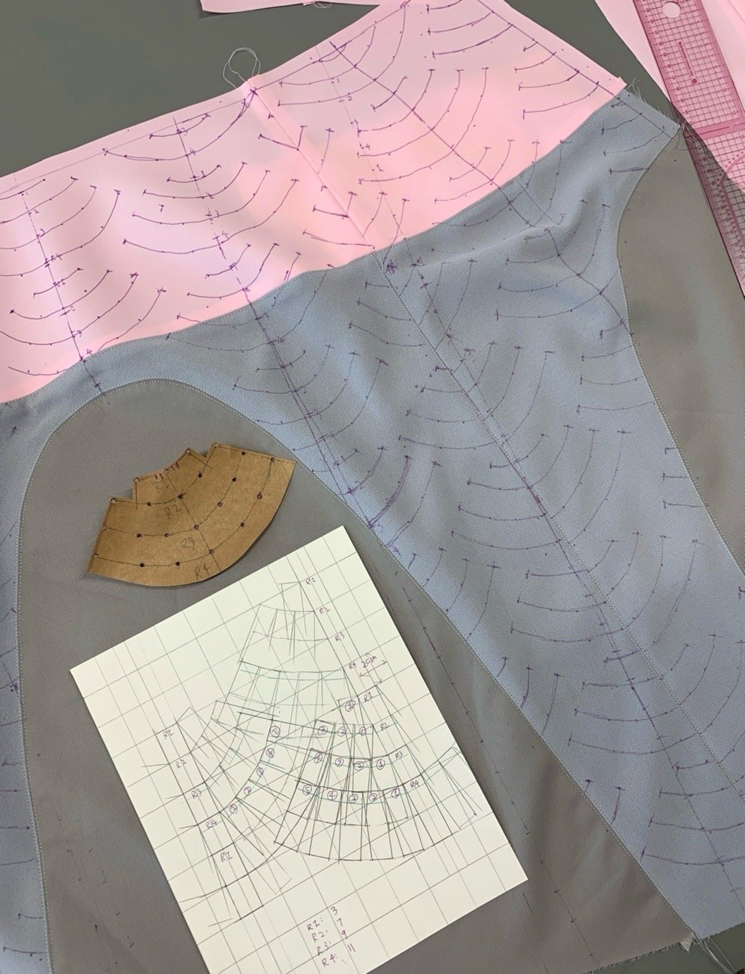
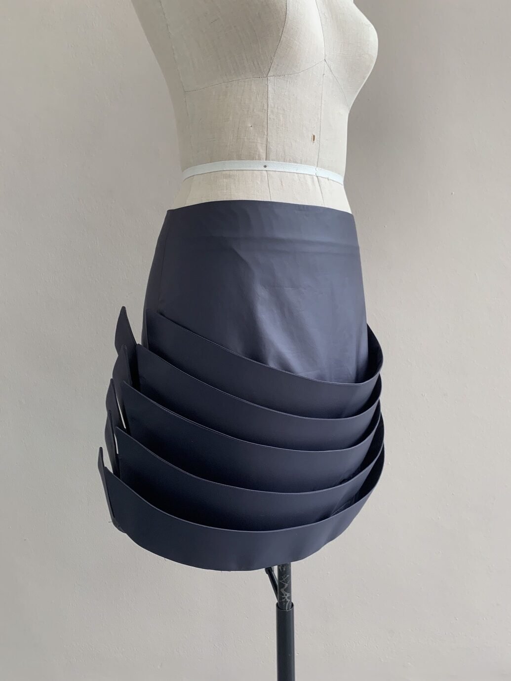
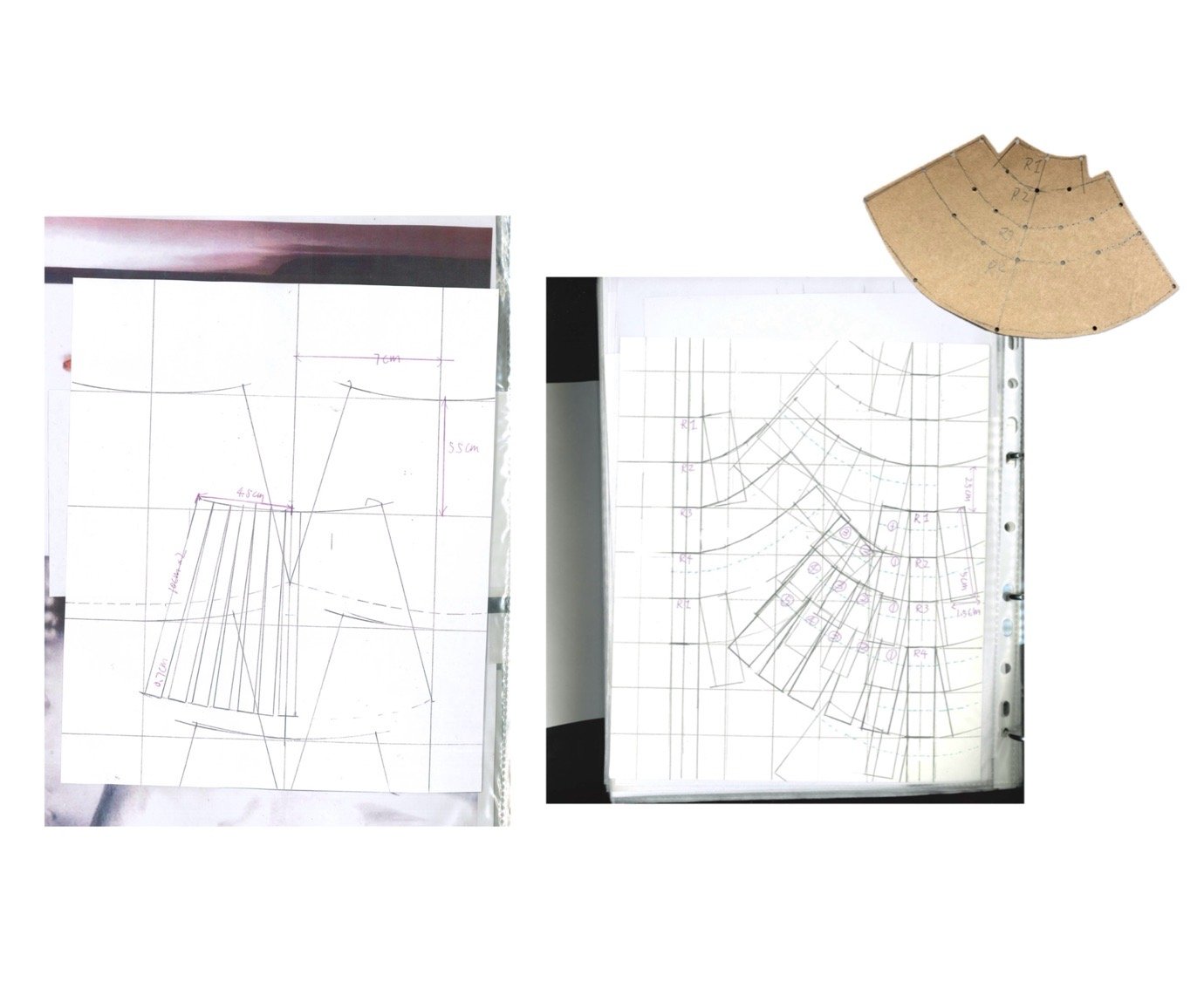
The cohort also possess an energising sense of aesthetic resourcefulness: Rebecca Halpenny, Kate Bigwood and Lily Rose Murphy fashioned natural wicker, silver candlesticks and sailor’s rope respectively into accessories or garments. Many of the designers expressed a whimsy or wantonness in their manipulation of familiar methods, as experiments with felted, shredded, scrunched and embellished fabrics rippled throughout the collections. The influence of their cultural intake from the last few years in London was tangible, with references to exhibitions on Medieval Women at the British Library or Hilma af Klint at the Tate, and resonances with beloved London labels like KNWLS and Chopova Lowena. These references to art and design were accompanied by a dedication to reviving and developing traditional hand-crafts and to repurposing existing fabrics, like a 1980s sail or antique military uniforms. 

The designers walked out at the end to the tune of David Bowie’s ‘Heroes’, only confirming the confidence rippling through the collections: perhaps they don’t have all the answers to the existential, moral questions of our age, but the class of 2025 know who they are and where they want to be. Get to know the graduates and their work below. 

Adele Feeley, Warwickshire

“Milk, Blood and Lipstick”

What’s the key inspiration behind the collection?

Milk, Blood and Lipstick draws from the complex, often contradictory portrayals of femininity in horror and erotic cinema. Influenced by Barbara Creed’s psychoanalysis of the horror genre in The Monstrous Feminine, and films like The Devils, Carrie, and Immoral Tales, the collection explores themes of sexuality, hysteria, and female rebellion. It also references the visual language of vintage pornography and lingerie, recontextualising their aesthetics through sporty silhouettes—suggesting bodies empowered, adorned, and yet constrained. The “final girl” trope—blonde, bloodied, and surviving—becomes a central figure, symbolising both vulnerability and strength. In this palette of innocence and confrontation, femininity is rendered defiant.

What materials, colours and techniques did you use?

The collection fuses unexpected textures and techniques to reinvent traditionally feminine materials. I created silicone casts of delicate doilies in a variety of tones, transforming them into rubbery, skin-like surfaces that feel both playful and uncanny. Laser-cut leather mimics lace, creating a sharp contrast between fragility and aggression, evoking the sensation of blood and precision. Printed pieces from my collages and shiny fabrics speak to the performative nature of lipstick, while touches of fur and mesh add texture and depth. The palette includes milky blonde tones, hyper-feminine pink, and black—drawing on the visual codes of horror iconography.

What’s next?

Creating this collection ignited a deep interest in textile development—particularly in how materials and processes can be used to challenge and reimagine traditional ideas of femininity. Experimenting with silicone casting, laser-cutting, and mixed textures revealed how textiles can carry powerful conceptual and emotional weight. It felt important to make work that was both visually striking and meaningful. This experience has inspired me to pursue a career in textile innovation, where I can continue pushing boundaries. I’m especially drawn to working within a smaller design team where close collaboration and creative experimentation are at the heart of the process.

@adele_feeley

Angelika Deopante, Camden Town, London

“Kasal sa Camden Town”

What’s the key inspiration behind the collection?

Kasal sa Camden Town is a playful homage to my Filipino heritage and my parents’ wedding in Camden Town. The collection references 1950s wedding ternos and endemic Filipino flora, using the distinctive butterfly sleeves to create extravagant shapes and patterns. It reimagines traditional wedding attire through a whimsical and intimate lens, blending nostalgia with a bold reinterpretation of cultural dress codes.

What materials, colours and techniques did you use?

I developed laser-cut embellishments with help from technician Katie and embroidered motifs based on my drawings of endemic Filipino flora like the Tayabak and Waling Waling. Using deadstock and vintage moirés, leathers, wool, and lace allowed me to reimagine traditional wedding materials. The palette ranges from pink to jade green—mirroring the stain-like tones of the flowers that inspired the collection. I also sourced a 1950s wedding dress, which helped guide the creation of stained jade vine leather laser-cuts.

What’s next?

My bed. Other than that, I hope to continue developing my textile skills and maybe one day start my own brand.

@xngelt

Azeika Nelson, Birmingham

“Echoes of Affection”

What are the key inspirations behind this collection?

The primary inspirations for Echoes of Affection stem from the 1968 film Je t’aime, je t’aime, directed by Alain Resnais. This cinematic piece shaped both the mood and visual tone of the collection. I was also drawn to vintage English football rosettes, which serve as symbols of triumph and heartbreak—evoking a sense of nostalgia while reflecting the emotional intensity of both the film and the sport. Together, these references form a quiet but poignant narrative around memory, affection, and loss.

What materials, colours and techniques did you utilise in the creation of this collection?

I worked with soft silhouettes and focused on blending traditional and experimental materials. Classic shirtings and wools contrast against bold, repetitive check patterns—used throughout the garments and echoed in the rosettes. I used laser engraving to add texture to cowhide and corduroy, often patchworking them together. The result is a collection that merges timeless tailoring with contemporary surface design, grounding emotional references in a tactile, crafted aesthetic.

What’s next?

After graduating, I plan to pursue freelance pattern cutting to refine my technical skills and deepen my industry knowledge. I’m particularly interested in working with menswear designers to build experience and develop creatively. I see this as the foundation for a long-term career, where collaboration and craft remain at the core of what I do.

@azeik.a

Ellie Roberts, Chichester

“Wyrcean”

What’s the key inspiration behind the collection?

Wyrcean is my exploration of handmaking, material integrity, and sustainability. Inspired by Hilma af Klint, Magdalena Abakanowicz, and the vivid landscapes of Yellowstone, the collection reflects a deep engagement with the natural world—its materials, forms, and textures. Af Klint’s spiritual symbolism, Abakanowicz’s raw fibre sculptures, and Yellowstone’s organic colours shape a collection grounded in environmentally conscious hand-making. Through the use of raw wool and recycled metal, Wyrcean explores how fashion can honour the resources nature offers while challenging the systems that so often exploit them.

What materials, colours and techniques did you use?

I created Wyrcean using natural fibres, deadstock yarns, and recycled materials. I sourced raw sheep’s fleece from Caclew Barton, a regenerative farm in Cornwall, and hand needle-felted this often-unused material into a coat and bag. Using a domestic knitting machine, I shaped recycled metal yarn, deadstock wool, and mohair into sculptural, wearable garments. I hand-placed thousands of beads on knitted pieces, hand-brushed mohair, and scrunched metal to reflect the natural shapes of Yellowstone, the textures of Abakanowicz, and the colours of Hilma af Klint—all while making every piece entirely by hand.

What’s next?

After my graduate collection, I plan to work as a knitwear developer—either within a brand or at a knitwear consultancy. I’m passionate about natural fibres and aim to keep exploring irregular, recycled, and organic materials in both industry and independent practice. I hope to pursue a master’s in knitwear design at the Swedish School of Textiles and begin spinning my own yarn from raw fleece, further grounding my work in sustainability and material traceability.

@elliealiceroberts

Holly Laidler, Cheltenham

“Hotsy Totsy”

What’s the key inspiration behind the collection?

At the heart of Hotsy Totsy is a persona: my interpretation of a 1920s term used to describe someone ostentatiously fashionable. She’s a woman of the past, dressed for the future—immaculate, in control, and magnetic without trying. Influenced by classic military uniforms from the 1940s—particularly the MA-1 bomber and flight suit—combined with the opulence of 1930s silhouettes, the collection offers a sharp, satirical take on vintage glamour reimagined through a modern lens.

What materials, colours and techniques did you use?

I paired luxurious and utilitarian fabrics to echo the blend of 1930s elegance and 1940s military structure. A palette of greys, taupes and greens—punctuated by bright orange—references artillery linings. Detail-heavy topstitching reinforces craftsmanship, while trompe l’oeil effects reveal mesh underskirts and underwear at the back of garments for a playful twist. Draping techniques developed during my placements helped shape sensual, wrapped forms—especially the twisted waistcoat dress, which merges seduction and strength.

What’s next?

I hope to step into a role where I can keep chasing the excitement this collection has given me—creating work that challenges me, inspires me, and ultimately keeps me happy.

@hollyylaidler

Screenshot

Ilaria Puckett, Surrey

“Infinite Columns”

What are the key inspirations behind this collection?

My final collection is inspired by Constantin Brâncuși’s sculptures—his muted colour palette, surface textures, and materials. I explored the contrast between soft, organic interiors and man-made, rigid exteriors, using jersey and wood against canvas and leather shells to distort and counteract the natural body. In my research, I found parallels between Brâncuși’s minimal forms and 1960s Vogue womenswear pattern books—both characterised by simplified lines and tubular shapes. I reinterpreted Brâncuși’s ‘stacked structures’ by creating seamless garments cut and draped from fused patterns, such as a two-piece dress suit—eliminating excess details and enabling a zero-waste approach.

What materials, colours and techniques did you utilise in the creation of this collection?

From the beginning, I consciously sourced second-hand fabrics from arts recycling centres and scrap stores. I used unconventional materials such as sofa canvas, chair upholstery, and curtains—contrasted with knitted stretch jersey to explore texture and structure. In reference to Brâncuși’s preferred materials of wood and metal, I collaborated with my father to create hand-crafted, hinged wooden bags and a belt, challenging traditional notions of functionality. The colour palette includes shades of mauve, pink, and purple, which emerged organically from my research process.

What’s next?

After graduating, I aspire to work with womenswear designers and brands in Italy, with a focus on artisanal craft and fabric innovation.

James Rowland, Romsey, Hampshire

“The Spring Will Come”

What are the key inspirations behind this collection?

I’m fascinated by the regenerative power of nature. Growing up, my mum was unwell and received a liver transplant that saved her life. I was inspired by the resilience of her body and her sense of hope and courage. Using abstracted natural forms, I wanted to create a collection that explores the transient cycles of stark decay into new life—telling a story of hope and rejuvenation. I’m also deeply inspired by artisanal skills. I learned a unique method of felting from a textile artist in my hometown, which became central to the development of materials for this collection.

What materials, colours and techniques did you utilise in the making of this collection?

Most garments are made from wool and silk using a technique called Nuno felting—a Japanese process where wool fibres are fused into soft, fluid sheer fabric bases. This technique allowed me to create experimental organic shapes that move beyond traditional garment construction. Natural tones are paired with deep, saturated shades of dark berry and olive green, contrasted against lighter, faded hues of pink, yellow, and white. I used hand-dyeing and hand-painting to create raw ombré effects that echo the power and unpredictability of the natural world.

What’s next?

In the long term, I’d love to keep making bespoke, handcrafted clothes and accessories—whoever wants to wear them, in whatever capacity I can provide. I’m also considering further study to deepen my practice and develop my creative identity. But first, I’d really value experience working for a brand. Being part of a team I can learn from would be an incredible opportunity to build skills and grow as a designer.

@jamesrrow

Jeonghyun Kim, South Korea

“The Beautiful Game”

What are the key inspirations behind this collection?

Inspired by the camaraderie and sense of belonging that football creates, this collection translates the energy of the game into bold, sculptural womenswear silhouettes. I studied the body language of players and the collective movement of a team, using circular forms and layered structures to evoke waves of attack and defence. The result is a series of intricate shapes made with vibrantly coloured sportswear fabrics and dynamic stripes. Football has always been a comfort and passion for me, and through this collection, I wanted to express the connection and excitement it fosters—visually, emotionally, and physically.

What materials, colours and techniques did you use?

Striped fabrics inspired by vintage football supporter uniforms were a key element, combined with vivid stretch jerseys and bold contrasts. Boning techniques allowed me to build undulating, sculptural shapes directly into the garments, giving structure to otherwise fluid materials. The playful tension between softness and construction defines the silhouette.

What’s next?

Maybe an MA… I really love making things—especially sculptural, round, colourful things. But first, probably a long nap. Or a trip somewhere new. I want to experience different places and cultures, and hopefully explore new kinds of artwork along the way.

@g.usdl

Joseph Inga, London

“Misilmeri”

What are the key inspirations behind this collection?

At the heart of this collection lies a deep generational nostalgia for Sicilian identity. I was drawn to what Leonardo Sciascia calls the “Sicilian palimpsest” — the idea that Sicily is a land written over many times, its identity shaped by waves of conquest, migration, and memory. I sought to express this complexity, its darkness and light, through a refined men’s wardrobe. An undercurrent of nomadism informs the silhouettes, inspired by the Maghreb’s flowing forms as imagined in Fortuny y Marsal’s orientalist paintings, and echoed in the work of Sicilian photographers who capture the island’s shifting sense of time and place.

What materials, colours and techniques did you use in the creation of this collection?

Every fabric in the collection carries a story. I used rare textiles such as inherited pure cashmere, French striped cotton, and silks from the corners of Marché Saint-Ouen. Military badges and regimental braid, found in a shuttered Old Kent Road wholesaler, were deconstructed from antique dress uniforms and reimagined with reverence and fantasy. Colour emerged organically through natural dyeing and bleaching, drawing from the Sicilian landscape: wine-dark seas, pink-blushed sunsets, and violet night skies. Garments are subtly manipulated, wrapped, draped, and folded to create structure without rigidity—offering an emotionally resonant elegance.

What’s next?

I am focused on refining my portfolio in preparation for a menswear design role within a forward-thinking house in Milan, Paris, or Antwerp. I am committed to building a thoughtful and enduring design practice—one that privileges craft and emotional resonance over speed or surface.

@josephtimondolfi

June Jeong, Seoul / Tokyo

“Nokori”

What’s the key inspiration behind the collection?

“Nokori” means “what is left behind” in Japanese. Subtitled Remaining Time, the collection captures a fragment of myself spanning the past, present, and future. It reflects my personal memory and quiet introspection—drawing from Tokyo’s indigo-tinted, rain-soaked days of the 1970s to explore impermanence, transformation, fragility, and resilience. Inspired by the coexistence of melancholy and beauty, the work balances old and new, and finds meaning in what is seemingly imperfect. It honours traditional craftsmanship while reflecting on identity through a poetic dialogue between memory, time, and emotional resonance.

What materials, colours and techniques did you use?

The collection honours traditional Japanese craft. I used antique kimonos from the 1900s and vintage deadstock fabrics featuring kasuri patterns, and dyed them with aizome (indigo) and dorozome (mud dyeing). Techniques like deep dyeing, shibori, sashiko, and boro reinterpret worn areas to express renewal. The palette blends muted earth tones with faded blues, greens, and soft monotones to evoke a quiet nostalgia. Garments feature harmonious contrasts—old and new, soft and structured—crafted with an emotional and material sensitivity.

What’s next?

I want to deepen my practice in heritage craft and artisanal textile techniques. I’m particularly focused on how dyeing, hand-stitching, and fabric construction can evolve through innovation while remaining rooted in tradition. My goal is to study how brands preserve these legacies and contribute meaningfully to the dialogue between traditional craftsmanship and contemporary fashion. I hope to create thoughtful, respectful work that bridges heritage and modernity.

@_junejeong

Kasper Feng, Guangzhou, Guangdong, China

“The Beauty of Fragility”

What are the key inspirations behind this collection?

This project explores the concept of “the beauty of fragility” by examining the physical and emotional effects of overwork in modern society. Inspired by the healing process of fractures and the asymmetry that can follow, it reflects on the imperfect and vulnerable nature of the human body. I also drew from the symbolic role of health supplements as psychological placebos—representing our need for comfort and self-rescue. Through fashion, the collection expresses the tension between strength and weakness, turning the silent pressures of labour into a powerful aesthetic statement.

What materials, colours and techniques did you use?

I combined wool and nylon to soften the rigidity often found in functional fabrics. Drawing from medical and work uniforms, the collection incorporates reversed shirts, detachable button systems, and tube insertions—elements that support sustainability and wearer interaction. These features allow garments to adapt and express individual identity. Aesthetics become a means of transformation, encouraging reflection on struggle while inspiring change through thoughtful, adaptable design.

What’s next?

I want to further explore the intersection of workwear and high-end clothing, creating designs that support functionality without sacrificing personal expression. My aim is to personalise workwear—helping people feel more comfortable, confident, and represented in what they wear, without compromising their professional image. I also hope to refine my craftsmanship to ensure garments are as wearable and human-focused as possible, staying true to my belief that clothing should always centre the needs and individuality of the wearer.

@kasper.yc

Kate Bigwood, Surrey

“Till Death Do Us Part”

What’s the key inspiration behind the collection?

Till Death Do Us Part is inspired by Victorian mourning dress, exploring the connection between melancholy and romanticism through fabrication and silhouette. Tailoring plays a central role, drawing from the Victorian gentleman’s wardrobe and merging it with my personal fascination with leather. Growing up around motorcycle culture, leather became symbolic—of protection, rebellion, and identity. As the collection evolved, the structured suits gave way to softer elements like silk undergarments and contemporary patchwork leather jackets, detailed with antique hardware sourced from my hometown. The result is a deeply personal narrative of nostalgia and self-expression, with emotion at its core.

What materials, colours and techniques did you use?

With a strictly black palette drawn from Victorian mourning rituals, the collection explores texture and layering through contrasts—heavy leather with sheer silk and mesh, accented with silver hardware. Leather was the primary material, so I focused on sustainability by sourcing mostly deadstock or donated hides. The final look was made entirely from leather samples gifted by All Saints, combined with leftover scraps from earlier pieces, ensuring nothing was wasted. These choices reflect both an ethical approach and a commitment to rich, tactile storytelling.

What’s next?

Creating this collection reinforced how important collaboration is for me. What’s next is finding a great team—somewhere I can continue to bring designs to life while learning and evolving. Whether that’s in clothing or accessories, I’m excited to see where this journey leads.

@kate.bigwood

KJ Tantivachyanon, London / Bangkok

“The Misty Trail”

What’s the key inspiration behind the collection?

The collection is rooted in my fascination with outdoor gear and equipment—objects engineered for survival and functionality. I became particularly interested in the sensory experience of hiking through unstable weather conditions: mist, fog, and rain served as both visual and emotional triggers. These atmospheres shaped the mood of the collection. I began to see textile crafts—like lace and knit patterns—as alternative forms of mapping, charting space through repetition and rhythm. This idea translated directly into my prints and textile development.

What materials, colours and techniques did you use?

Inspired by the unpredictability of weather, I focused on materials that respond to exposure and movement. Technical fabrics such as nylon, ripstop, waxed cotton, and bonded cotton formed the core of the collection. I used details typical of outdoor equipment—elastic drawstrings, paracord knots, and backpack buckles. Surface treatments evoked wetness: realistic raindrop textures, blurred dye effects, and foggy prints. Most garments are transformable—designed to detach or reconfigure—echoing the adaptability needed outdoors. Thousands of rivet studs were applied by hand in lace-inspired patterns, creating a tension between delicacy and utility.

What’s next?

First, I’d like to take a break to recharge and gather new inspiration. After that, I’m excited to enter the industry, absorb as much knowledge and experience as I can, and continue developing my skills with curiosity. This collection helped clarify my creative identity—it feels like an honest reflection of who I am as a designer. At the same time, I’m energised by the idea that it will keep evolving as I grow.

@k_j_knomjean

Lily-Rose Murphy, London

“Fair Winds and Following Seas”

What’s the key inspiration behind the collection?

The journey of this collection began with my family’s heritage in the British Navy. I’ve always been fascinated by military uniforms, so naval dress became a natural starting point—its fabrics, fastenings, and silhouettes informed my colour palette and pattern cutting. I was also inspired by the movement of sails, especially how they billow and shift in the wind, which influenced the structure and shape of many garments. Bold, graphic flag prints became a central motif throughout, grounding the collection visually in nautical codes and expanding my print language.

What materials, colours and techniques did you use?

I used a bold, saturated colour palette to reimagine maritime uniforms through a modern lens. Traditional menswear and naval silhouettes were contrasted with contemporary interventions: welded wooden toggles, manipulated fastenings, and a range of print techniques including digital, screen, and sublimation printing. A highlight was repurposing a donated 1980s sail—transformed via sublimation into a double-breasted jacket, merging my love of print with sustainable making. Donated deadstock fabrics featured throughout, reinforcing the collection’s balance of heritage and reinvention.

What’s next?

I hope to land a job in the industry—ideally as a menswear designer. After two amazing internships at Craig Green and Bianca Saunders, I’m excited to return to a studio environment. I’d love the chance to work abroad and continue developing my skills both professionally and personally. Costume design might be on the horizon too—who knows!

@lilyrmurphy

Screenshot
Screenshot

Misa Ricchiuti, Milan

“Sii uomo”

What’s the key inspiration behind the collection?

Sii Uomo (Be a man) explores a personal vision of masculinity, challenging traditional ideals of virility rooted in my hometown of Milan. The collection reflects what I wished my younger self could see when told, “Be a man.” This man embodies both strength and sensitivity: empathetic, gentle, and emotionally mature, yet also stoic, resilient, assertive, and courageous. To express this duality, I juxtaposed Italian Rationalist architecture with works by Italian female artists from the 1920s to 1960s. The result is a conceptual dialogue between the cultural codes of masculinity and femininity—offering a reimagined, more inclusive perspective on what it means to be a man.

What materials, colours and techniques did you use?

I used a mix of technical fabrics and leather to explore the tension between rigidity and fluidity—leather evoking masculine structure, while nylon and lighter materials suggested softness. For cutting, I developed 3D maquettes based on the works of female artists and Rationalist architecture, translating these into calico prototypes. Draping on half-scale mannequins helped me refine cuts and silhouettes, allowing conceptual references to evolve into wearable design.

What’s next?

My current plan is to pursue a master’s in fashion design, as I feel the need to further explore my creative vision and identity—something I began to uncover through my BA collection. Ultimately, I dream of building a creative universe where I can express myself freely across mediums, whether in fashion, music, architecture, toys, or novels. Before then, I’d love to work alongside someone whose vision I admire—like Rick Owens.

@steadyresearch

Paris Williams Otuyelu, South London (Tulse Hill)

“Aso-ikele”

What are the key inspirations behind this collection?

This collection blends historical Nigerian and Western attire, emphasising the contrasts between traditional robes. Each print draws inspiration from the patterns found on the Agbada robe worn by King Oba Adémuwagun Adésidà (1940), and from carvings on Nigerian tribal houses. The recurring face motif on his robe represents the eight Nigerian kings who preceded him. Each look merges traditional garments with Western pieces such as the smoking jacket, nightshirt, and nightdress. This fusion honours my Nigerian heritage while reimagining it through a modern lens—creating bold, contemporary designs that bridge past and present in Nigerian fashion.

What materials, colours and techniques did you use?

This collection showcases a diverse array of prints characterised by the vibrant primary colours found in historical Nigerian statues. Techniques such as hand painting, hand silkscreen, sublimation printing, and hand embroidery were used to bring the prints to life.

What’s next?

I intend to launch my own designer brand while I continue exploring new and enjoyable methods of producing my intricate prints.

@parisotuyelu

Rachel Ahonaruogho, West Sussex

“Legacy in Rhythm”

What are the key inspirations behind this collection?

The key inspirations behind my collection are tied to my late father’s love for jazz, his saxophone, and soul icons such as Teddy Pendergrass. Drawing from the bold style of the 1970s, the collection combines flared tailoring, statement prints, and a moody colour palette. I was particularly influenced by the work of painter and illustrator Aaron Douglas—a major figure in the Harlem Renaissance—whose rhythmic compositions echo the spirit of jazz and Black artistic expression. Legacy in Rhythm merges personal nostalgia with the enduring pulse of jazz and soul music.

What materials, colours and techniques did you utilise in the creation of this collection?

The collection features deep purples, lilacs, and pinks, expressed through layered printed dancing silhouettes. I used sublimation printing on cotton organdie for the printed shirt, lilac wool for the coat, and printed organza scarves. The moody palette continues in burgundy and camel cotton drill jackets, with contrasting lilac panels, plum linings, and donated pinstripe wool suiting.

What’s next?

I’d love to work in a design role focusing on menswear and tailoring—whether that’s in London or elsewhere.

@rachelahonaruogho

Rebecca Halpenny, Dublin

“Inherit the Lash”

What’s the key inspiration behind the collection?

Inherit the Lash is inspired by my Irish heritage, traditional Irish craft, and my love of fetish wear. It’s a celebration of Ireland’s rich creative history, reimagined through a provocative lens. I wanted to subvert inherited ideas of shame and restraint by fusing fetishistic elements with traditional craft. The collection merges glossy, erotic materials with tactile Irish ones—juxtaposing the familiar with the transgressive.

What materials, colours and techniques did you use?

I used open-weave wools and natural wicker, referencing bygone farming and fishing garments. Glossy latex, leather, and PVC introduce fetishistic elements. I laser-cut traditional herringbone patterns into leather and transformed them into fishnet-style panels. Sculptural wicker pieces—woven from scavenged birch, buff noir willow, ash, and moss—reimagine the chastity belt as a contemporary fetish cage. The colour palette draws from the Irish landscape: earthy browns, muted greens, glossy blacks, and warm tones of cream, beige, and yellow.

What’s next?

I’m hoping to maybe join a design or atelier team in London or Paris that values bold, timeless design and boundary-pushing aesthetics. I’m excited to collaborate with both established and emerging creatives and continue developing my artistic identity as I grow within the industry.

@rebecca_halpenny

Rosa Amelia Bonner-Morgan, Guernsey

“Tout emmitouflé” (Warm and Wrapped Up)

What’s the key inspiration behind the collection?

Responding to an island heritage that often favours practicality over style, I wanted to create a collection where warmth and elegance are given equal importance. Inspired by traditional Guernsey jumpers, wool was used in homage to this iconic and enduring craft. I also drew subtle references from local weaving practices, like crab pots and baskets, echoing their wrapping and twisting forms through seam lines and construction—not too literal, but present. I wanted the collection to feel grounded in both place and practicality.

What materials, colours and techniques did you use?

The natural beauty of Guernsey’s landscape and Renoir’s paintings of its south coast inspired a soft palette of blues, pinks, and maroons. I worked predominantly on the stand, then translated those drapes into patterns to ensure the pieces felt fluid and sculpted. Wool was a central material—chosen for its balance between structure and softness. A strong focus on fit and form guided the process, always keeping in mind how the wearer would feel in terms of warmth, movement, and comfort.

What’s next?

I’m looking forward to stepping into the industry—wherever that path may lead. I feel open, with particular interest in eveningwear and outerwear. We all know how challenging it can be to crack into fashion, but I feel lucky to be entering a field I’m completely invested in. My hope is to hold onto the mindset that fashion, above all, is a beautiful art form—meant to be admired, worn, and enjoyed.

@raomsealia

Rowan Hunt, Lewes

“Tracery”

What’s the key inspiration behind the collection?

My collection is inspired by the haunting beauty of Gothic architecture, drawing from towering arches, intricate stonework, and ornate ironwork. The aim is to personify these forgotten structures—breathing life into their forms through clothing. To anchor the collection within a contemporary fashion context, I fused Gothic artistry with the rebellious elegance of 1970s rock and the raw edge of punk aesthetics. Tracery is a tribute to lost craftsmanship, where the past collides with subversive modernity on the runway.

What materials, colours and techniques did you use?

The collection is crafted from leather, wool, denim, and jersey—each material chosen to echo the elemental qualities of Gothic architecture: stone, wood, iron, and glass. I employed techniques such as cording, tuck pleats, and smocking to embellish the garments, adding surface depth and texture that reflect the intricate detailing of carved stone. The colour palette draws from muted, earthy tones, inspired by both the weathered exteriors and shadowed interiors of these historic structures.

What’s next?

Working on Tracery has clarified my desire to refine my technical skills in a hands-on role. The process deepened my appreciation for construction, and I found real satisfaction in shaping garments with precision and intent. This experience has shown me that I want to grow as a maker or cutter—positions that allow me to build, solve, and learn through craft, while contributing to garments with depth, structure, and meaning.

@r.huntdesign

Sasha Lưu Ly Roche, Ho Chi Minh / Aix-en-Provence

“Mẹ ơi!”

What’s the key inspiration behind the collection?

Creating this collection was like writing a letter to my (Vietnamese) mother, my (French) grandmother, and the other maternal figures in my life—but most importantly, to my younger self, in her struggle for belonging and acceptance within a métissage of Vietnamese, Pied-Noir, and French cultures. I was born and raised in Vietnam, where I lived until moving here alone at 18. This collection expresses the complexity of growing up between cultures, and the quiet ache of feeling either never enough or too much. Through the eyes of my child self—playing dress-up in my mother’s closet—I explore identity, craftsmanship, and the raw beauty in imperfection.

What materials, colours and techniques did you use?

I worked with mulberry silks sourced from the same Bến Thành Market stall my mother has visited since childhood. Heirloom buttons passed down by my grandmother—perhaps even from her great-great-grandmother—appear throughout. I used donated wools, vintage trims, and flawed mother-of-pearl buttons, and taught myself Lunéville tambour embroidery to hand-bead with antique glass beads. The palette emerged instinctively and now reminds me of the warm pink sunsets back home in Saigon. A touch of colour after the storm.

What’s next?

A nap—and maybe couture! I’m deeply passionate about garment construction and finishings. I love when you can tell something’s been made with care. Sewing is my strongest skill, but I’m always looking to improve and learn different methods of fabrication. I’m curious about other artists’ techniques and want to know everything. Finishings especially scratch the right part of my brain—I could sit for hours beading or hand-stitching. My goal is simple: to become an expert at making clothes.

@itsluubelle

{"ARInfo":{"IsUseAR":false},"Version":"1.0.0","MakeupInfo":{"IsUseMakeup":false},"FaceliftInfo":{"IsChangeEyeLift":false,"IsChangeFacelift":false,"IsChangePostureLift":false,"IsChangeNose":false,"IsChangeFaceChin":false,"IsChangeMouth":false,"IsChangeThinFace":true},"BeautyInfo":{"SwitchMedicatedAcne":false,"IsAIBeauty":false,"IsBrightEyes":false,"IsSharpen":false,"IsOldBeauty":false,"IsReduceBlackEyes":false},"HandlerInfo":{"AppName":2},"FilterInfo":{"IsUseFilter":false}}

Siena Seung-Eun Cho, Korea

“Zoom-proof”

What’s the key inspiration behind the collection?

This collection was inspired by my experience during the pandemic, when I became hyper-aware of how I appeared on camera during online meetings while wearing comfortable loungewear out of frame. The boundaries between public and private, formal and casual, began to blur. I found beauty in everyday disarray—crumpled paper, shredded documents, printer errors, jackets tossed over chairs. There was a certain order in that chaos, and I wanted to express these contradictory emotions through garments that reflect the overlap of domesticity and professionalism.

What materials, colours and techniques did you use?

I combined structured materials like wool, typically used for tailoring, with soft, lightweight fabrics found in pajamas and garment linings. Wrinkles, digital print glitches, and pleats inspired by stacked documents embody the idea of “intentional mistakes.” I also repurposed everyday office objects—like shiny silver bulldog clips—as design details, turning the mundane into something poetic. The collection plays with contrast, embracing the odd harmony of structure and ease.

What’s next?

Looking ahead, I hope to gain hands-on experience at a designer brand where I can continue developing both creatively and technically. Long-term, I’d love to build my own label with a clear, distinct vision—one that balances experimentation with refined craftsmanship. Right now, I’m focused on learning as much as I can and shaping a strong foundation for the future.

@se.sienacho

Sumin Sim, South Korea

“Unforeseen Beauty”

What’s the key inspiration behind the collection?

Unforeseen Beauty was inspired by the idea that “the most Korean is the most global”—a belief that the unique beauty of Korean tradition can resonate universally. I drew from elements often overlooked in everyday life, blending them with the glamour of 1920s Western culture. Imagining a Great Gatsby party set in Korea, I created a collection that fuses heritage with vintage elegance in a modern, cross-cultural narrative.

What materials, colours and techniques did you use?

This collection explores the coexistence of East and West. I combined the linear, pleat-based structures of traditional Hanbok with the curved, form-shaping techniques of Western tailoring. Hanbok fabrics—light yet structured, with uniquely subtle colours—were paired with Western suiting textiles. The primary colour, jade green, was inspired by Korean celadon, while gold accents echo 1920s chandeliers. I used traditional Korean patchwork (bojagi), hand pleating, crochet, and hand knitting to add artisanal texture and refined shimmer. Each detail was designed to embody elegance without excess.

What’s next?

There are countless hidden gems within Korean traditional crafts that remain unknown to many. My goal is to continue discovering and celebrating this beauty by introducing it to the world—not through written records, but through garments. By translating these traditions into fashion, I hope to preserve and reimagine Korea’s cultural heritage in ways that allow it to be remembered, worn, and cherished for generations to come.

@ssuminn

Willow Selby-Willis, Darlington

“Belle Époque”

What are the key inspirations behind this collection?

Belle Époque, translated to ‘Beautiful Era’, draws inspiration from the vivacious cabaret and burlesque scene of the 1920s and 30s. The collection explores a showgirl between shows—her dressing room, personal trinkets, and the flurry of the quick change. I wanted to explore the woman beneath the performance, who she was behind the curtain. A beautiful moment born from glamorous chaos. Key references include cabaret royalty Gypsy Rose Lee and traditional 1930s undergarments and tulle overdresses. The delayed gratification of layers slowly falling away, the undoing of tedious fastenings—that burlesque allure—was something I really wanted to capture.

What materials, colours and techniques did you utilise in the creation of this collection?

A key concept was reinterpreting historical references through textiles—using fabrics that both honour and subvert tradition. I sourced vintage lace, draping it over satin bodices and embossing it into tight-laced leather corsets. Its delicacy is contrasted with hand-crafted steel roses embedded within grey shearling and strings of pearls. Over 500 hand-sewn hooks and eyes allow silhouette manipulation in Look 3. Chiffon and tulle shift in opacity through strategic creases and darts. Silk dupion is frayed and creased, echoing the wear of performance costumes, while plaited hessian evokes the texture of vintage show wigs. Each detail is a transformed echo of the past.

What’s next?

I’ll be taking some time to further develop my technical skills, especially in leather craft, and returning to a few freelance opportunities over the summer. Beyond that, I’m looking for a position where I can continue growing as a designer within a dynamic, experimental team. I’m excited to take this step from education and begin carving out my own voice in the industry.

@willowselbywillis

XiaoTing Chen, ShenZhen

“The Grid Sings”

What are the key inspirations behind this collection?

Inspired by the visual language of medieval musical notation, The Grid Sings translates melody and rhythm into silhouettes, pleats, and drapes. I’m drawn to the structure of music — its pauses, repetitions, and flow — not to imitate it, but to feel it through the body’s movement. The collection explores a tension between control and release, precision and improvisation.

Historical garments like braies, the towering hennin hat, and the pointed liripipe hood subtly inform the designs — not as costume, but as gestures toward memory and structure. Surface and silhouette intertwine, tracing a rhythm between stillness and motion.

What materials, colours and techniques did you use?

A muted palette of ink, grey, white, and crimson anchors the collection. Techniques include devoré printing, screen-printed foil, flocking, and hand-crocheting, creating tactile, layered surfaces. These methods echo musical tension and release through pleats, checks, and flowing drapes.

What’s next?

I plan to work in London while continuing to explore pattern cutting and develop a design practice that merges technical precision with playful, unconventional form-making. Alongside studio work, I hope to take on select freelance pattern cutting and custom garment commissions — allowing me to further investigate wearability and form through intimate, one-to-one processes.

@xiaotiiiiing_chen

Screenshot

Xiwen Zhang, Yunnan

“Nostalgic Futurism”

What’s the key inspiration behind the collection?

Nostalgic Futurism explores a personal longing for the unknown, shaped by childhood memories of rapid technological change and cosmic fascination. Growing up surrounded by chunky computers, imagined UFOs, moon myths, and meteor showers on TV, I was captivated by 1960s sci-fi aesthetics—clean silhouettes, smooth curves, and bold lines in fashion and film. This collection is a romantic reflection on space, technology, and memory, blending past and future into a vision rooted in wonder.

What materials, colours and techniques did you use?

I drew from cosmic imagery, using a palette inspired by space with touches of pink drawn from vintage sci-fi films. The base fabric is a nylon blend, double-fused with scuba to achieve structured, bouncy silhouettes. Custom acrylic sequins, finished with studs, add texture and a futuristic edge. For striped textile elements, I double-fused faux leather, hand-cut each segment, and arranged them based on a carefully designed placement layout.

What’s next?

I plan to continue developing my creative voice as an independent designer, seeking new opportunities within the fashion industry while expanding my professional network.

@xixiiixix_