Representing the creative future

The Masters: Lynne Searl

The first picture she shows me sets an alienating scene. It displays two sleeveless long dresses – one khaki-brown, the other stone white. There is no model, yet the dresses stand up straight, like ghostly sculptures, in front of black and white pictures of a prairie. On the floor lies a third dress, a black lace piece reworked with vinyl circles, like a distorted body.

It feels logical that pictures of her work are followed by images of Man RayBarbara Hepworth and Anish Kapoor. The 25-year old Scottish textiles designer usually looks to artists for inspiration: “I always get hassled for not having enough fashion research.” Art is a way to set the mood, to find the atmosphere she wishes to create her clothes in. “For me, taking inspiration from fashion feels like copying something, because you put it in the same context. When you take inspiration from art, it’s got a deeper meaning at the beginning, before it becomes a garment.”

Raised in Edinburg, it felt like a natural decision to move to London and do a bachelor’s degree at the Chelsea College of Arts. Studying Textile Design, she continuously felt more drawn to designing garments than curated objects or artworks. For Lynne, it was about turning those creative skills into something practical.

This is why she applied for the MA Fashion at Central Saint Martins: “I love that I’m next to people from menswear and womenswear. My textiles become more disciplined.” Lynne likes to think about how her designs can work practically, to take her creations out of the abstract.

This combination of the practical and the abstract also decides how she’d like to work later. Even though she just started thinking about it (“Oh yeah shit, I’m joining the adult life”) she already knows she’d like to go freelance and combine commercial jobs with smaller personal projects.

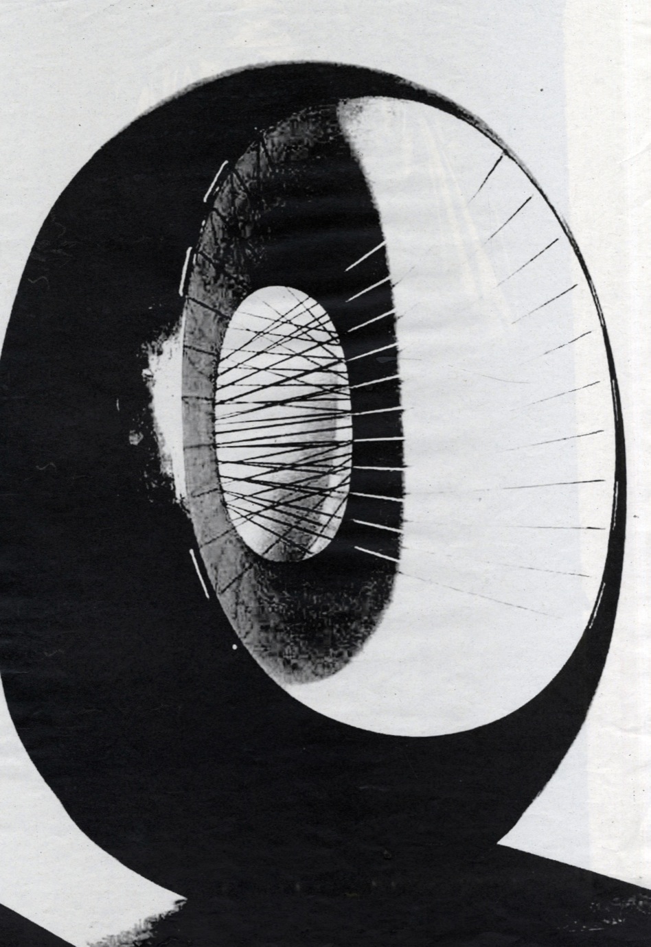
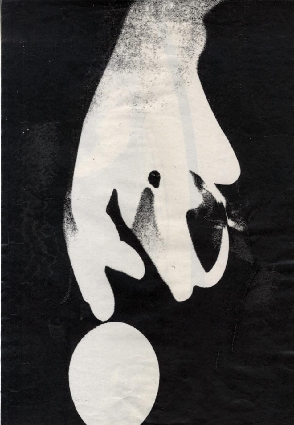
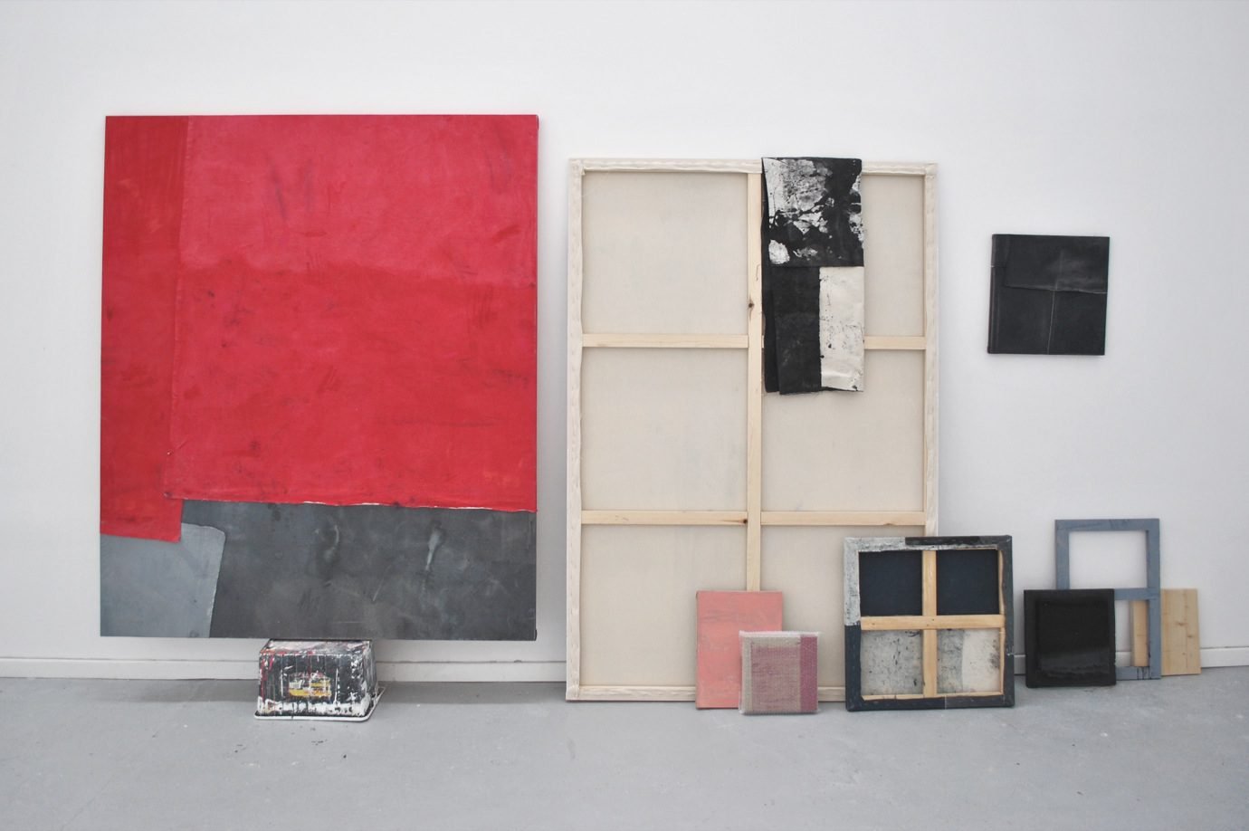
For her final collection, the main focus was on Barbara Hepworth and the way her work reflects on human relationships. The English artist juxtaposes materials and shapes to symbolise the tensions between different people – a woman and a man, or a parent and his child. A central image in Lynne’s research was a picture of Hepworth’s totems in the Yorkshire Sculpture Park. The industrial, heavy objects contrast sharply with the blowing grass and trees.

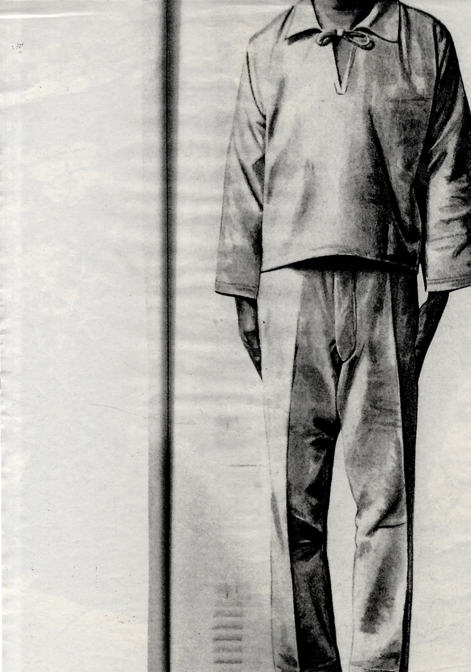
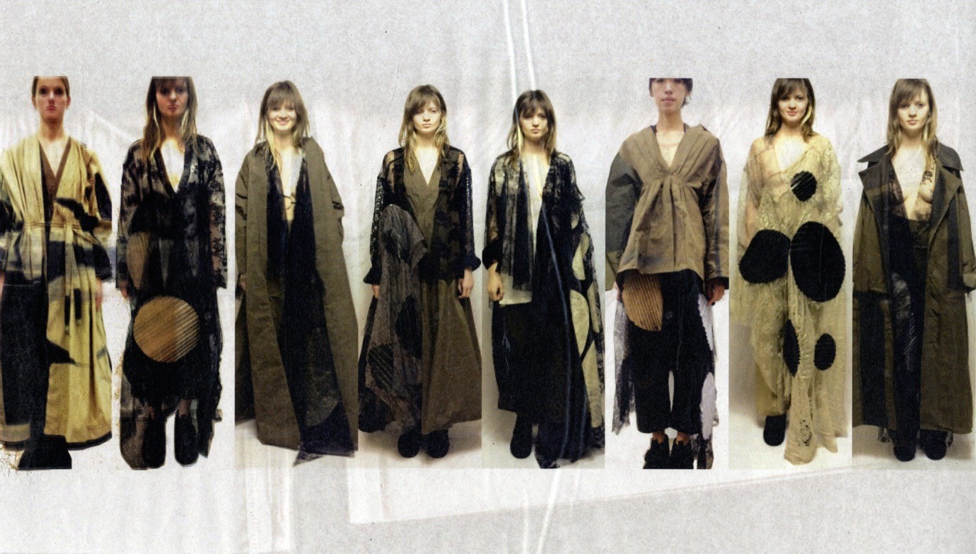
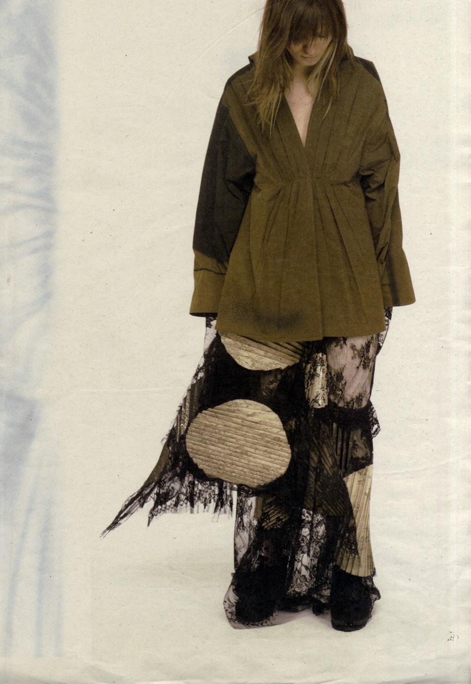
Lynne has worked on the same concept of tension throughout her design process. “With my collection, I knew I didn’t want one print across eight looks, I wanted a mix that was more dynamic.” She achieved this by combining nylon – heat-pressed to make it paper-like and crunchier – with a flowy and feminine lace.

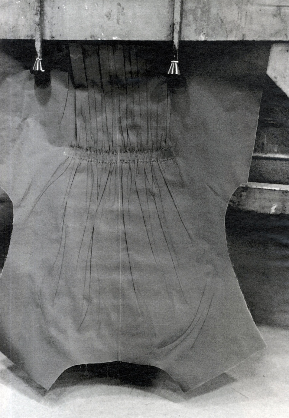
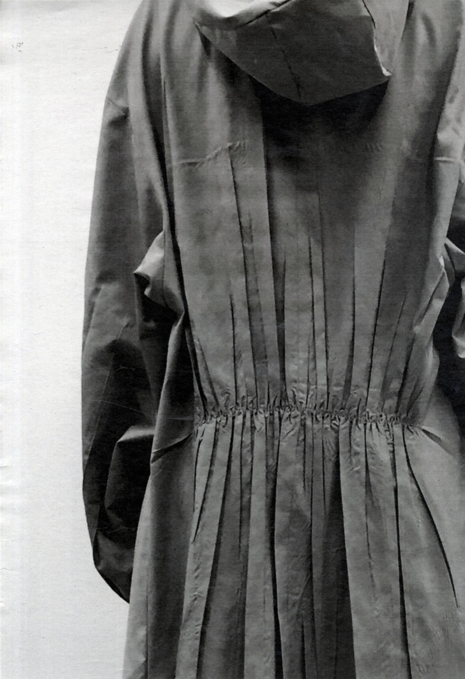
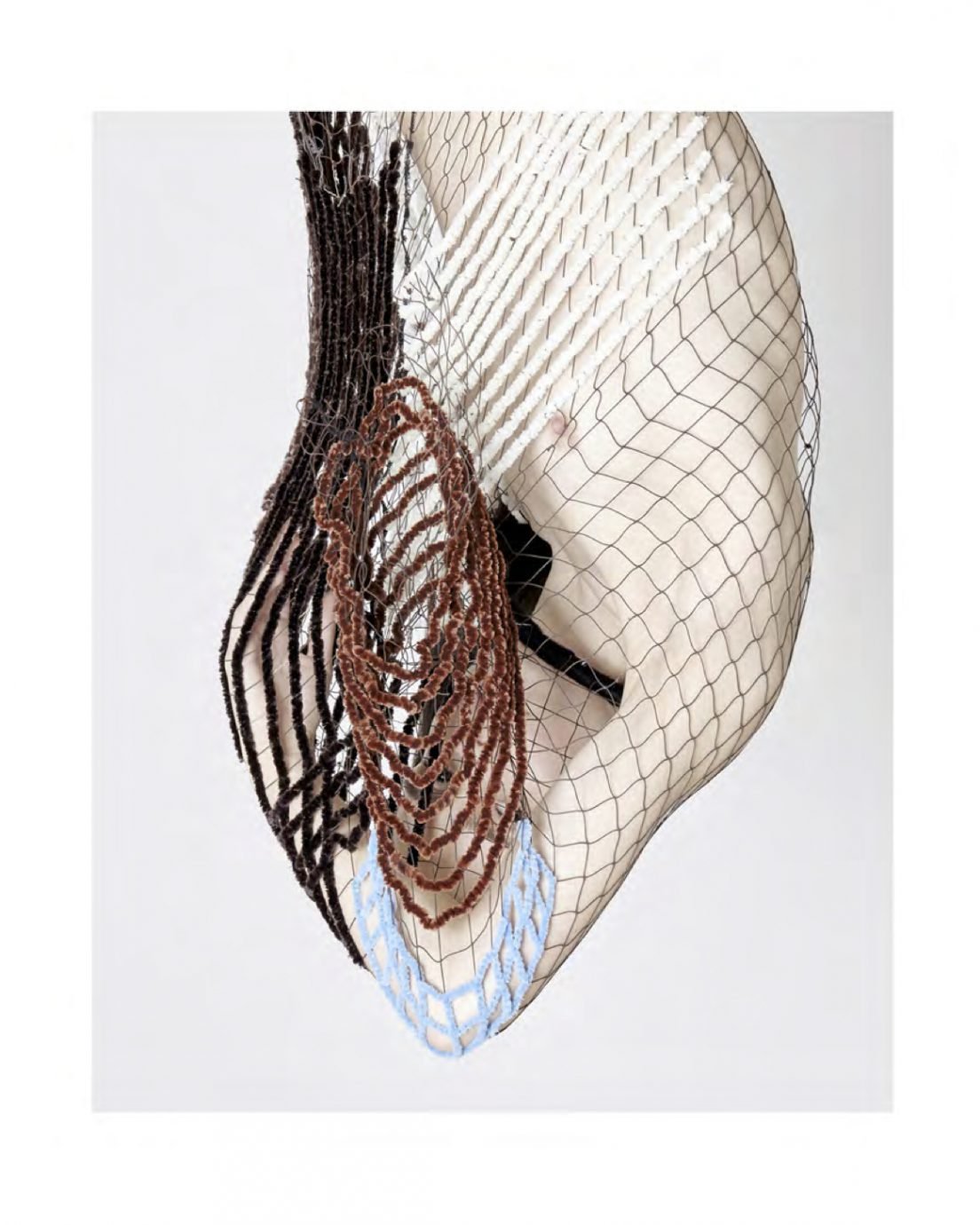
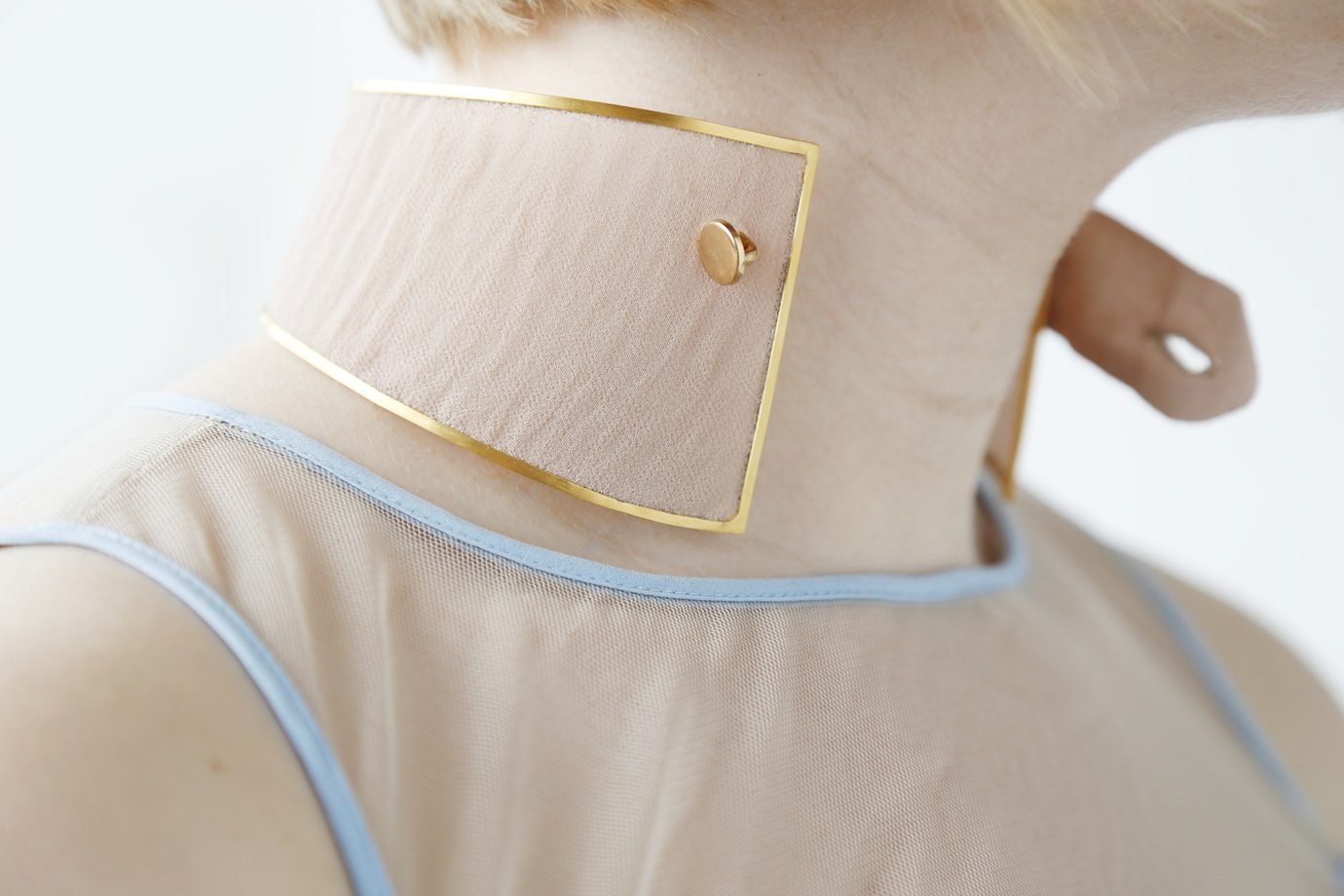
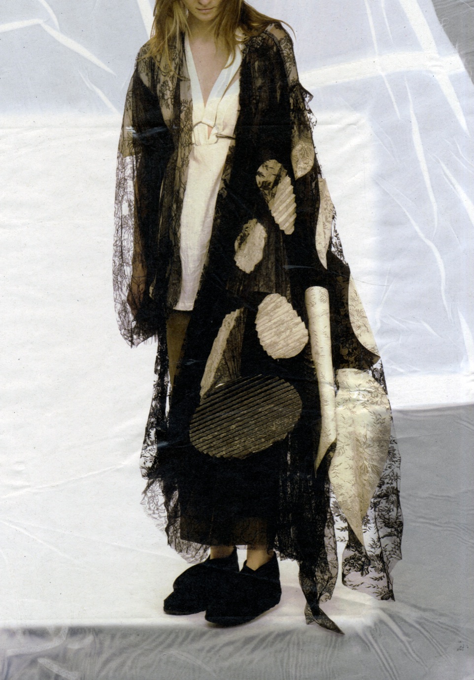
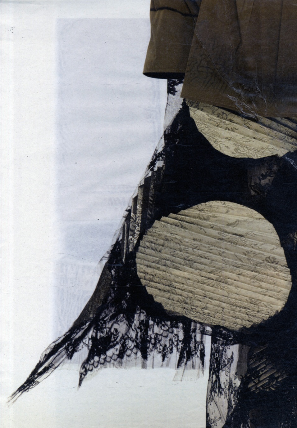
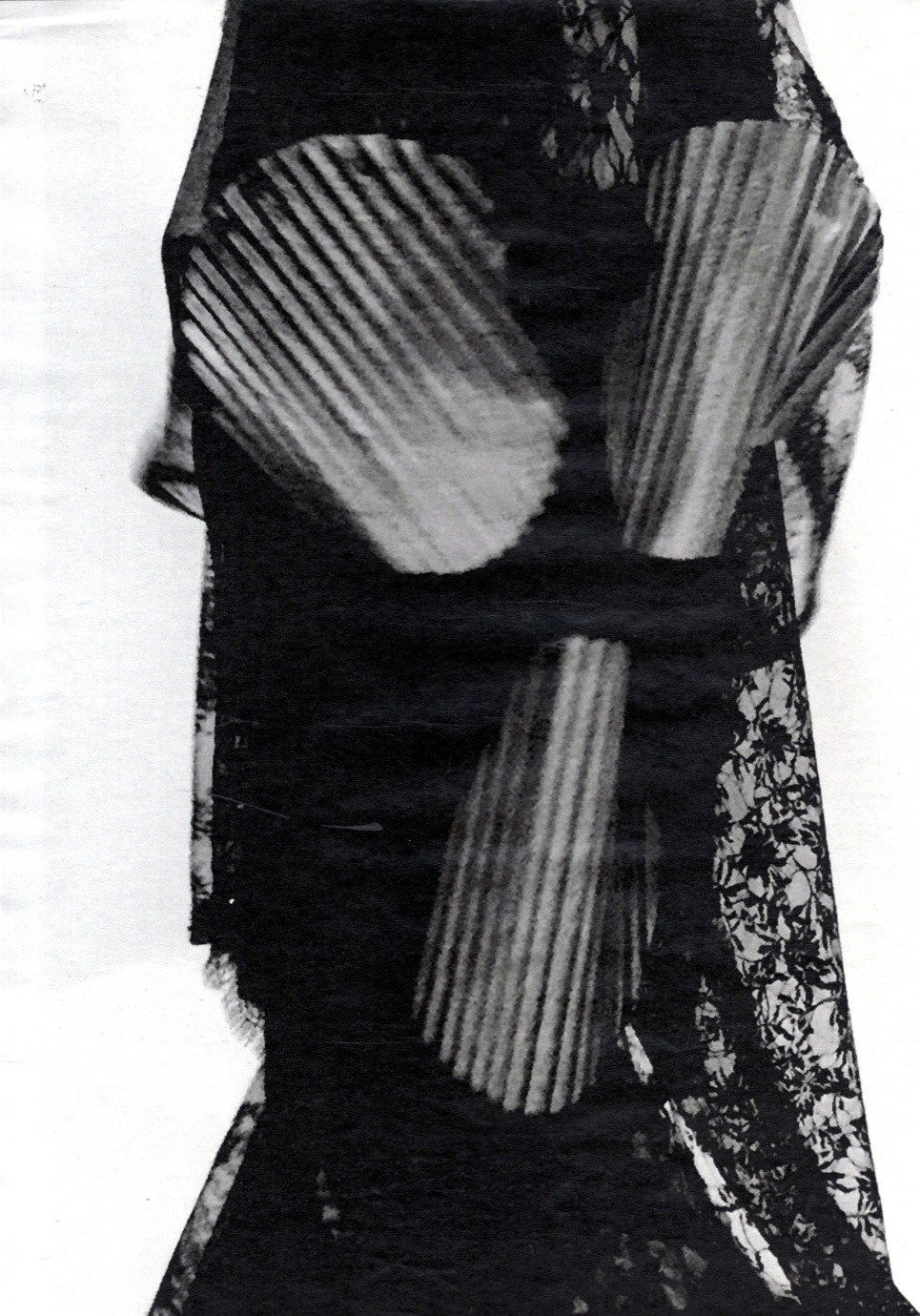
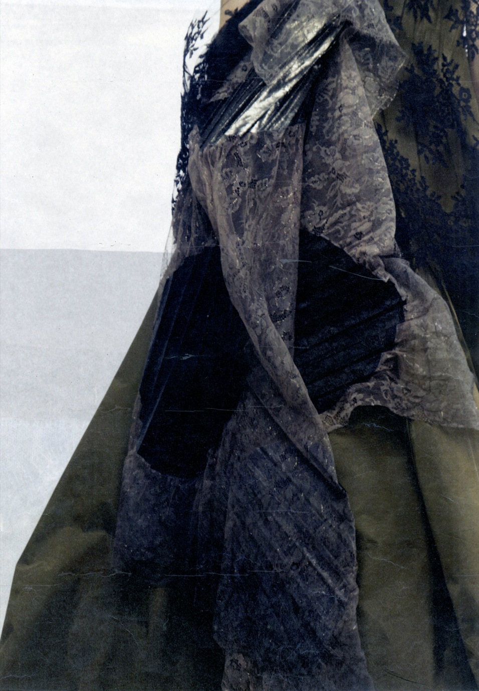
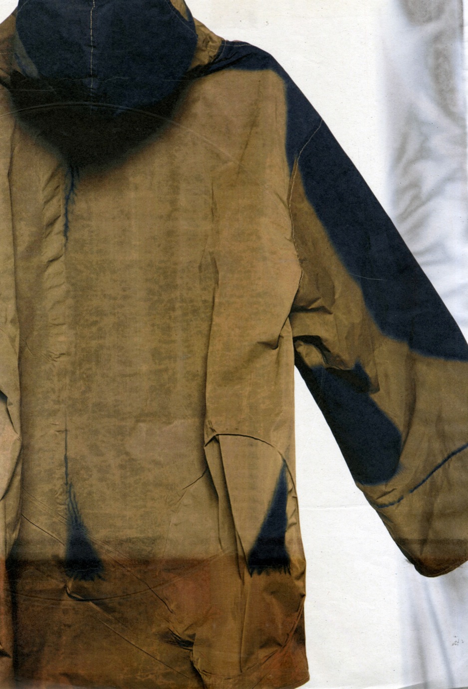
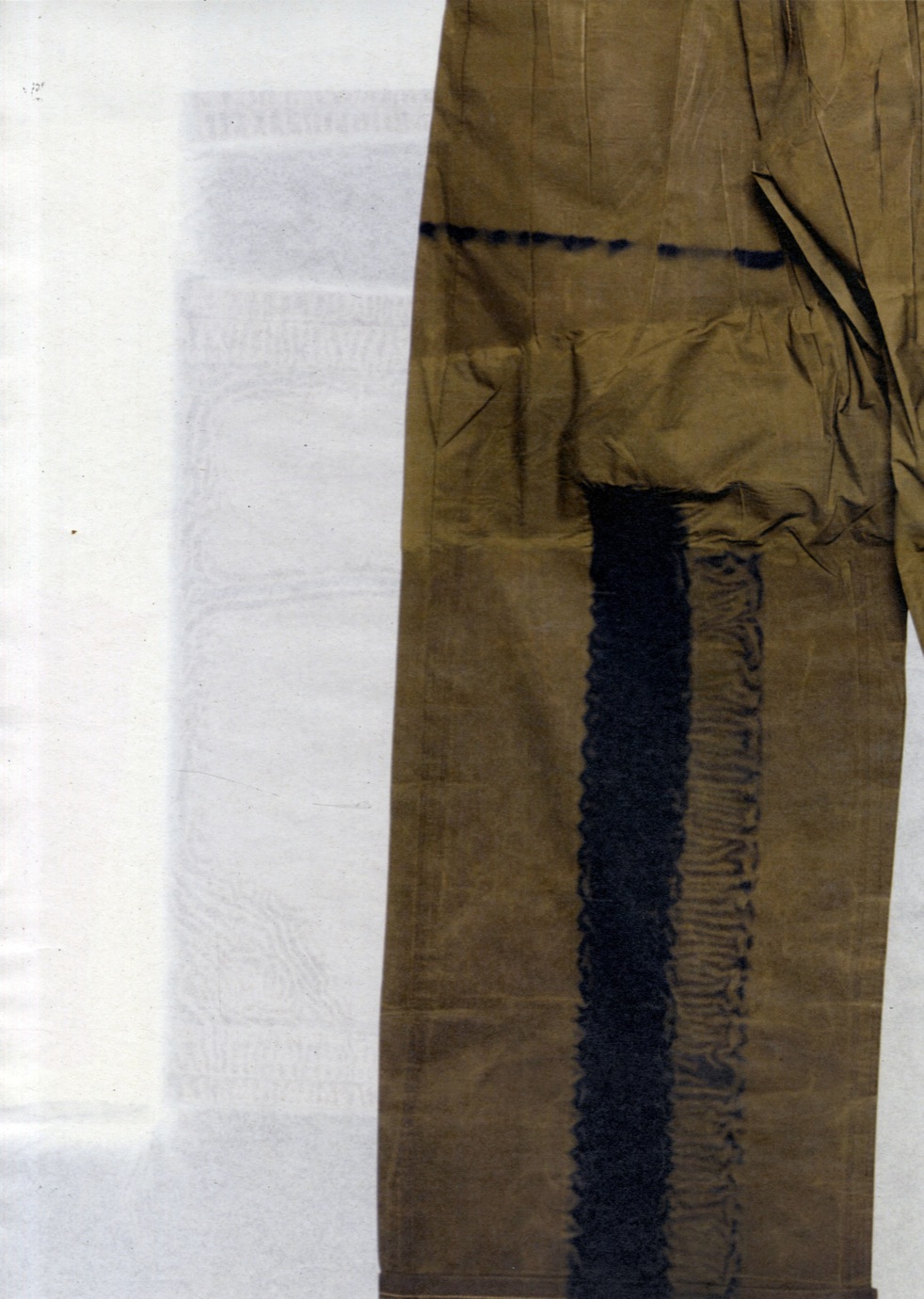
You can zoom-in endlessly on Lynne’s creations and find the idea of contrast on every level of her collection. From afar, the clash between the practical nylon and the decorative lace is immediately palpable. In detail, one notices the flat-felled seams (commonly seen on denim) structuring the soft lace.

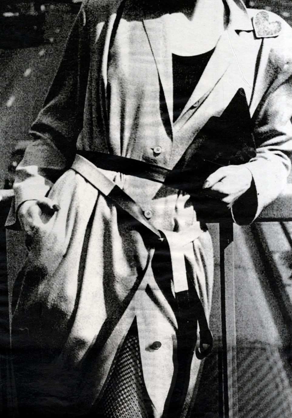
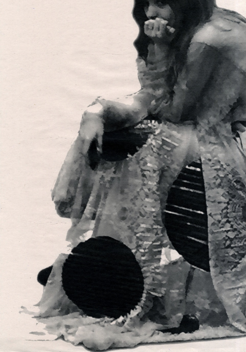
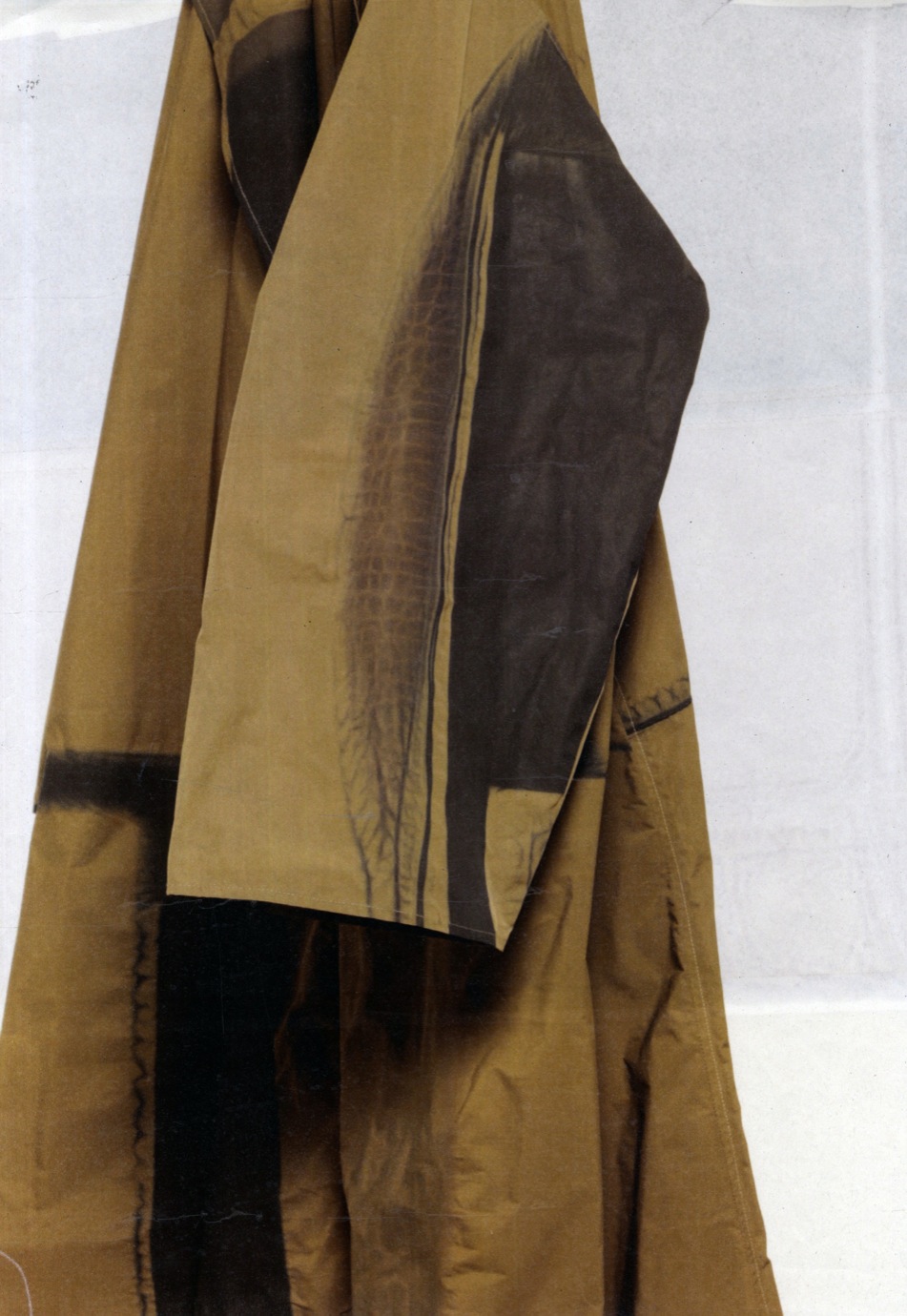
On the nylon, Lynne used a heatpress to print contrasting geometric shapes next to each other. Each print is unique, because the heat would react differently to the shapes each time. With the lace, she broke its meticulous pattern by adding simple vinyl circles. Then she pleated and pressed the samples, pressing the motif of the lace through the vinyl. This makes the dresses almost sculptural. The decorative fabric isn’t something she would’ve naturally chosen, but when she got it sponsored by Sophie Hallette, she felt challenged to take it away from what lace is usually associated with.

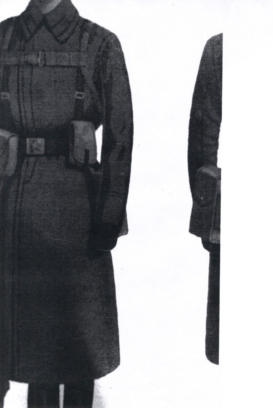
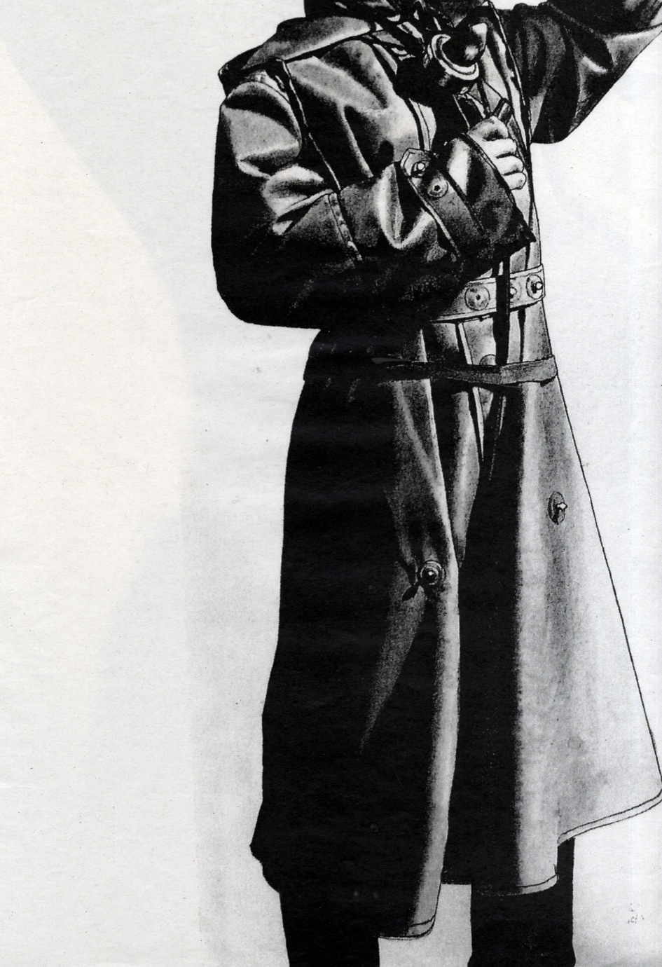
In the styling of the silhouettes, Lynne looked for an opposition between military and sensual. In this perspective, it was great to have a team who worked on the garments: “Some of them looked at the feminine silhouette, others looked at the military. So again, there was a mixture. That worked really well.”

Lynne loves working in a team and being able to bounce ideas off other people. “I am not someone who wants all the glory to myself.” With the help of her team, making the collection became an amazing experience. “I’m so happy to have had my team, they really had my back. Like I had my own support system.”

Working with Lynne doesn’t just seem easy, it also sounds like a lot of fun. When she’s around, the studio is usually filled with laughter. “Everyone joked that my team and I were always drinking and laughing.” In reality, Lynne and her crew were working their butts off, barely finding a free hand to hold that beer. “Everyone in my team was so on it, I cannot thank them enough.”

It might surprise that Lynne is also known as the organised one. “I always feel like I’m in a rush, but that’s because I’m so into it, I’m constantly doing it.” When Lynne’s got an idea, she’s not scared to just go for it. This doesn’t mean she’s not exempt from the waves of self-doubt or fear that usually come with artistic creation, she’s just learned that actually doing something is the best way to shake them off.

“One of my tutors, a while ago, told me –Just fuck it Lynne! – and I was like – Yes, exactly! – best advice I ever got!” Ever since she’s been turning her impulsiveness into her biggest advantage, convinced that the best way to work was with a “fuck-it attitude”. When experimenting with dyeing techniques, she would “chuck the fabric into the dyeing bin and just leave it there, instead of stirring the fabric around, and so the colour became uneven.”

One of her most impressive techniques was discovered by accident: when she added wooden shapes on top of the print paper – instead of the other way around – the shapes didn’t create the sharp lines she was expecting. Since the heat wasn’t entirely blocked, it left small marks around the edges, like tiny waves or blood vessels. She loved the effect and continued playing with it.

For somebody with a fuck-it attitude, Lynne pays great attention to detail. “It’s more that I pay attention to detail, and so I can afford to be spontaneous.” If there ever exists a thing called beautiful fuck-its, this must be what it looks like.