Representing the creative future

Parsons MFA Fashion 2017: full line-up

Meet the nine bright talents to have emerged from Parsons MFA Fashion.

Yesterday, the sixth generation of the MFA Fashion Design & Society of the Parsons School of Design presented their final collections. The nine graduates explained their inspiration behind the concept, struggles during the year and visions for the future.

NIHL

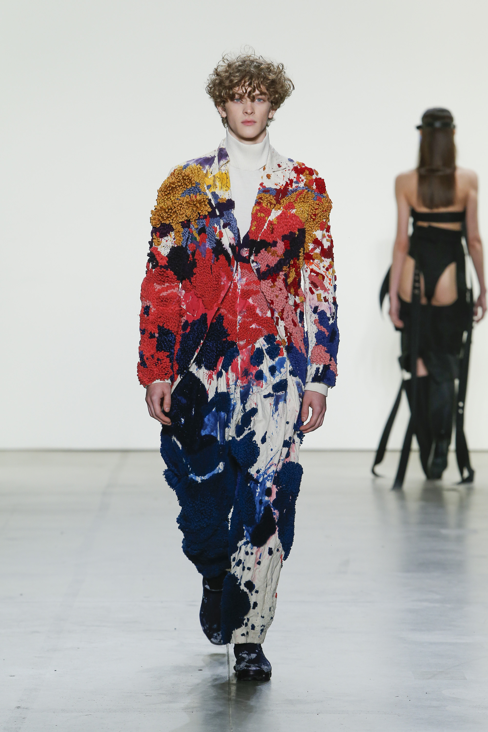
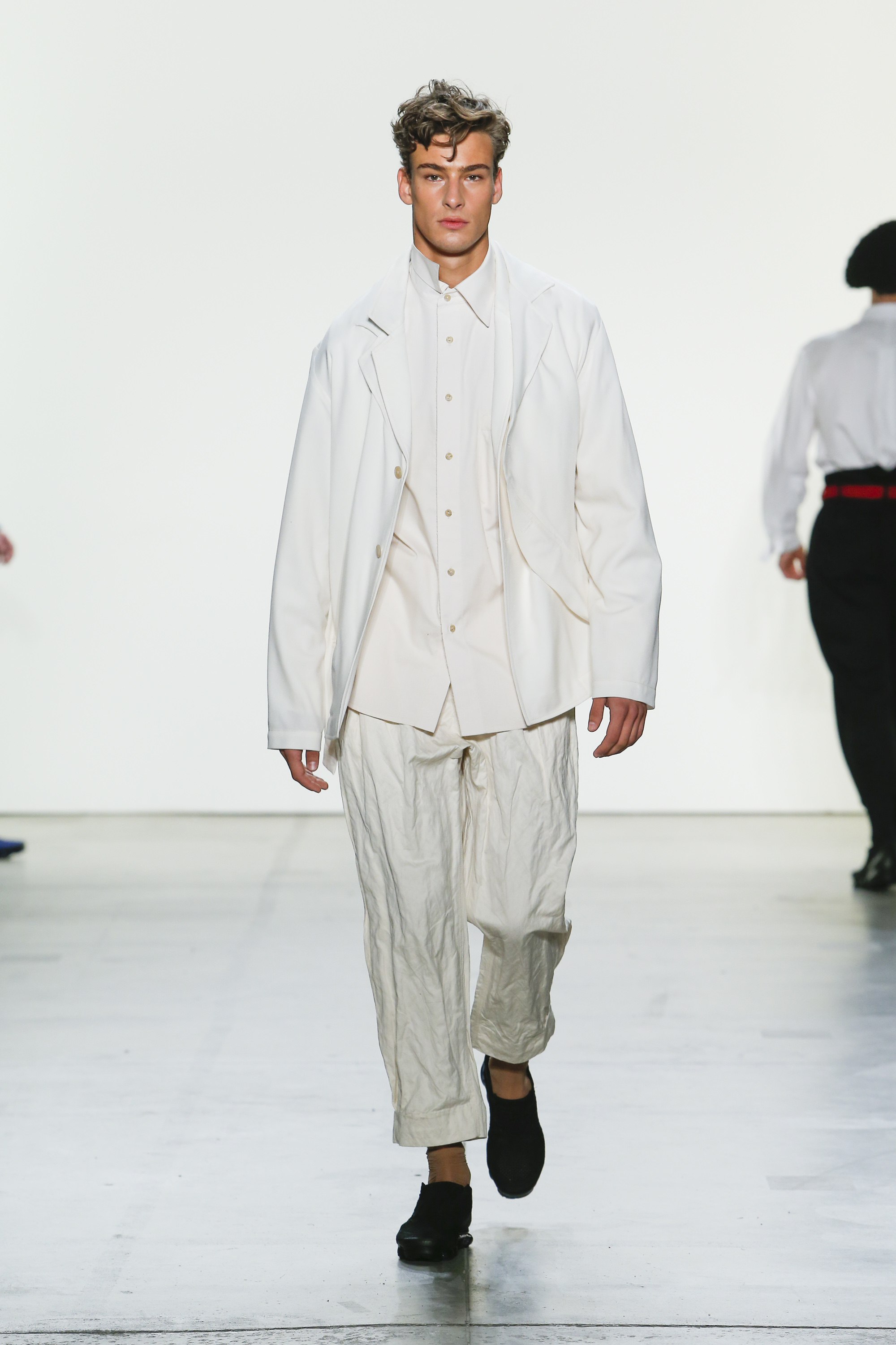
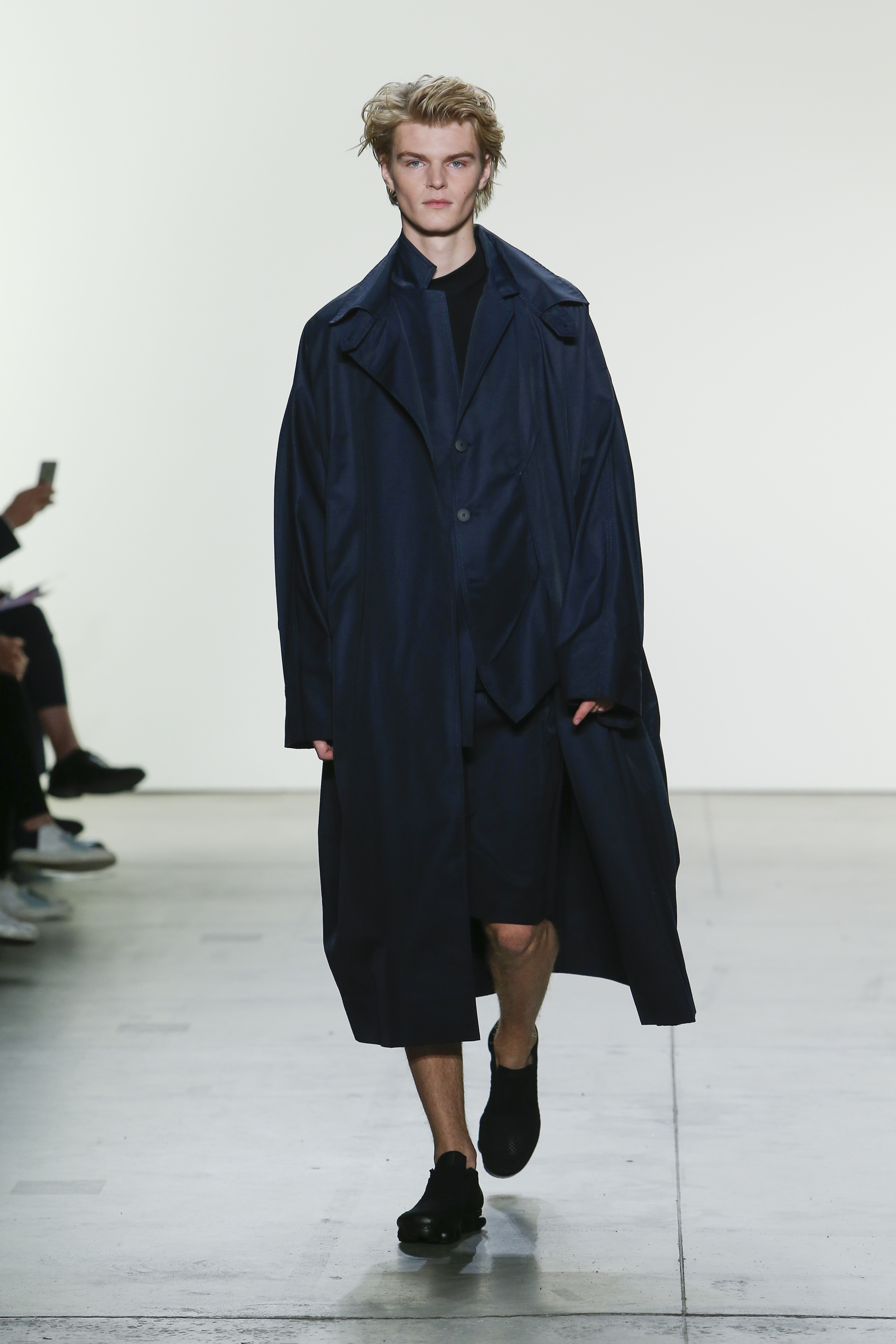
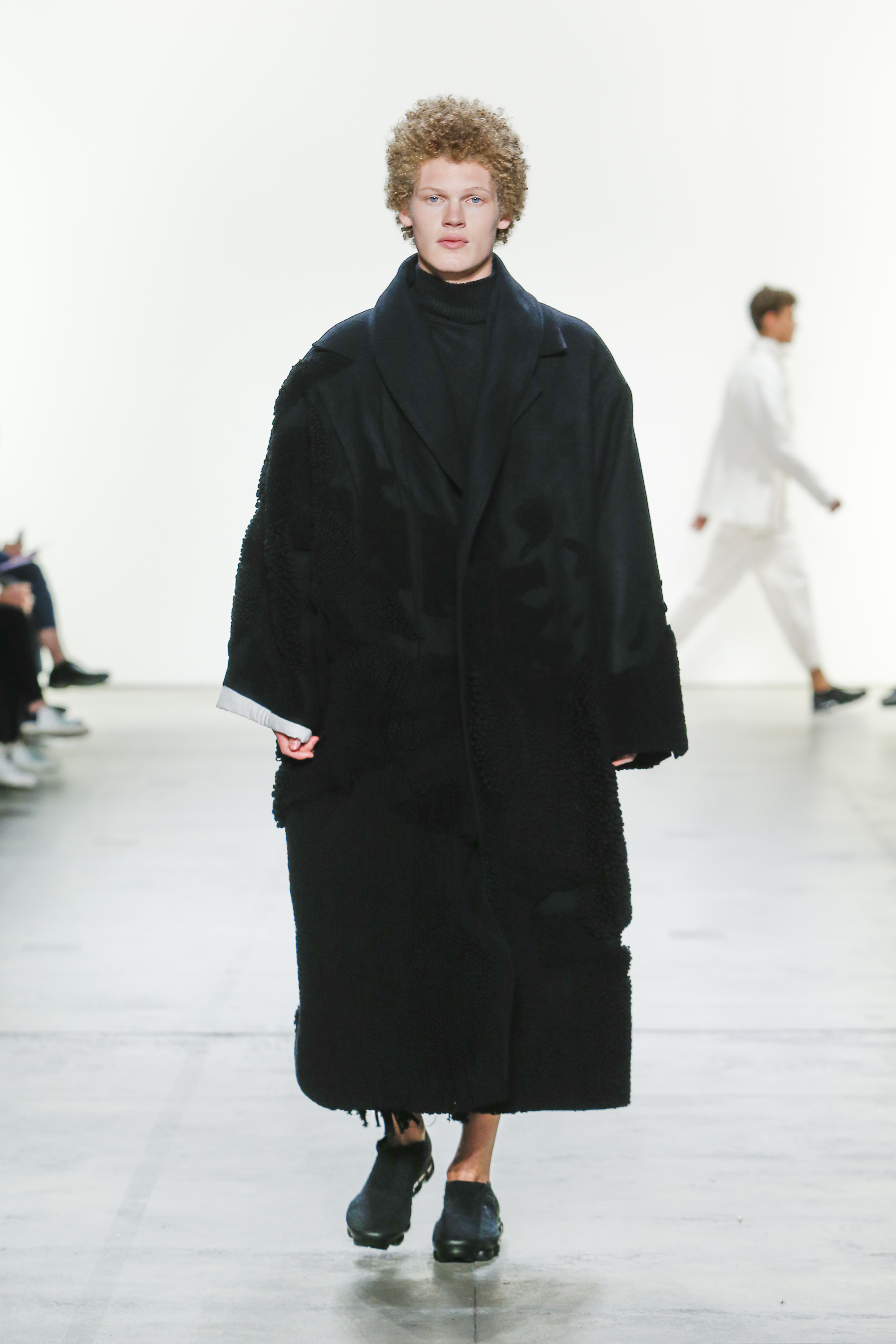
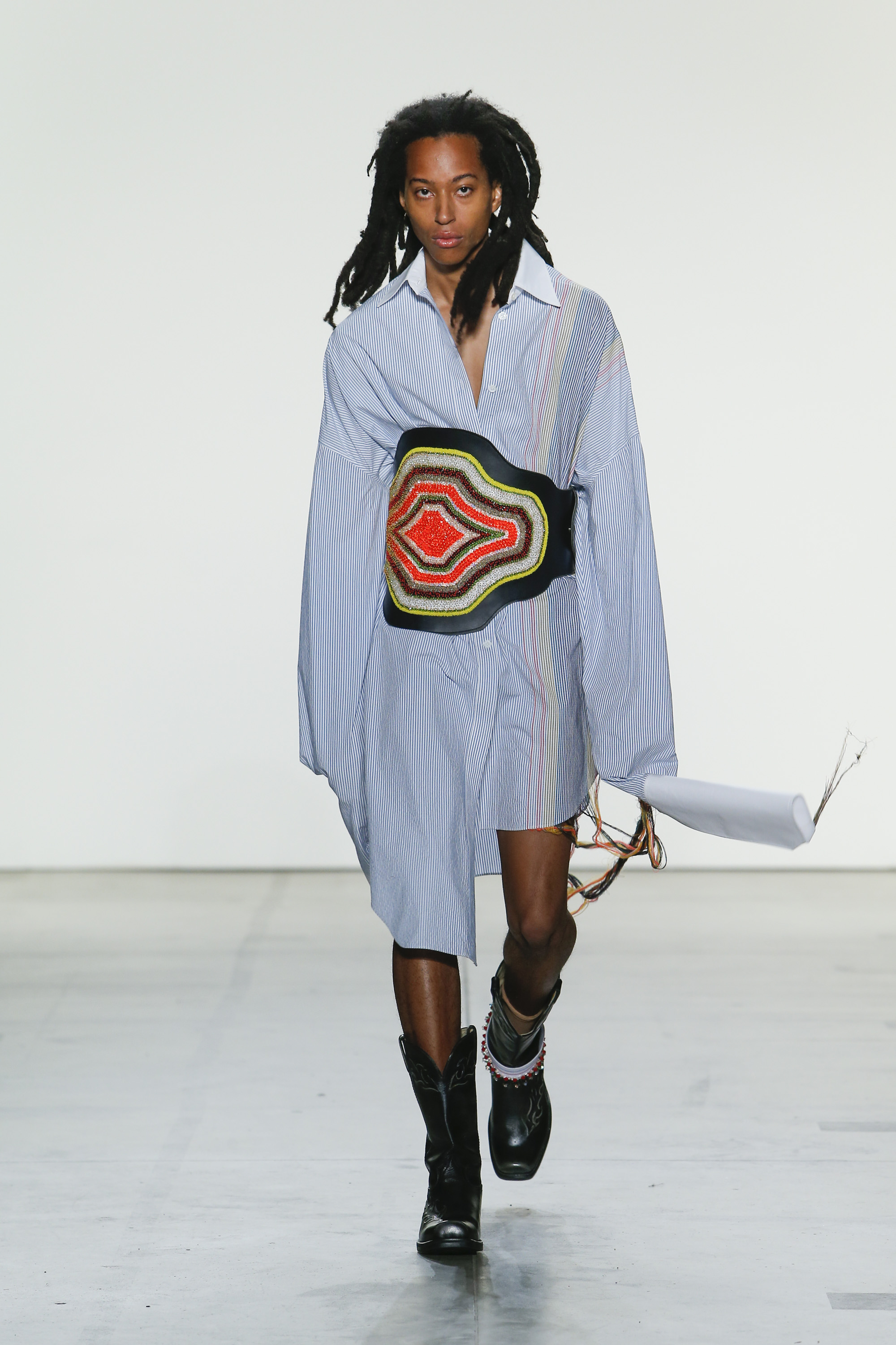
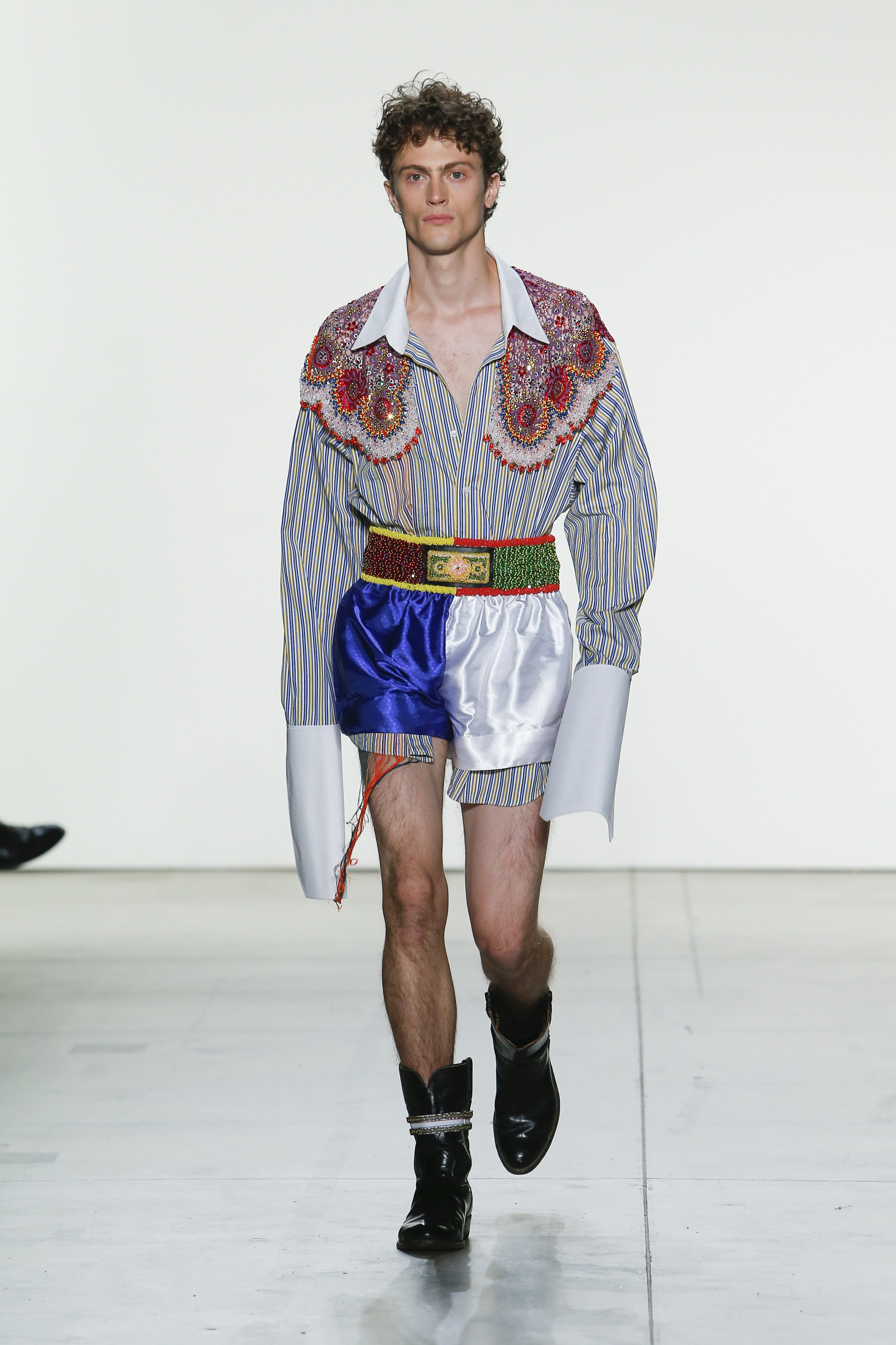
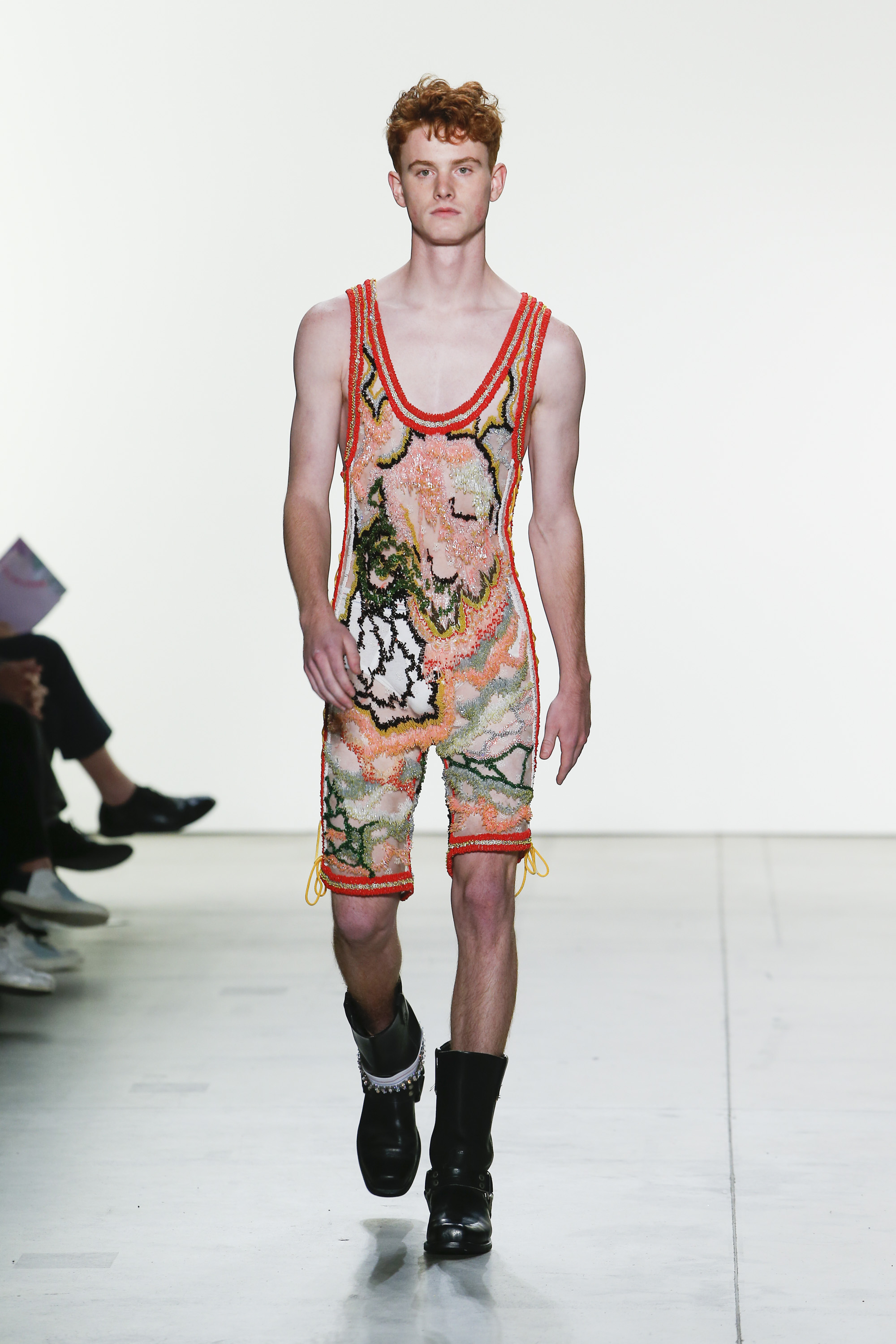
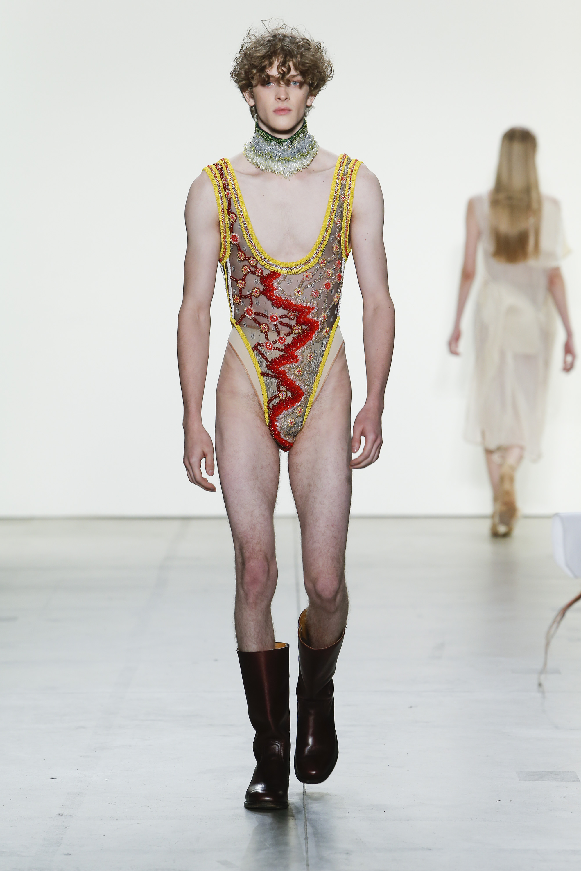
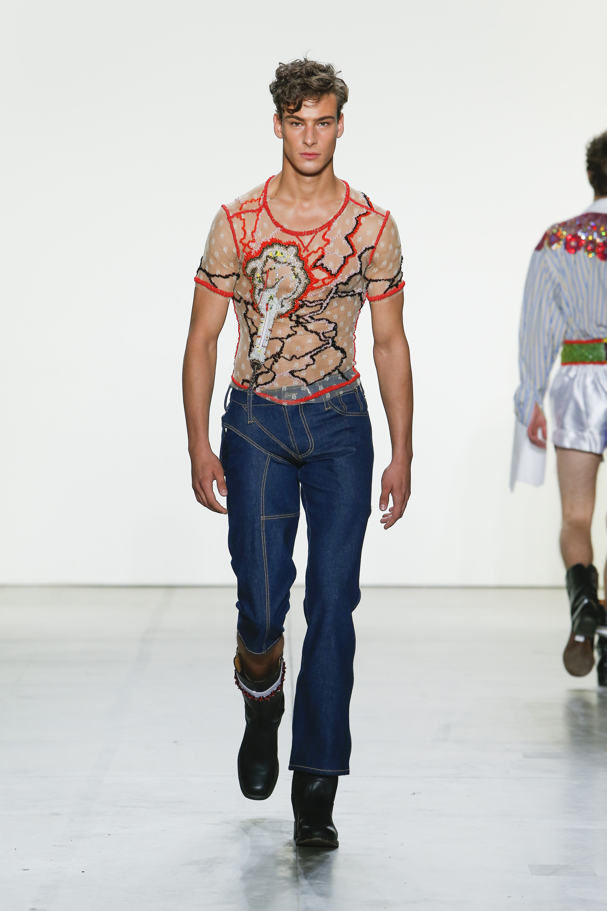
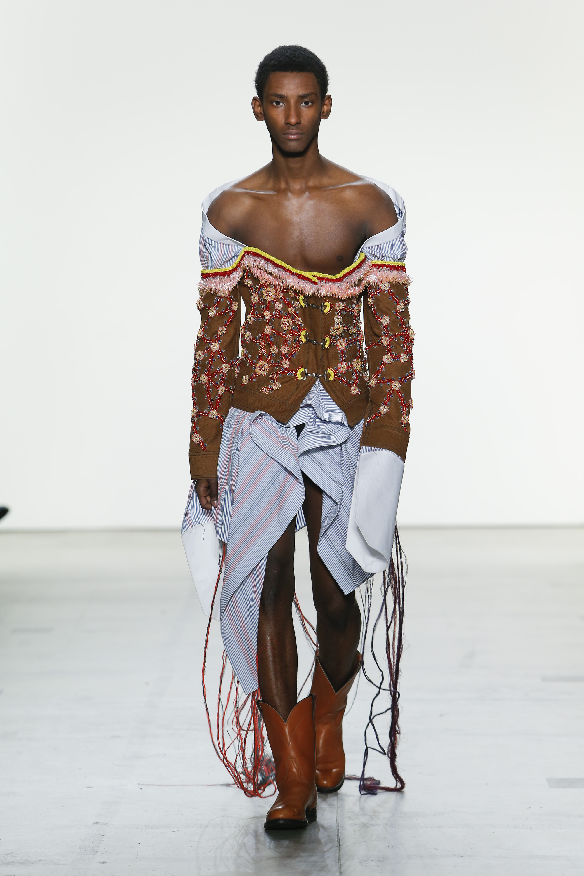
Originally from Colorado, Neil Grotzinger began working for a number of high-end womenswear labels in New York after his BA at the Pratt Institute. He specialised in hand bead work and embellishments, and soon started applying those techniques to his own, private wardrobe. Intrigued by the result, it incited him to pursue the MFA at Parsons. “I was getting so much satisfaction from taking the skills that I was using in my job, and applying them to clothes for myself. I was creating what I wanted but didn’t have access to. Now there’s a personal element to my work.” He intends to create a market for alternative couture menswear, and if all goes to plan, he’ll be showing his collection at the next fashion week in New York.

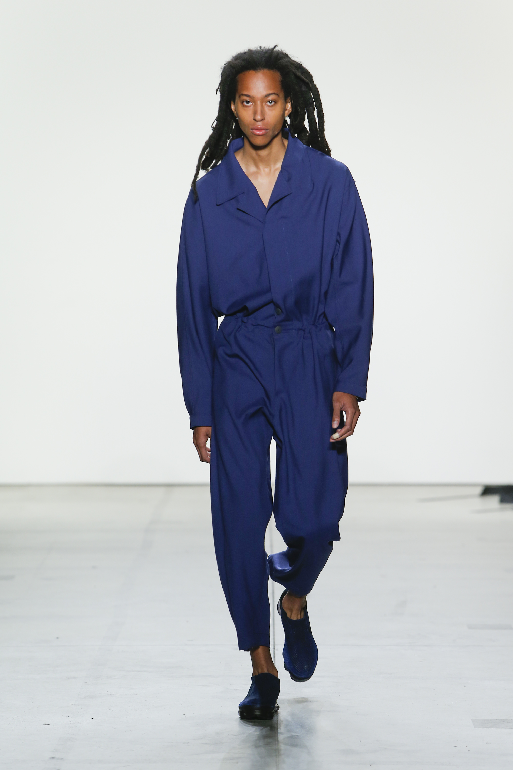
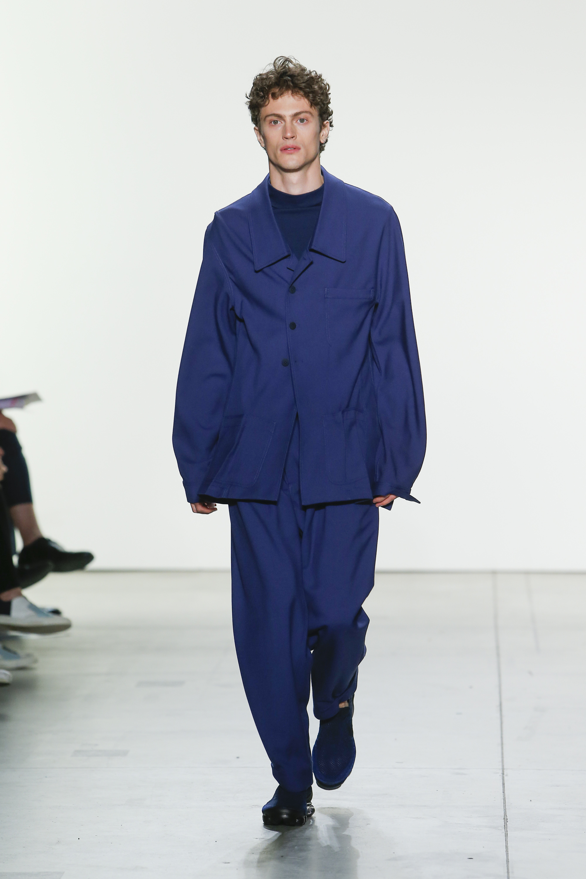
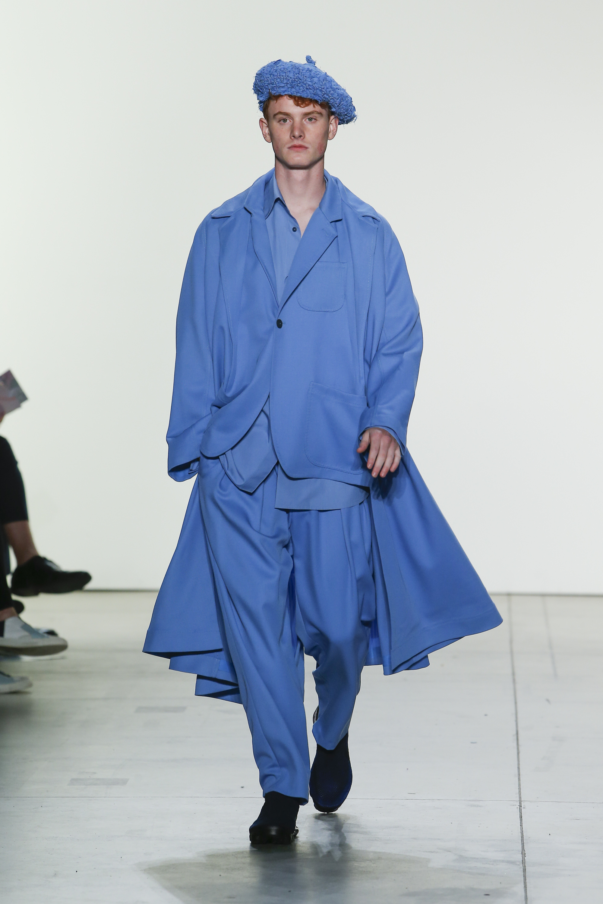
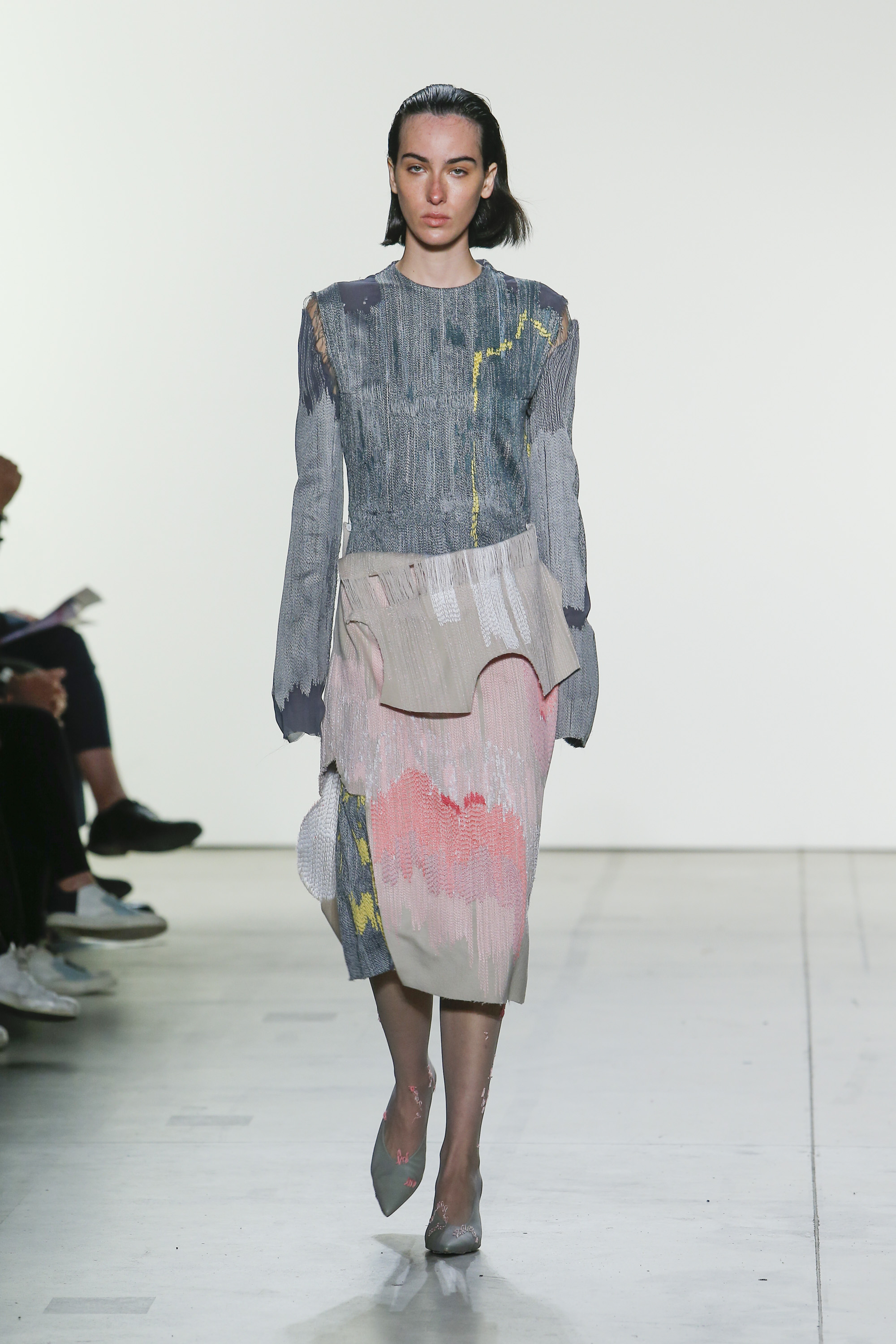
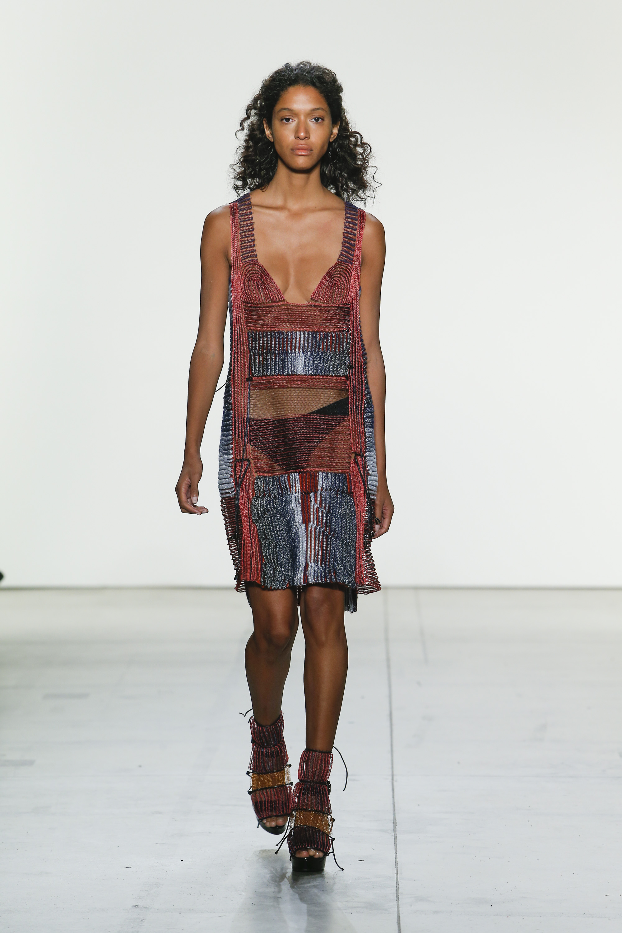
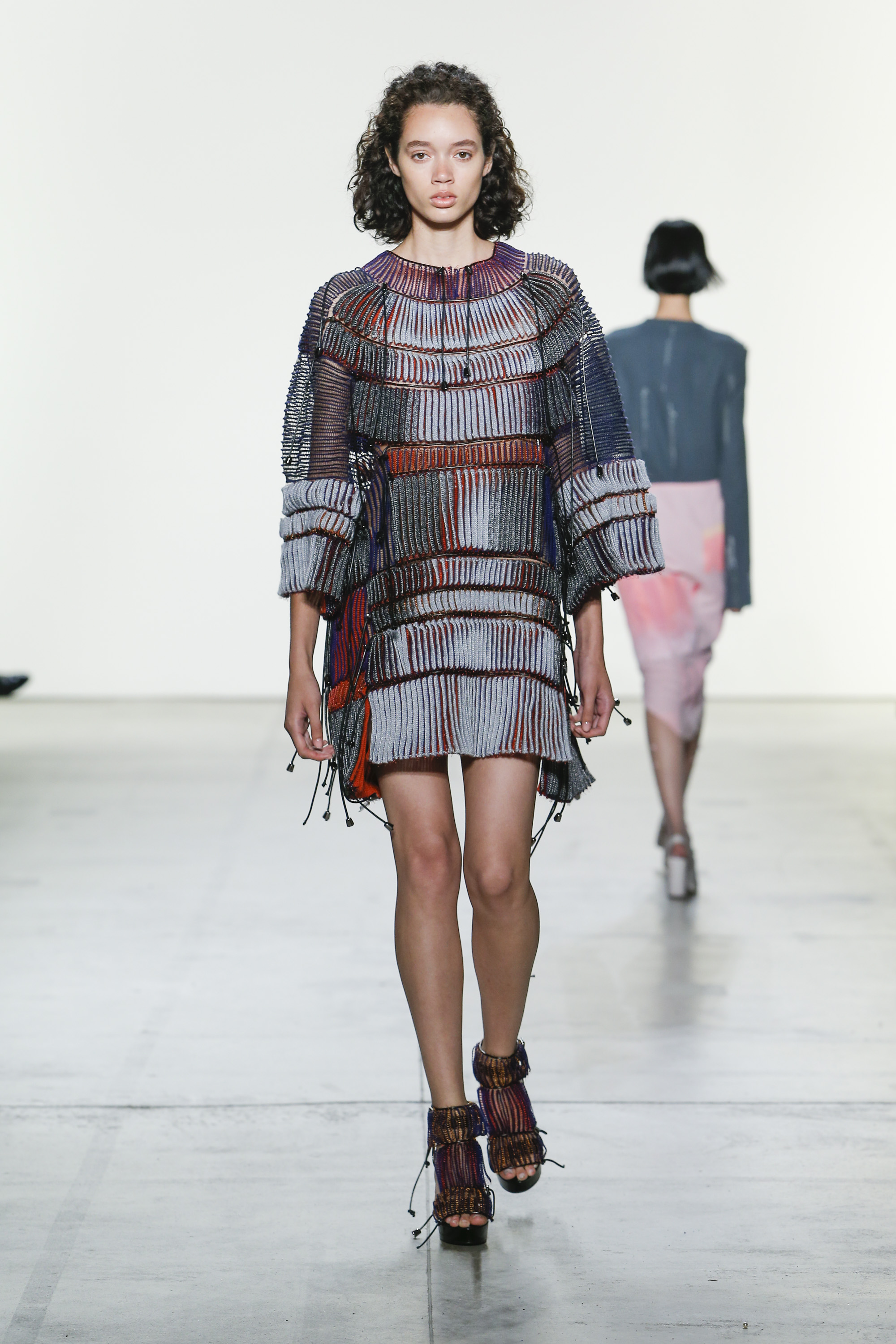
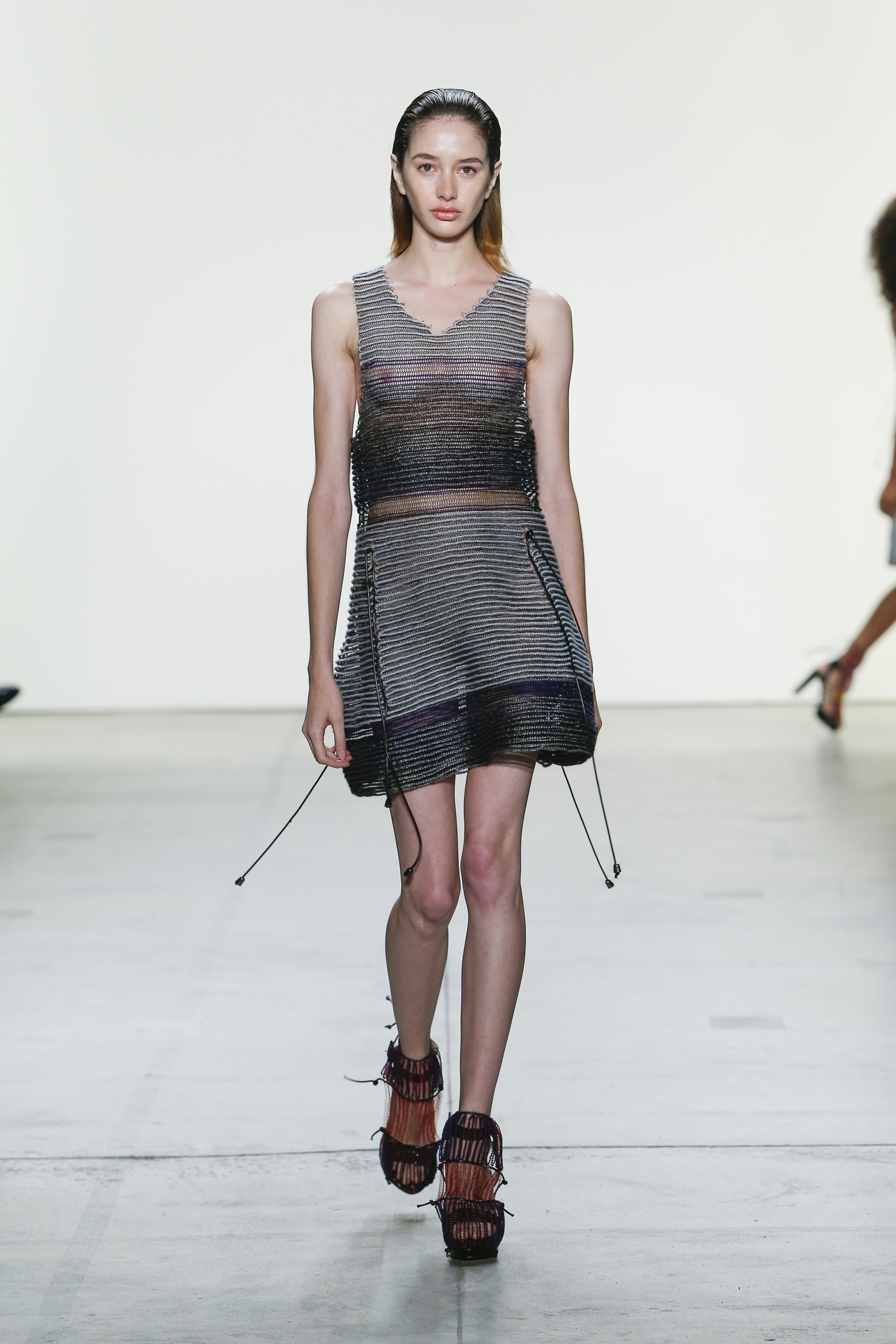
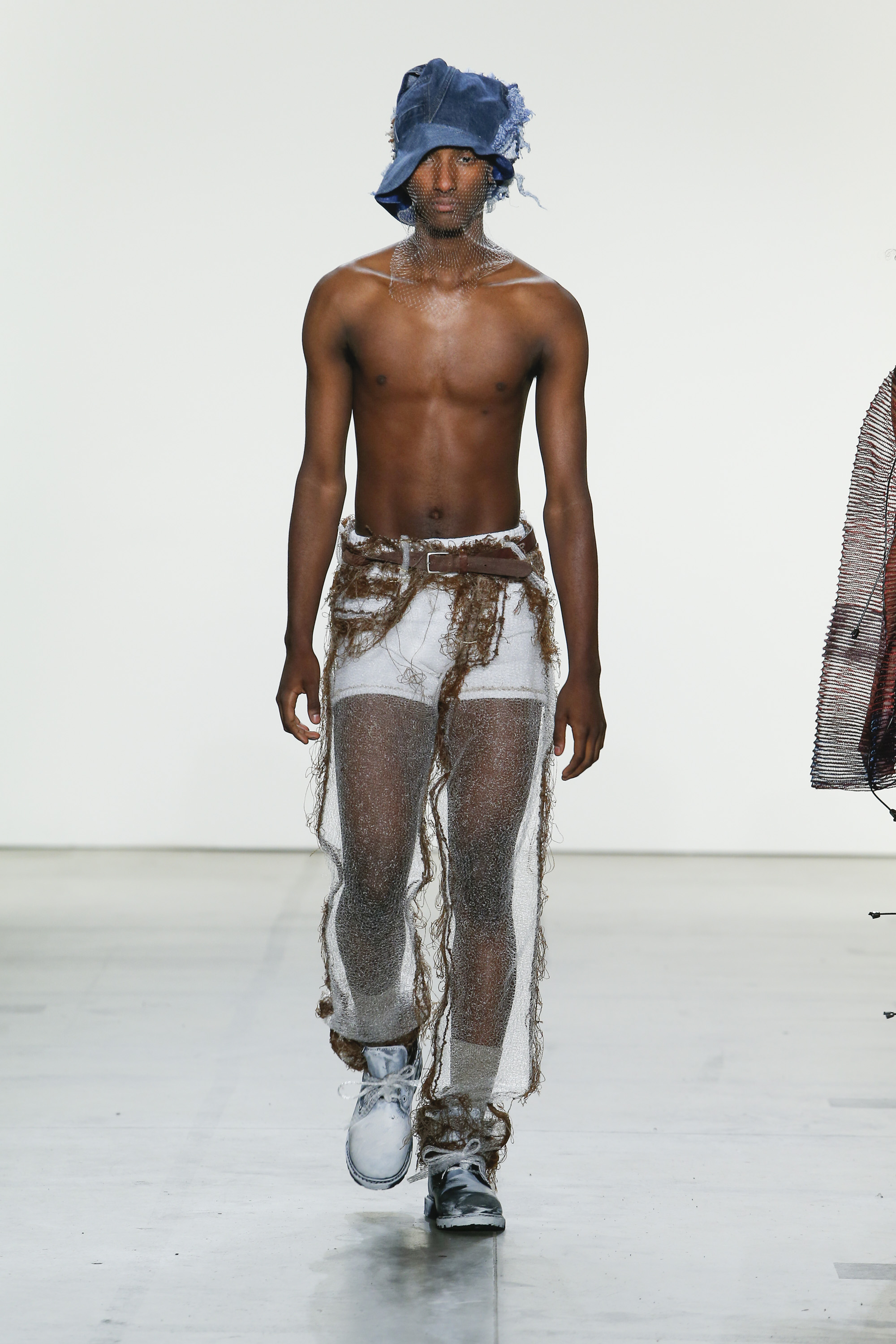
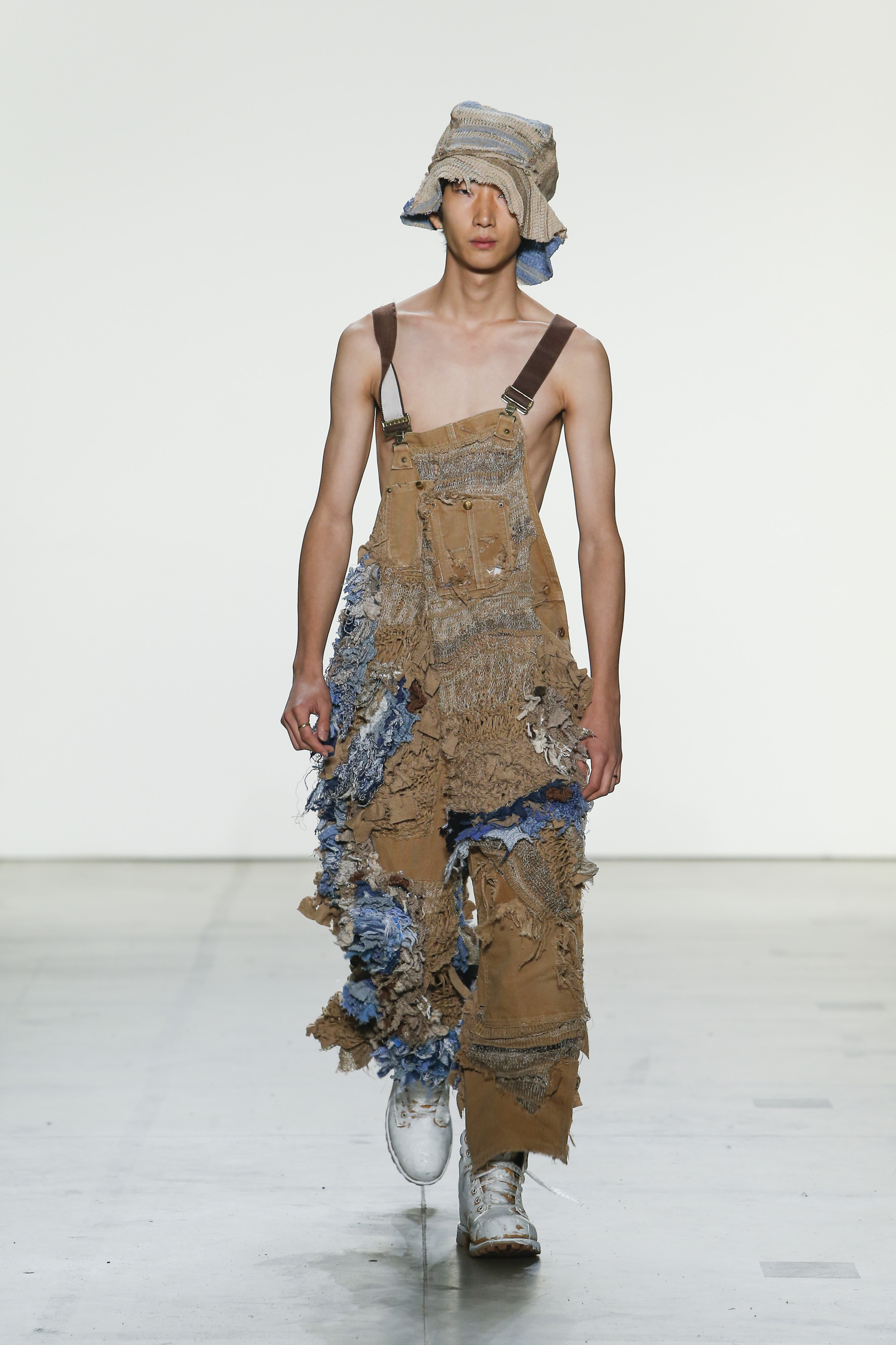
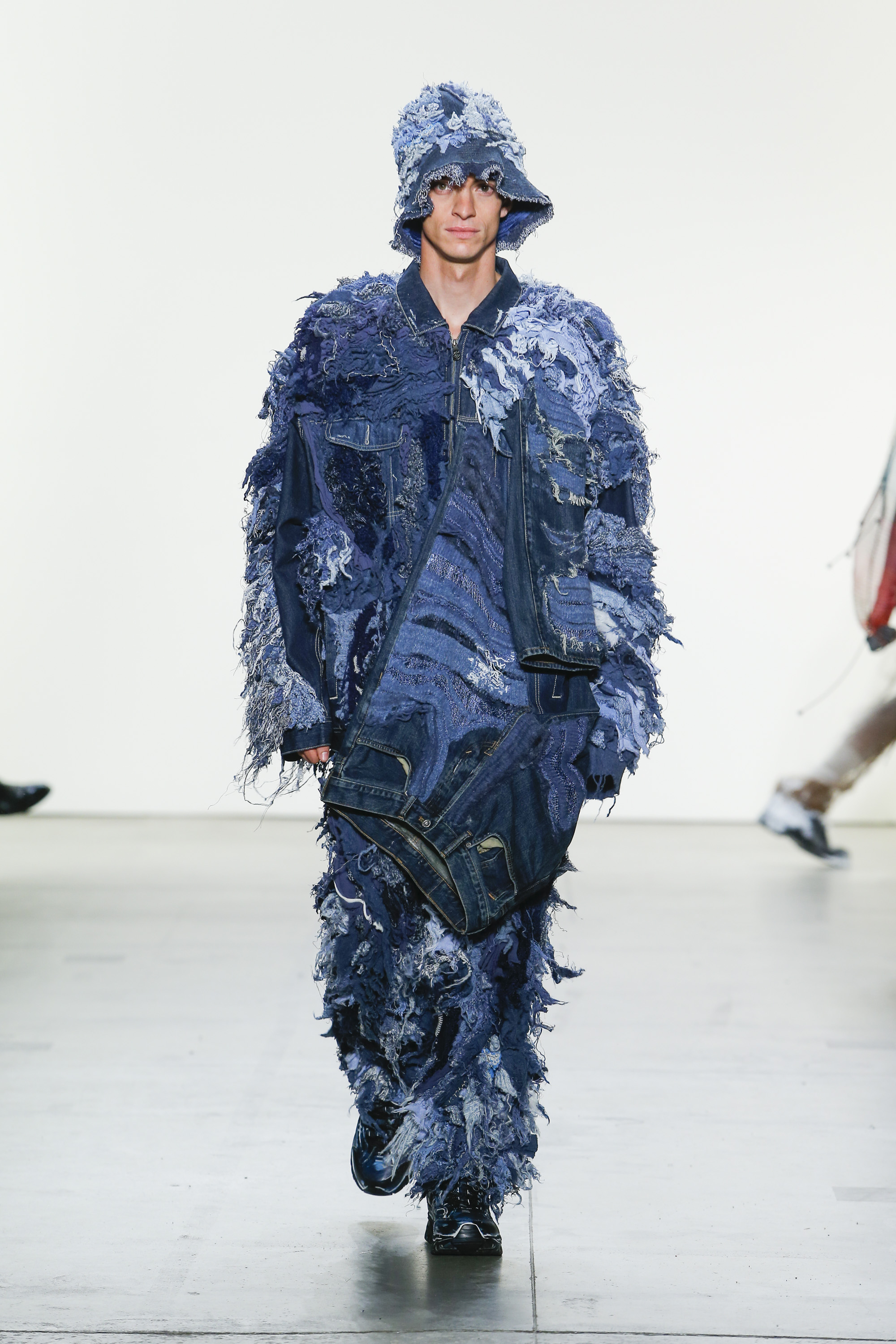
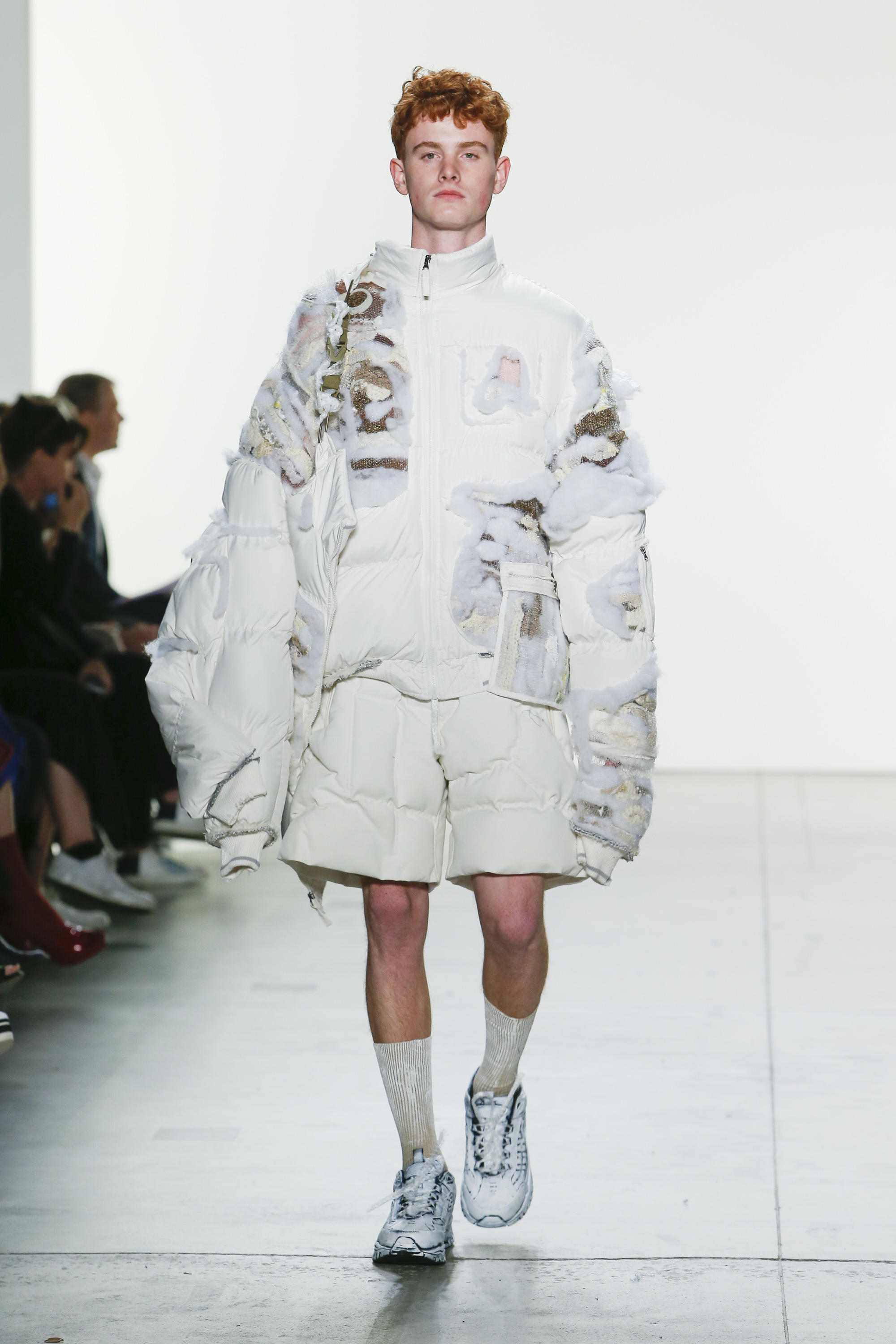
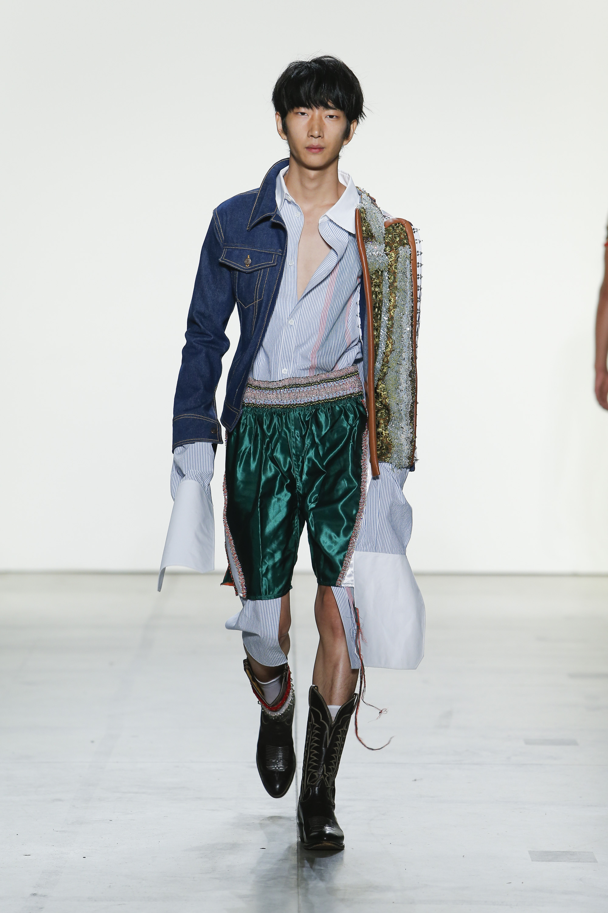
His graduate collection played with the iconic pieces traditionally found in menswear, and adding a decorative element to it – to break its functional restrictions. “It’s about breaking the masculine façade. There’s these ideas associated with functionality, certain expectations, that didn’t even exist in the first place. It breaks the restrictions of menswear.” A simple t-shirt, for example, was subverted by beading along the lines that define the piece. Athletic sportwear was another important element in his work. “I found it interesting to create something that maybe has been used for athletics, but made out of lace so you could never actually do those movements in those clothes.” His work critiques the stereotypes associated with masculinity by bringing something beautiful and effeminate. “It was tricky to combine all these different icons in a coherent way. In the end it became this collage of personas, which I really liked.”

ZOE CHAMPION – INLAY

“The beauty of knit is that you can engineer every single part of it, from the fibre to the yarn. I can really create every single moment, I’m not relying on anyone else.” For designer Zoe Champion, knitwear is always innovative and experimental. She likes to start with traditional elements, then reconfigure them.

For her graduate collection, she delved into her personal memories of her recently deceased grand-mother’s clothes. She explored the emotional response one has to clothing by working with the idea of hiding something within something else. “I used an inlay technique, adding colour and texture in a way that the machines shouldn’t be able to. It’s about adding something within something, the knit is holding another knit.” Thus, a coat contains the impression of two other coats, a sweater carries the beginning of a pair of trousers.

In addition to this, she used a selection of family photos to delve into the opposition between the unknown and the familiar. “These family photos have no actual connection to me because I wasn’t there, I wasn’t alive in that time, but then I do have a personal connection because it’s my family.” She further explored this concept by digitally manipulating the images and putting them through a program that breaks them apart and puts them back together. In a way, it recreates how outsiders would relate to it.

“What I love about knitwear is that you can create shape within the knitwear. You can do it all in one moment, if you’re really clever and plan it all.” However, this also means one mistake can ruin an entire silhouette. “It was a real process of trial and error, I think I have 3000 swatches laying around.” Luckily, she could rely on skilled technicians to help with the photo silhouettes. “It was really interesting to work with the technicians, as they have so much knowledge, they’re real knit nerds.”

SHANEL

Business and construction. Two very different worlds, but for Shanel Campbell they have one common denominator: “My dad worked in construction to put himself through law school. I knew I wanted the collection to be inspired by him, so I merged elements of suiting and industrial workwear and put it into womenswear.” Shanel firmly believes that societal norms can be challenged through clothing, and she always designs with a strong, independent woman in mind. However, this definition doesn’t need to be fixed. “Empowerment means different things to different women, it can be dressing modestly or being sexually liberated. To me it means wearing whatever you want, whether you’re covered up or not. Being happy with yourself.” This means the collection could speak to a range of women. Some silhouettes cover up the entire body, others were revealing and sensual, and a few did a bit of both, with a silhouette that covers the front, but reveals the wearer’s butt cheeks as soon as she turns around.

The goal was to create an armour for women. “I’m interested in industrial materials. I love these industrial polyester canvasses. I love shape and I love accentuating the female body by using harder materials instead of something tight.” Finding the central concept wasn’t hard, seamlessly blending the two central themes turned out a bit harder. The solution was all in the details.

After completing a BFA in Philadelphia, Shanel moved to New York craving a different approach. She was looking for a way to express her philosophical ideas through garments. “I studied fashion design in Philadelphia before. It wasn’t as conceptual, but more technical; that’s why I did this MA.” Shanel is looking to continue working on the ideas she developed the past year, and hopes to show at the next New York fashion week. “I’m excited for the next step, and have it be 100% my vision at the show.”

SHIZHE HE – THE INABILITY TO FIX A BOWL

Growing up in a creative family, and surrounded by artists, Shizhe He knew she wanted to work around the artist’s wardrobe. “I did a lot of research on how they wear their clothes. What items do they wear and how do they personalise them?” She noticed that while the answers varied for both questions, all her subjects had one thing in common – it was all about the details. “That’s where you see the personality of the artist, in the way they lift their collar or roll up their sleeves.” Wanting to record these mundane vestimentary details, Shizhe worked on the idea of a disappearing pattern. “It fixes the style, but it also breaks it. When you break something, you reveal something new within the thing you broke.”

At first sight, her pieces look like ordinary wardrobe staples, but up-close the pieces appear to melt and flow into themselves. In a series of trompe l’oeils, a collar runs seamlessly into the front of the shirt, the back of a trenchcoat disappears into the bottom half, one side of a coat is scrunched together mimicking the movement of the wearer holding their hand in their pocket.

The success of the collection can be attributed to Shizhe’s extraordinary pattern-cutting skills, which she picked up studying and working in China and Japan. “I’m very grateful for my education. My basic pattern cutting skills all come from China, where I spent three years just studying the pattern.” Complete with berets, the silhouettes read like an artist’s uniform, including not just those classic and practical pieces that people who work with their hands love to wear, but also the aesthetic side. A few looks feature an explosion of colour, representing the paint the artist works with daily. Shizhe hopes to start her own label next year.

TINGUYUE JIANG

After talking to a teacher who believed mass-production in China was the reason the country could not be creative, Tingyue Jiang knew he wanted to use Chinese culture and the lives of factory workers in his collection. The designer started with the endless repetition these workers face. “If you sew, you will be sewing for twenty years.” Using a regular sewing stitch, Tingyue started sewing thousands and thousands of layers of thread. “My whole experience of making this is me sitting on the sewing machine all day for seven days a week. No one could help me, because they all thought it was so boring. But to me, it was like a healing process. Just the fabric for a single piece would take three weeks, this is just layers and layers of stitches.”

Another element played with the idea of badly made knockoffs. “These factories are famous for low-quality and flawed stitches that are uneven. I brought those uneven stitches to the forefront.” The asymmetrical form created a decorative pattern throughout the collection. “I like a spontaneous approach. I can be a bit brutal – small and cute brutal, that is.” The designer also added subtle patches of grey and brown coloured thread throughout the garments. These represent the dirty and bleak environment the craftsmen have to work in, clashing with the bright colours. Lastly, he played with pattern repetition, displacing them to create holes and tears in the silhouettes. “I liked the idea that these patterns messed up the final piece.”

“I did interviews with factory workers. A factory is really gruesome, but the result is so luxurious. I wanted to bring that reality into the end product. Combine the happy and the sad. To me, textile is really emotional, so I want to bring real life into it.”

DI GAO

Di Gao was inspired by Chinese architecture and construction, the main design philosophy being that every shape has a different function. She aims to apply these ideals to the body in movement. What might appear as very rigid and structural pieces, are actually light creations that can be altered by pulling a string which allows the pieces to transform in an instant.

The starting point for Di was a crochet technique, which she did using copper wire. “The first step was about choosing the material. I wanted wire for aesthetical reasons, but it was tricky to make it functional. As soon as I solved that, the collection flowed out because I got so inspired.” Every piece is entirely made by hand. As the wire reacted very differently, she couldn’t use classic toile to map out the shapes and every part needed to be made directly in the copper crochet.

Di has an obsession for artisanal techniques and handicraft. “I know it seems like a nanny thing, but that’s not what I want to do. When I google crochet, I only find these vintage things, but I want to bring something modern.” Di aims to reshape the way we perceive craftsmanship in the 21st century.

Someday, Di hopes to open her own studio, continuing the work she initiated during her education. Her final collection was the third time she worked with crochet – the first being her BA in China, and the second her Swarovski project, a beautiful, anemone-inspired collection – so she is convinced it’s a technique she’d like to keep working on.

VENUS LO – HOARDER

“I came to Parsons to discover what kind of designer I am.” Venus Lo studied Knitwear in China and worked as an in-house designer for three years, but it was when she started at Parsons that she really learned how to express herself emotionally. Her graduate collection centres around the idea of the hoarder, with her dad as a prime example. “Hoarding in Hong Kong means something very different than it means here. Many people associate hoarding with being messy and chaotic, but back home it’s more about collecting and not being able to waste anything. My dad would keep all these random things that were broken or unused. It drove my mom crazy!”

By inserting found pieces of fabric throughout her knitwear, the designer created a textural fabric that seems to bulge and bubble around its wearer. “I didn’t want the knitwear to feel traditional. I wanted a three-dimensional approach.” The collection opened with a transparent pair of pants, the scraps of fabric barely visible on the edges, but with each look the texture got bigger and bulkier, representing the progress of the hoarder who slowly adds what they find.

To complete the collection, Venus herself was perpetually on the lookout for interesting bits and pieces to add to the textile. “I’m usually quite organised, but I became like an amateur hoarder, I got more and more crazy.” However, she isn’t done with the idea just yet. The designer would love to continue her work on a small scale, creating bespoke pieces for clients. “This is definitely a concept I’d like to continue with, this is only the beginning. This is the small version of what I’d like to do.”

AMANDA BROWN – CARRY ON

The final collection of Amanda Brown was born with the past elections in the U.S. and the shock of Hillary Clinton losing. “I started researching and thinking about the ways women carry that additional burden, something which is present in fashion as well.” This physical, psychological and metaphorical baggage was abstracted into the symbolic plastic bag, which relates to labour and production, another issue in women’s rights. “I liked that it was strange, absurd and playful. It ended up making it flat and linear, which is unintuitive if you work with the idea of a load and a burden.”

Once the idea was distilled down to the plastic bag, she worked on keeping her designs focussed. “I wanted to explore the colour white in knit, and look at the slight variations I could create through the use of fibre and construction. I was also wondering if I could recreate the feeling of plastic without using plastic. It was really narrowing, and then finding an expansive territory of subtleties that I found surprising.”

Amanda has an unconventional education, at least when it comes to fashion design. After an undergrad at Harvard, she toured with a theatre company and worked in cinema. “I’ve done a bunch of things, but what links them all is the way in which rigorous systems can be used to explore more complex social issues. Knitwear as a constructive process gives me that opportunity, and this collection was even more concept driven.”

Looking at the future, Amanda hopes to keep up this multi-disciplinary approach to fashion. At least, she feels the industry is ready for it. “Fashion is really exciting right now. People are writing their own rules in terms of how we do it and how it engages with the public. There is a huge possibility there.”

CAROLINE HU

A true romantic at heart, Caroline Hu believes in the power of beauty and poetry to make us forget the difficult world around us. Inspired by Renaissance art, Caroline wanted to recreate the effect of brushstrokes through textile. “I approach design like painting, applying splashes of tulle and lace to create coloured sketches and abstract shapes.” For Caroline, textile is a form of expression, and it always forms the basis of her work. “If I have inspiration, I always start from the fabric. The tulle is the basis of every piece, and these pieces are very emotional to me.” Sponsored by Sophie Halette, she used a smocking technique to add a variety of lace and other fabrics to the tulle, recreating the light and movement of painting. The fabric she used came from everywhere, the only important thing being that the colour had to be right. Her opening look was all white, with the exception of a drawing of a flower at the front. These types of poetic details define the designer’s identity.

Caroline did her BA at Central Saint Martins. To her, the difference between her BA and the MA is related to the cities. “New York is more focussed on technique, in London it’s very much about attitude. That’s what I wanted to learn here. In my BA, I just added all the techniques I knew, now I really focussed on one technique to build the whole collection.” Reflecting on the past year, Caroline admitted that the most difficult part was the development of the fabric. “When you make a sample it’s very small, so translating that to a body was tricky. I used a projector to see it on a bigger scale.”