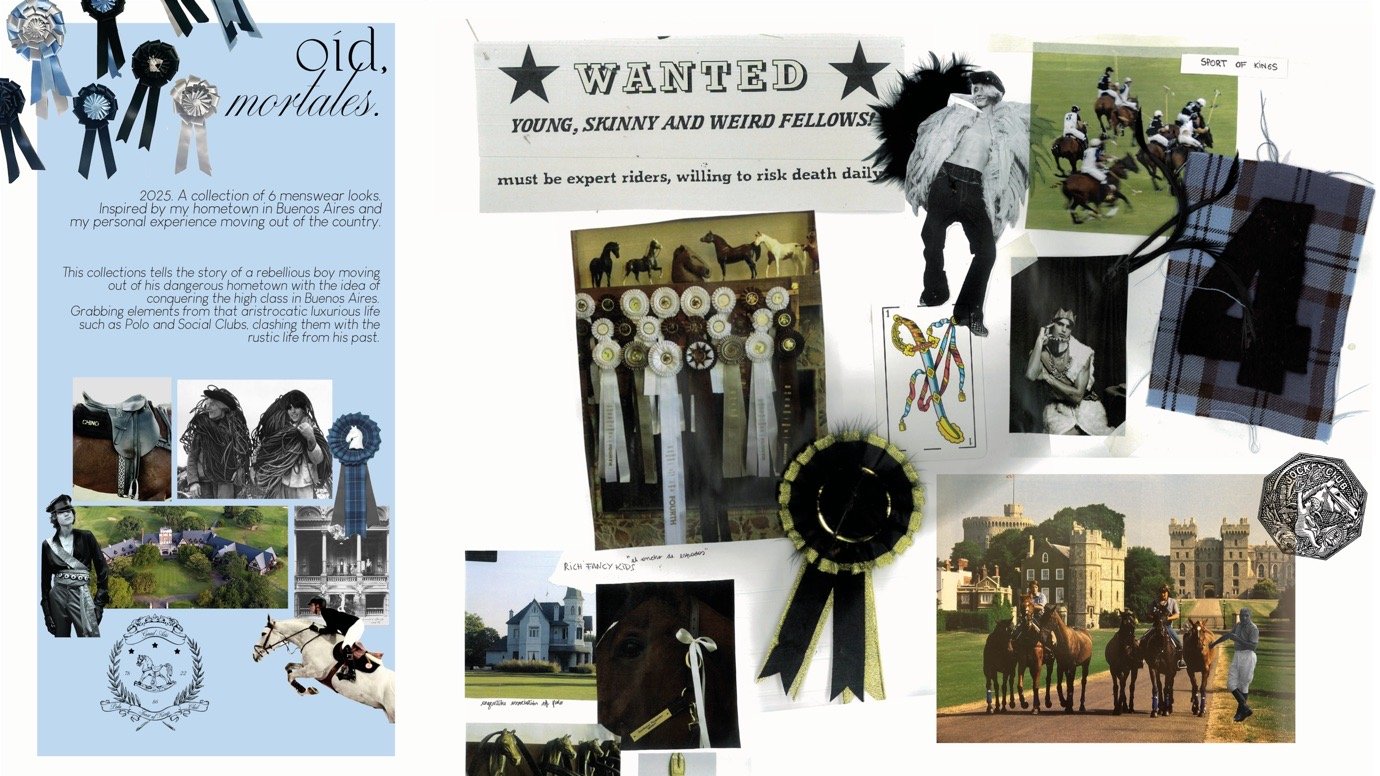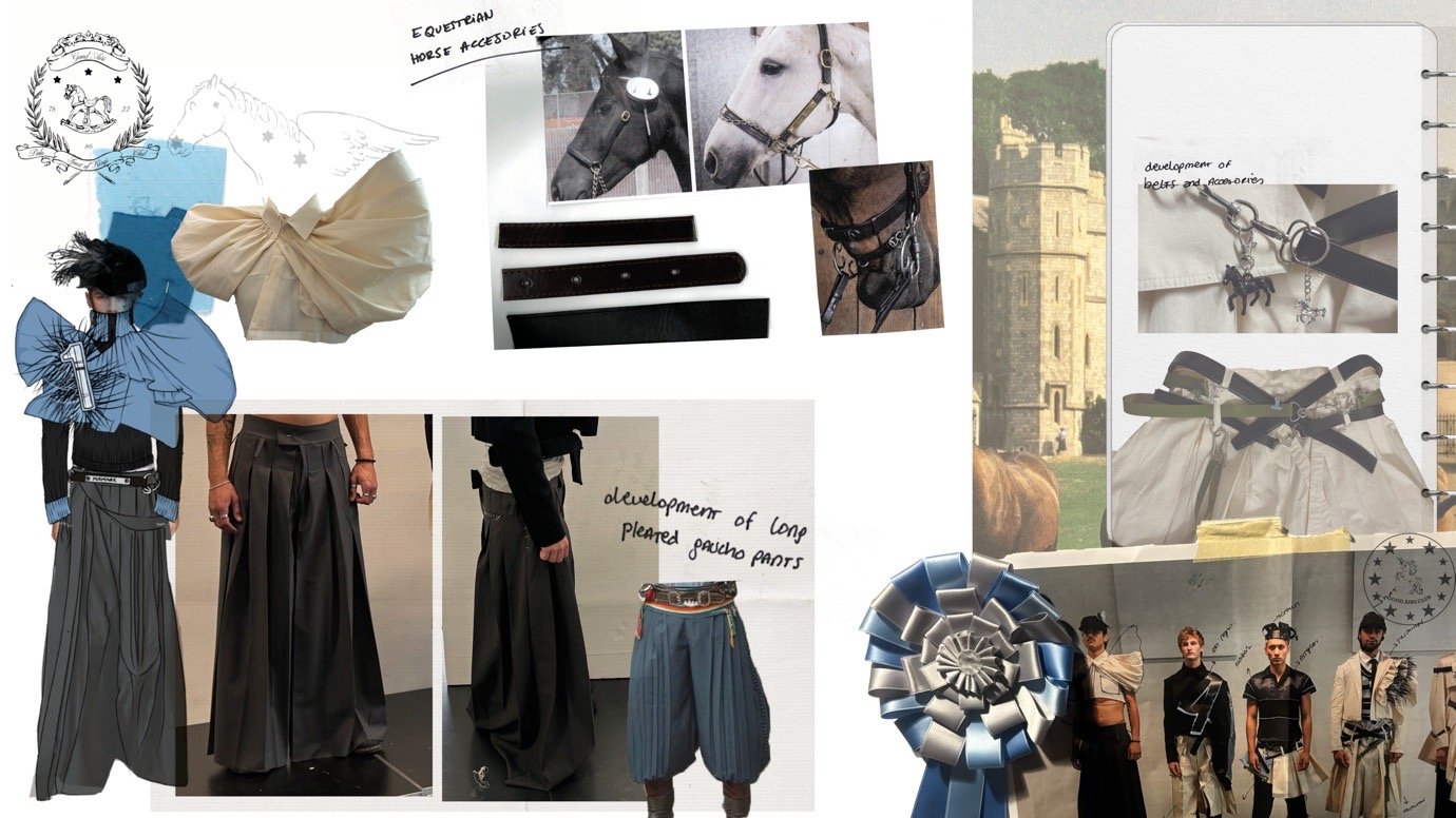


Amina Vanneling
Gothenburg, Sweden
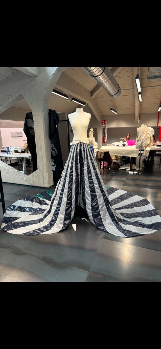
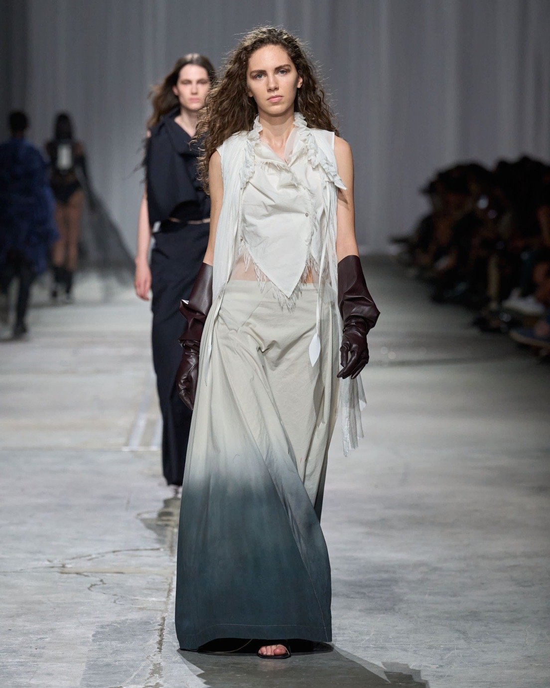
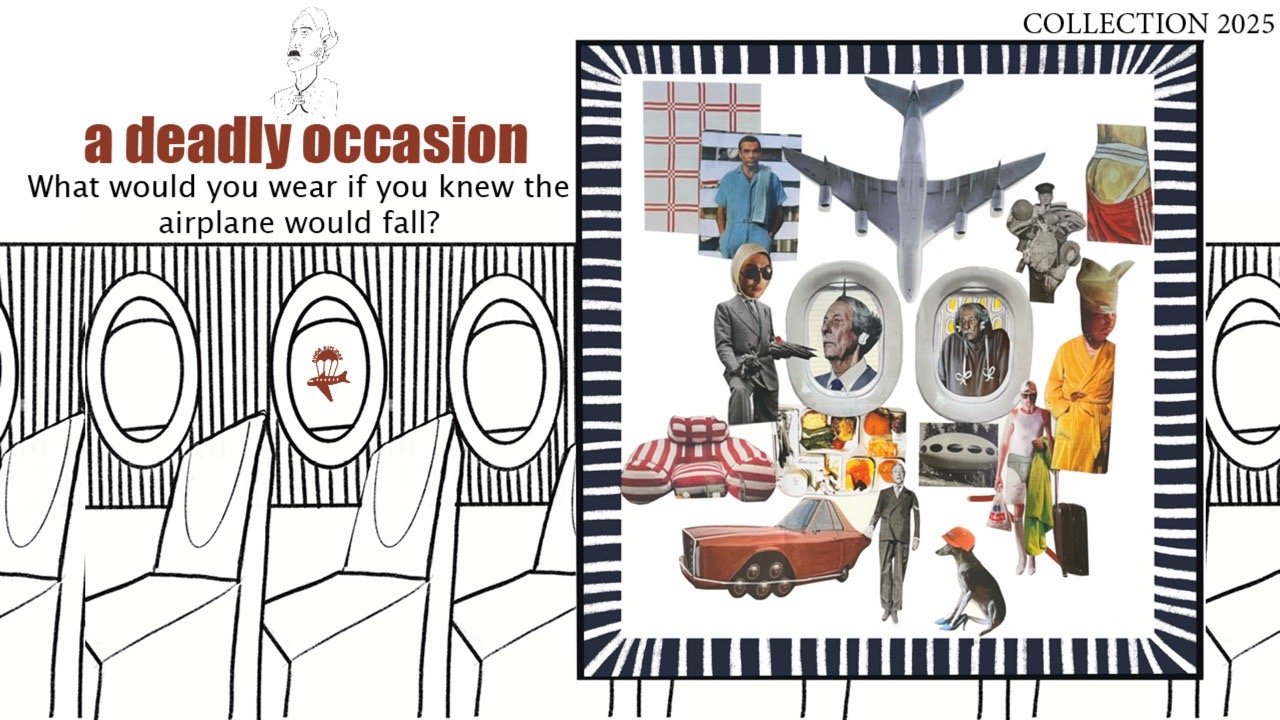
“Quiet One-Sided Rain (Gothenburg Rain)”
What are the key inspirations behind this collection?
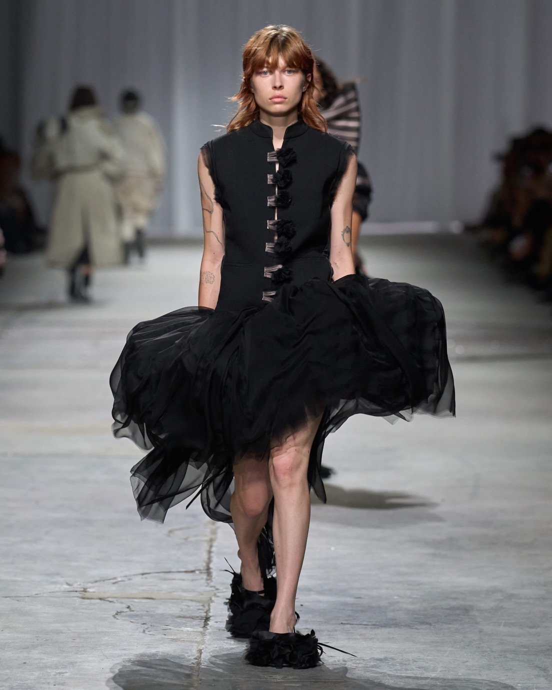
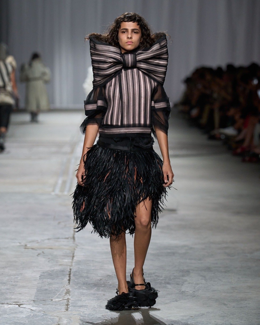
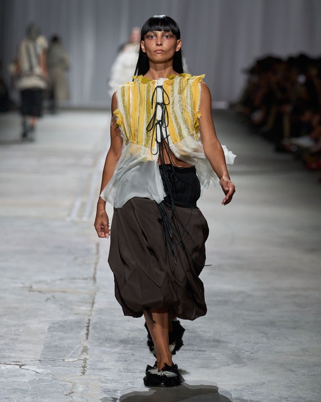
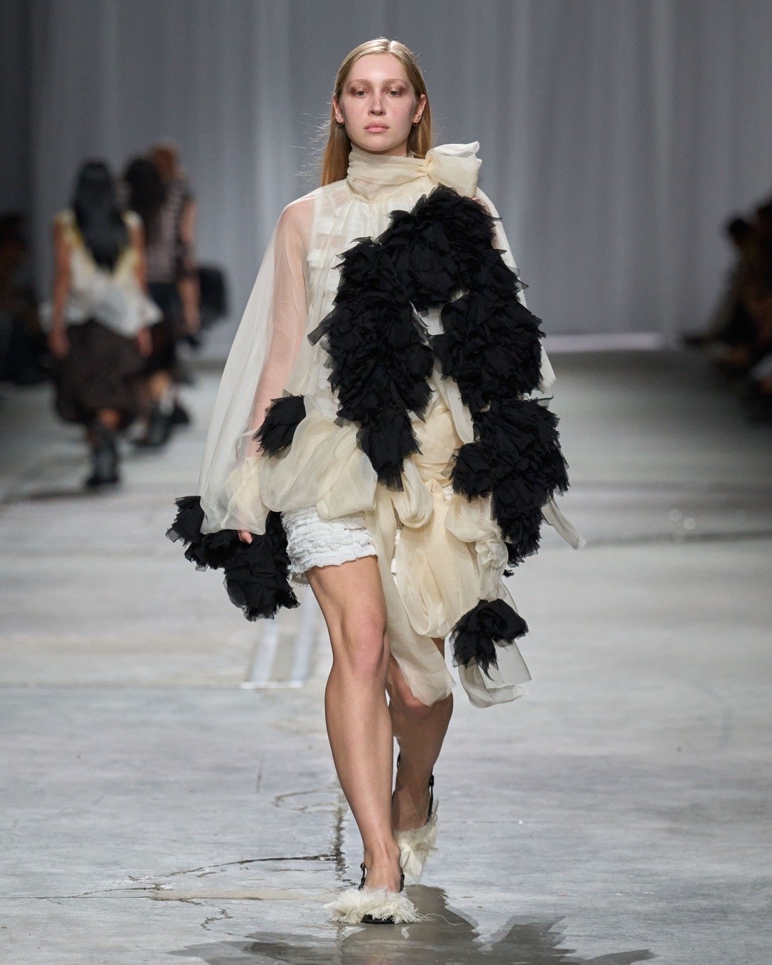
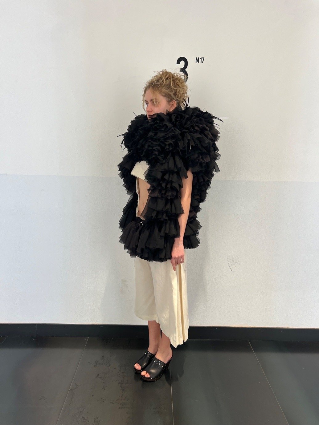
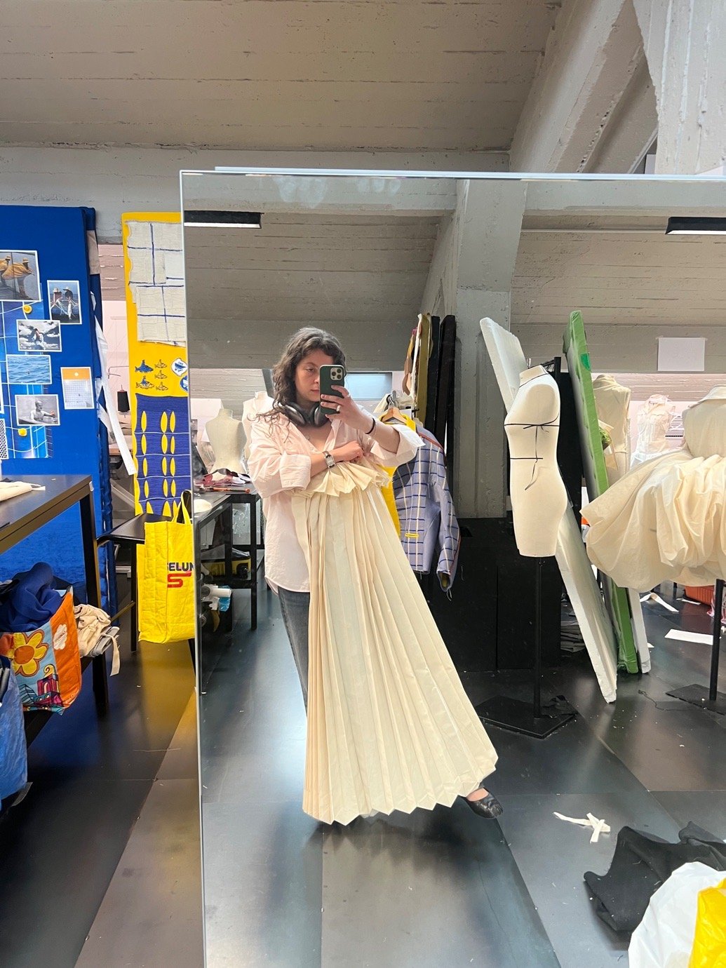
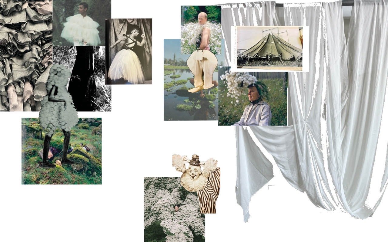
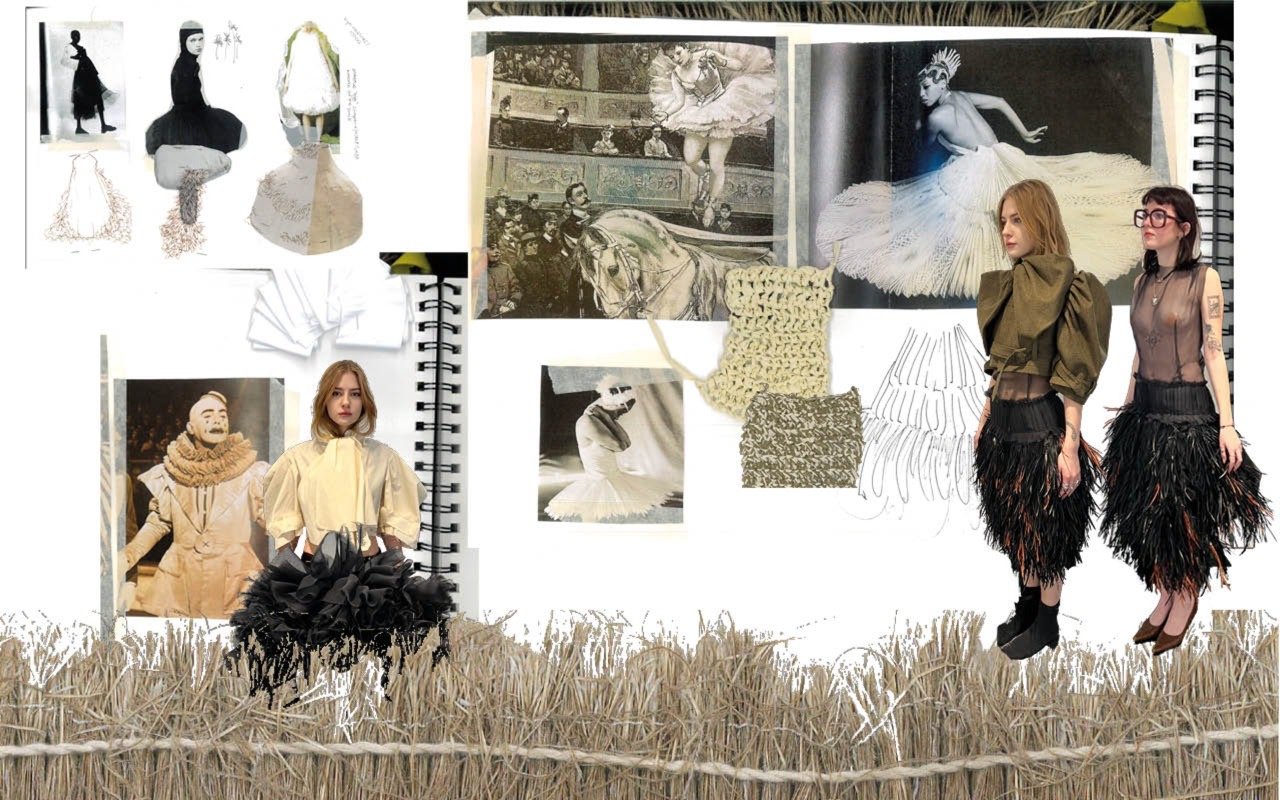
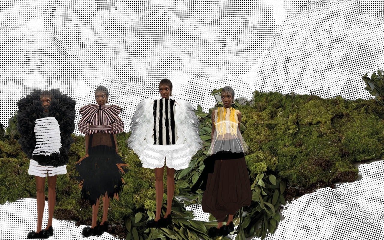
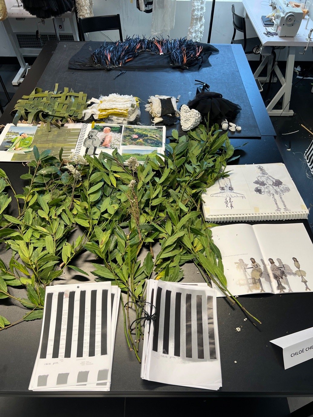
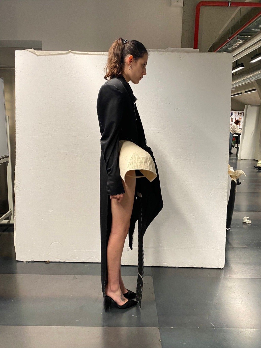
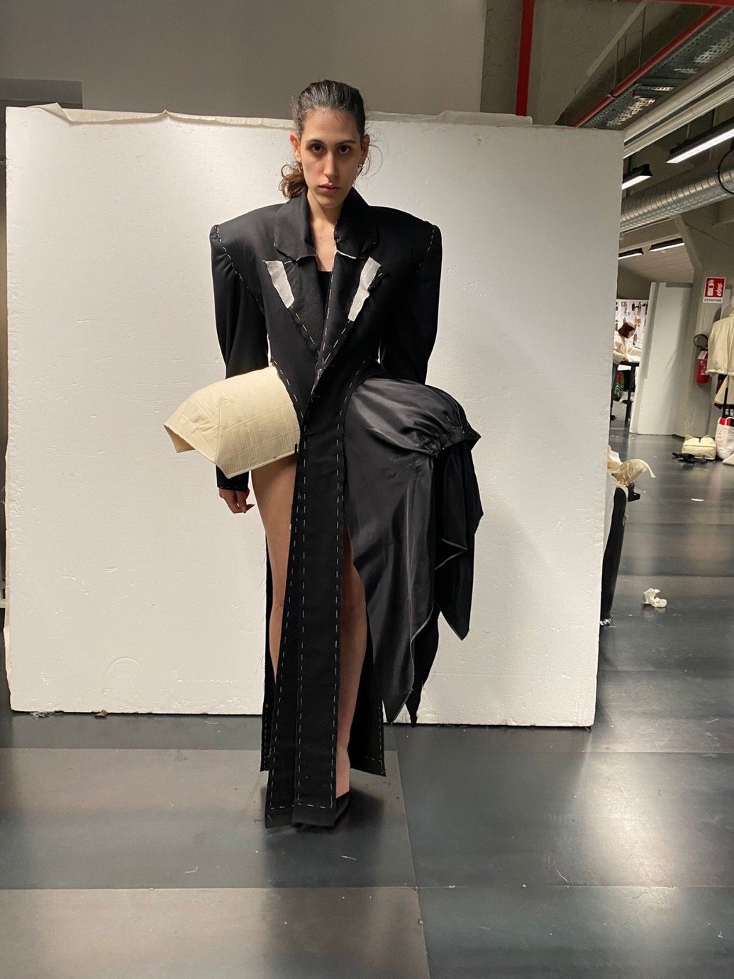
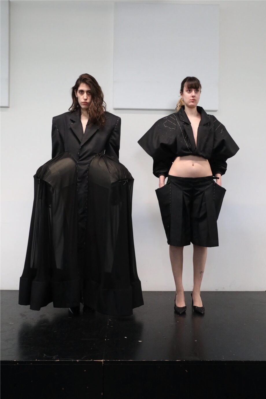
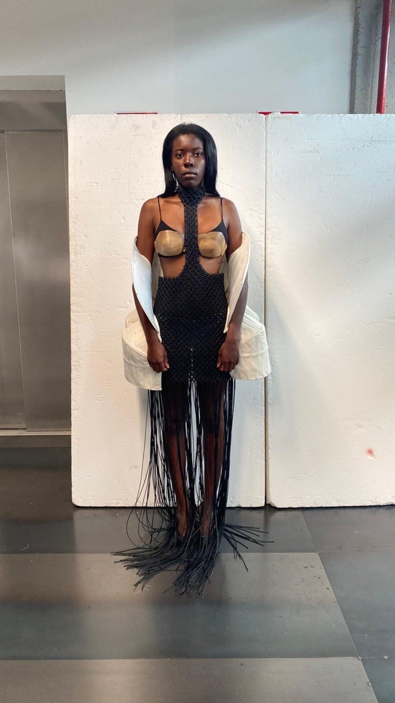
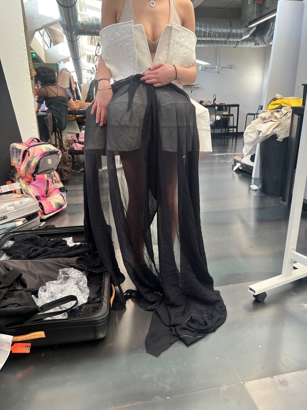
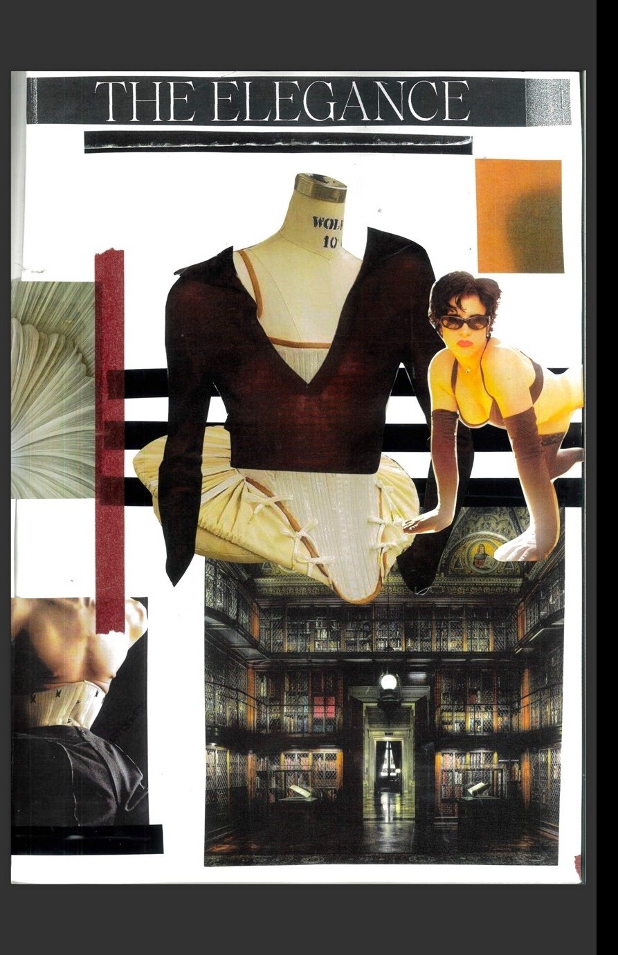
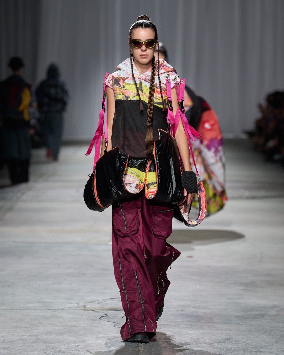
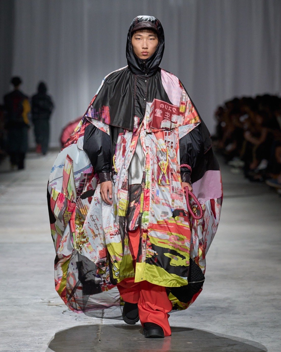
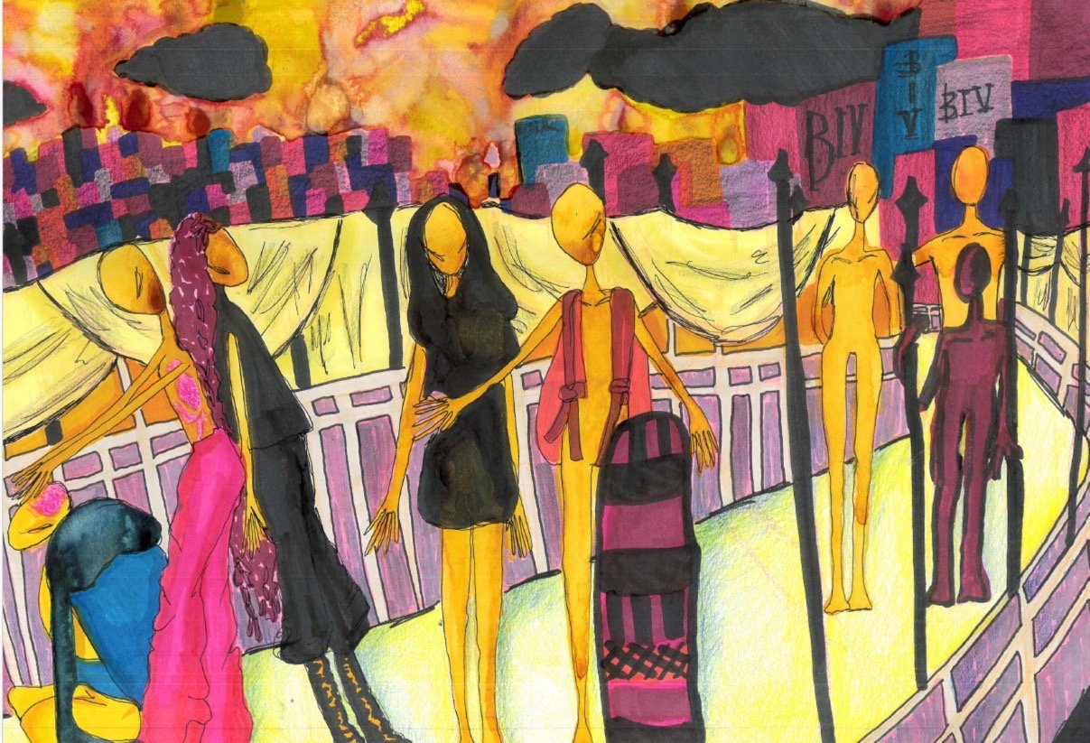
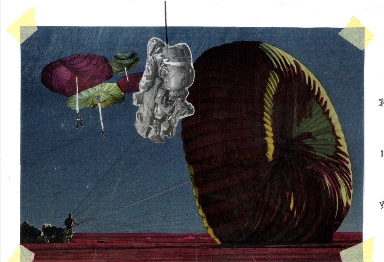
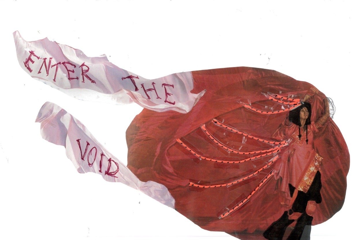
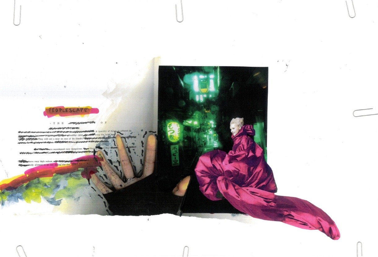
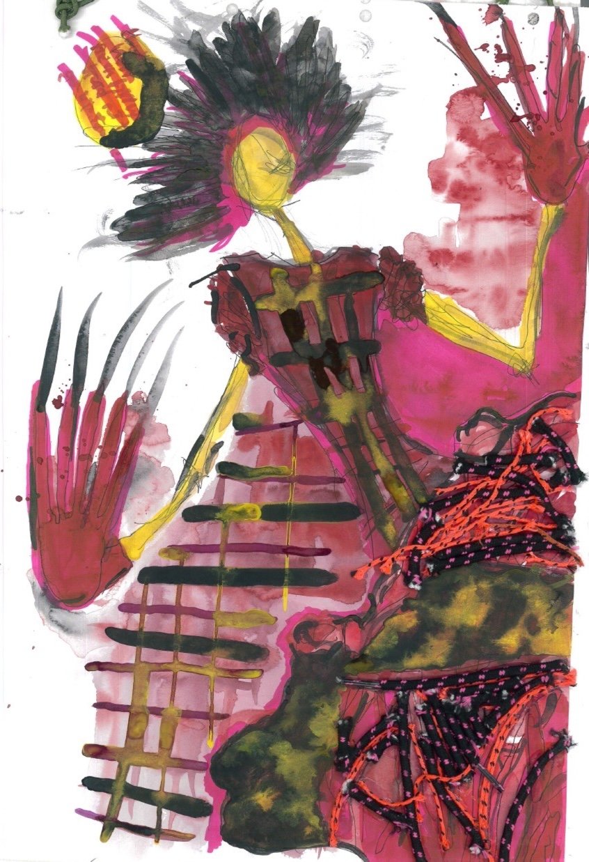
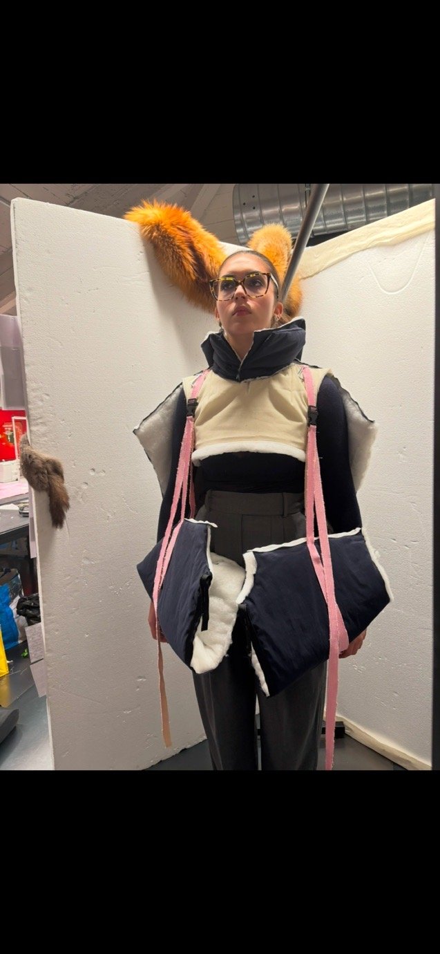
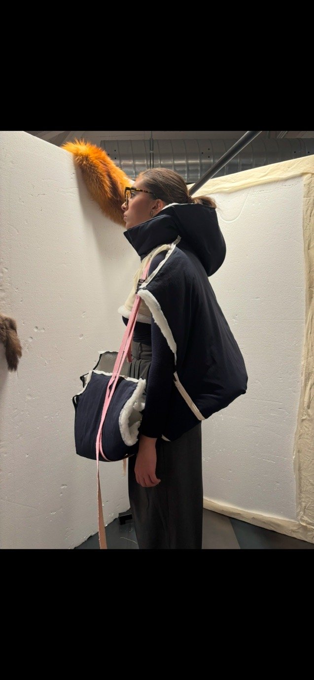
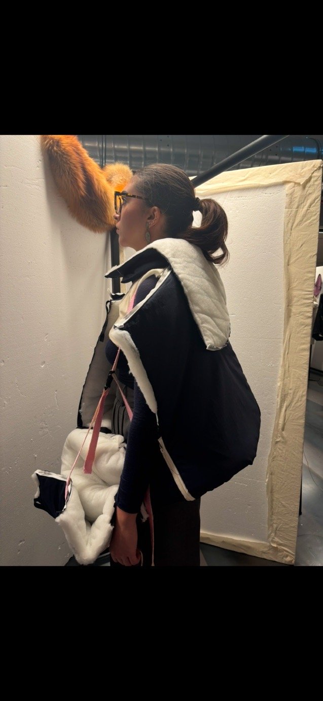
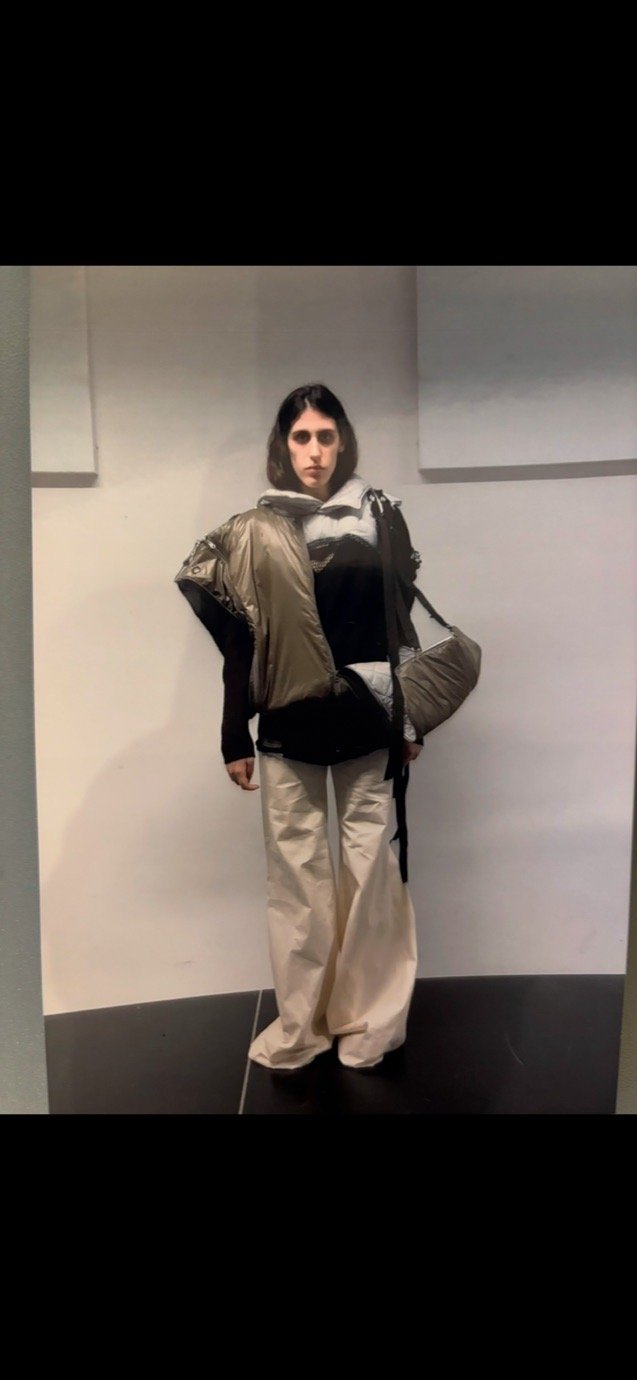
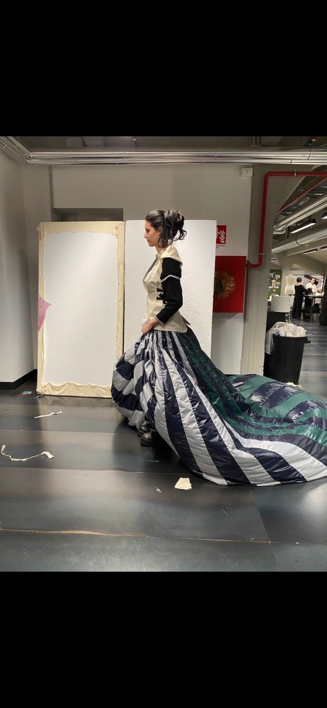
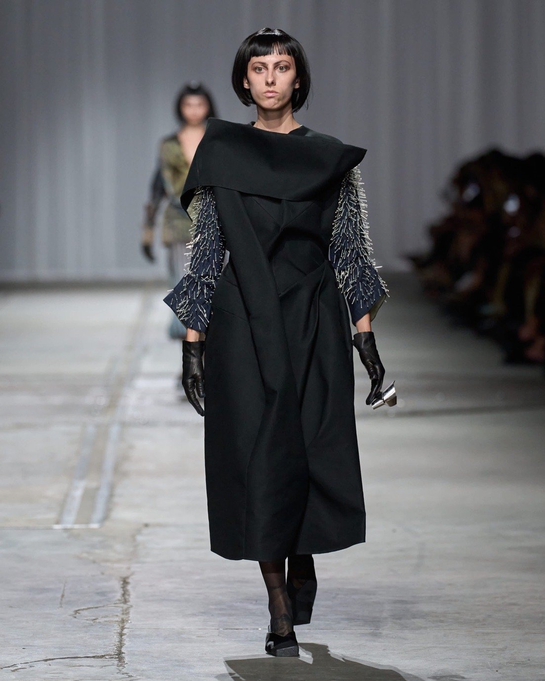
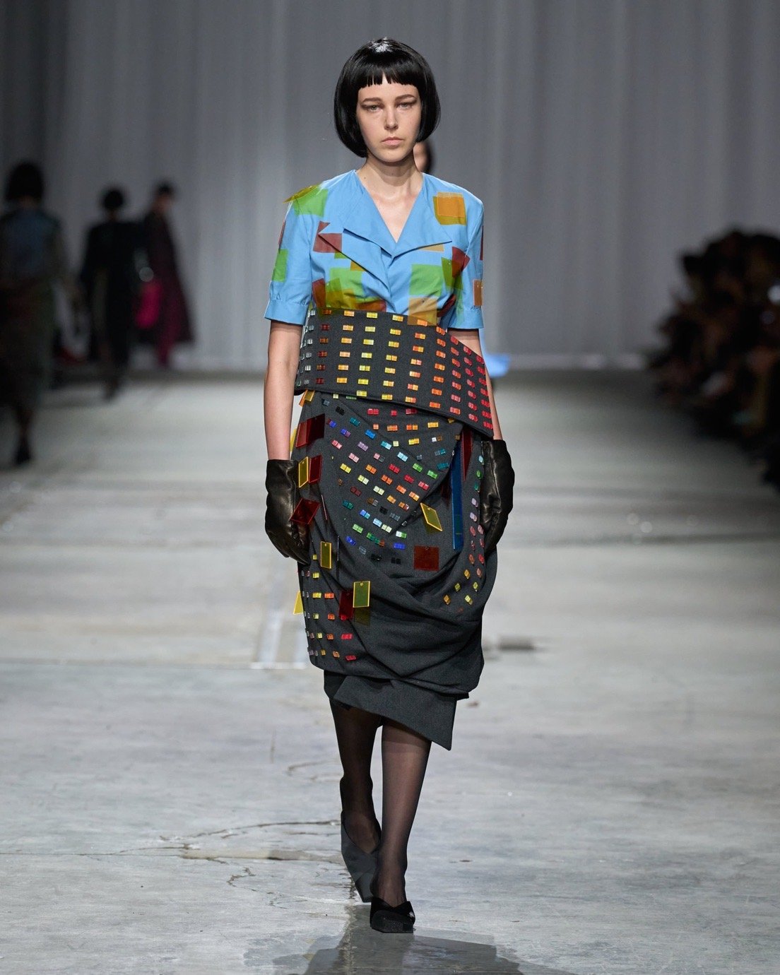
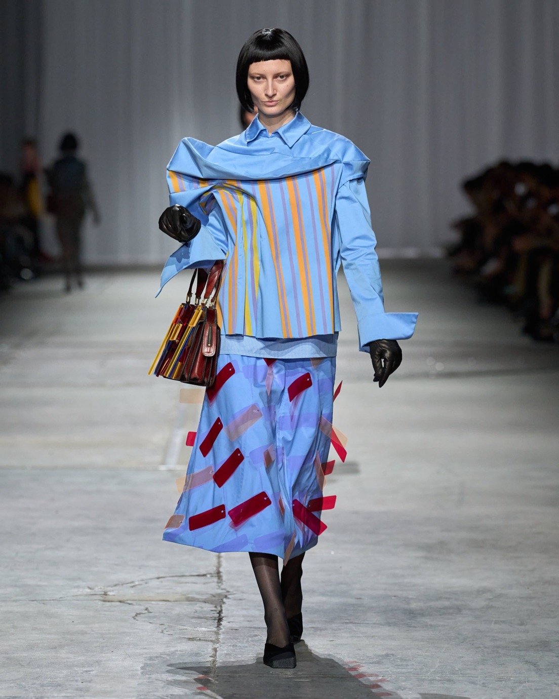
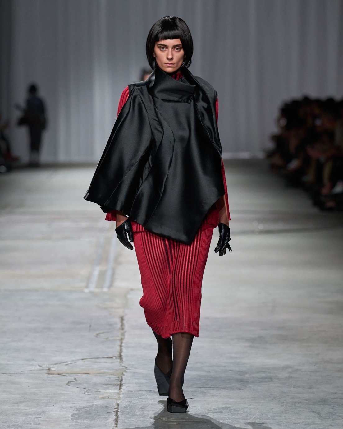
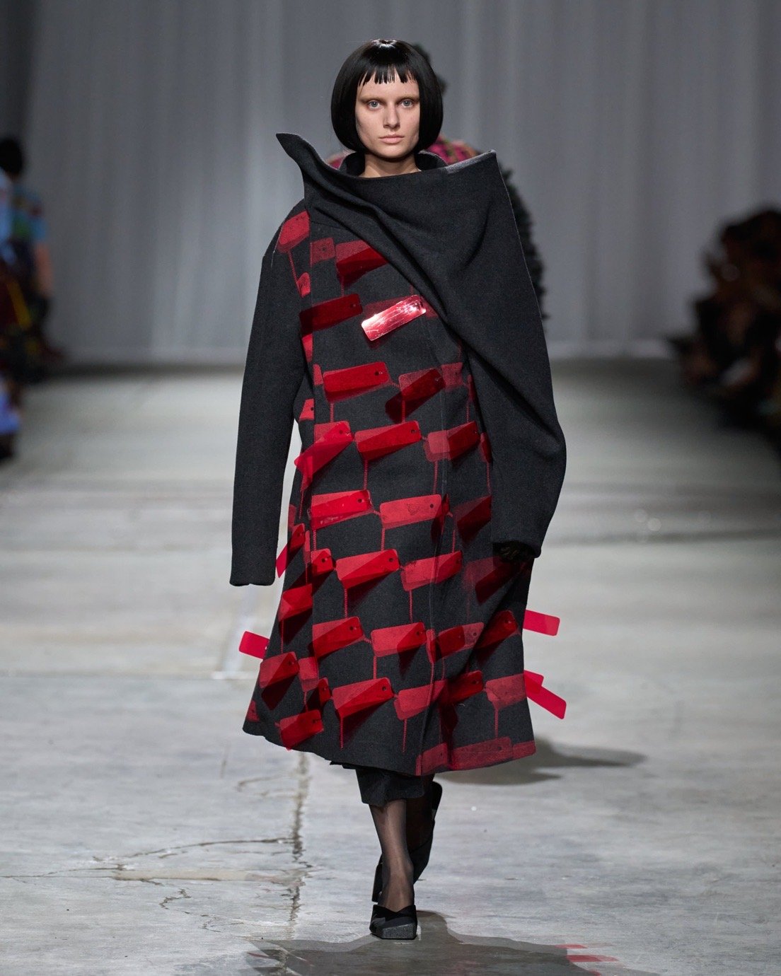
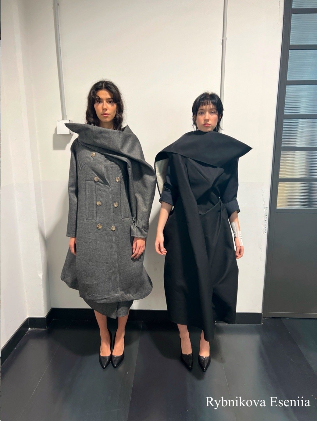
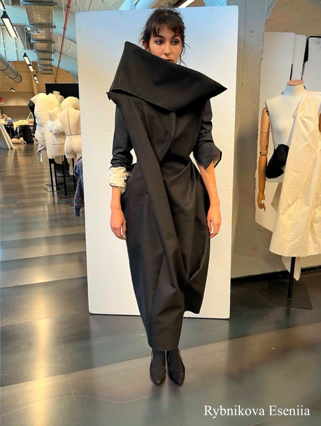
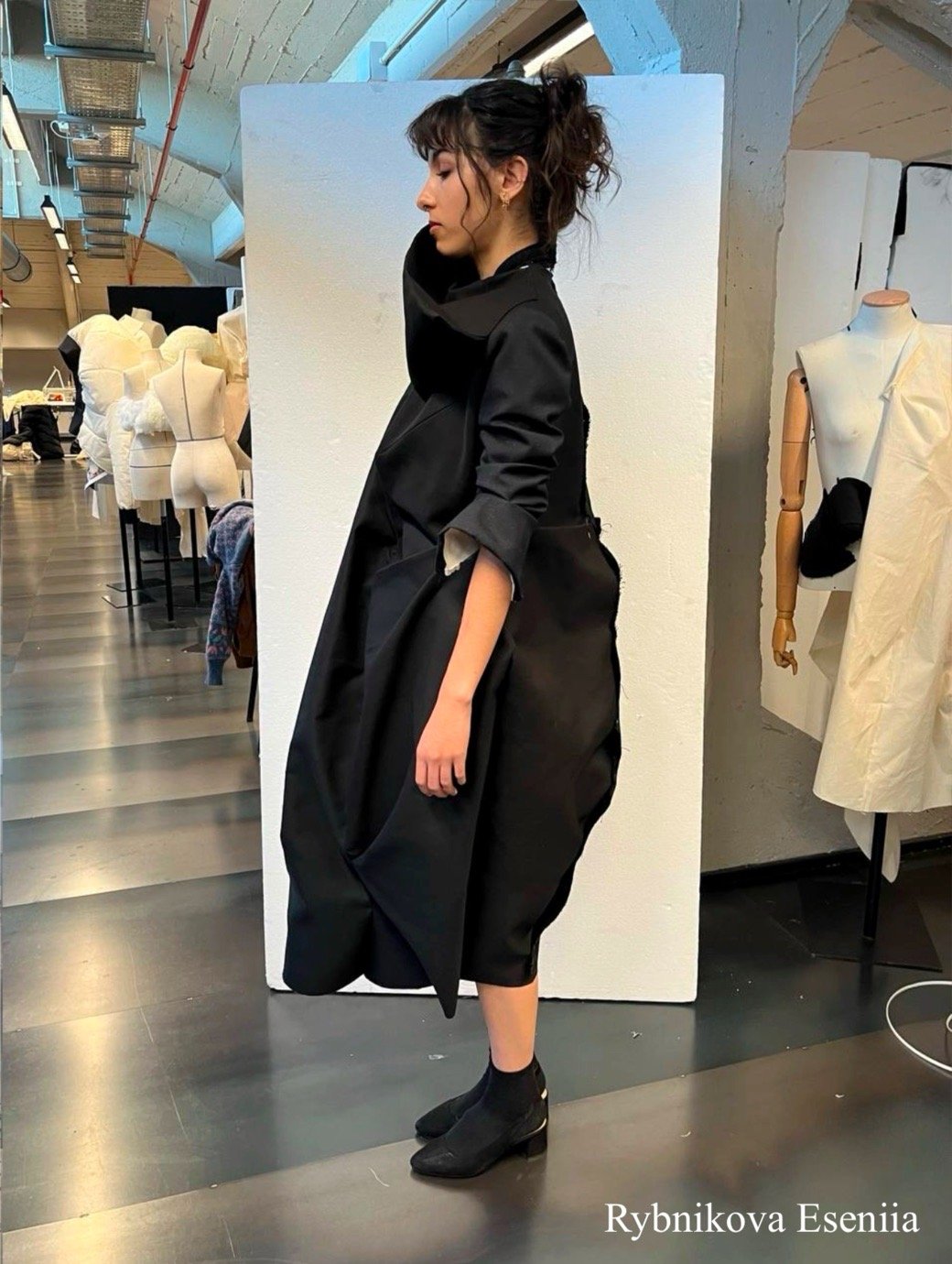
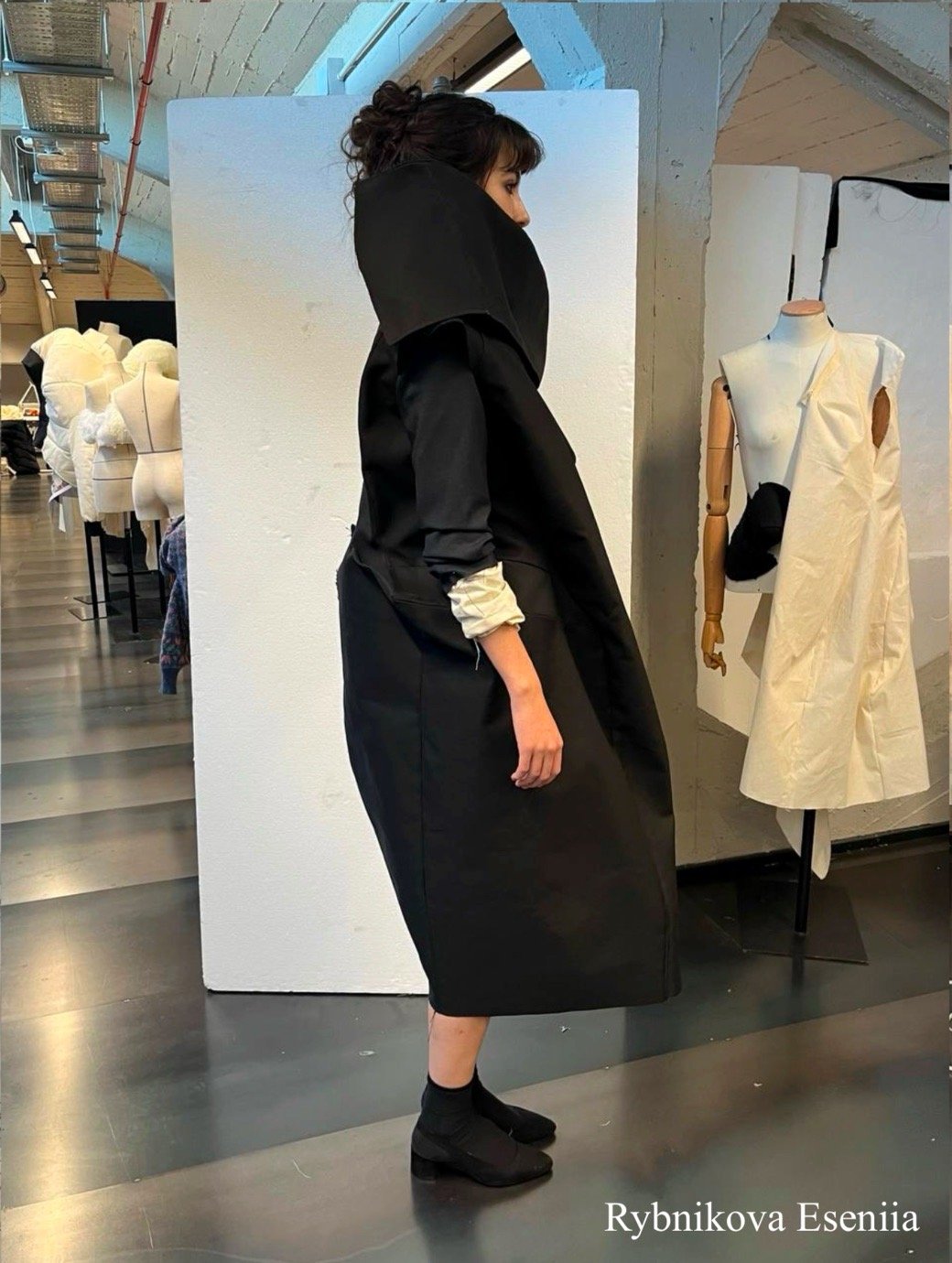
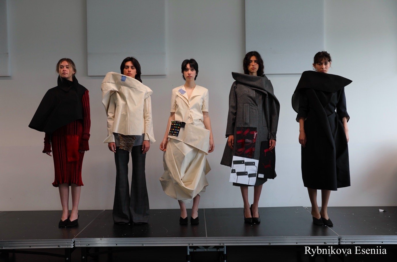
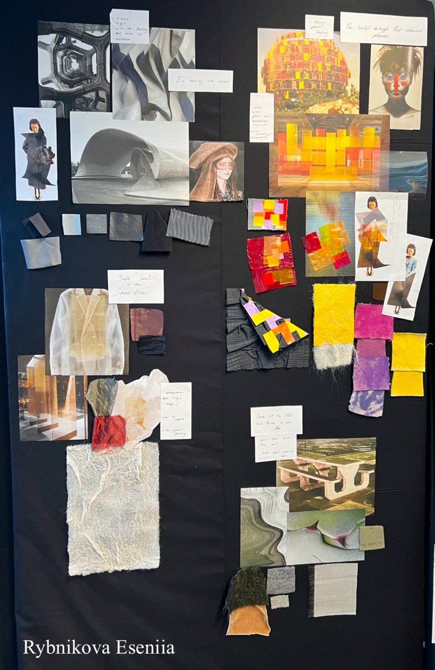
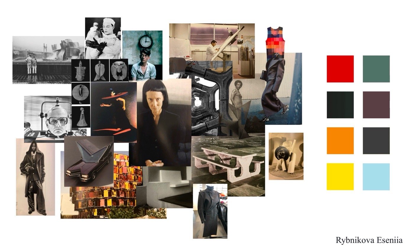
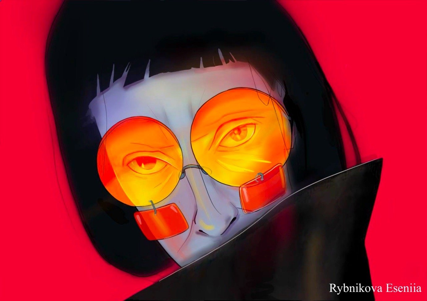
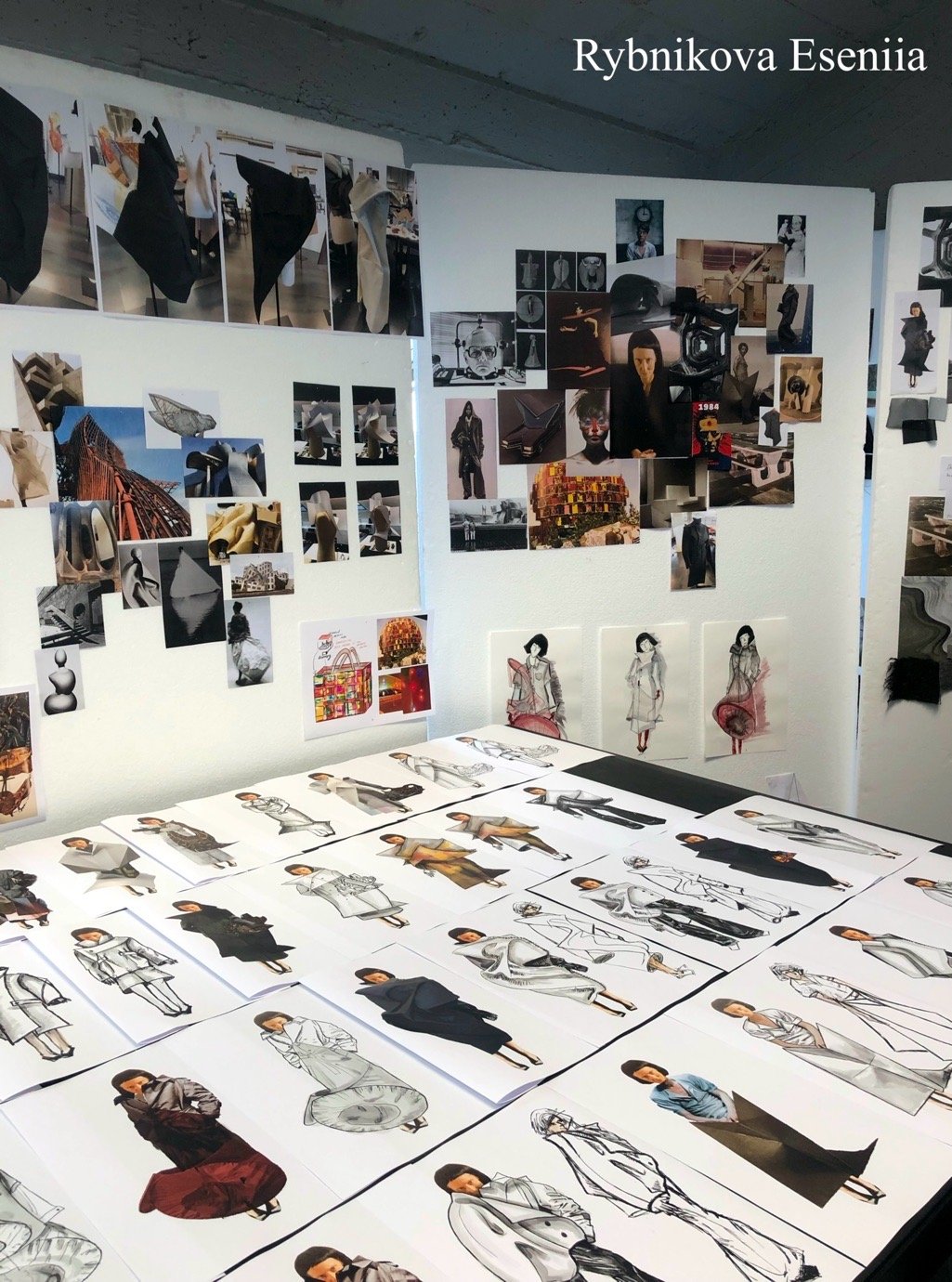
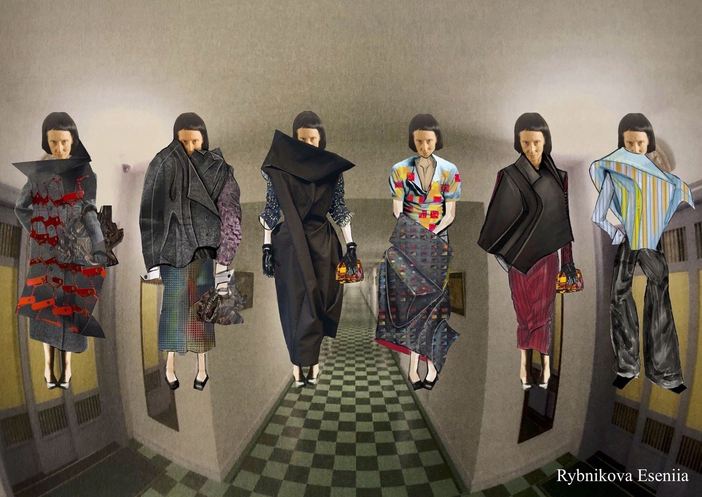
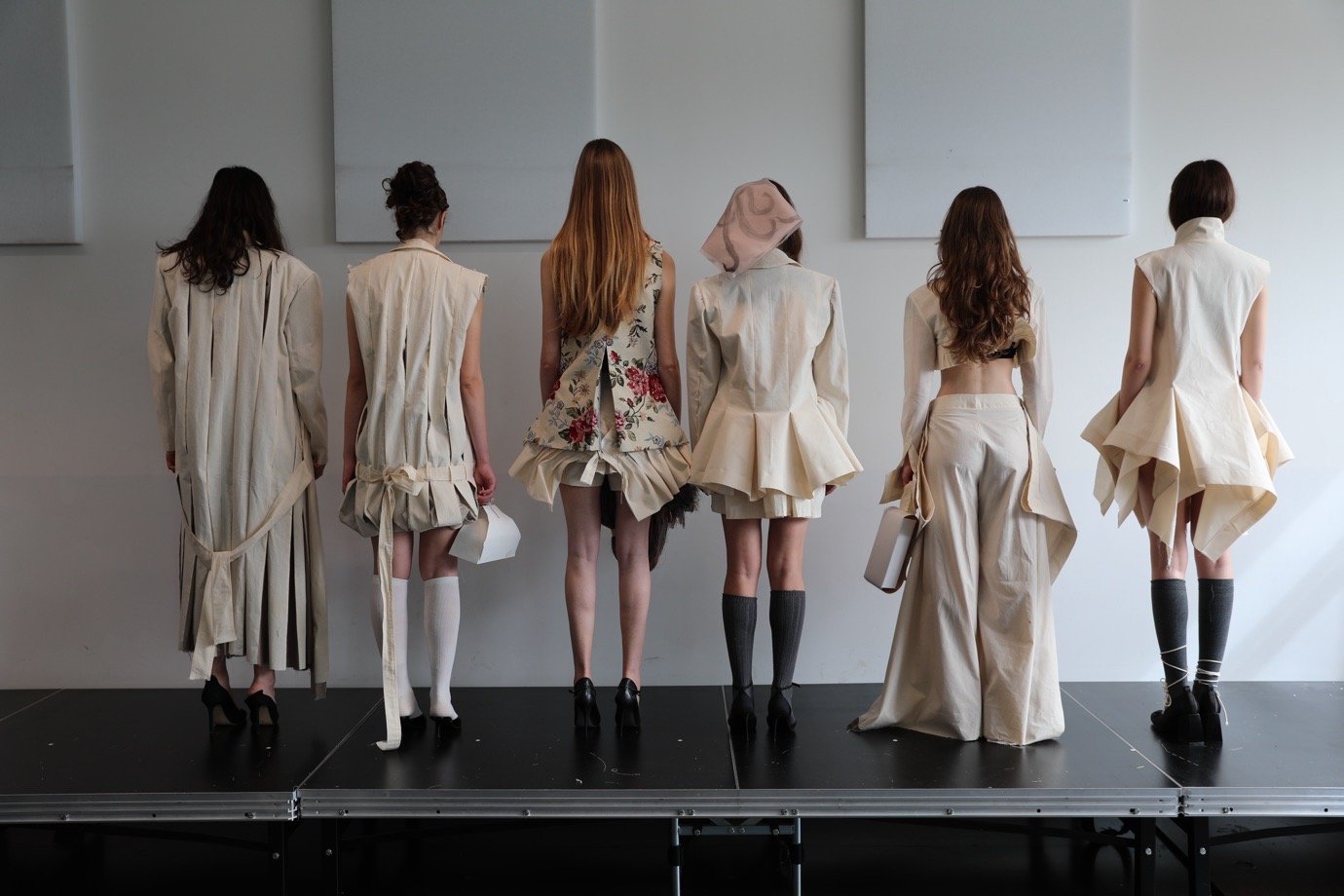
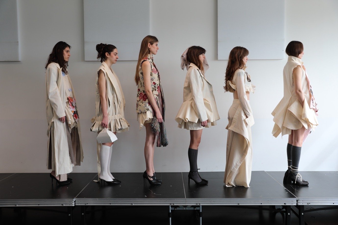
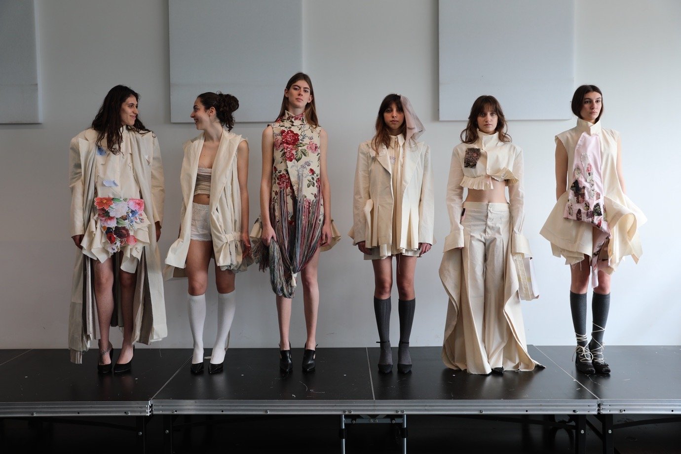
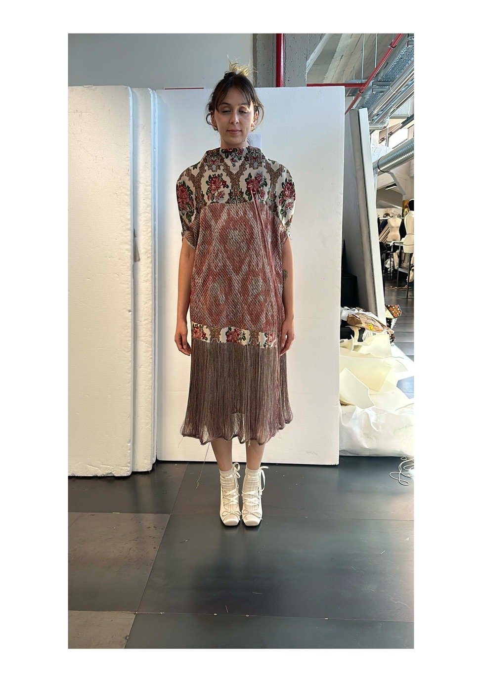
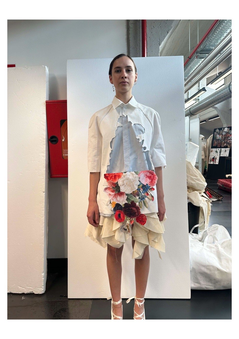
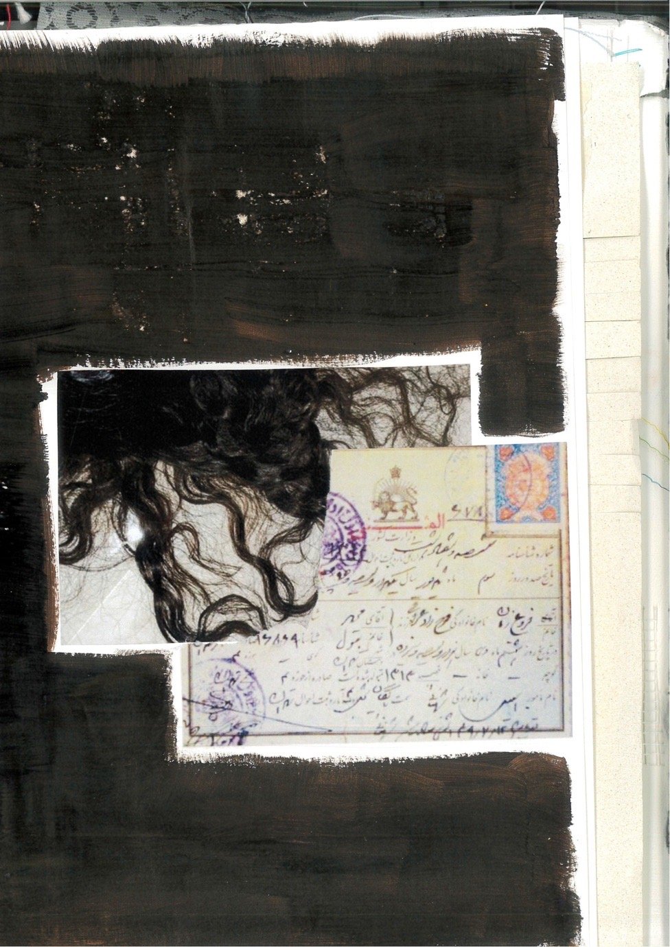
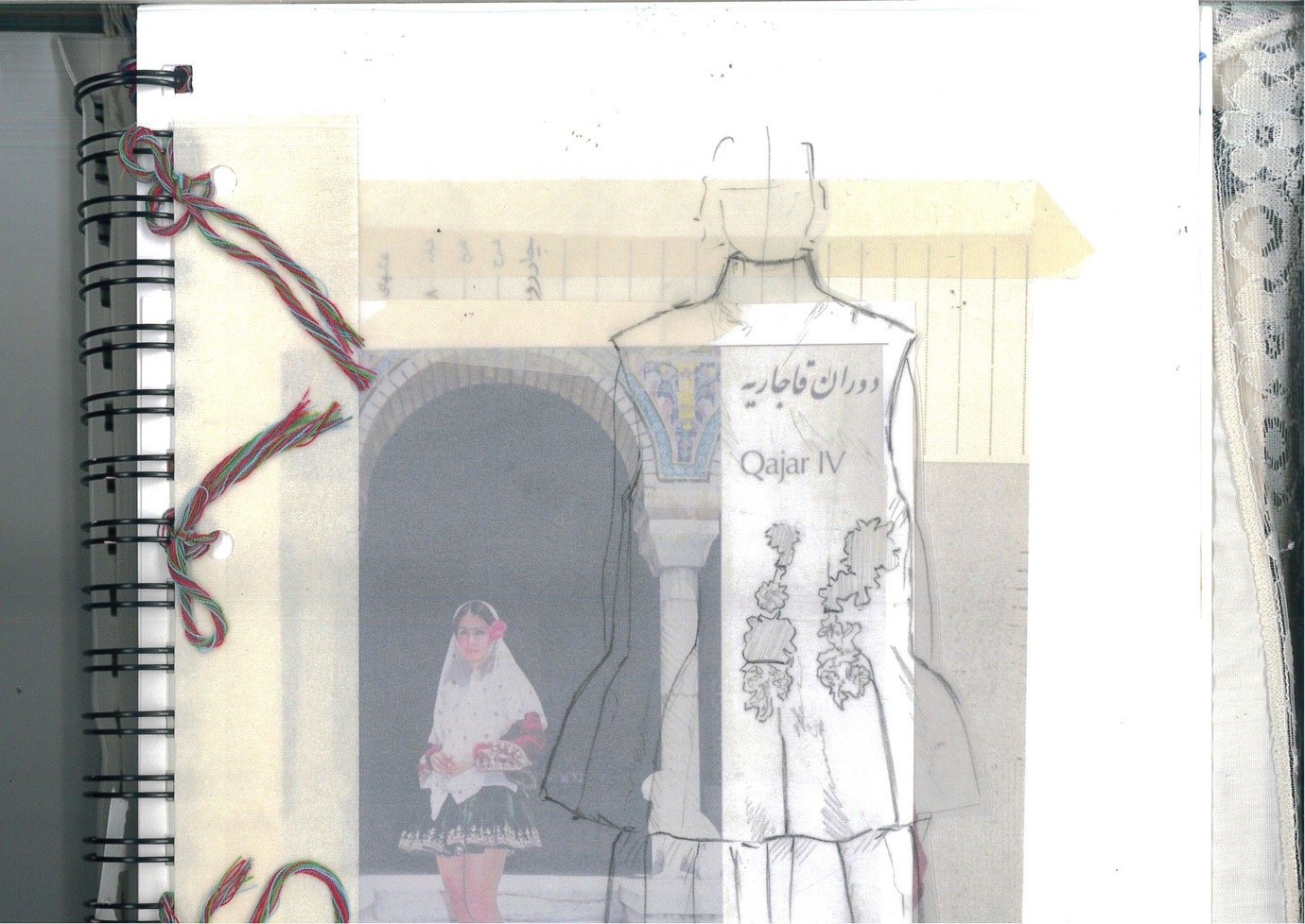
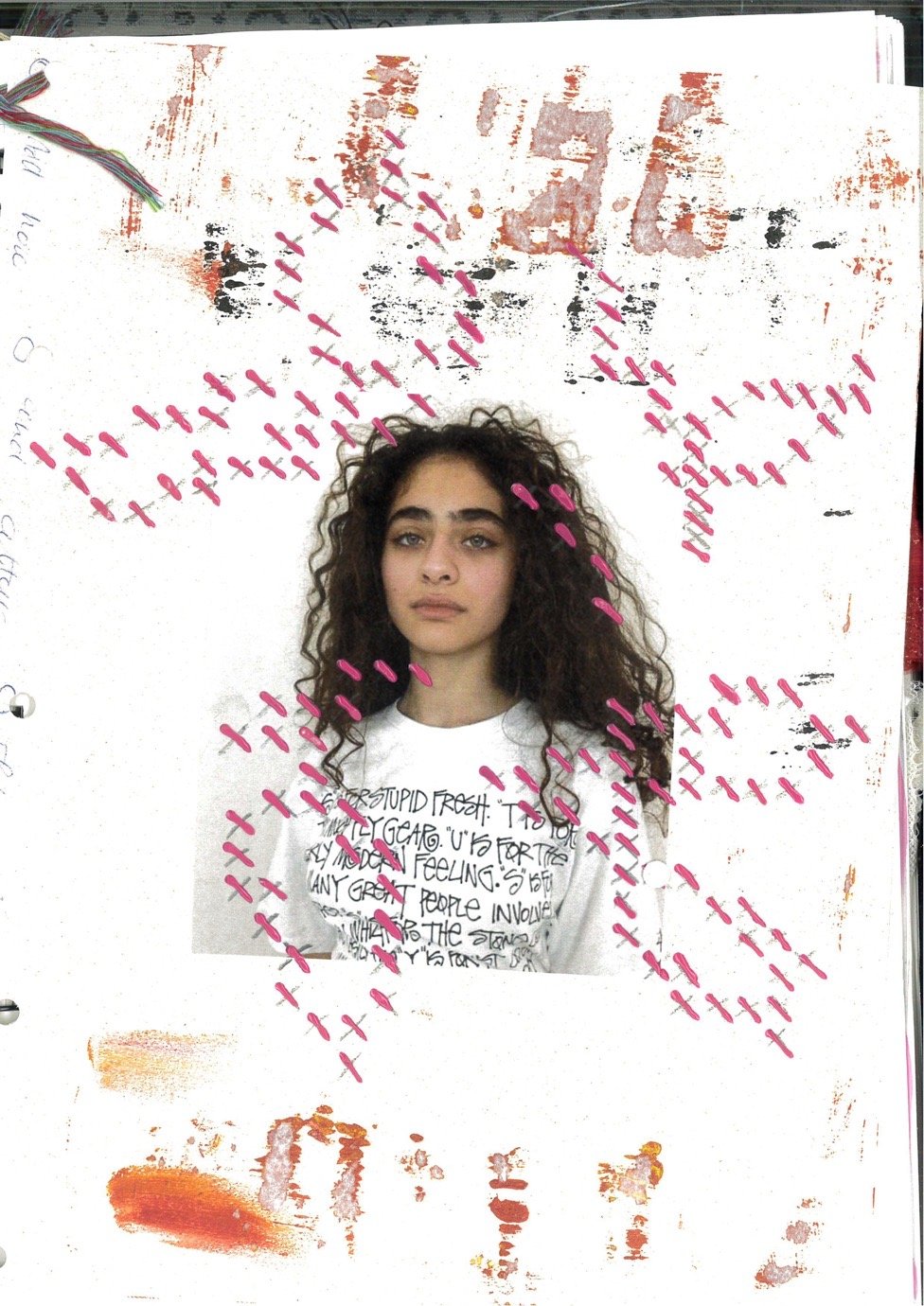
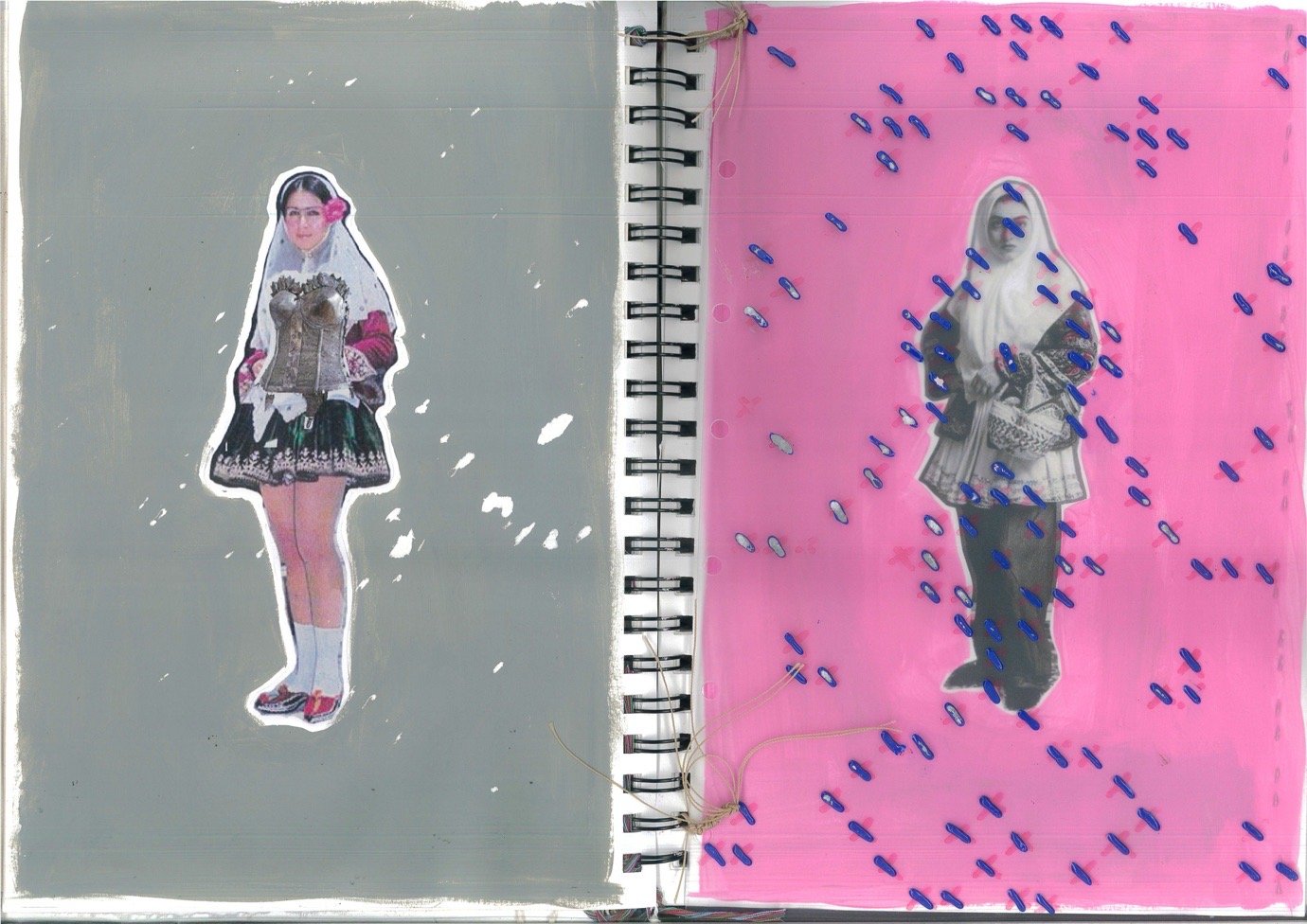
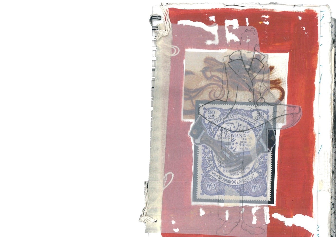
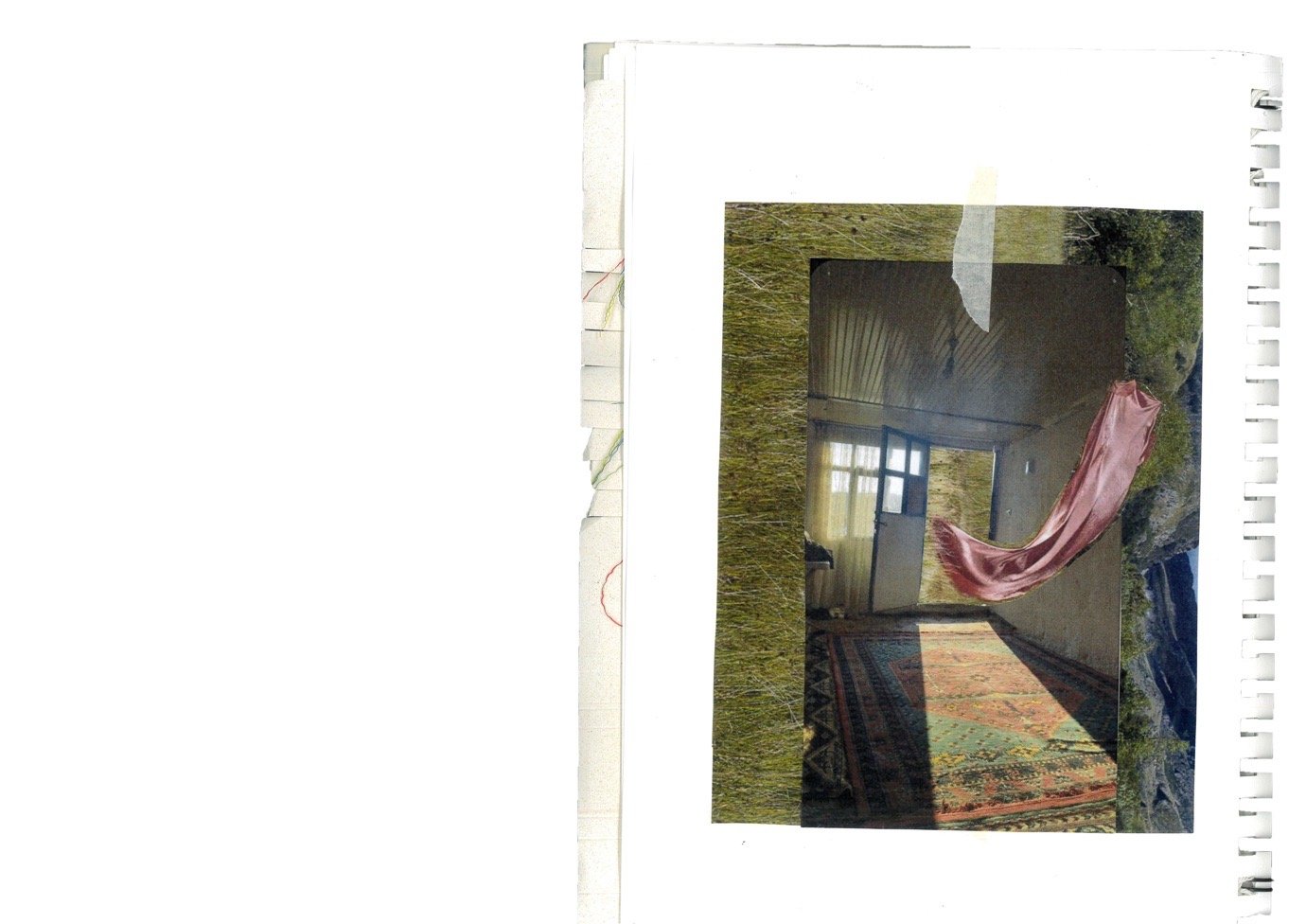
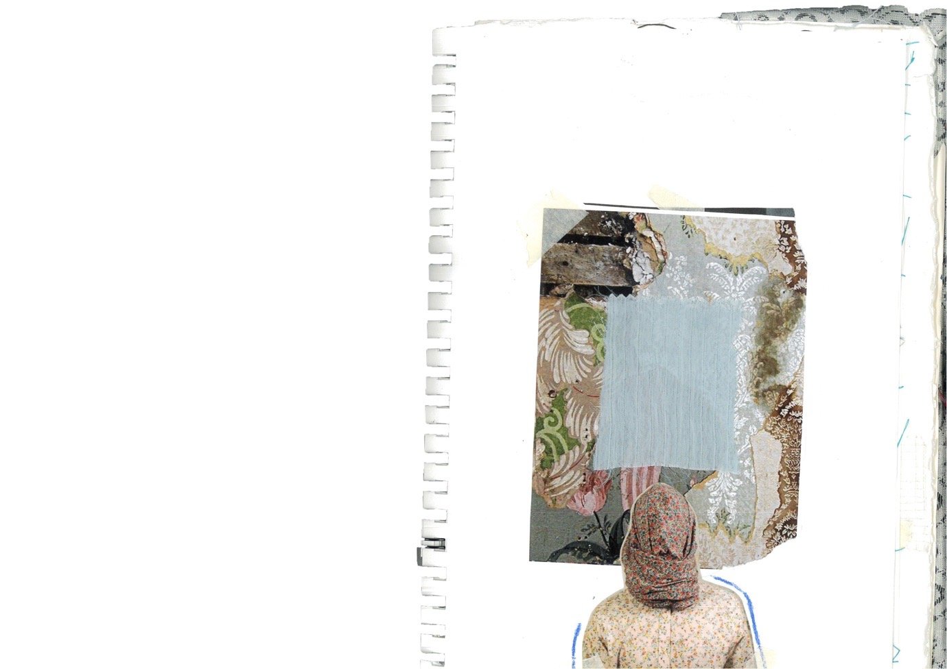
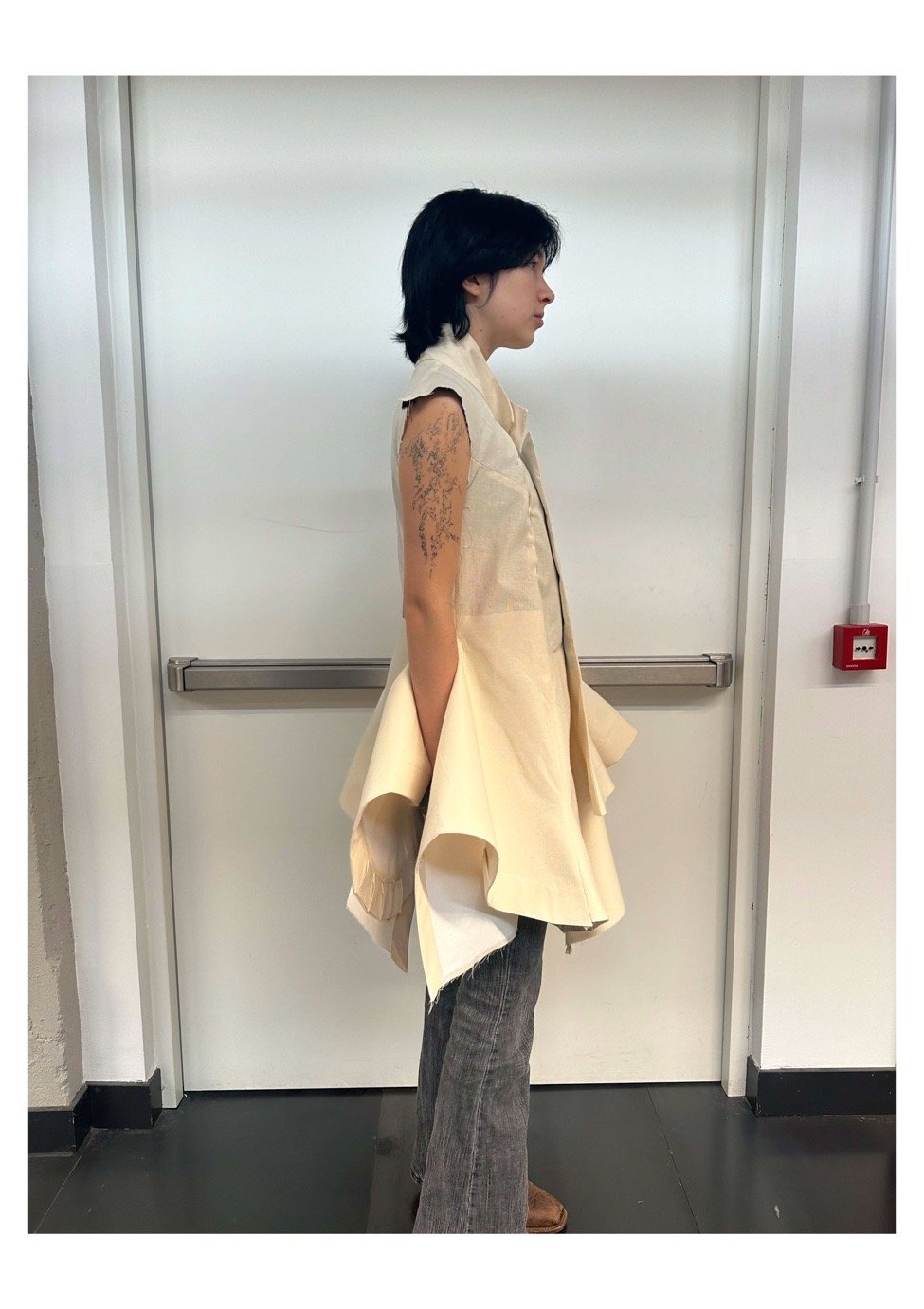
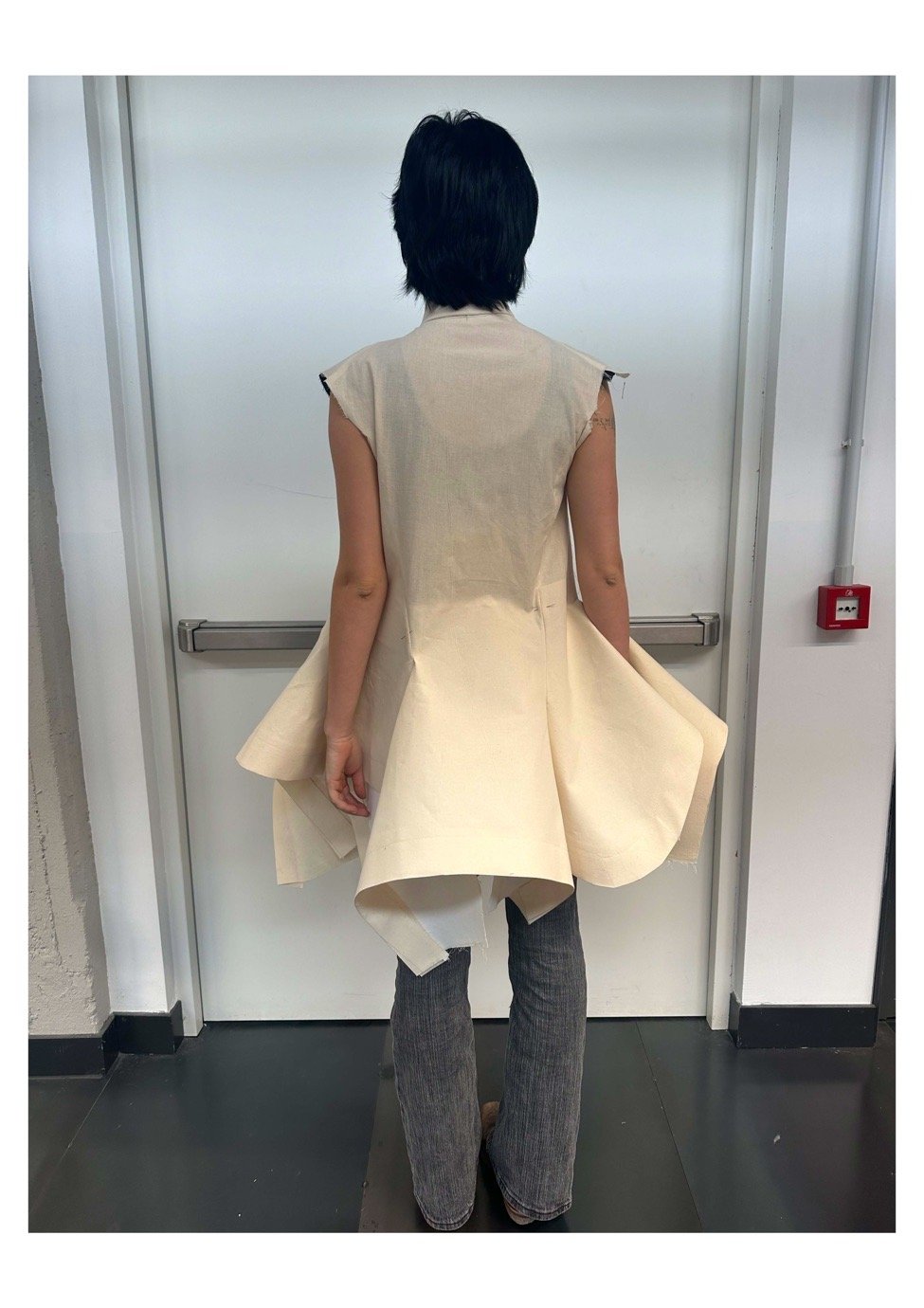
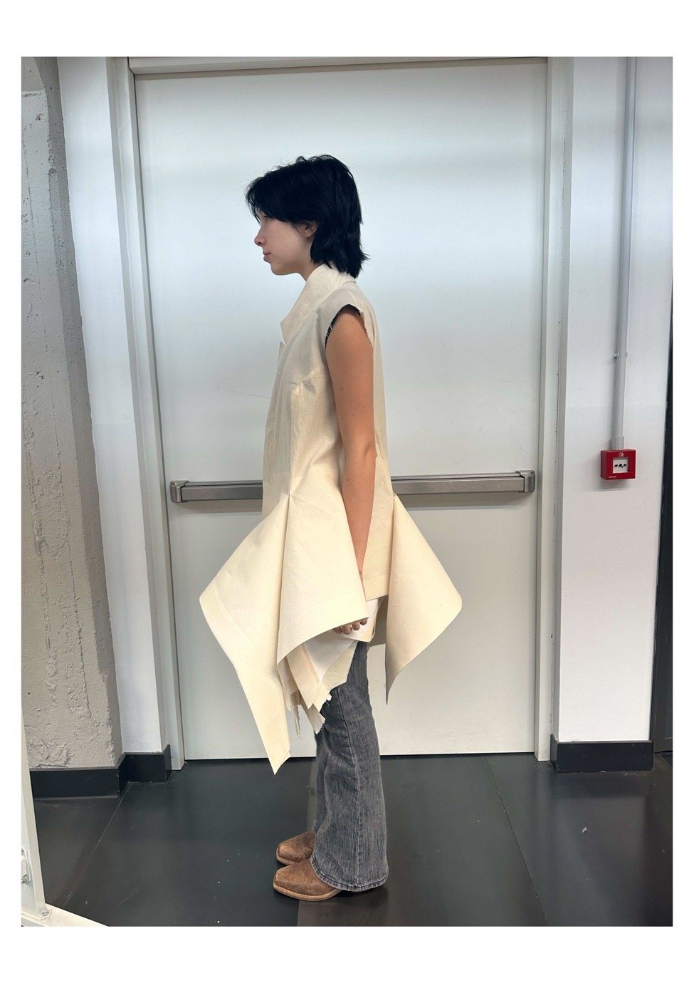
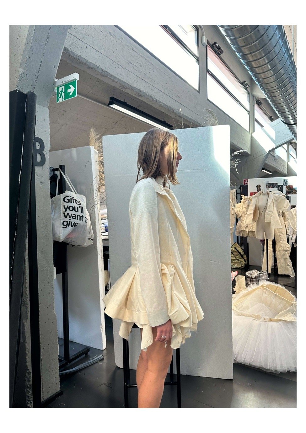
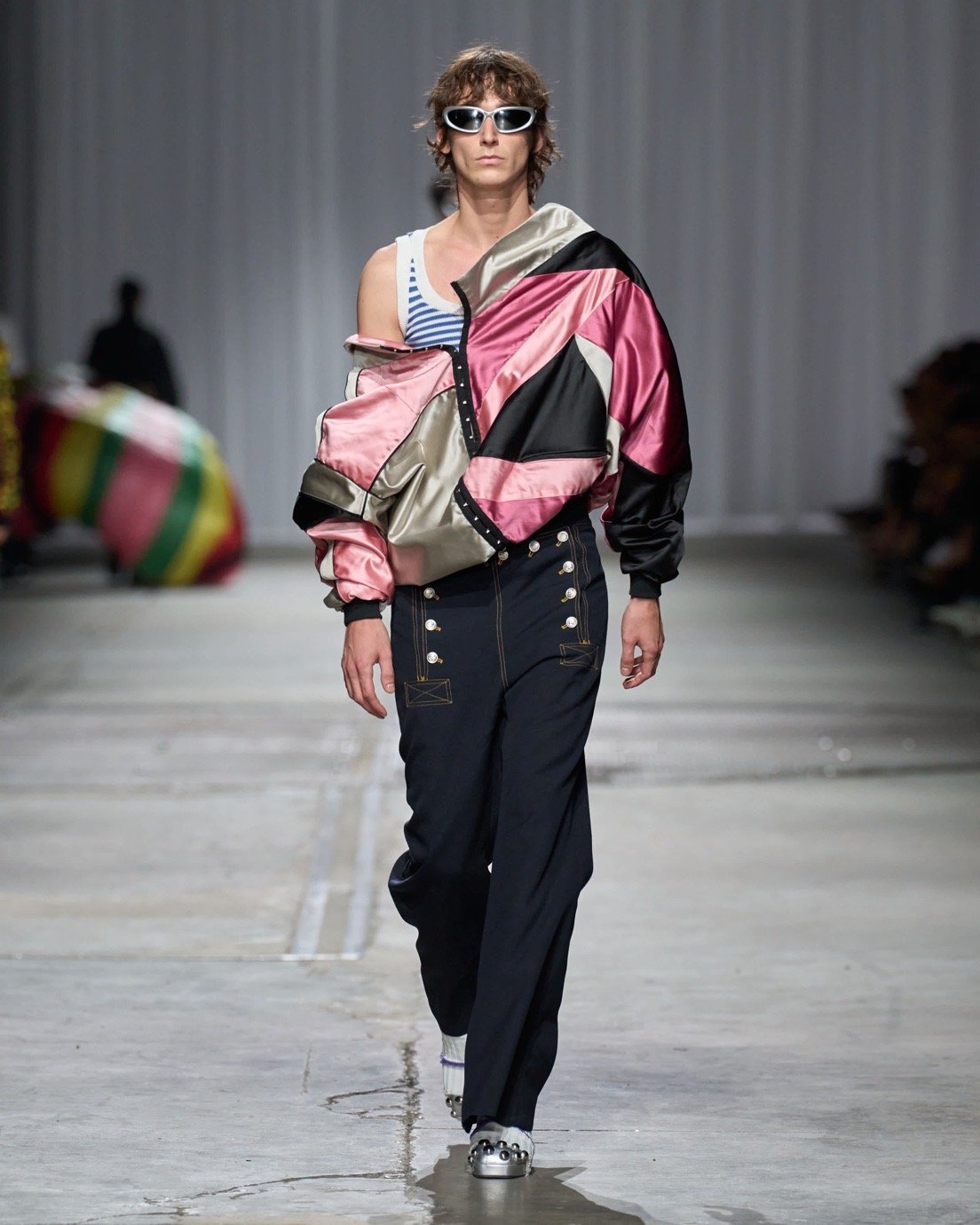
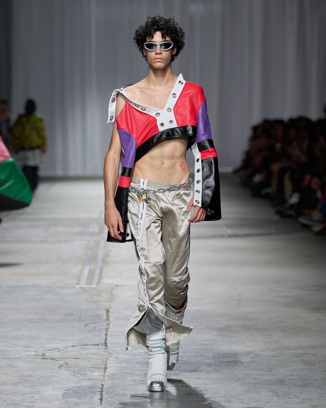
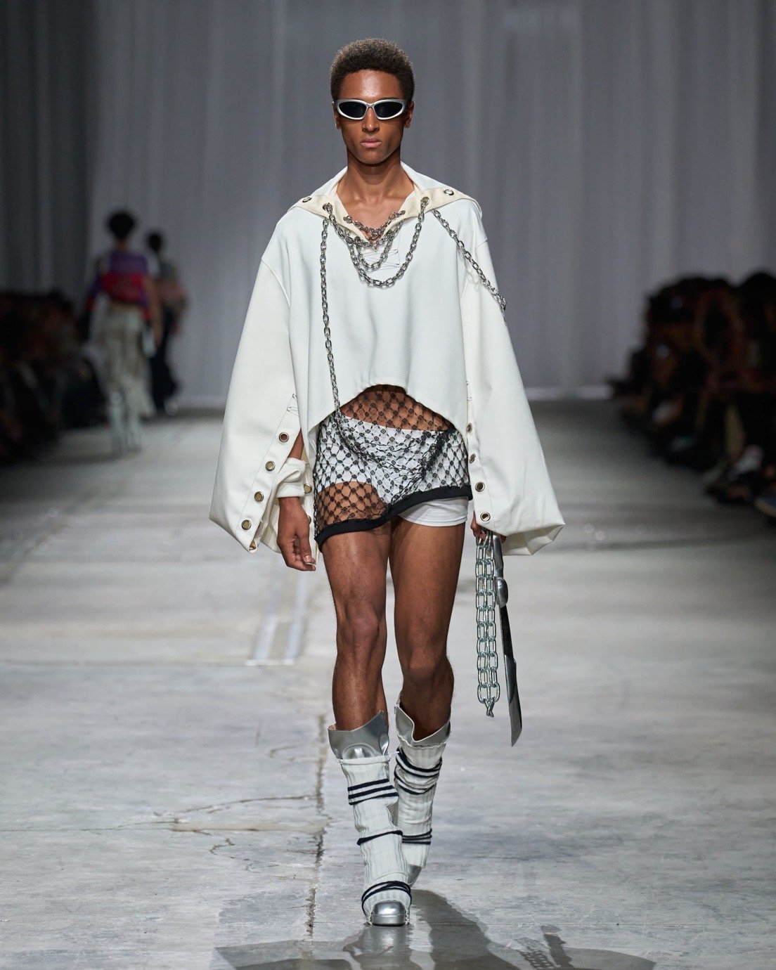
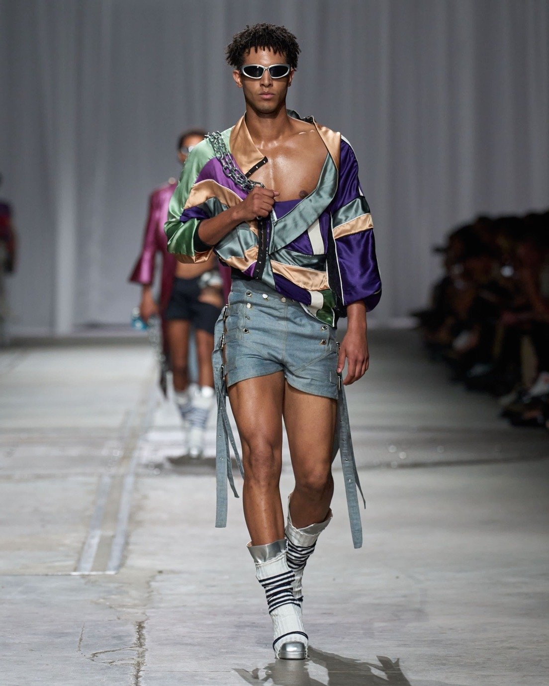
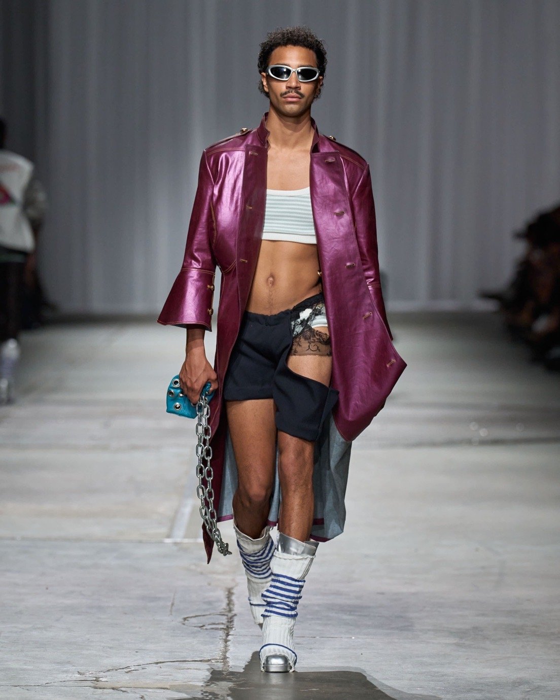
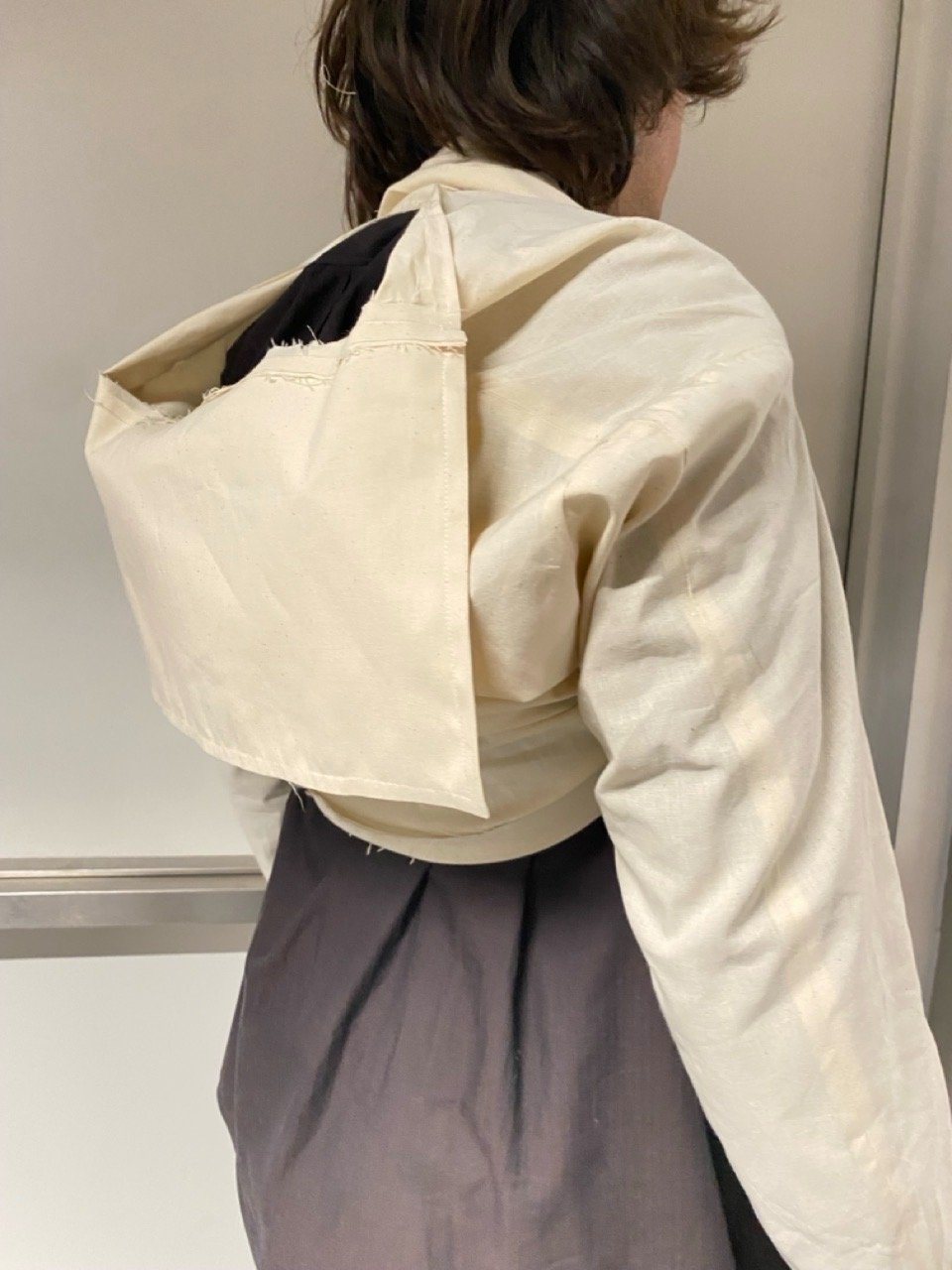
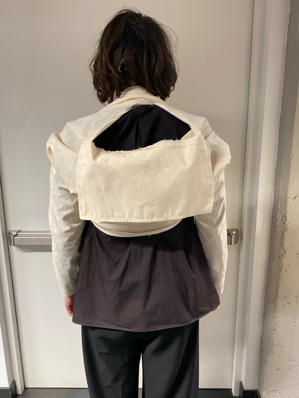
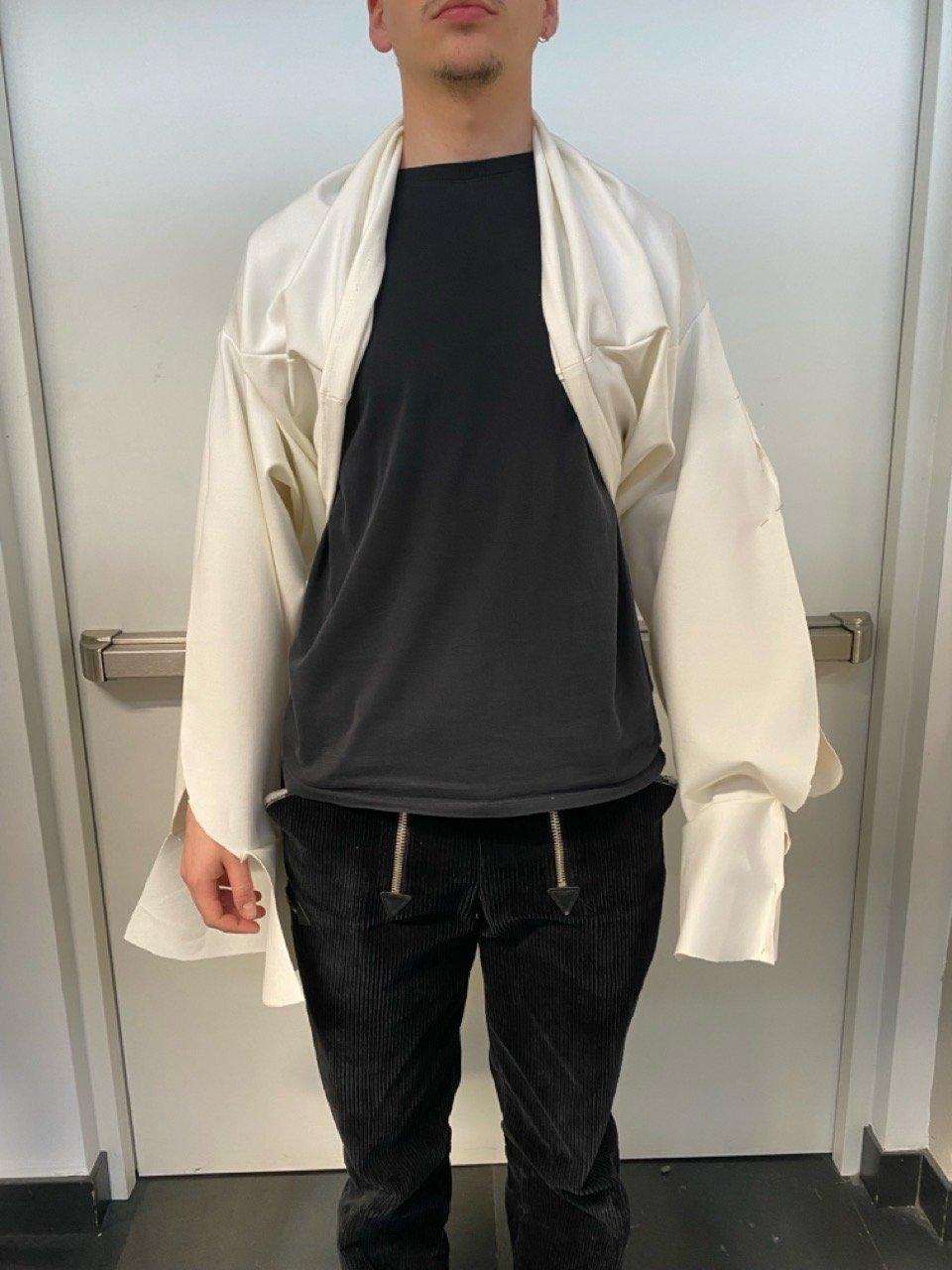
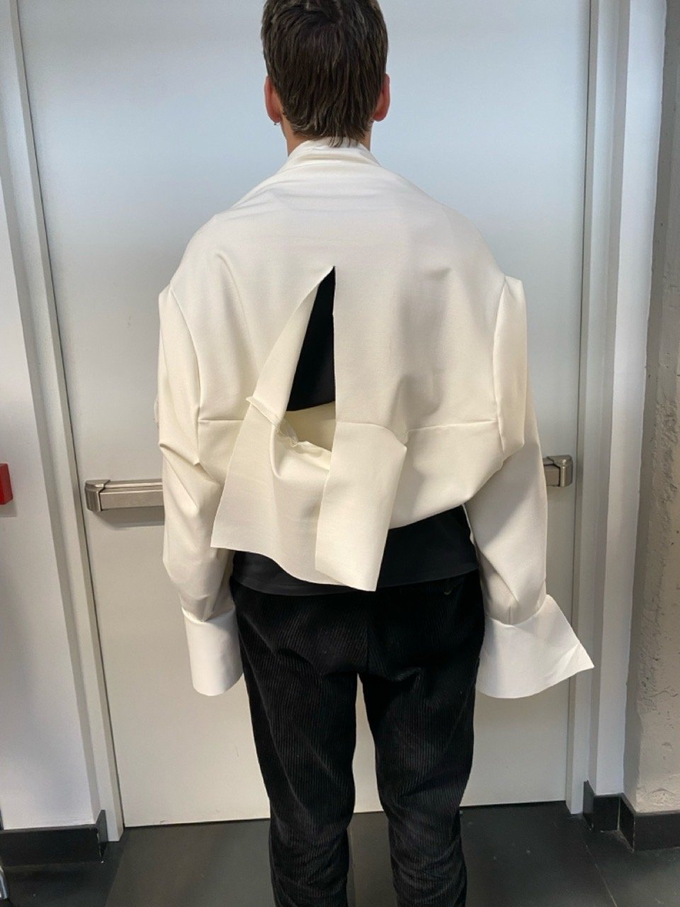
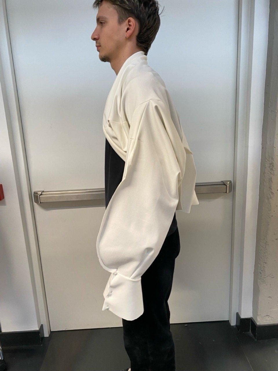
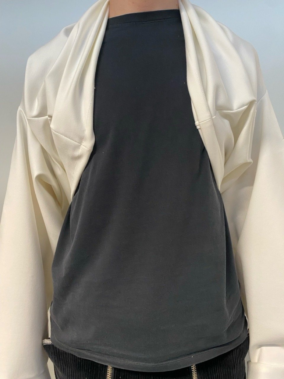
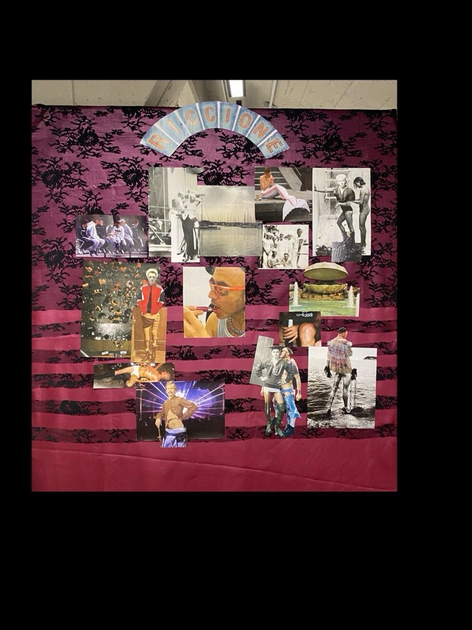
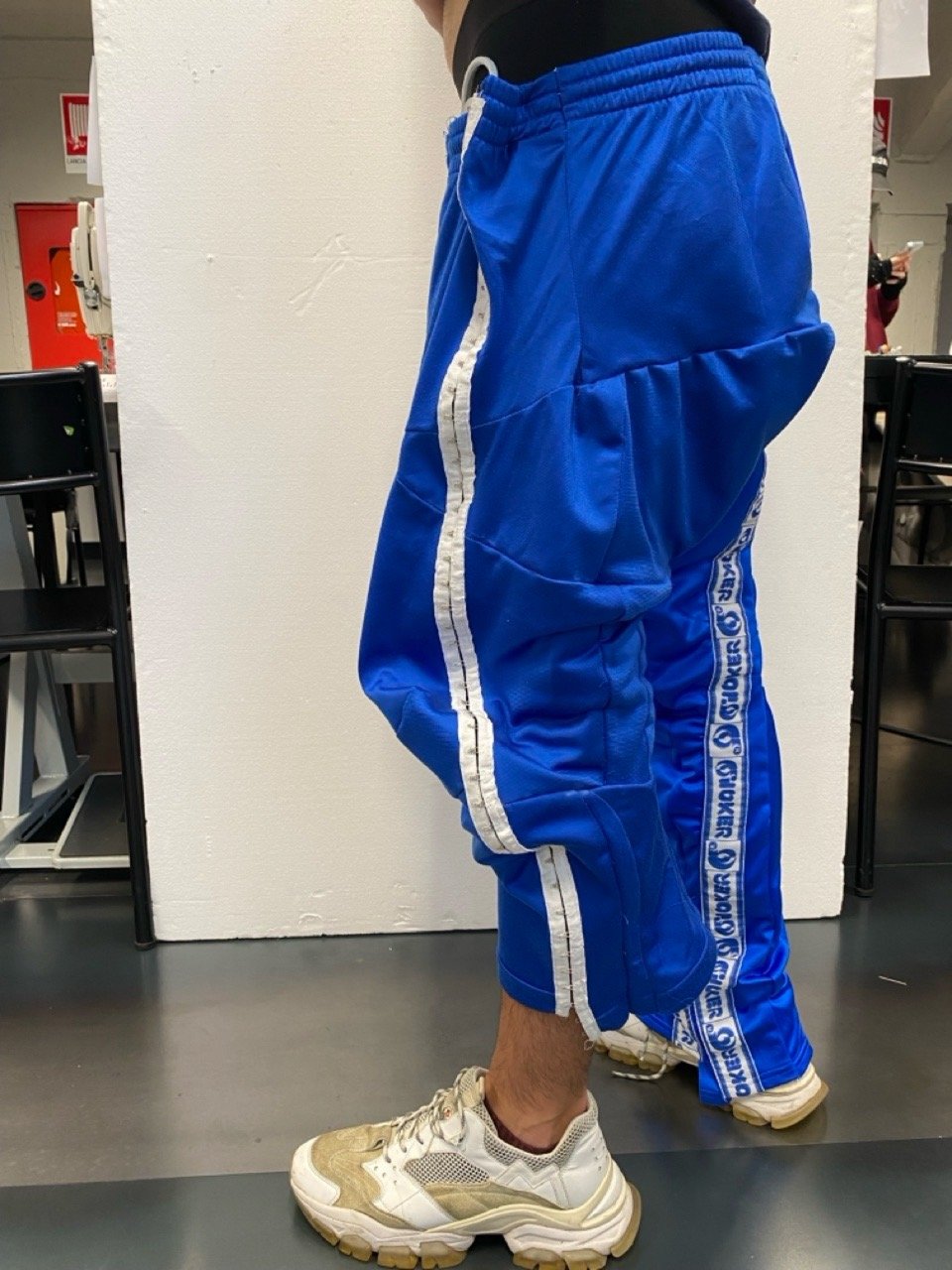
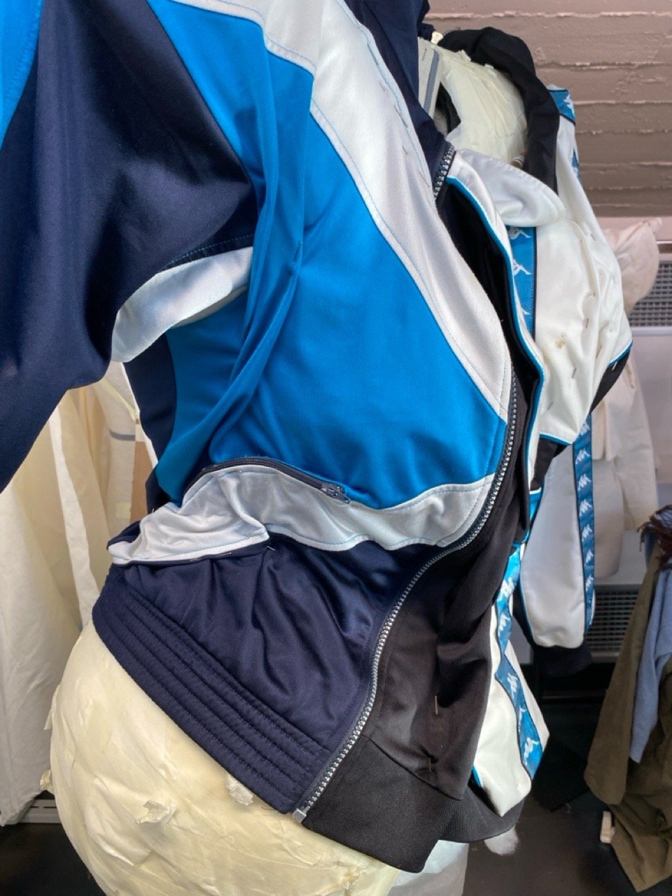
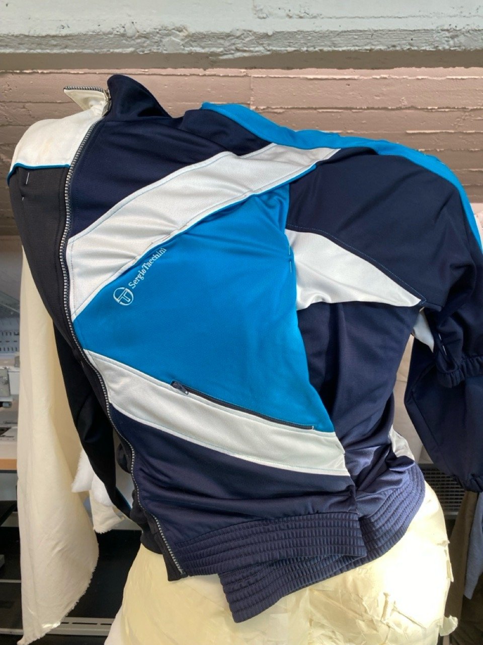
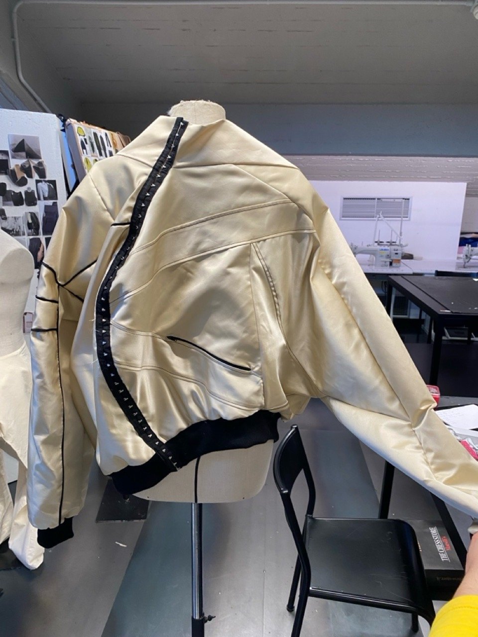
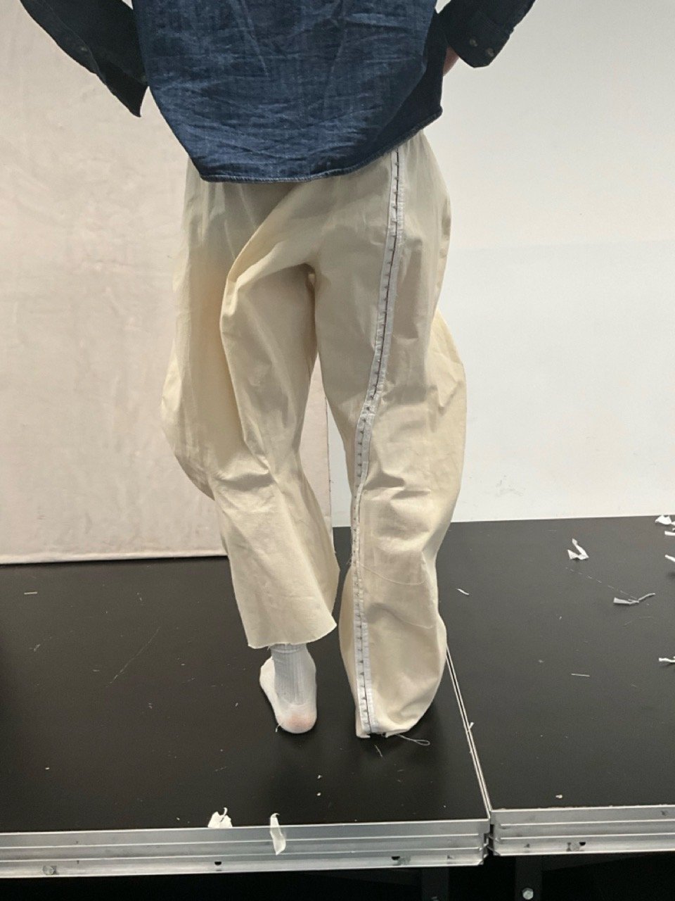
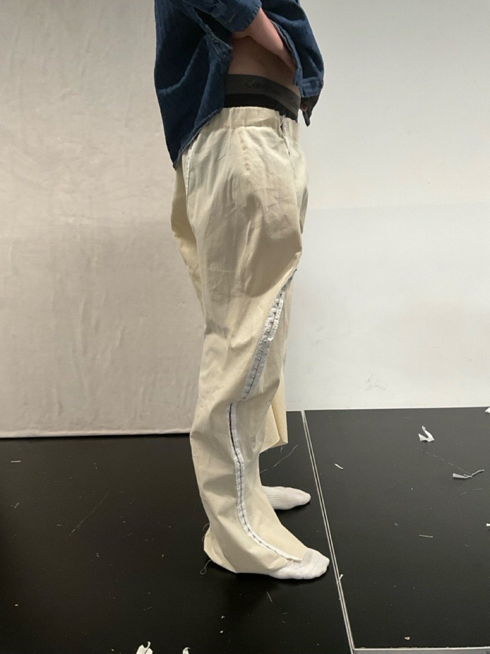
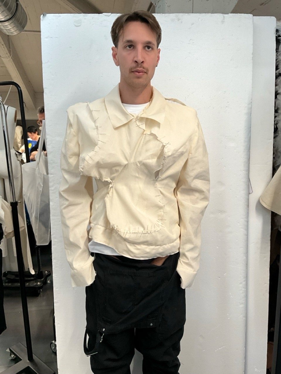
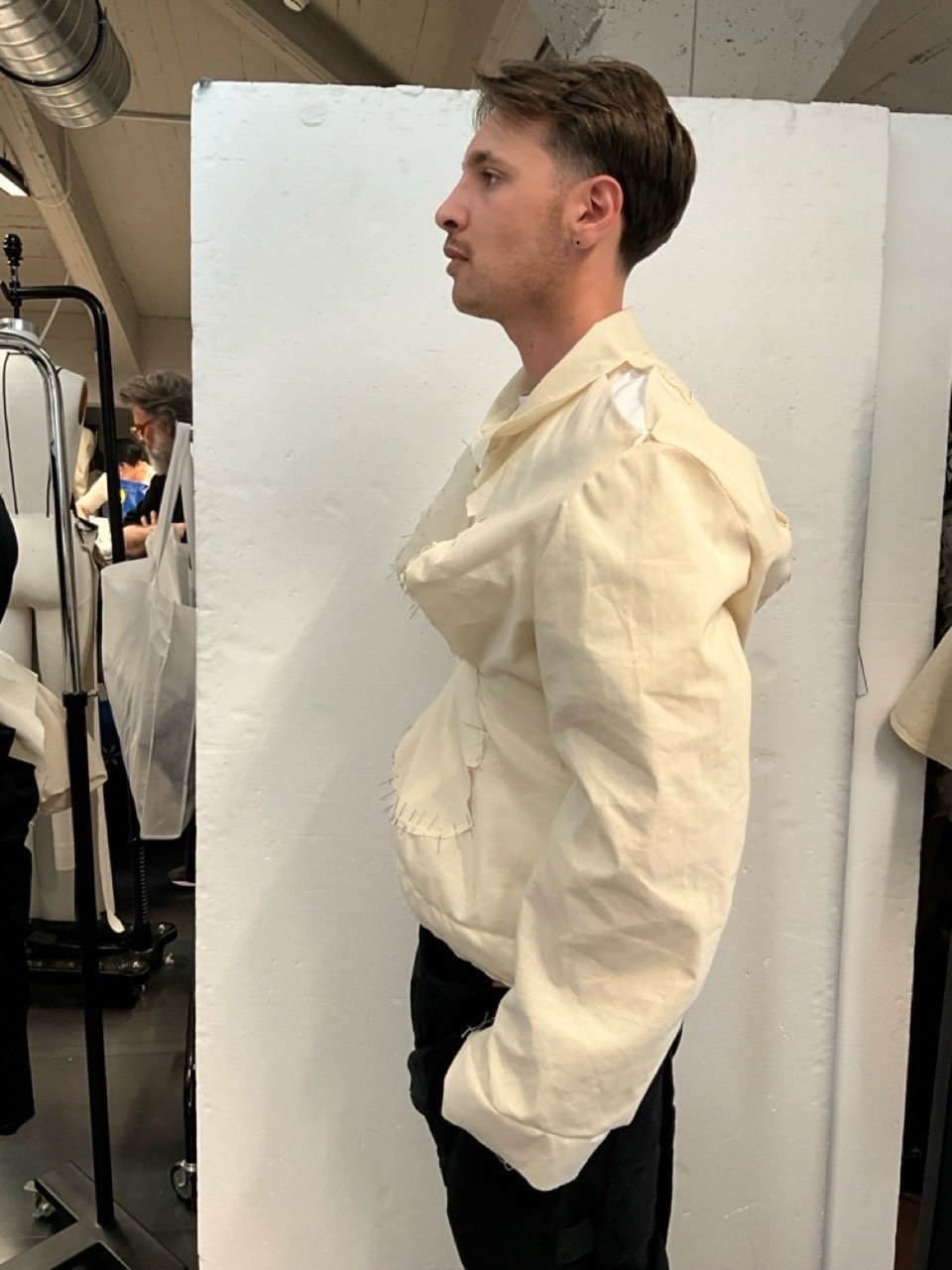
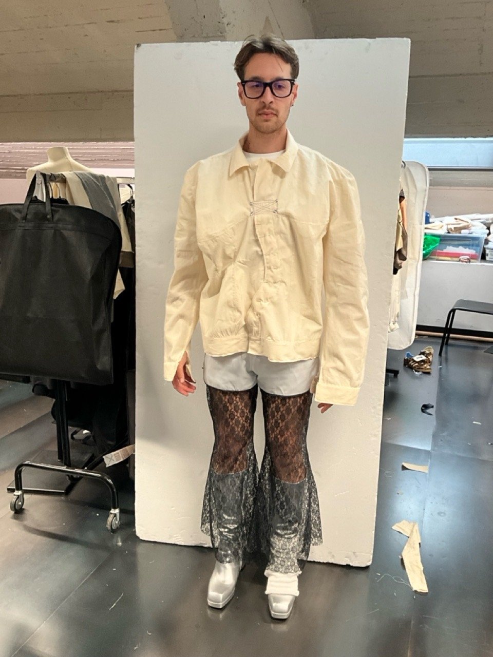
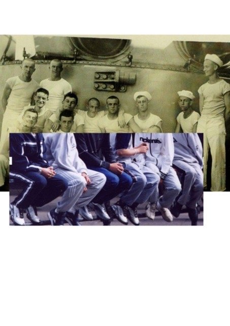
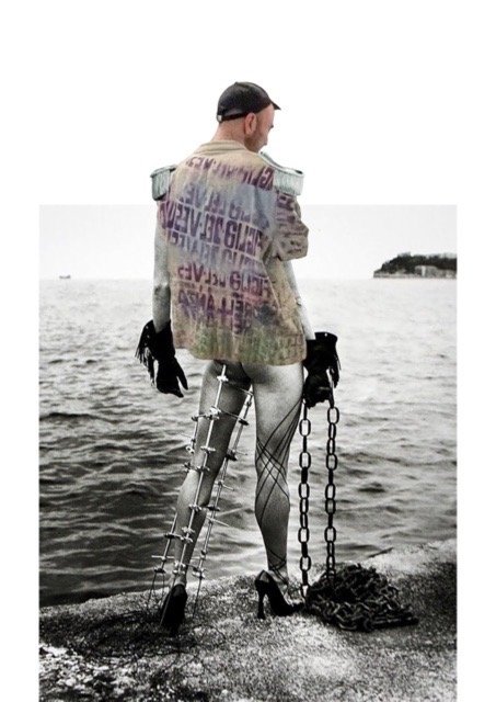
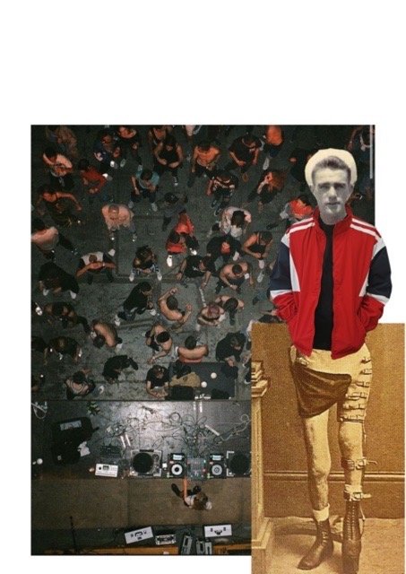
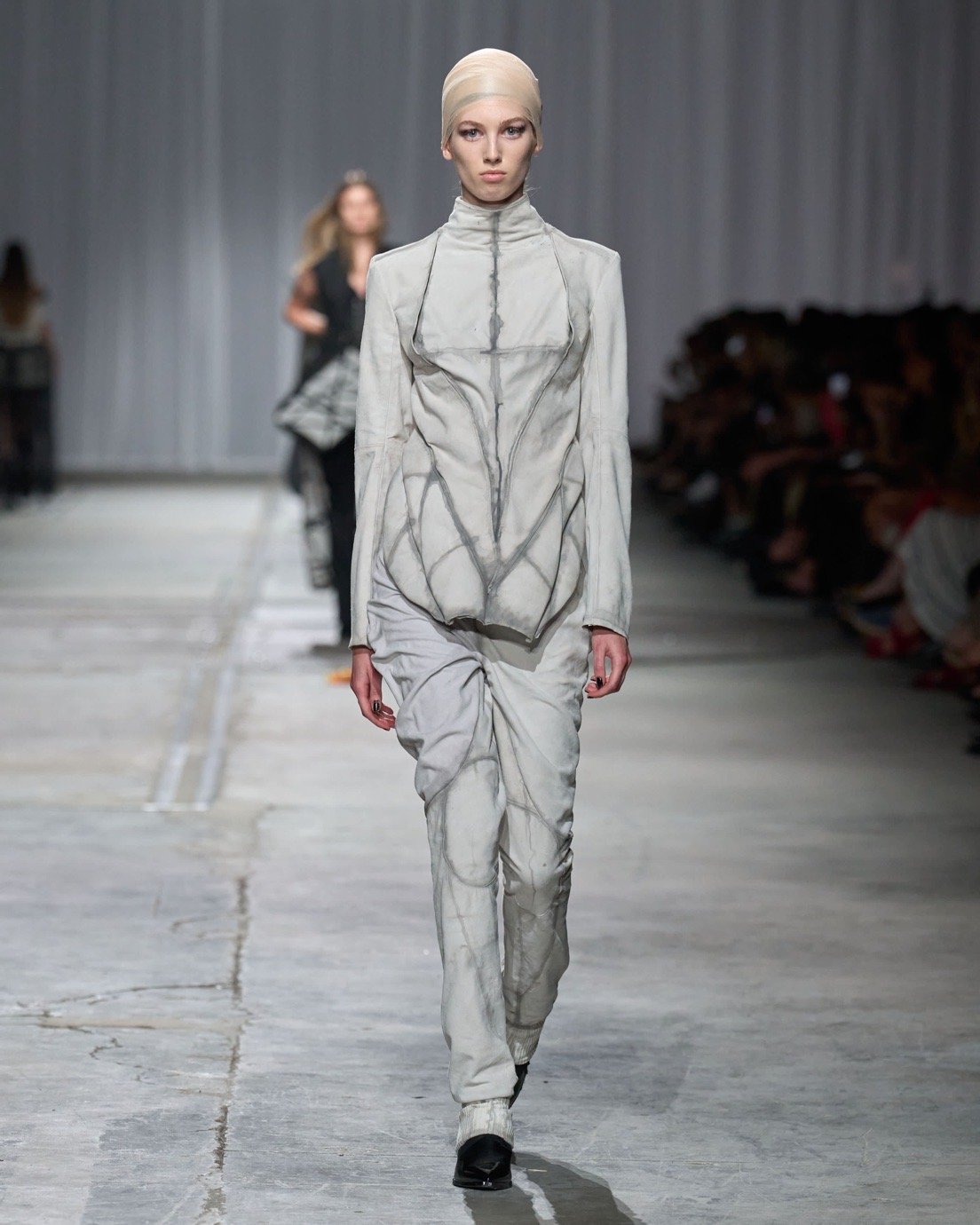
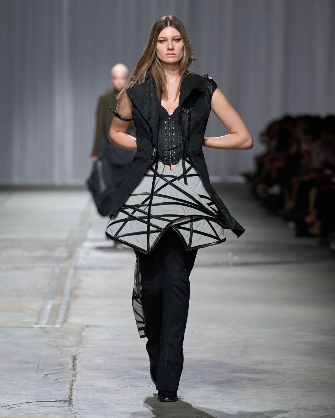
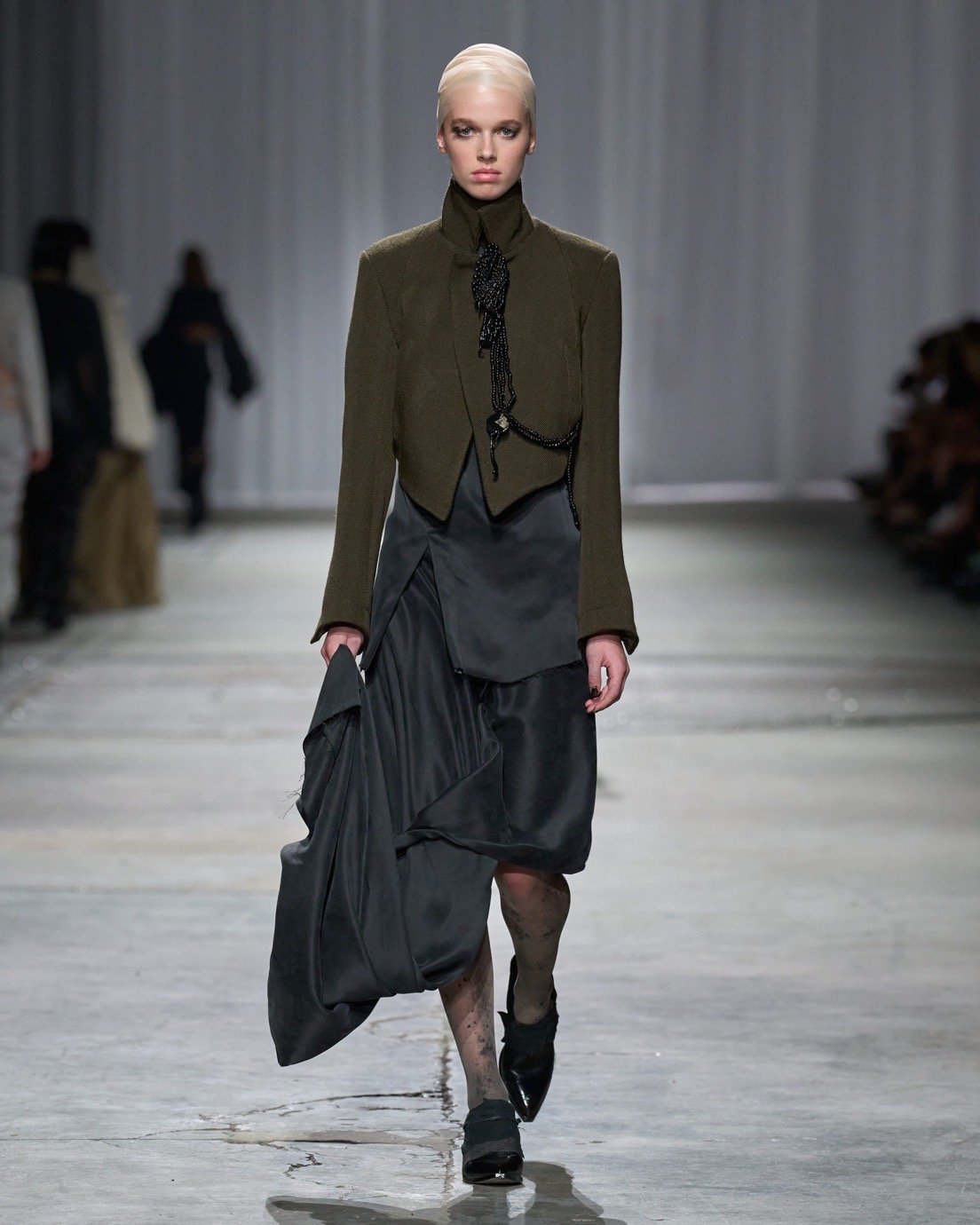
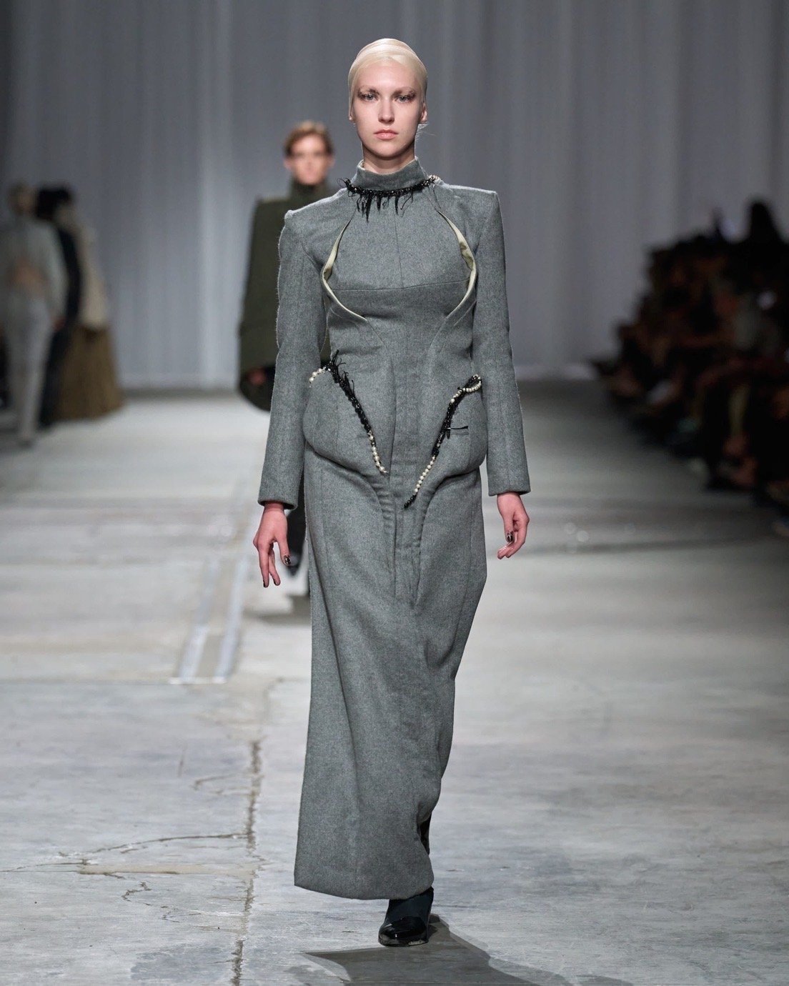
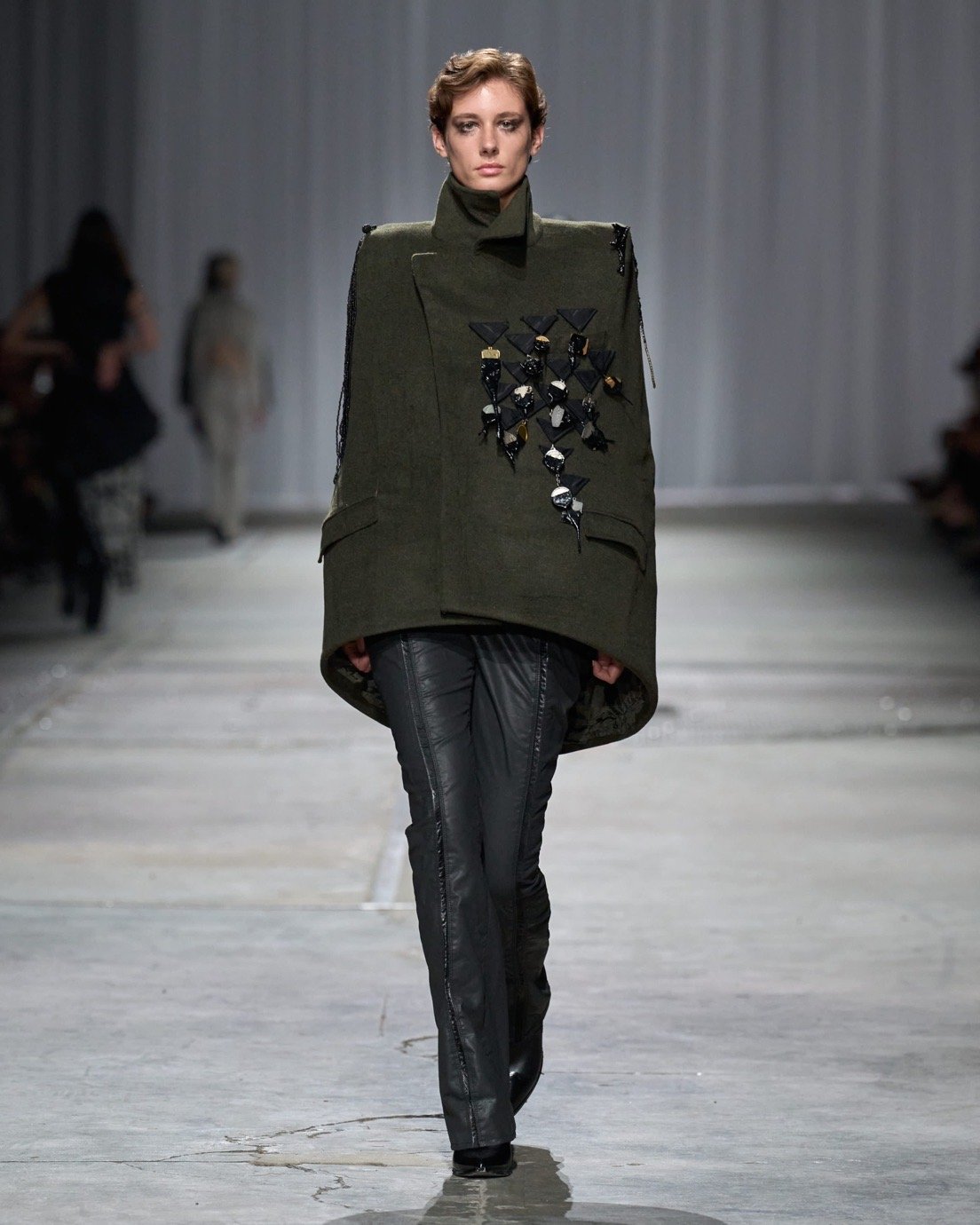
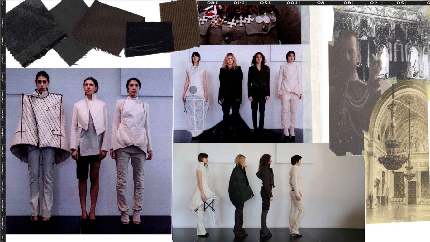
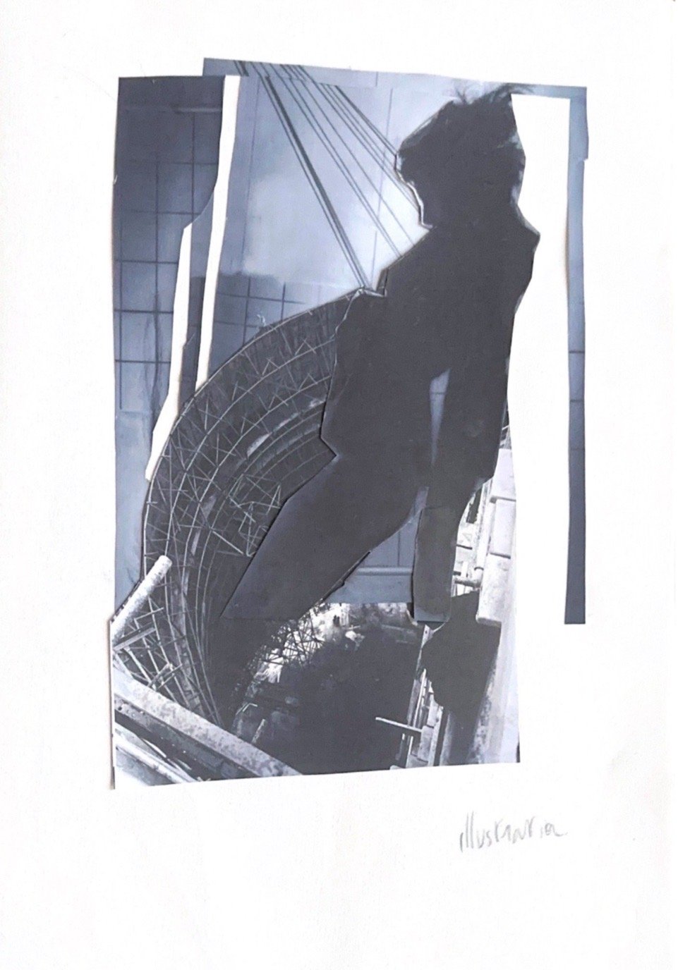
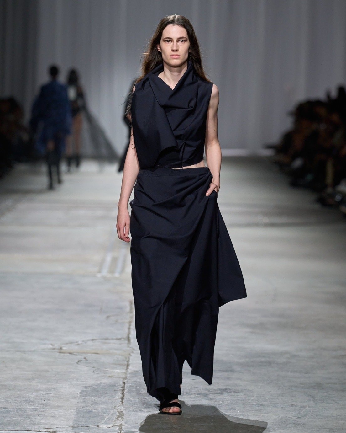
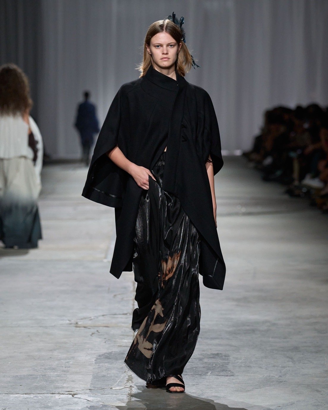
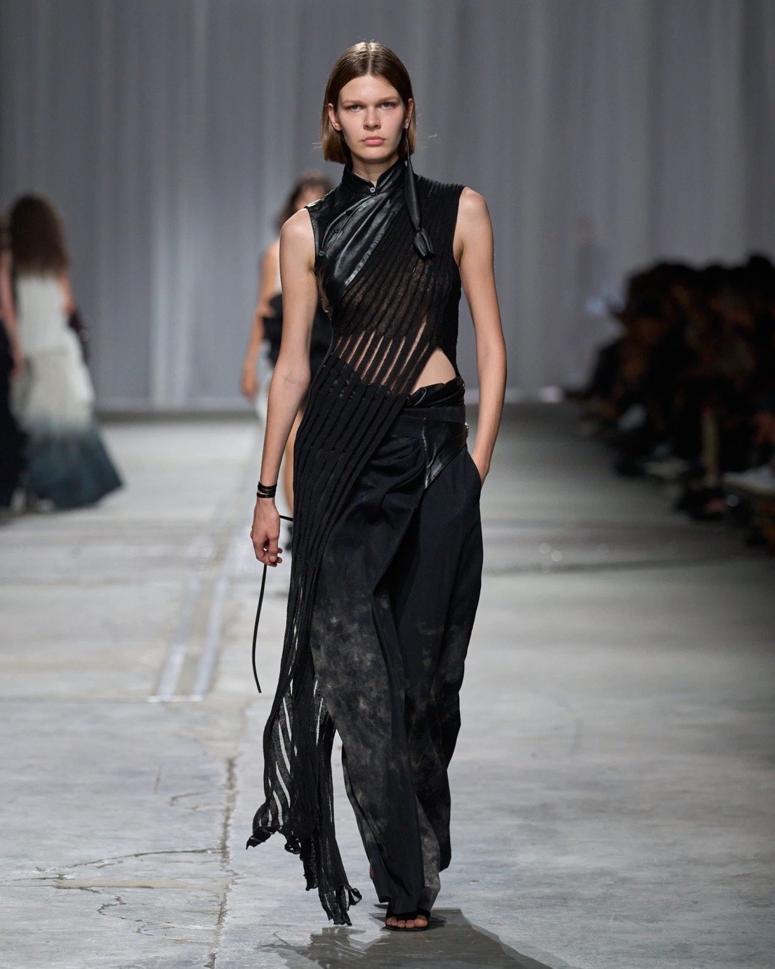
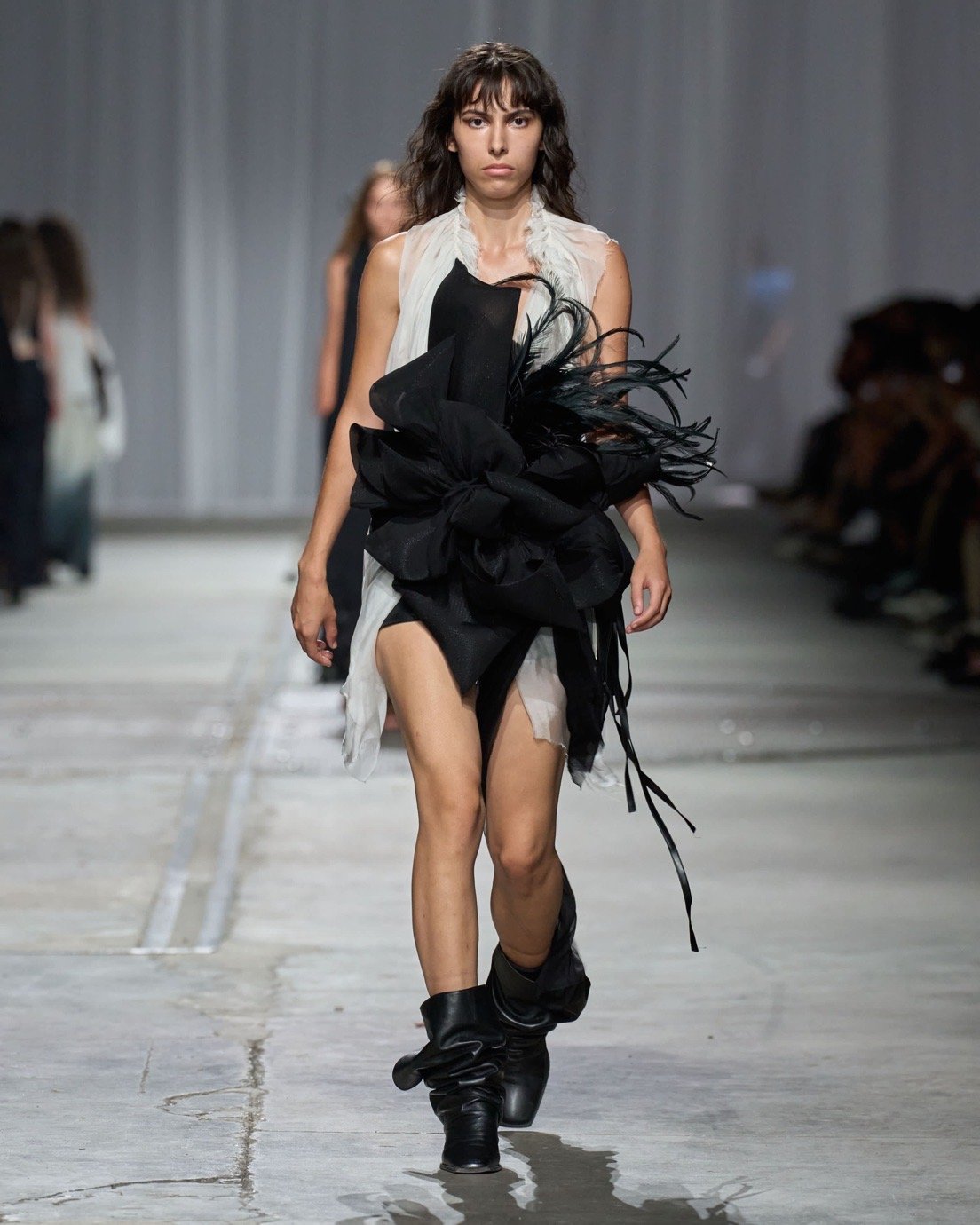
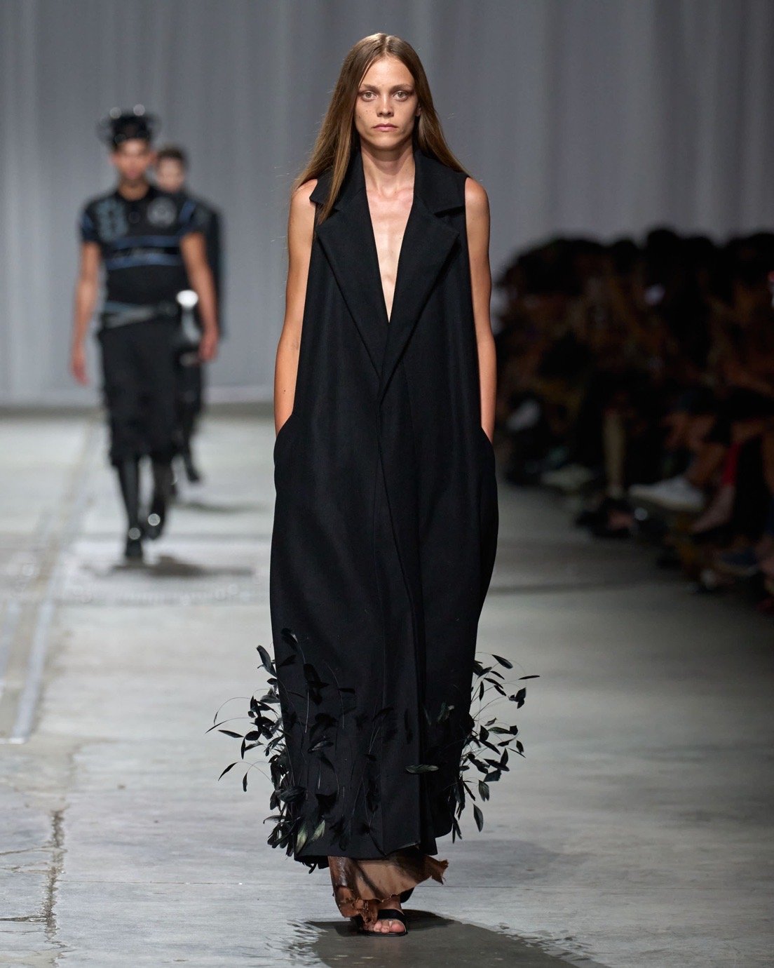
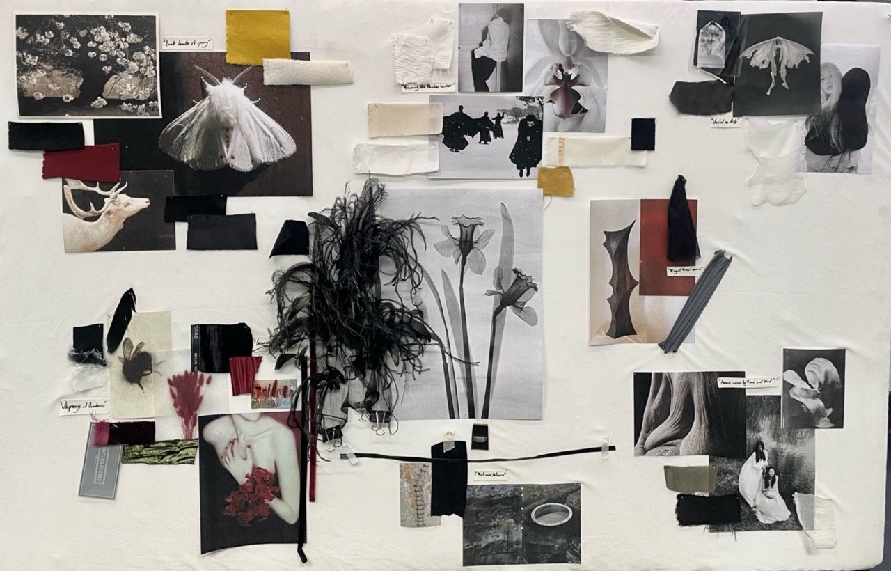
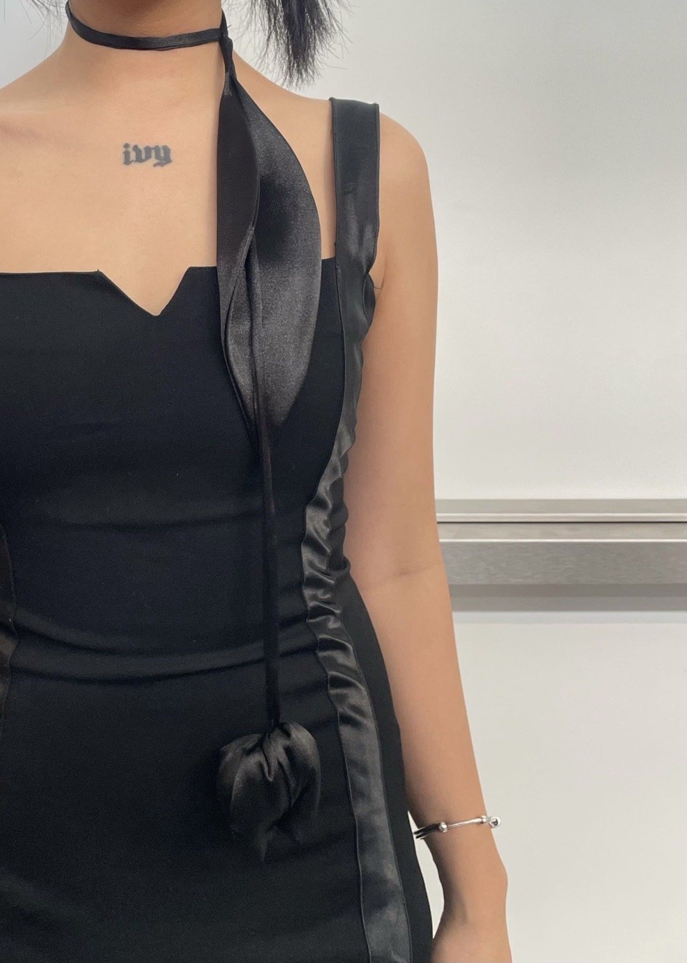
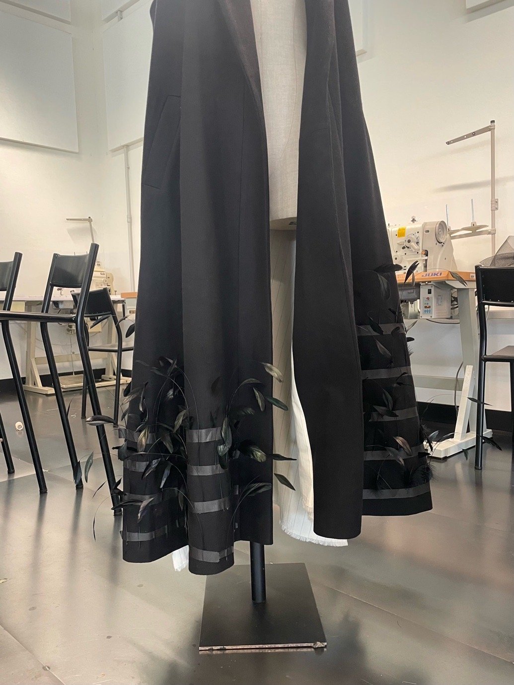
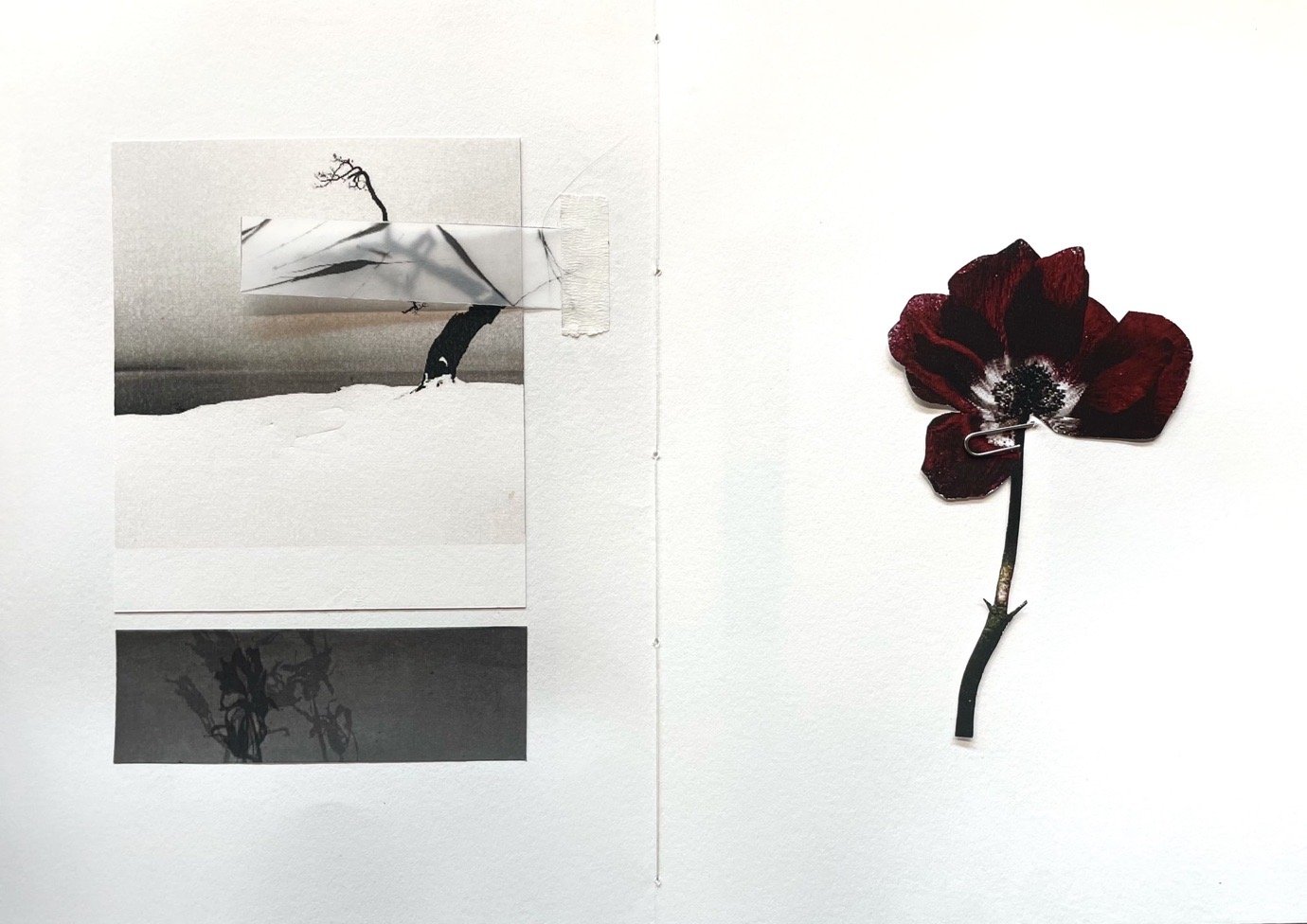
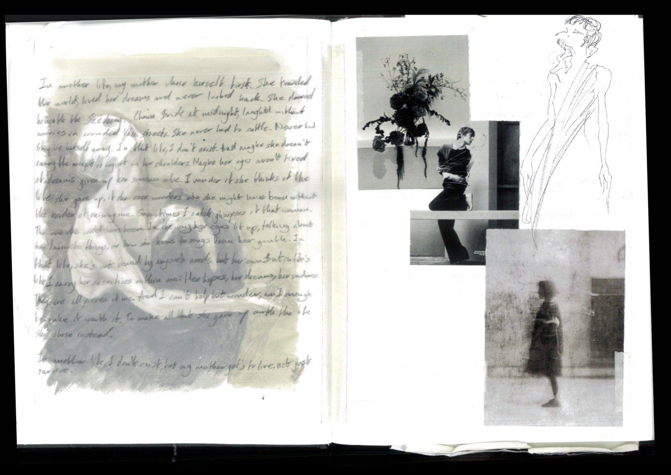
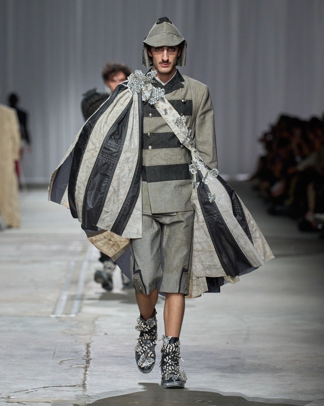
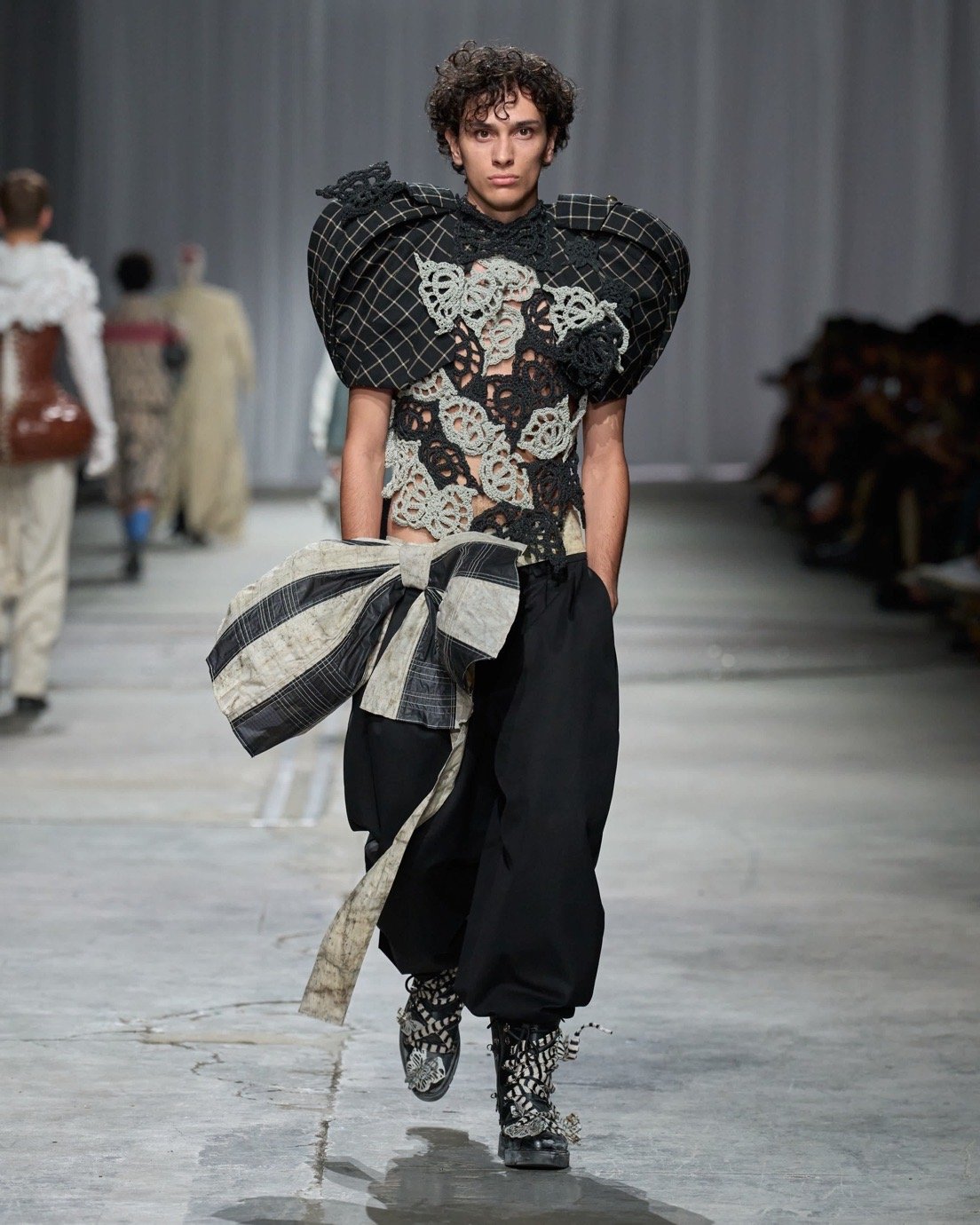
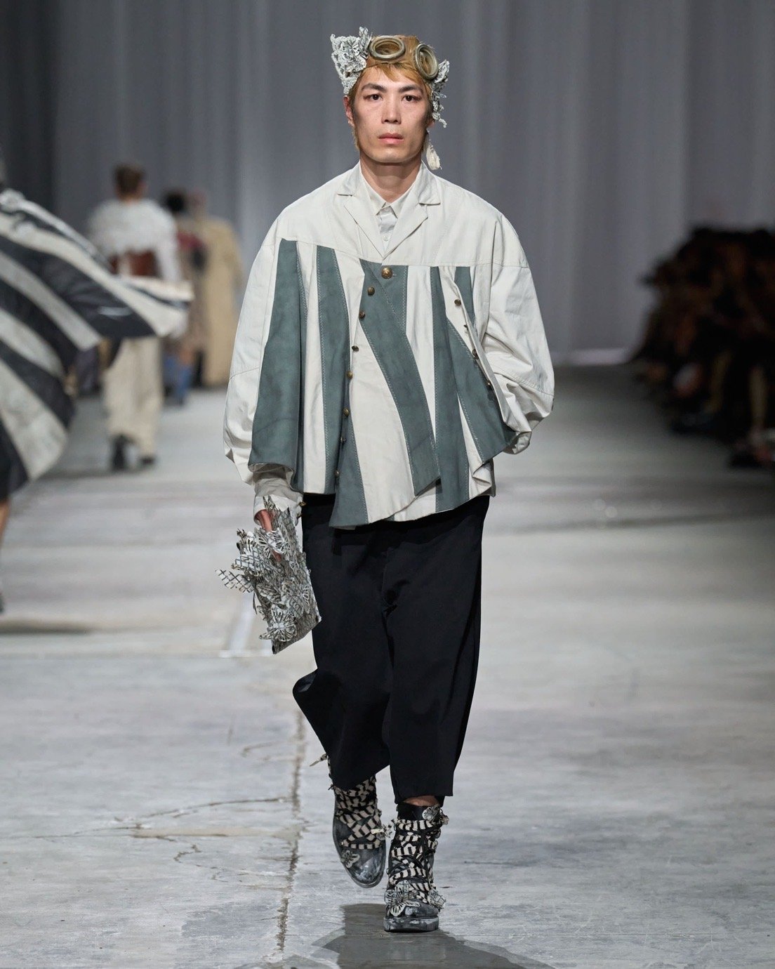
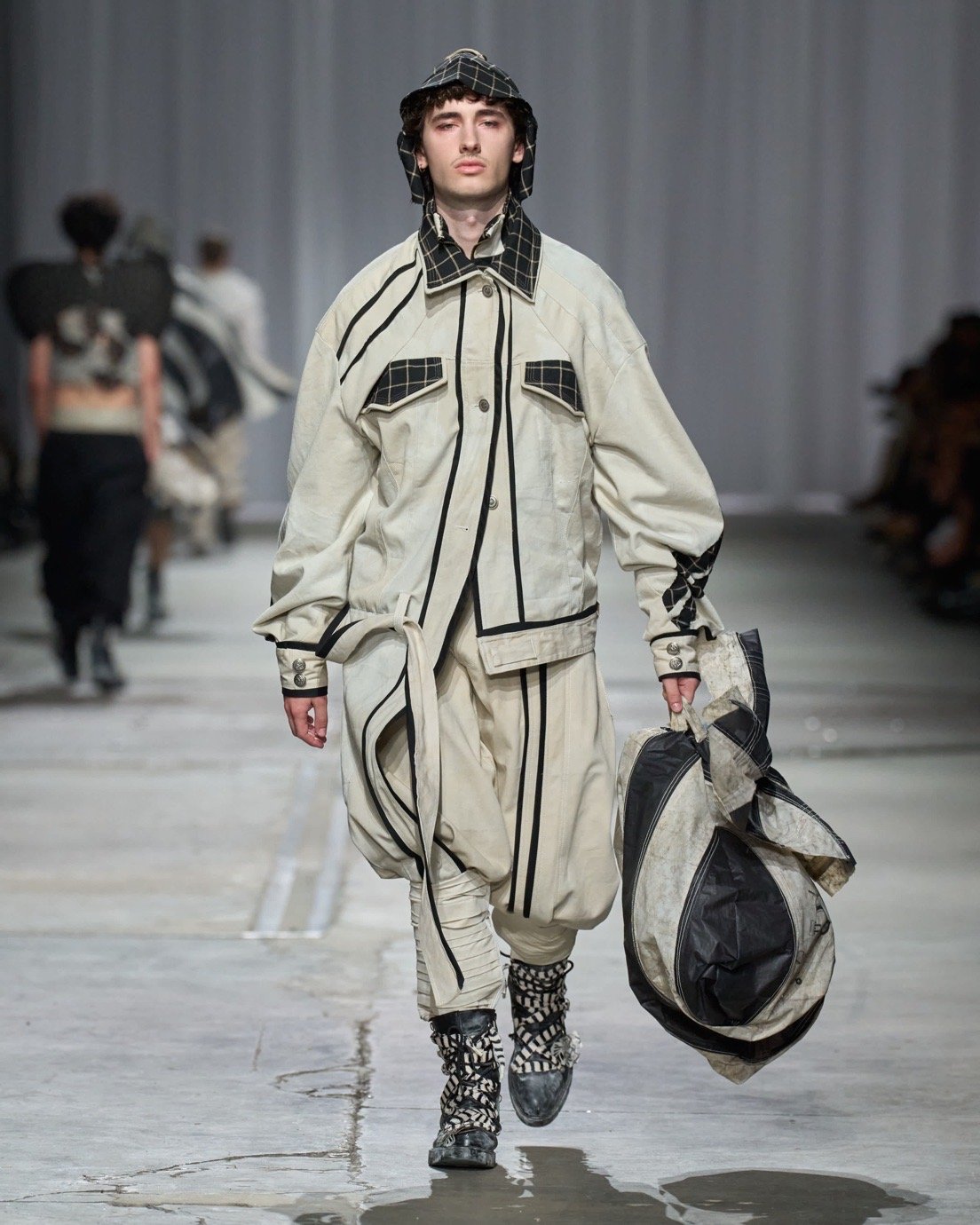
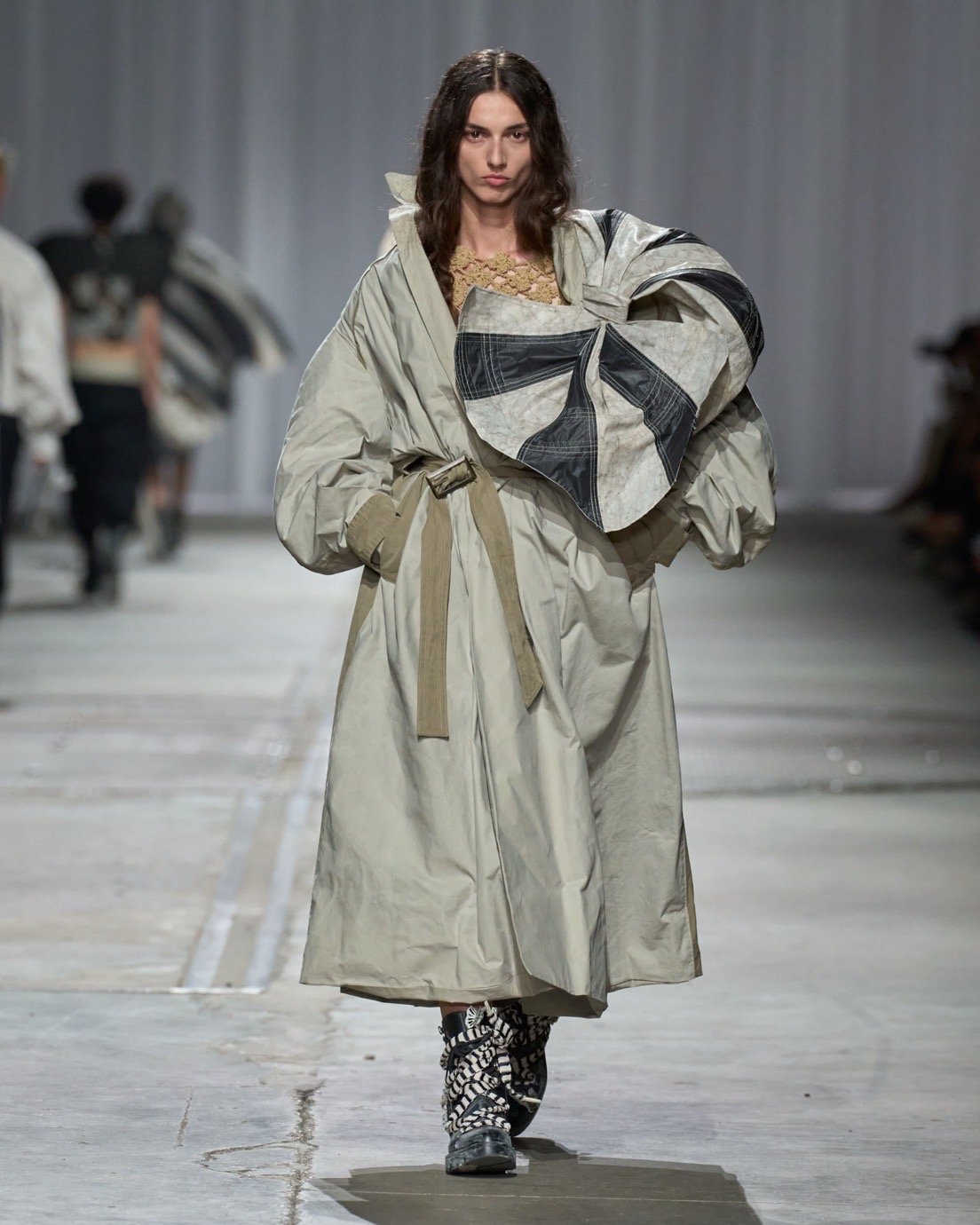
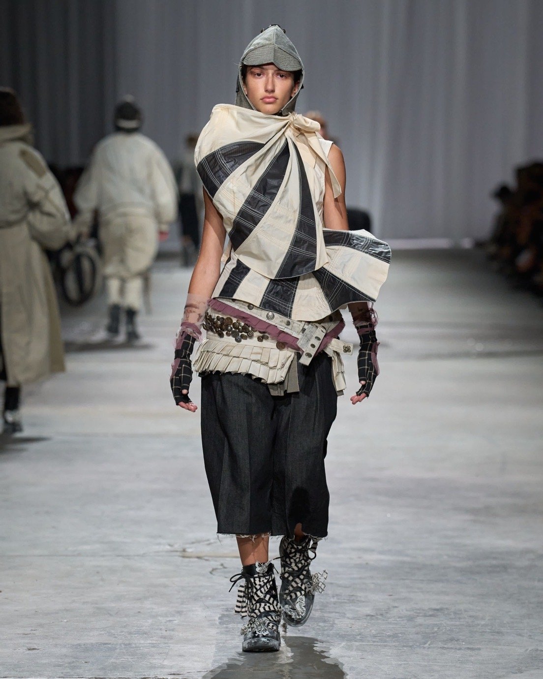
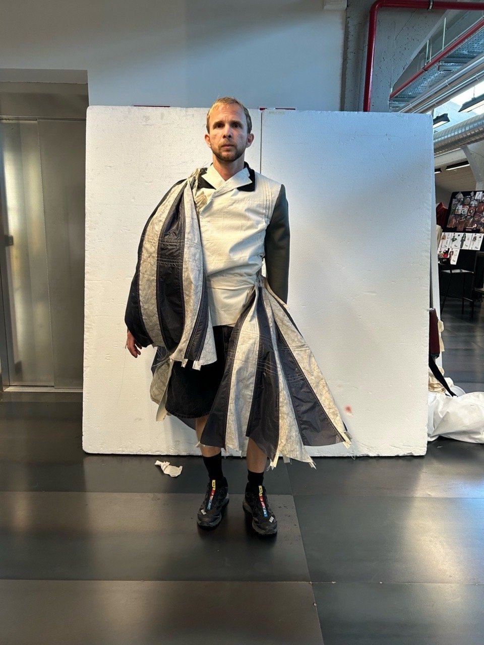
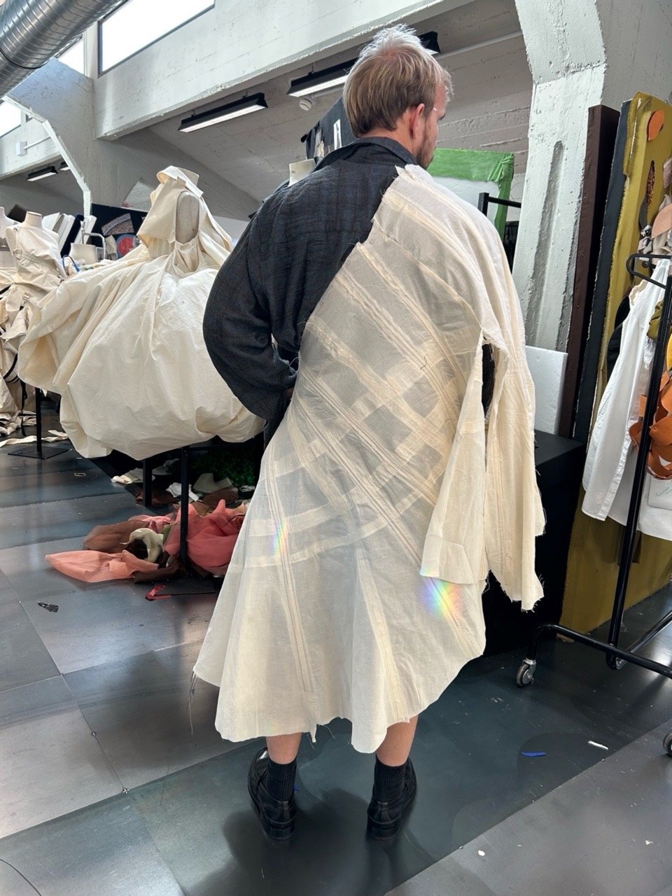
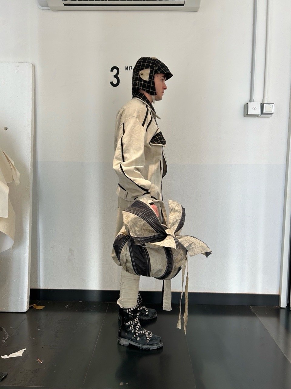
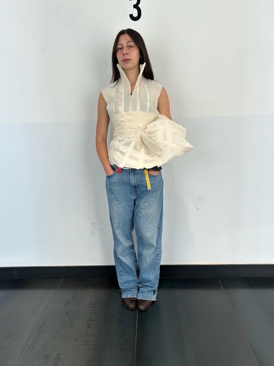
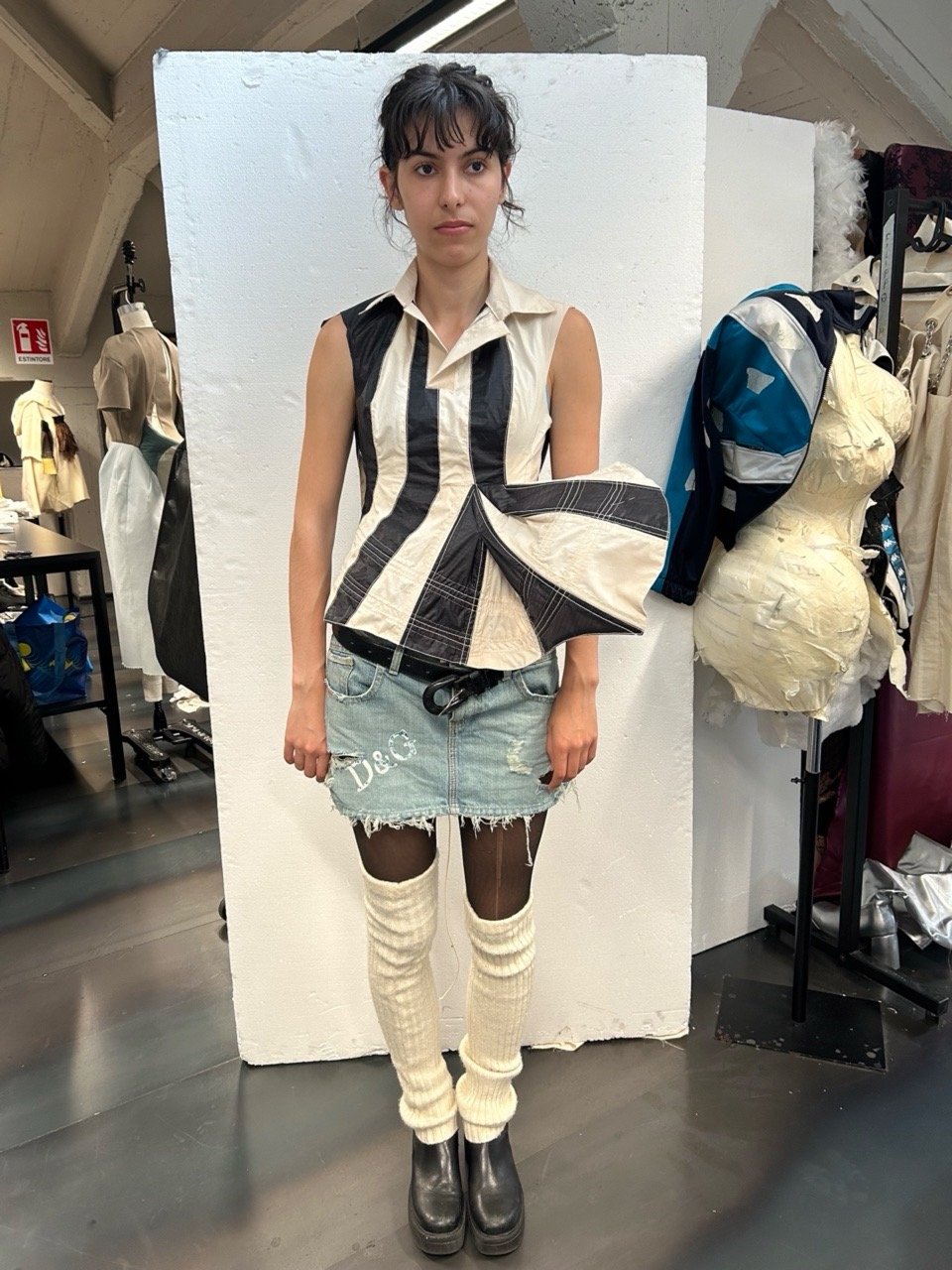
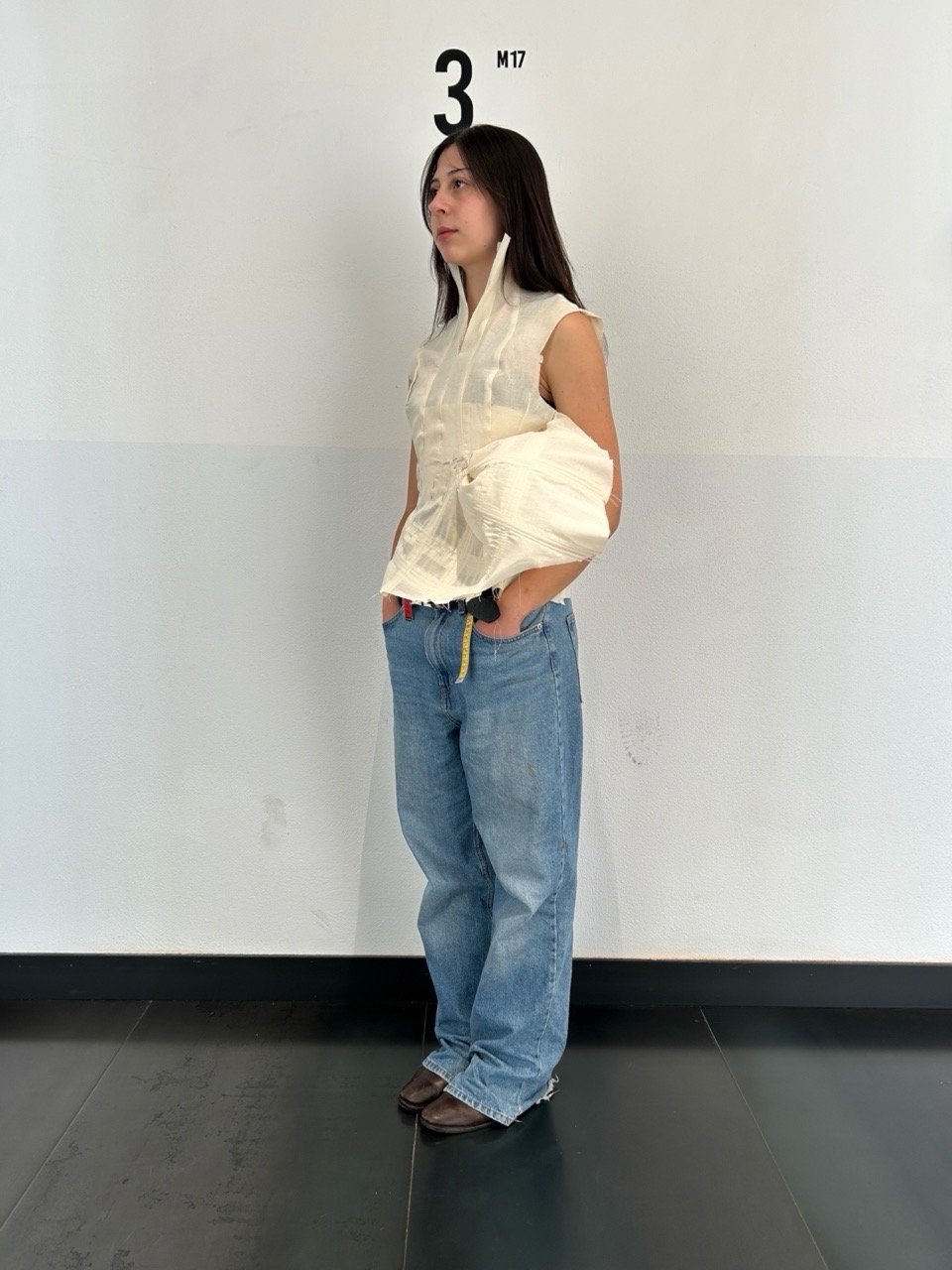
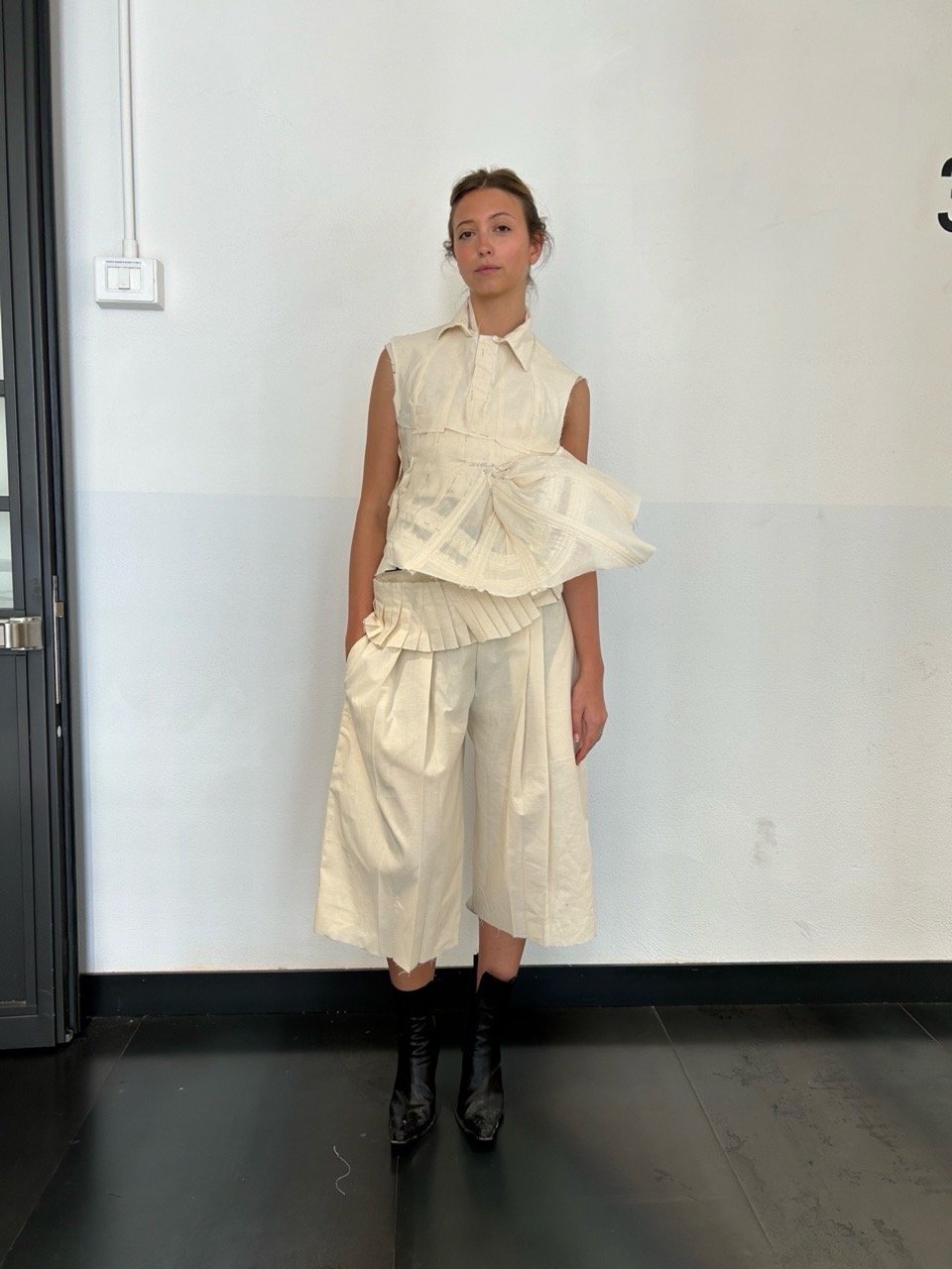
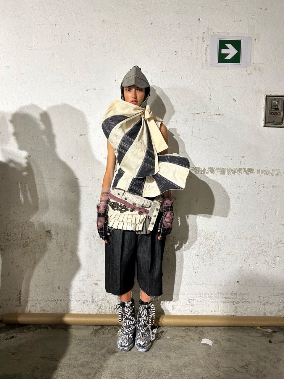
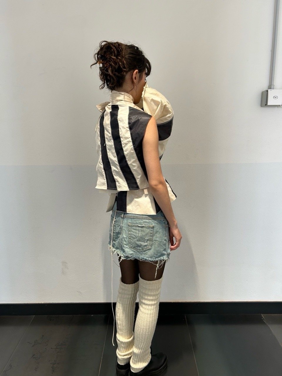
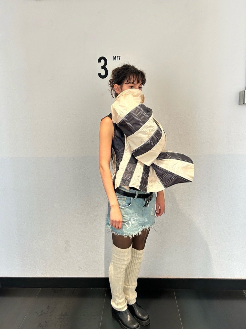
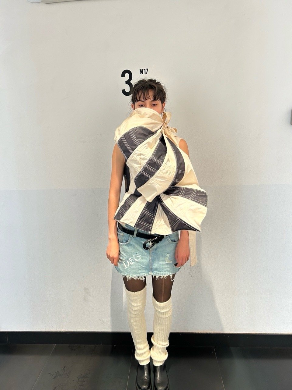
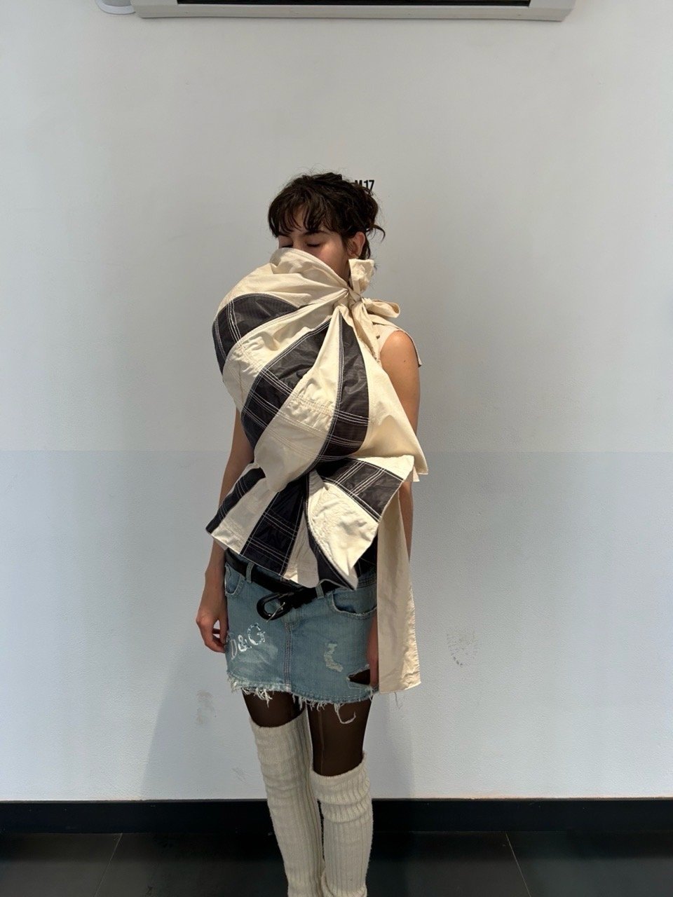
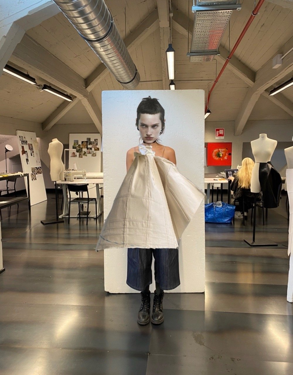
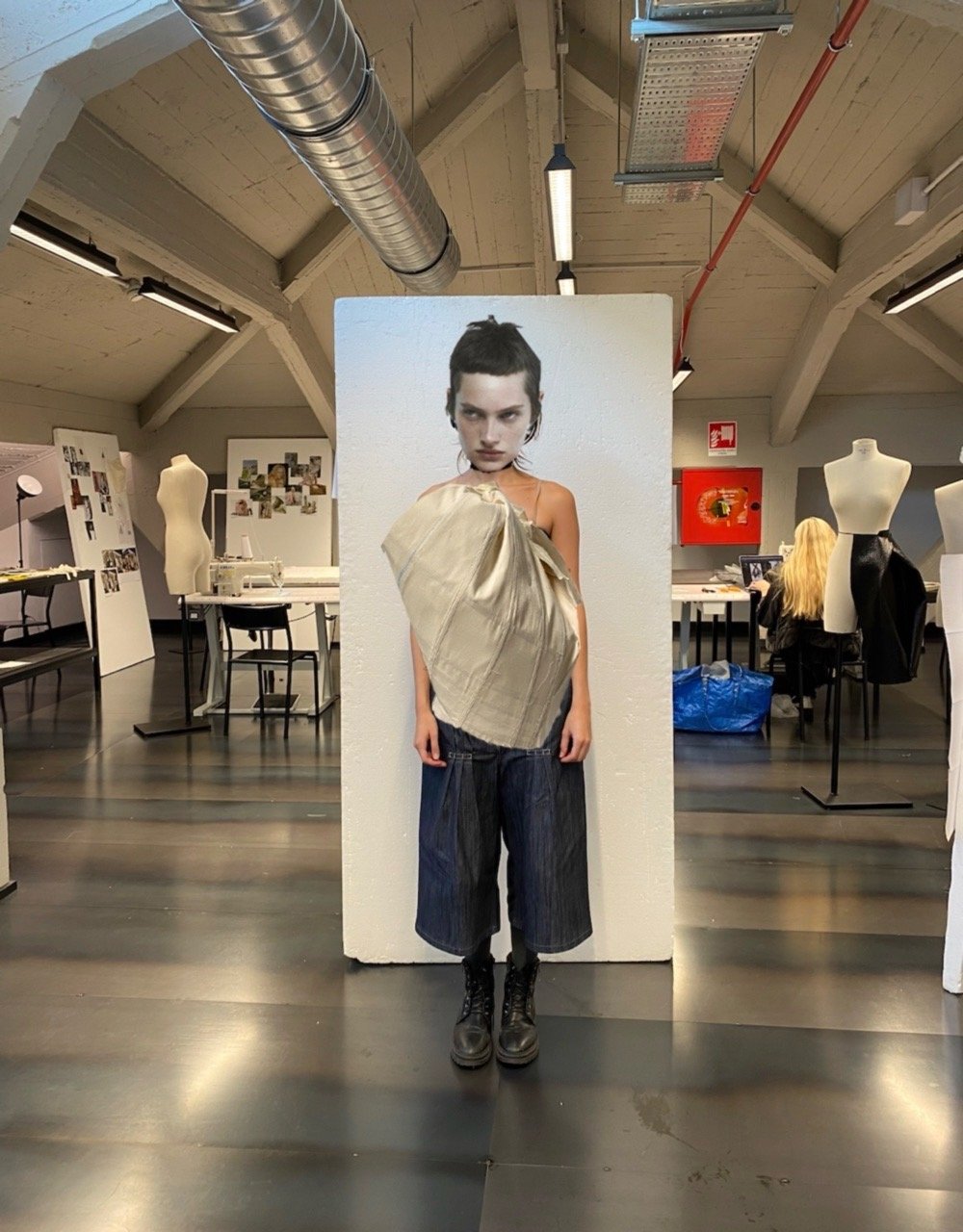
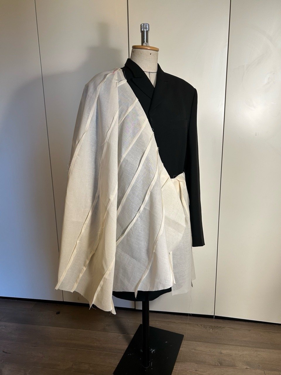
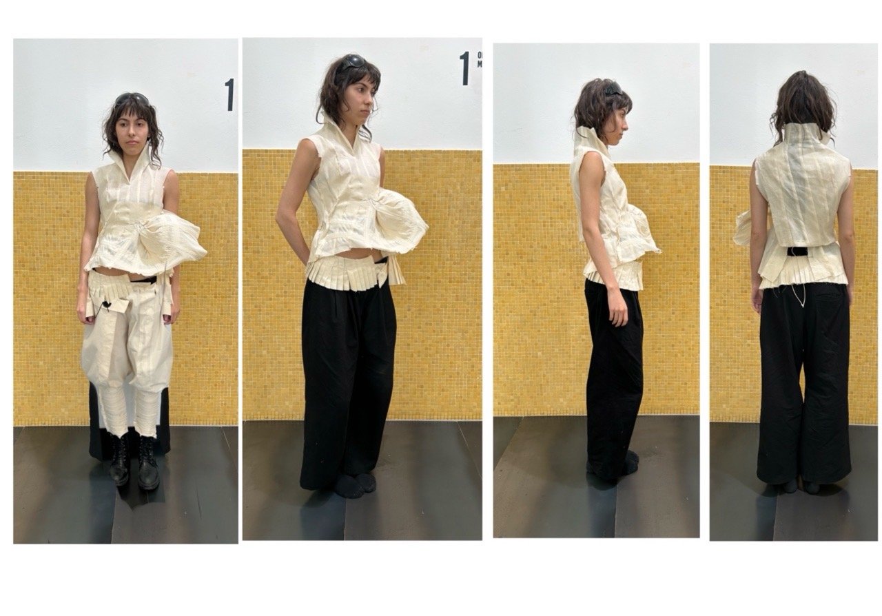
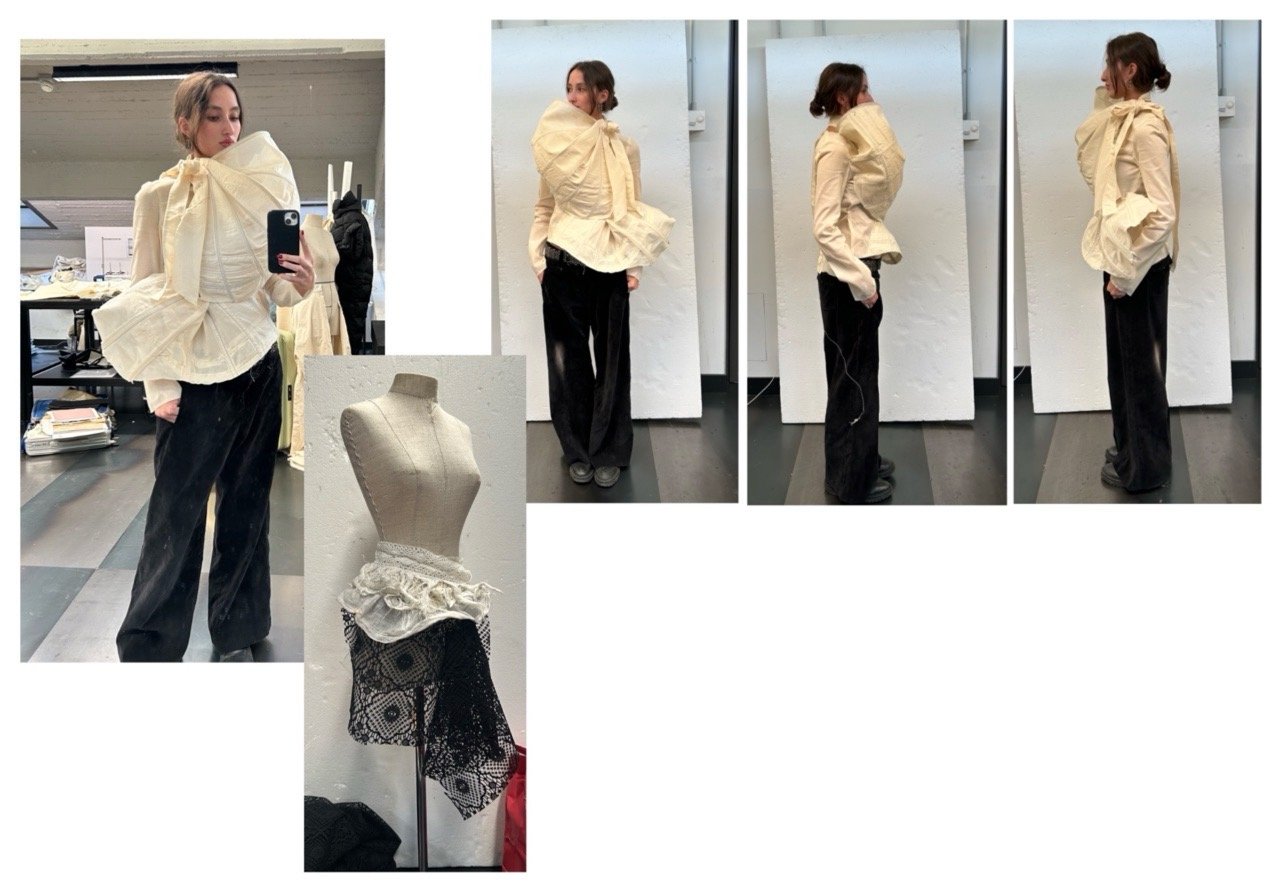
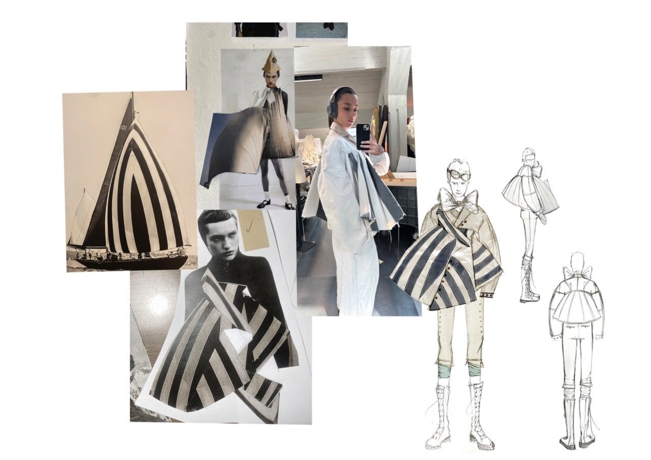
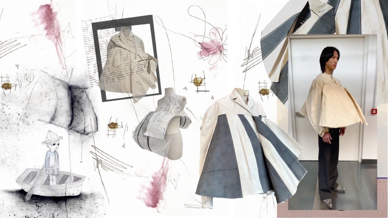
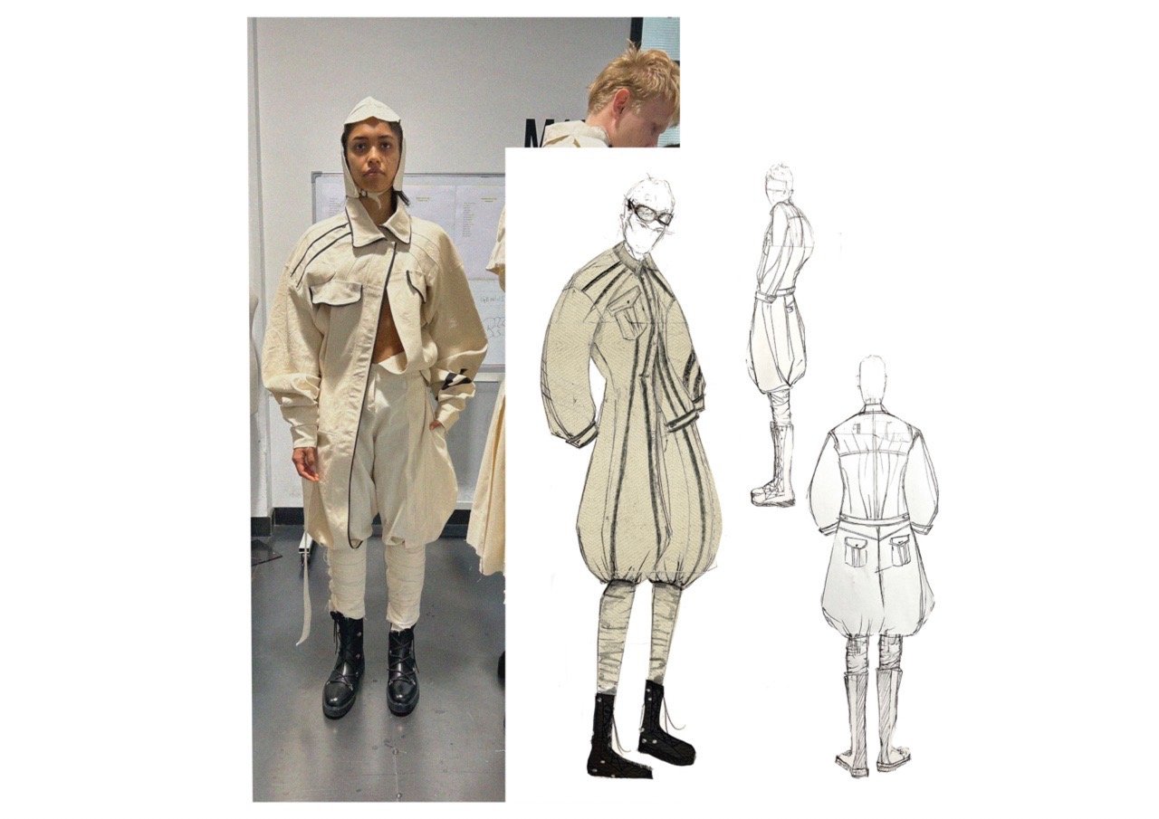
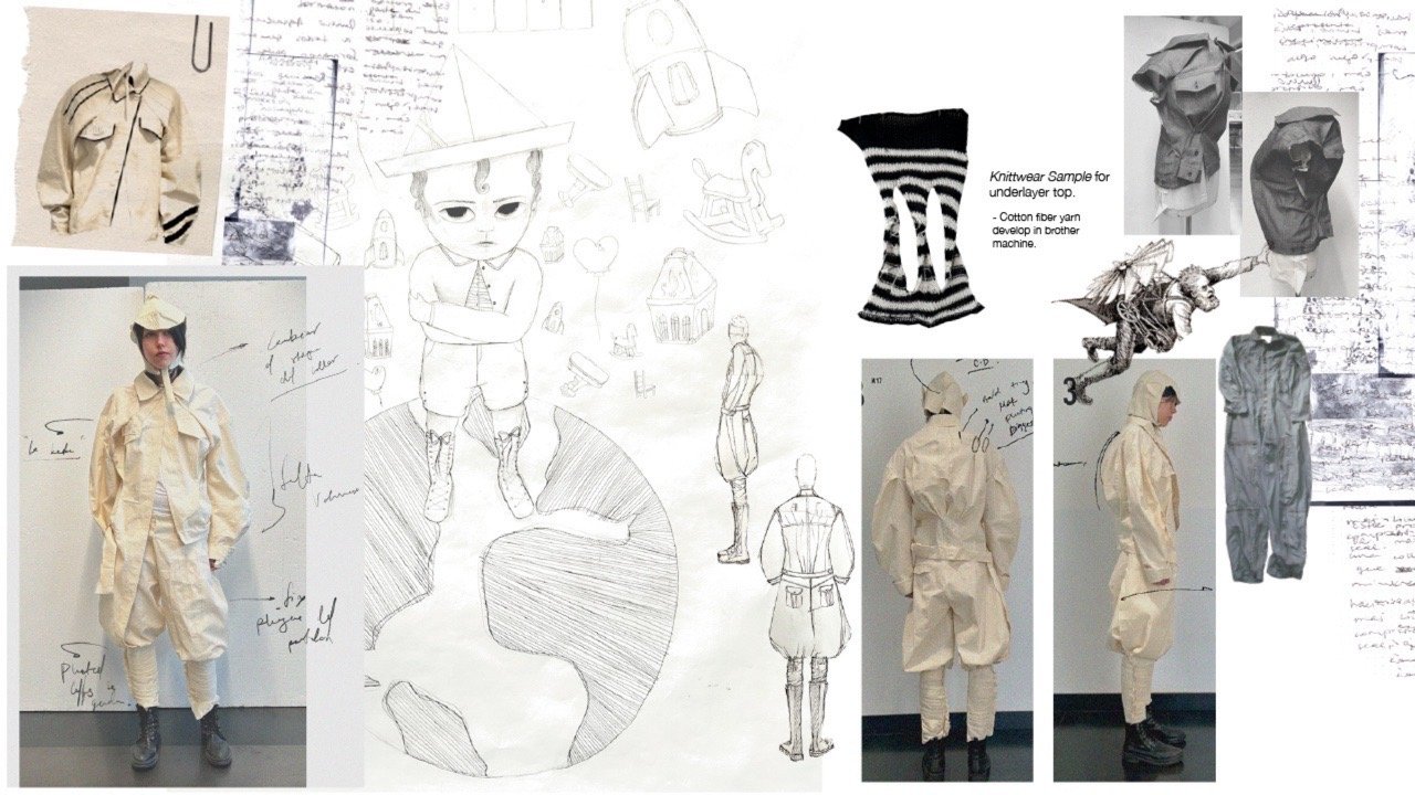
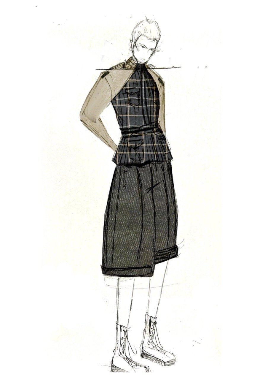
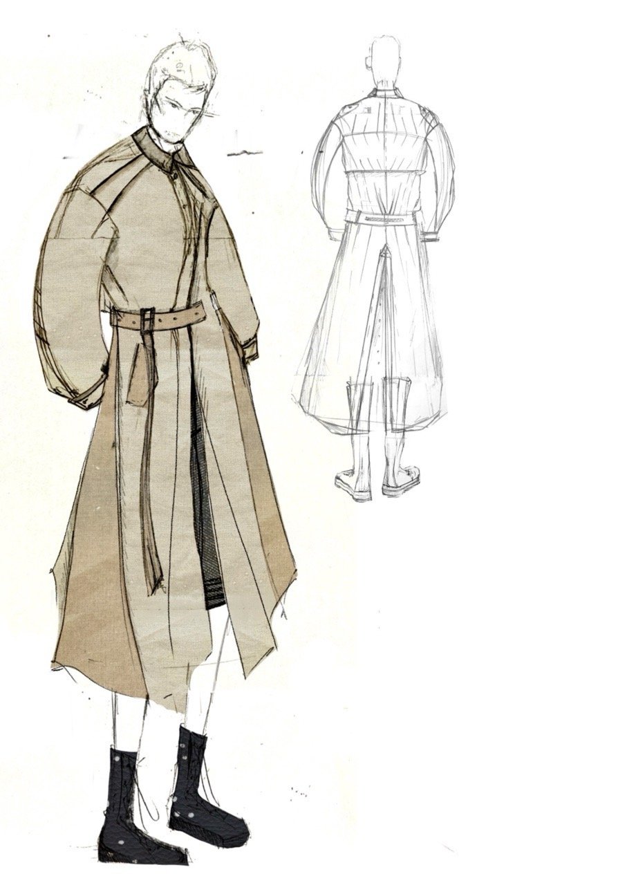
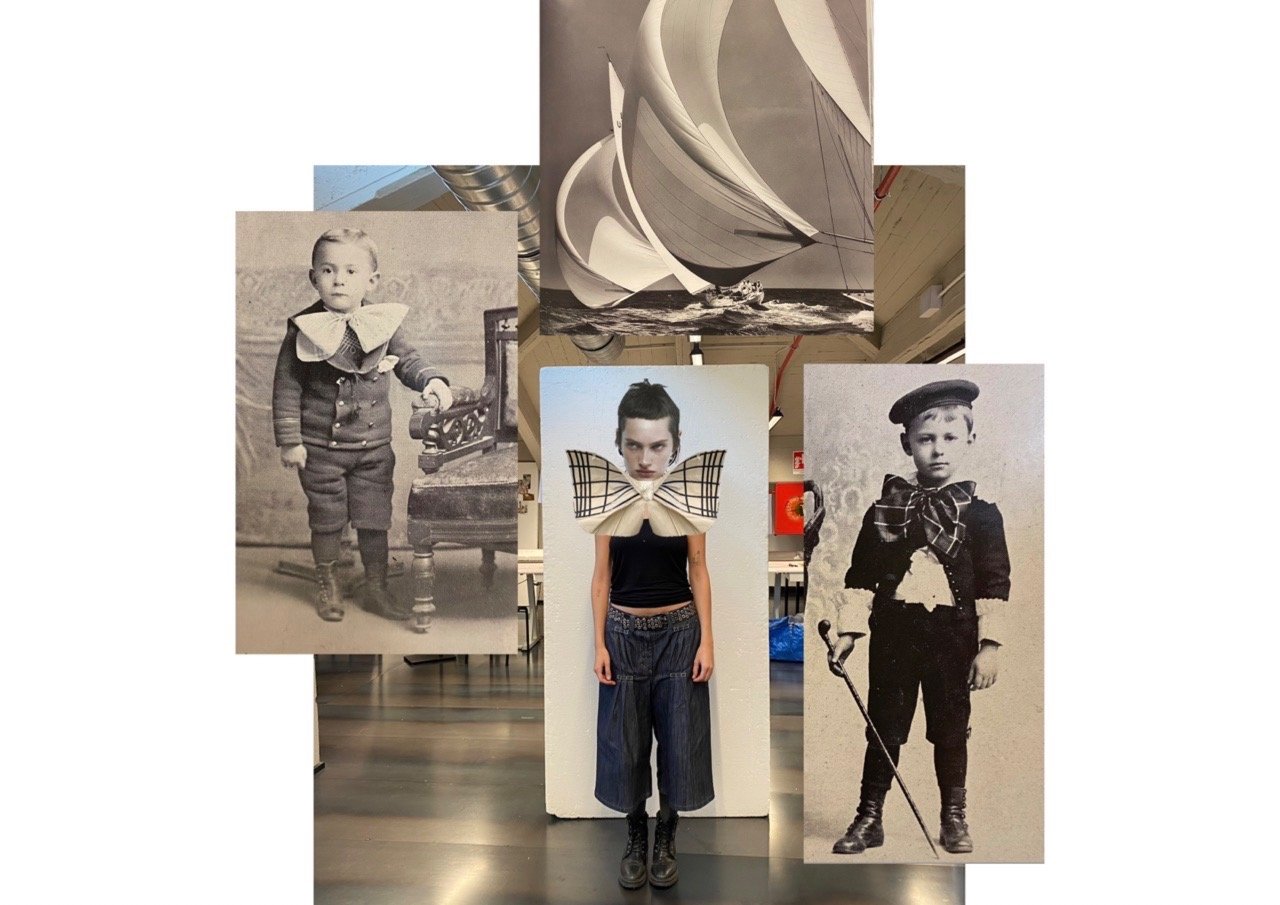
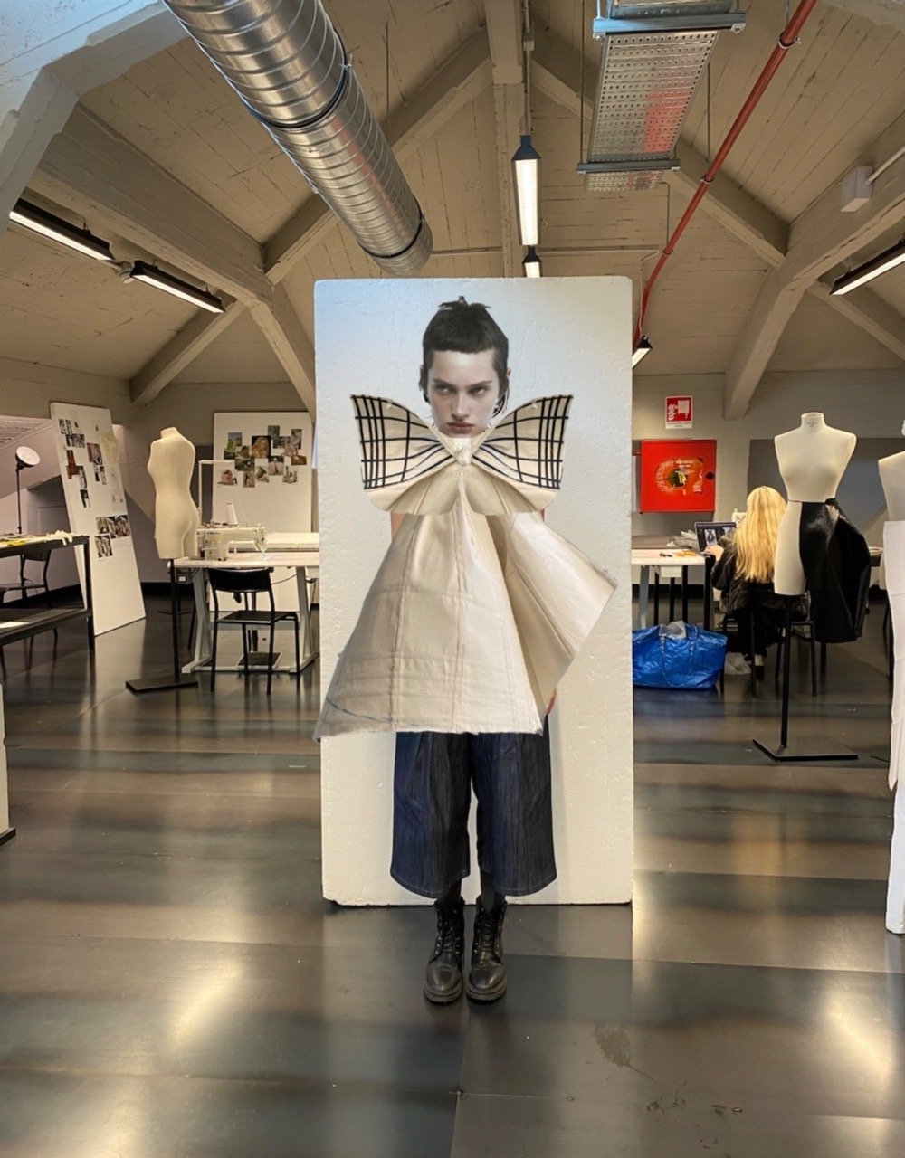
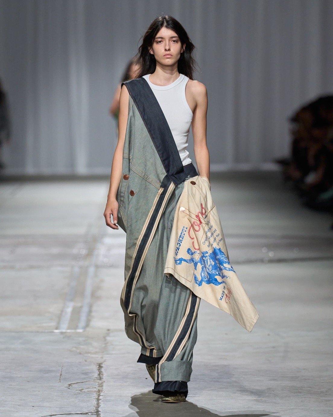
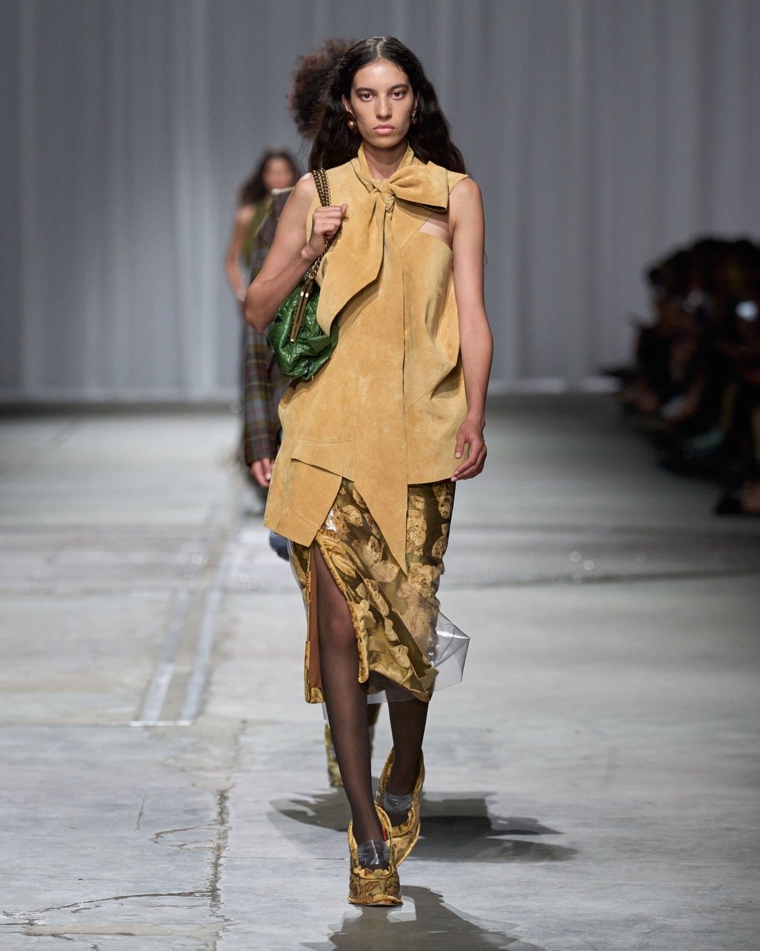
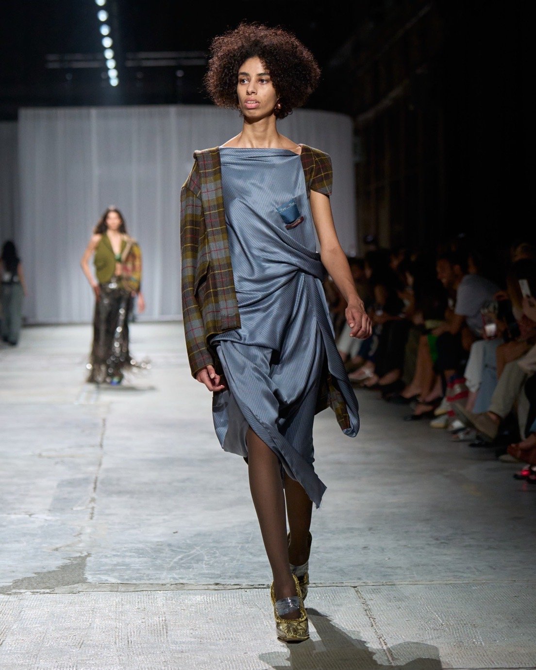
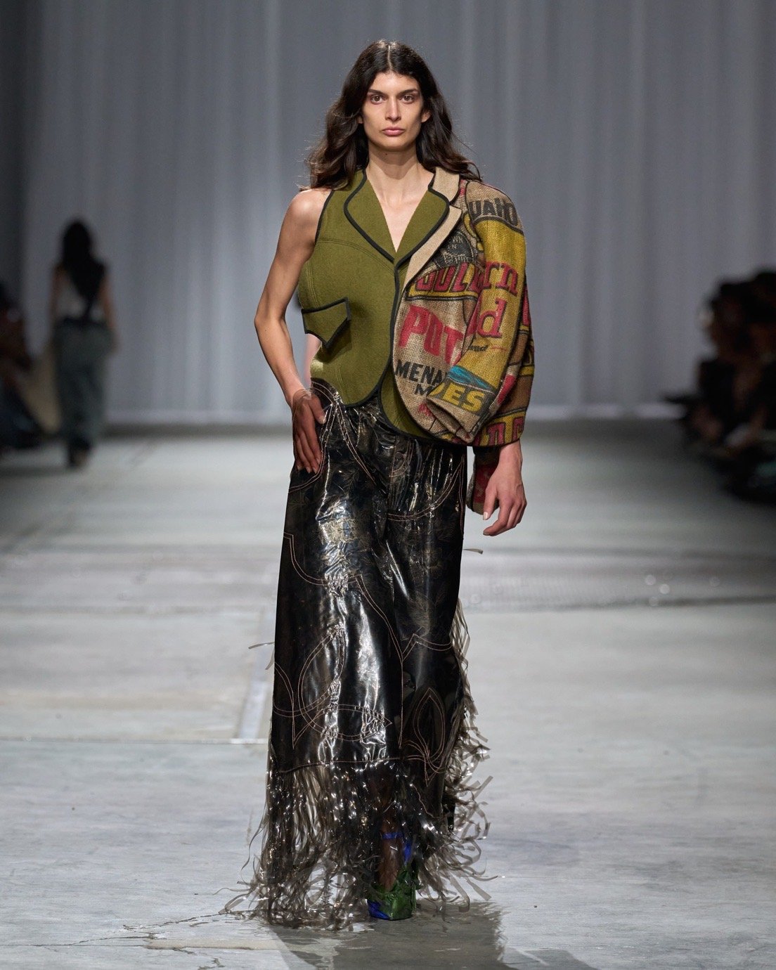
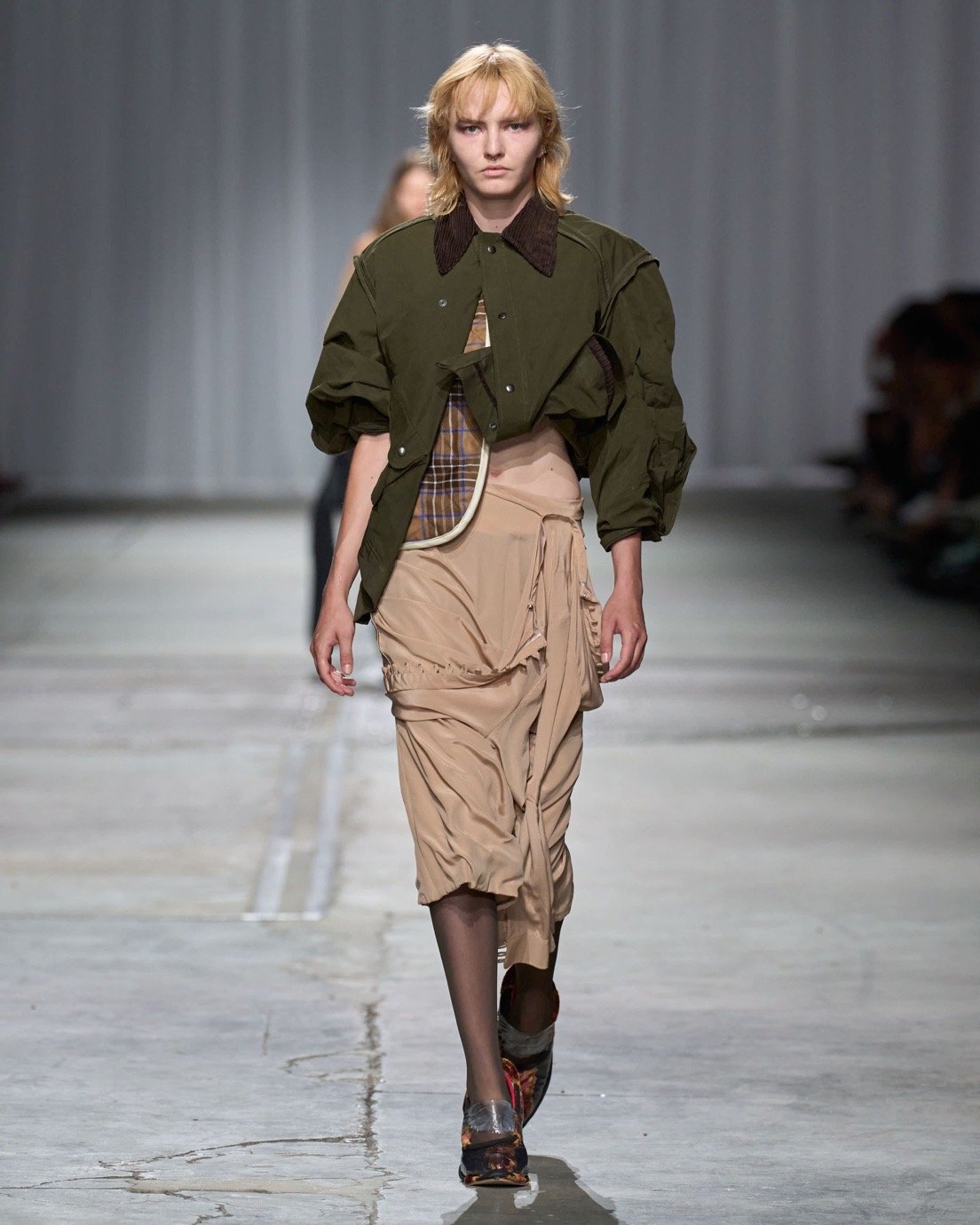
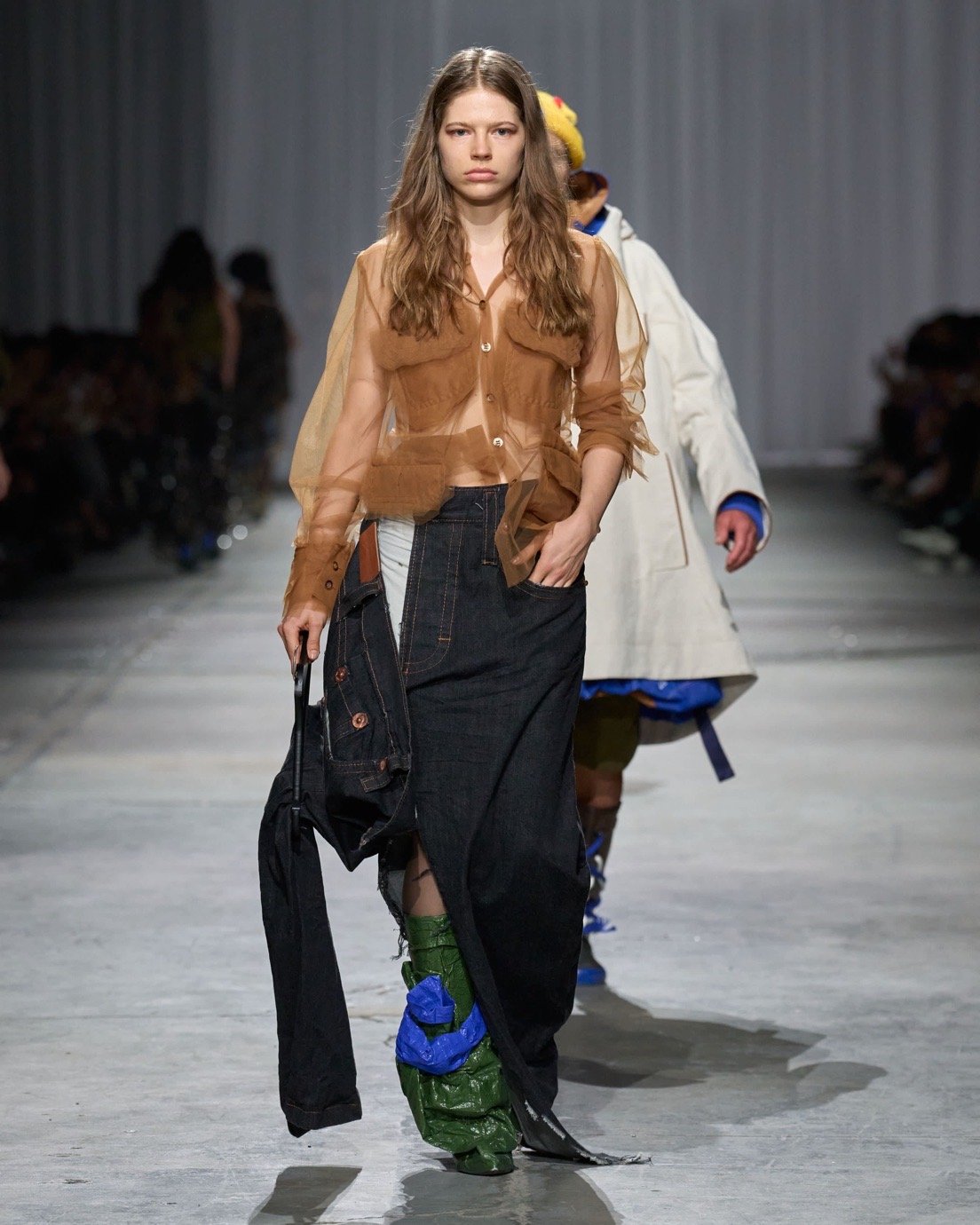
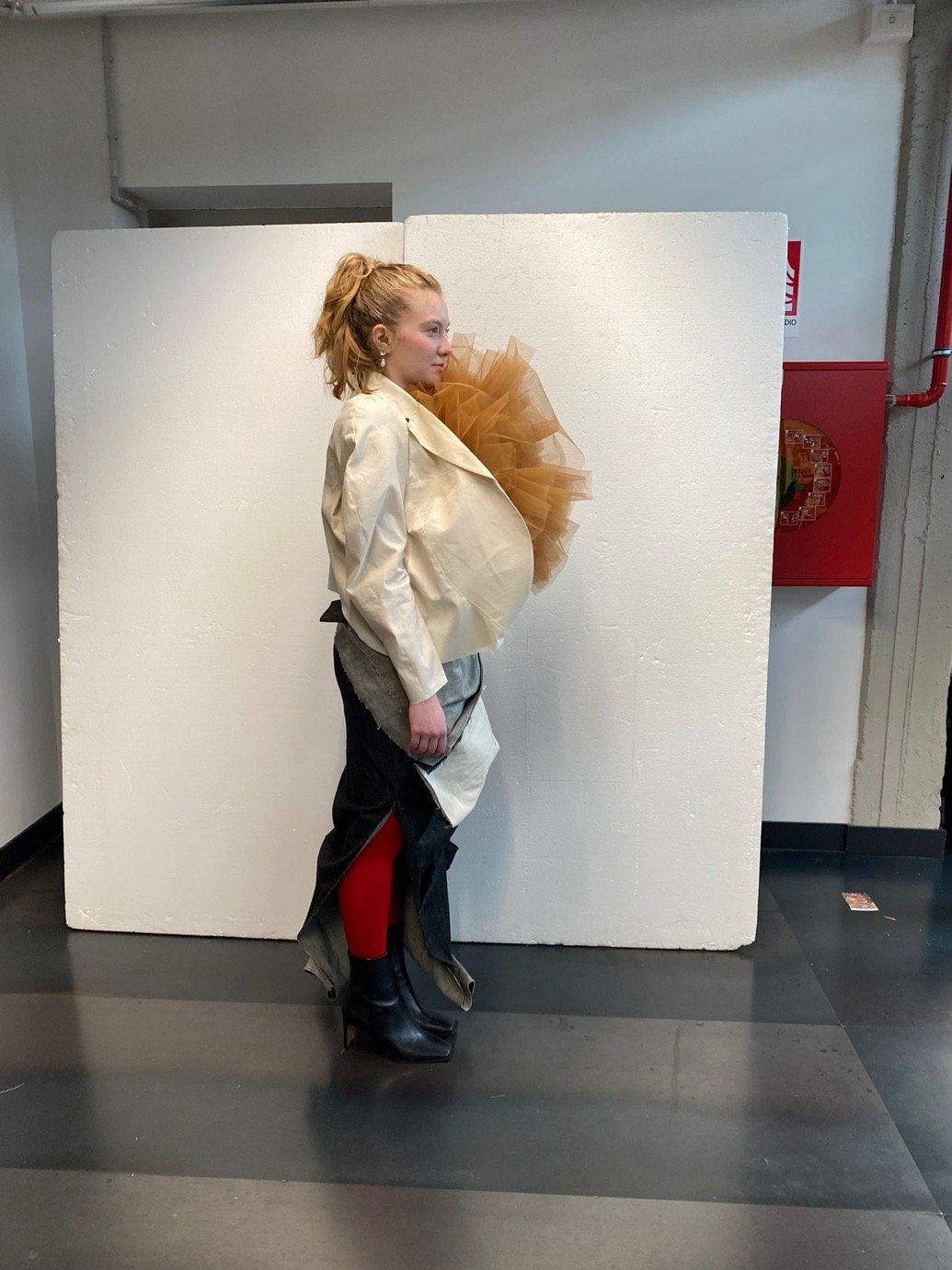
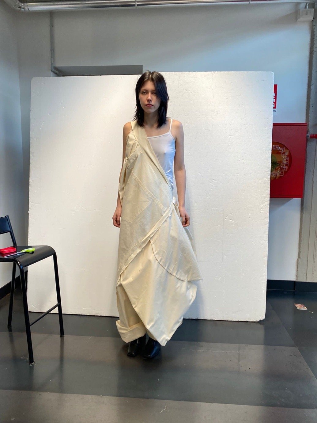
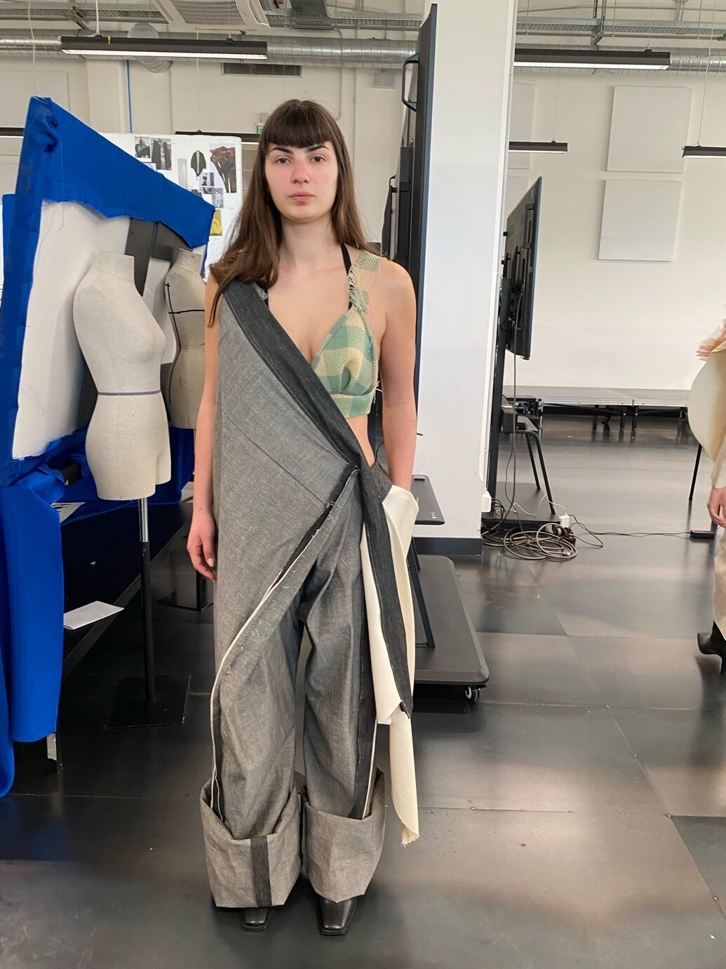
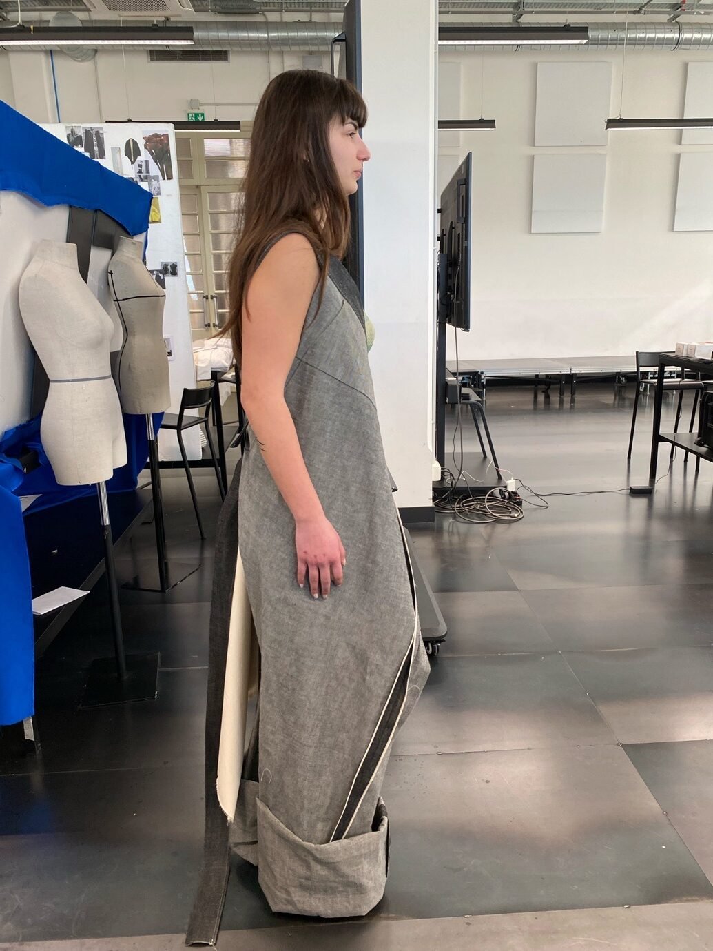
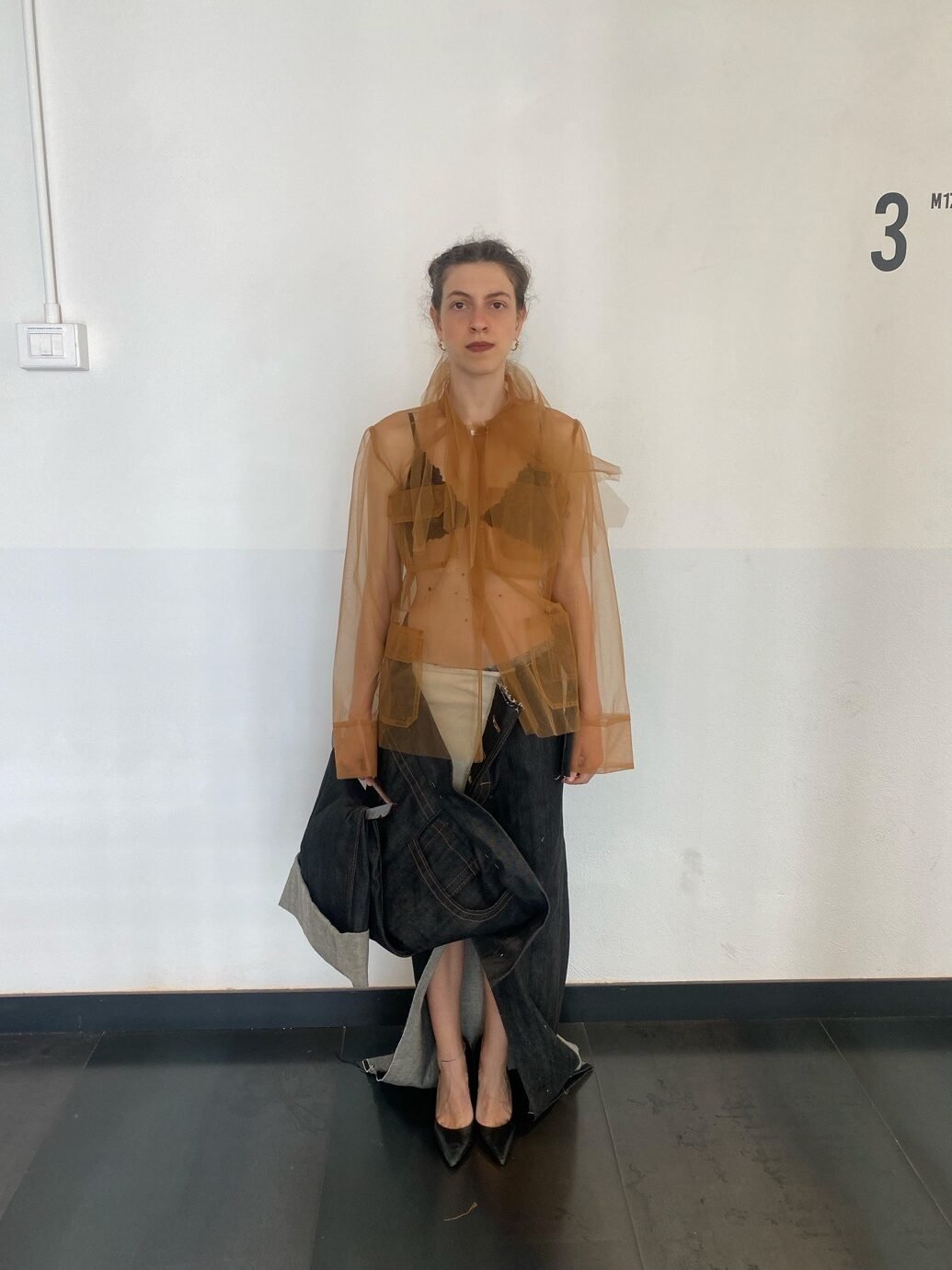
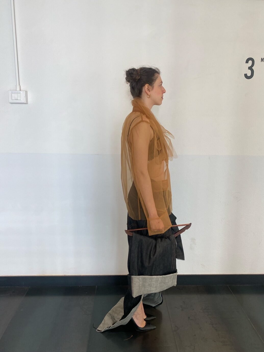
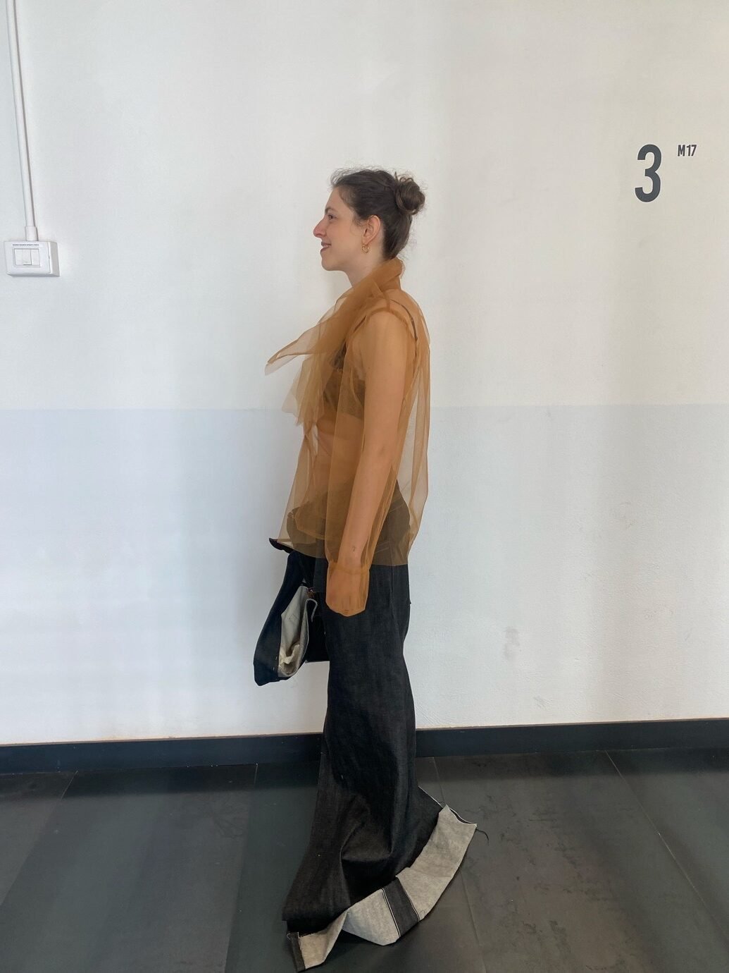
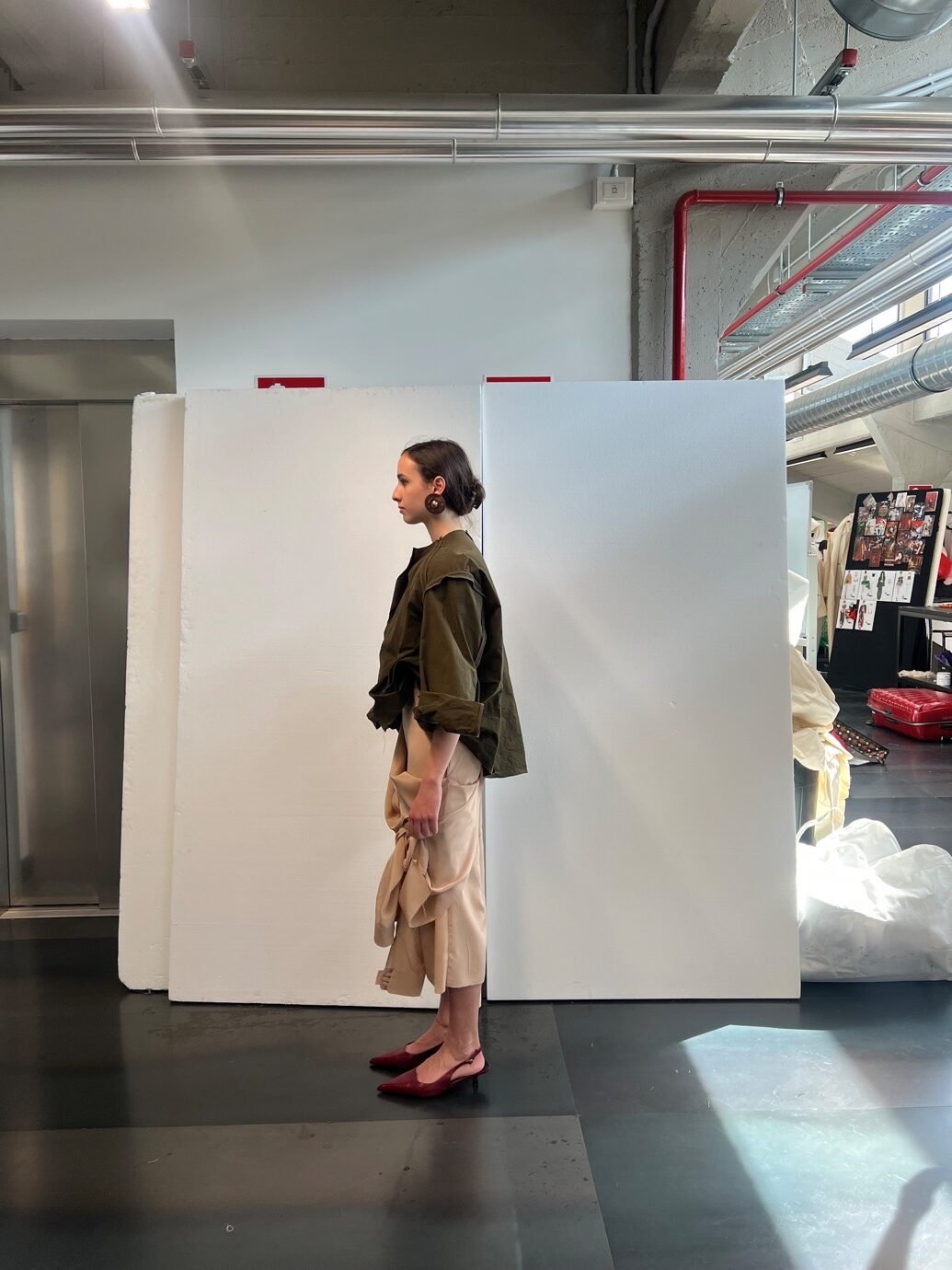
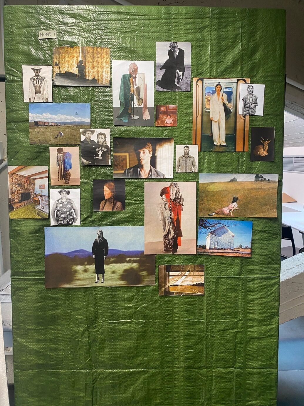
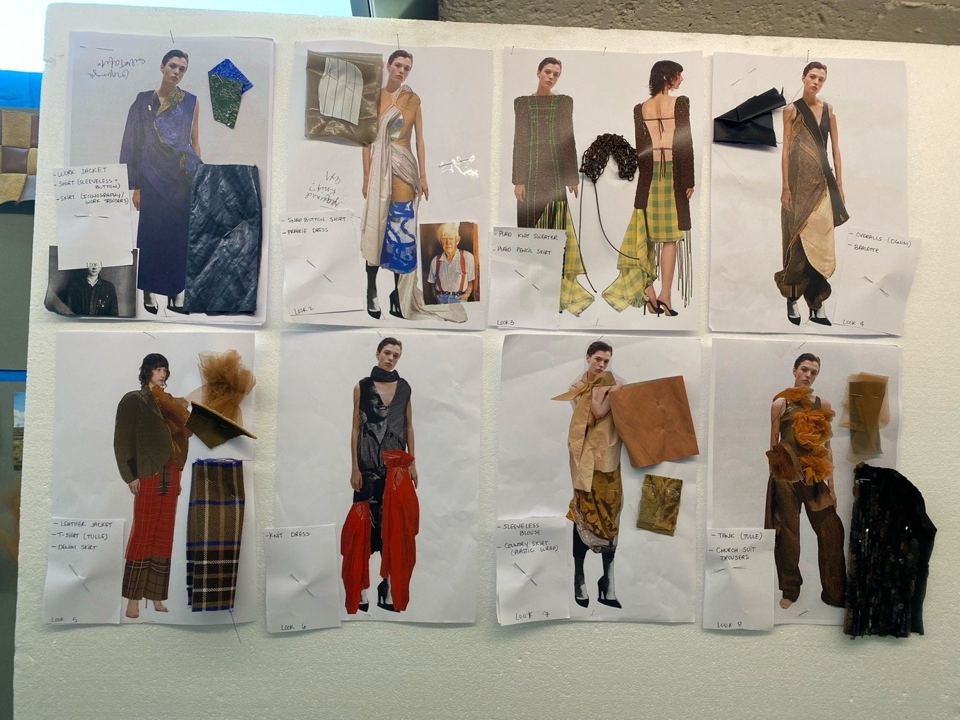
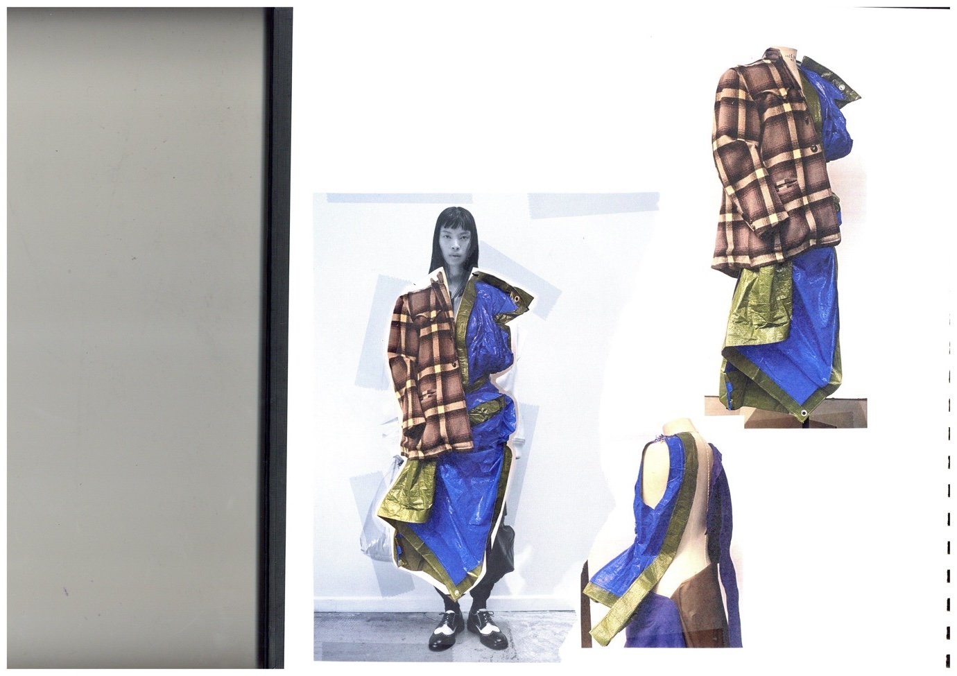
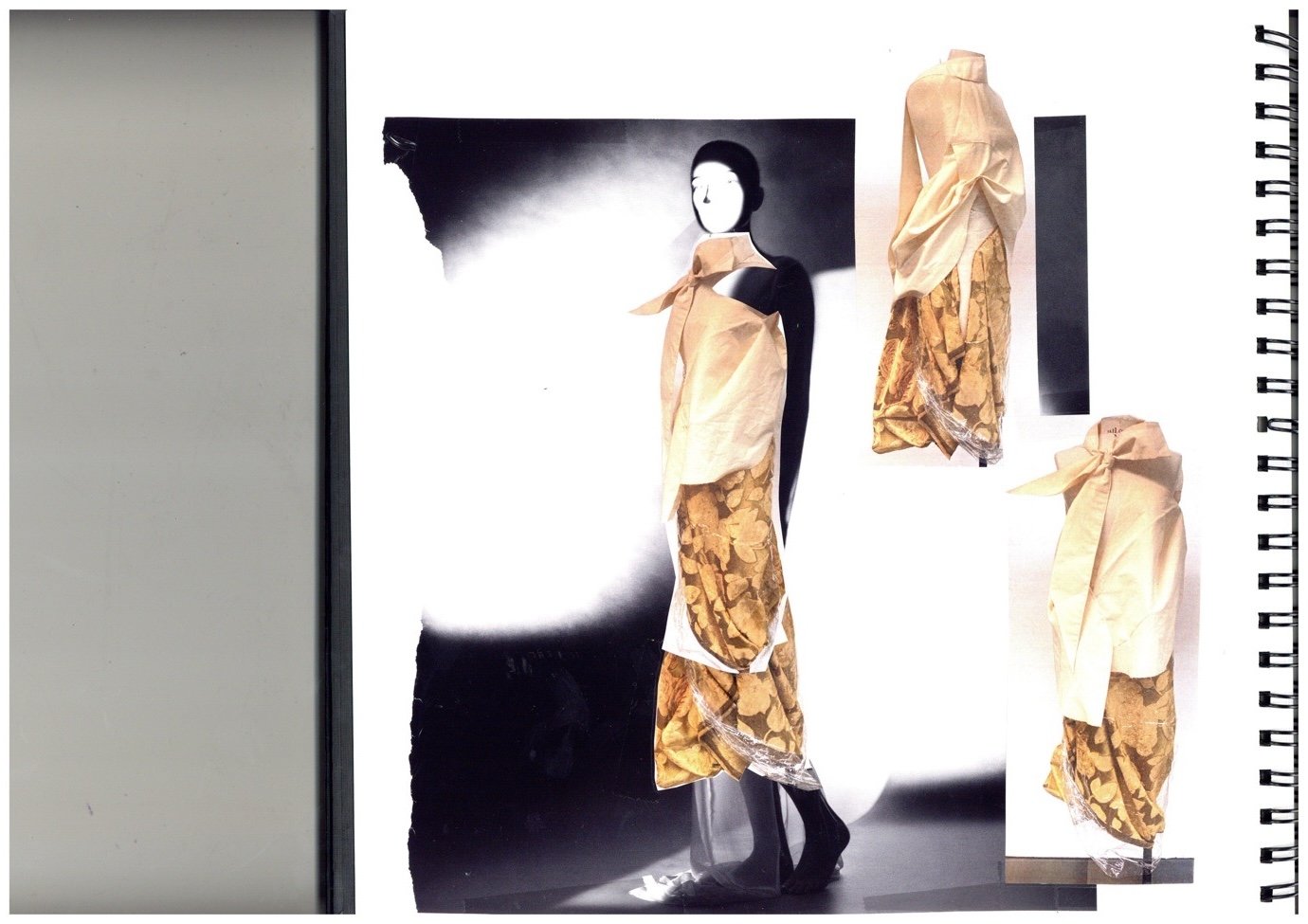
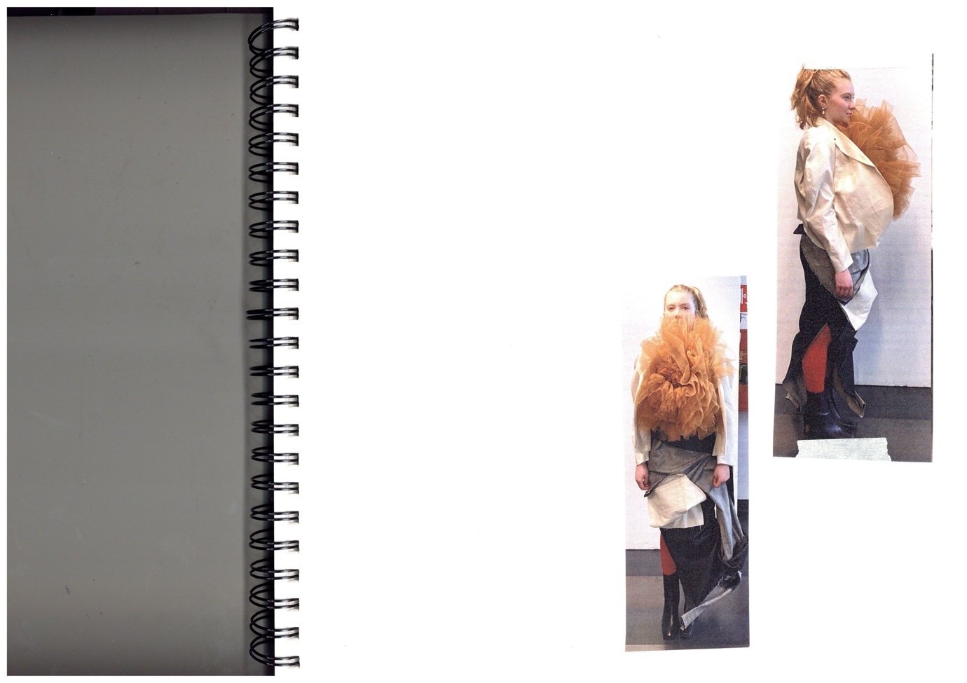
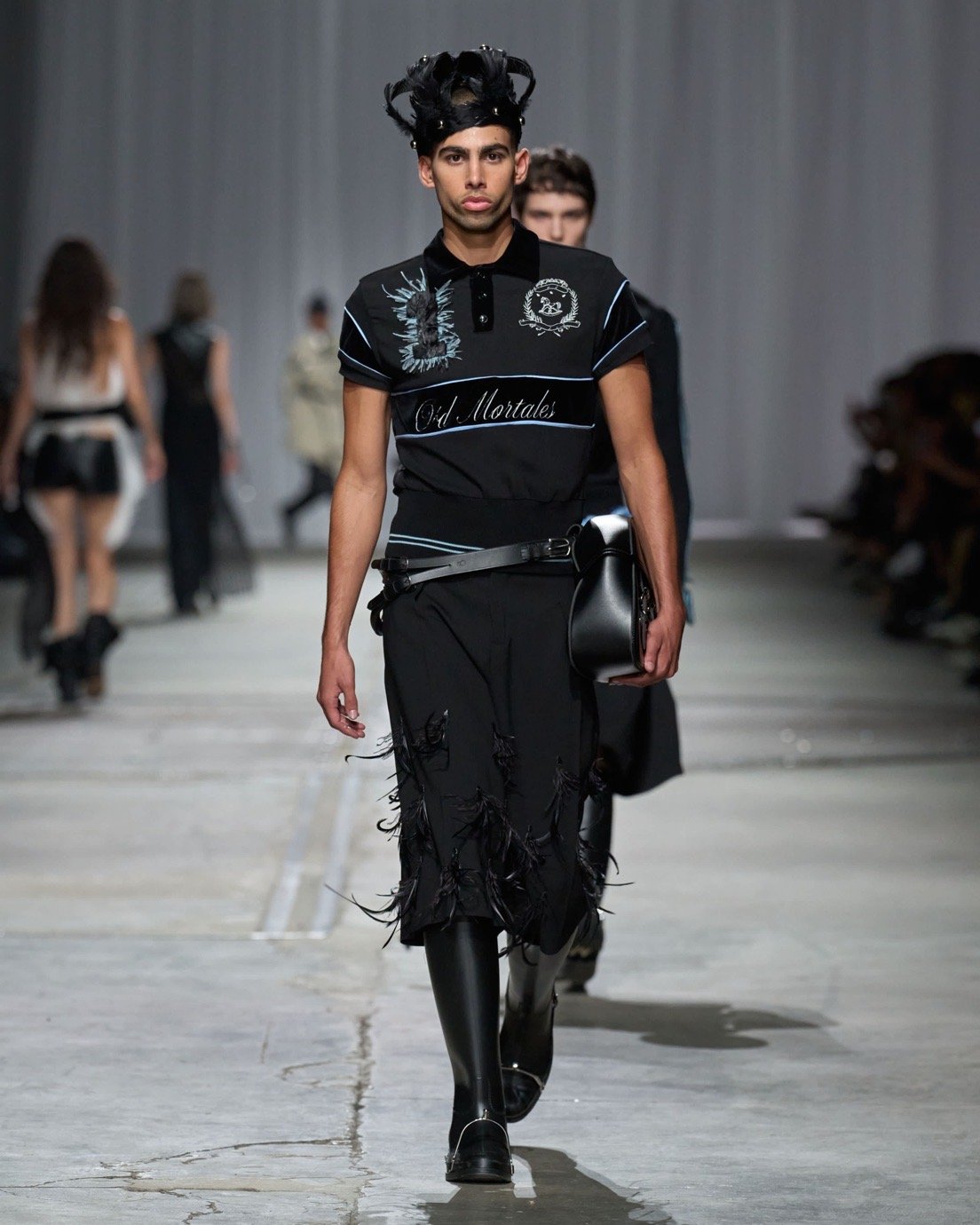
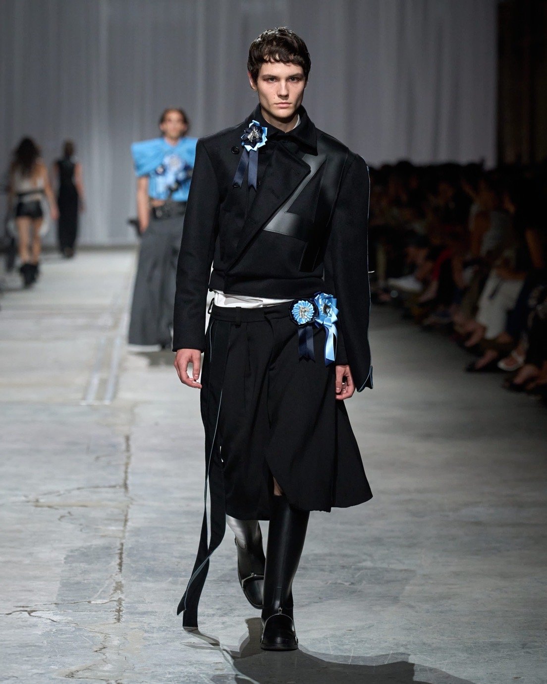
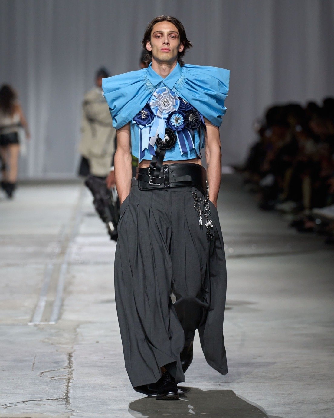
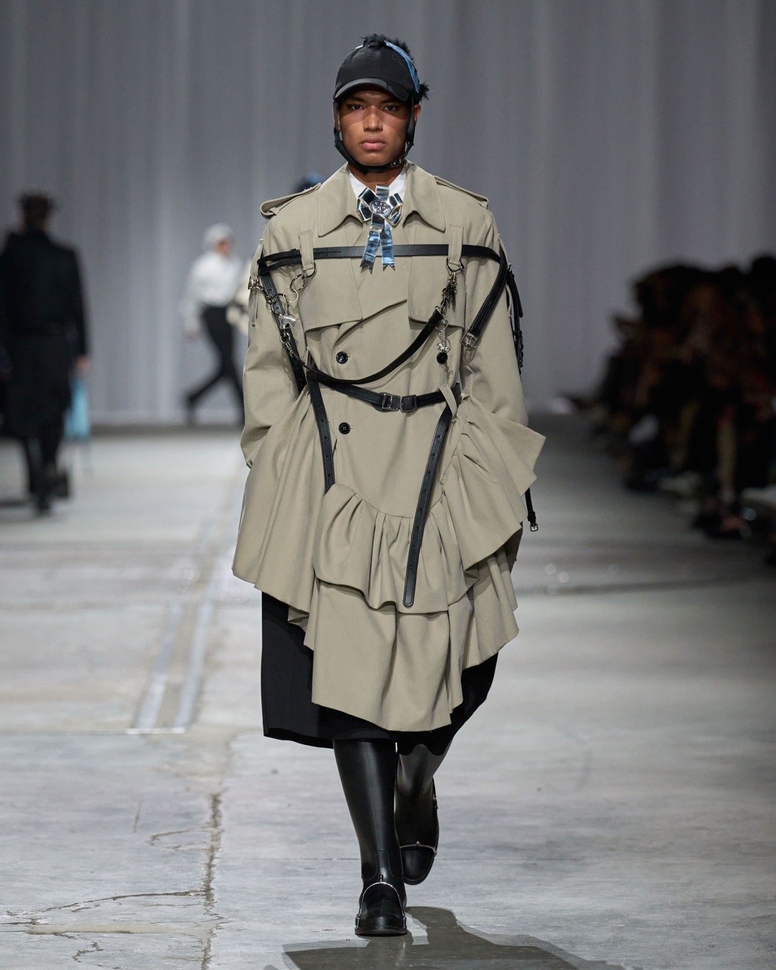
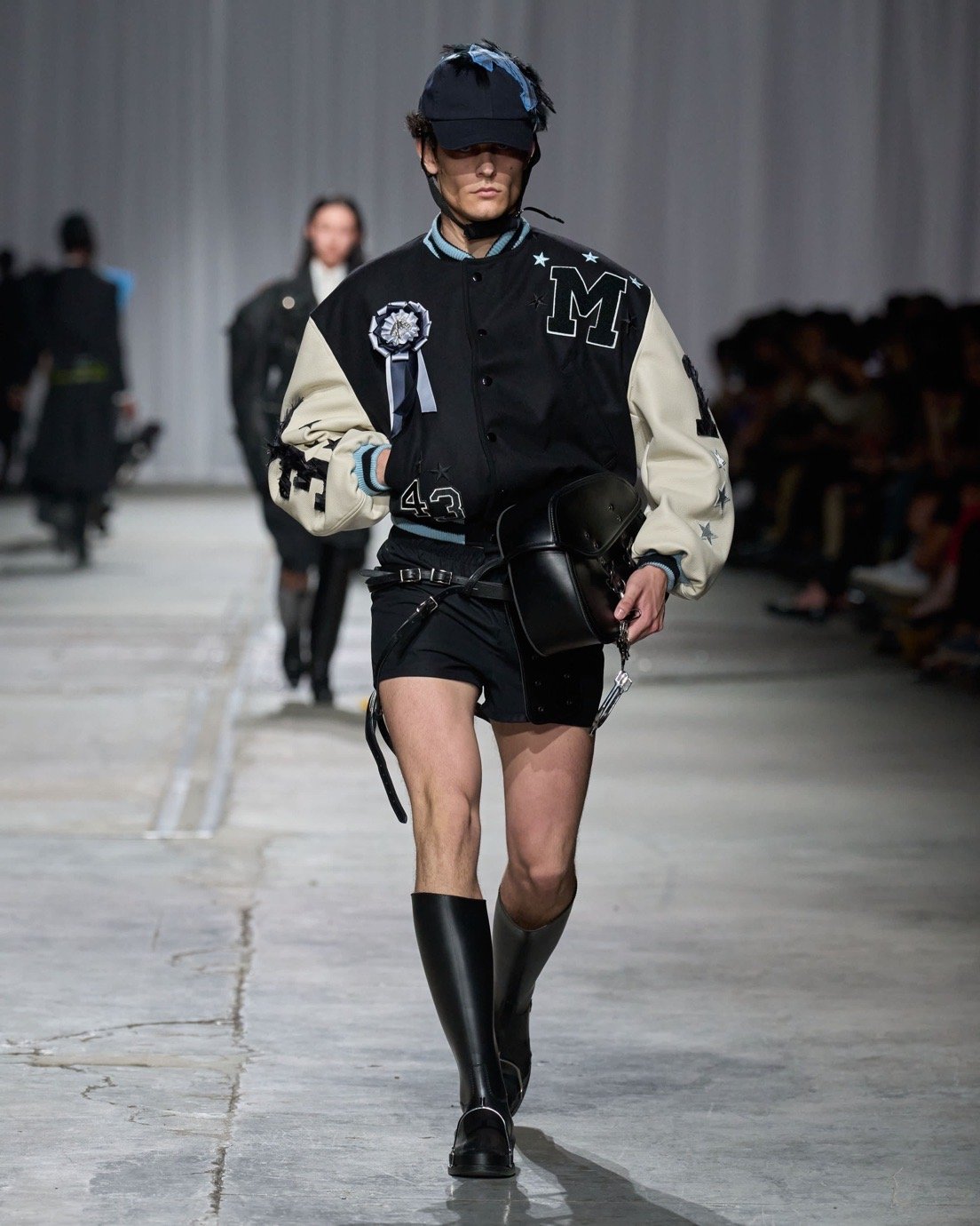
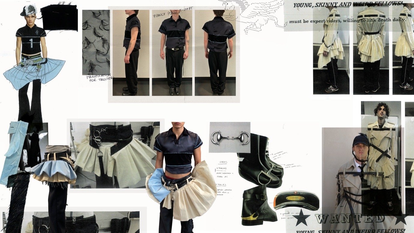
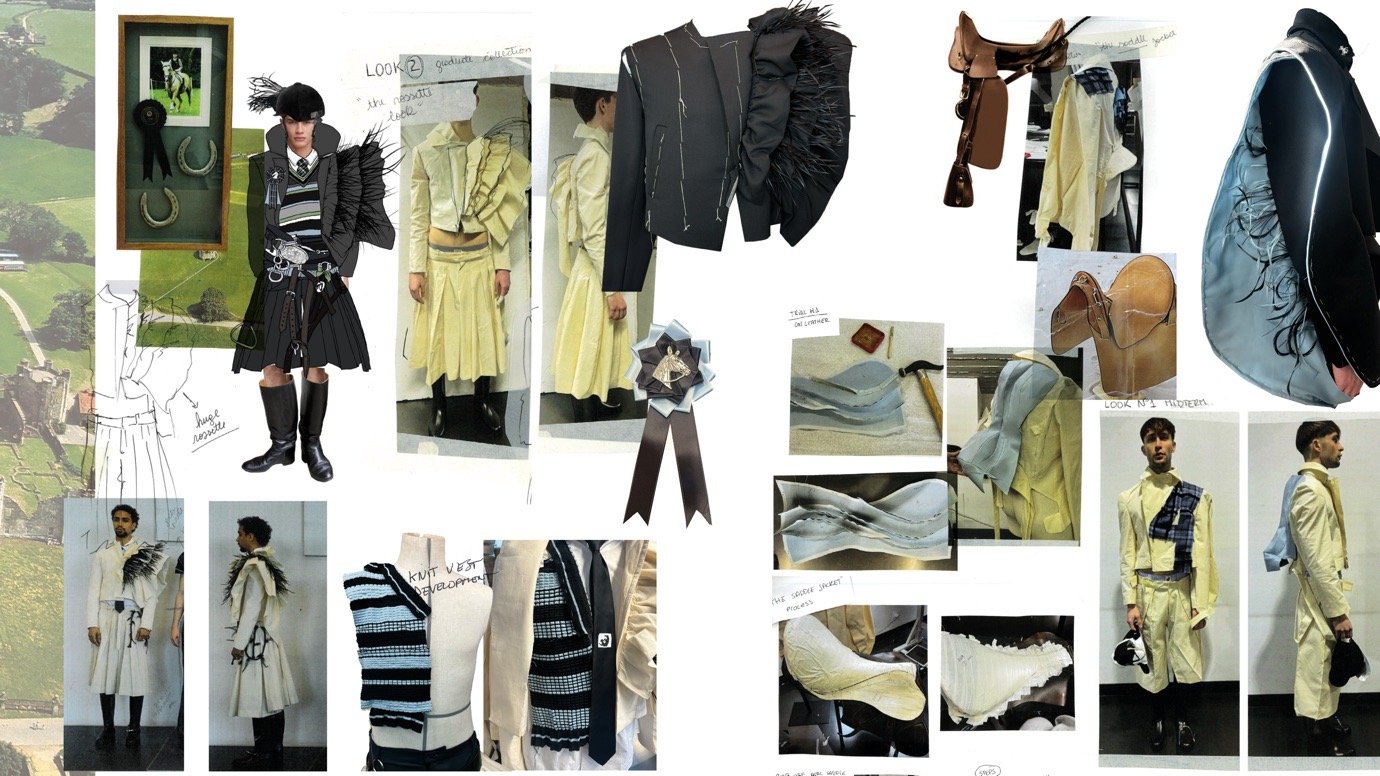
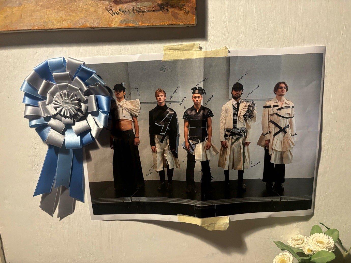
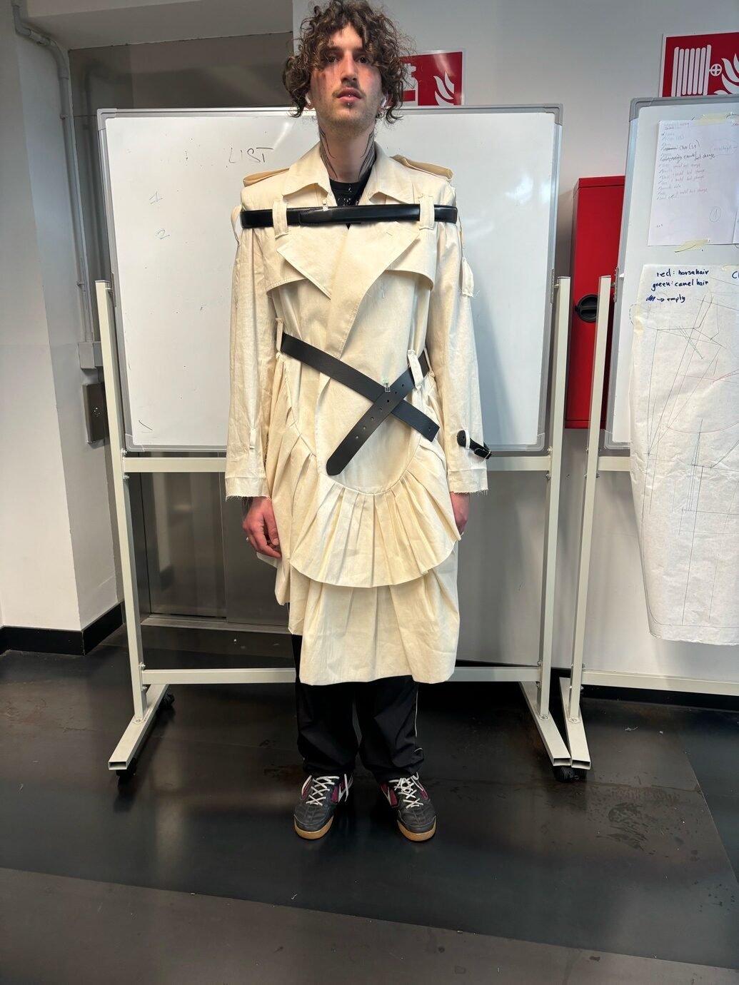
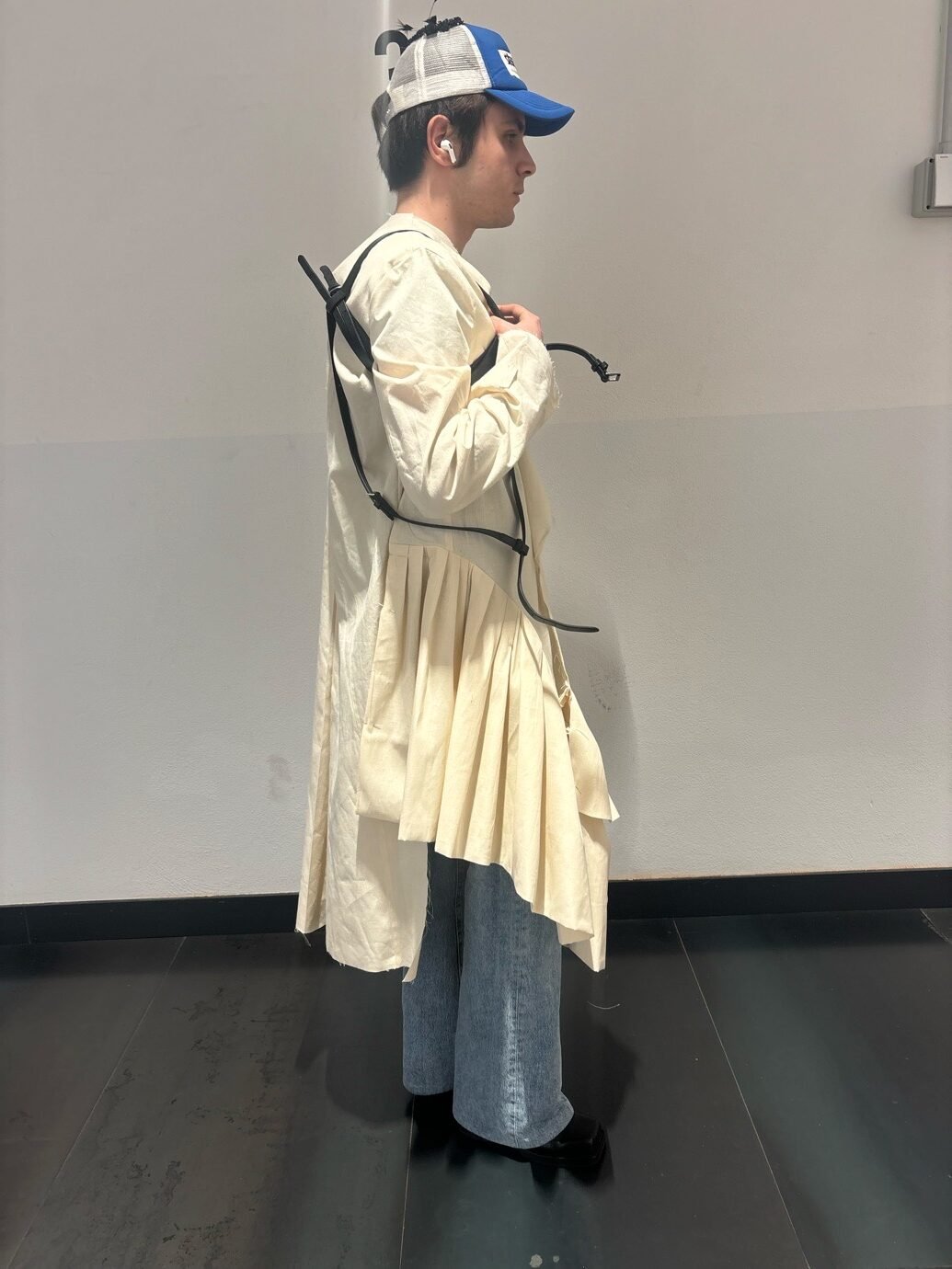
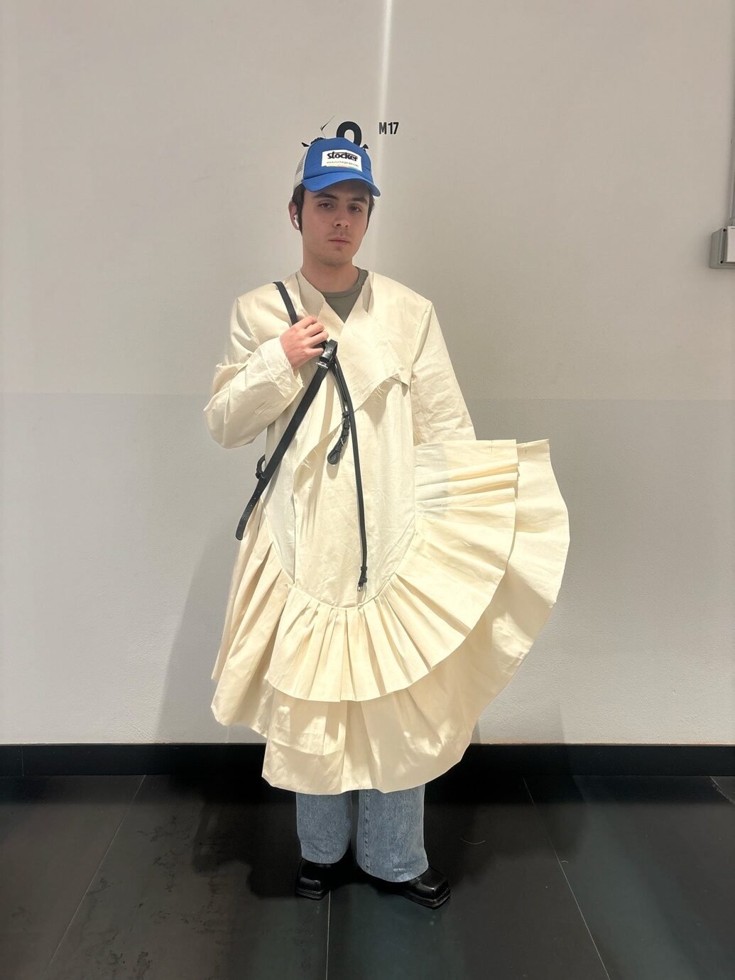
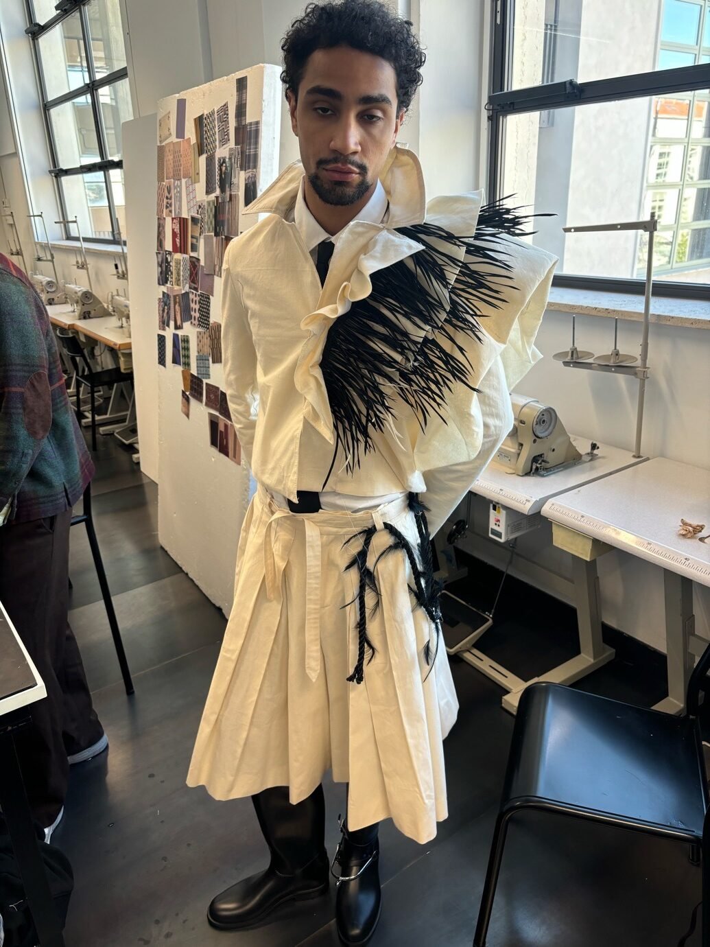
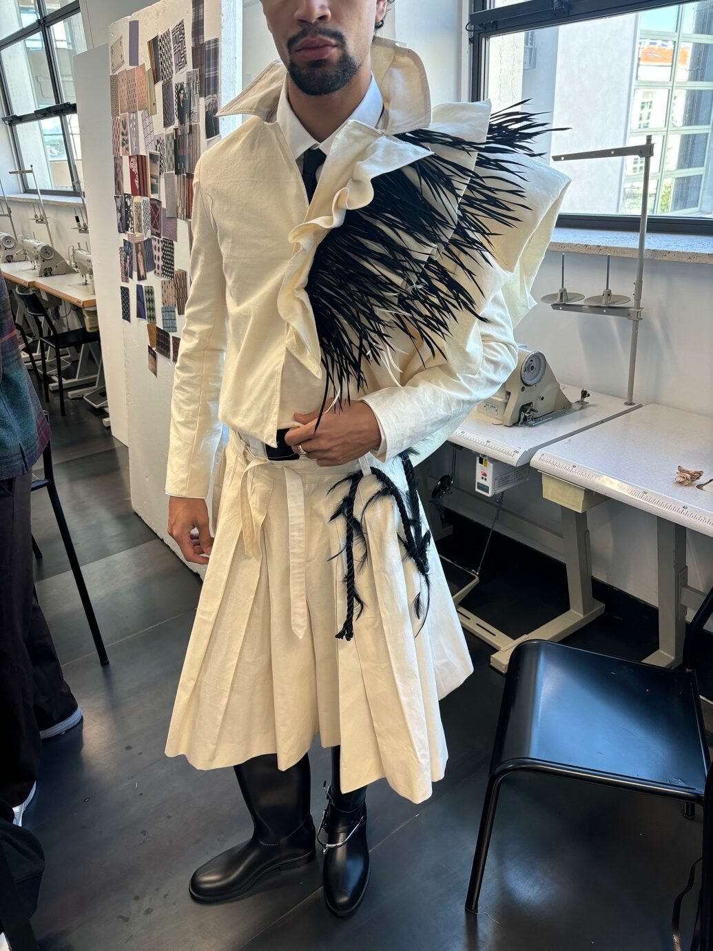
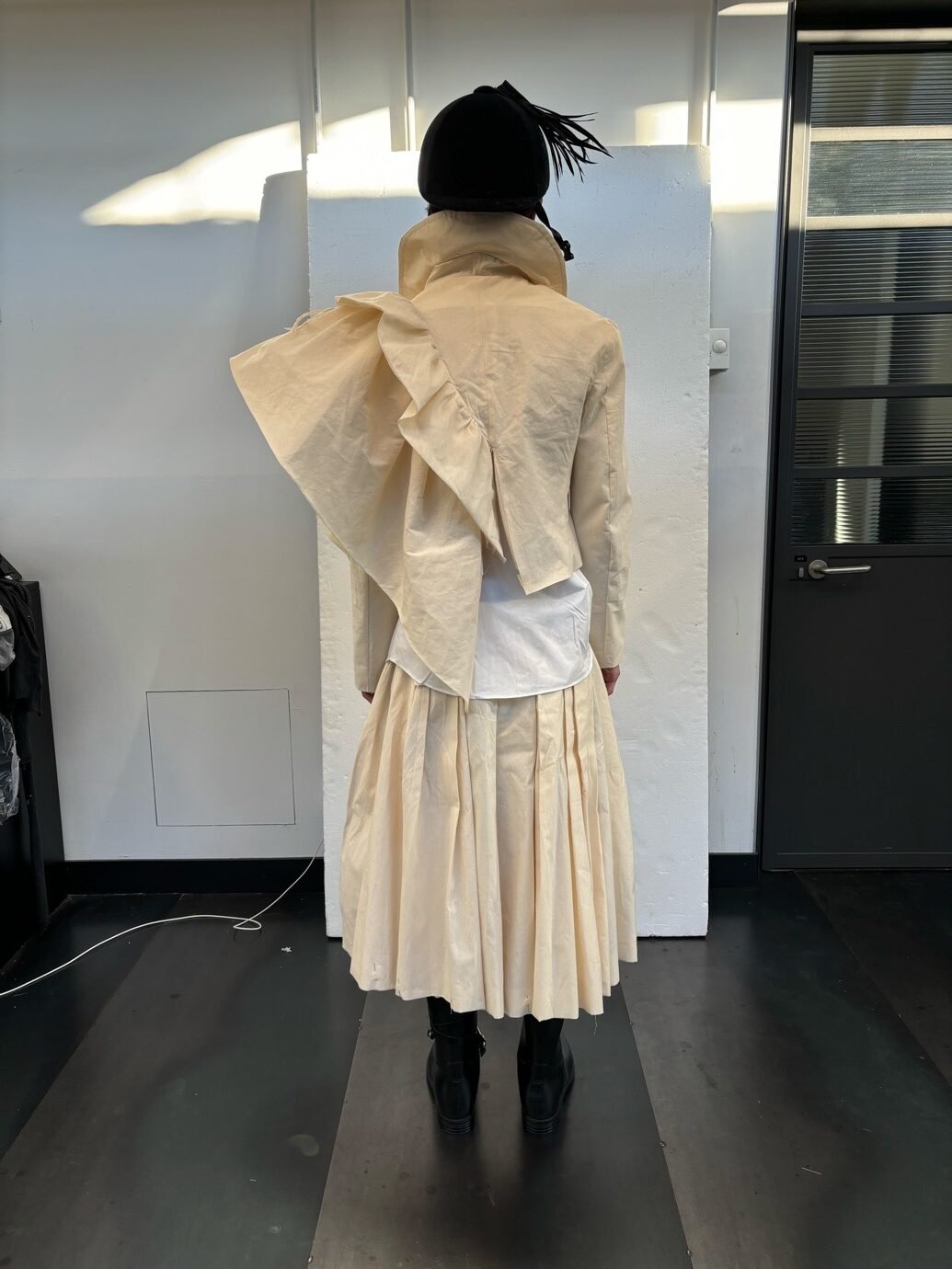
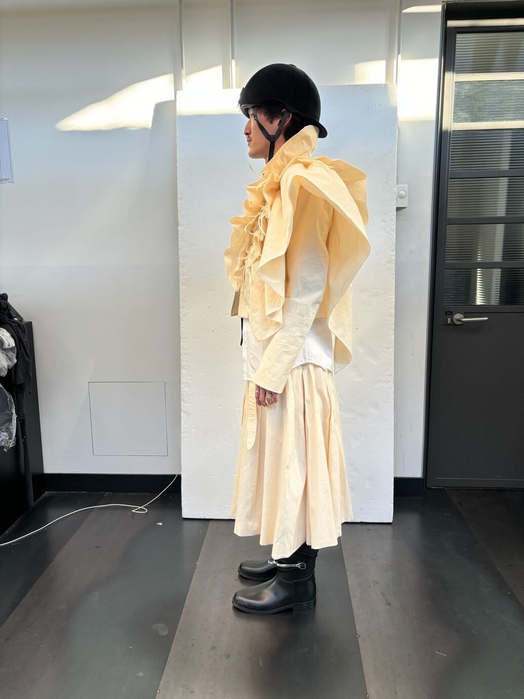
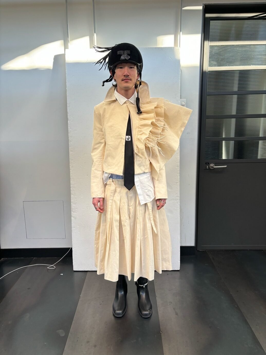
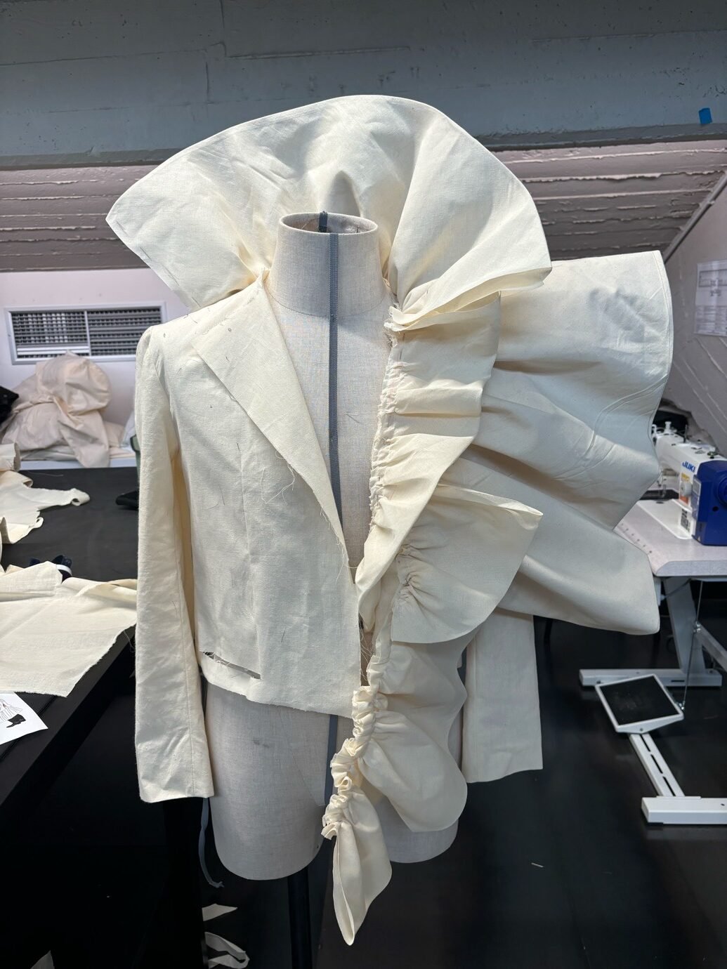
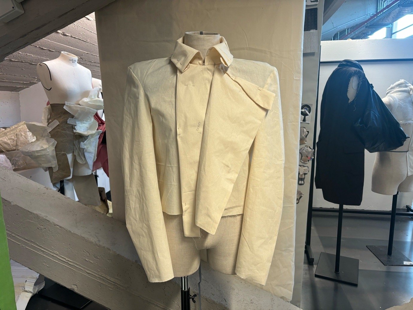
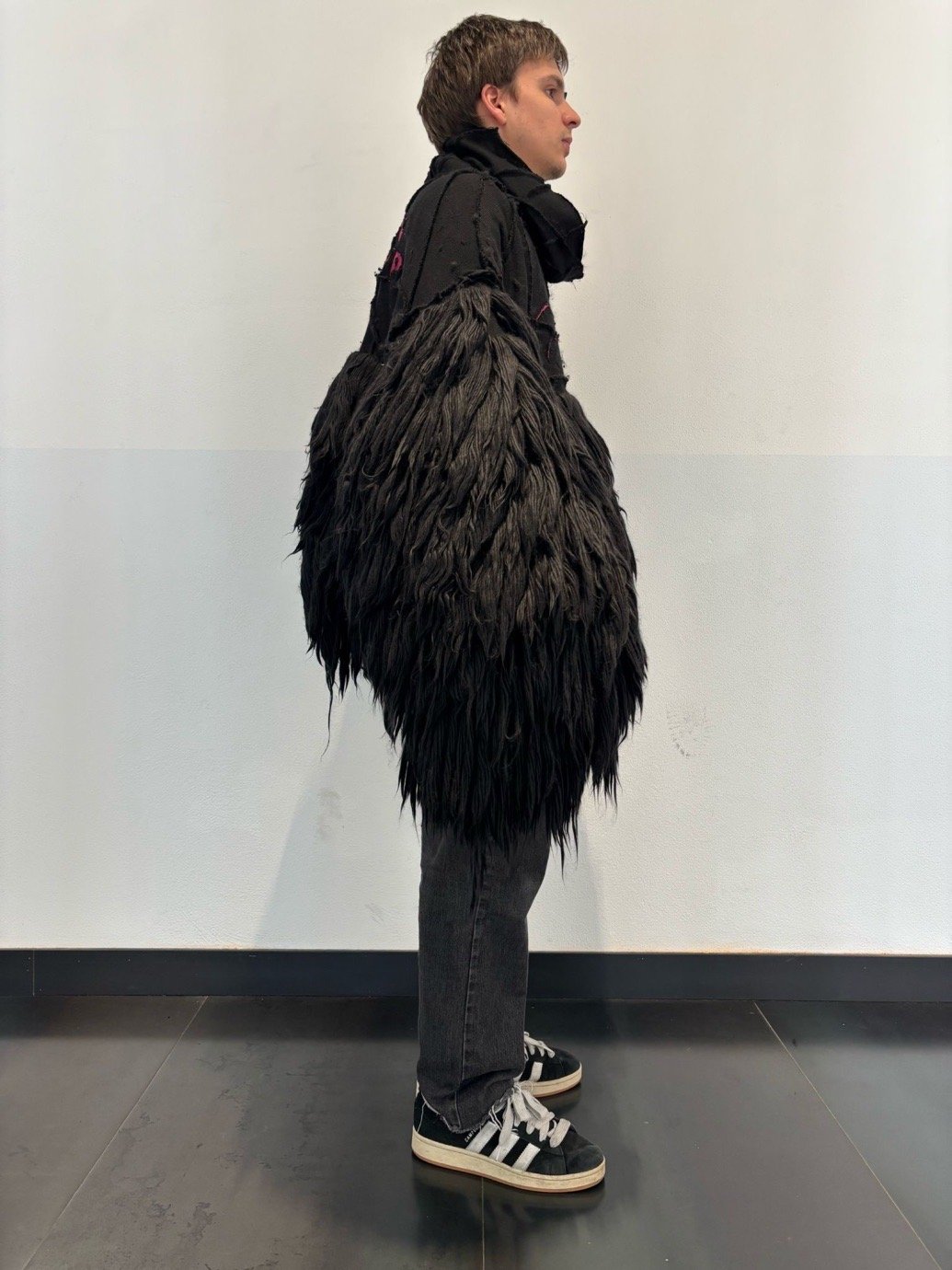
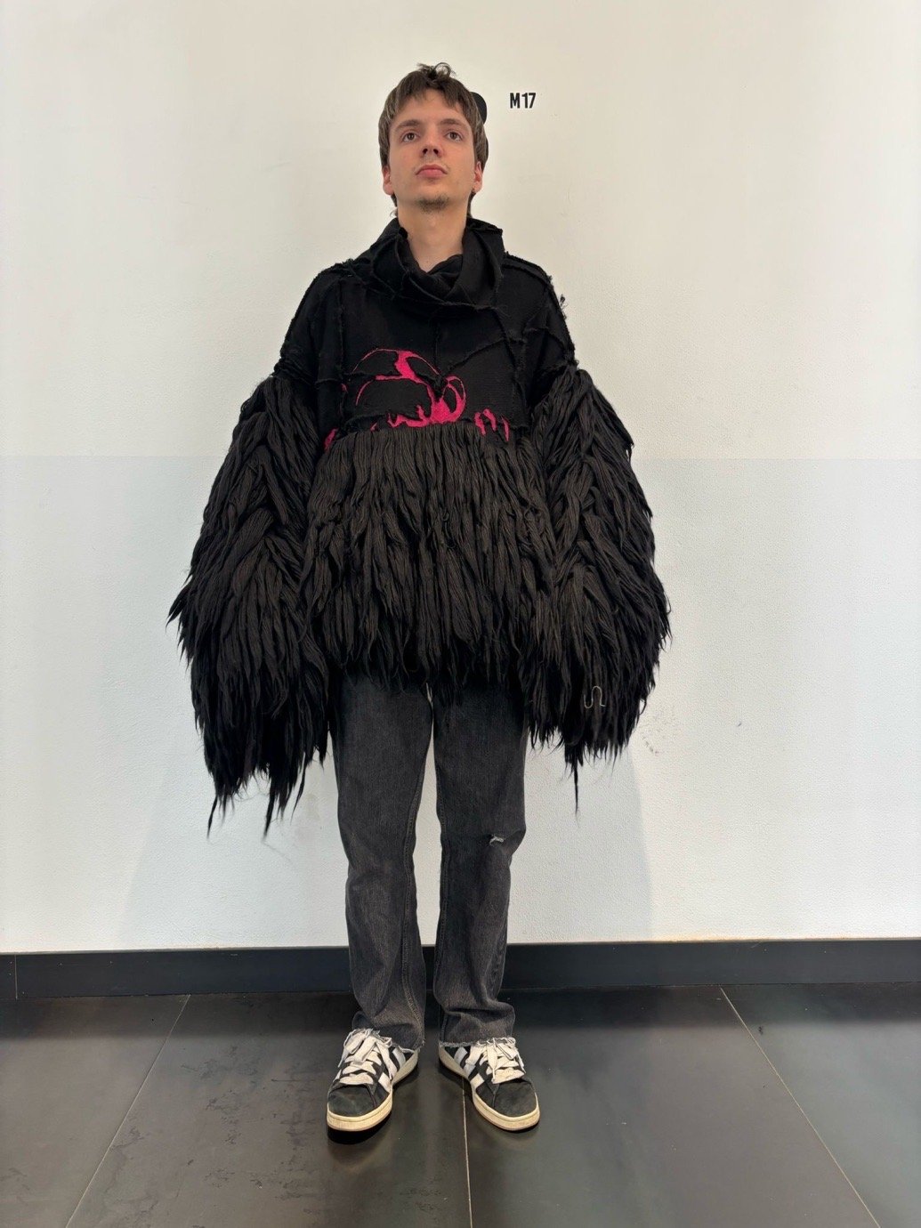
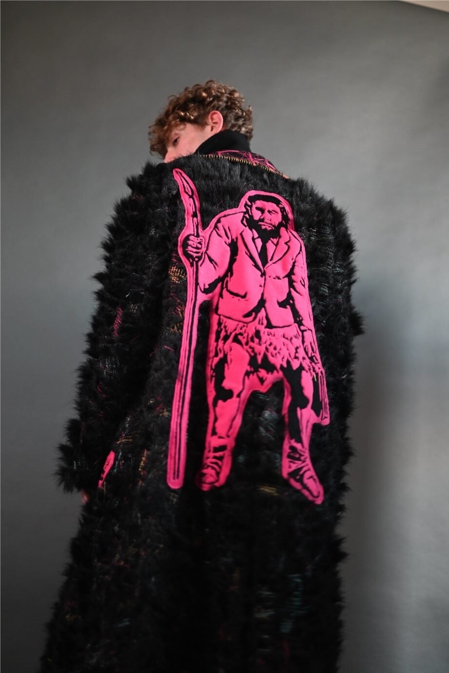
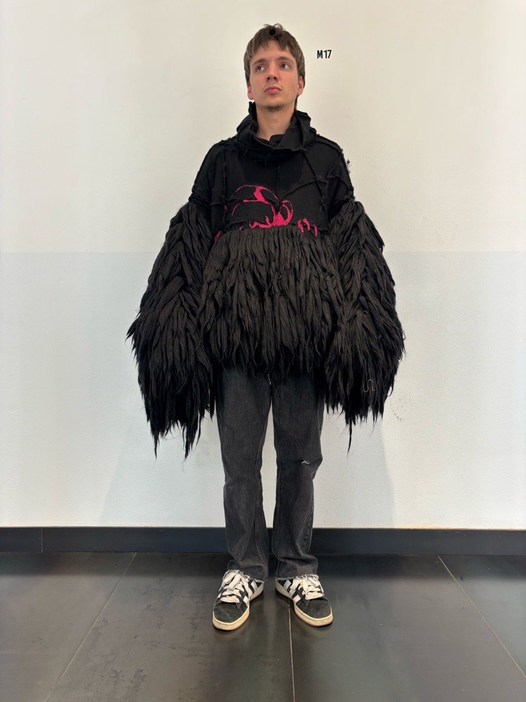
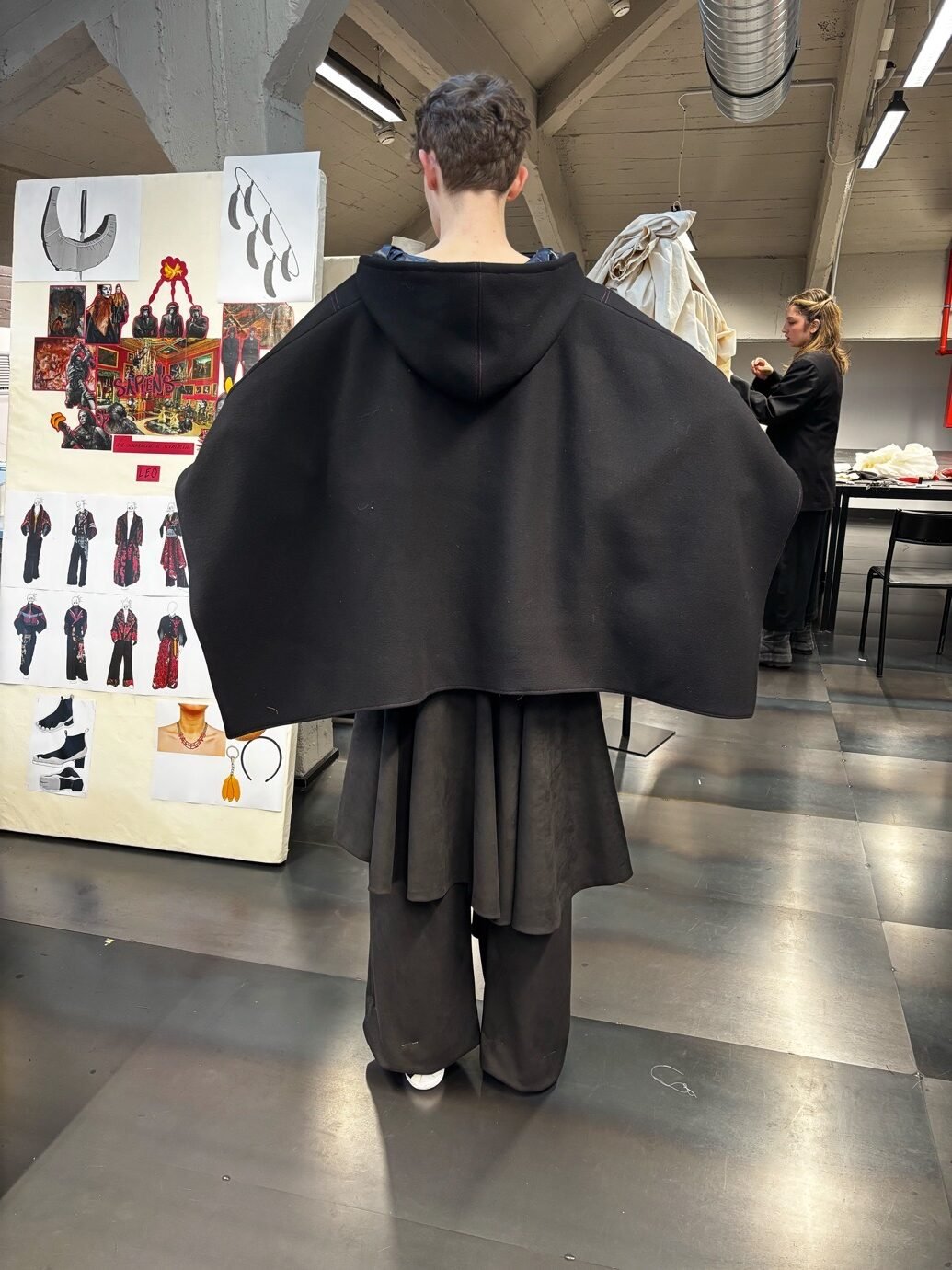
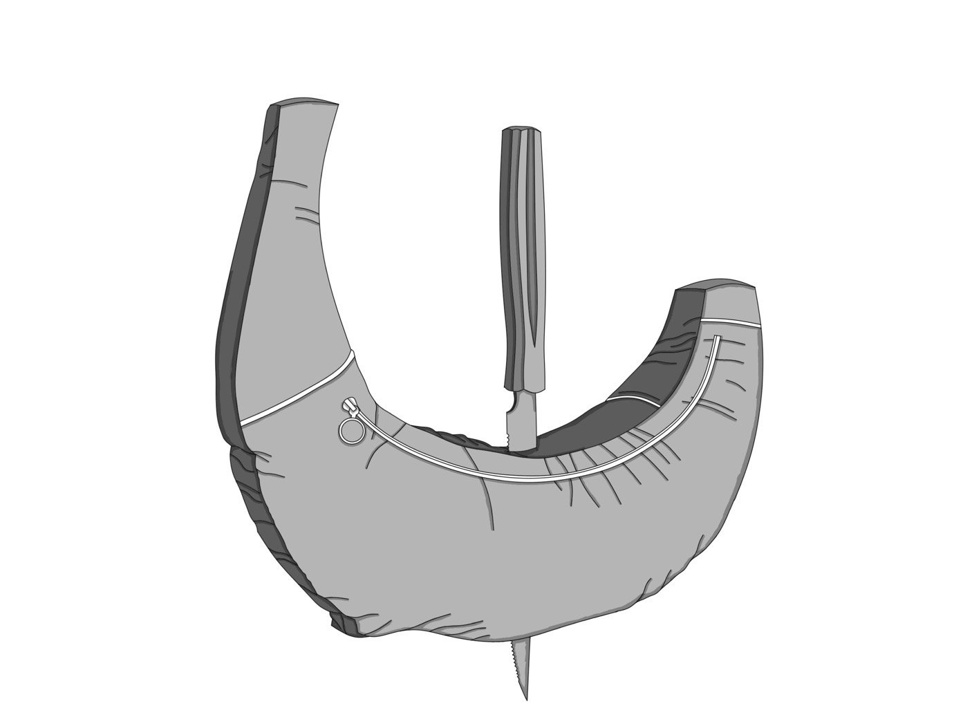
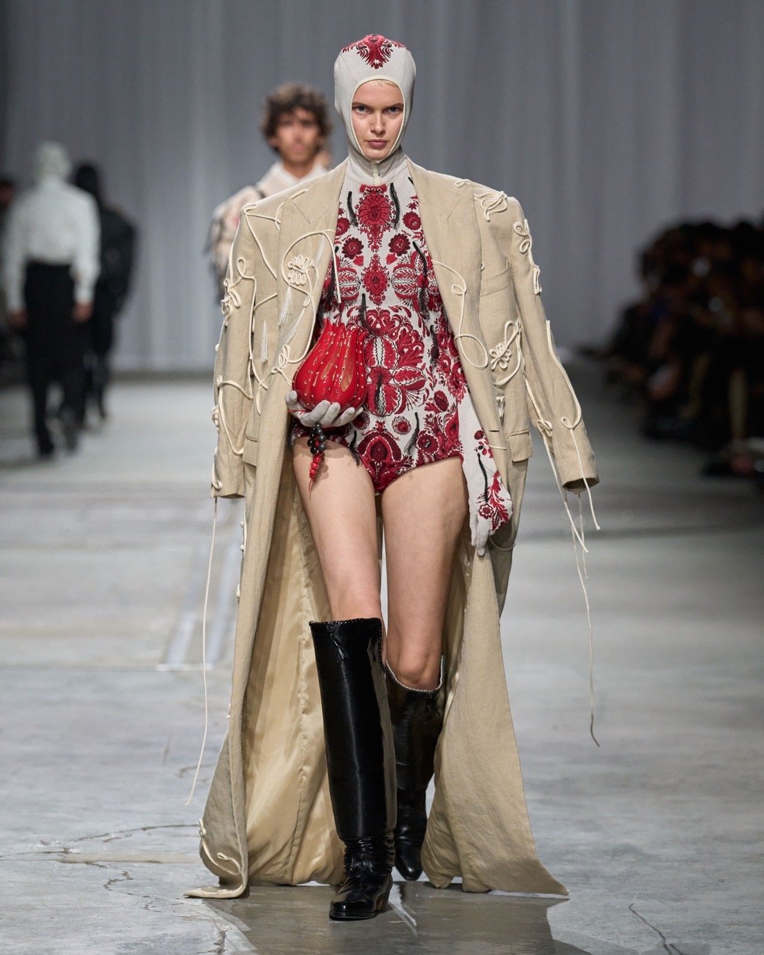
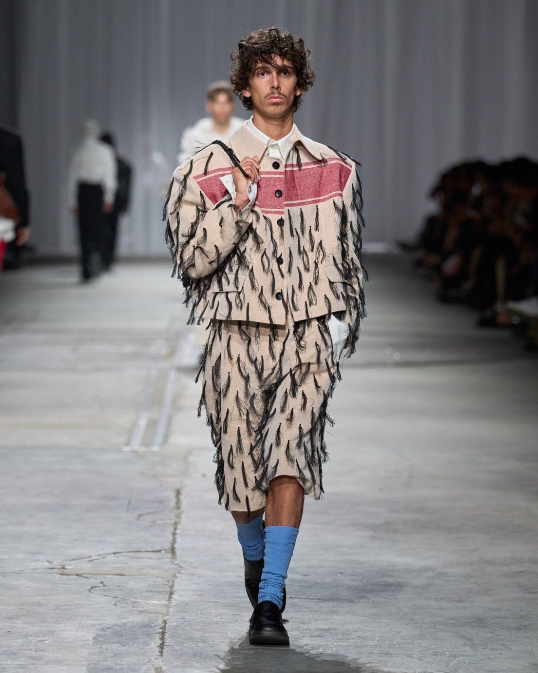
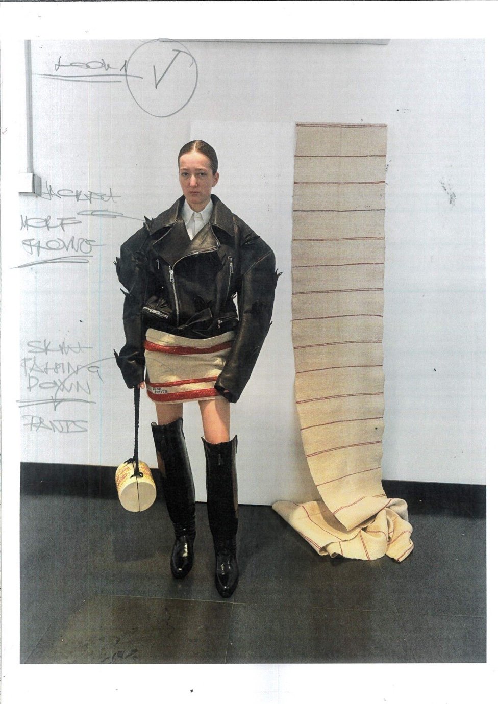
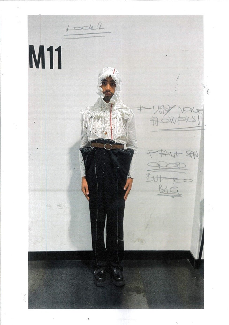
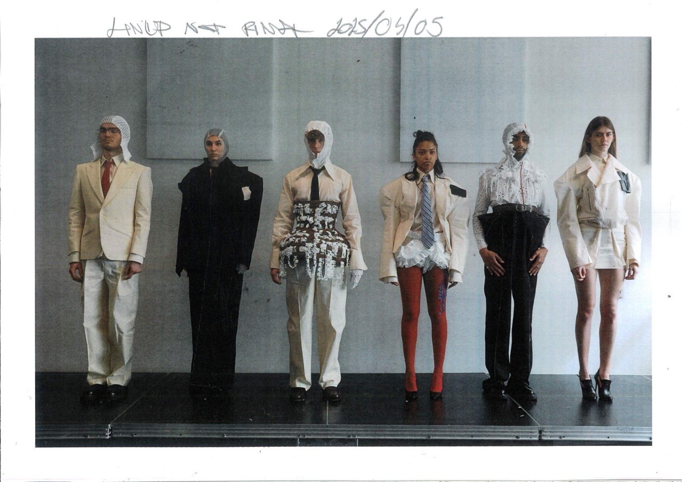
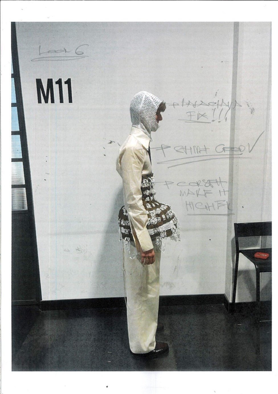
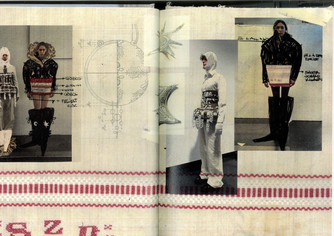
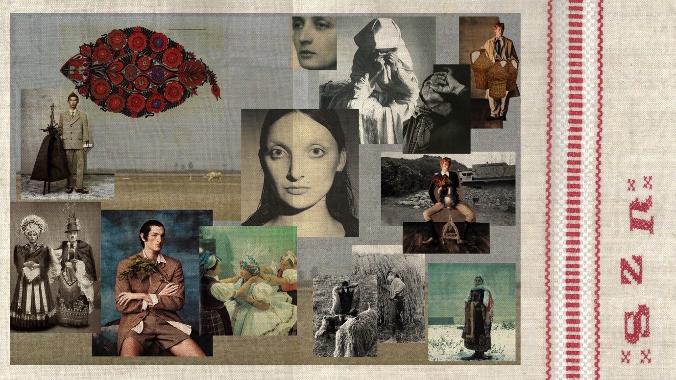
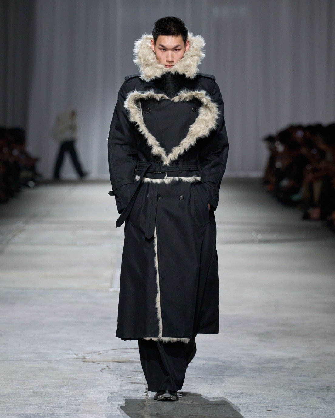
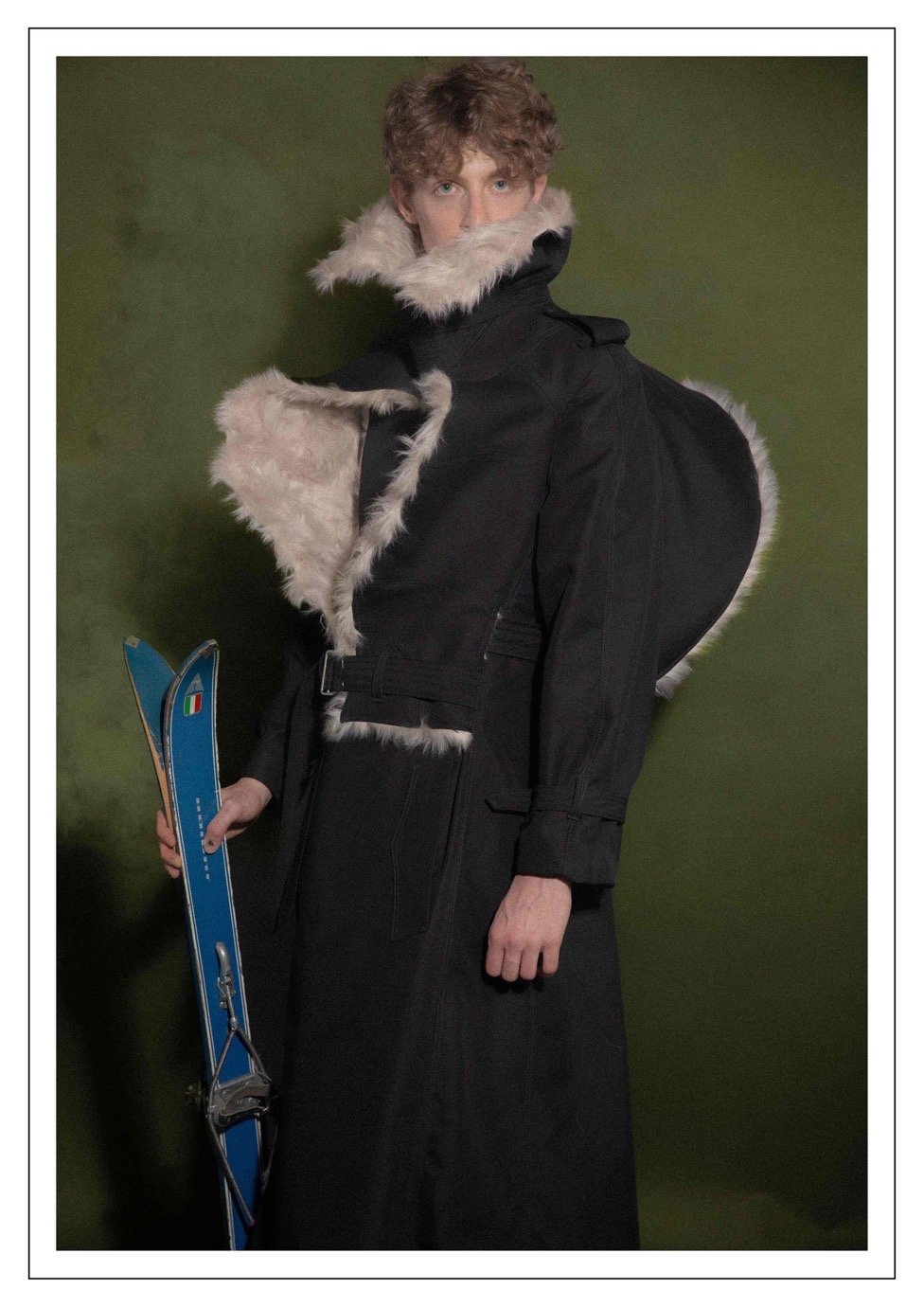
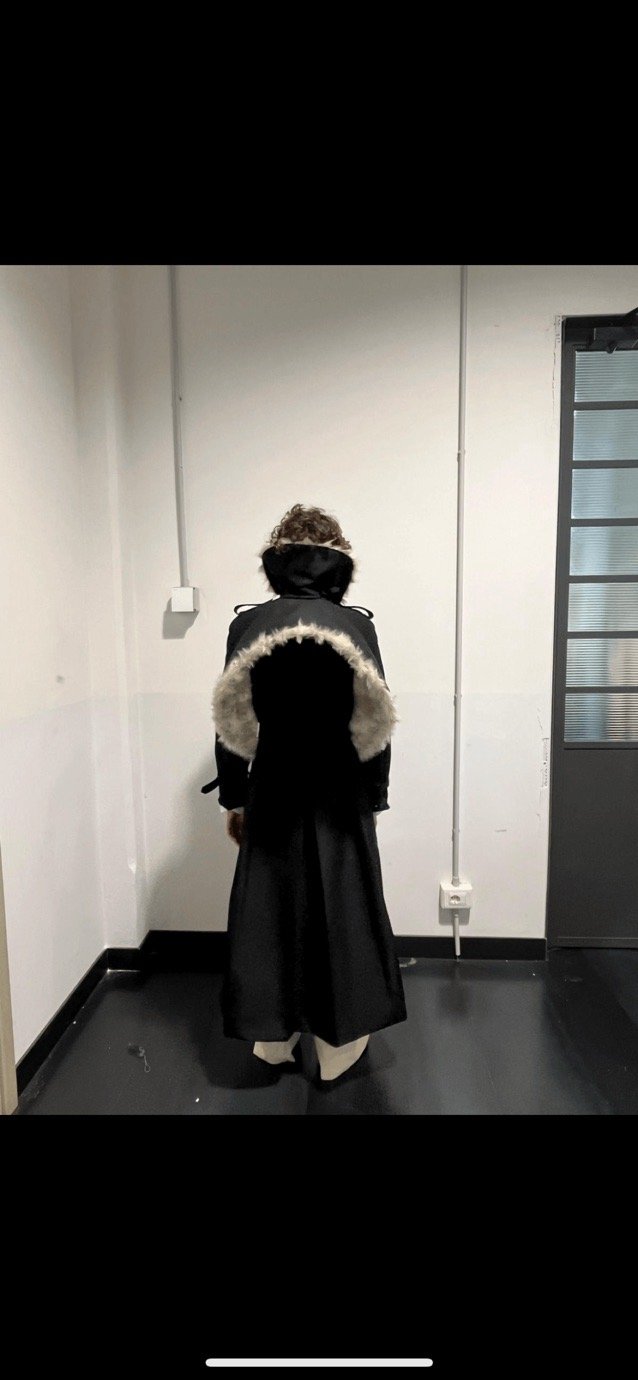
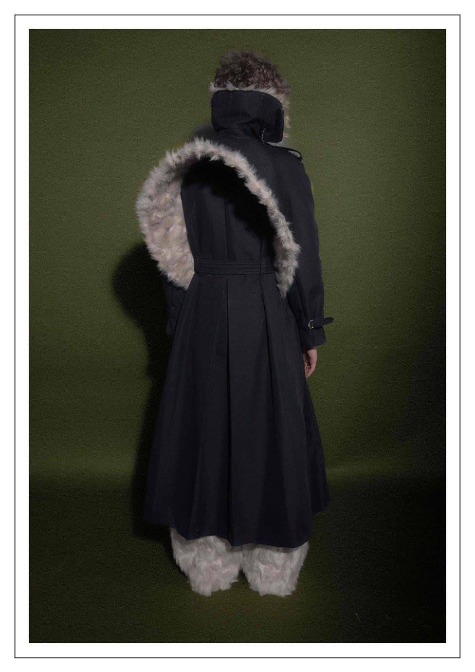
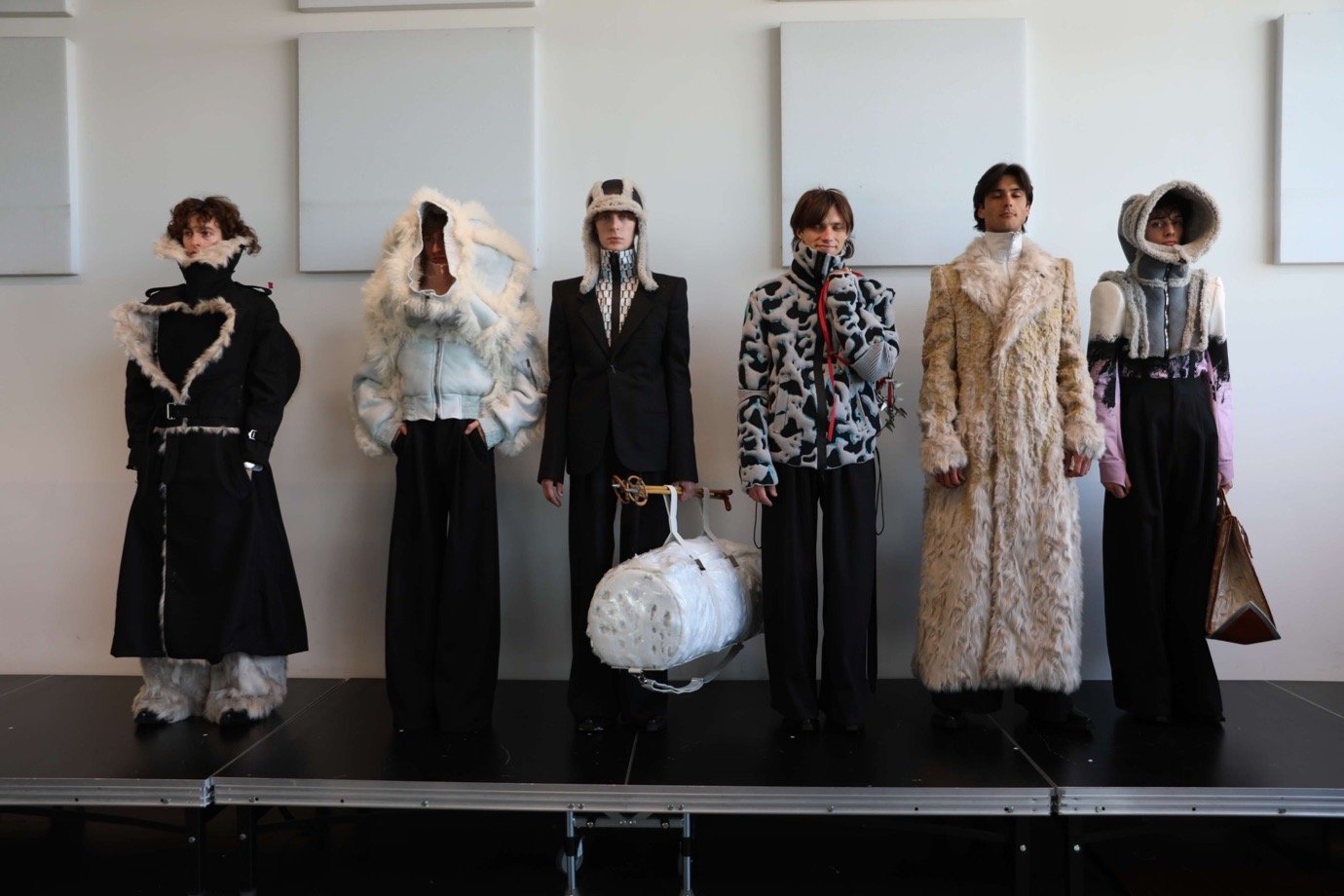
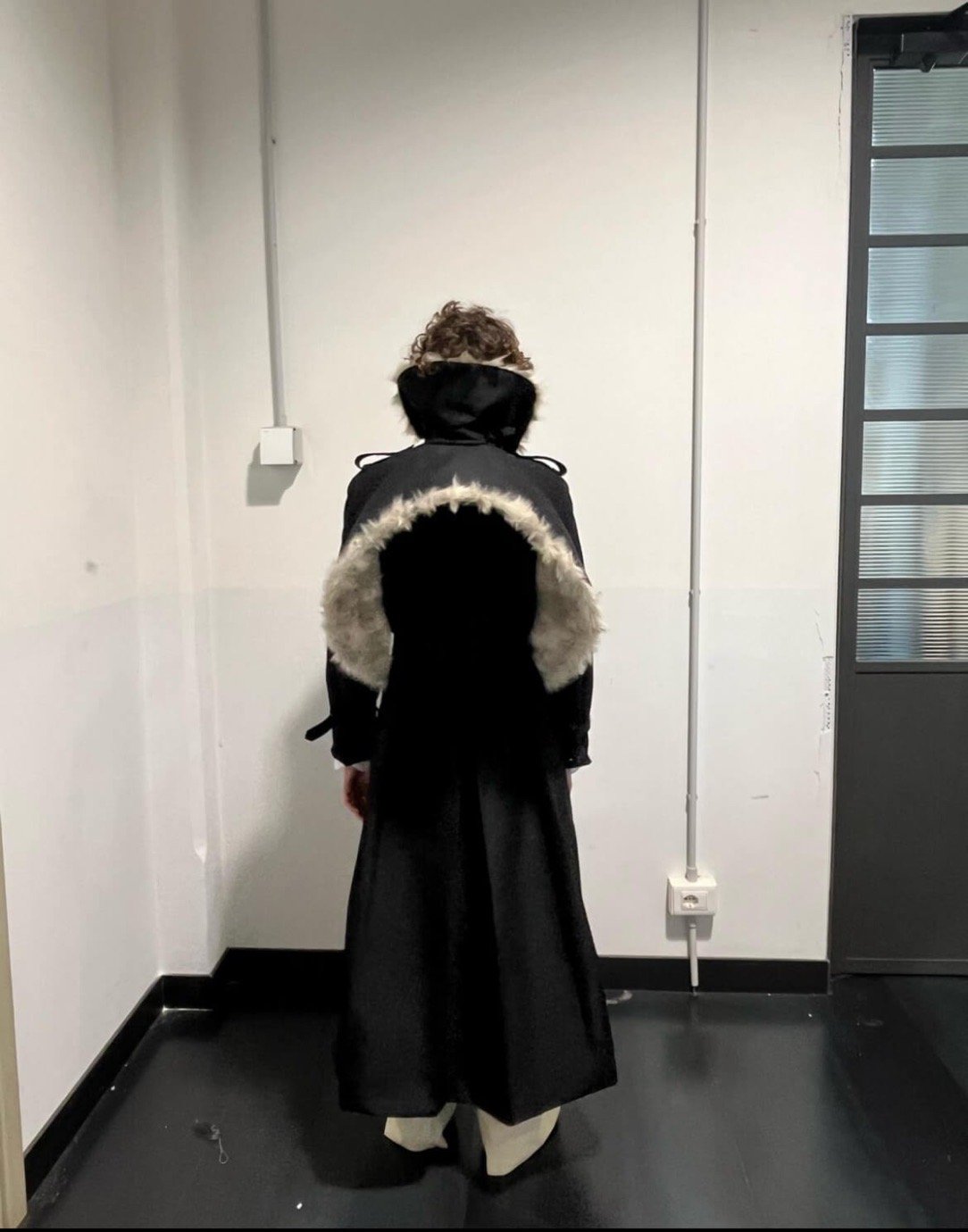
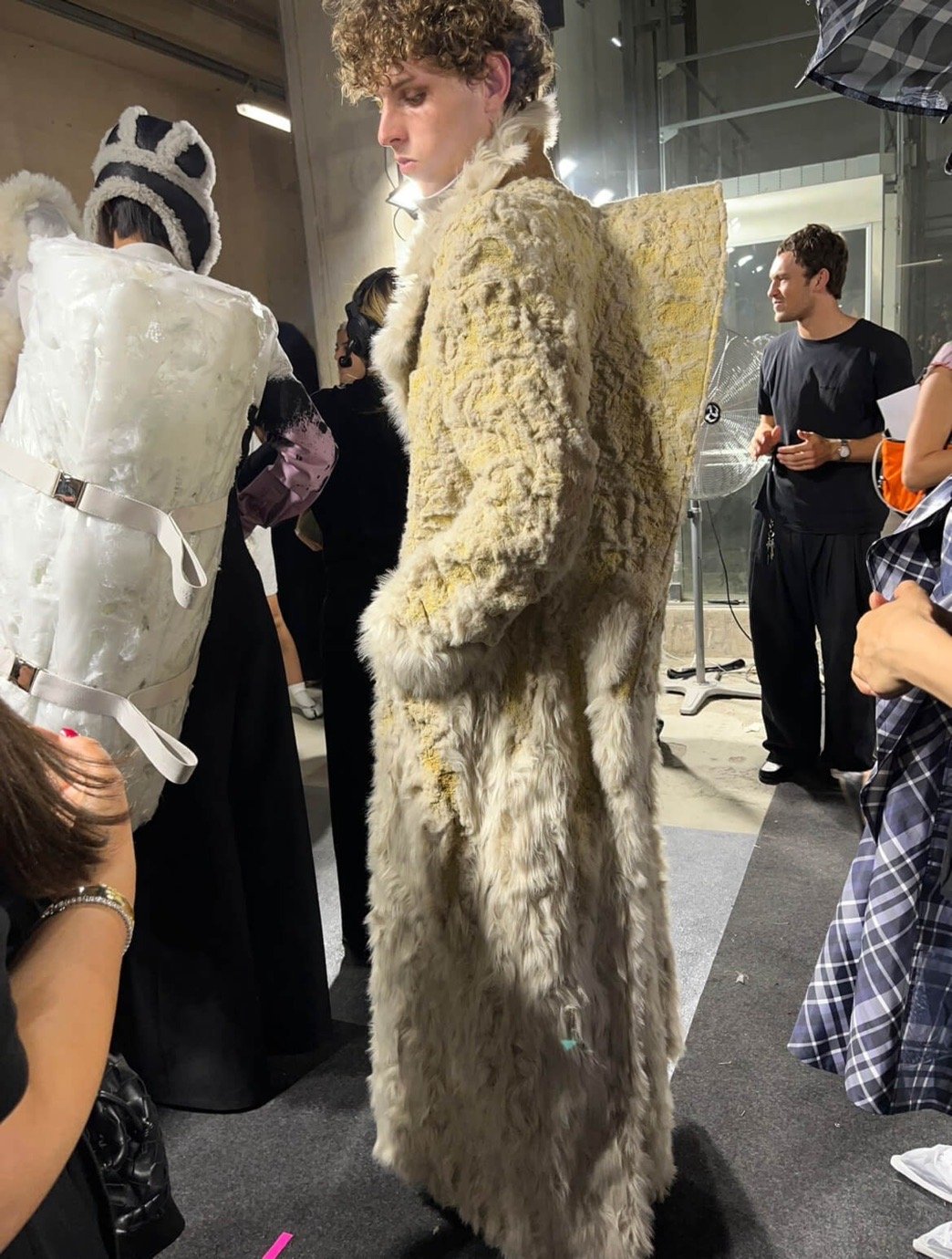
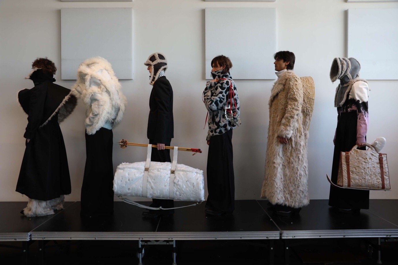
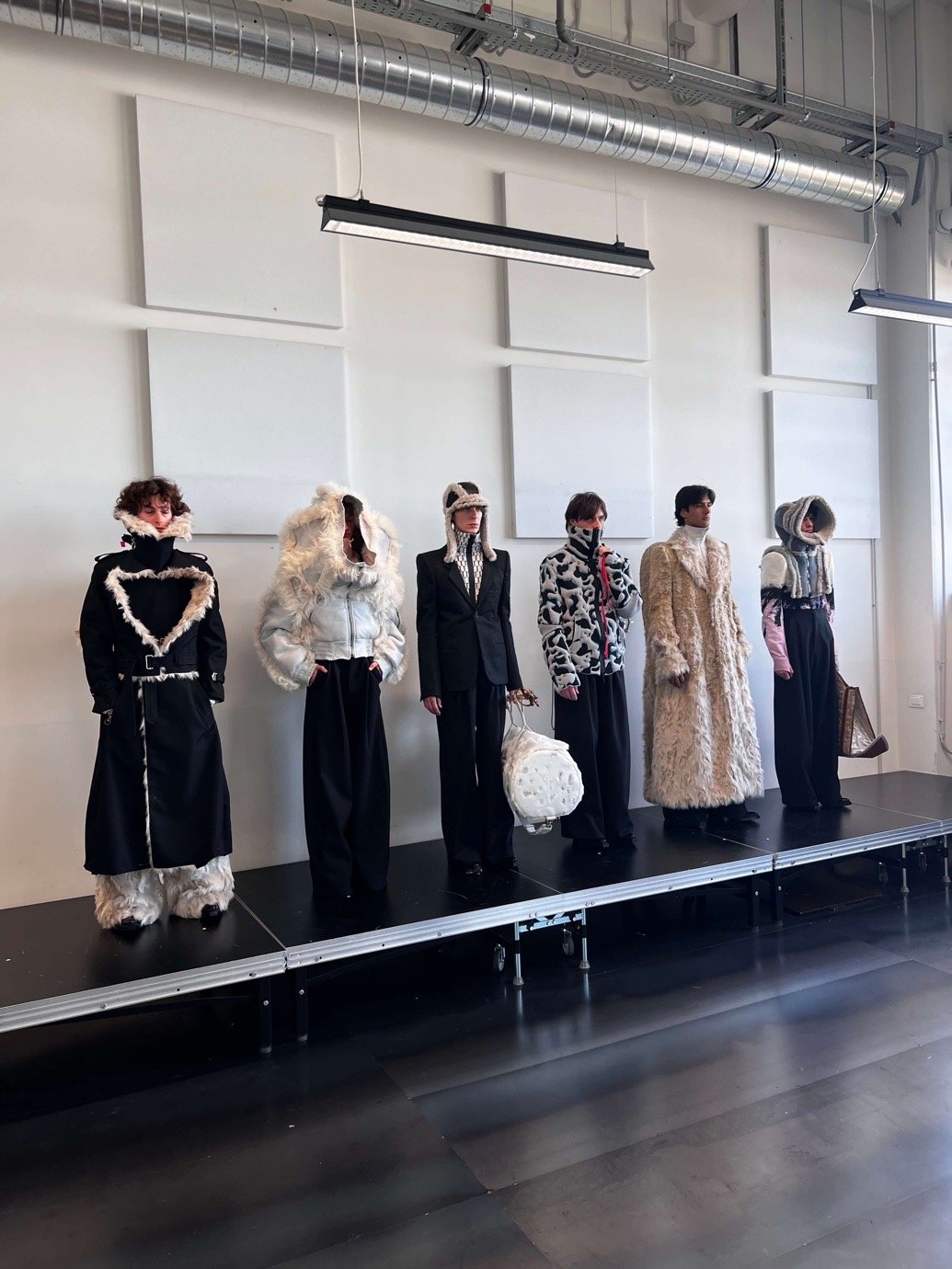
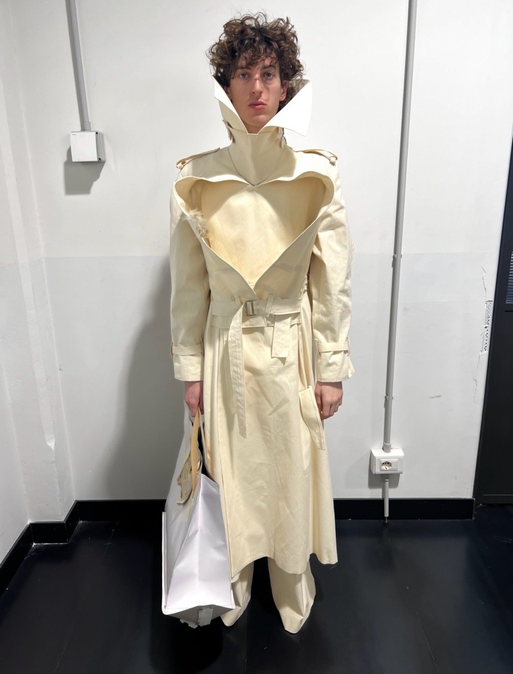
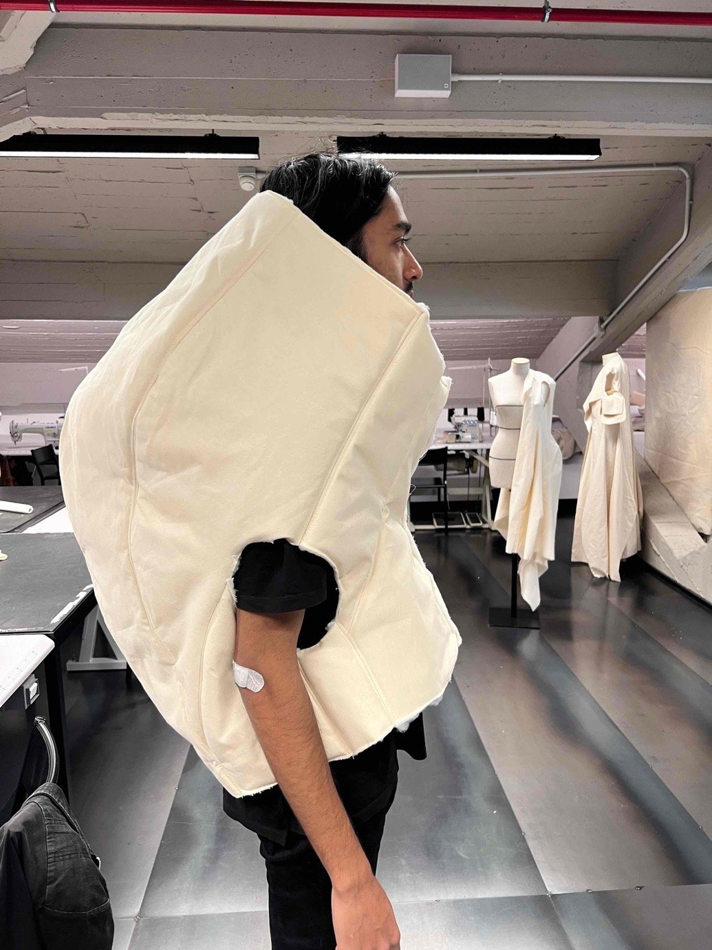
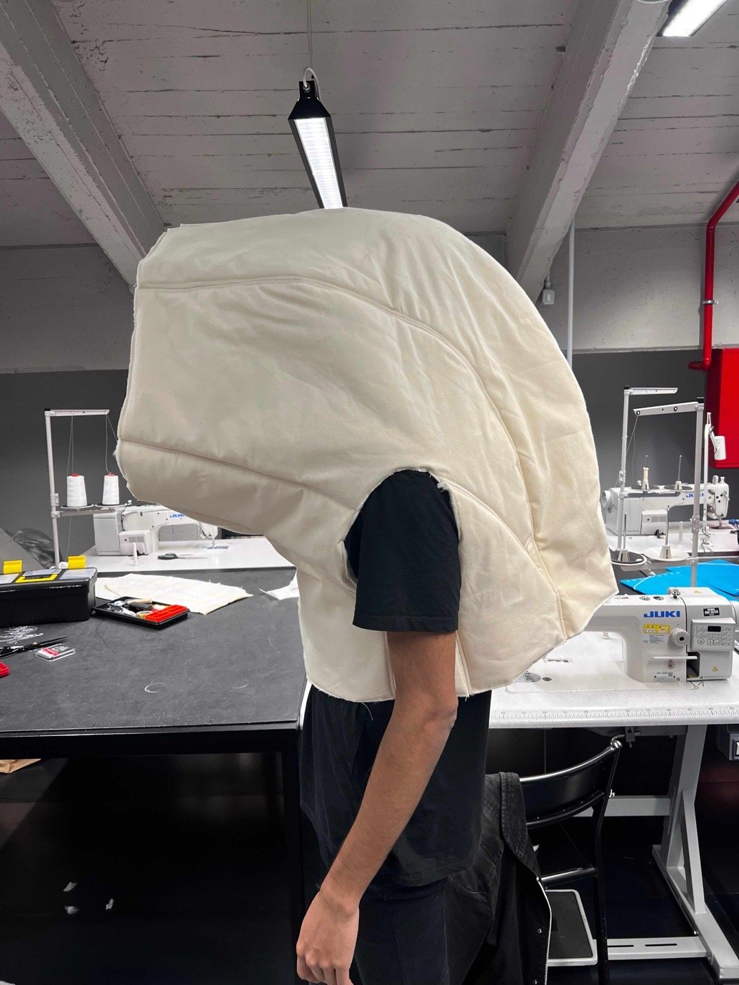
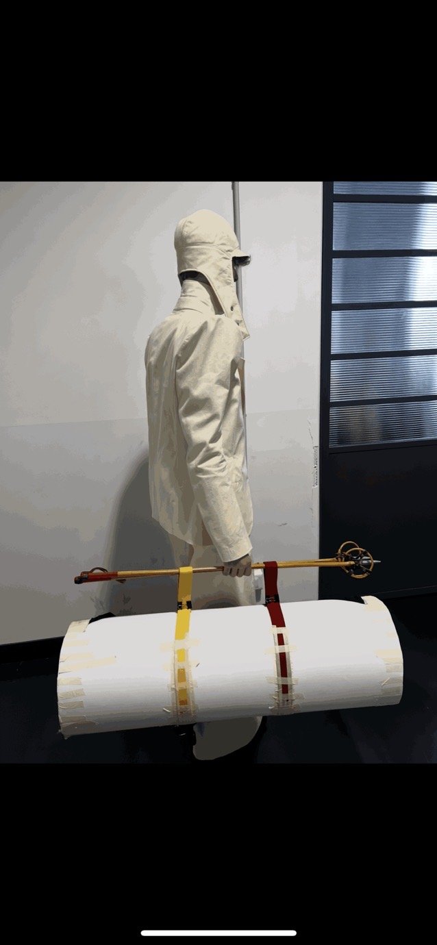
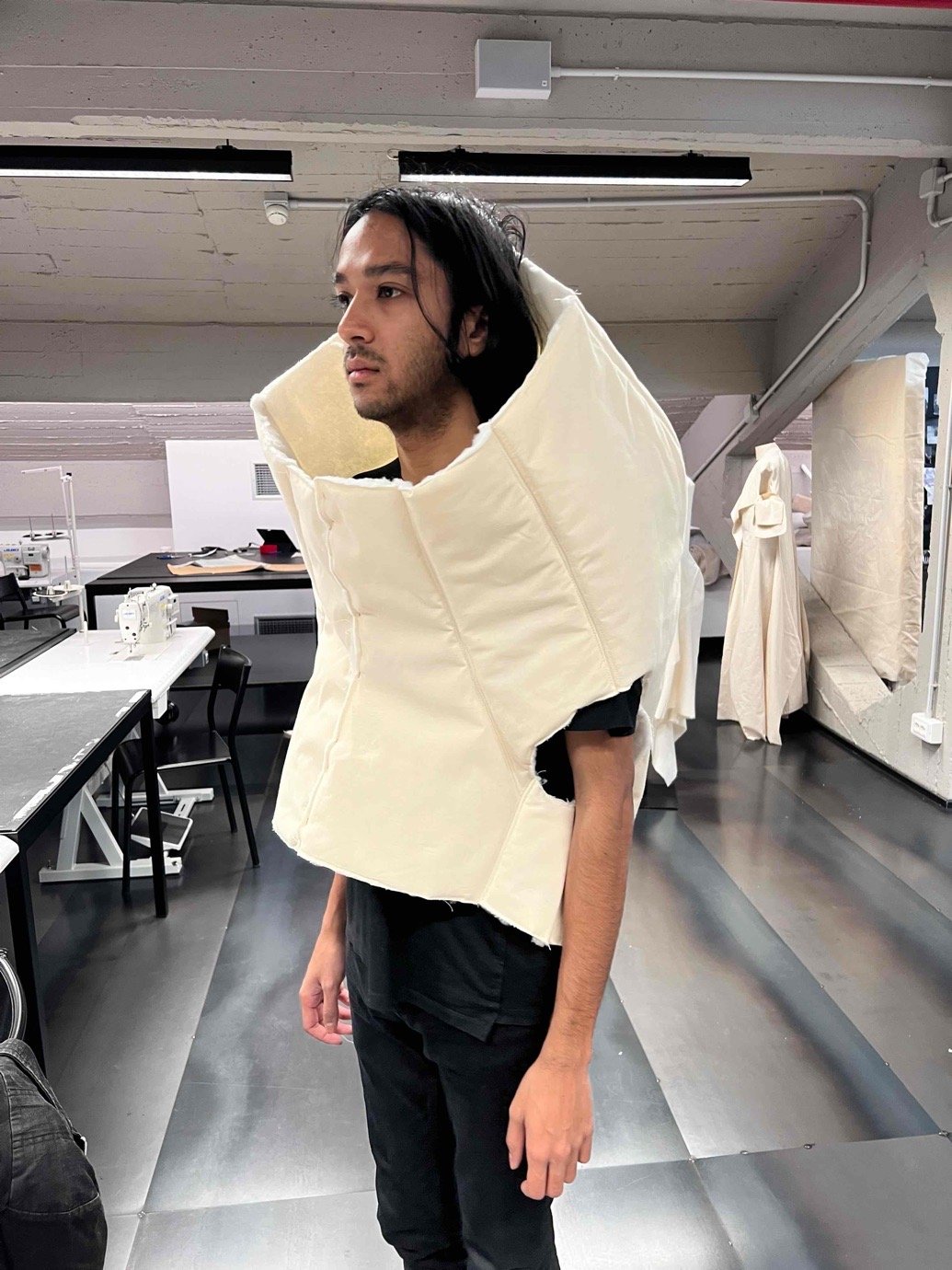
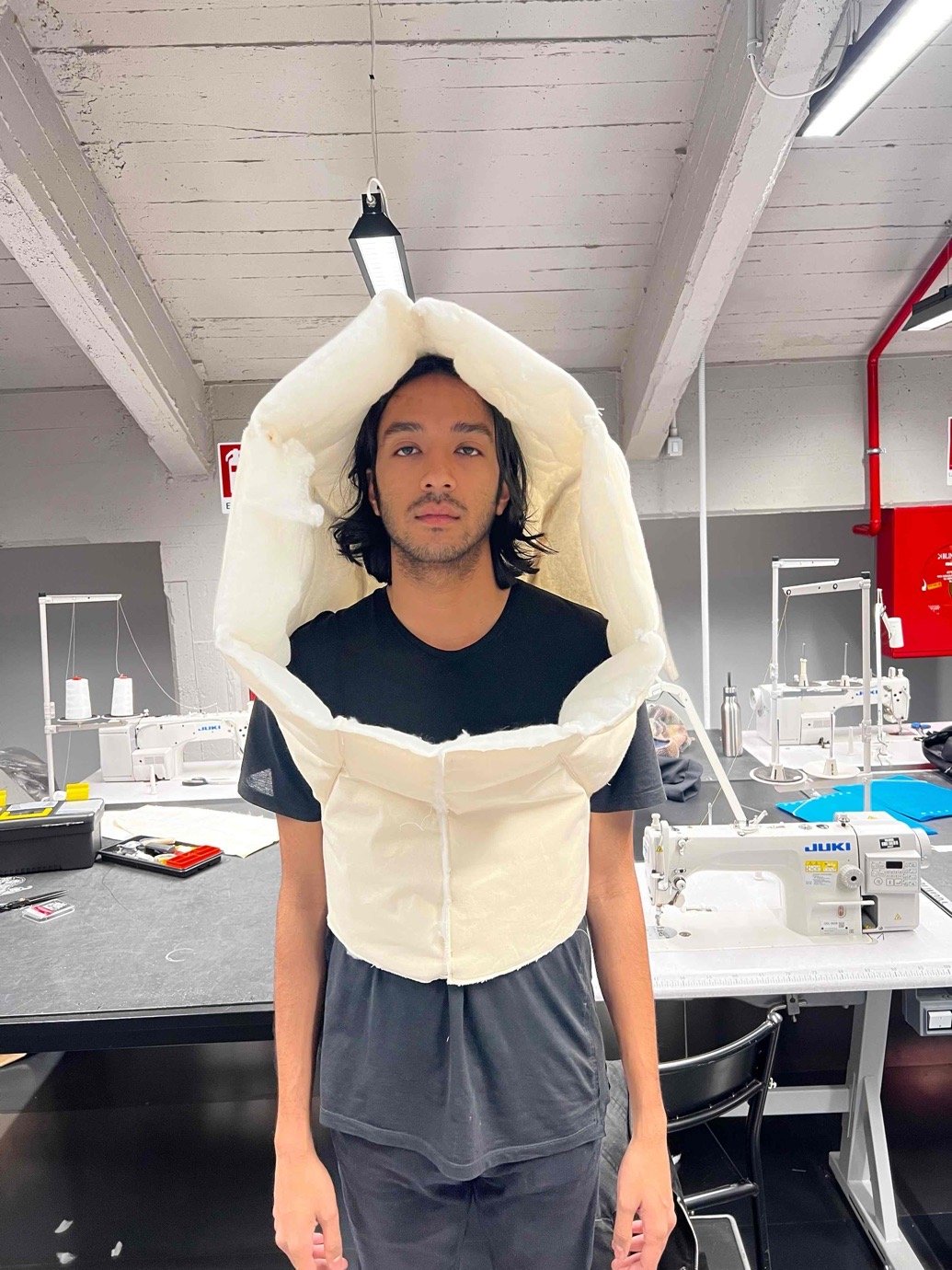
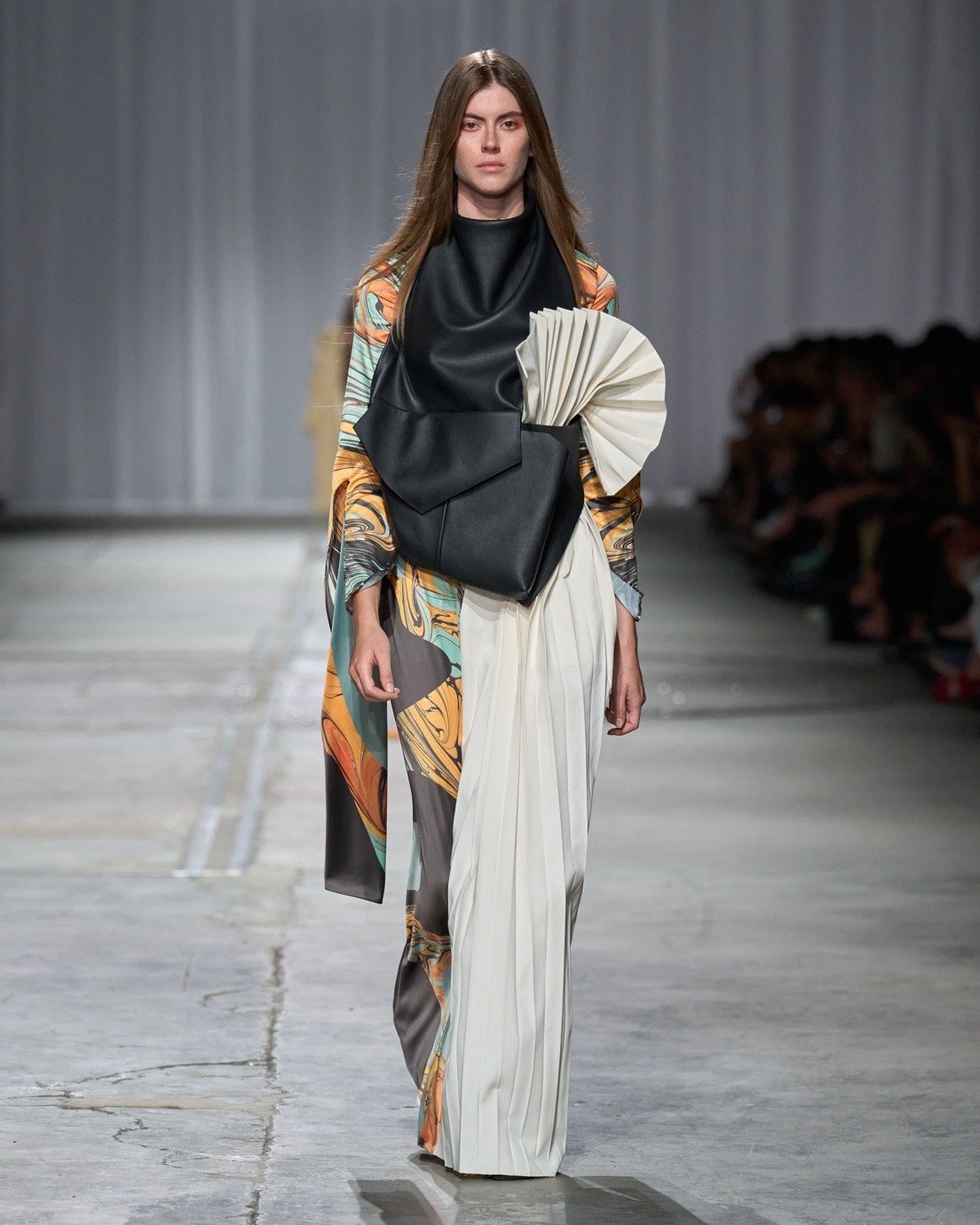
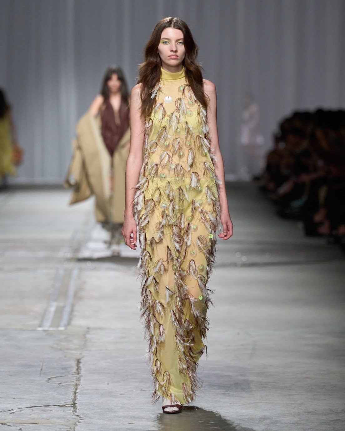
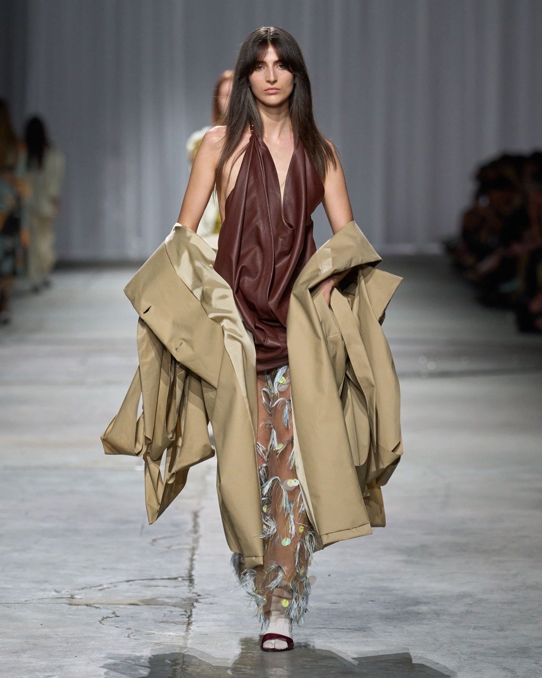
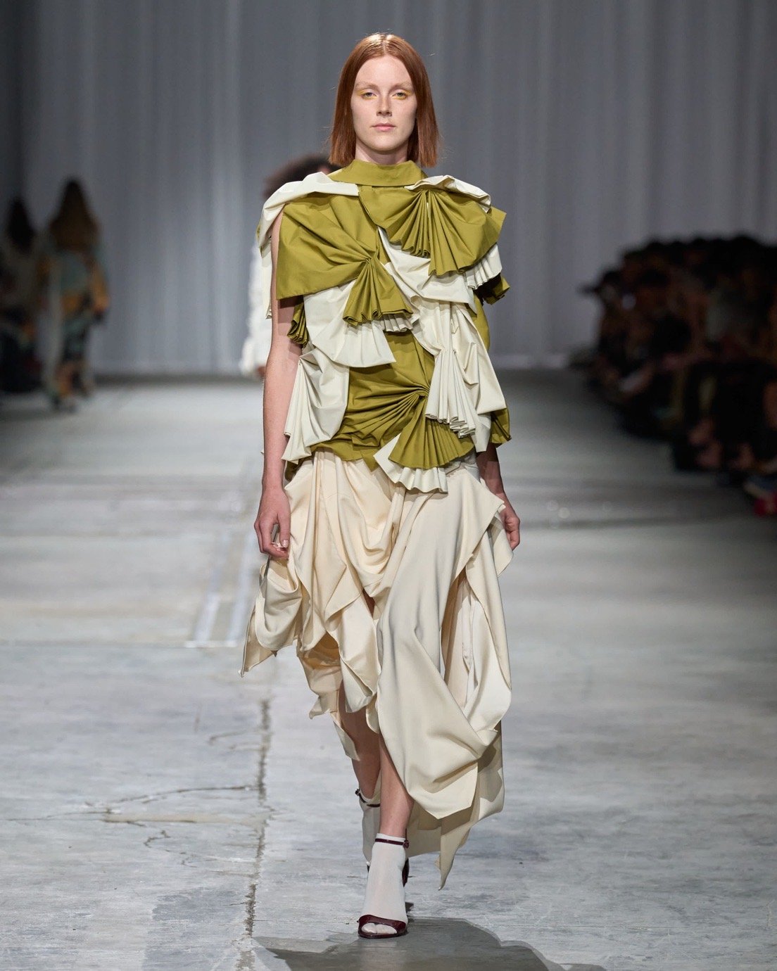
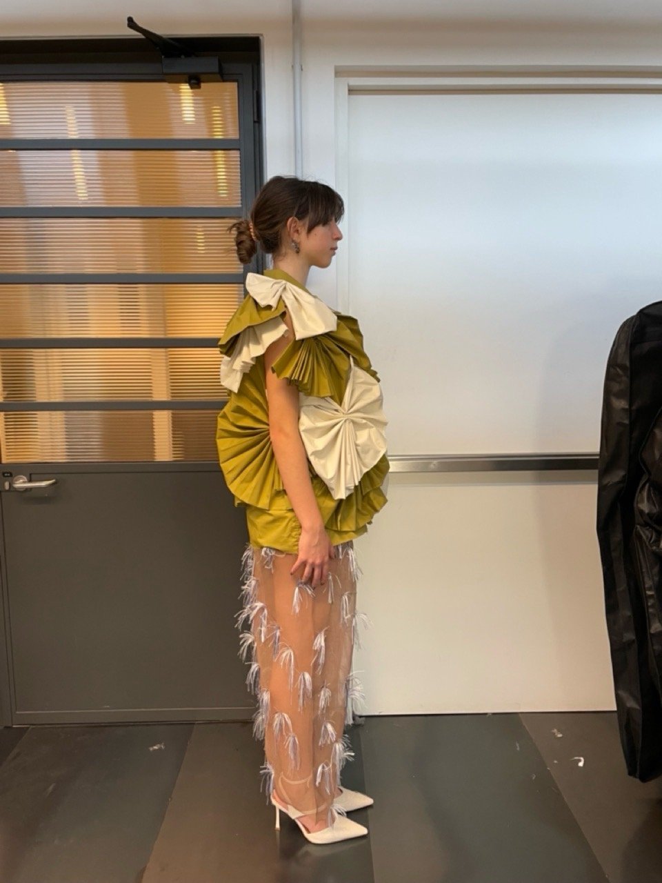
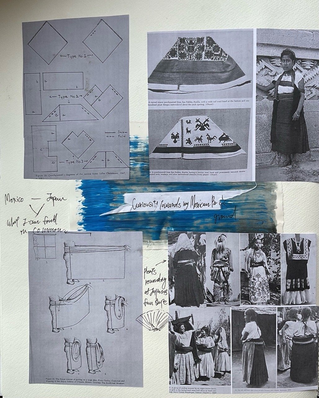
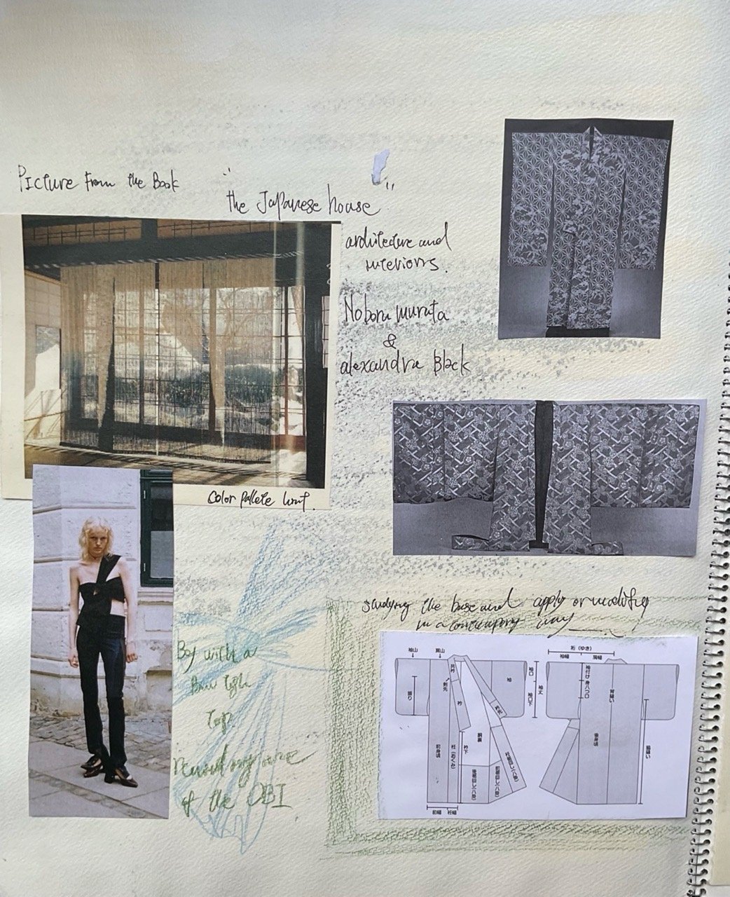
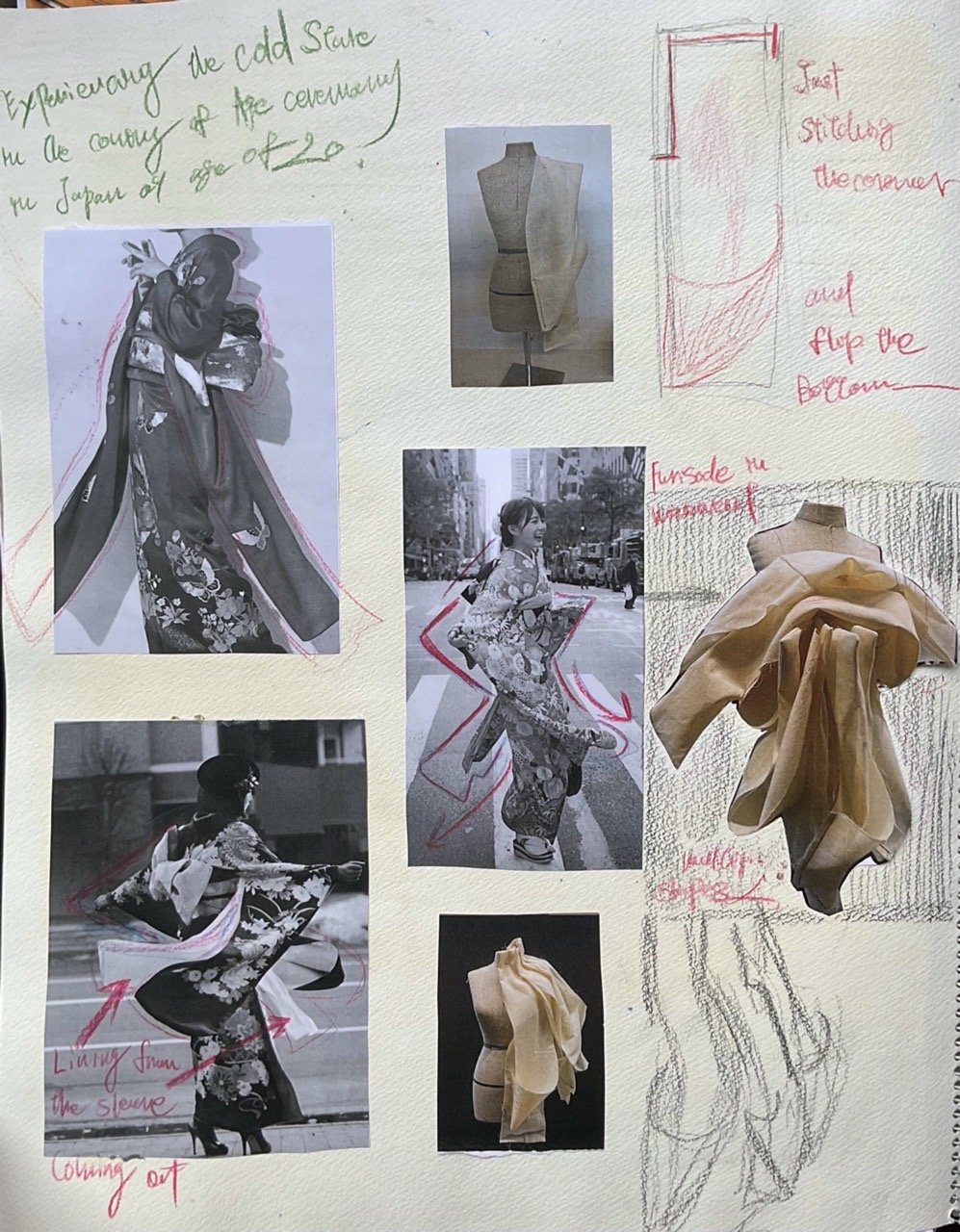
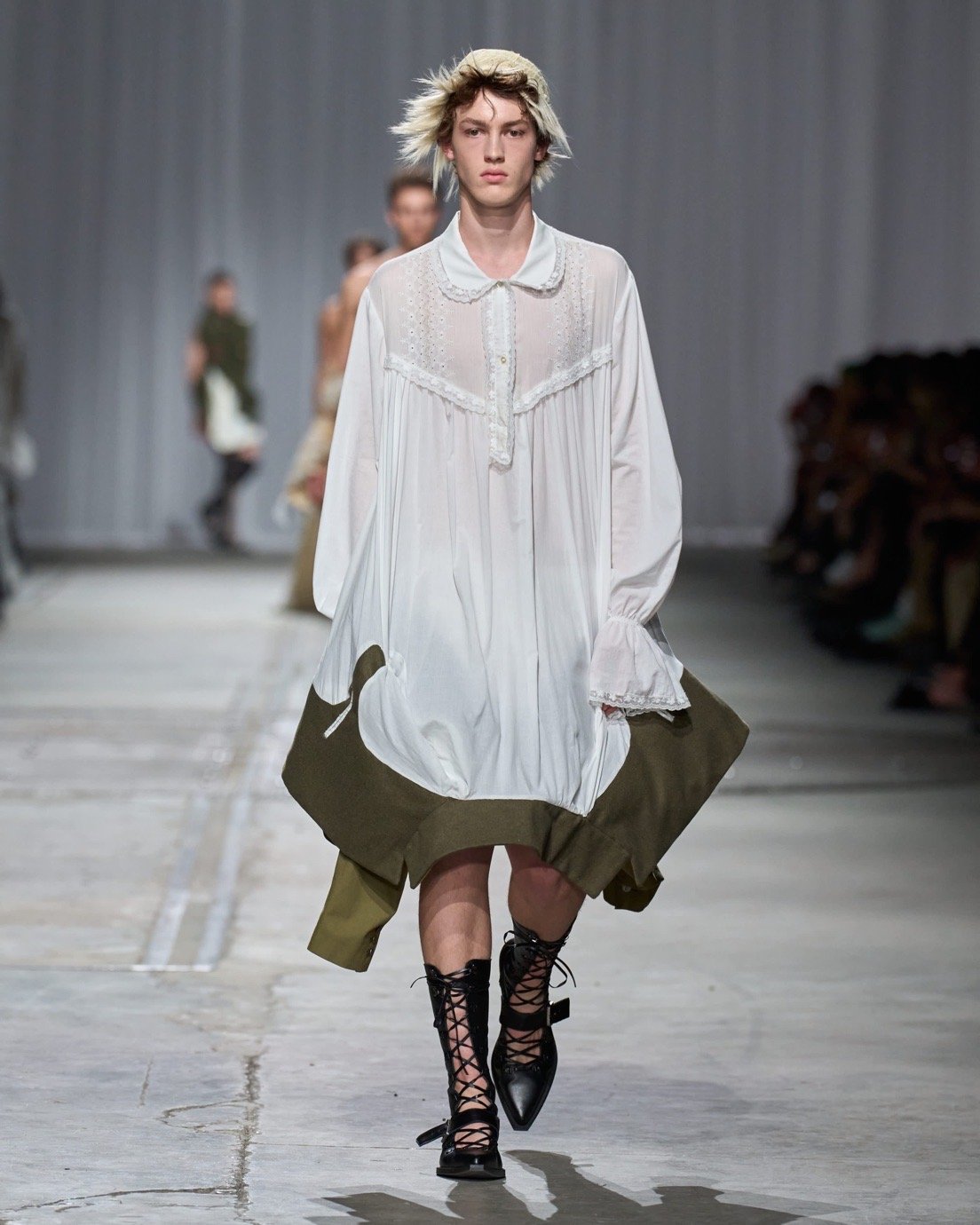
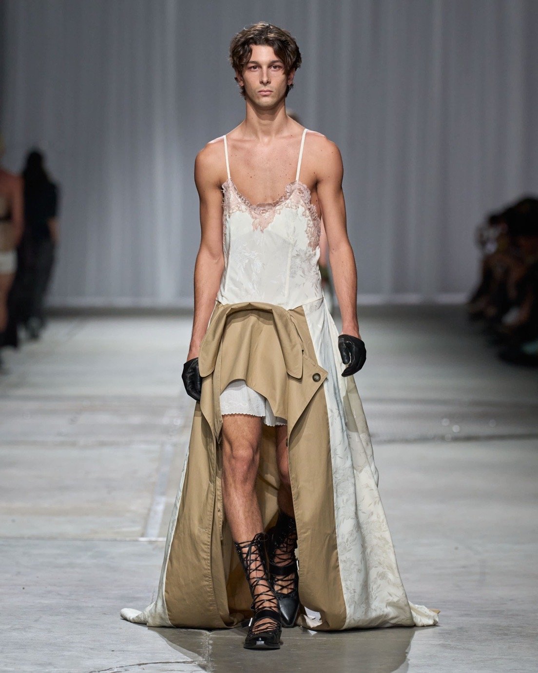
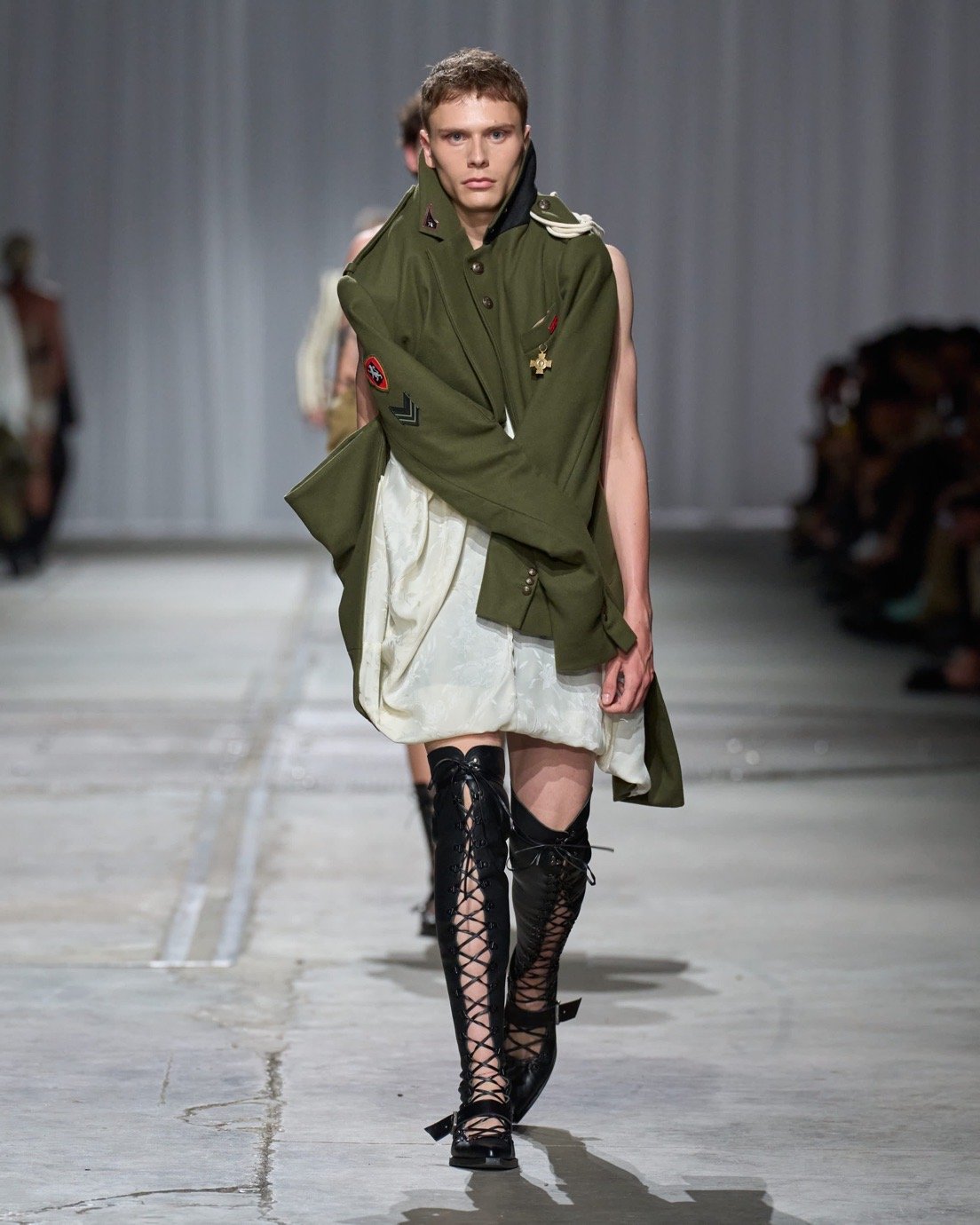
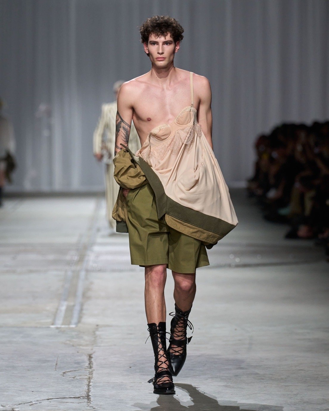
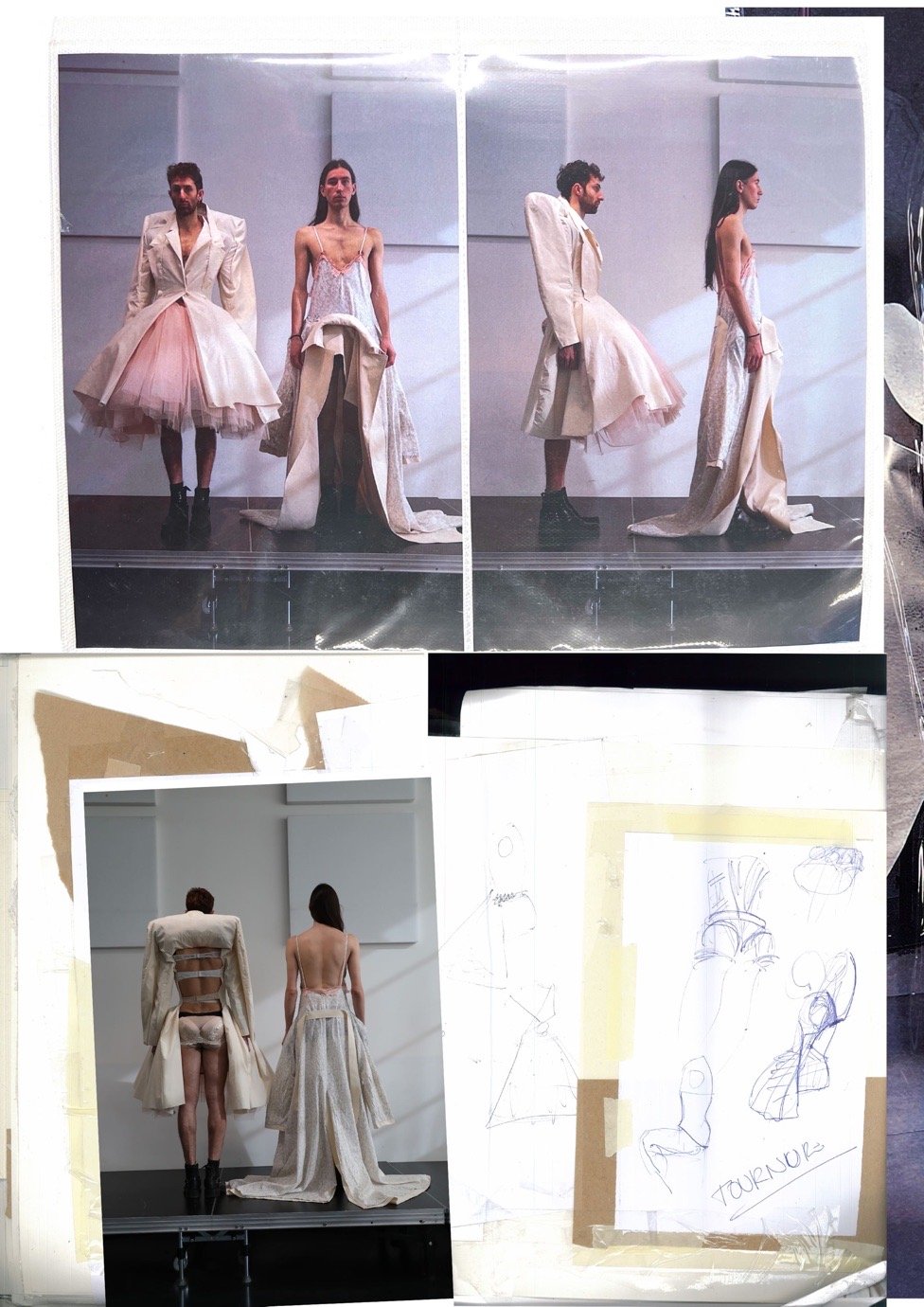
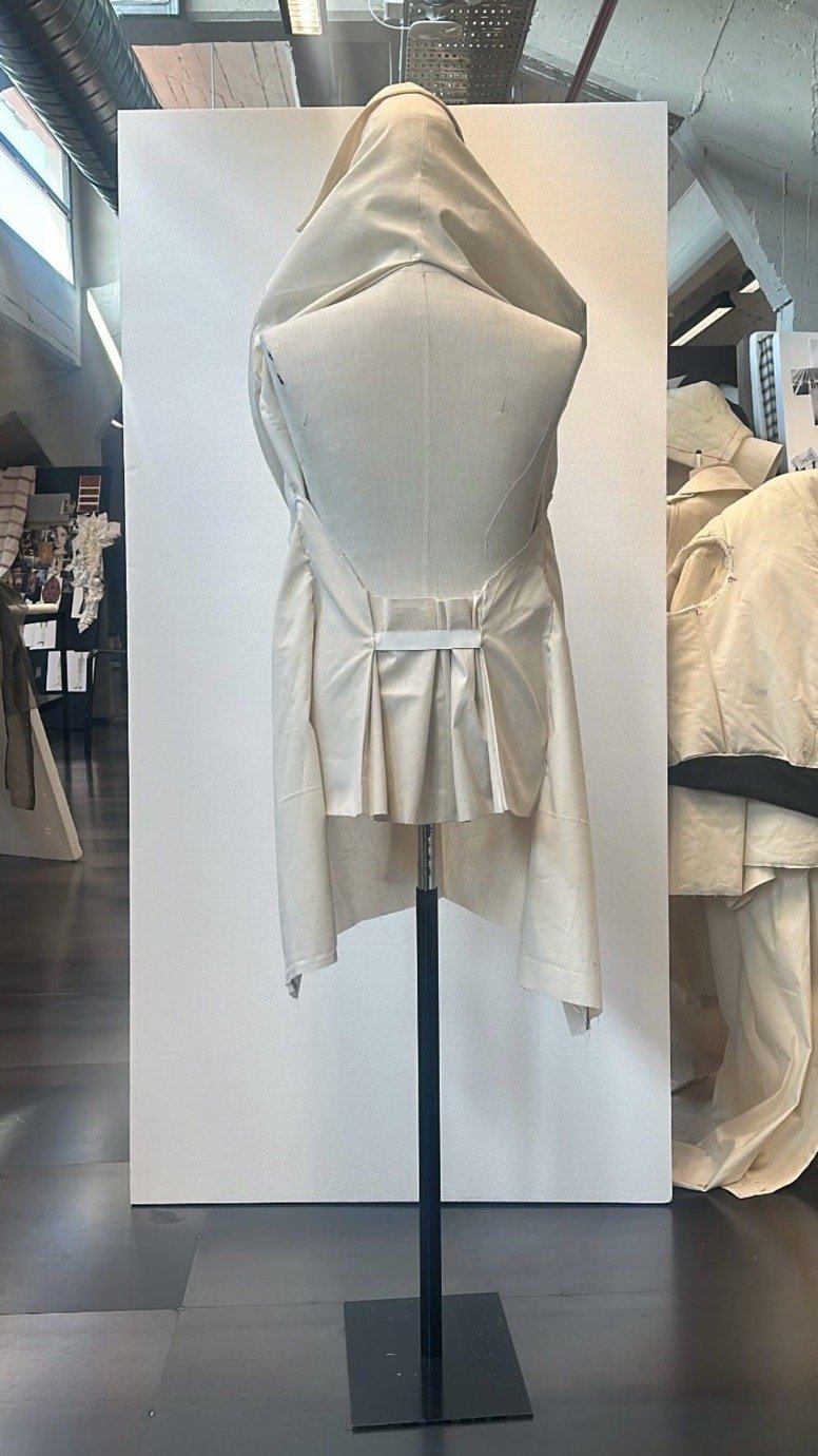
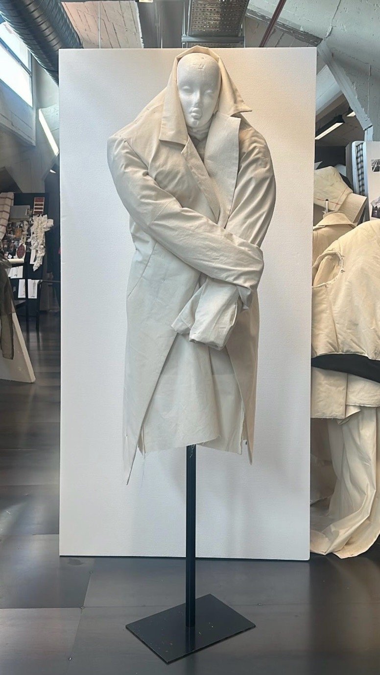
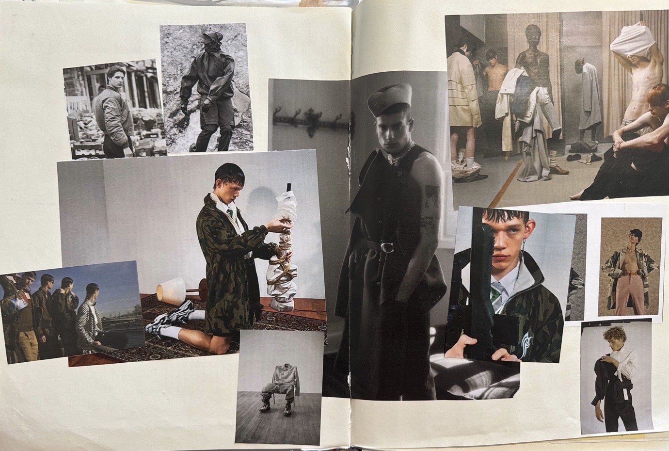
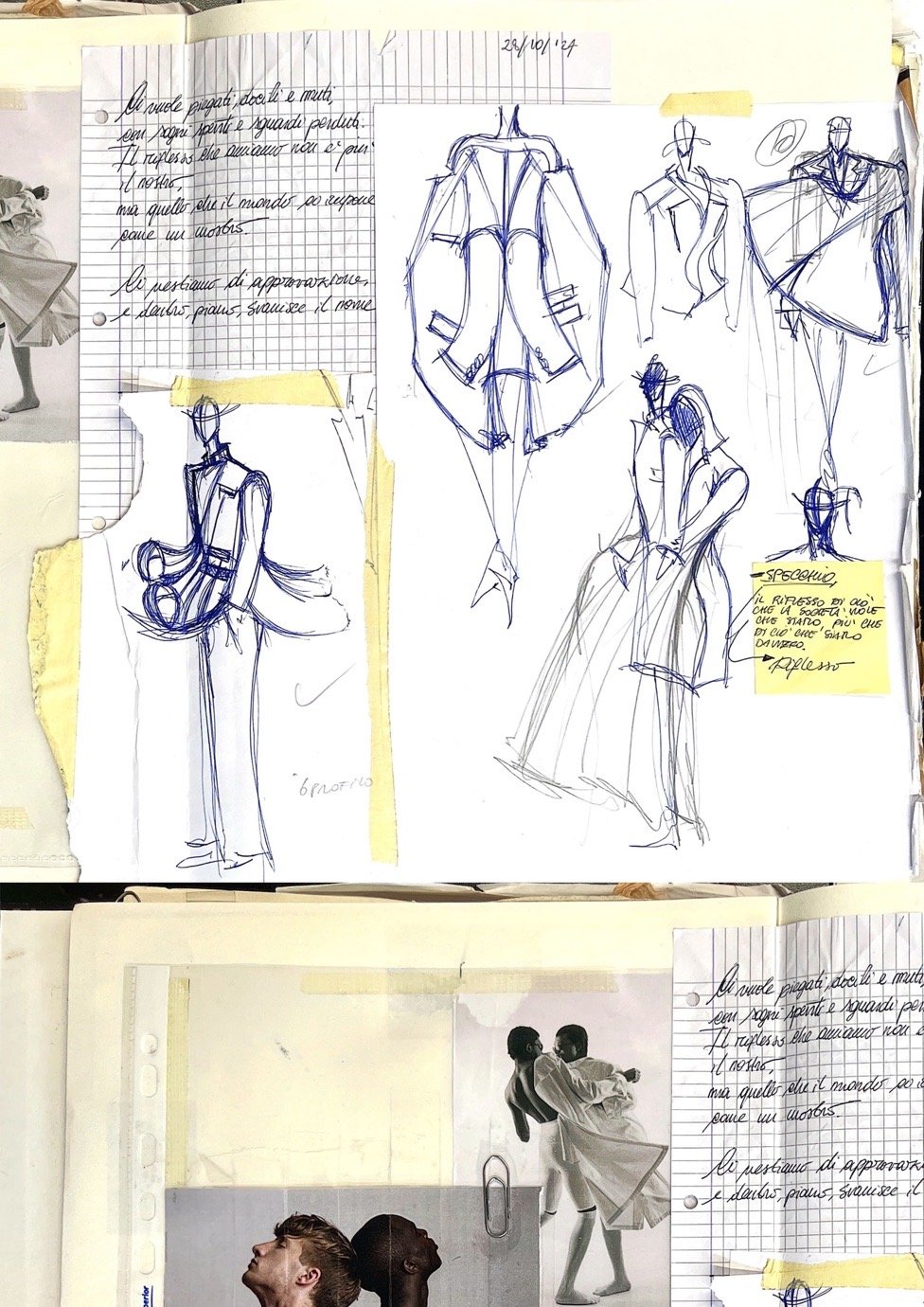
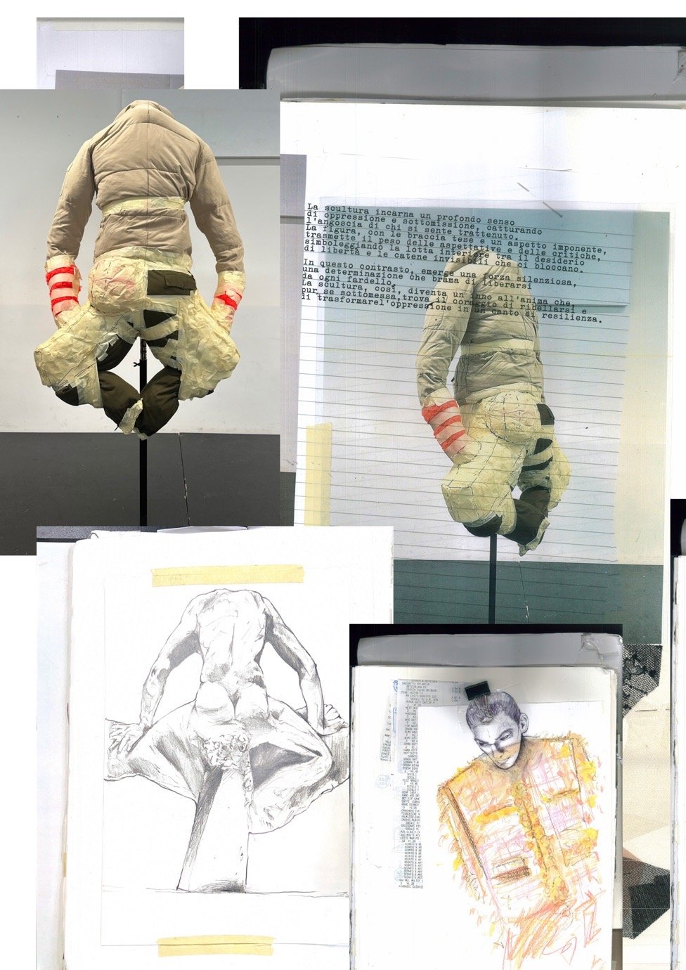
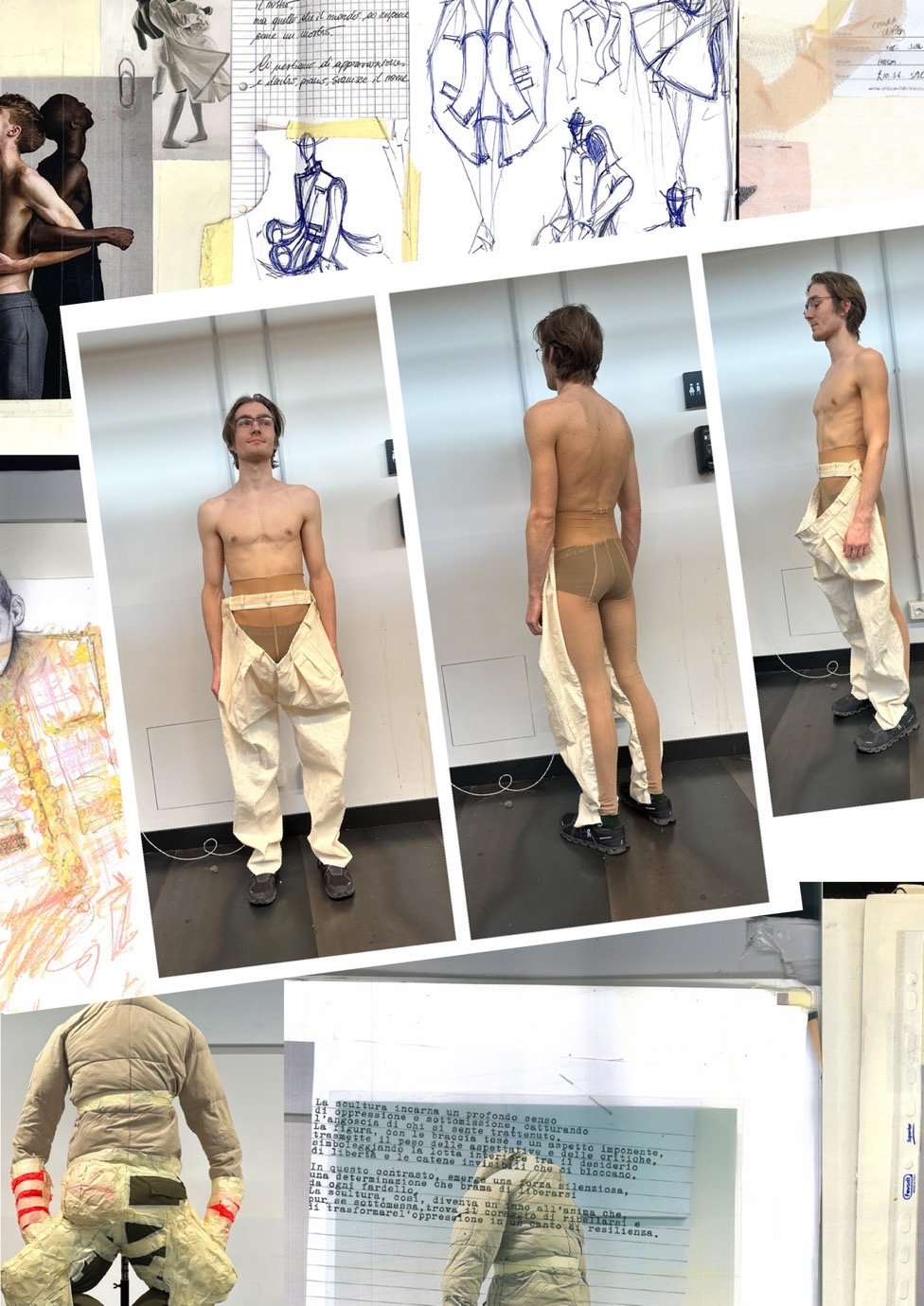
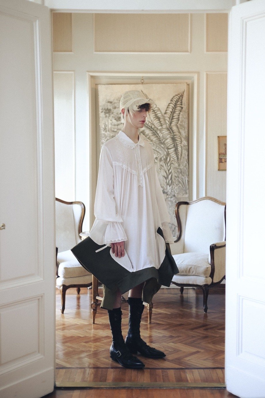
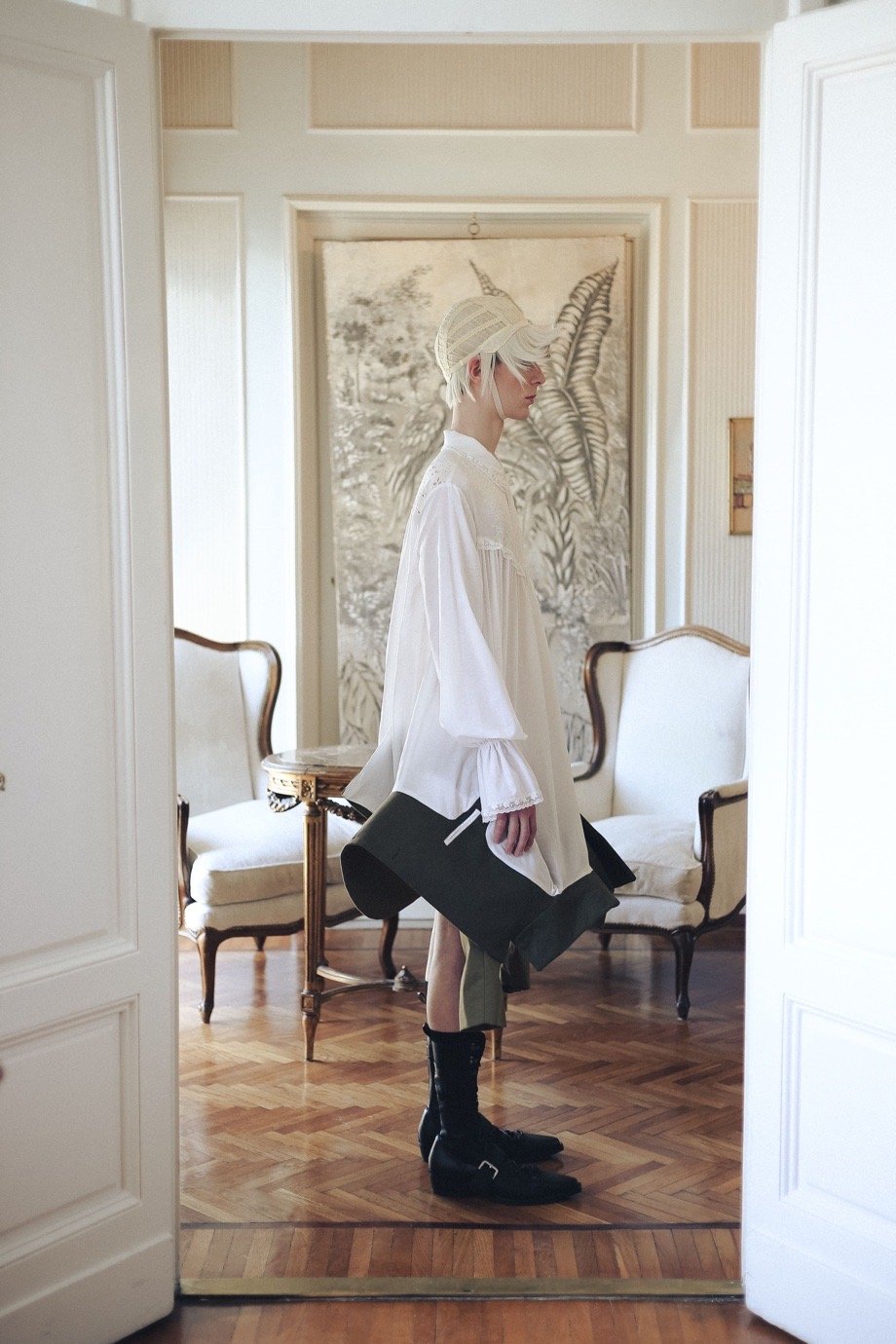
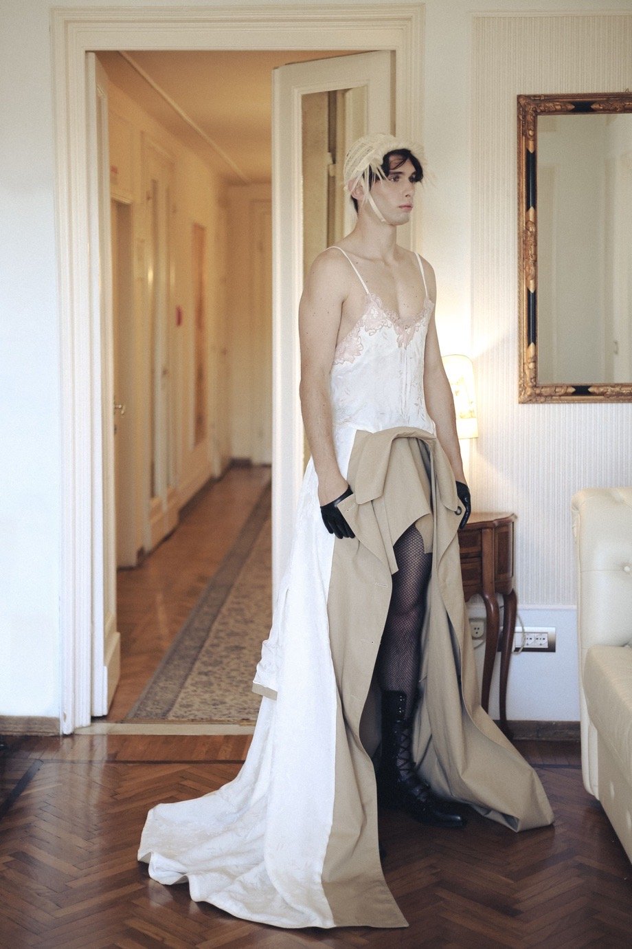
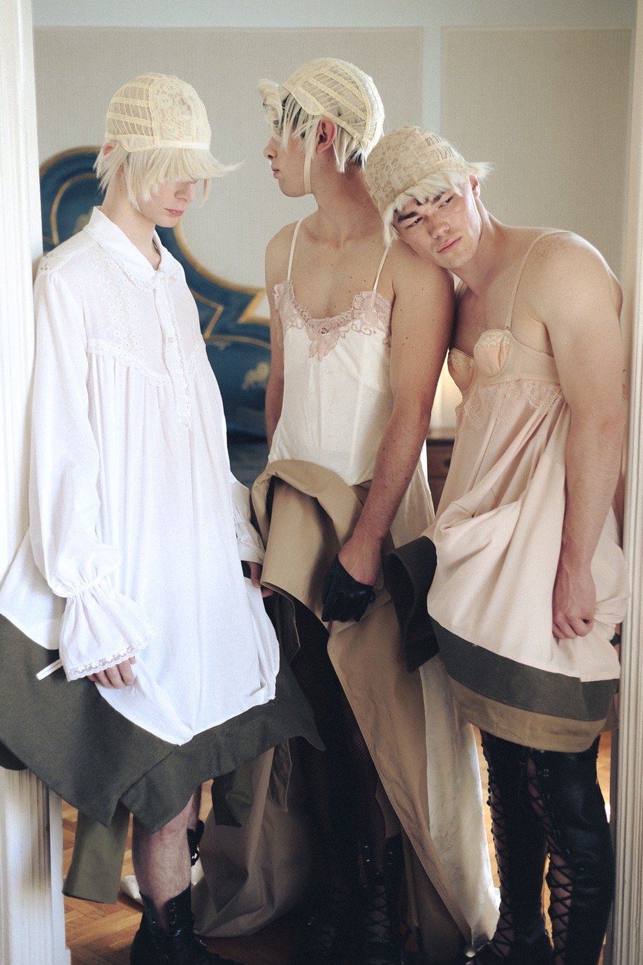
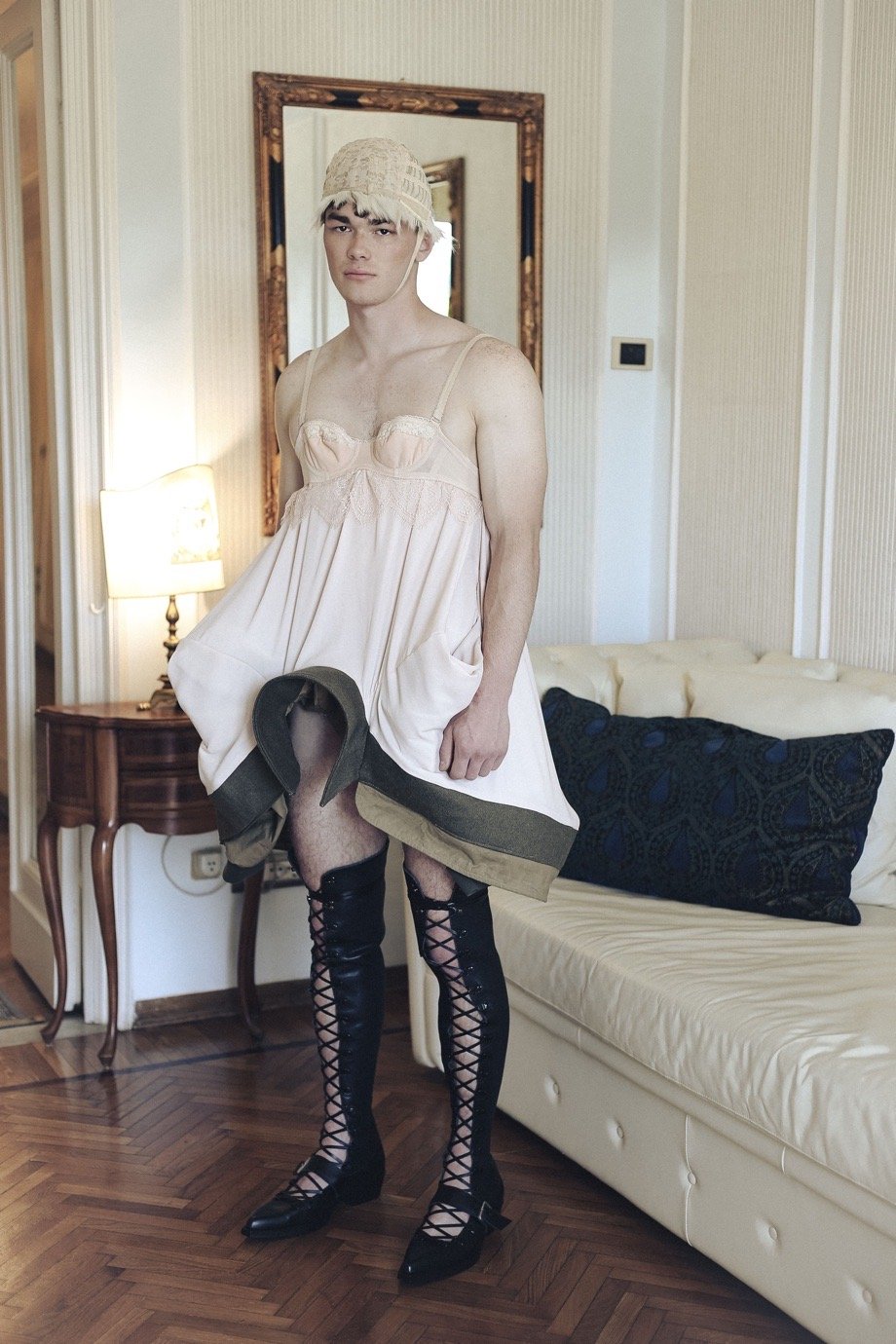
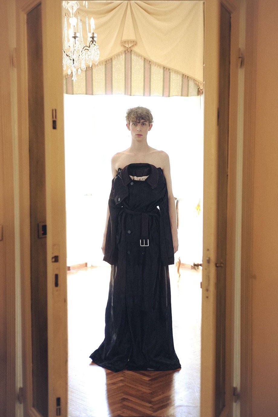
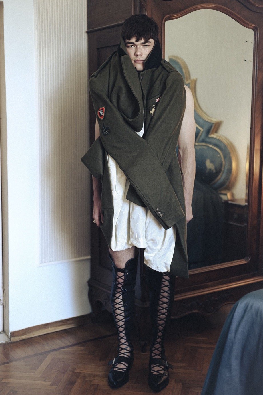
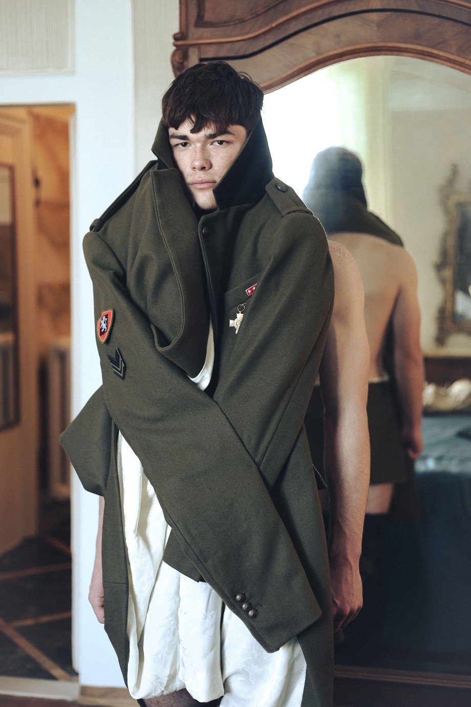
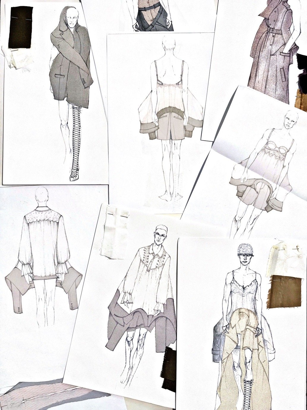
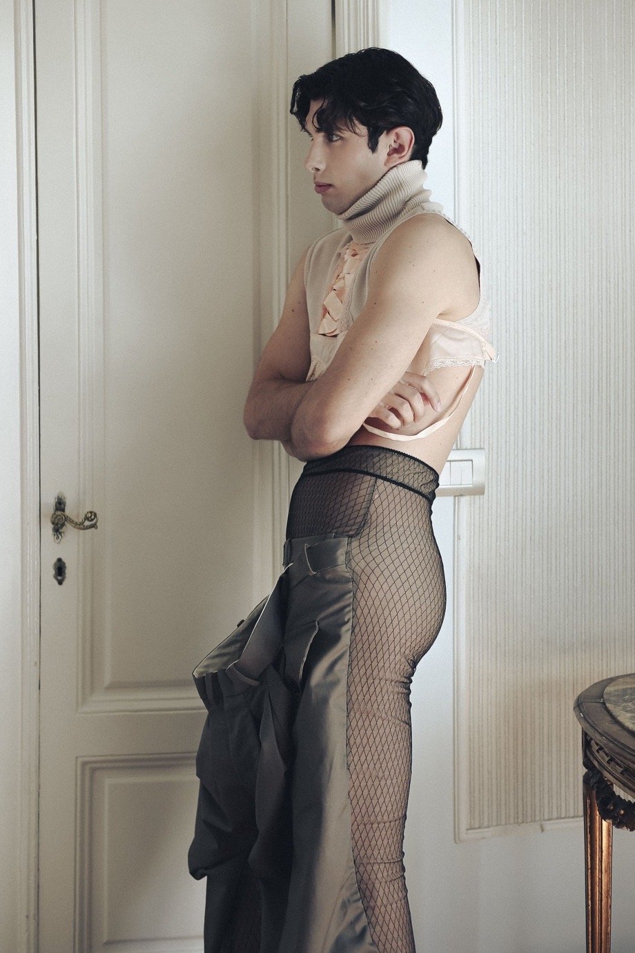
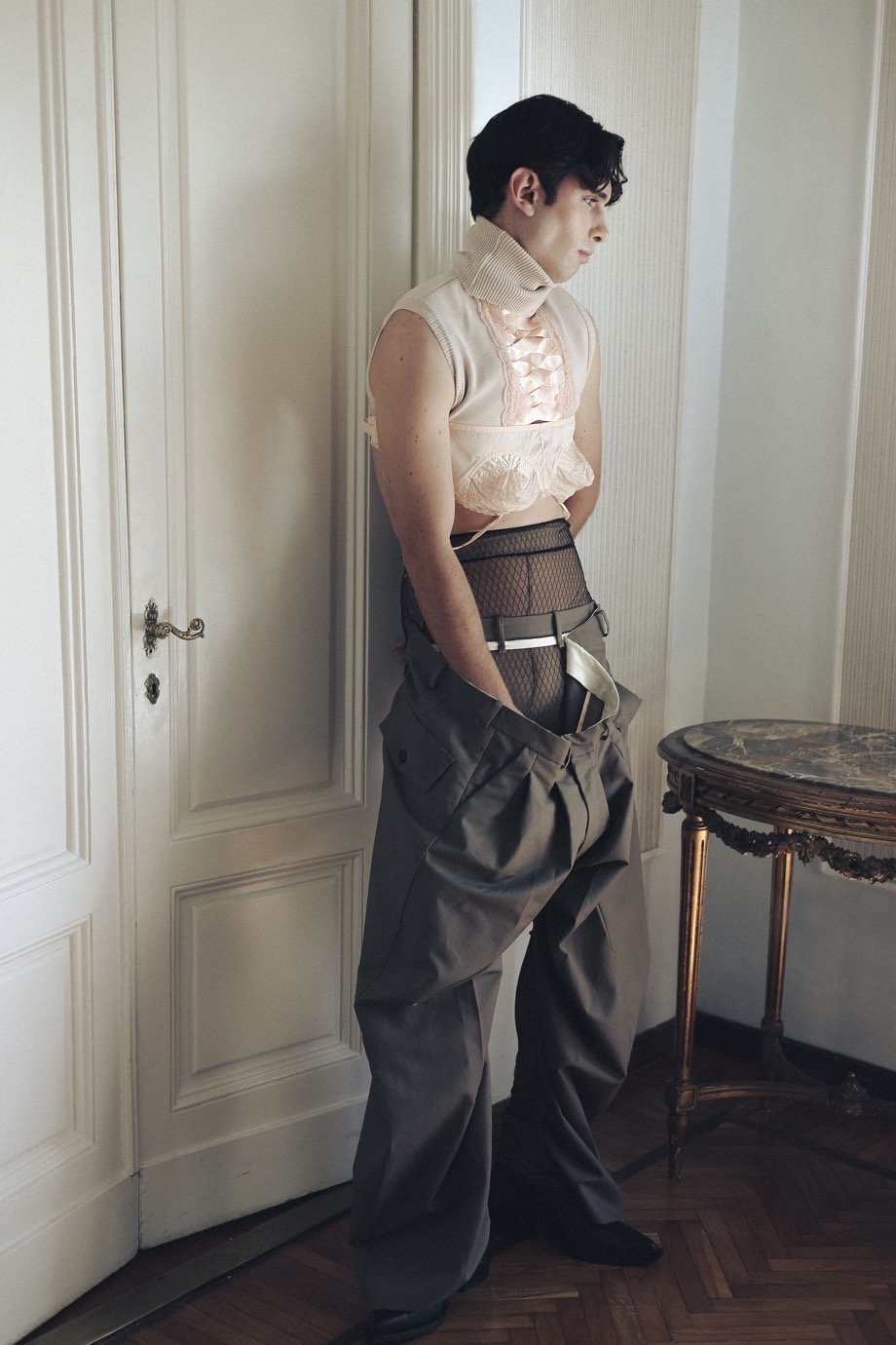
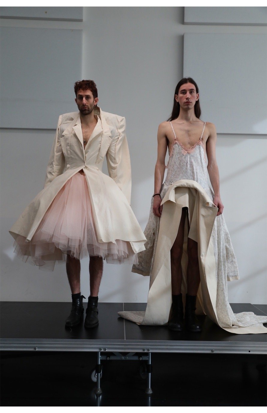
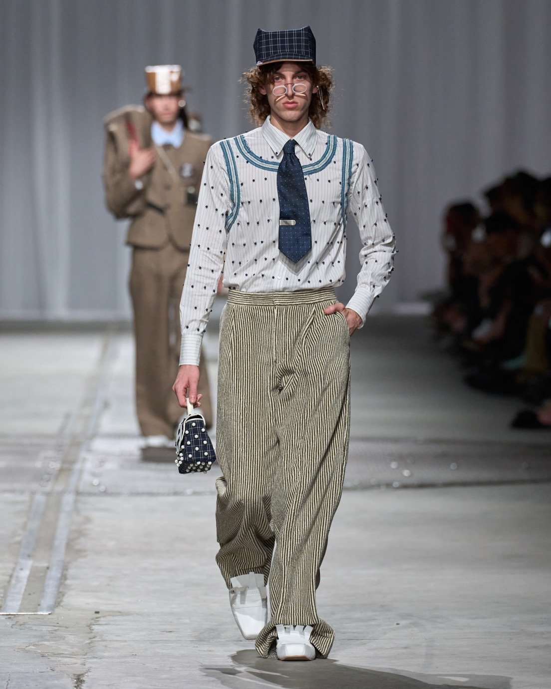
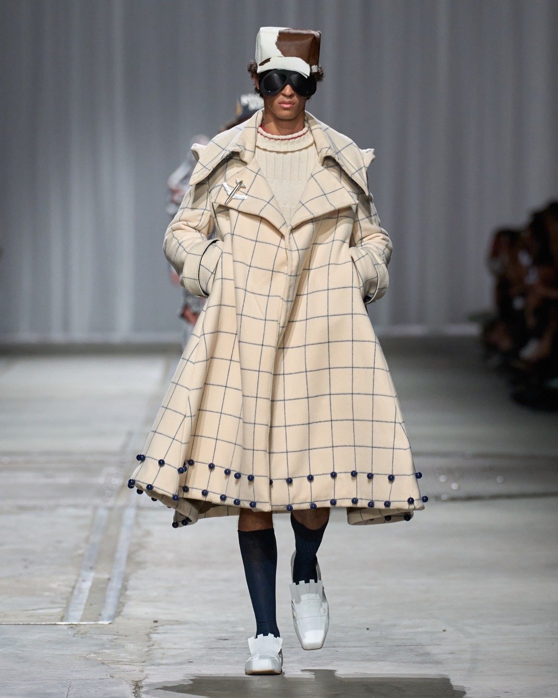
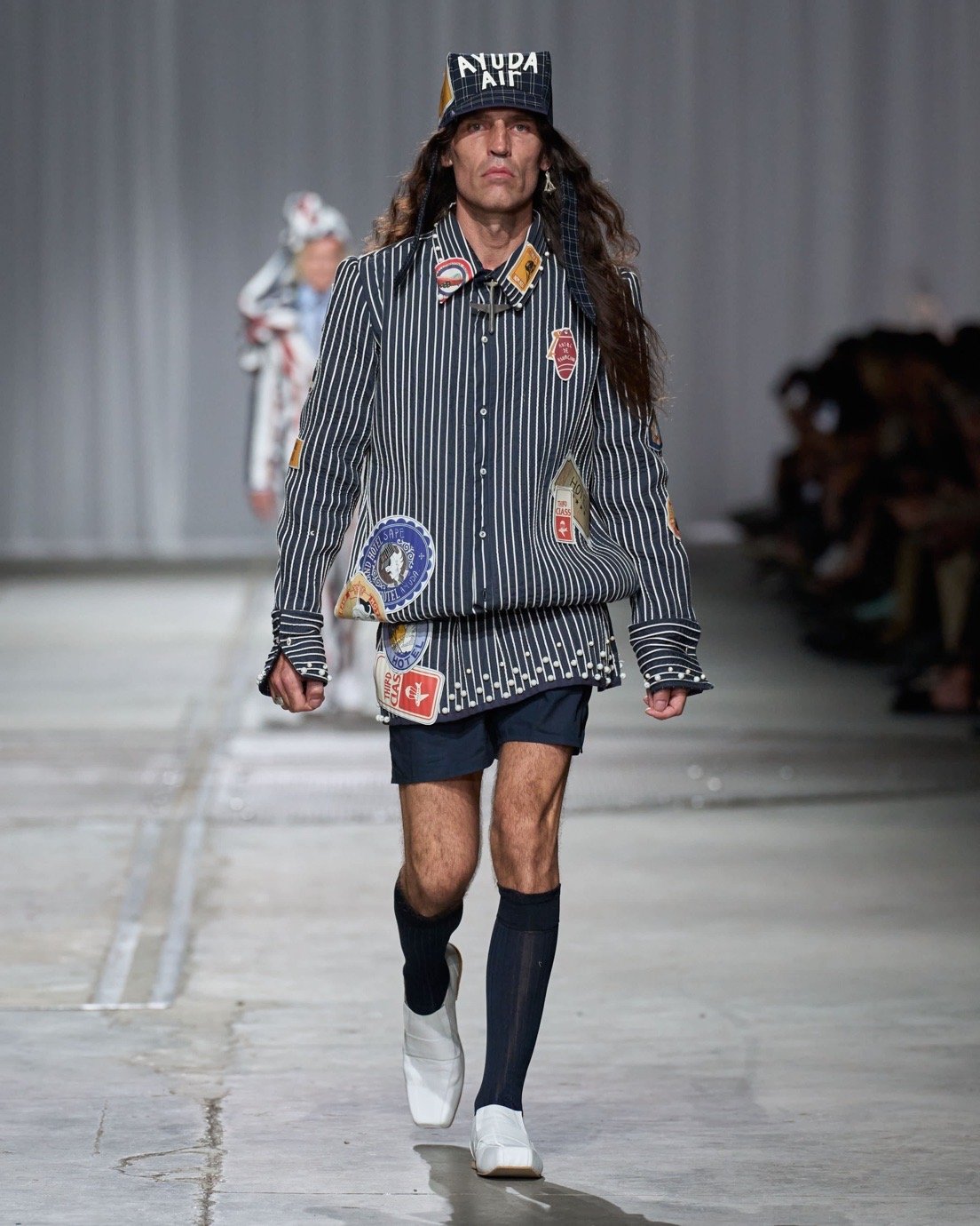
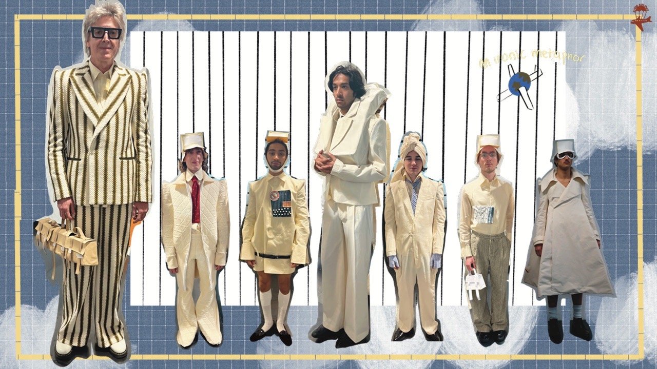
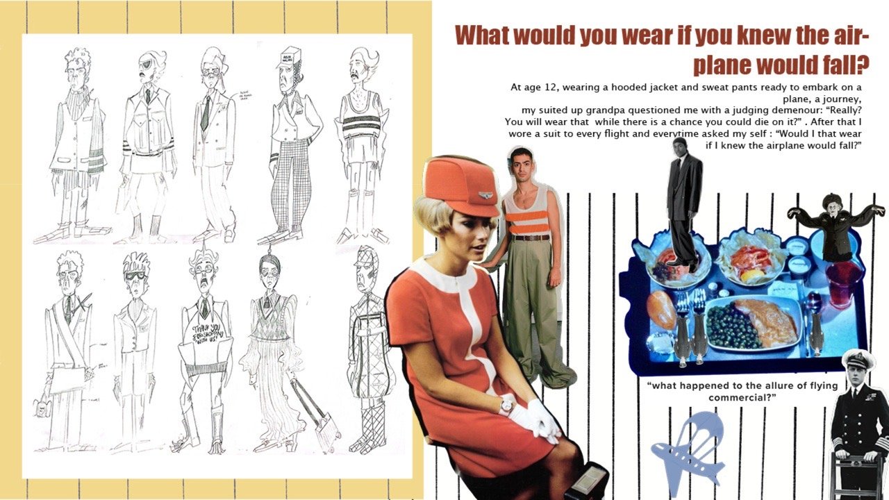
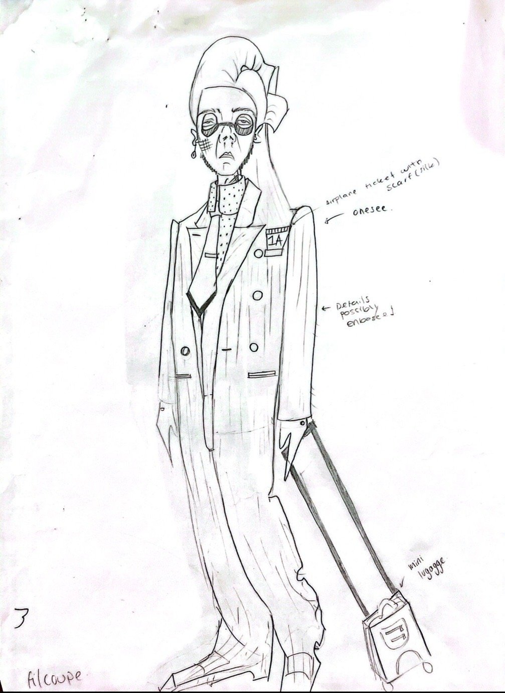
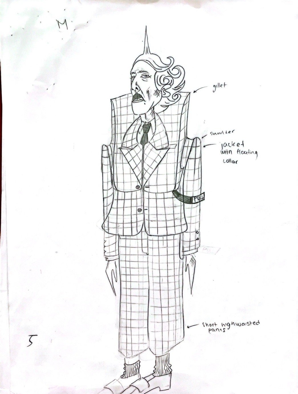
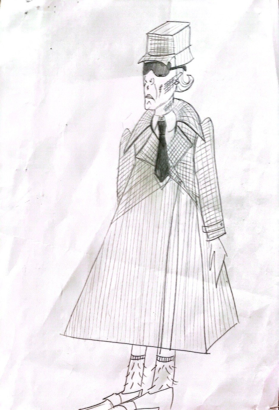
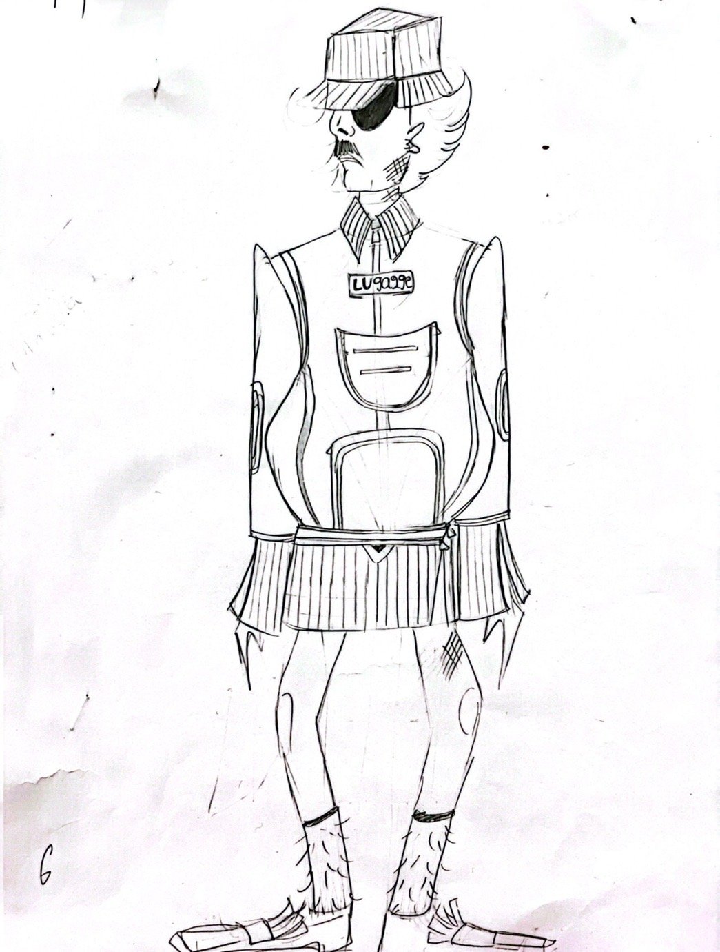
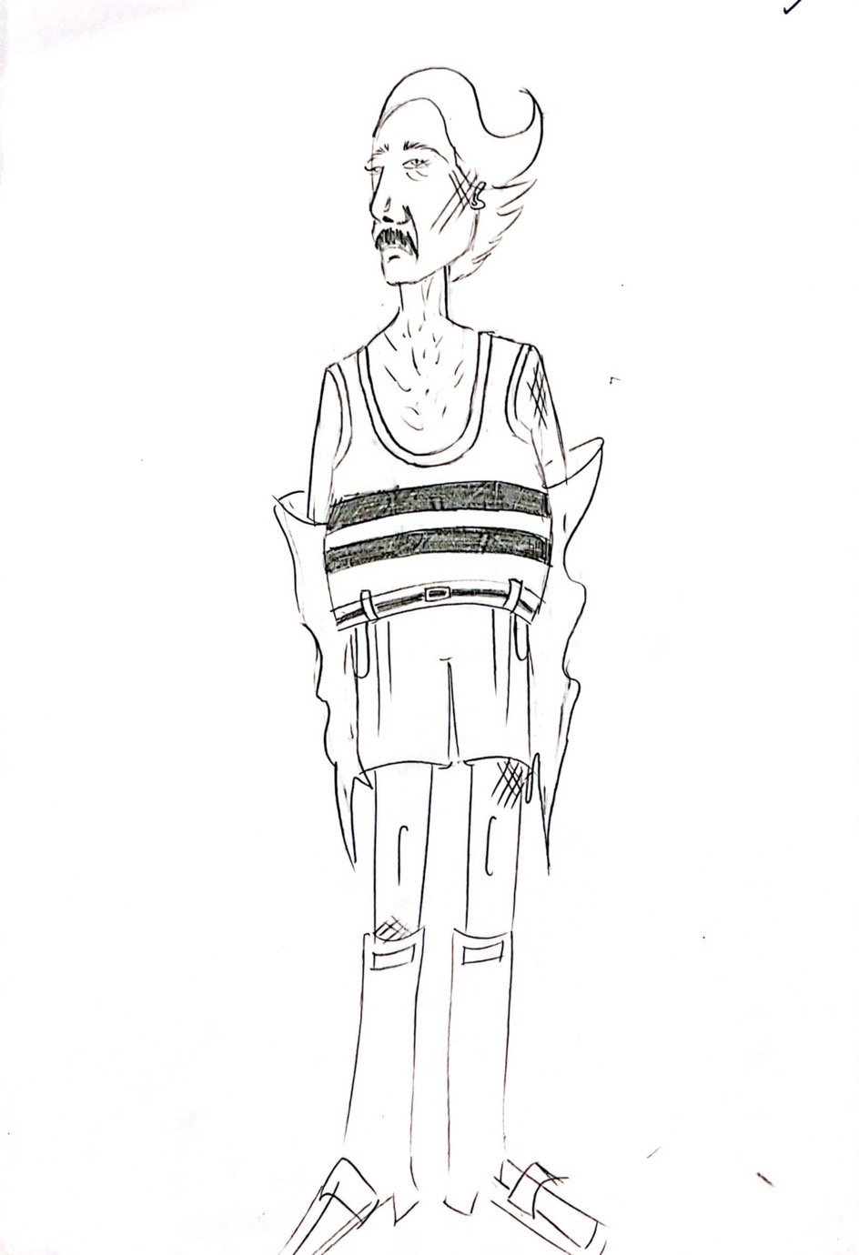
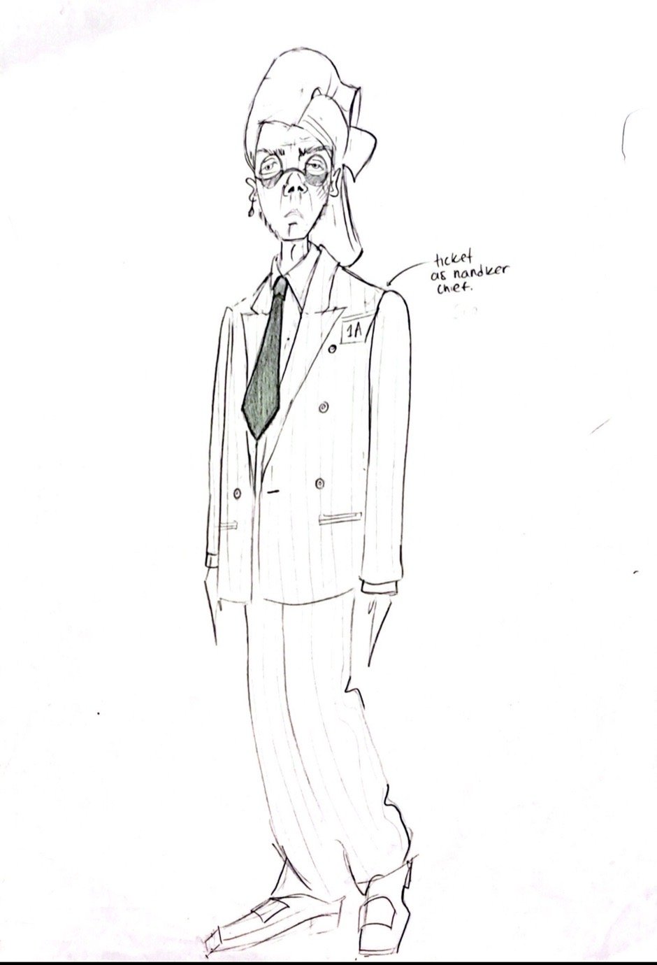
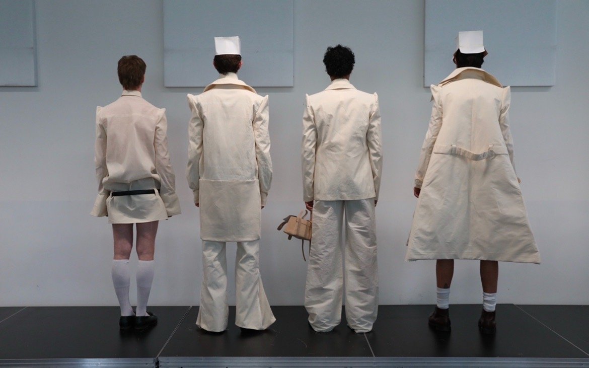
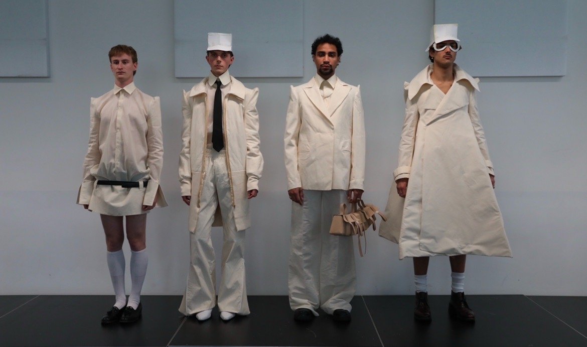
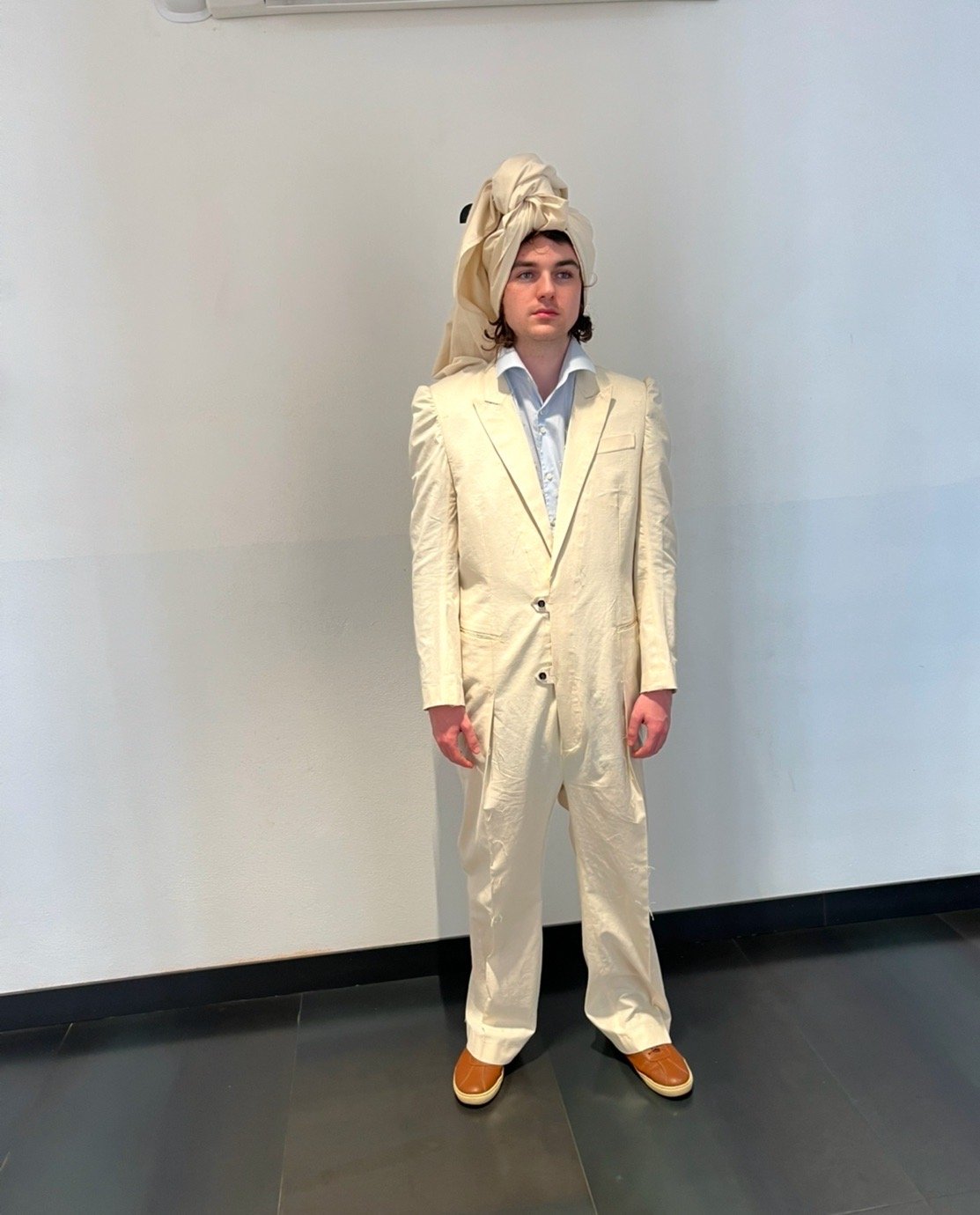
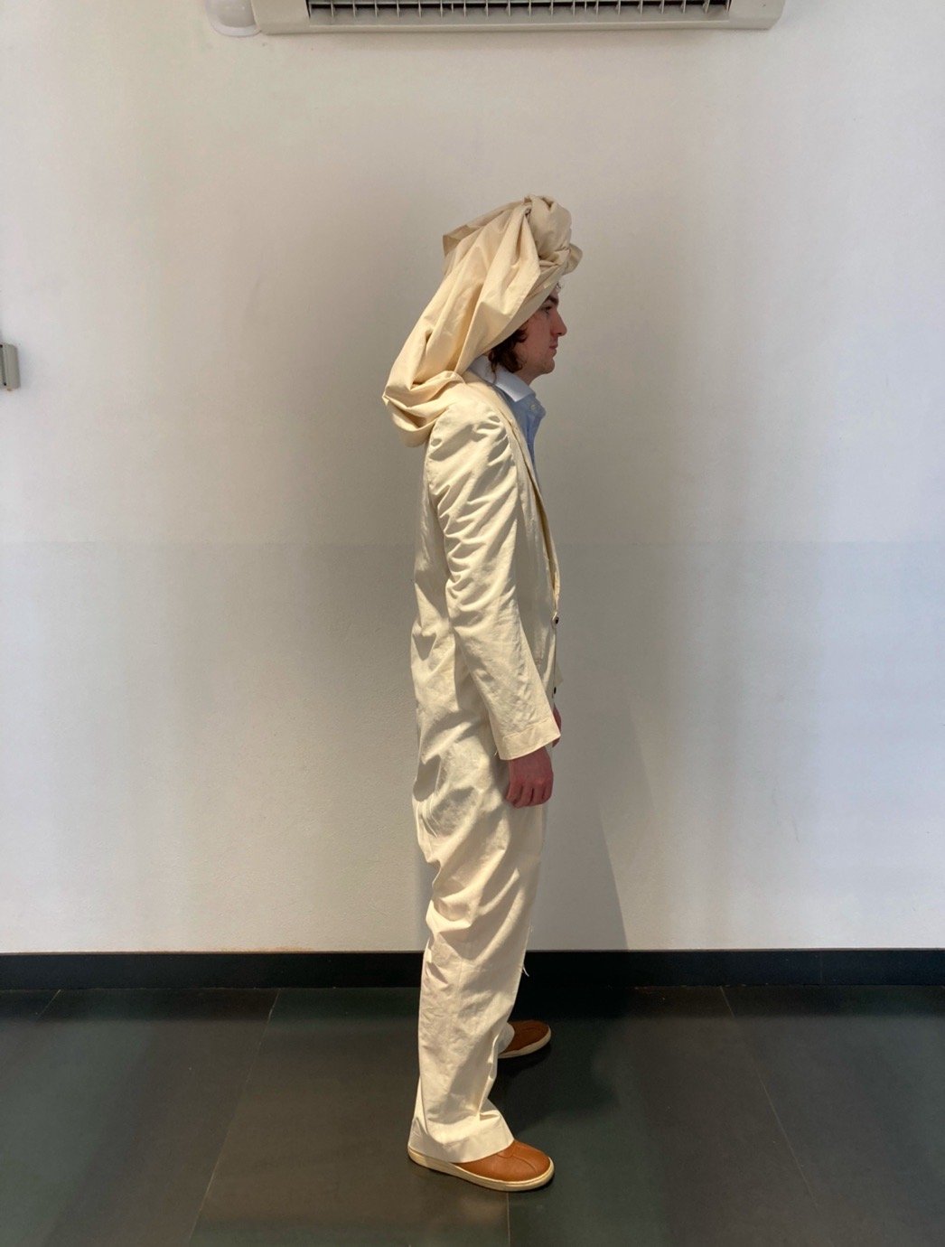
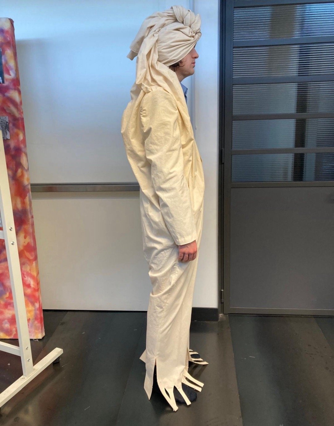
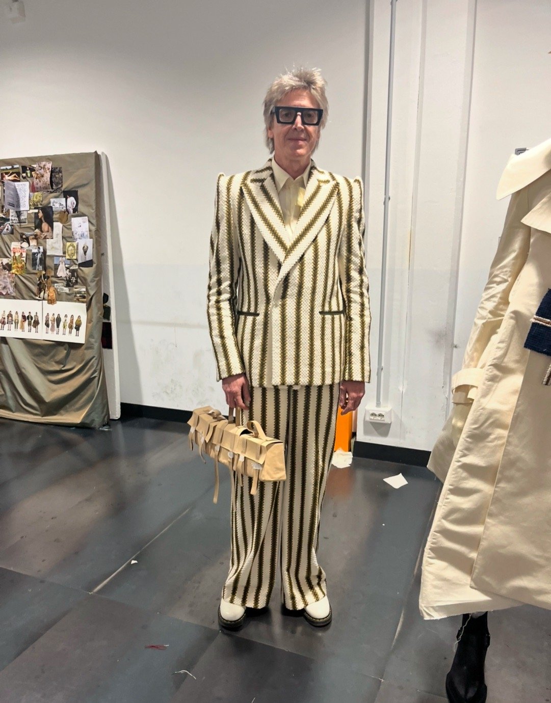
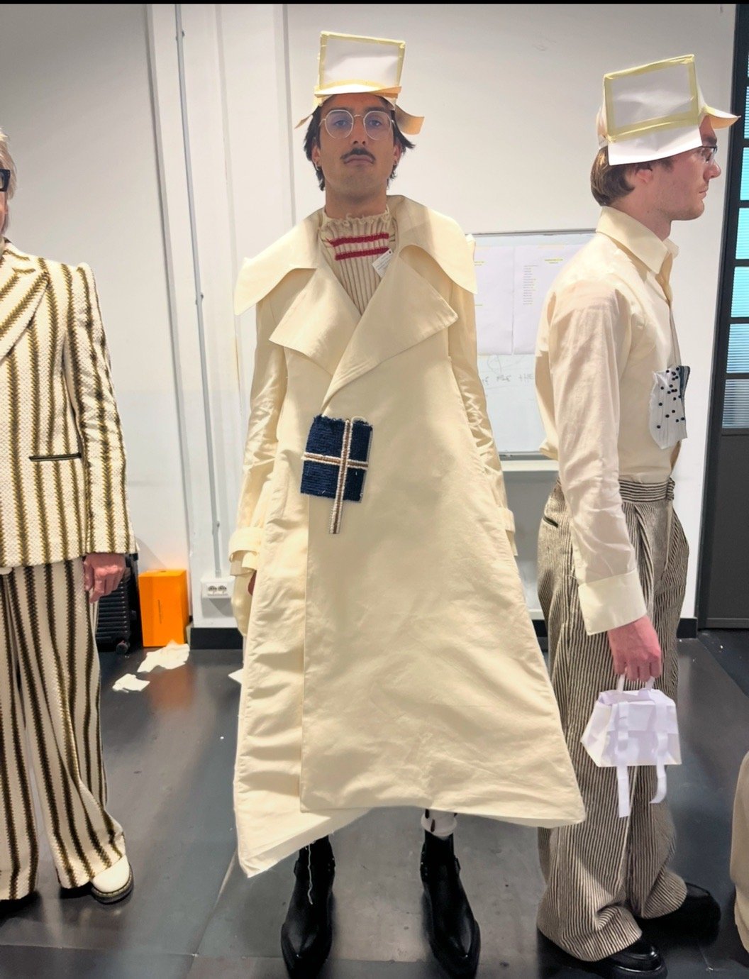
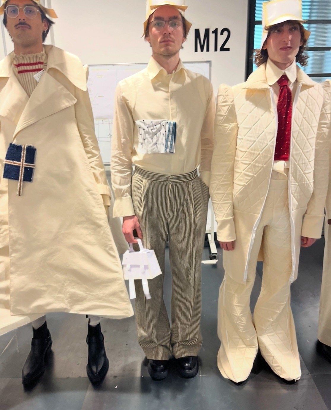
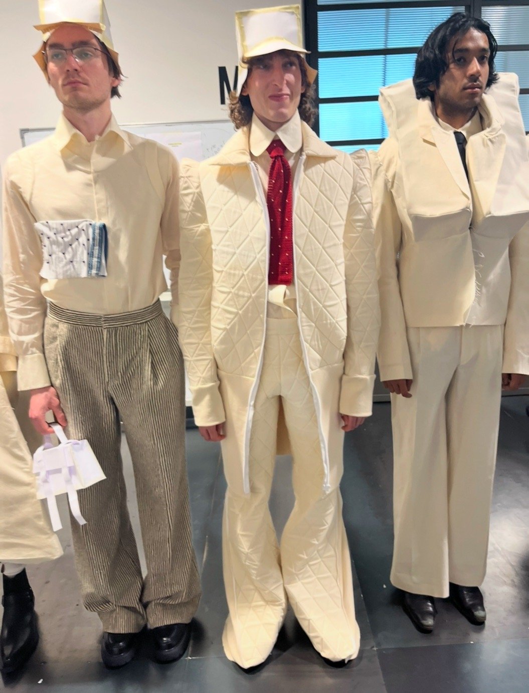
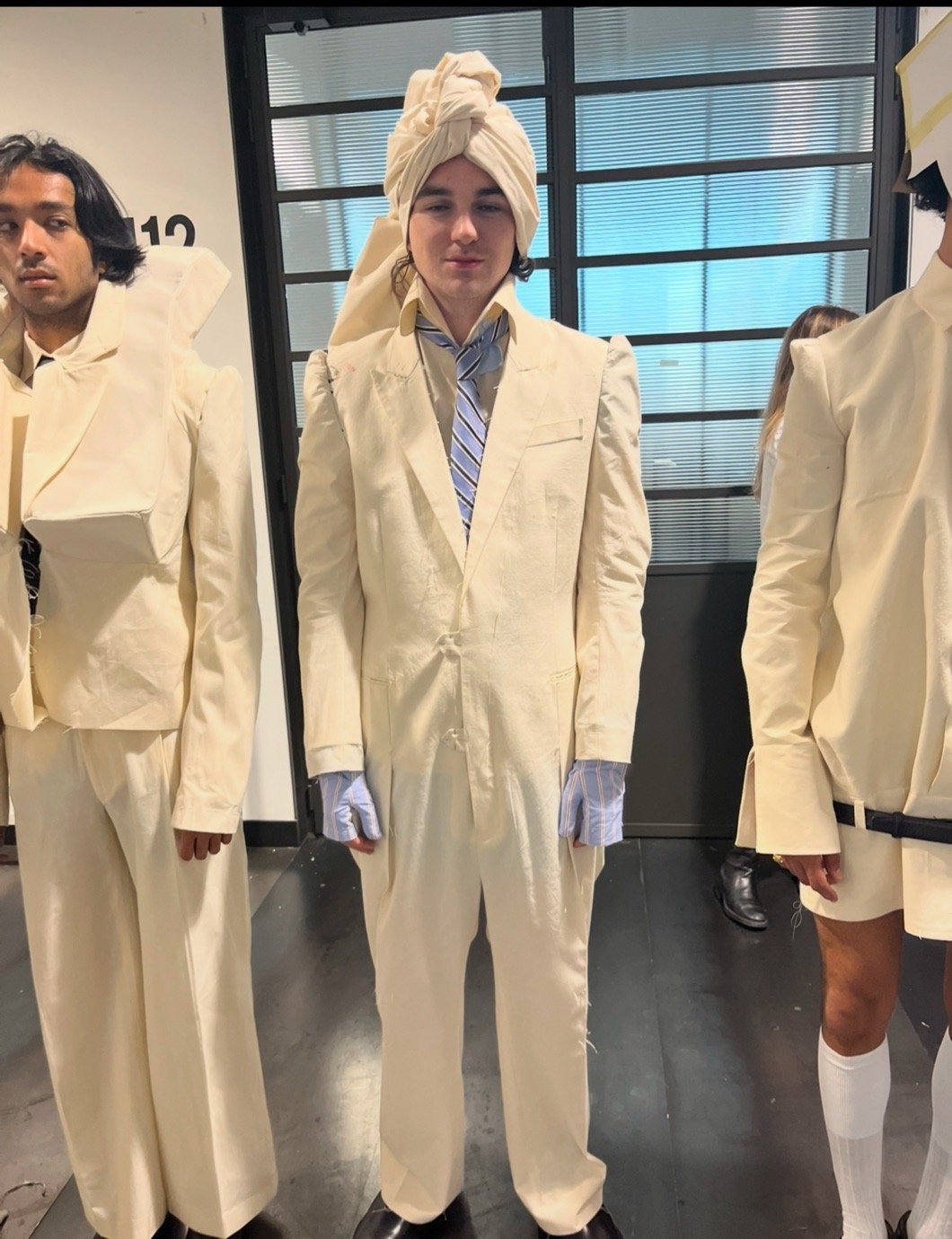
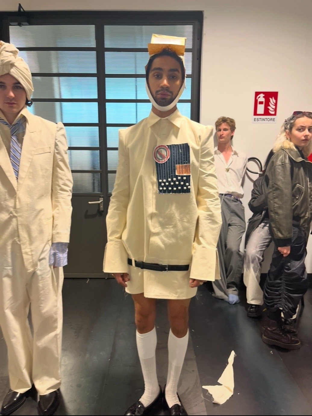
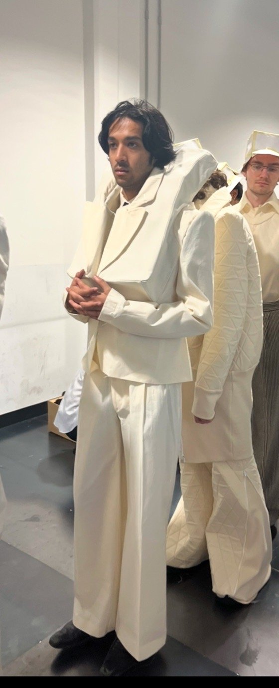
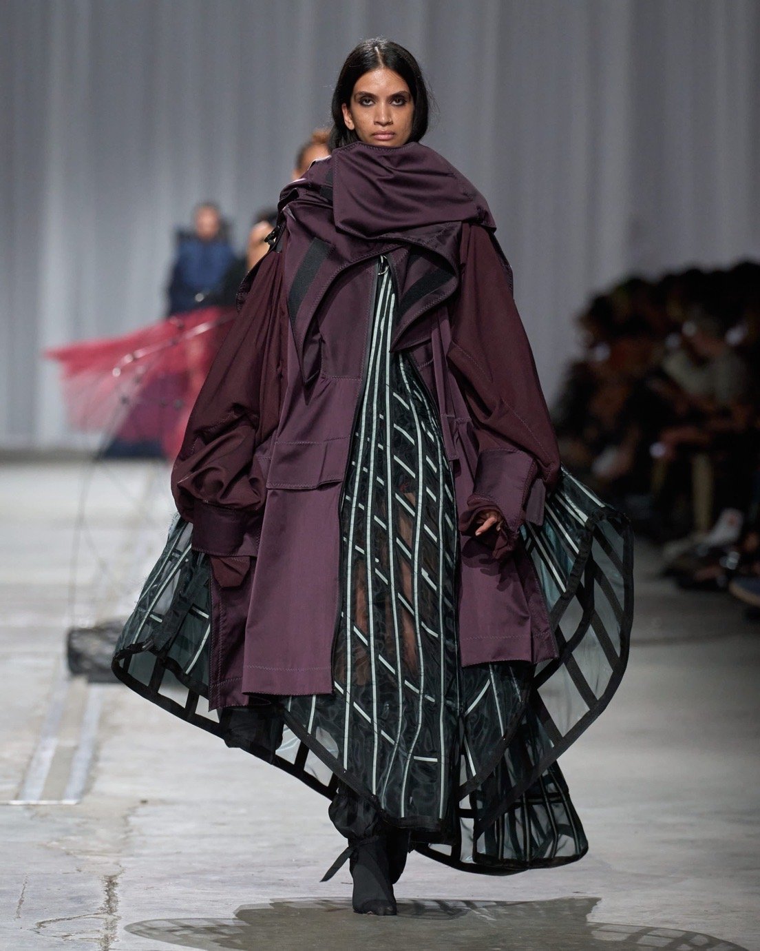
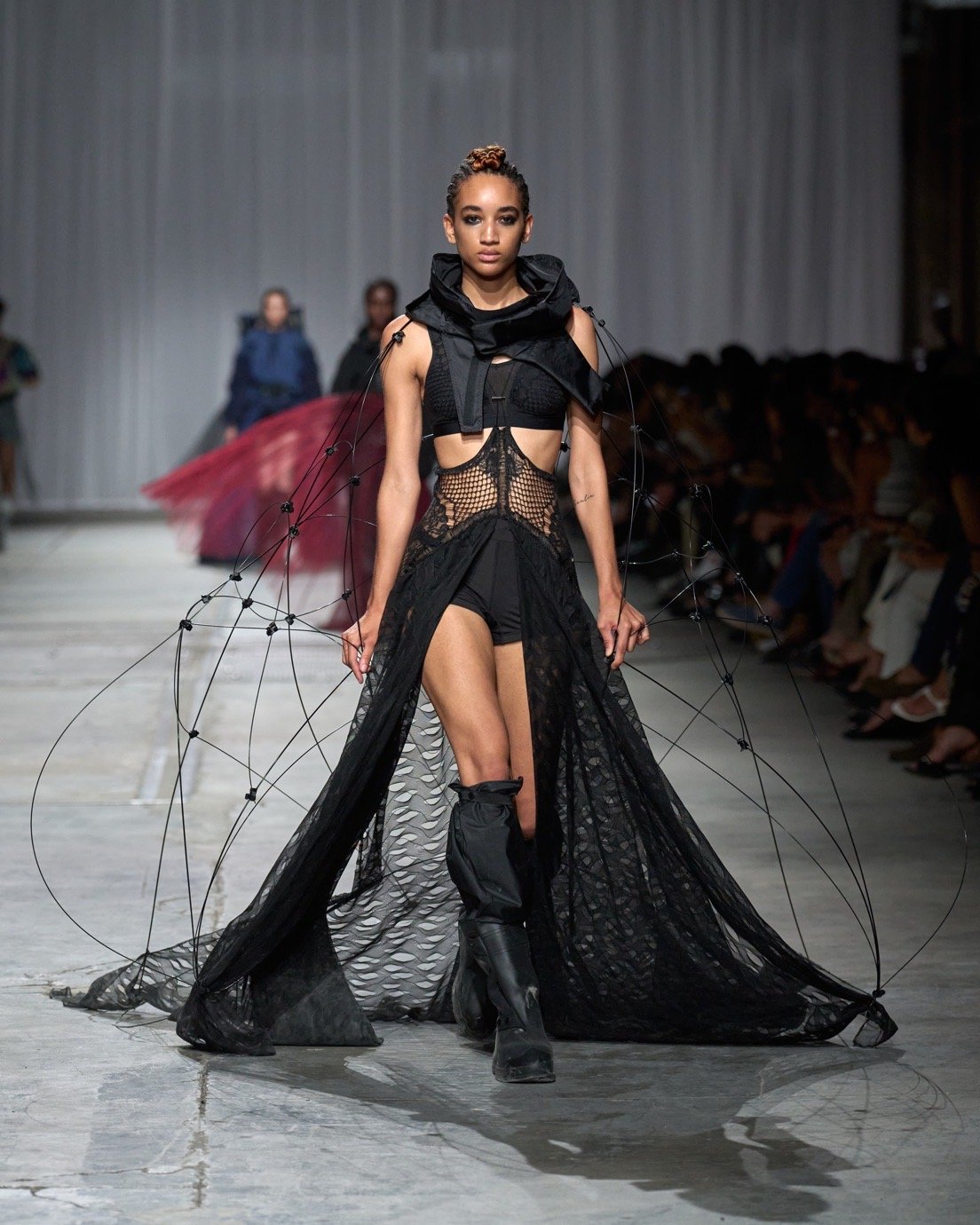
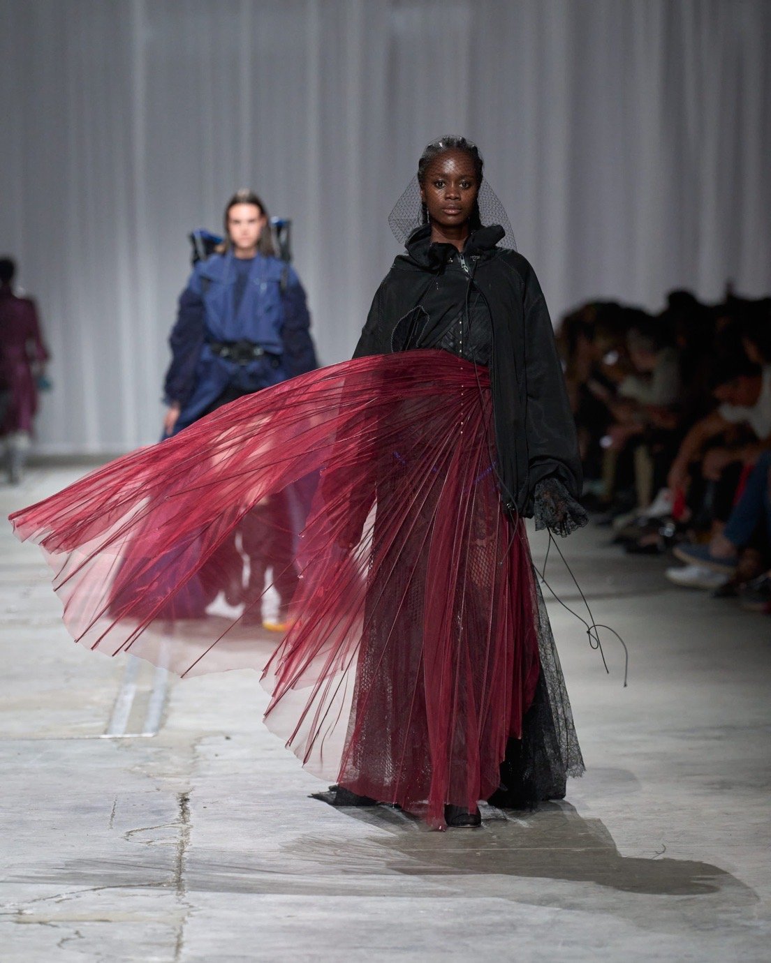
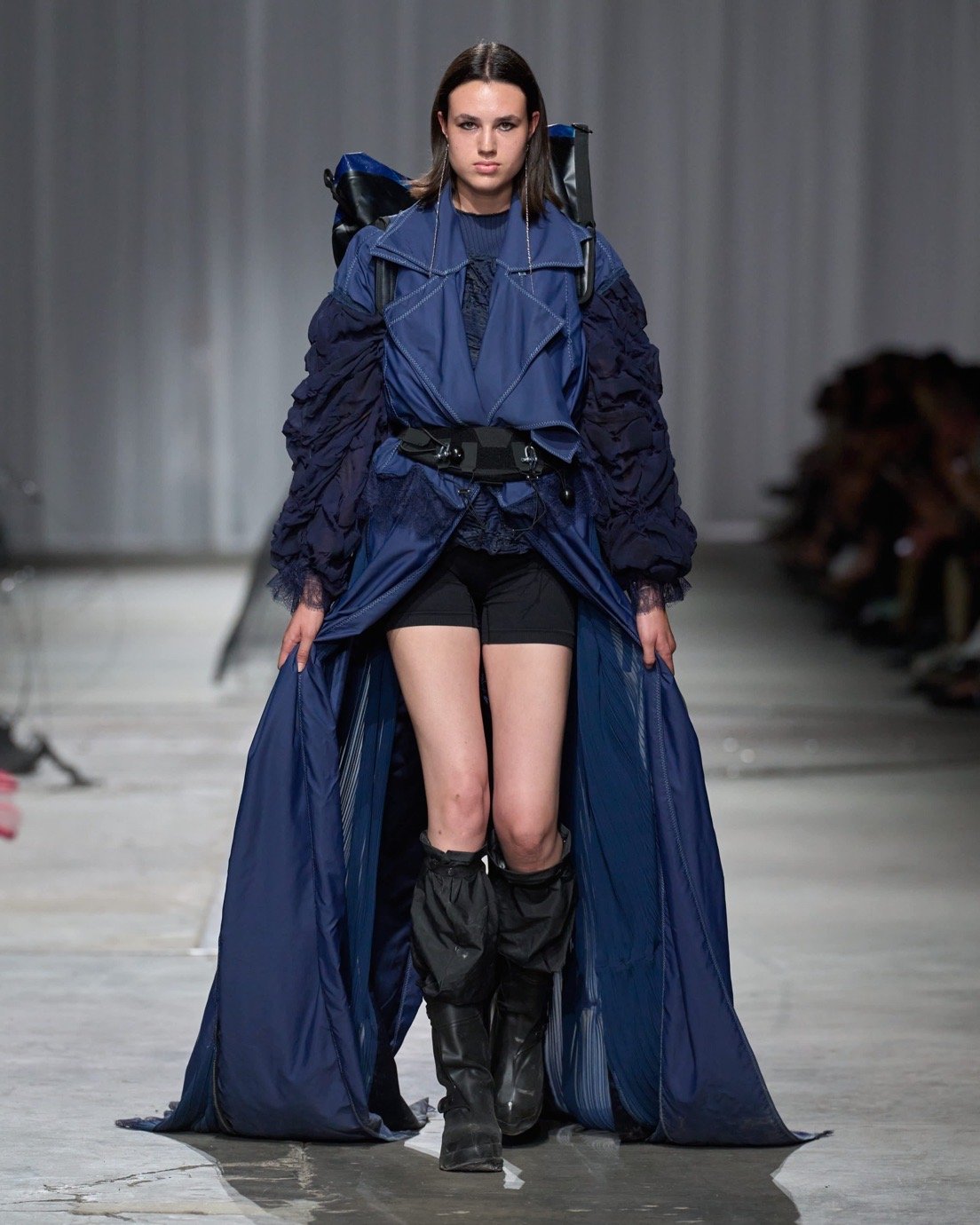
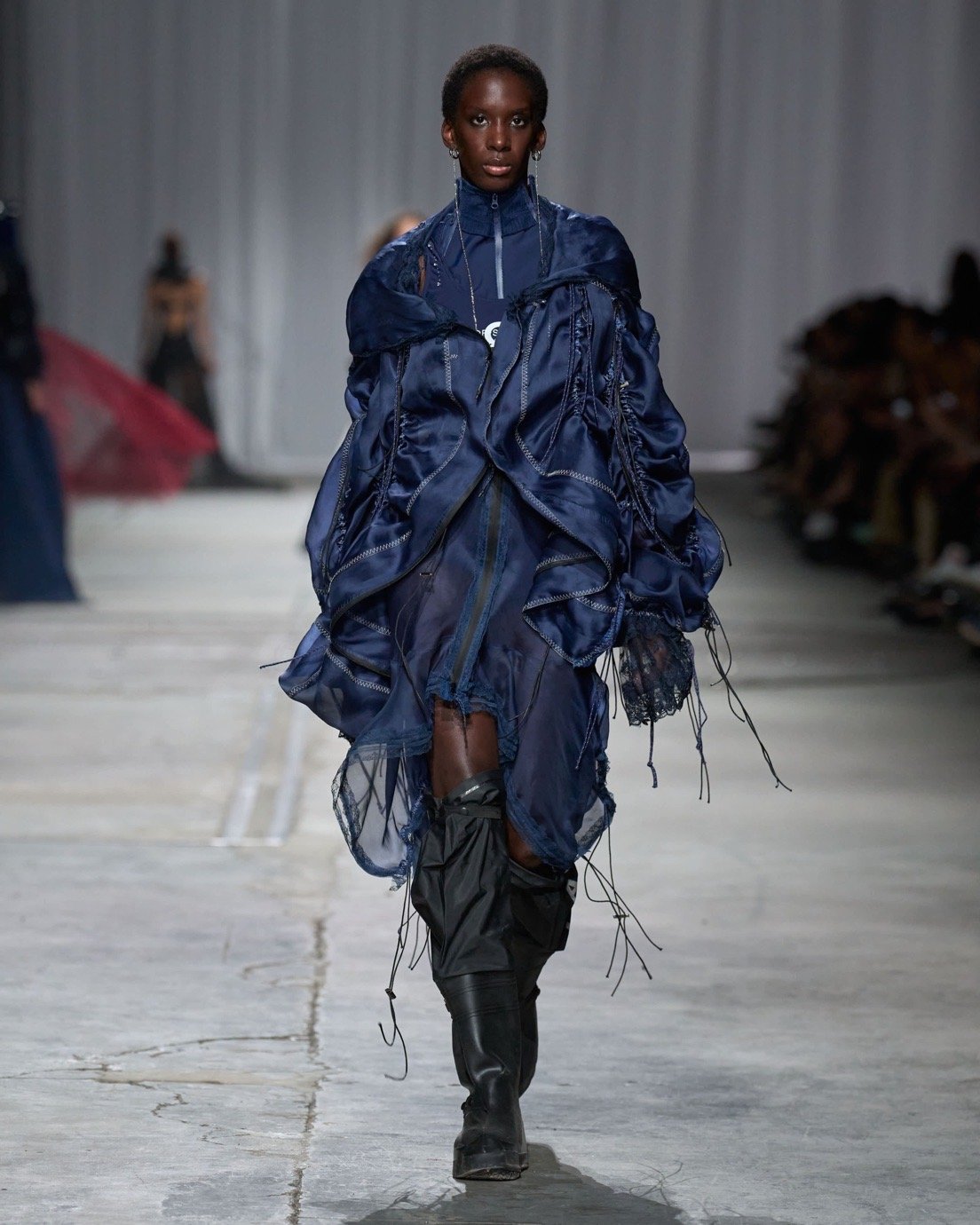
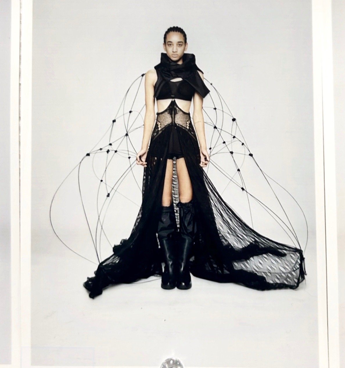
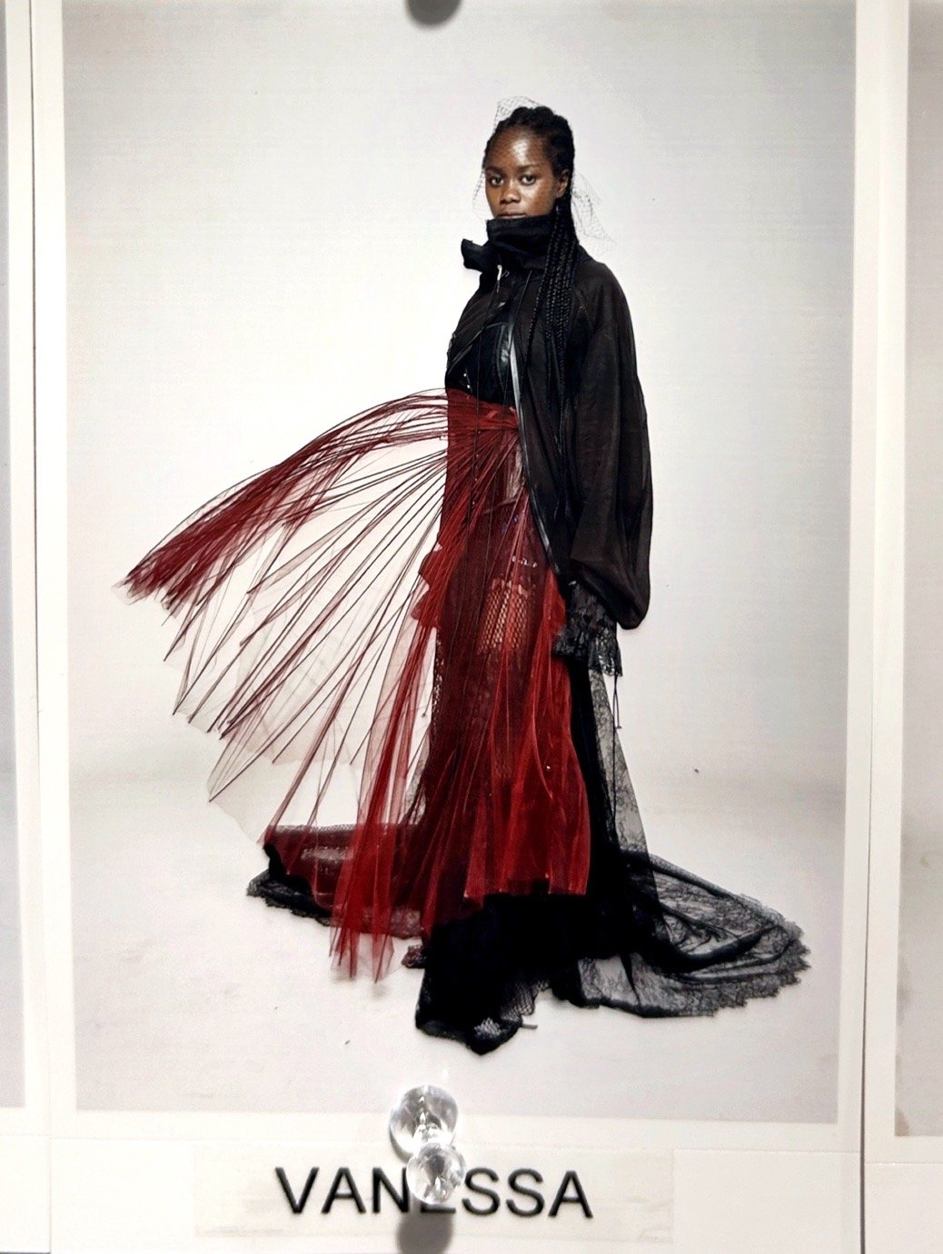
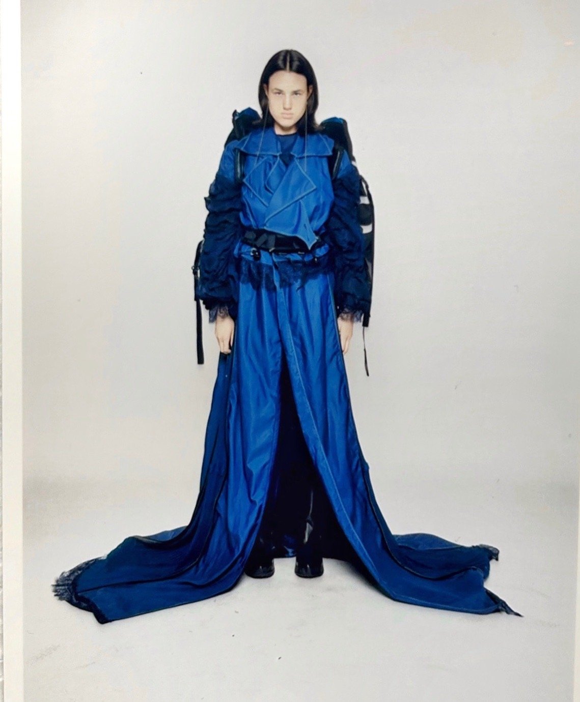
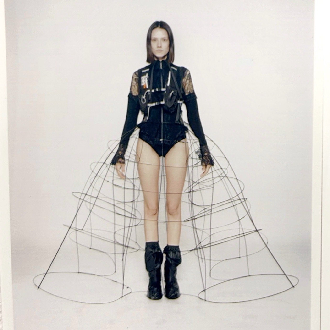
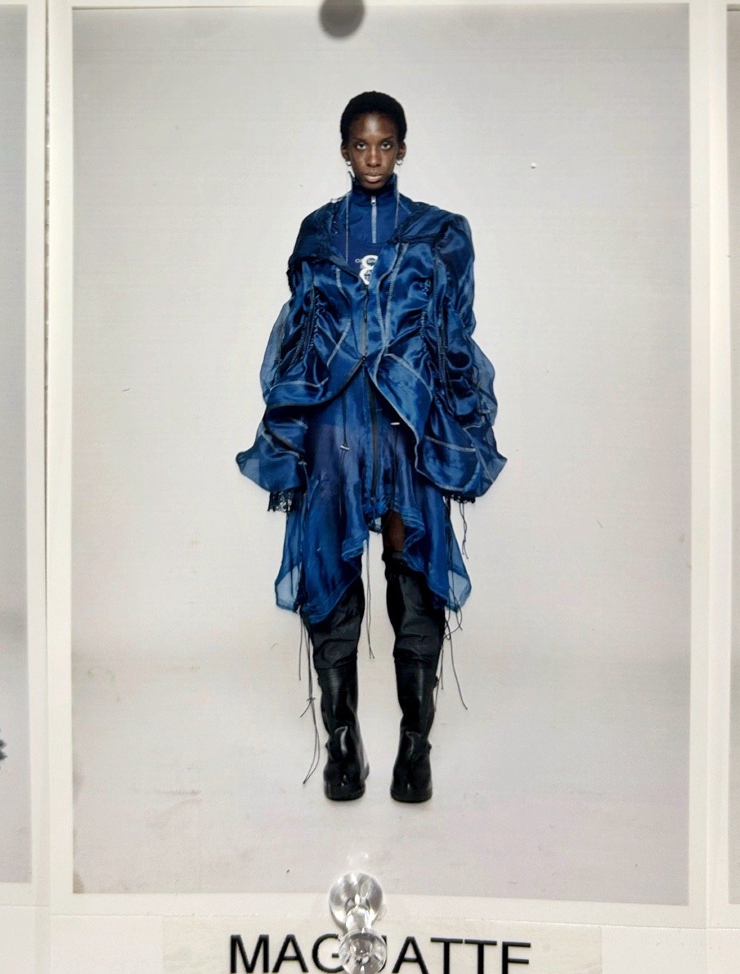
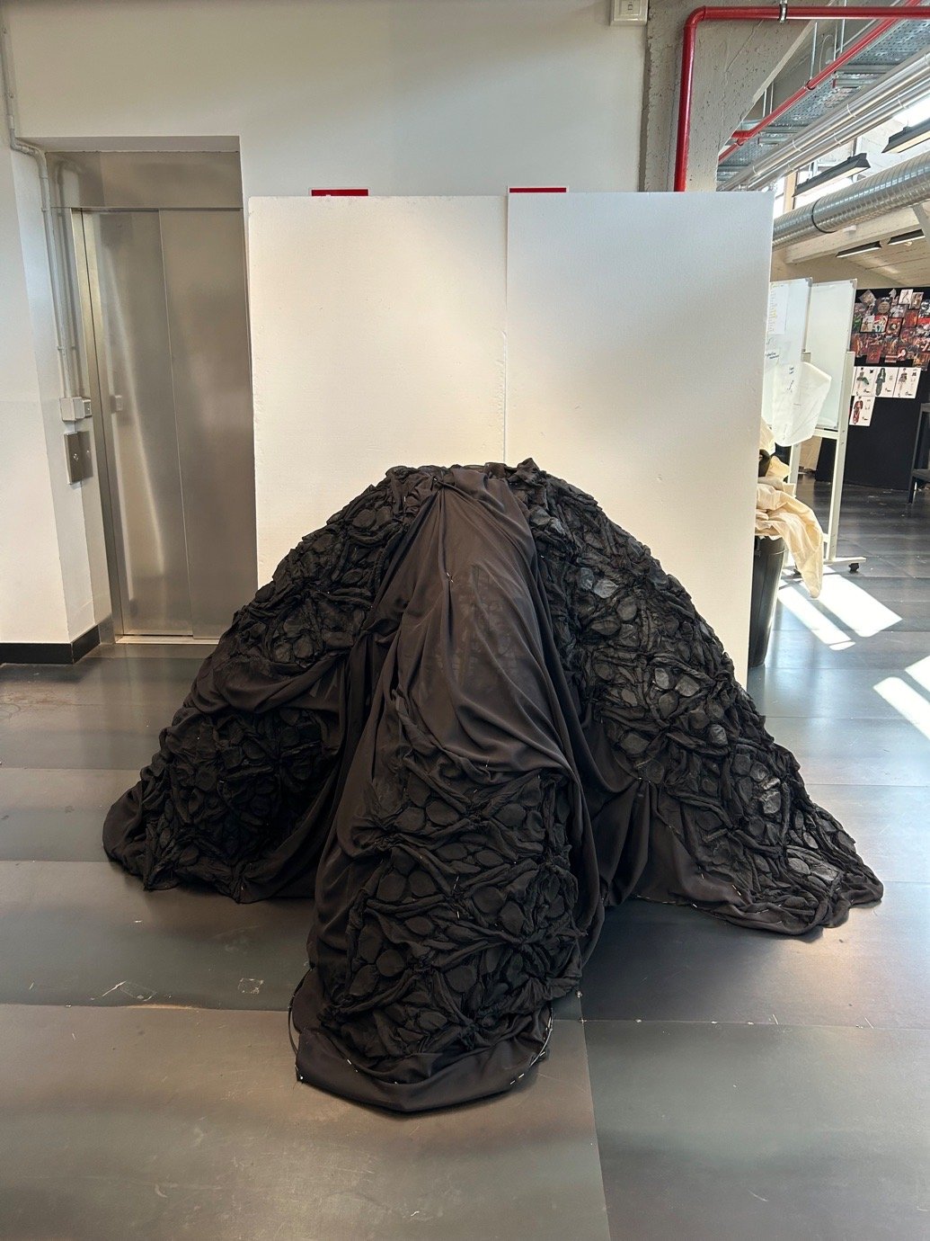
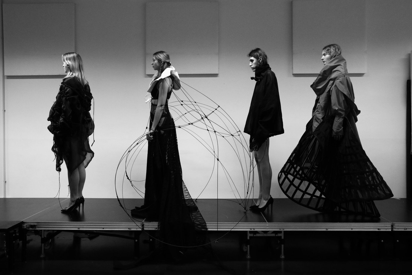
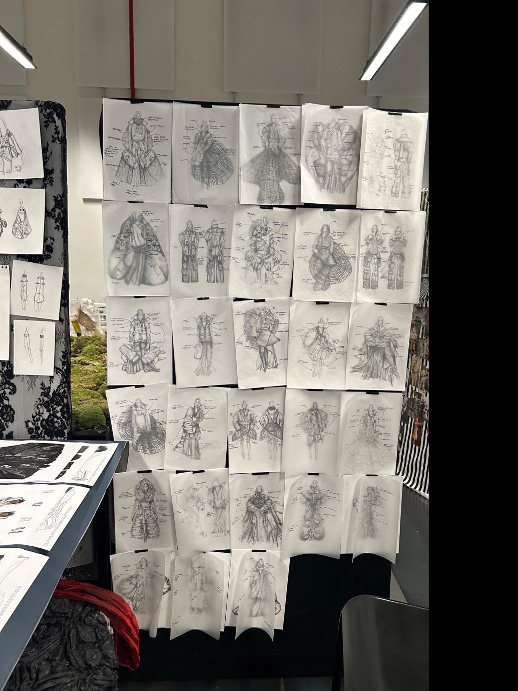
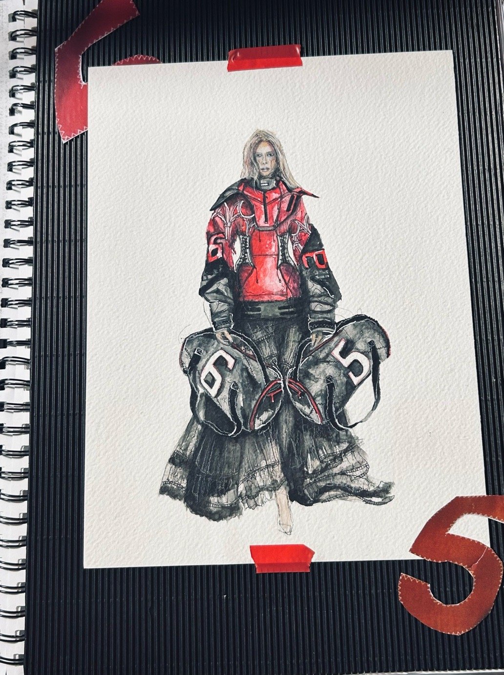
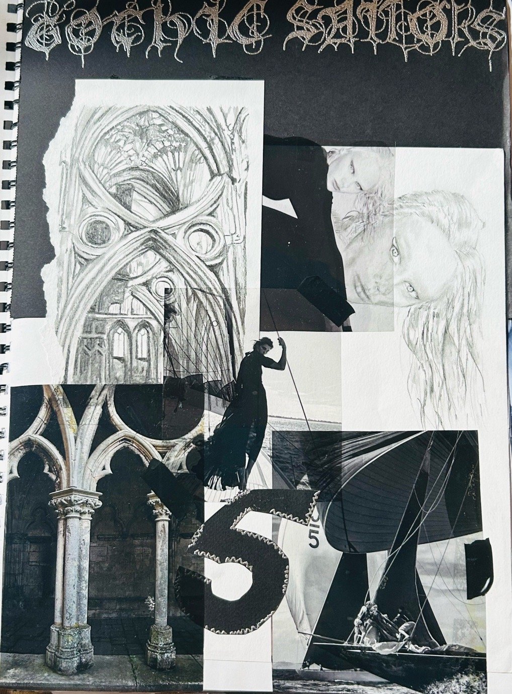
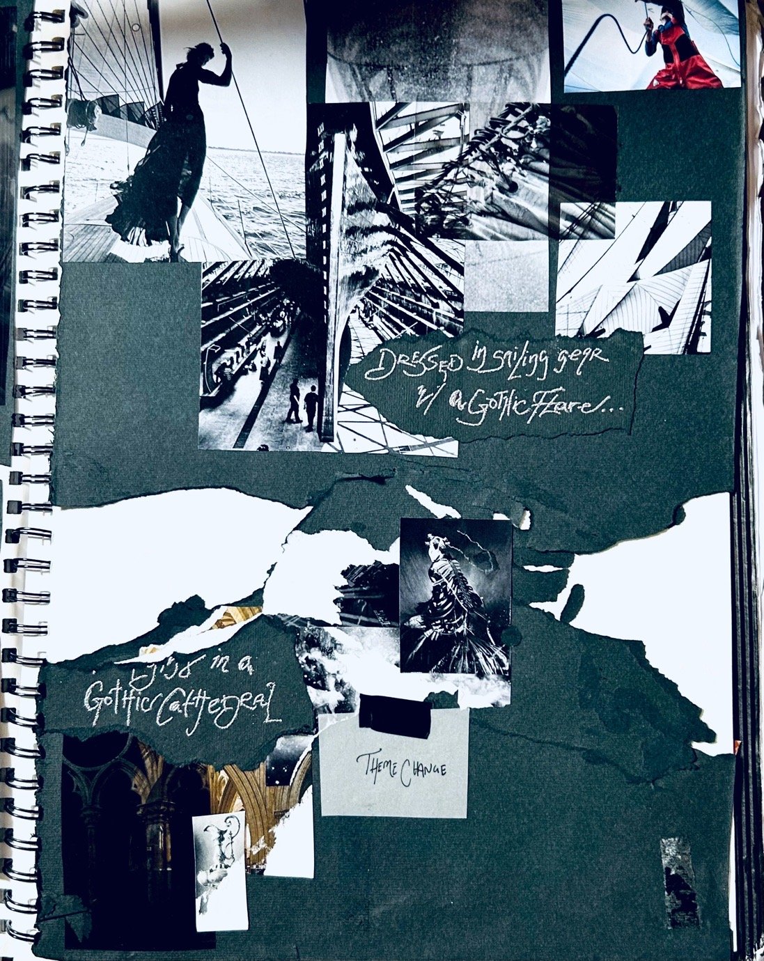
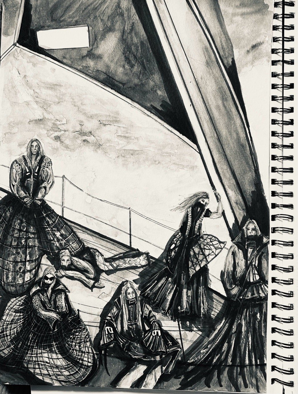
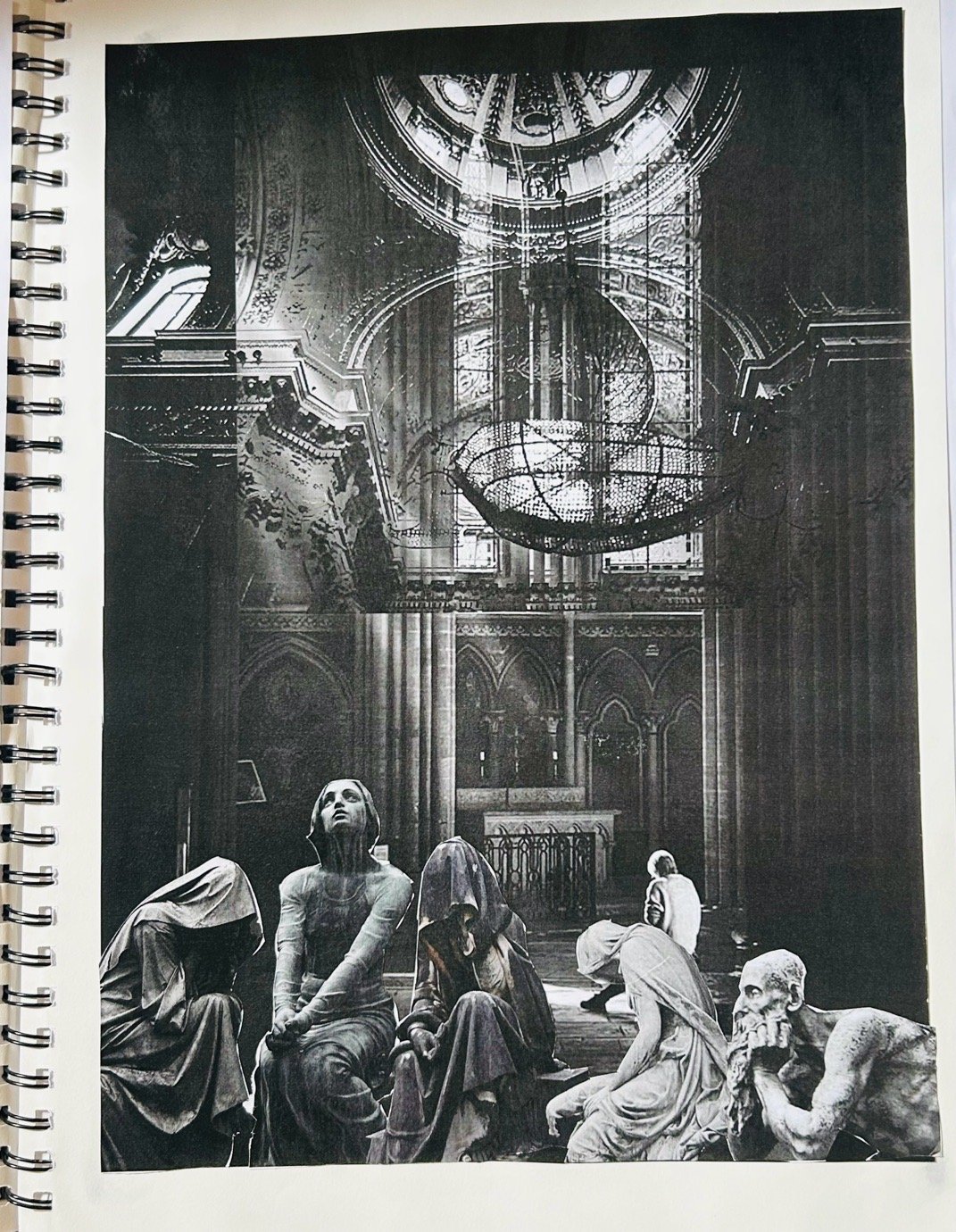
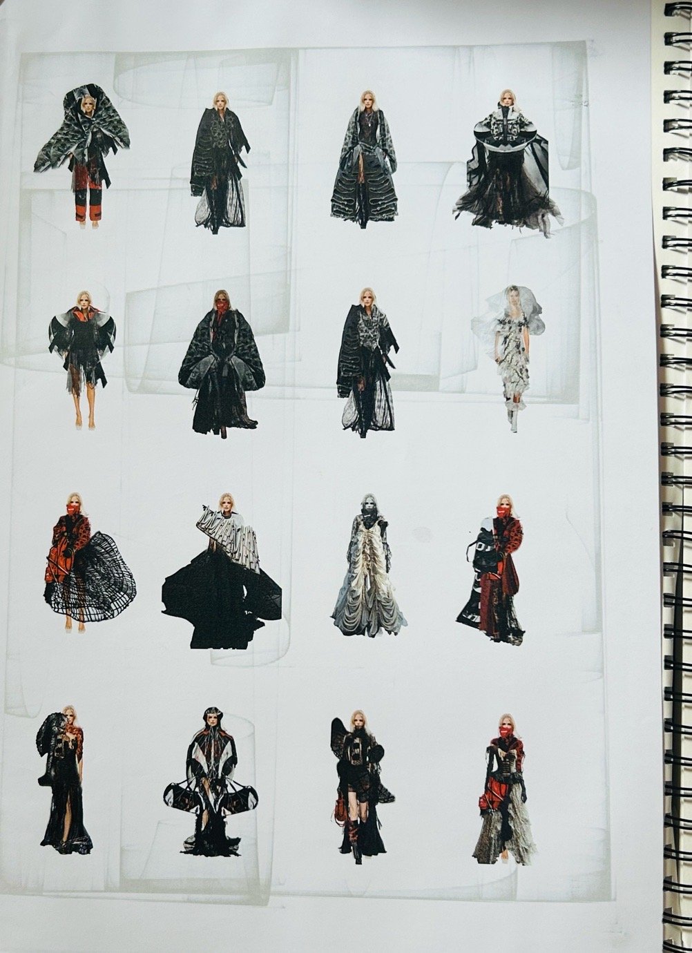
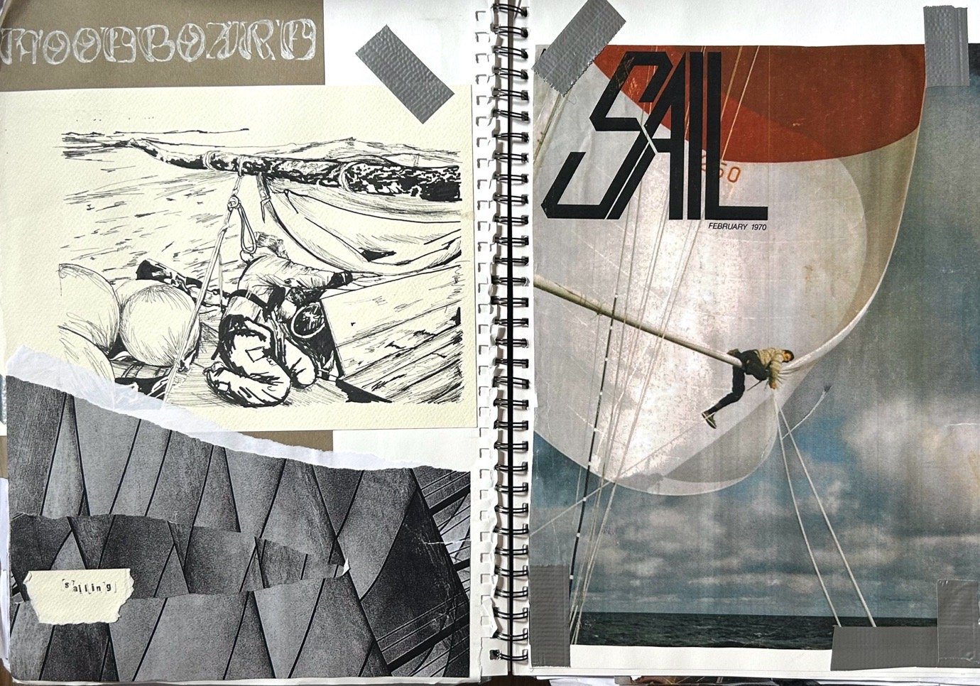
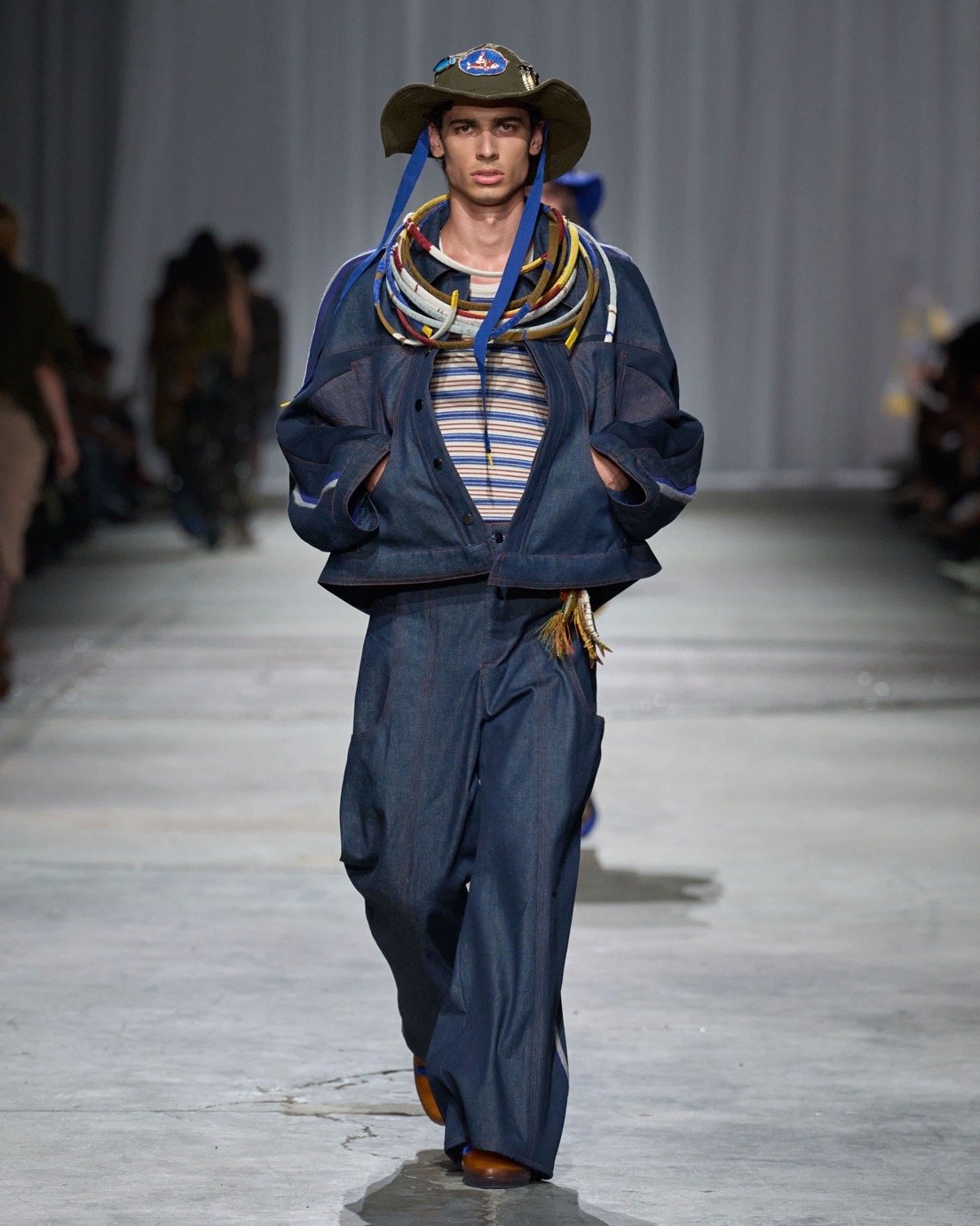
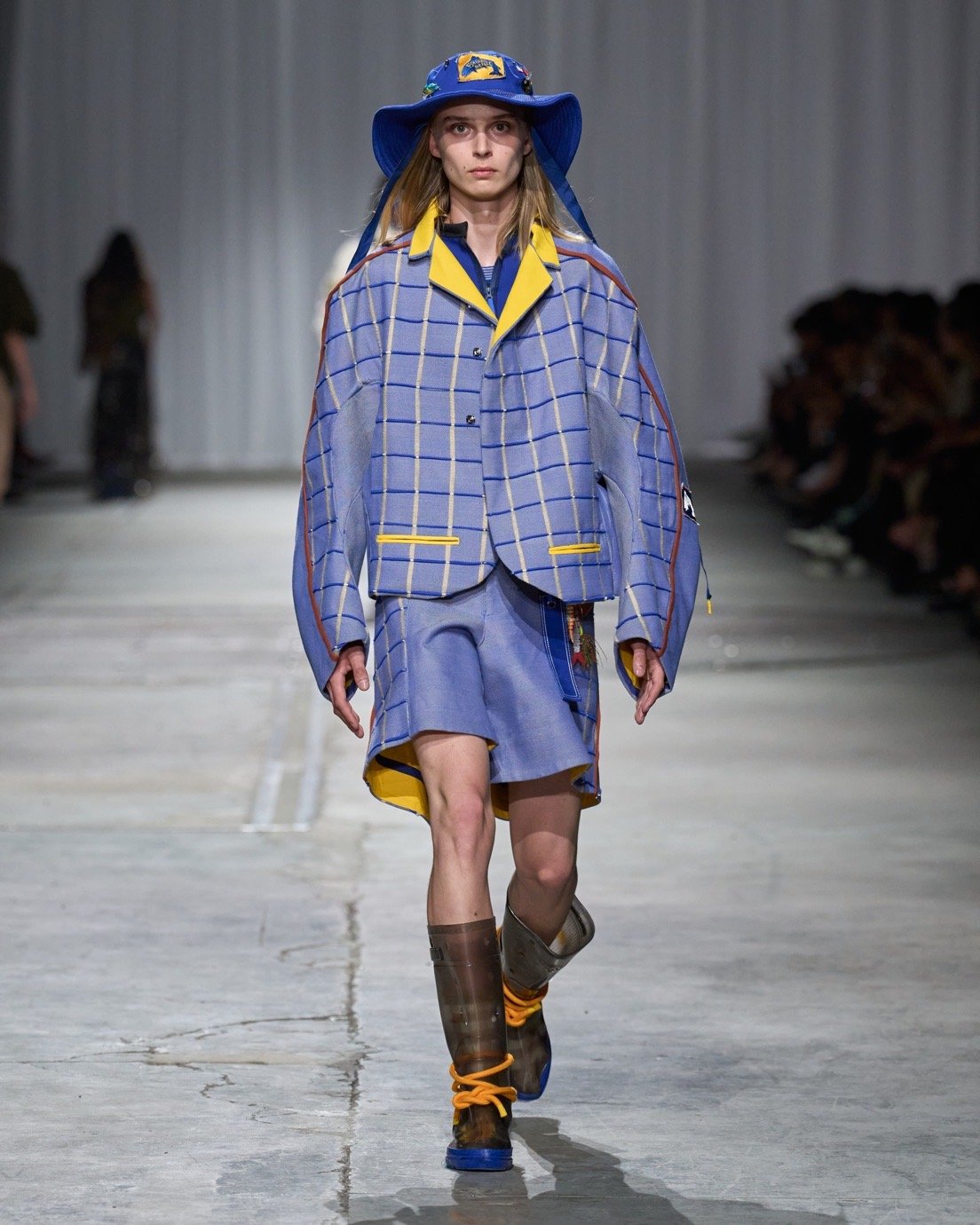
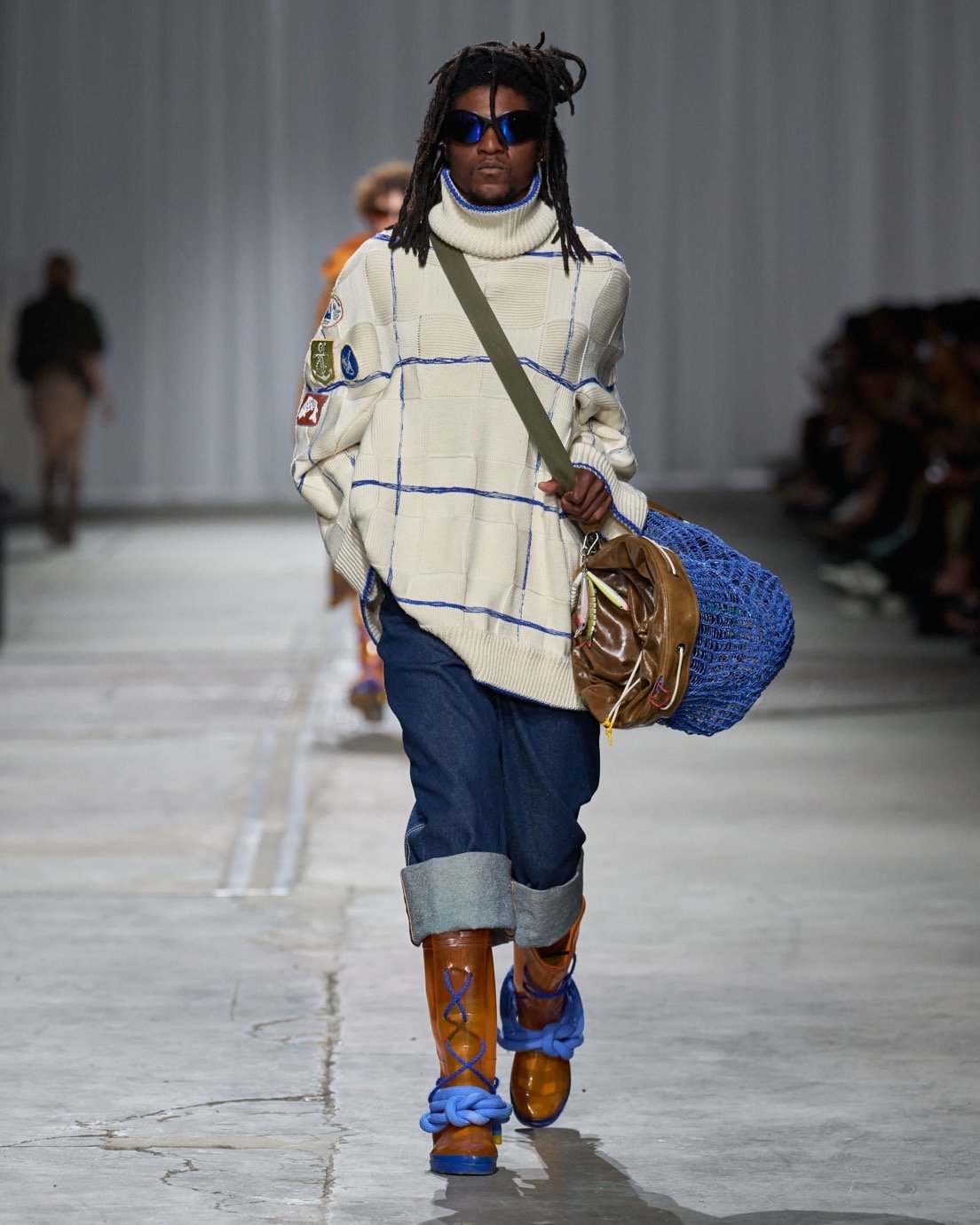
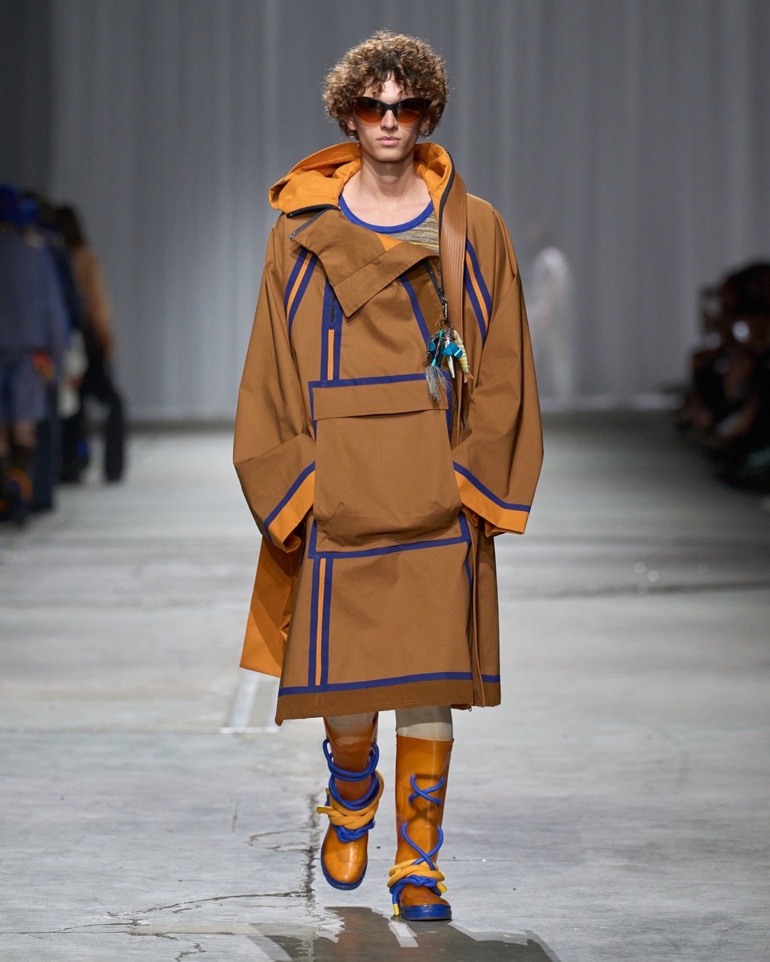
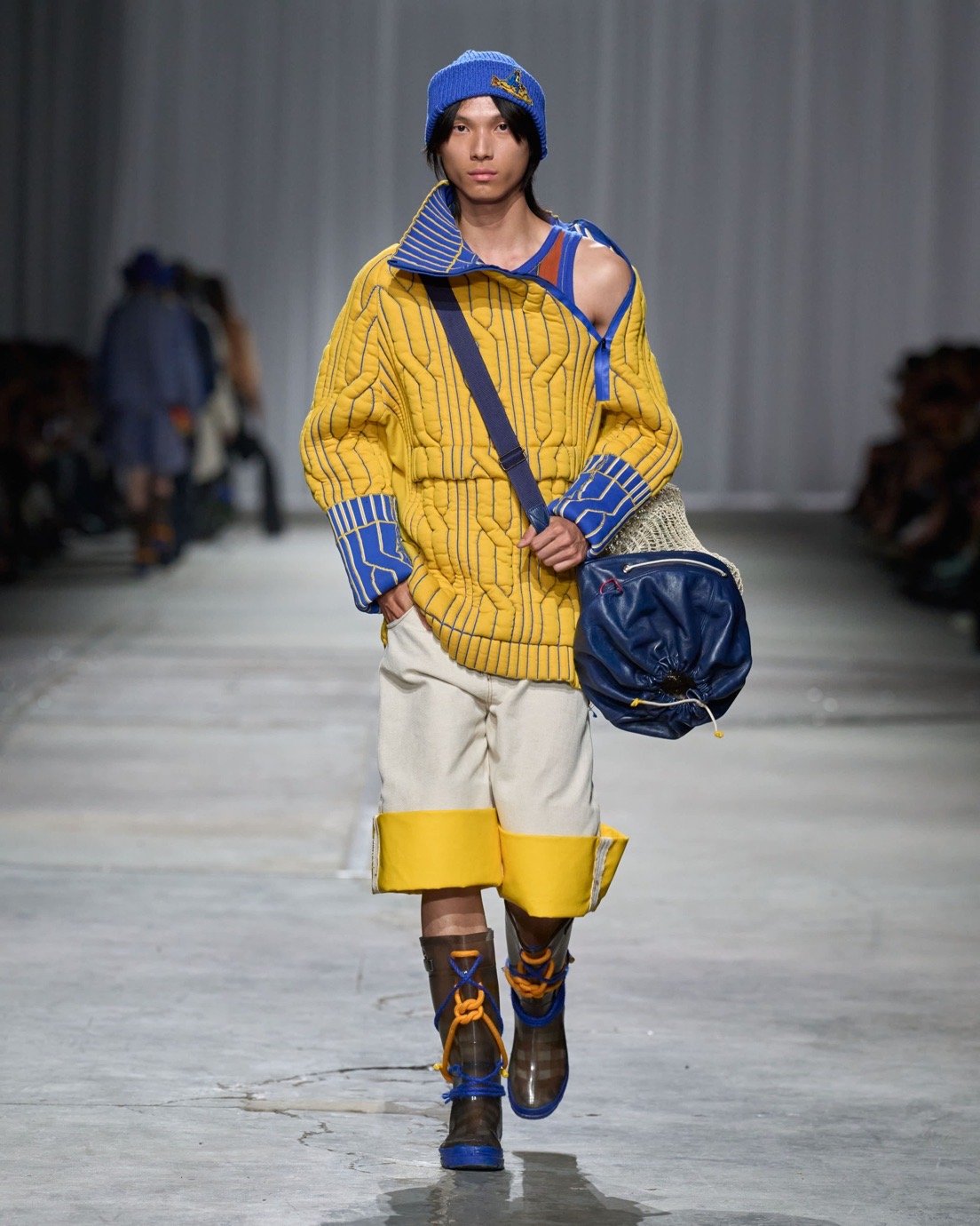
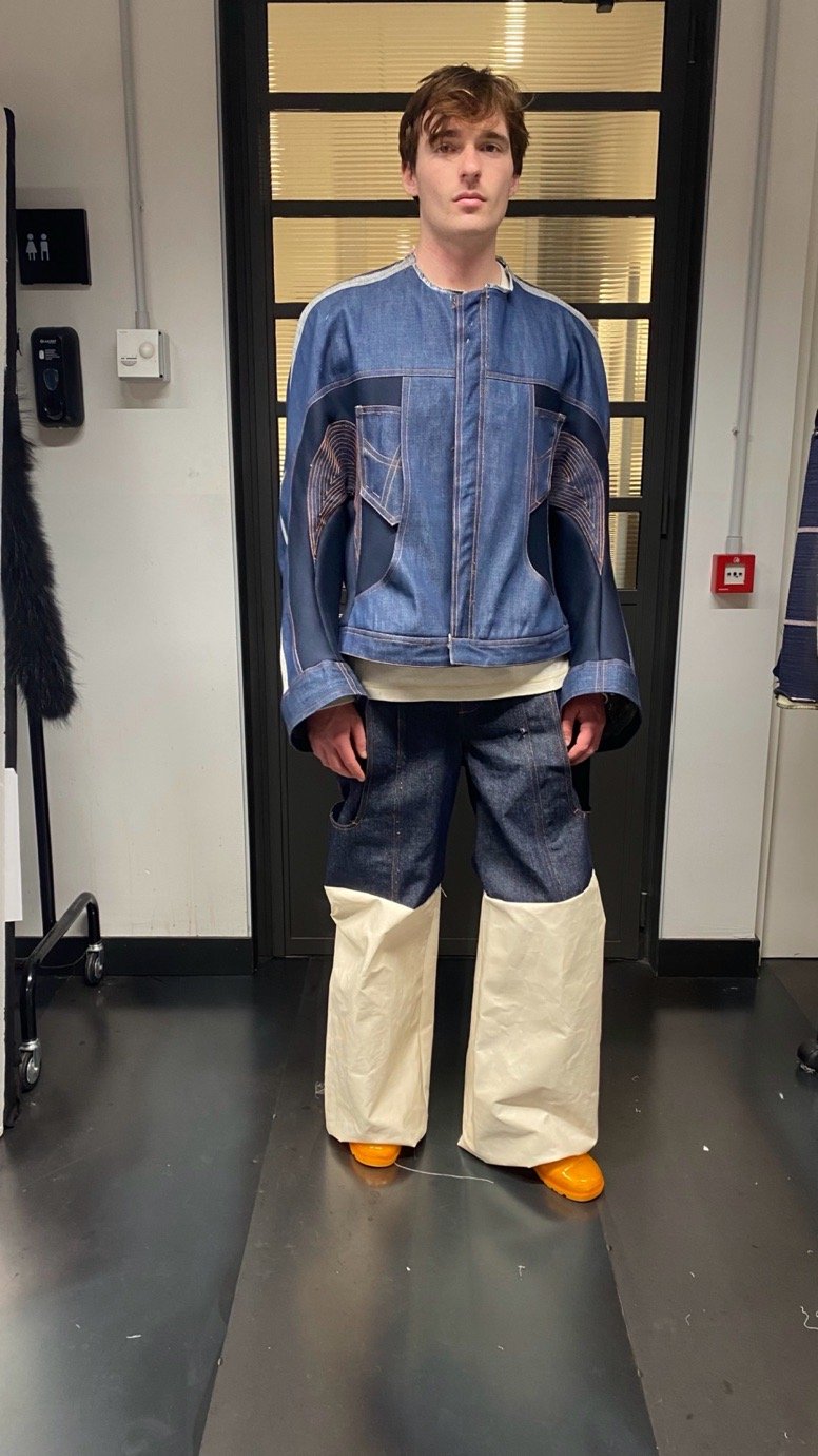
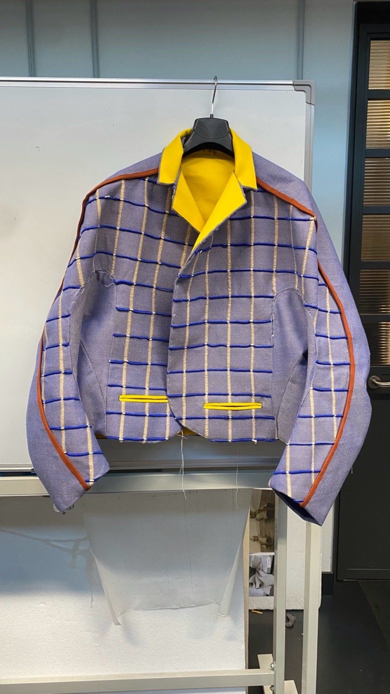
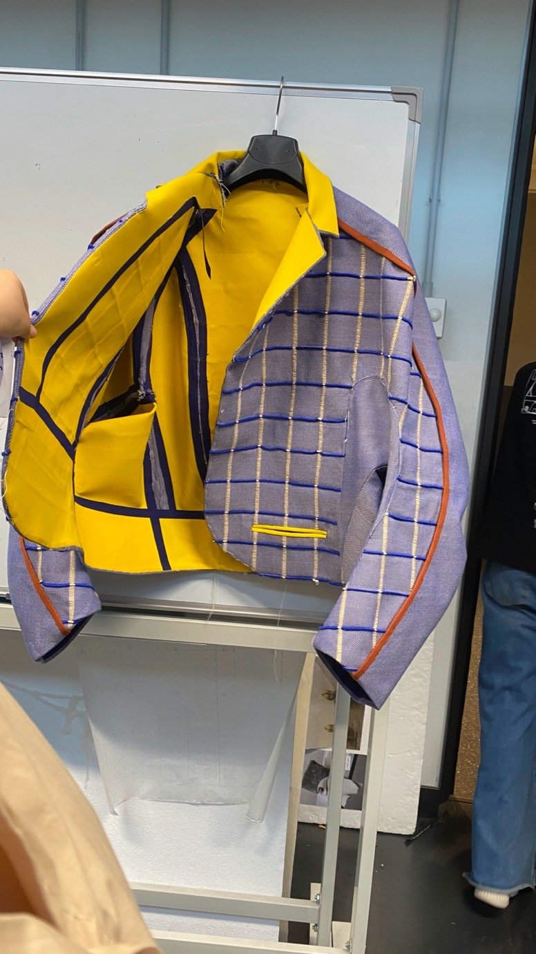
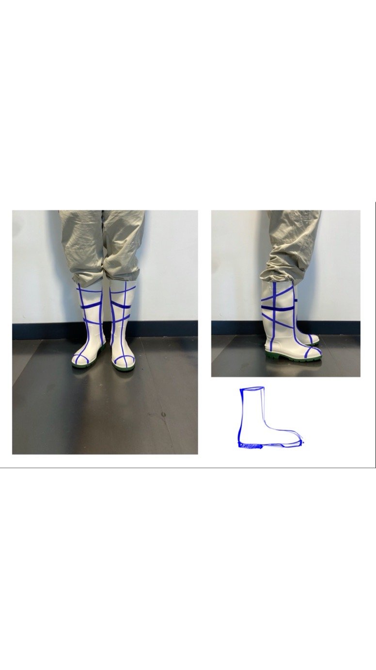
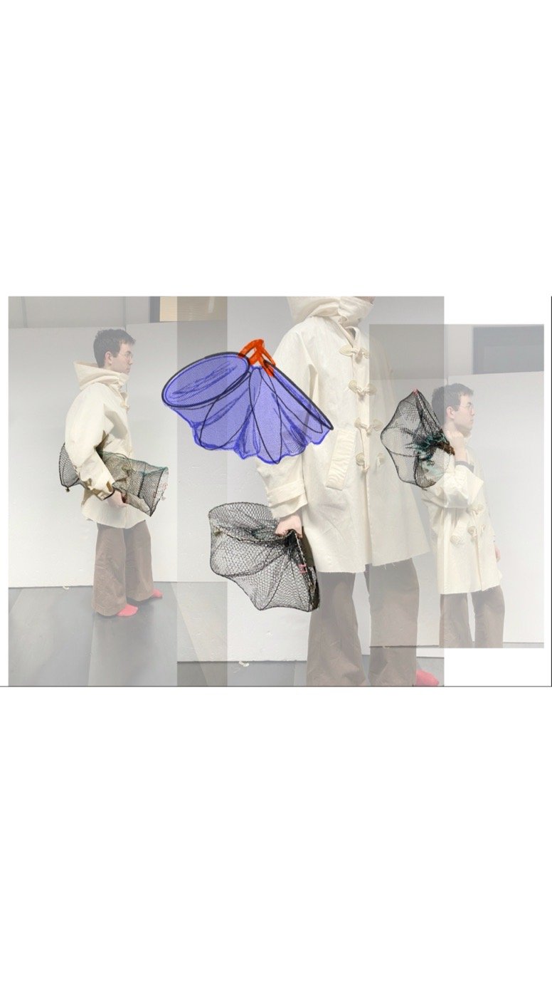
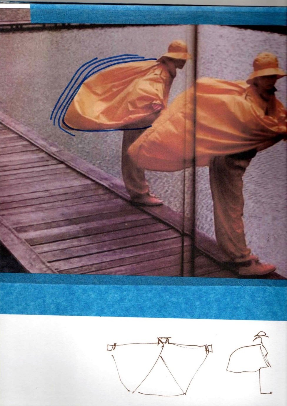
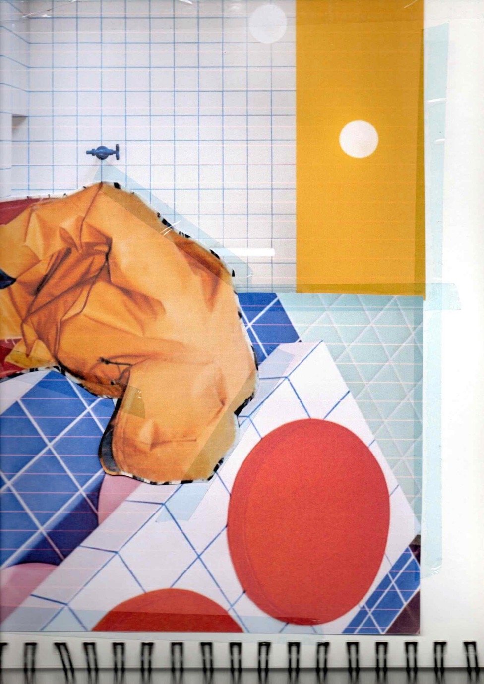
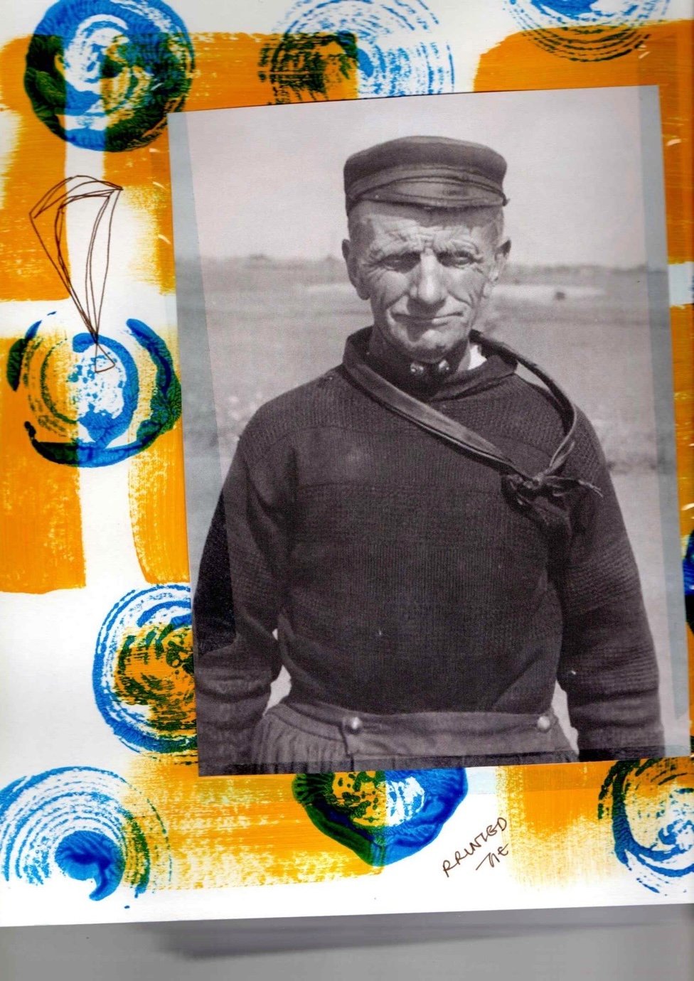
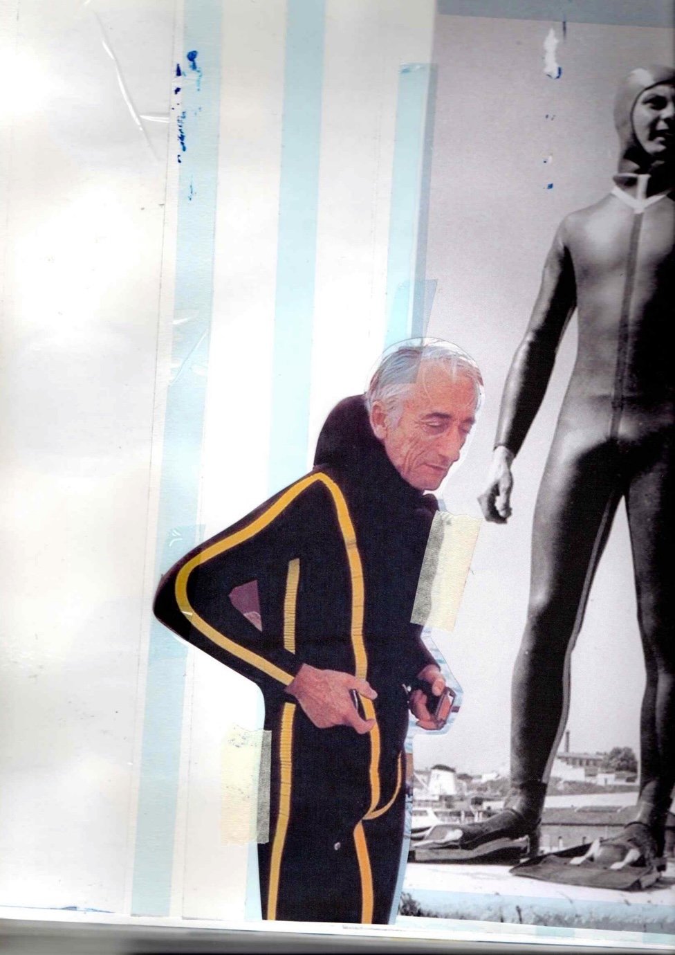
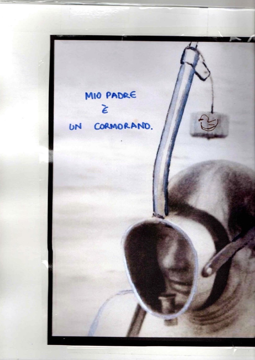
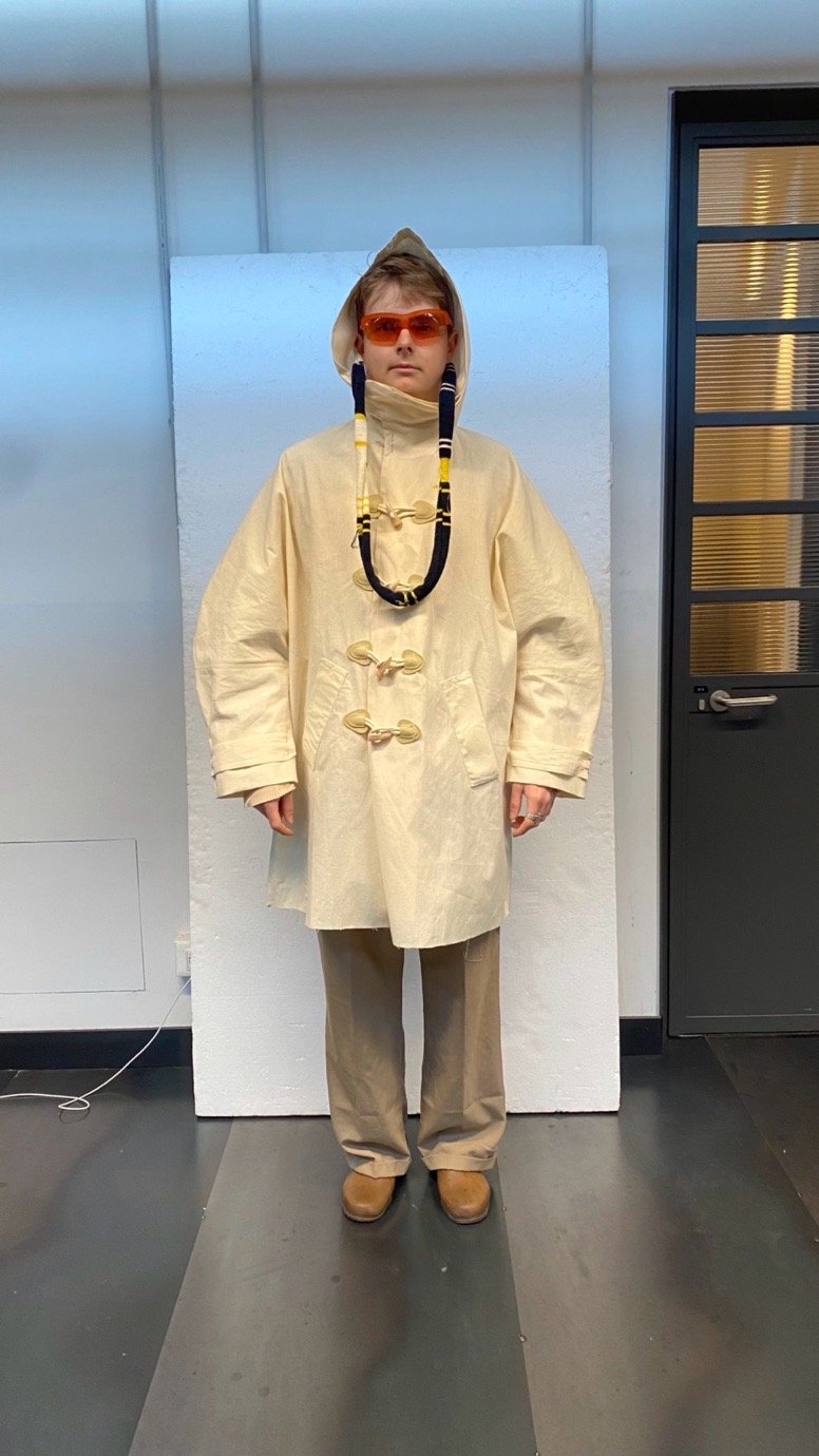
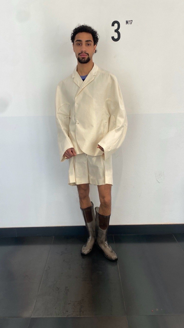
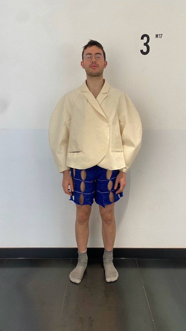
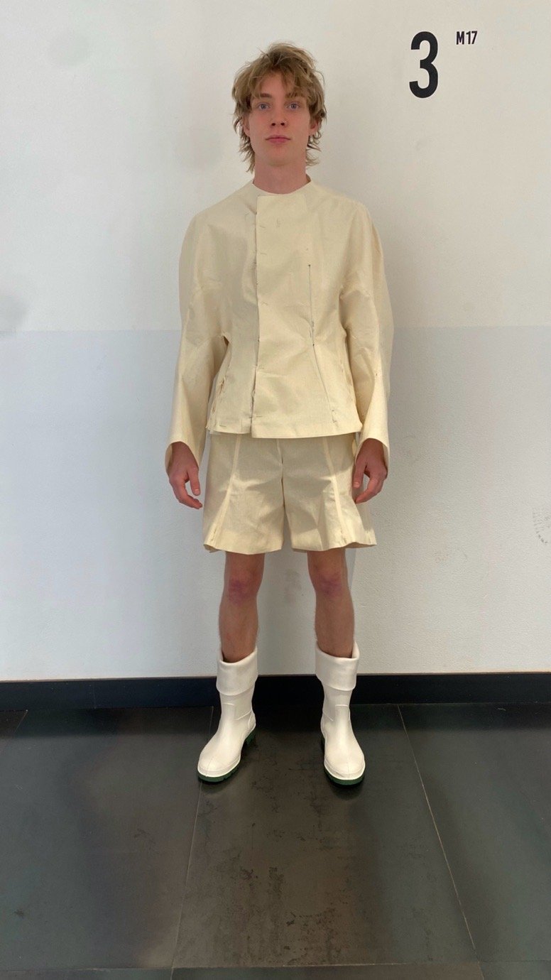
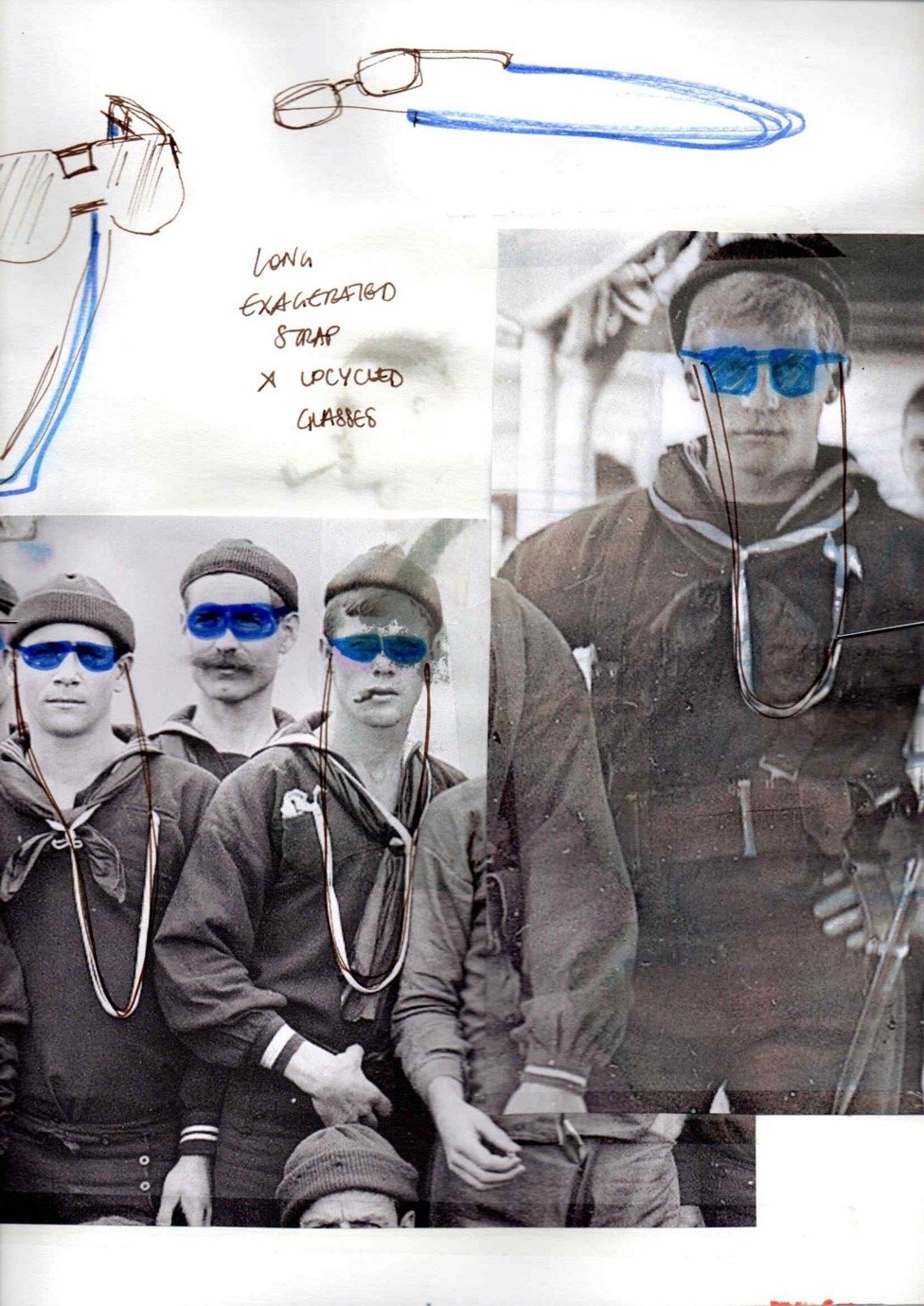
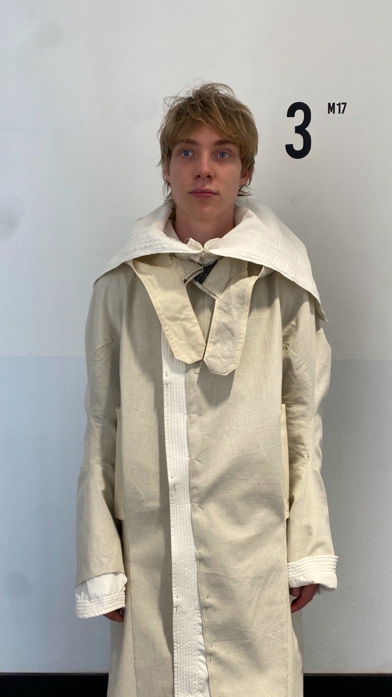
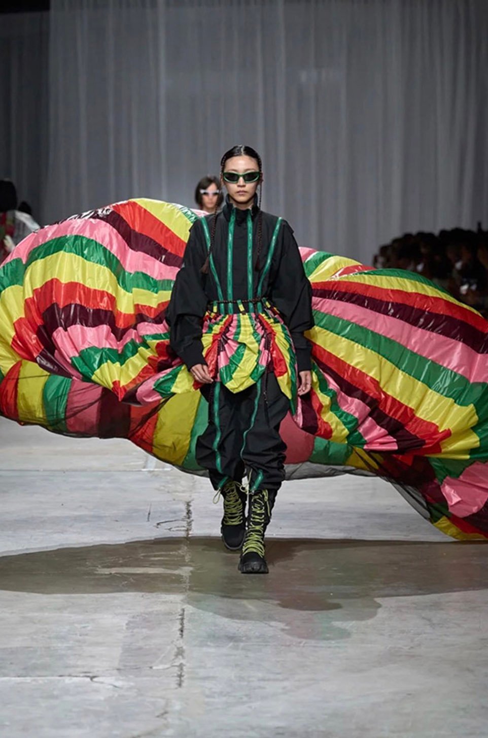
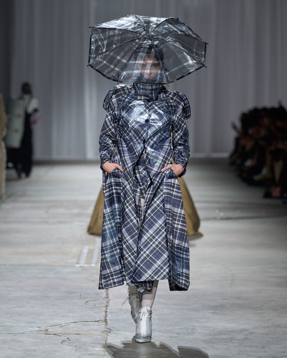
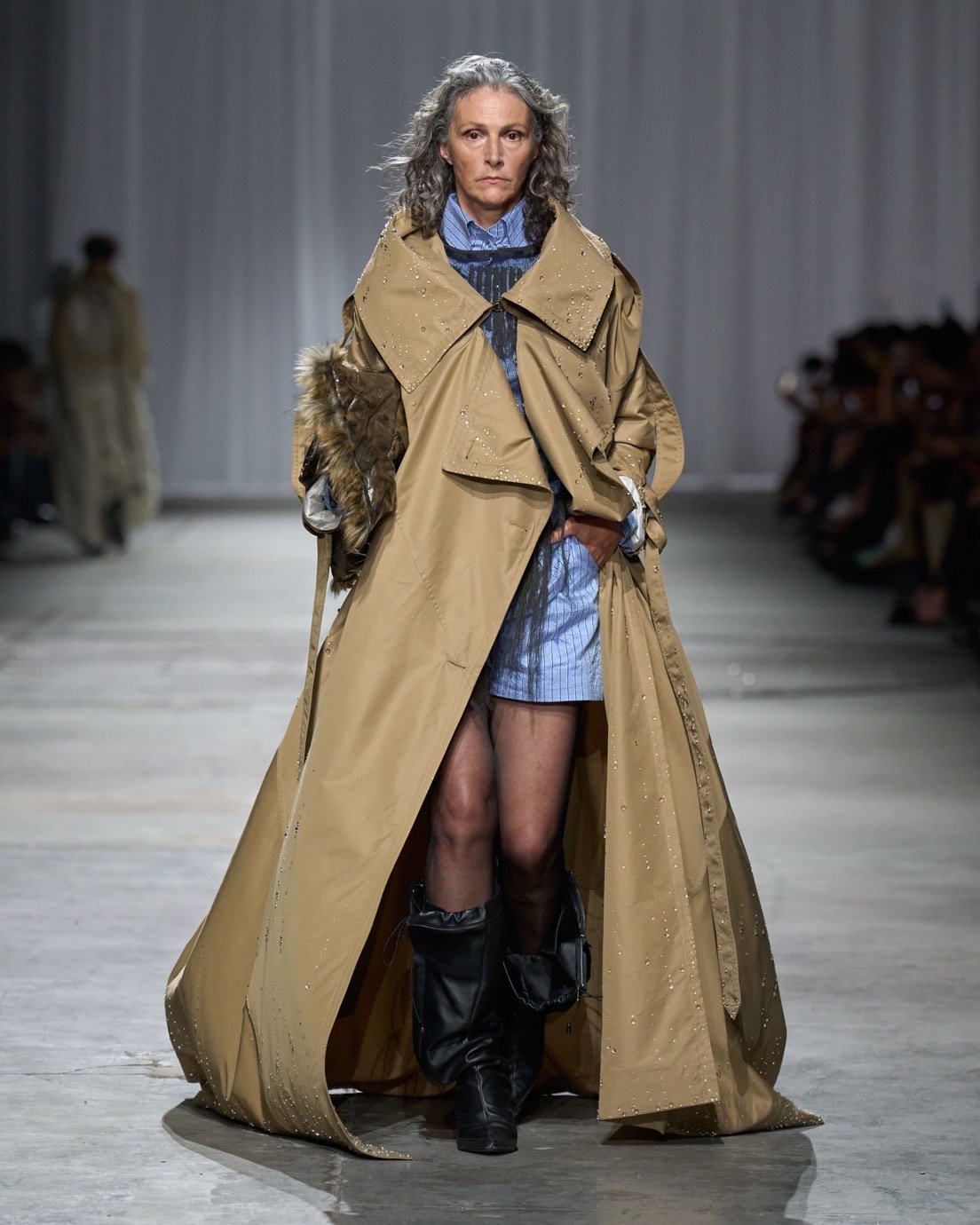
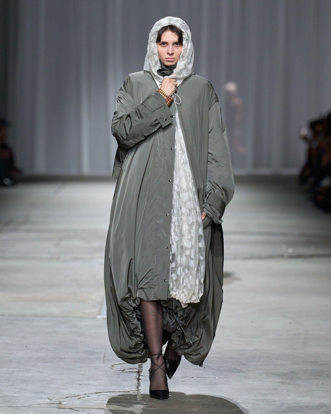
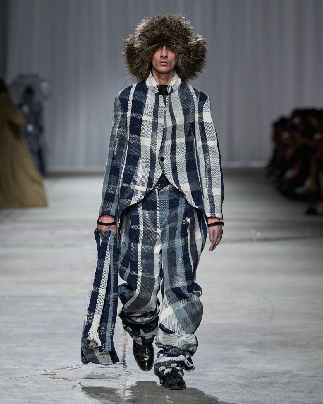
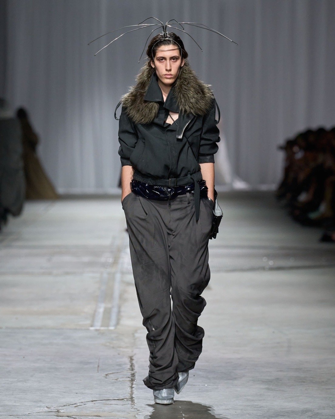
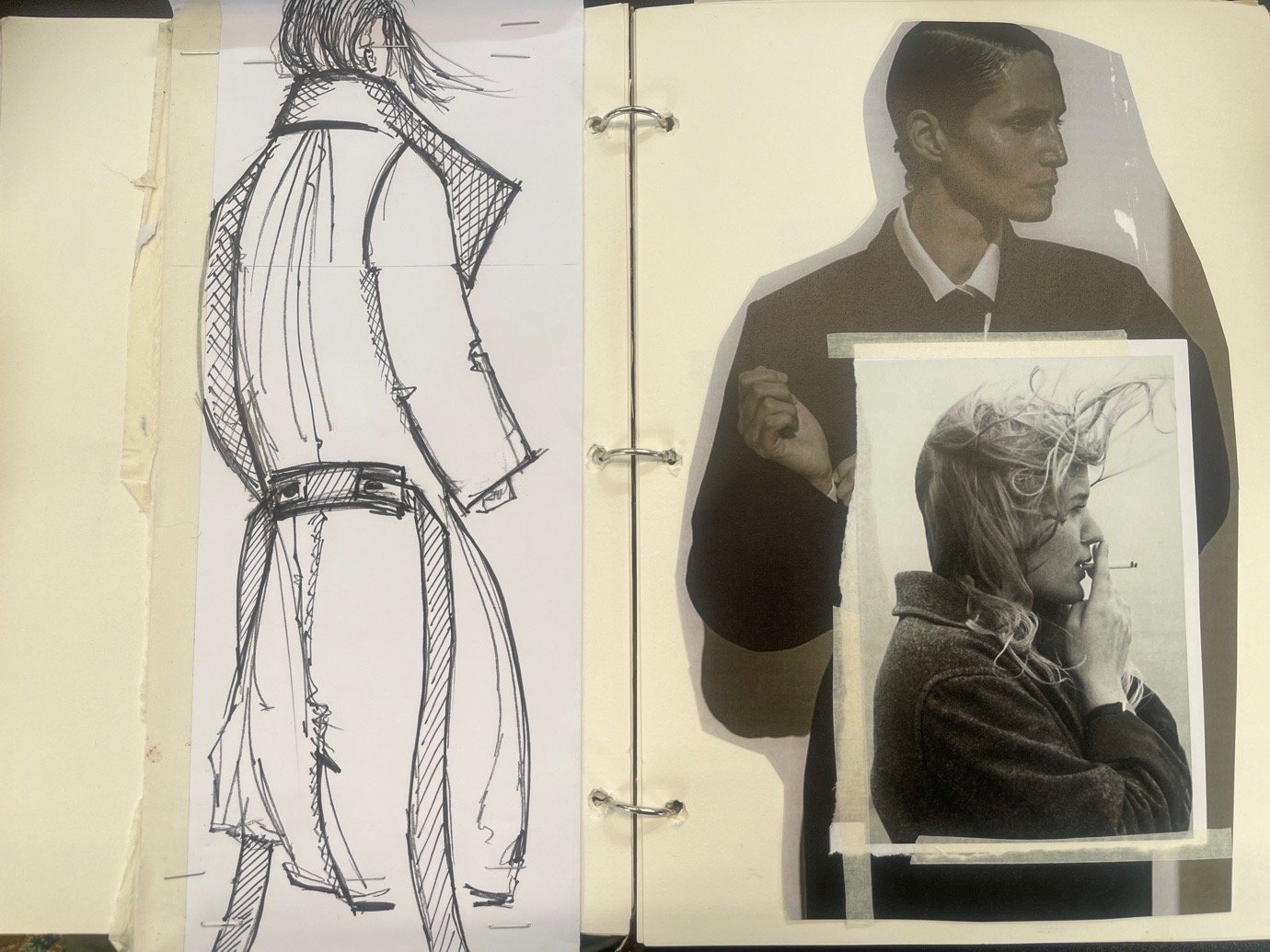
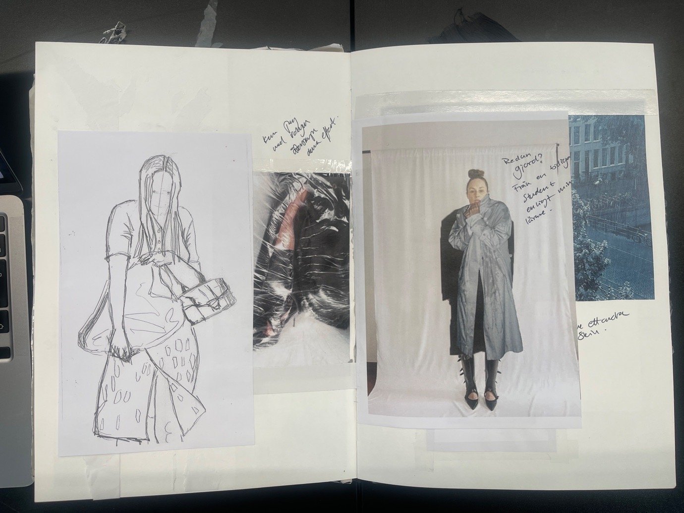
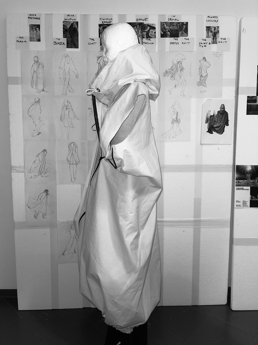
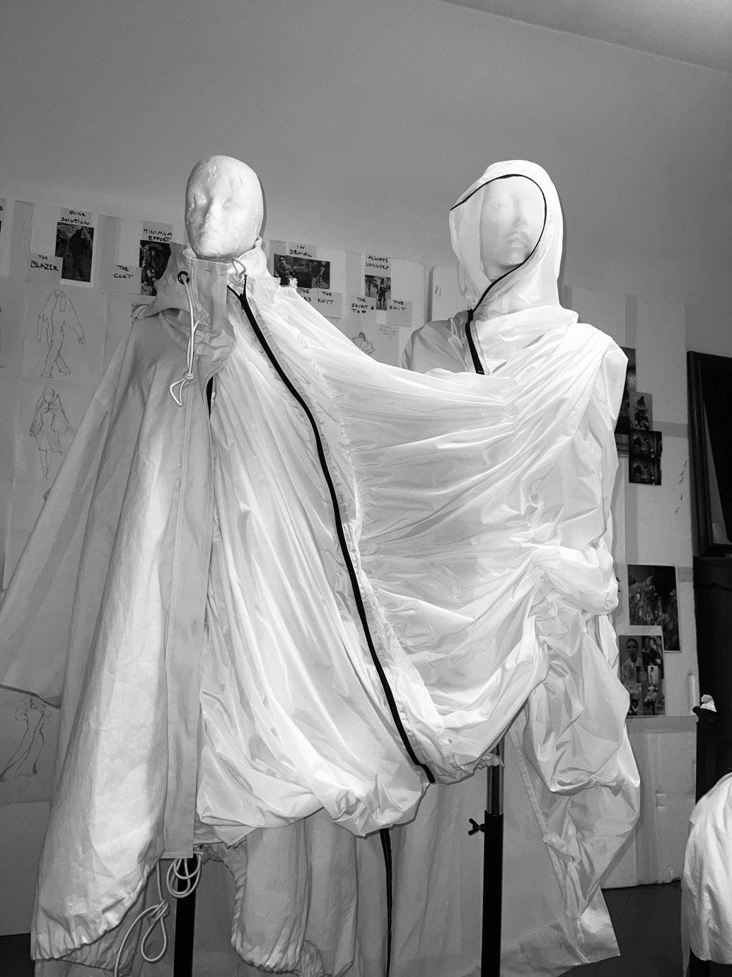
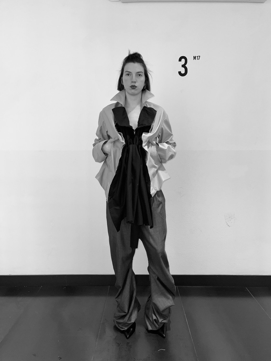
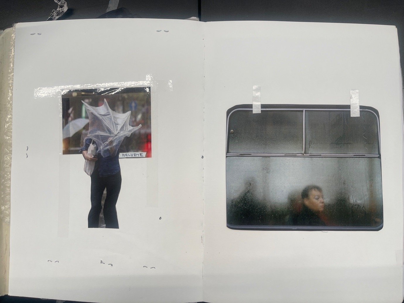
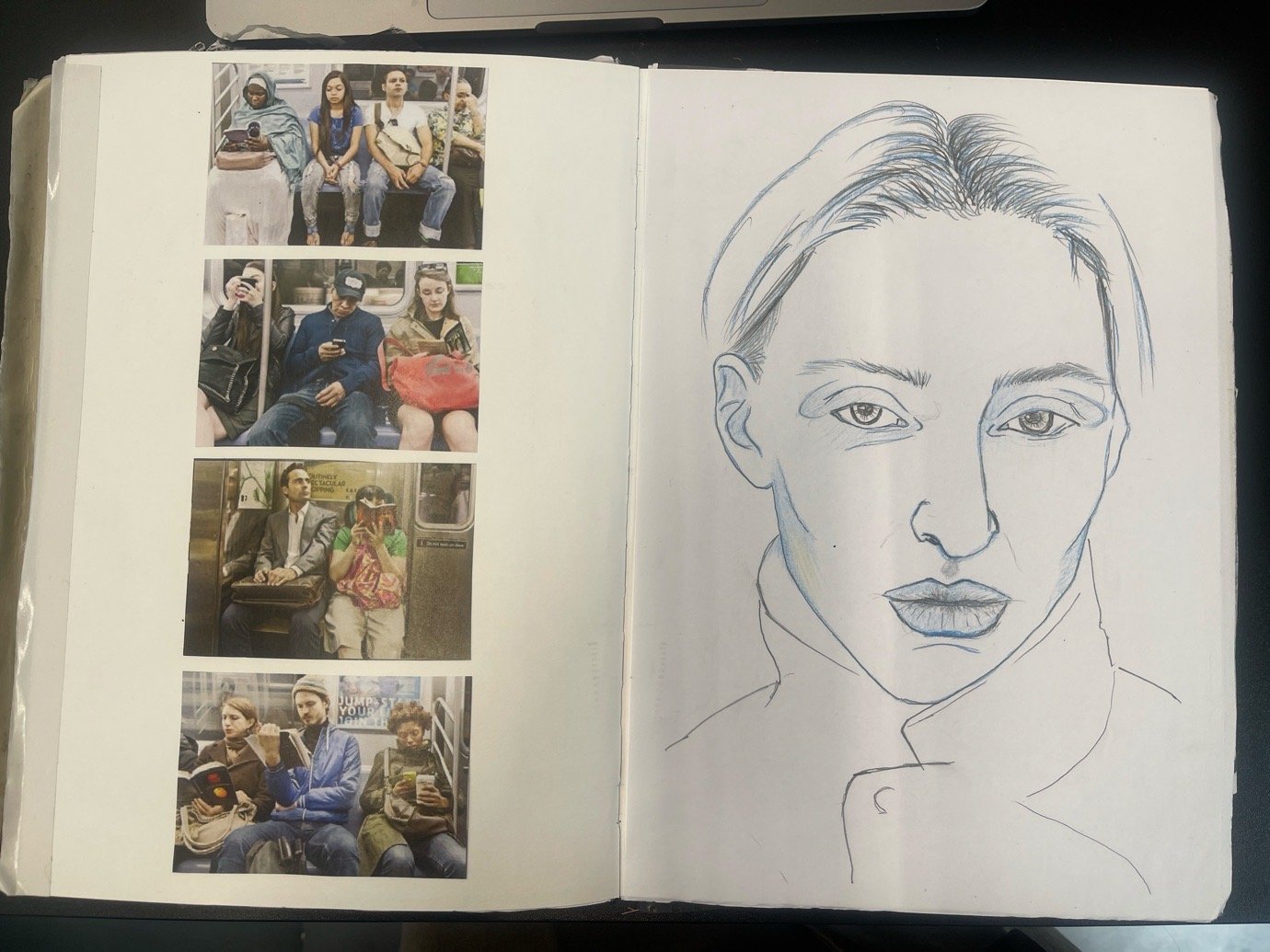
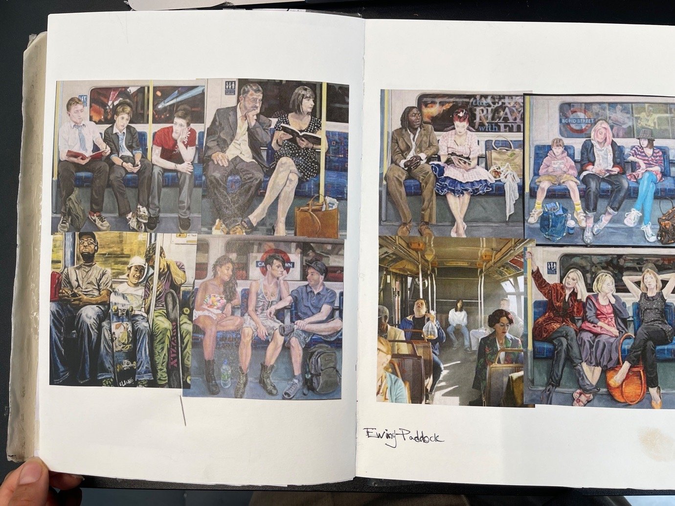
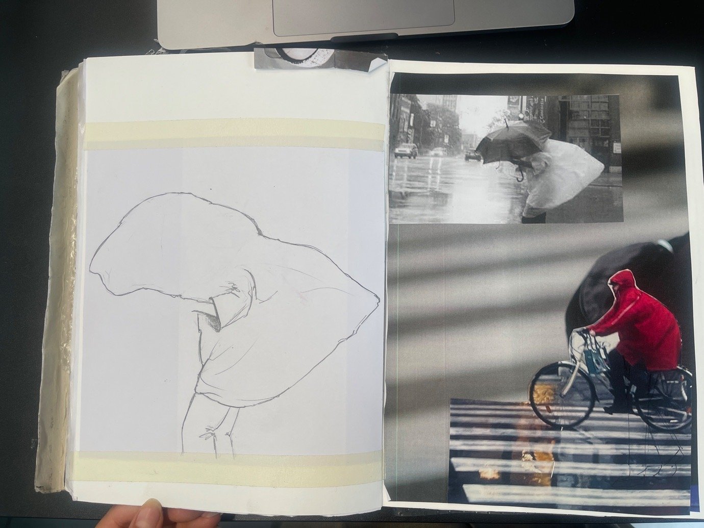
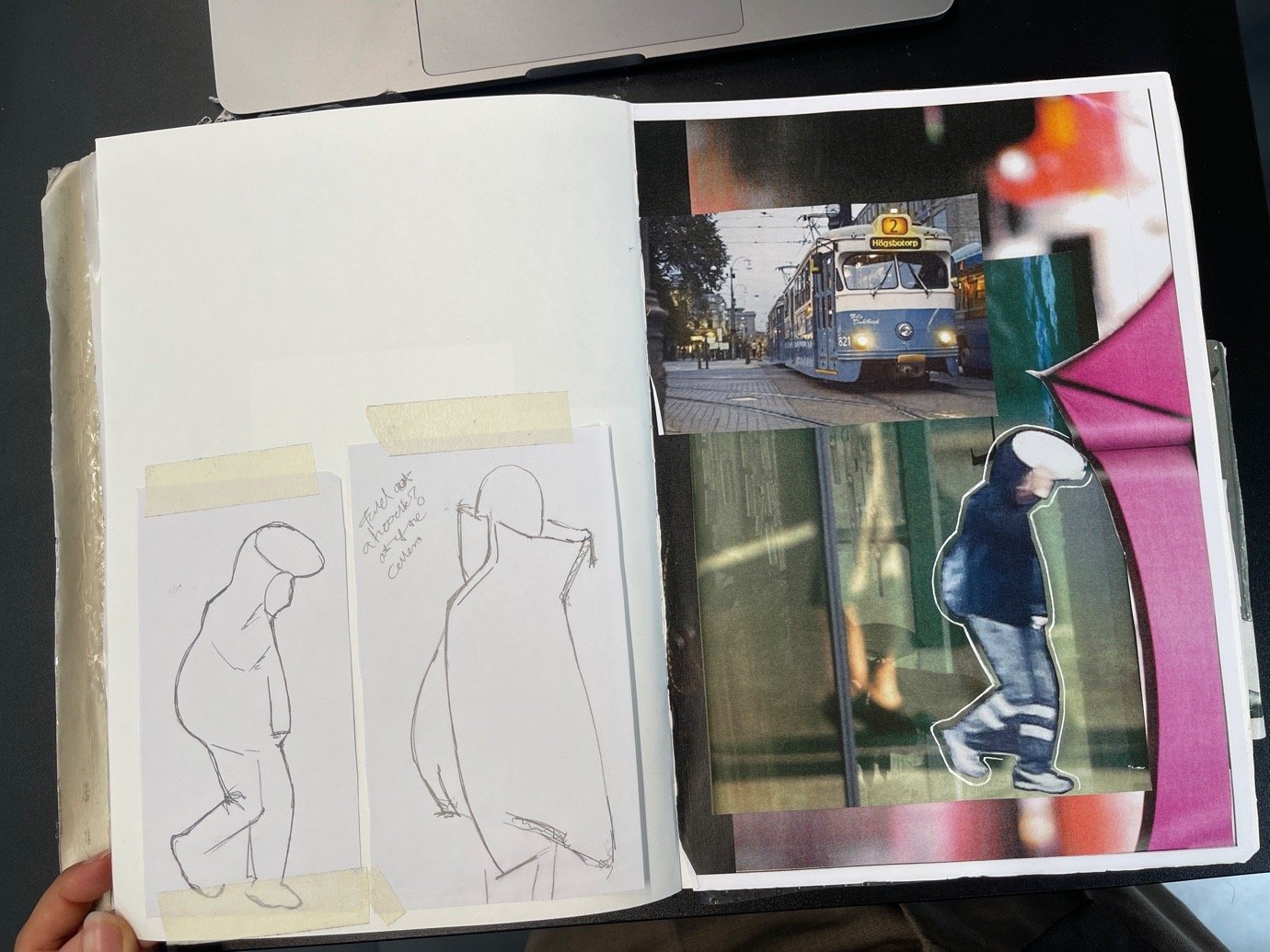
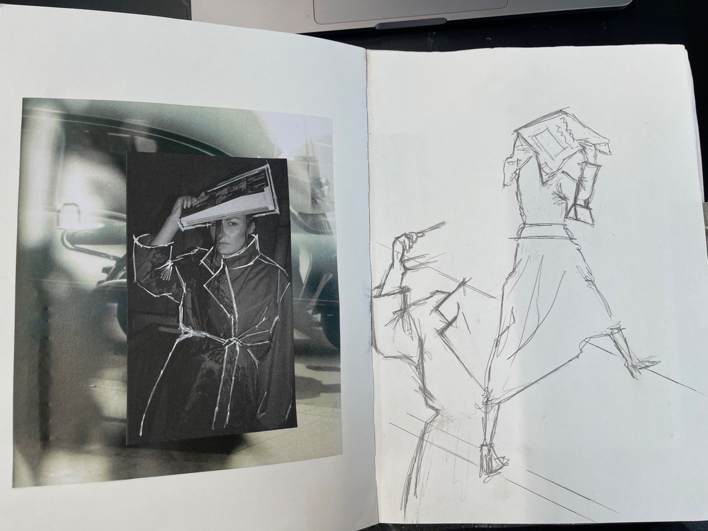
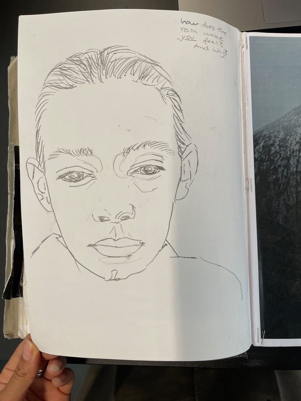
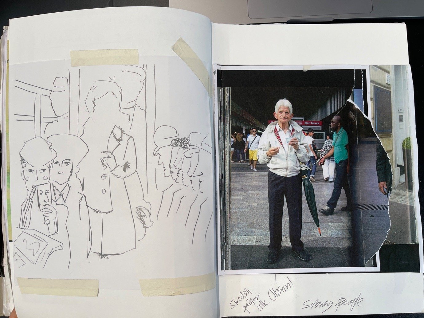
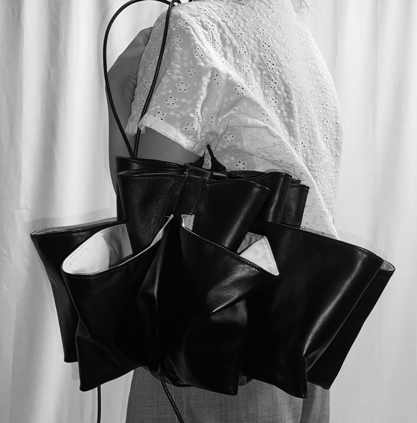
This collection began as an observation of individuality in Gothenburg – my first home after immigrating from Iran in 1999. I was struck by how quietly people moved through the rain, rarely speaking, even when sharing shelter. It felt distant, yet poetic. I viewed it all as an outsider, noticing how people prepared differently: the overprepared, the one in denial, the elegant, the careless. Rain became a metaphor for identity, emotion, and how we navigate the world – each commuter a character in a quiet urban play.
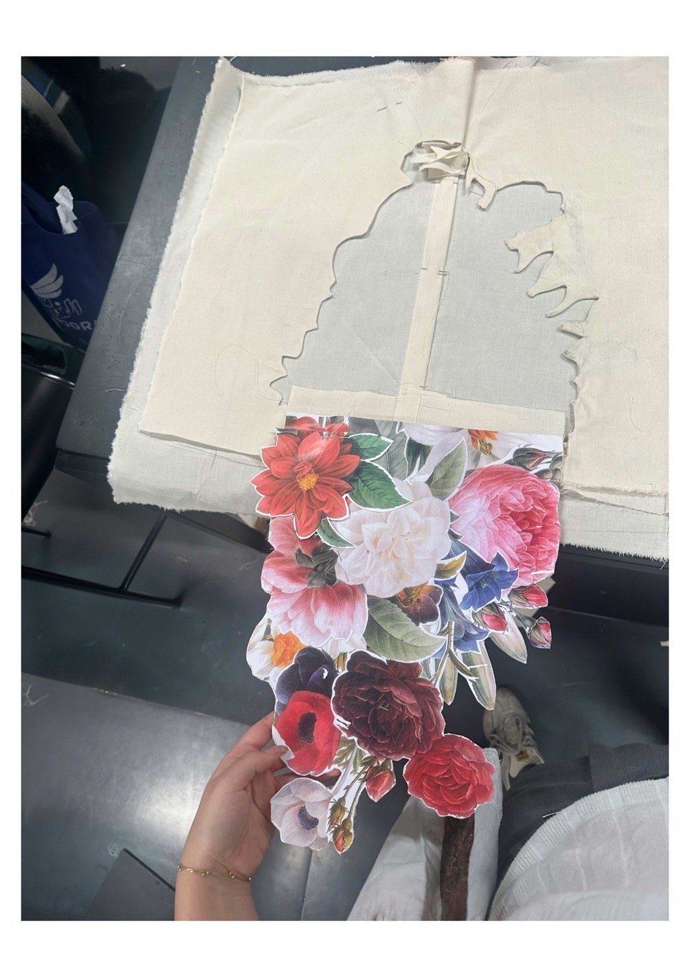
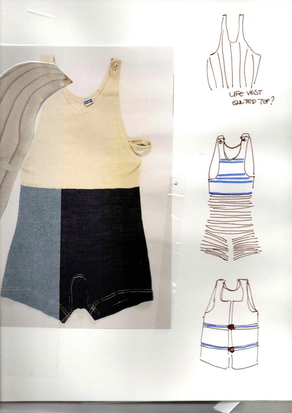
What materials, colours and techniques did you utilise in the creation of this collection?
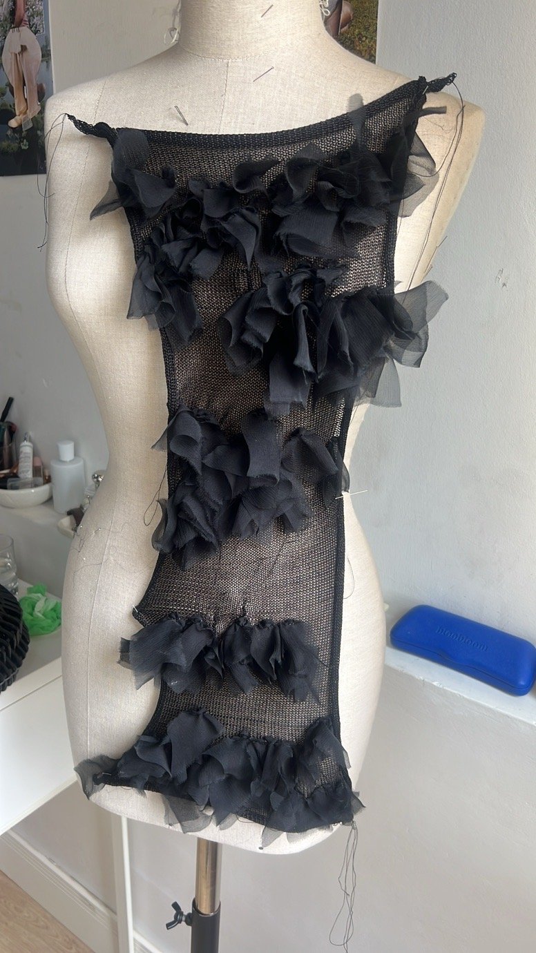
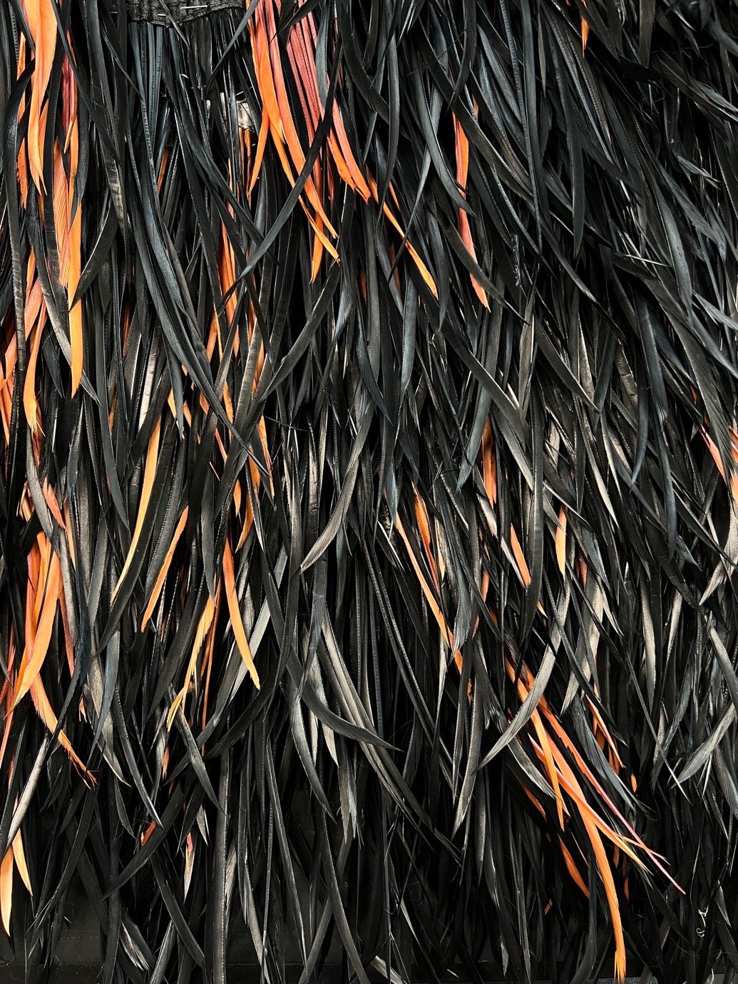
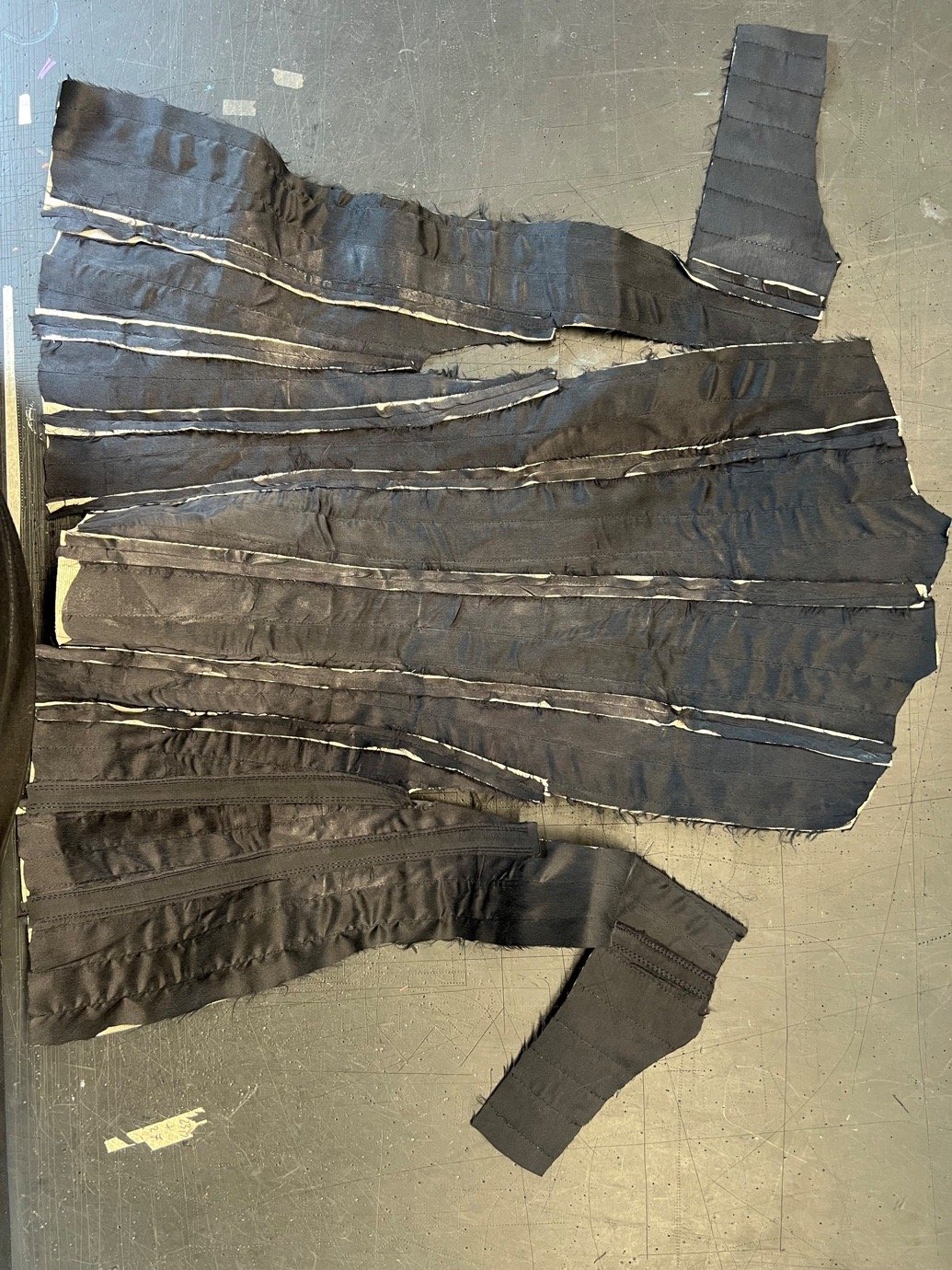
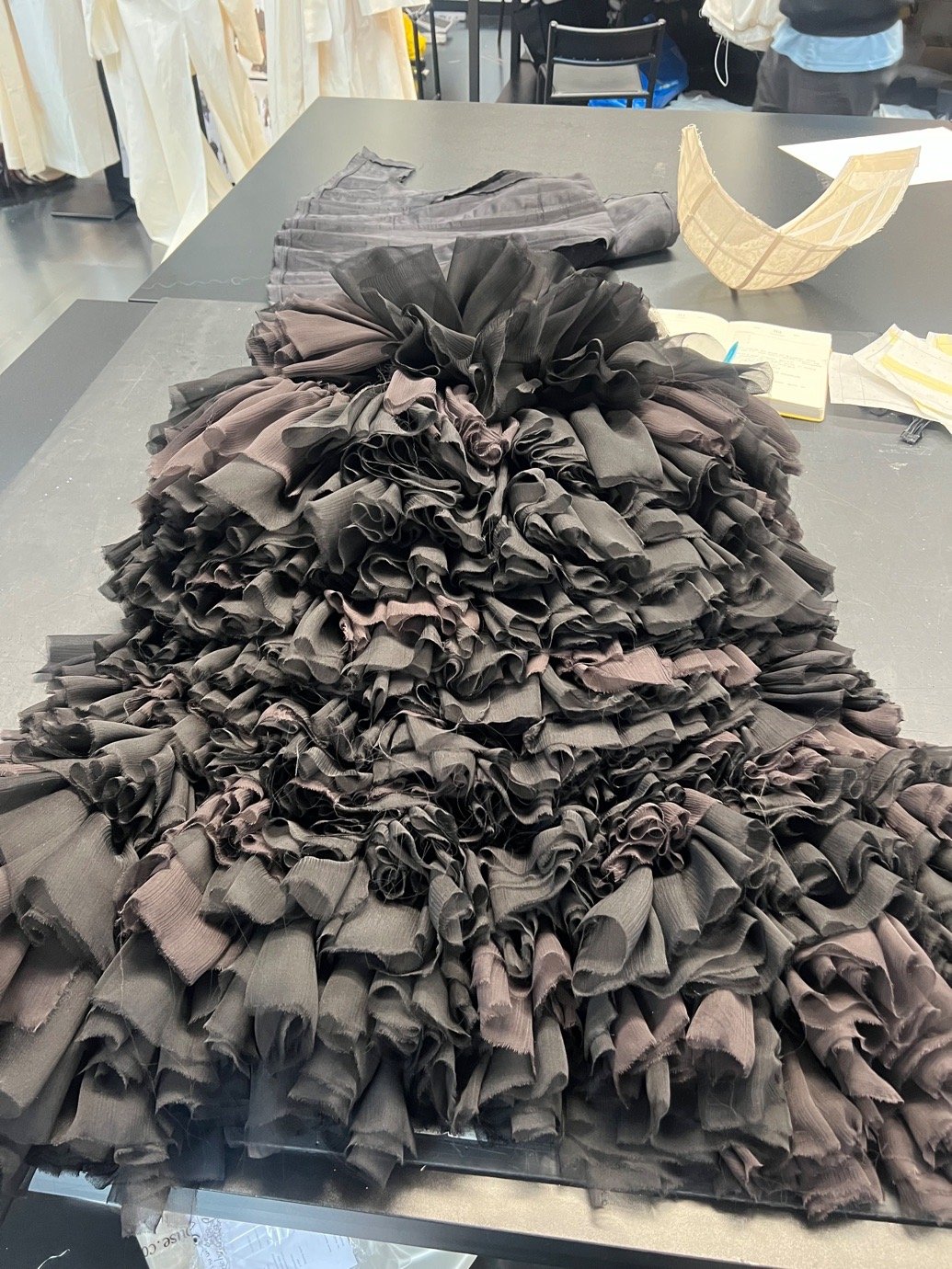
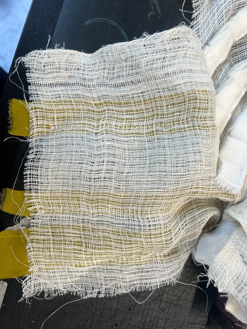
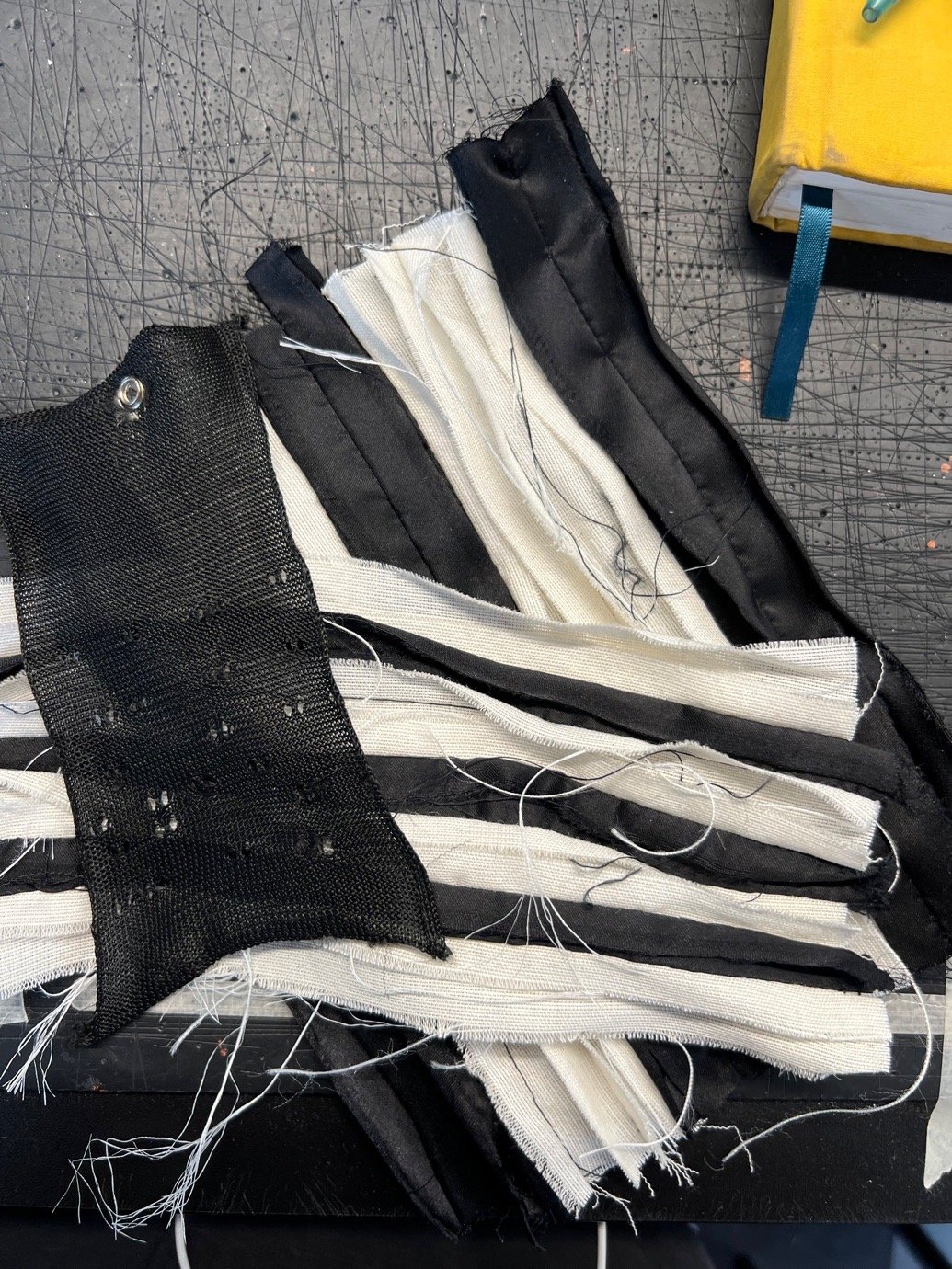
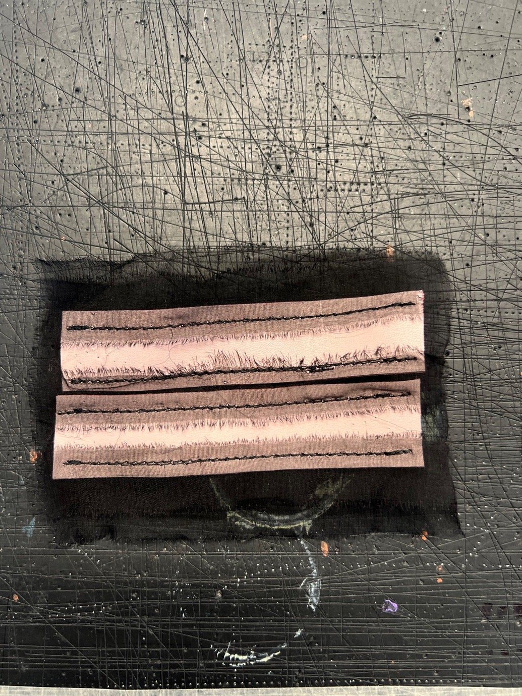
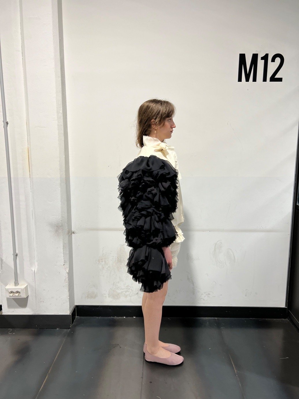
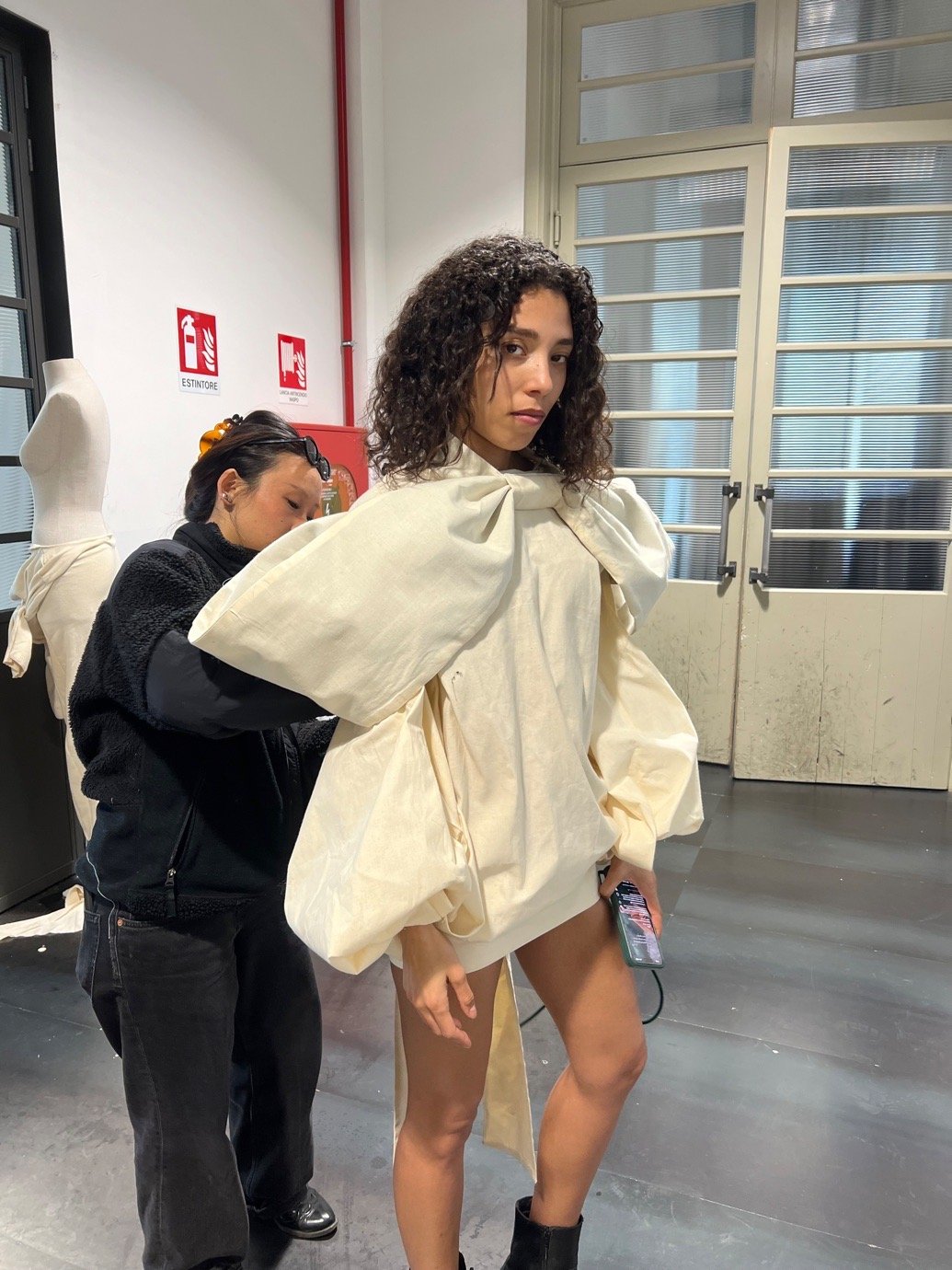
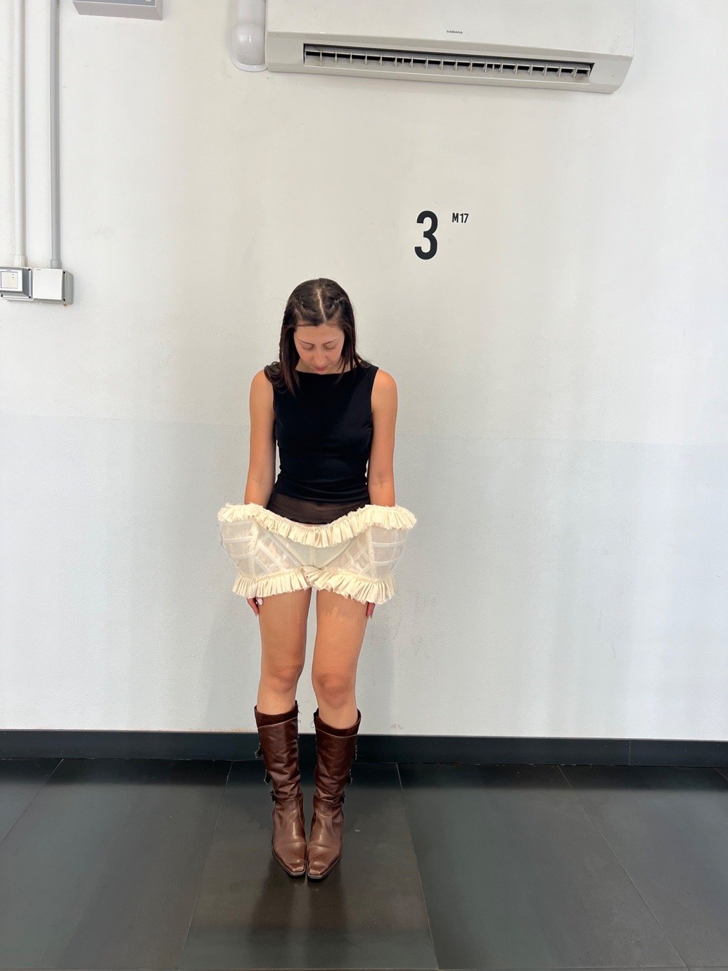
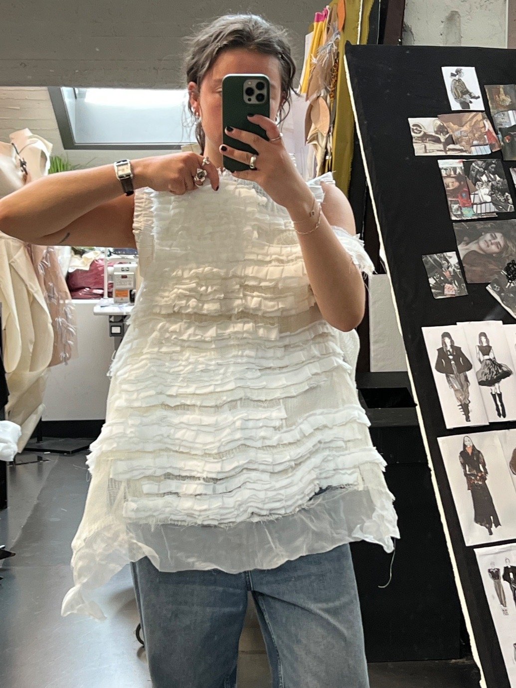
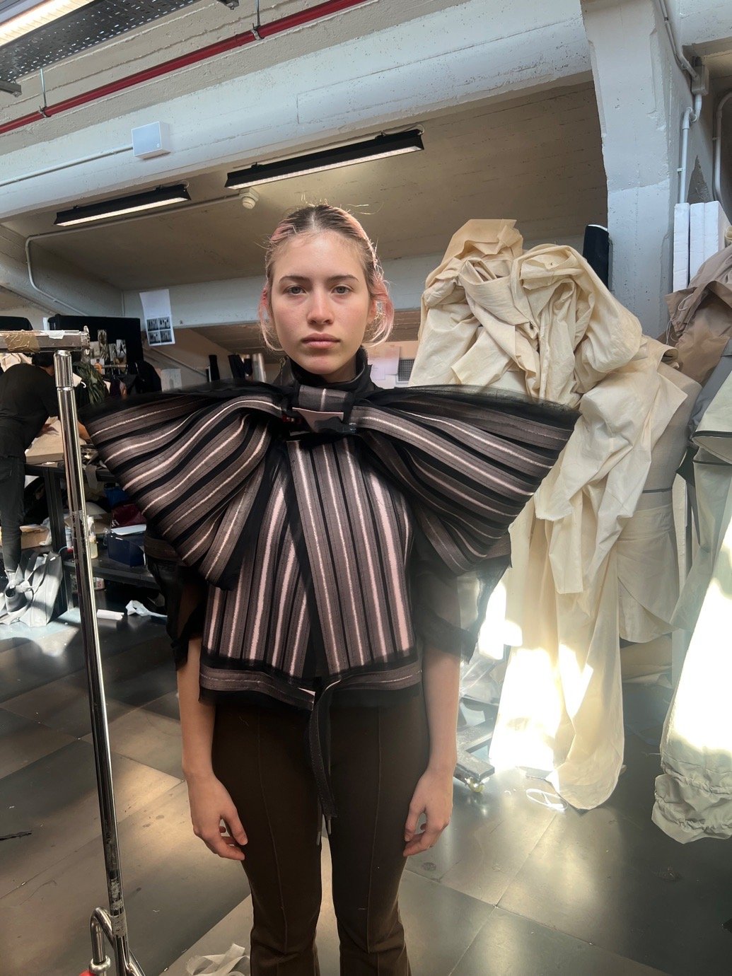
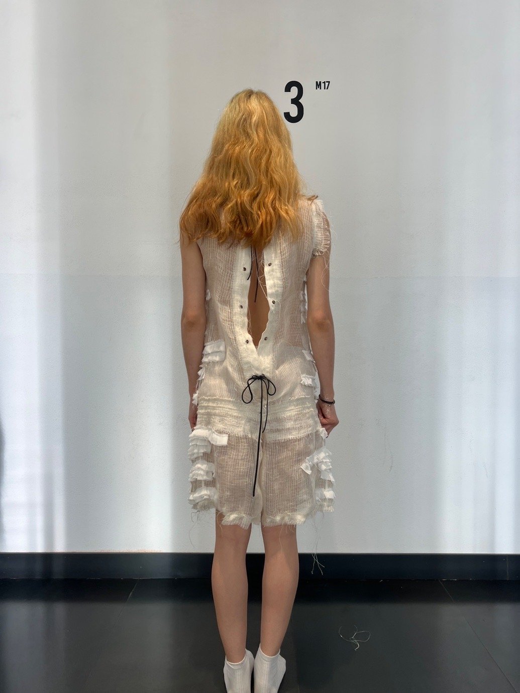
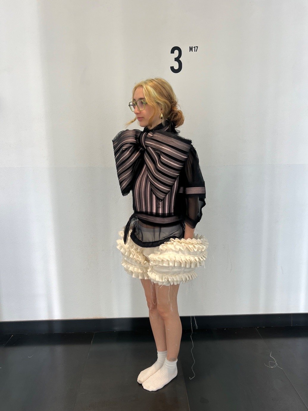
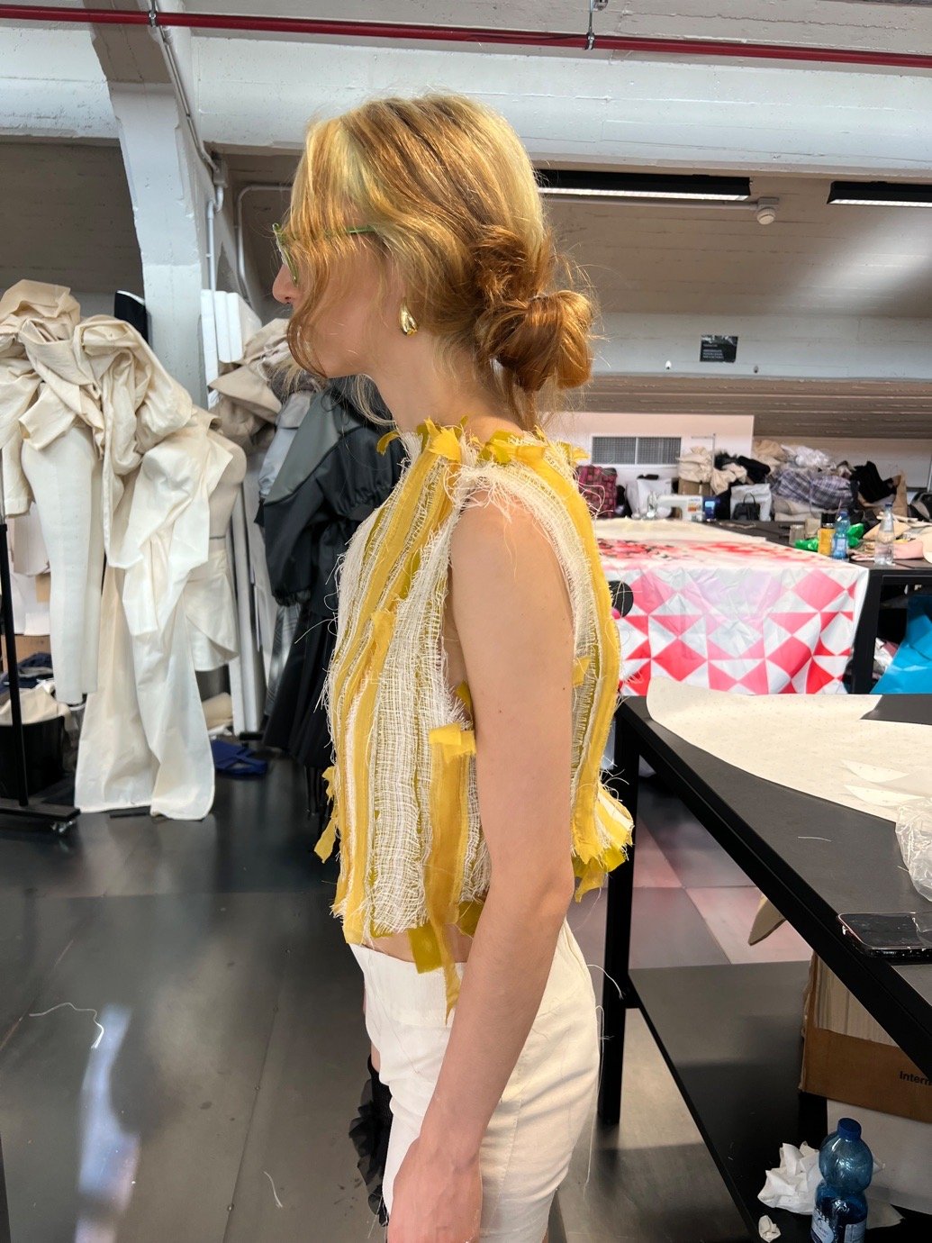
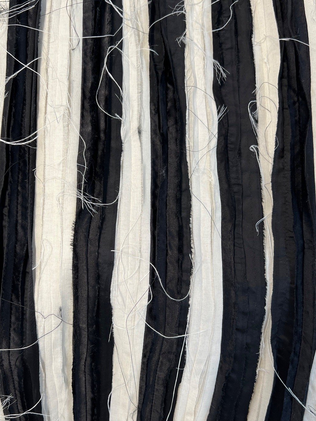
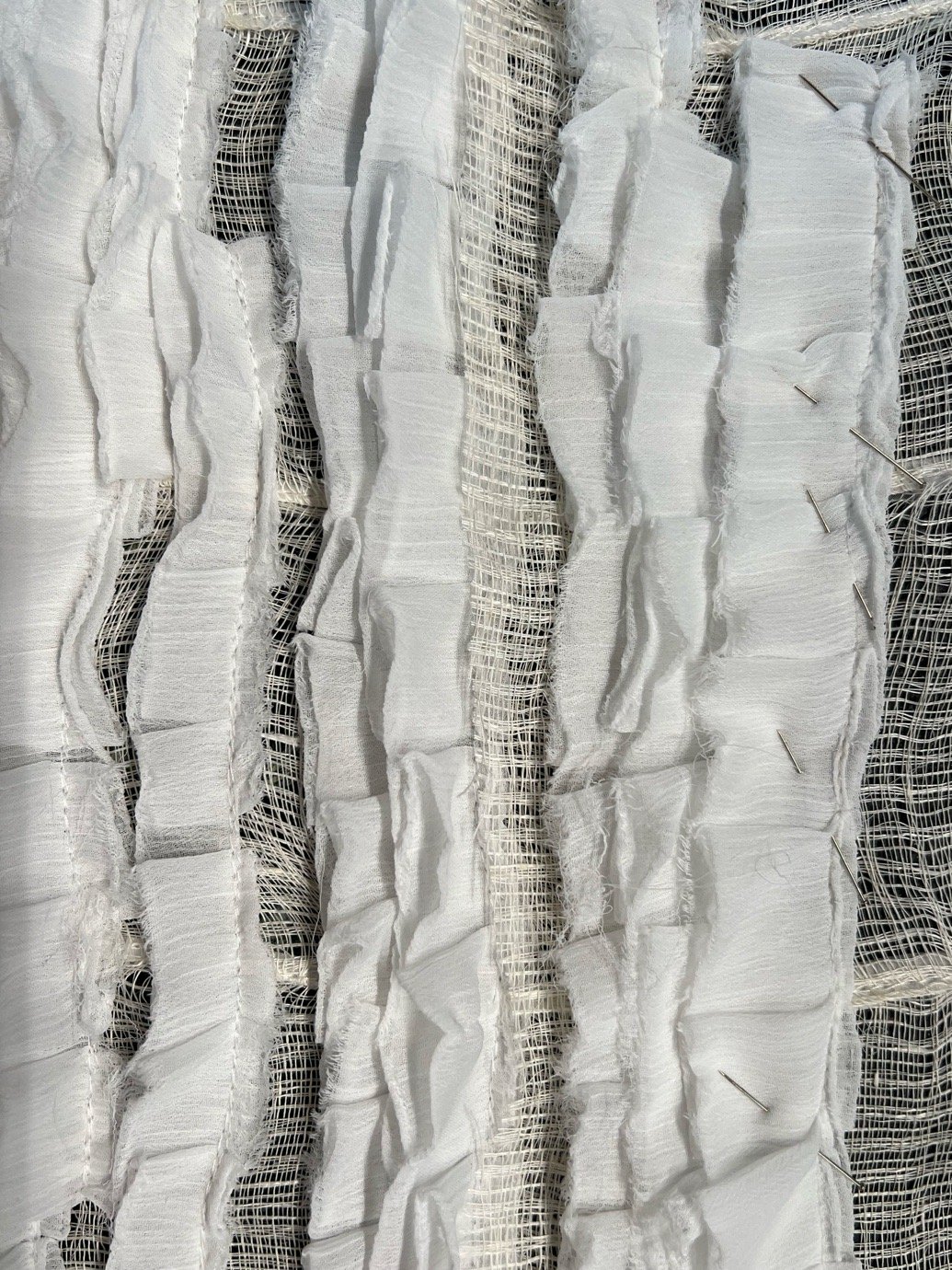
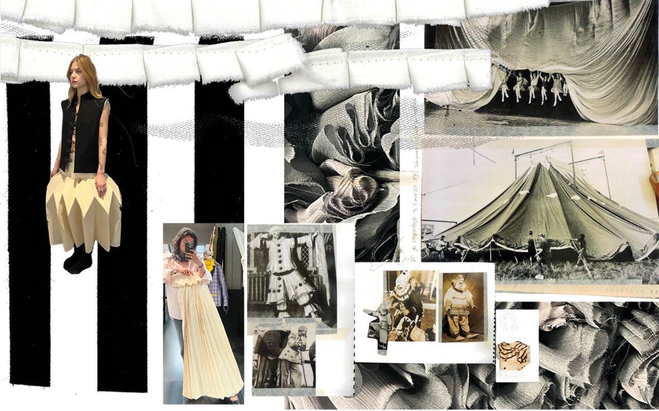
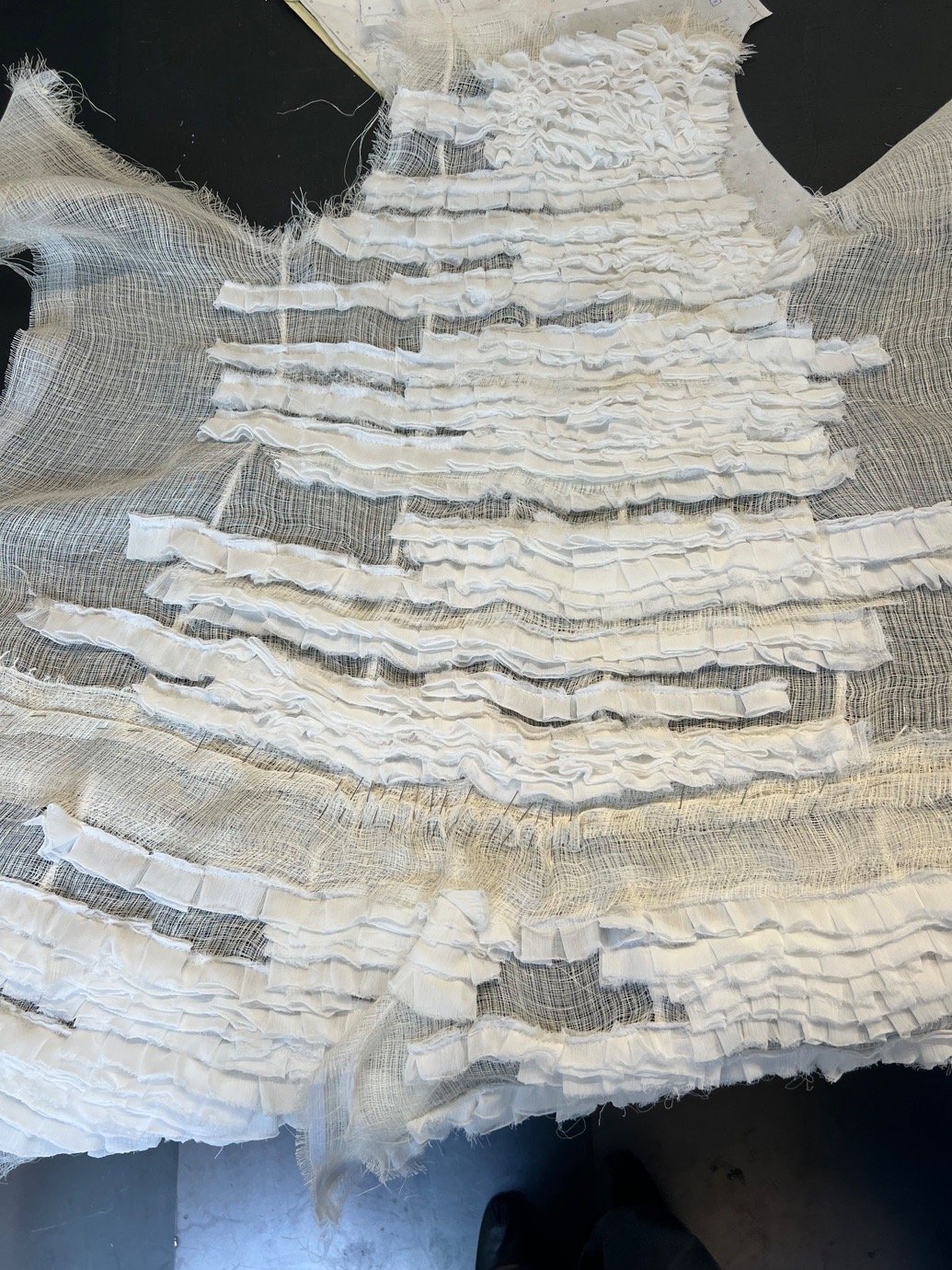
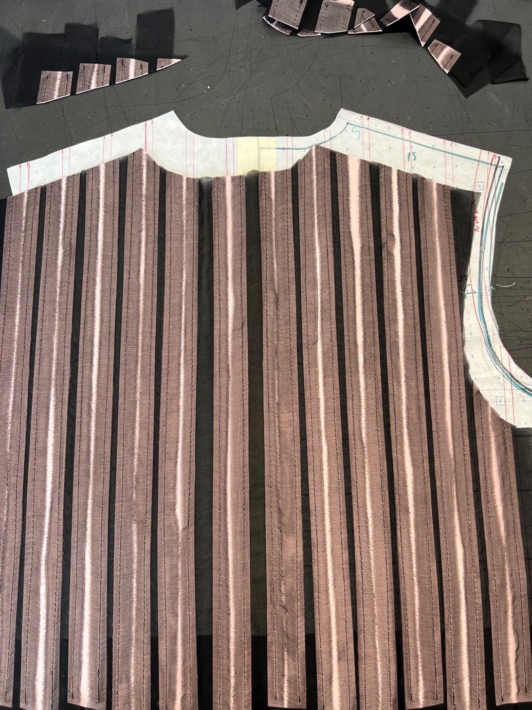
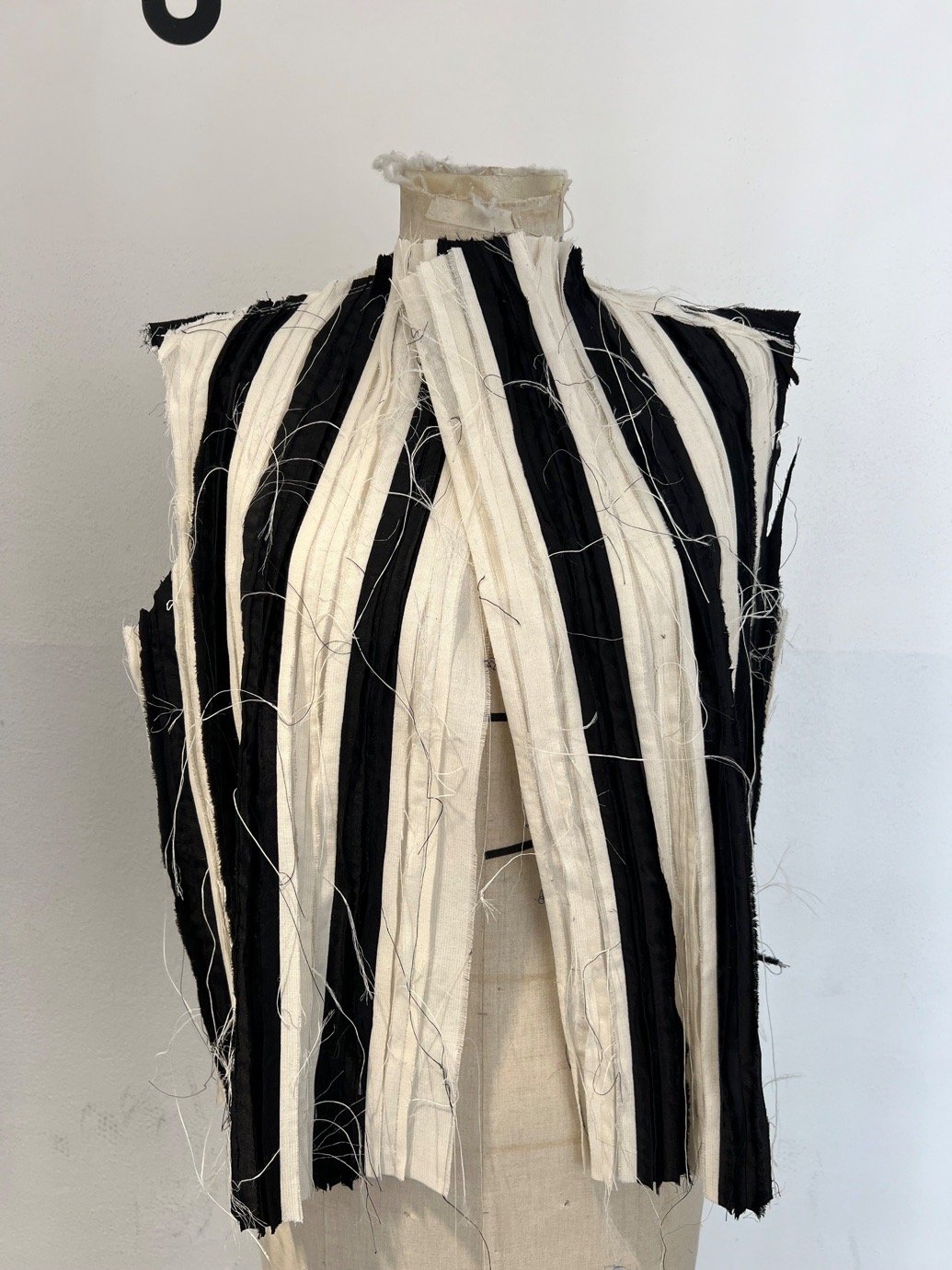
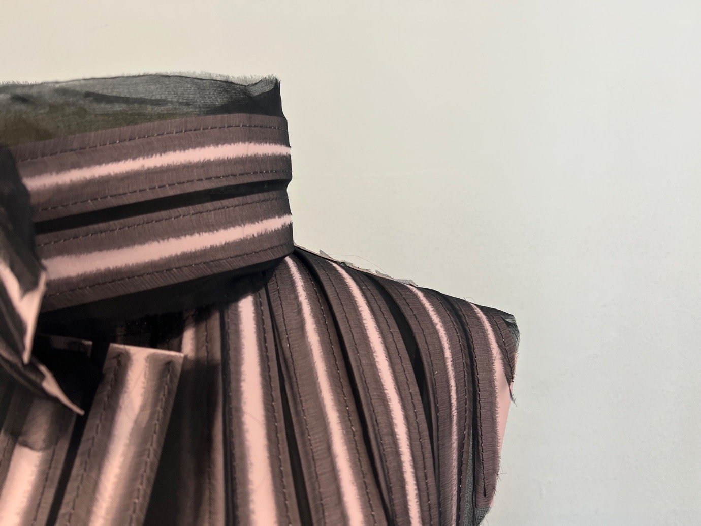
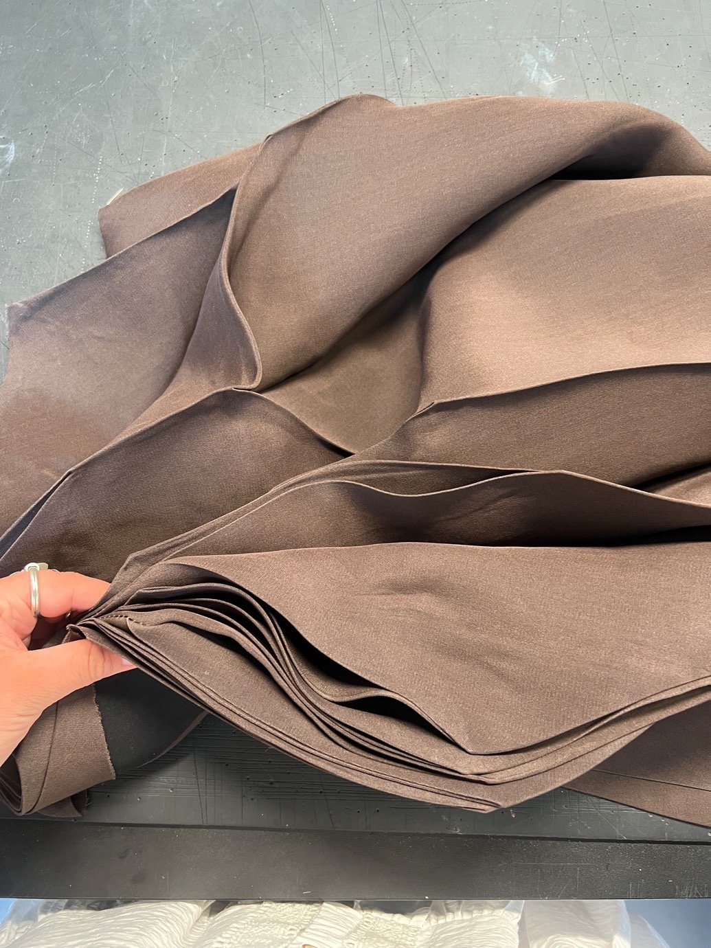
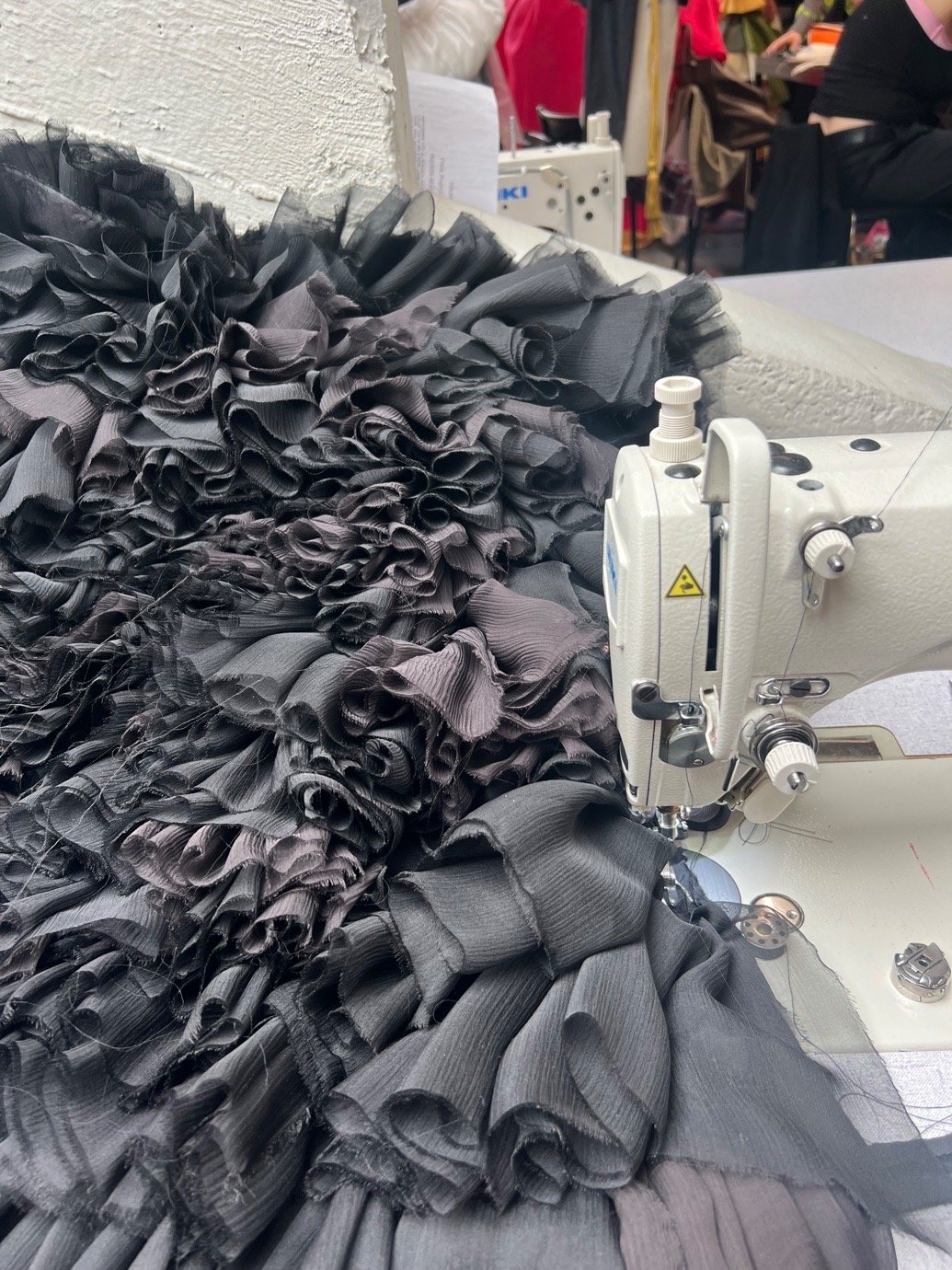
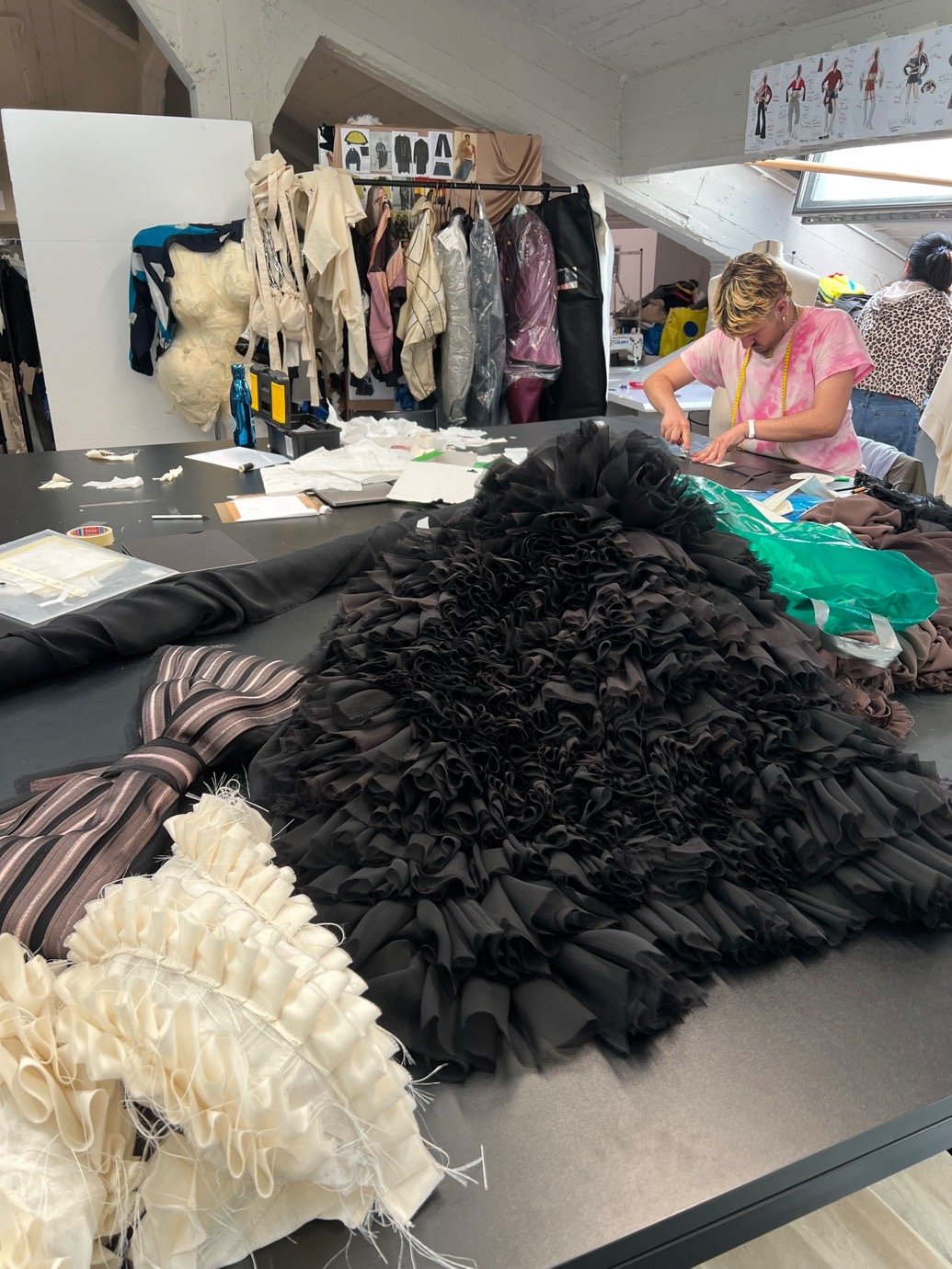
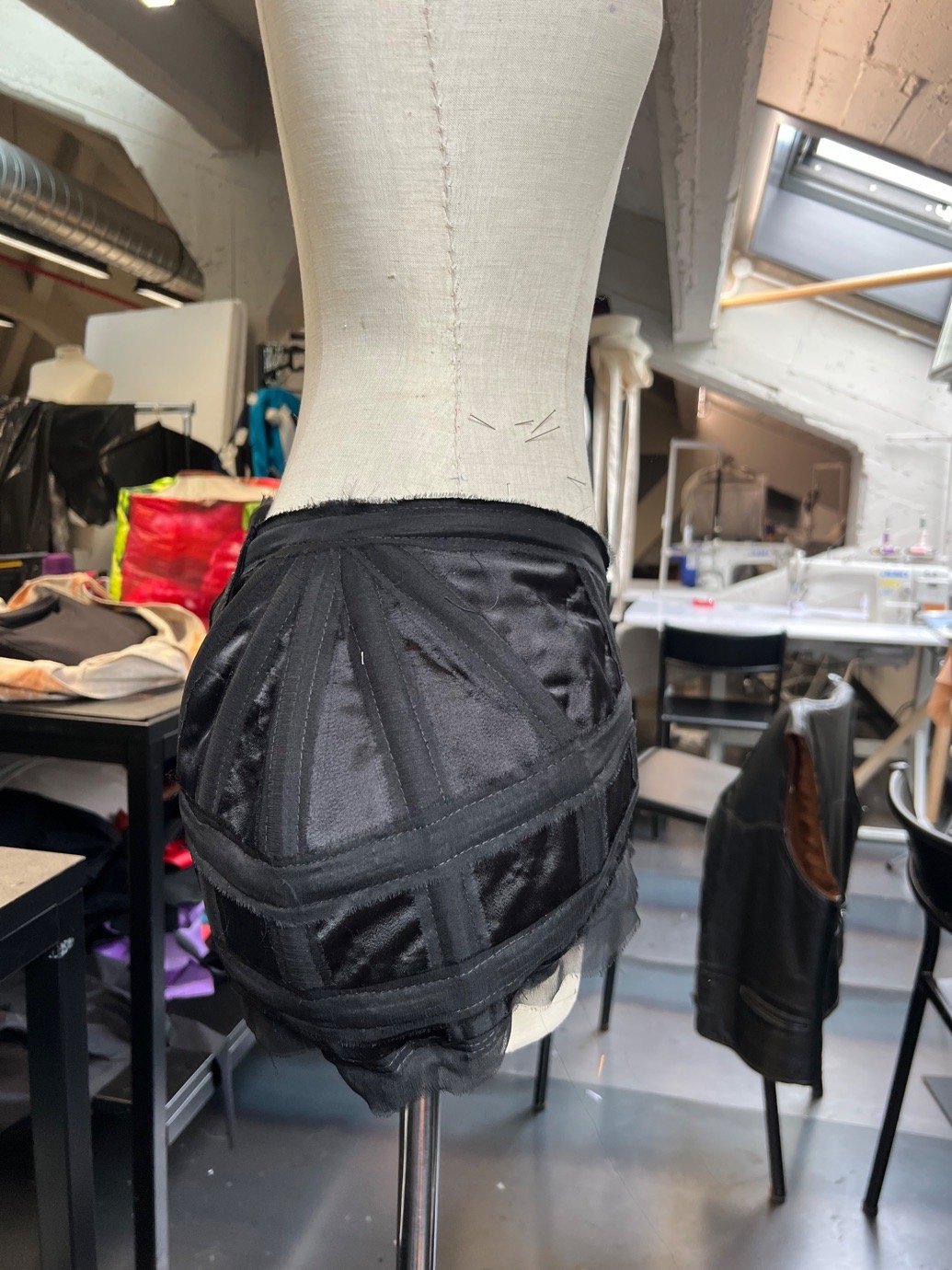
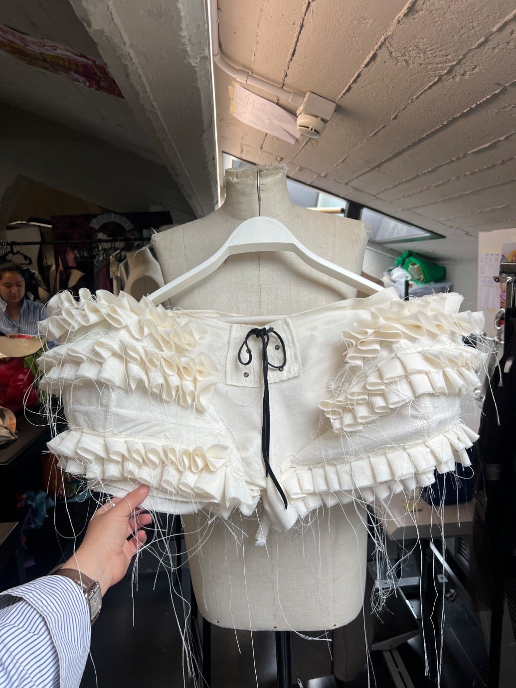
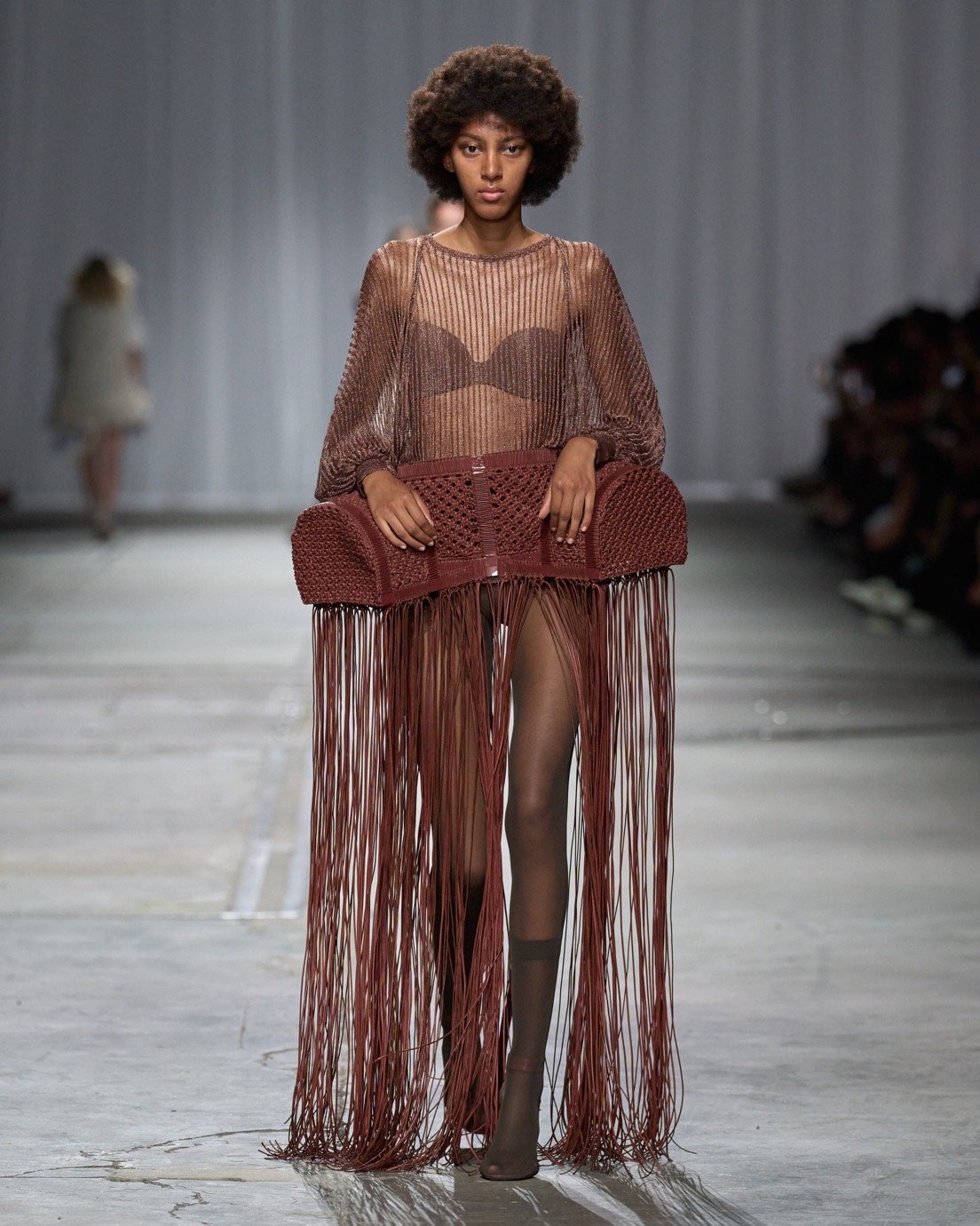
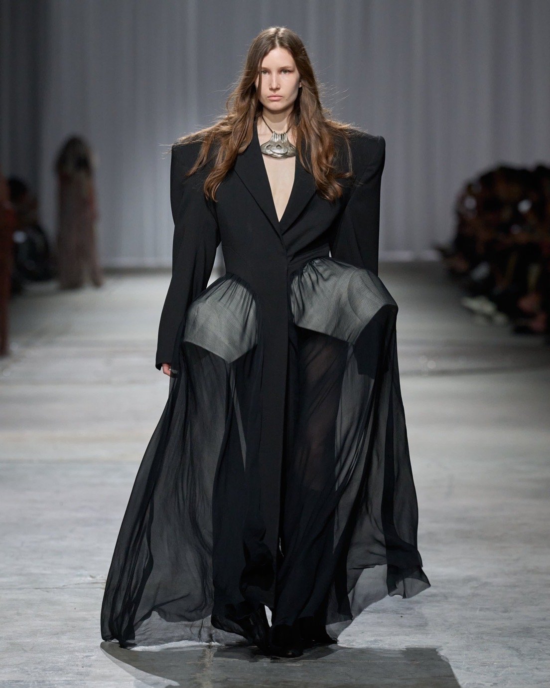
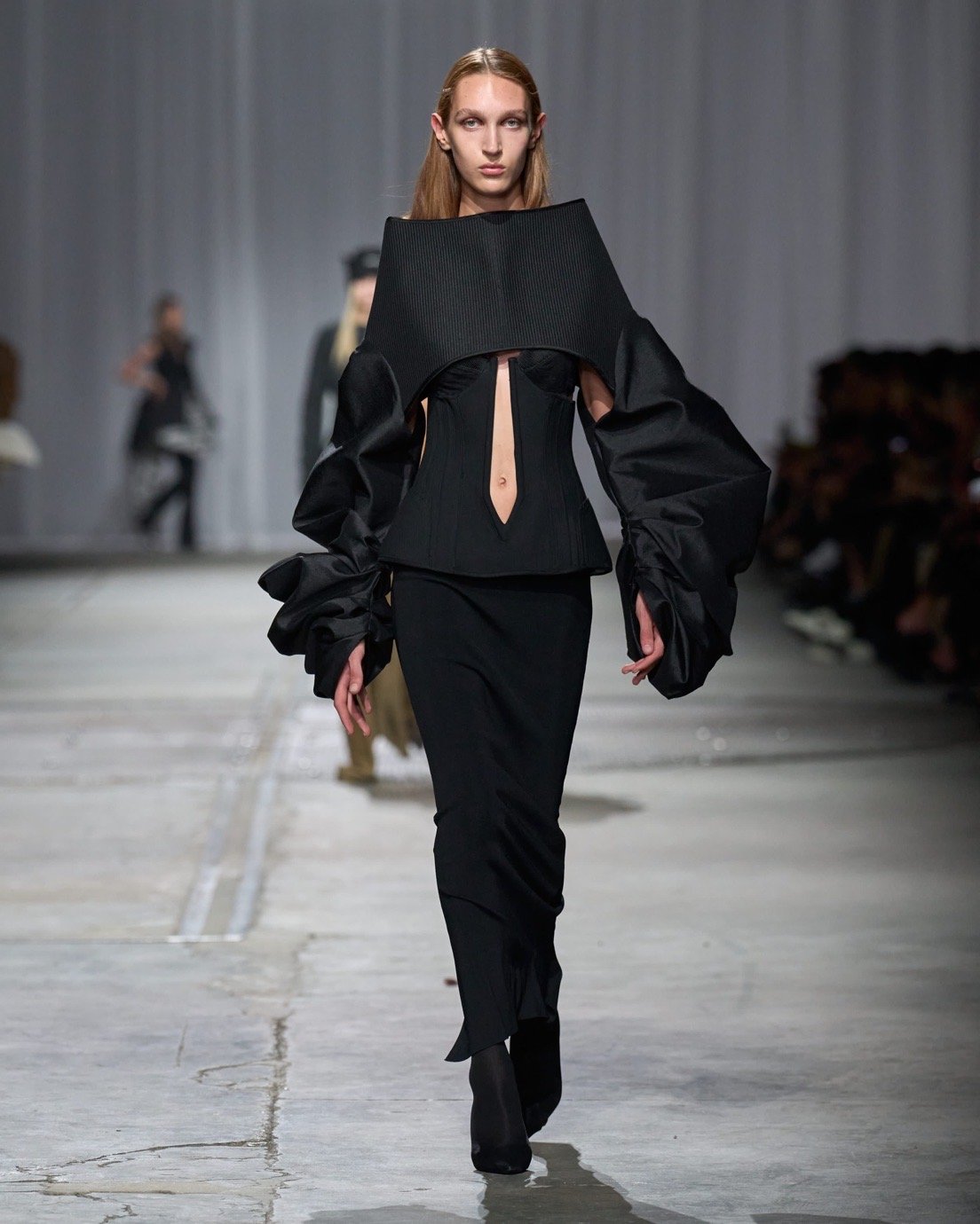
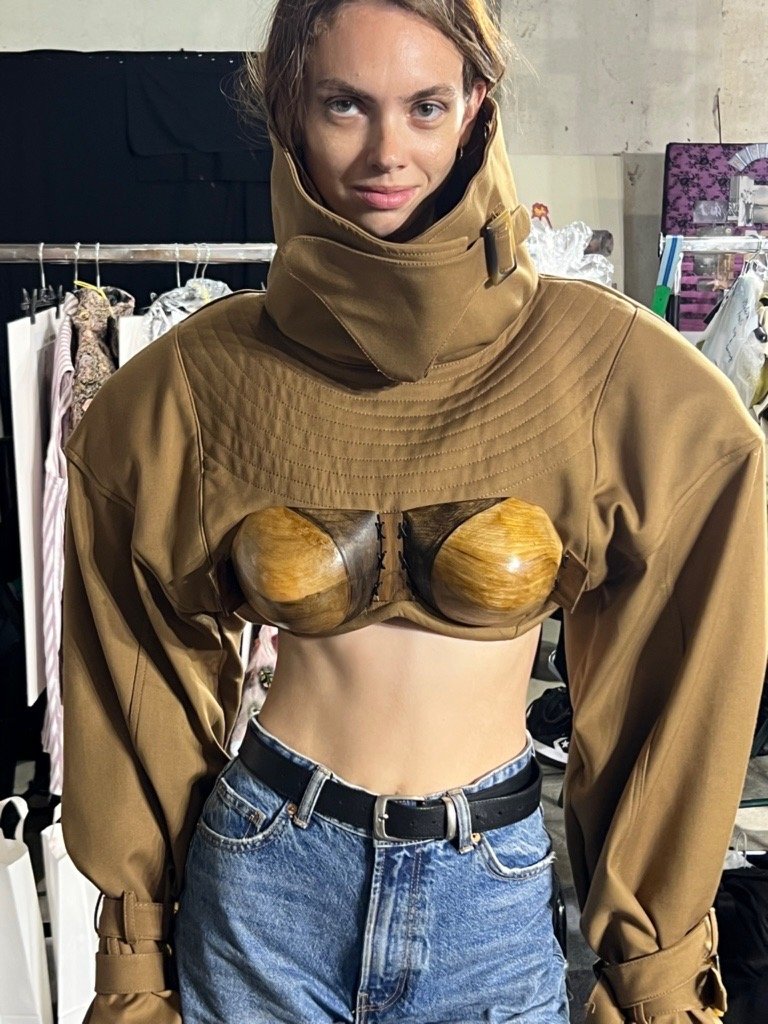
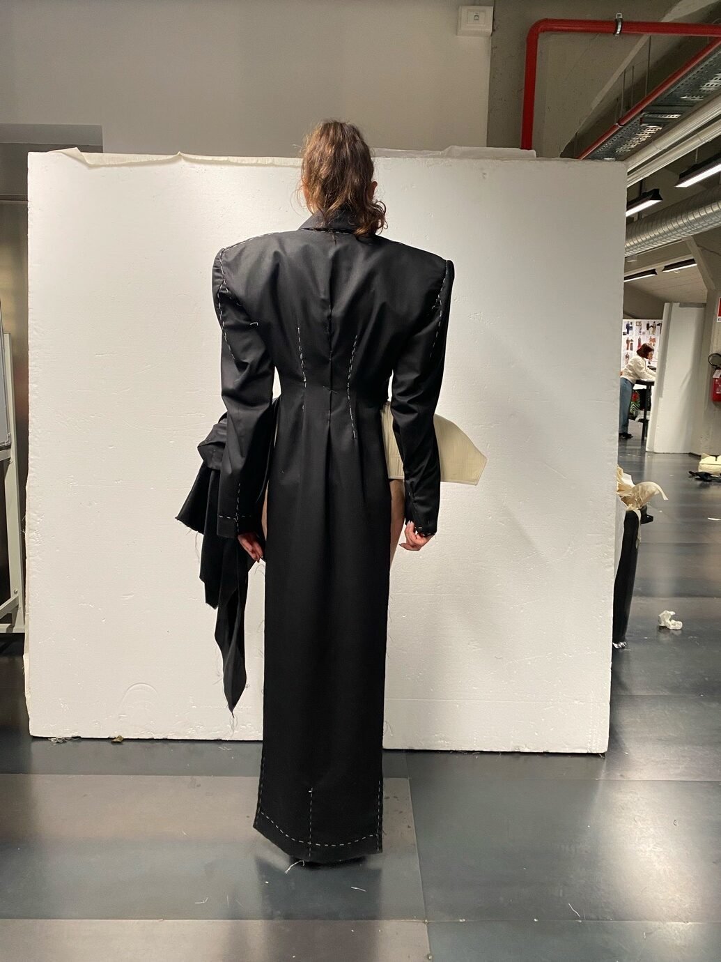
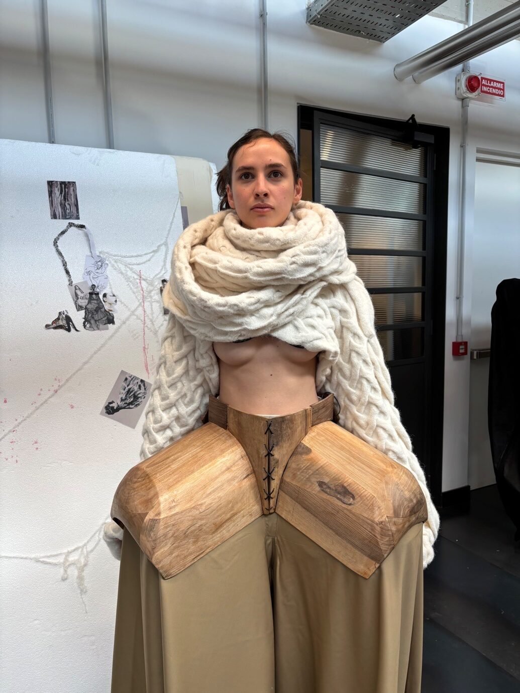
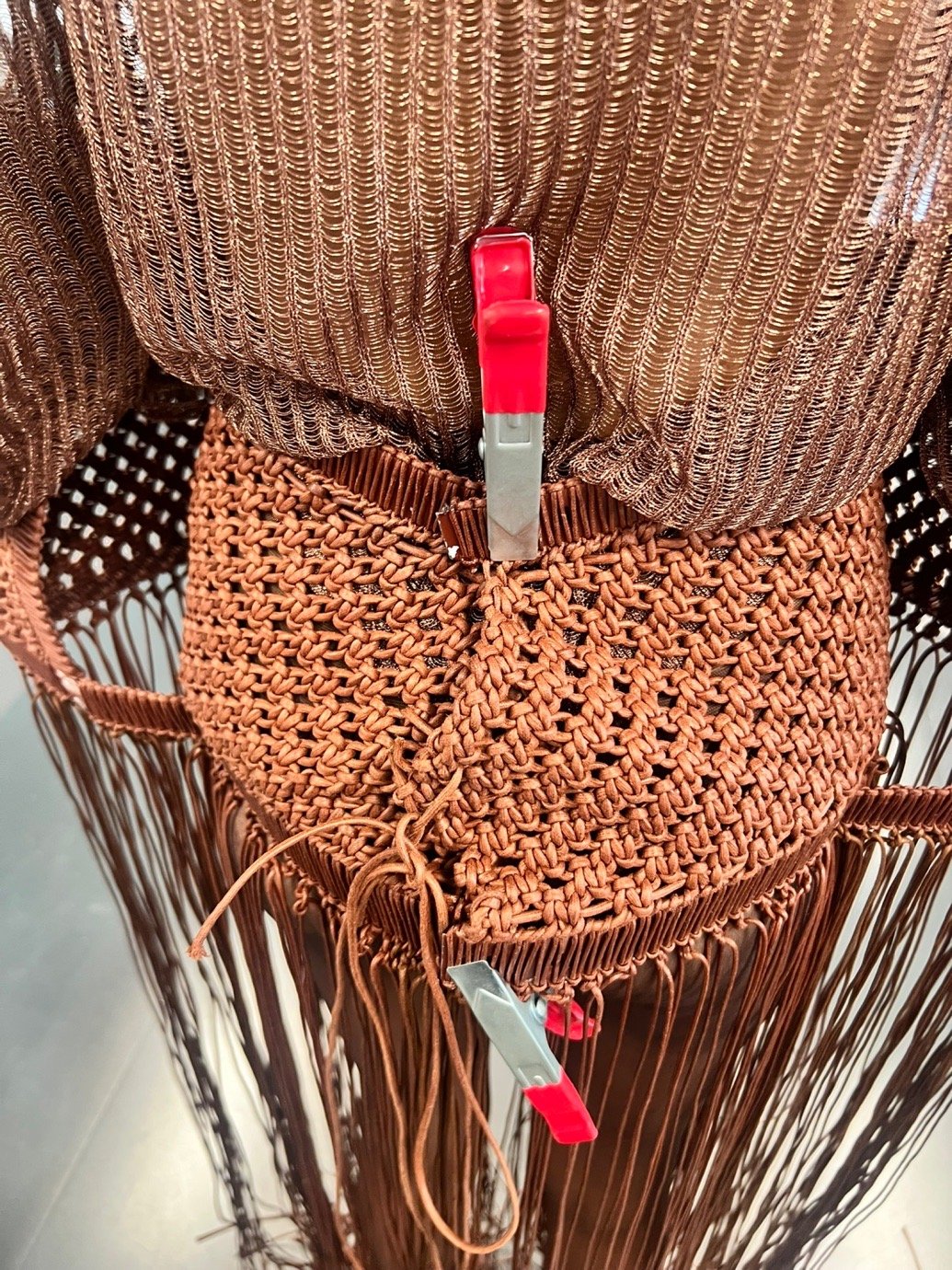
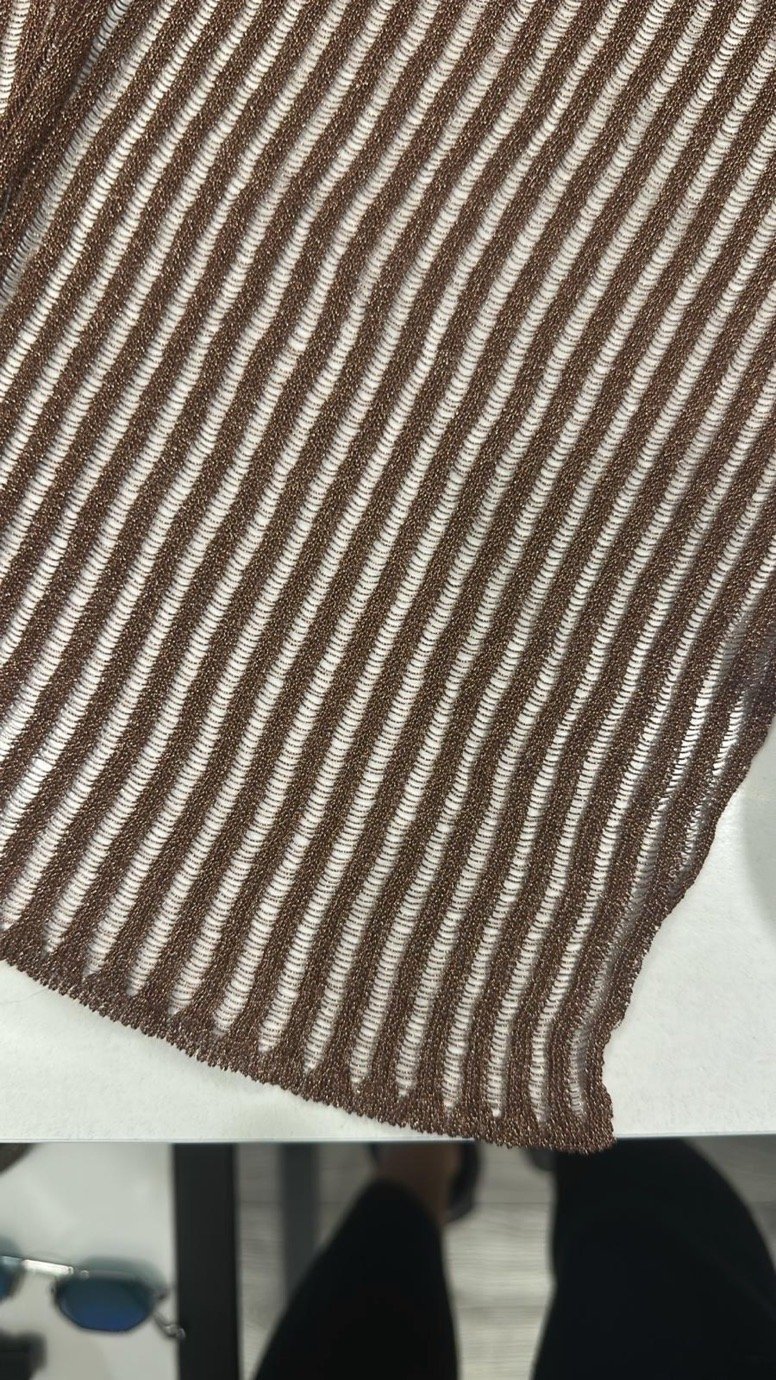
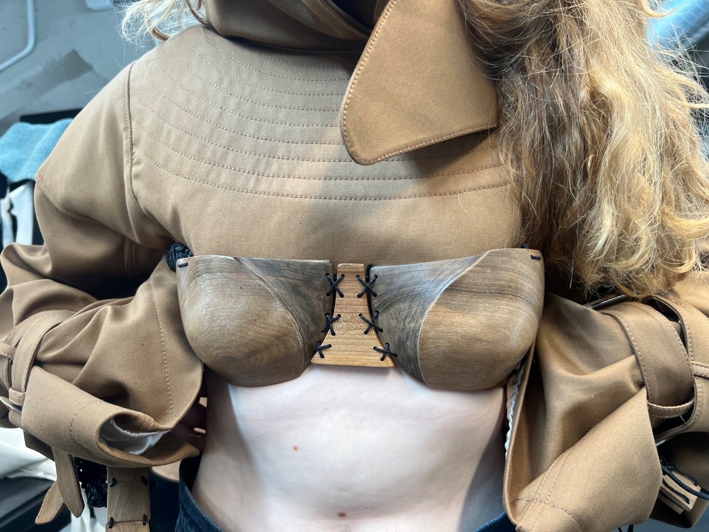
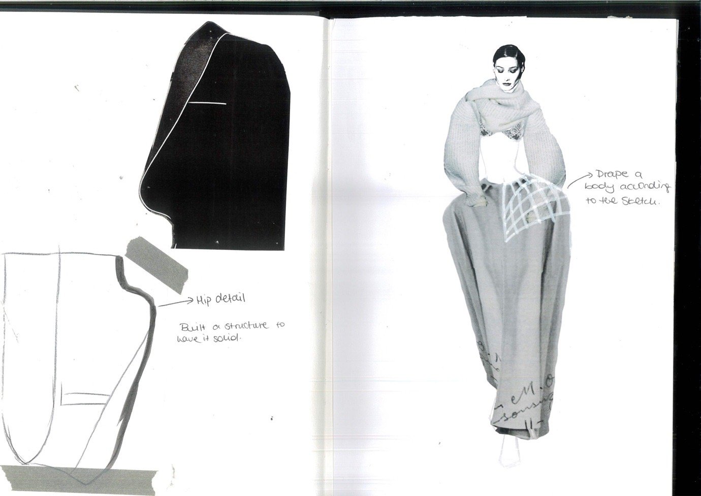
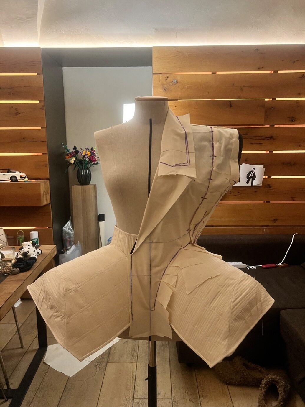
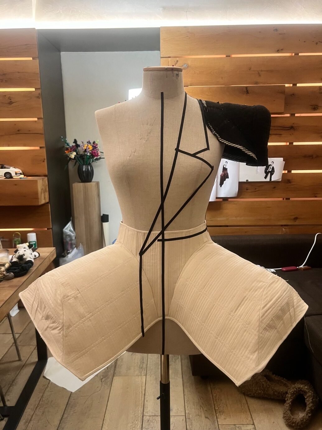
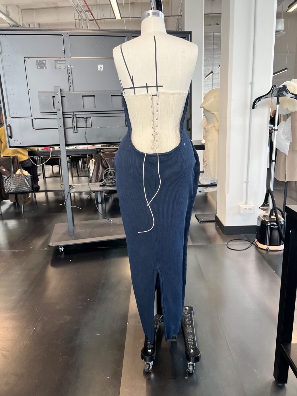
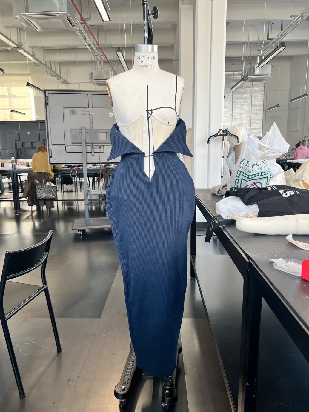
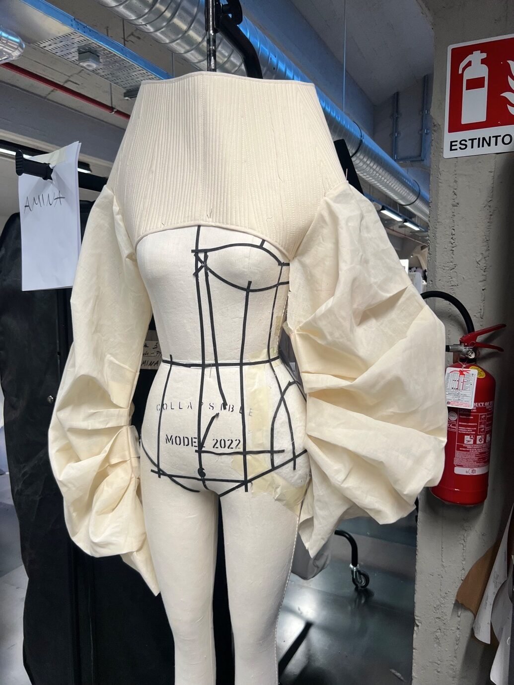
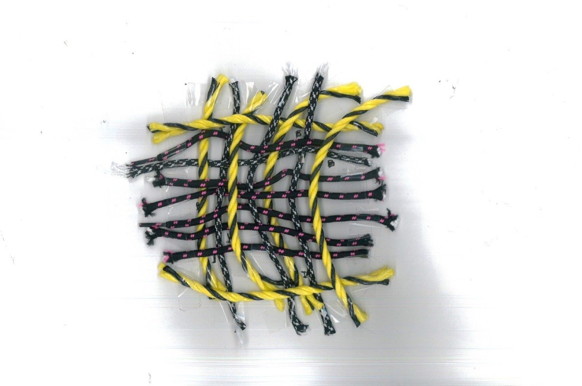
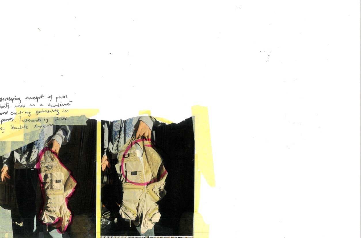
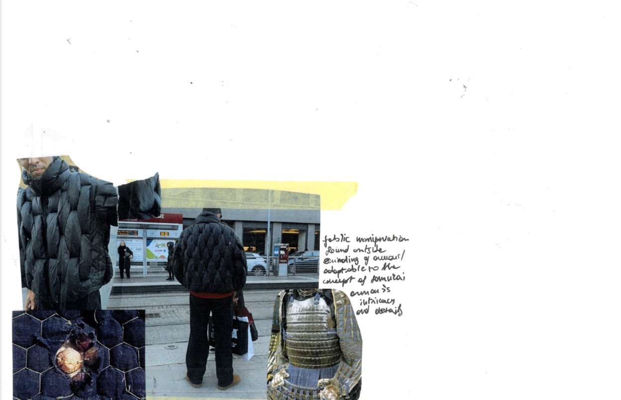
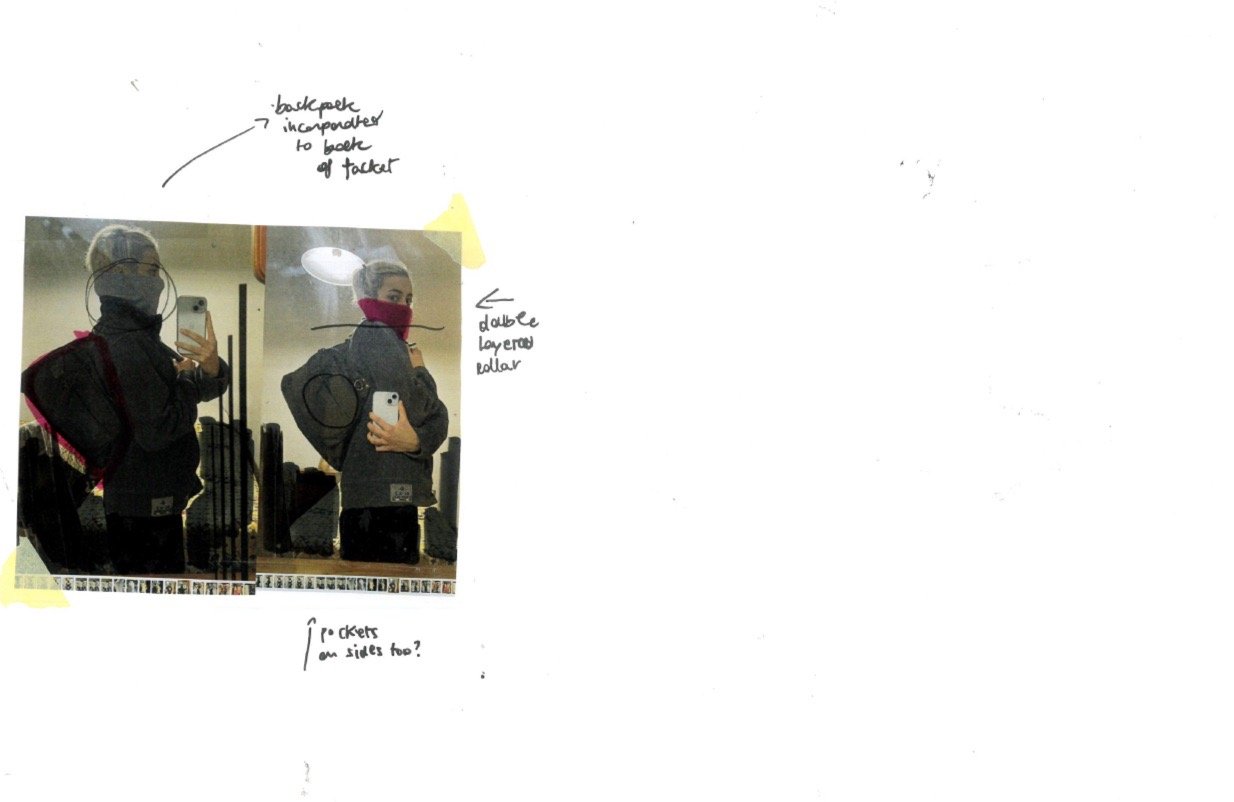
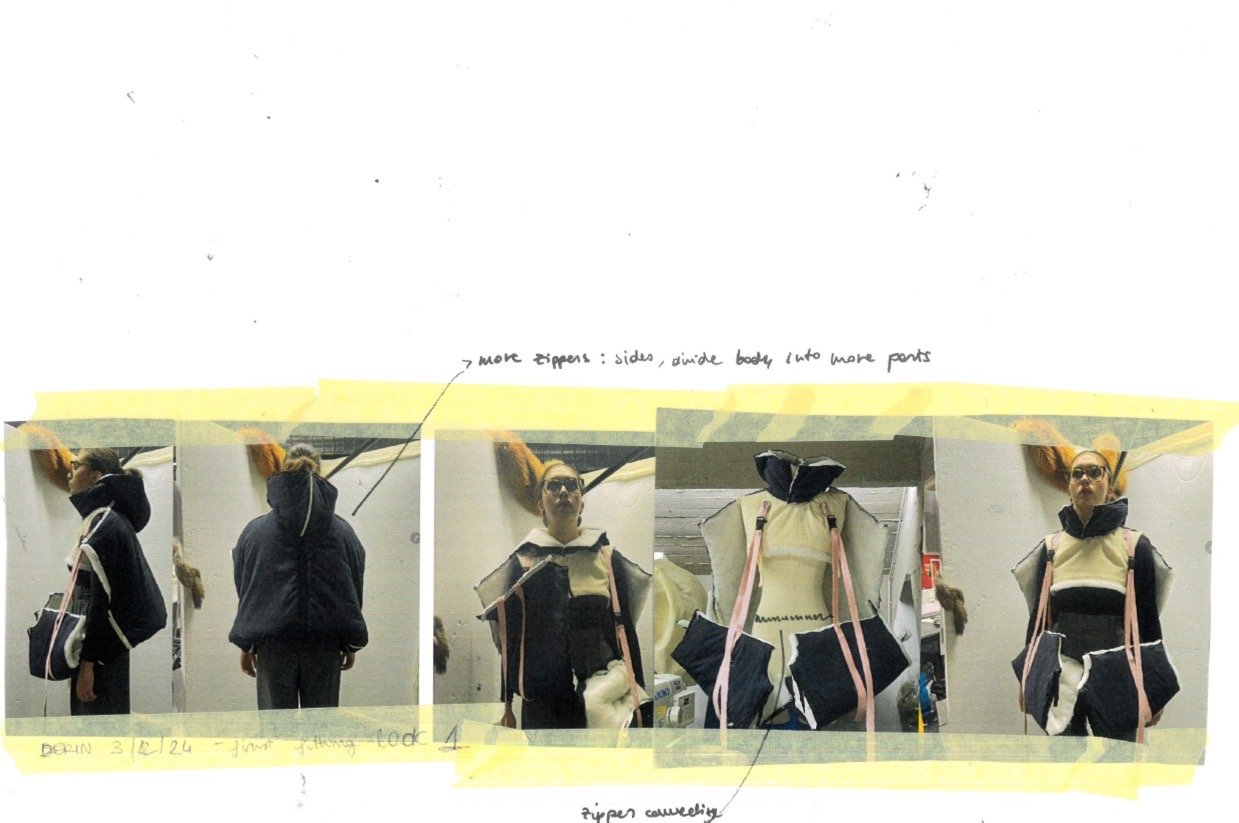
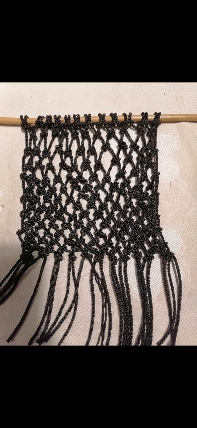
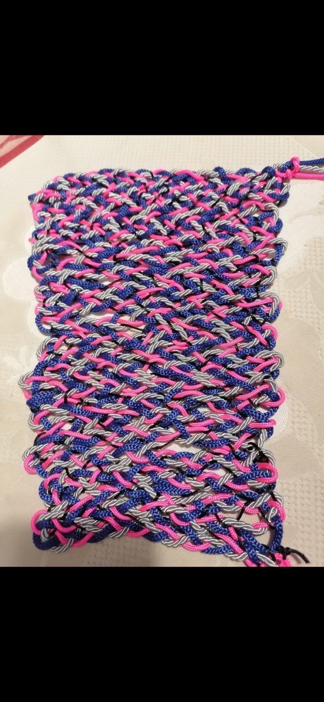
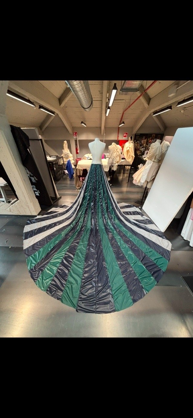
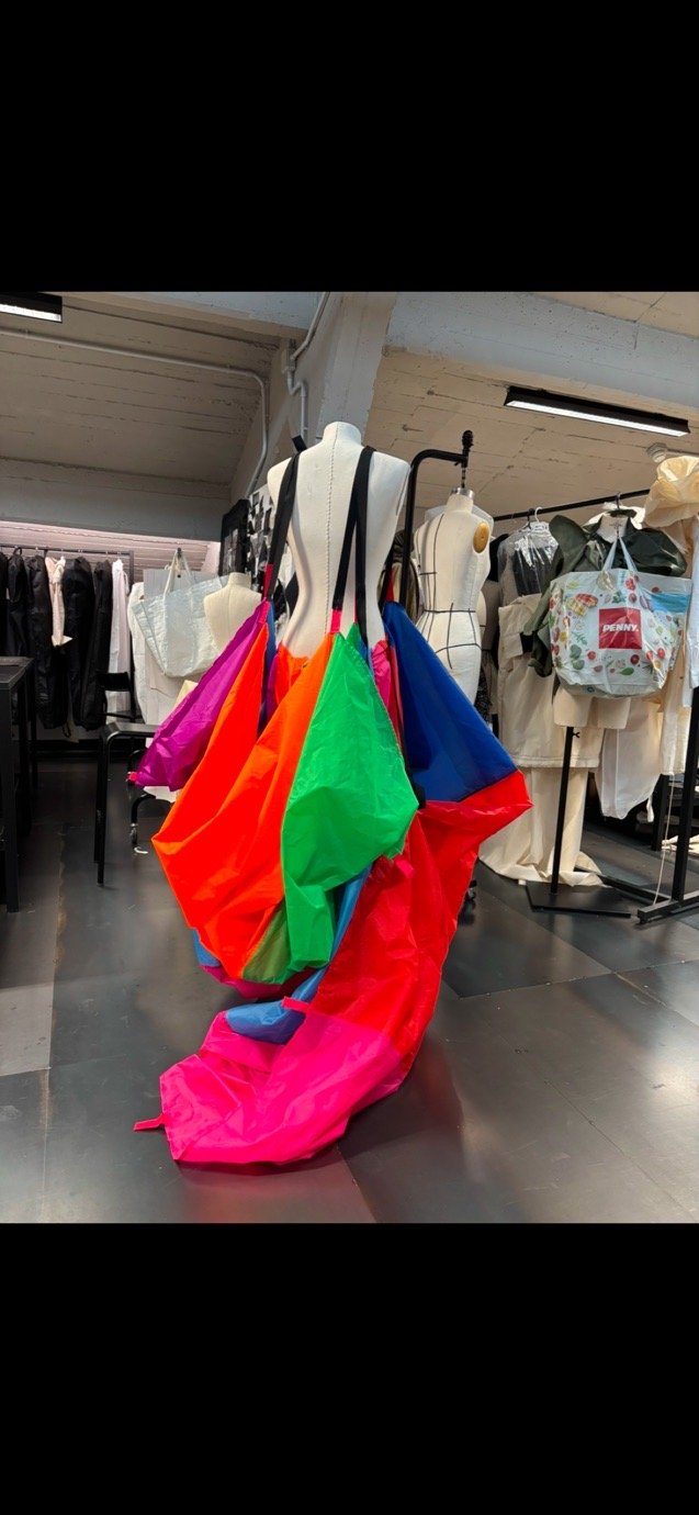
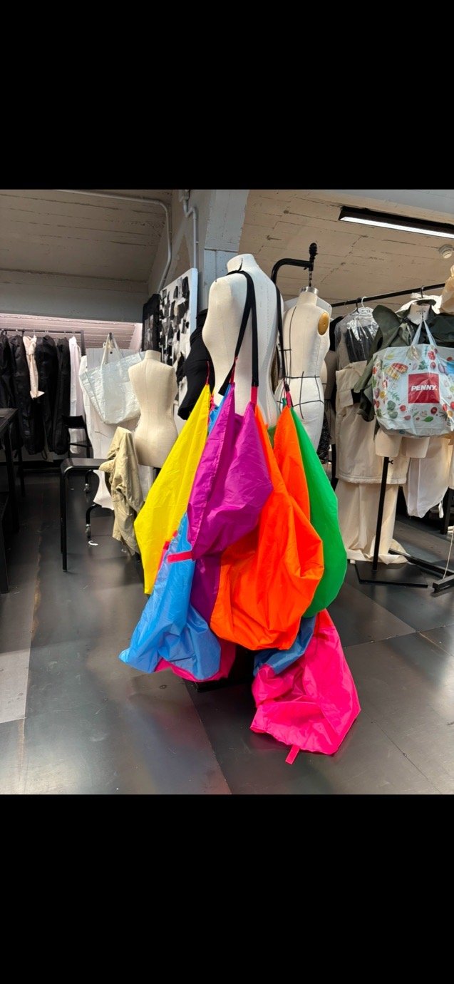
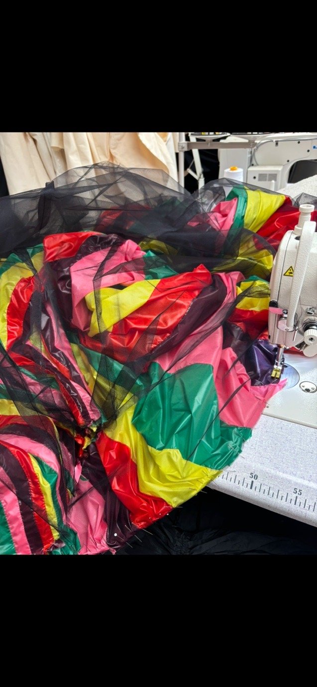
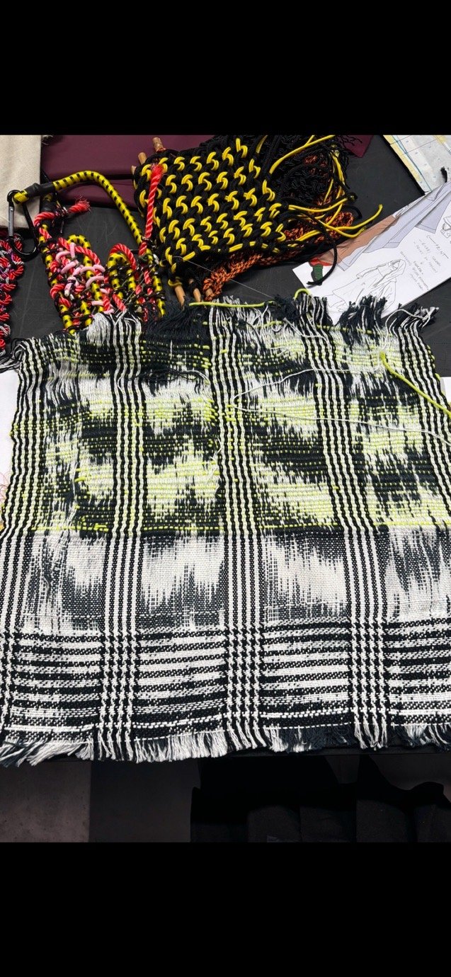
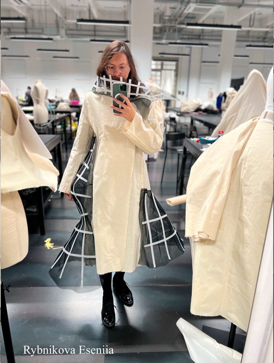
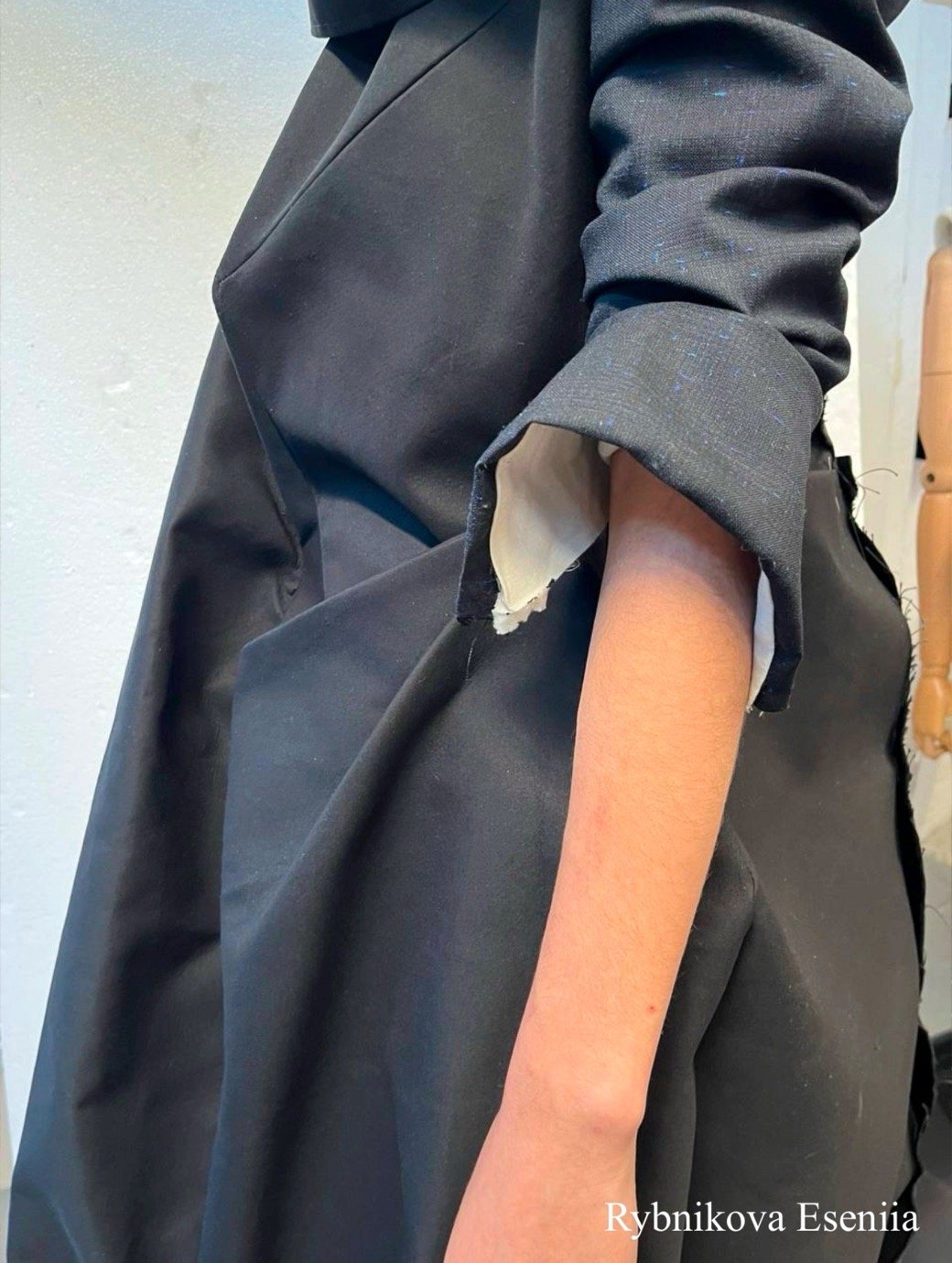
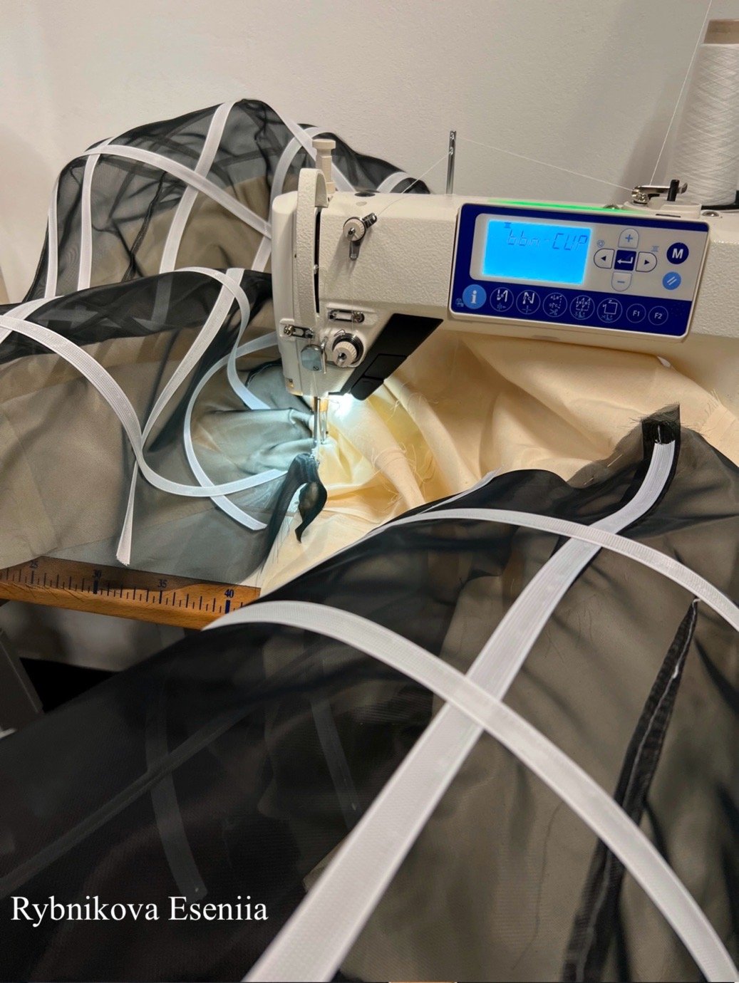
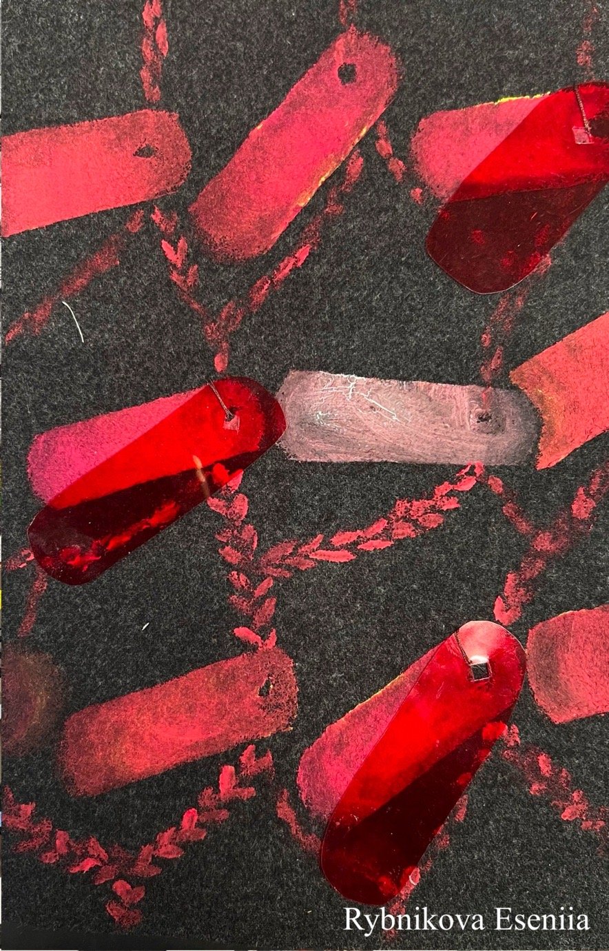
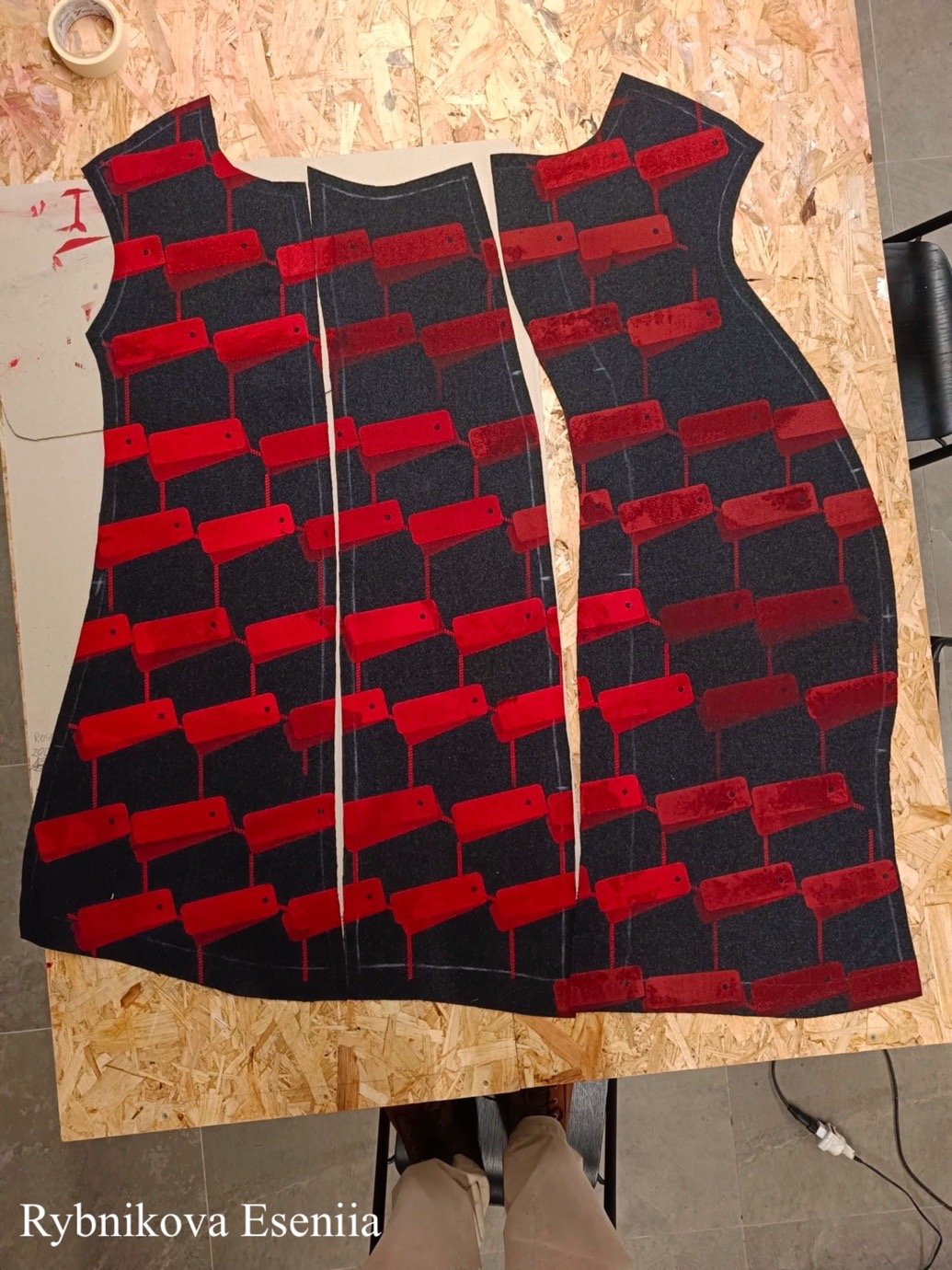
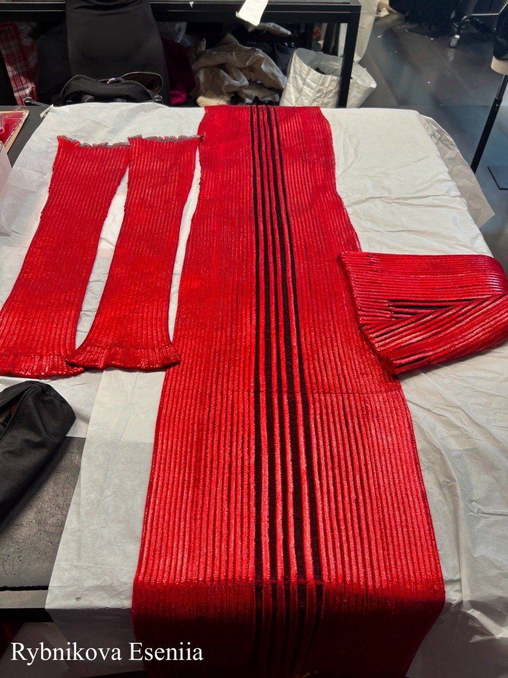
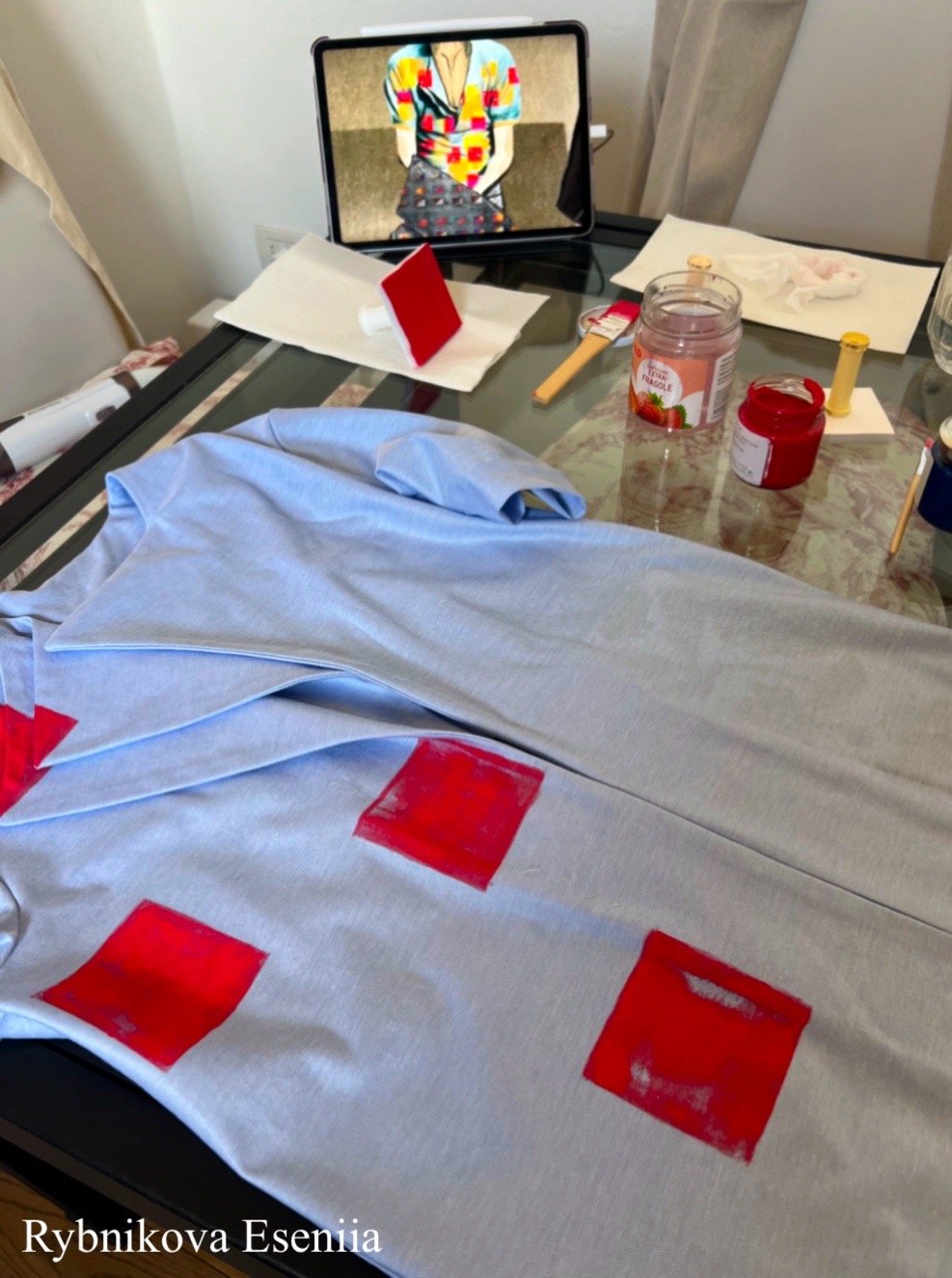
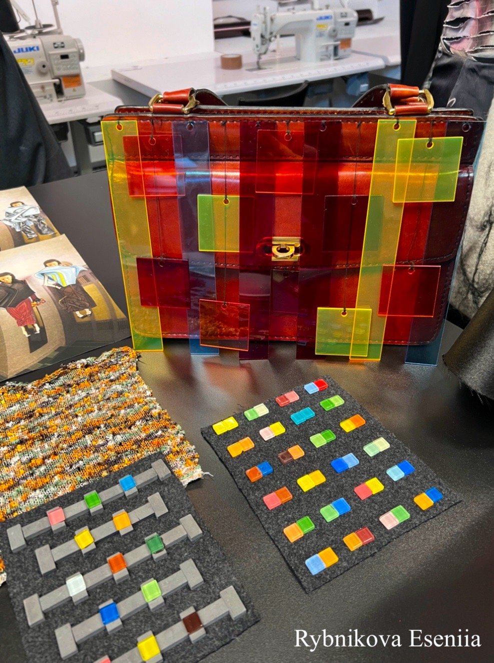
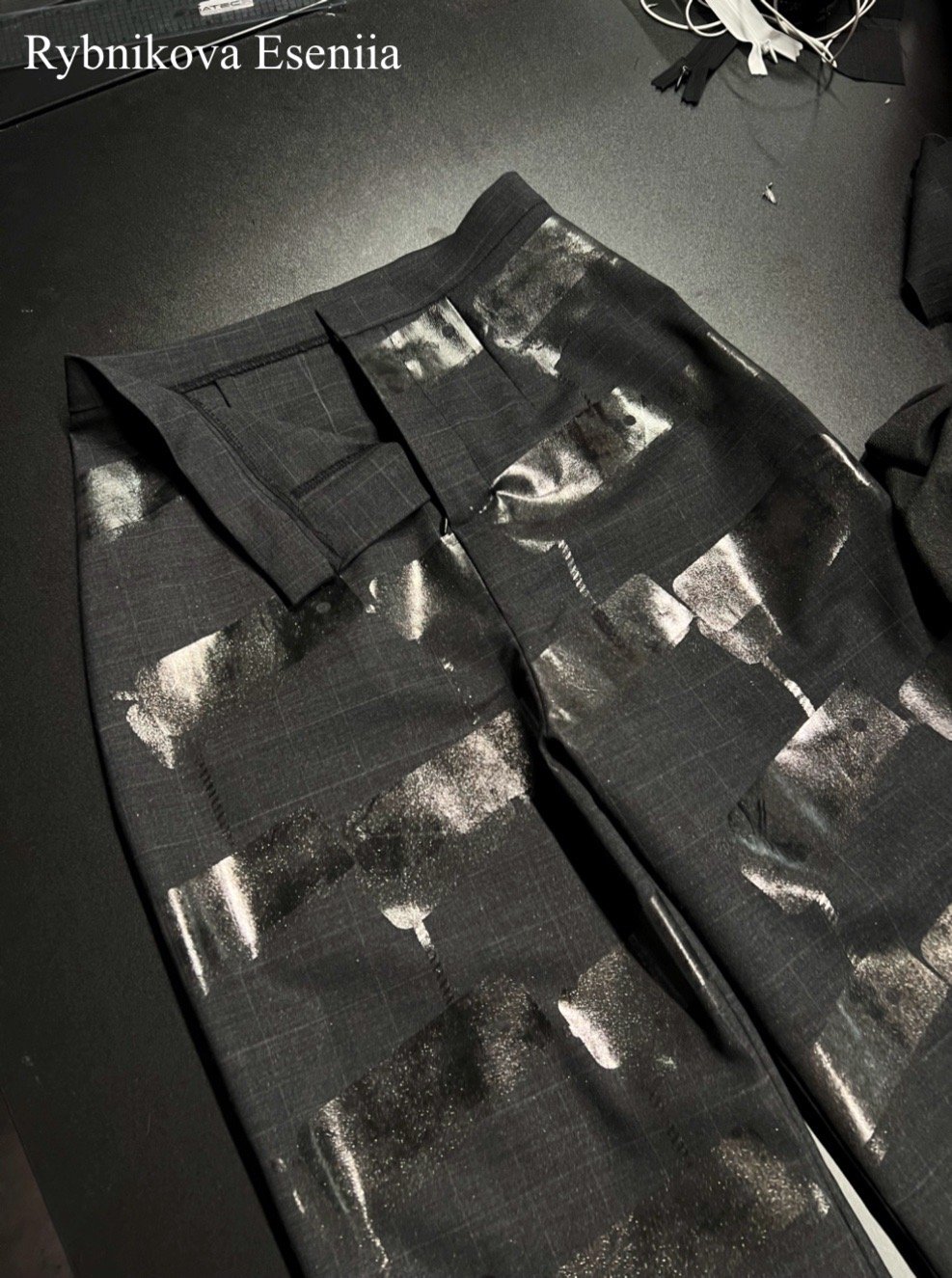
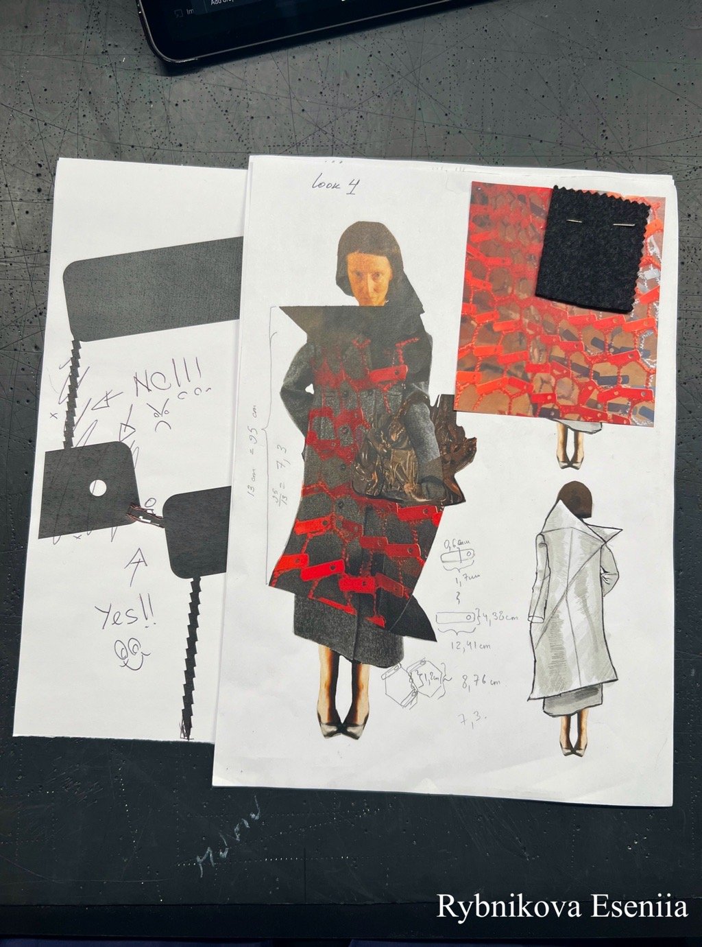
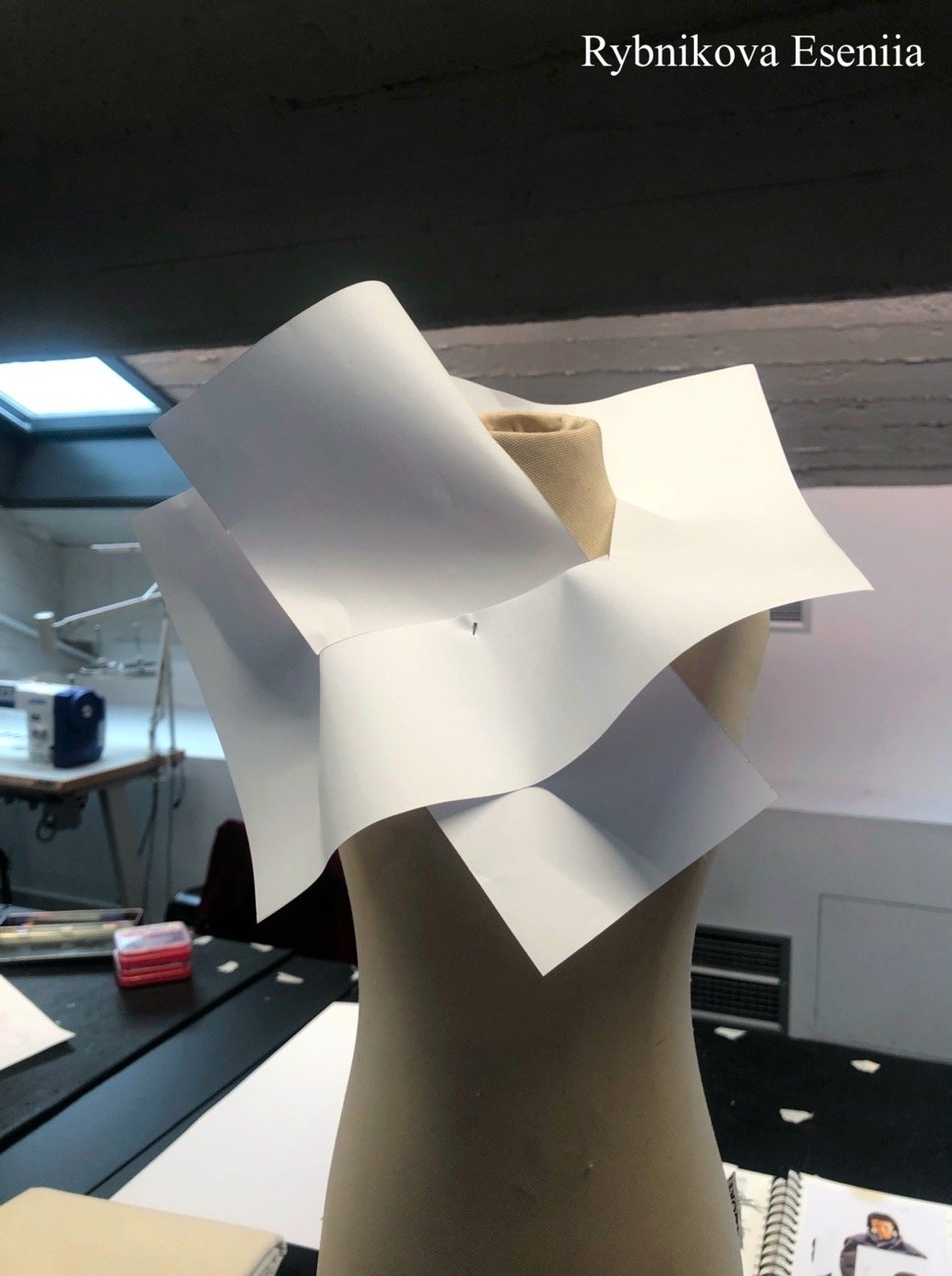
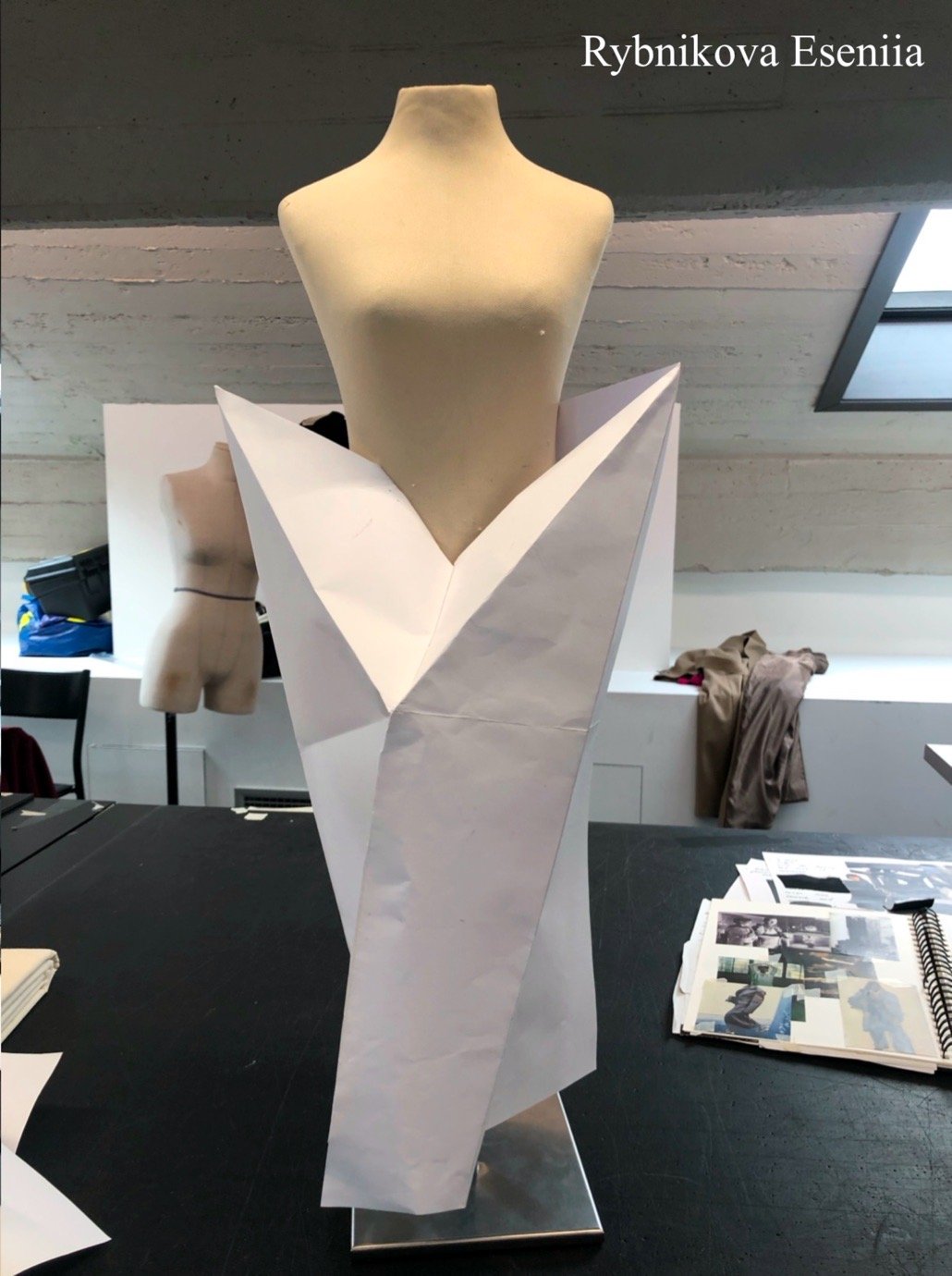
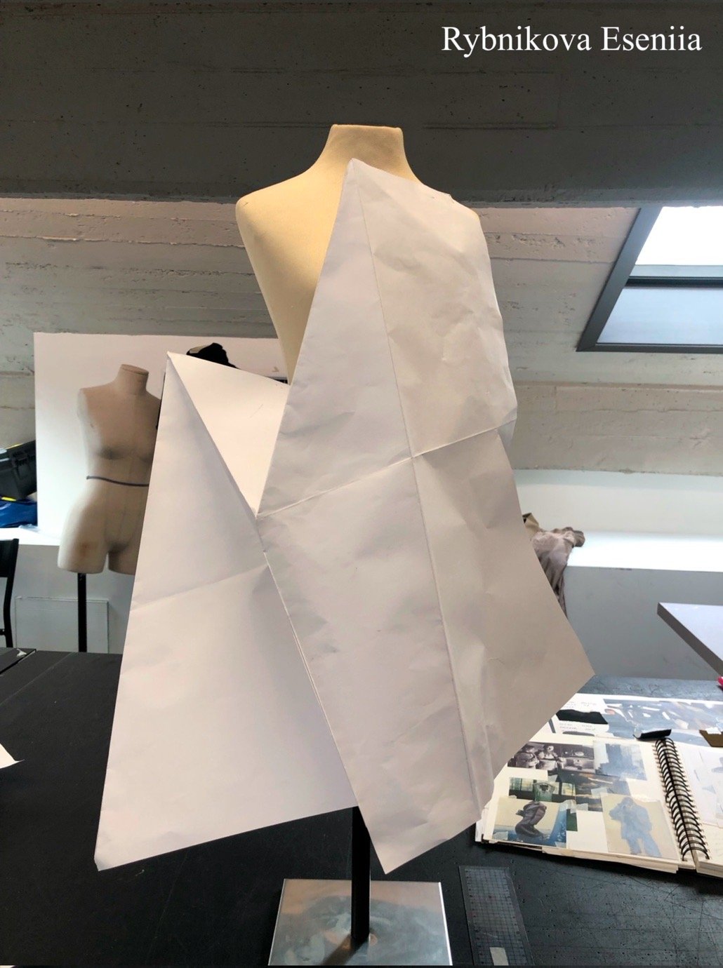
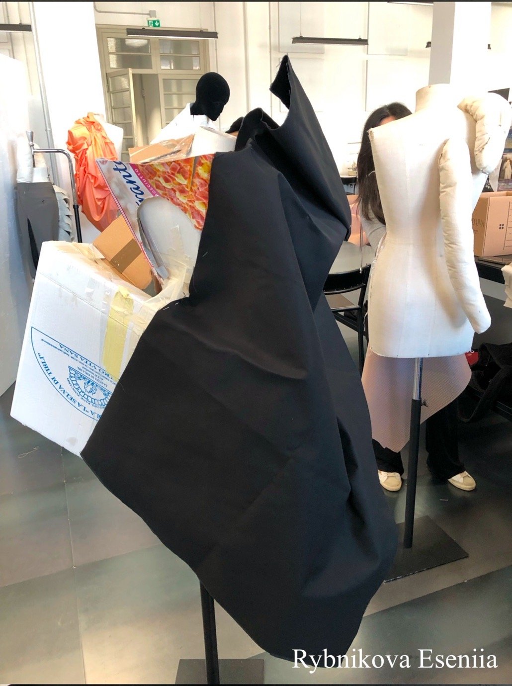
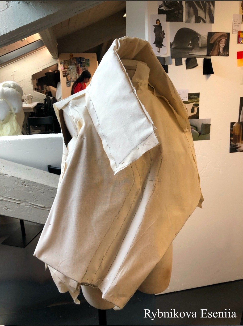
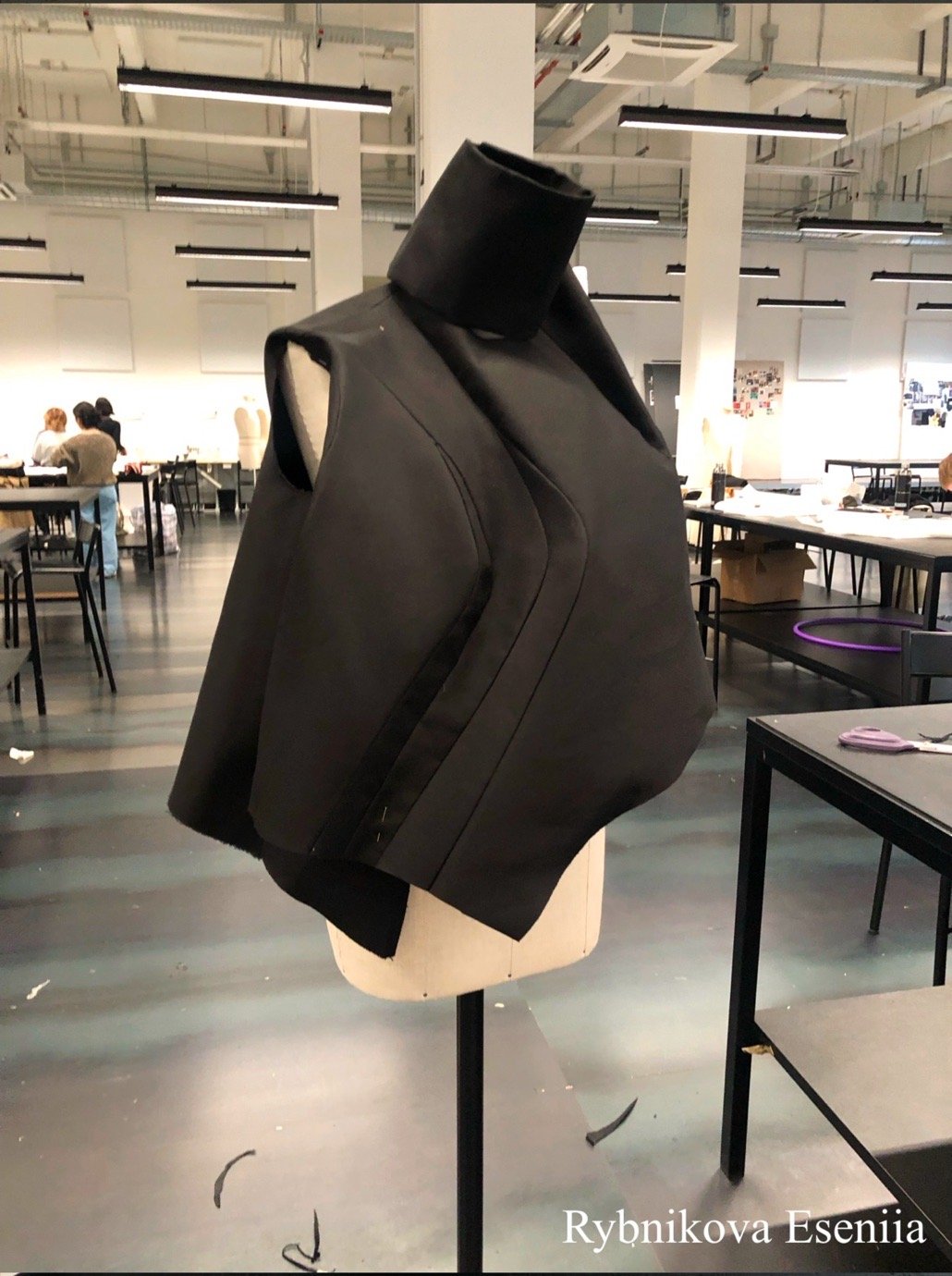
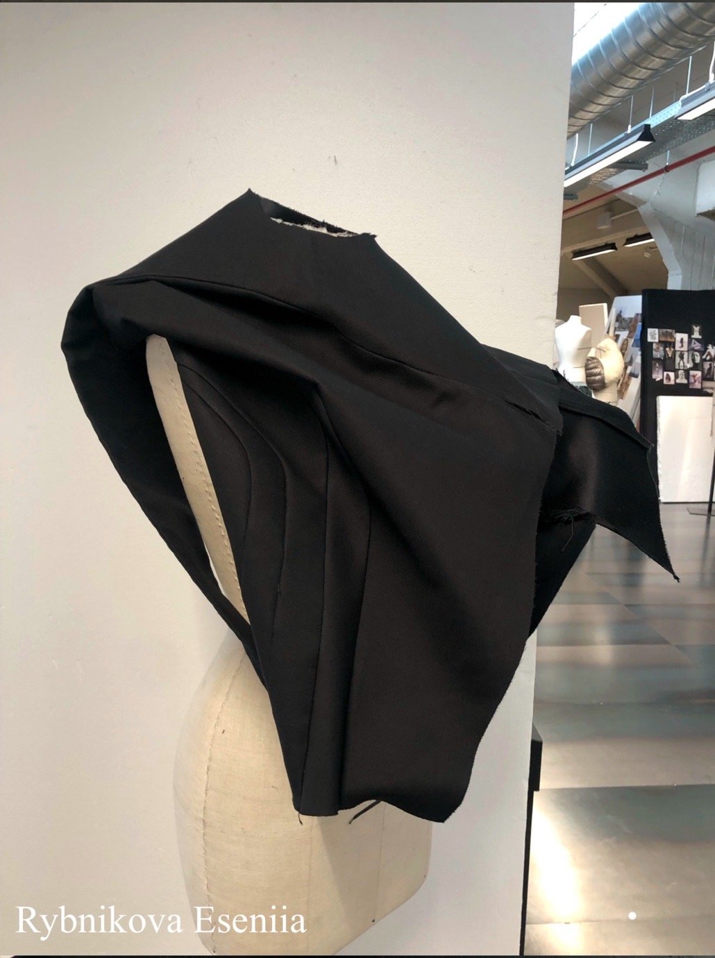
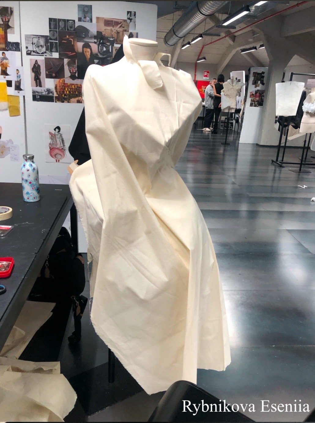
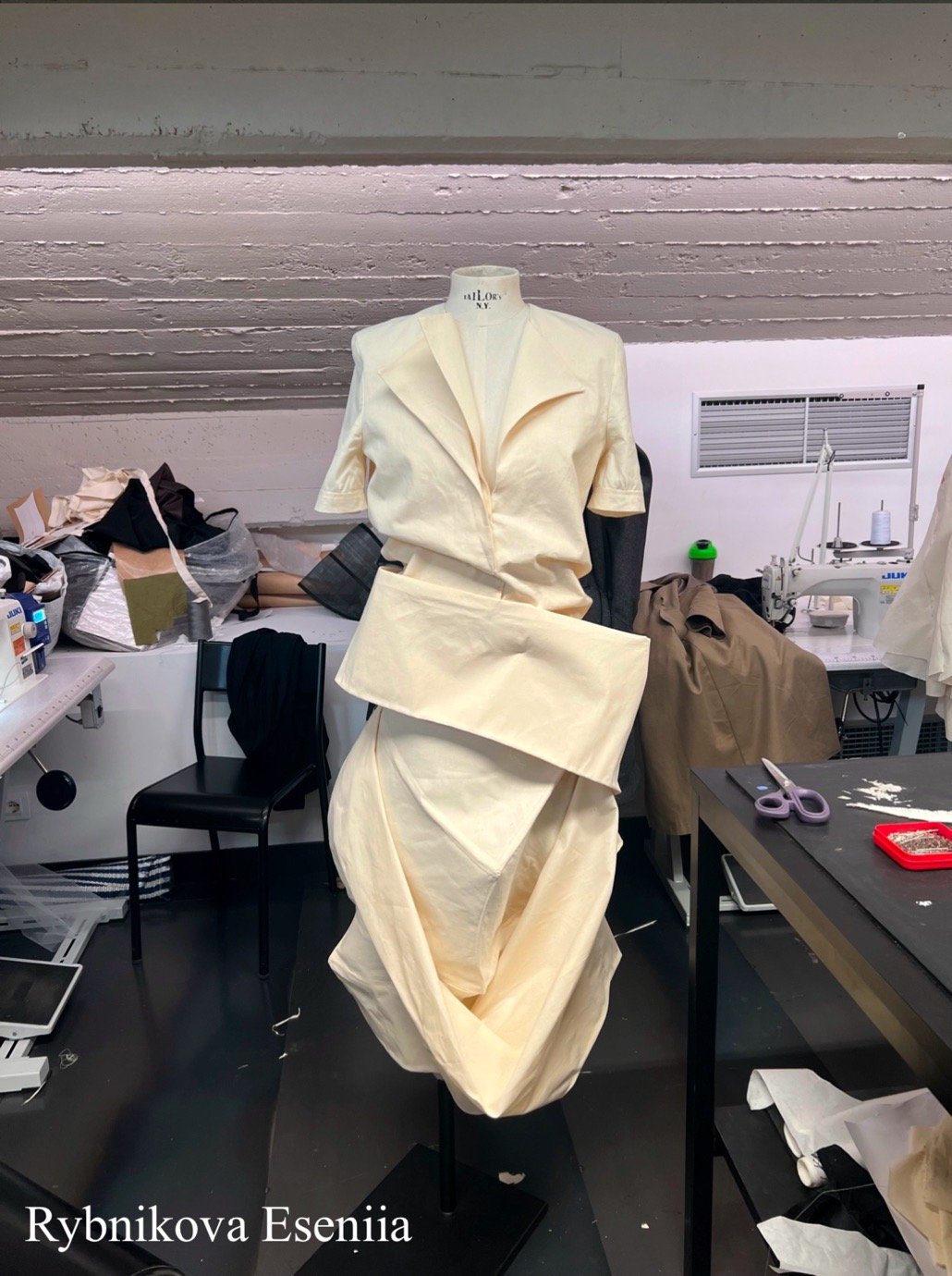
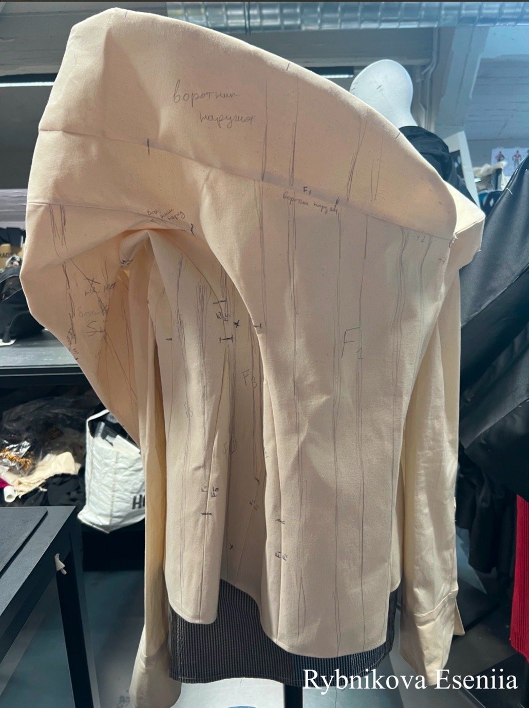
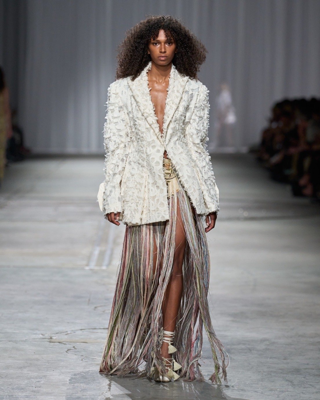
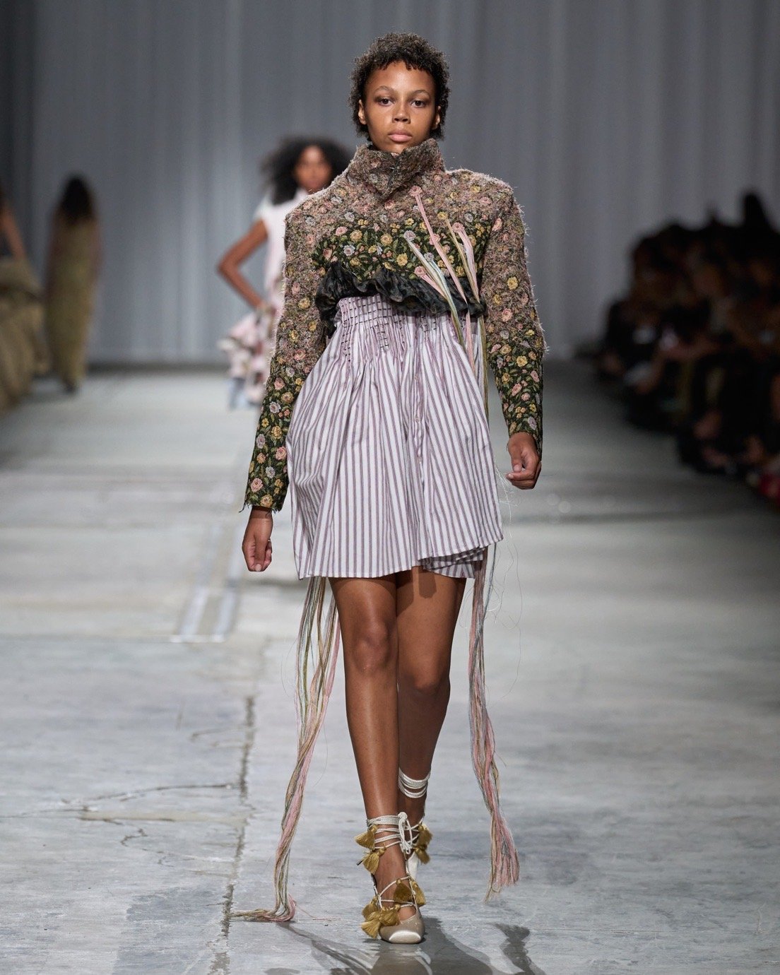
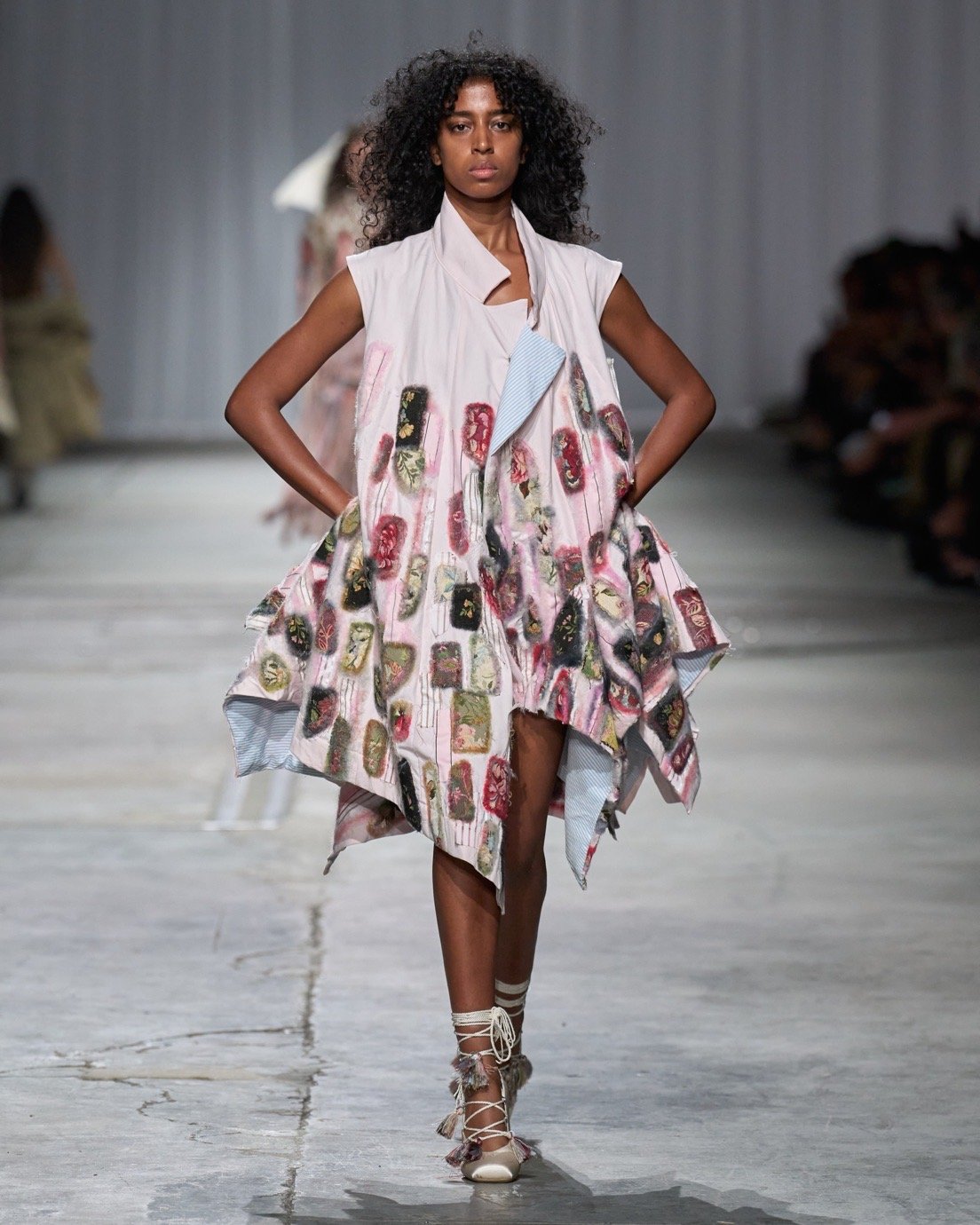
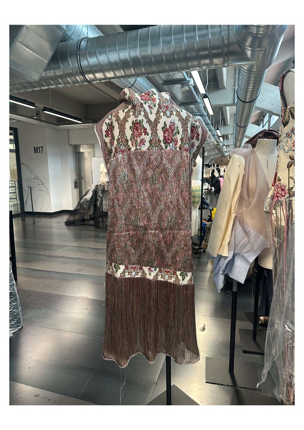
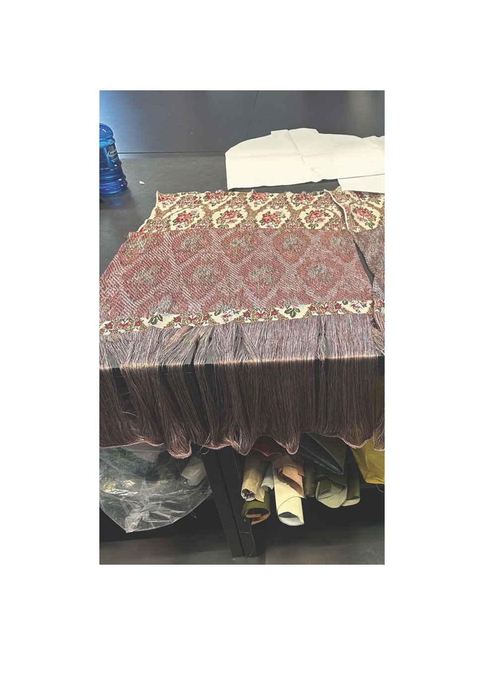
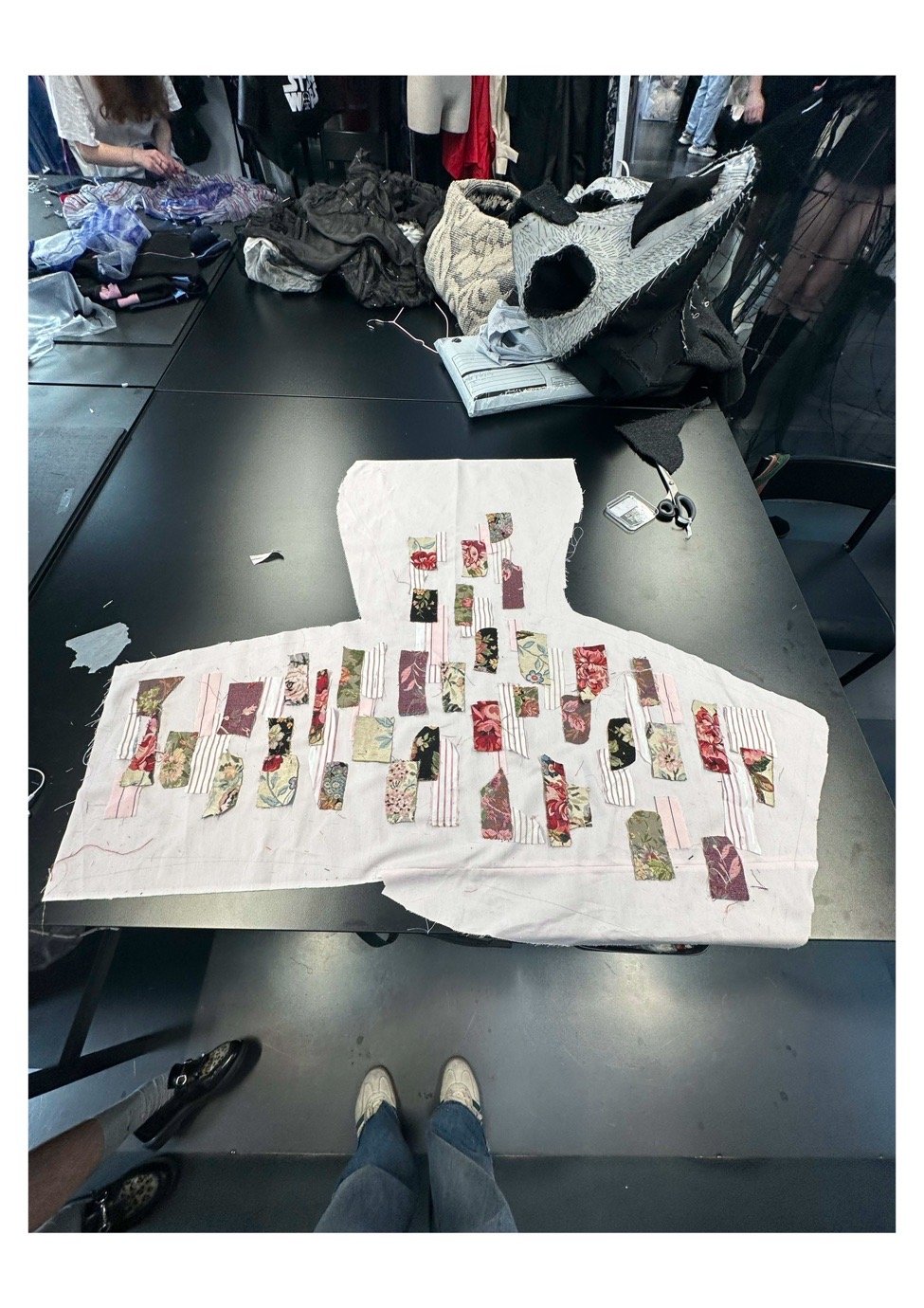
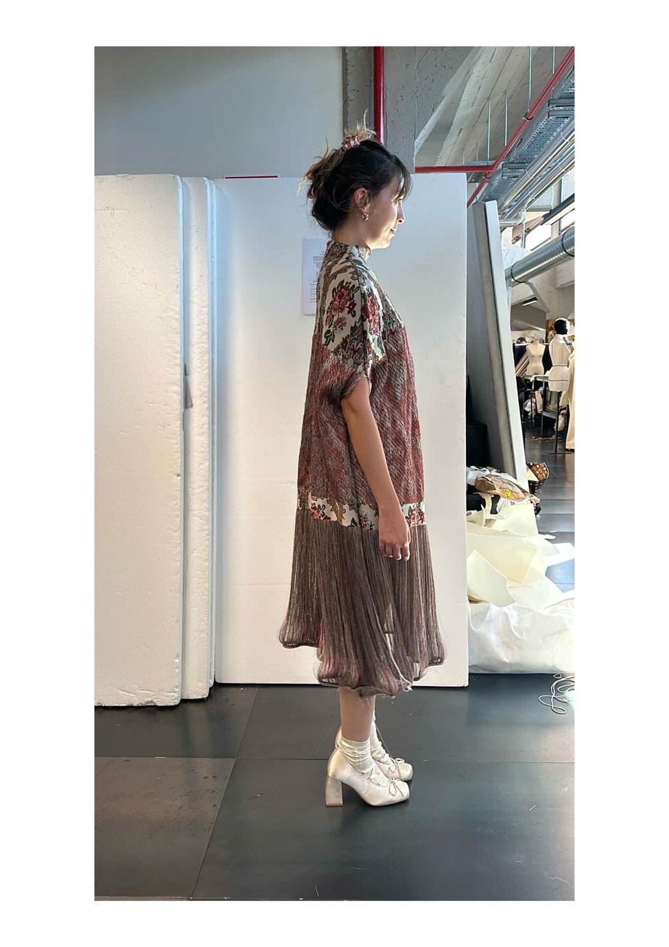
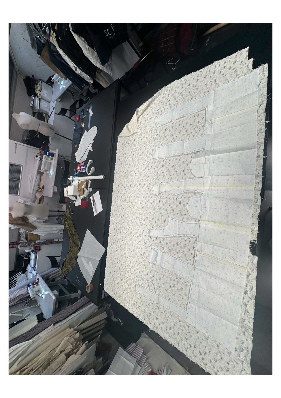
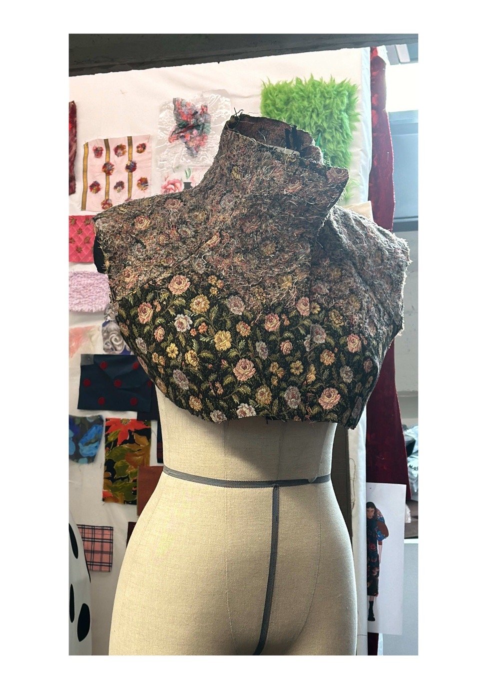
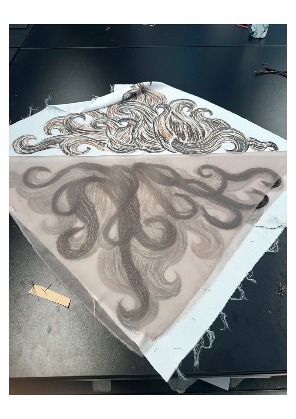
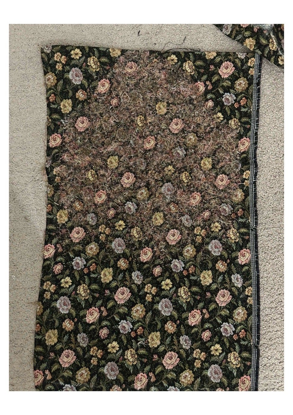
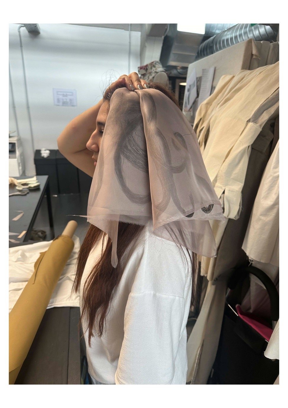
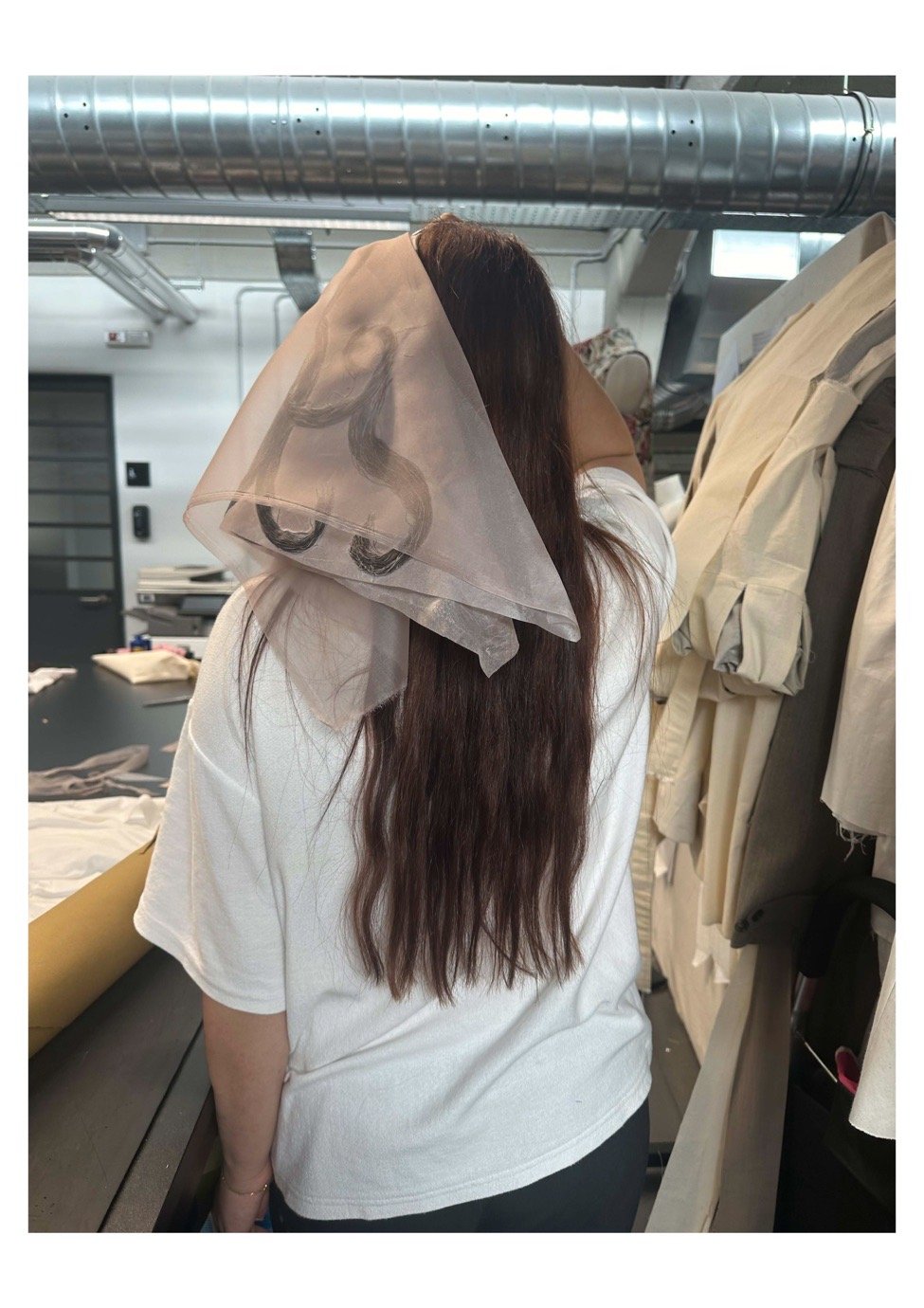
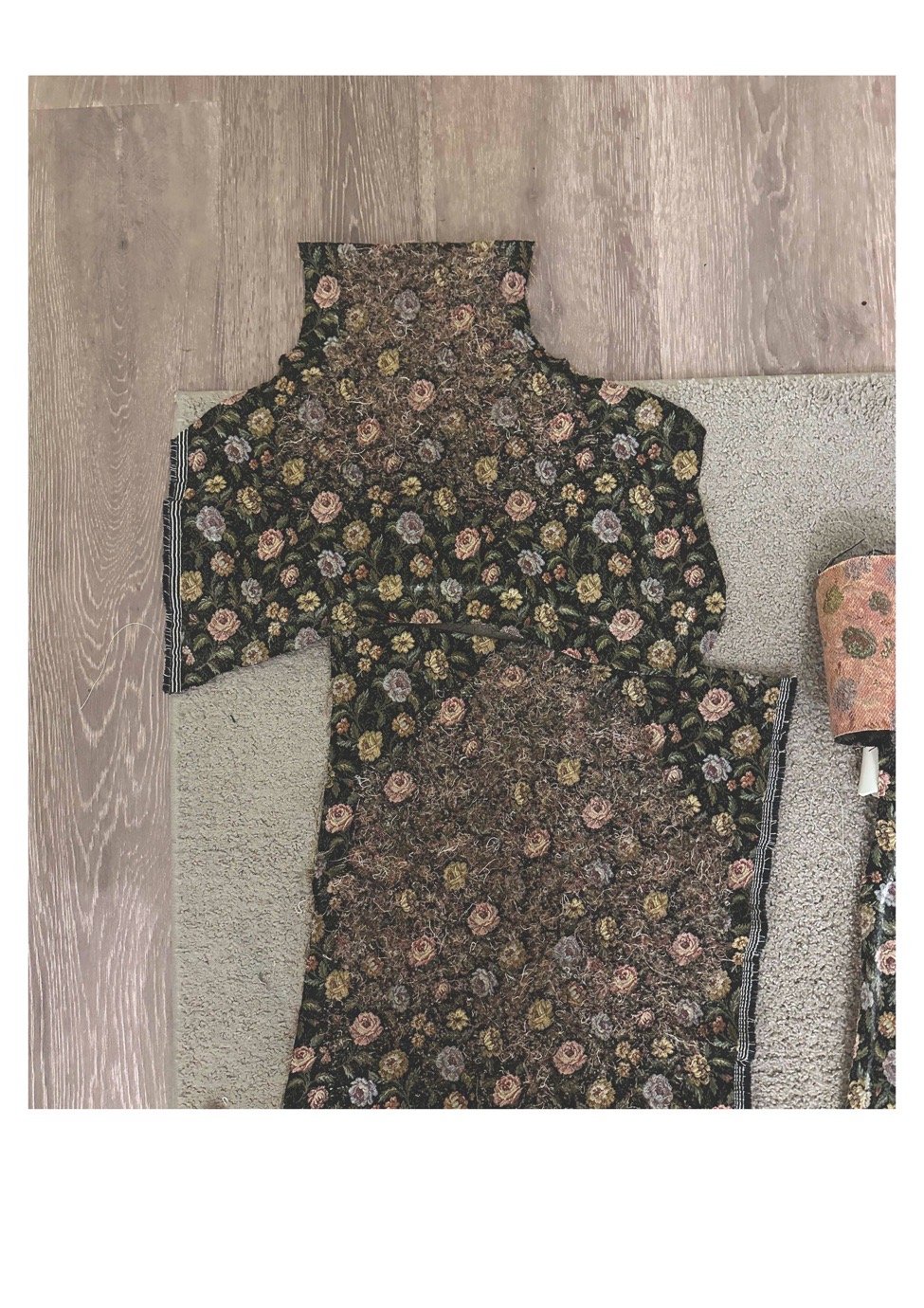
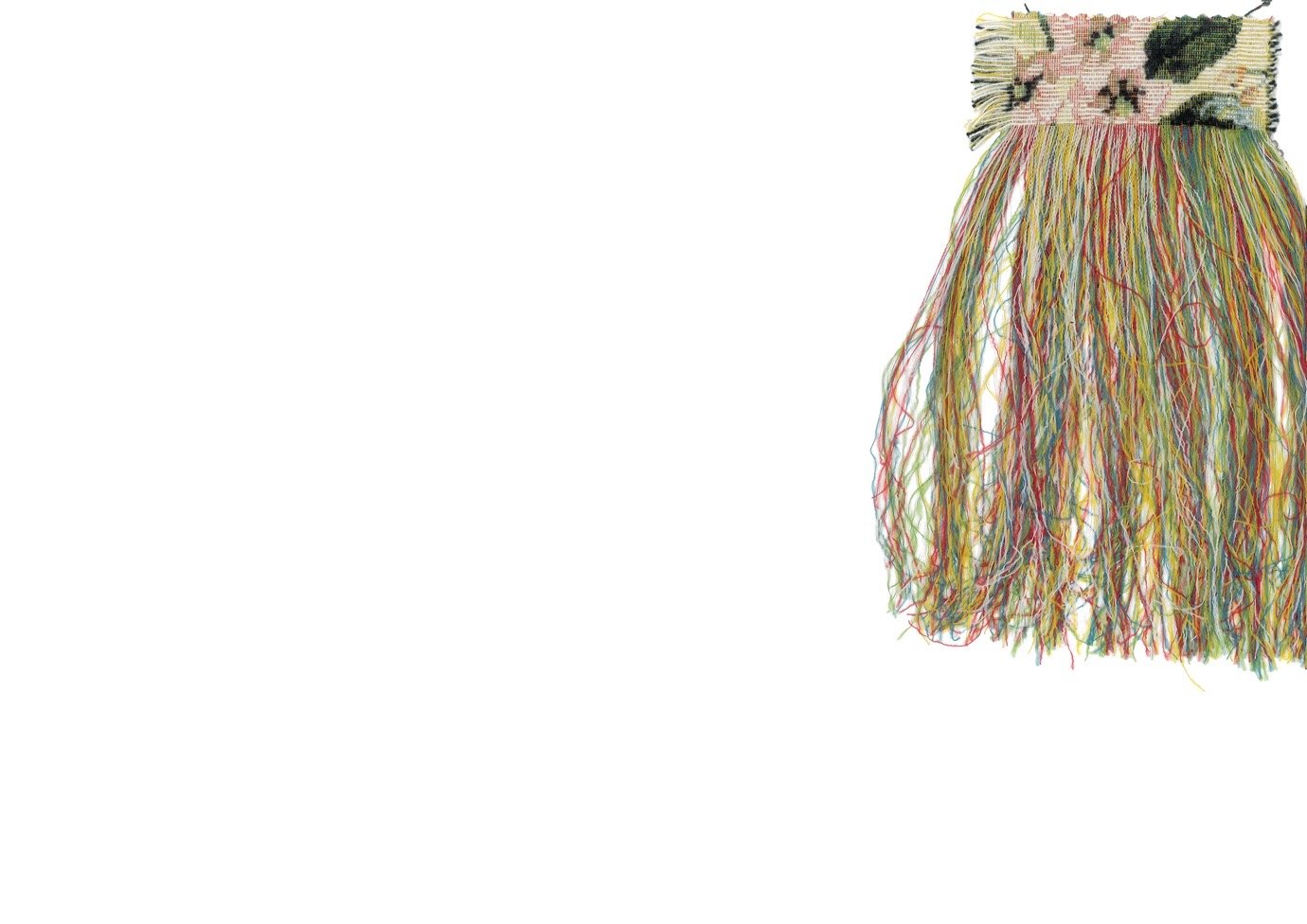
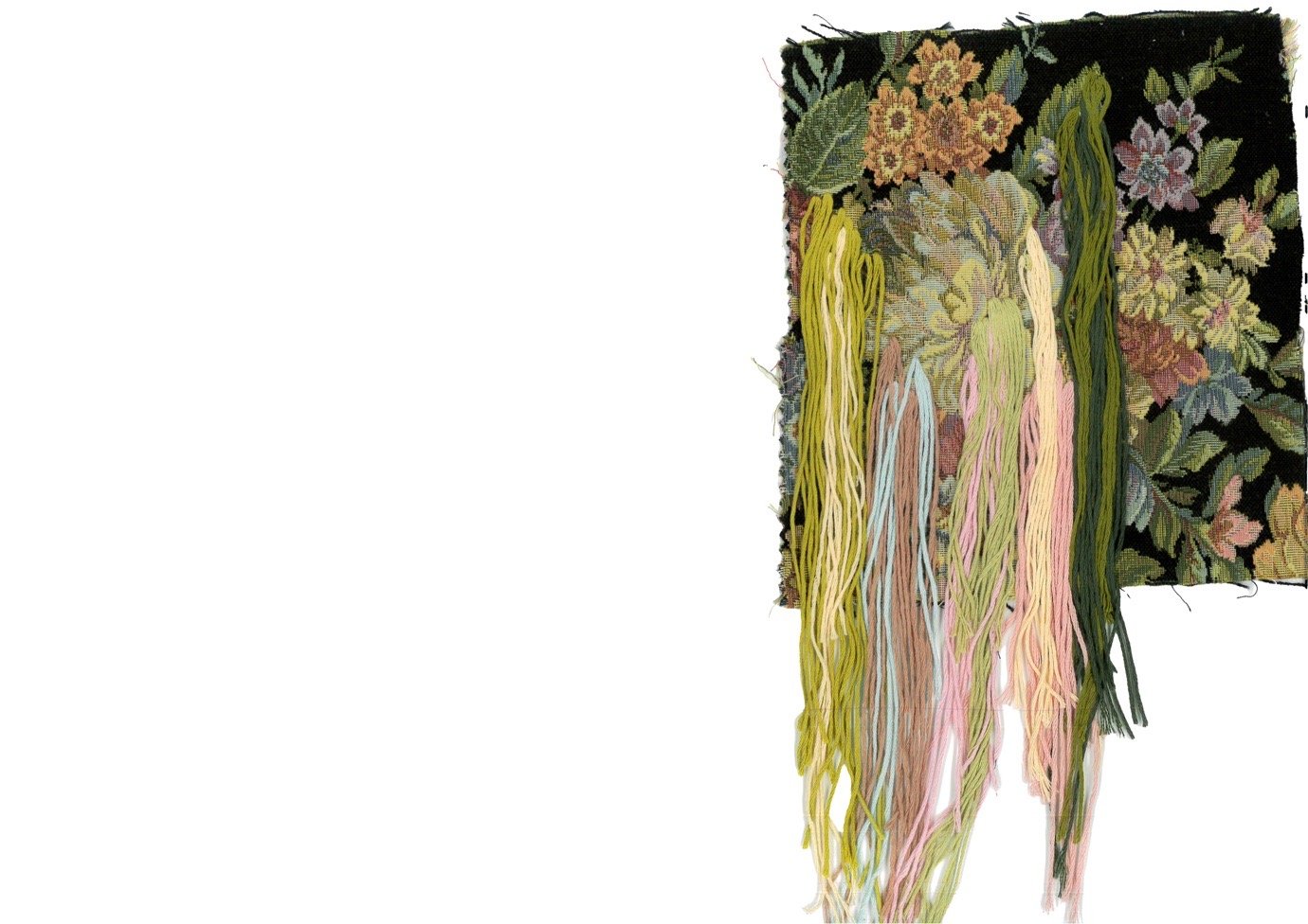
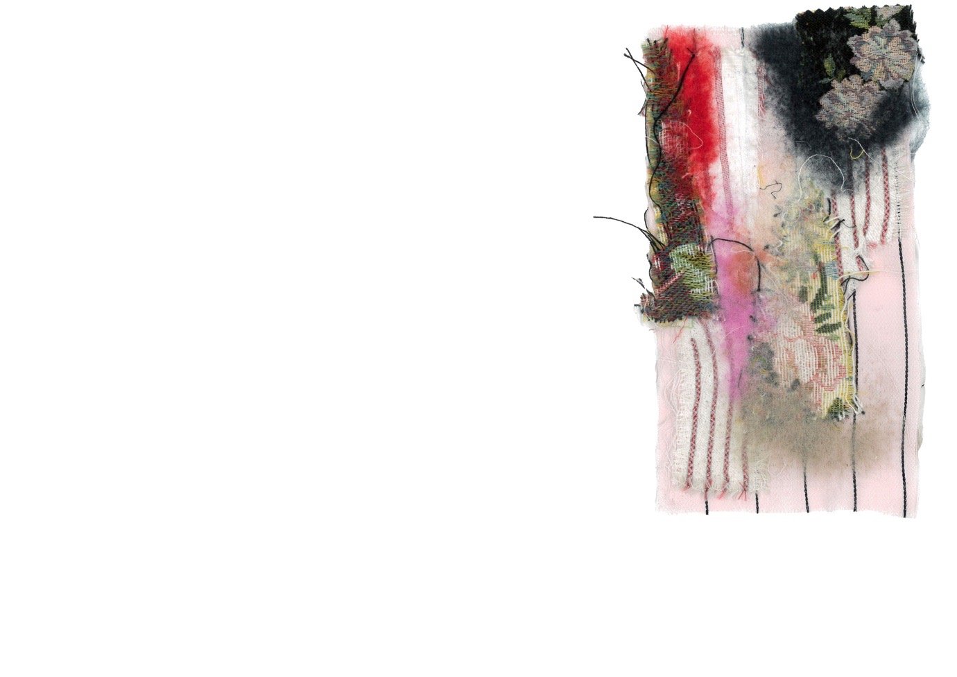
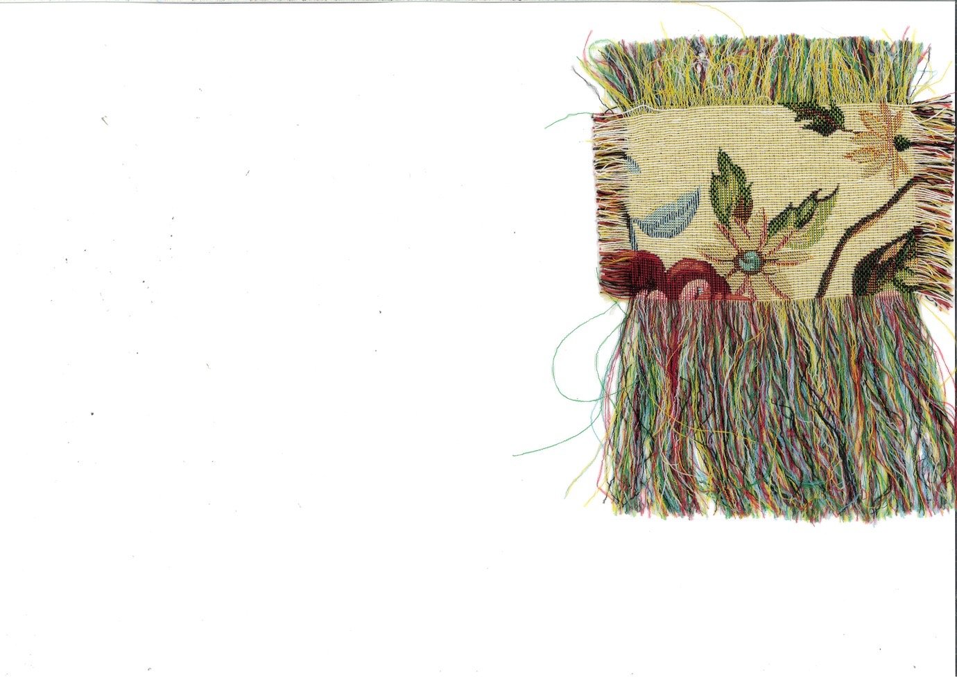
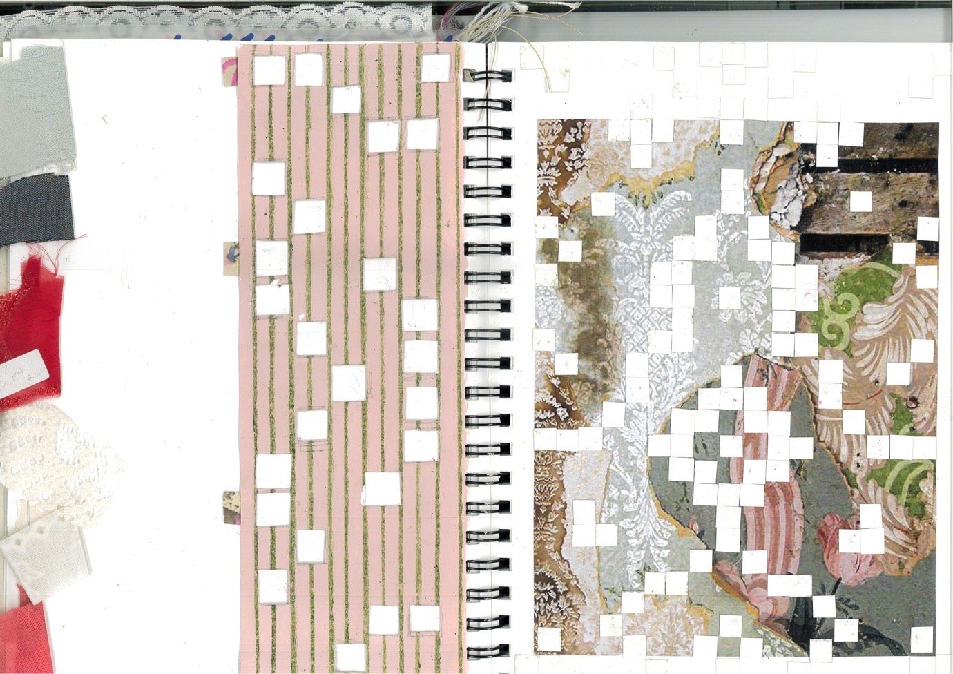
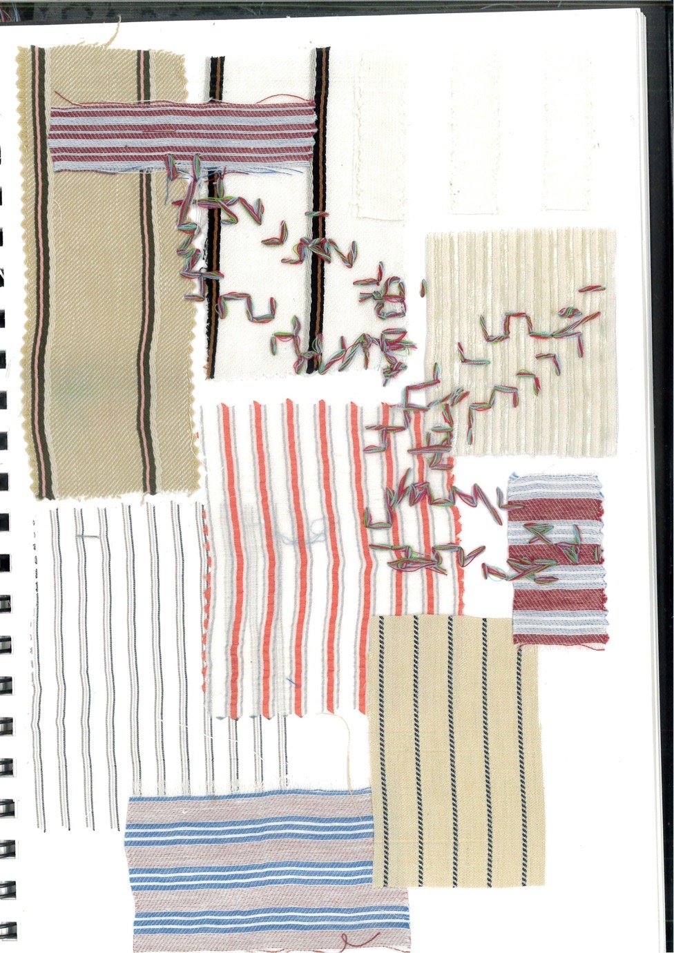
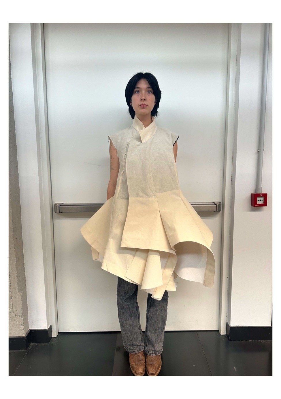
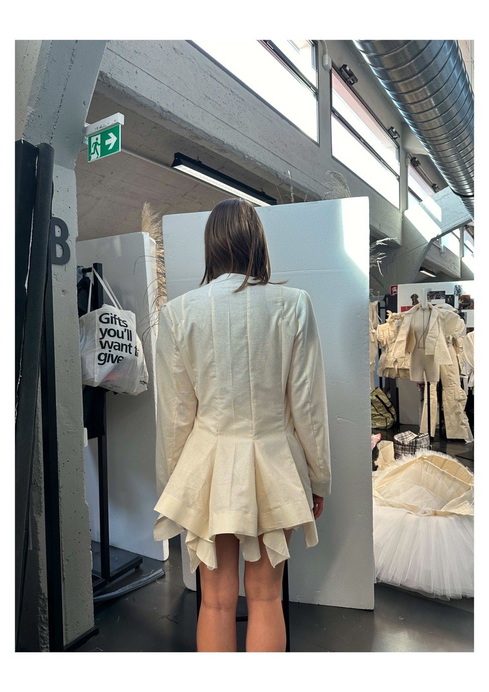
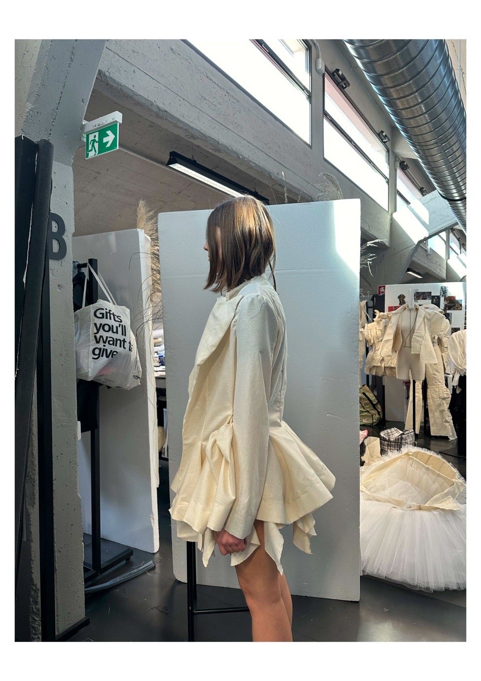
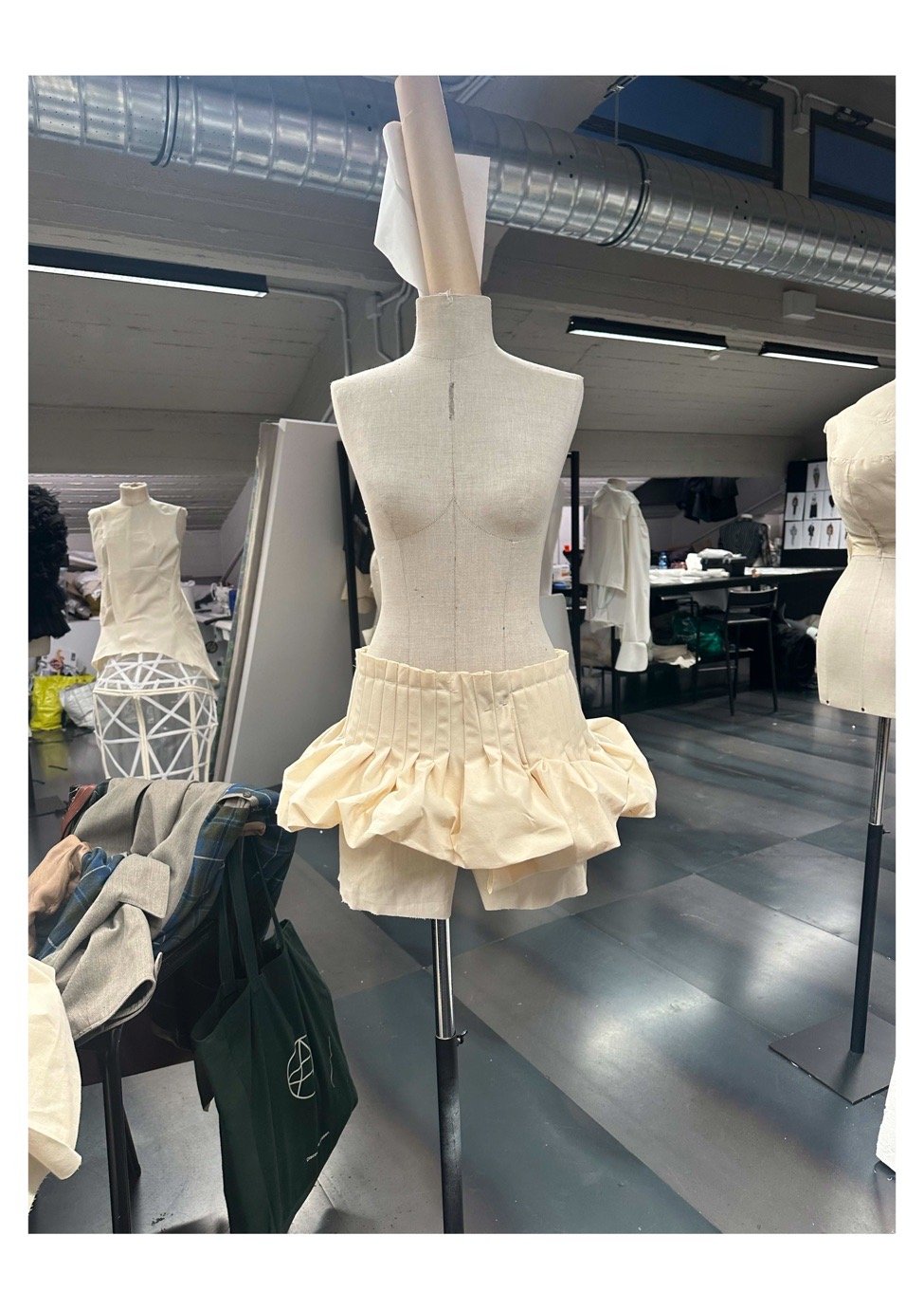
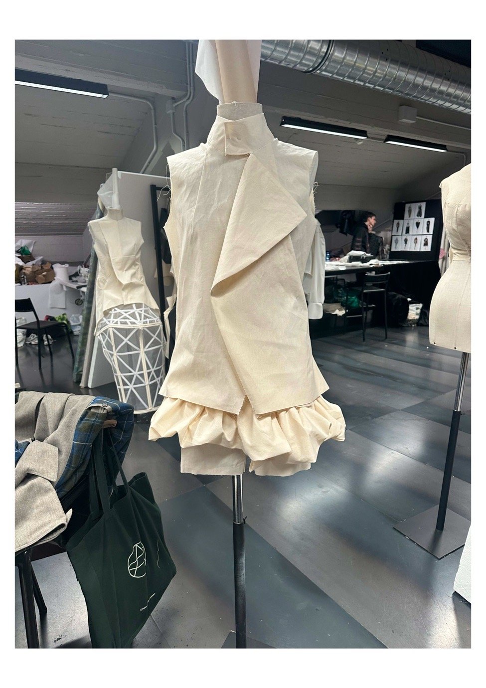
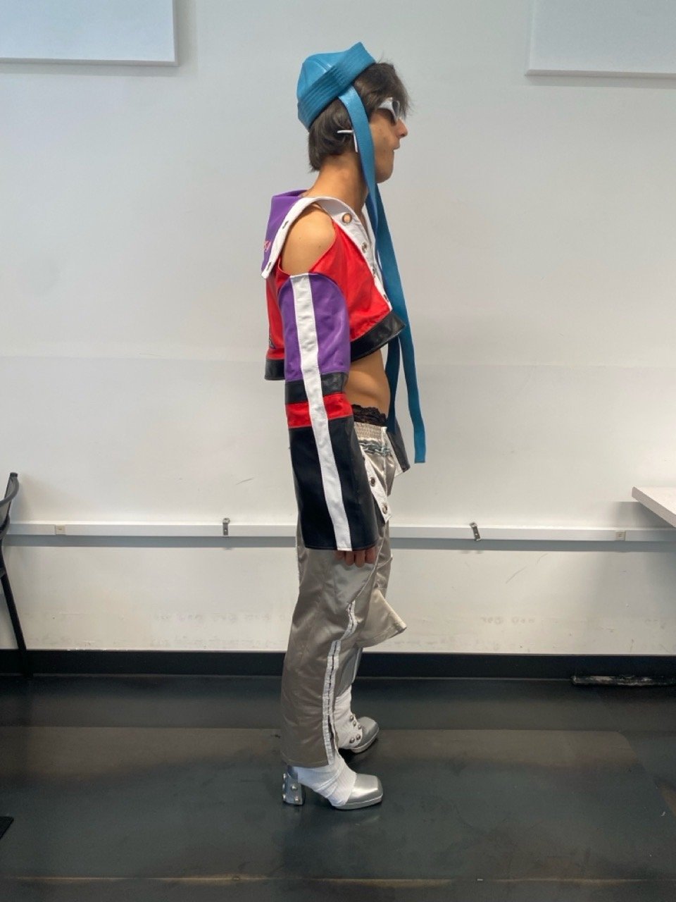
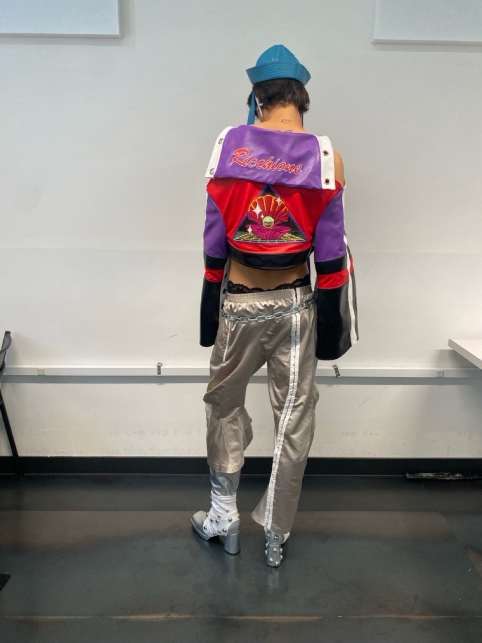
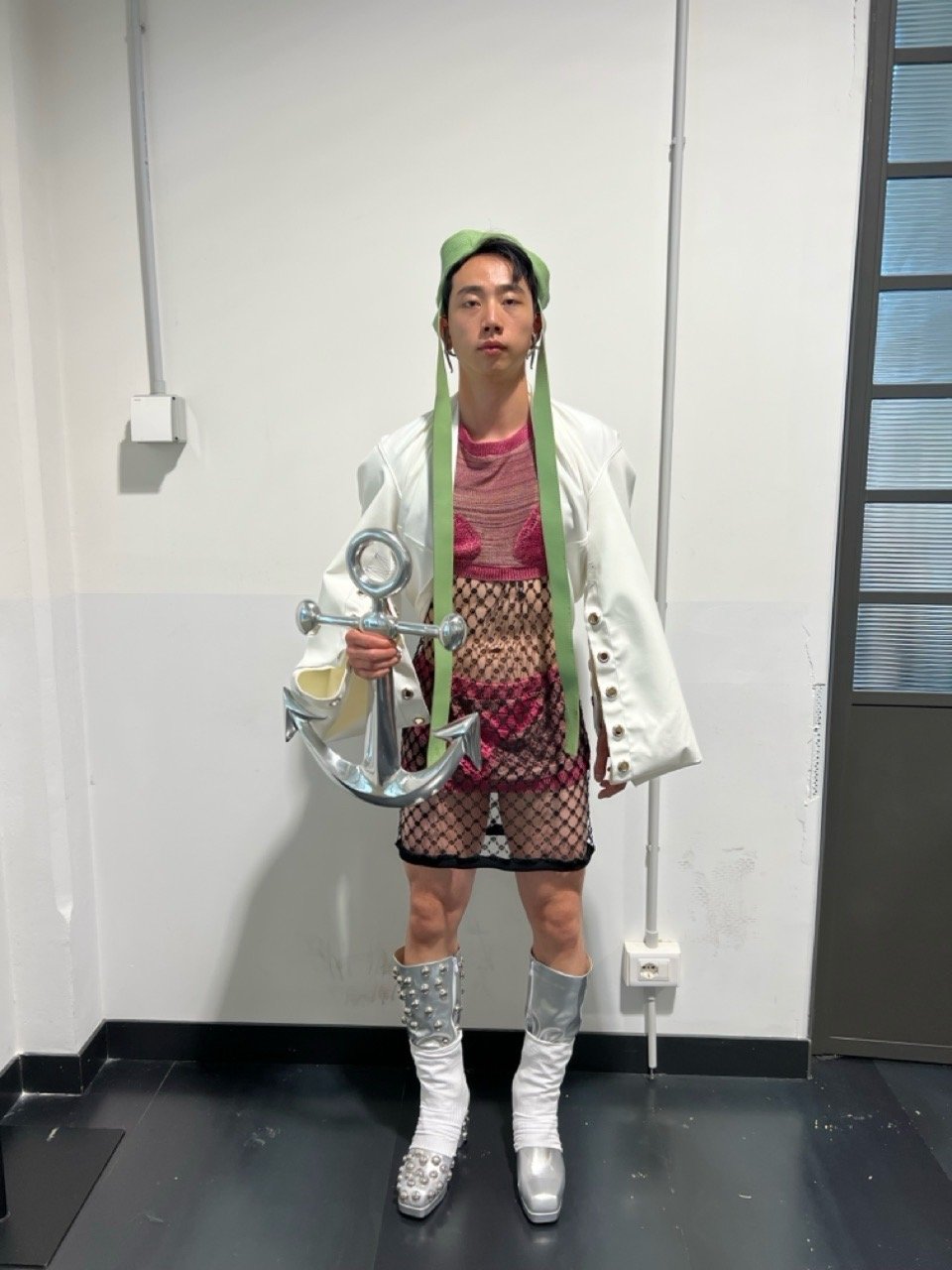
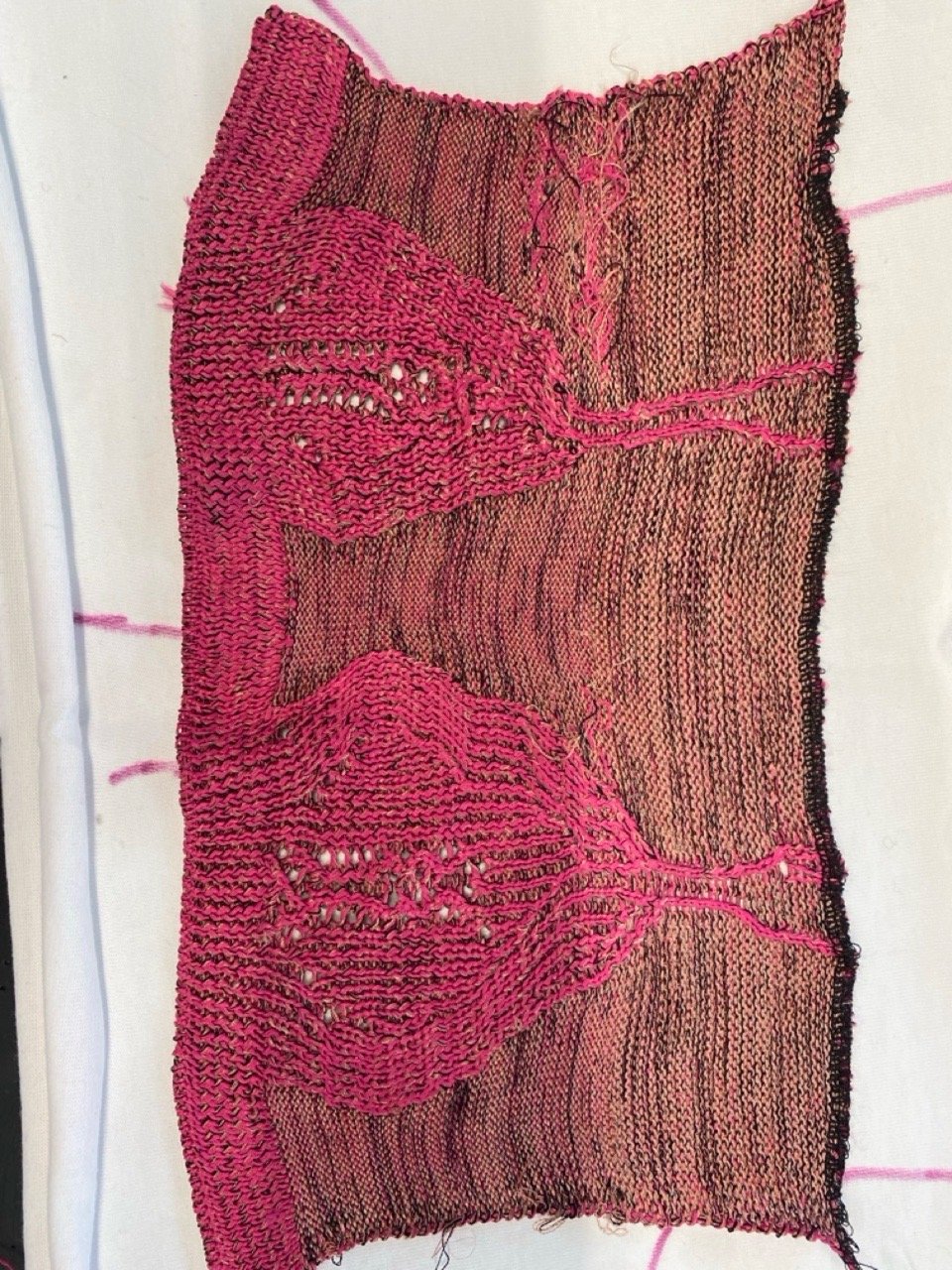
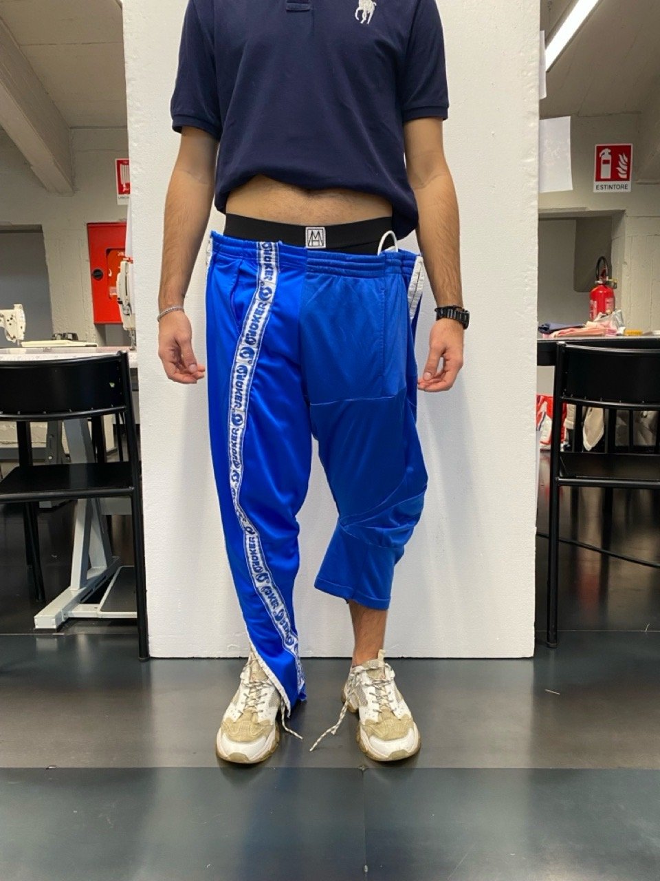
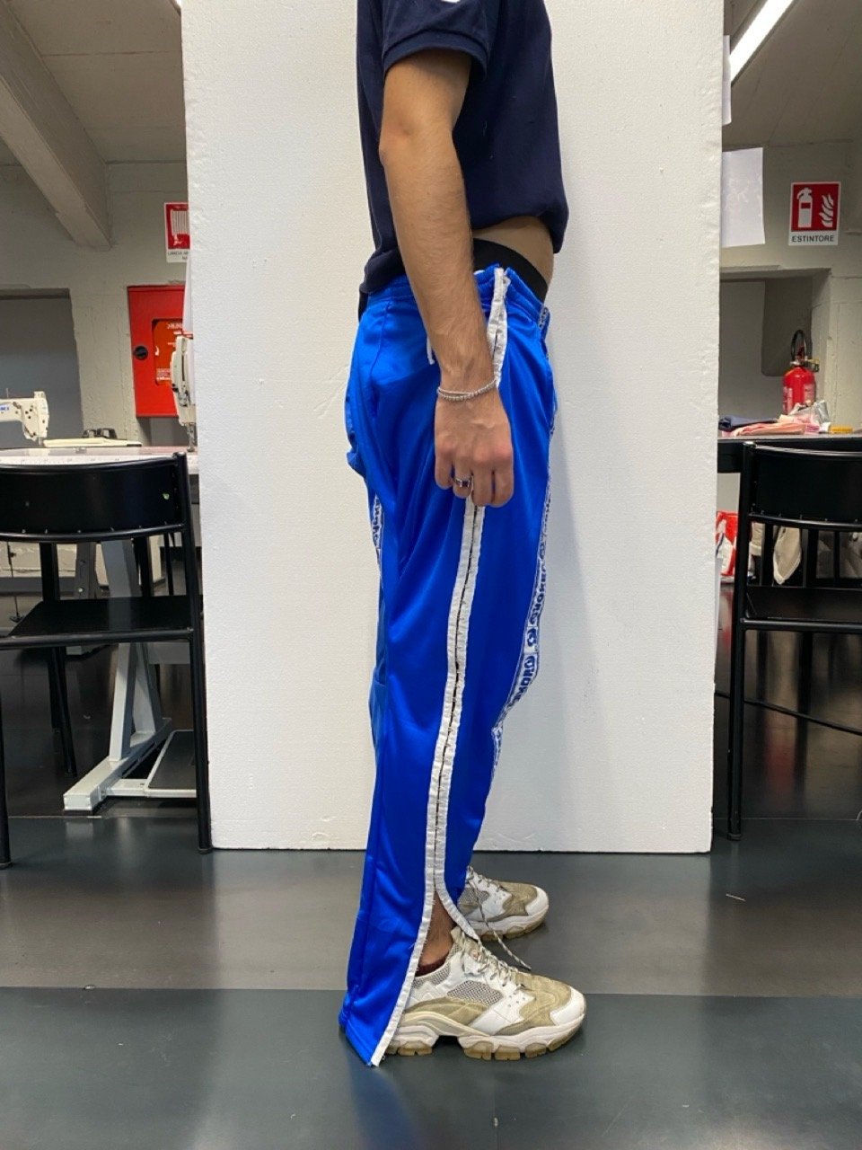
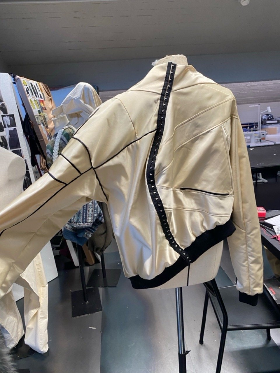
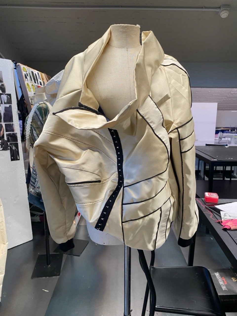
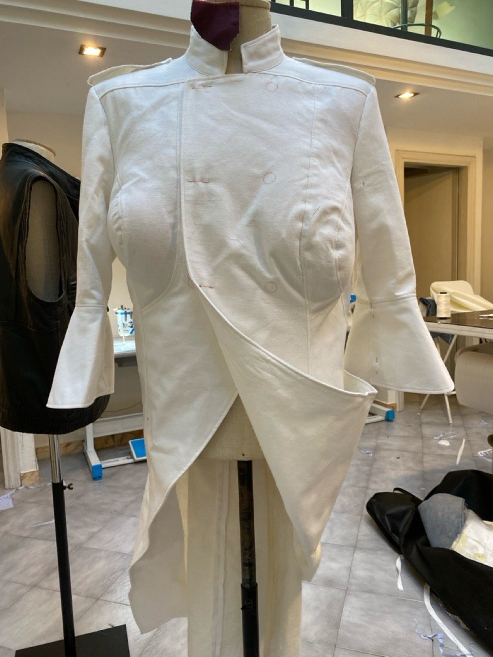
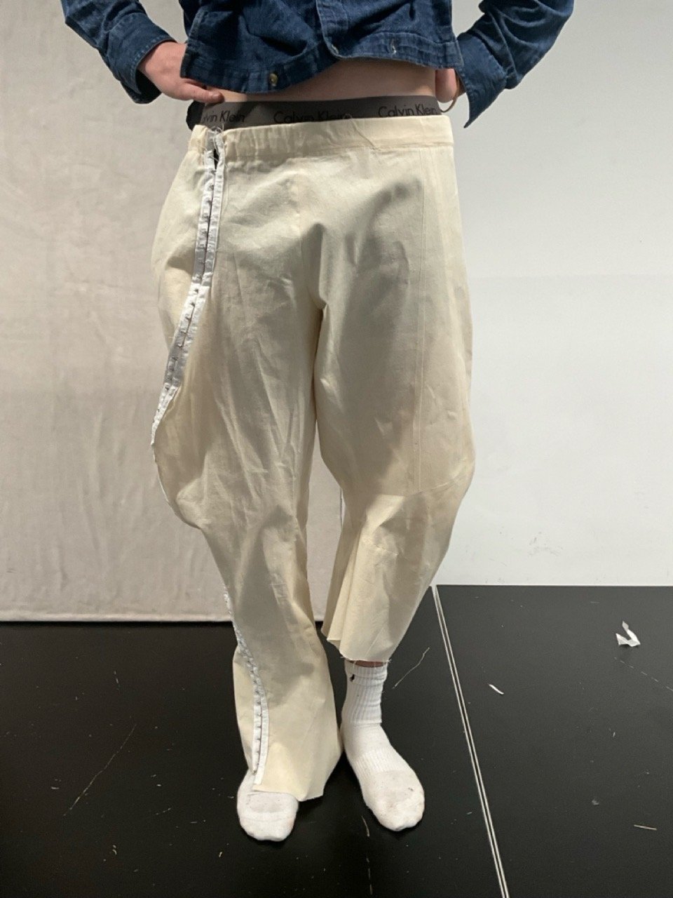
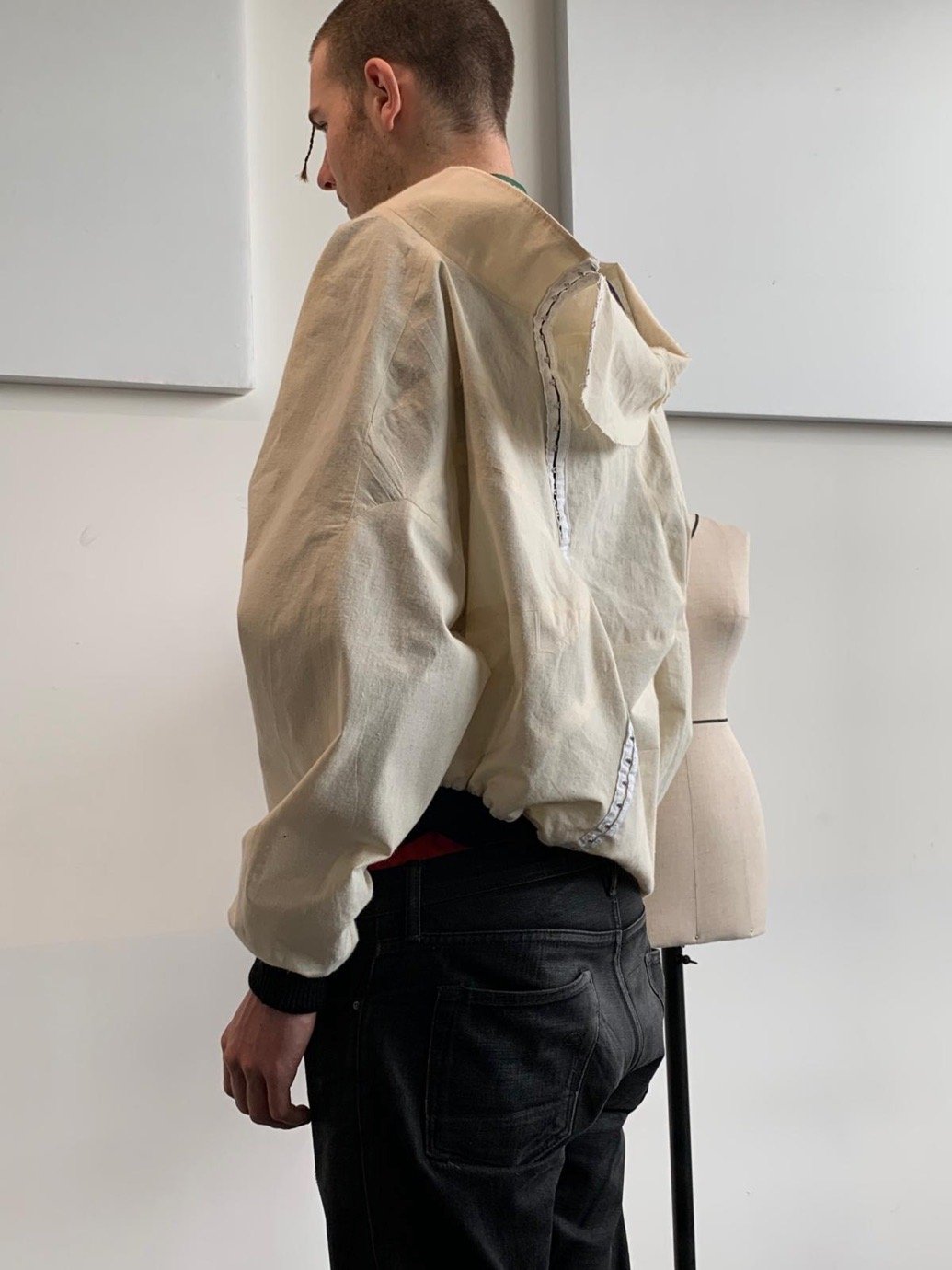
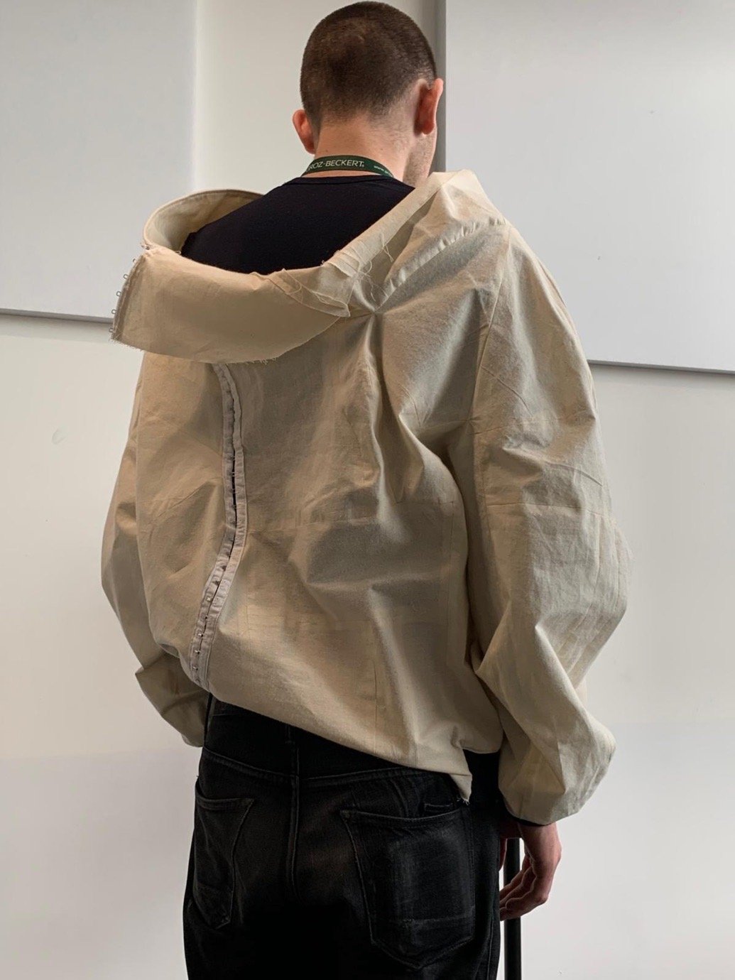
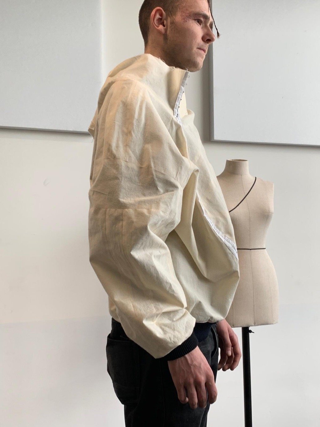
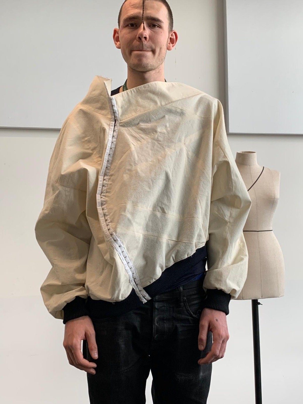
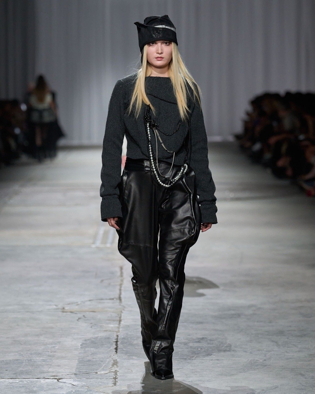
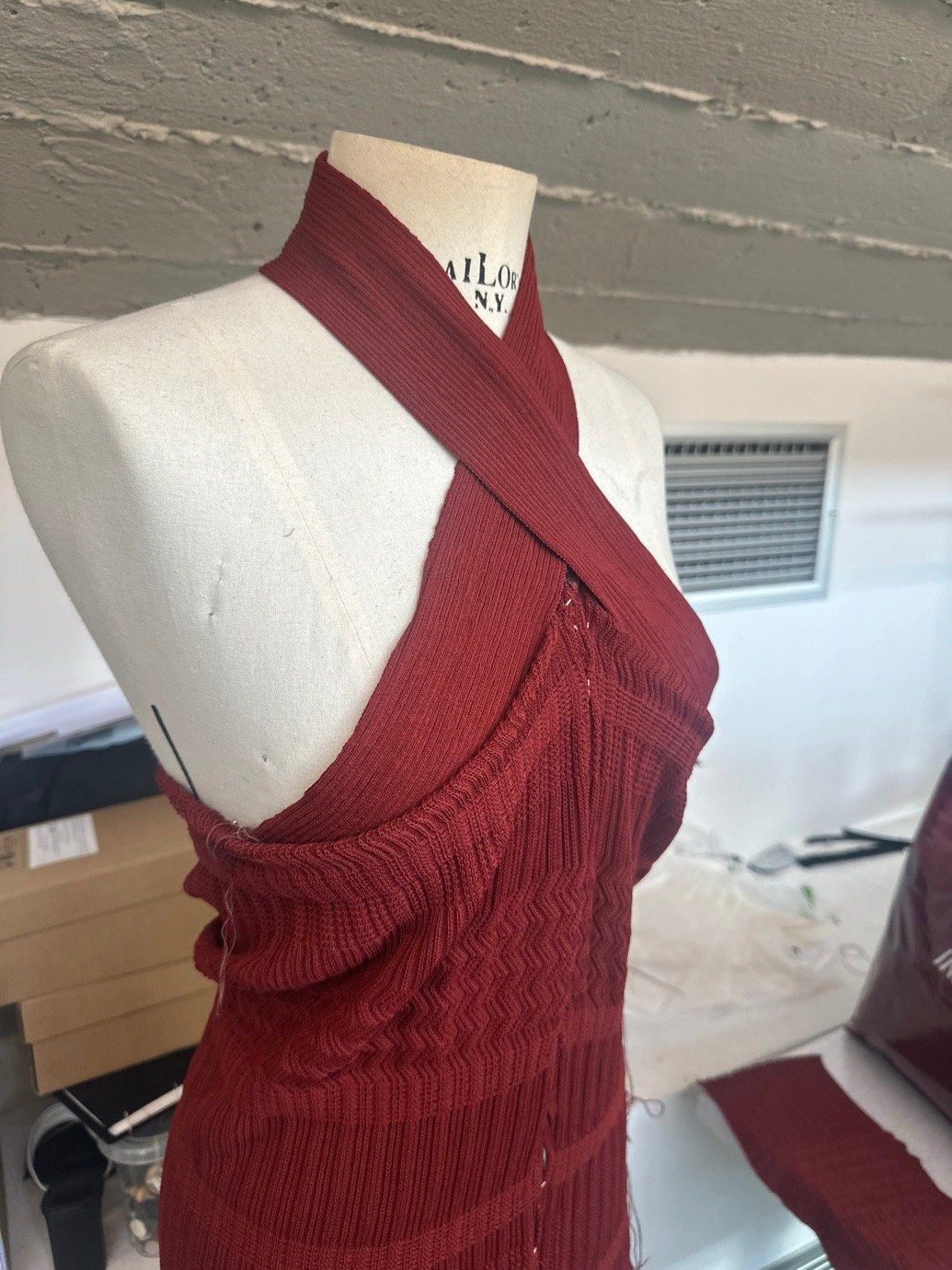
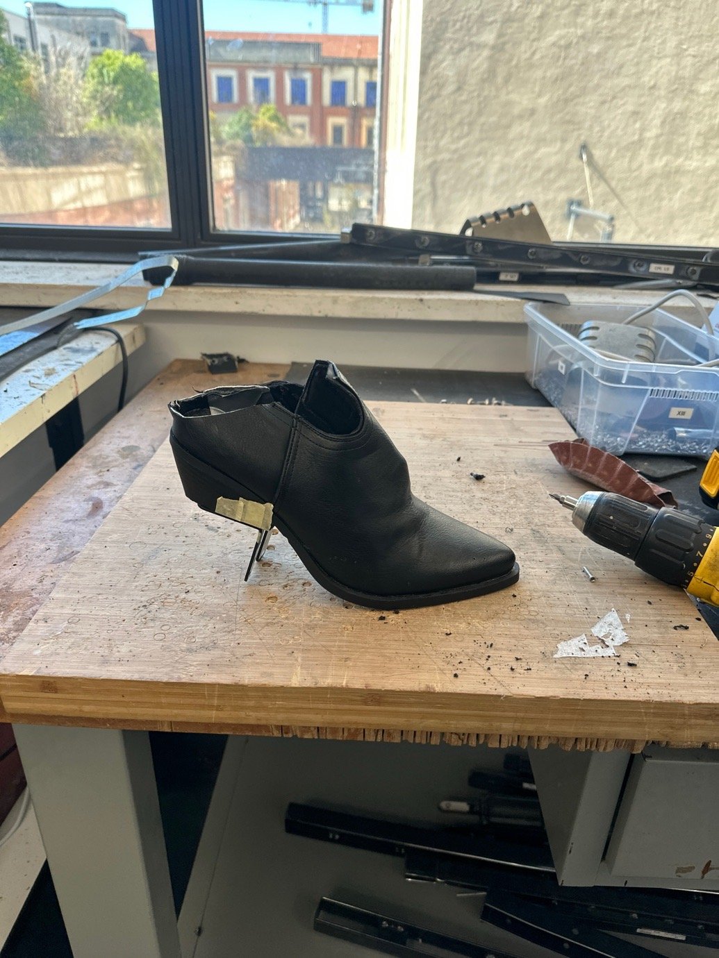
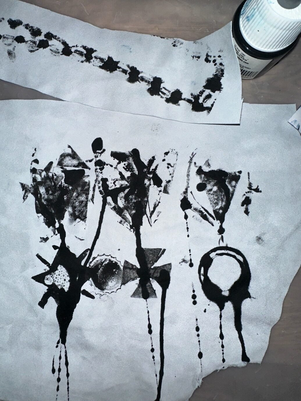
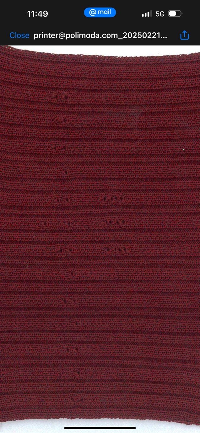
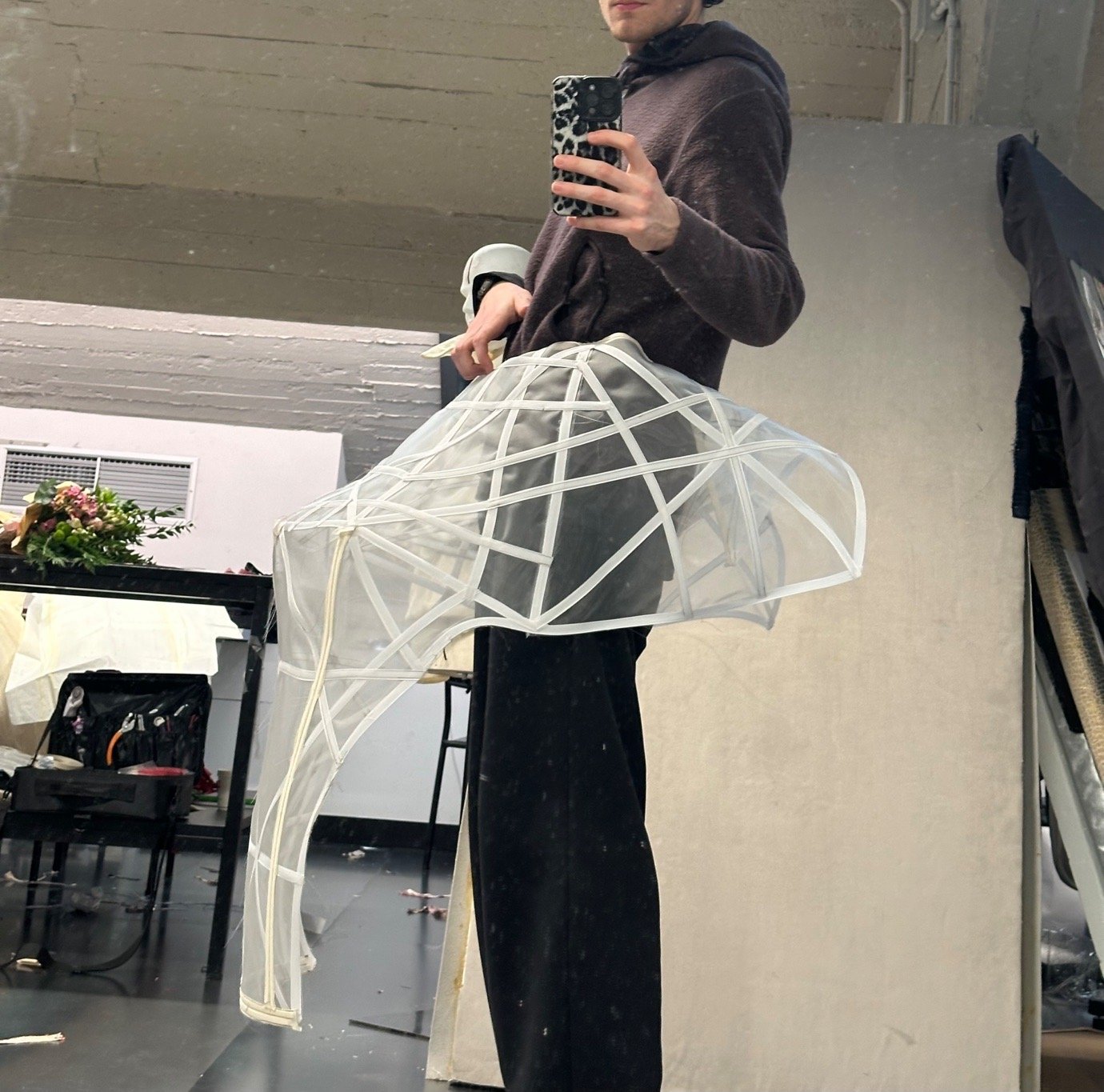
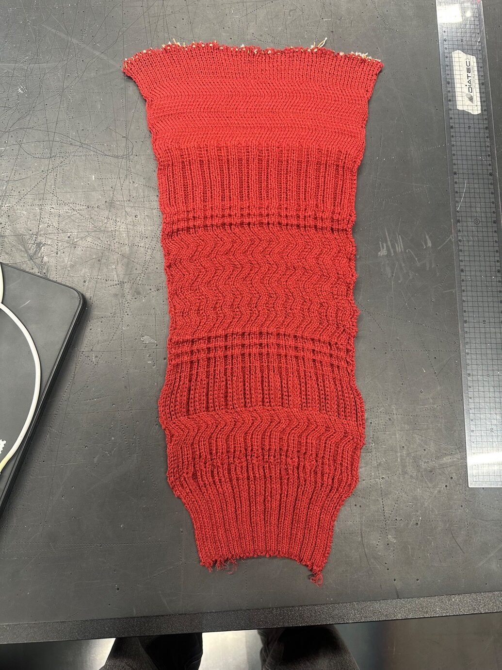
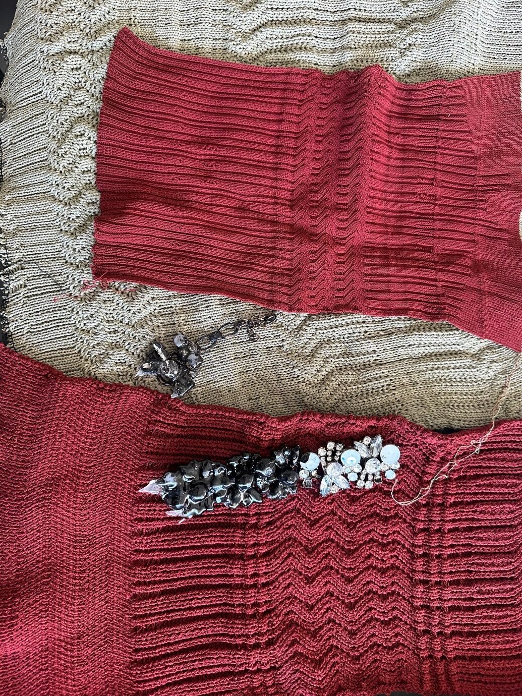
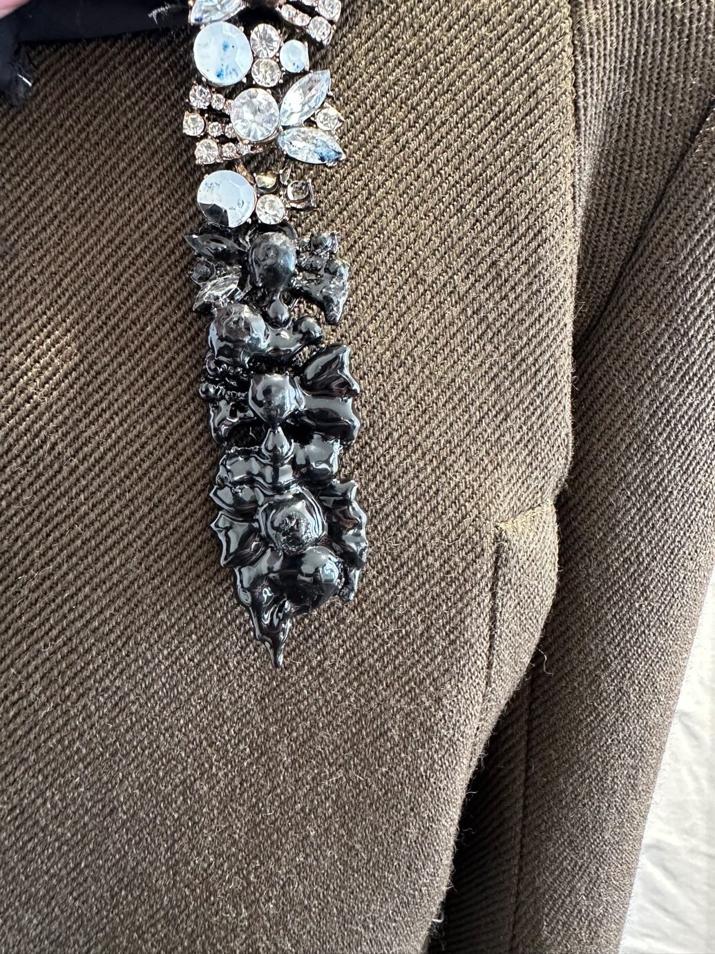
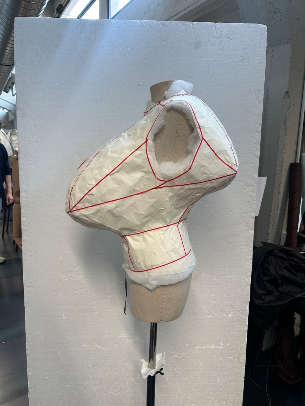
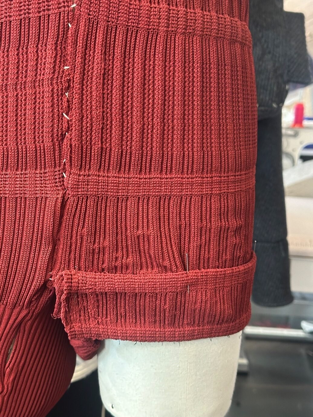
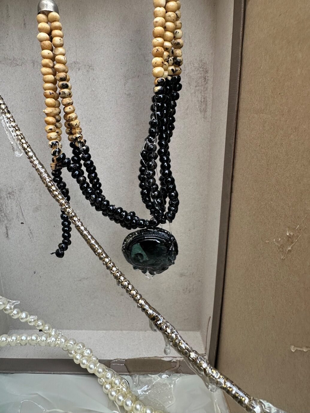
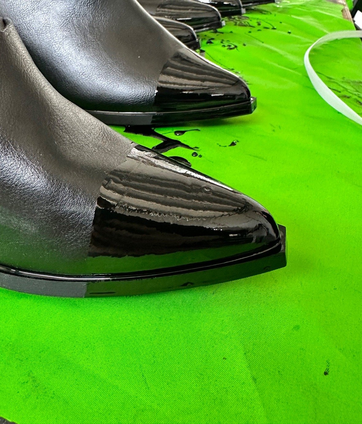
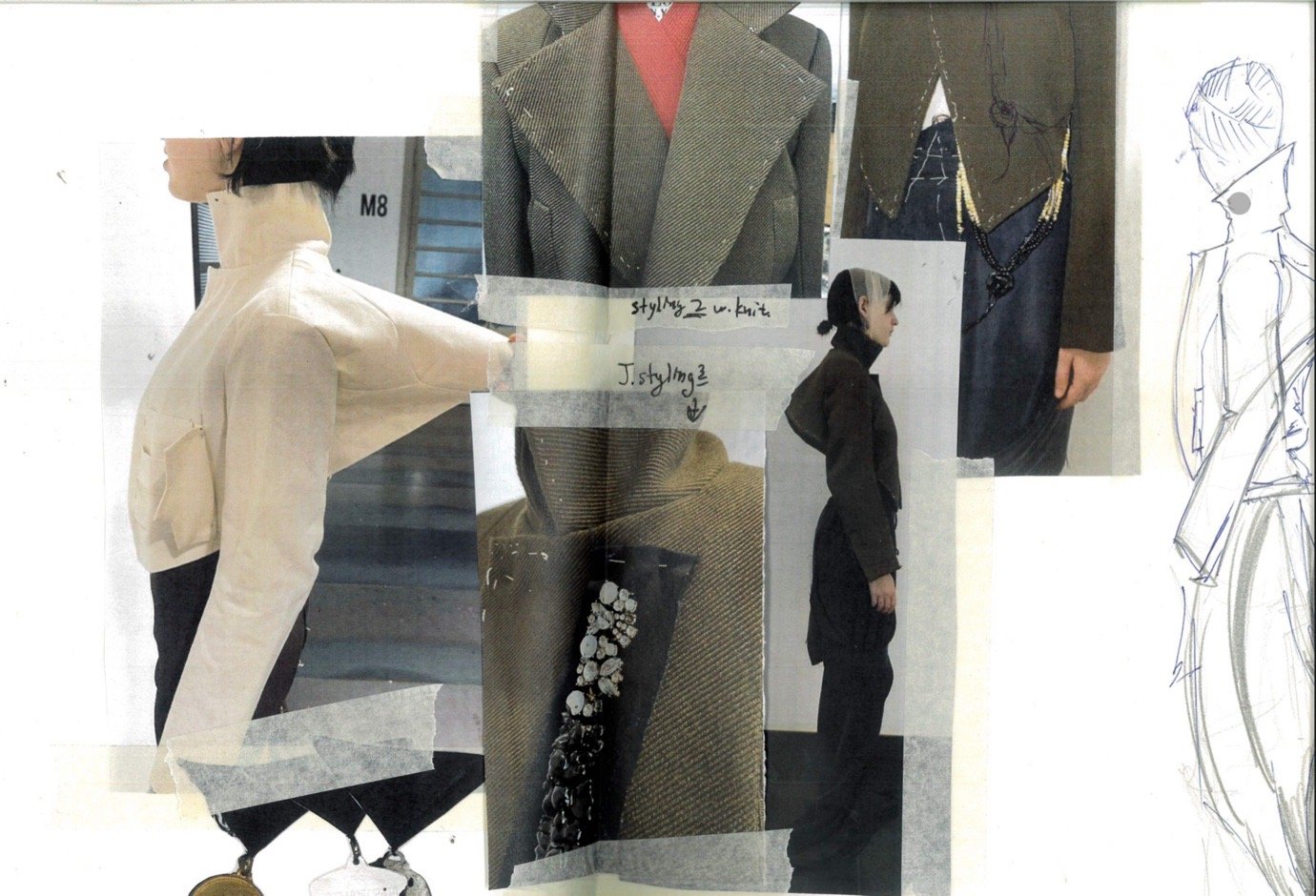
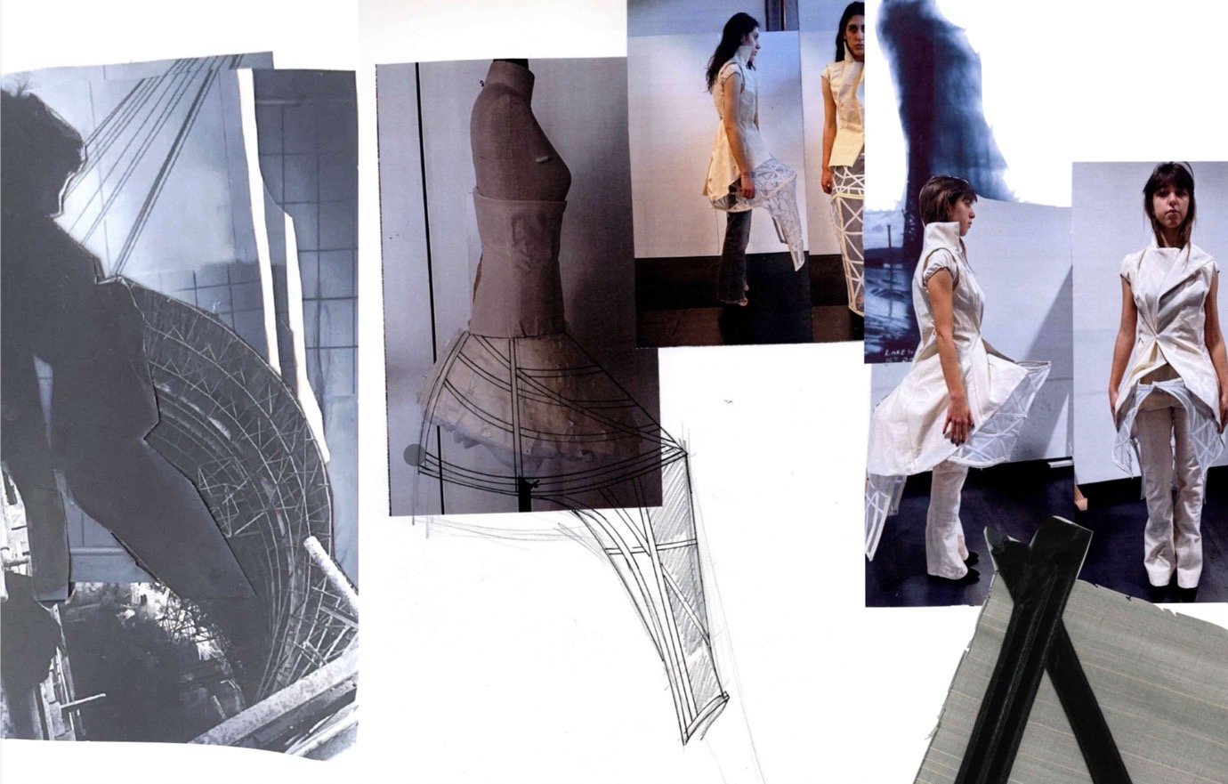
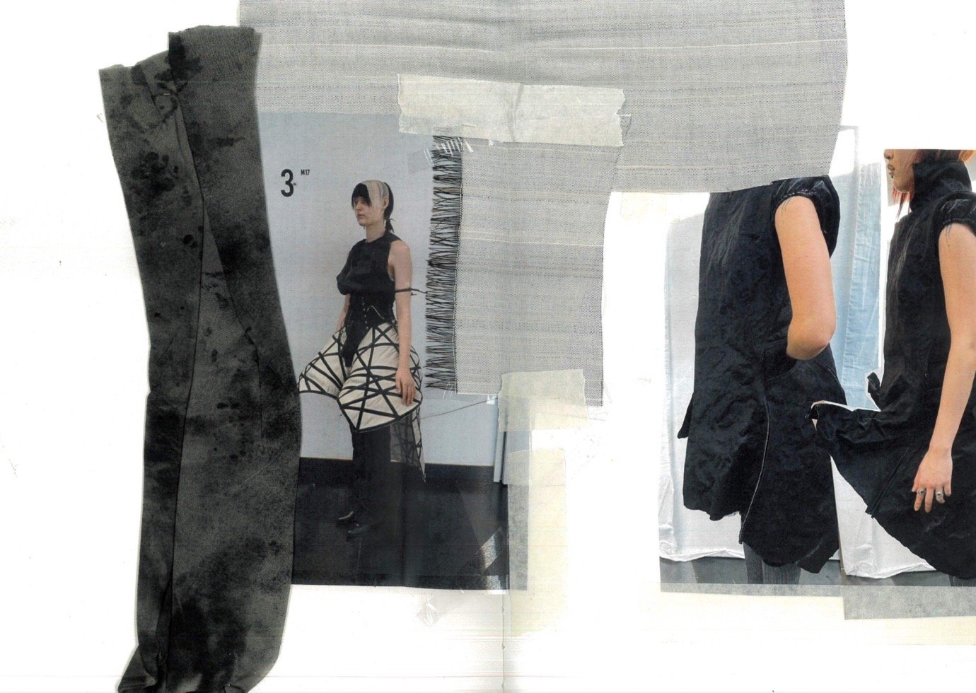
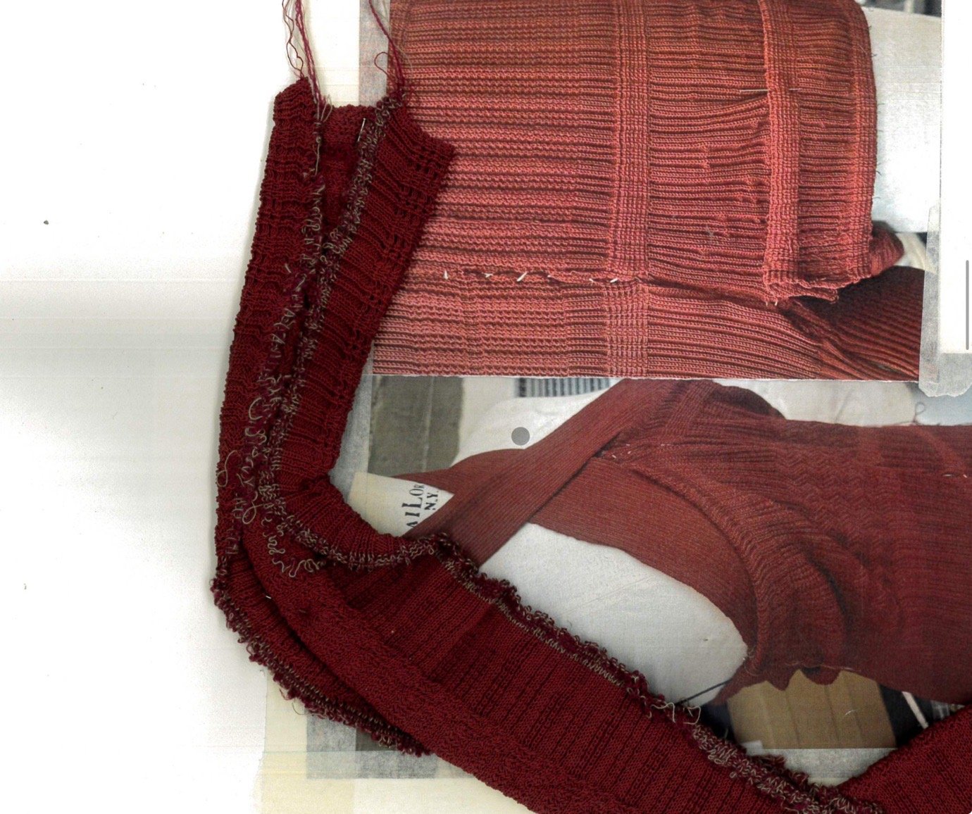
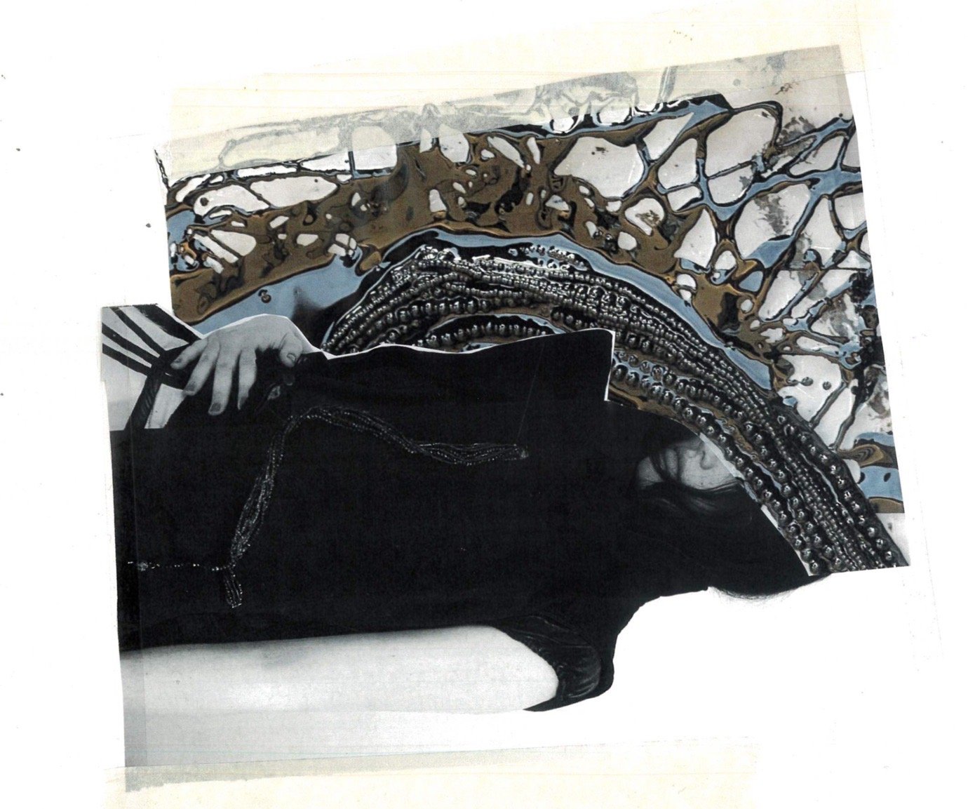
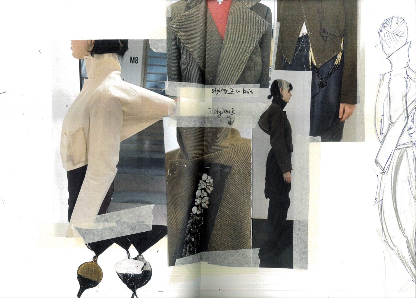
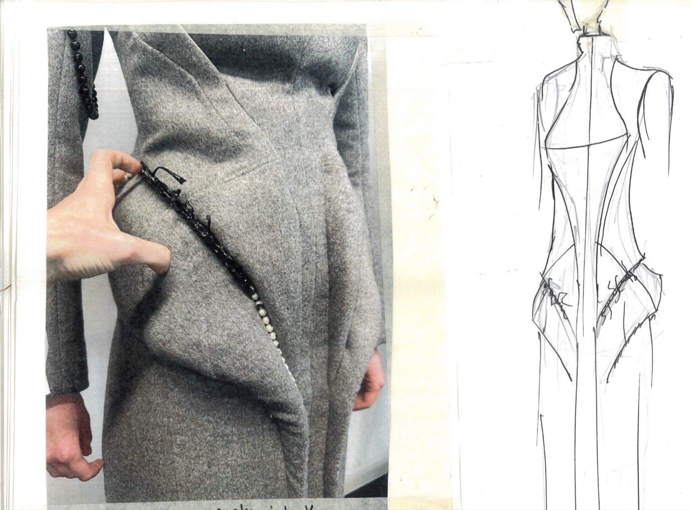
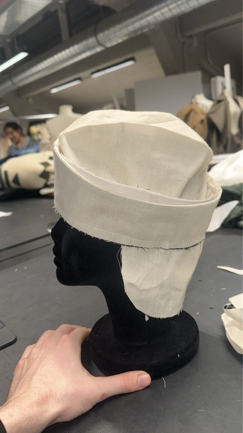
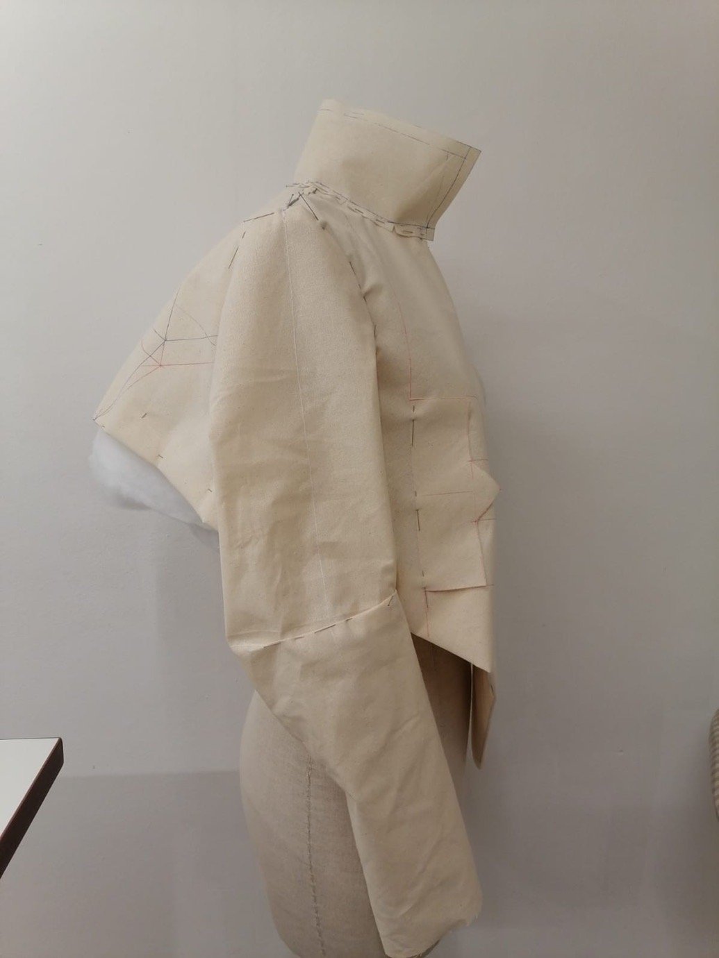
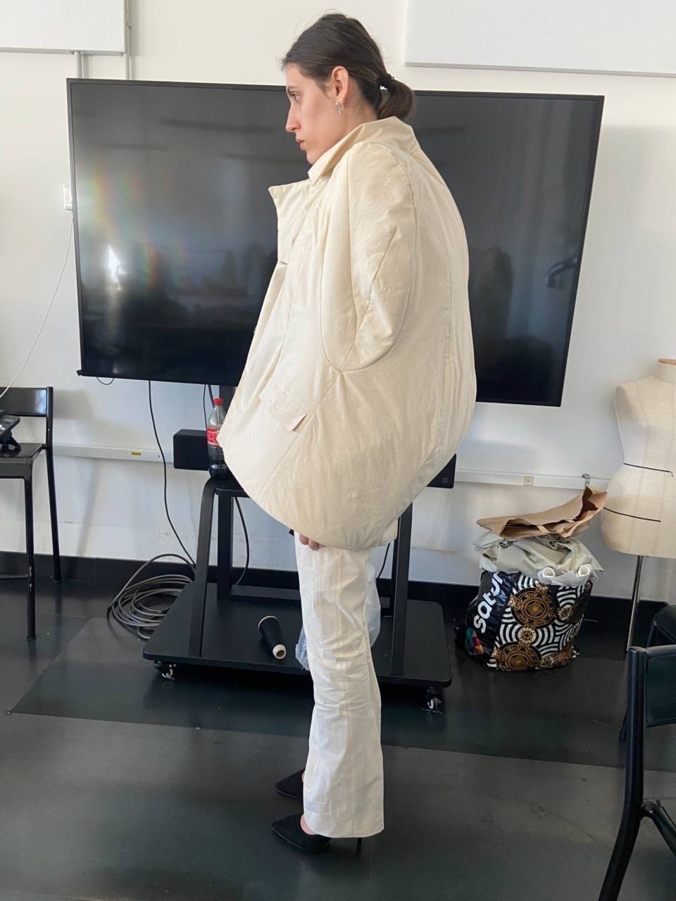
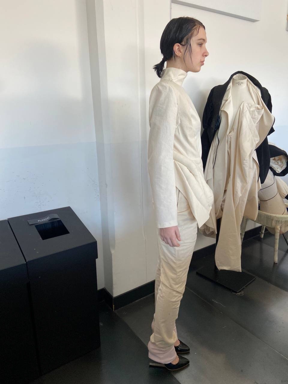
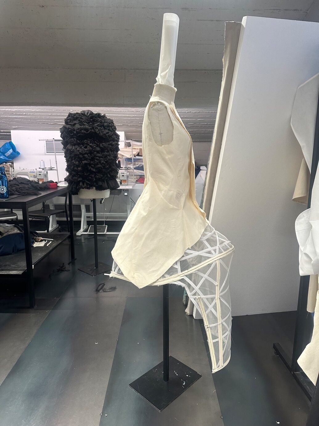
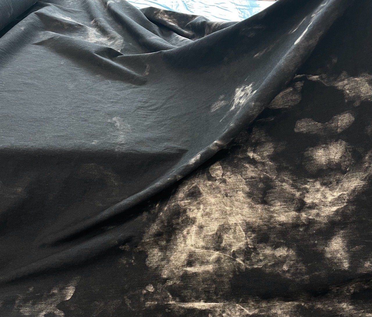
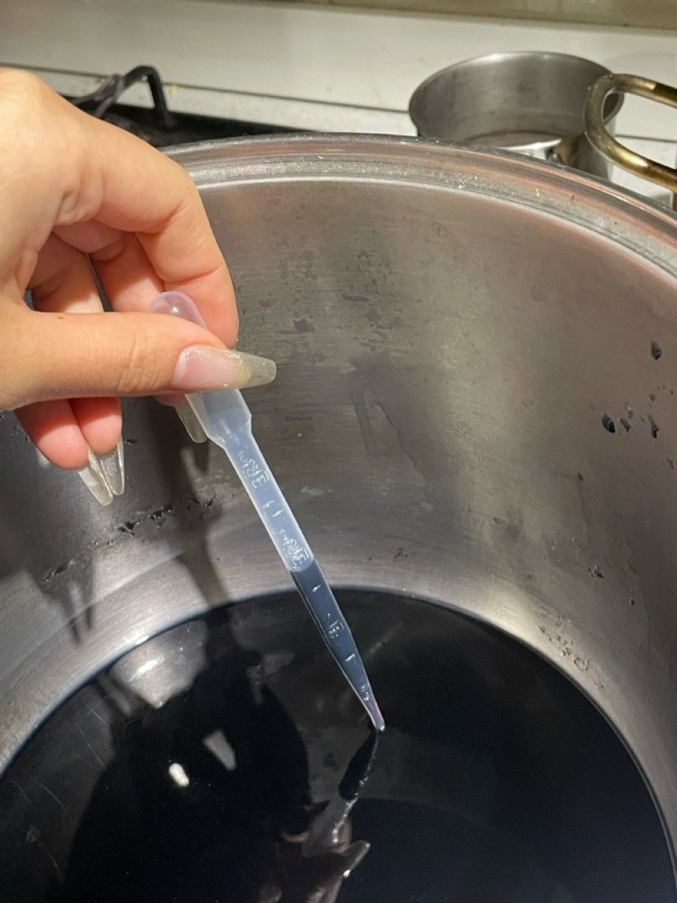
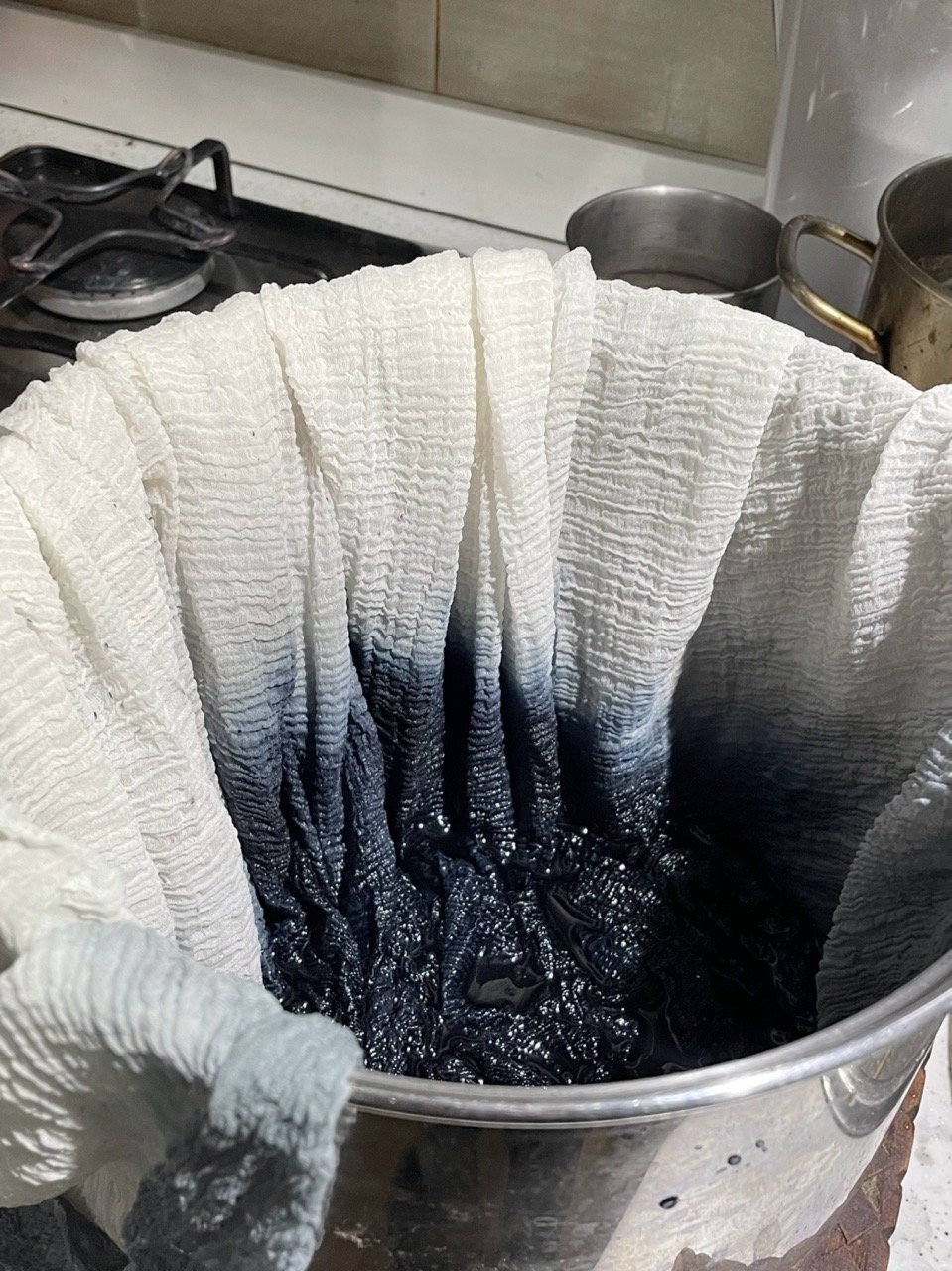
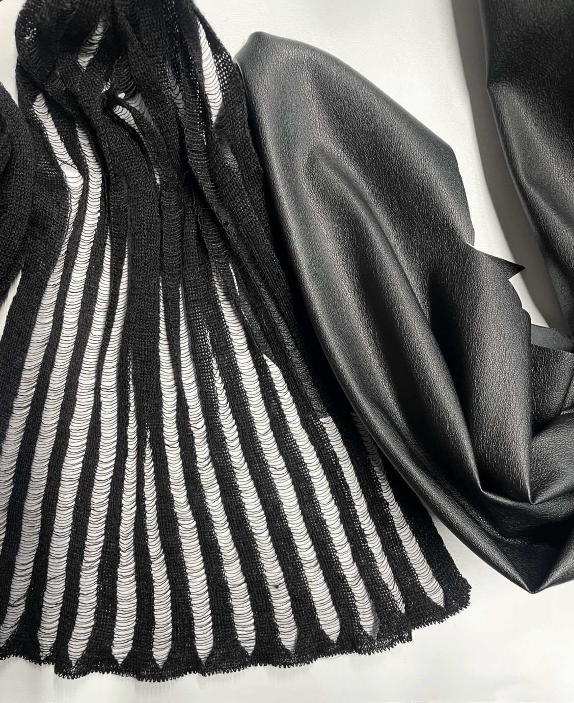
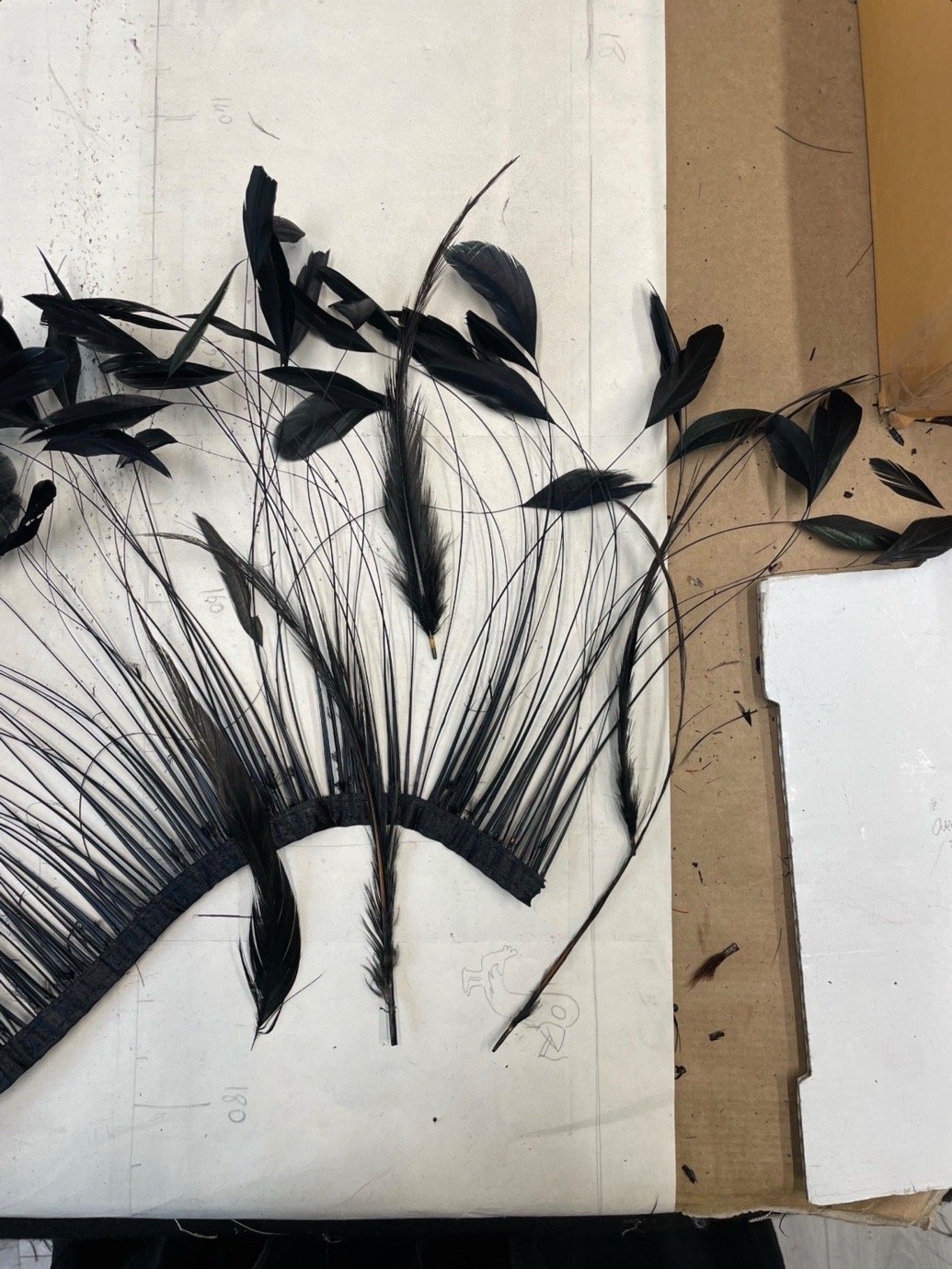
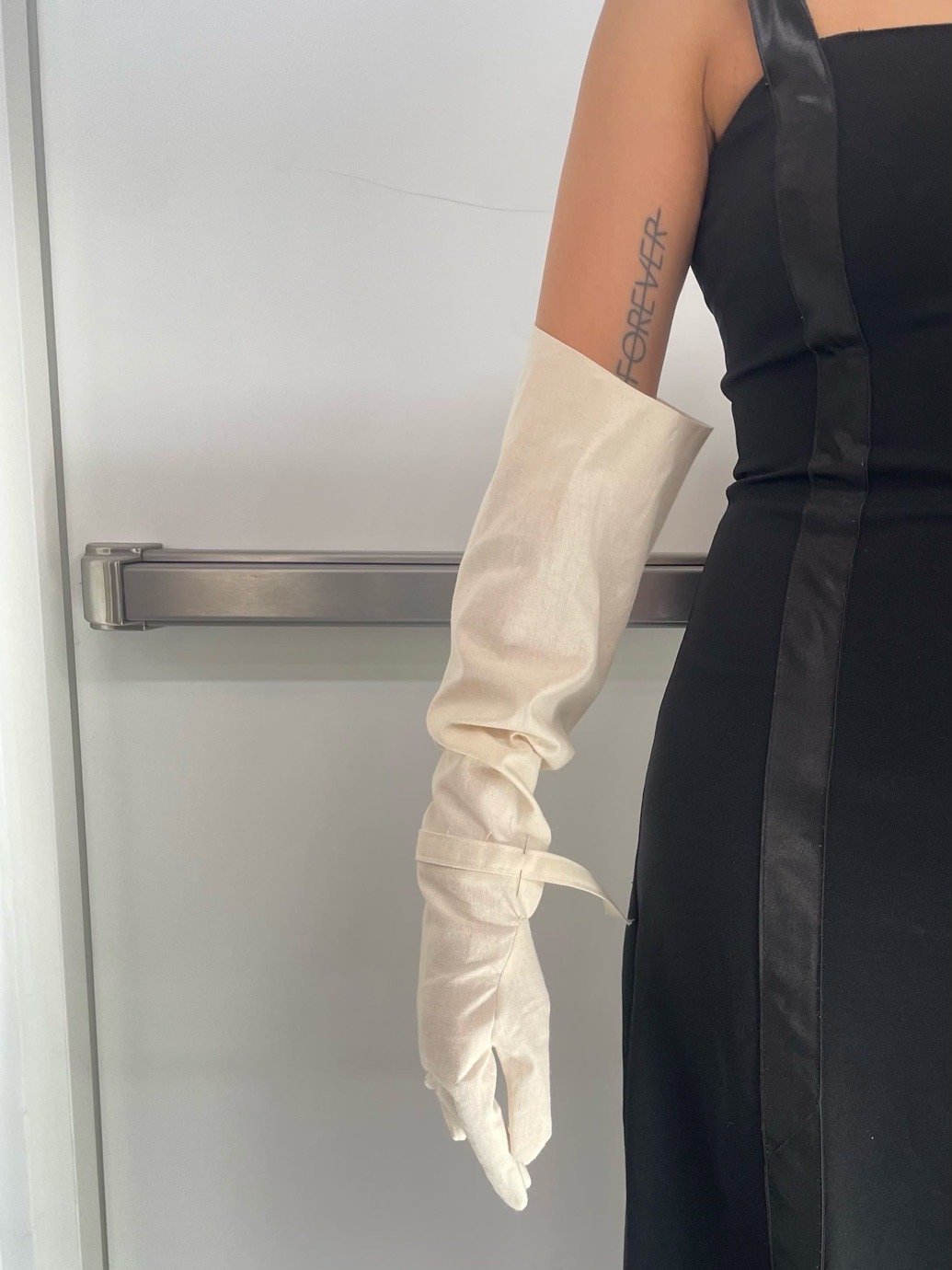
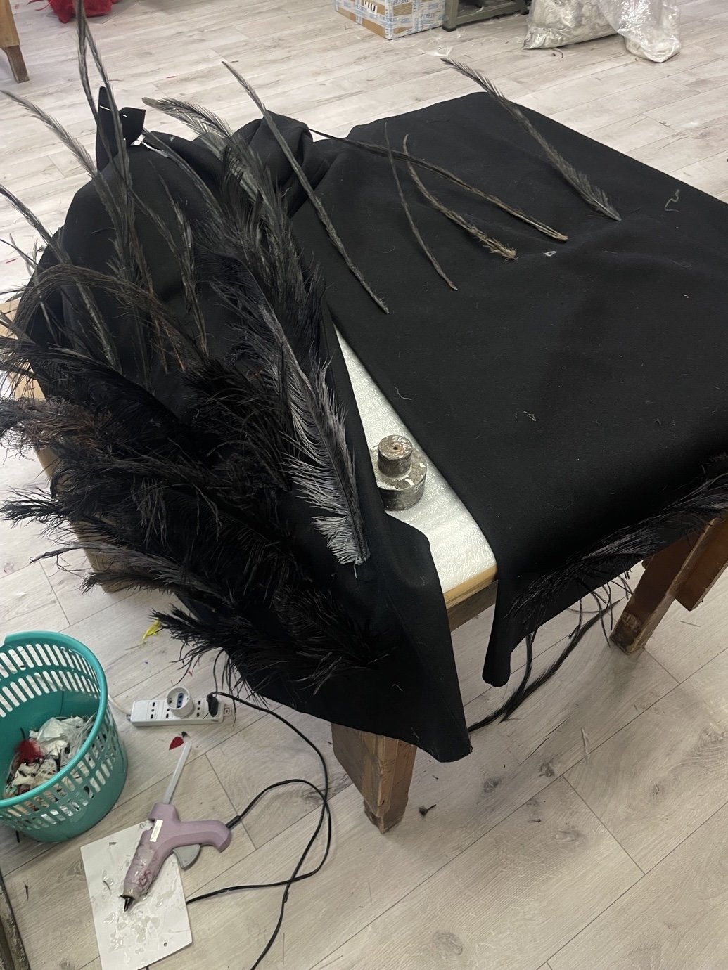
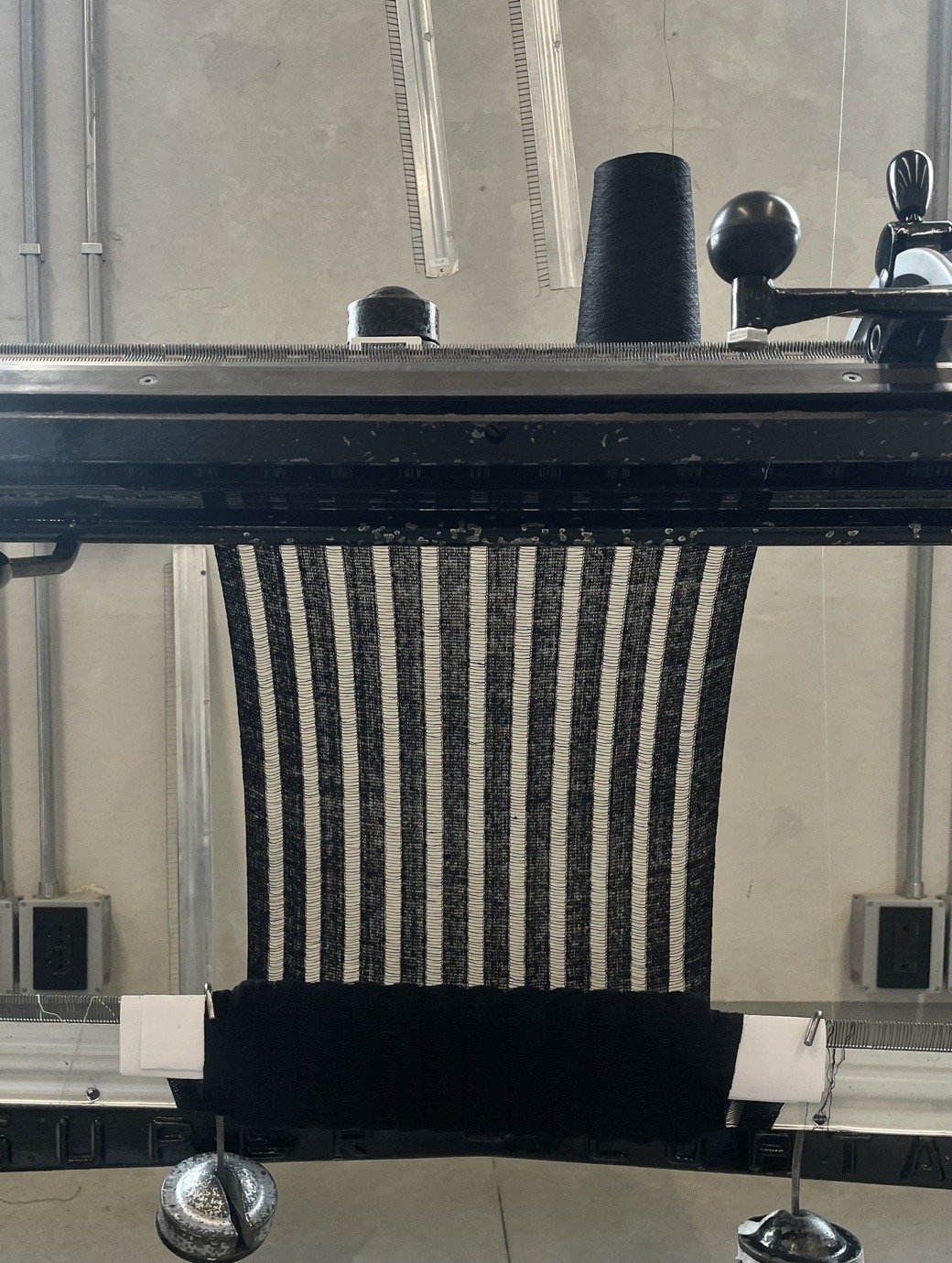
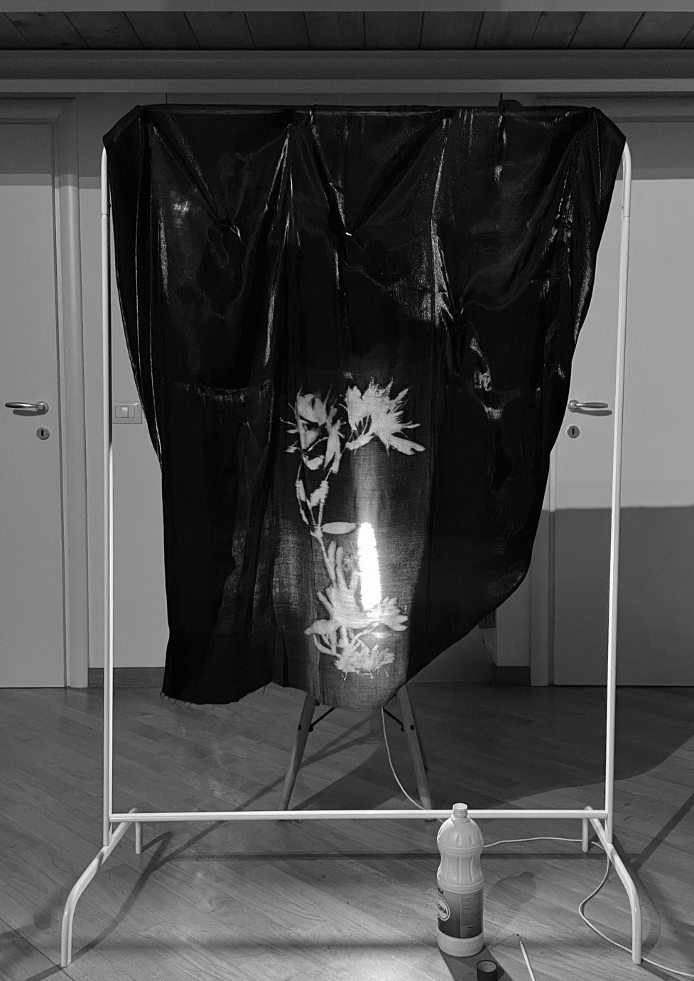
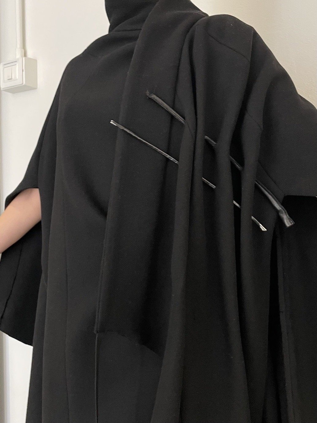
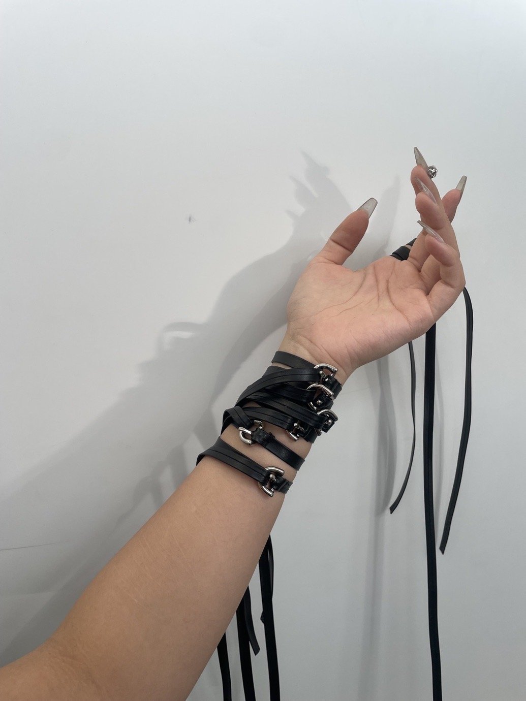
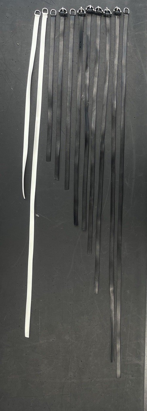
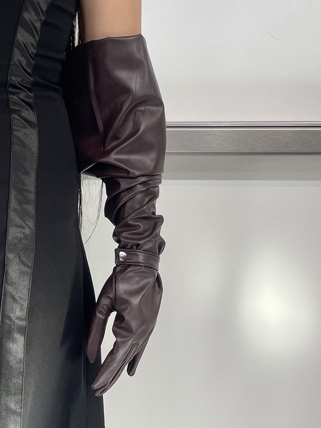
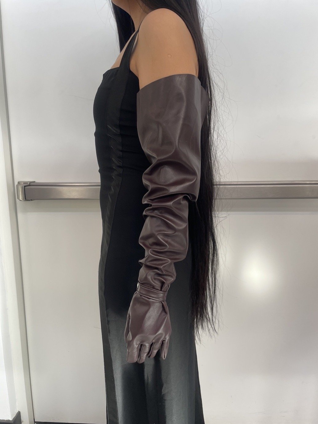
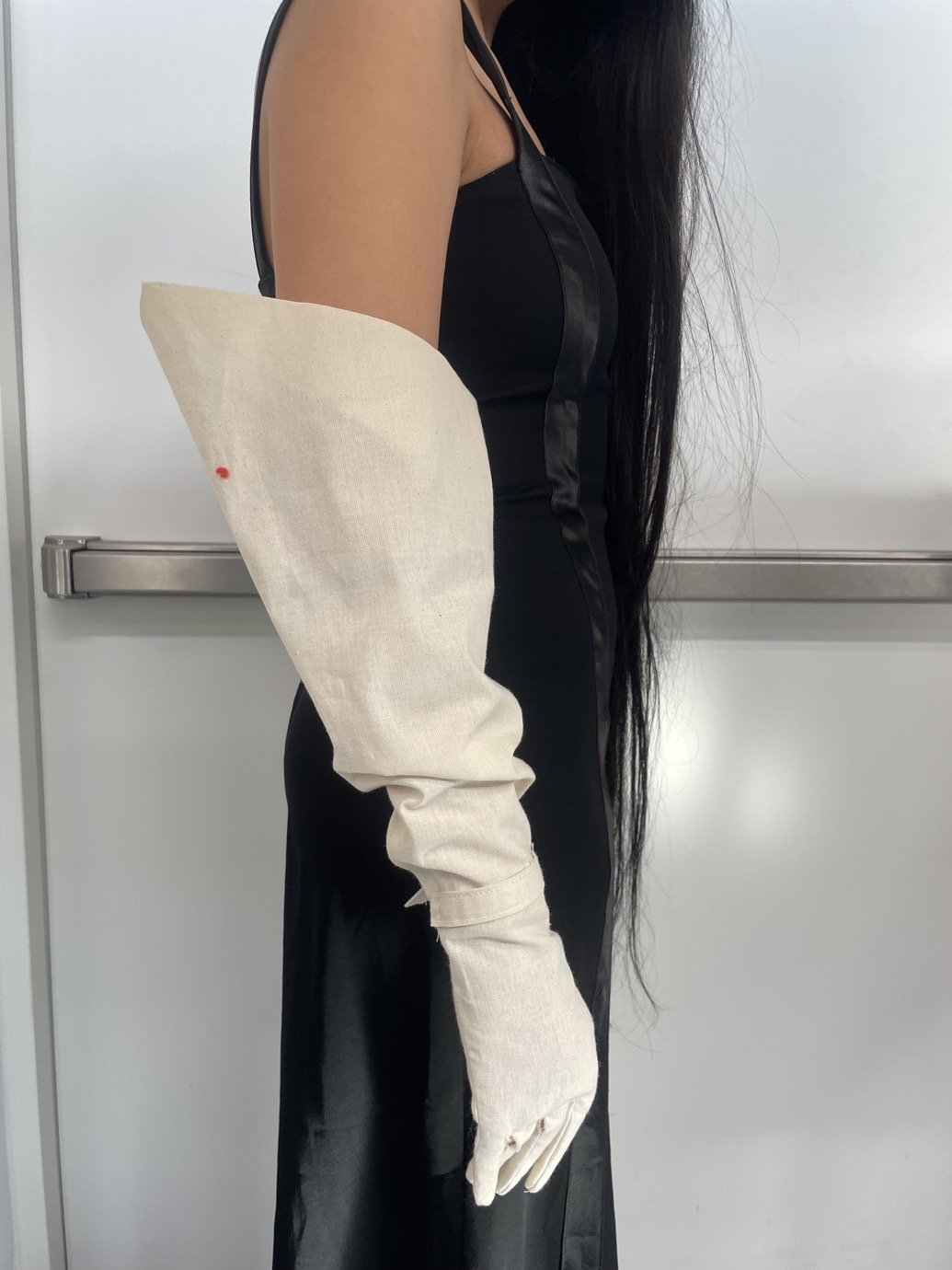
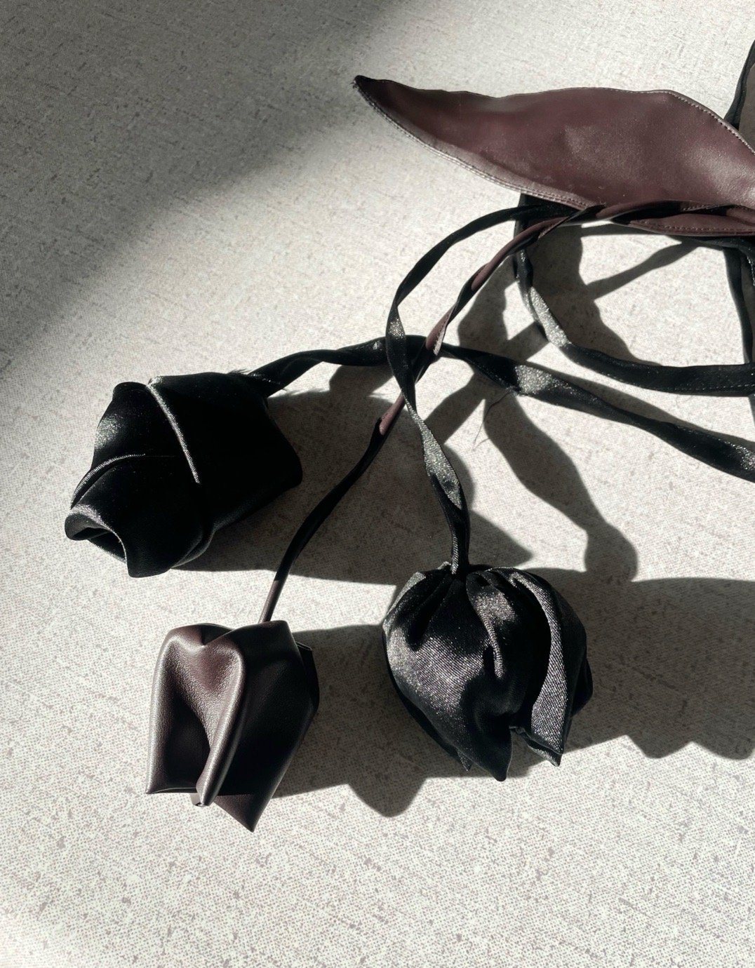
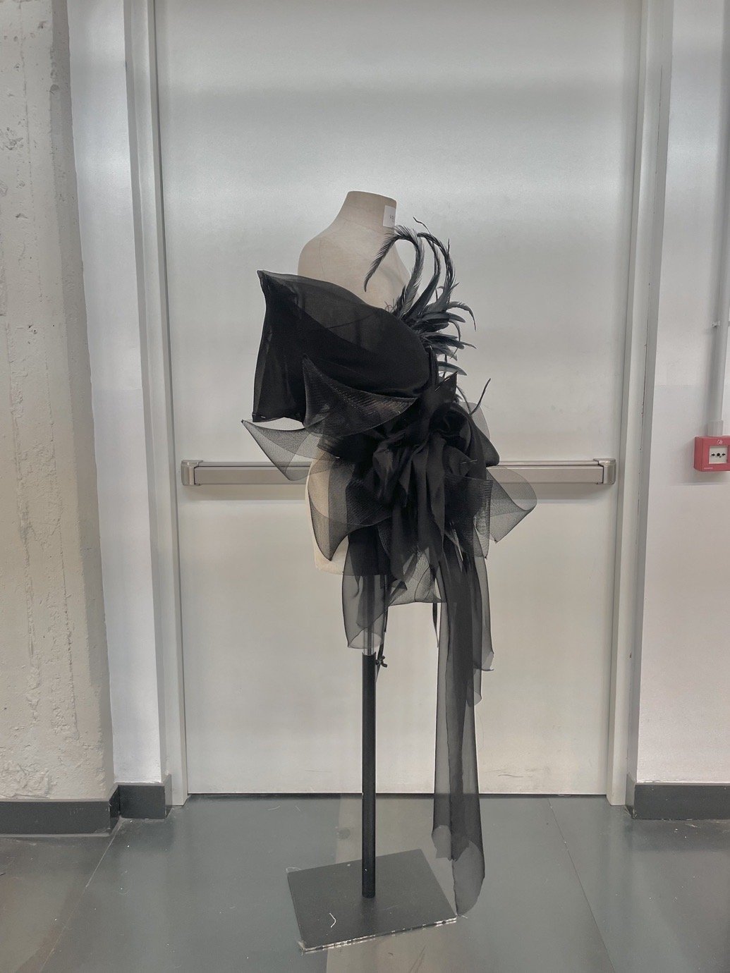
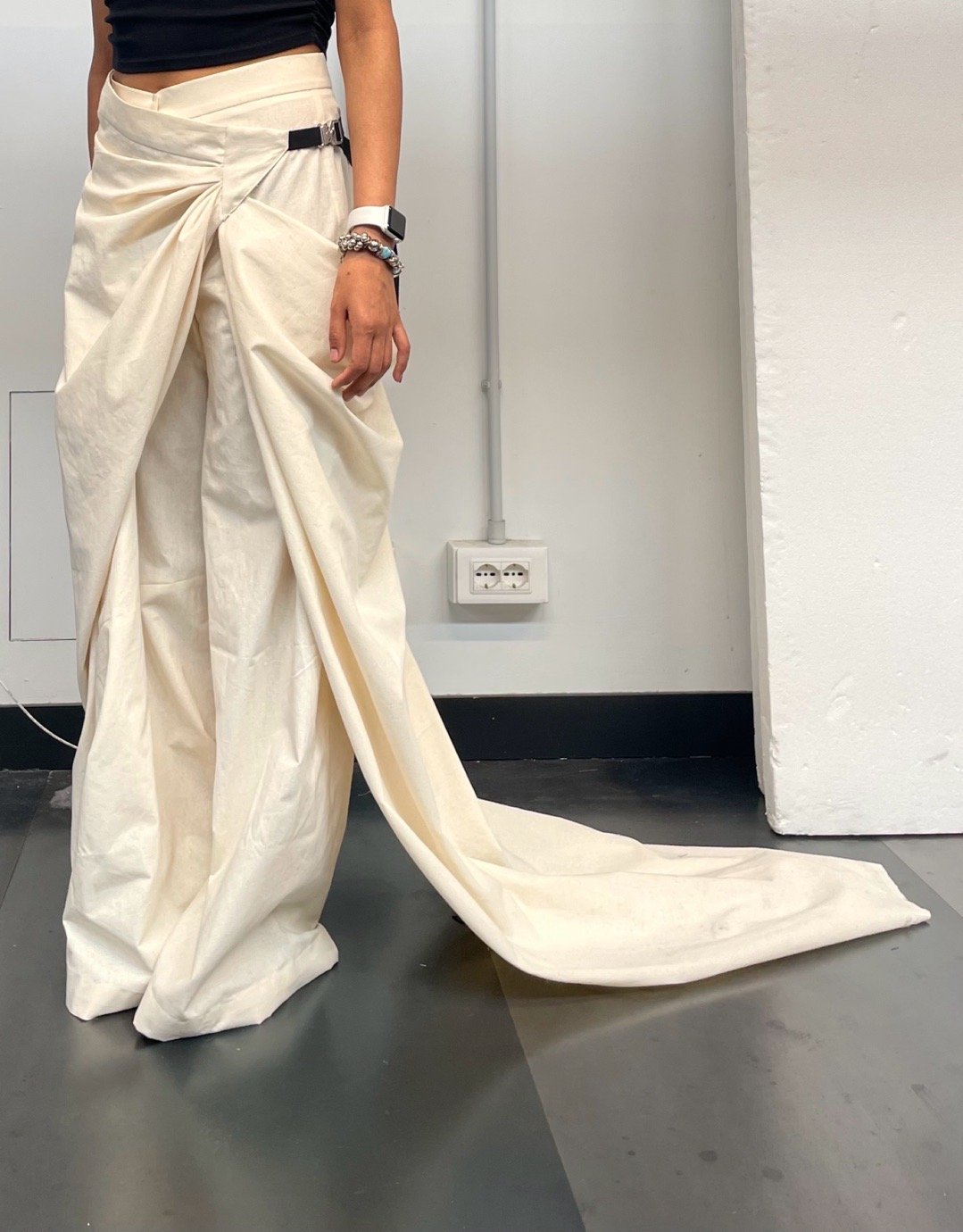
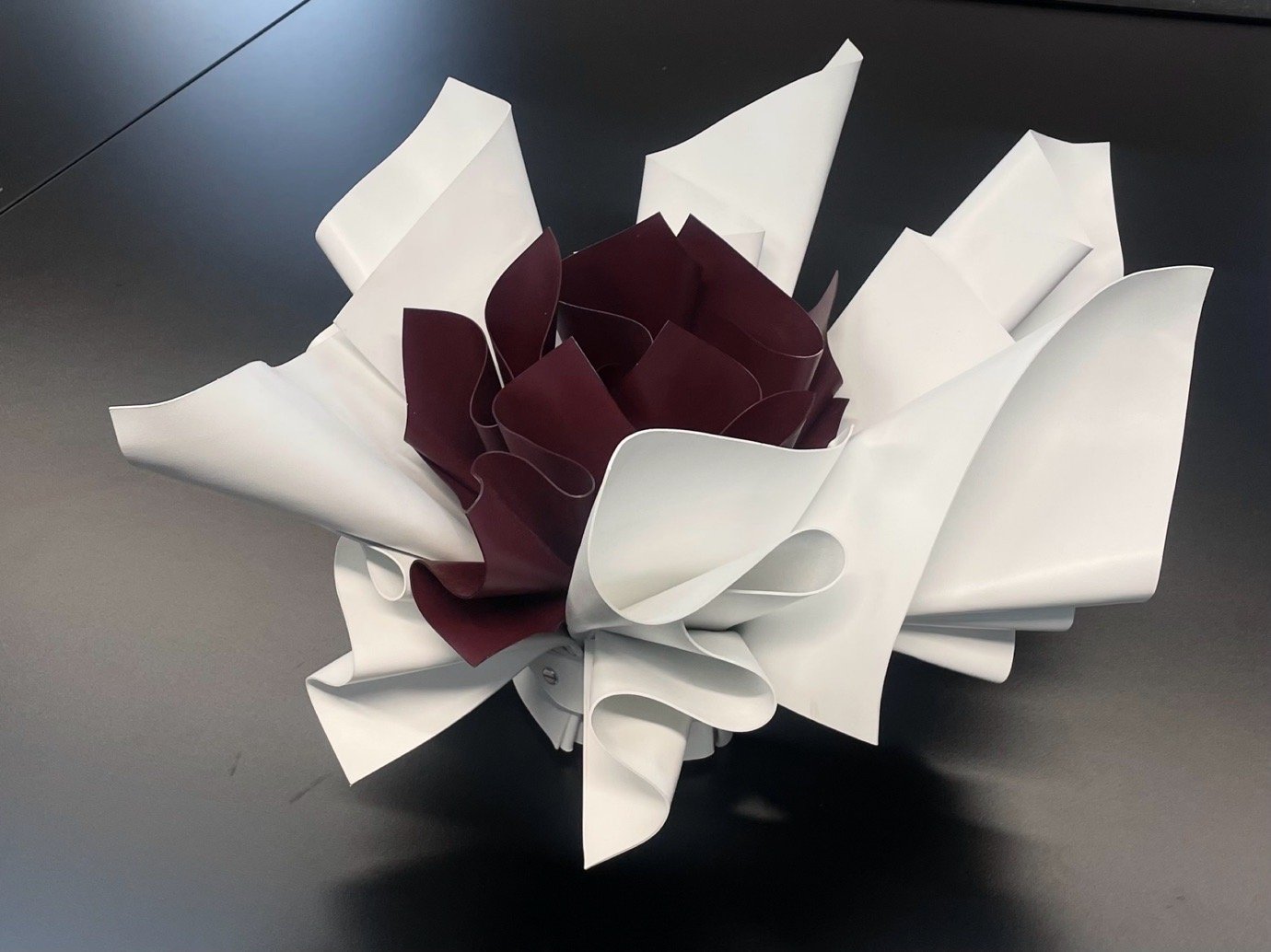
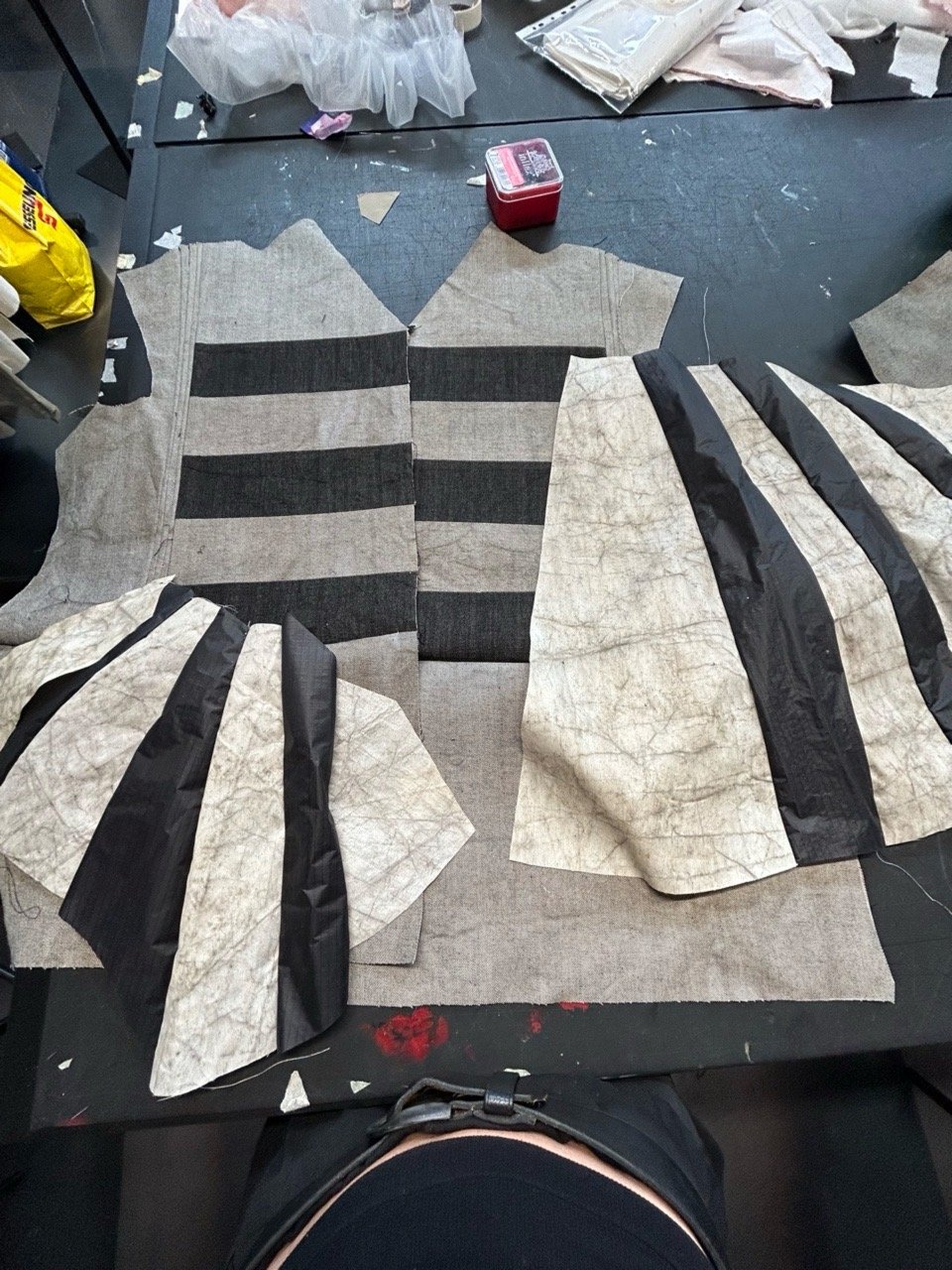
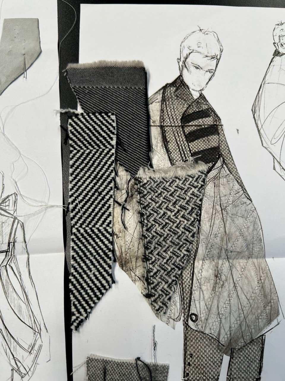
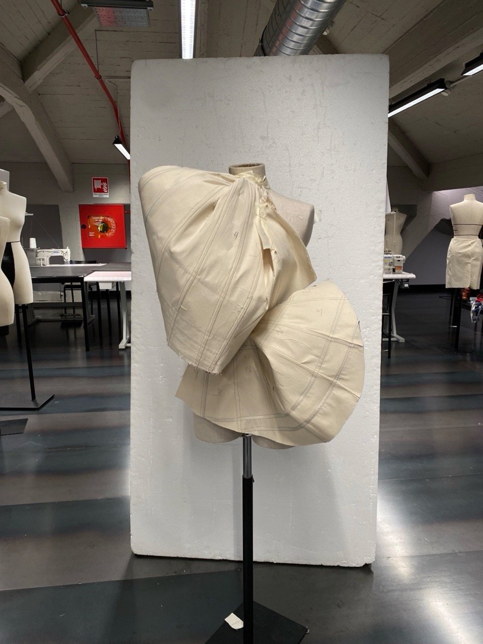
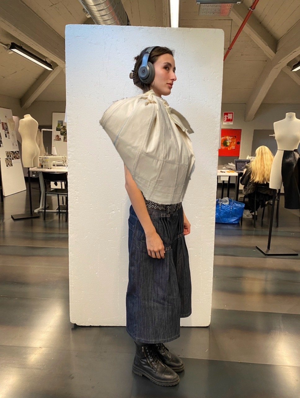
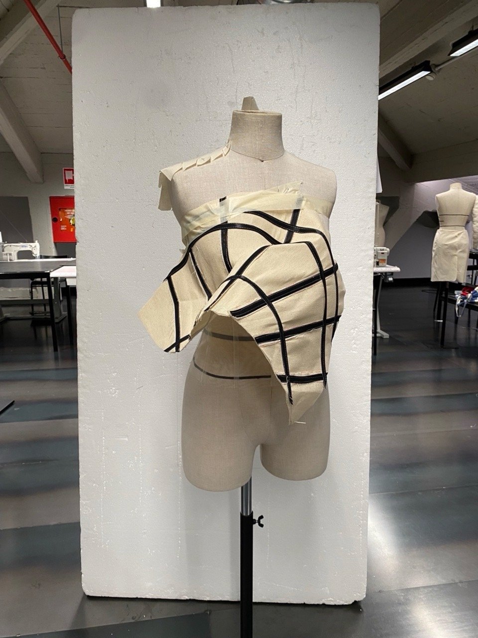
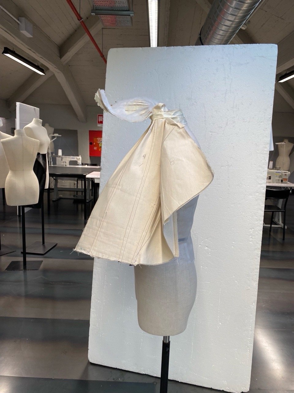
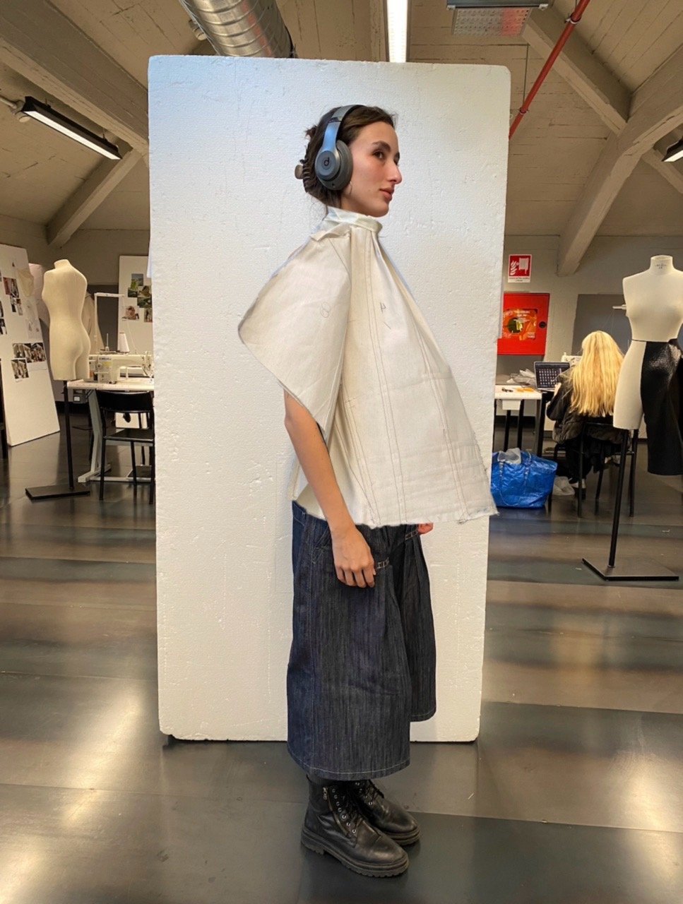
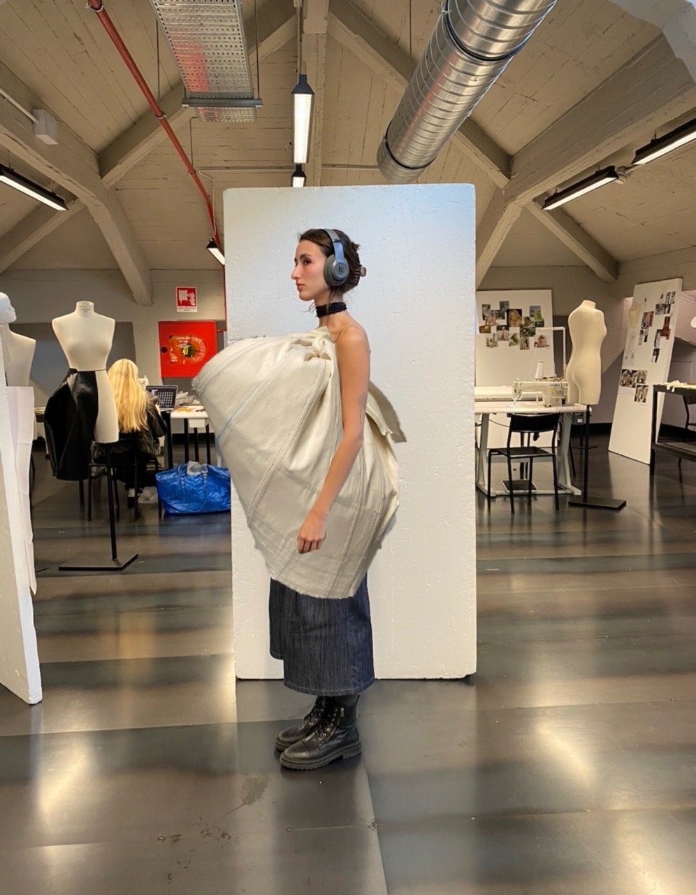
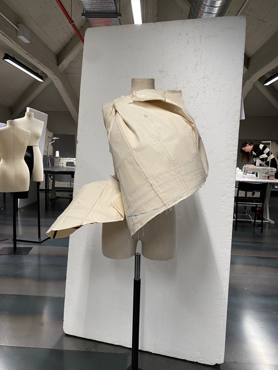
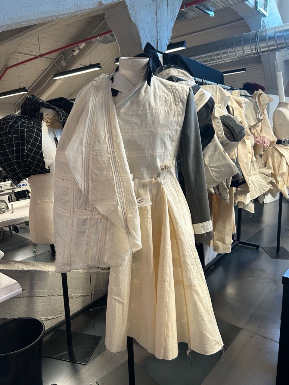
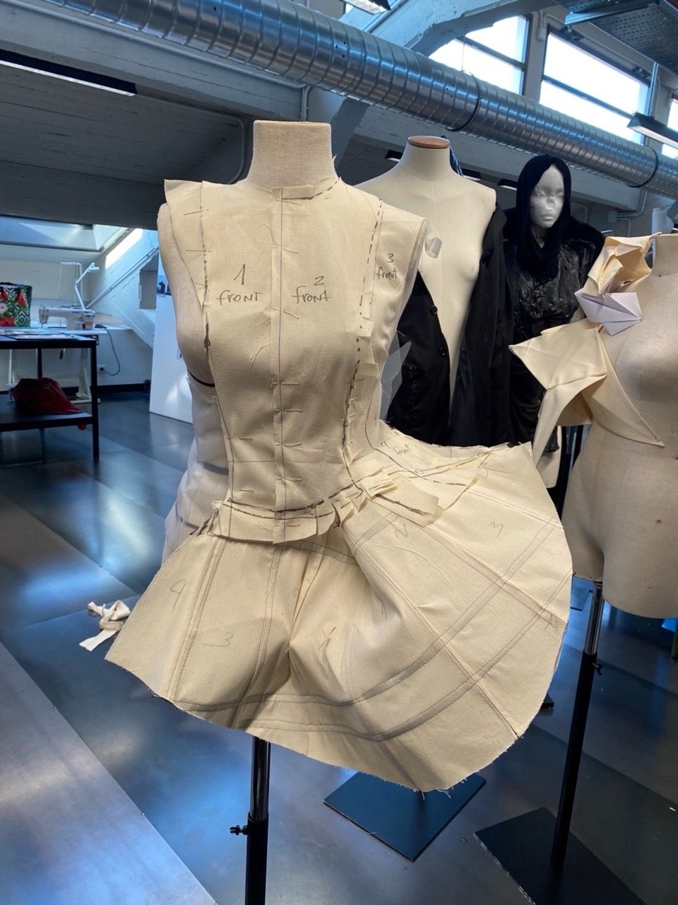
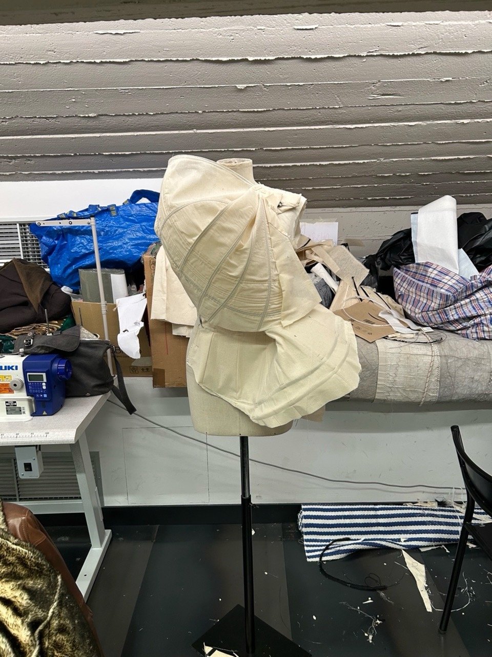
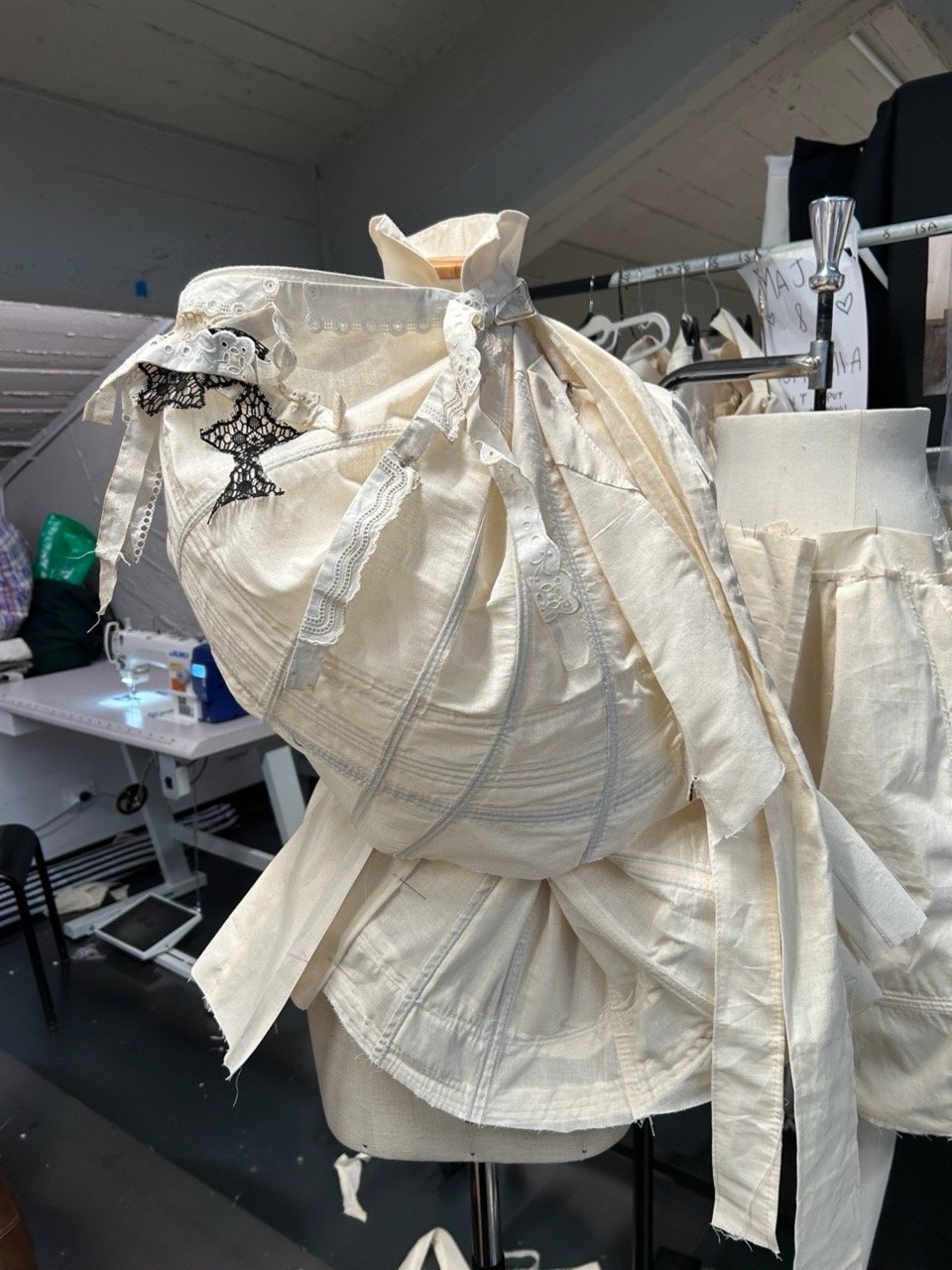
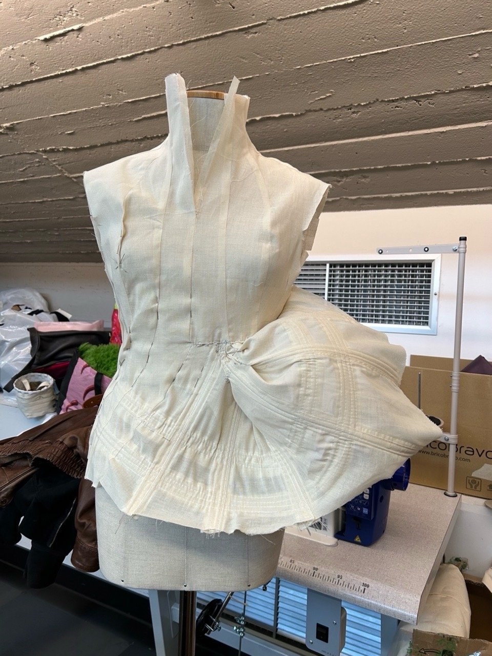
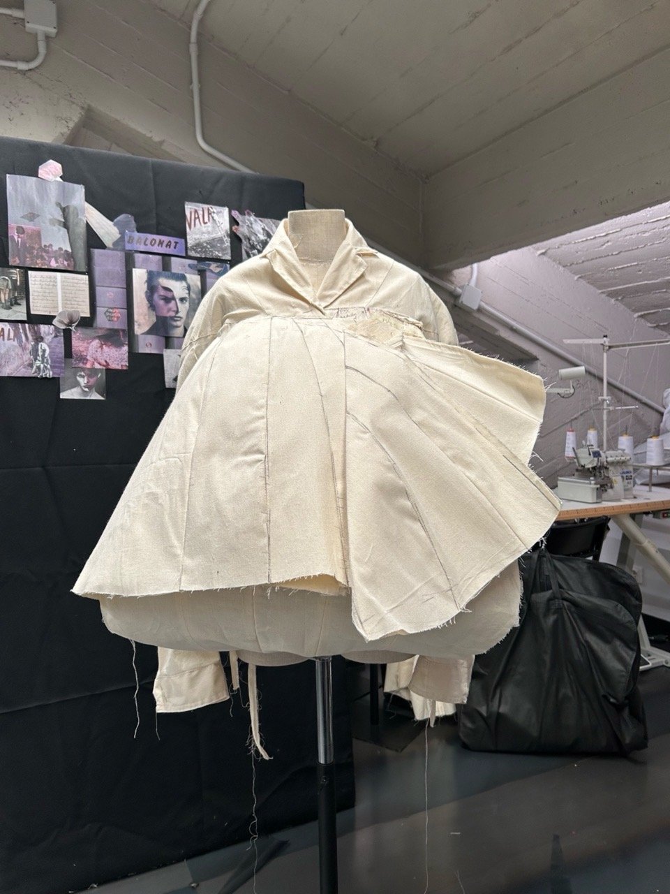
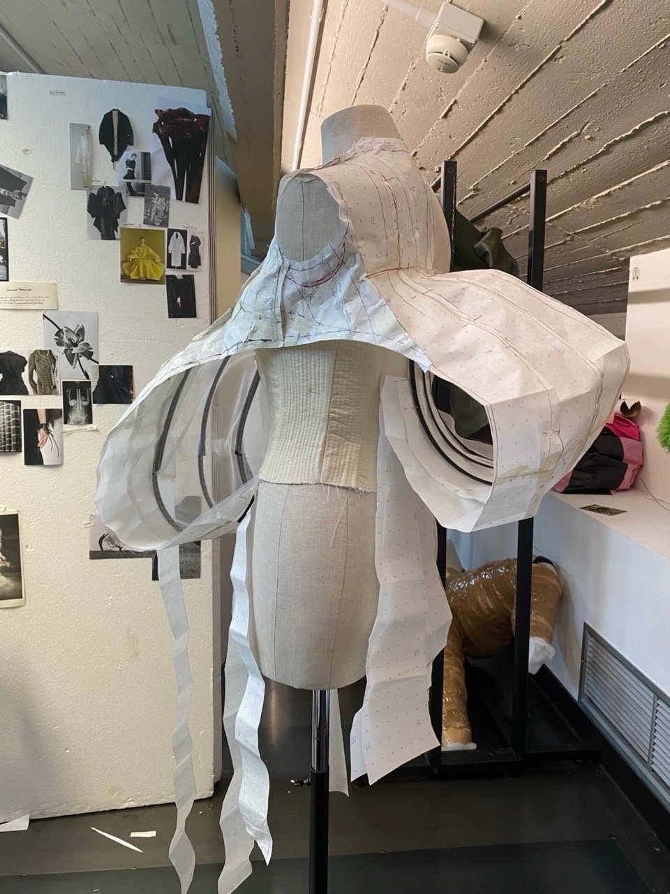
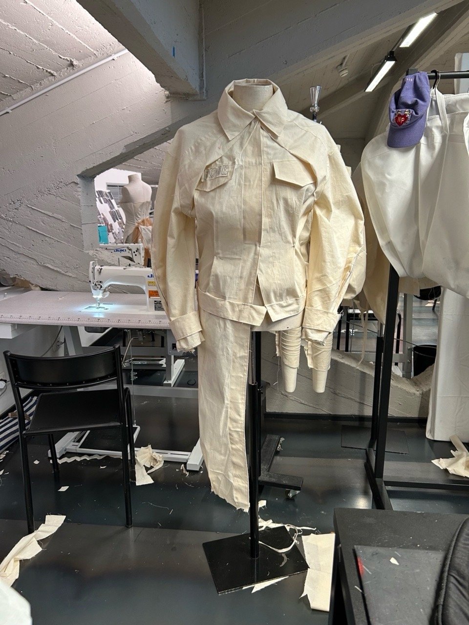
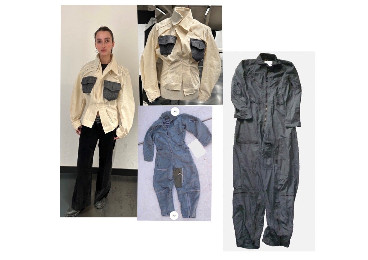
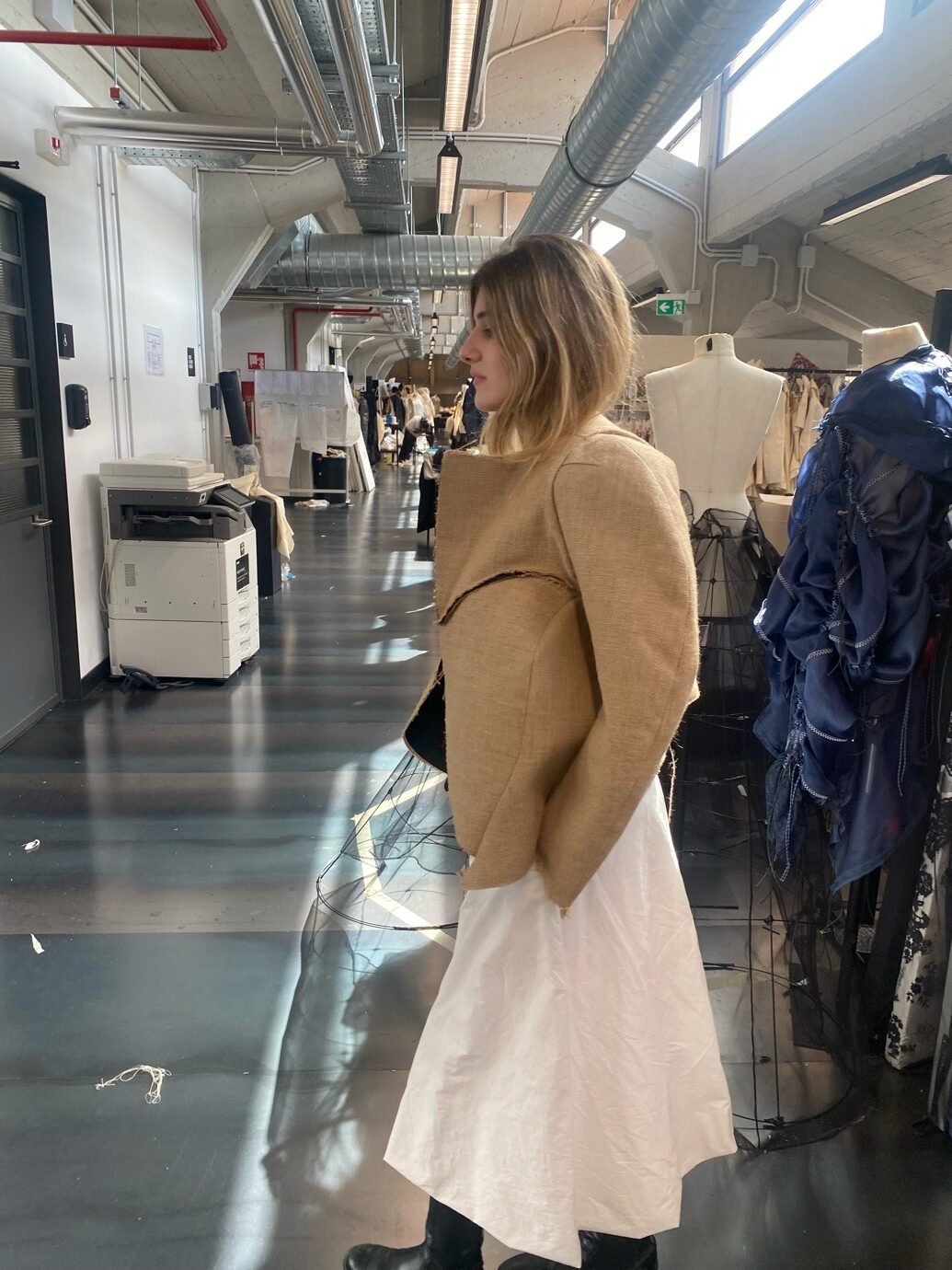
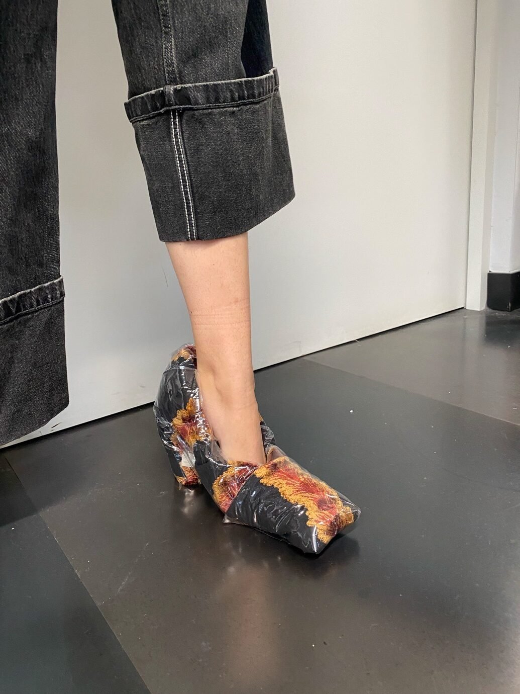
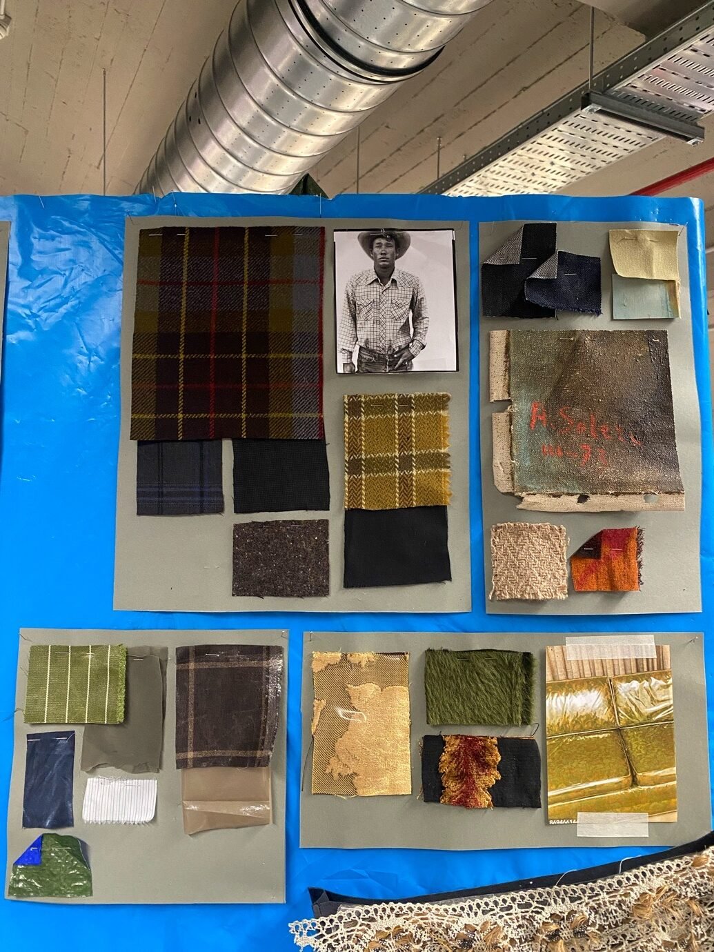
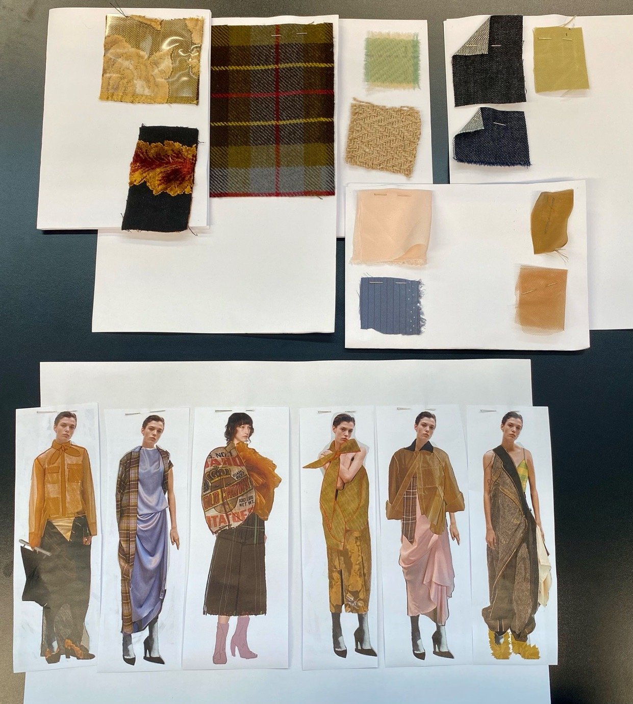
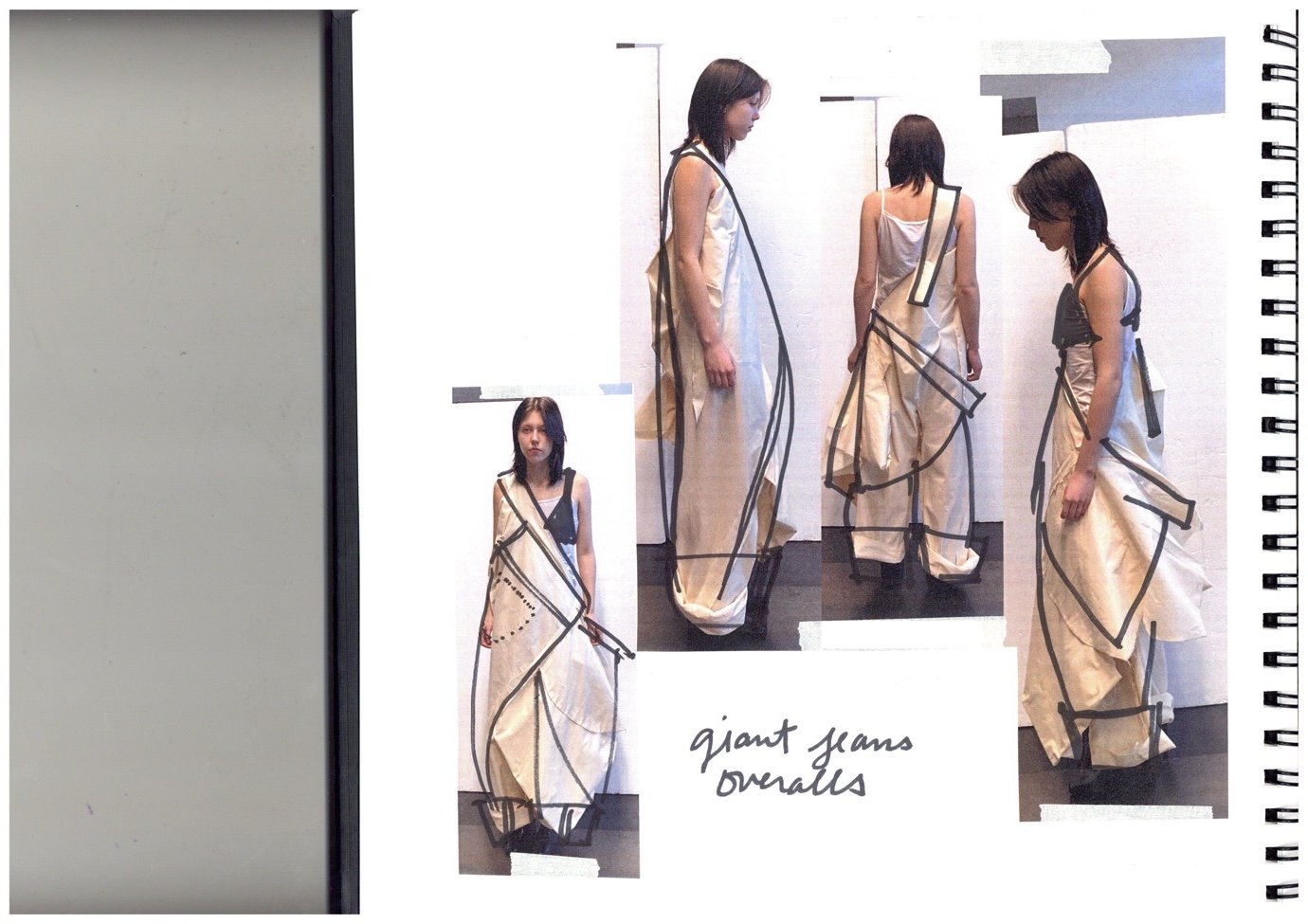
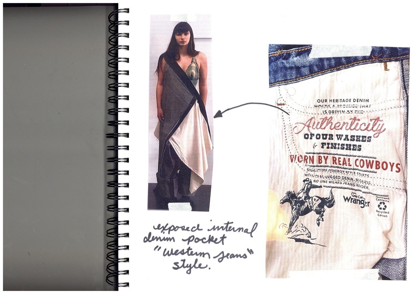
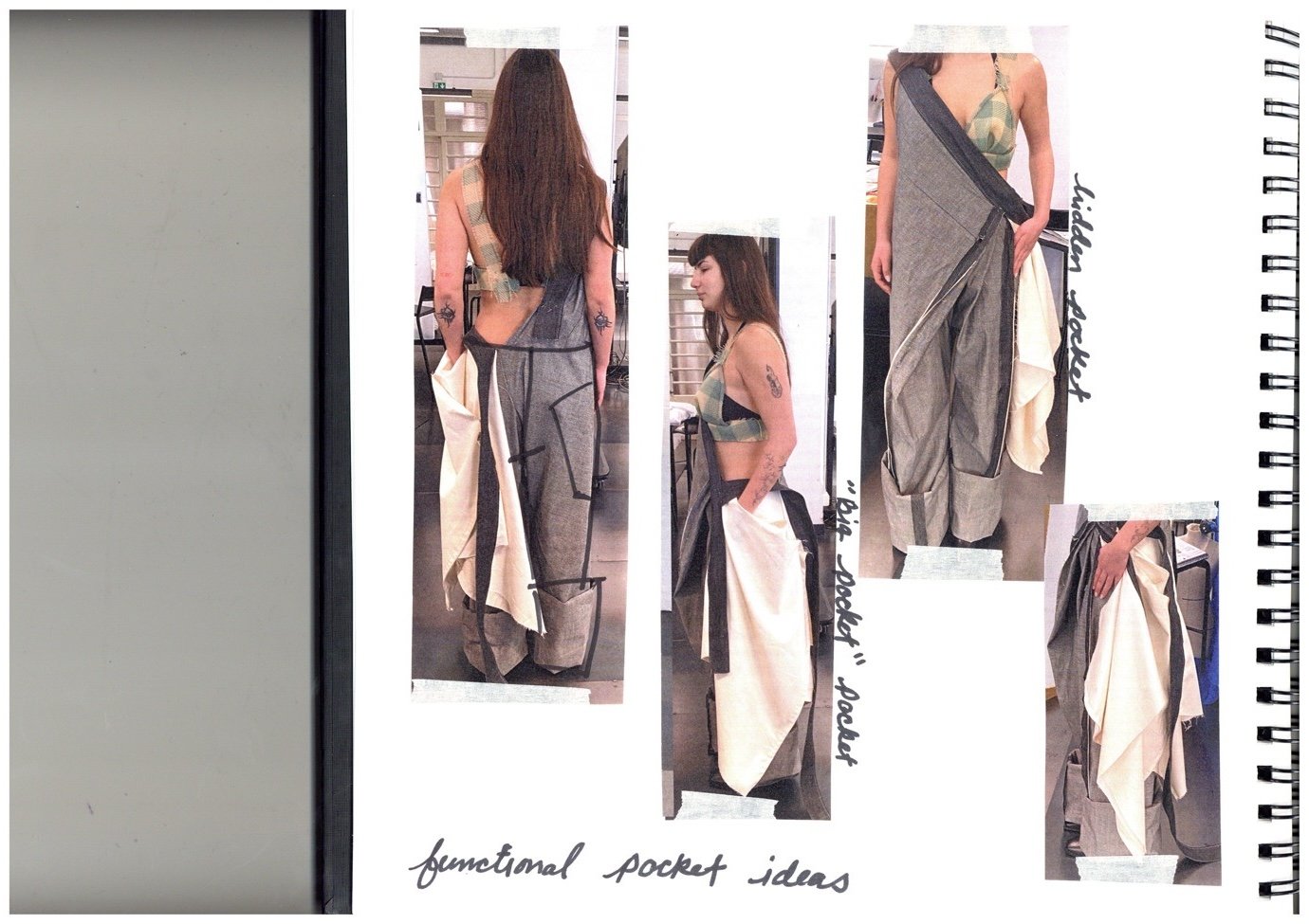
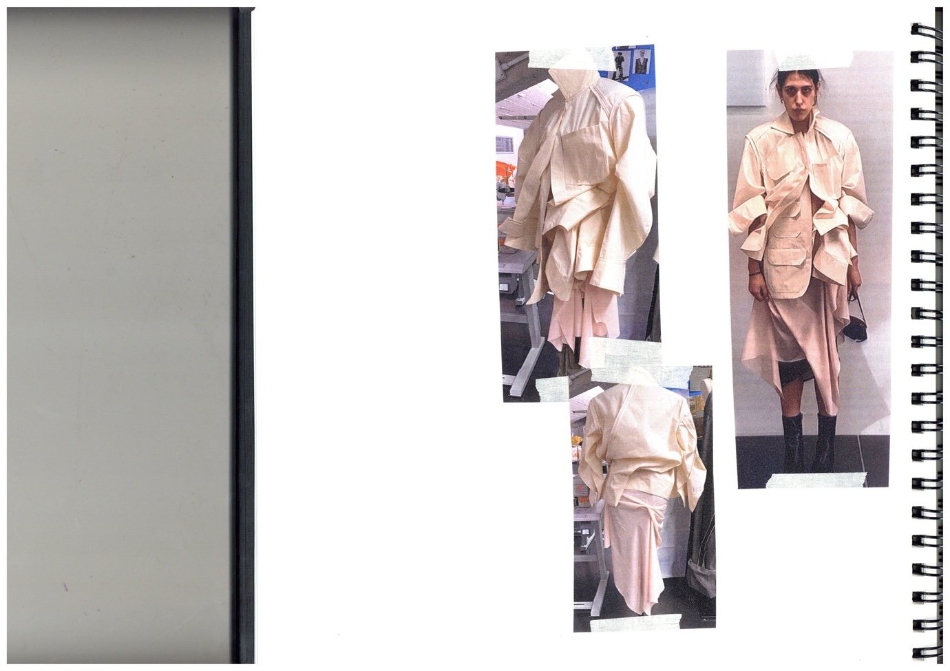
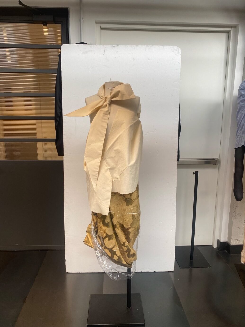
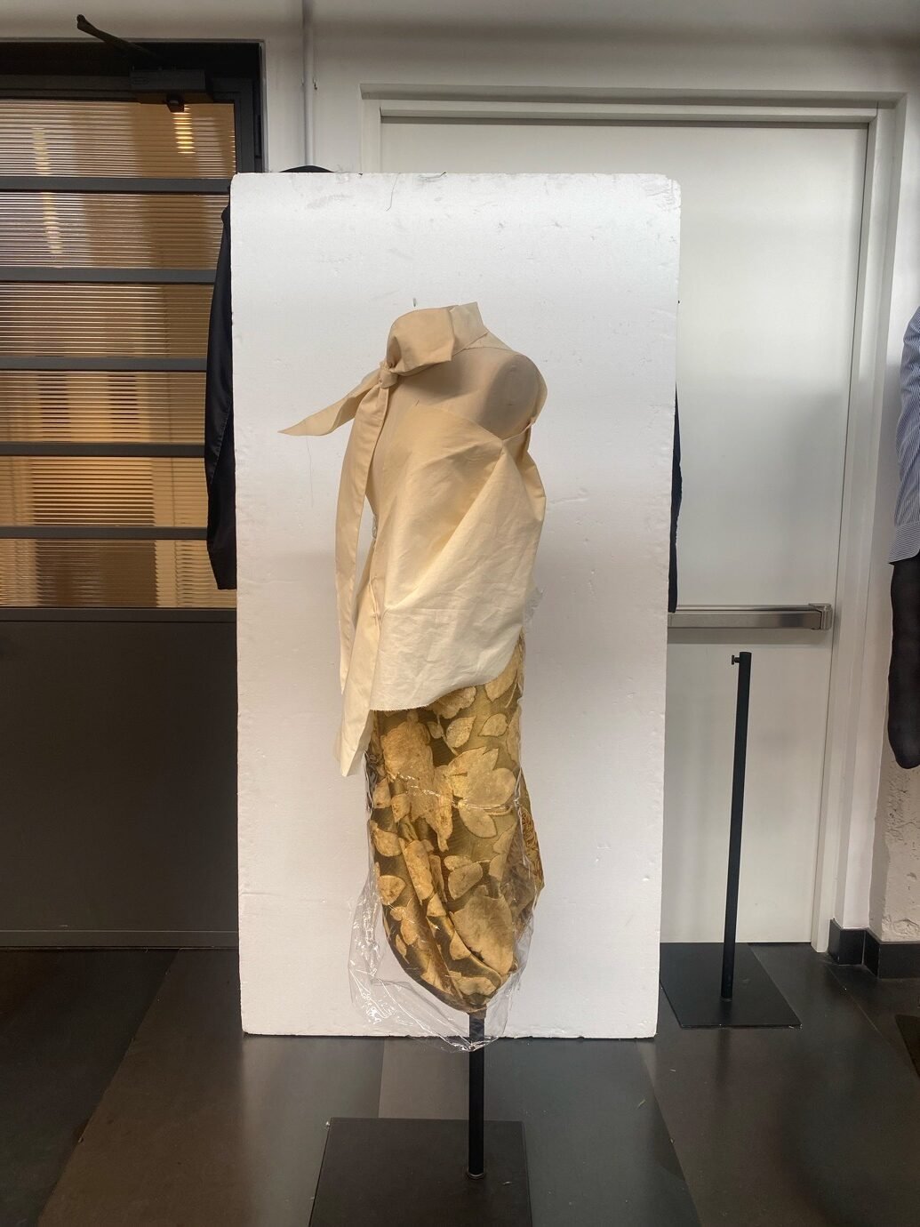
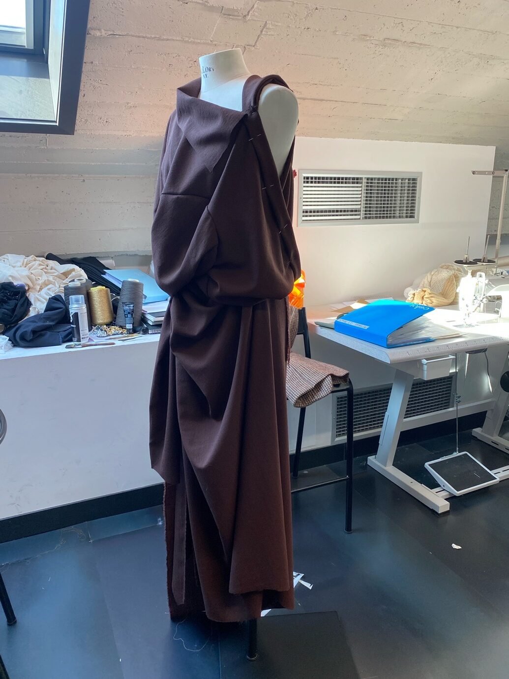
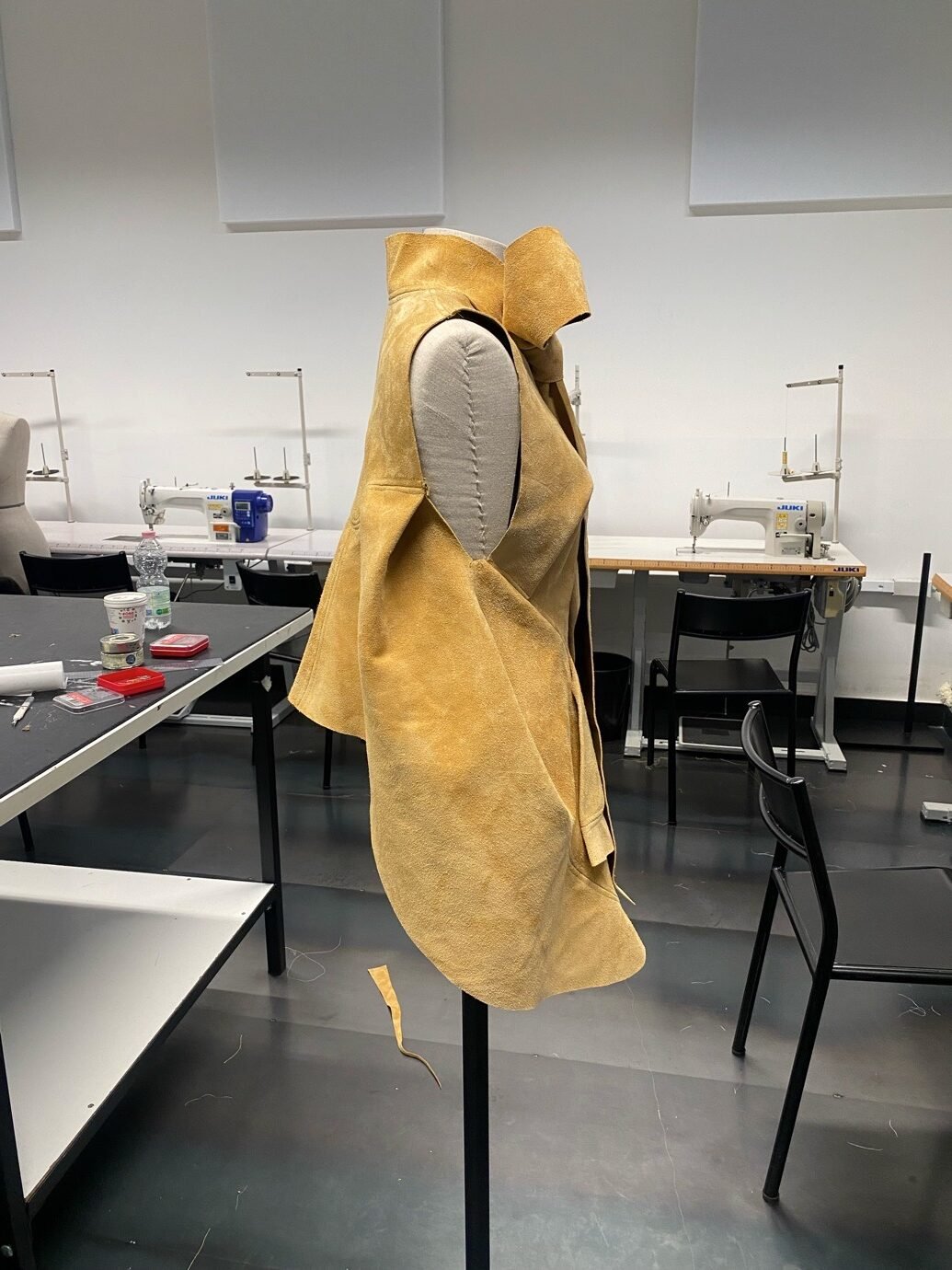
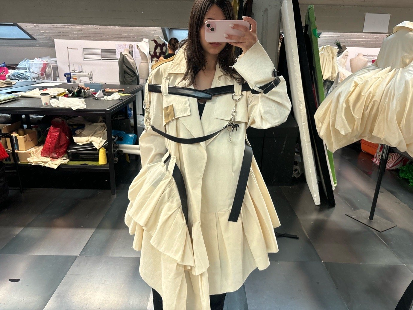
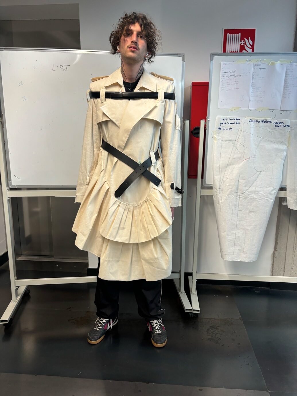
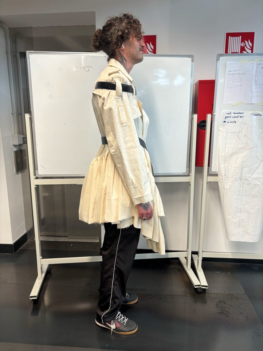
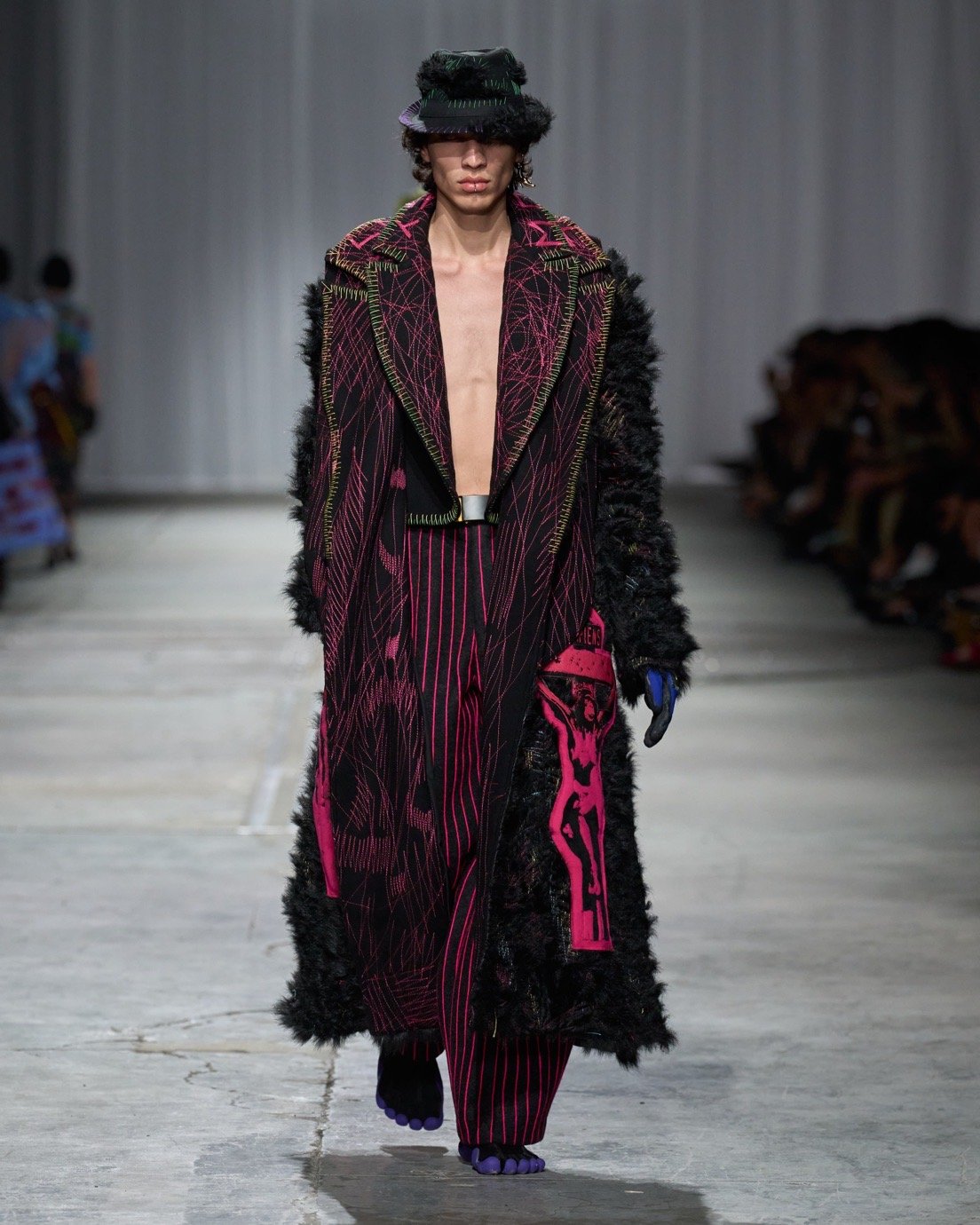
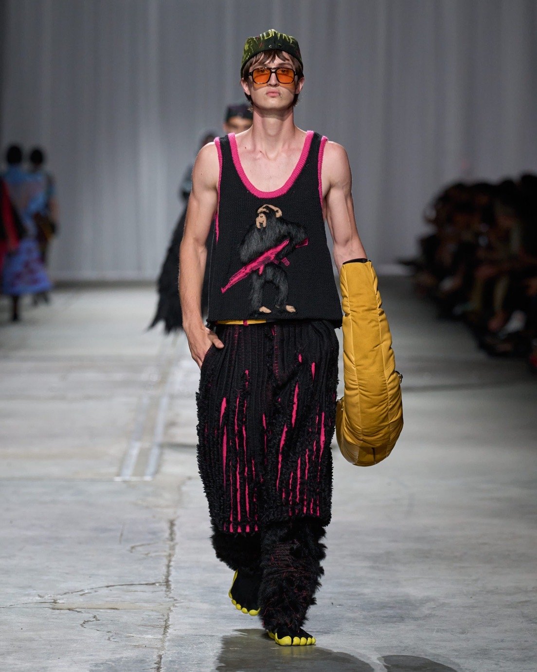
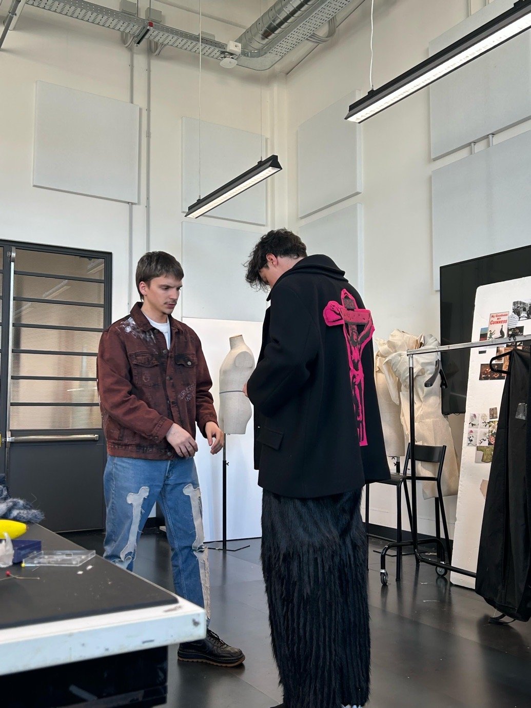
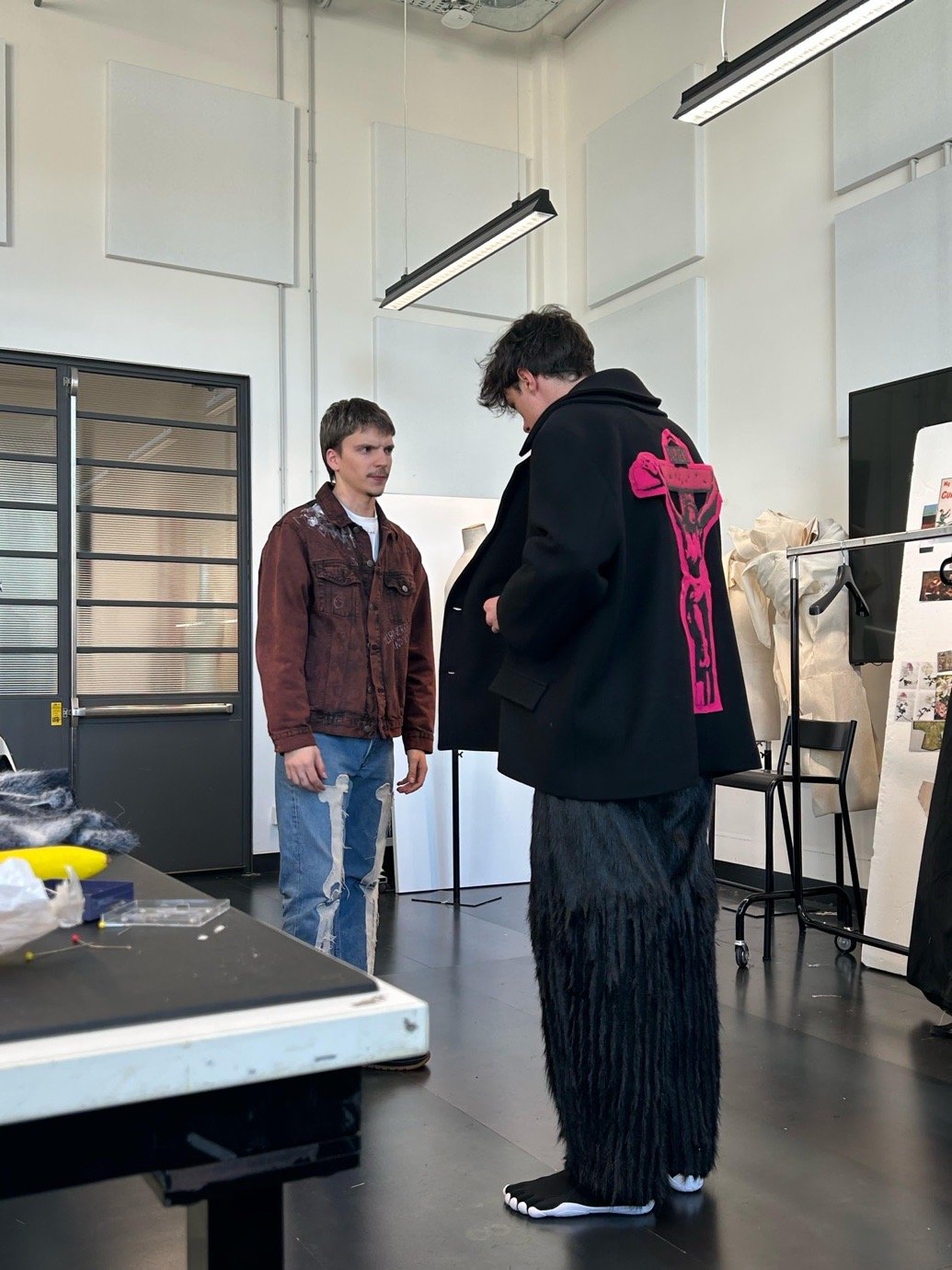
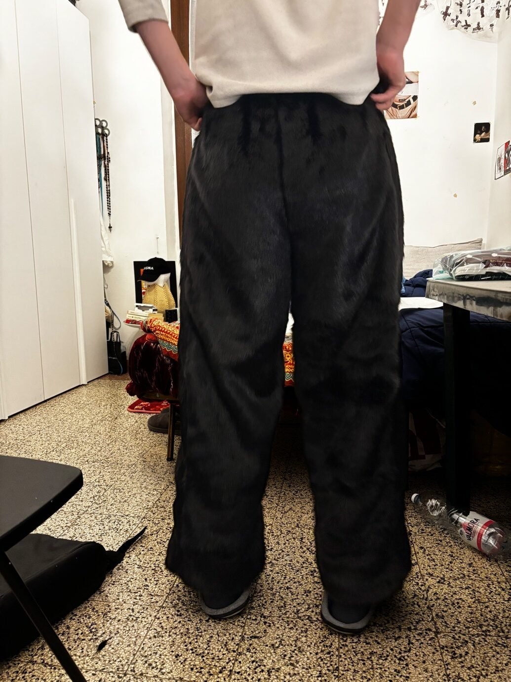
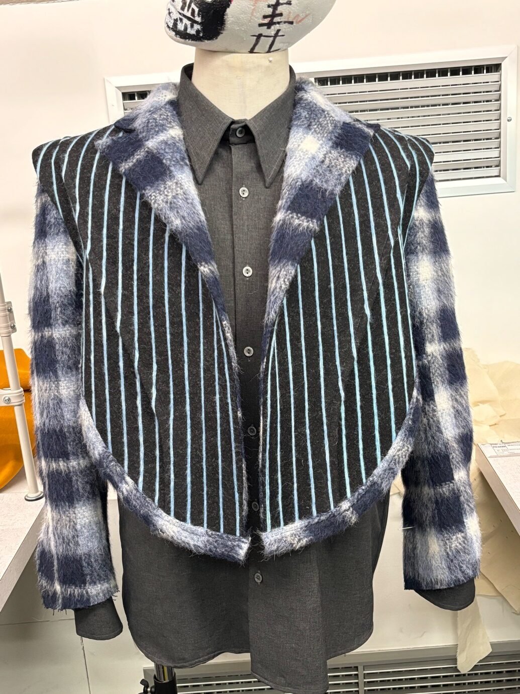
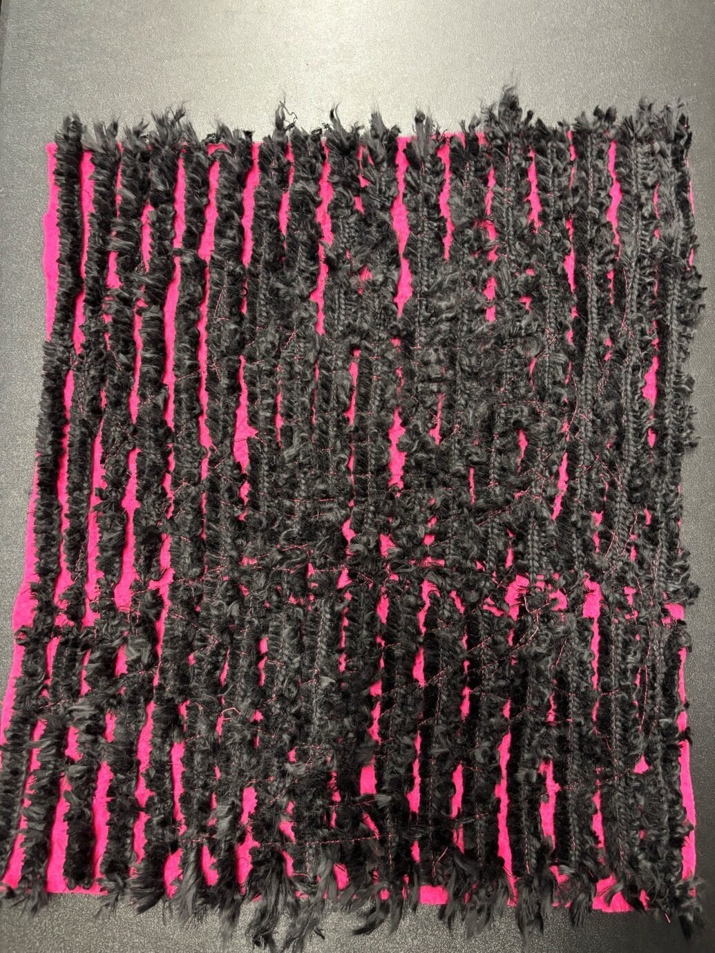
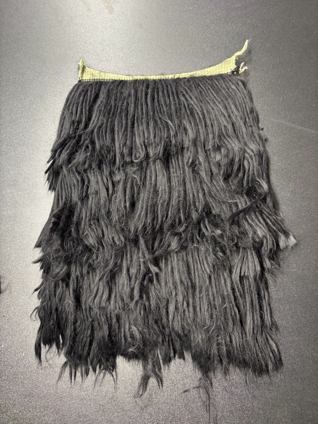
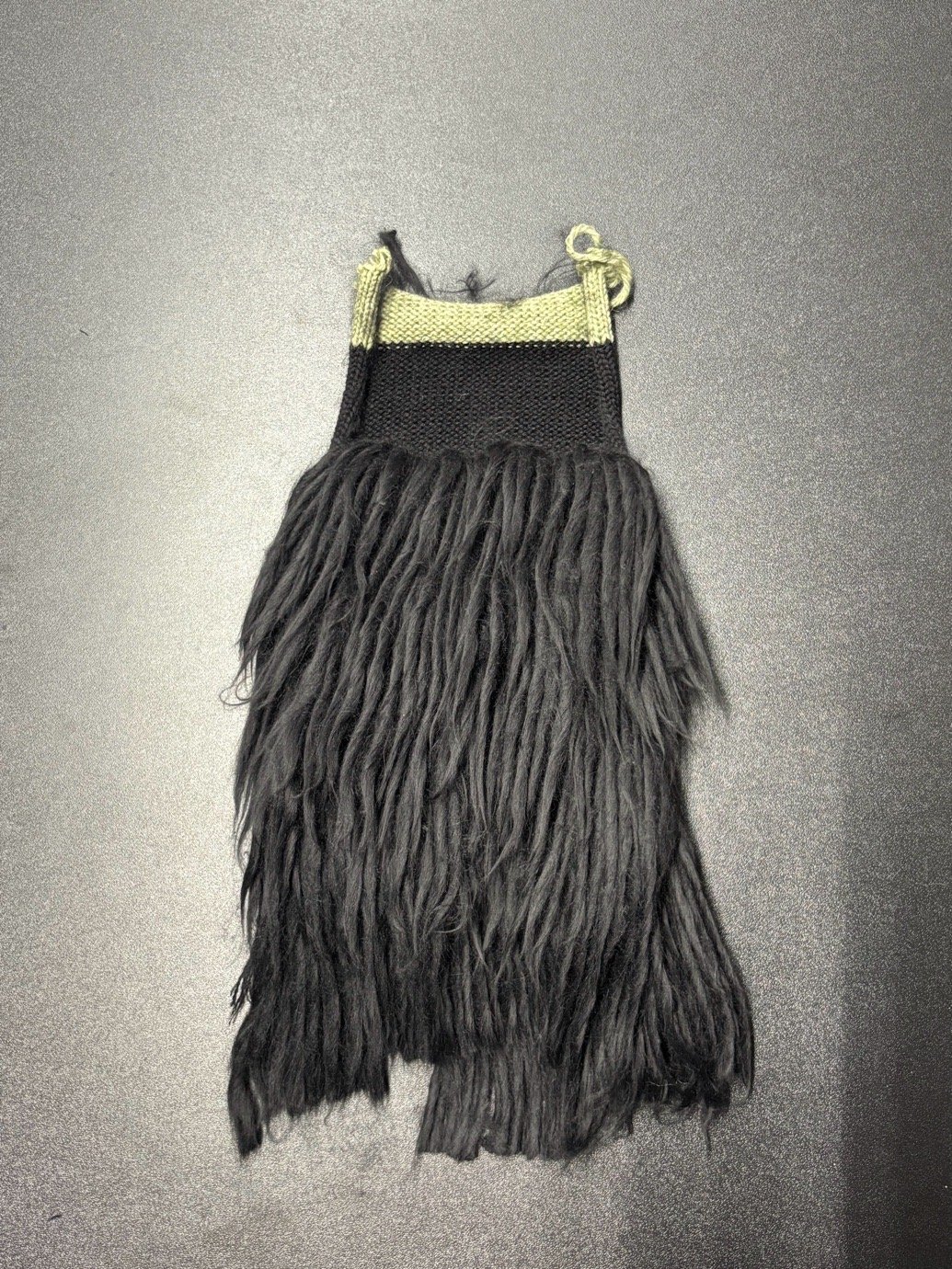
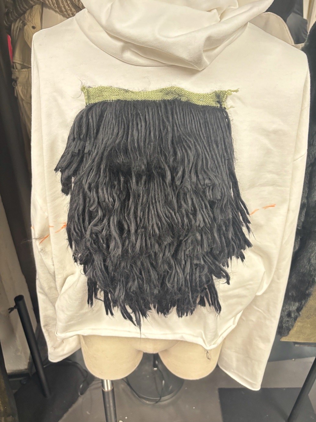
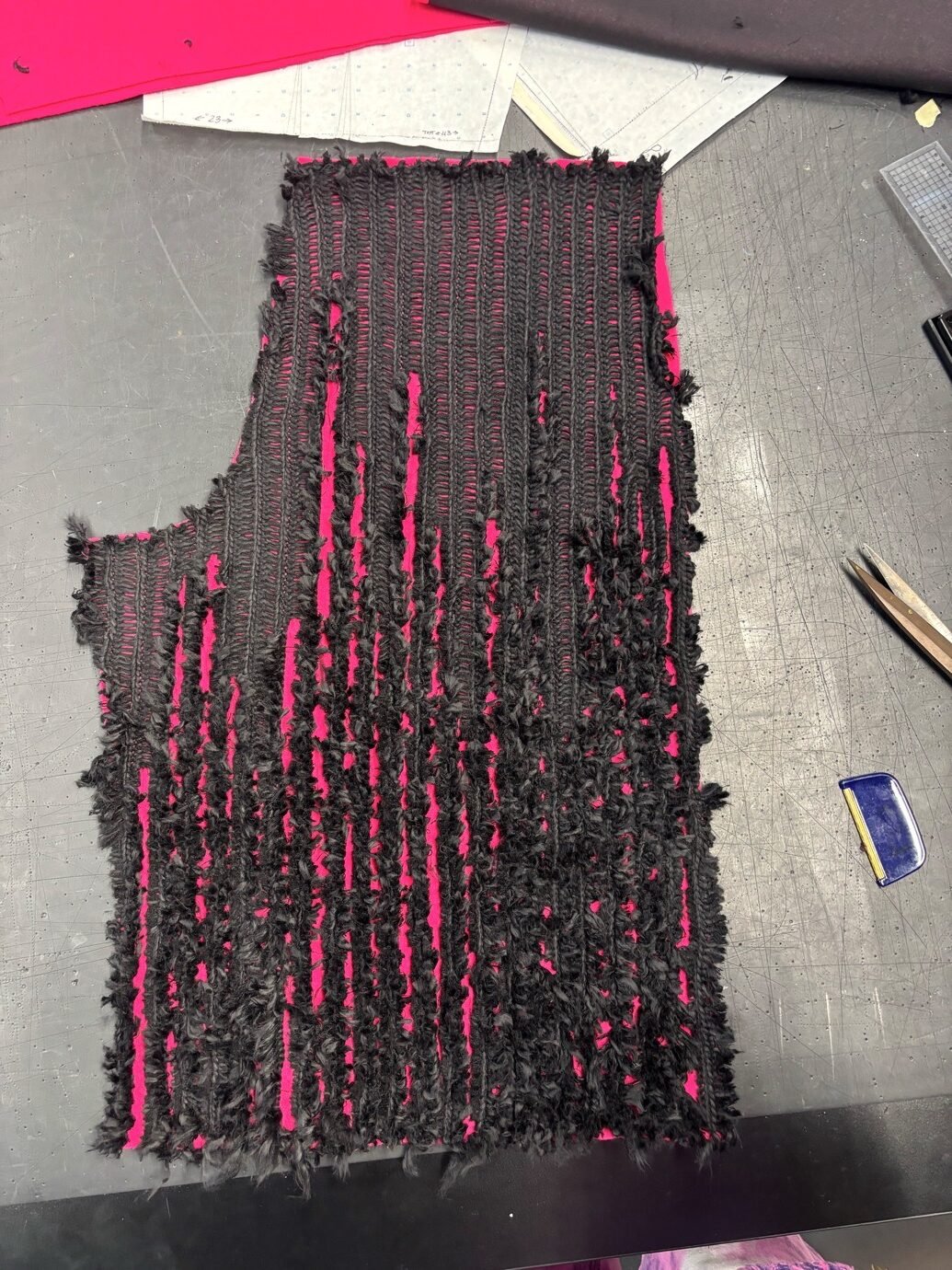
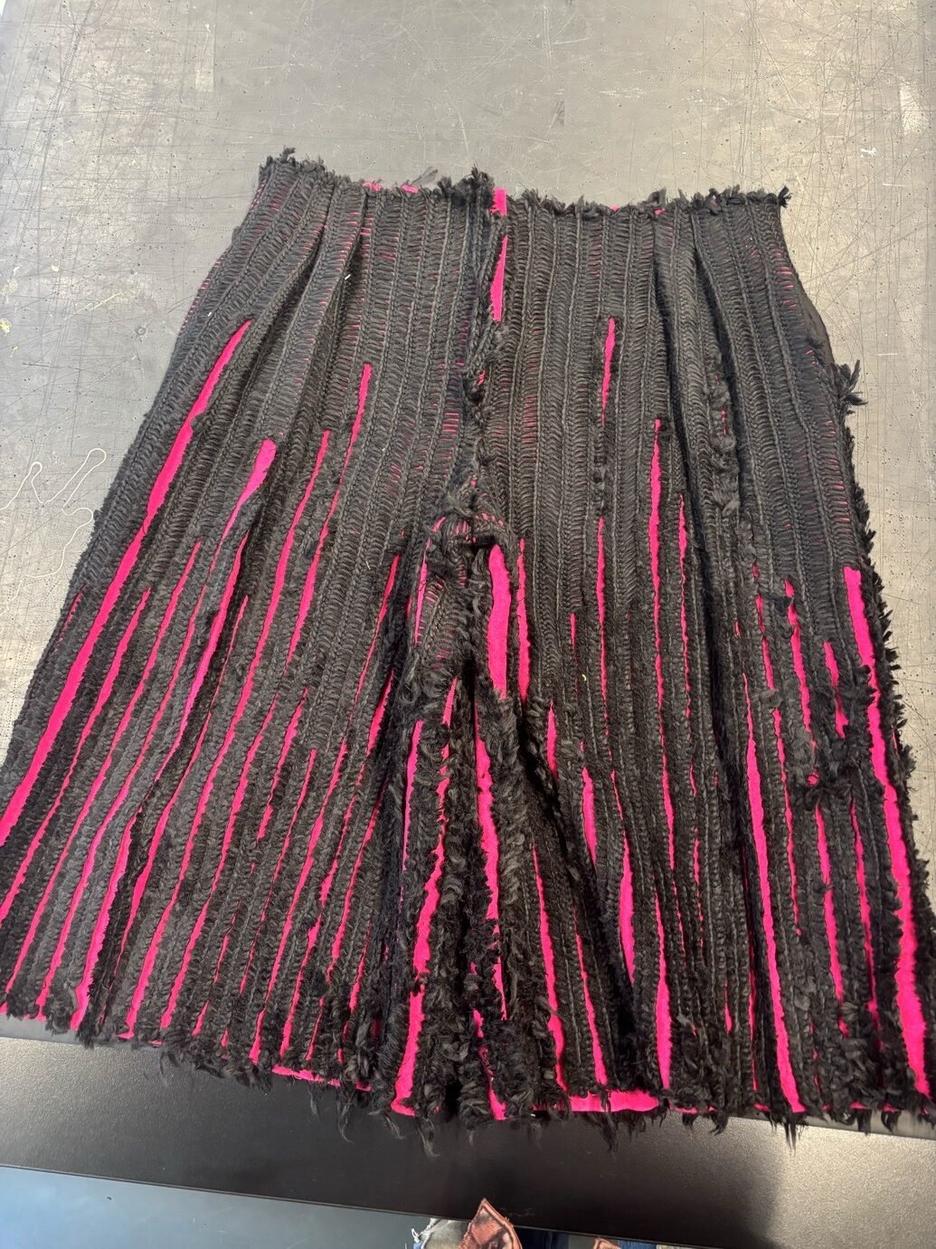
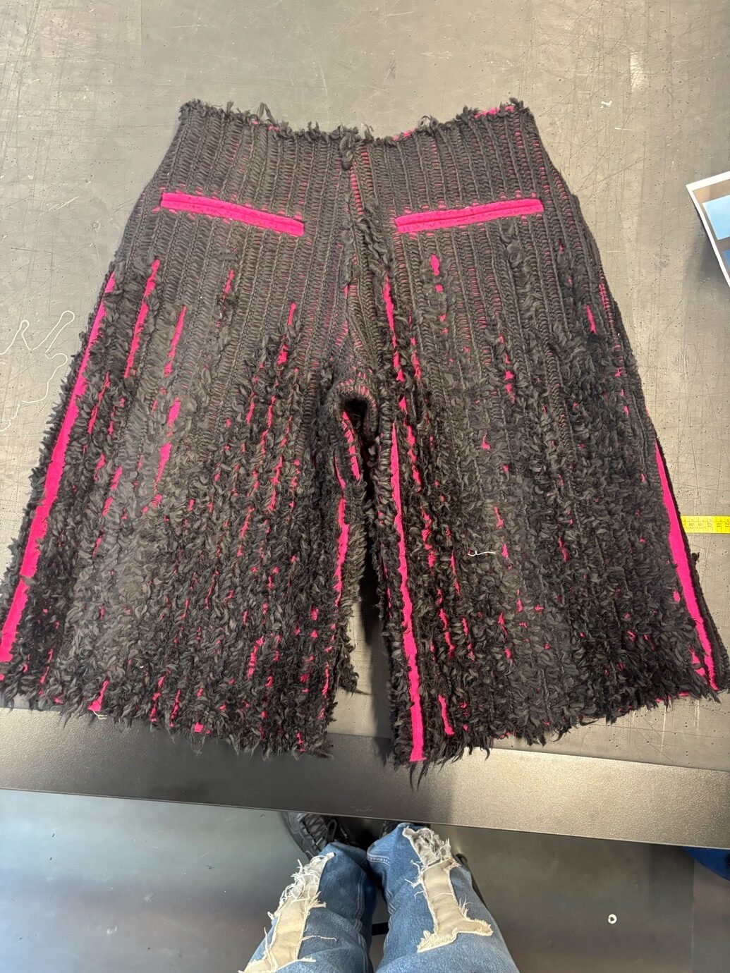
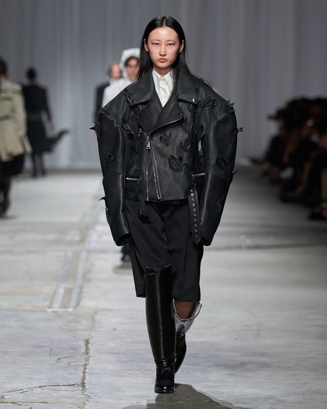
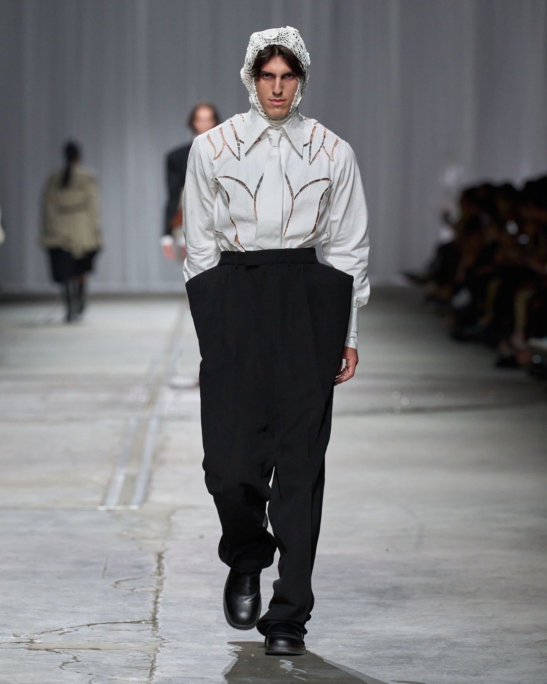
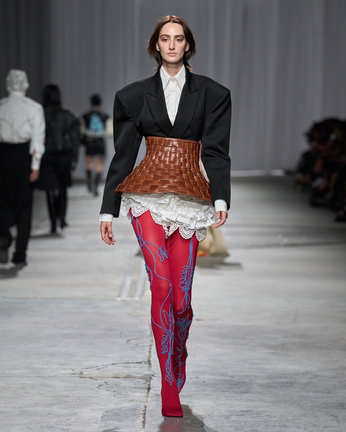
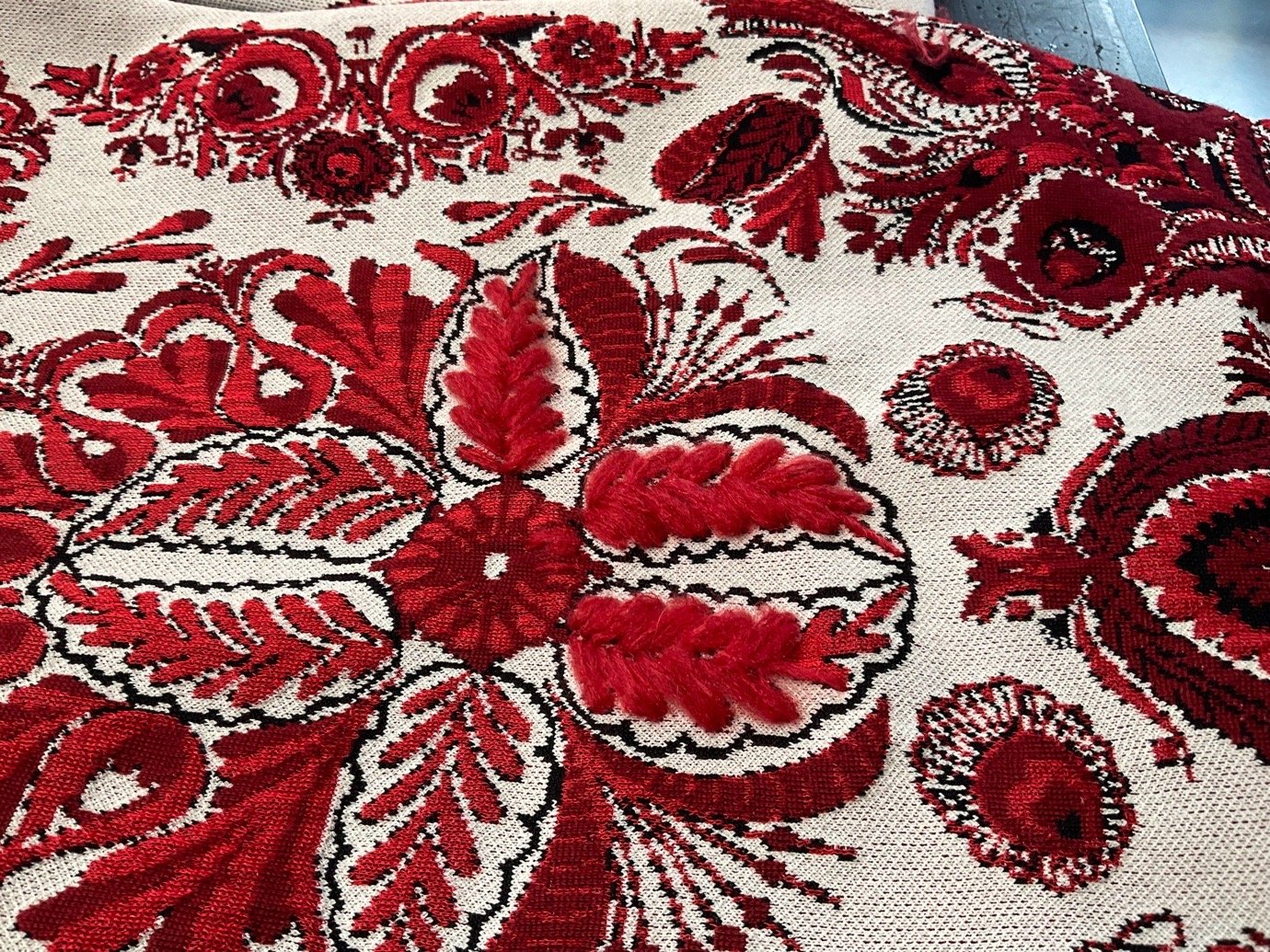
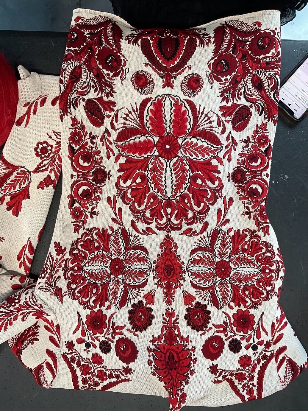
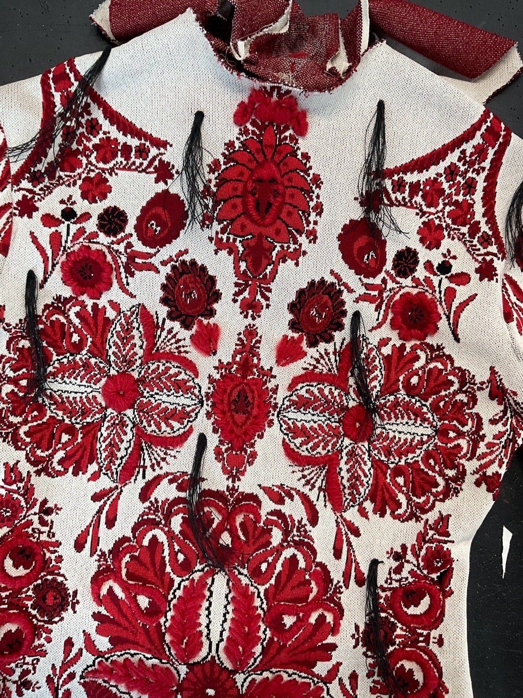
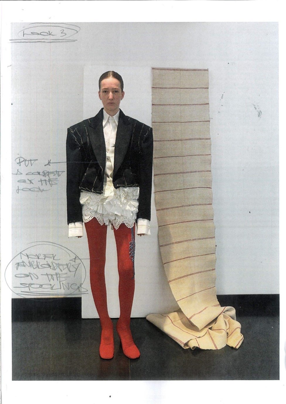
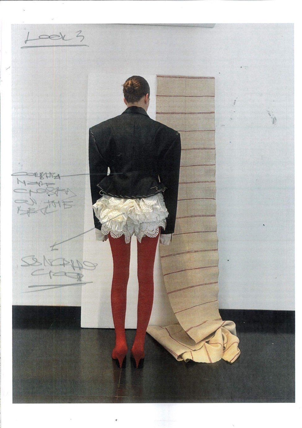
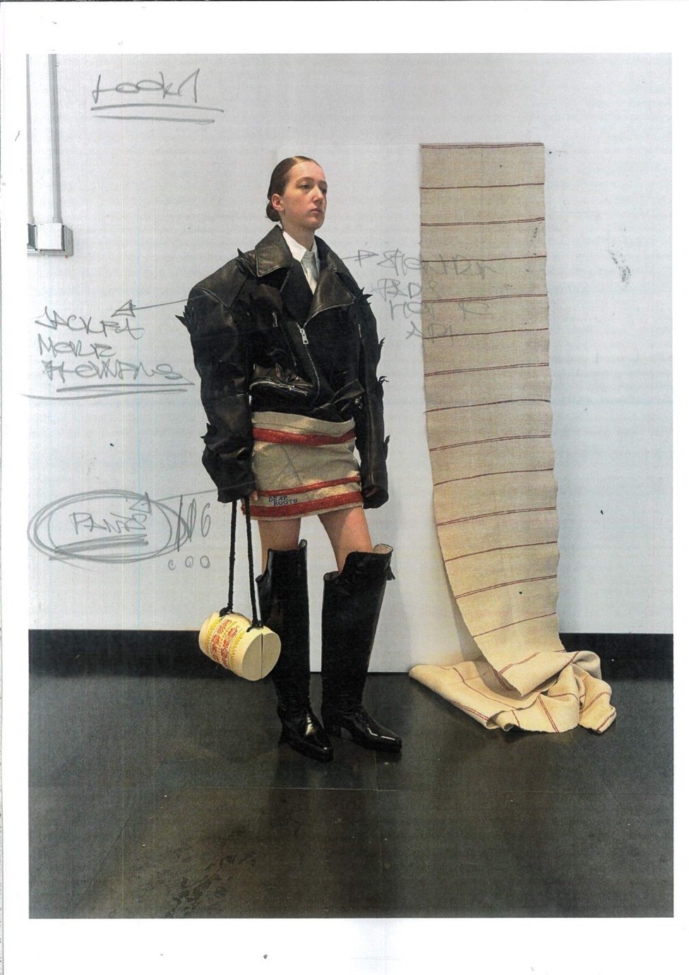
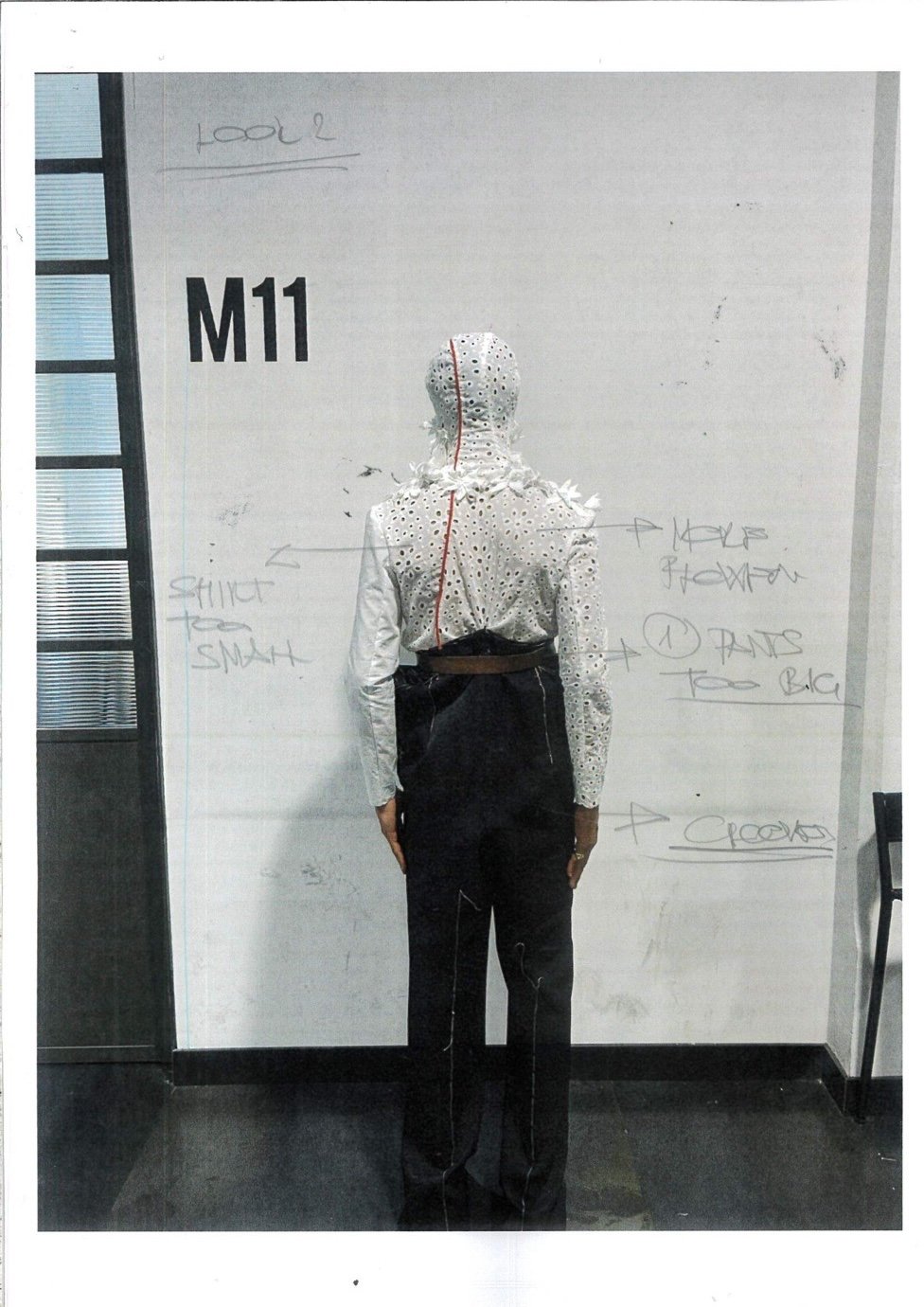
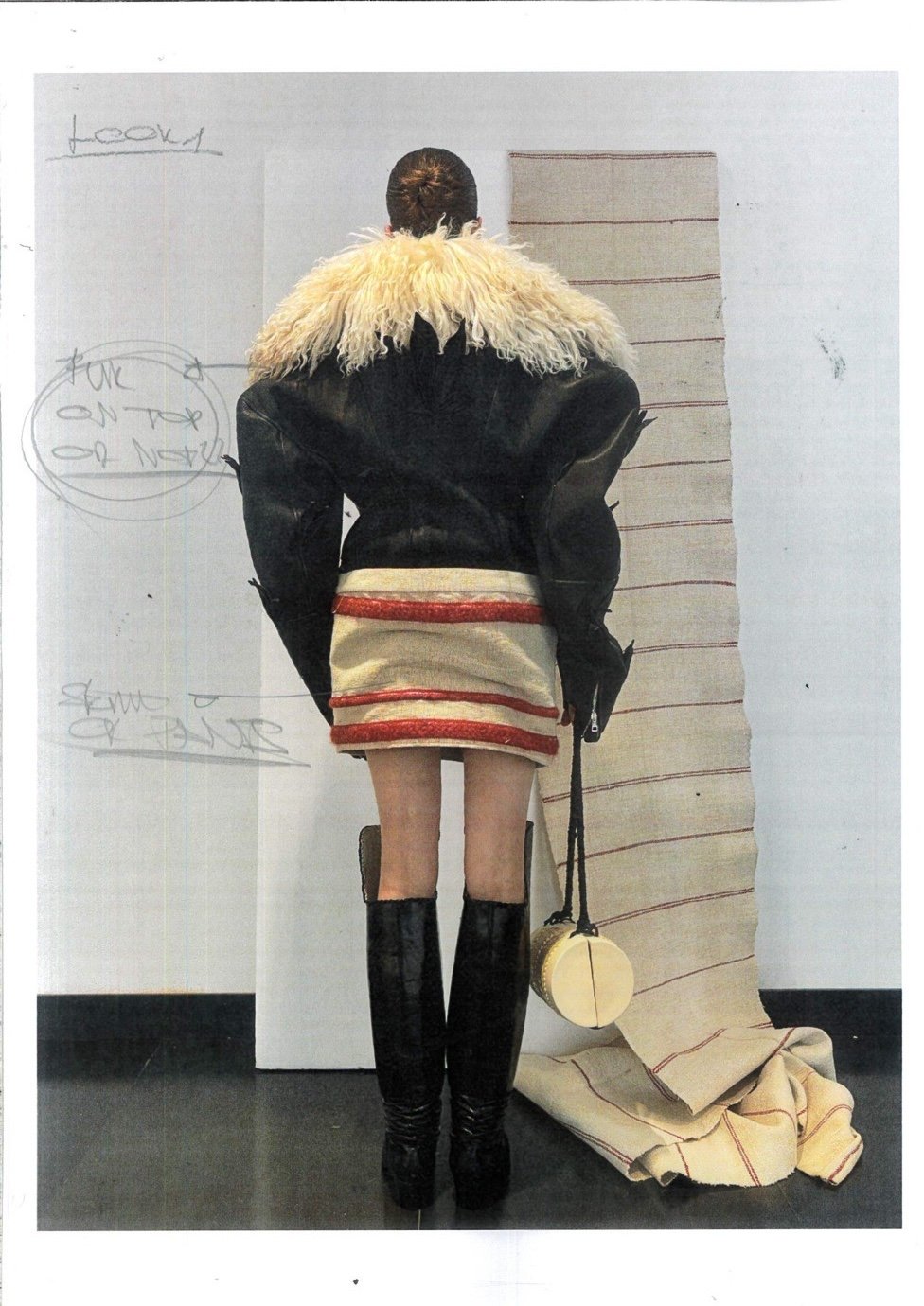
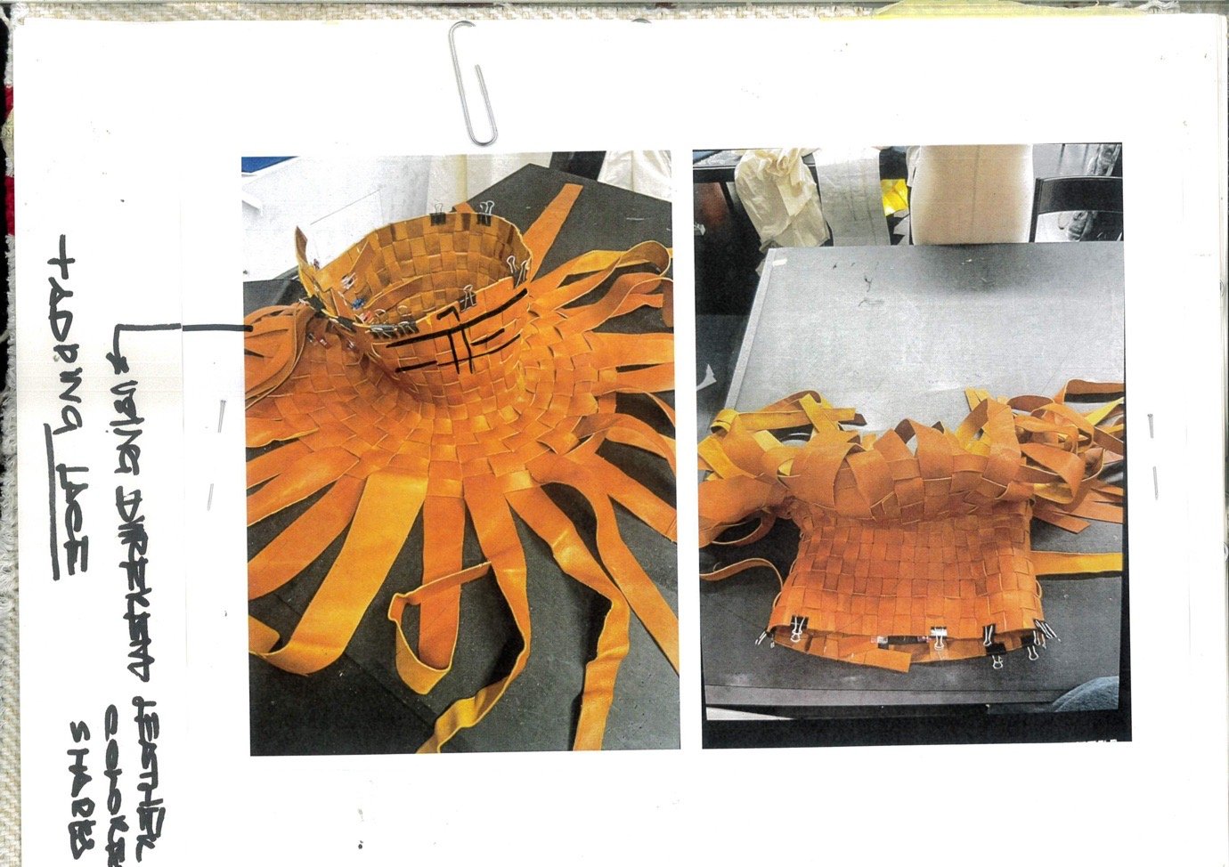
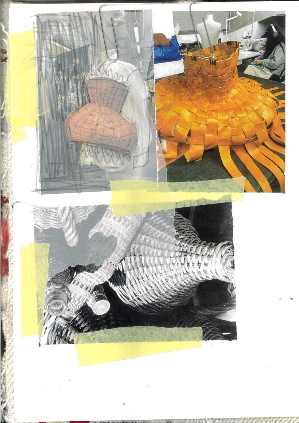
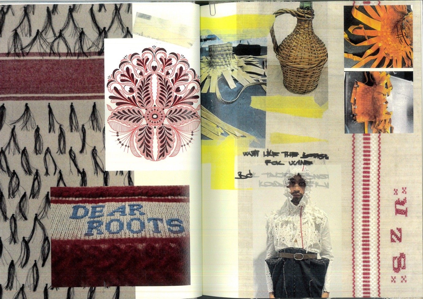
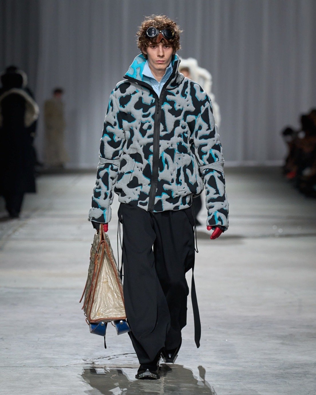
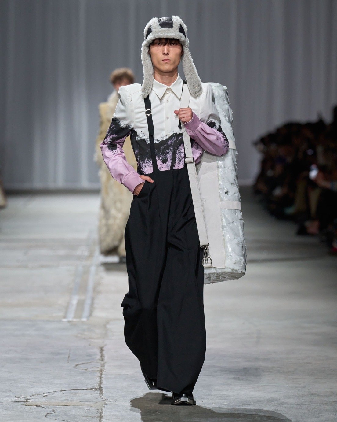
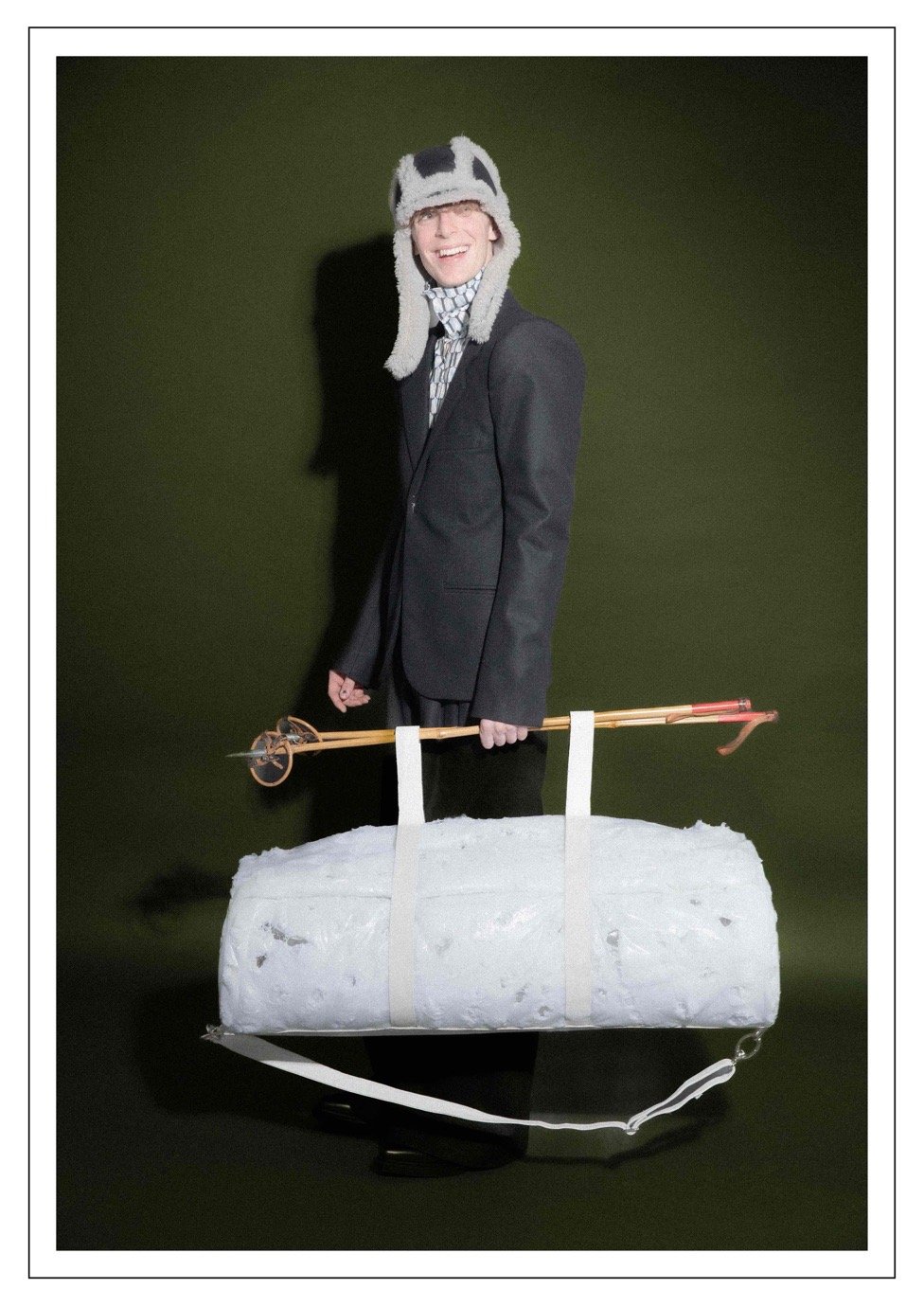
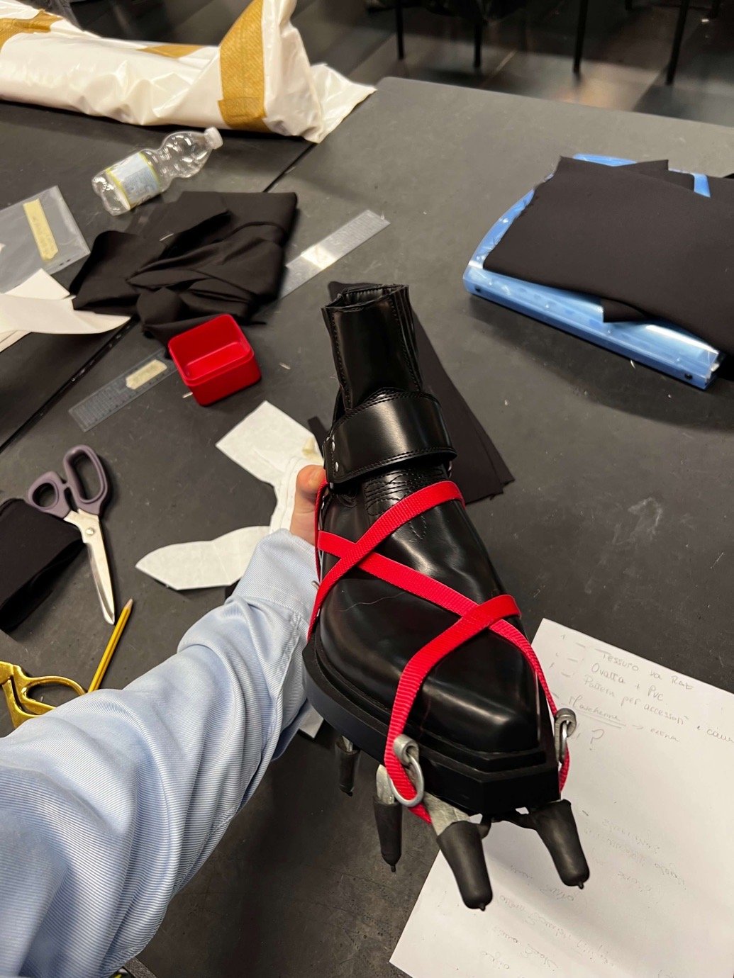
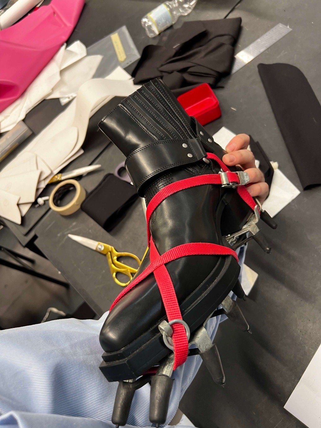
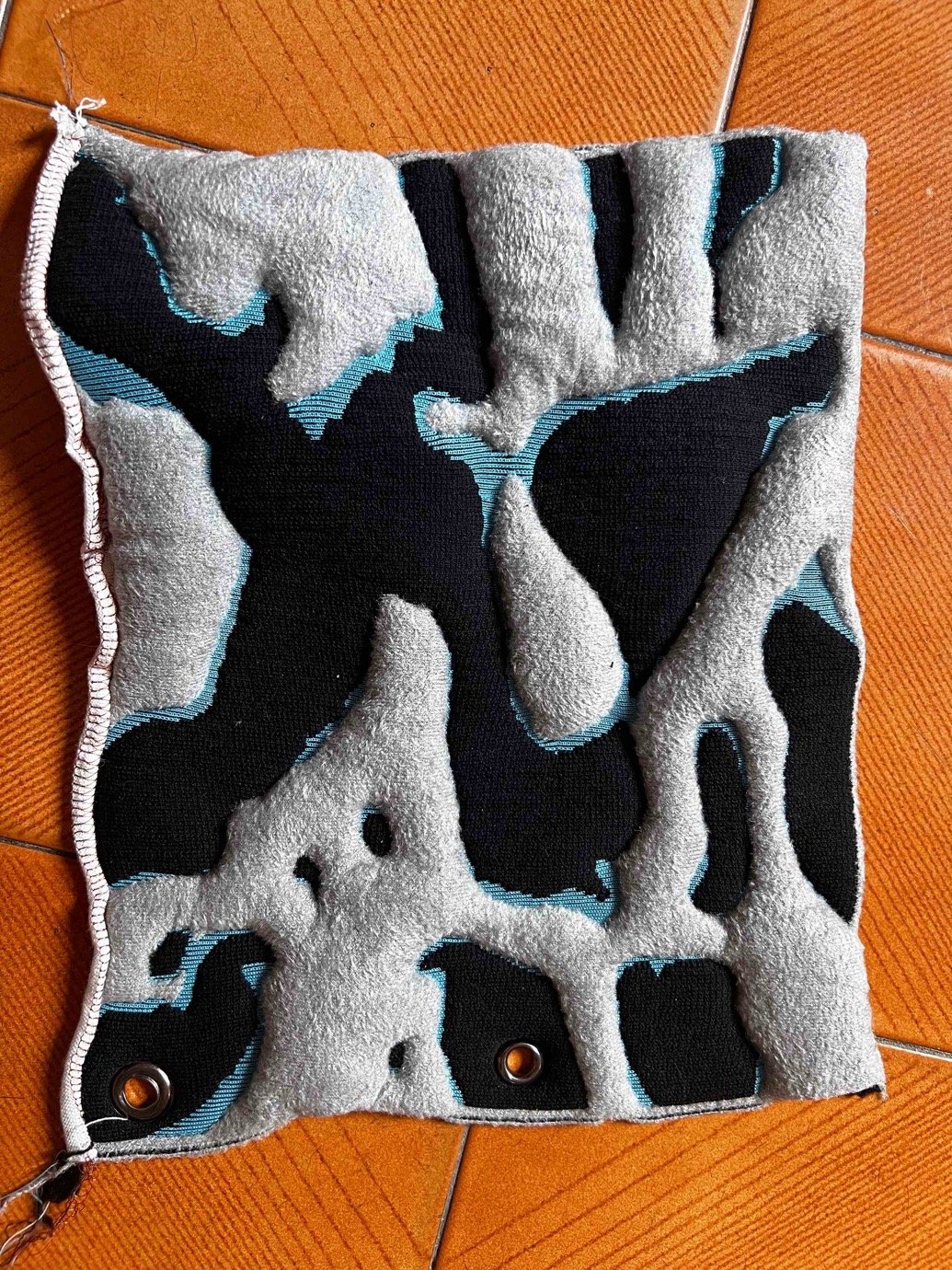
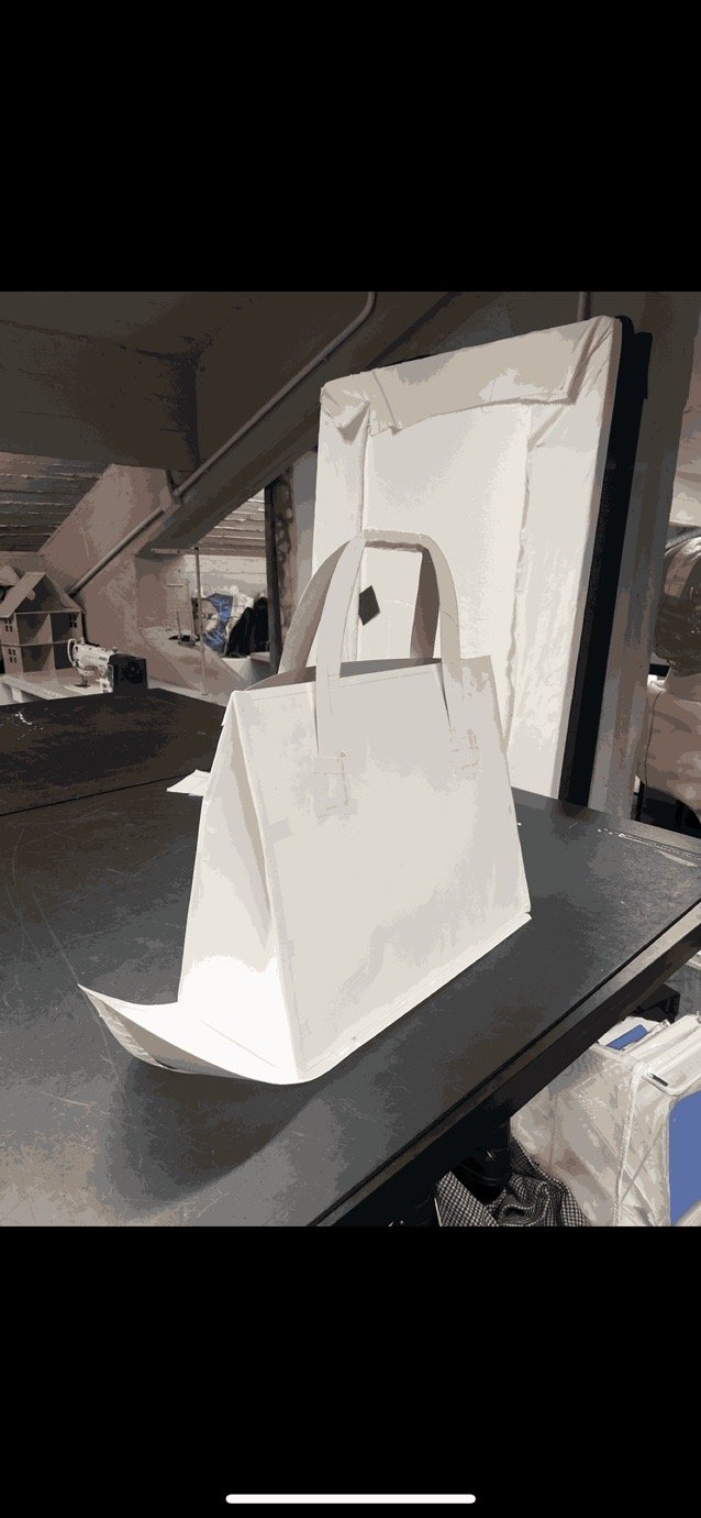
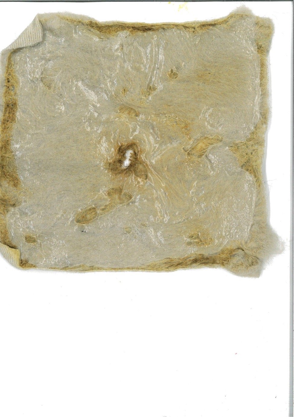
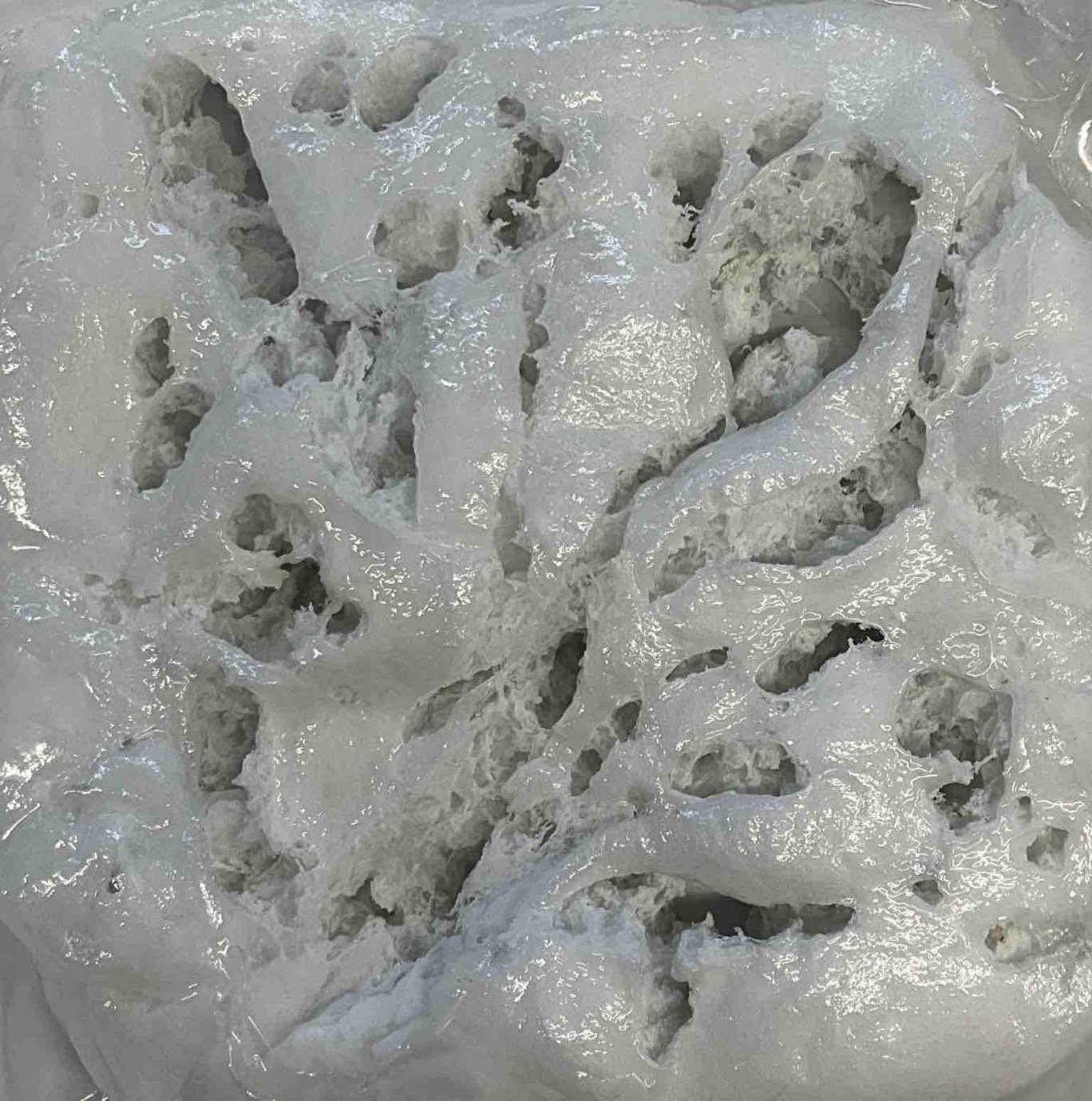
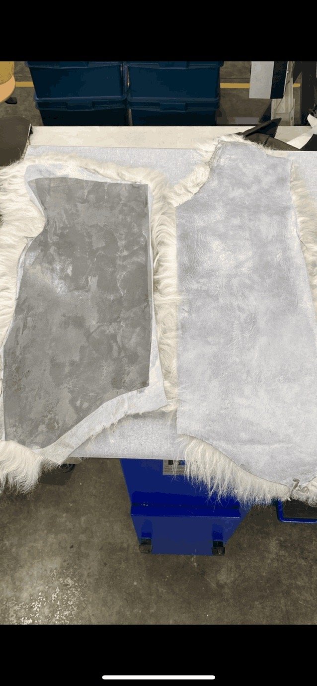
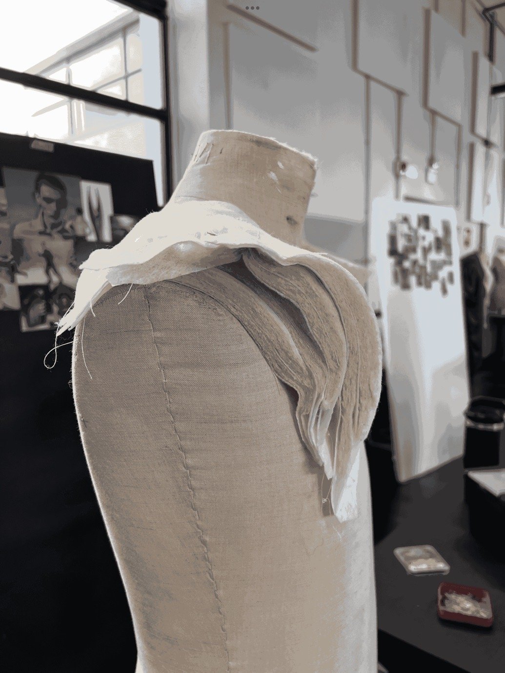
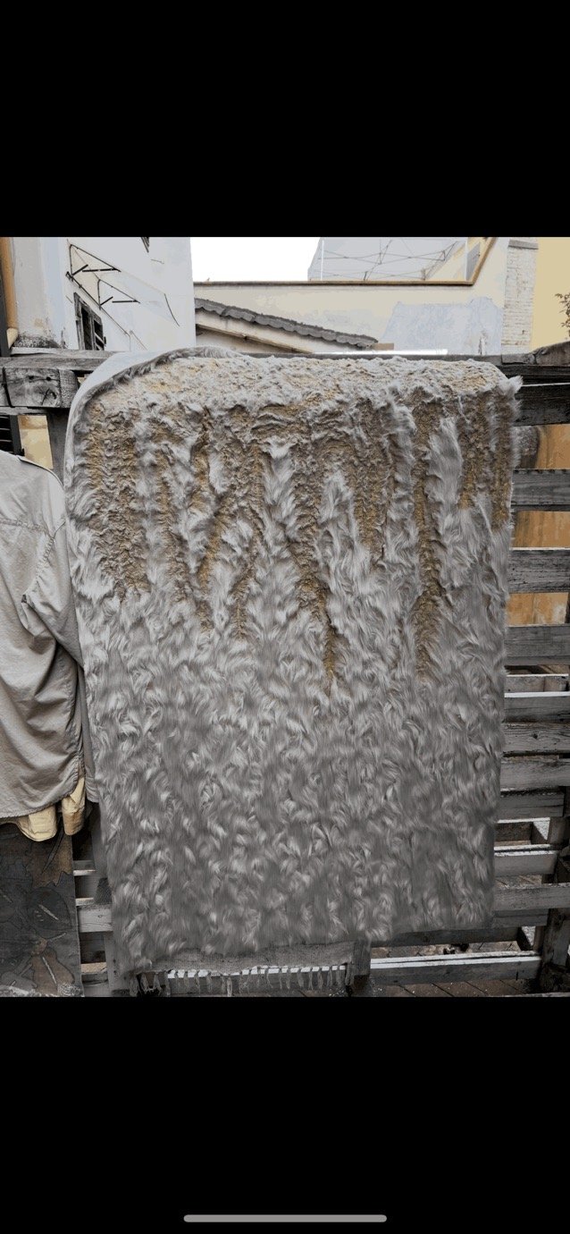
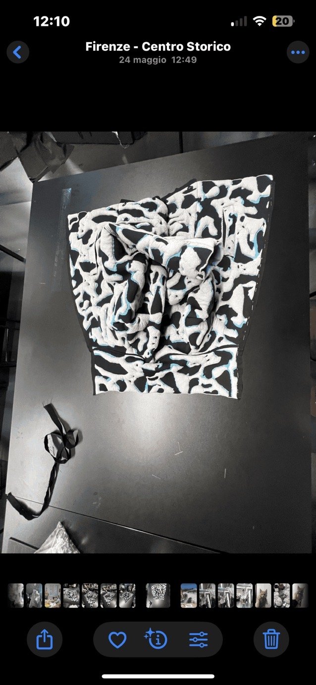
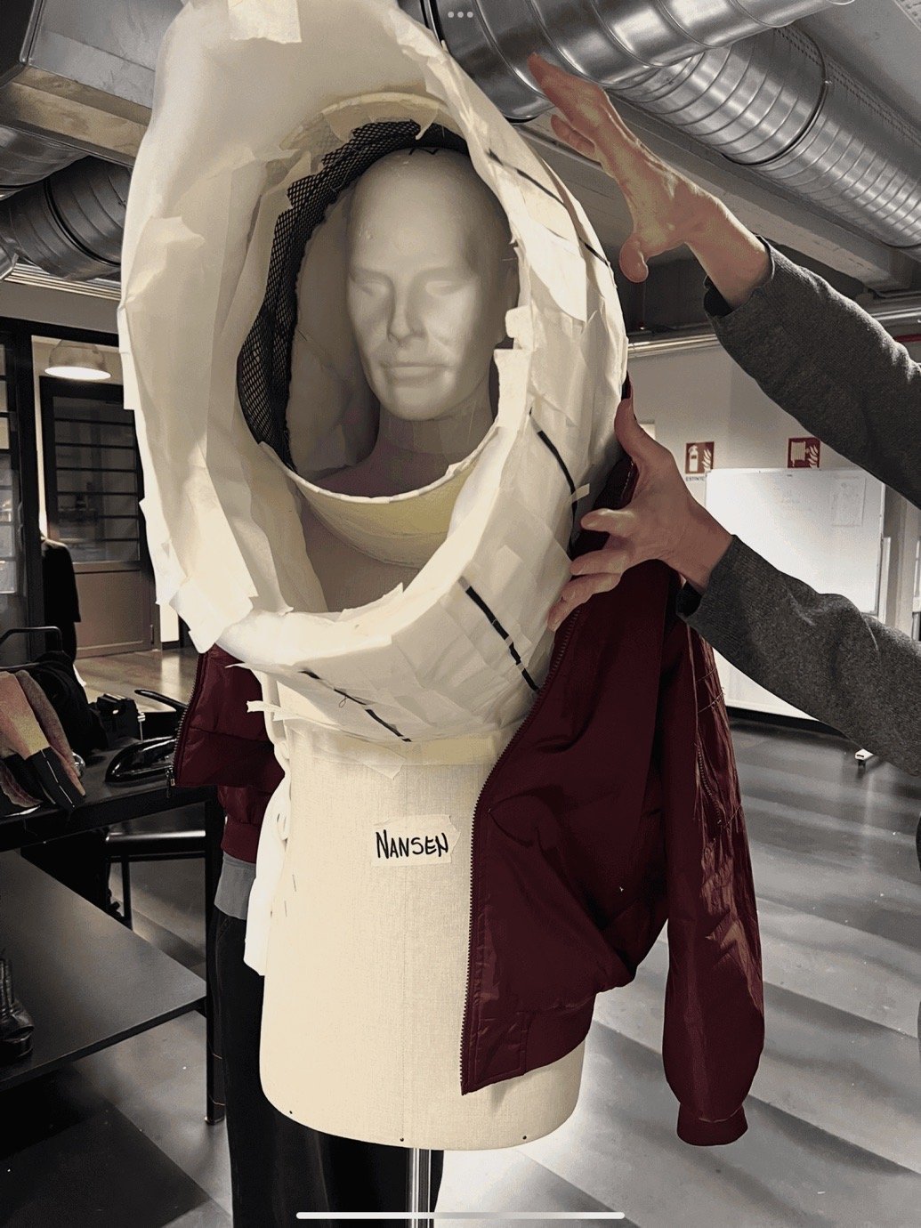
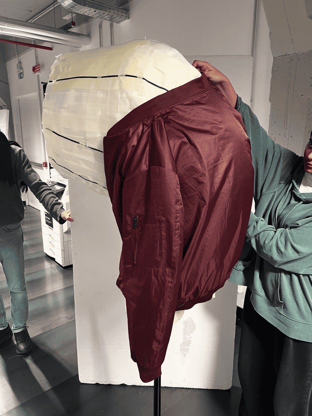
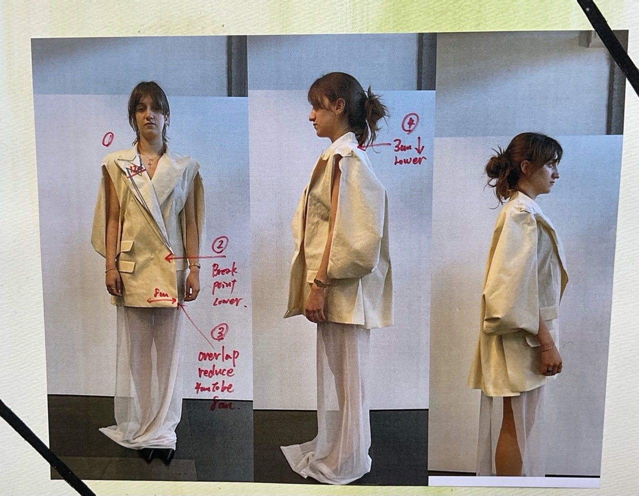
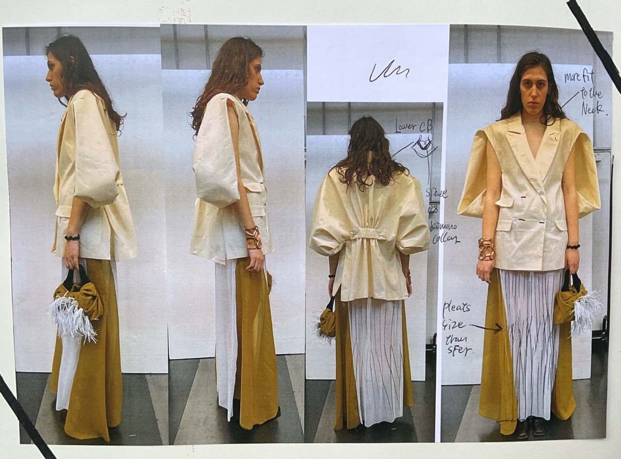
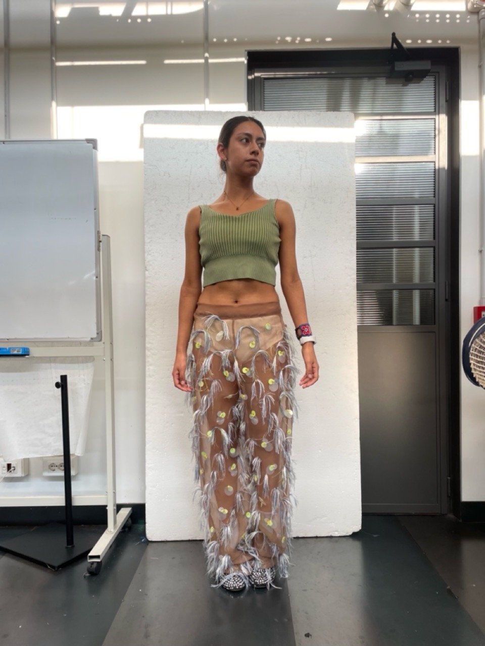
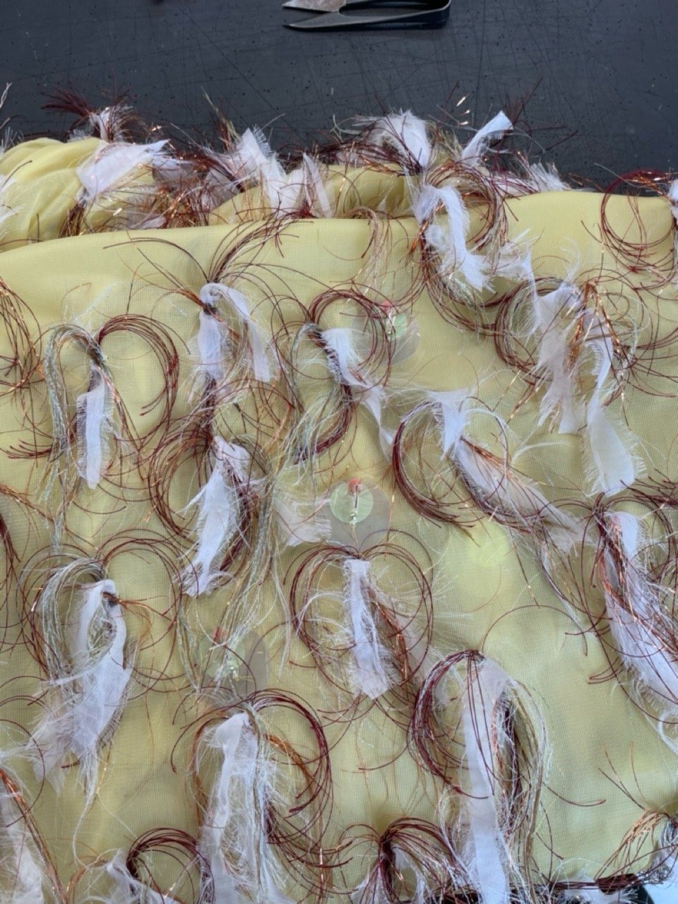
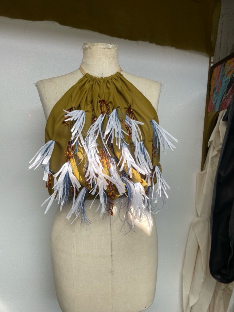
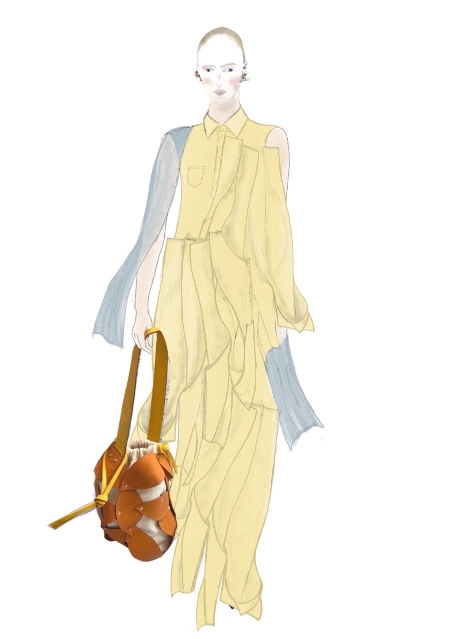
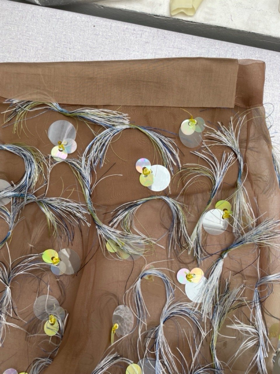
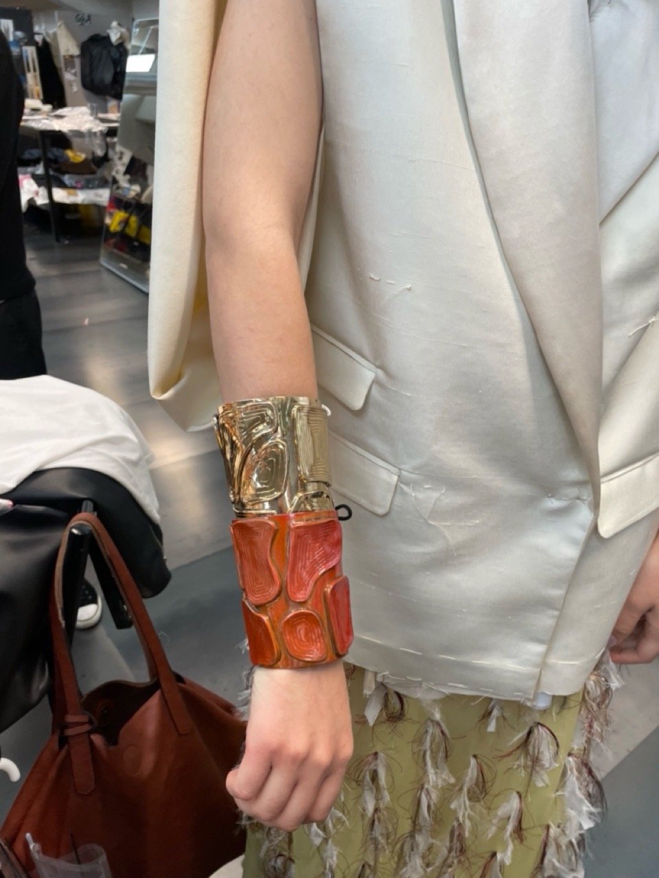
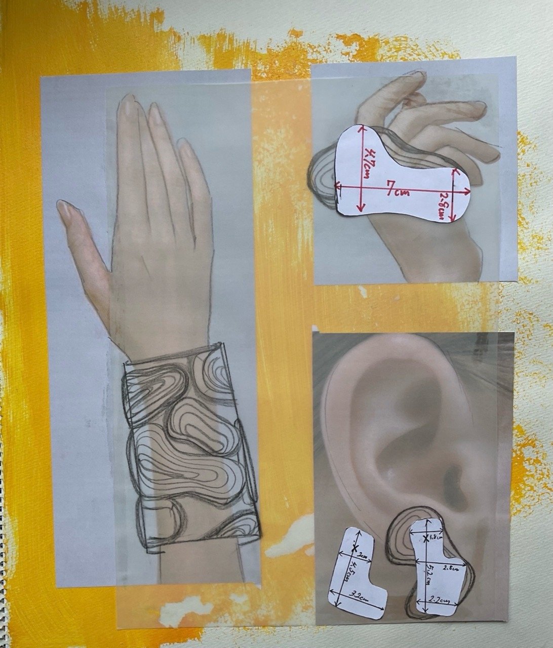
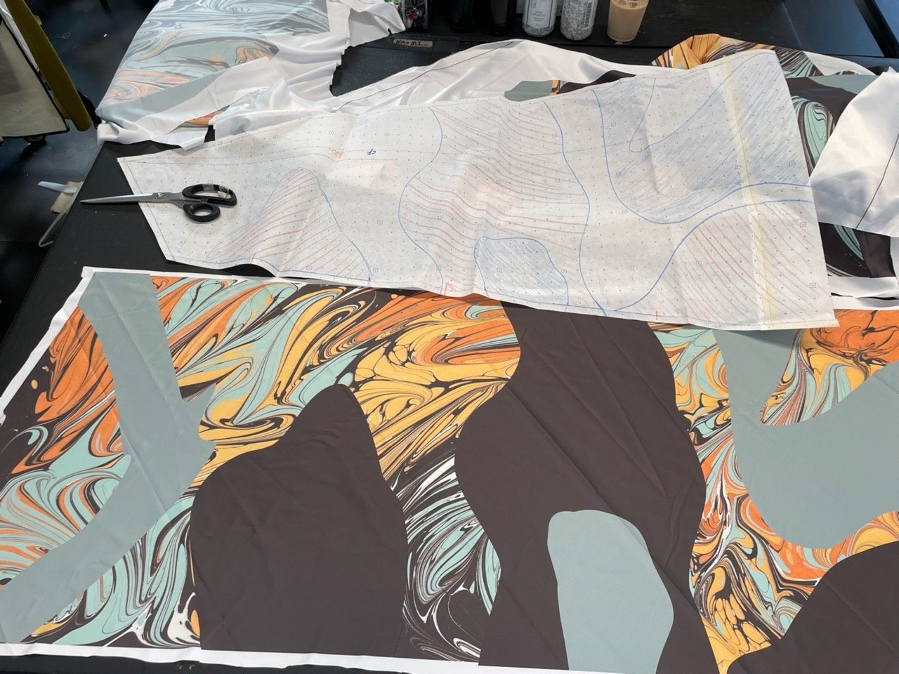
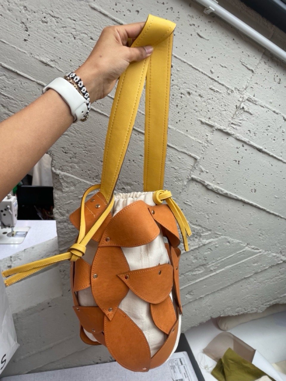
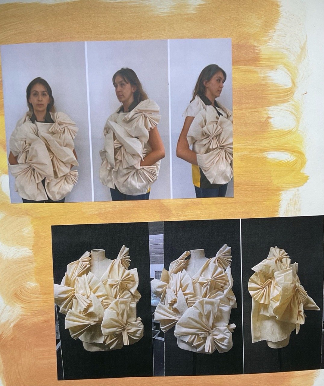
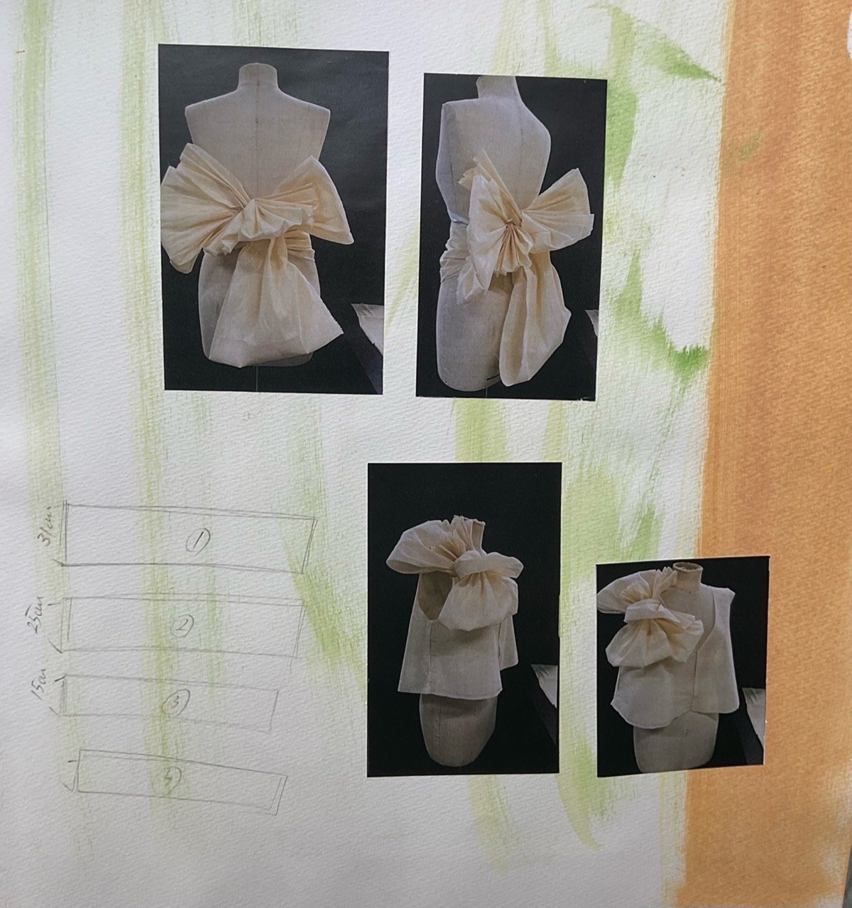
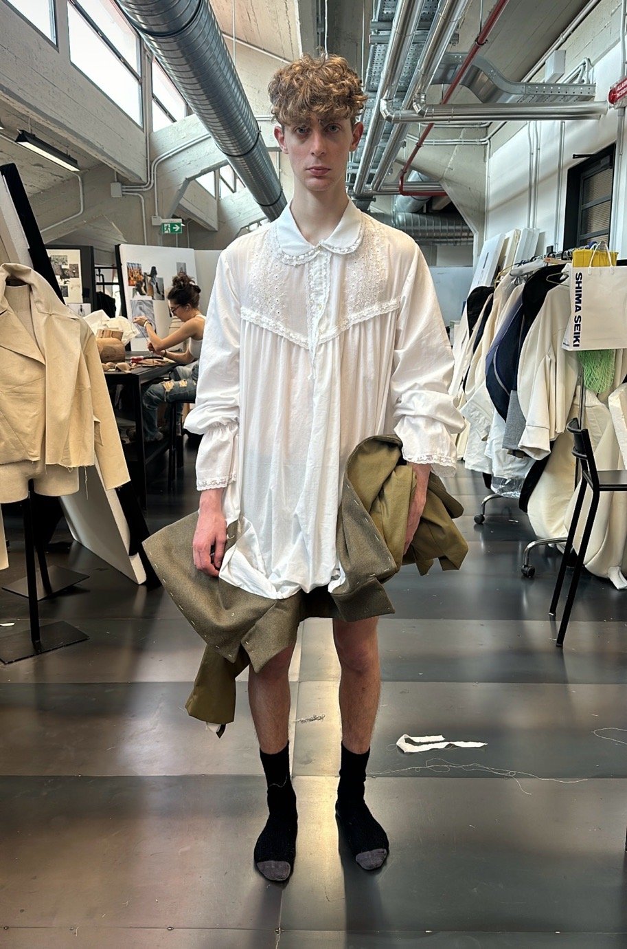
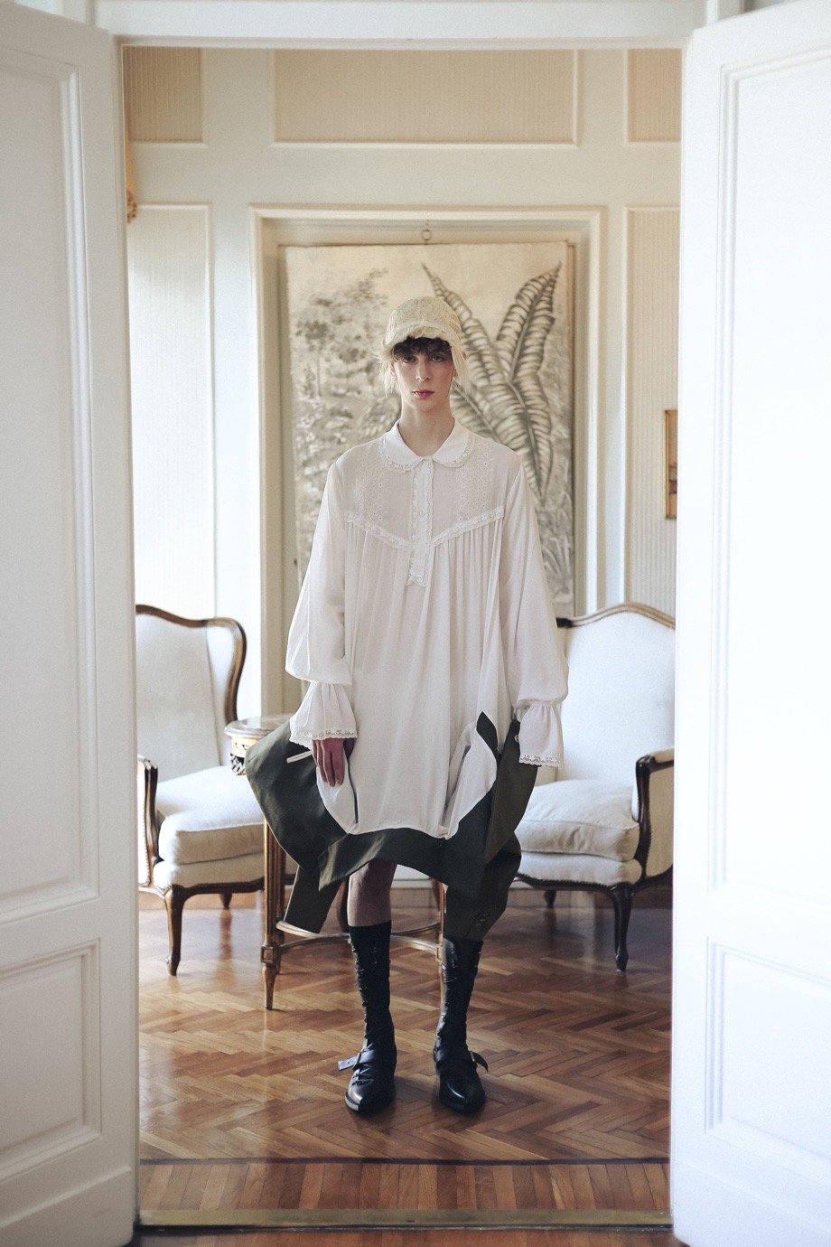
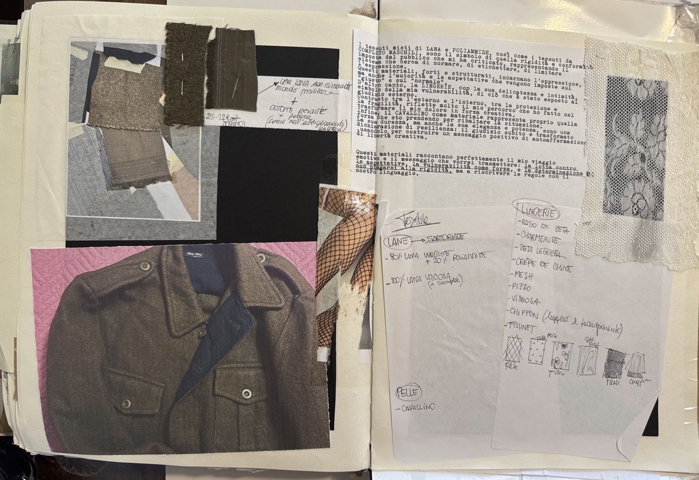
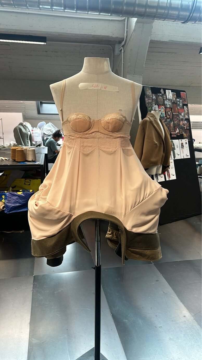
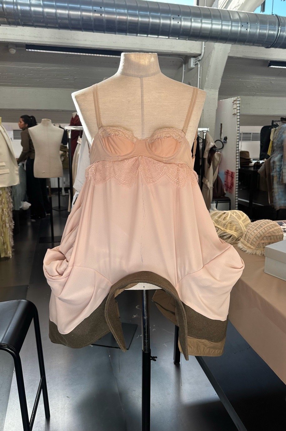
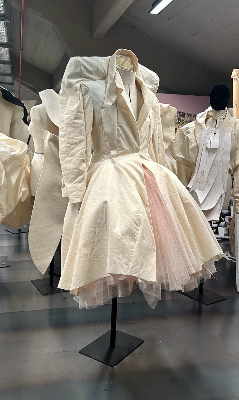
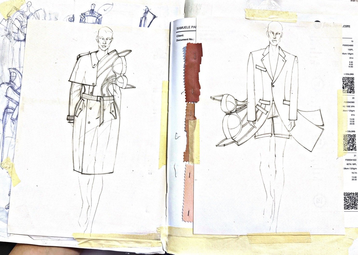
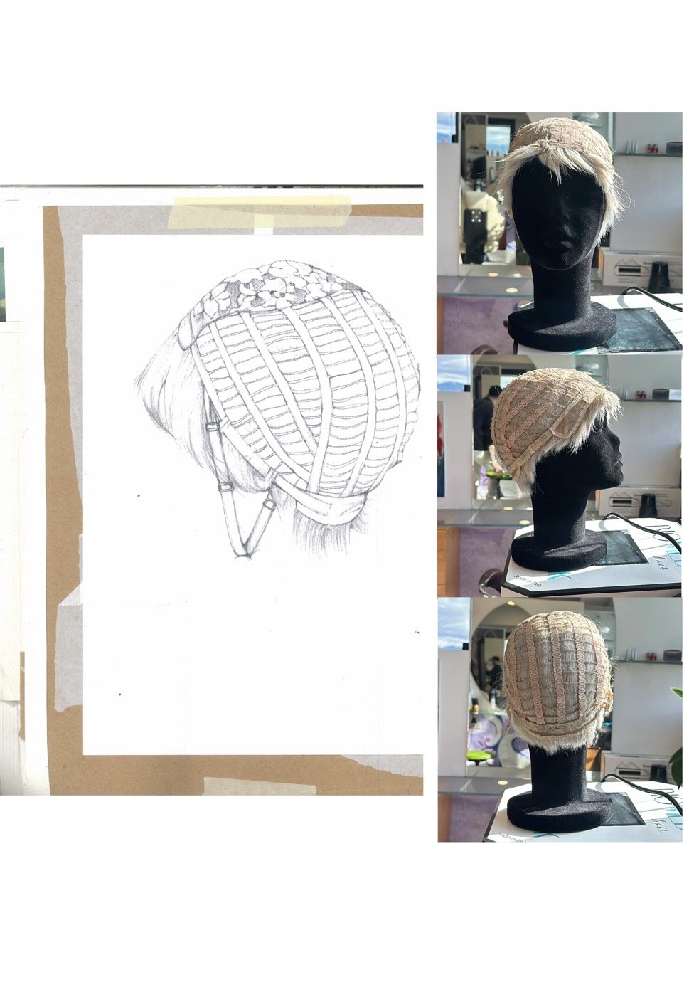
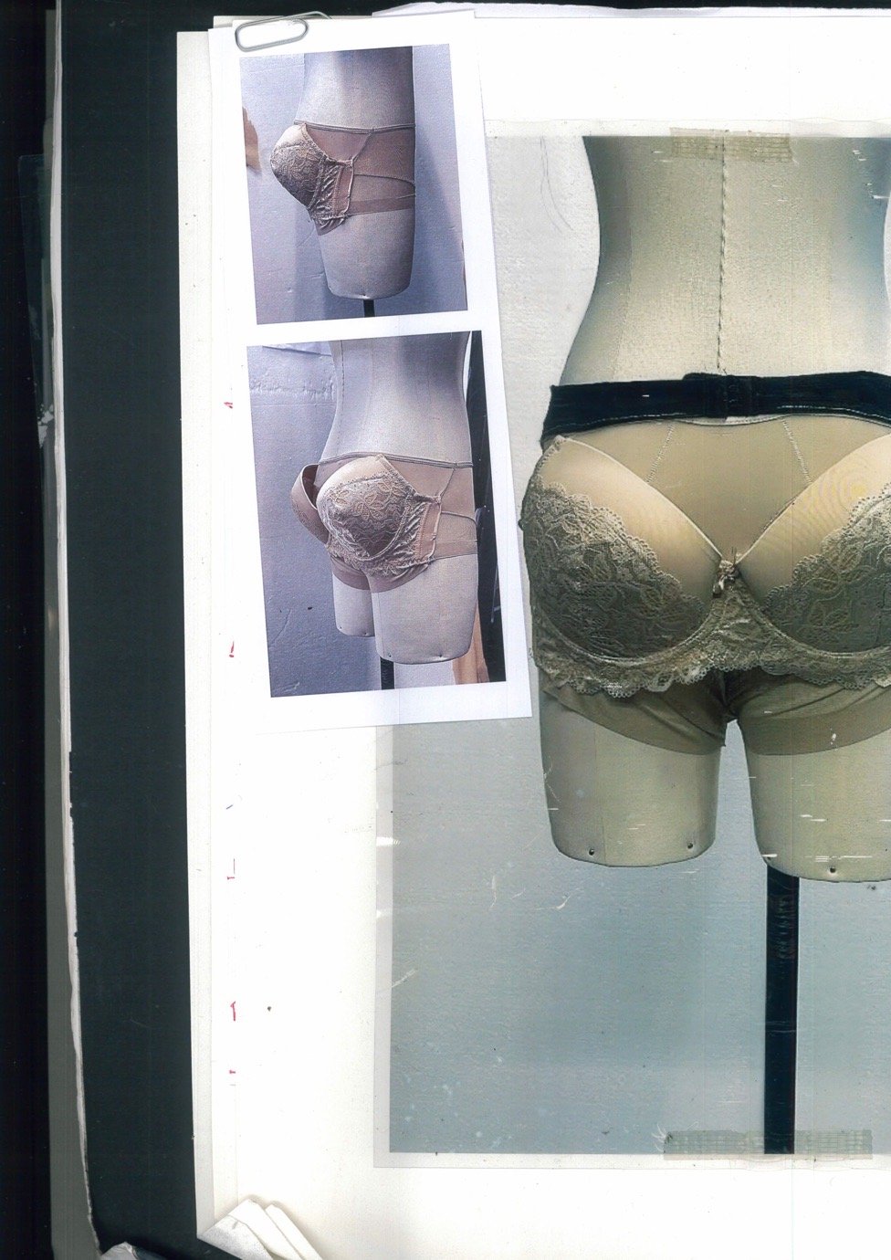
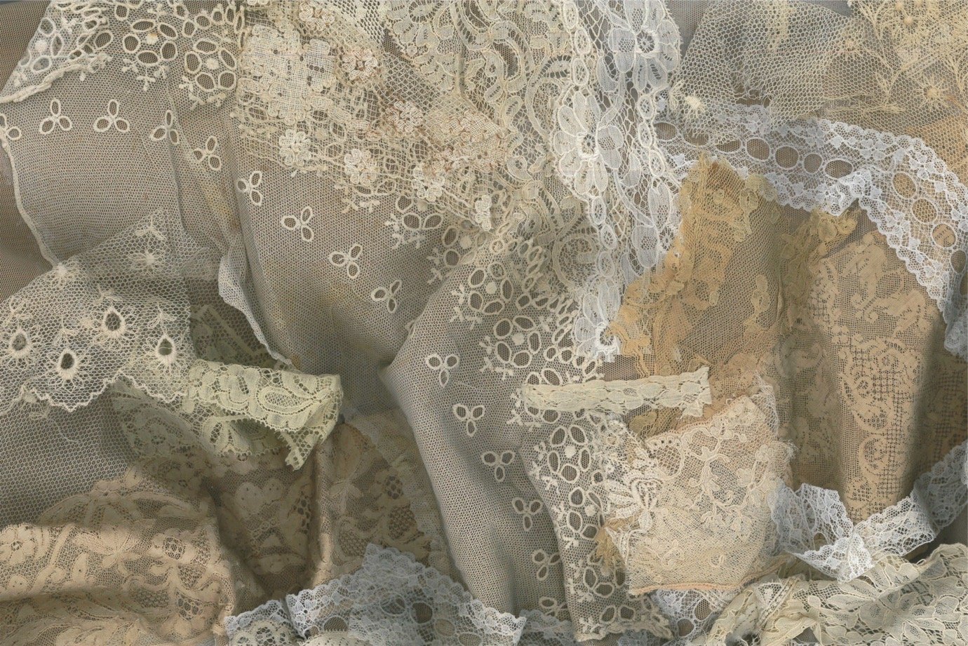
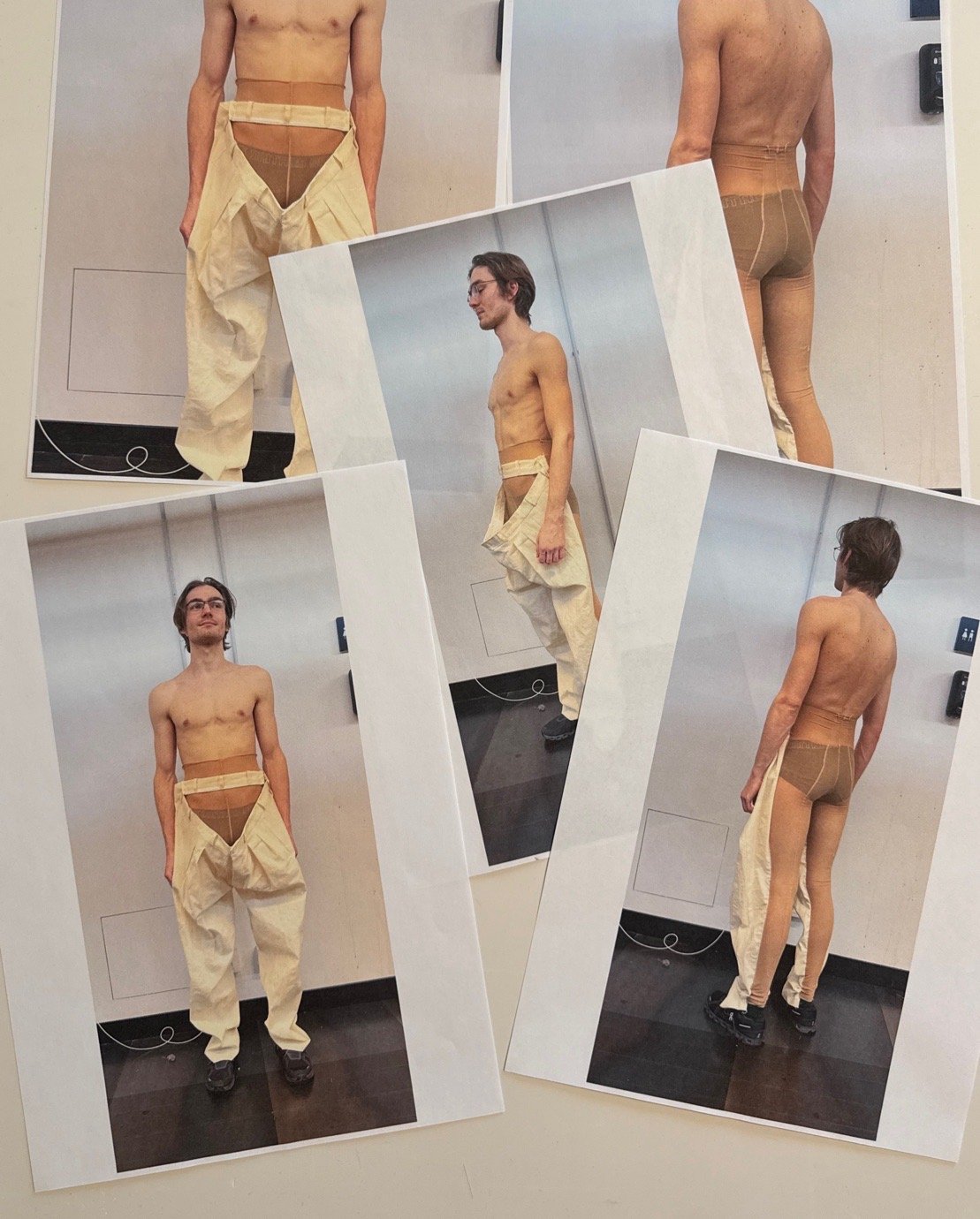
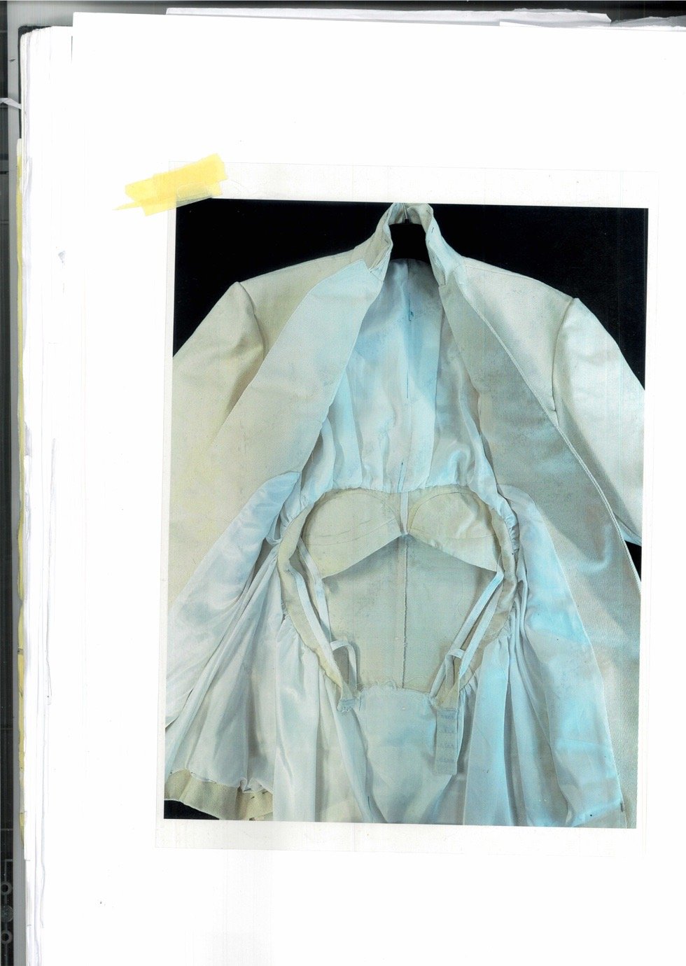
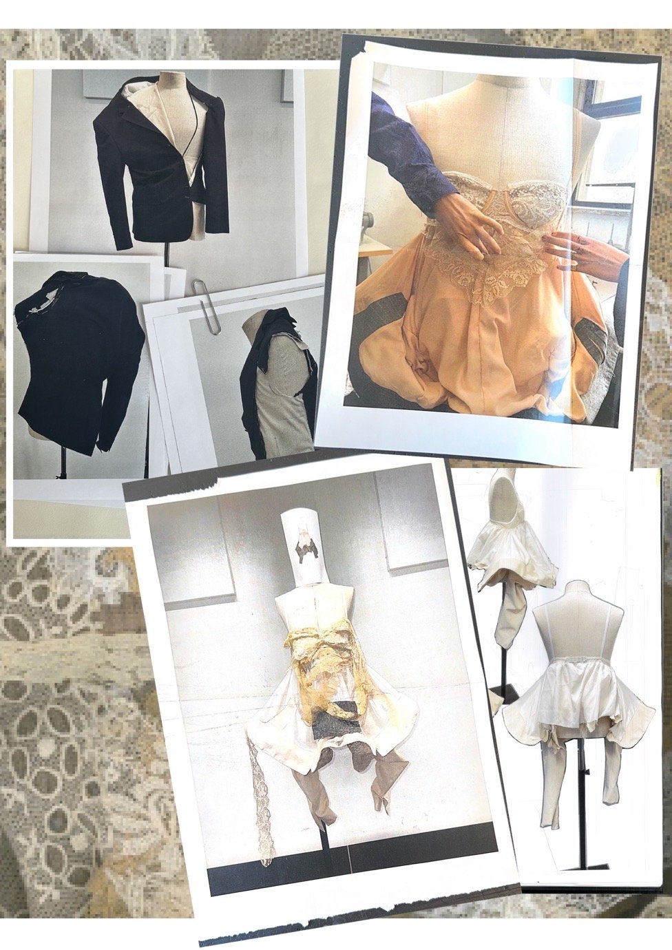
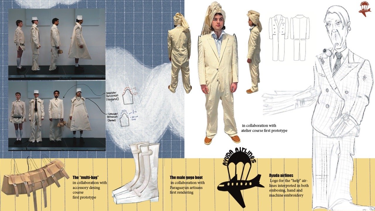
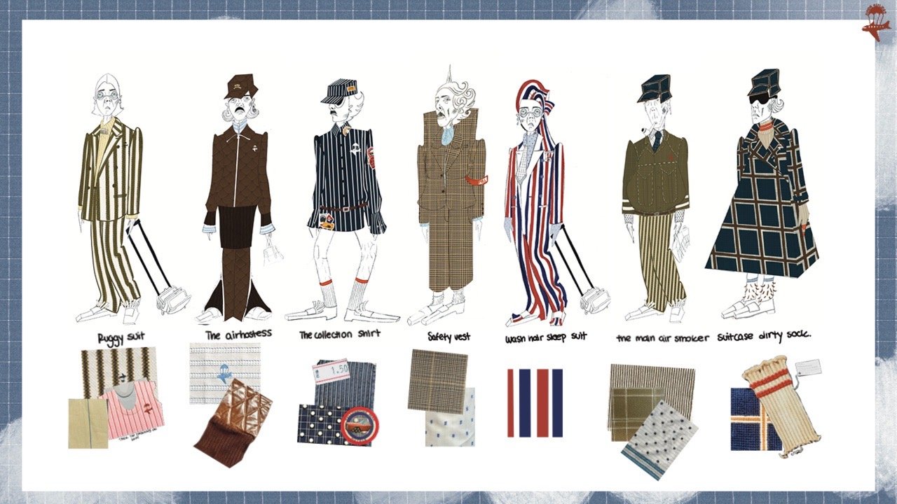
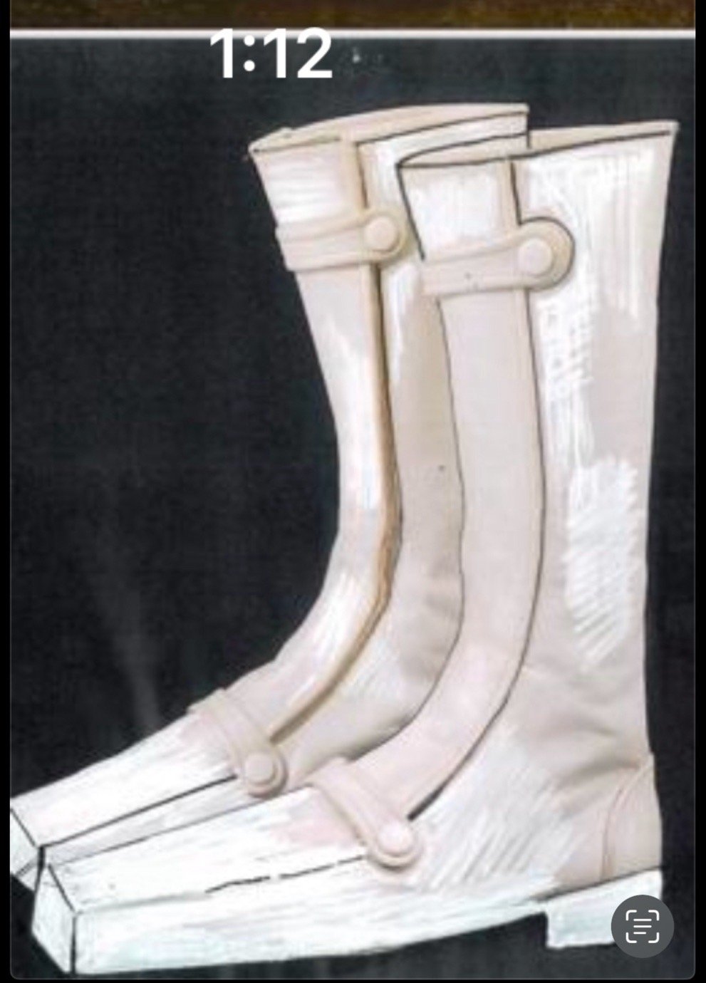
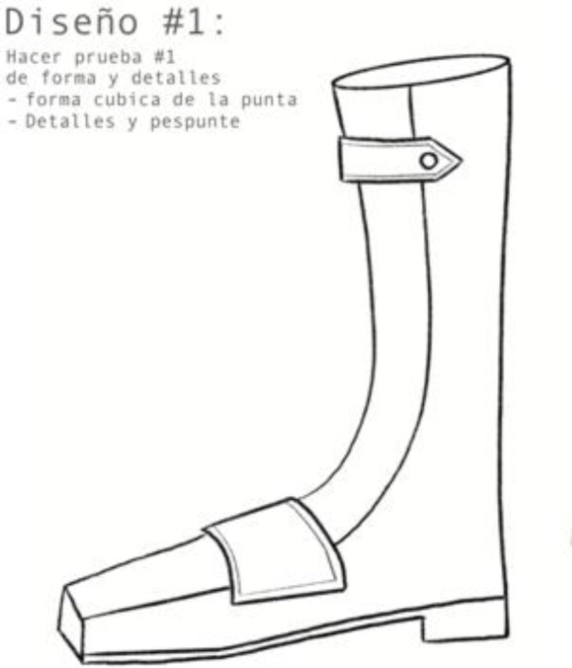
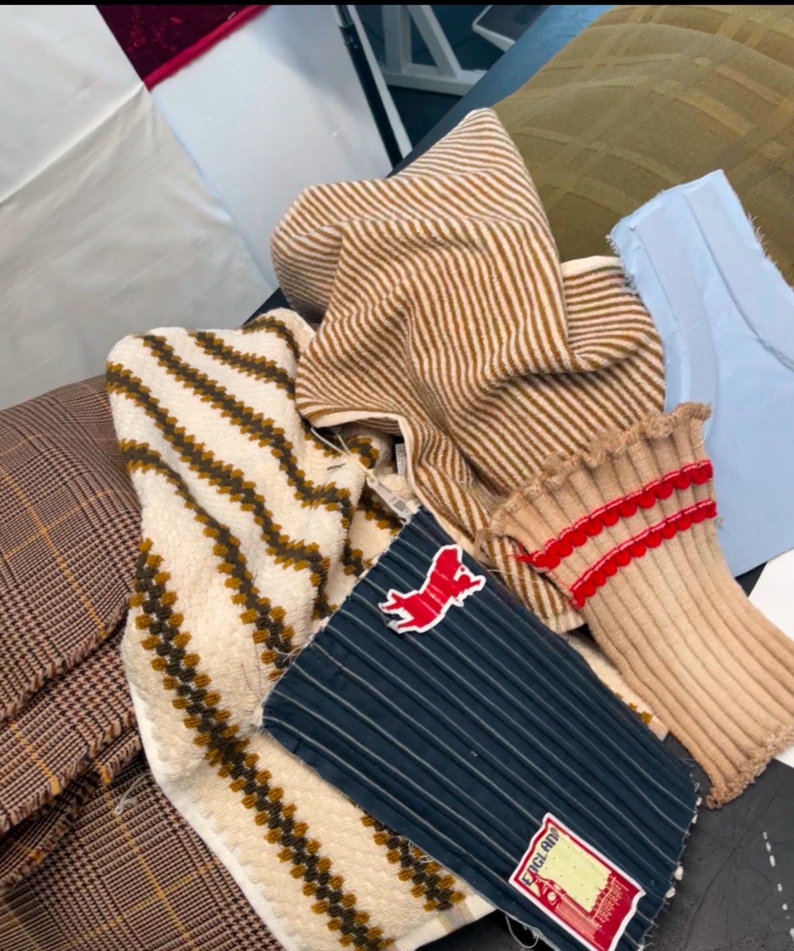
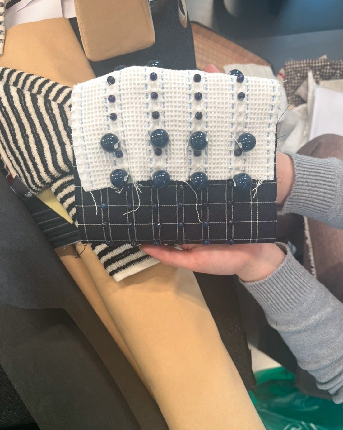
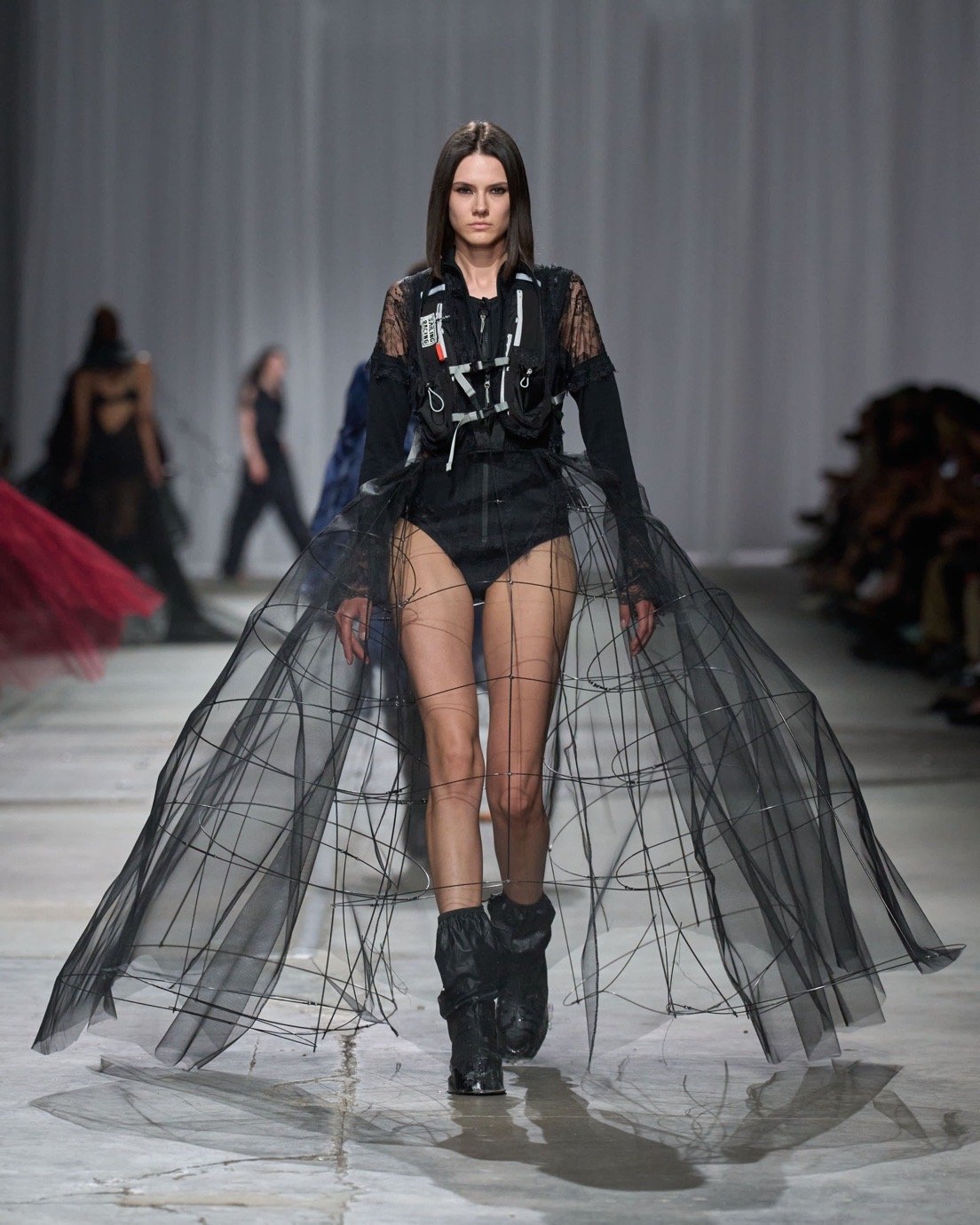
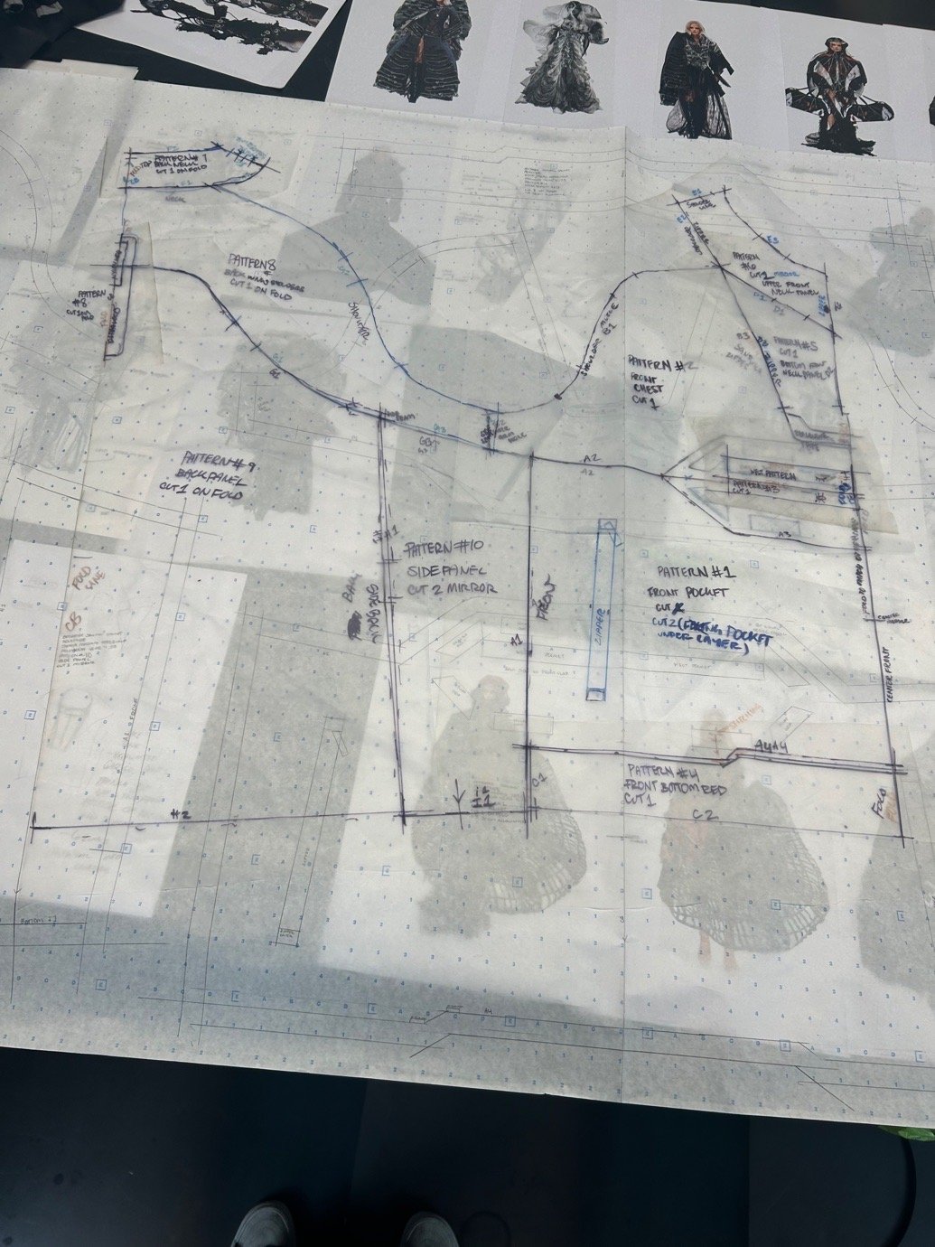
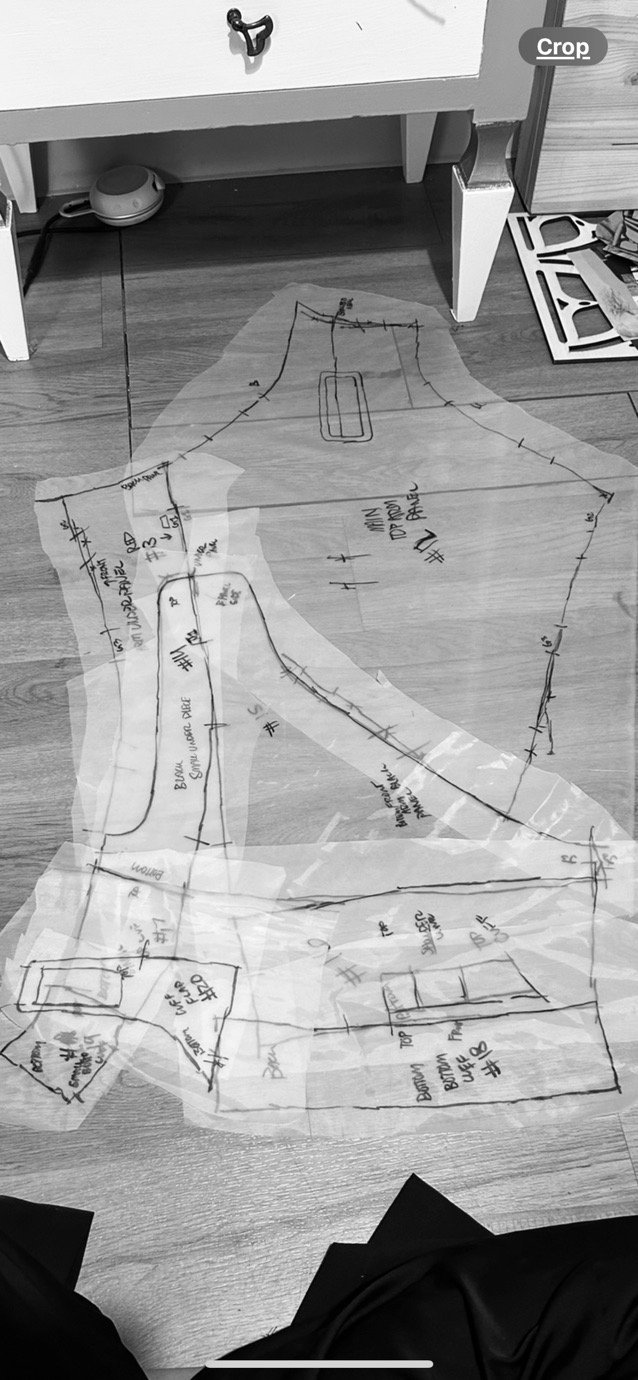
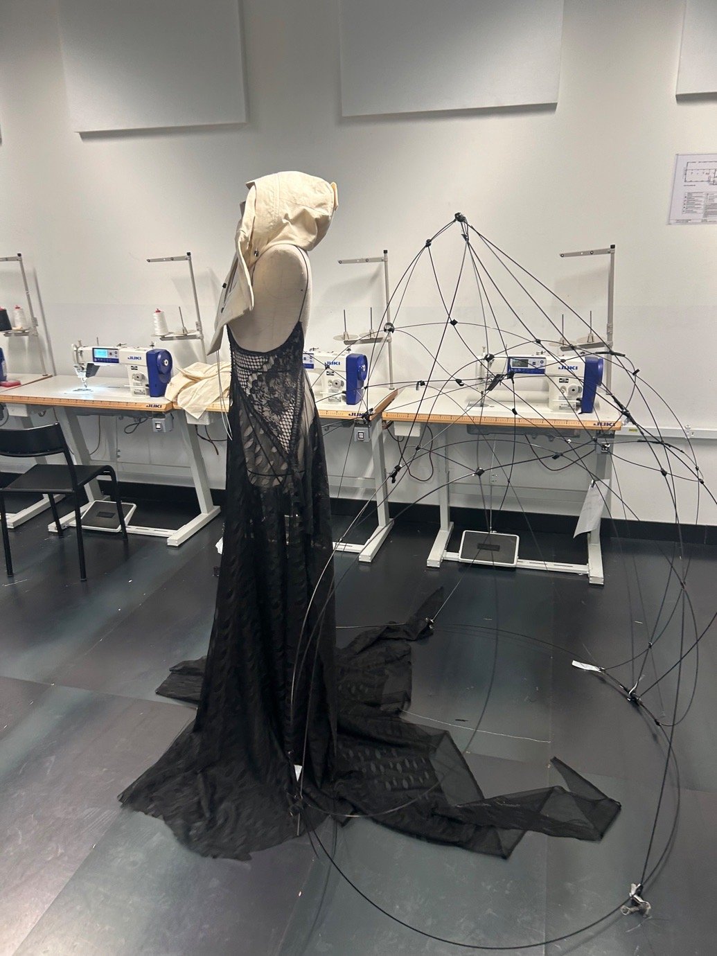
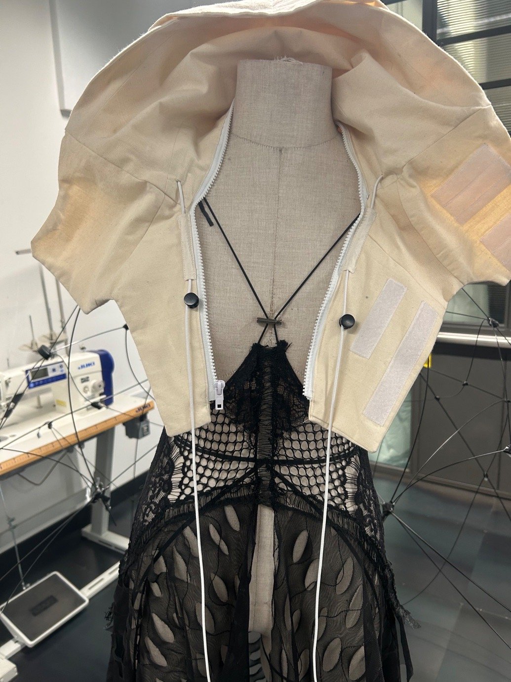
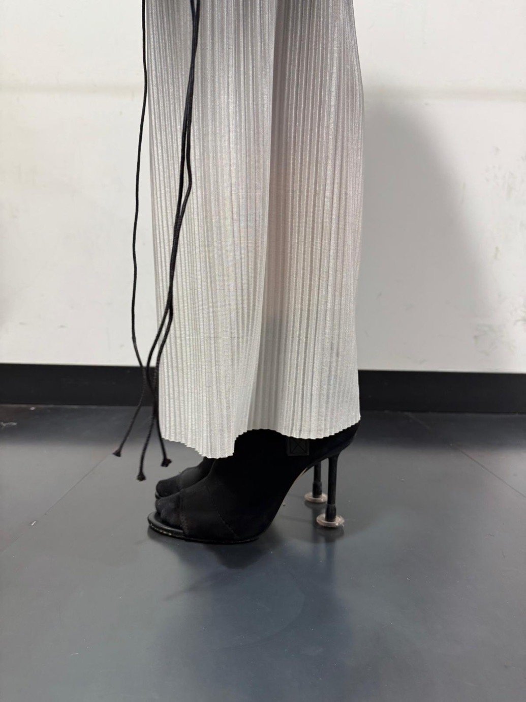
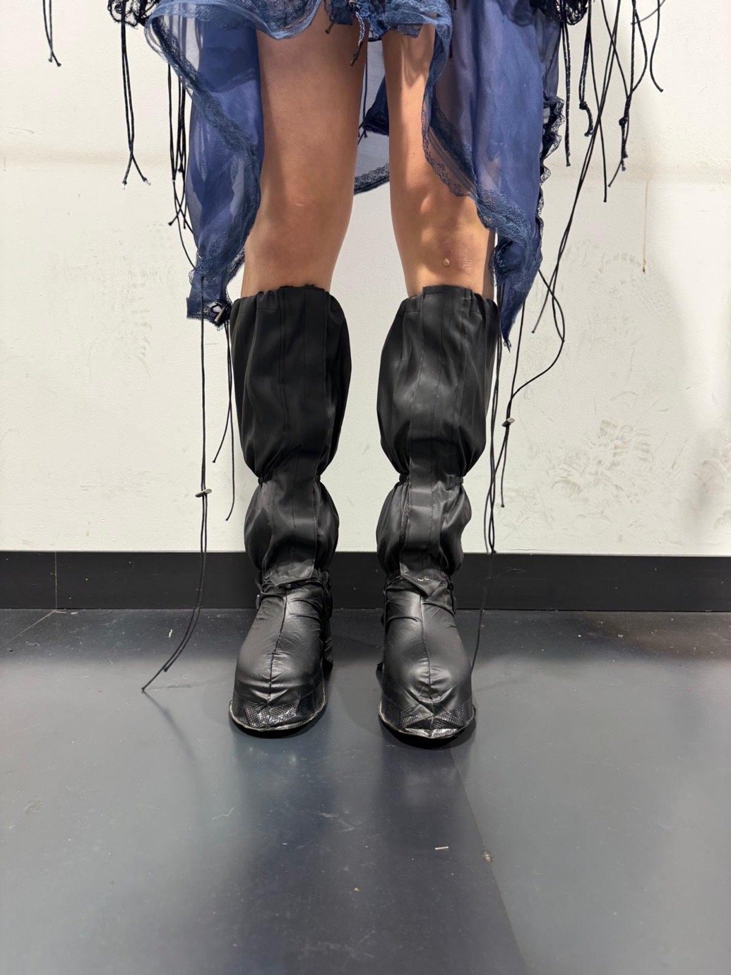
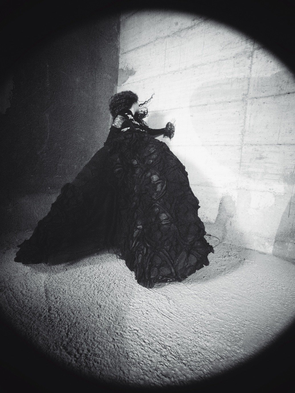
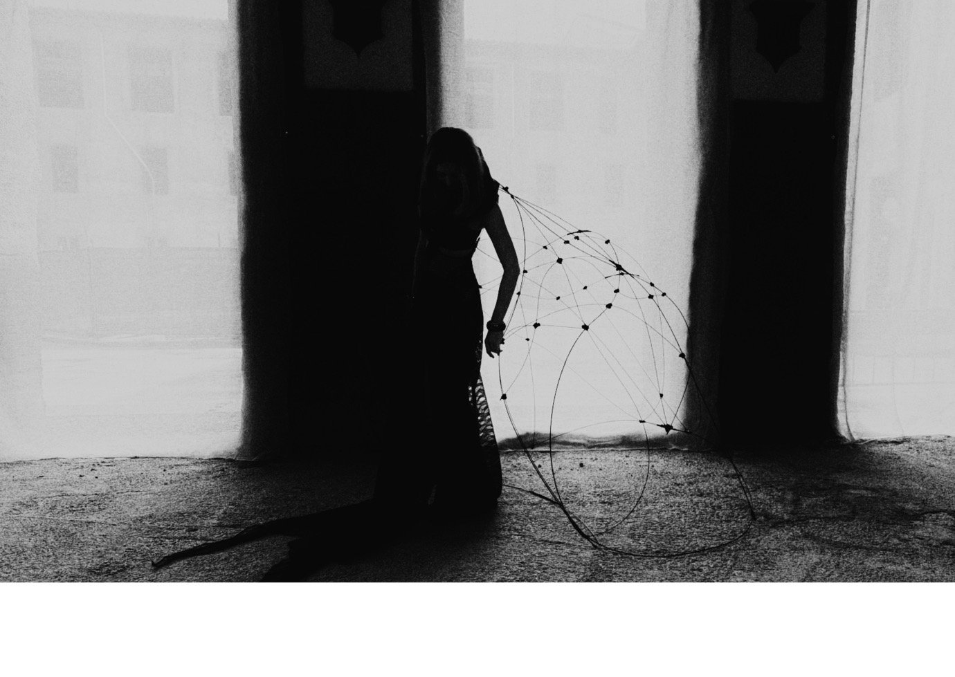
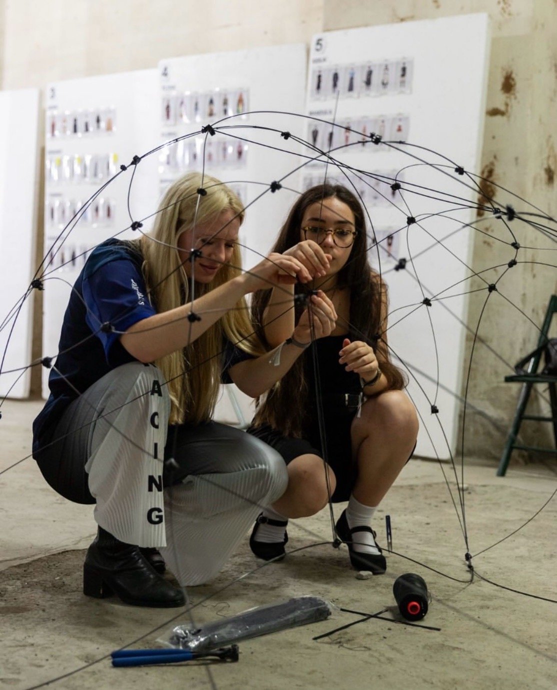
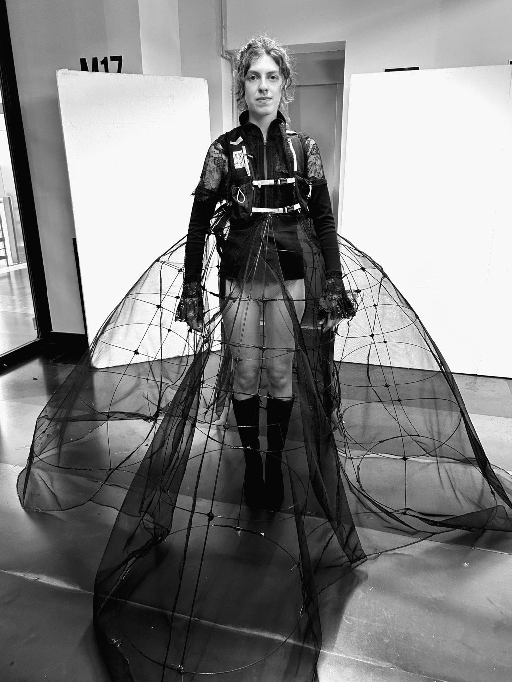
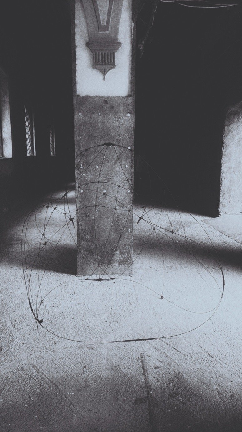
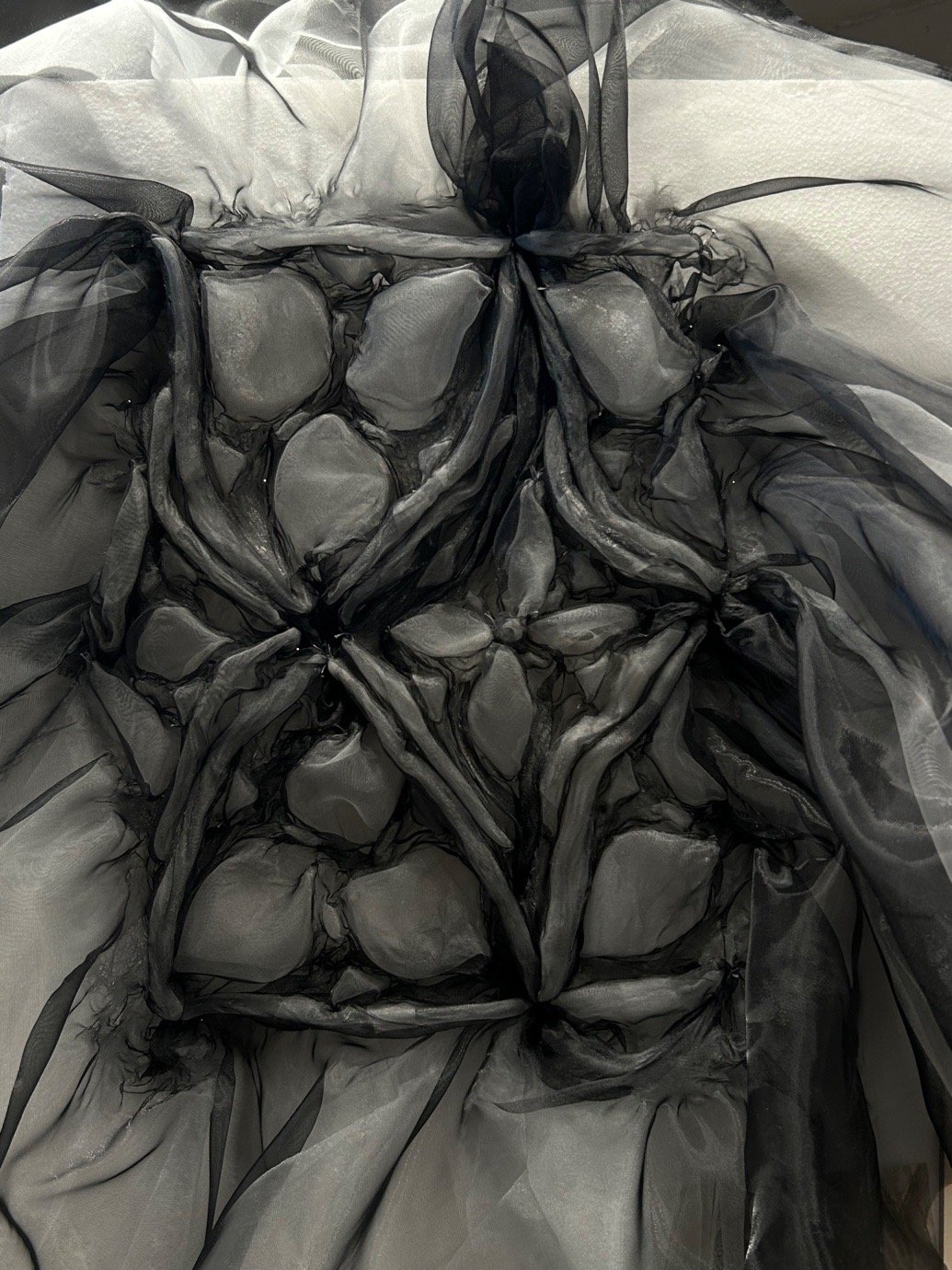
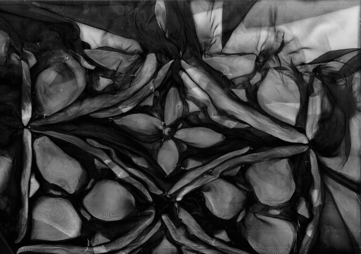
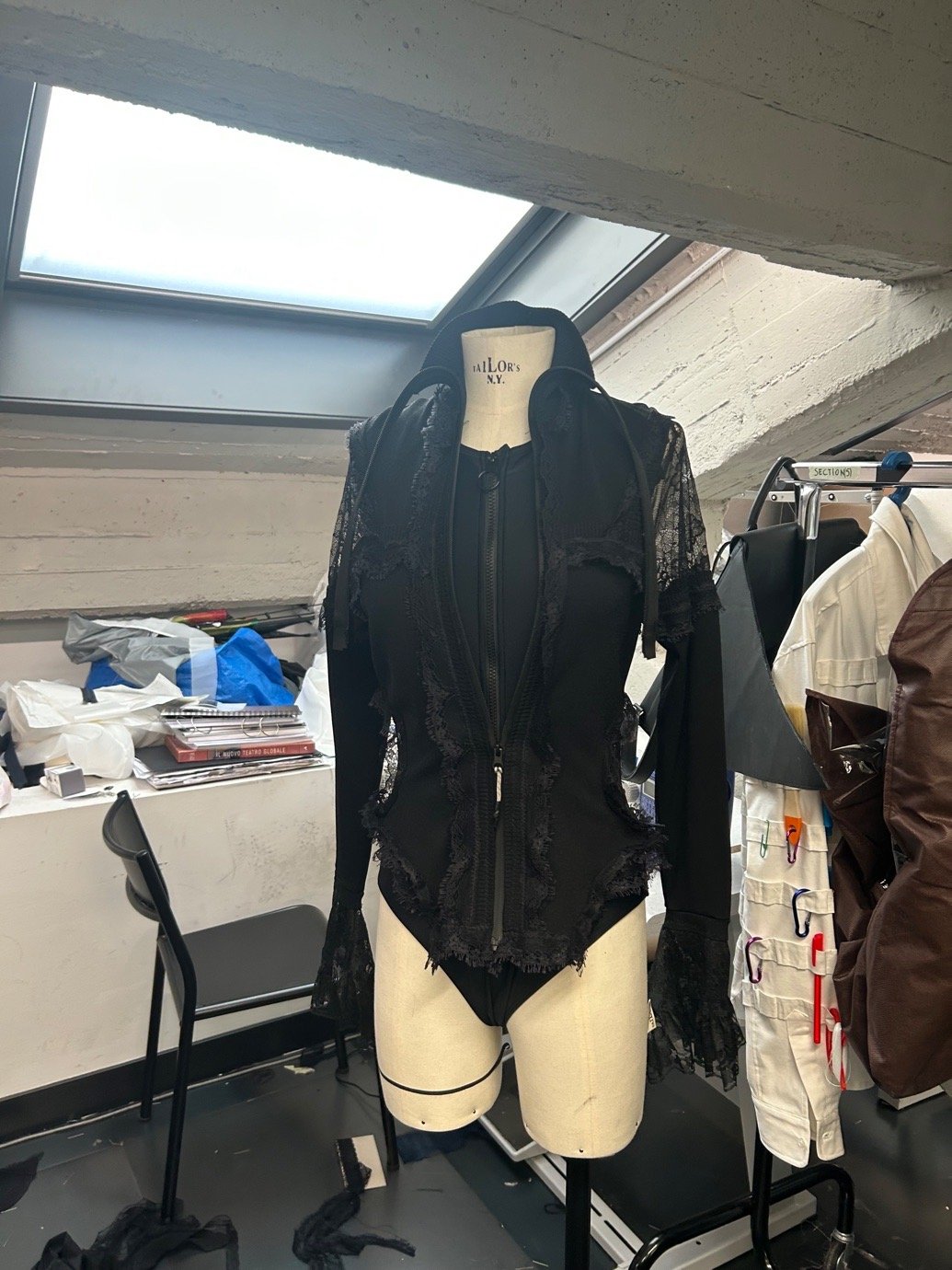
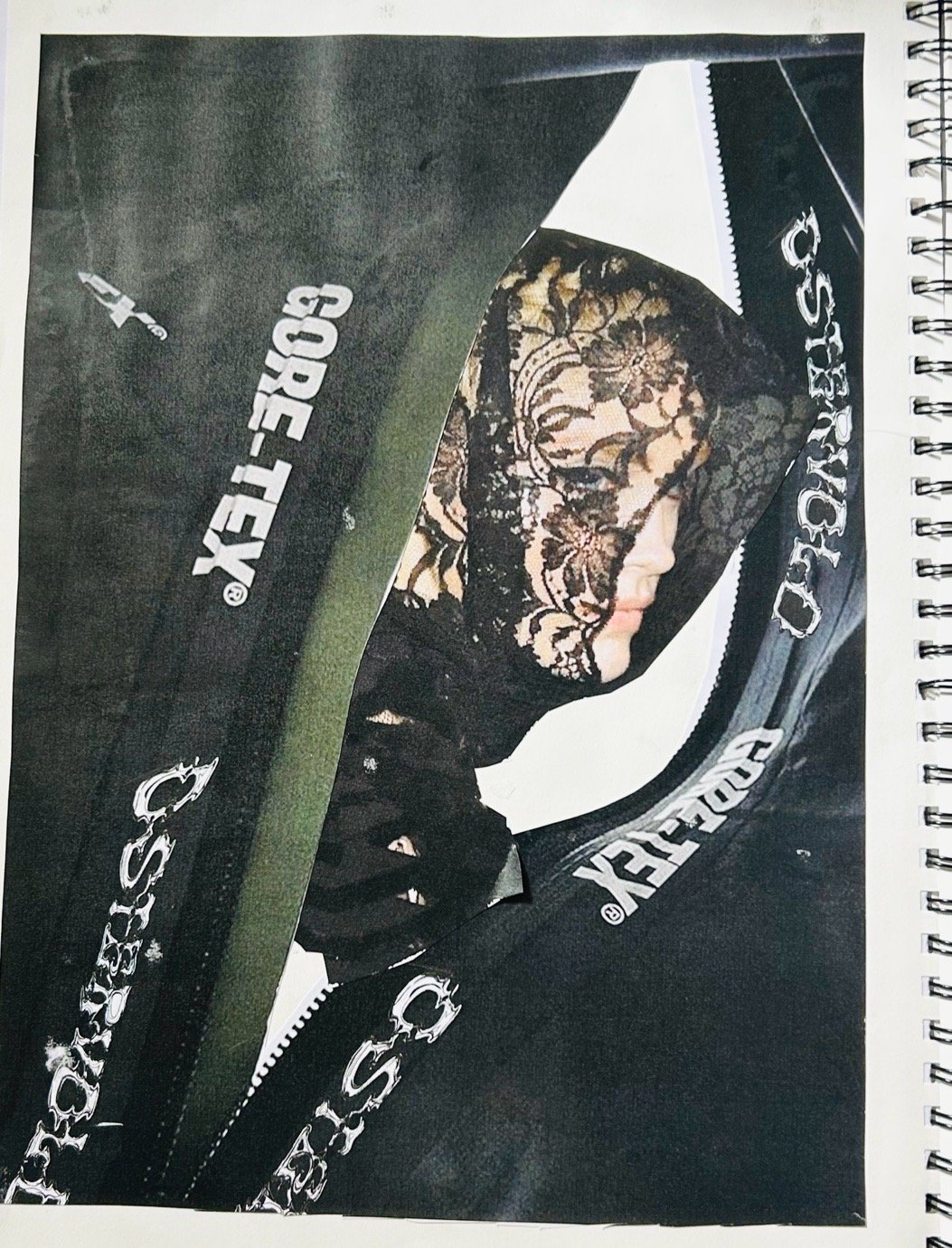
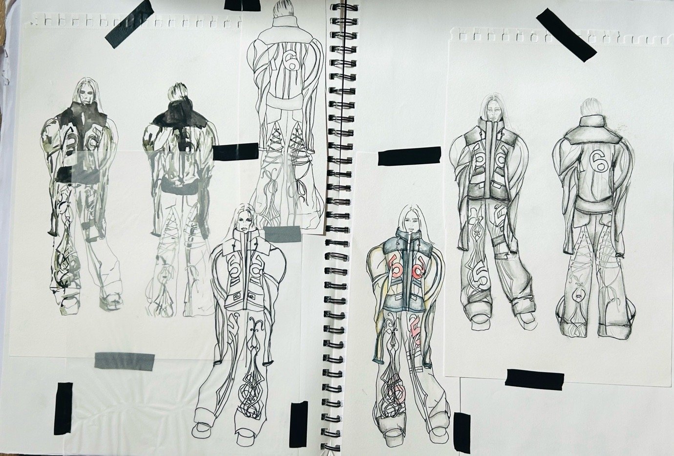
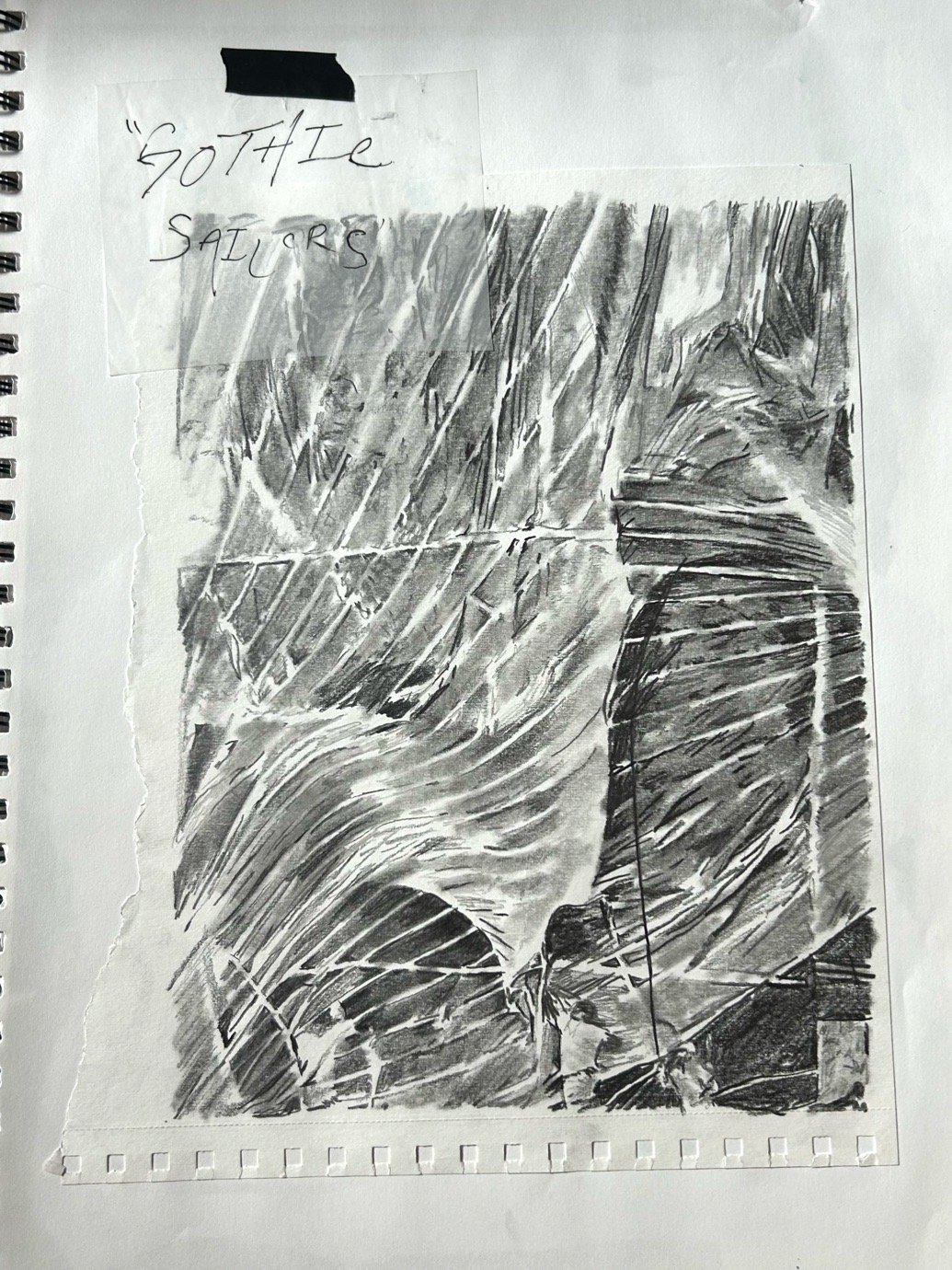
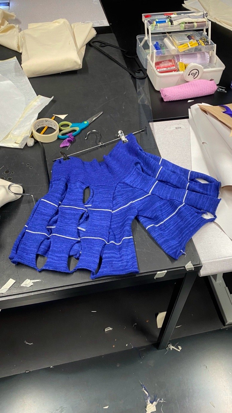
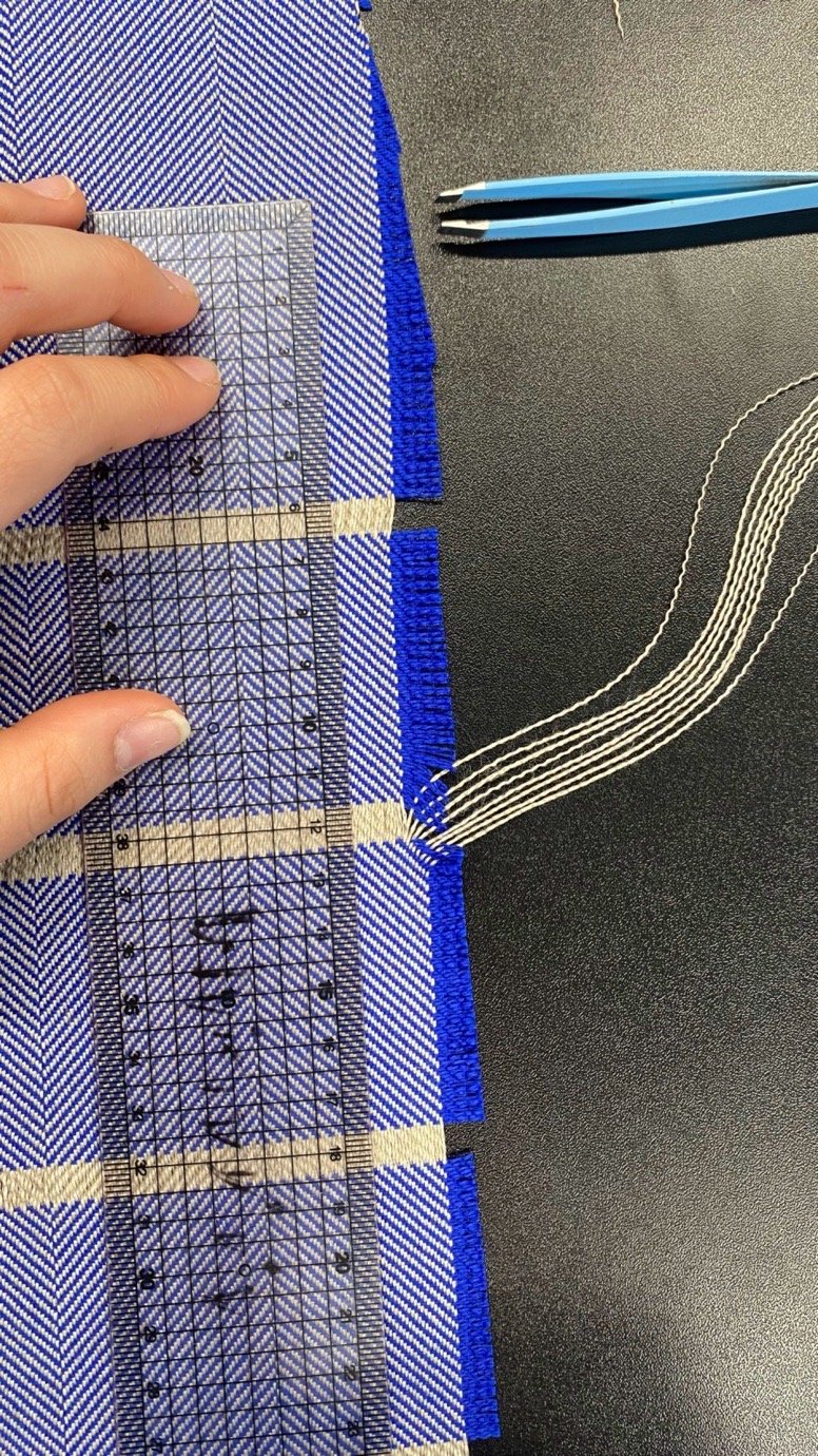
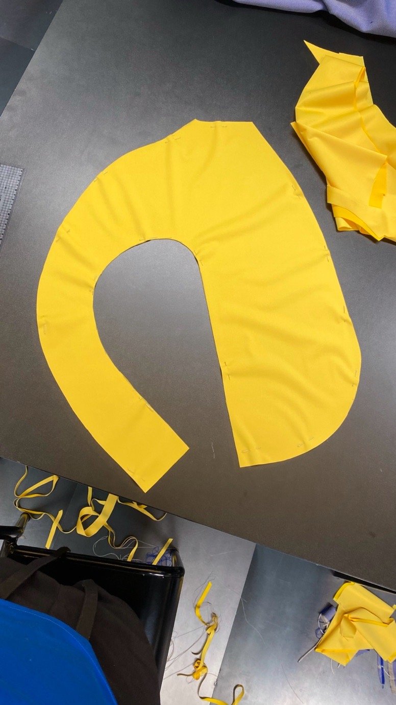
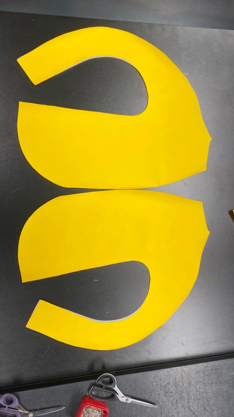
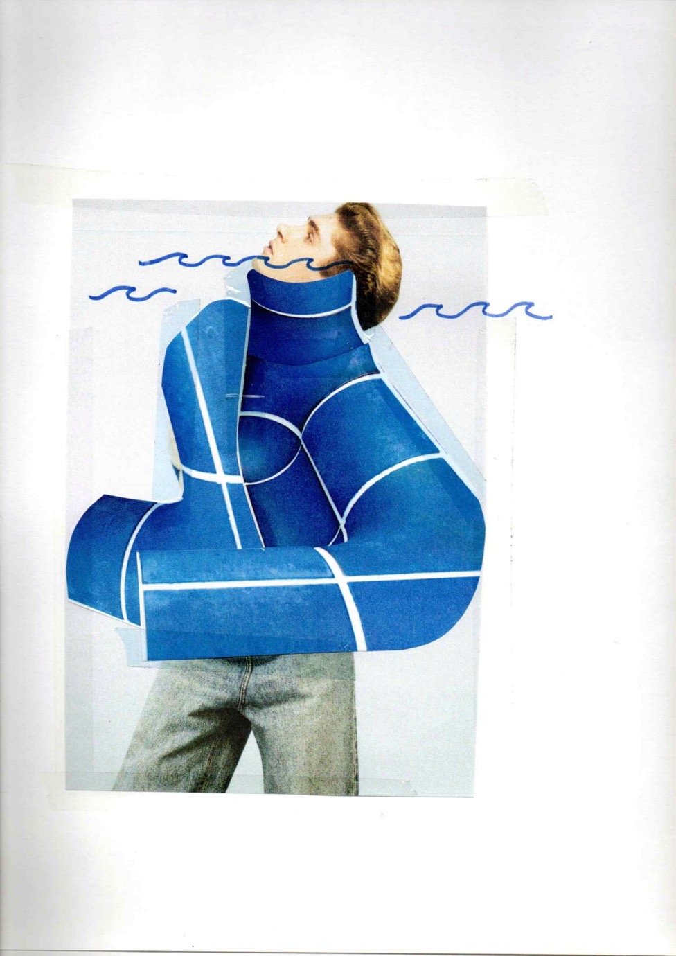
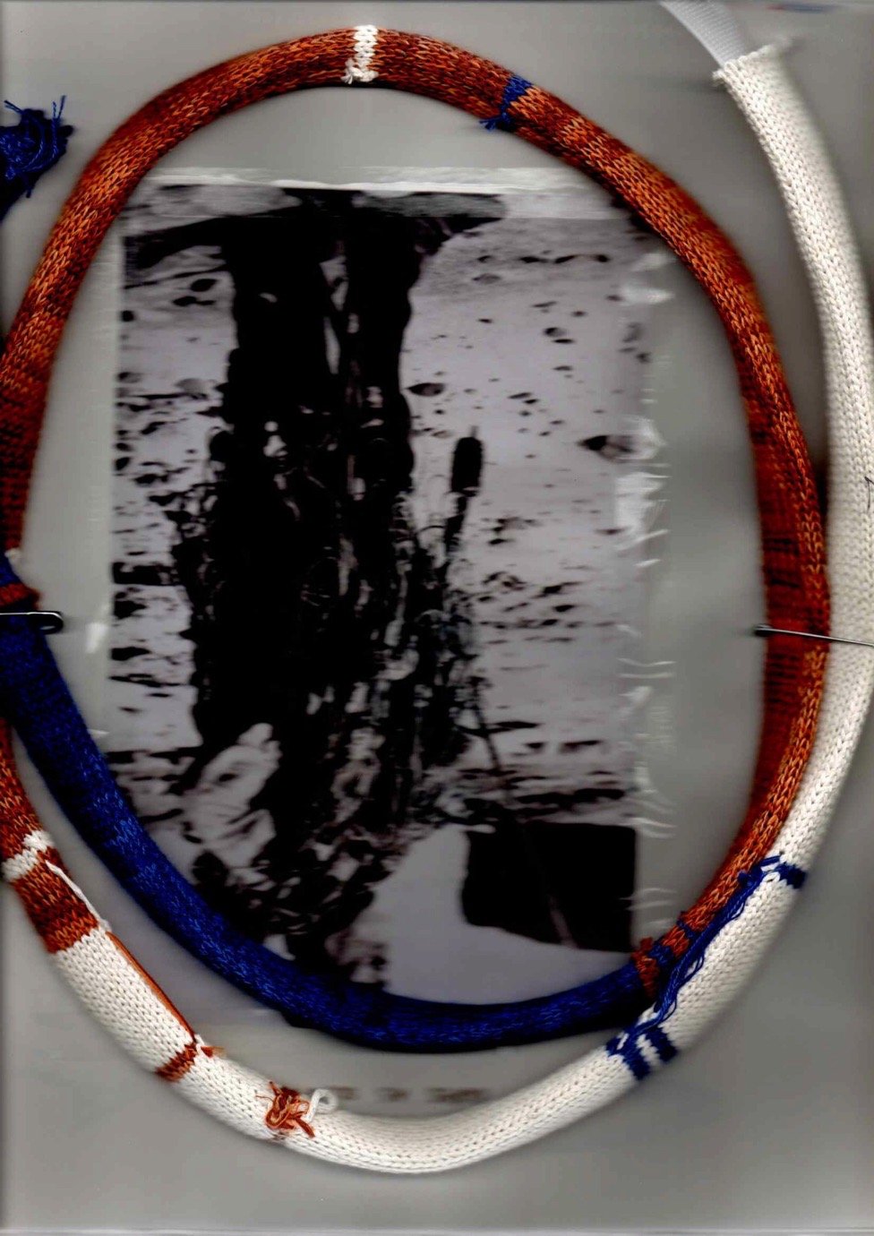
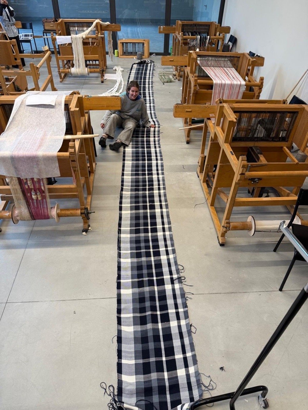
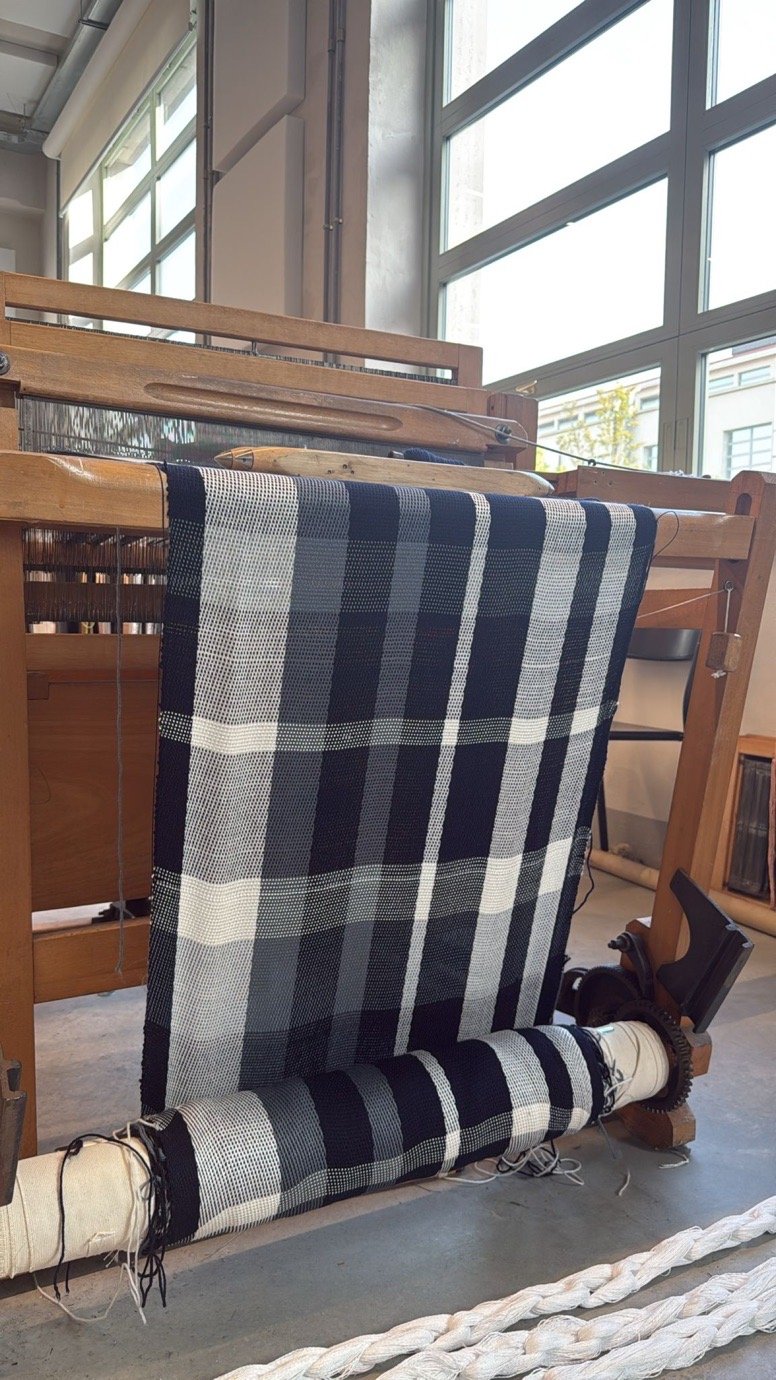
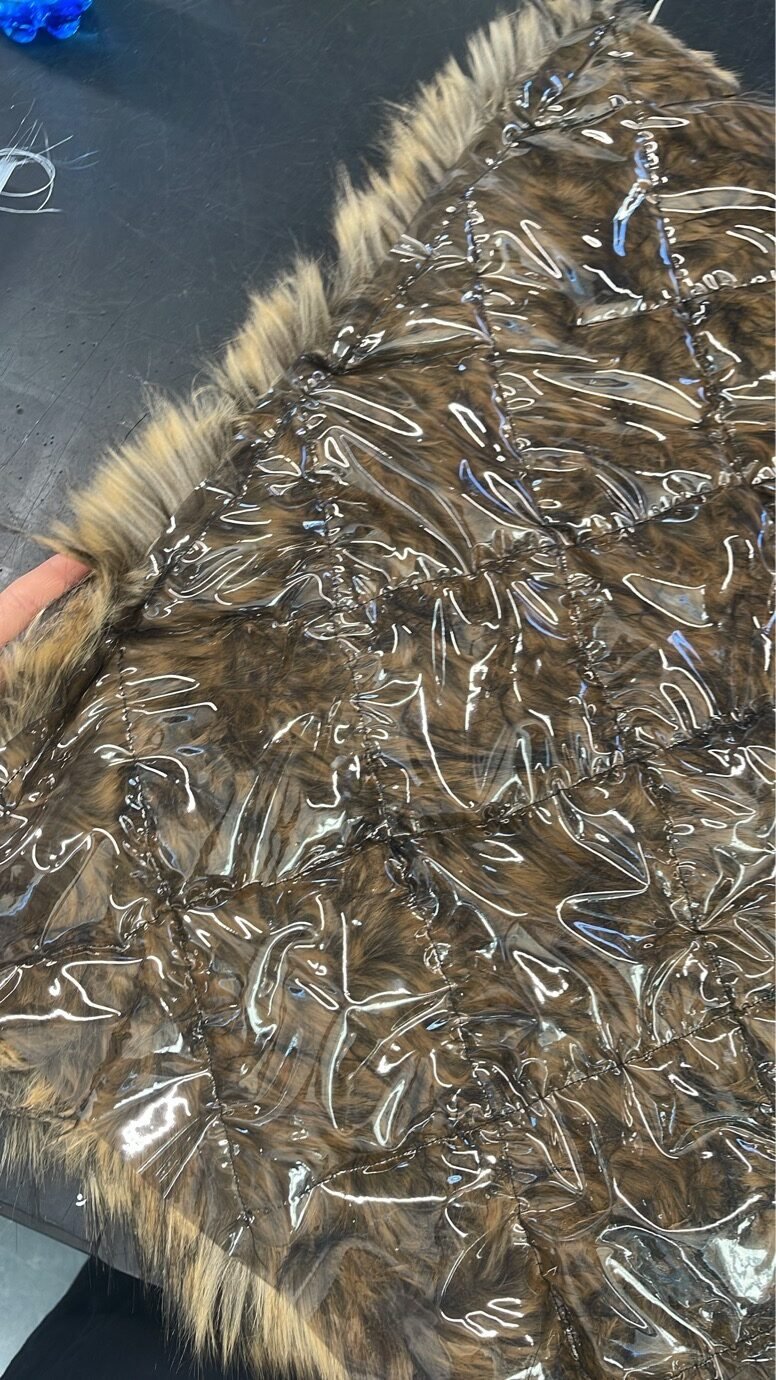
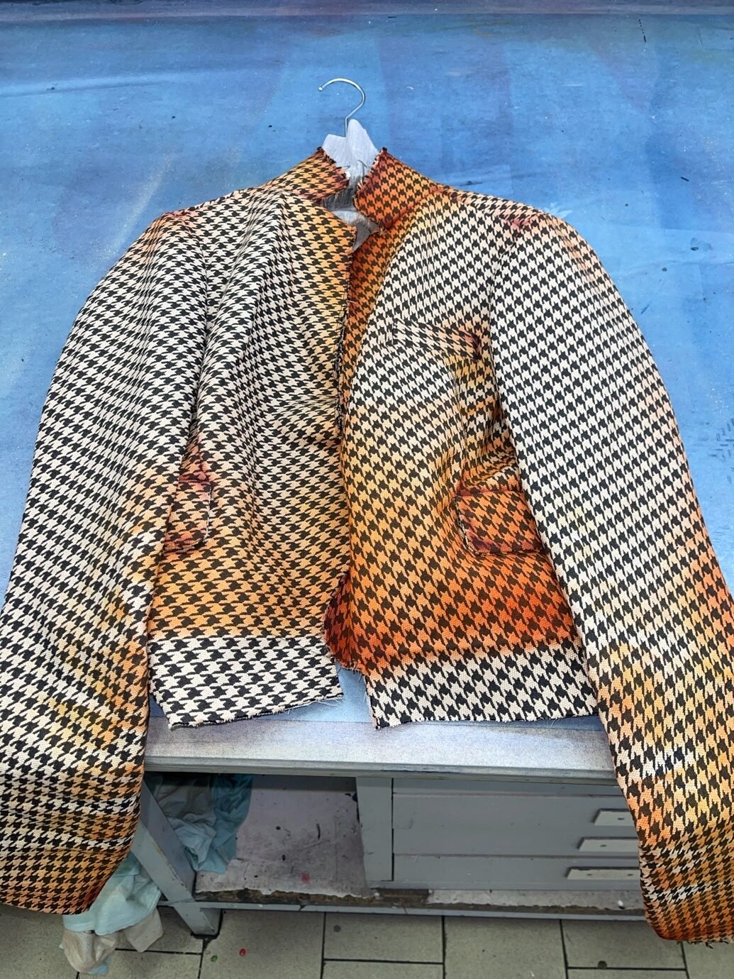
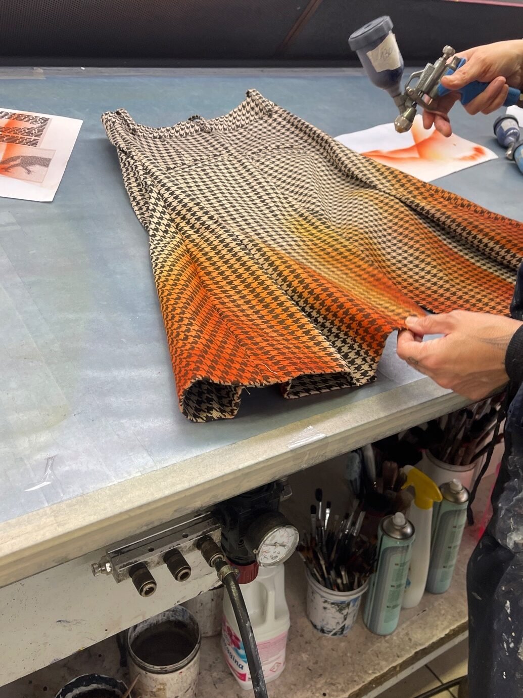
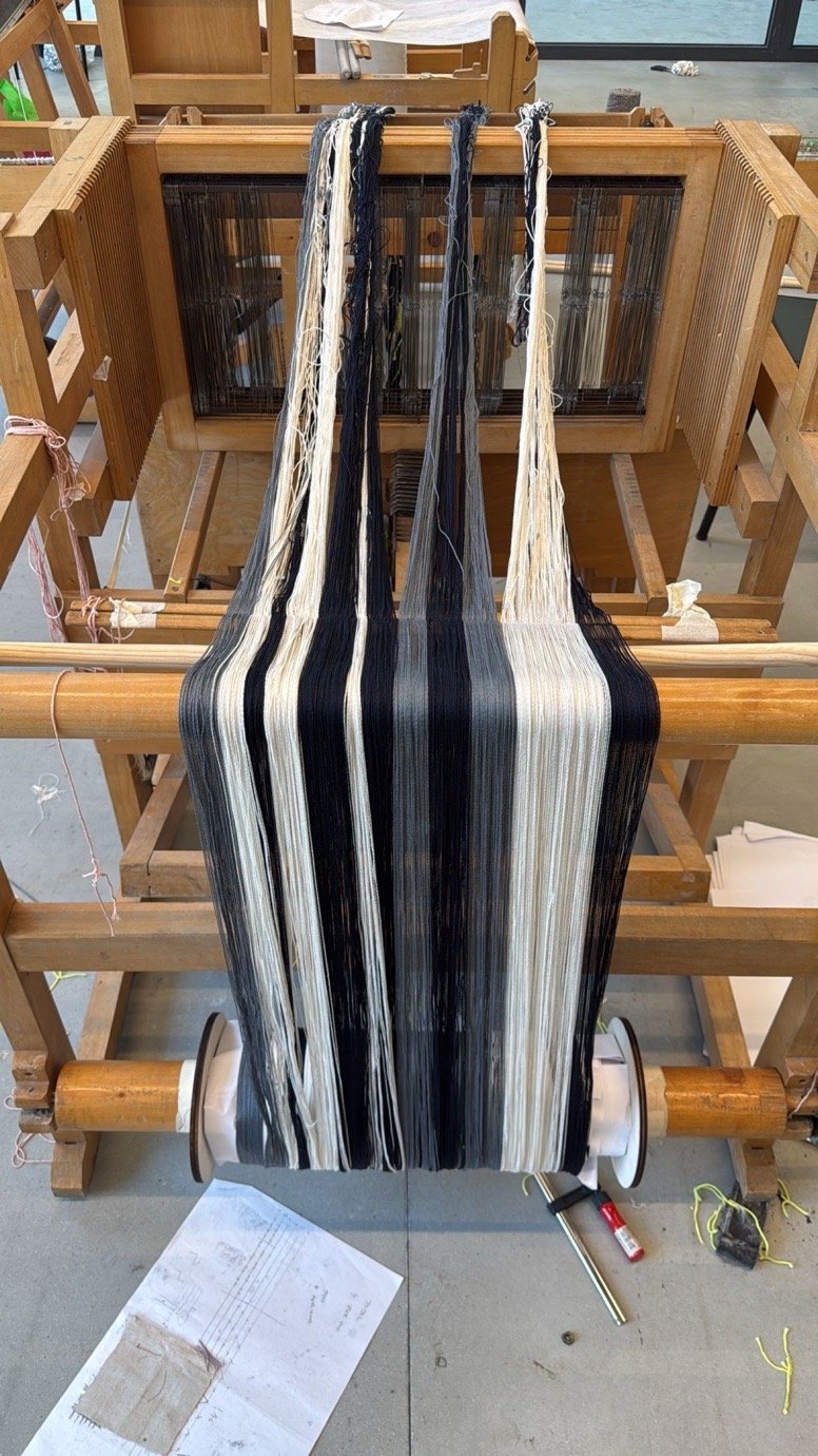
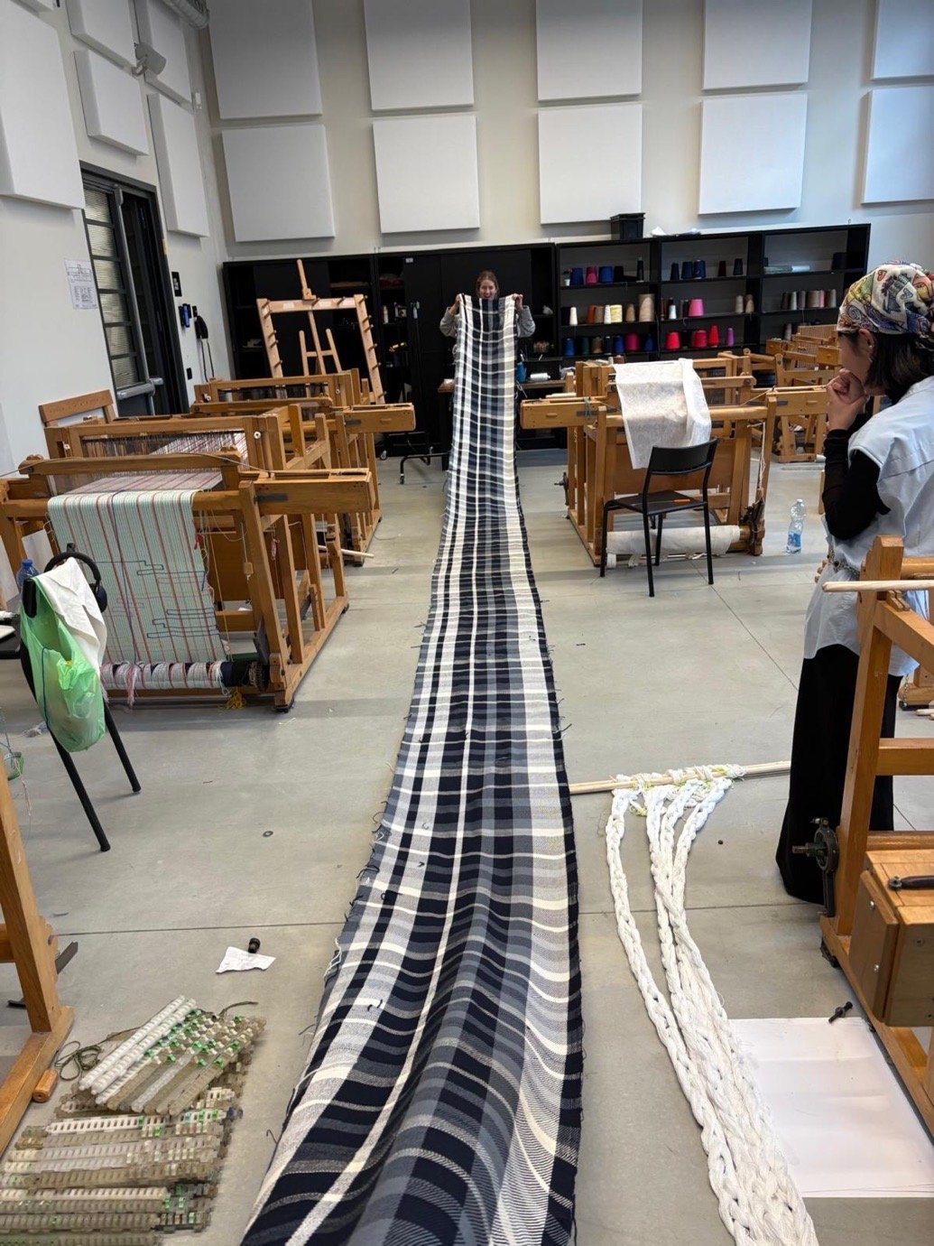
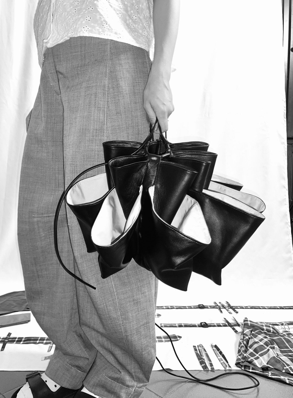
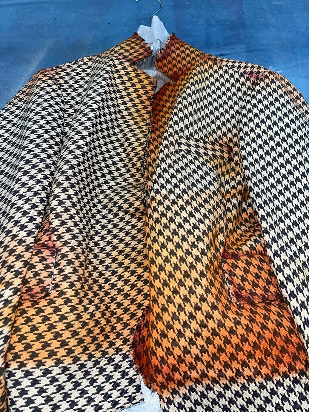
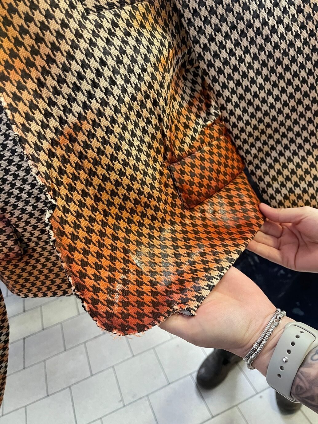
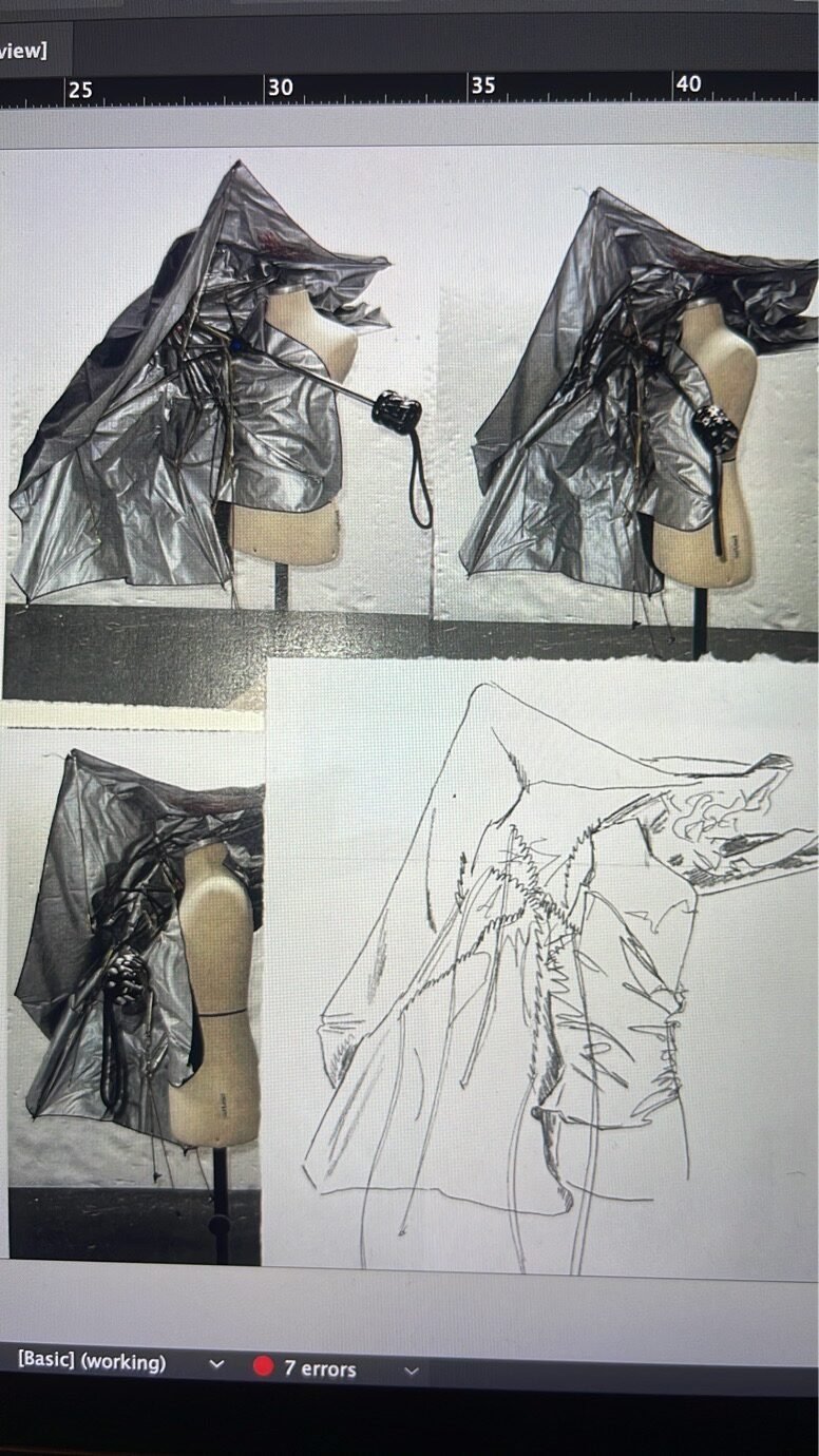
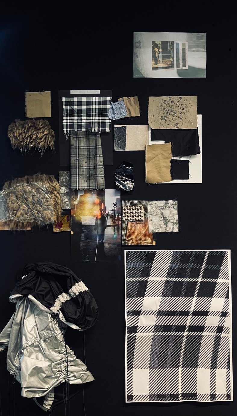
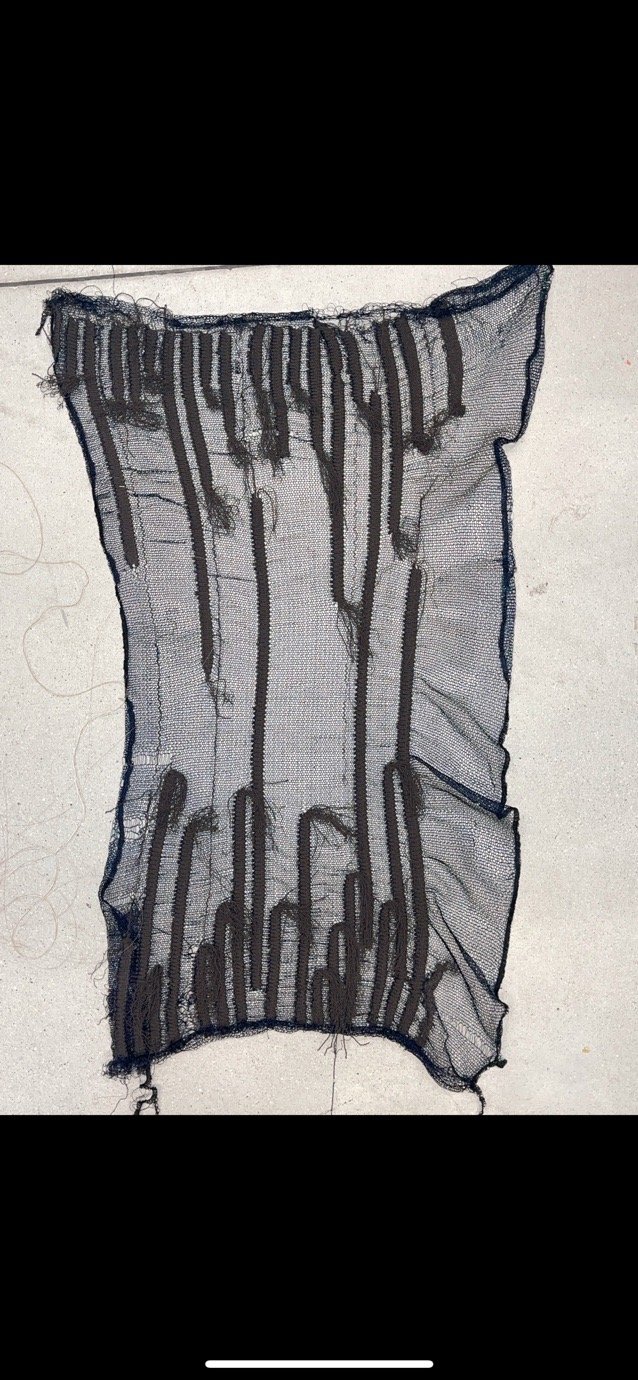
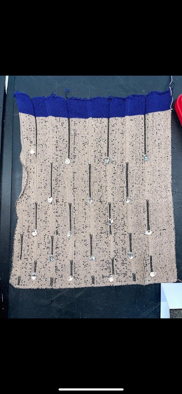
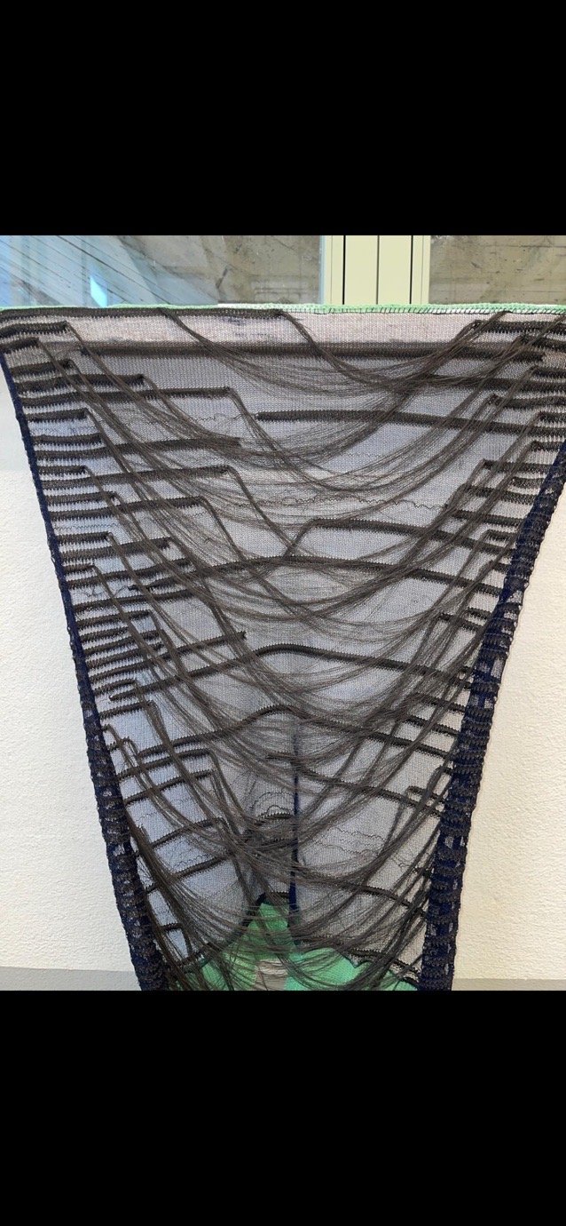
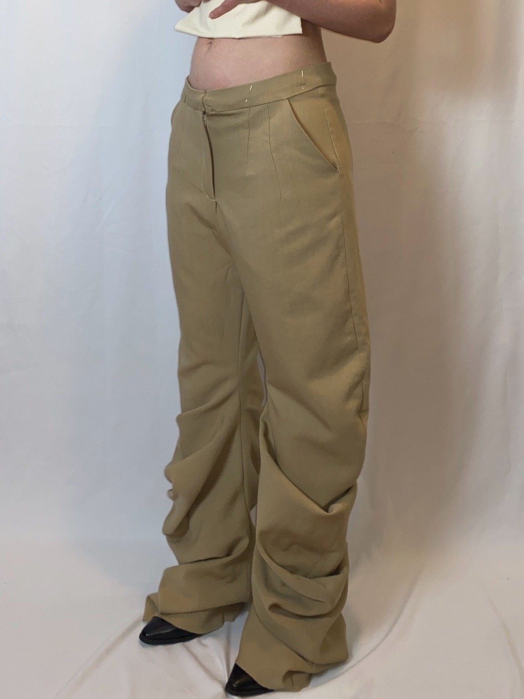
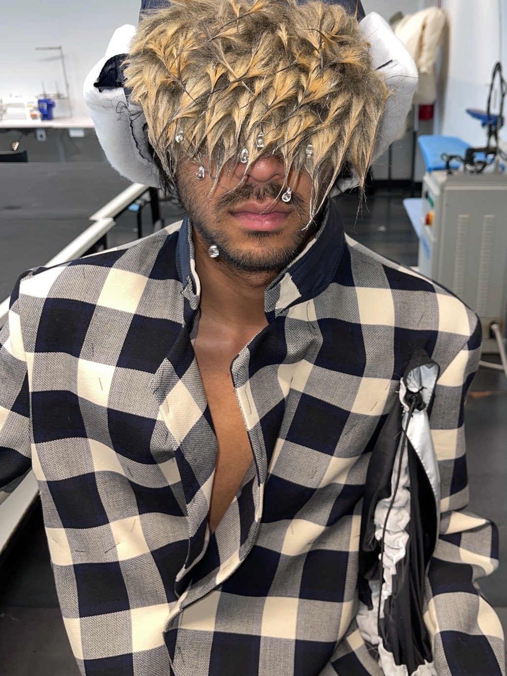
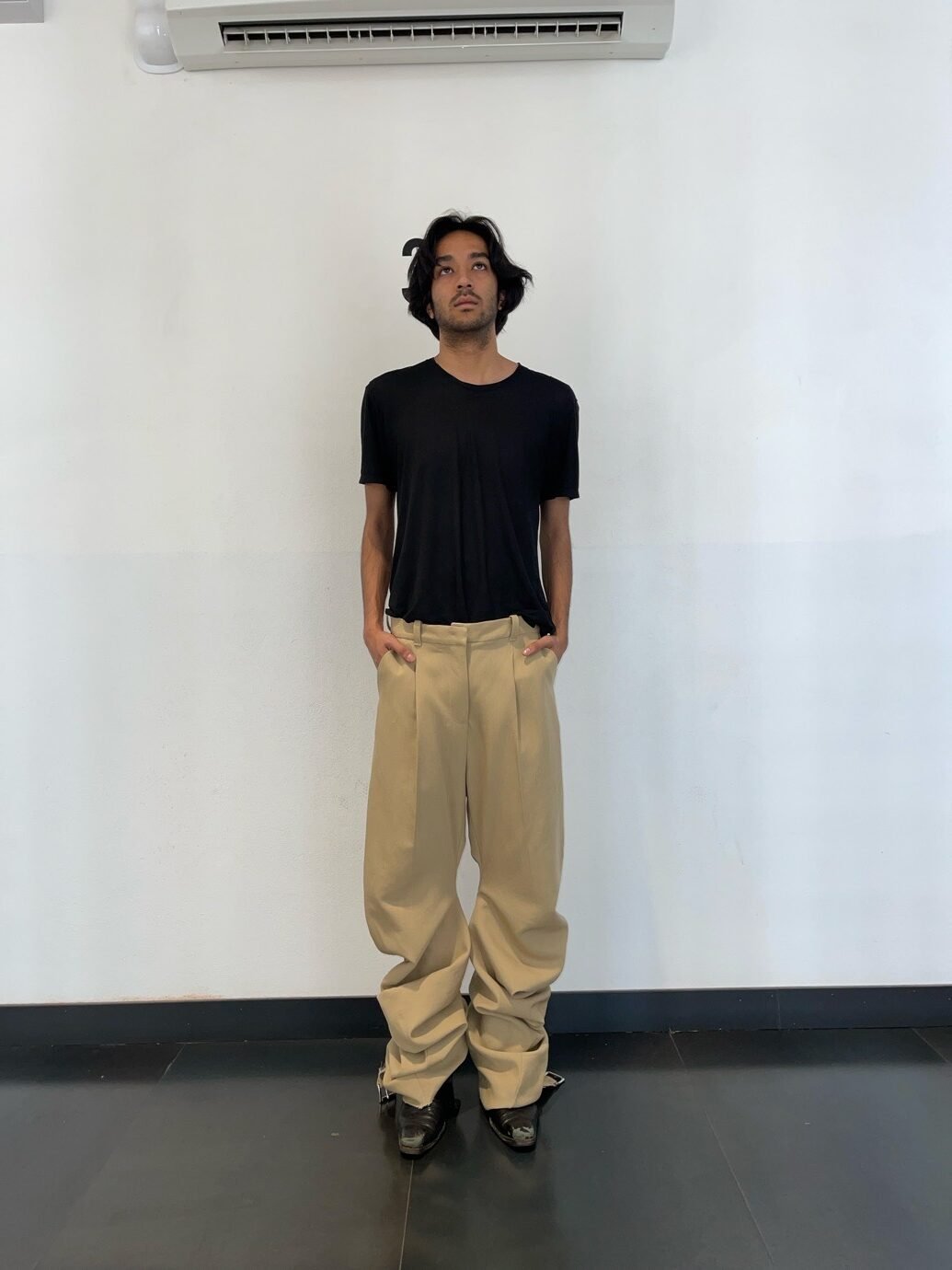
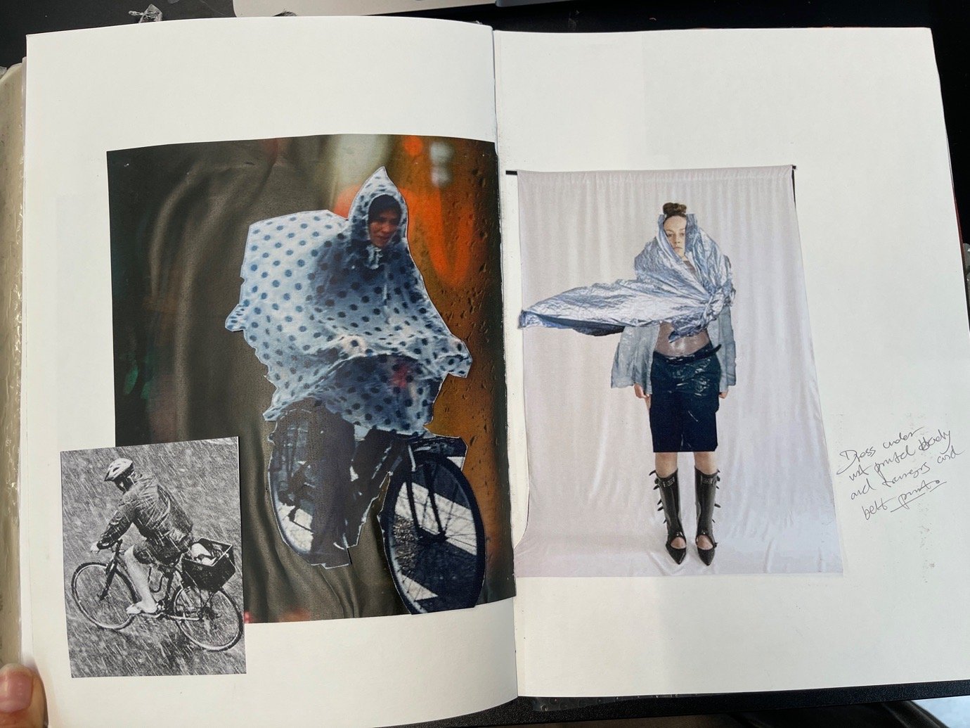
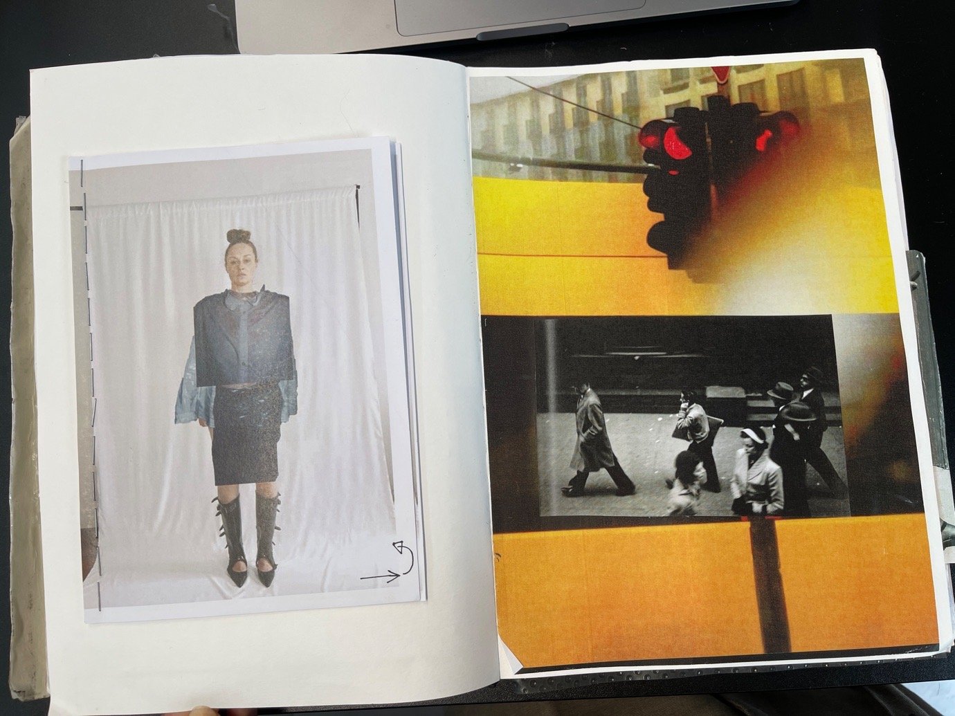
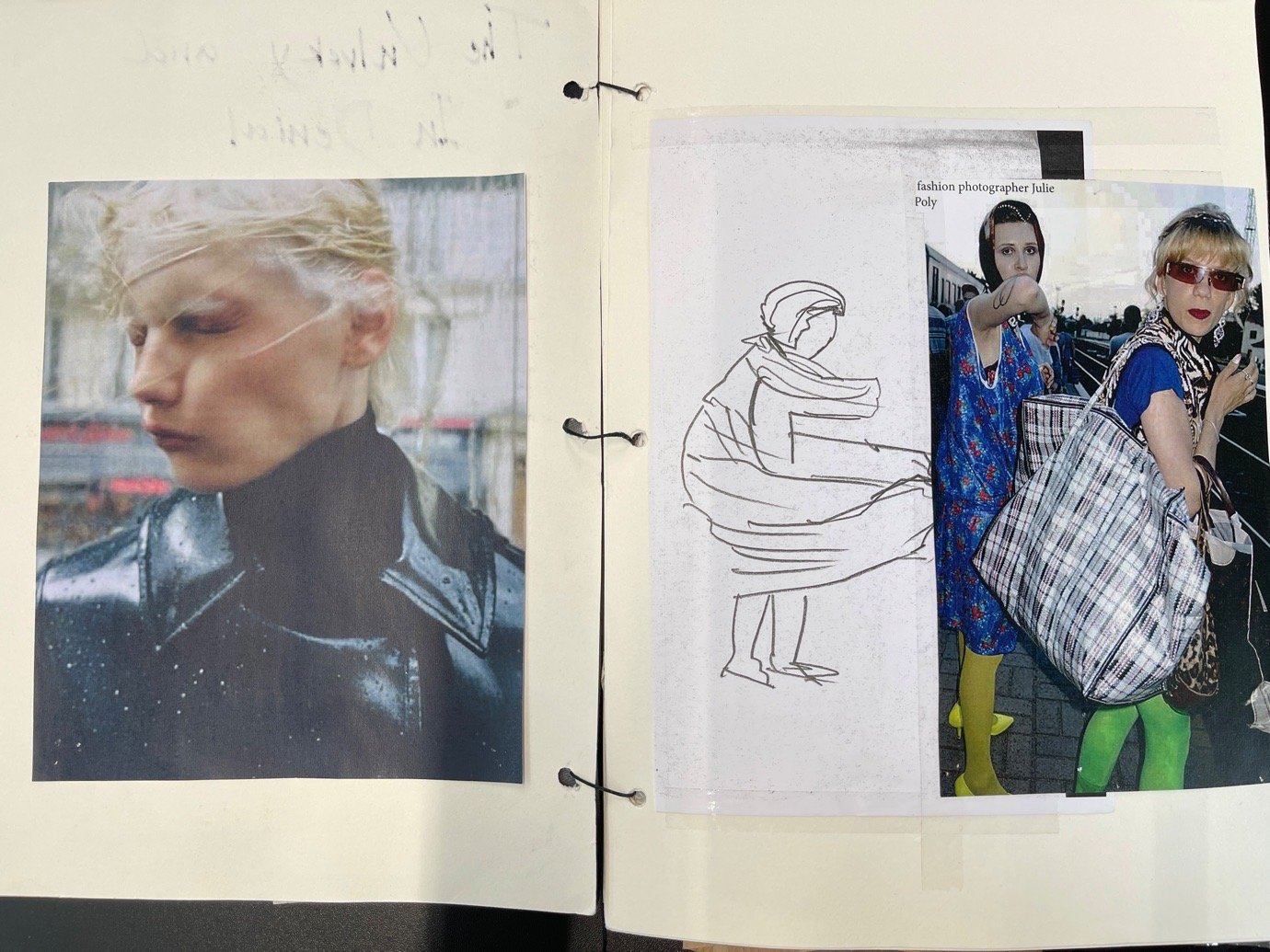
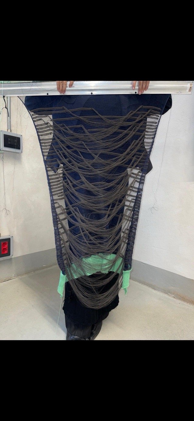
The palette reflects Gothenburg’s rainy atmosphere – deep blues, greys, touches of white and beige, and transparent elements inspired by Saul Leiter’s rain-soaked photography. Materials were chosen to mirror how people dress for rain: nylon for the prepared, sagging wool for the unprepared, and classic trench fabrics for the elegant. Each textile tells a story of personality and function. Reflections, distortion, and layering were key design techniques throughout.
What’s next?
After graduating from Polimoda in June, I’m relocating to Milan to begin an internship at Ann Demeulemeester. I’m excited to immerse myself fully in this experience and grow professionally. While I dream of developing my own creative universe, I’m focused now on learning, contributing, and building what’s next – step by step.