That feeling doesn’t happen by accident. Filmmakers spend months, sometimes years, establishing rules for their invented universes before they shoot a single frame. What colour is the light in this world? How do bodies move through space? What’s present, and just as important, what’s missing? What looks like a detail is actually the architecture of a collection on which everything else rests.
For fashion designers, there’s a version of this same question hiding in plain sight: What holds a collection together? Something deeper than a theme or a moodboard, a logic that makes 40 garments feel like they belong to the same universe. This chapter of Film as Method explores how filmmakers build worlds, and what designers might borrow from the process. We’ll look at three films with distinct approaches to world-building that translate directly to developing a collection, or for that matter an art show, an editorial, or an album: Blade Runner, Her, and Beau Travail.
Because this series relies on close viewing, MUBI is offering our student readers 60 days free: mubi.com/1granary. And don’t worry, if you’ve already graduated, you can still start with one month free, see here.
How production designers actually work
Before diving into specific films, it’s worth understanding what production designers do before they design anything.
Hannah Beachler, who became the first African American woman to win an Academy Award for Best Production Design for Black Panther, created a roughly 500-page “bible” to establish the world of Wakanda before designing a single set. The document covered the history, culture, technology, and timelines of the fictional nation: detailed histories for each of its five tribes, reference pictures, architectural rationales, everything needed to ensure consistency across the film’s Afrofuturist design. Director Ryan Coogler and his team used it as a reference throughout production. For the sequel, Wakanda Forever, Beachler added approximately 200 more pages. “I had to completely immerse myself 100,000 percent in talking to experts,” Beachler said. “I can’t just throw up a culture, even if it’s something that’s specifically not that culture or inspired by that culture. You need to know the rules before you can break anything. You need to understand it before creating something that’s an amalgamation of that or an evolution of that.”
Adam Stockhausen, who has designed most of Wes Anderson’s films, describes something different: a method where visual motifs reveal themselves through sustained research rather than being imposed. “In Grand Budapest we’d be scouting and you would see these coal-burning heaters in the corners of all these rooms,” he said. “And you just start to see it over and over and over, and then you start to say, ‘Well, that’s a good idea. That really is part of the feeling of this place, right?’ And so then you start to use that over and over again, because that’s what you saw when you were scouting. In Moonrise Kingdom, raccoons kept finding their way in. On The French Dispatch, this kind of yellow [colour] kept finding its way in.”
Stockhausen talks about the importance of a long research period, because what might become the core of your work may not appear immediately. The Red Balloon (1956), the acclaimed 35-minute short film directed by Albert Lamorisse – in which a sharp, crisp red balloon is constantly contrasted against the muted colours of a dilapidated Parisian cityscape – was a key visual and thematic inspiration for The French Dispatch. “And then, months down the road and 18,000 pieces of research later, we hit this beautiful reference image of a café – a bright yellow café in the middle of Paris in the ‘50s. And then all of a sudden, you go, OK, well, that’s that. But we went that entire couple of months without knowing that the tone of the whole thing was this intense yellow. The framework was there, it was just waiting for the right thing to click it into place.”
Beachler’s encyclopedic documentation and Stockhausen’s patient observation are two different methods that have the same underlying principle: the world precedes the objects. Instead of designing things and then trying to make them cohere, it’s much better to establish the conditions that would produce them.
Blade Runner: rules that generate decisions
Ridley Scott’s Blade Runner is probably the most-referenced film in fashion history. The trench coats, the neon, the perpetual rain, all these images have circulated so widely that they’ve become a kind of visual shorthand. The film’s production was a genuine collaboration. Director Ridley Scott worked with production designer Lawrence G. Paull, visual futurist Syd Mead, and special effects supervisor Douglas Trumbull, each bringing distinct expertise. But before anyone could build anything, they needed to establish what this Los Angeles of 2019 would be.
When Scott began developing Blade Runner, he gave his team a single governing principle: “Think of Chicago or New York City right now, the over-saturation, how impossible it is to maintain some of these buildings,” he said. “Think how expensive it’s going to be to take down the Empire State Building. It will cost as much as building it. Eventually, you’ll just have to ‘retrofit’ things on the face of the building rather than having to pull half the side off, re-house the air conditioning or re-wire it.”
The idea of building the future on top of the present became the film’s logic. Real Los Angeles, already layered with history, became the foundation for imagined Los Angeles. Everything was modified, added to or patched over, never simply replaced. The result, as Scott described it: “You wear your guts on the outside. That gives us a picture of a textured city.”
Paull, who had trained as an architect at the University of Arizona, brought research from a trip to Milan that had struck him deeply. The fascist architecture there – high facades rising directly from narrow streets, porticoes and arches creating a claustrophobic compression – offered a template for density. The buildings in Milan were built right up to the curb; the Warner Bros. backlot streets were similarly narrow. Paull and Mead began photographing the existing New York street sets, then filling them with texture: webs of pipes, ducts, technological debris layered onto building facades.
The design drew from everywhere: Egyptian, Art Deco, Streamline Moderne, Frank Lloyd Wright, Antoni Gaudí, but always filtered through the retrofitting logic. As Paull put it: “We turned the photographs sideways, upside down, inside out, and backward to stretch where we were going and came up with a street that looked like Conan the Barbarian in 2020. I didn’t want right angles; I didn’t want slick surfaces.”
That single ‘retrofitting’ idea generated thousands of specific choices. The flying cars share visual DNA with 1940s sedans. Street markets sell future tech alongside ancient goods. The Tyrell Corporation’s gleaming pyramid sits atop a base of industrial chaos. A city in perpetual repair, adapting to changing needs but never truly catching up. The world starts to make sense once you understand the rule, and anything that violates the rule would feel wrong, even if you couldn’t articulate why.
Paull’s architectural training made him think like a city planner. He designed not just buildings but the entire urban fabric: streets, utilities, public spaces, the infrastructure that makes a city function. Where do the pipes run? How does waste get removed? What happens when systems break down and get patched rather than replaced? These questions might never appear on screen, but answering them created a world that felt inhabited rather than constructed. The nuts and bolts of a functioning city, even a dysfunctional one, were worked out before the cameras rolled.
Syd Mead executed most of the vision. He was an industrial designer who’d worked for Ford, U.S. Steel, and Philips Electronics before, now bringing his real-world design methodology to fictional worlds. He was initially hired to design the film’s vehicles, began by sketching the streets as settings, and gradually became involved in visualising the film’s whole environment. Mead put it this way: “The design process is to treat a movie prop like a design problem in that particular ‘world’…the story world. Regardless of how weird or preposterous that story world might be, it has its own logic and its own rules. You design to fit those rules”. A circumstance is a set of conditions that constrain and generate simultaneously. If you know that this world is retrofitted rather than replaced, certain objects become possible and others become impossible.
Importantly, Mead distinguished between personal vision and client work: “I was hired as a consultant to produce exactly what they wanted for that story, for Ridley’s [visualisation],” he said. “The next movie that I’m hired to work on might involve a vision of the future that is slick or marvelous or has a slight kink in the whole framework so it looks a certain way, but I’ll do that just as deliberately. It has nothing to do with my own personal view of the future.” His goal is to create an atmosphere that serves narrative, not personal expression.
What might this mean for a designer? A collection needs a governing idea, a rule that generates decisions. Start by asking what the conditions of this world are, rather than how the collection will look. If you can articulate the circumstance, the garments will emerge from it. Start with the garments and you’ll spend the rest of the process searching for coherence.
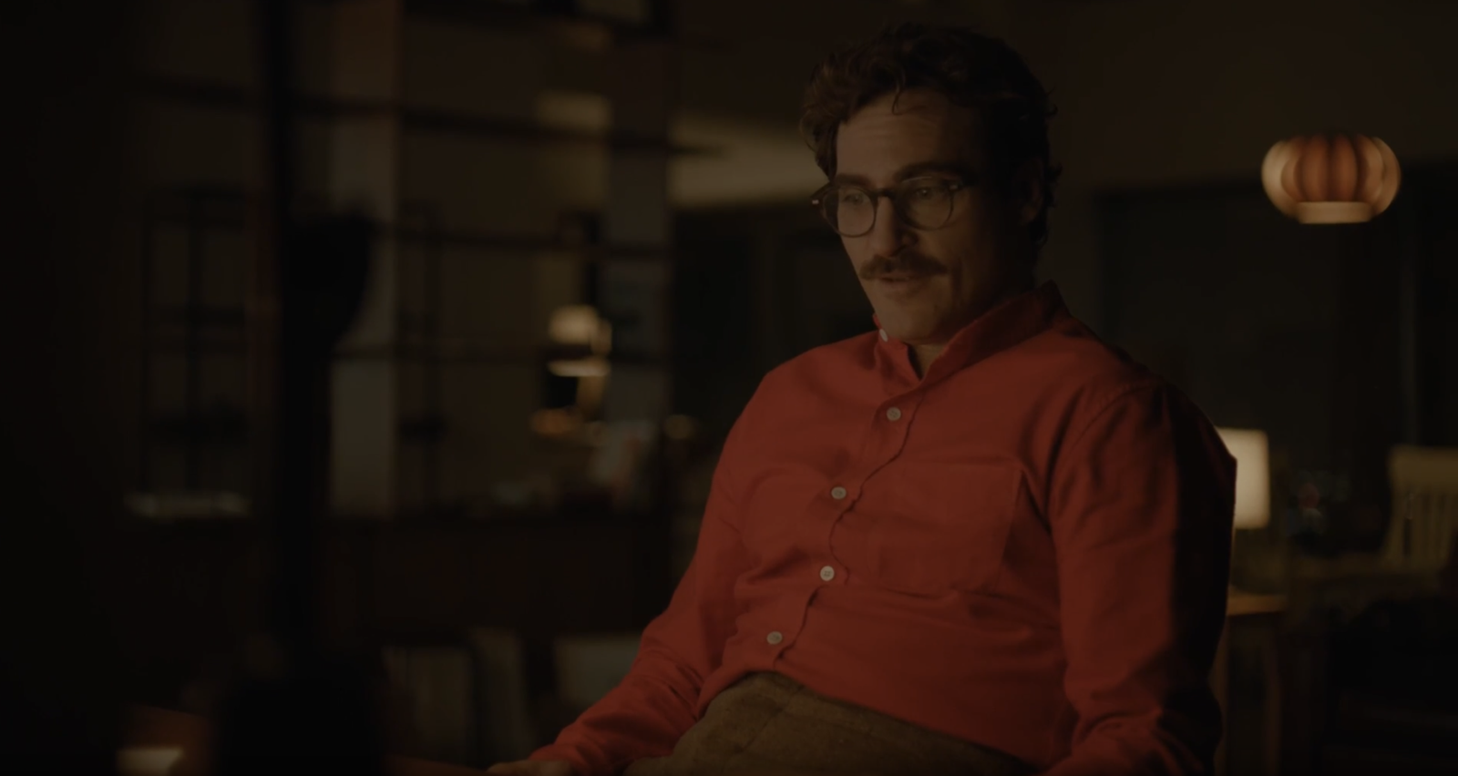
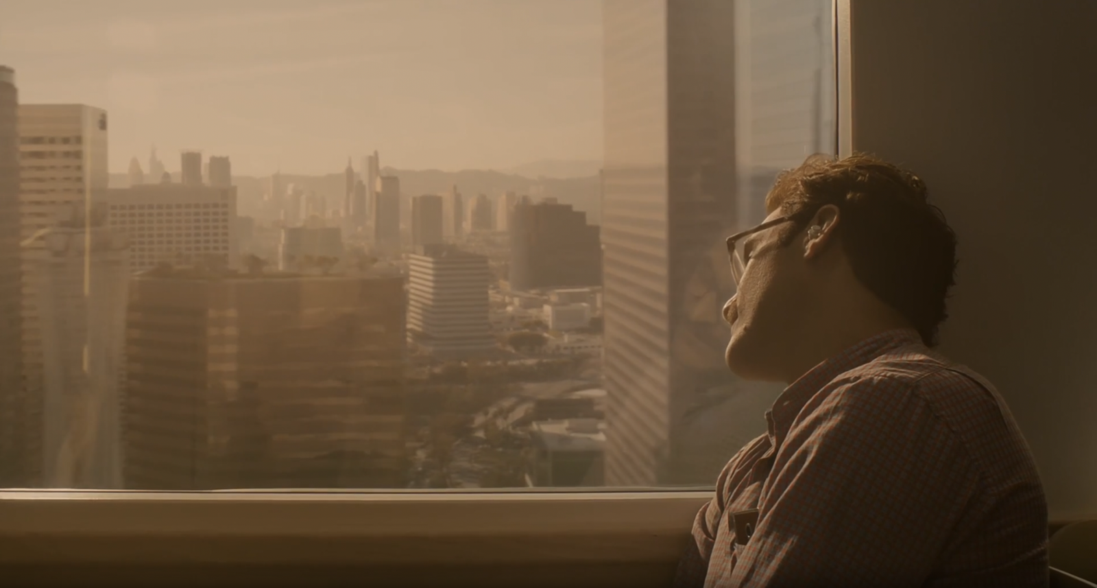
Her: atmosphere vs. aesthetic
Currently streaming on MUBI in Italy