Representing the creative future

How to edit a collection like a filmmaker

What cinema teaches fashion designers about decision-making.

Because this series relies on close viewing, MUBI is offering our student readers 60 days free: mubi.com/1granary. And don’t worry, if you’ve already graduated, you can still start with one month free, see here.

Part 1 of Film as Method trained the eye – how to look, slow down, and read images with intention. This second chapter is about something harder and more consequential: how to decide. Not how to generate ideas, which to designers often come a dime in a dozen, but how to organise them and get clarity. A moodboard can hold an infinite amount of references but a collection only has space for a certain number of looks. So it’s not about what inspires you but what you end up keeping in your collection and why.

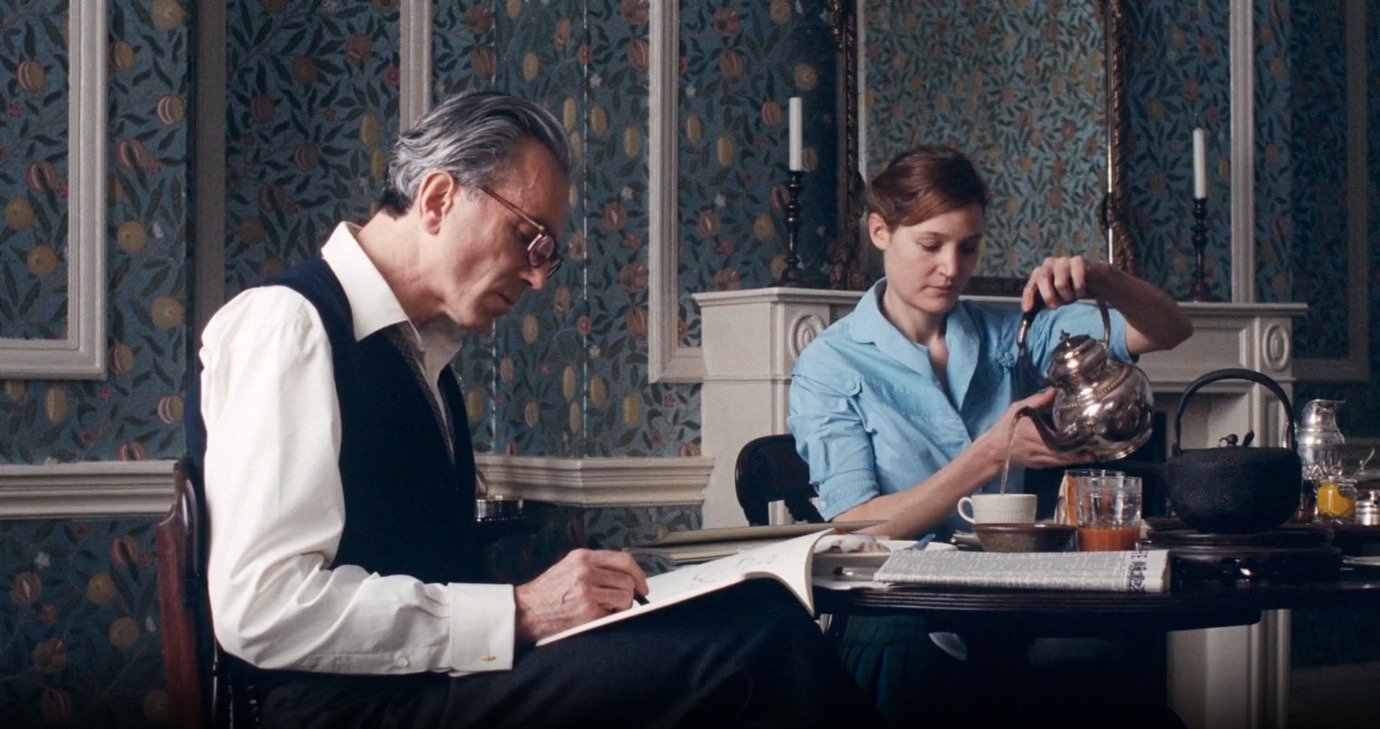
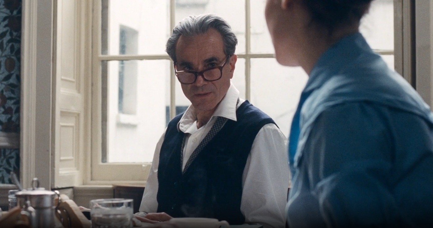
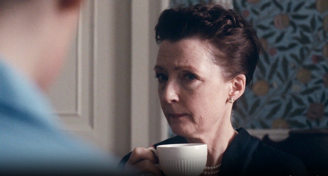
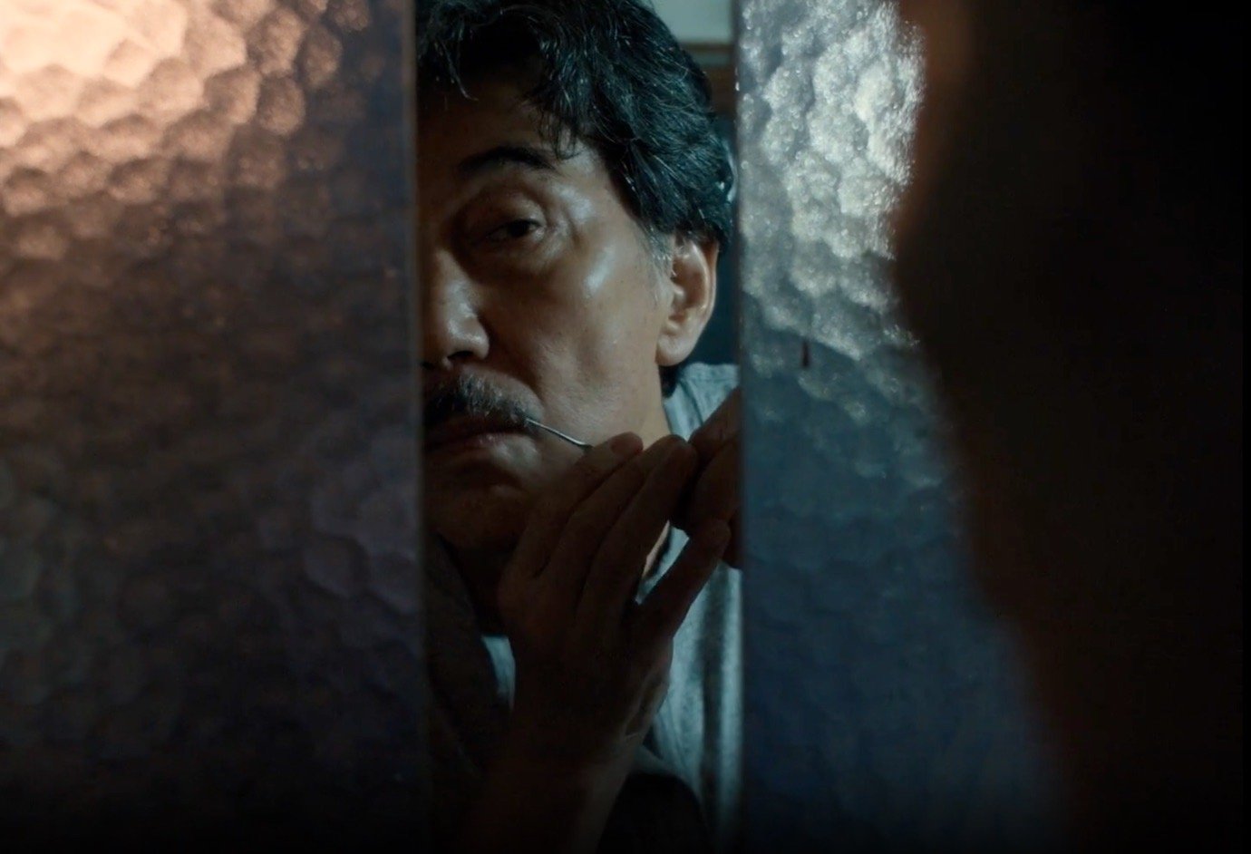
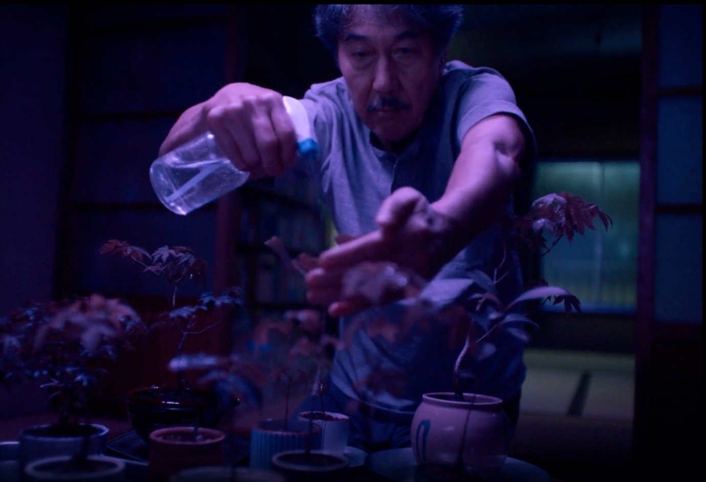
Film editors face this question on a daily basis. They’re handed hours upon hours of footage and must transform it into something that has meaning and sticks together coherently. The principles they’ve developed over the past century of cinema – how to sequence, when and what to cut – translate directly to the decisions designers make when editing a collection. Through four films currently available on MUBI – Phantom Thread, In the Mood for Love, Perfect Days, and Anatomy of a Fall – we can explore how cinematic thinking applies to the design process. We’ll introduce a number of key theoretical concepts, talk about how they show up in films, and break down how you can borrow them in your own practice.

Editing as subtraction

Michelangelo famously described his process as: “Every block of stone has a statue inside it and it is the task of the sculptor to discover it.” Film editing works the same way. The footage arrives already containing the film, it’s just buried under hours of material that needs to be stripped away. Andrei Tarkovsky titled his book on filmmaking Sculpting in Time – a metaphor that makes the subtractive principle explicit. The Soviet director – one of cinema’s most influential figures – wrote: “Just as a sculptor takes a lump of marble, and, inwardly conscious of the features of his finished piece, removes everything that is not part of it – so the filmmaker, from a ‘lump of time’ made up of an enormous, solid cluster of living facts, cuts off and discards whatever he does not need.”

A typical Hollywood production might shoot a hundred hours of footage for a two-hour film. That’s a 50:1 ratio, meaning about 98% of what was shot is removed. The most painful part of this process is removing footage that is excellent in itself but doesn’t serve the whole. It’s the process of killing your darlings, as William Faulkner put it. The beloved scenes may be beautifully photographed, and the performance might be extraordinary, but if it slows the rhythms, distracts from the emotional line, or confuses the narrative, it simply must go.

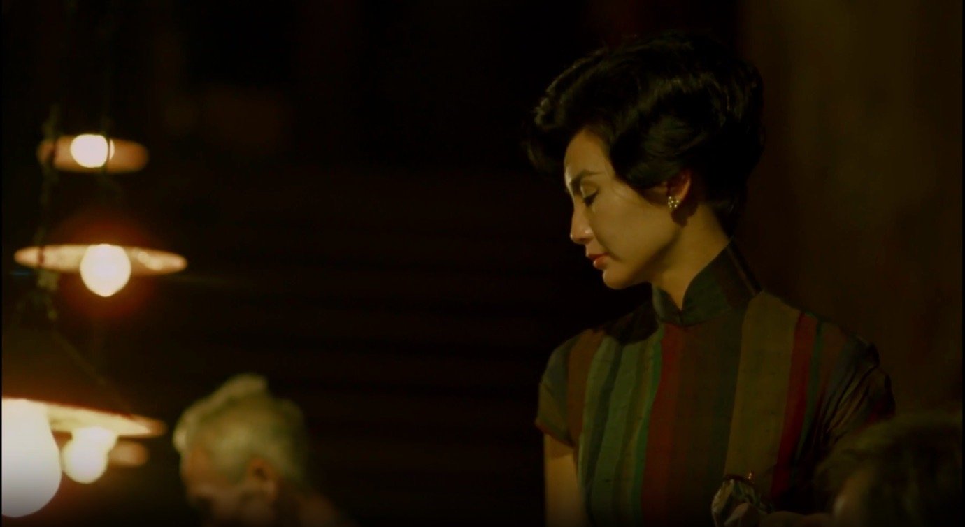
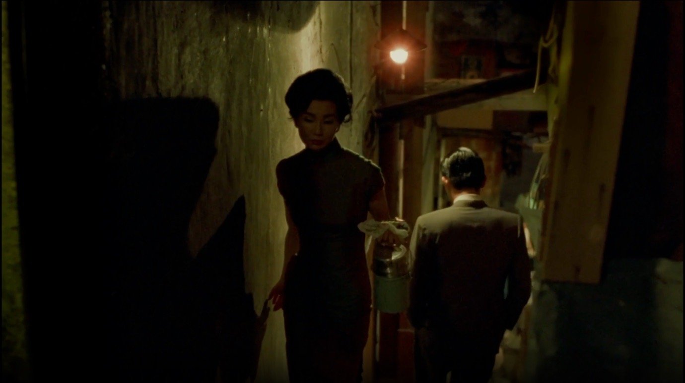
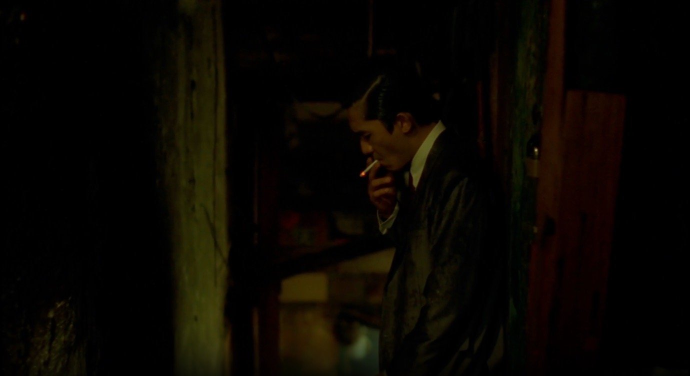
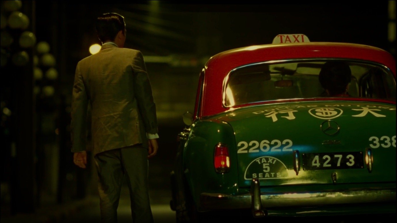
In the Mood for Love: treating absence as presence

Currently available to stream on MUBI in Latin America, the Netherlands and Italy

Wong Kar-wai’s process is a masterclass in editing as subtraction. For his most well-known film, In the Mood for Love, he shot footage spanning the film narrative of 1962 to 1972 but edited the final film to end in 1966. Half a decade of material, characters, storylines and development was removed. He also cut a sex scene at the last minute saying, “I suddenly felt that I didn’t want to see them make love.”

Wong reflected: “Even now, I’d cut those scenes. The film is about absence. What’s missing is as important as what’s there.” This statement is the philosophical core of editing as subtraction: the edits create meaning instead of leaving gaps, and the absence of the sex scene makes the longing more powerful. Because the tension isn’t able to resolve, the ache feels more permanent.

The famous staircase sequences embody this principle. Mrs. Chan and Mr. Chow pass each other on the narrow stairs of their apartment building, night after night, to buy noodles from a street vendor. They don’t talk. The sequences recur throughout the film with slight variations – different cheongsam (dresses), different music, different light – but always the same structure: proximity without touching, longing without resolution.

The editing never cuts away to context that would dilute the emotion. We never see their spouses, or the broader world of Hong Kong for the matter. We stay in the corridor, on the stairs, in the sealed-off emotional world of two people who cannot touch. Everything that doesn’t serve this feeling has been edited out.

For fashion: A collection of 12 looks is more powerful than a collection of 40 if those 12 are the right 12. What you remove defines what remains and the absence of explanation creates space for interpretation. A collection that leaves questions open, that trusts the viewer to draw their own conclusions, creates more engagement than one that explains everything in great detail.

The hierarchy of decisions

Walter Murch, the editor of Apocalypse Now and The English Patient, developed a framework for making cuts that he called the Rule of Six. He ranked six criteria in order of importance: Emotion (51%), Story (23%), Rhythm (10%), Eye-trace (7%), Two-dimensional plane (5%), and Three-dimensional space (4%).

His instruction: “If you have to give up something, don’t ever give up emotion before story. Don’t give up story before rhythm.” It’s quite revealing to look at the percentages and see that emotion alone accounts for more than half the decision. The technical considerations at the bottom – spatial continuity and the 2D grammar of the screen – account for less than 10% combined.

Murch’s core insight is sacrifice upward, never downward. A cut that nails the emotion but breaks spatial continuity is still a good cut. But a technically perfect cut that feels emotionally dead is a failure. “How do you want the audience to feel?” Murch wrote. “If they are feeling what you want them to feel all the way through the film, you’ve done about as much as you can ever do. What they finally remember is not the editing, not the camerawork, not the performances, not even the story – it’s how they felt.”

Phantom Thread: prioritise emotion over everything else

Currently available to stream on MUBI in the UK, Latin America, Germany, the Netherlands, France, Italy and Turkey

The breakfast scene in Phantom Thread is Murch’s hierarchy at work. Reynolds Woodcock is trying to work, sketching in his notebook, while his new girlfriend Alma eats toast. The ordinary sounds of breakfast become unbearable to him and the tension escalates silently until he snaps: “It’s entirely too much movement at breakfast.”

The scene operates on a fundamental contrast between Reynolds’s control and Alma’s vulnerability, between the clinical precision of his world and the ordinary messiness of shared domestic life. But beneath the contrast lies a secondary one: the gap between what is said (measurements, mundane breakfast sounds) and what is felt (vulnerability, the friction of intimacy). The tension lives in this gap.

For fashion: When design decisions conflict, then sacrifice from the bottom up. A technically imperfect garment with emotional power stays; a perfect garment with no emotional impact goes. A show-stopping coat that doesn’t speak the same language as everything around it weakens the whole. The question isn’t Is this well-made? but Does this make someone feel something?

Building meaning through the use of repetition

Soviet filmmaker Vsevolod Pudovkin identified five techniques for creating meaning through editing: contrast, parallelism, symbolism, simultaneity, and leitmotif. Where Sergei Eisenstein saw montage as collision – shots smashing into each other to generate new ideas – Pudovkin saw it as linkage: shots building on one another to accumulate emotional effect.

Of these techniques, leitmotif may be the most directly applicable to fashion. Borrowed from musical theory (Wagner’s operas), leitmotif refers to the recurring appearance of an element that becomes associated with a character, concept, or emotional state. So each time something recurs, it cements a little more – like the breakfast table in Phantom Thread or the staircase in In the Mood for Love. Repetition builds meaning through accumulation.

Perfect Days: using ritual as structure

Currently available to stream on MUBI in the UK, Latin America, the Netherlands and Turkey

Wim Wenders’s recent film Perfect Days is built entirely on leitmotif. The film follows Hirayama, a Tokyo toilet cleaner, through his daily routines: waking up, folding his futon, watering his plants, buying coffee from a vending machine outside his house, selecting a cassette tape, driving to work. This sequence repeats with variations throughout the film.

The morning routines across different days are structured as parallels: same actions, same sequence, but each iteration adds something. By the third or fourth morning routine, we’re not just watching Hirayama wake up; we’re watching him practice a way of being. The repetition demonstrates who he is. The small variations (different light, different tape, different encounters) reveal that no two days are identical. The contrast between apparent monotony and actual subtle variation is the film’s philosophical argument about attention and presence.

The cassette tapes are rich in symbolism. In an age of streaming and disposability, Hirayama’s analog cassettes represent choice, curation and commitment. Selecting a tape each morning is a symbolic act: deciding what will accompany this particular day. The plants are symbolic of care that requires no recognition. The trees he photographs obsessively represent komorebi, the Japanese word for light filtering through leaves – the beauty available to those who pay attention.

For fashion: Prada’s Fall/Winter 2023 show operates on exactly this logic. The collection opens with six white skirt looks, establishing a tempo through repetition. The white returns throughout the show, but each time with a shift: different music, different context, accumulated meaning. By the third return of the white sequence, the skirts aren’t really the same garments they were at the beginning of the show. They now carry the weight of everything that’s happened in-between. The show also uses what film editors call duration, letting sequences run longer than expected. The audience stops looking for surprise when they see extended blocks of masculine tailoring – six looks at a time – and they start reading structure. And that’s how you can make meaning appear: through persistence, not escalation.

The psychological guidance of the viewer

Pudovkin made a claim that sounds obvious but has radical implications: “Editing is not merely a method of the junction of separate scenes or pieces, but is a method that controls the ‘psychological guidance’ of the spectator.” The key word is control. Every cut is a decision about what the viewer will see, when they will see it, and, crucially, from what position they will see it.

Two of Pudovkin’s techniques are especially relevant here: contrast and simultaneity. Contrast works by cutting between opposing elements to force comparison. Pudovkin’s original description: “Suppose it be our task to tell of the miserable situation of a starving man; the story will impress the more vividly if associated with mention of the senseless gluttony of a well-to-do man… forcing the spectator to compare the two actions all the time, one strengthening the other.” The classic example is the baptism sequence in The Godfather – Michael Corleone renouncing Satan during his nephew’s christening, intercut with the murders he has ordered. The sacred ritual and the brutal killings illuminate each other through opposition.

Simultaneity operates differently. It cuts between two events happening at the same time to create tension, where the viewer knows more than any single character. In Hitchcock’s words: “Four people are sitting around a table talking about baseball. Five minutes of it. Very dull. Suddenly, a bomb goes off. What does the audience have? Ten seconds of shock. Now take the same scene and tell the audience there is a bomb under that table and will go off in five minutes. The whole emotion of the audience is totally different because you’ve given them that information.”

What both techniques share is the positioning of the viewer. Contrast forces judgement because you must compare, evaluate and choose sides. Simultaneity creates complicity: you know something that the characters don’t, and that knowledge shapes everything you see. The editor isn’t just assembling footage; they’re constructing a viewing position, deciding where to place the audience in relation to what unfolds.

This means that the same material, presented differently, tells different stories. A scene of intimacy can read as romantic or threatening depending on how it’s cut, what precedes it, what the viewer has been led to expect. Nothing in the image changed. Everything around it did.

Anatomy of a Fall: the viewer as juror

Currently available to stream on MUBI in Italy, the Netherlands and Turkey

Justine Triet’s Anatomy of a Fall is fundamentally about this problem: how the same events can be framed to tell opposing stories. A man falls from a window. His wife is accused of murder. The entire film unfolds in the gap between what happened and how it’s interpreted.

The key scene: midway through the trial, the prosecution plays an audio recording of a heated argument between Sandra and Samuel, recorded the day before his death. Editor Laurent Sénéchal cuts between the courtroom – lawyers, judges, spectators listening – and a visualisation of the argument itself. We hear the real audio while seeing a reconstruction of the event.

That’s an example of contrast and simultaneity. The contrast: the controlled and formal space of the courtroom versus the raw and intimate violence of the argument. Sandra composed in the present, watching herself being judged, versus Sandra furious in the past, attacking and defending. The same person exists in two registers, and the editing forces us to hold both versions at the same time, to compare them and judge which is the “real” Sandra.

The simultaneity: we’re in two places at once – the courtroom listening and the argument being heard. The past becomes present. The dead husband speaks. The fight that may or may not have led to his death happens again, in front of witnesses who weren’t there. And crucially, there’s a gap between what we hear (the documentary reality of the recording) and what we see (an interpretation that’s possibly unreliable).

What makes this scene important is how it positions the viewer. Triet cuts repeatedly to the jury, to Sandra’s son, to the public gallery – all watching, all listening, all forming judgements. These cuts do something specific: they make us aware that we, too, are watching. We are positioned as jurors. Every reaction shot asks implicitly: what do you think? The editing doesn’t tell us what to conclude; it forces us to participate in the act of interpretation.

For fashion: John Galliano’s Maison Margiela Artisanal 2024 collection – the show that opened with a figure stumbling through fog and ended with a model in a deconstructed wedding dress collapsing into a chair – operates through this logic of contrast and viewer positioning. The silhouettes swing between vulnerability (sheer fabrics, garments that fall apart) and extreme protection (exaggerated shoulders, cocoon shapes). A look that appears defenseless is followed by one that appears impenetrable – keeping a tension in the contrast.

Galliano also deploys simultaneity: many garments appear to be both constructed and deconstructed at once – precise tailoring in one area, raw edges in another. Past and present coexist in the same piece, historical silhouettes treated with contemporary destruction. The presentation also positions the viewer as witness and voyeur simultaneously – watching something staged for us while feeling we’ve glimpsed something private. Like Triet, Galliano doesn’t tell us what to feel, but instead he constructs a position from which feeling becomes unavoidable.

Editing as thinking

A collection, like a film, doesn’t succeed because it has many good elements. It succeeds because the relationships between all those elements are deliberate. That’s editing as thinking – not as cleaning up or polishing, but the intellectual work of building meaning through sequence, repetition, subtraction and juxtaposition.

The designer editing a collection faces the same decisions as the film editor cutting footage: What follows what? What echoes what? What gets removed? What tension needs to remain unresolved? Murch’s hierarchy gives permission to prioritise feeling over craft when you must choose. Pudovkin’s techniques show how contrast and repetition create meaning. Wong Kar-wai’s subtractions demonstrate what’s missing can be as powerful as what’s there, that giving less can be giving more. Triet’s framing teaches that the same material, differently presented, tells different stories. It’s the version you chose – the looks you kept, the rhythm you built, the meanings you left open.

A collection, like a film, finishes in the mind of the person watching. The designer chooses the looks, the rhythm, the contrasts – but meaning is made in the encounter. Editing is the art of setting that encounter up: deciding what to show, what to withhold, where to place the viewer in relation to what unfolds. The final act isn’t the last look on the runway, it’s the moment after, when the work is no longer yours.

MUBI is offering students 60 days free here.

*and again, if you’re not a student you can still start with one month free, see here.