Representing the creative future

How to watch cinema like a designer

Treating film as method, not reference, changes how you design. A practical guide.

Because this series relies on close viewing, MUBI is offering our student readers 60 days free: mubi.com/1granary. And don’t worry, if you’ve already graduated, you can still start with one month free, see here.

Design is a deeply visual practice defined by how we interpret the world around us. In art school, we learn to analyse materials and garment construction, and we might be handed a list of films to look at and be ‘inspired’ by. What often goes missing, however, is how to engage with cinema as more than just a surface-level visual reference.

Cinema is a deliberately built microcosm. Sound, colour, narrative: nothing is left to chance. Instead of treating a film as an aesthetic source, we could study its methods of world-building and apply them to constructing a collection.

From Raf Simons being deeply inspired by The Night Porter or Helmut Lang by Stalker, cinema is central to design history. Alexander McQueen understood this transfer of method intuitively: “Films always inspire me… I have used them as visual backdrops in my shows, as they instill such an incredible atmosphere of emotion”.

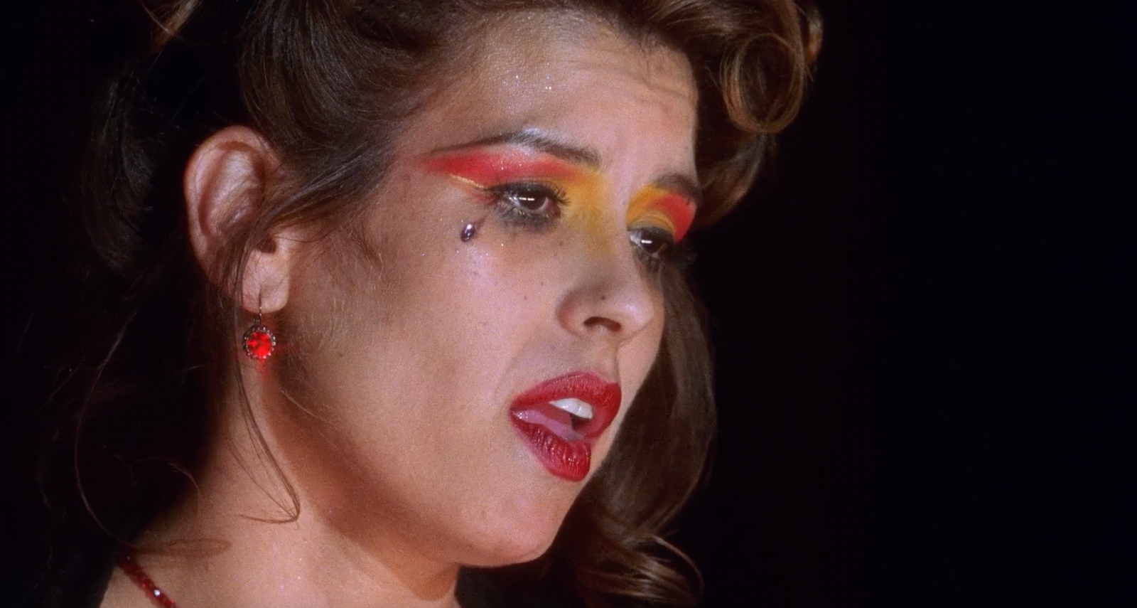
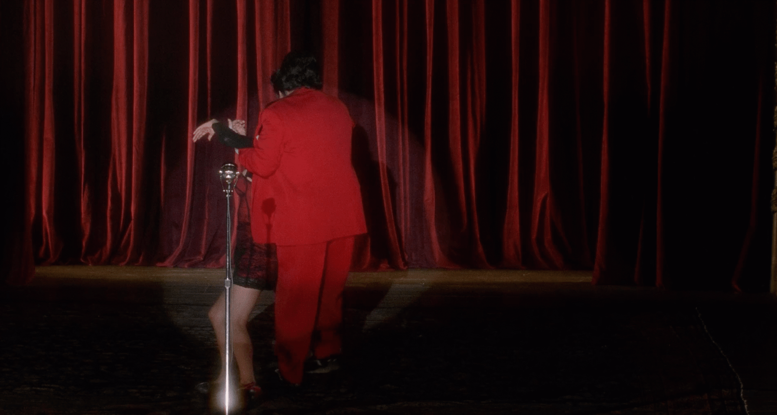
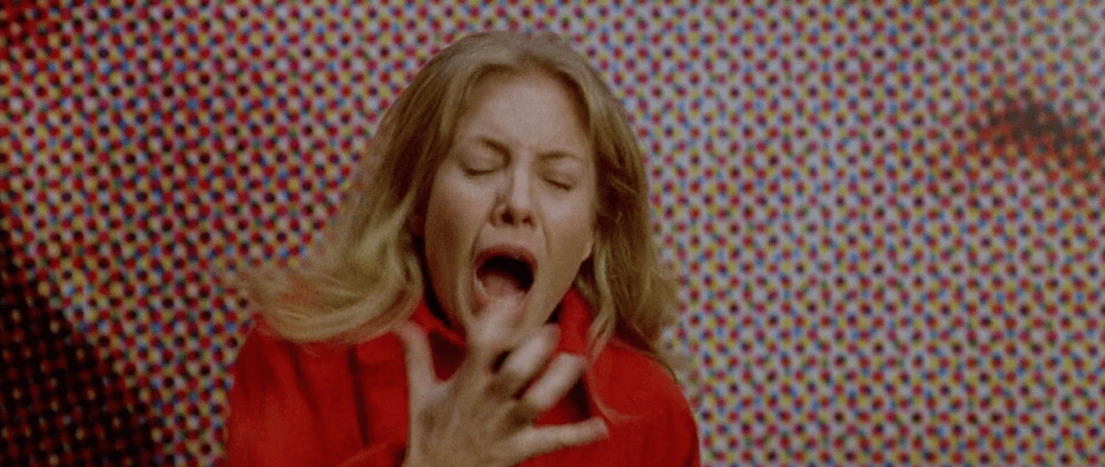
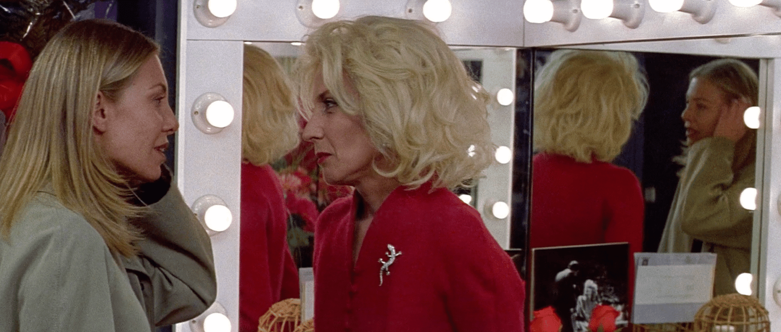
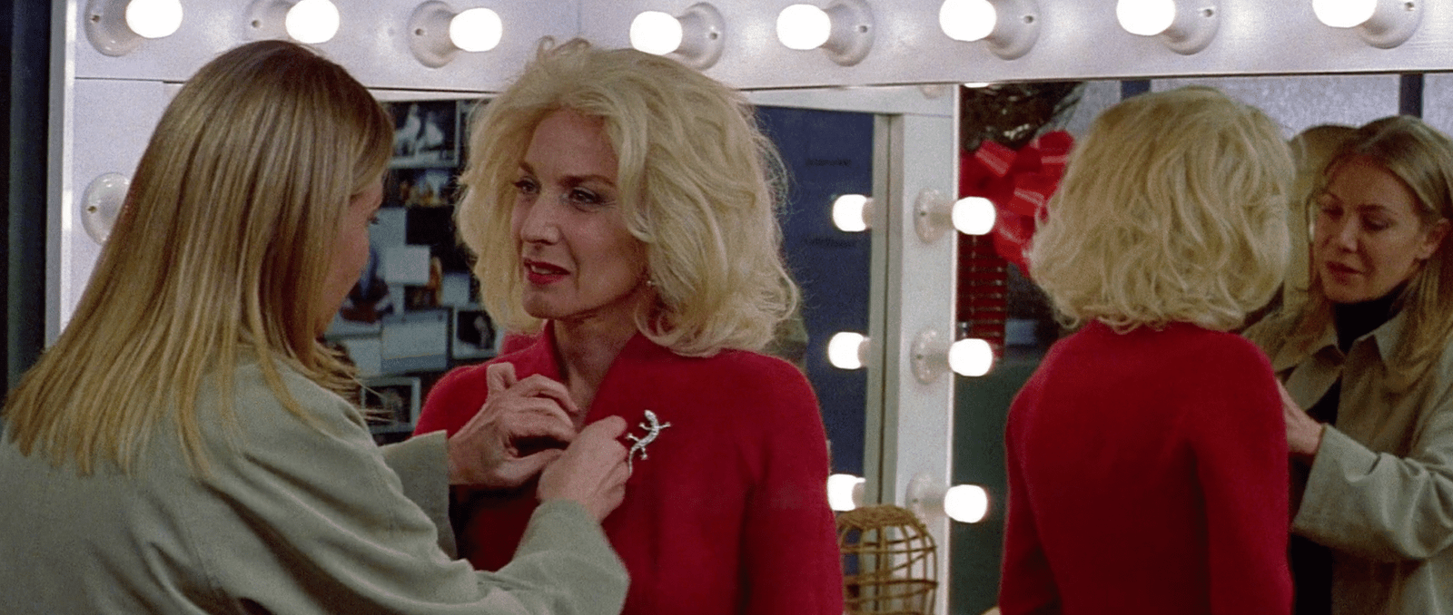
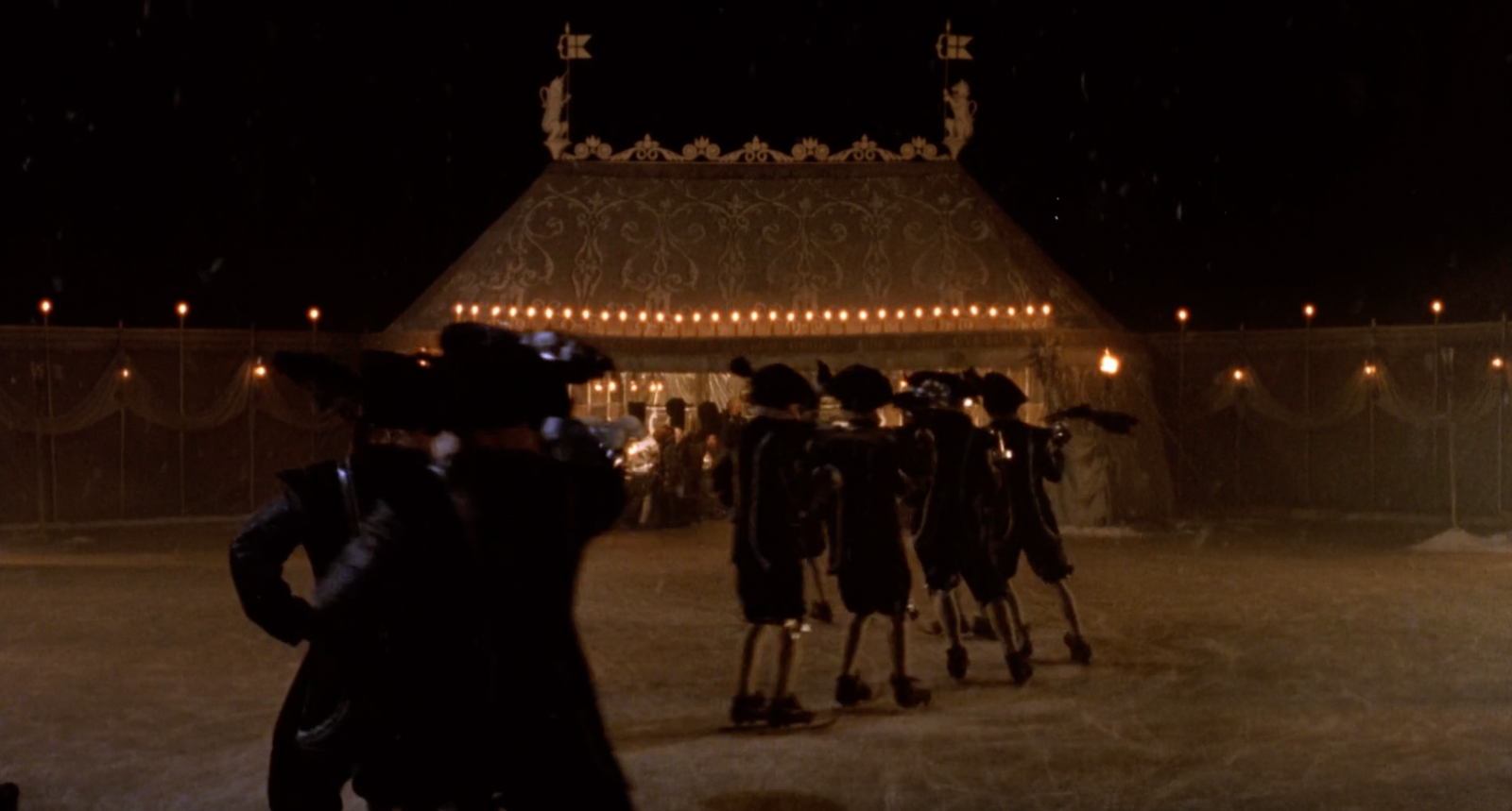
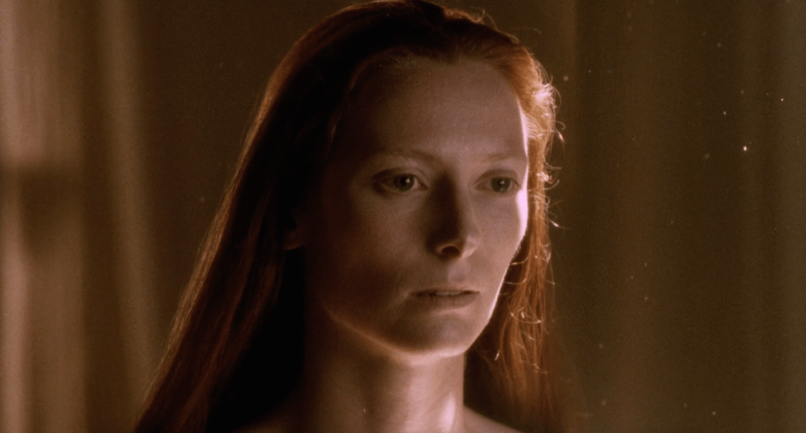
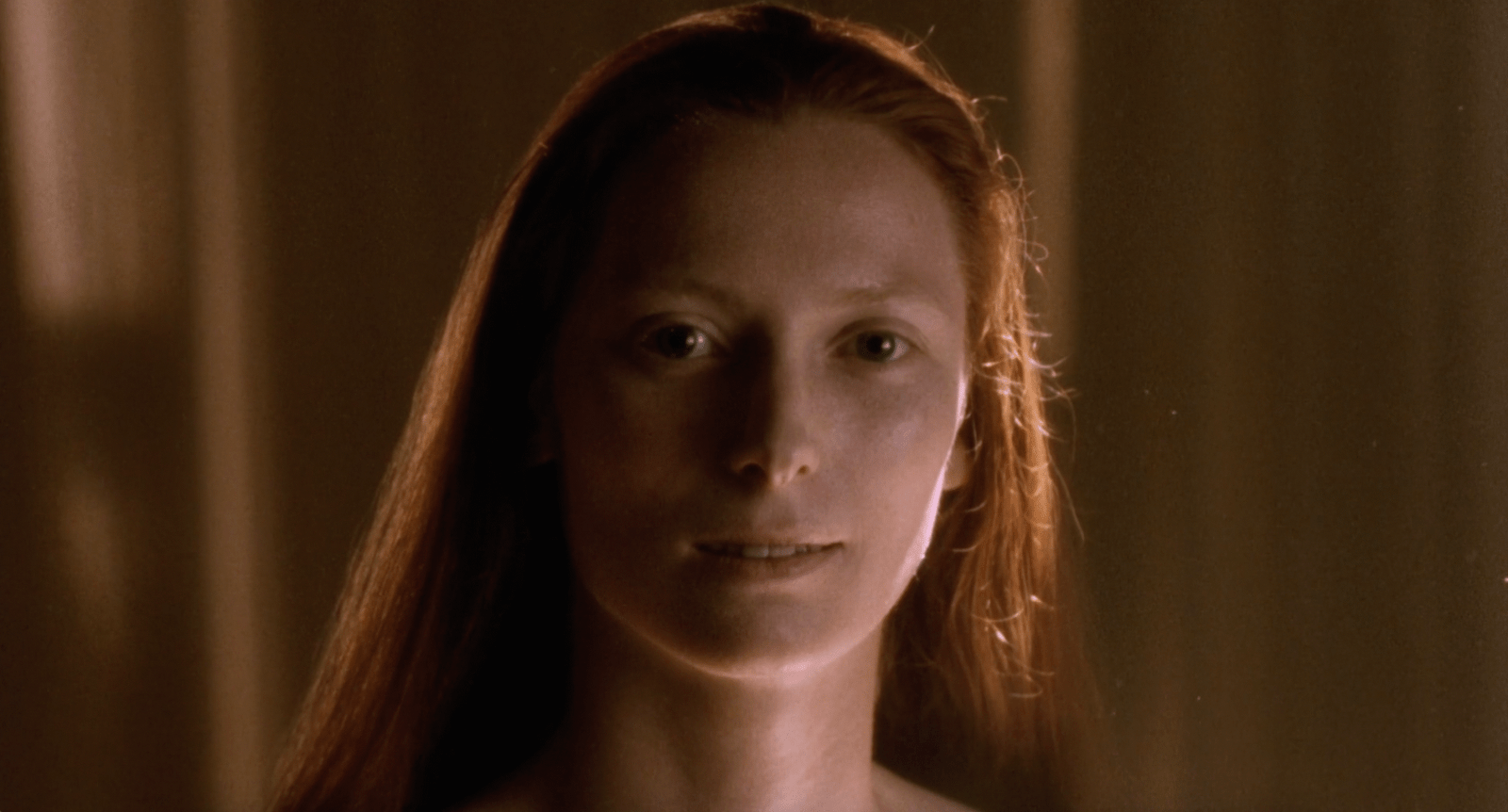
But McQueen wasn’t just collecting images from films. He was translating their systems. This intuitive approach mirrors what film theorists call the Kuleshov Effect: the idea that meaning comes not from a single image, but from the relationship between images. Change what comes before or after, and you change the meaning entirely. A look in a fashion show doesn’t stand alone; its meaning shifts depending on what precedes and follows it. Designers often think in single outfits, but the audience sees a sequence. Once you understand that, the gap becomes obvious. It’s the difference between a collection that feels deliberate and one that feels accidental.

Together with MUBI, we wanted to explore how designers can integrate these lessons. This mini-series, Film as Method, deconstructs specific films and suggests ways to use the cinematic toolkit in your own practice in three chapters. Because this series relies on close viewing, MUBI opened a one-month window for our readers to watch the films discussed. You’ll find it at mubi.com/1granary

The Mechanics of Looking

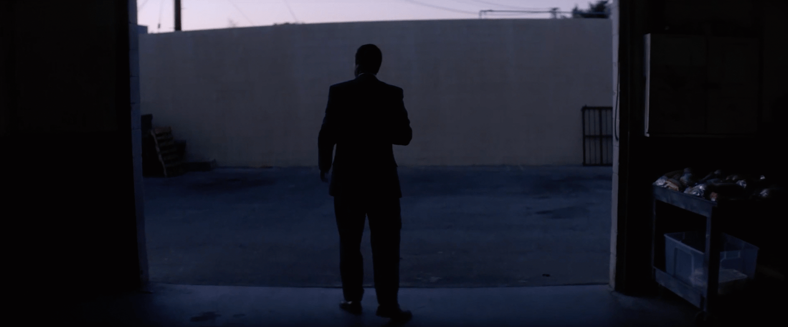
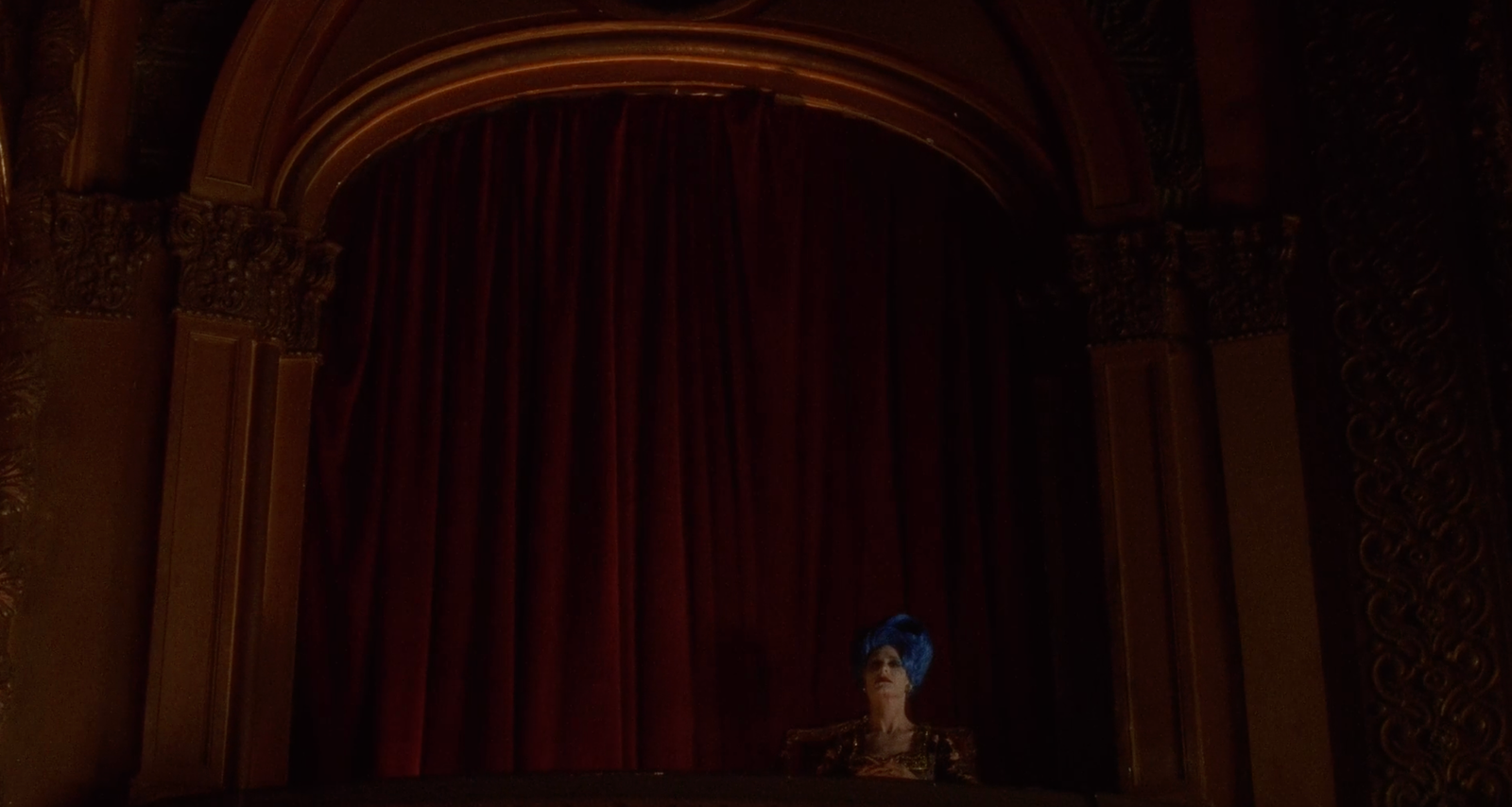
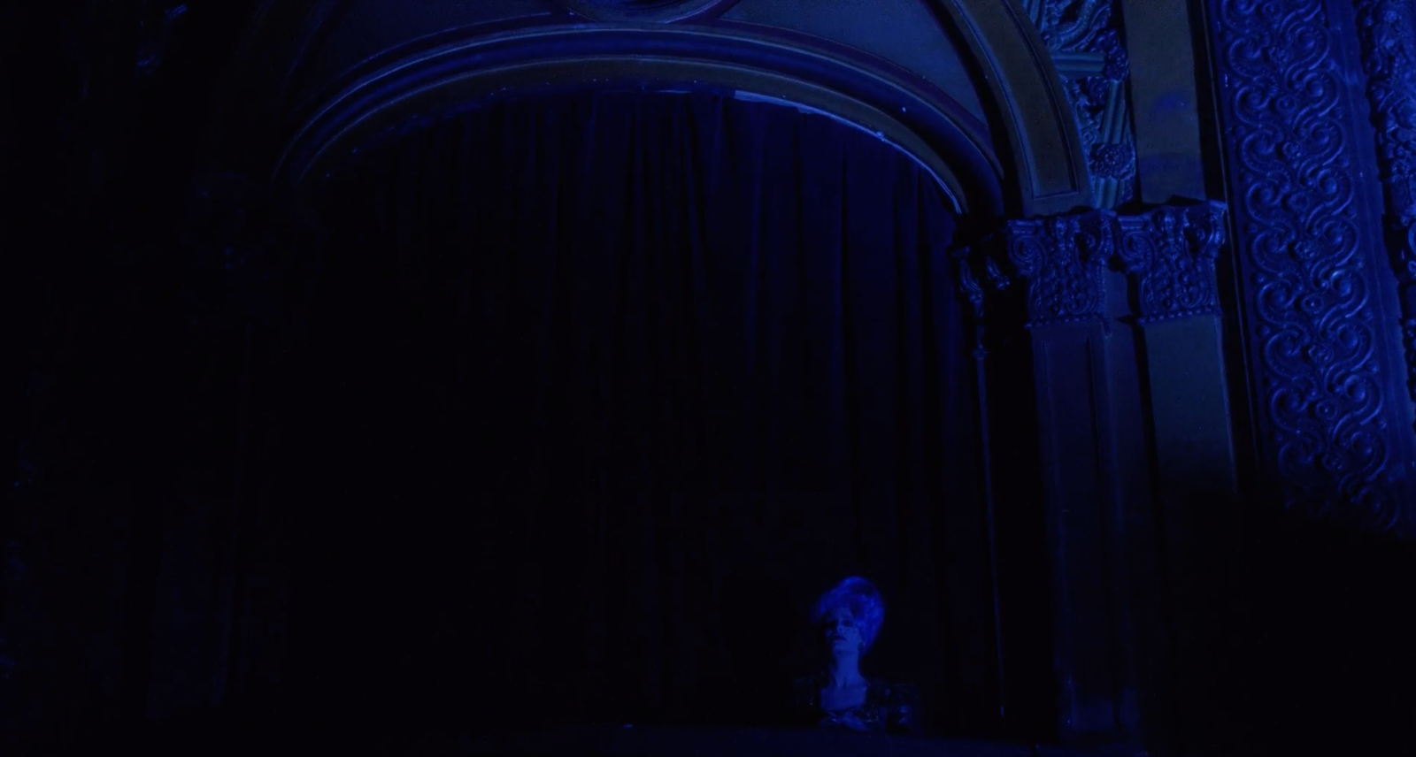
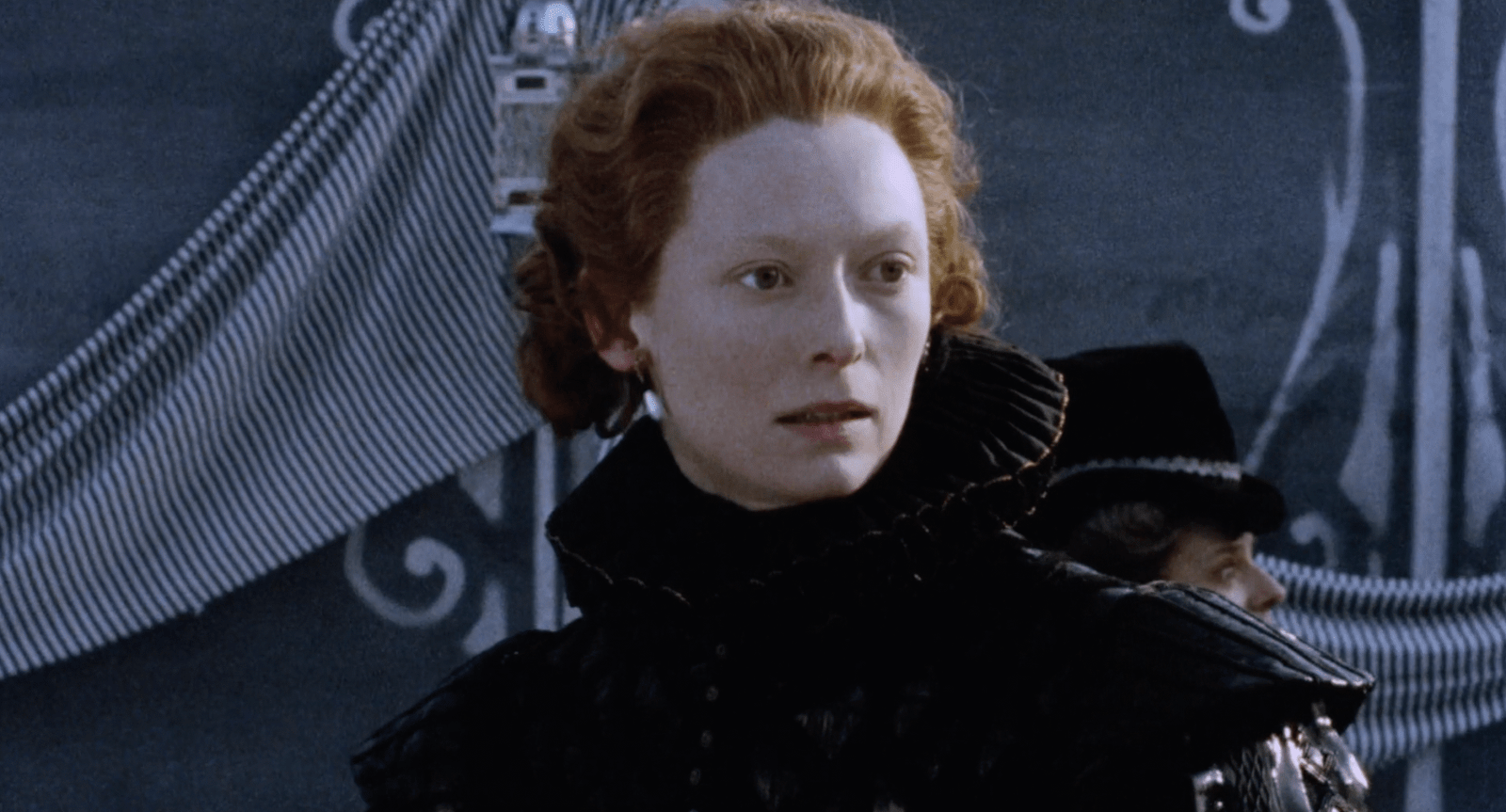
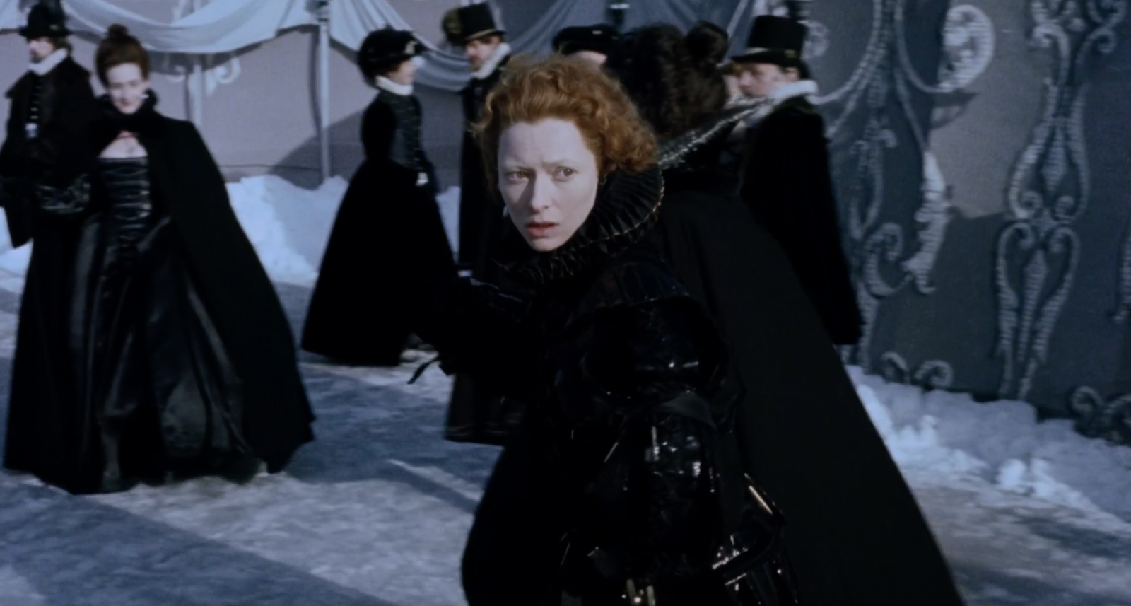
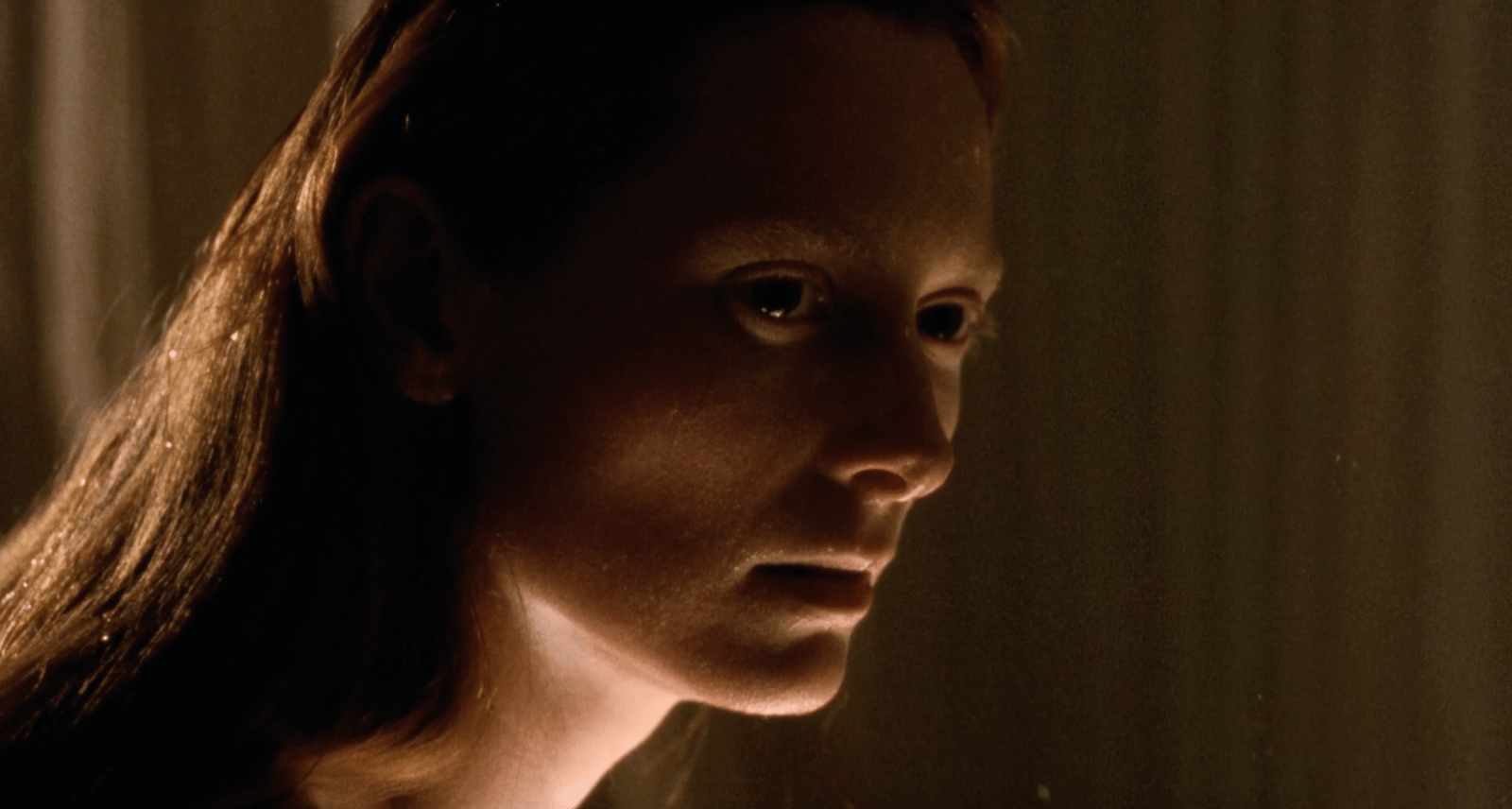
Before analysing specific films, it helps to understand how visual attention actually works. The eye moves through a frame predictably: first to areas of highest contrast, then to faces, then along lines and edges. Every element carries visual weight, determined by size, saturation, and position. Cinematographers exploit these mechanics to direct attention precisely; so can designers. But these are components. What matters is how they combine.

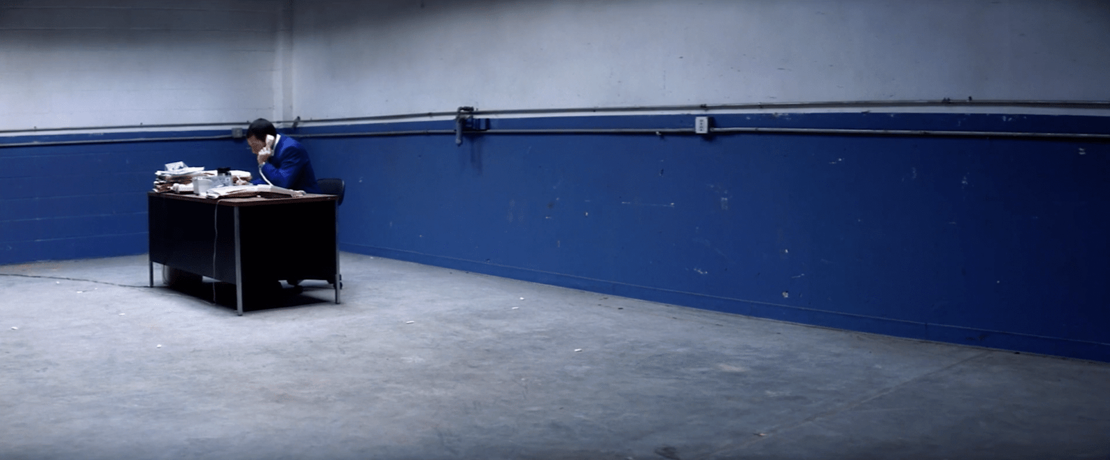
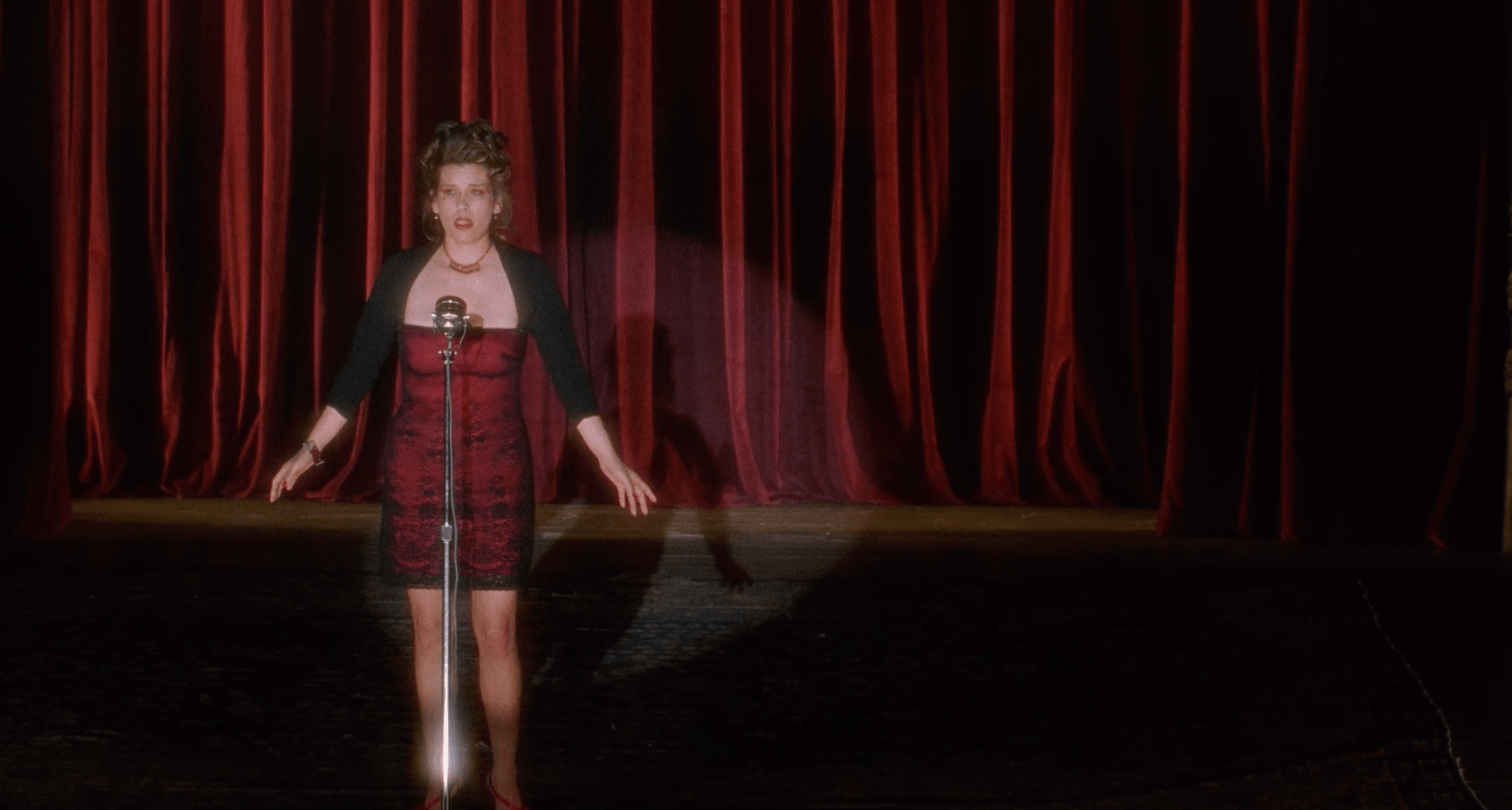
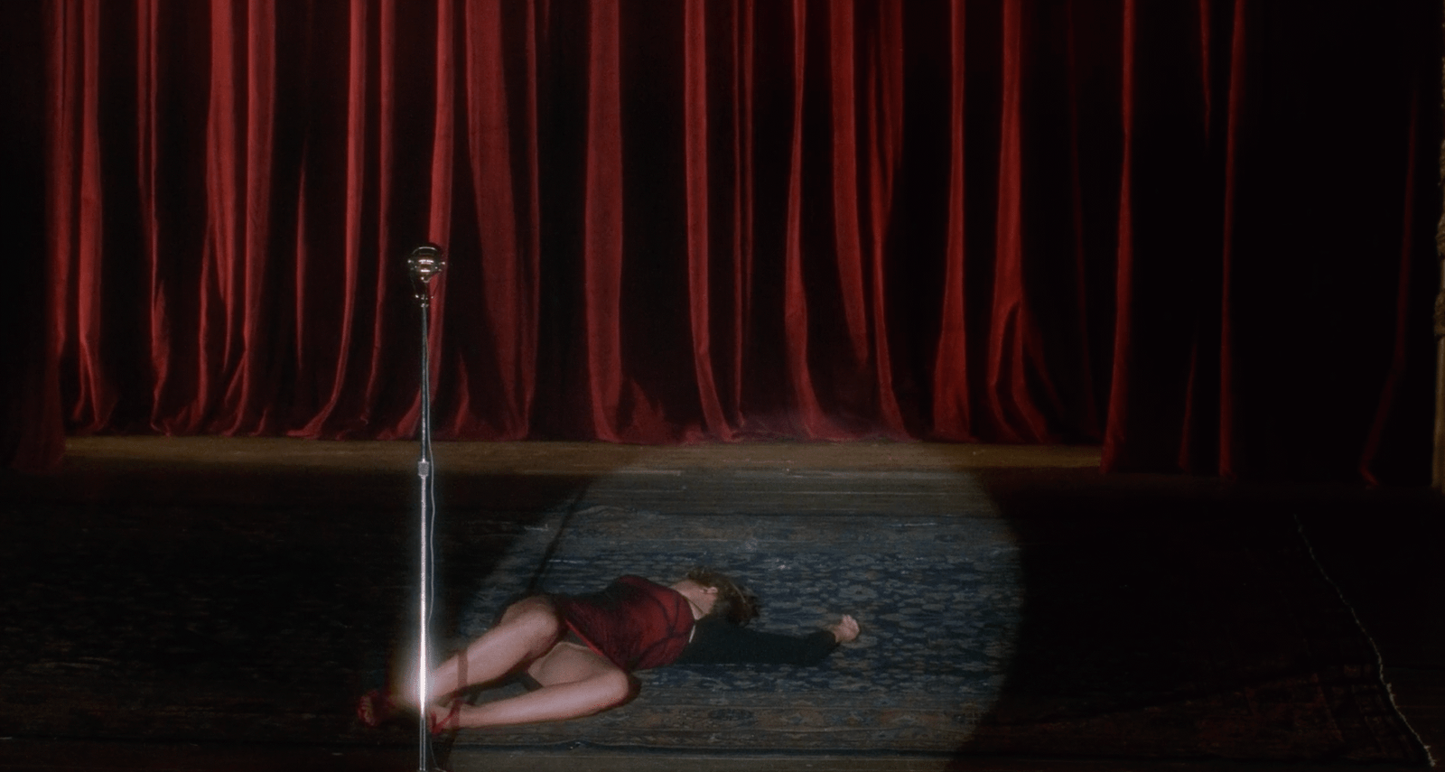
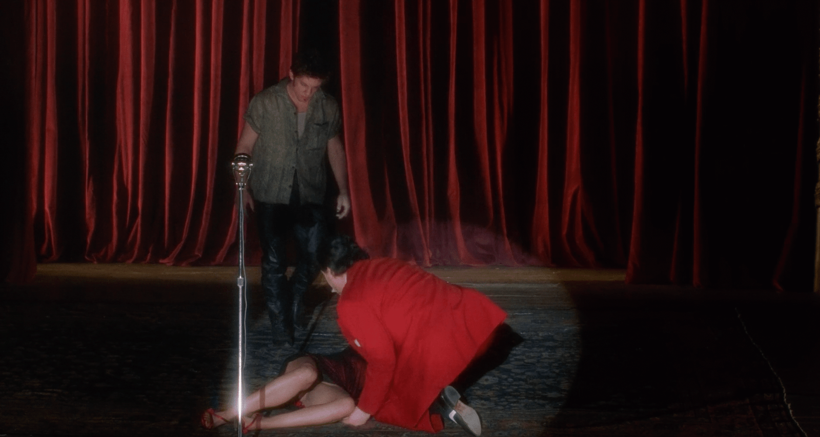
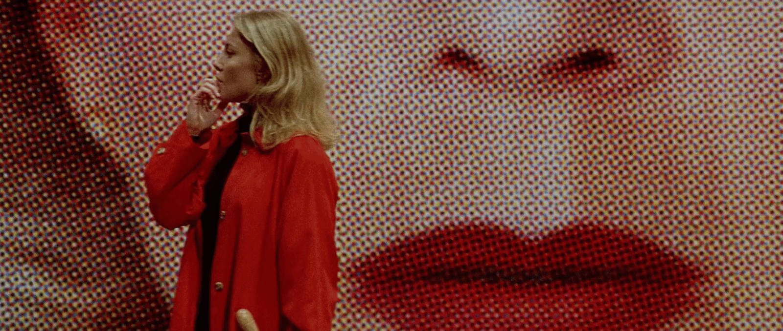
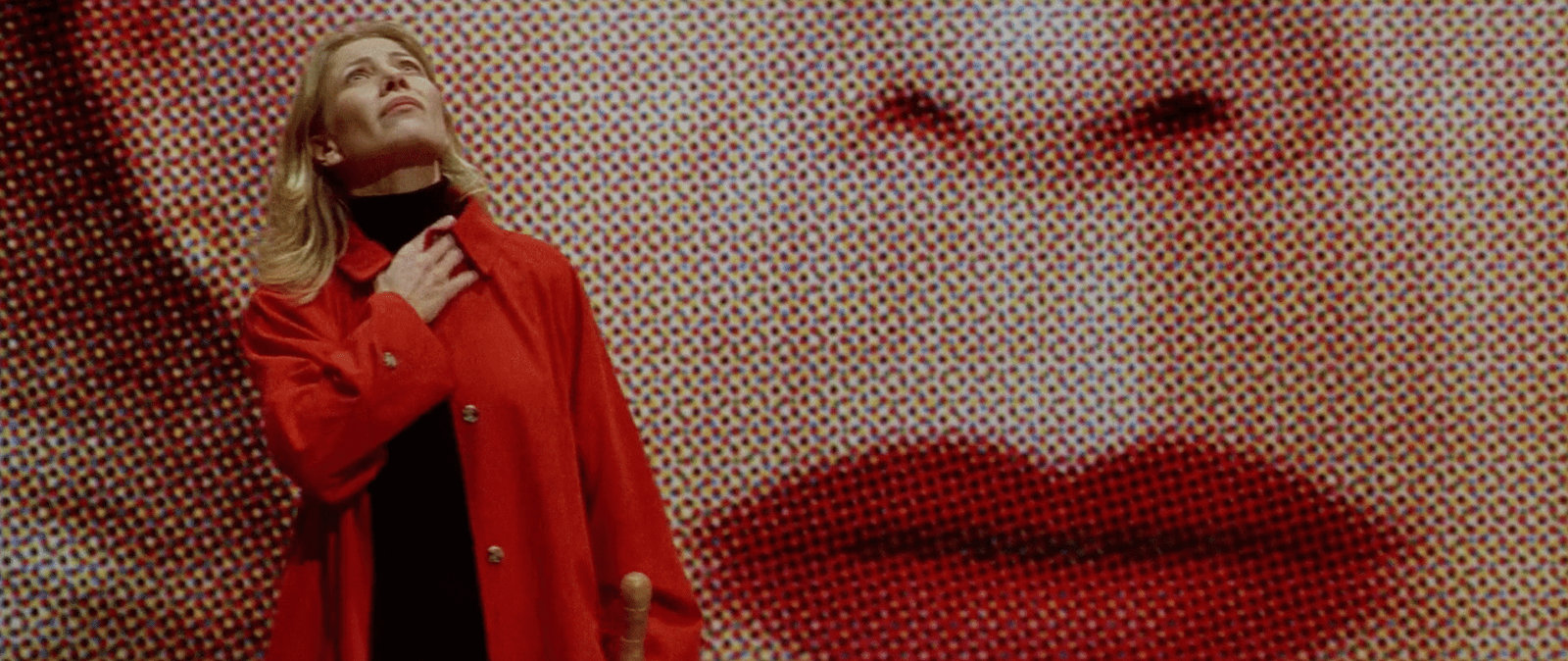
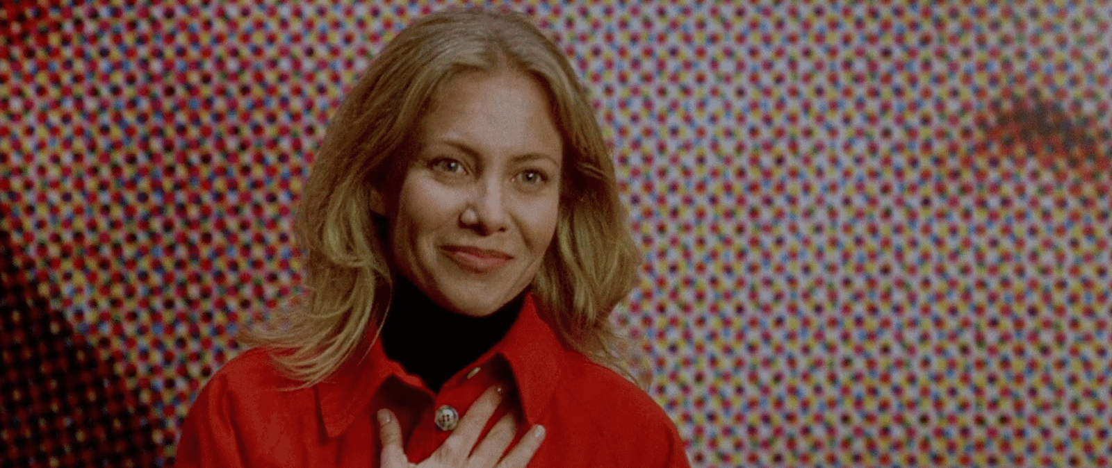
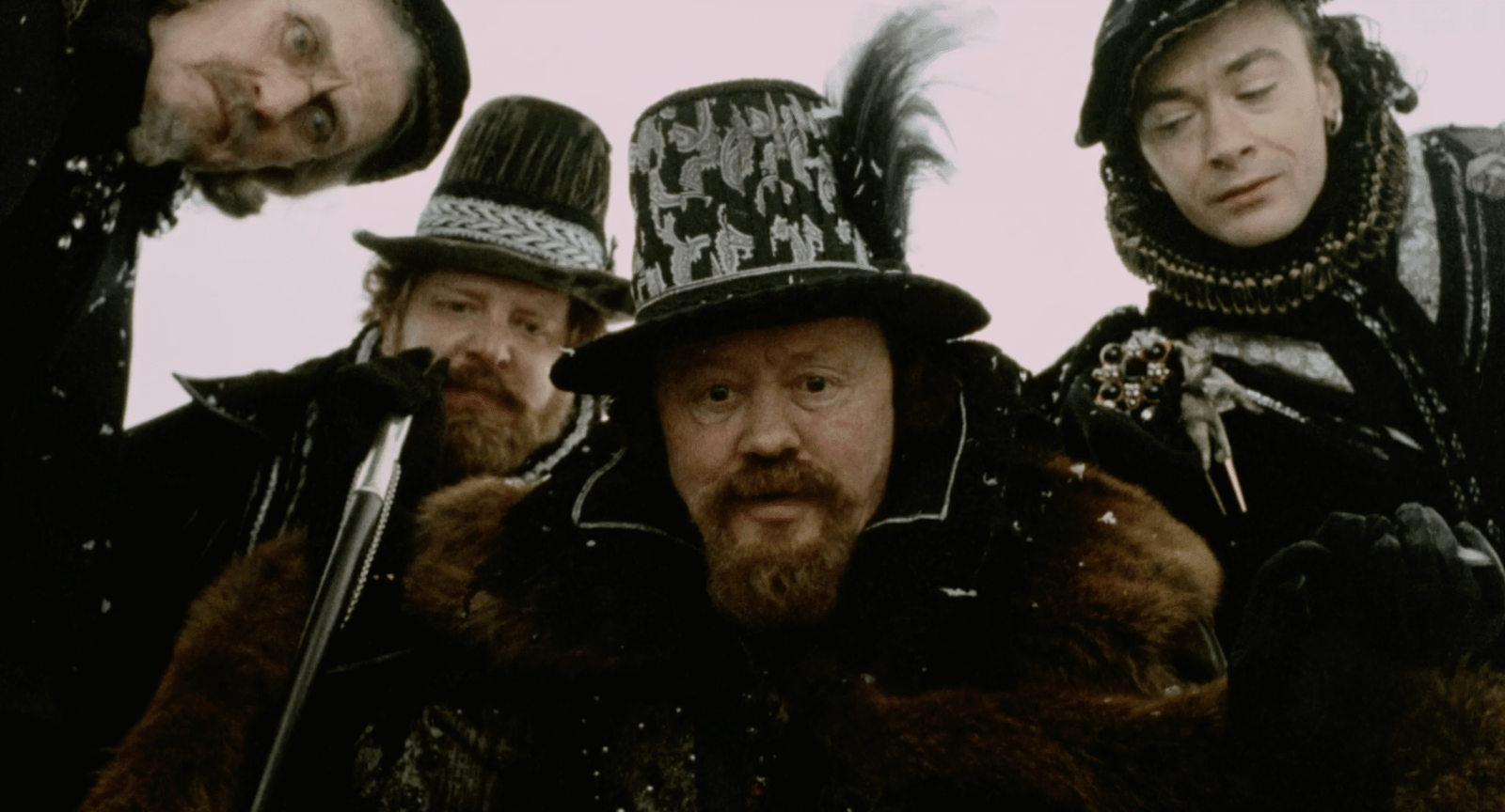
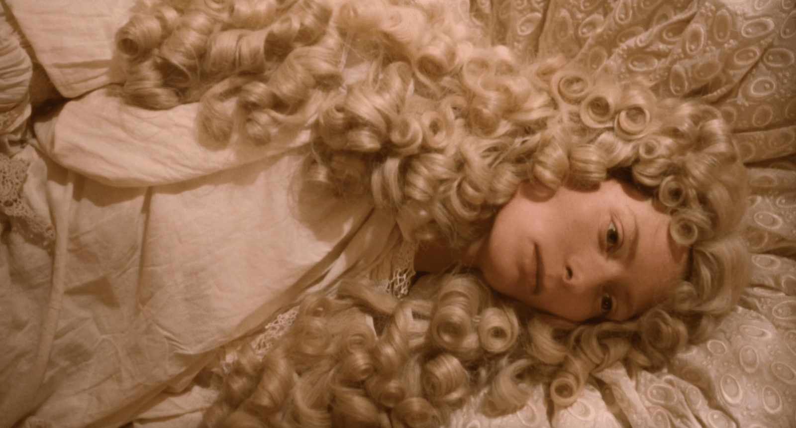
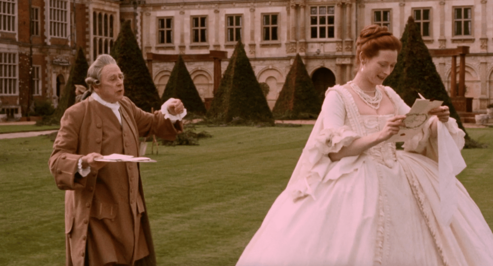
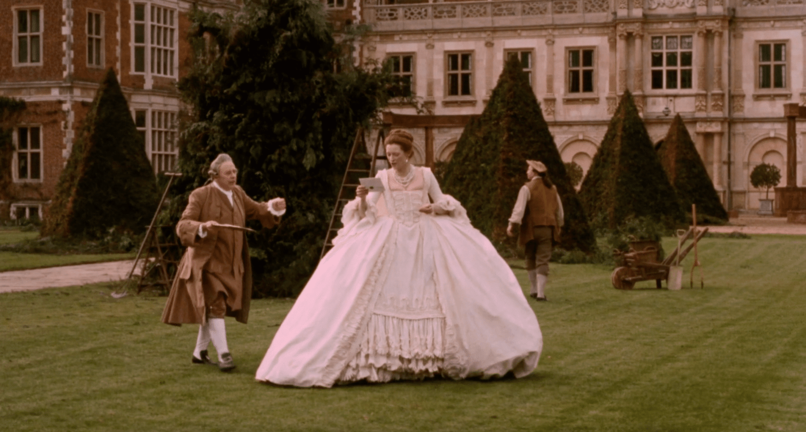
Filmmakers call this larger organisation mise-en-scène, a term that translates roughly as “placing on stage.” It refers to everything the camera captures: the positioning of bodies, the choice of colours, the quality of light, the depth of space, the presence or absence of objects. Mise-en-scène is not a single decision but the accumulation of decisions, the underlying structure that gives an image its meaning.

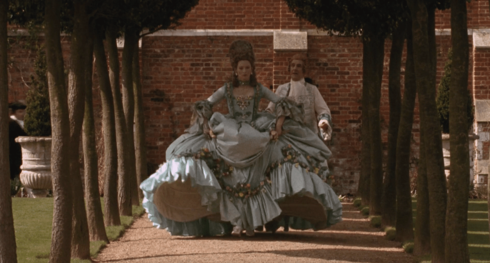
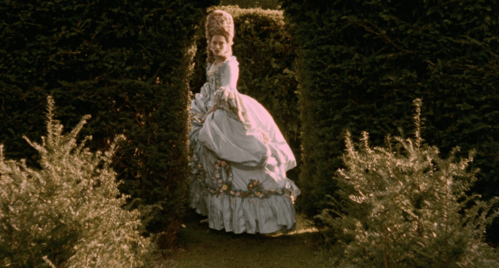
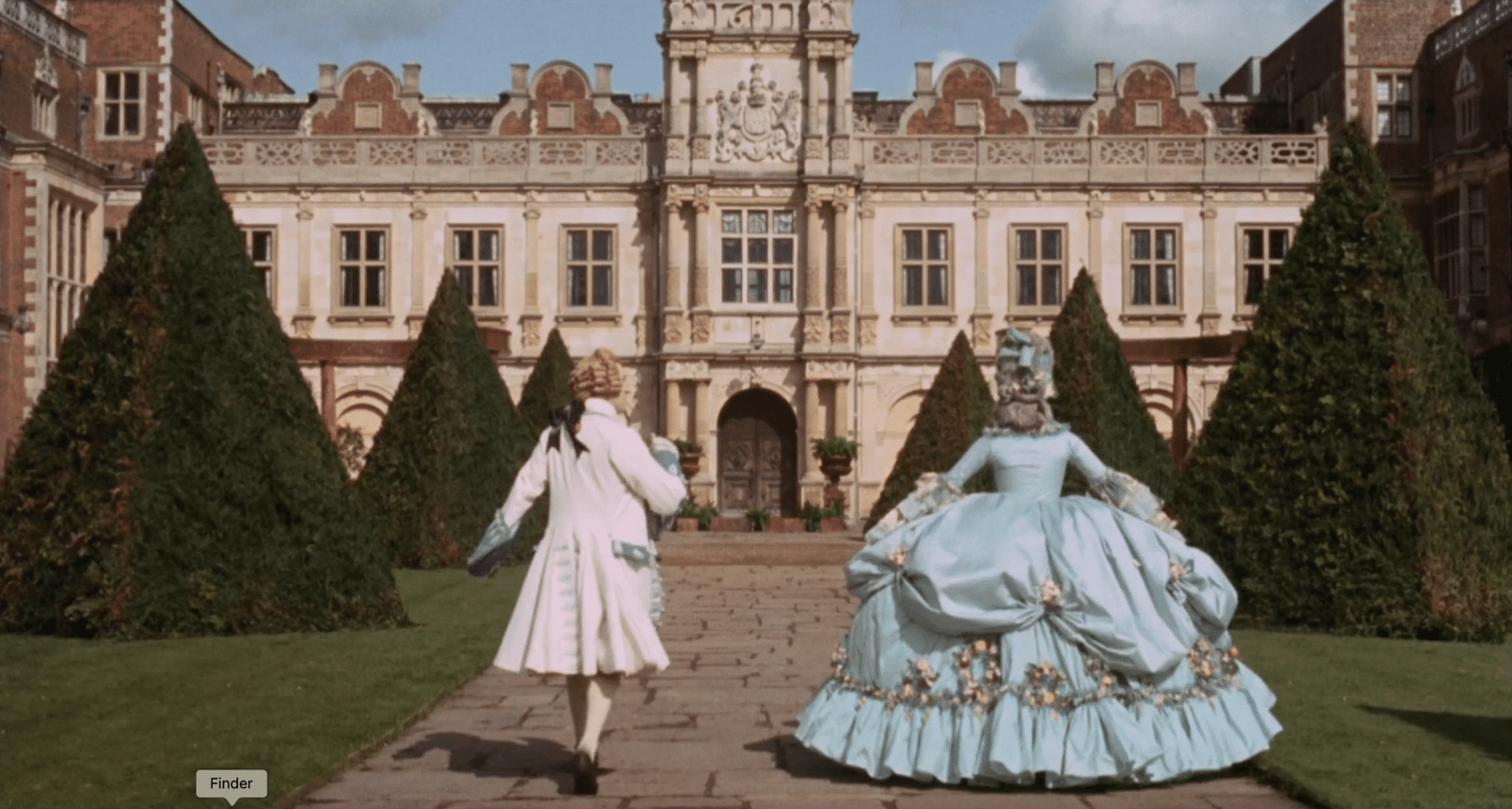
For designers, the concept is directly transferable. A collection is not a series of isolated garments; it is an environment built from silhouette, colour, casting, styling, and space. Each element influences how the others are read. A voluminous coat means something different when it follows a narrow tailored suit than when it follows another voluminous shape. A saturated red reads differently against a monochrome lineup than against a riot of colour. Mise-en-scène is the recognition that every choice exists in relation to every other choice, and that the frame, whether a cinema screen or a runway, is where those relationships become visible.

Understanding this changes how you watch, and how you can build in your own creative work. When we asked Lucy Moyse Ferreira, who teaches fashion and film at Central Saint Martins, what students miss when they first approach cinema, she pointed to exactly these fundamentals: “Students can initially overlook elements such as composition, lighting, and use of space. These details shape mood, guide attention, and convey subtext, yet only become fully apparent when viewing with deliberate intention.”

She suggests a framework: break a frame down systematically and ask, So what? Why was this choice made? What effect does it have? What would change if this element were removed?

Consider how this applies to Paul Thomas Anderson’s Punch-Drunk Love. In the opening scenes, the protagonist Barry is placed in cramped, sterile spaces. If you ask “So what?”, the answer is clear: the composition conveys suffocation before a word of dialogue explains this.

This is the level of looking designers should cultivate. Not “I like the colour.” Rather: “The colour is doing this specific work”.

Case Study 1: Mulholland Drive

Towards the end of David Lynch’s Mulholland Drive, a woman with blue hair sits in the balcony at Club Silencio. She sits motionless, washed in blue, while everything around her recedes into shadow. The shot lasts only a few seconds, but it lingers far longer than scenes with heavy dialogue. 

What makes it stay has little to do with story. It’s the construction of the image itself. Lynch has stripped the frame to its essentials. The body is placed high, the balcony rail cuts a clean line, and everything else disappears into darkness. There is almost nothing to look at except her. The less information a frame contains, the more weight what remains is forced to carry.

This is negative space at work. The darkness in the frame isn’t absence; it’s active. It forces the eye toward a singular point and holds it there. Peter Deming, Lynch’s director of photography, described their working method as primarily emotional rather than technical. Lynch would ask for a scene to feel like a dream, or to “start happy and get sadder as it goes.” For the blue-haired woman, the instruction was iconic isolation. Light, composition, emptiness: everything in the frame exists to maximise her presence in the viewer’s mind.

The same logic applies to a runway. Consider the effect of a single white look following a dense sequence of patterns and textures. The eye, overstimulated by detail, suddenly has nothing to process but shape. The look commands attention not because it’s louder, but because it’s been given room.

Negative space can be literal: the pause between exits, the blankness of a backdrop, the decision to strip away accessories. It can also be structural: placing a key silhouette after several restrained ones so the audience arrives ready to focus. What Lynch understands, and what design students might underestimate, is that restraint is not the absence of a decision. It is the decision. What you choose not to show determines how powerfully what remains will land.

Analysing the Scene: Sound as Structure

Rebekah Del Rio’s performance of “Llorando” sits at the centre of the Club Silencio sequence. What Lynch constructs here is a lesson in sound as structure: the mechanism that shifts the scene from one reality to another.

Del Rio sings live on stage. The scene moves from a diegetic performance (sound originating within the scene) to a non-diegetic recording (sound outside the reality of the scene) when she collapses but the voice continues. That shift into non-diegetic sound is a structural break. The rules change mid-sentence, and the audience is forced to recalibrate.

The film theorist and composer Michel Chion called this forced fusion “synchresis”: the mind’s instinctive attempt to reconcile image and sound that no longer belong together. Del Rio lies motionless, but the voice continues. The mismatch generates meaning. The performance suddenly feels larger than the performer. Her voice takes on what Chion called “added value”: an emotional weight the image alone cannot carry. The moment overwhelms precisely because the logic refuses to align.

Fashion shows are not silent. Music shapes how a collection is perceived, often more than designers acknowledge. The sound tells the audience how to read what they’re seeing. In Club Silencio, sound not only supports the image but also carries information the image cannot. A shift in the score marks a shift in meaning. 

The same principle applies to a runway: changes in tempo can signal transitions in the collection, repetition can build tension, a broken rhythm can land a key look. Sound, treated structurally, becomes another tool for directing attention and shaping how the sequence is read.

Case Study 2: All About My Mother

How to See: Physiological Colour

One of the most revealing images in Pedro Almodóvar’s All About My Mother appears early in the film. Manuela stands waiting for her son, framed against a massive red poster of the actress Huma Rojo. The red takes over the frame. It doesn’t feel decorative; it feels structural. Before a word is spoken, the colour – the colour of alarms, warnings, danger – has told you something is wrong. This is what makes the shot useful as a case study: it isolates colour as a narrative force, separate from dialogue or action.

Almodóvar is explicit about this: he uses colour as a design system. As he told Filmmaker Magazine: “The colours of my movies are not completely real… I don’t want to make something that looks completely real. I want a representation of that.” By representation, he means something closer to emotional truth than literal accuracy. He described red as a force in Spanish culture, representing “passion, and fire, and blood, and death.”

But Almodóvar isn’t only working with symbolism. He’s working with physiology. Warm colours like red advance toward the viewer; cool colours recede. Saturated colours feel closer; desaturated colours feel further. Stand in front of a red wall and then a pale blue one and you’ll feel the difference immediately: the red presses in, the blue opens up. The red wall in All About My Mother feels oppressive partly because the colour is literally pushing forward in space, dwarfing the small figure of Manuela.

Long before colour theory became standard in film production, Soviet film director Sergei Eisenstein (Battleship Potemkin, Ivan the Terrible) was building a framework for exactly this kind of effect. He argued that colour gains meaning through contrast and collision, not through fixed associations. A red next to a grey does different work than a red next to an orange; a deep blue beside a sickly green yields a different charge than the same blue beside a neutral beige. Eisenstein compared these shifts to montage: just as two shots cut together produce a third meaning, two colours placed in sequence create a perceptual rhythm. What Almodóvar achieves with that red wall is essentially Eisensteinian. The colour not only represents passion or death – it collides with the figure in the frame.

Directors like Almodóvar spend months plotting how colour will move through a film: where it will intensify, where it will withdraw, how one scene’s palette will set up the next. The underlying logic is sequencing. And sequencing, of course, is exactly what a runway show is.

In fashion, colour can be handled as a finishing step, the decision made after silhouette and fabric are locked. But it’s one of the fastest ways to shift how a lineup feels. Colour tells the viewer where to look and how to feel, whether they notice it or not.

Analysing the Scene: Proxemics & Blocking

When Manuela finally meets Huma Rojo, Almodóvar shoots the moment through mirrors. Huma appears first as a reflection; Manuela arrives in real space. Before either woman speaks, the frame has already established who holds control. This is proxemics: the use of distance, angle, and position to communicate relationship. It is the architecture of power made visible through space.

Almodóvar reinforces the dynamic through blocking. Huma stays elevated and slightly removed. Manuela moves toward her, closing the distance. Their spatial arrangement tells you who is guarded, who is exposed, and whose point of view the audience is meant to share. Blocking determines not just where bodies sit in the frame, but whose emotional position the viewer inhabits.

Then the lighting shifts. The cold neon of the earlier scene gives way to warm gold, signaling a narrative transition: the emergency is over, and intimacy has begun. Lighting change, like spatial change, carries structural information.

For designers, proxemics governs every mode of presentation. A look shown in isolation reads differently than the same look shown shoulder-to-shoulder with others. A model leaning toward the camera projects authority; one held back, half in shadow, suggests hesitation or mystery. On a runway, the spacing between exits shapes rhythm and emphasis. In a lookbook, where you place the figure in the frame determines how dominant or recessive the garment feels.

Proxemics is spatial storytelling. Almodóvar understood that the mirror told you everything before the dialogue arrived. For designers, the frame works the same way, whether it’s a dressing room mirror, a runway, or a photograph. Where you place the body, and how much space you give it, tells the audience how to feel about what’s inside it.

Case Study 3: Orlando

How to See: Figure and Ground

One of the most striking images in Orlando appears during the “Great Frost” sequence. The shot is near-monochrome: whites, pale blues, silver ice. Orlando, still in male dress, moves through the frame like a dark vertical mark across a page. The image is stark enough to function almost as a diagram, which is precisely what makes it useful.

The film’s director, Sally Potter, was not chasing historical accuracy. Her driving question, as she told Sight & Sound, was: “What is the present moment?” This is costume design’s central tension. Period films carry an implicit promise of authenticity, but strict accuracy can flatten meaning. A costume that is merely correct offers nothing beyond documentation. The challenge is to honour the historical frame while making the clothes feel emotionally present.

Costume designer Sandy Powell, who earned her first Academy Award nomination for Orlando, found a way through. “I don’t think, ‘I’m going to put her in green because that means envy,'” she said. “I have a much more instinctive feel. I pick colors because they feel right.”

What Powell calls instinct is, in practice, a sophisticated visual logic. The eye naturally groups elements that share colour, texture, or luminosity into a unified field, while isolating anything that breaks the pattern. In the “Great Frost” sequence, the whites and pale blues of the frozen Thames register as environment. Orlando’s dark costume registers as disruption. The figure separates from the ground not through action or dialogue, but through the simple mechanics of contrast.

The effect is not incidental. Orlando, at this point in the story, is a figure set apart from the world: present in it, but not belonging to it. Powell’s colour choice doesn’t symbolise loneliness in any literary sense. It produces the sensation of loneliness through the way we see. The costume makes the isolation visible before the viewer has consciously registered the emotion.

This principle translates directly to fashion. A look photographed against a background that matches its tonal range will merge into the image; the same look against a contrasting field will snap into focus. On a runway, a pale silhouette following a sequence of dark ones will appear to advance toward the audience, even if the model’s pace hasn’t changed. 

Analysing the Scene: Narrative Economy

The gender transformation sequence – Orlando waking up as a woman – is a masterclass in cinematic economy. Sally Potter explained to BOMB Magazine that the film wasn’t about confirming identities, but “exploding them… Exploding the myths of sexual identity with a gentle touch.” The transformation arrives without drama because the film’s thesis depends on restraint: identity shifts, but the self remains continuous. 

The scene is pared to its essentials. A dim room, Orlando in bed, a warm muted palette of soft golds and washed creams. She rises, crosses the frame, looks in the mirror. The film holds just long enough for the viewer to register what has changed. No score signalling importance, no dramatic zoom, no ornamentation. She sees herself, accepts it (“Same person… just a different sex”), and moves on. 

This is narrative economy, the idea that every element must earn its place. If a gesture, object, or shot does not advance the story, deepen character, or adjust the emotional temperature, it goes. Potter delivers an entire transformation, psychological and narrative, through a handful of the strongest decisions and lets everything else fall away.

After the stillness of the interior, the frame opens up in the garden. The world widens and the landscape becomes an extension of Orlando’s renewal. The shift from enclosed room to open air functions as its own sentence: acceptance, then expansion. The exterior catches up to what the interior has already resolved.

The logic transfers directly to design. Editing is a creative act, and a collection is defined as much by what you remove as by what you show. Potter’s scene is a reminder of how much power comes from stripping away anything that does not serve the idea.

The same discipline applies to elements designers often treat as decoration. Accessories, casting, styling: each must do narrative work. When every component earns its place, the work feels sharper, more controlled, more complete. In both film and fashion, clarity is force. Narrative economy is not minimalism. It is the intention, the recognition that meaning lands hardest when nothing stands in its way. 

Exercises

Mapping a Mood Sequence

Treat the Club Silencio sequence as if you were the designer asked to recreate its rhythm in a collection.

  1. First Watch: Note three words for the mood at the beginning, middle, and end.
  2. Second Watch: Track shifts in light (source, intensity, warmth). Note the dominant colours at each beat.
  3. Track Sound: Silence, announcements, performance, rupture. Where is the tension held? Where is it released?
  4. Translate: Which look in your lineup would carry each beat? Where is your “quiet” moment? What garment or gesture carries the emotional charge and becomes your version of the “blue-haired woman”?

The Colour Spine

Choose any 2-4 minute sequence from the film. Ignore the plot and focus only on colour logic.

  1. Draw a Timeline: Create a simple timeline of the scene. Where does the palette warm up? Where does it cool down? Where does it flatten?
  2. Translate: Which look in your collection corresponds to the emotional peak of the scene?
  3. Edit: What would you eliminate from your lineup to maintain the clarity of this colour story?
  4. Reflect: Could you describe your entire collection as a colour arc?

Shift the Frame

Choose a moment of transition from your own work – a character shift, a theme change, or a move from sketch to final.

  1. Structure: Break the shift into three beats: Before / Threshold / After.
  2. Light Logic: Define the lighting of each beat (e.g., warm → neutral → bright).
  3. The Gesture: Identify one physical gesture that marks the threshold.
  4. Translate: How would you express this through silhouette? What changes in texture or palette echo the shift?.

Get 60 days free on MUBI as a student here: mubi.com/1granary. And if you’ve already graduated, you can get one month free, see here.