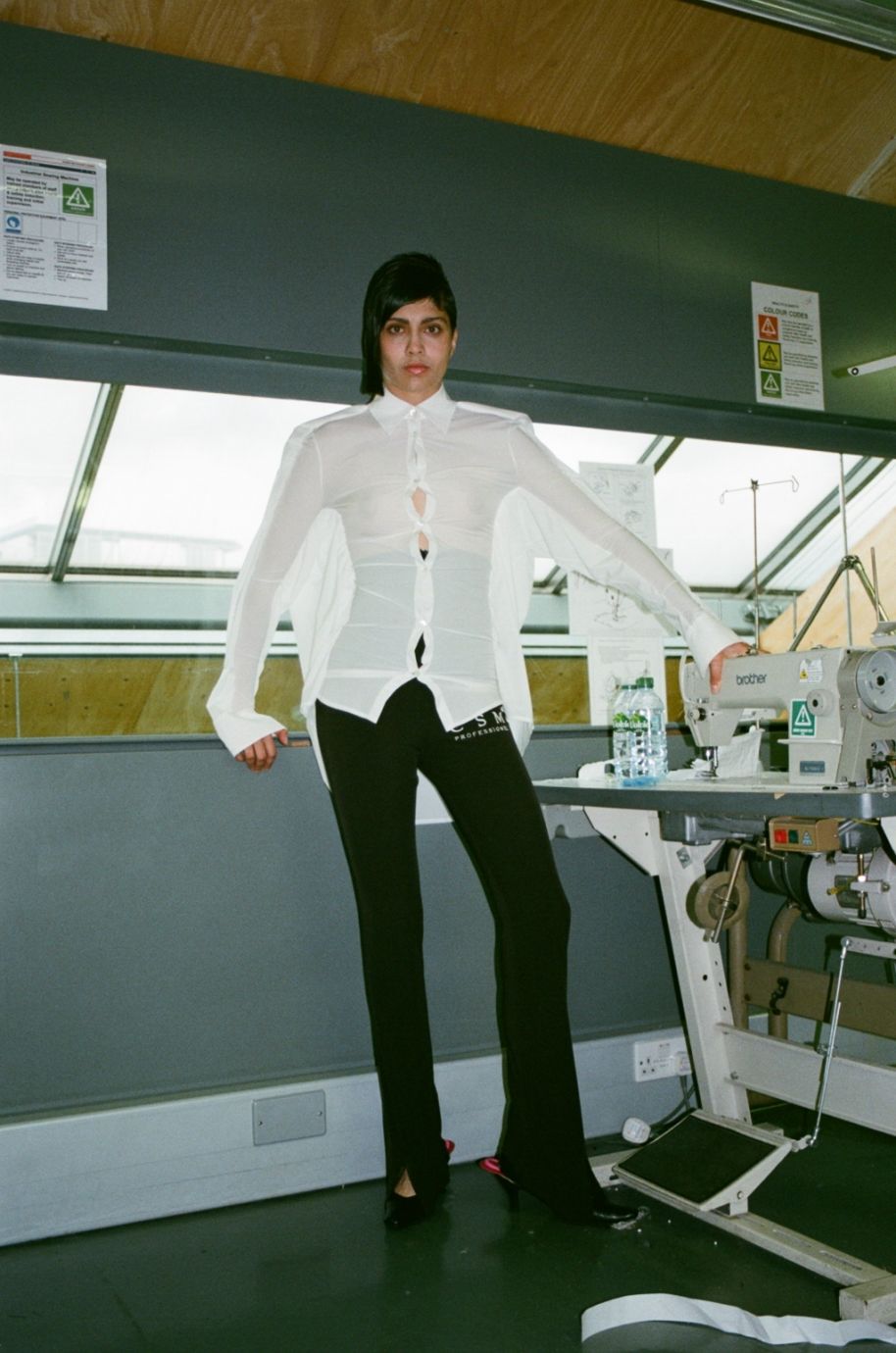
Coming from Barnsley, a market town between Leeds and Sheffield, Matt Dyer was the archetype of a small town boy with big dreams; meatpacking in an assembly line was no longer sufficient. Having kipped on his fashion friends’ couches during their CSM heydays to find employment opportunities in London, Dyer knew he wanted that life. He enrolled into the CSM BA fashion design course and upon one of his fittings, heard the late Louise Wilson OBE, refer to the university as a corporation. It was this incident that triggered the genesis for his creation. The UAL behemoth had struck hard, “[CSM] is a huge mammoth building and it has all these deadlines and fees… it really did feel like a corporation and that stuck with me. I played with the idea of the school being a factory and the students as products that the school is churning out.”
New Waves: Matt Dyer
BA graduate Matt Dyer exposes the similarities between becoming a product of education and working at a meat packing factory.
Discourses about fashion education have been stirring the pot lately, some question its value, some critique its methods and many are concerned with life as a graduate. Packed, processed and stamped pieces from Matt Dyer’s graduate collection were a tongue-in-cheek commentary on the issue, a bold manifesto through the eyes of fashion’s own.
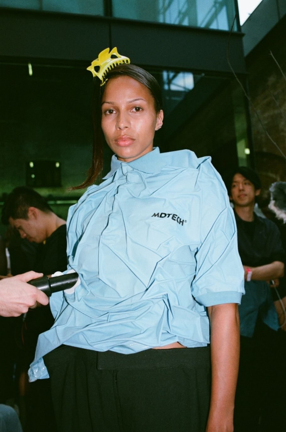
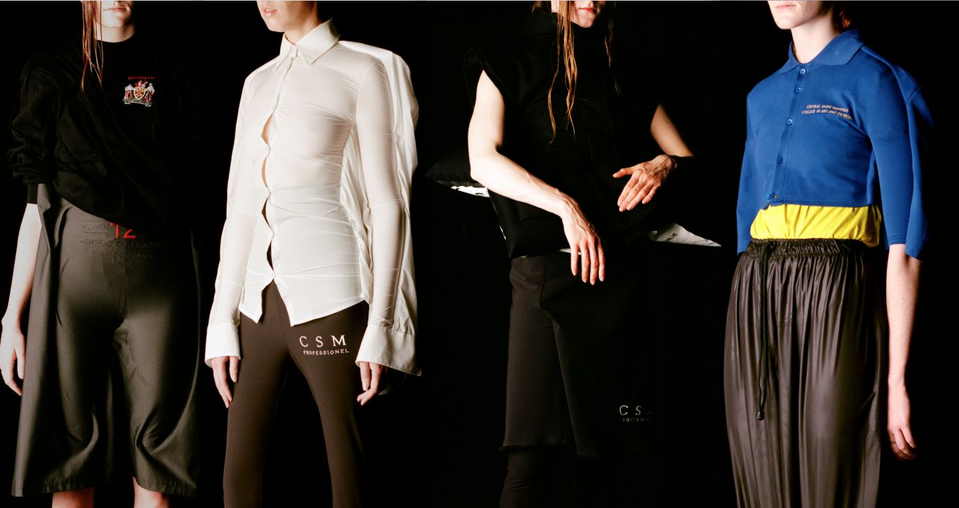
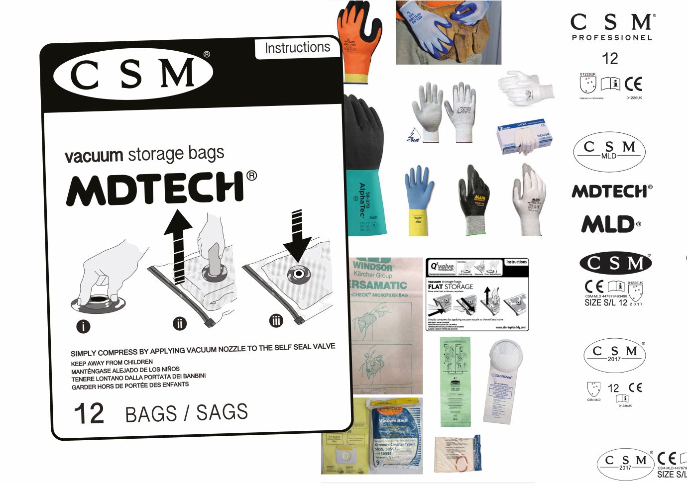
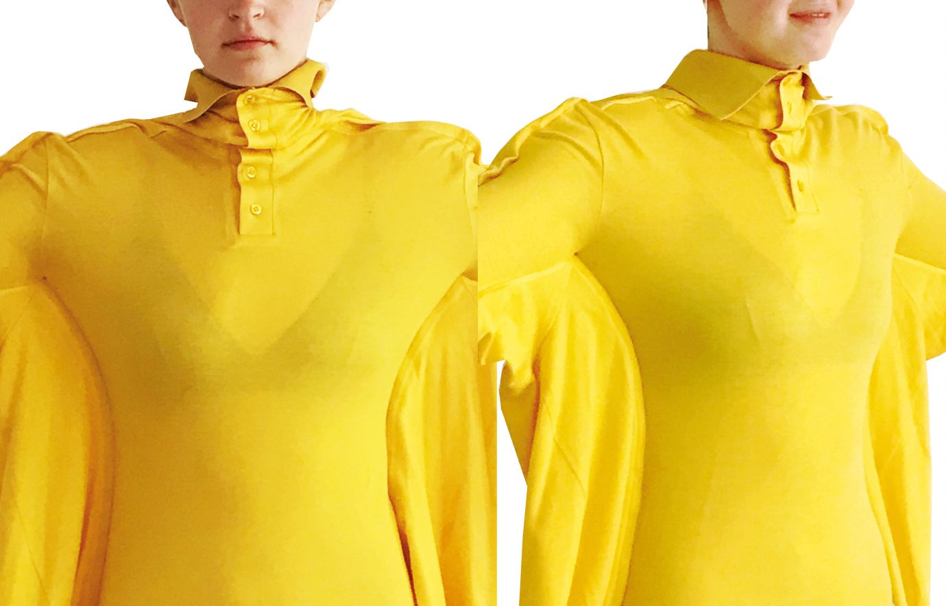
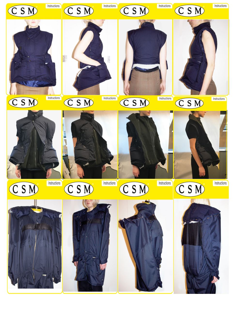
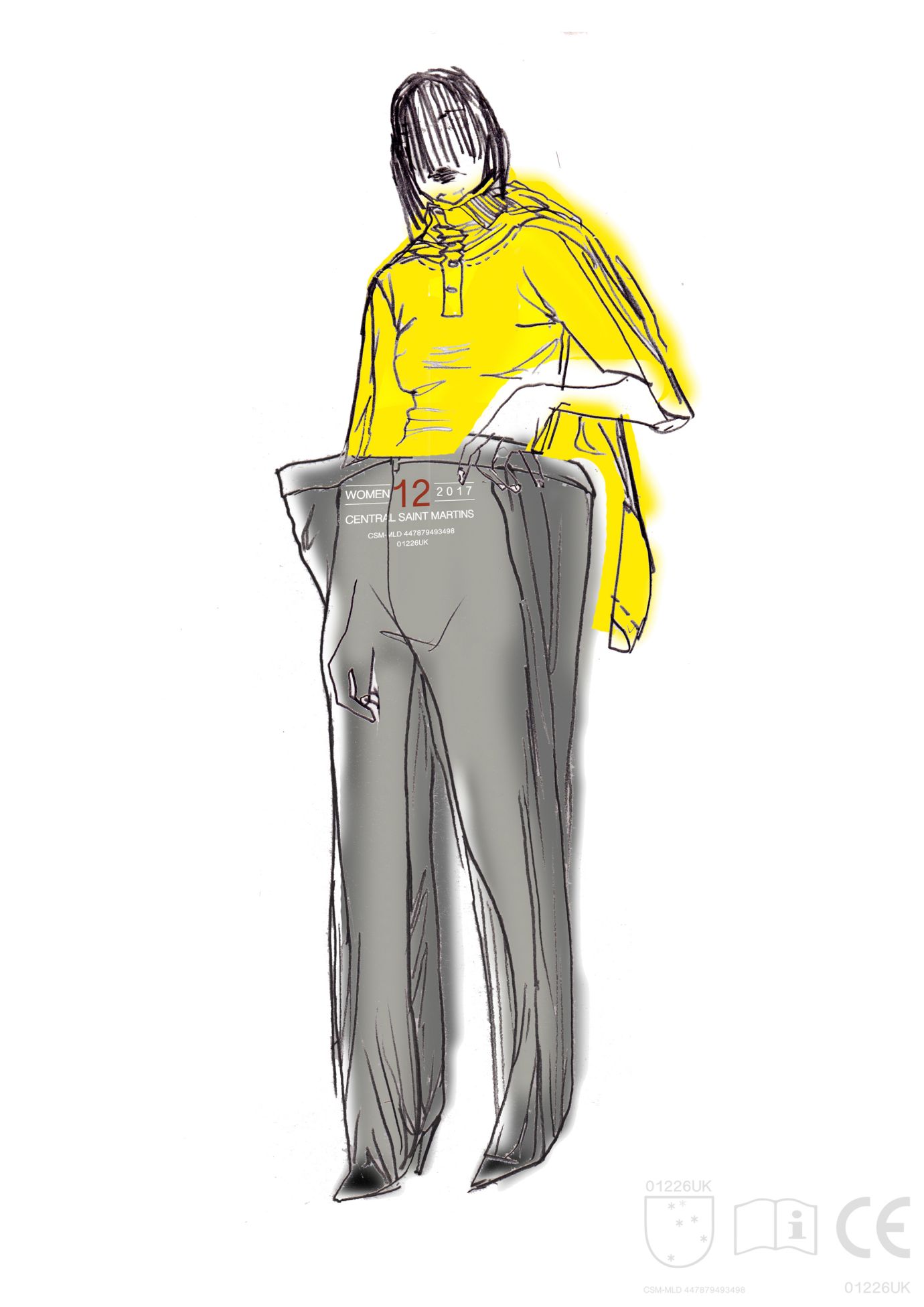
Whilst the utilitarian aesthetic — inspired by Wilson’s truth and Dyer’s days in the factory — reigned supreme, the technique he created was far more refined. “The most important aspect to a garment is the inside, the mechanics really affects the shape, the exterior and its movement,” Matt said. With knowledge from his placement year at Vêtements and a partnership with Italian factory Beste, his pieces took elements from raincoats, shirt stiffeners and fusing techniques. Playing with the idea of corporate branding, he designed a logo influenced by the branded mannequins he worked with on a daily basis. This was then emblazoned in bold block letters on the fronts of his pieces. Sterile whites and greys reminiscent of school uniforms and factory environments clashed loudly with the blues, yellows and greens, homage to everyday clothing choices in the working place. These were all pulled back, stiffened and sealed close to the models body with one piece in particular that resembled a real vacuum pack, symbolic of his meat packing days with the air sucked out of the layers to accentuate its popper buttons. The bottoms made use of the same techniques, an oversized layer fused and stiffened to its interior creating sharp definition. Despite its airtight look, the clothes, he’s assured us, are comfortable – made from lycra, cotton pique and jersey, every specification has been thoroughly thought through.
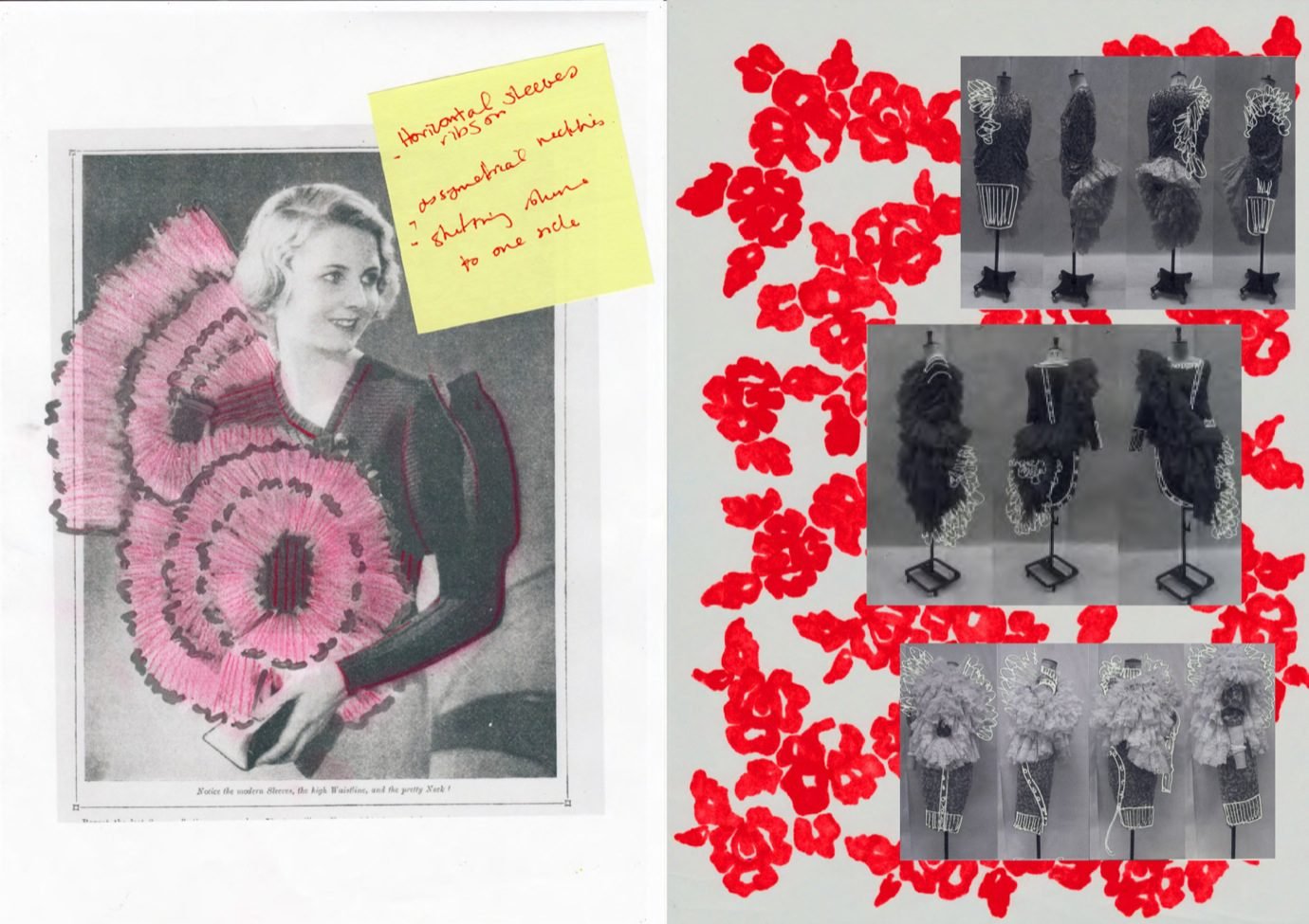
There’s nothing identical with these uniform looks and Dyer’s attention to detail is unmistakable. Nostalgia being a strong source for the designer, his hometown crest sat proudly on the chest of a shirt, close to heart and close to home. The Yorkshire rose was also intertwined on the wrists of the models, a comely juxtaposition to the rigid threads. And the bags, “inside were all of the models’ clothes that they originally came in, it’s a commentary on you coming into the school as one person and come out completely different and a nod to working at the factory. When you come into work you get changed and put all of your stuff into a clear bag that goes into a locker and you then put on your uniform.” And with a final sign off, signatures of his graduating class scrawled on across his last look, Dyer bids adieu, for now, to his school days.

