Representing the creative future

The colour blue interpreted by 21 young artists

For a party of students to create a coherent experience for viewers at an open-call group exhibition, which inevitably leads to the involvement of many different kinds of practitioners, is no mean feat. It’s about finding a balance within a theme that allows a curatorial thread to develop, drawing relationships between seemingly polarised practices, while allowing artists to retain their individual voices and create work they still consider to be their own. Twenty-one artists from the 2D Pathway decided to take on this challenge and put together ‘Sacred Blue’, a self-organised second year interim show, taking place at the East London gallery The Rag Factory, for just one night. The value of such a venture for the artists involved is incredibly clear, demanding skills which are often not taught within the comfort of the art school studio — at least not until the degree show, and sometimes not even then. Despite confronting the extensive logistical and creative tasks, from PR to transportation to curation, for the very first time, the result was an evening of great success, which saw over two hundred guests venture down the inconspicuous side alley off Brick Lane to the gallery.

“I WANTED TO MAKE IT FEEL LIKE YOU WERE JUMPING INTO A POOL.”

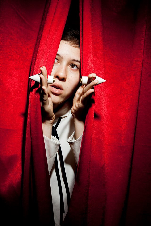
While an agreement could never truly be reached on the art world’s most important hue — every colour has had its moment in time — blue presents a strong case for itself as ultimately having one of the most complex and striking histories. Blue invokes a meditative, spiritual state. It is a colour associated with the elements and divinity for its relationship to water and sky — hence its apt coupling with the word ‘sacred’ — as well as being a pigment that is difficult to find in nature. Nowadays blue remains antithetical to nature as the colour of the digital void: chromakey, a blank desktop, the blue screen of death — indeed, this describes the well known technological phenomenon, but it’s also a phrase which relates beautifully to Derek Jarman’s final film, made as his health was deteriorating from AIDS, ‘Blue’. In Camille Henrot’s ‘The Pale Fox’, where the artist explores the history of humankind and our universe, the entire space of the Chisenhale Gallery was painted and carpeted in rich ultramarine; in the beginning there was blue, and in the end there will be blue. Empty space and absence are sensations conventionally related to black or white, which themselves are either devoid of, or dense with colour, depending on how you choose to look at them. Blue is the colour in the spectrum which has this same effect, and in fact technically and psychologically exceeds black and white in doing so.

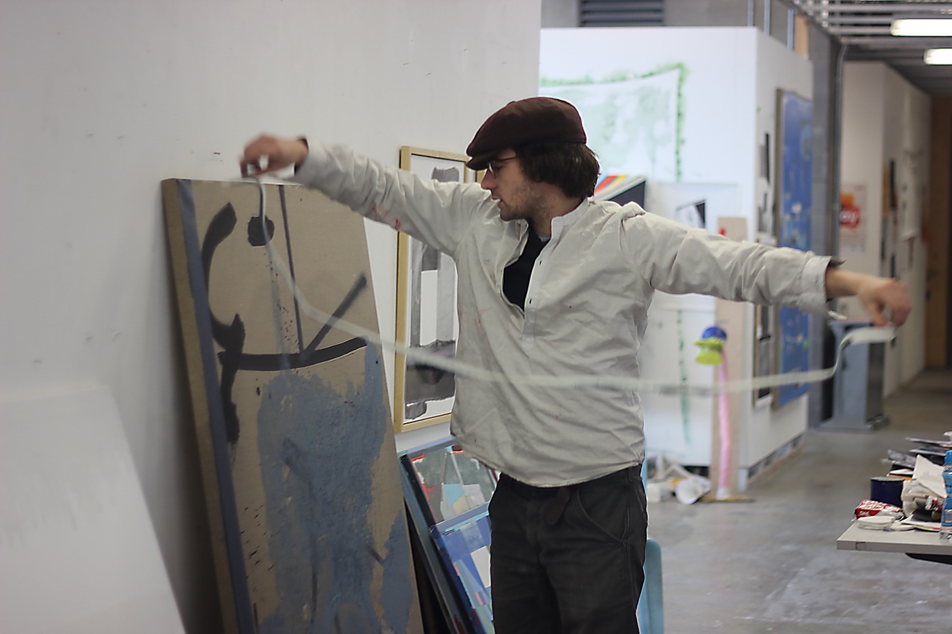
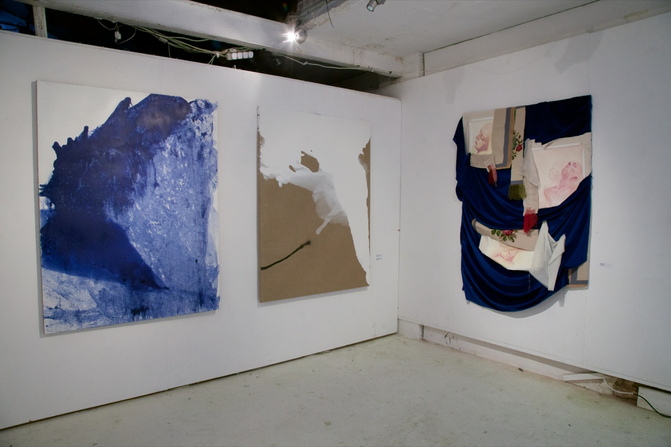
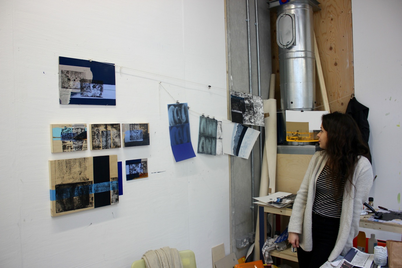
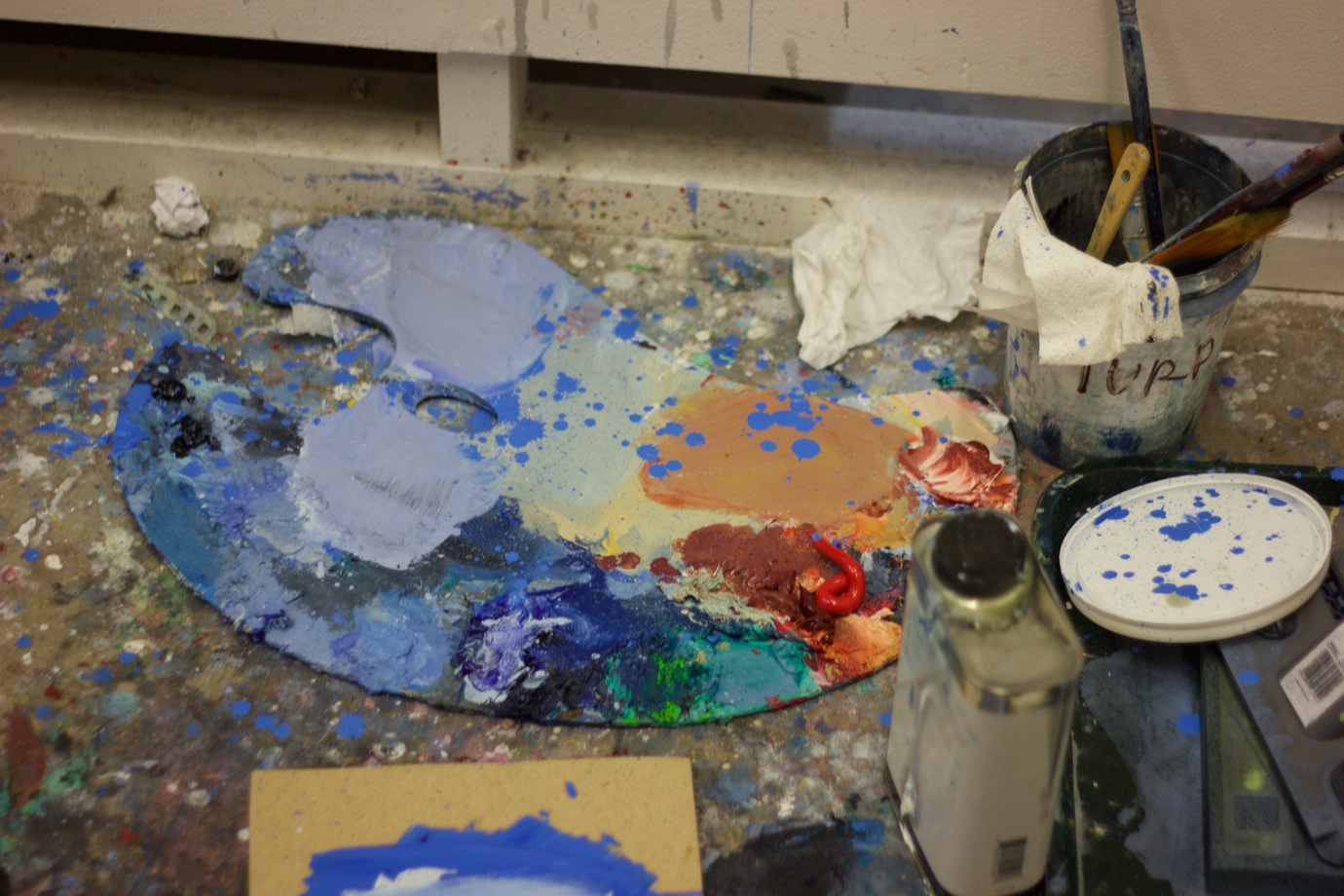
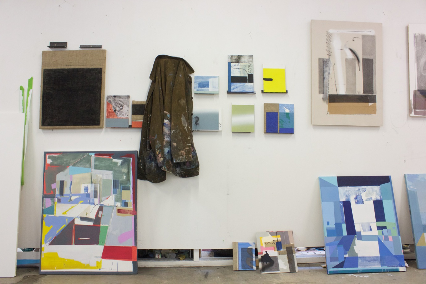
For instance, in Antoine Langénieux-Villard’s diptych for ‘Sacred Blue’, in one painting the poured white emulsion sits weightily atop its linen support, while the viewer seems to lose themselves into the great blue splash of the other. This sensation is not a coincidence, or exclusive to this work — optically, blue has the effect of receding next to absolutely any other colour. The feeling is only enhanced by its immersive scale. “I wanted to make it feel like you were jumping into a pool,” says Antoine. Speaking about his practice, he says, “My work is questioning the surface of paint though different tools and physical manipulation. The paint creates its own territory. It’s a simple narration of the act of painting.” Although Antoine is, without a doubt, first and foremost a painter, I ask him about whether he sees his work in any way as photographic. Giorgio Agamben talks about the photograph in relation to a “Judgement Day” — like a religious notion of the end of time — where successful photography captures traces of simple acts performed over time, and as such defines the truest essence of our time on Earth. When I question him on this, he smiles and says, “I never thought about it that way. But it’s a trace of time, and kind of photographic because it captures an instant. A frozen moment. I like that — especially because I think these paintings are cold.”

Antoine Langénieux-Villard (two works on the left)

 “IT WAS AS IF YOU WERE LOOKING THROUGH A DOORWAY INTO A PRIVATE MOMENT WITHIN SOMEONE’S HEAD, ALLOWING THE AUDIENCE TO BECOME A VOYEUR.”

Antoine’s work served as the starting point for curation. The Rag Factory is made of strange dimensions, so long and thin that only a work as bold and large as his paintings could draw the viewer’s gaze throughout the length of the gallery in its entirety to its back wall. It is an altogether awkward space, with sloping floors and puzzling brick archways which need to be negotiated. In a way, the slight scruffiness of the site gave an informality that the group preferred to the idea of a pristine gallery. Some even found that the unusual architectural elements brought unexpected and exciting new elements to their work. Ayşe Kipri responded to the one of the gallery’s archways to contain her numerous small mixed media works, giving them a space for introspective recognition and contemplation amongst so many large pieces, while Elliot Jack Stew’s mysterious painting of a figure occupied the other as if it were made for the space. Elliot explains that he is “currently using painting as a vessel to analyse interior spaces and their relationship with figures, or a suggested human element.” Hanging it in the folly allowed it to operate in a different way from in the studio, that was poignantly resonant with his concerns, and placed the viewer in a new position to the work. “It was as if you were looking through a doorway into a private moment within someone’s head, allowing the audience to become a voyeur.”

Cybi Williams

“NO ONE ELSE IS REALLY WORKING WITH CHARACTERS OR NARRATIVE IN THIS WAY. THEY’RE WORKING WITH ABSTRACTION, OR FIGURES AND LANDSCAPES — THINGS THAT APPEAR IN THE REAL, PHYSICAL WORLD. MINE DOESN’T HAVE THAT. IT’S IMAGINATIVE REALISM, IF YOU WANT TO PUT A BRACKET AROUND IT.”

Not every artist was as initially comfortable adapting to the demands and conditions of a group show. Camille Smith reflects, “I found it really hard to place my practice within the theme ‘Sacred Blue’, and the work of others.” Working alongside each other in pathway for almost two years, all the artists have an insight into each other’s practices, and so Camille recognised early on that her aesthetic and interests might be especially at odds with the rest of the show. “No one else is really working with characters or narrative in this way. They’re working with abstraction, or figures and landscapes — things that appear in the real, physical world. Mine doesn’t have that. It’s Imaginative Realism, if you want to put a bracket around it.” The artist made use of her naïve painting style and interest in Renaissance painting and religious iconography to adapt her narratives into something appropriate for the show — “In a child’s drawing, the sky is always blue.”  The horizontal tale playing out across the work, referencing primitive modes of pictorial storytelling, was echoed in Cybi Williams’ canvas depicting a passage through a landscape, positioned on the wall directly opposite, and both artists also exhibited the use of gold pigment for its spiritual connotations and reference to the baroque. This shared desire to reflect upon art history, and its enduring relevance to contemporary art and society, could also be found in the work of Alex Hosking, whose interest in the marginalised female figure drove her to re-interpret Sir John Everett Millais’ ‘Mariana,’ condemning the sensuous depiction of a helpless woman, famously dressed in a striking blue velvet dress, pining for her man. In one of the more socially critical pieces from the show, Alex says she chose to “work with the relationship between cloth and women in art and women’s history, from suppression through clothing to liberation through expressive textile crafts that have also been suppressive for the ‘domestic’ woman.”

“I IMMEDIATELY SAW EVERYTHING THAT WASN’T WORKING WITH IT. I’VE NEVER HAD THAT BEFORE WITH A PAINTING. I THINK IT’S BECAUSE IT WAS IN A SITUATION THAT WAS SO FAR REMOVED FROM ANYTHING THAT I WORK IN, AND IT WAS THE FIRST TIME I’D EVER SEEN MY WORK IN SUCH A FORMAL SETTING.”

The overall process of curating these works together was very organic — admittedly, this owed itself in no small part to the time pressures of hanging a show in under seven hours, with many of the works only seen by the curation team for the first time that day — which allowed for these kinds of associations to develop, giving works new contexts in relation to each other. This is one of the many valuable experiences artists can gain from being involved in a project like ‘Sacred Blue’, particularly whilst still studying. It’s both a blessing and a curse to be an artist working inside the safety of the educational bubble, where we spend most of our time looking introspectively; we have our studio spaces, we make our work there, and then we display it there, which can be limiting and sometimes leaves us blind to its potential. Camille describes the experience of seeing her work in the space of The Rag Factory: “I immediately saw everything that wasn’t working with it. I’ve never had that before with a painting. I think it’s because it was in a situation that was so far removed from anything that I work in, and it was the first time I’d ever seen my work in such a formal setting. Although I spent the whole evening looking at it and thinking ‘that doesn’t work’ or ‘that’s wrong’, that critique wouldn’t have happened without the show.” There’s also a certain naïvety about the creative environment that lies beyond the studio walls. For instance, it’s a little known fact that SUARTS has a budget to support external projects such as group shows, bringing them within the reach of students, for whom financial constraints can be an issue. If we can only take one thing away from ‘Sacred Blue’, let it be to see the space of art making and exhibiting as a more fluid and collaborative process, and recognise how this can positively impact individual practice.