Representing the creative future

Mirko Borsche: Why design history matters and brainstorming sucks

Lunch break at Bureau Mirko Borsche: a handful of graphic designers and interns sit outside in a canopy swing, smoking a cigarette, listening to hip hop tunes. Borsche, barefoot, walks around the office, a Döner (turkish Kebab) in one hand, his phone in the other. On the other end of the line: the editor-in-chief of Tush, one of the magazines Borsche art directs.

What might sound like the perfect description of Berlin’s start-up scene is in fact set in Munich, the Bavarian capital otherwise famous for Oktoberfest and Lederhosen. Here, a stone’s throw away from the scenic river Isar, the art director with an MA from Kingston University has established his Bureau, a light-filled office space with a single shared table. The studio’s client list sounds like music to the ears of anyone with an interest in art, fashion and design. It encompasses avant-garde fashion designer Kostas Murkudis as well as German weekly newspaper Die Zeit, art magazine Spike as well as Pinakothek der Moderne, independent music label Gomma and the Bavarian Radio Symphony Orchestra. Besides, the studio consults brands like Nike and realises fashion projects from textiles to sunglasses.

It is calming to hear that Borsche started out small. After studying graphic design, he began to work in advertising, but soon grew tired of the back-then ego and power-driven industry: “In advertising you are basically editing large corporate manuals, it often doesn’t have much to do with design. That’s why I can’t watch Mad Men, it’s just too dramatically authentic.” His first steps in editorial design, though, were not exactly as he expected: “My first proper design job was Jetzt Magazine, for the first issues I designed, possibly the worst magazine in the world. I was completely overwhelmed, I had no idea how many rules there are in making a magazine, after a few issues I started to understand how a magazine works.” Opening his own studio in 2007, set in a wooden kiosk, eventually allowed Borsche to make his own rules and to develop an idiosyncratic visual signature.

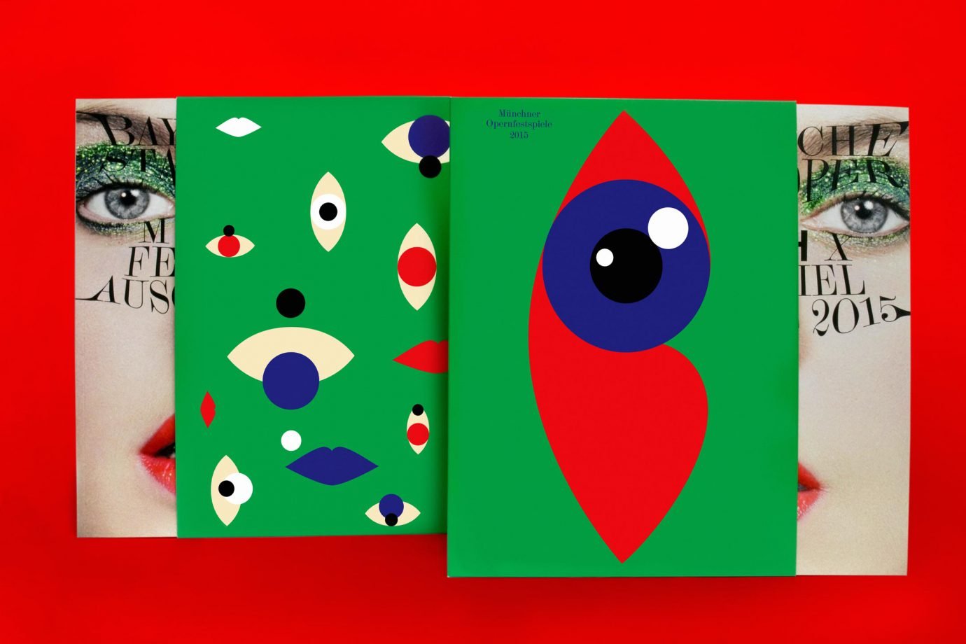
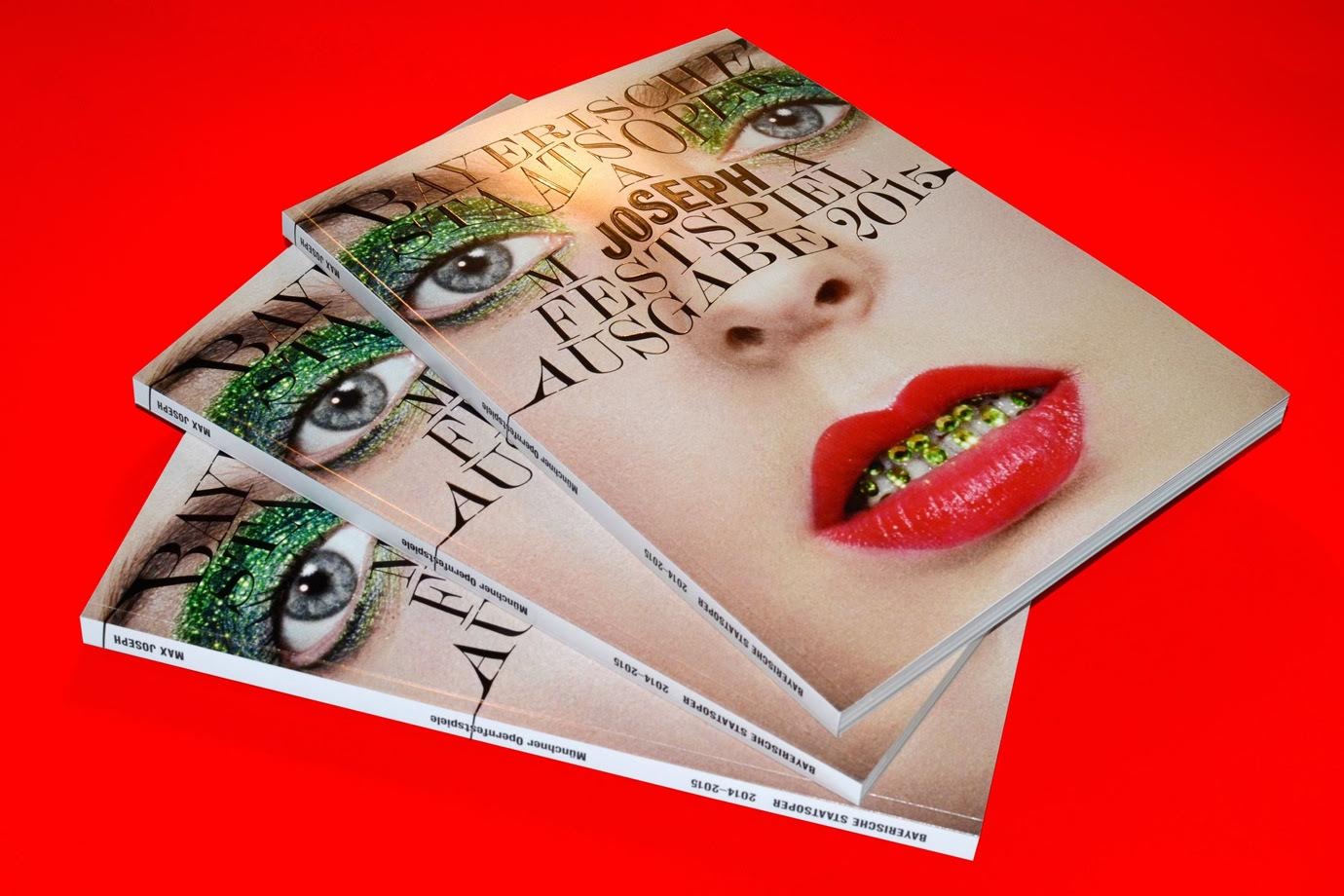
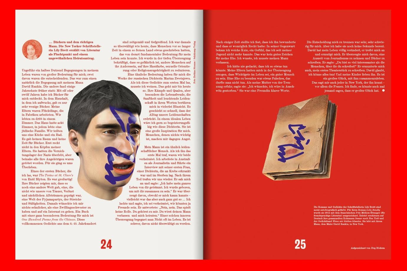
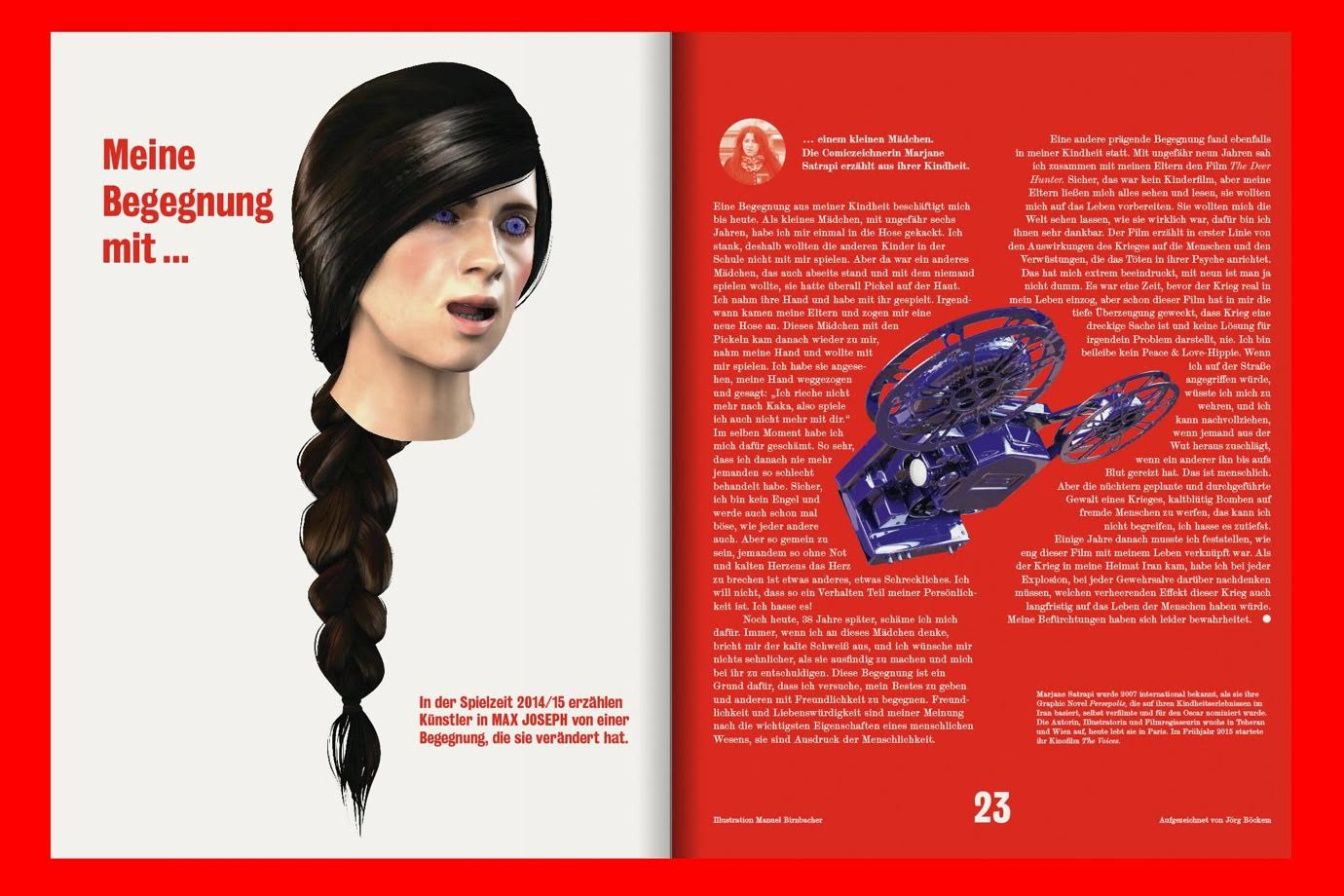
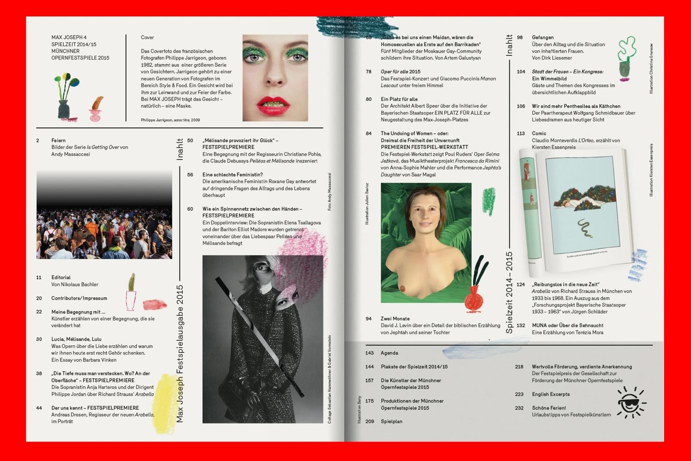
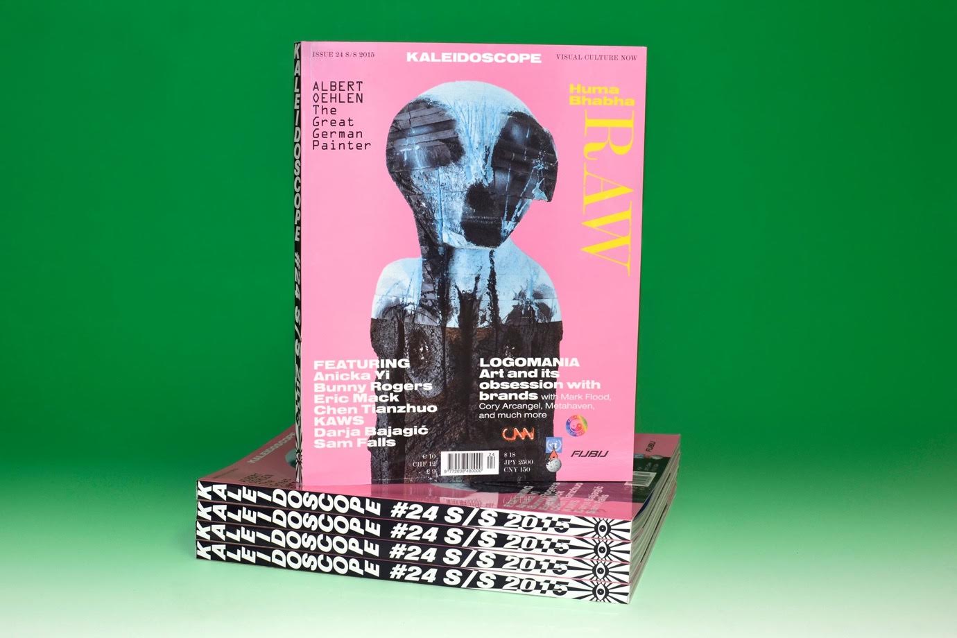
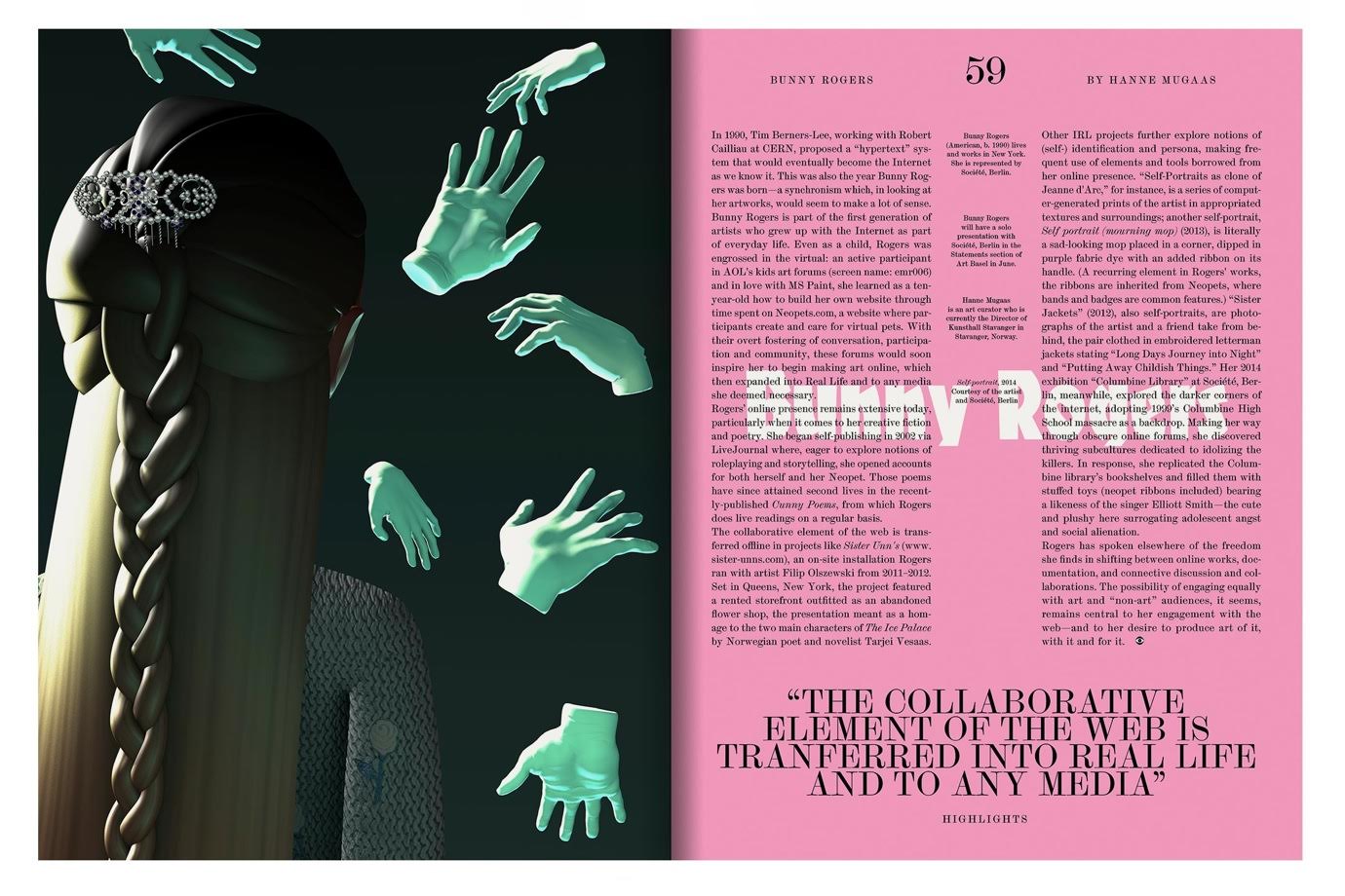
I am not surprised to learn that the father of two learned his craft through graffiti as a teenager. “I liked graffiti because people see it, if they want to or not. If a businessman is going to work by train and there is a panel on it, he has no option but to engage with it.” Today, Borsche is art director of several leading art magazines and the aesthetics of graffiti is still a key influence: “There are enough magazines which present art in a very clean look. Take the beautiful Art Review in London, it’s super polished and looks great.” Borsche is pushing into a different, less White Cube, direction. Instead of letting art speaks for itself, he engages in its visual language, creating a dynamic two-way discourse between content and form: “Spike has almost has a 70s vibe to it and a very fine-tuned layout. In contrast, Kaleidoscope has a bolder and more experimental design, which fits the artists they feature. There is definitely a dialogue between content and design.” Borsche likes to play with the boundaries of design and taste: “The way we use fonts sometimes hurt a bit. We like to experiment. If that means stretching the limits of what we consider beautiful, we can live with that.” Is this richness of styles an anti-position towards German pragmatism and intellectualism? “True, our style is not typically German”, he says, “but boldness is never a goal in itself”. The 43-year old is not trying to provoke. “My best friend’s mum collects the programmes we do for the Bavarian State Opera because she appreciates them as objects, and she has nothing to do with design.” Borsche is aware of the designer’s responsibility towards the public. Appealing to a heterogeneous audience of different ages and interests is therefore much more satisfying for Borsche than to only address a scene of design insiders. “Niche”, he says, “is boring anyway. My only goal is to make good design work.”

“I THINK NICHE IS BORING. I’M NOT INTERESTED IN THAT.”

If you ever think of applying to work with him, don’t try to impress with the attempt to condense all the theory you read for your art school into your portfolio. Chances are nobody will even bother to understand what you are trying to say. What, then, does it really mean for design to function? Borsche’s answer is simple: “Graphic design is good when people get it. Many graduates come up with designs that are too complicated to even get noticed. You cannot expect your average consumer to have the time and the expertise to engage with overly abstract, conceptual approaches.” Hence, a certain visual immediacy is prevailing in every project Mirko Borsche realizes. “Raketen” (‘rockets’) comments a fan on the studio’s Facebook page and the analogy is fitting, Borsche’s loud, confident and energetic works rarely go unnoticed.

Does graphic design these days need to compete against fast-paced online media? Quite the opposite, believes Borsche. Rather than trying to keep up with accelerating digital media consumption, Borsche wants to design magazines that offer something different: well-curated content and a visual experience that not simply replicate trends. “Tumblrs and blogs start to look more and more the same and there is a small circle of photographers who work for all the brands. This is one of the reasons we like to work with illustrators.” Plus, doesn’t it seem like there is a renewed appreciation for the haptic appeal of a magazine? “Only if it is well done. If the big publishing houses continue to cut production costs and print on cheap paper, they will have a hard time keeping their customers.” On the flip side of that, he points to the flourishing scene of small and independent magazines. “Ten years ago, i-D or The Face were absolutely marginal. Today, you have Fantastic Man, Gentlewoman, 032c and other independent titles that sell just as well as or even better than a German mainstream title.” Besides independent publications, Borsche sees cultural at the forefront when it comes to design awareness. “Today, public museums are leaders in visual communication. Just look at what Chris Rehberger does for the Venice Biennial.” What he is sceptical of, though, is the increasing homogenisation of design in high budget, but fear-driven industries like the automobile sector. “Large Industry clients are the most difficult. There is no more soul in it, everything is based on data and market research. The result? All cars look the same, all adverts look the same.” In times when design is increasingly determined by marketing interests, it is even more important for a design agency to stand out with personality. “There are enough clients on the market, but there will be less money. We need to give the client a reason to come to us and not go to another studio and not because we are the cheapest.” It is a bit like with freckles, he adds, “They don’t make you more perfect, but they can make you look more special. And there is something very compelling about imperfections.”

“GRAPHIC DESIGN IS NOT ART”

Design, for Borsche, has less to do with letting your imagination run wild than with understanding your client and focusing on your task. “Graphic design is not art. We give form to brands, with the clients of our clients in mind.” While the internet has made the spheres of design and photography more accessible to the degree that anyone with a smartphone can rise to Instagram fame in an instant, Borsche doubts that it has led to more creative variety. “Nowadays, everyone builds mood boards, but nobody knows how to develop ideas on a conceptual level.” For Borsche, the emotional quality of a product comes prior to its form: “I begin a project with an idea of how the result should feel like. Then, at some point I stumble upon a certain clue, be it the wrapping paper at the butcher or a song on my playlist, which leads me to the form.” If you start with the aesthetics, though, then the outcome is already pre-determined and that makes it hard not to come up with new ideas. However, this is exactly what Borsche observes in emerging designers: “I’m sure you have a folder of images you saved from your favourite tumblrs, right?” he asks me. “Our people here do the same thing, but if you look closely and beyond the surface of the aesthetic you will find that most of it won’t sustain any relevance in 10 years time.”

According to Borsche, a good graphic designer needs to be familiar with a broad spectrum of design and not just one visual style. Recently, his team designed a catalogue for Cory Arcangel made up as a teen mag. “Once you immerse yourself into the world of teenager magazines, you start to notice the expertise behind it. And you realise how few buttons in InDesign you actually know how to use.” Borsche’s idea of creativity is much more pragmatic than one might expect: “I think 80 percent of what comes out of brainstorming sessions is useless. People take it as an excuse to sit back and talk bullshit, it’s a waste of time.” And, frankly, the pace of his work doesn’t really allow time for things like that, either. Every Monday, he is phoned up by Christoph Amend, editor-in-chief of Zeit Magazin, and has an hour to come up with the entire visual concept for the following issues. “Some interns first of all need to understand that we have to make money here.” But there is good news: Borsche is convinced that you can practice to generate good ideas. “With experience you become much better at telling ideas with potential from naive illusions.”

“THEY SEE SOMETHING AT METAHAVEN AND THINK IT’S REALLY HIP, BUT THEY HAVE NO CLUE ABOUT THE ORIGINS OF THAT AESTHETIC.”

So what is lacking in today’s young graduates? “Awareness of where design is coming from.” Borsche would like to see more designers look beyond the surface of contemporary trends: “Many students pin down a handful of studios, magazines and typographies they like and that becomes the palette. They see something at Metahaven and think that’s hip, but they have no clue about the origins, the concept and idea of that aesthetic and how it developed since the 80s.” Doing your homework and showing up to the design history lectures at art school, though, is key if you want to push things forward. “Even a humorist like Loriot was obsessively organized and lived an utterly boring life at Lake Starnberg. Still, this enabled him to shape German humour for two decades.”

“POLITENESS IS IMPORTANT. I LIKE MY EMPLOYEES TO BEHAVE AS IF THEY WERE MEETING THEIR PARENTS-IN-LAW.”

At least at work, also Borsche is less enfant terrible than you might think: “I can be very strict. Our job has a lot to do with being organised. The office needs to be clean. And politeness is important, I like my employees to behave as if they were meeting their parents-in-law.” By now, lunch break is well over and Borsche’s team, relaxed but fully concentrated, is back at work. “You can only do wild stuff with a system behind it,” says Borsche. “If you rely on chance and intuition only, there is no way you will be able to do it over and over again.” A moment later, he smiles behind his sunglasses and adds “It is just like love. There is only that one time you fall in love in an instant, you cannot simply repeat it. But you can grow a relationship, practice to be with each other, and eventually it is love as well, but a long-lasting version of it.”